
Chapter 14. Creating User Forms
In this chapter, you will:
Gathering feedback from your website’s visitors can be a valuable way of assessing your site’s success, and it can help you build a customer or subscriber database. For example, a business could collect the addresses of people who are interested in receiving product samples, email newsletters, or notifications of special offers.
To receive feedback, you can set up an email hyperlink, as you did in Chapter 5, but an email message is not structured, and respondents are given no guidance as to the type of information you want to collect. When you need specific information, such as complete mailing addresses, it is helpful to provide visitors with a form to complete. You can use HTML to create user input forms that can send their results to you in an email message, or you can store the data in a file on your server.
In this chapter, you will learn how to create several types of user input forms. You’ll set them up to deliver their results to you in an email message because that’s the simplest method—and the most convenient for a low-traffic website. You’ll learn how to create forms with text boxes, option buttons, check boxes, and drop-down lists. You’ll also learn about some of the new HTML5 form controls, such as date boxes. At the end of this chapter, you’ll find some information and web resources that can help you create even more advanced forms by using Common Gateway Interface (CGI) scripting and third-party utilities and services.
Important
Before you can use the practice files provided for this chapter, you need to install them from the book’s companion content page to their default locations. See Code Samples in the beginning of this book for more information.
Caution
Many web design professionals strongly recommend against using email to deliver web form results. Not only is email not secure, but web forms do not interface very well with some email programs and some older browsers (such as Internet Explorer 3.0). If a visitor’s email program or browser does not support web form submittal, the form won’t work, but the visitor won’t know until he clicks the Submit button, at which point the form will simply be cleared or a blank message window will open. The dilemma, though, is that nearly all of the other alternatives to email submission require either programming knowledge or going through an external service. In this chapter, you’ll test your forms by using email, but use caution when relying on them for your real-world sites. Be sure to read the section Understanding CGI and Other Advanced Tools at the end of this chapter for alternatives.
Creating a Basic Form
You can place a form anywhere in the body of an HTML document. Some people like to use a table to organize form elements; others create form fields within ordinary paragraphs. A form is enclosed in a two-sided <form> tag:
<form method="post">
...
</form>
The method attribute specifies what will happen when the form is submitted. Almost all forms use the method=“post” attribute, meaning that the data users enter into the form will be collected and either delivered (by email) or sent to the server, where server-side code can retrieve it and perform tasks such as storing it (in a database).
Within the opening <form> tag, you specify an action attribute. This is typically either an email address to which to send information or the URL of a script that will run when the user submits the form. For an email delivery, the action attribute might look like this:
<form action="mailto:[email protected]" enctype="text/plain">
Note
The enctype attribute specifies how the results will be encoded. An encoding type of text/plain is required when sending result by using email; otherwise, the results might be unreadable.
To send the form contents to a CGI script, include the URL for the appropriate CGI script stored on your server:
<form action="http://www.margiestravel.com/cgi-bin/feedback.pl">
You place the various tags that create form controls between the opening and closing <form> tags. Form controls available include text boxes, buttons, check boxes, lists, and/or command buttons. A command button is a button that executes a function, such as submitting the form or resetting it.
Creating a Text Box
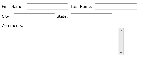
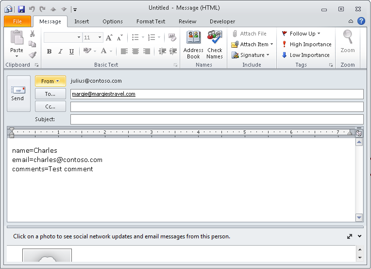
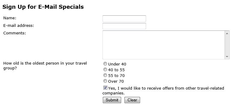
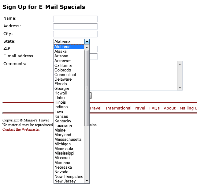
The most basic type of control is a text box. Users can enter data such as names, addresses, phone numbers, and comments into text boxes. There are two types of text boxes: regular text boxes (single line) and text areas (multi-line). In Figure 14-1, the top four fields are single-line text boxes, while the Comments box is a multi-line text area.
You create a regular text box using a single-sided <input> tag with a type=“text” attribute:
<input type="text">Each control within a form must have a unique name, expressed with the name attribute. For example, to name a particular text box phone:
<input type="text" name="phone">You can specify a width for the text box with the size attribute. The default width is 20 pixels.
<input type="text" name="phone" size="30">You can also specify a maximum length for the text string that users enter into the text box. This is different from the size of the text box. If the specified maximum length is greater than the text box width, the text scrolls horizontally as the user types. When users reach the specified maximum number of characters, the text box does not accept any more input. Use the maxlength attribute:
<input type="text" name="phone" size="30" maxlength="100">In HTML5, you can require users to fill out a field before they submit the form (this applies only to HTML5-compliant browsers). To mark a field as required, add the required attribute to its tag:
<input type="text" name="phone" size="30" maxlength="100" required>Special Field Types for Email and Web Addresses
Two new input field types in HTML5 support email addresses and web addresses. Use the attribute type=“email” instead of type=“text” to define a field designed to collect email addresses. If a browser doesn’t support HTML5, the field defaults to a text type, so you don’t risk anything by using it.
<input type="email" name="email-address">The same is true of web addresses (also known as uniform resource locators or URLs). There is a special type attribute in HTML5 for them:
<input type="URL" name="website">In most browsers, you won’t notice any difference, but there are a few exceptions. One exception is in the Apple iPhone browser; a special version of the on-screen keyboard pops up when the user selects an email or web field. This special keyboard provides dedicated keys for the most common symbols used for typing email addresses and URLs. Other browsers, especially in other smartphone operating systems, might implement special treatment for these field types, too.
Creating a Text Area
You create a multi-line text area by using a two-sided <textarea> tag containing a rows attribute that specifies the number of lines of text that the box should accommodate:
<textarea name="comments" rows="5"></textarea>
You can also include a columns attribute that specifies how many characters (each character represents a single column) wide the text area will be. The default is 40 characters.
<textarea name="comments" rows="5" cols="60"></textarea>
The columns attribute affects only the size of the box, not the maximum number of characters that can be entered. You can use the maxlength attribute to limit the number of characters a user can enter.
Creating a Submit or Clear Button
You will need to include a Submit button on the form so visitors can send the information to you. Submit refers to the button’s function, not the wording that appears on the button face. The default button text is Submit, but you can use a value attribute to display different text on the button. For example, to make the word Submit appear on the button face, set up the value attribute:
<input type="submit" value="Send">
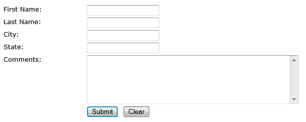
You can also include a Reset button on the form, which allows the user to clear all the fields (see Figure 14-2). Again, use the value attribute to change the text on the button:
<input type="reset" value="Clear">
Many web designers find it useful to place form fields in tables to make it easier to align the fields. For example, as shown in Figure 14-3, you could place field labels in one column and the actual fields themselves in another. You’ll see this type of design in the next exercise.
Adding Default or Placeholder Text
By default, text boxes and text areas are blank when the form loads. You can optionally place either default or placeholder text in them.
Default text is regular text that is submitted with the form results as if the user had actually typed it in.
Placeholder text is “phantom” text that appears as a prompt within the text box but disappears when the user types something else there. If the user chooses to leave that text box blank, nothing is submitted.
Most browsers support the use of default text, even if they do not support HTML5. For a text box, add a value attribute to the tag that specifies the default text:
<input type="text" name="country" value="United States of America">For a text area, you should place default text between the opening and closing <textarea> tags:
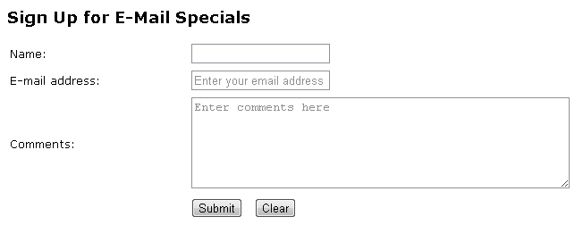
<textarea name="comments" rows="5">Great job! Keep up the good work.</textarea>Placeholder text displays only in HTML5-compliant browsers. To use placeholder text, add the placeholder attribute:
<input type="text" name="country" placeholder="Enter your country here">In the following exercise, you will create a simple form with text boxes and text areas in a table.
Create a Simple Form with Text Boxes
In Notepad and Internet Explorer, open the signup.htm file located in the DocumentsMicrosoft PressHTML5 Start Here14FormsCreatingForm folder.
Immediately following the opening <table> tag, create an opening <form> tag that sends results to your own email address. Substitute your address for youremail:
<table>
<form method="post" enctype="text/plain"action="mailto:youremail?subject=Comment">In the empty <td> tag following Name:, create a single-line text box:
<colgroup align="right" valign="top"> <tr> <td>Name:</td> <td>
<input type="text" name="name"></td> </tr>In the empty <td> tag following E-mail address:, create a single-line text box with a type of email and a maximum length of 100 characters:
<tr> <td>E-mail address:</td> <td>
<input type="email" name="email" maxlength="100"></td> </tr>Add a placeholder for the email field of Enter your email address:
<tr>
   <td>E-mail address:</td>
   <td><input type="email" name="email" size="30" maxlength="100"
   placeholder="Enter your email address"></td>
In the empty <td> tag following Comments:, create a six-line text area with a width of 50 characters:
<tr> <td>Comments:</td> <td>
<textarea name="comments" rows="6" cols="50"></textarea></td> </tr>Add a placeholder attribute for the comments field of Enter comments here:
<tr> <td>Comments:</td> <td><textarea name="comments" rows="6" cols="50"
placeholder="Entercomments here"></textarea></td> </tr>Save the file and then refresh Internet Explorer to check your work.
Immediately before the closing </colgroup> tag, add another row at the bottom of the table. Leave the first cell empty, and in the second cell, place a Submit button and a Reset button, separated by a nonbreaking space:
<tr><td></td><td><input type="submit" value="Submit"> <input type="reset" value="Clear"></td></tr>Save the file and then refresh Internet Explorer. Depending on the version of Internet Explorer you are using, the placeholder text might or might not appear.
In Internet Explorer, type some text into each field on the form (it doesn’t matter what you type) and then click the Submit button.
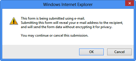
Depending on what browser and version you are using, one of two things will happen at this point: either a warning will display alerting you to the fact the message is about to be sent (click Yes to allow it) or your email program will open up a new email message with the appropriate fields filled in from the form (click Send to send it).
Close Notepad and Internet Explorer.
Creating Check Boxes and Option Buttons
When the valid responses to a particular prompt will always be one of a few simple options, such as sex or employment status, you will get more consistent and easier-to-evaluate results by using check boxes and option buttons rather than text boxes.
Note
There are security benefits to using check boxes and option buttons as well. Text box controls on forms can sometimes be used by hackers to get into the associated database. Using controls other than text boxes can help minimize that risk.
For example, suppose you are asking site visitors a yes/no question such as, “Are you interested in receiving our catalog by mail?” If you provide a text box, people might answer the question in any number of ways: y, n, Y, N, yes, no, Yes, No, YES, NO, maybe, Sure, No Thanks, and so on. Tabulating such results would be tedious because a human would need to evaluate each one. But by providing a check box, you remove any doubt: a check mark means yes; the lack of a check mark means no.
You use check boxes for single binary (yes/no) questions. A form might contain multiple check boxes, but each one is a separate decision for the person filling out the form (see Figure 14-4).
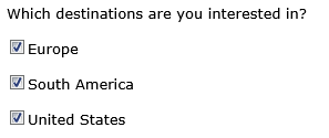
To create a check box, use the type=“checkbox” attribute with the <input> tag:
<input type="checkbox" name="europe">By default, the results of the form will show a value of On when the check box has been selected. For the check box shown in Figure 14-4, the results would display like this:
europe=on
You can change that default by specifying a value attribute. For example, you could report the word Yes for the check box:
<input type="checkbox" name="europe" value="Yes">By default, check boxes display unselected; users must click each check box to select it. In some cases, however, it might be advantageous to have a check box preselected. For example, to encourage people to sign up for your newsletter, you could select the Newsletter check box by default, so that users must click it to clear it. To do this, add the checked=“checked” attribute:
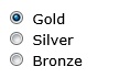
<input type="checkbox" name="europe" value="Yes" checked="checked">Use option buttons (also called radio buttons) to present a group of mutually-exclusive options. When you select an option button, all the other option buttons in the group are cleared (see Figure 14-5).
To create a group of option buttons, choose a name for the group. You will specify the same name in the name attribute for each individual button. Use the value attribute (which will be different for each button in the set) to specify the value that will be reported for the group in the form results.
For example, suppose you want users to choose among three membership categories: Gold, Silver, and Bronze. Because you make the most money on a Gold membership, you want to make it the default choice:
<p><input type="radio" name="category" value="gold" checked="checked"> Gold<br>
<input type="radio" name="category" value="silver"> Silver<br>
<input type="radio" name="category" value="bronze"> Bronze</p>
As shown in Figure 14-6, each button is followed by text describing that option (Gold, Silver, Bronze). The words Gold, Silver, and Bronze are just ordinary text within the paragraph, as shown in the previous code.
Note
The space before the text is inserted by default to prevent the option buttons from running into the text. You don’t need to add any space yourself.
When the form results are returned, this button group will report its name and the selected value:
category=gold
In the following exercise, you will enhance a form by adding a group of option buttons and a check box.
Add Option Buttons and a Check Box to a Form
Add Option Buttons and a Check Box to a Form
In Notepad and Internet Explorer, open the signup.htm file located in the DocumentsMicrosoft PressHTML5 Start Here14FormsCreatingButtons folder.
Immediately above the row containing the Submit and Clear buttons, add a new row that allows the user to choose their age range:
<tr><td>How old is the oldest person in your travel group?</td><td><input type="radio" name="level" value="under40">Under 40<br><input type="radio" name="level" value="40to55">40 to 55<br><input type="radio" name="level" value="55to70">55 to 70<br><input type="radio" name="level" value="over70">Over 70<br></td></tr>Save the file and then refresh Internet Explorer.
Immediately after the row you just created, create a new row that contains a checkbox to the left of Yes, I would like to receive offers from other travel-related companies. Set its name to partner and then set its default value to checked:
<tr><td></td><td><input type="checkbox" name="partner" value="Yes"checked="checked">Yes, I would like to receive offers from other travel-related companies.</td></tr>Change the mailto address in the opening <form> tag to your own email address.
Save the file and then refresh Internet Explorer.
Fill out the form (use any text you like, and select any of the option buttons) and then click Submit to send it to yourself.
Close Notepad and Internet Explorer.
Creating Menu Lists
Check boxes are good for yes/no questions, and option buttons are appropriate when there are a few options to choose from, but what if you have a dozen or more choices? Option buttons for that many choices can take up a lot of space onscreen and can overwhelm a web visitor.
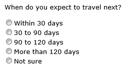
For situations involving many options, consider a list, also called a menu. A list can contain as many options as needed, yet it takes up very little space on the form (see Figure 14-7).
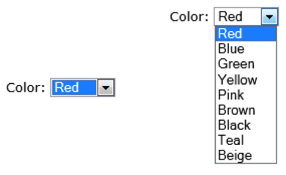
To create a list, start with a two-sided <select> tag. Within it, place each option in its own <option> tag. Place the text that you want to appear on the list between the opening and closing <option> tags. For example, to create the list shown in Figure 14-7, use the following code.
<p>Color: <select name="colors" size="1">
<option>Red</option>
<option>Blue</option>
<option>Green</option>
<option>Yellow</option>
<option>Pink</option>
<option>Brown</option>
<option>Black</option>
<option>Teal</option>
<option>Beige</option>
</select></p>
Note
By default, the form results will report the text of the selected option. If you want to make the form report something different, include it in a value attribute in the option’s opening tag.
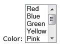
A list can be any height you like. In the preceding code, the size attribute is set to 1, which creates a drop-down list. If you set the size attribute to a larger value, the element renders as a list box instead. If there are more items in the list than will fit in the viewing space, a scroll bar displays automatically at the right side of the box. For example, you might change the opening <select> tag in the preceding code to this:
<p>Color: <select name="colors" size="5">
The result would be a list like the one shown in Figure 14-8.
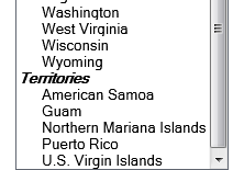
If the list’s choices fall into categories, you might want to divide them into sections (see Figure 14-9).
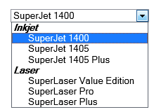
To format a list as shown in Figure 14-9, surround the groups of options with an <optiongroup> tag. Include a label attribute that specifies the heading text for each option group. Here’s the code for the preceding example:
<select name="printers" size="1">
   <optgroup label="Inkjet">
      <option>SuperJet 1400</option>
      <option>SuperJet 1405</option>
      <option>SuperJet 1405 Plus</option>
   </optgroup>
   <optgroup label="Laser">
      <option>SuperLaser Value Edition</option>
      <option>SuperLaser Pro</option>
      <option>SuperLaser Plus</option>
   </optgroup>
</select>
In the following exercise, you will add a drop-down menu list to a form.
Create a Drop-Down Menu List on a Form
Create a Drop-Down Menu List on a Form
In Notepad and Internet Explorer, open the signup.htm file located in the DocumentsMicrosoft PressHTML5 Start Here14FormsCreatingMenus folder. Make sure you use the version provided for this exercise; do not use a previous version.
In Notepad, replace the <input> tag for the text box that follows State: with an empty <select> tag:
<tr> <td>State:</td> <td>
<select name="state"></select></td> </tr> <tr>In a separate Notepad window, open the states text file, which can be located in the data files for this exercise.
Press Ctrl+A to select the entire content of the file and then press Ctrl+C to copy it to the Clipboard.
In the signup file, click between the opening and closing <select> tags. Press Ctrl+V to paste the options for each state into the file.
Save the file and then refresh Internet Explorer. Click the down arrow to the right of the State box to ensure the drop-down list displays.
Enclose the 50 states in an <optgroup> tag with a label of States:
<optgroup label="States"><option>Alabama</option> ... <option>Wyoming</option></optgroup>After the closing tag of the States option group, add a Territories option group that contains entries for American Samoa, Guam, Northern Mariana Islands, Puerto Rico, and the U.S. Virgin Islands:
... <option>Wyoming</option> </optgroup>
<optgroup label="Territories"><option>American Samoa</option><option>Guam</option><option>Northern Mariana Islands</option><option>Puerto Rico</option><option>U.S. Virgin Islands</option></optgroup></select>Save the file and then refresh Internet Explorer. Scroll to the bottom of the State drop-down list to see the changes.
Close Notepad and Internet Explorer.
Additional Input Types in HTML5
HTML5 provides several other field types that can add that extra bit of polish to your forms. If the user’s browser does not support them, it renders and treats them as text fields, so you can use them freely without worrying about backward compatibility.
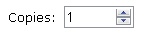
Spin boxes (see Figure 14-10) are used to increment numeric values.
The spin box shown in Figure 14-10 was created by using the following code:
<input type="number" name="copies" min="0"max="100" step="1" value="1">
The min and max attributes control the minimum and maximum values, respectively. The step attribute specifies how much the value increments or decrements when you click the up or down arrow buttons. The value attribute specifies the default value.
A slider (see Figure 14-11) is a sliding bar that you can drag from side to side. Its type is range and its attributes are nearly identical to those for a spin box.
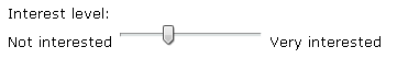
<input type="range" name="copies" min="1"max="4" step="1" value="1">
Understanding CGI and Other Advanced Tools
As you have learned in this chapter, directing form results to an email address is a quick, no-hassle way of collecting information, provided the visitor’s web browser and email program support it. As the volume of messages increases, however, organizing all the information you receive can become a challenge. You need to copy the information from the form results into a database or you need to at least print out a copy of the email messages. When you start receiving hundreds of form submissions a day, that responsibility can become overwhelming.
As an alternative, you can rely on a server-based script or application to handle the form results. A Common Gateway Interface (CGI) script written in a programming language such as Perl is one common, low-cost possibility. You reference the script in your <form> tag’s action attribute. The server on which you host your site must allow CGI scripts (some do not, for security reasons.)
Important
One drawback of using CGI scripts is their lack of security. Unless you put security measures in place, the collected data resides in a file on the server, which is a potential security risk. For this reason, you shouldn’t use a CGI script to collect sensitive information such as credit card or Social Security numbers unless you also implement security measures that prevent the data from being compromised. Most commercial sites use a secure server for that; you can partner with a company that offers secure form processing, including credit card processing, for a monthly fee.
There are hundreds of websites that offer free CGI scripts that you can modify in a text editor (such as Notepad) to meet your needs. To do this, you must know a little something about programming, which is beyond the scope of this book. However, if you are interested in learning about Perl and CGI scripting or you are looking for a service that will host your CGI script, see one of these websites:
Comprehensive Perl Archive Network: www.cpan.org
Matt’s Script Archive: www.scriptarchive.com
The CGI Resource Index: cgi.resourceindex.com
BigNoseBird.Com: www.bignosebird.com
As your website becomes more sophisticated, you also might want to include a public bulletin board area where people can post and read comments, or a guest book where people can leave public comments. You cannot create one of those by using only HTML, but you can integrate add-on components into your site that will do the job. There are many free and low-cost sources of programming code for a message board, both in CGI (see the previously mentioned sites) and in other languages. For example, check out the phpBB open-source bulletin board package at www.phpbb.com. (In order to use that package, your server must support PHP.) There are also many servicessuch as ProBoards (www.proboards.com) that will host your bulletin board on their servers,. You place a link to the message board hosting site on your webpage; to your visitors, it seems like the message board is part of your site.
Key Points
To create a form, use a two-sided <form> tag. Within it, place one or more <input> tags that define the form fields.
In the opening <form> tag, place a method=“post” attribute and an action attribute that describes how the form should be processed. The most common attribute is action=“mailto:address” where address is a valid email address. If you are collecting form results by using email, include an enctype=“text/plain” attribute.
To create a text box, use <input type=“text” name=“fieldname”>, where fieldname is the unique name you assign to the text box. Optional additional attributes include size and maxlength.
For web and email collection, you can optionally use the URL and email input types, respectively. These work only in HTML5-compliant browsers.
To create a multi-line text box (a text area), use a two-sided <textarea> tag with a name attribute and a number of rows and columns. For example:
<textarea name="comments" rows="5" columns="40"></textarea>
To create a Submit button, use an <input> tag with a type=“submit” attribute. To change the button text, use the value attribute. For example, <input type=“submit” value=“Send”>. Use type=“reset” to create a Reset button that clears the form.
A check box is a one-sided, standalone element. Use an <input> tag with a type=“checkbox” attribute.
An option button operates in a group with other option buttons; only one in a group can be selected at a time. Use a one-sided <input> tag with a type=“radio” attribute. For each option, use a common name attribute and a unique attribute.
To create a list, use a two-sided <select> tag, and within it, include two-sided <option> tags for each list item.
Use a size=“1” attribute with the <select> tag to create a drop-down list, or specify a higher number to create a list box with a scroll bar.
To create category headings on a list, use a two-sided <optgroup> tag with a label for the text that should appear. For example, <optgroup label=“Inkjet”>.
HTML5 offers several other input types for special cases, such as spin boxes (type=“number”), sliders (type=“range”), and date pickers (type=“date”).
To process form input on a server, use a Common Gateway Interface (CGI) script or a third-party program.