
The Bivariate Platform and the Density Ellipse
Assumptions of Linear Regression
Regression Analysis in the Bivariate Platform
In this chapter, we will examine the third component of the Fit Y by X platform, the Bivariate platform. This platform examines the effects of a quantitative variable on another quantitative variable. As the name implies, this platform examines two variables (X and Y) simultaneously. In statistical terms, this chapter will introduce correlation analysis and regression analysis. The distinction between correlation and regression analysis, although subtle, is important and is amplified in more advanced multivariate statistical methods. The material in this chapter will provide a foundation for study of the more advanced techniques, some of which will be covered in Chapter 11.
The Situation at INCU
Hank Wilson, the CFO at INCU, has long been interested in trying to predict deposits at the credit union. From his reading of the Finance literature and his days in the MBA program, he is aware of the use of time series methods to try and predict trends in deposits at financial institutions. However, Hank believes that if he can discover characteristics of members that are related to their level of deposits at INCU, he could do a better job of prediction than he could with simple time series methods.
John Riggins, a recent MBA graduate, was just hired at INCU, and Hank knows that John has had several courses in statistics and financial analytics. He asks John to try to come up with some data that they can use to develop a way of predicting deposits based on member characteristics. John gathered information from a number of sources within INCU and came up with a set of variables that he thought might be useful in predicting deposits.
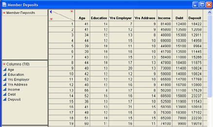
After a few weeks of determined work with databases, John tied together a sample of 50 members who had recently applied for loans at INCU and for which he could find information on income and debt. He also gathered information on age, education, how long they had been at their current job, and how long they had lived at their current address. Part of the data table that John built (Member Deposits.jmp) is shown in Figure 9.1.
Figure 9.1 Portion of the Member Deposits Data Table
Correlation Analysis versus Regression Analysis
Although the techniques are closely related, statisticians make a distinction between correlation analysis and regression analysis. Technically, the distinction is that in correlation analysis both variables (X and Y) are random variables, and in regression only Y is a random variable and X is regarded as fixed. In practice, what this means is that there is a crucial difference in regression between X (the Factor) and Y (the Response), while in correlation this difference is arbitrary. Put a slightly different way, the correlation between X and Y is the same as the correlation between Y and X but the same is not true of regression. The regression of Y on X is quite different from the regression of X on Y.
Also, in correlation analysis, we are usually just interested in whether or not there is a relationship between the two variables with the correlation being a measure of the strength of that relationship. In regression, we are usually interested in making predictions about the Response (Y) based on the value of the Factor (X). The regression equation defines the relationship between the two variables in terms of an equation. Despite these differences, as we will see, in actual practice there is a good deal of overlap between regression and correlation, and they can both be accessed via the same platform in JMP.
Correlation Analysis
As with the last two chapters, the primary platform for our analyses is the Fit Y by X platform. You can access this platform either through the JMP Starter or through the JMP menu. Using the JMP Starter, you can access this platform through the Basic group by selecting Bivariate. Optionally, you can select Fit Y by X in the menu, and JMP will automatically determine the type of analysis depending on the nature of the columns you choose to analyze.
Correlation analysis begins with a scatter plot. A scatter plot is simply a plot of the coordinates of the two values X and Y. We introduced scatter plots in Chapter 3 as a means of looking at the relationship between two quantitative variables. Figure 9.2 shows some different types of relationship patterns that might appear in a scatter plot. Plot (a) indicates a perfect positive relationship. The relationship is perfect because if we know the value of X, we can predict the value of Y exactly. Panel (b) indicates a strong positive relationship in that as X increases Y also tends to increase. Panel (c) indicates a strong negative relationship because as X increases, Y tends to decrease. Finally, panel (d) indicates no relationship since there is no discernable pattern in Y as X changes.
Figure 9.2 Example Scatter Plots
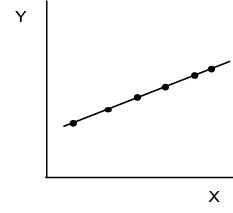
(a) Perfect Positive Relationship
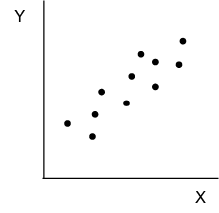
(b) Strong Positive Relationship
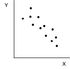
(c) Strong Negative Relationship
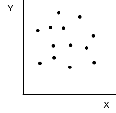
(d) No Relationship
The Bivariate Platform and the Density Ellipse
Although the patterns in Figure 9.2 are readily identifiable, with real data it is not always so easy to see the relationship, especially with a large number of observations. Thus we need a more formal means of describing the relationship between two variables. We will start our discussion of the Bivariate platform and correlations by using a Density Ellipse to help identify patterns in data.
Example 9.1
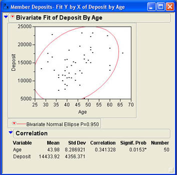
The first thing that Hank Wilson asks John to do after he has gathered the data is to look at the relationship between age and deposits. Hank was concerned about how an aging population would impact deposits at INCU. John loads the data table Member Deposits.jmp and selects Analyze → Fit Y by X from the JMP menu. In the dialog, he selects Deposits as the Y, Response and Age as the X, Factor.1 After clicking OK, the results window opens with the scatter plot shown in Figure 9.3.
Figure 9.3 Scatter Plot of Age and Deposits
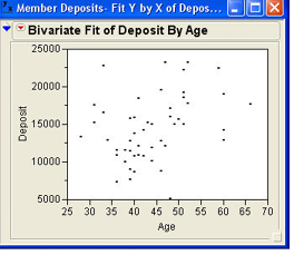
As you can see from the figure, it is not quite as easy to discern patterns with real data as it was with our artificial data. However, it does appear that there is a somewhat positive relationship between Deposits and Age.
To further explore the relationship between these two variables, we need to use some of the Bivariate options. Figure 9.4 shows the options available in the Bivariate platform. Most of the options relate to fitting lines to the points. We will return to these options shortly. The option we want now is the Density Ellipse option. This option fits an ellipse around the data that encompasses a certain percentage of the points. The percentage included in the ellipse depends on your choice of options shown in Figure 9.4. The most common selection is .95 to include 95% of the data that lies within the ellipse. Figure 9.5 shows the results after John selects the .95 option for the density ellipse. John knows from his use of JMP in his MBA program that an ellipse that is round like a circle indicates no relationship between the two variables. Otherwise, the direction of tilt in the ellipse will indicate whether the relationship is positive or negative. The ellipse in Figure 9.5 indicates a positive relationship between Age and Deposits. However, John knows that there is a numerical measure of the strength of relationship between two variables called a correlation that will give him a specific value to describe the relationship.
Figure 9.4 Bivariate Option Menu
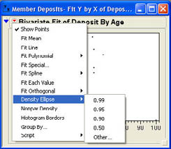
Figure 9.5 95% Density Ellipse for Deposit by Age
Correlation Coefficient
The bottom portion of the results window shows the correlation between Age and Deposits. By default, this portion of the output is hidden at first. You will need to click on the outline icon (![]() ) to open the report. The Correlation report shows the mean and standard deviation of both variables along with the correlation coefficient. This particular correlation is also sometimes called the Pearson correlation to distinguish it from other correlation measures.
) to open the report. The Correlation report shows the mean and standard deviation of both variables along with the correlation coefficient. This particular correlation is also sometimes called the Pearson correlation to distinguish it from other correlation measures.
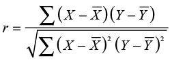
The correlation (r) is a measure of the strength of the relationship between two variables, and the value of r varies between -1.0 and +1.0. Negative values of r indicate a negative relationship, and positive values of r indicate a positive relationship. A value of 0 indicates no relationship between X and Y. Figure 9.5 shows that the correlation between Age and Deposits is about .34. To understand what this value means, it is instructive to look at how the correlation is calculated. The equation for the sample correlation is shown in Equation 9.1.
 (9.1)
(9.1)
The numerator of the correlation is called the covariance. The covariance measures the extent to which X and Y vary together or “co-vary.” Figure 9.6 may help explain what a covariance is. The area of the scatter plot is divided into four quadrants by lines at the mean of Y and the mean of X. The quadrants are labeled I, II, III, and IV.
Figure 9.6 Illustration of the Covariance
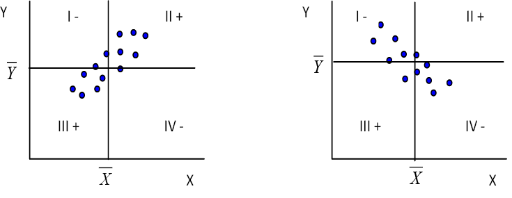
(a) Positive Linear Relationship (b) Negative Linear Relationship
In quadrant I, the Y values are above their mean, and the X values are below their mean so the product in the covariance will be negative (-). In quadrant II, the Y values are above their mean, and the X values are above their mean so that the product will be positive (+). In quadrant III, the Y values are below their mean, and the X values are also below their mean so that the product will be positive (+). In quadrant IV, the Y values are below their mean, and the X values are above their mean so the product will be negative. As you can see, in a positive relationship most of the points fall into quadrants II and III so that the sum of the products, the covariance, will be positive. Just the opposite will be true for a negative relationship. Therefore, it is clear that the covariance term determines the sign of the correlation since the denominator of the ratio can never be negative.
The covariance also determines the size of the correlation. If there is no correlation between X and Y, then points will fall randomly in all four quadrants, and the positives and negatives will cancel out leaving a sum of about zero. We will see the importance of the covariance again later when we discuss regression analysis.
Hypothesis Testing and the Correlation
A correlation of zero means that there is no relationship between X and Y. However, you can probably guess that the sample correlation will never be exactly 0.0000. Then how do we tell that a population correlation is zero when sampling error will cause the sample correlation to be a nonzero value even if there is no correlation in the population? In other words, how do we test the following hypotheses?
H0: ρ = 0
H1: ρ ≠ 0
It can be shown that this null hypothesis is tested with the familiar Student’s t distribution. The test statistic is
 (9.2)
(9.2)
where ρ is the hypothesized population correlation (usually 0), and the standard error is
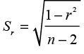 (9.3)
(9.3)
In figure 9.5, we saw that the correlation coefficient was .341. Next to the correlation, in the results window is a value labeled Signif. Prob, which is the p-value for this t-test of the correlation. In Figure 9.5, the p-value is .0153. Since this is less than .05, we can reject the null hypothesis and conclude that the population correlation between age and the size of the deposits at INCU is not zero. In statistical terms, we say that there is a (statistically) significant correlation between age and deposits.
Caveats about Correlations
Although the correlation coefficient does measure the strength of the relationship between X and Y, there are three concerns that you need to be aware of when interpreting correlations.
- A significant correlation does not mean that X causes Y. Correlations tell us that there is a relationship between the two variables, but the mere existence of a relationship does not tell us that one variable causes another. We cannot infer causality from simple correlations.
- In some ways, the correlation is misleading as to the magnitude of the relationship. In the past two chapters, we discussed a measure called r2, which was a measure of the percentage of variability captured by the model. We will discuss a similar measure in correlation and regression, which is the square of the correlation. This value, called the coefficient of determination, is a much better measure of the strength of the relationship, and it is always less than the correlation unless the correlation is 0 or 1. For example, consider a correlation of .7. This seems to indicate a strong relationship between X and Y, and in some cases this may well be the case. However, the relationship between X and Y still accounts for less than 50% of the variability in the Y values. In our example, the correlation of .341 means that the relationship between age and deposits accounts for approximately 12% of the variability in deposits. Later in this chapter, we will explain more about the calculation of r2 and what it means.
- Care should be taken in examining the data for outliers since the value of the correlation can be greatly influenced by unusual data points. We will return to this point in our discussion of regression analysis.
Regression Analysis
In correlation analysis, it does not matter which column we specify as the Response and which we specify as the Factor.2 In regression analysis, we have to be careful when we specify which column is the Factor and which is the Response. However, as we will see, there is a very close relationship between correlation analysis and regression analysis, and both begin from the exact same point, the Fit Y by X platform and the scatter plot of X and Y.
Regression analysis involves fitting a line to the points in the scatter plot so that the line is as “close” as possible to all of the points. There are two important concepts implicit in this statement.
- What do we mean by line? There are a variety of lines that we could draw through the set of points. There are straight lines, parabolas, curved lines, etc. What kind of line are we going to draw? In this chapter, we will discuss only straight lines or linear regression.
- What do we mean by close? In order to fit a line close to all of the points, we have to define what we mean by “close.” It is common in statistics to use the principle of least squares to determine the fit of a line to a set of points. If we let Y be the value of the Response column and Y′ be the point on the line, we can define distance of the point to the line as (Y – Y′)2. The term (Y – Y′) is a very important concept and is called a residual. The principle of least squares states that we want to determine a line that minimizes the sum of the squared residuals.
Assumptions of Linear Regression
Before getting into the specifics of regression analysis, we first need to gain an understanding of the assumptions underlying the analysis. The assumptions are:
- In the population, X and Y are related by a linear equation with error
where β0 is the Y intercept or constant term, and β1 is the slope of the line. The εi term indicates that there is error in the relationship for a given value of Xi. In other words, we cannot perfectly predict the value of Y for a given value of Xi, even if we have the entire population.3 The remaining assumptions relate primarily to the error term εi.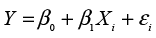
- For each value of Xi, the mean of the error terms is zero. This means that, in the population, we can perfectly
predict the average value of Y for a given value of Xi.
where μY|X is read as the mean of Y given X.
- The standard deviation of the error terms (εi) is the same for all values of X.
- For each value of X, the error terms (εi) form a normal distribution in the population.
Putting these assumptions together, we get a population like that illustrated in Figure 9.7 where for each value of X there is a normal distribution of values for Y centered on the regression line with a standard deviation σ, which is the same for all values of X.
Figure 9.7 Illustration of Population Assumptions of Regression
Regression Analysis in the Bivariate Platform
Regression analysis begins, as does correlation analysis, with the Fit Y by X platform and the resulting scatter plot. From the Bivariate option menu (see Figure 9.4), we want to select Fit Line rather than Density Ellipse. When John selects this option for the Age and Deposit example, he observes the results shown in Figure 9.8.
Figure 9.8 Regression Results Predicting Deposits from Age
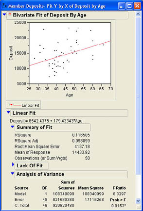
The line of best fit shown in Figure 9.8 represents the sample regression equation
Y′ = b0 + b1X
where b0 and b1 are estimates of the corresponding population values β0 and β1. The Y intercept b0 is the predicted value of Y when X is equal to zero. The slope b1 is the change in Y for a unit change in X. The numerical values for these estimates are shown in the section Linear Fit. As shown in Figure 9.8, the equation is
Deposit = 6542.4375 + 179.43343*Age
We could then use this equation for making predictions by substituting a value for Age in the equation. For example, for a member age 40 we would predict
Deposit = 6542.4375 + 179.43343*(40) = $13,719.77
Prediction is often a primary goal of regression analysis, but you must be careful about predicting outside the range of values observed in the data. This is because you have not observed the relationship outside this range and therefore do not know what that relationships looks like for other values of the Factor. This makes prediction for values very far outside the range of observed values dangerous. Often the intercept is outside the range of observed values. This is why, in many cases, the intercept or constant term simply does not make sense. In our example, the literal interpretation would be that a member 0 years old would be predicted to have deposits of $6,542.44.
The slope, however, is always meaningful. The slope of 179.43343 in our example implies that each additional year in age would increase deposits by $179.43 on average.
Summary of Fit
The next section of the results window presents a summary of how well our regression model fits the data. The primary measure of fit is RSquare, which is the coefficient of determination described earlier. This measure tells us the percentage of variability in the Response column that our model predicts. In this example, our relationship can predict a little over 11% of the variability in deposits in our sample. There is also an adjust r2, which is labeled RSquare Adj. This value is most relevant to multiple regression and will be discussed in more detail in Chapter 11.
The next term in the Summary of Fit section (Root Mean Square Error) is sometimes called the standard error of the estimate. However, root mean square error is a better term because this value is not a standard error in the traditional sense. Recall that we defined the term standard error in Chapter 5 as the standard deviation of a sampling distribution. The term being discussed here is a standard deviation, but it is not the standard deviation of any sampling distribution. The root mean square error can be calculated as
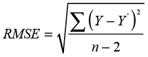 (9.4)
(9.4)
Essentially, the root mean square error is the square root of the sum of the squared residuals divided by the degrees of freedom (n-2). This is a standard deviation, but the standard deviation of what? One of our regression assumptions was that in the population the standard deviation around the regression line was the same for all values of X. The root mean square error is an estimate of this common standard deviation. It is an estimate of the standard deviation of the Y values around the regression line in the population.
The final two values in the summary are self explanatory, the mean of the response column and the number of paired observations in the data.
Analysis of Variance
The next results we will discuss are in the section labeled Analysis of Variance. In Chapter 7, we discussed the analysis of variance technique and the idea of breaking total variability down into parts. We can discuss a similar concept in regression analysis. The basic idea is to take the total variability of the Y values around their mean and break it down into two parts. Figure 9.9 illustrates the basic idea. Taking one point in our scatter plot from our example (the circled point), the distance of the point from the mean (Y – Y ) (Y can be broken into two components: the distance from the point to the line (Y – Y′), which is the residual, and the distance of the line from the mean (Y′ – Y ). When we square these deviations and add them up, we find that we can break the total variability of the Y values (SST for sum of squares total) into two additive components: SSR for sum of squares regression and SSE for sum of squares error.
SST = SSR + SSE (9.5)
Figure 9.9 Breaking Variability of Y into Components
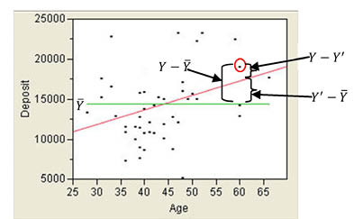
The analysis of variance table in Figure 9.8 shows the total variability of Deposit (929920480) broken down into SSR (108340099) plus SSE (821580380). If you look at the ratio of SSR to SST, you will find that 108340099/929920480 = .116505, which is the value of r2. This is what we mean when we say that r2 is the percentage of variability in the Response column that our regression equation predicts.
As usual, when we divide sum of squares by the corresponding degrees of freedom, we obtain mean squares. When we divide the mean square for regression by mean square error, we obtain an F value with a corresponding p-value. In this case, the p-value is .0153, which means the results are statistically significant. Notice that this p-value is exactly the same as the p-value we obtained for the t-test of the correlation earlier. We will return to this point a little later.
But what hypothesis is being tested here? This is basically a test of the fit of the overall model. Technically, the hypotheses being tested here are
H0: ρ2 = 0
H1: ρ2 ≠ 0
where ρ2 is the population coefficient of determination. As with the correlation, the null hypothesis essentially states that there is no relationship between X and Y, and the alternative says that there is a relationship. Since we reject the null hypothesis, we can conclude that there is a statistically significant relationship between age and deposits.
Parameter Estimates
After scrolling down the output, John reaches the section entitled Parameter Estimates, which is shown in Figure 9.10.
Figure 9.10 Parameter Estimates Section of the Results Window
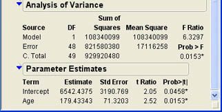
This part of the output shows the values of the sample estimates b0 and b1 along with their standard errors. Dividing the estimates by their standard error terms gives a t ratio that can be tested using the usual Student’s t distribution. In most cases, we are not interested in testing hypotheses about the population Y intercept (β0). One of the main reasons for this is that usually this value is well outside the range of values that we have observed. As discussed earlier, it is dangerous to speculate on values outside the range of values observed in our data.
The slope is our primary interest in regression analysis. The slope is closely related to the correlation coefficient examined in correlation analysis. The equation for the sample slope is shown in Equation 9.6.
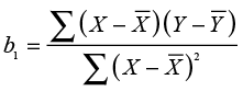 (9.6)
(9.6)
Comparing this equation with Equation 9.1 for the correlation, you can see that the numerator is exactly the same and is the covariance of X and Y. Since the covariance gives both the correlation and the slope their sign (positive or negative), the correlation and slope must have the same sign for any given set of data. Moreover, as we will see shortly, hypothesis tests for the two statistics are also very closely related. The usual form of the hypothesis tests for the population slope (β1) is
H0: β1 = 0
H1: β1 ≠ 0
This test is conducted using a t-test
 (9.7)
(9.7)
where the normal hypothesized value of ß1 is 0. Figure 9.10 shows a t ratio of 2.52 with a p-value of .0153. Notice that this is the same p-value as that of the F ratio in the analysis of variance table. You may also note that if you square the t value of 2.52, you will get the 6.3504, which is very close to the F ratio in the ANOVA table.4
The value of the sample slope, in this case 179.43, is also usually of interest. The interpretation of the slope is the change in the Response for a unit change in the Factor. In this case, the slope tells us that, for each additional year in age, deposits should increase by approximately $179.43.
The Relationship between the Three Tests
At this point, we have encountered three hypothesis tests in this chapter. The three sets of hypotheses, their test statistics, and the associated p-values are shown in Table 9.1. As the table shows, the p-values for the three tests are exactly the same. The three null hypotheses all state basically the same thing—that there is no relationship between X and Y. The values of the test statistics are all related. The t ratios are the same except for rounding, and the F value is the square of the t values. Therefore, all three tests are essentially equivalent.
Table 9.1 Hypothesis Tests in Correlation and Regression
| Correlation | Slope | R Squared |
|---|---|---|
| H0: ρ = 0 | H0: β1 = 0 | H0: ρ2 = 0 |
| H1: ρ ≠ 0 | H1: β1 ≠ 0 | H1: ρ2 ≠ 0 |
| t ratio | t ratio | F ratio |
| 2.515883 | 2.52 | 6.3297 |
| .0153 | .0153 | .0153 |
You may wonder why we need three equivalent tests all testing basically the same hypothesis. The reasons will become clearer in Chapter 11 when we discuss multiple regression. In the more general case with multiple factors, the three tests are no longer equivalent.
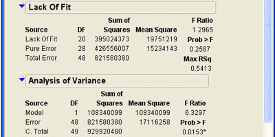
Lack of Fit
The final section of the Regression results is closed by default and, in some cases, will not appear at all in the results window. If there are multiple occurrences for some values for the Factor column, then the error variance can be estimated separately from the test for the form of the model. This is called pure error. If there are not any repeated values for the Factor column, this test cannot be performed.
The results for our example are shown in Figure 9.11. As you can see, the test is an F test and is reported in an ANOVA table. Note that the Total sum of squares here is the sum of squares error from the original ANOVA table. This is broken down into pure error and lack of fit error. The lack of fit error reflects variability that may be due to an incorrect model, in this case the linear model. Rejecting the null hypothesis here means that the linear model is not appropriate for our data and that we should use a different model. In this case, the p-value is .5413, which is much larger than .05. This indicates that the linear model is likely appropriate for our data. In our example, there are quite a few repeated values for the Factor (Age). This provides enough degrees of freedom for a good test of the lack of fit. In some situations, there may be very few repeat observations and, therefore, very few degrees of freedom for the lack of fit test. In these situations, one should not place too much reliance on this test.
Figure 9.11 Lack of Fit Results
Regression and Outliers
When we discussed correlations, we noted that the correlation coefficient can be influenced by extreme values. The same is true of regression, which we can illustrate with a simple example.
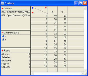
Example 9.2
A simple data table (Outliers.jmp) was created with one outlier point. The data table with 15 observations is shown in Figure 9.12.
Figure 9.12 Example Data with an Outlier
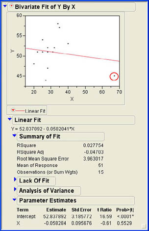
Using the Fit Y by X platform to predict Y from X yields the results shown in Figure 9.13. The results show a negative slope in the regression equation, but the slope is not statistically significant, and the R2 value is only about 3% (correlation of -.167). Looking at the scatter plot in Figure 9.13, we find that the outlier data point can be easily identified in the lower right corner; it is circled in the figure.
Figure 9.13 Regression Results for the Outlier Data
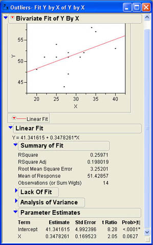
Now suppose we delete the outlier observation (observation 8 in the data table) and rerun the analysis. The results are shown in Figure 9.14. Here we can see that the slope of the regression line is positive and now predicts approximately 26% of the variability in the Response column (the correlation is .510). Notice that the slope and the correlation changed signs when the outlier was deleted and both increased greatly in value. This illustrates the impact that outliers can have on correlation and regression. We will return to this issue of outliers in Chapter 11 when we discuss regression diagnostics. Suffice it to state here that one should always examine the scatter plot produced by the Fit Y by X platform to see if there are any potential problems with outliers.
Figure 9.14 Regression Results with Outlier Point Deleted
Summary
This chapter examines the Bivariate platform, which measures the effect of one quantitative variable on another quantitative variable. Both correlation analysis and regression analysis are discussed. Correlation analysis simply looks at the relationship between the two variables without differentiating between which one is the Factor and which the Response. The emphasis is on the correlation as a measure of the strength of the relationship. Although a correlation can tell us if there is a relationship between the two variables, it does not tell us that one variable causes the other. The value of the correlation can also be influenced by outliers in the data. The statistical significance of the correlation is tested with a Student’s t-test.
In regression analysis, the primary emphasis is on prediction of the Response using the Factor. Therefore, in regression, which variable is the Response or dependent variable and which is the Factor or independent variable is a critical distinction. Prediction is in terms of a linear equation whose sample form is Y′ = b0 + b1X. The parameter b0 is called the Y intercept or constant, and b1 is called the slope.
Regression analysis derives the numerical values by fitting a straight line to the points in the scatter plot using the principle of least squares. The principle of least squares fits the line so as to minimize the squared distance of the points from the line, the squared residuals. The summary fit measure for regression analysis is the coefficient of determination or r2. The statistical significance of the regression equation can be tested using analysis of variance and the F ratio to test a hypothesis about the population coefficient of determination or with a Student’s t-test for the population slope. These two tests are equivalent and are both equivalents to the t-test for the population correlation in correlation analysis. If there are repeat values of the Factor column, then the regression analysis also produces a report that tests the fit of the model form, i.e., the linear form of the relationship.
Chapter Glossary
- coefficient of determination
- The percentage of the variability in the Response that is explained or predicted by the regression equation (r2).
- correlation
- A measure of the strength of the relationship between two variables that varies between -1.0 and +1.0.
- covariance
- Variance-like measure of the degree to which two variables vary together.
- principle of least squares
- Principle for fitting a line to a set of points to minimize the squared distance of the points from the line.
- pure error
- A measure of error in regression that does not contain error from the form of the model.
- residual
- The difference between the actual value of the response and the value predicted by the regression equation.
- root mean square error
- Another name for the standard error of the estimate.
- scatter plot
- A plot of the paired observations of the Response and Factor columns.
- slope
- A parameter of the regression equation that represents the change in the Response for a unit change in the Factor.
- standard error of the estimate
- An estimate of the standard deviation of the Response around the regression line in the population.
- Y intercept
- The parameter of the regression equation that represents the value of the Response when the Factor equals zero.
Questions and Problems
Hank Wilson is quite sure that income and other variables are related to deposits as well.
1. Develop a regression equation predicting deposits from income. Is income a better predictor of deposits than age? Explain you reasoning.
2. Is there a significant correlation between age and income? How would this relate to the first problem?
3. Develop a regression equation to predict deposits from debt. Explain the slope of the regression line. What are the predicted deposits for someone with a debt of $11,000?
Bob Reed in Human Resources wonders if he can use correlation or regression to get a better handle on which factors drive salaries at INCU. Use the data table Employee Data.jmp to answer the following questions for Bob.
4. Correlate age and seniority with salary. Which seems to be most strongly related to salary?
5. Develop a regression equation predicting salary from age. How much of the variability in salary can your regression equation explain? What salary would you predict for someone 42 years old?
6. Develop a regression equation predicting salary from seniority. Is the relationship statistically significant? What percentage of the variability in salaries can your equation explain? What would be the predicted salary for someone with 15 years of seniority?
Notes
1 For correlations, it does not matter which column we call the Factor and which column we call the Response. However, for our discussion of regression later, it does matter. We will return to the discussion then.
2 To see this, go back to Example 9.1 and redo the analysis making Deposit the Factor and Age the Response. You will observe that the correlation coefficient is exactly the same.
3 Think of height and weight. There is a relationship between these two variables, and we could develop an equation predicting weight from height. But even if we had the heights and weights of every person on earth, we still could not perfectly predict a person’s weight from their height.
4 The reason the values are not exactly equal is because of rounding. If you divide the sample slope by its standard error, you get 2.515882, which when squared is equal to 6.32966, which is essentially equal to the value of F.
..................Content has been hidden....................
You can't read the all page of ebook, please click here login for view all page.