
Summarizing Quantitative Variables
Summary Measures for Qualitative Variables
Summarizing by a Qualitative Variable
In the last chapter, we discussed visual presentations of data as tables or charts. In this chapter, we want to explore simple descriptive measures of data. These descriptive measures will consider only one variable at a time—hence, the “Univariate” in the title of this chapter. We will also introduce additional charts in this chapter that depend on these descriptive measures. The material in this chapter, besides providing the tools to more completely describe a set of data, also provides the basis for our discussion in the following three chapters, which present the foundations for statistical inference.
The Situation at INCU
Betty Anderson of the Marketing Department at Inland Northwest Credit Union has recently conducted a customer survey of a randomly selected group of 100 INCU customers at the request of her boss Ann Rigney. In this survey, she gathered information on several customer demographics such as gender (male or female), age in years, and zip code of their home address. She has also extracted from the company database information on how long the customer has been with INCU in months, how many accounts they have with INCU, and whether or not they have current loans with INCU. The brief survey asked three questions related to customer satisfaction, which were answered on a 7-point scale from 1 (Very Unsatisfied) to 7 (Very Satisfied). The three questions were: satisfaction with the physical facilities at INCU, satisfaction with the attitudes and capabilities of the employees at INCU, and an overall satisfaction with the services of INCU. In addition, the customers were asked if they used the online bill-paying system at INCU and if they used the ATM machines that were placed at various locations around the area. The structure of the data is shown in Figure 4.1, and the data are contained in the file Customer Survey.jmp.
Figure 4.1 Structure of the Customer Survey Data
The Distribution Platform
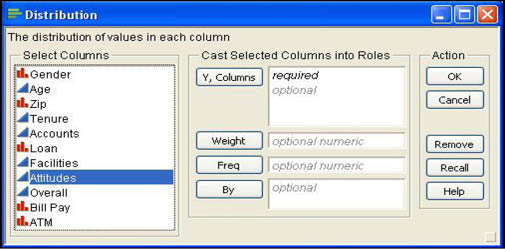
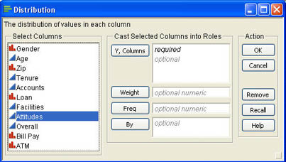
Betty wants to calculate some quick summary measures of the customer survey data to get an idea of the typical values for the different variables in the questionnaire and quickly summarize the distribution of these values. She knows that the Distribution platform is commonly used to look at individual variables and to summarize their values. Betty activates the Distribution platform by selecting Analyze → Distribution from the main menu. The platform can also be accessed by clicking Distribution on the Basic Stats tab of the JMP Starter window. The launch dialog shown in Figure 4.2 opens after the platform is activated. The most important task in the launch dialog is to select the columns to be analyzed. Although the Distribution platform analyzes each column individually (univariate statistics), you can select multiple columns at one time, which will be analyzed separately in different windows. You choose columns to analyze by selecting them in the list of columns on the left side of the dialog. Then click Y, Columns to add them to the list of columns to be analyzed. The Distribution platform requires that you select at least one Y column to analyze.
Figure 4.2 Distribution Platform Launch Dialog
Summarizing Quantitative Variables
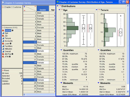
Betty first decides to select the quantitative variables Age and Tenure for analysis. She selects these two columns, clicks Y, Columns, and then clicks on OK. The results of the analysis are displayed in a results window like that shown in Figure 4.3. Notice that although the results for both columns are displayed in the same window, they may be manipulated separately because they are truly independent analyses.
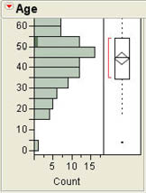
Figure 4.3 Results Window for Age and Tenure
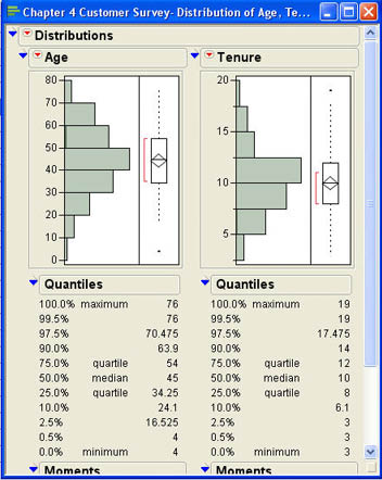
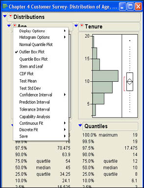
The default for results of the distribution platform is to display three output panes. The first pane, labeled with the name of the column, displays graphic output for the column; the second panel labeled “Quantiles” displays various quantiles. The third panel labeled “Moments” displays summary measures for that column. The outline icon ![]() allows you to close and open different output segments. The top outline icon opens and closes all of the output for that column. The drop-down menu at the top of the output
allows you to close and open different output segments. The top outline icon opens and closes all of the output for that column. The drop-down menu at the top of the output ![]() allows you to specify different display options. Figure 4.4 shows the first level menu items that are displayed by clicking the
allows you to specify different display options. Figure 4.4 shows the first level menu items that are displayed by clicking the ![]() symbol.
symbol.
Figure 4.4 Drop-Down Menu for the Distribution Platform
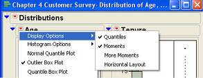
The first menu item Display Options leads to submenus. The submenu items are shown in Figure 4.5. The first two items in this submenu function like the outline icons to open and close the “Quantiles” and “Moments” portions of the output. The last menu item (Horizontal Layout) changes the layout of the display. In the default layout, the output panels are arranged vertically. Selecting the Horizontal Layout option will arrange the panels horizontally. This option operates as a toggle switch. After you switch to horizontal layout, the menu item will read Vertical Layout, and selecting it will arrange the panels vertically. The third option (More Moments) adds additional summary statistics to the Moments panel. We will look at this additional output in a moment. First, we want to discuss the three output panels in more detail and describe some of the additional options in Figure 4.5.
Figure 4.5 Display Options for the Distribution Platform
Graphic Analysis Panel
With the default JMP preference settings, the graphics panel displays two graphs for each column. The first is the familiar histogram that we discussed in the last chapter, and the second is called an outlier box plot.
Histograms
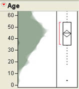
Histograms were initially discussed in Chapter 3 as a graphical display for continuous variables. Recall that a histogram displays the frequency with which various values appear in the data. For continuous variables, this means that we have to group values together into intervals so that we have a reasonable number of frequencies for each bar of the graph. From Figure 4.3, we can see that most of our customers are between the ages of 30 and 60 and that the distribution is relatively symmetrical.
However, we can get additional details on the histogram by selecting additional options in JMP. The Histogram Options menu item leads to a submenu shown in Figure 4.6.
Figure 4.6 Histogram Submenu Options
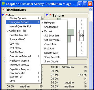
The first option determines whether the histogram panel is displayed or not. If you uncheck this option, the histogram will no longer be displayed, but the box plot will still be there. The second option changes the histogram into a shadowgram as shown in Figure 4.7. The shadowgram displays the same basic information as a histogram and is similar to what is usually called a frequency polygon, which is a line chart version of the histogram.
Figure 4.7 Shadowgram of the Age Data
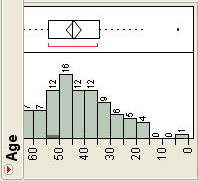
The third submenu option changes the orientation of the histogram from vertical to horizontal. Again, this is a toggle switch so that if it is selected again, it returns the histogram to a vertical orientation. The next option (Std Error Bars) will be discussed in Chapter 6 when we discuss confidence intervals. The next option (Set Bin Width) is used to see the width of the intervals used. As can be seen in Figure 4.3, the current interval width is 10. If you select the Set Bin Width option for Age and change the 10 to 5, you will see the histogram shown in Figure 4.8(a). You can experiment with different interval widths until you get the pattern that makes the most sense to you.
Figure 4.8 Illustrations of Histogram Options
 (a) |
 (b) |
The next three options relate to the other axis of the histogram, which is currently unlabeled. The first of these (Count Axis) puts the frequency on the unlabeled axis. The second option (Prob Axis) puts the relative frequency on that axis. Recall from Chapter 3 that the relative frequency is the actual frequency for the interval divided by the number of observations. Figure 4.8(b) illustrates the graph with the frequency count on the axis. With this axis in place, we can finally see approximately what the frequencies are in each interval of the graph. The third option for the axis (Density Axis) will not be discussed in this text.
The final two options add clarity to the graph by labeling the bars of the graph with either the actual frequency for that interval (Show Counts) or the relative frequency (Show Percents). Figure 4.9 shows both options in a horizontal orientation.
Figure 4.9 Illustrations of Data Labels
 (a) |
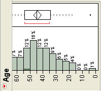 (b) |
Stem and Leaf
The stem-and-leaf diagram is another graphic option available in the menu shown in Figure 4.5. We also briefly discussed this type of graph in Chapter 3. Figure 4.10 shows the result of selecting this option for the Age distribution. A stem-and-leaf diagram divides each value in the data into two parts, a stem and a leaf. The leaf part of the number always represents a single digit of the number, the last significant digit. The stem portion may represent multiple digits. As shown in Figure 4.10, the stem is presented on the left side and the leaf on the right with a line dividing them. At the bottom of the diagram is an explanation of what the numbers mean. In this case, the explanation states that 0|4 represents 4. This means that the stem represents the “tens” position and the leaf represents the “ones” position in the number. Therefore, a 7|6 would represent the number 76. Some of the stems have multiple leaves and represent more than one number. For example, 7|01 represents two numbers, 70 and 71. The count or frequency for each stem and leaf group is shown on the right side of the diagram. The next grouping (6|567899) represents 6 values (65, 66, 67, 68, 69, and 69). Note that the pattern of the leaves in the stem and leaf diagram is very similar to a histogram in that it represents the frequency or counts of a group of numbers. Thus we can quickly see that most of the customers are between 30 and 60 years old with the bulk of these in their 40s. We also can see that the youngest customer is 4 years old and the oldest is 76. We also know that there are exactly two forty-year-olds in our data.
Figure 4.10 A Stem and Leaf Diagram for Age
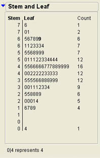
The stem-and-leaf diagram for age was very straightforward since the original values were all two-digit numbers. But what happens if we have values such as 23, 413, or 31.42? In these cases, JMP must make decisions about what is represented by the stem and what the leaf means. In some situations, JMP may round off values. In this case, some information may be lost because of the rounding, but each observation is still represented in the graph, even if the value is rounded. In other situations, JMP may drop fractional values to make the graph clearer. What this means is that JMP will make intelligent choices about the significant digits in the data and will tell you at the bottom of the stem and leaf diagram what the values represent.
Dynamic Graphing
Most of the graphs on the results sheet and the data sheets are interactive in JMP. For example, if you highlight a bar in the histogram, JMP will highlight the corresponding data in the data sheet. Figure 4.11 shows an example of this that was produced by clicking on the bar between 40 and 50 in the histogram for Age. Similarly, when you highlight an item or set of items in the data sheet, JMP will partially highlight the bar in the histogram where that data point is plotted. Recall that in the histogram the original values are lost when we plot the graph since they are grouped together into intervals. This interactivity allows us to again identify the original values.
Figure 4.11 Interaction between Graphs and Data
The primary advantage of interactivity comes in comparing the distribution of two different columns of data. Notice that in Figure 4.11 not only are the data connected to the histogram for age but also connected to the histogram for tenure. This allows us to see, for example, that all of the individuals making between $40,000 and $50,000 have tenure of 15 years or less. This interactivity between graphs allows a deeper exploration of the relationship between variables.
Quantiles Panel
Quantiles are numbers between 0 and 1 that indicate the proportions of values that lie above or below that quantile. For example, if the 10th quantile were equal to 35, that would mean that 10% of the values in the data are less than 35. When the quantiles are based on one hundreds, they are sometimes called percentiles. Notice that the definition of quantiles depends only on the order of the values. Therefore, quantiles can be defined for ordinal data as well as interval or ratio scale data. Some of the quantiles have particular significance and have special names. For example, the values that divide the data into four equal parts are called quartiles. Therefore, the first quartile is the 25th quantile of the data. The third quartile is the 75th percentile of the data. The implication of this is that 50% of the data fall between the third and first quartiles. The second quartile is called the median. Since the median is the 50th percentile, half of the values are less than the median and half are greater than that value. The quantile panels for our Age and Tenure data are shown in Figure 4.3 and are repeated in Figure 4.12 for convenience.
Figure 4.12 Quantiles for Age and Tenure

The quantiles panel shows the extreme quantiles that are the minimum and maximum. It also displays the first and third quartiles along with the median. In addition, it shows the quantiles close to the minimum and maximum values. This is because values close to the extremes of the distribution can sometimes be of special significance in statistics. For our purposes, the most important quantiles are the minimum and maximum values, the two quartiles, and the median. For age, the results show that the median age is 45 and that 50% of the customers are between 34.25 years and 54 years old. The youngest is 4 and the oldest is 76. The difference between the upper and lower quartiles (in this case, 54 – 34.25 = 15.75) is called the interquartile range.
Graphs and Quantiles
There are additional graphic options in the Distribution platform that utilize the quantile information. The most important is the Outlier Box Plot which is the second default graph produced by the Distribution platform. The outlier box plot is used to identify “extreme values” or outliers in the data. Outliers are values that are very “different” from most of the values in the data. Outliers can be extremely large values that are much larger than most of the data or they can be extremely small values that are much smaller than most of the values in the data. The box portion of the plot is defined by the 25th and 75th quantiles, or the first and third quartiles.
For example, for the Age variable in Figure 4.12, the box is defined by the quartiles 34.25 and 54. The line near the middle of the box represents the median value—in this case 45. The “diamond” portion of the plot represents the mean value (discussed later in this chapter) along with a confidence interval. We will not focus on this part of the diagram nor the red bracket in the figure that represents the “shortest half” of the values, which is the densest portion of the data. The dotted lines emanating from the box are called whiskers.1 The whiskers connect the box with the outermost data values that are within the fences of the box plot. The fences are not shown in the box plots produced by JMP but are computed as follows:
Upper Fence = Upper Quartile + 1.5*(Interquartile Range)
Lower Fence = Lower Quartile + 1.5*(Interquartile Range)
The premise of the fences is that most of the data should fall within this range; i.e., the data should fall between the two fences. Data that fall outside this range are “unusual” or outliers. We will return to this discussion of where values in a set of data should fall later in this chapter when we discuss the empirical rule. Outliers are shown in the outlier box plot as filled squares at either end of the whiskers. Figure 4.12 shows that there is an outlier at the lower end of the values for Age (the 4-year-old customer) and an outlier at the upper end of the distribution for Tenure (an employee who has been with INCU for 19 years). If there are no outliers, there will be no squares beyond the whiskers of the plot.
Moments Panel
This is the third panel that is produced by the Distribution platform, and it appears directly below the Quantiles panel. Figure 4.13 shows the results for Age and Tenure for our customer survey. Some of the values in this panel will not be covered until Chapter 6.
Figure 4.13 Moments Panel for the Customer Survey Data

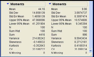
At this point, we will focus on three summary measures in this panel, the mean, the standard deviation (Std Dev in the panel), and the sample size (N in the panel). The sample size is simply the number of observations that have a value for that variable. In our data, there are no missing values so that the sample size will be 100 for all variables. Most of the results presented in the Moments panel are what are called summary measures in statistics. Summary measures are numerical values that describe a characteristic of the set of numbers. Summary measures are usually grouped into measures of central tendency, measures of dispersion, and measures of shape.
Measures of Central Tendency
Measures of central tendency describe a central or typical value in the set of data. The three primary measures of central tendency are the mean, median, and mode. The median is the middle value or the 50th quantile; we discussed that measure earlier. The mode is the most frequently occurring value and is most relevant to qualitative variables, not quantitative data. The mean is our primary measure of central tendency for quantitative variables, and it is simply the average of the numerical values for that variable. In equation form, the mean is calculated as
 (4.1)
(4.1)
where the Σ is the summation operation. Figure 4.13 indicates that the average age of our customer sample is 44.16 years and the average length of tenure as a customer is 9.96 years. The mean has one very interesting property. This property relates to the concept of a deviation. A deviation is the difference between a value in the data and a central value such as the mean
Deviation = (X – Mean)
If we use the mean as the central value, then the following statement is always true:
Σ(X – Mean) = 0 (4.2)
With the mean, the positive and negative deviations cancel each other out. It is in this sense that the mean is the middle value of the data. We shall see in a moment that this property has important consequences.
Measures of central tendency are certainly useful in statistics, but they are not sufficient to completely describe a set of numbers. At a minimum, we also need to describe the dispersion or variability of the numbers.
Measures of Dispersion or Variability
To see why measures of central tendency are not sufficient to describe a set of data, consider the following two sets of numbers:
| X | 10 | 10 | 10 | 10 | 10 | 10 | 10 | 10 | 10 | 10 |
| Y | 9 | 15 | 1 | 5 | 21 | 7 | 13 | 4 | 6 | 19 |
As you can verify, the mean of both sets of numbers is 10. Yet variables X and Y are certainly not equivalent. Variable Y is much more variable than X. It is this notion of variability or dispersion that we want to capture here. The standard deviation (labeled Std Dev in the Moments panel in Figure 4.13) is one common measure of variability, but there are others. For example, the interquartile range described earlier can be considered a measure of variability or dispersion. For variable X, since all of the values are the same, the quantiles would all be the same, and the interquartile range would be 0. For Y, the first quartile is 4.75, and the third quartile is 16; so the interquartile range is 11.25, indicating that the values of Y are more variable or dispersed than the values of X.
Recall that a deviation is the difference between a value in the data and a central value, usually the mean. It may be apparent that these deviations could be used as a measure of variability since they measure how far the values are from the middle. It may occur to you that the average of these deviations might be a useful measure of variability. However, there is a problem with this measure. Recall that one of the properties of the mean is that the sum of the deviations about the mean is always zero. (See equation 4.2.) This implies that the average deviation would also always be zero. There are two ways to get around the problem of the positive and negative deviations canceling each other. One is to look at the average of the absolute deviations. This measure, called the mean absolute deviation, is often used in a business environment in connection with forecasting systems. However, absolute values do not have very nice mathematical properties, and this measure is of limited use in statistics. The second way to ensure that the positive and negative deviations do not cancel each other is to square the deviations. The variance is the average of the squared deviations about the mean.
 (4.3)
(4.3)
The variance is a widely used measure of variability in statistics and will play a central role in our text. However, there is one small problem with the variance. The units of the variance are in the original units squared. For example, our variable age is measured in years so that the units of the variance will be in Years.2 If we take the square root of the variance, then the measure will be back in the original units. This measure is called the standard deviation.
 (4.4)
(4.4)
The standard deviation is also reported in the Moments panel right below the mean. The mean age in our survey in Figure 4.13 is 44.16 years, and the standard deviation is 14.66 years. For the tenure variable, the mean is 9.96 months, and the standard deviation is 3.10 months. You may note that the variance is not produced in the moments report. We will see how to find this value in a moment.
At this point, you may be asking yourself why we need two very similar measures of variability, the variance and the standard deviation. After all, if we know one of these values, we know the other. If we know the standard deviation, we can square it to find the variance. On the other hand, if we know the variance, we can take the square root to find the standard deviation. The reason we need both measures is that sometimes it is mathematically useful to use the standard deviation as the measure of variability, and sometimes it is necessary to use the variance. Therefore, we will use both measures as we progress through this book.
Uses of the Standard Deviation
The standard deviation is widely used in statistics and is often used as a unit of measure. When used this way, the standard deviation allows us to compare values measured on different scales, make statements about the distribution of values, and other useful tasks.
Standard Scores
Standard scores allow us to, in a sense, compare apples and oranges. They allow us to make comparisons of values measured on different scales. For example, suppose that your son John takes the ACT test in preparation for college, and his cousin Mary takes the SAT. John has an ACT score of 22, and Mary has an SAT score of 1130. One obvious way to compare scores is in terms of their percentile (quantile) scores, which are commonly reported by the testing agencies. However, there is another way of comparing the two scores by translating them to a common scale. Suppose that we know that the mean ACT score of this year’s graduating class is 20 and the mean SAT score is 1100. Now we know that both John and Mary scored above average on their tests. But that still does not tell us how they did relative to one another. To do this, we also need the standard deviations of the tests. Suppose that the standard deviation of the ACT is 5, and the standard deviation of the SAT is 100. We can now convert both test scores to a common scale called a standard score or Z score.
 (4.5)
(4.5)
The Z score for John would then be (22 – 20)/5 = .40 and for Mary the Z score would be (1130-1000)/100 = 1.30. Therefore, Mary did better on her test than John did on his. Note that since we are subtracting the mean from each value, the mean of the Z scores would then be zero. Since we are dividing by the standard deviation, the standard deviation of the Z scores will be 1, the unit of measure. As we will see as we progress through our discussion of statistics, this process of conversion to a standard score by subtracting a value and dividing by the standard deviation is a common one in statistics.
Chebychev’s Theorem and the Empirical Rule2
One of the most famous theorems in statistics is Chebychev’s Theorem, also sometimes called Chebychev’s Inequality. This theorem states that
For any set of numbers, at least (1-1/k2)% of the values must be within k standard deviations of the mean where k≥ 1. Another way of stating this is that for any set of numbers at least (1-1/k2)% must have Z scores between –k and +k.
Table 4.1 shows different values of k along with the relevant percentages from 1 to 3.
Table 4.1 Percent of Values within K Standard Deviations of the Mean: Chebychev’s Theorem
| K | % |
|---|---|
| 1 | 0% |
| 2 | 75% |
| 3 | 89% |
When k = 1, the results are not too interesting; but when k = 2, Chebychev’s Theorem says that for any set of numbers at least (1 – ½2) = .75 or 75% of the values must be within 2 standard deviations of the mean. The amazing thing about this theorem is that it applies to any set of numbers. In other words, you cannot make up a set of numbers that would violate this theorem. There are very few things in mathematics that apply universally.
Although Chebychev’s Theorem is remarkable in terms of its scope, we can make even more precise statements if we know something about the shape of the distribution of values. If the distribution of values is symmetrical and bell-shaped, the empirical rule applies.3 The empirical rule states that
If a set of values has a symmetrical bell-shaped distribution then
- approximately 68% of the values are within 1 standard deviation of the mean
- approximately 95% of the values are within 2 standard deviations of the mean
- virtually all of the values are within 3 standard deviations of the mean
Table 4.2 shows some values of K along with the relevant percentages for the empirical rule.
Table 4.2 Percent of Values within K Standard Deviations of the Mean: Empirical Rule
| K | % |
|---|---|
| 1 | 68% |
| 2 | 95% |
| 3 | almost 100% |
It is apparent that if we know the shape of the distribution, we can make much more precise statements about the distribution of values. In terms of the SAT example earlier, with a mean of 1000 and a standard deviation of 100, the empirical rule would tell us that 68% of the values would be between 900 and 1100, 95% would be between 800 and 1200, and virtually all of them would be between 700 and 1300. As we will see later, two standard deviations and 95% are very important values in the practice of statistics. In fact, they are so commonly accepted that they are even incorporated into civil law.4
Another way to think about Chebychev’s Theorem and the empirical rule is that they tell us the percent of values that should have Z scores in a particular range. For example, the empirical rule says that 68% of the values should have a Z score between -1 and +1, 95% should have a Z value between -2 and +2, and virtually all of them should have Z scores between -3 and +3.
Application to the Customer Survey Data
Betty notes that the mean age of the customers in the survey was 44.16 with a standard deviation of 14.66. This means that 95% of the customers should be between
44.16 – 2(14.66) = 14.84 years and 44.16 + 2(14.66) = 73.48 years
Similarly, since the mean tenure of the customers in the survey was 9.96 months with a standard deviation of 3.1 months, 95% of the customers should have tenures of between
9.96 – 2(3.1) = 3.76 months and 9.96 + 2(3.1) = 16.16 months
Identifying Outliers
Earlier, in the context of the outlier box plot, we discussed the concept of outliers, values that are very different from the majority of the data. In the outlier box plot, outliers were identified as values outside the fences around the box defined by the upper and lower quartiles. These fences were defined by 1.5 times the interquartile range. The value 1.5 is not an accident. In a normal distribution, the interquartile range is approximately 1.35 so that 1.35 times 1.5 is 2.025 in terms of Z scores or approximately 2 standard deviations. However, in the box plot, the fence is set at 2 standard deviations above (below) the upper (lower) quartile rather than above (below) the mean. It turns out that this point is very close to 3 standard deviations above the mean. Therefore, the outliers identified by the box plot are also related to the empirical rule.
Additional Moments
Additional summary information can be obtained from the JMP output by selecting the More Moments option from the drop-down menu for the Distribution platform. (See Figure 4.4.) When this option is selected, additional output will be added to the Moments panel. Figure 4.14 illustrates the full output for Age and Tenure. Notice that one of the additional values is the variance that we just discussed above.
Figure 4.14 Additional Information Using the More Moments Option
Measures of Shape
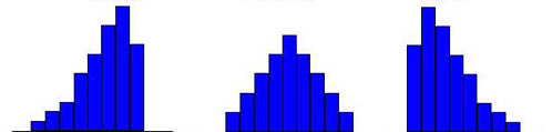
Two additional measures displayed with this option, skewness and kurtosis, are both measures of the shape of the distribution of values. Skewness, the more important of the two for our purposes, is a measure of the symmetry (or more precisely the asymmetry) of the distribution of values. A skewness of zero indicates a symmetrical distribution or an absence of asymmetry. Skewness values greater than zero indicate an asymmetry in a positive direction, and skewness values less than zero indicate an asymmetry in a negative direction. Figure 4.15 illustrates distributions with zero, negative, and positive skewness.
Figure 4.15 Symmetric, Negatively and Positively Skewed Distributions
Skewness is important in statistics because it can impact which measures of central tendency we use. For example, both the mean and the median are measures of central tendency for quantitative variables. However, the mean is influenced by extreme values or outliers. Therefore, in a highly skewed distribution, the median may well be a better measure of a “typical” value than the mean. Most income or wealth figures are highly positively skewed because of a few high values. That is why the median is a better measure of the typical value for such variables. For example, the average salary for the New York Yankees Major League Baseball team in 2009 was over $7.7 million, but the median was only $5.2 million.5 This phenomenon is not restricted to the highest paying teams. The Oakland Athletics had the lowest median salary in baseball for 2009 at $410,000, but the mean salary for The A’s was over $2.2 million.
There are different measures of skewness in statistics. The skewness measure reported by JMP in Figure 4.14 is what is called moment skewness. The equation for this measure is
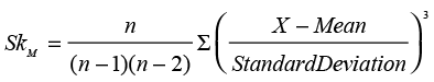 (4.6)
(4.6)
This measure of skewness is the form most often used by statistical software but
can be difficult to interpret. Zero is an absence of skewness, but rarely will the actual skewness
for a set of data be exactly zero. So what value of skewness would represent “significant” or
nonzero skewness? With the moment skewness measure, it is difficult to say because the size of
this measure depends on the magnitude of the numbers. An approximate value for the standard error
of the skewness is ![]() where n is the number of data points. If the ratio of the
skewness measure to the standard error is greater than 2, then we can say that the data
exhibit significant skewness. The skewness for age (-0.149) and tenure (0.271) are not
significant by this criteria.6
Contrast this with the example of the Oakland Athletics salaries. The salary data are contained
in the file Oakland Salaries.jmp. The relevant statistics for this data are shown in
Figure 4.16.7
where n is the number of data points. If the ratio of the
skewness measure to the standard error is greater than 2, then we can say that the data
exhibit significant skewness. The skewness for age (-0.149) and tenure (0.271) are not
significant by this criteria.6
Contrast this with the example of the Oakland Athletics salaries. The salary data are contained
in the file Oakland Salaries.jmp. The relevant statistics for this data are shown in
Figure 4.16.7
Figure 4.16 Oakland Athletics Salaries
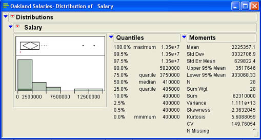
For this data set, the standard error of the skewness measure is
![]() Dividing the skewness of 2.36 by this value gives a ratio of about 5.1, which is much larger than 2.
You can also see the large degree of skewness from the histogram and the existence of
outliers from the box plot.
Dividing the skewness of 2.36 by this value gives a ratio of about 5.1, which is much larger than 2.
You can also see the large degree of skewness from the histogram and the existence of
outliers from the box plot.
A second measure of skewness is conceptually simpler than the moment measure. This measure is sometimes called Pearson skewness.8
 (4.7)
(4.7)
In this equation, the key relationship is that between the mean and the median. The basic idea is that in positively skewed distributions, the mean will be pulled in an upward or positive direction and be greater than the median; and in a negatively skewed distribution, it will be pulled in a negative direction and will be less than the median. These relationships usually hold but not always. There are several counterexamples with discrete distributions that have only a few possible values.
The other measure of shape produced by the JMP output is called kurtosis. Kurtosis is a measure of how “peaked” or “flat” the distribution of values is in relation to a normal distribution. Since kurtosis is somewhat less important in statistics than skewness, we will not discuss it any further here.
Coefficient of Variation
The last measure produced by the Additional Moments option is the coefficient of variation, designated as CV in the output in Figure 4.17. The coefficient of variation is defined as the ratio of the standard deviation to the mean.
 (4.8)
(4.8)
The coefficient of variation is useful for comparing the variability of different sets of numbers. Since the value of the standard deviation (or variance) depends on the magnitude of the numbers, if we have two sets of data with radically different values, a simple comparison of the standard deviations would be deceptive in terms of which set of numbers was more variable. For example, in Figure 4.14, the standard deviation of the Age variable is 14.656, while the standard deviation of the Tenure variable is 3.097. This would seem to imply that age is much more variable than tenure. However, the coefficients of variation for the two variables are 33.189 and 31.099 respectively, which indicates a much smaller difference in their variability. When you want to compare the variability of two very dissimilar variables, you should use the coefficients of variation.
Summary Measures for Qualitative Variables
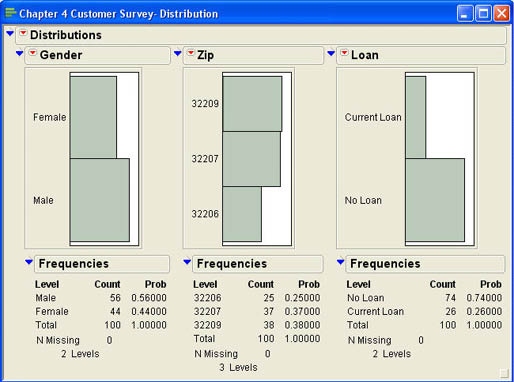
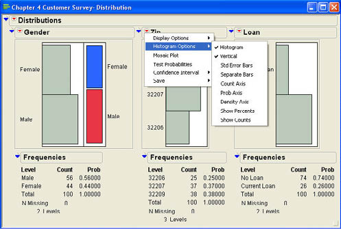
We can also produce summary measures for qualitative variables using the Distribution platform. The output for qualitative variables is much simpler than that of quantitative variables. Figure 4.17 shows the output for the qualitative variables Gender, Zip, and Loan. Both Gender and Loan are binary variables (have only two possible values), while Zip has three different values. As with quantitative variables, the first output is a histogram. However, in this case, there is no grouping of values since there are a limited number of possible values. As with quantitative variables, there is an option in the drop- down menu under Display Options for a horizontal layout rather than vertical. The usual Histogram Options are also there so that you can, for example, display the counts or percents in each category.
Figure 4.17 Output of the Distribution Platform for Qualitative Variables
These options, along with the drop-down menu, are shown in Figure 4.18. One of the additional options in the drop-down menu is to display a mosaic plot. A mosaic plot presents the same basic information as the histogram but in a slightly different way. Mosaic plots will become more useful when we discuss the relationships between two qualitative variables later in the text. Figure 4.18 shows the mosaic plot for Gender. As you can see, the mosaic plot does not really add any additional information to the histogram, and that is why it is omitted by default.
Figure 4.18 Drop-Down Menu and Histogram Options for Qualitative Variables
Frequencies Panel
The second part of the output shows the actual and relative frequencies for each category. This type of presentation is called a frequency distribution. For the gender variable, we can see that 56 out of the 100 customers (or 56%) were male, while 44 out of the 100 (or 44%) were female.9 In statistics, these relative frequencies are usually called proportions. A proportion is the percentage of the observations that fall in a particular category. It is also the mean of the variable if there are only two possible values, and the categories are assigned the values of 0 and 1. We will discuss proportions in more detail in the coming chapters.
Summarizing by a Qualitative Variable
JMP also gives you the option of summarizing either qualitative or quantitative variables after splitting the data on the basis of the values of a qualitative variable. Ann Rigney, Vice President of Marketing at INCU, believes that there may be an age difference between those who have loans at INCU and those who do not. In particular, she feels that those who currently have loans may be older than those who do not and that a marketing campaign aimed at the younger customers could significantly increase INCU’s loan portfolio. Ann, therefore, wants to look at Age separately for those who have loans and those who do not. Figure 4.19 shows the completed dialog box in the Distribution platform for Ann’s analysis. In this example, we want to summarize the variable Age separately for those that have loans and those that do not. Figure 4.20 shows the results of the analysis after Ann clicks OK.
Figure 4.19 Completed Dialog Box Illustrating Using a BY Variable
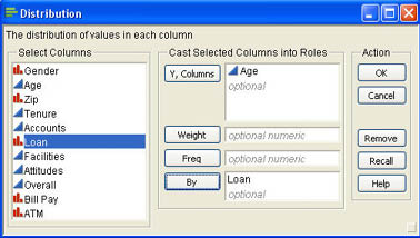
Figure 4.20 Initial Output of the Distribution Platform with a BY Variable
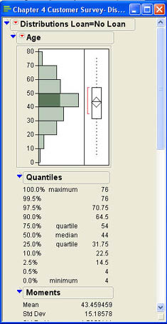
As you can see, by default JMP stacks the two outputs on top of each other with the output for No Loan on the top. You can use the scroll bar on the right side of the output to scroll down to the output for those who have loans. Often it would be better to have the results side by side for easier comparison. You can do this in two ways. One is to select Horizontal Layout from the drop-down menus![]() for each of the outputs. The second way to achieve this is to select the Stack option from the drop-down menu
for each of the outputs. The second way to achieve this is to select the Stack option from the drop-down menu ![]() with Distributions No Loan. Either way will display the results as shown in Figure 4.21.
with Distributions No Loan. Either way will display the results as shown in Figure 4.21.
Figure 4.21 Horizontal Layout for the BY Variable Results
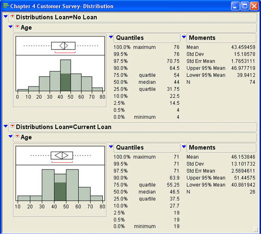
From the histogram, we can see that the distribution of ages seems to be different for those customers without loans and those who have loans. The summary measures show that the mean age of those with loans is 46.15 years while the average age of those without loans if 43.46 years. The standard deviation of the ages in the No Loan group also seems to be higher than in the Loan group. The ages of those with loans seems to be concentrated in the 30–60 year old range while the No Loan group has a broader distribution. Of course, these conclusions are appropriate only within the context of this particular sample. We cannot generalize beyond the sample to all of the customers at INCU without inferential statistics. We will see in later chapters how we can determine if these sample results can be safely generalized to the population at large.
We can also summarize quantitative variables with a BY variable. A BY variable is a qualitative variable that divides the data into groups. After viewing the results for Age, Ann Rigney wonders if there could also be differences in terms of where the customers live. In that case, a campaign targeted to different zip codes may also make sense. Figure 4.22 shows the resulting output where again, the output has been stacked for easier viewing.
Figure 4.22 Outputs for Zip Code by Loan
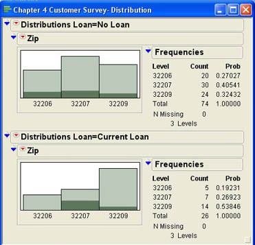
From the output, it appears that those who currently have loans tend to be concentrated in the 32209 zip code (about 54%) and that a campaign focusing on the other two zip codes might be worthwhile.
Summary
This chapter has focused on the Distribution platform. This platform allows you to summarize univariate (one variable at a time) data for both quantitative and qualitative variables. Data are summarized by graphs and tables or by summary measures. Graphs illustrated in this chapter include histograms, box plots, and stem-and-leaf diagrams.
For quantitative variables, important summary measures include the mean (average) value, the variance and standard deviation, and measures of shape, particularly skewness. Two different skewness measures are described: moment skewness and Pearson skewness. The standard deviation is a particularly useful measure of variability of the data. It is often used in statistics as a “unit of measure.” When used this way in standard (Z) scores, it allows us to compare values measured on different scales. It also serves as the foundation for Chebychev’s Theorem and empirical rule, which allow us to make statements about where values are likely to fall in a data distribution for quantitative variables. The coefficient of variation can be used to compare the variability of two different variables that have very different magnitudes. The concept of outliers was also introduced in this chapter. Outliers can be identified in Outlier Box Plots or by using standard scores and the empirical rule.
Qualitative variables are primarily summarized by a frequency distribution along with the associated relative frequencies or proportions. Sometimes qualitative variables are also used to split the data into groups for analysis. We can then look at how the data vary depending on the value of the qualitative variable.
Chapter Glossary
- Bowley skewness
- Skewness defined in terms of quartiles so it can be used with ordinal variables as well as interval or ratio data.
- coefficient of variation
- A measure of relative variability defined as the ratio of the standard deviation divided by the mean.
- frequency distribution
- A distribution of frequencies by grouped data or by the categories of a qualitative variable.
- histogram
- A bar chart of a frequency distribution where the height of the bar is determined by the frequency for that category or group.
- interquartile range
- The difference between the third quartile (75th percentile) and the first quartile (25th percentile). A measure of variability appropriate for ordinal scales.
- mean
- The arithmetic average of a set of numbers found by adding all the values and dividing by the number of observations. This is a common measure of central tendency or typical value.
- median
- The middle value of 50th percentile (the 2nd quartile). Divides the data into two groups. Also a measure of central tendency.
- mode
- The most frequently occurring value in a set of data. A measure of central tendency that is most useful for qualitative variables.
- moment skewness
- A skewness measure based on the cubed deviations of the data values around the mean.
- mosaic plot
- A graph of a qualitative variable divided into rectangles where the area of each rectangle is proportional to the frequency of that category.
- Pearson skewness
- A skewness measure based around the difference between the mean and the median divided by the standard deviation.
- proportion
- The percentage of values within a particular category or group of values. Most often used with qualitative variables.
- outliers
- Extreme values (either high or low) in a set of data. Values that don’t “fit” with the other values in the data set.
- quantiles
- Values that cut off a certain percentage of the distribution. A more common term is percentiles.
- quartiles
- Three values that cut a distribution of values into four equal groups.
- shadowgram
- Similar to a histogram, but it has a filled line chart rather than columns or bars.
- skewness
- Measures the symmetry (or asymmetry) of a distribution of values. A skewness of zero indicates a symmetric distribution.
- standard deviation
- A common measure of variability that has the advantage of being in the original scale units of the variable.
- summary measures
- Values that summarize a particular characteristic of the data such as the central tendency or typical value, variability, or shape (asymmetry or peakedness).
- variance
- A summary measure of variability that measures the average of the squared deviations about the mean.
Questions and Problems
Betty Anderson in Marketing wants information on the number of accounts that INCU customers have. She has asked you to conduct an analysis of the customer survey data for her.
1. Analyze the data for Betty. What conclusions can you draw from the data?
2. Betty notices that the accounts variable has been designated as a continuous variable, but it is really a discrete variable. She wonders if you should analyze this variable as an ordinal variable rather than continuous. Change the variable type and redo the analysis. Does this change your perceptions of the data? Is this a better way to analyze this variable?
3. Liz Barton in the Marketing Department at INCU believes that there are marked differences between male and female customers of the credit union. She would like to see an analysis by gender of the variables Age, Tenure, number of accounts, and whether or not they use Bill Pay and the ATMs. Conduct the analysis for Liz. Do there appear to be any differences between males and females on these variables? What are the implications of these differences?
Andy Jordon, the director of Customer Service at INCU, is most interested in the survey results for customer satisfaction.
4. Analyze the three customer satisfaction variables. What can you tell Andy about customer satisfaction?
5. Andy would like to see if there are differences in customer satisfaction based on gender or location (measured by zip code). Conduct the appropriate analyses and draw up a brief report for Andy.
Betty Anderson is curious about the application of the empirical rule to their sample data.
6. Does the empirical rule seem to hold for the age and tenure data? [Hint: One way to approach this is to create a new column based on a formula to calculate Z scores for the age and tenure variables and then sort the data on these Z scores.]
Notes
1 For this reason, the box plot is sometimes called the box-and-whisker plot.
2 Different sources may spell this name in different ways. Other common spellings are Chebychev, Tchebyshev, and Tchebychev.
3 We will later call such a distribution a Normal curve.
4 Courts have held that in civil suits of gender discrimination, if the difference in wages is more than 2 standard deviations, there is sufficient evidence of possible discrimination for the case to continue.
5 Salary figures are from http://content.usatoday.com/sports/baseball/salaries/default.aspx for the 2009 season.
6 In this case, n = 100 and the standard error is ![]()
7 The horizontal output option of the distribution platform was selected for this figure to more clearly show the histogram.
8 Named after its developer, the famous statistician Karl Pearson (1857–1936).
9 Note that the relative frequencies are labeled Prob, which stands for probabilities.
..................Content has been hidden....................
You can't read the all page of ebook, please click here login for view all page.