
Visualization of Multivariate Data
4.1 Introduction
The topic of visualization of multivariate data is related to more general subjects called exploratory data analysis (EDA) and statistical graphics. The term “exploratory” is in contrast to “confirmatory,” which could describe hypothesis testing. Tukey [275] believed that it was important to do the exploratory work before hypothesis testing, to learn what are the appropriate questions to ask, and the most appropriate methods to answer them. With multivariate data, we may also be interested in dimension reduction or finding structure or groups in the data. Here we restrict attention to methods for visualizing multivariate data.
In this chapter several graphics functions are used. In addition to the R graphics package, which loads when R is started, other packages discussed in this chapter are lattice [239] and MASS (see [278]). Also see the rggobi [167] interface to GGobi and rgl [2] package for interactive 3D visualization. Table 1.4 lists some basic graphics functions in R (graphics) or other packages. Table 4.1 lists more 2D graphics functions and some of the 3D visualization methods.
Graphics Functions for Multivariate Data in R (graphics) and Other Packages
Method |
in (graphics) |
in (package) |
|---|---|---|
3D scatterplot |
cloud (lattice) |
|
Matrix of scatterplots |
pairs |
splom (lattice) |
Bivariate density surface |
persp |
wireframe (lattice) |
Contour plot |
contour, image |
contourplot (lattice) |
contourLines |
contour (MASS) |
|
filled.contour |
levelplot (lattice) |
|
Parallel coord. plot |
parallel (lattice) |
|
parcoord (MASS) |
||
Star plot |
stars |
|
Segment plot |
stars |
|
Interactive 3D graphics |
(rggobi), (rgl) |
Chapter 1 gives a brief summary of options for colors, plotting symbols, and line types.
4.2 Panel Displays
A panel display is an array of two-dimensional graphical summaries of pairs of variables in a multivariate dataset. For example, a scatterplot matrix displays the scatterplots for all pairs of variables in an array. The pairs function in the graphics package produces a scatterplot matrix, as shown in Figures 4.1 and 4.2 in Example 4.1, and Figure 3.7 on page 75. An example of a panel display of three-dimensional plots is Figure 4.5 on page 106.
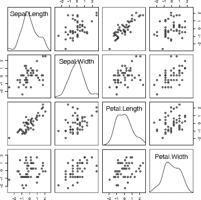
Scatterplot matrix (pairs) comparing four measurements of iris virginica species in Example 4.1.
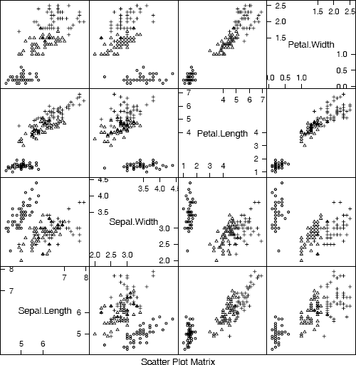
Scatterplot matrix comparing four measurements of iris data: setosa (circle), versicolor (triangle), virginica (cross) from Example 4.1.
Example 4.1 (Scatterplot matrix)
We compare the four variables in the iris data for the species virginica, in a scatterplot matrix.
data(iris)
#virginica data in first 4 columns of the last 50 obs.
pairs(iris[101:150, 1:4])
In the plot produced by the pairs command above (not shown) the variable names will appear along the diagonal. The pairs function takes an optional argument diag.panel, which is a function that determines what is displayed along the diagonal. For example, to obtain a graph with estimated density curves along the diagonal, supply the name of a function to plot the densities. The function below called panel.d plots the densities.
panel.d <- function(x, ...) {
usr <- par("usr")
on.exit(par(usr))
par(usr = c(usr[1:2], 0, .5))
lines(density(x))
}
In panel.d, the graphics parameter usr specifies the extremes of the user coordinates of the plotting region. Before plotting, we apply the scale function to standardize each of the one-dimensional samples.
x <- scale(iris[101:150, 1:4])
r <- range(x)
pairs(x, diag.panel = panel.d, xlim = r, ylim = r)
The pairs plot is displayed in Figure 4.1. From the plot we can observe that the length variables are positively correlated, and the width variables appear to be positively correlated. Other structure could be present in the data that is not revealed by the bivariate marginal distributions.
The lattice package [239] provides functions to construct panel displays. Here we illustrate the scatterplot matrix function splom in lattice.
library(lattice)
splom(iris[101:150, 1:4]) #plot 1
#for all 3 at once, in color, plot 2
splom(iris[,1:4], groups = iris$Species)
#for all 3 at once, black and white, plot 3
splom(~iris[1:4], groups = Species, data = iris,
col = 1, pch = c(1, 2, 3), cex = c(.5,.5,.5))
The last plot (plot 3) is displayed in Figure 4.2. It is displayed here in black and white, but on screen the panel display is easier to interpret when displayed in color (plot 2). Also see the 3D scatterplot of the iris data in Figure 4.5.
For other types of panel displays, see the conditioning plots [42, 48, 49] implemented in coplot.
4.3 Surface Plots and 3D Scatter Plots
Several packages provide surface and contour plots. The persp (graphics) function draws perspective plots of surfaces over the plane. Try running the demo examples for persp, to see many interesting graphs. The command is simply demo(persp). We will also look at 3D methods in the lattice graphics package and the rgl package [239, 278, 2].
4.3.1 Surface plots
For certain graphs we need to mesh a grid of regularly spaced points in the plane. The command for this is expand.grid. If we do not need to save the x, y values, and only need the function values {zij = f(xi, yj)}, the outer function can be used.
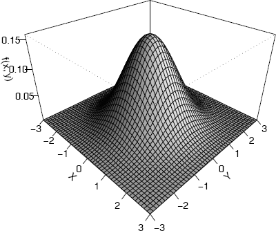
Example 4.2 (Plot bivariate normal density)
Plot the standard bivariate normal density
Code to plot the bivariate standard normal density surface using the persp function is below. Most of the parameters are optional; x, y, z are required. For this function we need the complete grid of z values, but only one vector of x and one vector of y values. In this example, zij = f(xi, yj) are computed by the outer function.
#the standard BVN density
f <- function(x,y) {
z <- (1/(2*pi)) * exp(-.5 * (x"2 + y"2))
}
y <- x <- seq(-3, 3, length= 50)
z <- outer(x, y, f) #compute density for all (x,y)
persp(x, y, z) #the default plot
persp(x, y, z, theta = 45, phi = 30, expand = 0.6,
ltheta = 120, shade = 0.75, ticktype = "detailed",
xlab = "X", ylab = "Y", zlab = "f(x, y)")
The second version of the perspective plot is shown in Figure 4.3.
R note 4.1 The outer function outer(x, y, f) in Example 4.2 applies the third argument, a bivariate function, to the grid of (x, y) values. The returned value is a matrix of function values for every point (xi, yj) in the grid. Storing the grid was not necessary.
For a presentation, adding color (say, col = “lightblue”) produces a more attractive plot. The box can be suppressed by box = FALSE.
Adding elements to a perspective plot
The persp function returns the ‘viewing transformation’ in a 4 × 4 matrix. This transformation can be used to add elements to the plot.
Example 4.3 (Add elements to perspective plot)
This example uses the viewing transformation returned by the perspective plot of the standard bivariate normal density to add points, lines, and text to the plot.
#store viewing transformation in M
persp(x, y, z, theta = 45, phi = 30,
expand = .4, box = FALSE)→ M
The transformation returned by the persp function call is
[,1] [,2] [,3] [,4]
[1,] 2.357023e-01 -0.1178511 0.2041241 -0.2041241
[2,] 2.357023e-01 0.1178511 -0.2041241 0.2041241
[3,] -2.184757e-16 4.3700078 2.5230252 -2.5230252
[4,] 1.732284e-17 -0.3464960 -2.9321004 3.9321004
This transformation M is applied to (x, y, z, t) to project points onto the screen for display in the same coordinate system used to draw the perspective plot.
#add some points along a circle
a <- seq(-pi, pi, pi/16)
newpts <- cbind(cos(a), sin(a)) * 2
newpts <- cbind(newpts, 0, 1) #z=0, t=1
N <- newpts %*% M
points(N[,1]/N[,4], N[,2]/N[,4], col=2)
#add lines
x2 <- seq(-3, 3, .1)
y2 <- -x2^2 / 3
z2 <- dnorm(x2) * dnorm(y2)
N <- cbind(x2, y2, z2, 1) %*% M
lines(N[,1]/N[,4], N[,2]/N[,4], col=4)
#add text
x3 <- c(0, 3.1)
y3 <- c(0, -3.1)
z3 <- dnorm(x3) * dnorm(y3) * 1.1
N <- cbind(x3, y3, z3, 1) %*% M
text(N[1,1]/N[1,4], N[1,2]/N[1,4], "f(x,y)")
text(N[2,1]/N[2,4], N[2,2]/N[2,4], bquote(y==-x^2/3))
The plot with added elements is shown in Figure 4.4 (Note: R provides a function trans3d to compute the coordinates above. Here we have shown the calculations.)
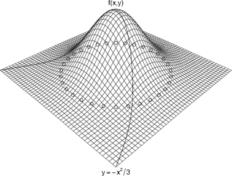
Perspective plot of the standard bivariate normal density with elements added using the viewing transformation returned by persp in Example 4.3.
Other functions for graphing surfaces
Surfaces can also be graphed using the wireframe (lattice) function [239]. Supply a formula z ~ x * y and a data frame or data matrix containing the points (x, y, z).
Example 4.4 (Surface plot using wireframe(lattice))
The following code displays a surface plot of the bivariate normal density similar to Figure 4.3 using wireframe(lattice). The wireframe function requires a formula z ~ x * y, where z = f(x, y) is the surface to be plotted. The syntax for wireframe requires that x, y and z have the same number of rows. We can generate the matrix of (x, y) coordinates using expand.grid.
library(lattice),.
x <- y <- seq(-3, 3, length= 50)
xy <- expand.grid(x, y)
z <- (1/(2*pi)) * exp(-.5 * (xy[,1]^2 + xy[,2]^2))
wireframe(z ~ xy[,1] * xy[,2])
The wireframe plot (not shown) looks very similar to the perspective plot of the bivariate normal density in Figure 4.3.
An interactive 3D display is provided by the graphics package rgl [2]. If the rgl package is installed, run the demo. One of the examples in the demo shows a bivariate normal density. (Actually, the data used to plot the surface in this demo is generated by smoothing simulated bivariate normal data.)
library(rgl)
demo(bivar) #or demo(rgl) to see more
It may be helpful to enlarge the graph window. The graph can be rotated and tilted by the mouse to see the surface from different angles. For the source code of this demo, refer to the file ./demo/bivar.r in the directory where rgl is installed.
Chapter 10 gives examples of methods to construct and plot density estimates for bivariate data. See e.g. Figures 10.11, 10.12(a), and 10.13.
4.3.2 Three-dimensional scatterplot
The cloud (lattice) [239] function produces 3D scatterplots. A possible application of this type of plot is to explore whether there are groups or clusters in the data. To apply the cloud function, provide a formula z x~y, where z = f(x, y) is the surface to be plotted. The first part of the following example is a simple application of cloud with groups identified by color. The second part of the example illustrates several options.
Example 4.5 (3D scatterplot)
This example uses the cloud function in the lattice package to display a 3D scatterplot of the iris data. There are three species of iris and each is measured on four variables. The following code produces a 3D scatterplot of sepal length, sepal width, and petal length. The plot produced is similar to (3) in Figure 4.5.
library(lattice)
attach(iris)
#basic 3 color plot with arrows along axes
print(cloud(Petal.Length ~ Sepal.Length * Sepal.Width,
data=iris, groups=Species))
The iris data has four variables, so there are four subsets of three variables to graph. To see all four plots on the screen, use the more and split options. The split arguments determine the location of the plot within the panel display.
print(cloud(Sepal.Length ~ Petal.Length * Petal.Width,
data = iris, groups = Species, main = "1", pch=1:3,
scales = list(draw = FALSE), zlab = "SL",
screen = list(z = 30, x = -75, y = 0)),
split = c(1, 1, 2, 2), more = TRUE)
print(cloud(Sepal.Width ~ Petal.Length * Petal.Width,
data = iris, groups = Species, main = "2", pch=1:3,
scales = list(draw = FALSE), zlab = "SW",
screen = list(z = 30, x = -75, y = 0)),
split = c(2, 1, 2, 2), more = TRUE)
print(cloud(Petal.Length ~ Sepal.Length * Sepal.Width,
data = iris, groups = Species, main = "3", pch=1:3,
scales = list(draw = FALSE), zlab = "PL",
screen = list(z = 30, x = -55, y = 0)),
split = c(1, 2, 2, 2), more = TRUE)
print(cloud(Petal.Width ~ Sepal.Length * Sepal.Width,
data = iris, groups = Species, main = "4", pch=1:3,
scales = list(draw = FALSE), zlab = "PW",
screen = list(z = 30, x = -55, y = 0)),
split = c(2, 2, 2, 2))
detach(iris)
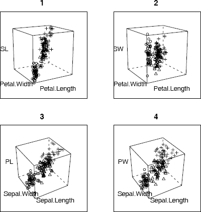
3D scatterplots of iris data produced by cloud (lattice) in Example 4.5, with each species represented by a different plotting character.
The four 3D scatterplots are shown in Figure 4.5. The plots show that the three species of iris are separated into groups or clusters in the three dimensional subspaces spanned by any three of the four variables. There is some structure evident in these plots. One might follow up with cluster analysis or principal components analysis to analyze the apparent structure in the data.
R note 4.2 Syntax for cloud: The screen option sets the orientation of the axes. Setting draw = FALSE suppresses arrows and tick marks on the axes.
Syntax for print(cloud): To split the screen into n rows and m columns, and put the plot into position (r, c), set split equal to the vector (r, c, n, m). One unusual feature of cloud is that unlike most graphics functions in R, cloud does not plot a panel figure unless we print it. See print.trellis for documentation on the print method for cloud.
4.4 Contour Plots
A contour plot represents a 3D surface (x, y, f(x, y)) in the plane by projecting the level curves f(x, y) = c for selected constants c. The functions contour (graphics) and contourplot (lattice) [239] produce contour plots. The functions filled.contour in the graphics package and levelplot function in the lattice package produce filled contour plots. Both contour and contourplot label the contours by default. A variation of this type of plot is image (graphics), which uses color to identify contour levels.
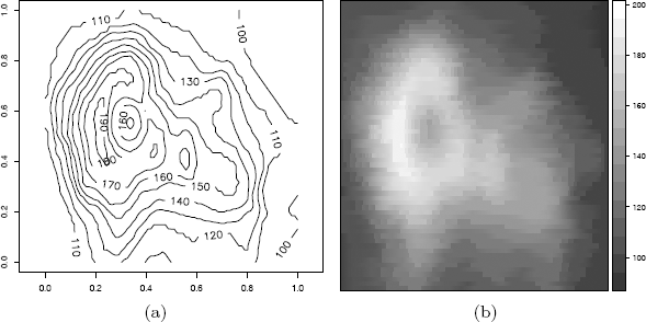
Example 4.6 (Contour plot)
A good example is provided in R using the volcano data. Information about this data is in the help file for volcano. The data is an 87 by 61 matrix containing topographic information for the Maunga Whau volcano.
#contour plot with labels
contour(volcano, asp = 1, labcex = 1)
#another version from lattice package
library(lattice)
contourplot(volcano) #similar to above
Figure 4.6(a) shows the contour plot of the volcano data produced by the contour function.
It may also be interesting to see the 3D surface of the volcano for comparison with the contour plots. A 3D view of the volcano surface is provided in the examples of the persp function. The R code for the example is in the persp help page. To run the example, type example(persp).
If the rgl package is installed, an interactive 3D view of the volcano appears in the examples. When the volcano surface is displayed, use the mouse to rotate and tilt the surface, to view it from different angles.
library(rgl)
example(rgl)
Yet another 3D view of the volcano data, with shading to indicate contour levels, appears in the examples of the wireframe function in the lattice package. See the first example in the wireframe help file.
Example 4.7 (Filled contour plots)
A contour plot with a 3D effect could be displayed in 2D by overlaying the contour lines on a color map corresponding to the height. The image function in the graphics package provides the color background for the plot. The plot produced below is similar to Figure 4.6(a), with the background of the plot in terrain colors.
image(volcano, col = terrain.colors(100), axes = FALSE)
contour(volcano, levels = seq(100,200,by = 10), add = TRUE)
Using image without contour produces essentially the same type of plot as filled.contour (graphics) and levelplot (lattice). The contours of filled.contour and levelplot are identified by a legend rather than superimposing the contour lines. Compare the plot produced by image with the following two plots.
filled.contour(volcano, color = terrain.colors, asp = 1)
levelplot(volcano, scales = list(draw = FALSE),
xlab = "", ylab = "")
The plot produced by levelplot is shown in Figure 4.6(b). (The display on the screen will be in color.)
A limitation of 2D scatterplots is that for large data sets, there are often regions where data is very dense, and regions where data is quite sparse. In this case, the 2D scatterplot does not reveal much information about the bivariate density. Another approach is to produce a 2D or flat histogram, with the density estimate in each bin represented by an appropriate color.
Example 4.8 (2D histogram)
In this example, simulated bivariate normal data is displayed in a flat histogram with hexagonal bins. The hexbin function in package hexbin [38] (available from Bioconductor repository) produces a basic version of this plot in grayscale, shown in Figure 4.7.
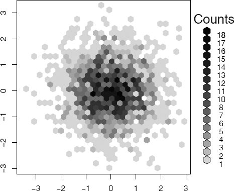
Flat density histogram of bivariate normal data with hexagonal bins produced by hexbin in Example 4.8.
library(hexbin)
x <- matrix(rnorm(4000), 2000, 2)
plot(hexbin(x[,1], x[,2]))
Compare the flat density histogram in Figure 4.7 with the bivariate histogram in Figure 10.11 on page 308. Note that the darker colors correspond to the regions where the density is highest, and colors are increasingly lighter along radial lines extending from the mode near the origin. The plot exhibits approximately circular symmetry, consistent with the standard bivariate normal density.
The bivariate histogram can also be displayed in 2D using a color palette, such as heat.colors or terrain.colors, to represent the density for each bin. A similar type of plot is implemented in the gplots package [290]. The plot (not shown) resulting from the following code is similar to Figure 4.7, but with color and square bins.
library(gplots)
hist2d(x, nbins = 30,
col = c("white", rev(terrain.colors(30))))
4.5 Other 2D Representations of Data
In addition to contour plots and other projections of data into two dimensions, there are several other methods for representing multivariate data in two dimensions. These include, among others, Andrews curves, parallel coordinate plots, and various iconographic displays such as segment plots and star plots.
4.5.1 Andrews Curves
If one approach to visualizing the data in two dimensions is to map each of the sample data vectors onto a real valued function. Andrews Curves [10] map each sample observation xi = xi1, ... , xid to the function
Thus, each observation is represented by its projection onto a set of orthogonal basis functions Notice that differences between measurements are amplified more in the lower frequency terms, so that the representation depends on the order of the variables or features.
Example 4.9 (Andrews curves)
In this example, measurements of leaves taken at N. Queensland, Australia for two types of leaf architecture [162] are represented by Andrews curves. The data set is leafshape17 in the DAAG package [184, 185]. Three measurements (leaf length, petiole, and leaf width) correspond to points in . It is easiest to interpret the plots if leaf architectures are identified by different colors, but here we use different line types. To plot the curves, define a function to compute fi(t) for arbitrary points xi in and −π ≤ t ≤ π. Evaluate the function along the interval [−π, π] for each sample point xi.
library(DAAG)
attach(leafshape17)
f <- function(a, v) {
#Andrews curve f(a) for a data vector v in R^3
v[1]/sqrt(2) + v[2]*sin(a) + v[3]*cos(a)
}
#scale data to range [-1, 1]
x <- cbind(bladelen, petiole, bladewid)
n <- nrow(x)
mins <- apply(x, 2, min) #column minimums
maxs <- apply(x, 2, max) #column maximums
r <- maxs - mins #column ranges
y <- sweep(x, 2, mins) #subtract column mins
y <- sweep(y, 2, r, "/") #divide by range
x <- 2 * y - 1 #now has range [-1, 1]
#set up plot window, but plot nothing yet
plot(0, 0, xlim = c(-pi, pi), ylim = c(-3,3),
xlab = "t", ylab = "Andrews Curves",
main = "", type = "n")
#now add the Andrews curves for each observation
#line type corresponds to leaf architecture
#0=orthotropic, 1=plagiotropic
a <- seq(-pi, pi, len=101)
dim(a) <- length(a)
for (i in 1:n) {
g <- arch[i] + 1
y <- apply(a, MARGIN = 1, FUN = f, v = x[i,])
lines(a, y, lty = g)
}
legend(3, c("Orthotropic", "Plagiotropic"), lty = 1:2)
detach(leafshape17)
The plot of Andrews curves for this example is shown in Figure 4.8. The plot reveals similarities within plagiotropic and orthotropic leaf architecture groups, and differences between these groups. In general, this type of plot may reveal possible clustering of data.
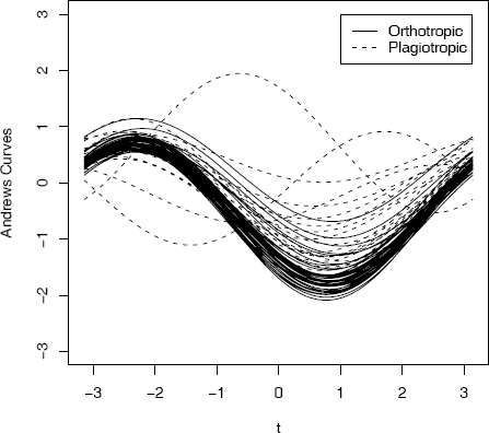
Andrews curves for leafshape17 (DAAG) data at latitude 17.1: leaf length, width, and petiole measurements in Example 4.9. Curves are identified by leaf architecture.
R note 4.3 In Example 4.9 the sweep operator is applied to subtract the column minimums above. The syntax is
sweep(x, MARGIN, STATS, FUN="-", ...)
By default, the statistic is subtracted but other operations are possible. Here
y <- sweep(x, 2, mins) #subtract column mins
y <- sweep(y, 2, r, "/") #divide by range
sweeps out (subtracts) the minimum of each columns (margin = 2). Then the ranges of each of the three columns (in r) are swept out; that is, each column is divided by its range.
R note 4.4 In Figure 4.8 to identify the curves by color, replace lty with col parameters in the lines and legend statements.
4.5.2 Parallel Coordinate Plots
Parallel coordinate plots provide another approach to visualization of multivariate data. The representation of vectors by parallel coordinates was introduced by Inselberg [152] and applied for data analysis by Wegman [294].
Rather than represent axes as orthogonal, the parallel coordinate system represents axes as equidistant parallel lines. Usually these lines are horizontal with common origin, scale, and orientation. Then to represent vectors in ℝd, the parallel coordinates are simply the coordinates along the d copies of the real line. Each coordinate of a vector is then plotted along its corresponding axis, and the points are joined together with line segments.
Parallel coordinate plots are implemented by the parcoord function in the MASS package [278] and the parallel function in the lattice package [239]. The parcoord function displays the axes as vertical lines. The panel function parallel displays the axes as horizontal lines.
Example 4.10 (Parallel coordinates)
This example illustrates using the parallel (lattice) function to construct a panel display of parallel coordinate plots for the crabs (MASS) data [278]. The crabs data frame has 5 measurements on each of 200 crabs, from four groups of size 50. The groups are identified by species (blue or orange) and sex. The graph is best viewed in color. Here we use black and white, and for readability select only 1/5 of the data.
library(MASS)
library(lattice)
trellis.device(color = FALSE) #black and white display
x <- crabs[seq(5, 200, 5),] #get every fifth obs.
parallel(~x[4:8] | sp*sex, x)
The resulting parallel coordinate plots are displayed in Figure 4.9(a). The labels along the vertical axis identify each axis corresponding to the five measurements (frontal lobe size, rear width, carapace length, carapace width, body depth). Much of the variability between groups is in overall size.
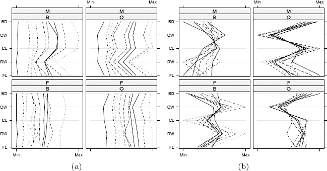
Parallel coordinate plots in Example 4.10 for a subset of the crabs (MASS) data. (a) Differences between species (B=blue, O=orange) and sex (M, F) are largely obscured by large variation in overall size. (b) After adjusting the measurements for size of individual crabs, differences between groups are evident.
Adjusting the measurements of individual crabs for size may produce more interesting plots. Following the suggestion in Venables and Ripley [278] we adjust the measurements by the area of the carapace.
trellis.device(color = FALSE) #black and white display
x <- crabs[seq(5, 200, 5),] #get every fifth obs.
a <- x$CW * x$CL #area of carapace
x[4:8] <- x[4:8] / sqrt(a) #adjust for size
parallel(~x[4:8] | sp*sex, x)
In the resulting plot in Figure 4.9(b), differences in species and sex are much more evident after adjustment than in Figure 4.9(a).
4.5.3 Segments, stars, and other representations
Multivariate data can be represented by a two dimensional icon or glyph, such as a star. The Andrews curves in Example 4.9 are an example; the curves are the two-dimensional symbols. Andrews curves were displayed superimposed on the same coordinate system. Other representations as icons are best displayed in a table, so that features of observations can be compared. A tabular display does not have much practical value for high dimension or large data sets, but can be useful for some small data sets. Some examples include star plots and segment plots. This type of plot is easily obtained in R using the stars (graphics) function.
This example uses the subset of crabs (MASS) data from Example 4.10. As in Example 4.10, individual measurements are adjusted for overall size by area of carapace.
#segment plot
library(MASS) #for crabs data
attach(crabs)
x <- crabs[seq(5, 200, 5),] #get every fifth obs.
x <- subset(x, sex == "M") #keep just the males
a <- x$CW * x$CL #area of carapace
x[4:8] <- x[4:8] / sqrt(a) #adjust for size
#use default color palette or other colors
palette(gray(seq(.4, .95, len = 5))) #use gray scale
#palette(rainbow(6)) #or use color
stars(x[4:8], draw.segments = TRUE,
labels = x$sp, nrow = 4,
ylim = c(-2,10), key.loc = c(3,-1))
#after viewing, restore the default colors
palette("default"); detach(crabs)
The plot is shown in Figure 4.10. The observations are labeled by species. The differences between the species (for males) in this sample are quite evident in the plot. The plot suggests, for example, that orange crabs have greater body depth relative to carapace width than blue crabs.
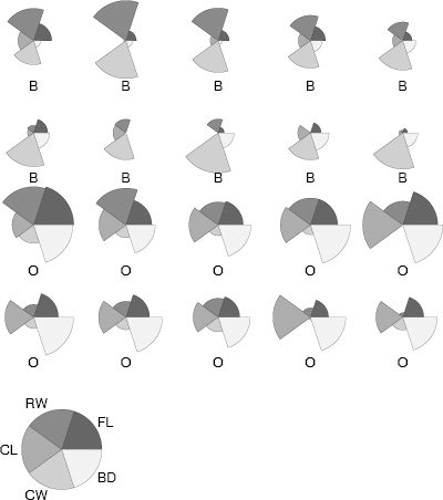
Segment plot of a subset of the males in the crabs (MASS) data set in Example 4.11. The measurements have been adjusted by overall size of the individual crab. The two species are blue (B) and orange (O).
4.6 Other Approaches to Data Visualization
Many other methods for data visualization are in the literature and we mention here only a few more. Asimov’s grand tour [14] is an interactive graphical tool that projects data onto a plane, rotating through all angles to reveal any structure in the data. The grand tour is similar to projection pursuit exploratory data analysis (PPEDA) (Friedman and Tukey [100]). In both cases, structure might be defined as departure from normality. Once the structure is removed, the search can be repeated until no significant structure remains. Principal components analysis similarly uses projections (see e.g. [188, Ch. 8] and [278, Sec. 11.1]). When the data are projected onto the eigenvector corresponding to the maximal eigenvalue of the covariance matrix, this first principal component is in the direction that explains the most variation in the data. Dimension is reduced by projecting onto a small number of the principal components that collectively explain most of the variation. Pattern recognition and data mining are two broad areas of research that use some visualization methods. See Ripley [224] or Duda and Hart [75]. An interesting collection of topics on data mining and data visualization is found in Rao, Wegman, and Solka [222]. For an excellent resource on visualization of categorical data see Friendly [102] and http://www.math.yorku.ca/SCS/vcd/.
In addition to the R functions and packages mentioned in this chapter, several methods are available in other packages. Again, here we only name a few. Chernoff’s faces [46] are implemented in faces(aplpack) [298] and in faces(TeachingDemos) [254]. Mosaic plots for visualization of categorical data are available in mosaicplot. Also see the package vcd [199] for visualization of categorical data. The functions prcomp and princomp provide principal components analysis. Many packages for R fall under the data mining or machine learning umbrella; for a start see nnet [278], rpart [268], and randomForest [176]. More packages are described on the Multivariate Task View and Machine Learning Task View on the CRAN web. Also see the graph gallery at http://addictedtor.free.fr/graphiques/.
The rggobi [167] package provides a command-line interface to GGobi, which is an open source visualization program for exploring high-dimensional data. GGobi has a graphical user interface, providing dynamic and interactive graphics. The GGobi software can be obtained from http://www.ggobi.org/downloads/. Readers are referred to documentation and examples at http://www.ggobi.org/rggobi and the book by Cook and Swayne [52] featuring examples using R and GGobi.
Exercises
4.1 Generate 200 random observations from the multivariate normal distribution having mean vector µ = (0, 1, 2) and covariance matrix
Construct a scatterplot matrix and verify that the location and correlation for each plot agrees with the parameters of the corresponding bivariate distributions.
4.2 Add a fitted smooth curve to each of the scatterplots in Figure 4.1 of Example 4.1. (?panel.smooth)
4.3 The random variables X and Y are independent and identically distributed with normal mixture distributions. The components of the mixture have N(0, 1) and N(3, 1) distributions with mixing probabilities p1 and p2 = 1 − p1 respectively. Generate a bivariate random sample from the joint distribution of (X, Y) and construct a contour plot. Adjust the levels of the contours so that the the contours of the second mode are visible.
4.4 Construct a filled contour plot of the bivariate mixture in Exercise 4.3.
4.5 Construct a surface plot of the bivariate mixture in Exercise 4.3.
4.6 Repeat Exercise 4.3 for various different choices of the parameters of the mixture model, and compare the distributions through contour plots.
4.7 Create a parallel coordinates plot of the crabs (MASS) [278] data using all 200 observations. Compare the plots before and after adjusting the measurements by the size of the crab. Interpret the resulting plots.
4.8 Create a plot of Andrews curves for the leafshape17 (DAAG) [185] data, using the logarithms of measurements (logwid, logpet, loglen). Set line type to identify leaf architecture as in Example 4.9. Compare with the plot in Figure 4.8.
4.9 Refer to the full leafshape (DAAG) data set. Produce Andrews curves for each of the six locations. Split the screen into six plotting areas, and display all six plots on one screen. Set line type or color to identify leaf architecture. Do the plots suggest differences in leaf shape by location?
4.10 Generalize the function in Example 4.9 to return the Andrews curve function for vectors in where the dimension d ≥ 2 is arbitrary. Test this function by producing Andrews curves for the iris data (d = 4) and crabs (MASS) data (d = 5).
4.11 Refer to the full leafshape (DAAG) data set. Display a segment style stars plot for leaf measurements at latitude 42 (Tasmania). Repeat using the logarithms of the measurements.