
4
Modeling Formulation Data
“All models are wrong, but some are useful.”
George E. P. Box
Overview
Empirical modeling--fitting equations to data--is a process that can be studied and improved. It involves a lot of science, and a fair amount of art as well. When applied to formulation data, there are also some unique aspects that need to be kept in mind. In this chapter, we discuss the fundamentals of building good models, such as critical model evaluation. Also covered are the unique circumstances to consider when fitting formulation models. We focus on response surface models in this chapter and will address screening models in subsequent chapters.
CHAPTER CONTENTS
4.1 The Model Building Process
4.2 Summary Statistics and Basic Plots
4.3 Basic Formulation Models and Interpretation of Coefficients
4.4 Model Evaluation and Criticism
4.6 Transformation of Variables
4.7 Models with More Than Three Components
4.8 Summary and Looking Forward
4.1 The Model Building Process
The development of good, actionable models presents a significant challenge, especially with formulation data. Simply entering data into a computer and pushing buttons will produce models, but these will often be poor models that provide no insight and that predict the results of future formulations poorly. Model building is a process, one that has been studied and improved over time by many researchers. By following a proven process for developing models, we significantly enhance our probability for success. Figure 4.1 depicts one view of a model building process that can be applied to formulation variables or independent variables. It is based on a similar process in Hoerl and Snee (2012) and is an example of statistical engineering, as discussed in Chapter 2. In this chapter we focus on response surface models. In Chapter 5 we discuss models built upon screening designs.
Figure 4.1 – The Model Building Process

Note that modeling does not begin with data, but rather with a clarification of purpose and objectives. There are many types of models and many purposes for which they are developed. For example, experimenters may wish to validate a theory, or they may wish to develop an empirical model to approximate a complex relationship within a defined region. If experimenters are not clear on their objectives for developing the model, it will be virtually impossible to evaluate the model and determine whether it is adequate or not. Obviously, the level of precision needed when modeling the potential for a meltdown at a nuclear power plant is very different from modeling consumer preferences in a soft drink.
Here are some of the common purposes for developing models:
• Developing deeper understanding of how formulation components relate to the response--i.e., enhancing our fundamental knowledge.
• Predicting future values of the response, based on the component levels.
• Quantifying the potential effect of changing component levels--that is, conducting a what-if analysis to evaluate potential formulation changes.
• Quantifying experimental variation, as discussed in Chapter 2.
• Some combination of the above.
Next, and before developing quantitative models, experimenters should get to know the data through evaluation of the data “pedigree,” simple plots, and summary statistics. Before selecting a model form, it is very helpful to have a good understanding of the data, and what patterns and trends are detectable in the plots. By data “pedigree” we refer to the background and history of the data--where it came from, how it was sampled, how it was measured, identification of questionable data points (outliers), and so on. If the data was produced from a designed experiment, then the answers to most of these questions will be known. However, if the data came from another source, such as historical records, these questions will need to be answered. Simple plots of the data help guide the analysis, in terms of suggesting appropriate model forms, identifying outliers or the potential need for transformation, and so on.
Next, based on a good familiarity with the data, we are in a position to suggest an appropriate model. The model form will typically depend on several considerations:
• The experimental design used--i.e., the models that can be supported by the data.
• Trends or patterns seen in the plots. For example, how much curvature is present?
• Current subject matter knowledge. In other words, what does the existing theory of the phenomenon under study suggest? Does prior experimentation provide any clues?
• Software available. Software to estimate models that are linear in the parameters is common, but software to estimate models that are non-linear in the parameters can be more challenging. We say more about non-linear models in Chapter 9.
Of course, the initial model form that is selected may not turn out to be appropriate, requiring evaluation of different model forms. Recall that model building is a process. Once the initial model form has been selected, statistical software will be used to fit the model to the data--that is, to estimate the parameters in the model. This software will produce not only the estimated model, but also summary statistics that measure in various ways how well the chosen model fits the data. These metrics are useful in model evaluation and criticism, the next step in the model building process.
Unfortunately, it is a rare occurrence for the initial model to fully satisfy the modeling objectives and assumptions, which we discuss in more detail shortly. Therefore, model evaluation and criticism are critically important aspects of building useful models. In addition to evaluating the model metrics to determine how well the model fits the data, it is important to closely examine the residuals, or errors in model prediction. That is, the residuals are the actual values of the response, yi, minus the values predicted by the model, ŷi. As we discuss shortly, if the model has accounted for all the systematic variation in the response--i.e., all the predictable or systematic behavior of y--then the residuals should appear in any plots as random variation with no discernable pattern or trends. Patterns in the residuals generally indicate either that one of our assumptions was violated or that an inappropriate model form was selected.
If issues are seen in the residuals and summary statistics, alternative model forms may be evaluated, including measuring the response in a different metric (transformation), inclusion of additional terms to account for curvature, or potentially a completely different model form. This is depicted in Figure 4.1 as the loop going from model evaluation and criticism back to model formulation, when the current model appears inadequate. Several loops back through the process are often required to develop good models, and these should be expected.
4.2 Summary Statistics and Basic Plots
As noted in Figure 4.1, it is typically useful to first evaluate the data collected through consideration of the data pedigree, summary statistics, and also basic plots. The background or pedigree of the data was discussed in Chapter 2 and Section 4.1. Summary statistics, such as the mean, standard deviation, maximum, and minimum, help develop a feel for both the x and y variables, and can help identify outliers. For example, if a maximum component level is 1.1, this obviously must be an error in the data, since the maximum possible value is 1.0. Correlation coefficients (Hoerl and Snee 2012 p. 171) quantify the degree of linear association between variables and can also be insightful. However, since correlations quantify only linear association, it is also important to plot each of the x variables versus y to understand the potential nature of the relationships.
Figure 4.2 shows a plot of each of the x variables versus y for the vegetable oil data from Chapter 1 (Table 1.2). This set of plots shows that the solid fat index, the key y variable, seems to be more sensitive to variation in the components stearine and solids, as opposed to vegetable oil. In some formulations there is a single, dominant component, but that does not appear to be the case here.
Figure 4.2 – Plots of Solid Fat Index (Y) versus Each Component
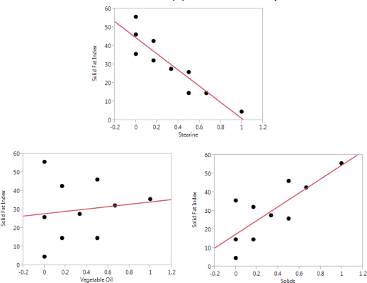
Of course, it should be kept in mind with formulations that if one component is increased, then one or more other components must be decreased. For example, we see that the solid fat index tends to increase when the level of solids increases. However, for solids to increase, either stearine or vegetable oil must decrease. Therefore, the increase seen in the solid fat index can also be attributed to decreases in stearine and vegetable oil. In Figure 4.2, stearine and solids appear to be the most critical components for this y, and there seems to be some, but not a great deal of, curvature. When selecting a model form for this data, some thought should be given to non-linear blending, but we would expect the linear blending terms to account for most of the variation in the solid fat index.
4.3 Basic Formulation Models and Interpretation of Coefficients
There are many potential models that can be applied to formulations. Here we highlight the most common models used in applications, particularly Scheffé models (Scheffé 1963, Cornell 2002), without attempting to provide a comprehensive review. More sophisticated models will be discussed in Chapters 9 and 10. As noted in Chapter 1, the constraint that the formulation components sum to 1.0 results in the inability to fit a standard linear regression model. Therefore, it is common to simply drop the constant term, producing a Scheffé model. For example, with q components the linear Scheffé model would be written as follows:
In Equation 1, E(y) means the “expected value of y”--i.e., the long-term average value of y that we would expect to observe with these component levels, xi. The bi are the coefficients and quantify the relative impact of each component level on the response y. We can also write this model in the following form, which includes the error term:
Note that Equations 1 and 2 represent equivalent models; the difference is that Equation 1 is for the expected, or long-term average value of y for a given set of x values, while Equation 2 is for one specific observation of y. When writing Equation 2, we often assume that each error term, ei, is a random observation from the same probability distribution, typically a normal distribution with a mean value (μ) of zero and a standard deviation of σ. In other words, we typically assume that the error terms are normally and identically distributed random variables. We typically further assume that these error terms are independent of one another. Of course, such assumptions should always be evaluated as part of the analysis rather than blindly accepted, as depicted in Figure 4.1.
Because the components in Equations 1 and 2 sum to 1.0, it is not the absolute value of the coefficients that is most meaningful, but rather the relationships between the coefficients. For example, suppose in the case of three components that b1=10, b2=20, and b3=30. Then we would say that x1 has a negative impact on the response, because to increase x1 we would have to decrease either x2 or x3 by an equal amount. Hence, the net impact of increasing x1 would be to decrease E(y). Clearly, it is not the linear coefficient itself that is most important, but rather its relationship to the other linear coefficients. To calculate the effect of a component, say x1 in this example, we use the following formula (Cornell 2002 p. 246):
In the formula, is the average of all coefficients other than for xi:
For the case of x1 noted above, since we have b1=10, b2=20, and b3=30, this implies that E1 = (10 – 25) = -15. In other words, as we increase x1 by some amount, say z, y is expected to decrease by 15z, assuming x2 and x3 are decreased in equal proportions as x1 increases. It should be obvious that just listing +10 as the coefficient for x1 would be misleading. Note that Equation 3 works only for linear blending models that cover the full range of each component. For evaluating component effects in more complex situations, Snee and Piepel (2013) and Cornell (2002) provide more appropriate options. While other types of models and design spaces make these calculations more complicated, experimenters can still make contour plots of the predicted y--i.e., ŷ, within the design space and visualize the impact of each component.
Fitting the models given above in JMP 13 software is relatively straightforward using the Fit Model command. For a linear model using the vegetable oil data, simply enter the solid fat index as the response and then the three components as the model effects (explanatory variables), as with any other regression model. To indicate that this is a mixture model, however, select the three components in the Model Effects dialog box. Then click Attributes and select Mixture Effects. This informs JMP that these are formulation variables that must sum to 1.0. JMP will then fit a linear formulation model with no intercept.
Figure 4.3 shows a contour plot of the linear model (Equation 1) fit to the vegetable oil data. Note that the contours form a plane; there is no curvature in the plot. Further, the response increases most dramatically when stearine is decreased and least dramatically when vegetable oil is increased. In fact, the contour plane runs almost perfectly along the vegetable oil axis, indicating that the level of vegetable oil has minimal impact on the solid fat index. Rather, it is the relative ratio of stearine to solids that is most critical. There are other linear mixture models that can be considered, such as the slack variable model discussed in Chapter 2. With the slack variable model, one of the formulation ingredients is dropped to avoid the formulation constraint, and the constant term is added back into the model. The missing component is said to “take up the slack” that was left over from the other components.
To produce contour plots such as Figure 4.3 in JMP, first fit the model in Fit Model, as discussed above. Next, select the options button (triangle) in the upper left corner of the output. When the further options appear, select Factor Profiling and then Mixture Profiler.
Figure 4.3 – Contours of the Linear Vegetable Oil Model

When curvature is present, another option is to fit a quadratic Scheffé model, which incorporates linear terms plus all possible cross-product terms between components:
Because each component can be viewed as one minus the sum of all other components, we would not typically consider the cross-product terms as modeling interaction in the traditional sense of the word, but rather as modeling non-linear blending in general. That is, if the response surface were a plane, then all these coefficients for the cross products would be zero. Figure 4.4 shows the contours of Equation 4 fit to the vegetable oil data. Note that this plot looks very similar to the linear model in Figure 4.3, indicating that the blending is predominantly linear. However, there is some noticeable curvature in this plot, particularly toward the top of the graph, near a pure stearine blend.
There are options in JMP that enable the user to fit Equation 4 without having to manually enter all terms into the Fit Model platform. Specifically, after entering the response, select the three components in the Columns dialog box (before entering them into the model) and then click Macros. One option will be Mixture Response Surface; this model contains all cross-product terms, but not any cubic terms--i.e., it fits Equation 4. The contours are obtained in exactly the same way as the contours for the previous model.
Figure 4.4 – Contours of the Quadratic Vegetable Oil Model

When severe non-linear blending is present, and sufficient data is available to estimate additional terms, we may fit the special cubic Scheffé model:
This is considered a “special” cubic model in the sense that it does not include all third-order terms, but is rather the quadratic model plus all possible three-term cross products. Here is a special cubic model with three components:
E(y) = b1x1 + b2x2 + b3x3 + b12x1x2 + b13x1x3 + b23x2x3 + b123x1x2x3
Figure 4.5 shows Equation 5 fit to the vegetable oil data. Note that Figure 4.5 looks virtually identical to Figure 4.4 because the curvature in this data is not severe. Hence, the additional non-linear blending term, the cubic term in Equation 5, does not provide a noteworthy improvement over Equation 4. The quadratic model seems sufficient for this data, at least based on these plots.
The simplest way to fit Equation 5 in JMP is to first create the quadratic model, as discussed above, and then to manually add the three-factor cross-product terms. This is done by selecting the three components in the column box, and then clicking Cross. JMP has an option in Macros for a cubic model, but this is for the full cubic model with all possible third-order terms.
Figure 4.5 – Contours of the Special Cubic Vegetable Oil Model

Again, cubic terms would be considered measures of non-linear blending rather than three-factor interactions. Obviously, significant cubic terms would indicate more severe non-linear blending than quadratic terms. More complex full cubic models can be used (Cornell 2011 p. 31), as well as models involving ratios or differences of components, and many other potential model forms. Some of these more complex models will be discussed in subsequent chapters.
4.4 Model Evaluation and Criticism
As depicted in Figure 4.1, models should never be accepted at face value, but should be critically evaluated before use. Several assumptions go into model fitting, including the one that the specific model form selected is correct, and those concerning the distribution of the errors. If these assumptions are not reasonable, then poor models are likely to result. A serious model evaluation should consider the summary statistics that are produced by the model, such as measures of how well the model fits the data, as well as investigation of the residuals, as noted previously. Examination of the residuals helps determine whether the assumptions of the model form and distribution of errors appear to be reasonable. Further, if the assumptions appear to be violated, residual analysis will often provide clues about how the model might be modified to better satisfy the assumptions.
First, we discuss model summary statistics and tests as produced by standard commercial statistical software. Table 4.1 shows output from JMP 13, applying the linear model (Equation 1) to the vegetable oil data. For this discussion, we assume basic understanding of regression analysis. See Chapter 6 of Hoerl and Snee (2012) for an introduction to regression, and Montgomery et al. (2012) for a more complete treatment.
Table 4.1 – JMP Output for the Linear Vegetable Oil Model

Table 4.1 shows that the coefficient of determination (R2), or percent of variation in the response that can be explained or predicted by the model, is about 0.982, which is quite high. As a rough rule of thumb, we can say that R2 > 0.7 suggests that the model is explaining a fair amount of variation. Note that this is just a guideline, and even with a high number such as 0.982, we should continue to evaluate the model critically. This number also implies that the correlation between the actual y values and the predicted y values (ŷ) is . That is, R2 is the square of the correlation coefficient between y and ŷ. It also implies that only about 2% of the variation in the solid fat index remains unexplained by the model. For the linear model depicted in Equation 1, the predicted values of y are calculated as follows:
For more complex models, ŷ is still calculated by simply replacing each bi with the corresponding .
It is well known that R2 cannot decrease when more variables are added to the regression model. Hence, serious modelers generally use adjusted R2 when evaluating models. The adjusted R2 penalizes R2 based on how many explanatory variables have been added to the model. Montgomery et al. (2012) provides further details on the calculation and interpretation of adjusted R2. In this case, we see that the adjusted R2 is also quite good, at about 0.977.
The root mean square error (RMSE) of 2.38 is an estimate of σ, the standard deviation of the errors. Assuming that this is the correct model, the RMSE is an estimate of the experimental error in this formulation. That is, this model output suggests that the actual solid fat index values vary randomly above and below the hypothesized regression line with a standard deviation of about 2.38. This suggests that we could not predict future values any more accurately than this. Obviously, we would like the root mean square error to be as small as possible. Keep in mind, however, that all of this numerical output is based on the assumptions that were made concerning the model form and distribution of errors. Those have not yet been verified.
The analysis of variance (ANOVA) table shows the breakdown of the variation in y and also performs a statistical hypothesis test. The total (corrected) sum of squares is the total variation in y--i.e., . The error or residual sum of squares is the sum of the squared residuals--that is, the total variation that is not explained by the model: . The model or regression sum of squares is the amount of variation explained by the model: . Note that the model and error sum of squares sum to the total sum of squares. Dividing the model sum of squares by the total sum of squares produces R2. Also, dividing the error sum of squares by the appropriate degrees of freedom, to account for the number of estimated parameters in the model, produces the mean square error. This is an estimate of the variance of the errors, σ2. Therefore, RMSE is literally the square root of the mean square error.
The F ratio is calculated by dividing the mean square model by the mean square error. In standard (non-formulation) regression models, this F ratio tests the null hypothesis that all regression coefficients in the hypothesized model are equal to zero:
H0: b1 = b2 = b3 = 0
H1: At least one bi is not equal to 0
Note, however, that this hypothesis is not meaningful in a formulations context because there is no constant or intercept term in the model. Therefore, if the levels of the components had no effect on the response, all bi would be equal to the average response, not zero. Because of this difference, most commercial software, such as JMP in this case, tests the null hypothesis that the linear coefficients are equal to one another--i.e., that the component levels have no effect on the response. Mathematically, here is how we would write this:
H0: b1 = b2 = b3
H1: At least one bi is not equal to another
The probability or p-value is < 0.0001, indicating that we have enough evidence to reject the null hypothesis. As explained in Hoerl and Snee (2012), the p-value is essentially the probability of observing an F ratio this large or larger by chance, assuming that the null hypothesis was true. Therefore, the lower the p-value, the stronger the evidence that the null hypothesis is false. In short, we have very strong evidence that the component levels affect the response--i.e., that all bi are not equal to one another. In general, parameters that have p-values below some arbitrary cut-off, often 0.05, are referred to as being “statistically significant”. This does not mean that they are important from a practical point of view, but rather that we have convincing evidence to reject the null hypothesis. i.e., to conclude that they are not zero, or in the case of formulations, that they are not equal to one another.
The estimated regression coefficients (), and hypothesis tests performed on each of them, are given in the parameter estimates section of the JMP output listed in Table 4.1. Each t test in this table is testing the hypothesis that the population regression coefficient in the hypothesized model (bi) is equal to zero. As noted above, this is not the logical hypothesis to test for formulation coefficients. Rather, it makes more sense to evaluate the Ei, per Equation 3. In this case, the three Ei values are E1 = (0.818 – 44.4) = -43.6, E2 = (34.1 – 27.7) = 6.4, and E3 = (54.6 – 17.5) = 37.1. These values reveal that decreasing x1 (stearine) tends to increase y the most, while increasing x3 also tends to increase y.
The statistical significance of the Ei can be evaluated several ways; the simplest is to first subtract the sample average from each value of y and then rerun the model, testing the , which are now equivalent to the Ei (although not exactly equal to the Ei). That is, use yci = (yi - ȳ) as the response, where yc is the mean corrected version of y. Since yc has a mean of zero, each should be approximately zero (the mean of yc) if the components have no impact on y. It now makes sense to test the null hypothesis that the population coefficients are equal to zero. To create yc in JMP, create a new column using the formula option, the specific formula being y - ȳ.
See Montgomery et al. (2012) for a more detailed explanation of the ANOVA table and hypothesis tests in regression analysis.
Aside from the slack variable model discussed previously, we generally do not drop components from a formulation model, even if they are not statistically significant, because this would affect the constraint on the components summing to 1.0 and thereby change interpretation of the model. However, if there is one dominant component, we can consider the option of using only this variable in a standard linear regression model. Further, if some components have virtually the same Ei, we can consider combining those into a new single variable. For example, suppose we have two catalysts in the formulation, labeled x3 and x4. If E3 and E4 are virtually identical, we can consider creating a new variable, x5 = x3 + x4. In this case, x5 would model the effect of overall catalyst level, and when x3 and x4 are dropped from the equation, the components would still sum to 1.0. See Chapter 10 and also Snee (2011) for further discussion of such model re-expression options.
4.5 Residual Analysis
As noted previously, residuals can provide a great deal of insight into the adequacy of any model. The residuals we evaluate are simply the differences between the observed values of y and the values predicted by the model--i.e., êi = yi - ŷi, where ŷi is calculated as explained above. Note that we use the term êi rather than ei for the residuals. There is a subtle but important difference in these two. Per Equation 2 above, the ei represent the variation or error in the observed data, causing it to differ from the true model, the model we would see if we had all data in the population. In this sense, they are population parameters, which are not directly observed. Note that Equation 2 involves the bi, which are the population coefficients. But in practice we never observe these either--rather we observe only the coefficients estimated from the data--that is, the .
The typical theoretical assumptions made concerning the errors, noted previously, are that they are independent and identically distributed as normal random variables with a mean (μ) of 0 and standard deviation σ. Note that these assumptions are made for the ei, the errors. The residuals, the êi, are constrained by least squares estimation to sum to zero. Hence, they cannot be independent. However, they will generally have a similar distribution to the ei, and we can still learn much from their analysis. Various forms of standardization of the residuals can provide a more theoretically sound residual analysis, by better satisfying the assumptions made on the ei. These approaches are explained in most regression textbooks, such as Montgomery et al. (2012).
A key reason why residual analysis is so valuable is that we know what we should expect to see in the residuals, if the model is an appropriate one. The residuals should look like random variation or noise in various plots--i.e., they should be “boring”. If we see something other than noise, such as trends, patterns, or noteworthy points, this typically implies that our model did not account for all the systematic or explainable variation in the data. Any systematic variation in the data that our model does not account for will often show up in the residuals, providing a warning that the model is inadequate. In this case, we should go back and reconsider the model, per Figure 4.1. If the regression output looks good, and the residual plots are boring, with no interesting or noteworthy patterns, we can be more confident that the model is reasonable.
While there are many analyses and plots of the sample residuals that can be made, here are four main plots:
• A plot of residuals versus predicted values--i.e., êi versus ŷi.
• A plot of residuals versus component levels (xi).
• A normal probability plot of the residuals.
• A run chart of the residuals--i.e., a plot of residuals over time sequence-- assuming the data was collected over time.
Table 4.2 shows the original vegetable oil data, along with the predicted solid fat indices based on the linear model (ŷi from Equation 6), and residuals from this model, calculated as êi = yi - ŷi. It also includes a column for run order, to which we will return later. The first plot, shown in Figure 4.6, plots the residuals versus the predicted values. The reason the residuals are plotted against predicted rather than actual yi values is that the residuals are statistically uncorrelated with the predicted values, the ŷi, but are correlated with the actual yi values. This phenomenon results from the standard assumptions made about the ei. See Montgomery et al. (2012) for further details.
Note that JMP 13 produces this plot by default in the Fit Model platform. Using earlier versions of JMP, it can be obtained by selecting the options (triangle) button on the output, selecting Row Diagnostics and then Plot Residual by Predicted.
Table 4.2 – Vegetable Oil Data with Residuals

Figure 4.6 – Plot of Residuals versus Predicted Values for the Linear Model

Recall that if our assumptions are valid and the model is reasonable, we would expect to see nothing noteworthy in this plot. Rather, it should look like random variation or noise. In this case, there is one extreme positive residual at the lower end of the predicted values (upper left corner of graph), then a series of negative residuals, and then a series of positive values. This plot does not appear random. There is clearly one point that stands out, a potential outlier. In addition, if this first point is a valid observation, then there may be curvature in the plot. While no residual plot from real data will be perfectly random, this plot suggests a problem with our assumptions or model. Since this is a linear model, it is possible that the data contains curvature—non-linear blending--that is not accounted for by the model.
In addition to outliers and curvature, the plot of residuals versus predicted values will often reveal non-constant variation, or heteroscedasticity. In other words, the variation in the residuals may not be constant as we assume, but may change according to the level of yi. For example, an appraiser trying to estimate the value of single-family homes would expect that an error in evaluating a $200,000 home would likely be less than an error in estimating a $2,000,000 home, if measured in absolute dollars. It would be more likely that the appraiser’s error would be some percentage of the home’s value, not a constant dollar amount. This common situation violates our assumption of the ei having constant variance. In the next section we discuss how appropriate transformations can often help address such a situation.
Figure 4.7 shows some typical patterns that may be seen in plots of residuals versus predicted values. In Panel a, we see the megaphone shape, indicating that the variation is not constant, but increases with predicted value. Panel b shows curvature, similar to what was seen with the vegetable oil data. Outliers, as seen in Figure 4.6, are extreme values that do not appear to follow the same pattern as the rest of the data, at least relative to the current model under consideration. Outliers can be the result of bad data, poor measurement processes, or human error, or they can reveal a poor model choice. While some analysts immediately remove outliers from the data set, we recommend that first these values be examined for measurement accuracy, and alternative model forms be considered. An outlier in a linear model may be well-fit by a curvilinear model. Of course, if it is clear that the value represents bad data, such as a negative reaction time or weight, then of course the data should be deleted from the analysis. Panel d is “boring”; it has no noteworthy pattern or trend. This is what we are hoping to see!
Figure 4.7 – Samples of Residuals versus Predicted Values

We may gain further insight into the source of problems in the plot of residuals versus predicted value, such as the situation seen in Figure 4.6, by plotting these same residuals versus each of the individual component levels. The plot of the residuals versus the component variables (xi) should also be a random scatter, but these plots will typically reveal problems if the plot of residuals versus predicted values reveals problems. Generally, these plots of residuals versus component levels are less helpful if the plot of residuals versus predicted value shows a random pattern. To obtain these plots in JMP, first save the residuals. You do that through the options button; select Save Columns and then select Residuals. This command saves the residuals as another column in the data table. Then, using the Graph Builder, you simply plot the residuals versus individual components.
In Figure 4.8 we see that there seems to be curvature in residuals versus stearine, more so than in residuals versus solids or vegetable oil. This indicates that stearine is a key variable involved in the curvature seen in Figure 4.6. Further, the outlier may very well follow the pattern of the other residuals, and therefore may not be an outlier with a curvilinear model. We will try a model with non-linear blending terms shortly to see if it provides a better fit for the data. First, we review the other residual plots.
Figure 4.8 – Linear Model Residuals versus Component Levels

A normal probability plot, our third main plot, is a plot of the ordered residuals versus a normal probability scale. That is, the horizontal scale is based on the actual residuals, ordered from smallest to largest. The vertical scale is based on how far apart one would expect a random sample of normally distributed values. That is, the vertical scale for the smallest residual is based on how low we would expect the smallest of ten observations from a normal distribution to be, based on probability theory (Montgomery et al. 2012). Therefore, if the data behaves like a random sample from a normal probability distribution, the plot should look roughly linear. Recall that one of our assumptions about the errors is that they are normally distributed. If they are, the residuals will be approximately normal. If this plot shows curvature, however, this would be an indication of a problem with the model or the error assumptions.
Outliers will appear as points well off the general trend line, and other problems may show up as various anomalies in the plot. Note that all of these plots are diagnostics, similar to a physician taking someone’s blood pressure; if the blood pressure is measured in the normal range, there is no indication of a problem, while an abnormality warrants closer examination. Just as high blood pressure could have many root causes, so problems in residual plots could be due to many different root causes in the data, model, or assumptions. Further examination is typically required to identify the root cause of the issue, and what to do about it.
Figure 4.9 shows the normal probability plot for the linear solid fat index model. Note that the largest residual, the point that stands out in our plot of residuals versus predicted values, also stands out in the normal probability plot. However, with only ten data points it is hard to detect a noticeable deviation from a straight line on the plot, other than the one large residual. To obtain the normal probability plot in JMP, the residuals must first be saved, as discussed above. Then, we use the Basic platform and select Distribution in order to obtain summary statistics and a histogram of the residuals. When you select the options (triangle) button for the Distribution command, the option for Normal Quantile Plot will be available, which produces this plot.
Figure 4.10 shows a normal probability plot from another set of sample data that clearly reveals curvature, indicating that the residuals are not approximately normally distributed. Of course, this still leaves the question of what to do about it. A transformation, further examination of individual outliers, or revision of the model are all possibilities. Note that all the plots should be reviewed as a set, and modeling decisions made based on the complete set of diagnostic information--similar to standard medical practice. Frequently, a problem in the assumptions, data, or model will show up in more than one plot.
Figure 4.9 – Normal Probability Plot of Residuals from Linear Model

Figure 4.10 – Normal Probability Plot of Non-Normal Sample Data

Note that a histogram of the residuals can also reveal the degree to which the residuals follow a normal distribution. However, the visual base of reference for the histogram is a bell-shaped curve. That is, when looking at the histogram we mentally compare it to a hypothetical normal curve. This can be difficult, and it is certainly more difficult than comparing a plot to the base of reference of a straight line, which is what we use in a normal probability plot. In other words, most people can detect deviation from a straight line much more easily than deviation from a bell curve.
The fourth plot mentioned is a run chart of the residuals, or a plot over time. This assumes, of course, that the data was collected over time, which is typically the case with formulation experiments. For example, even if all experimental runs are made at the same time, it is not typically possible to measure the key output variable for each experimental run at the same time. Rather, the runs must be measured in some sequence. The purpose of plotting the residuals versus this sequence is to identify the potential impact of any other variables that might have changed over time, but that are not measured in the data set. In this case, the experimenters consciously varied the proportions of stearine, vegetable oil, and solids. However, is it possible that ambient temperature or humidity might have changed during the time period that the experiment was conducted? If any other variables that were not the objects of this study varied over time, they may have affected the results. Such unknown but important variables are often referred to as lurking variables.
Time, then, becomes a surrogate for all variables that might have changed over time. If we see patterns in this plot, such as a steady increase or a dramatic drop half way through the experiment, this suggests that something changed, and that it affected our results. We may still be able to identify what it was, and incorporate it into our model. For example, suppose our stock of strearine ran out halfway through the experiment, and had to be replaced by a new batch of strearine. If there is significant batch-to-batch variation in strearine, we might see a pattern in the residuals, especially between the runs with the old batch and the new batch. If this can be identified as the root cause, then a dummy variable can be incorporated into the analysis. This variable could be labeled 0 for the initial batch of strearine and 1 for the second batch. This variable would then account for any variation in the solid fat index that is caused by the different batches of strearine.
Recall that Table 4.2 presented a run order with the vegetable oil data. As discussed in Chapter 2, it is wise not to run experimental designs in the original order, but rather to randomize them. In this way, changes in any lurking variables present are not likely to coincide with planned changes in the component levels, which will be randomized. Therefore, the lurking variables may add variation to the response, but their effects will not be confused with the effects of component changes. In other words, randomization of the experiment provides an “insurance policy” in case any lurking variables are present, despite our best efforts to avoid them.
Figure 4.11 shows the plot of residuals versus the random run order from Table 4.2. We again see that one large positive residual stands out as being different--run number 6. Other than this, however, we see no specific pattern over time. As with the plot of residuals versus predicted value, JMP 13 will produce a run chart of residuals by default. For earlier versions of JMP, a run chart can be obtained by selecting the options (triangle) button in Fit Model, selecting Row Diagnostics, and then selecting Plot Residual by Row. This will plot residuals versus row. If the rows of data are not listed in the order in which they were actually run, as is the case with this data, then use the Graph Builder to plot residuals versus the run order column.
Now that we have all four plots, we should consider what we have learned. Clearly, the residual for run number 6 stands out as different. However, Figure 4.6 suggests an overall abnormal pattern, in that the residuals go from a high positive residual to all negative residuals to positive residuals again. This suggests that there might be unexplained curvature in the data, rather than just a single outlier. One way to evaluate this possibility would be to fit a model incorporating curvature, such as the quadratic Scheffé model given in Equation 4. The JMP output from fitting this model is shown in Table 4.3.
Figure 4.11 – Run Chart of Residuals from Linear Model

Table 4.3 – JMP Output for the Quadratic Vegetable Oil Model

Comparing Table 4.3 with the linear model output from Table 4.1 reveals a much better fit with the quadratic model. Not only have the R2 and adjusted R2 improved, but the RMSE, our estimate of the error standard deviation, has decreased dramatically from 2.38 to 0.71. This suggests that the quadratic model should be able to predict future runs much more accurately than the linear model. However, we still need to evaluate the residuals before putting confidence in the quadratic model.
We should also point out that when evaluating the quadratic terms--the cross products of components--it does make sense to compare these to zero--i.e., to test the null hypothesis that the bij are equal to 0. If all bij were equal to zero, then this quadratic model would simplify to the linear model. In this case, the coefficient for the cross product between vegetable oil and solids is not statistically significant (p = 0.3354). Hence, we might consider dropping this term from the model. Recall that Figure 4.8 revealed that most of the curvature in the residuals was associated with stearine. Therefore, we are not surprised that the two cross-product terms involving stearine are the most significant. The F ratio in Table 4.3 tests the hypothesis that all linear coefficients are equal and that the quadratic coefficients are all 0. In other words, it is again testing the hypothesis that the component levels have no effect on the response.
Figure 4.12 shows the set of three residual plots discussed previously for the quadratic model. We do not include plots of residuals versus individual component levels because there is no problem seen in the plot of residuals versus predicted value. Note that we no longer have a large positive residual that stands out. Further, there is no evidence of curvature in the plot of residuals versus predicted values. Based on these plots and model statistics, it appears that the quadratic model provides a much better fit than the linear model. While we have no reason at this point to question the quadratic model, for the sake of completeness we can fit a special cubic model to this data. Table 4.4 shows the output from this model. Note that the adjusted R2 is lower, and the RMSE larger, than for the quadratic model. Also, the cubic term is not statistically significant--i.e., we have insufficient evidence to conclude that b123 is different from 0. Therefore, it appears that the quadratic model accounts for the curvature in this data well, without the need for a cubic term.
Figure 4.12 – Residual Plots for the Quadratic Model

Table 4.4 – JMP Output for the Special Cubic Vegetable Oil Model

Table 4.5 summarizes the key residual plots discussed above, the typical problems that might be seen in them as well as their root causes, and potential approaches to consider in addressing such issues. The information in Table 4.5 should be viewed as general guidelines, and as neither complete nor absolute. There are other issues that may be seen in residual plots, and none of the steps that have been suggested to address issues will work effectively for every data set. There is some science, but also some degree of art, in evaluating and responding to residual plots. Several iterations through the modeling process depicted in Figure 4.1 may be required in order to develop a useful and actionable model.
In Chapter 6 we discuss a formal statistical hypothesis test of the adequacy of the model, using the residuals. This is referred to as the lack of fit test. It requires segregating the residual variation into two components--variation between replicated points, which is therefore not dependent on the model chosen, and variation of the data points from the model predictions. This latter variation is of course model dependent, and it measures the adequacy of the model, or lack of fit. Variation from replicated points is considered “pure error”, in that it is not dependent on the model, but reflects only the experimental error. By comparing the variation of the data points from the model to this pure error, we can formally test model adequacy. We will illustrate this test using a design with replicated points in Chapter 6.
Table 4.5 – Residual Plots for Assessing the Fit of Formulation Models

4.6 Transformation of Variables
As noted in the previous section, a common problem that is discovered in model evaluation is that the residual variation is not constant, but is somehow related to the average level. When this is the case, re-expressing one more of the variables in an alternative metric often helps. This is usually referred to as transforming the variable. There are numerous examples in everyday life when variables can be measured in different metrics. For example, we can measure temperature in degrees Fahrenheit, Celsius, or Kelvin. A US cookbook will usually refer to measures such as cups, ounces, or tablespoons, while a European cookbook might use grams and milliliters. Of course, such alternative metrics all refer to the same fundamental variable, whether it is heat, weight, or volume. Further, re-expression of degrees from Celsius to Fahrenheit, or weight from ounces to grams, doesn’t affect statistical analysis significantly, because these are linearly related variables. That is, degrees Fahrenheit = 32 + 1.8*(degrees Celsius), which is a linear equation.
However, some re-expressions will affect the analysis, especially when the transformation is not linear. For example, the Richter scale, commonly used to measure the strength of earthquakes, is based on a logarithmic equation. Specifically, the Richter value of an earthquake is the logarithm (base 10) of the ratio of the amplitude of the seismic wave of this earthquake divided by the amplitude of an arbitrary minor earthquake. Here are the specifics:
RS = log10(At/Am)
In the equation, At is the amplitude of the seismic waves from this earthquake, and Am is the amplitude of the seismic waves from an arbitrary minor earthquake.
This implies that a 4.0 Richter scale earthquake is actually ten times more severe than an earthquake that measures 3.0. Such a non-linear equation can change statistical analysis considerably. In particular, it has been shown (Montgomery et al. 2012) that if the residual standard deviation is proportional to the average value of y, then a logarithmic transformation, using either base 10 or the natural number e, will result in constant variation of residuals. That is, the variation in the residuals from modeling y* = log(y) will be constant, which is our assumption. As noted, it is not important statistically whether base e or base 10 is used, because loge(y) is a linear function of log10(y)--i.e., loge(y) is approximately equal to 2.303* log10(y). When base e is used, the log function is usually referred to as the natural log, and it is written ln(y).
Further, if the standard deviation of the residuals is proportional to , then a square root transformation, , will stabilize the residual variation. For a standard deviation proportional to y2, an inverse transformation, y* = 1/y, will stabilize the variation. That is, modeling the new variable y* will produce residuals with constant variation, independent of the level of y*. We should point out that stabilization of variation is only one reason to transform the response variable y. Here are the three main reasons such transformations are used in practice:
• To stabilize the variation, as noted above
• To linearize the relationships between y and the x variables
• To use an equation that comes closer to the fundamental relationships between the variables--i.e., to produce a model that makes more sense in light of subject matter knowledge
Relative to the second point, recall that in order to accommodate curvature in our model, we must incorporate more terms. However, if by re-expressing y we can partially account for the curvature, perhaps a simpler model can be used. Parsimony, making a model as simple as possible, is a key aspect of model building. In practice, one of the three transformations noted previously--logarithm, square root, or inverse--will typically suffice. In some cases, more sophisticated approaches, such as the Box-Cox family of transformations, is required (Montgomery et al. 2012). Note that typically the response variable y is the focus of transformation, although transformation of the components can also be used to find a better model.
To illustrate the impact of transforming the response, suppose that instead of the observed solid fat index values presented previously, we had recorded the values listed as Alternative Solid Fat Index in Table 4.6. Fitting the quadratic Scheffé model used previously, we obtain the JMP output given in Table 4.7. Note that the adjusted R2 is 0.953, which is good, but not as good as the 0.998 from the original model. We cannot directly compare the RMSE from these models because they are in different units of measurement. This is a drawback of using transformations; the model is now in different units of measurement. Therefore, the RMSE values cannot be directly compared. However, adjusted R2 is on a dimensionless scale. Hence, these values can be compared.
Table 4.6 – Alternative Solid Fat Index Data

Table 4.7 – JMP Output for the Quadratic Alternative Vegetable Oil Model

Figure 4.13 shows the plot of residuals versus predicted values for the alternative data model from Table 4.7. Note that, unlike the previous plot of residuals versus predicted values from the quadratic model given in Figure 4.12, this plot reveals some relationship between the residuals and the predicted values. In particular, there is a large positive residual, followed by a cluster of residuals around zero, followed by three fairly large residuals (in absolute value). The initial large positive residual is due to a negative predicted value for this run. Negative predicted values for variables that can be only positive often indicate an inadequate model. It therefore appears that there may be curvature present, as well as an increase in variation for larger predicted values. Clearly, this plot is not nearly as “boring” as the plot of residuals versus predicted in Figure 4.12. A transformation is suggested, since the residual variation seems to increase with the predicted values.
Figure 4.13 – Residuals versus Predicted: Alternative Solid Fat Index

In fact, the alternative solid fat index values in Table 4.6 are just exponents of the original y values times .1. That is, yalt = e(.1y). These alternative values were calculated simply to illustrate how transformations work. If we were to take a log transformation of yalt, this would produce .1 times the original y values. That is, y* = ln(yalt) = ln(e(.1y)) = .1y, or just the original solid fat index numbers times .1. The constant .1 would not materially affect the analysis, since it is a linear transformation of y, but it was used in this case to prevent the yalt values from becoming too large to print in a table. In other words, we have seen that if the original data had been yalt, a log transformation of yalt would have produced a better model, not only in terms of the adjusted R2, but also in terms of more random residual plots.
Note that if we transform y, then the predictions from our models are for y*, not for y. Generally, however, scientists are more interested in the yield of a chemical reaction than in the log of yield! Therefore, if one wishes to predict y in the original units, it will be necessary to construct the inverse transformation. This is typically obtained by simply reversing the expression. Here are common examples:
Therefore, once predictions are calculated for y*, and perhaps prediction intervals to document uncertainty, these would be converted to the original units using the inverse transformation. This approach would provide the most appropriate predictions for y, including prediction intervals. For example, suppose y* = ln(y), and the 95% prediction interval for y* for a given formulation is (0.57, 1.03). This implies that the 95% prediction interval for y is (e.57, e1.03) = (1.77, 2.80).
4.7 Models with More Than Three Components
Mathematically, there are no challenges in fitting formulation models with more than three components. As seen previously, Scheffé linear, quadratic, or special cubic models with four, five, six, or even more components are well defined, and can be fit with standard statistical software. However, visualization of such models presents some challenge, because standard plots can show only a three-component simplex, and even three-dimensional plotting can show only a four-component simplex. To illustrate interpretation of higher-dimensional formulations, we use the artificial soft drink sweetener data from Myers et al. (2009). In this application, the response of interest is the degree of aftertaste, with smaller numbers being obviously preferred. The components consist of four different types of artificial sweetener, which we label A, B, C, and D. Table 4.8 shows the 15-run simplex-centroid design used, along with the observed response values.
Table 4.8 – Myers et al. (2009) Sweetener Data
| Blend | A | B | C | D | Aftertaste |
| 1 | 1 | 0 | 0 | 0 | 19 |
| 2 | 0 | 1 | 0 | 0 | 8 |
| 3 | 0 | 0 | 1 | 0 | 15 |
| 4 | 0 | 0 | 0 | 1 | 10 |
| 5 | 0.5 | 0.5 | 0 | 0 | 13 |
| 6 | 0.5 | 0 | 0.5 | 0 | 16 |
| 7 | 0.5 | 0 | 0 | 0.5 | 18 |
| 8 | 0 | 0.5 | 0.5 | 0 | 11 |
| 9 | 0 | 0.5 | 0 | 0.5 | 5 |
| 10 | 0 | 0 | 0.5 | 0.5 | 10 |
| 11 | 0.33333 | 0.33333 | 0.33334 | 0 | 14 |
| 12 | 0.33333 | 0.33333 | 0 | 0.33334 | 11 |
| 13 | 0.33334 | 0 | 0.33333 | 0.33333 | 14 |
| 14 | 0 | 0.33334 | 0.33333 | 0.33333 | 8 |
| 15 | 0.25 | 0.25 | 0.25 | 0.25 | 12 |
Without going through the detailed steps in the model-building process, which can be found in Myers et al. (2009), it turns out that a quadratic model provides a reasonable fit to this data. The JMP output from fitting this model is shown in Table 4.9. Note that of the four possible pure blends, B would produce the lowest aftertaste, because it has the smallest linear coefficient. However, the cross-product terms appear to be important, in particular all those involving sweetener D. The cross-product term involving B and D is negative, indicating that perhaps an even lower aftertaste is possible through a formulation involving both sweeteners B and D.
Plotting contours in four dimensions is more complicated than using three. Figure 4.14 shows contours of this model holding sweetener A constant at 0.25. This is why B, C, and D are shown in the simplex, but not A.
Table 4.9 – JMP Output for the Quadratic Sweetener Model

Figure 4.14 – Contours of the Quadratic Sweetener Model

Note that each axis in Figure 4.14 goes from 0 to 0.75. This is because A is being held constant at 0.25. On the left side of the graph, we can see that there seems to be a low point at roughly B = 0.525, C = 0, D = 0.225. One can of course change the value of A from 0.25 to 0, or to any other value of interest. In this case, it is clear that B and D provide the best options for minimizing aftertaste, not only because they have the lowest linear coefficients, but also because they have a strong negative cross product, offering additional opportunity to decrease aftertaste. Note that the lowest observed value of aftertaste in Table 4.8 was 5.0, which corresponded to a formulation of A = 0, B = 0.5, C = 0, and D = 0.5.
If we take the regression equation from Table 4.9 and set A and C to 0, here is the resulting equation:
ŷ = 7.96B + 10.08D – 16.81BD (7)
Since B + D = 1.0 because of the formulation constraint, we can rewrite Equation 7 as a function of only B by replacing D with (1-B). By taking a derivative of this version of Equation 7 relative to B and setting it to zero, we find the value of B that produces the minimum possible value of Equation 7. This turns out to be approximately 0.56, meaning that the value of D that minimizes Equation 7 is 0.44. The predicted aftertaste at the point A = 0, B = 0.56, C = 0, and D = 0.44 is 4.75. Of course, this is just a prediction, and it provides no guarantee that we will actually observe this value of aftertaste at this point. The fact that one of the runs in the actual experiment was very close to this point, and that it produced a similar aftertaste value of 5.0, is reassuring.
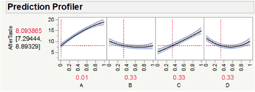
Fortunately, JMP has other options for model evaluation and exploration with more than three components. For example, the Prediction Profiler allows users to simultaneously see the impact of all variables at the same time. Figure 4.15 shows the prediction profile for the quadratic sweetener model. This graph shows how aftertaste changes as a function of each component. The horizontal dotted lines show the currently selected values for each component. We again see that formulations with A and C near zero, and B and D near 0.5, should produce the lowest aftertaste.
When one is actually using JMP, this graph is interactive, in that one can move the levels of the different components and observe the predicted change in the response. As we shall see in Chapter 10, the Prediction Profiler has other capabilities as well, including numerical optimization of the response within the experimental region. The Prediction Profiler is produced by default in JMP 13, and it can be obtained in earlier versions via the options (triangle) button, and Factor Profiling.
Figure 4.15 – Prediction Profiler for the Quadratic Sweetener Model
4.8 Summary and Looking Forward
In this chapter we have discussed modeling of formulation data, focusing on the most common models used in practice, such as Scheffé linear, quadratic, and special cubic models. As with modeling any type of data, careful attention to following the main steps in the model building process, as illustrated in Figure 4.1, is more important than use of any particular model form. We emphasize that careful model scrutiny and critical evaluation are key to developing useful and actionable models. Residual analysis, using various plots of the model residuals, is one of the most effective tools in model evaluation.
In Part 2, Modeling Formulation Data, we have now covered standard experimental designs and models used with formulation data. In the next chapter, the last in Part 2, we cover design and analysis of a specific type of experiment, screening experiments. These experiments were mentioned in Chapter 2 as often effective in early stages of experimentation. Following Chapter 5, we move to Part 3, Experimenting with Constrained Systems, which will address the common situation where component levels do not cover the entire range from 0 to 1.0, but are constrained to be within smaller ranges. Such constraints add significant complexity to our experimental strategies, both in terms of design and analysis.
4.9 References
Cornell, J.A. (2002) Experiments with Mixtures: Designs, Models, and the Analysis of Mixture Data, 3rd Edition, John Wiley & Sons, New York, NY.
Cornell, J.A. (2011) A Primer on Experiments with Mixtures, John Wiley & Sons, Hoboken, NJ.
Hoerl, R.W., and Snee, R.D. (2012) Statistical Thinking: Improving Business Performance, 2nd Edition, John Wiley & Sons, Hoboken, NJ.
Montgomery, D.C., Peck, E.A., and Vining, G.G. (2012) Introduction to Linear Regression Analysis, 5th Edition, John Wiley & Sons, Hoboken, NJ.
Myers, R.H., Montgomery, D.C., and Anderson-Cook, C.M. (2009) Response Surface Methodology: Process and Product Optimization Using Designed Experiments, 3rd Edition, John Wiley & Sons, Hoboken, NJ.
Scheffé, H. (1963) “The Simplex-centroid Design for Experiments with Mixtures.” Journal of the Royal Statistical Society. Series B (Methodological), 25 (2): 235–263.
Snee, R.D. (2011) “Understanding Formulation Systems-A Six Sigma Approach.” Quality Engineering, 23 (3), 278-286.
Snee, R.D. and G.F. Piepel. (2013) “Assessing Component Effects in Formulation Systems.” Quality Engineering, 25 (1), 46-53.