Now that your site is mostly complete, it’s time to start thinking about some of the options that you have in terms of layout and content. Earlier in this book, we purposely designed a relatively simple site, figuring that you will dress it up as you see fit, as well as to match your personal artistic vision.
In this chapter, we will explore methods to change and add to the site. For example, instead of the two-column layout that we’ve used until now, you might prefer a three-column layout, with the third column reserved for additional links (like a blogroll) or to add advertising content. You might want to change the navigation bar from vertical in the left-hand sidebar to a horizontal menu bar under the header. And if you have a more complex site structure, you will want to know how to turn either a vertical or horizontal navigation bar into a true menu bar, with multiple menu choices under a main choice. All of these are changes that you can make easily, with just a few changes to the site’s existing XHTML and CSS.
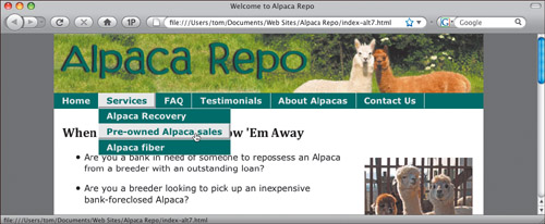
This chapter is all about taking one XHTML file and changing its appearance dramatically using almost entirely CSS, with minimal XHTML changes. The main thing that we will change in the XHTML from previous chapters is that we will rename the div that contained the navigation bar. In all of the previous chapters we called it #sidebar, and in this chapter we will rename it #navbar, since in some of the examples the navigation bar won’t be on the side of the layout.
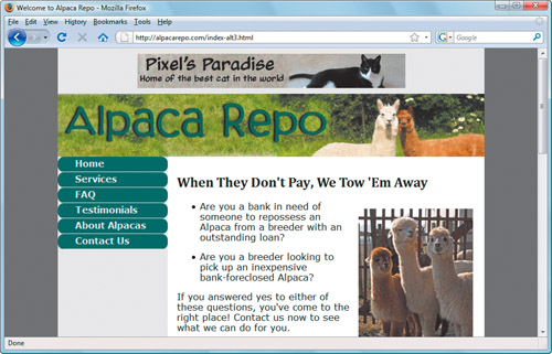
In this particular example, we’ll show you how to turn the vertical navigation bar that was inside the left-hand sidebar into a horizontal navigation bar that is snug underneath the header. Because it isn’t needed anymore, the left-hand sidebar will go away.
In order to make the changes to the navigation bar, we’ll need to change the CSS rules for the following:
The position and color of the navbar div.
The look of the anchor tags inside the navbar.
The behavior of the anchor tags when the user hovers over them.
And finally, we’ll have to change the #mainContent div a bit, since the left-hand sidebar will no longer exist.
To begin, let’s review the old CSS from previous chapters:
#navbar {
   float: left;
   width: 12em;
   font-weight: bold;
}
Replace that with this new CSS:
#navbar {
   font-weight: bold;
   height: 1.8em;
   background-color: #336666;
   overflow: hidden;
}
The font-weight is still bold in both snippets, but everything else has changed. We don’t need float: left, because we no longer want the entire menu to be left-aligned. And because this is a horizontal menu, rather than a vertical one, we eliminate the width property in favor of height.
We’re setting the background-color here because we want the entire horizontal span to be the same color (which we didn’t when it was vertical). We set overflow: hidden so that the menu won’t do freaky things when the user changes the width of the browser window to be very narrow.
Now let’s change the look of the links in the navbar.
Here’s the old CSS:
#navbar a {
   display: block;
   background-color: #336666;
   border-bottom: 1px #EBEBEB solid;
   padding: 3px 3px 5px 30px;
   color: #EBEBEB;
   text-decoration: none;
}
That CSS needs to be replaced with this new rule:
#navbar a {
   float: left;
   white-space: nowrap;
   border-right: 1px #EBEBEB solid;
   padding: 3px 15px 4px 15px;
   color: #EBEBEB;
   text-decoration: none;
}
Again, some things (color and text-decoration) remain the same. Let’s go through the changes.
By applying the float: left at the level of the anchor (instead of at the div level), it makes each link stack up to the right of the previous menu item. The white-space: nowrap property, which is new to us, acts like the XHTML non-breaking space entity . In other words, it keeps the words inside the anchor tag from wrapping. We don’t want our menu items to wrap, so nowrap does the trick.
The old CSS used border-bottom to create a horizontal line between the menu items. The new CSS uses border-right to create a vertical line between the menu items. We also adjusted the padding, using trial and error to make everything look right.
To change the behavior of the links when a user hovers over them, we only need make a few minor changes. Once again, let’s compare the old and new CSS.
Out with the old:
#navbar a:hover {
   background-color: #EBEBEB;
   color: #336666;
   border-right: 3px #999999 solid;
   border-bottom: 3px #999999 solid;
   padding-bottom: 3px;
}
And in with the new:
#navbar a:hover {
   background-color: #EBEBEB;
   color: #336666;
   border-right: 3px #999999 solid;
   border-bottom: 3px #999999 solid;
   padding-right: 13px;
   padding-bottom: 1px;
}
The only changes when we hover over the link are the the addition of some padding on the right and the size of the padding on the bottom of the menu item.
The last change that we need to make is to the #mainContent div.
The old CSS:
#mainContent {
   background-color:
      #FFFFFF;
   margin-left: 12em;
   padding: 10px 20px 0 1em;
}
This gets replaced with the new CSS:
#mainContent {
   background-color:
      #FFFFFF;
   padding: 10px 20px 0 1em;
}
All we need to do here is eliminate the big left margin where the sidebar used to be.
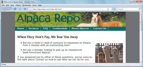
Let’s say that you like the look of the horizontal menu under the header, but you would still like to maintain a left sidebar, perhaps so that you can put advertising content there.
To create this effect, we used the same CSS as in the preceding example, and we added the following rules:
#sidebar {
   float: left;
   width: 12em;
   text-align: center;
   padding-top: 20px;
}

#sidebar img {
   border-width: 0;
}
This CSS brings back the left-hand sidebar, which we’re now using to show that vertical ad banner. The #sidebar img selector sets the ad banner’s border-width to zero, so that the image doesn’t have the blue line around it indicating a link.
Because we brought back the sidebar, we also need to adjust the #mainContent div.
#mainContent {
   background-color: #FFFFFF;
   margin-left: 12em;
   padding: 10px 20px 0 1em;
}
And again, this looks just like the #mainContent area in the styles that we used in the preceding chapters in this book.
As for the XHTML, all that needs to be done is add a #sidebar div, which can then contain anything you want on the side of your page.
In the last section, we saw how to put an advertising banner in the left sidebar. Another very common place for an ad banner is at the top of the page, above the page header.
Adding the ad banner requires adding a new div to the XHTML, called #adHeader. The div goes right at the beginning of #container and right before #header.
<div id="container">
   <div id="adHeader">
      <a href="http://www.pixel.mu"><img
         src="images/pixelHorizontal.jpg" width="468"
         height="60" alt="ad banner" /></a>
   </div>  <!-- end #adHeader -->
   <div id="header">
      <img src="images/header.jpg" width="800" height="110"
           alt="site header" />
   </div>  <!-- end #header -->
As you can see, the #adHeader div contains a link tag that points to the destination the user will go to if they click on the ad (in this case, it’s our cat’s Web site).
The only additions we need to make to the CSS file for the site are two rules, one of which centers and pads the ad banner and the other which suppresses the blue line around the graphic.
#adHeader {
   text-align: center;
   padding: 10px;
}

#adHeader img {
   border-width: 0;
}In this variation of our site, we’ll have the header at the top, the navigation bar on the left, and the usual main content area, but we’ll add a third column on the right side of the page that contains links to other sites and also a vertical ad box. Instead of another mockup ad for our cat, we’ll use a real ad box that is generated by Amazon.com, using a snippet of code they provide.
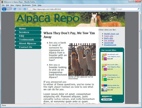
To add a third column, we’ll need to make additions to both the XHTML and the CSS. Let’s begin with the XHTML, by adding a new div called #adbar.
<div id="adbar"> <p>Other sites we like:</p><ul> <li><a href="http://www.pixel.mu">World's best cat</a></li> <li><a href="http://www.negrino.com">Tom's site</a></li> <li><a href="http://www.dori.com">Dori's site</a></li> <li><a href="http://www.backupbrain.com">Our weblog </a></li> <li><a href="http://www.javascriptworld.com">JavaScript </a></li> <li><a href="http://www.dreamweaverbook.com">Dreamweaver </a></li> </ul> <script type="text/javascript" src="http://ws.amazon.com/wi dgets/q?ServiceVersion=20070822&MarketPlace=US&ID=V20 070822/US/chalcedonyconsul/8001/2e92b15b-dfaa-46b0-bcfe-09c7d 4b58575"> </script> </div> <!-- end #adbar -->
Inside the div, we’ve added an unordered list with links to our related sites. Then we’ve done something new: adding a <script> tag. This one call to JavaScript in the XHTML required no programming knowledge; all we did was fill out a form on Amazon’s site, which generated the <script> tag for us, which we then copied and pasted into the XHTML.
To position the div, we added the following CSS:
#adbar {
   float: right;
   width: 15em;
   font-size: .8em;
}

#adbar div {
   margin: 0 auto;
}
You might be wondering: why use 15em on the right column when the left column has a width of 12em—shouldn’t they be equal? The answer is: actually, they are. The trick is that when an element’s width is declared using relative sizes, in order to figure out the actual width of the element, the browser uses the size of the text contained in that element. The text inside #adbar is .8em, or, 80% of the size used on the rest of the page. If we multiply 15em by .8em, the result is 12em—or in other words, the left and right columns are the same width.
Giving the div inside #adbar a margin of 0 auto allowed us to make the Amazon widget always be centered. We use the same trick on #container way back in Chapter 2.
We also added one declaration to the #mainContent rule:
#mainContent {
   background-color: #FFFFFF;
   margin-right: 12em;
   margin-left: 12em;
   padding: 10px 20px 0 1em;
}
We added the margin-right property to make room for the right column. Here, we used 12em rather than 15em because the number is calculated based on the text size inside #mainContent.
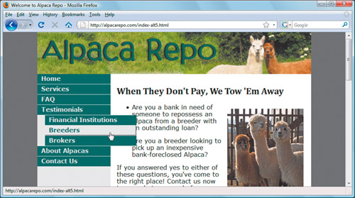
Up to this point in the book, we’ve made the assumption that the Alpaca Repo site will have a very simple navigation bar; just a simple group of links, all on the same level. But if your site has a more complex structure, you’re going to want to include a more involved menu bar, one that can handle secondary choices.
If all common Web browsers were fully standards compliant, you would be able to implement these sorts of complex menu structures using nothing more than XHTML and CSS. Unfortunately, the dominant browser, Microsoft Internet Explorer, doesn’t properly handle all the required CSS. So instead, we’ll use the triple threat of XHTML, CSS, and JavaScript to create menus that will work in almost any browser in widespread use today.
We’re not going to try to teach you JavaScript; this isn’t that kind of book. But we don’t have to, because our menus will be made with the help of jQuery, a JavaScript toolkit. JavaScript toolkits are pre-written, already-programmed libraries of functions that make it easy for you to bring the power of JavaScript to your projects. In this particular example, jQuery provides the horsepower to actually make the menus work. All we will need to do is plug the names of the divs and tags in our XHTML document into a prewritten script.
We’ll need to add two <script> tags to the XHTML, which will go between the <head> and </head> tags.
The first <script> tag loads the jQuery code, hosted (in this example) on one of Google’s servers. See the extra bits for a discussion of serving jQuery.
<script type="text/javascript" src="http://ajax.googleapis.com
/ajax/libs/jquery/1.2.6/jquery.js"></script>
The next script includes references to the specific parts of our XHTML page, so that jQuery can use them to implement the menus.
<script type="text/javascript">
   $(document).ready(function() {
      $("#navbar li ul").hide();

      $("#navbar li").hover(
         function() {
            $(this).children("ul").show();
         },
         function() {
            $(this).children("ul").hide();
         });   //hover
   });         // document ready
</script>
If you look inside the parenthesis at the jQuery code, it should look vaguely familiar. That’s because jQuery is very CSS-like in the way it handles selectors. That is, when the jQuery code uses “#navbar li ul”, it means exactly the same thing it does in CSS: we want something to apply to all uls inside all lis inside #navbar.
The XHTML that makes up the menu is not much more complex than what we’ve used in previous chapters. It is still an unordered list, but now it includes nested unordered lists for the second-level menu choices.
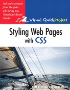
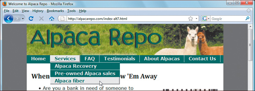
<div id="navbar">
   <ul>
      <li><a href="EB9780321573025_1.html">Home</a></li>
      <li><a href="">Services</a>
         <ul>
            <li><a href="recovery.html">Alpaca Recovery
               </a></li>
            <li><a href="preown.html">Pre-owned Alpaca sales
               </a></li>
            <li><a href="fiber.html">Alpaca fiber</a></li>
         </ul>
      </li>
      <li><a href="">FAQ</a>
         <ul>
            <li><a href="recoveryfaq.html">Recovery FAQ
               </a></li>
            <li><a href="salesfaq.html">Sales FAQ</a></li>
         </ul>
      </li>
      <li><a href="">Testimonials</a>
         <ul>
            <li><a href="fi_blurb.html">Financial
                   Institutions</a></li>
            <li><a href="breeder_blurb.html">Breeders</a></li>
            <li><a href="broker_blurb.html">Brokers</a></li>
         </ul>
      </li>
      <li><a href="about.html">About Alpacas</a></li>
      <li><a href="contact.html">Contact Us</a></li>
   </ul>
</div>  <!-- end #navbar -->
The CSS changes for navbar are minimal:
#navbar a {
   display: block;
   padding: 3px 3px 5px 10px;
   background-color: #336666;
   color: #EBEBEB;
   border-bottom: 1px #EBEBEB solid;
   text-decoration: none;
}
The only difference here is that the last value of padding used to be 30px and now it’s 10px. That is, we moved the text over to the left to provide more room for the fly-outs on the right. We also got rid of the radial corners that appear in Firefox and Safari, because they don’t look good with fly-out menus.
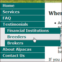
To style the fly-out menus, we create a rule that selects list items that are inside list items.
#navbar li li {
   white-space: nowrap;
   width: 15em;
   margin-left: 20px;
   position: relative;
}
As we’ve previously done, we use white-space set to nowrap so that our menu items won’t ever break in the middle (which would look bad). Giving the element a width makes them all be the same dimensions. Otherwise, they’d all only be as wide as they need to be (which would again look really bad). The left margin of 20px makes the second-level items stand off a tad from the main menu items. And finally, making this element be position:relative tells the browser to make these block elements, which keeps the underlying text from showing through the buttons.
Looking back to the first task in this chapter, create horizontal menu, you might be thinking “That looks nice, but what if my site has a more complex menu structure?” You’ve come to the right place, as this example shows you how to add second-level menu choices to a horizontal navbar.

The XHTML for this example is identical to that in add fly-out menus, so we’re going to focus just on the CSS changes. This task also makes use of the jQuery scripts to power the menus. Refer to the previous task if you need more information on either the XHTML or jQuery.
We’re going to need to change the #navbar rule that styles anchor tags that we used in create horizontal menu, so let’s review it.
#navbar a {
   float: left;
   white-space: nowrap;
   padding:
      3px 15px 4px 15px;
   border-right:
      1px #EBEBEB solid;
   text-decoration: none;
   color: #EBEBEB;
}
We replace that rule with the following two rules:
#navbar li {
   float: left;
   white-space: nowrap;
   padding:
      3px 15px 4px 15px;
   border-right:
      1px #EBEBEB solid;
}

#navbar a {
   text-decoration: none;
   color: #EBEBEB;
}
What you should be able to see here is that the rules that used to be applied to the links inside the #navbar are now split into two: some stayed with the links, but others were moved to the list items. That’s because we want the fly-outs to appear when you’re over the entire list item, not just the link itself.
Similarly, we need to split up the a:hover rule into three new rules.
First, the old rule:
#navbar a:hover {
   background-color:
      #EBEBEB;
   color: #336666;
   border-right:
      3px #999999 solid;
   border-bottom:
      3px #999999 solid;
   padding-right: 13px;
   padding-bottom: 1px;
}
Again, properties that used to be applied to links are now applied to list items. In the first of the new rules, the only property that didn’t get carried over from the old rule was the text color; that’s in the second rule, directly below. That rule also uses the child selector (>), as we want to only change the text color on the button over which we’re hovering, and not on the fly-out buttons.
And now the new rules:
#navbar li:hover {
   background-color:
       #EBEBEB;
   border-right:
      3px #999999 solid;
   border-bottom:
      3px #999999 solid;
   padding-right: 13px;
   padding-bottom: 1px;
}

#navbar li:hover > a {
   color: #336666;
}

#navbar ul ul {
   position: fixed;
   background-color:
      #336666;
   margin-top: 4px;
   margin-left: -15px;
   border-top:
      1px #EBEBEB solid;
}
And finally, we have some rules that apply to the uls inside uls (that is, only the fly-outs). The only ones that are really of interest are the top and left margins, which align the child buttons under their parent.
Our last site variation builds on the horizontal menus from the immediately preceding task, but instead of the second-level menu choices flying out as another bar below the main horizontal navigation bar, we’ve changed the CSS so that the second-level items drop down vertically, just like a standard menu bar.
All we need to do is make a small change to one rule, and add one more.
The rule that needs to be changed is for #navbar ul ul, and that change is to remove the top border, because now it needs to be between individual menu items instead of above the fly-out menu.
#navbar ul ul {
   position: fixed;
   background-color:
      #336666;
   margin-top: 4px;
   margin-left: -15px;
}
Here’s the rule that we need to add:
#navbar li li {
   float: none;
   padding-right: 16px;
   border-right-width: 0;
   border-top:
      1px #EBEBEB solid;
}
That, by itself, is enough to make the menus go down instead of across. The trick is that in the previous example, the menu items inherited the float left from their parent, so they went across in the same way. In order to make them go vertically, we need to get them to stop floating by setting float to none. Doing that gets the effect we want.?????????