Images convey an important amount of the message of your Web site. Indeed, for some sites, images tell virtually the entire story of the site. For our Alpaca Repo site, we’re using images sparingly, to illustrate the text, rather than making images the star of the show.
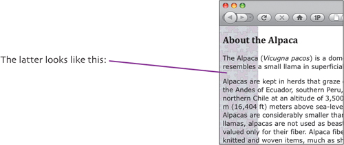
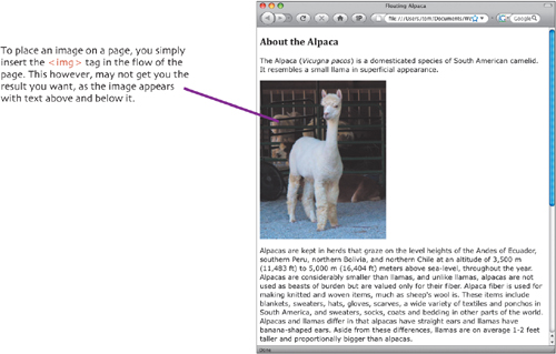
In this chapter, we’ll first go into a little detail about preparing images for the Web. Then we’ll show you how you use CSS to position images on your Web pages, as with the photo and caption floated to the right on the page shown below. And finally, we’ll go through the rules we created to place the images on our pages.

When you’re working on your sites, you’ll need to have a good image editing program available to prepare your images for the Web. That preparation will take three steps:
 Resampling the image so that it is at the proper resolution for the Web.
 Resizing or cropping the image so it is the right size on your page.
 Saving the image in one of the three Web image formats.
The first step, resampling, is important, because Web graphics are inherently low-resolution, being designed to be viewed on-screen. There’s no need to have photos on your site be more than the resolution of the screen, which will be between 72 and 96 dpi (dots per inch). The extra resolution is wasted, and higher-resolution photos have larger file sizes, which will make your Web page load more slowly. So if you have photos taken by a digital camera, which is usally much higher resolution, you should reduce the resolution with your graphics editor.
Reducing the resolution will usually change the width and height of the picture, depending on your image editor. Many editors allow you to see how resolution changes affect image size.
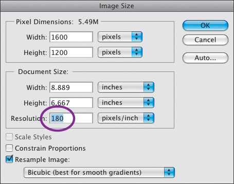
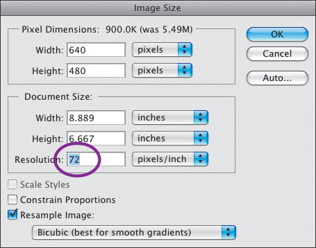
In this Photoshop dialog, changing the resolution for a digital photograph from its native 180 pixels/inch to 72 pixels/inch proportionally changes its width and height, too.
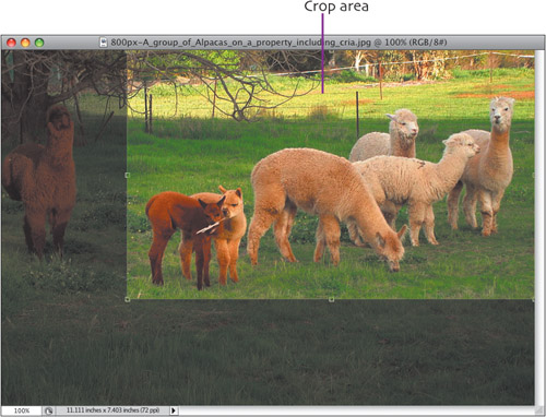
Once you have the proper resolution, you should crop or resize the image to show only the important part of the image. Here, we’ve selected the area we want with the crop tool. After reducing the resolution and cropping, the image is the size that we want.
Finally, save the image in one of the three Web graphics formats: JPEG, PNG, or GIF. See the extra bits for more details on these formats.
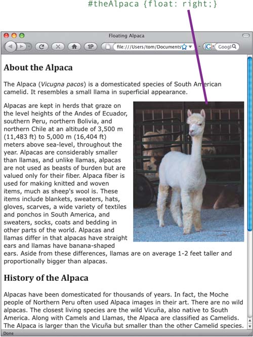
To get the text to wrap around the image, you need to float the image to the right or to the left. If you float a box element (let’s call it theAlpaca) to the right, anything outside theAlpaca will wrap around to its left.
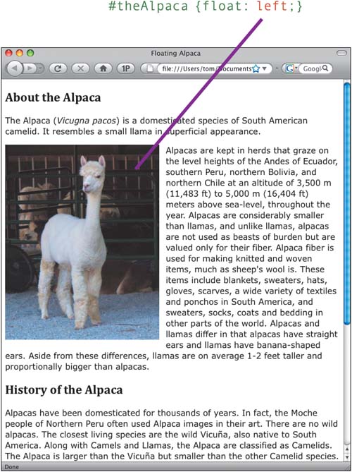
If you instead float it to the left, anything outside theAlpaca will wrap around to its right.
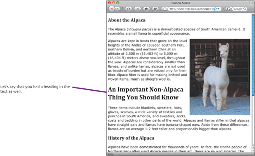
But we don’t want that heading to be on the side of the alpaca, as it’s important. Additionally, when the headline is next to the alpaca, it appears that it’s about the alpaca—but it’s not.
To fix that, we want it to always be on a line by itself, and to do that, we need to clear the float.
#theAlpaca {float: right;}
h1 {clear: right;}

That’s what you need to know about floating and clearing box elements. You can do this for any box element, not just images. You can float divs, paragraphs, whatever.
Now let’s put the theory into practice for the photos on the Alpaca Repo site. First, in the styles.css file, we’ll need to create three new classes to handle photos: floatRight, floatLeft, and photo.
The photo class sets up the styling for the photo and its caption that we use on the front page of the site.
.photo {
   width: 200px;
   font-size: .8em;
   font-style: italic;
   line-height: 1em;
}
Let’s also look at the XHTML for the image, which is in the index.html file:
<p class="photo floatRight"><img src="images/3alpacas.jpg"
width="200" height="237" alt="alpacas" />Some of the alpacas
we've recovered.</p>
In this XHTML, you can see that we’ve put the image inside a paragraph, which is a block element. We’ve applied two class attributes to the paragraph: photo and floatRight, each of which has a rule inside styles.css. Let’s explain what those rules do.
The photo class makes this paragraph block have a width of 200 pixels—the same width as the image. Because the paragraph is set to be the same width as the image, the caption, which is inside the paragraph tags, goes under the image without any need for a break or second paragraph. The photo class also sets the text in the paragraph to be italic, and sets the font size and line height, so the caption has the style of our choice.
The floatLeft and floatRight classes just push the block to either the left or the right, with other text wrapping around it. There’s also a margin here to keep a little offset to make the picture pop. Because the margin is applied to the entire paragraph, the caption does not get pushed away by the margin.
.floatRight {
   float: right;
   margin-left: .8em;
}

.floatLeft {
   float: left;
   margin-right: .8em;
}
Next, in the site’s index.html file, there’s a line that says
<br clear="right" />In this particular case, we had floated the photo to the right, so we clear it by giving clear a value of right. That bit of markup forces the following paragraphs to go below the right-floated photo instead of wrapping around it.
In case we want to clear all of our floats, we’ve also created a class that does that, which we’ve cleverly called clearfloat.
.clearfloat {
   clear: both;
   height: 0;
   font-size: 1px;
}
See that the clear property has the value of both? That means that any element with clearfloat applied to it clears all elements floated to either the left or right.
We don’t want to use the clearfloat class after the images inside #mainContent, though, because it would clear the sidebar as well (remember that we floated the sidebar in Chapter 2, and we don’t want to force everything following to go after the sidebar ends).
If index.html used floatLeft for the photo instead of floatRight, that line above would instead have to be
<br clear="left" />However, then we’d have the same possible problem—clearing the left-floated item would also clear the sidebar, forcing the following paragraphs way down the page. That isn’t a problem when your sidebar is short (as ours is here), but it’s something to keep in mind.
One more thing that relates to images, then we’re done with this page. We’ve added a property to the header rule we created back in Chapter 2, so that it looks like this:
#header {
   background-color: #91A43D;
   text-align: center;
   margin: 0;
   padding: 0;
   overflow: hidden;
}
The property that we added, overflow: hidden; is what performs the cool shrinking effect when we make any page narrow. All it does is tell the browser that if there isn’t enough room to display the entire header image, don’t worry about it. Just hide whatever doesn’t fit. This allows us to have a wide header image that shows just what we want it to show, but it doesn’t force the window to be a particular width.
We’re not using them on the Alpaca Repo site, but it’s not uncommon to want to use background images on your page, so we’re covering them here. A background image can be any graphic, but they are usually small images that can tile seamlessly when they are repeated. You can use CSS to tile them over the whole page (the default) or tile the image in the horizontal (x) direction or the vertical (y) direction. Of course, you don’t have to use a background image on just the <body> tag so that it covers the whole page; you can add a background image to any div or other block element.
To add a background image, just add this property to a block element:
background-image: url(images/background.jpg);
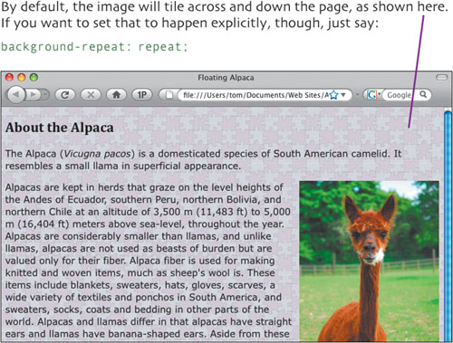
To control the horizontal and vertical tiling of the image, use one of these properties:?????????
background-repeat: repeat-x;
background-repeat: repeat-y;