Every site needs a way for your visitors to navigate around it. Usually, that means a menu of one sort or another. There are different ways to create menus on Web sites, and you’ve probably seen many of them, some using JavaScript, fancier ones using Ajax, and even ones using Flash.
In this chapter, we’re going to discover how to create good-looking menus using nothing more than an XHTML unordered list, styled with CSS.
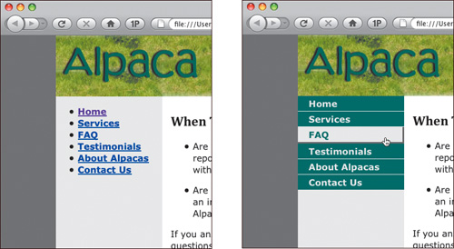
On the Alpaca Repo site, we previously created an unordered list with the site’s navigation, and put it in the sidebar. Each item in the list is a link to another page. By adding rules to our CSS stylesheet, we can change the look of the list so that it looks like a menubar, and even add rollover effects.
The sidebar div is where we’ve put the site navigation. We start with that div, which is wrapped around an XHTML unordered list (<ul>). Within the <ul>, each list item is enclosed in a <li> tag. The text of each list item is a link, so each is wrapped in an <a> tag. Here’s what this XHTML looks like:
<div id="sidebar">
   <ul>
      <li><a href="EB9780321573025_1.html">Home</a></li>
      <li><a href="services.html">Services</a></li>
      <li><a href="faq.html">FAQ</a></li>
      <li><a href="testimonials.html">Testimonials</a></li>
      <li><a href="about.html">About Alpacas</a></li>
      <li><a href="contact.html">Contact Us</a></li>
   </ul>
</div> <!-- end #sidebar -->
Unordered lists, in general, look like the list on the site’s home page, shown on the opening page of this chapter. You have bullets, you have text, and you automatically get some space around the <ul> block.
In the styles.css file, add the following rule:
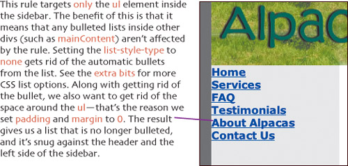
#sidebar ul {
   margin: 0;
   padding: 0;
   list-style-type: none;
}
To change the appearance of the links in the list to look like buttons, we’ll add another rule to the styles.css file.
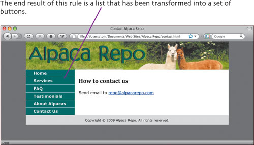
#sidebar a {
   display: block;
   padding: 3px 3px 5px 30px;
   background-color: #336666;
   color: #EBEBEB;
   border-bottom: 1px #EBEBEB solid;
   text-decoration: none;
}
This rule applies to all the <a> tags inside the sidebar div. The display: block rule is where the magic happens. Back in Chapter 1, we said that every element was either block or inline. Of course, a elements, which create links, are inline—right? But here we tell the browser we want the links to be block elements instead. That’s how we start to get our button appearance.
Next, we put some padding around our nacent button. We’re using 3 pixels for the top and right, 5 pixels for the bottom, and 30 pixels for the left side, to push the text of the links away from the edge of the sidebar. Now we’ve got nice big button areas we can click.
The background-color property is the actual color of the button itself. We gave it a nice green that we picked out of the header image.
The color property is the color of the text inside the buttons. We picked the same gray here as is used on the rest of the sidebar. That makes the text match the sidebar, and look consistent overall.
By adding the border-bottom property, we create a single pixel bottom border that’s the same color as the rest of the sidebar (and the text). This makes it appear as if the buttons don’t butt up against each other, so it’s easier to see which is which.
Notice that the 5 pixel padding and the 1 pixel bottom border add up to a total of 6 pixels. This will matter later in this chapter when we add rollover effects.
And finally, we set text-decoration to none. That tells the links to not be underlined, so again, they look more like buttons.
Now that we’ve created the buttons, we want to give them a rollover effect, so that when the user hovers the cursor over a button the appearance of the button changes, giving feedback to the user.
To the browser, the user interacting with the page by pointing or clicking on an element on the page triggers what is called an event. As a Web page creator, if you want the page to react to the user’s events, you have a variety of tools at your disposal, including JavaScript and CSS. Rather than learn JavaScript to do a simple rollover, however, let’s just use CSS. To do that, we’ll introduce a new concept: the pseudo-class. Pseudo-classes apply rules when certain events occur, and pseudo-classes are always applied to other elements.
That is, you have an element of some kind, and then you apply one of the pseudo-classes listed below. The syntax is element, colon, pseudo-class. For instance, a link can have the pseudo-class visited applied to it, which would be written as: a:visited { color: #FF00FF; }. That would make any previously visited links be kind of purplish.
Pseudo-classes are commonly used with a tags, which create links, and that’s how we’ll use them here. There are four pseudo-classes for the a tag.???
Since each button in the Alpaca Repo sidebar is a link, we’ll want to add one more rule that applies to the a tags. Enter this rule in the styles.css file:
#sidebar a:hover {
   background-color: #EBEBEB;
   color: #336666;
   border-right: 3px #999999 solid;
   border-bottom: 3px #999999 solid;
   padding-bottom: 3px;
}
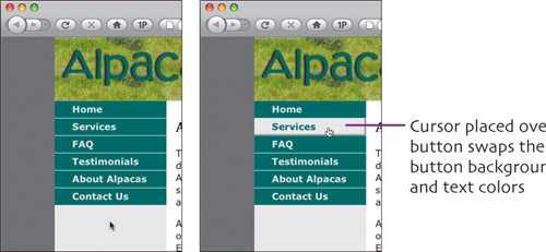
We start this rule by adding the :hover pseudo-class to the a elements in the sidebar, which means that this rule will only take effect when the user is pointing at a link. If you look back at the last rule that we added, you can see that this rule swaps the background-color of the button and the color of the text. In other words, we go from gray on green to green on gray. Next we add 3 pixel wide solid dark gray borders to the right and bottom of the button. Finally we set the padding on the bottom of the button to 3 pixels.
Recall in the last section, we told you to remember that the total of the padding and the bottom border of each button is 6 pixels? Here’s why we said to remember that. In this rule, if you add the bottom padding (3 pixels) + the bottom border (3 pixels), you get, again, 6 pixels. That makes the regular version and the hover version of the button the same size. If you don’t make sure of that, instead of a nice rollover effect, the button will actually appear to move when the user hovers over it.
So you might be wondering, why reset the right and bottom sides of the button to dark gray at all? If they were not reset, the button would maintain its appearance and you wouldn’t have to worry about making sure that the size adds up exactly. The reason is that by resetting those sides, it gives the button a three-dimensional effect that provides a better visual cue for the user that things are changing when the button is being hovered over.
When we move the mouse away from the links, the display automatically goes back to the non-hover version.
The great part about using CSS to create these effects is that if we add a new option to the menu, all that needs to be done is a little XHTML. Just add a link, and it all works via the magic of CSS. No extra CSS, no extra JavaScript, and no graphics to create.?????????