

The Spectators by Miss Aniela (aka Natalie Dybisz)
For any photographer who shoots digital, whether or not they want to have a go at creating surreal images, some kind of editing package is essential. It can be the slightest of edits—a straighten, a small crop—that elevates a good image to something really special, but equally, editing software can be used to create your very own fantasy world. This is the realm of serious image manipulation.
Knowing the basics of the tools that an editing suite puts at your disposal is essential before you start attempting to create images. This chapter will help you to find your feet and navigate your way through the buttons, sliders, and drop-down menus of your editing suite.
Although Photoshop forms the basis of this chapter, most of the tools it employs and the skills it demands are transferable to the various other editing packages.
Editing packages—where to begin?
The range of different post-production packages out there is enough to send you cross-eyed and give you a headache if you think about it for too long. They stretch in price from free to hundreds of dollars, which means that whatever your needs or your budget, you should be able to find something suitable.
If you’re just starting out it’s probably worth beginning with one of the free packages to get a feel for just how much you’re going to be using it and precisely what your needs are. Even the free packages come with quite a considerable range of tools, offering you a decent introduction. If you reach a point where you find yourself frustrated by your editing software being too slow or not providing you with enough options, then you can think about laying down some cash for something more sophisticated.
THE FREE OPTIONS
When you are starting off with surreal manipulation—and digital photography, for that matter—there’s no need to go out and buy the most expensive editing package on offer, or even spend money on one at all. Specially buying the full version of Photoshop when you’re just starting off would be a little like turning up to your first tennis lesson in full tennis whites, expensive sneakers, and with a brand new racket. Until you’re certain that tennis is the sport for you, you would be just fine practicing with a secondhand racket. Similarly, there are plenty of good free options out there when it comes to editing suites.
 GIMP
GIMP
GIMP (GNU Image Manipulation Program) has been around a long time. It started life as a college project in 1995, but has grown since then and is now one of the leading freely distributed image manipulation programs available. GIMP was written and developed on a Unix platform, but operates on both Mac and Windows systems, and was designed to be extended and augmented with plugins and extensions. As a consequence, a community of highly knowledgeable and loyal GIMP users has flourished around it, which is a great advantage to using it. On the flipside, one small disadvantage is that the user interface can be confusing.
The original idea behind GIMP was to offer a Photoshop alternative, and its functionality reflects that with its range of brushes, selection and extraction tools, channels, a gradient editor, and layers. Although GIMP doesn’t support Raw images straight from the download, you can install a plugin, UFRaw, that does. In conclusion, GIMP offers you everything that you might want from an image manipulation package, though with a slightly idiosyncratic interface.
 Paint.NET
Paint.NET was another program developed as a no-cost alternative to a big-name package; this time, it was Microsoft’s Paint. As a consequence, Paint.NET only operates on Windows machines. It supports layers, has an unlimited undo function, and enjoys plenty of special effects features. Paint.NET’s functionality probably isn’t quite up there with GIMP’s and Photoshop’s, but it is a decent package that comes for free.
Much like GIMP, a loyal user base has grown up around it, with support, tutorials, and an extensive range of plugins that add functionality to the program.
WHAT’S A PLUGIN?
A plugin is an additional piece of software that you can introduce to a larger program that provides more features. If you think of your editing suite as like a food processor, plugins are the attachments that don’t come with it, but can be bought separately. Unlike the mincer attachment for your food processor that you’ll definitely have to buy, some plugins are free and some must be purchased.
Plugins for editing software include collections of filters, options that enable you to perform certain operations more quickly or easily, and options that provide extra functionality for your program. If you ever find yourself mumbling: “I wish that my editing suite could …” it’s worth having a look on the internet; someone might have written a plugin that does just the thing you’re looking for.
Almost all of the paid-for editing programs offer you the option to try before you buy with a free trial that usually lasts 30 days. It’s a useful way to judge if the program suits your needs and meets your expectations before parting with your hard-earned dollars for it.
THE MID-RANGE OPTIONS
 Adobe Photoshop Elements
If you decide to spend a little cash on an editing suite, the first option you might want to consider is Adobe Photoshop Elements. Where Photoshop is regarded as a professional package that has a matching price tag, Elements is aimed at amateurs and serious hobbyists. It does almost everything that Photoshop does, comes with Quick and Guided Edit modes to help you along, and the price won’t leave you wincing.
Elements is designed so that from the moment you transfer an image from your camera to your computer until you upload it to the web or send it for printing, everything that you’ll need is easily accessed. It’s also built on the same platform as Photoshop, so if you do decide to upgrade, you’ll have an idea of what you’re doing when you get there.
Corel PaintShop Pro
For Windows users, Corel PaintShop Pro is a well-respected editing package. It offers an extensive range of features as well as a workflow management system to help you to organize your images. If you don’t require all the functionality of Photoshop, but still want a powerful editing package, PaintShop Pro is a worthy alternative.
 Pixelmator
Pixelmator is an editing app designed exclusively for the Mac operating system. It’s incredibly slick to look at and offers a range of tools to rival any other editing package out there, except Photoshop. You can use it to select, paint, draw, retouch, add filters, correct color, and do it all in layers.
It doesn’t have all the functionality of Photoshop, but that’s why Photoshop is the industry leader. However, it is excellent value for money and unless you’re a professional, will likely provide you with all of your editing needs.
THE BEST OPTIONS FOR EXTENSIVE USE
 Photoshop
The industry standard for image editing over the past 20 years has been Adobe’s Photoshop. It isn’t just a part of a photographer’s arsenal, it is also used extensively by designers and other creative professionals. It offers its users ultimate control over their images, with its color manipulation capability, use of layers, and diversity of filters.
When you open Photoshop the functions are so extensive and the integration with other design and publishing packages so neat that it will leave you thinking that there is almost nothing that it can’t do to a photograph. Of course, the corollary to this is that it can be overwhelming for a new user, its learning curve is steep, and it doesn’t come cheap.
If you think that you might be manipulating images extensively, then you will at least want to consider investing in Photoshop. However, before purchasing it consider whether you’re doing enough manipulation to justify the expense, and whether you could learn the ropes on a less extensive, demanding system. You might find that one of the alternatives is sufficient for your needs.
 Adobe Lightroom
For photographers who want comprehensive processing power over their images, but don’t necessarily need the heavy-duty image manipulation capabilities of Photoshop, Lightroom is a highly regarded option. Lightroom isn’t designed to enable compositing (it’s primarily designed to streamline the Raw-processing workflow for large batches of images, though it has evolved considerably over the years), however, it will afford you extensive control over your digital images, from straight editing to faux cross-processing to IR development. Unless my aim is to create a multi-layered, heavily manipulated image, Lightroom is my photographic editing suite of choice.
Layers
Without its layers capability, Photoshop wouldn’t be nearly as effective. Layers are what give you the ability to edit non-destructively, so that any adjustment that you make can be easily amended or even removed altogether without having an impact on your other edits, or your original files. The most common description of the layers function is that it resembles a stacked pile of transparencies, each containing information that makes up the final image and can be altered individually. You can amend or remove one of your layers without affecting your other layers. How many layers can each image have? As many as your processor can handle.
The advantage of working with layers is that you can continue to adjust each one until you are satisfied with the overall result. Each layer affects only those underneath, and you can change the stacking order; each layer can also be made more transparent if wanted. Layers are virtually essential for compositing, and have every advantage except that they increase the size of the file. A basic layer, available on most programs, simply superimposes one picture or effect over a base image. A Layer Mask is linked to a layer and hides, or masks, part of the layer from the image. Any effect applied in an Adjustment Layer is stored in a separate layer, is easily editable, and does not change the original layer.
NAME YOUR LAYERS
You can name layers individually, so rather than having to try and remember that Layer 23 adjusts the luminosity of the unicorn’s coat, you can call it “Unicorn Coat Luminosity.”
ADJUSTMENT LAYERS
To demonstrate the effect of Adjustment Layers, we’ll use a photo of my sandals languishing on a beach.

The photo was taken handheld at sunset, so it’s a touch on the dark side. That, however, is easily corrected.

From the Adjustments panel I can steadily work through the range of functions, each on a separate layer, to edit my photograph and improve its appearance.
I won’t necessarily make an adjustment using every option presented to me, but if I were to, each one would be on a separate layer and thus would be independently modifiable.

In this instance, I’m going to adjust the Brightness/Contrast, Levels, Curves, and Hue/Saturation. As I work through my editing process, I can adapt each layer’s adjustment in sequence, and then modify each as I need to, without it having an impact on the other edits.

If I’m unsure that the adjustments I’ve made to one particular layer are having the effect that I initially anticipated, I can hide it by clicking on the eye icon to the left of the layer. On this image, I’ve hidden the contrast layers showing how the image would look with all the other adjustments except for the contrast edits.
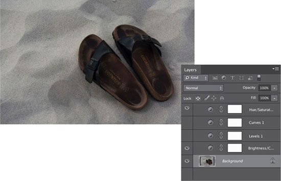
Here, I’ve reinstated the Contrast Adjustment Layer, but removed the Levels and Curves layers. I think I need both of those, too. If I conclude that it’s not what I want, I can delete the layer. I won’t have lost any of the Raw information in my image and I won’t have affected any of my other edits.

When I’m happy, I can save my image, or continue to manipulate it, play with it, and turn it into something far more surreal!
A VERY QUICK INTRODUCTION
Just in case you’re new to Photoshop, here’s a quick introduction to the workspace.
![]()
1) The Tool bar. It’s from here that you can select the tools to crop, make selections, heal images (with the Spot Healing Brush tool, Healing Brush tool, and Red Eye tool), move things, erase things, add text, play with color, and quite a bit more. There are more tools hiding beneath most of these buttons; click and hold to reveal the others.
![]()
2) The Options bar. When you have selected a tool, you will be able to refine and control it from here.

3) The Layers panel, although by changing the tab it could also be the Channels or Paths panel. You will probably most often use it to control layers, though.

4) Adjustments panel, which allow you to amend the color and contrast of your images.

5) Histogram If there is an image in the Image panel, this box will hold a histogram, showing the range of distribution of the image’s pixels.
![]()
6) The Menu bar, from where you’ll be able to control just about anything in Photoshop.
Fill layers are located under the Layers menu: Layer > New Fill Layer. They allow you to create a layer of solid color, a consistent pattern, or a graduated effect. Importantly, they don’t affect the layers beneath them, which makes them useful when creating new backgrounds for your composite works. There are hundreds of different options of patterned backgrounds, and if you count the different possibilities of color and gradient, the possibilities verge on the infinite.
We will return to look at different types of layers, how to use them effectively, and how to combine them, throughout this chapter.

You can select from one of Photoshop’s preinstalled Gradient Fill options, or you can apply your own gradient to your background. In this instance, I’ve applied my own gradient values to a solid color fill layer.

The Gradient Fill dialog box allows you to select the variation of gradient that you’d like (for example, a linear gradient that runs across the screen or a radial one that emanates from a central point), the precise angle at which you’d like your gradient to run, and how diffused it is across the frame. If you’re not careful, you could find yourself spending hours experimenting with nothing but gradients!

The default gradient setting that appears when you open the Gradient Fill dialog.

I’ve altered the angle of the gradient to run diagonally across the frame, but that’s about it.

By increasing the Scale value, I’ve diffused the gradient across the frame.
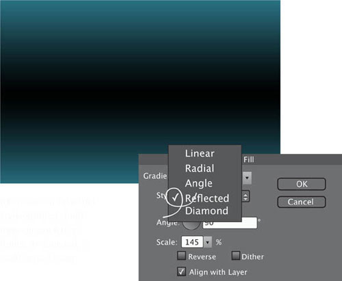
This is the Reflected style option; I could have chosen Radial, Angle, or Diamond, in addition to Linear.
Levels & Curves
It’s a very rare thing to encounter a photograph that is perfect straight out of the camera. So often, an image will benefit from some minor tweaking, specifically of the “Three Cs”: crop, color, and contrast. It isn’t necessarily about stripping great swathes off of your images, or radically altering their color makeup, but a touch here and there can make all the difference. When you are experimenting with surreal imagery you might find that making less-than-subtle changes will help you to achieve your desired effect.
LEVELS
Photoshop’s Levels and Curves functions are key players when it comes to controlling the tone and contrast of your images. Levels (Layer > New Adjustment Layer > Levels) is the simpler of the two tools. It controls the black, white, and gray levels of an image, helping to give more punch to slightly flat or dull images.

If you take a look at my original photo of two of the Twelve Apostles, a rock formation off Australia’s Victorian coast, it’s a perfectly acceptable image, but a little on the flat side.

The Levels histogram explains why the image seems a little flat with that dead zone in the darks.
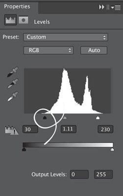
By moving the black slider to the right, which eats up the unused area, and slightly adjusting the gray and white pointers, there’s more tonal differentiation in the image, making it a lot more lively.

There is a trade-off, however. Compare the shadowing at the lower right-hand base of the right-hand rock. You’ll notice that by bringing more emphasis to the mid-tones, I’ve sacrificed some detail in the shadows. In this instance, I think it’s an acceptable exchange, but I wouldn’t want to push it too far.
The Curves tool (Layers > Adjustment Layers > Curves) is designed to control the distribution of tonal values throughout the image. In terms of controlling contrast, Curves is far more precise than Levels. Rather than offering you three specific points of control, like Levels, Curves provides you with up to 14. This allows you more precision when adjusting the contrast (as you can select a given point that you want to adjust from the image), and helps you to prevent the loss of detail in some areas of the image at the expense of gaining it in others.
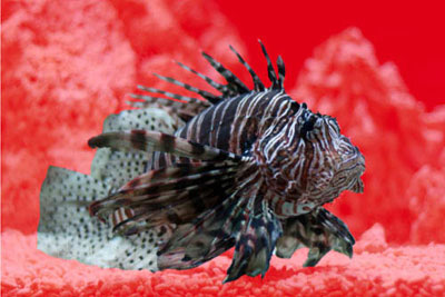
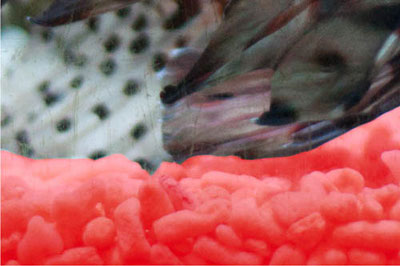
The adjustments to the aquarium image left were all made using the RGB curve, which affords you control over all the colors in an image simultaneously. However, Photoshop also lets you adjust the red, green, and blue Tonal Curves in an image independently of each other—select this option from the drop-down box at the top of the Curves panel. This gives you more precision when you’re making standard edits to an image.

There’s not that much wrong with my original image from this touching pool taken in the aquarium in Seattle, but I’m sure that a little more definition could be brought to the dark areas and some more punch to the mid-tones.

By selecting points in the image that I think could benefit from more definition, and adjusting their corresponding points on the tonal curve accordingly, I’ve been able to increase the overall impact of the colors in the image without losing detail in the highlights. Awesome!
ADJUSTING THE RED, GREEN, AND BLUE TONAL VALUES INDEPENDENTLY
There is no right or wrong way to go about this sort of editing; it is entirely dependent on your eye, your tastes, and the effect that you want to achieve.


To give you some examples of what you can create by fiddling with the red, green, and blue Curves in an image, here are two different looks, along with their histograms so that you can see the sorts of changes I made.
Making selections
The ability to select and isolate individual elements of an image is a vital skill when creating surreal images. You might want to apply an edit to just one area of an image, in which case you will need to isolate it from everything else, or you might want to completely move or remove a particular photo. Photoshop provides you with a plethora of ways to make selections within an image; which one you use will depend on the item that you’re selecting, its background, and your own preferences.
MARQUEE TOOLS
If you are selecting simple shapes, using the Marquee tools is probably the easiest option. The Rectangular Marquee isolates square or oblong blocks from your images in seconds.
For subjects that are round or oval, you can use the Elliptical Marquee tool. This isn’t a tool that I find myself clicking on a great deal, but if you need to produce a perfectly round selection (make sure to hold down the Shift key when you’re selecting), it can be useful.


The original image of the sailboat was lovely, but I thought that the sea could look a touch bolder.
I selected it using the Rectangular Marquee tool, created a new Adjustment Layer from it, and then altered the Levels slightly. It’s not an overwhelming change, but I think it makes the image better.

The adjusted image.
Photoshop comes with three Lasso tools: the standard Lasso tool, a Polygonal Lasso, and a Magnetic Lasso. If you’re competent at drawing freehand, then you might work well using the standard Lasso tool. By holding down the ALT key, you can trace along a straight line, and press the backspace key to delete a freshly drawn straight-line section.
The Polygonal Lasso allows you to make selections bordered by straight lines by clicking from point to point. If you need to include a freehand section—for example to round a corner—hold down the ALT key and drag. To complete your selection, join up to the starting point, or double click to release the tool.
I’m quite a fan of the Magnetic Lasso tool, despite the indifference of many other Photoshop users. Trace the outline of the subject that you want to select and it snaps itself onto the subject’s edges. If you’re working with a subject that has complex edges, and especially if it’s on a high-contrast background, the Magnetic Lasso is very effective. You can adjust the frequency with which the Magnetic Lasso attaches fastening points around a selection (the more frequently it places a point, the longer a selection will take, but the more accurate it will be), and assign a contrast value to help define edges on lower contrast images. Combine it with Quick Mask, Refine Edge, or Refine Mask (more on those soon), and you should be able to achieve an accurate selection relatively painlessly.


I used the Magnetic Lasso tool to trace the outline of a lionfish that I photographed while he (or maybe she) was lurking menacingly at the bottom of an aquarium. You can see from the outlined selection that the Magnetic Lasso worked just fine. While the effect took me some time to complete, I doubt that any other method would have been faster, or less frustrating.

The isolated image.

QUICK SELECTION
For shapes more complex than rectangles and circles, Quick Selection is probably the fastest and simplest selection method in Photoshop. You’ll find it in the Tool bar on the left side, sharing a button with the Magic Wand.
The Quick Selection tool is great for selecting simpler forms very quickly, but it also handles more complex outlines capably, especially if they’re on a contrasting background. If you do happen to make any slips or spills, they can be tidied up easily using the Add To or Subtract From function, which you’ll find in the Options bar towards the top of the screen.

The Quick Selection tool sweeps over an area using a brush with an adjustable tip to find the defined edges of a subject. I don’t want to lose the beautiful blue sky of this image by altering the overall exposure or contrast. Instead, I can isolate the too-dark temple and carry out my edits on that specifically.

I used the Quick Selection tool and started in the bottom right-hand corner. It took fewer than 30 seconds.

By selecting an Adjustment Layer straight from the selection, I won’t alter the sky. A few tweaks here and there, as well as a crop, and the image is much better.

Final image

MAGIC WAND
If you’re selecting a subject that is roughly consistent in color, for example a pink flower on a green background, using the Magic Wand is likely your best option. You click on a pixel of the particular color that you want to isolate, and the Magic Wand selects all the pixels of that color. By adjusting the tool’s tolerance, you can determine how much variation in color away from the original pixel the tool is prepared to tolerate. A tolerance of 0 doesn’t allow for any variation; 255 on the other hand, gives a huge latitude.
You can ensure that only pixels in your desired color that are adjacent to each other will end up in the selection by checking the Contiguous box in the Options bar. If you have a photograph of a strawberry bed, for example, and you want to select one particular strawberry, check the Contiguous box; to select all of the strawberries, uncheck it.
COLOR RANGE
If you need to select a specific shade quickly or want to pick out a color within a selection, you can use the Color Range tool, found under Select > Color Range. You can choose from the six preselected colors in the drop-down menu, or select your own using the Eyedropper tool. By adjusting the Fuzziness slider, you can increase or decrease the range of the selected color.
The Color Range tool includes a skin tones function in its drop-down menu, which is useful for selecting common skin tones across an image. Should you want to make adjustments to an image excepting people’s skin, you can use the Color Range tool to select skin tones with the Invert button selected.

Using the Magic Wand to Isolate Colors
This image of my blue Holga on a perfectly complementary orange background is an easy image to isolate. With a tolerance of 170 set and the Contiguous function checked, the Magic Wand was primed to select colors close to where I waved it. As this meant that it would only select pixels adjacent to each other and not from all over the image, it took under a minute to isolate the camera.
More on selections

QUICK MASK
After you’ve made a selection, especially one with intricate edges like this lionfish, you might want to clean it up before doing anything else with it.
By pressing “Q” on your keyboard, you will activate the Quick Mask function. This will mask everything that you haven’t selected in a red shroud—rubylith—and allow you to clean up the edges. What is masked depends on the tool preferences, and the default is to select masked areas.

Zoom in on the image and you will be able to see where your selections have been less than accurate. Then use the Brush tool to make your adjustments.
Paint with black to conceal parts of the image and white to reveal it. By adjusting the size of the brush, you will be able to make your alterations with greater precision.

When you’re done, press “Q” again, and you’re ready to go!
Using the Refine Edge or Refine Mask commands (they are essentially the same tool) is probably the most effective means of achieving a clean, precise selection after you’ve done the initial work.

By clicking on the Refine Edge/Refine Mask menu option (it’s a single option that changes from Refine Edge to Refine Mask depending on whether you’ve made a selection or mask), your selection will pop up on a white background together with a dialog box. The Magic Wand tool did a good job of selecting my blue camera from an orange background, but there are some discrepancies. In this instance, I’ve applied a Layer Mask to the selection of my camera, so I’ll be working with the Refine Mask tool to help remove the orange fringing from around its edges.


The Refine Mask options will help to remove the orange fringing and give a cleaner finish to the selection. By using a combination of the Edge Detection Radius slider and the Shift Edge function, I’m able to eliminate most of the extraneous orange. It’s often a good idea to feather the edge of the image by between a half and one pixel, too. It helps to prevent a selection from looking as if it has been superimposed onto a background if and when you move it elsewhere.

When you’ve made your selection (if you’re making a selection to cut out and place elsewhere, as opposed to working with a Layer Mask), you have two options after you’ve isolated and removed your selection from its background (Select > Inverse and then delete). You can insert it directly into a new background, using the Move tool. Or you can save it as a new PSD file for multiple uses, and position it on its new background by using the Place function (File > Place). I always feel that if I’ve gone to the trouble of isolating and extracting the image, I might as well file it for future use.
MASK COLOR
If your image contains lots of red, pink, or orange tones, working with a rubylith mask isn’t very easy, but you can change the mask color. Double click on the Quick Mask tool; it will open an options dialog box so that you can select a new, more appropriate, mask color.
Content Aware Move & Content Aware Extend
When the Content Aware Move tool was unveiled in Photoshop CS6, there were whispers that it resembled magic, and I have to say, it is a very nifty piece of technology. If you are working with images on plain or consistent backgrounds, the Content Aware Move tool makes shifting a subject from one place in an image to another place a breeze, while enlarging an item takes seconds.

CONTENT AWARE MOVE
Look to the Tool bar and hiding behind the Spot Healing Brush, you’ll see a tool with a symbol that resembles two crossed arrows; this is the Content Aware Move tool.

I’ve chosen a fairly innocuous image of some witch hazel to demonstrate the tool’s capabilities. While I actually like the composition here, it might not suit everyone’s tastes, so I’m going to move the plant higher into the frame.

I select the tool, outline the plant, and then I drag it to its new position in the frame. After a few moments of thinking, Photoshop relocates the plant and replaces the hole where it used to be with a replicated background. It’s by no means perfect, but it is super easy and effective.

In the Options bar, you have the ability to select between a Very Strict and a Very Loose Adaptation, with three points in between. This determines how the replicated content adapts to its new position and how precisely the background content is recreated. As a general rule, you might find that tighter selections need a stricter Adaptation setting, but it pays to experiment. Don’t forget, you can always undo and redo your moves.
When you have selected the Content Aware Move tool, if you look to the Options bar, you can switch the Mode between Move and Extend. When you are in Extend mode, it gives you the opportunity to make things grow!


This is me, cooling my small but well-proportioned feet in a freshwater stream. I’m going to use the Content Aware Extend option to elongate my toes.

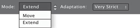

A few clicks and a drag later, however, and my toes have become comically large. In this instance, I set the Adaptation to Very Strict and, with this, was aware that I couldn’t stretch my toes too far before they started to replicate themselves.
Color
Adjusting the color of your images is one of the Three Cs of fundamental image editing, along with cropping images and changing contrast. Photoshop provides you with the tools to adjust the hue and saturation levels of your images, making them bolder or more faded depending on your preferences. Photoshop allows you to correct the white balance to ensure that your white really is white and that you don’t have peculiar color casts affecting your photos, and also lets you have some fun with zanier colors.
HUE AND SATURATION
Hue is a fancy word for color. Blue, green, and red are all hues. Hues come in different tones, or variations in light and dark. Saturation determines how intense a color is. You can control both hue and saturation in your images using an Adjustment Layer: Layer > New Adjustment Layer > Hue/Saturation. When you’re performing normal edits, you will probably want to exercise caution when making any adjustments to an image’s saturation. If you go too far, it can look garish and unrealistic. When you’re experimenting with surreal imagery, however, a little unrealism can go a long way toward helping you get the effect you want.
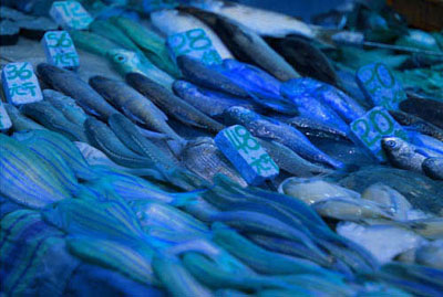
You can have all sorts of fun with the Hue slider, and from this dialog box, if you click the Colorize button and play around with the Hue and Saturation sliders, you can give your images an overall tint. To give you an idea of the impact of saturation, here are some variations on the same image of fish in Wan Chai market, Hong Kong.

A minor tweak to the Saturation, the sort that I’d customarily make to an image.

The Saturation level has been increased by 60 points on this image, which gives it a garish and cartoon-like effect.

Reducing the Saturation by 45 points produces a subtler, quieter photograph.
The Saturation has been pushed to +60 and the Hue raised to 180, in the blues.

The Saturation and Hue have both been moved into negative figures to give everything a pinkish-red cast.

Here, I’ve clicked on the “Colorize” button and then pushed the Saturation to 25 and the Hue to 91 for a green effect.
Violet egg yolks, yellow oceans, and blue leaves are all possible with Photoshop’s help. As soon as you have mastered the basics of making a selection, changing the color of an object is a cinch.

Here I’ve taken a photograph of some oranges in the early morning light, intending to turn one of them vivid pink.

First I selected my orange of choice—just the one—using the Quick Selection tool.
Then I engaged the Replace Color tool: Image > Adjustments > Replace Color.


Using the Eyedropper, I selected a medium shade of orange from within the fruit for the Selection box. I moved down to the Replacement box and clicked on Result. This opened a second dialog box from which I selected the vivid pink color to replace the orange. Happy with my selection, I clicked OK, and that was that.
Masks
Compositing, or the process of combining different images or elements of images to create a new whole, is one of the most oft-used skills when creating surreal digital art. Knowing how to select and isolate subjects from an image is imperative to good compositing, and we’ve already laid the foundations of that understanding. But how do you actually go about combining the different parts to create the finished article?
We looked briefly at moving and placing selections on pages 52–57, but there are other methods of moving and placing elements of an image.
CLIPPING MASKS
Wrapping your head around the idea of a Clipping Mask can be a bit of a challenge at first. After trying lots of different analogies, I decided that a paper clip was the most satisfactory. A Clipping Mask attaches together two (or more) layers. It holds them in place so that the contents of the upper layers cannot impinge on any of the other layers in the image, except those to which they are fastened.
For example, if you had a series of images stacked on top of each other and you wanted one of those to present as black and white, but not any of the others, you would clip a Black & White Adjustment Layer to the layer that is meant to be black and white.
We’ll use an image of some opera glasses to explore this idea further.
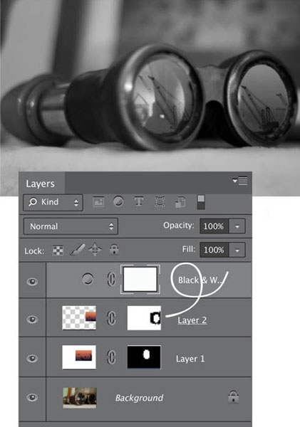
If I add a Black & White Adjustment Layer over the top of the three existing layers, the entire image turns black and white. It’s not quite the effect that I’m looking for.

If I clip together the Black & White Adjustment Layer and Layer 2 (ALT-click between them), Layer 2 becomes black and white, but the rest of the image remains in color.

By inserting a Black & White Adjustment Layer above Layer 1 and clipping them together, I get two black-and-white lens images, and a pair of opera glasses in color. Just what I wanted.

I could also insert a Black & White Adjustment Layer above the Background layer and not clip them together to create black-and-white opera glasses with colored lenses.
Of course, the application of clipping masks is not restricted to partial black-and-white images. They can be employed anywhere you need to restrict the effects of one particular layer to another given layer.
A Layer Mask will allow you to place one image over another and mask selected areas of the upper layer from view. Effectively, this allows you to see through it to the image below, thereby creating a montage. Of course, you’re not restricted to just two layers when it comes to compositing; you can include as many as you need, and as your computer can handle.
At the very beginning of the book, I talked about the importance of having a concept for your surreal creations. Knowing just what you need and how you are going to create your montage will make your life a great deal easier as you start to composite.

When I decided that I wanted to insert an incongruous reflected industrial sunset scene onto the lenses of a pair of opera glasses, the preparation involved examining just how light reflects off of glasses, to ensure that the final result was realistic.

As a result of my experiments with a flashlight and a pair of glasses, I realized that the size of the opera glasses’ lenses meant that I would have to import the sunset image twice, and insert it individually over the lenses.

I started by making the opera glasses my Background layer, then imported the first sunset layer and added a Layer Mask by clicking on the Add Layer Mask button at the bottom of the Layers panel. I decreased the sunset layer’s Opacity to 39%. (Scale images at Edit > Transform > Scale; hold down the Shift key to maintain proportions when adjusting the size.)

Happy that my layer was in the right place, I selected the Brush tool, selected the mask, and began to paint away the excess from the sunset image. Just as with the Quick Mask function, paint with white to reveal the upper layer, and paint with black to erase the upper layer. I zoomed in close and used a relatively small brush with a mid-size feather to get the edge that I wanted. When I was satisfied with my handiwork, I played around with the Opacity and Blending Mode options to finalize the effect I wanted. We will look at opacity and Blending Modes shortly, but in this instance I set the Opacity to 100% and opted for a Screen blend.

With the second lens, it was a very similar process, except that I positioned the image of the sunset differently across the lens. I selected the Screen blend again, and adjusted the opacity until I was happy with the result.
Finally, I saved my image as a PSD file and then a JPEG and felt very proud of myself.
Clouds, Drop Shadows, & Lighting Effects
CLOUDS
Hiding away beneath the Render button in the Filter menu are the options to add Clouds and Difference Clouds to your images.
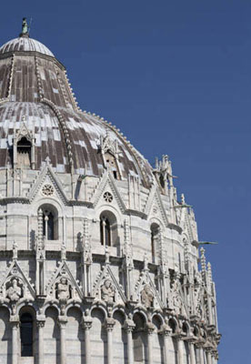
In this instance, I’m going to add some soft clouds to the perfect blue sky behind the Duomo in Pisa.


I make a quick selection of the Duomo and invert it, to ensure that it, too, isn’t covered in clouds. Then I apply the Cloud filter (Filter > Render > Clouds) and reduce the filter’s Opacity to 15%; I’m looking for gentle fuzziness here, not a perilous thunderstorm. The cloud pattern is generated randomly, so if the first pattern that envelops your image isn’t quite right, you can regenerate it by pressing Command-F on a Mac or Control-F on a Windows machine. That’s all there is to it!

The Difference Clouds option needs to be applied in addition to the Clouds filter, and can be applied multiple times to create a more veinous look to your clouds.
CLOUDS FILTER
Don’t forget, the Clouds filter doesn’t necessarily have to be applied to skies. You can apply it anywhere that you want to produce a mottled tone, or something that resembles sunlight passing through dust. The Opacity slider will help to ensure that the effect doesn’t resemble a misplaced cumulonimbus, though!
DROP SHADOWS
Unless you’re creating an image intended to reference Peter Pan, who famously lost his shadow, placing shadows in your composites helps to elevate them from the ordinary to the special. Although we might not necessarily pay attention to shadows in our everyday lives, we subconsciously expect their presence, and images that should have them, but don’t, will look wrong. Thankfully, Photoshop makes it easy to insert a shadow into an image.


Working on the layer where the object is to which you’d like to attach a shadow, select the Drop Shadow option from the Layer Style menu (Layer > Layer Style > Drop Shadow). A dialog box will appear that will allow you to determine the appearance of your shadow, from the angle of the light falling on your object to the distance that the shadow spreads from the object, to the shadow’s opacity.

When I added the shadow to this image of a camera, I opted for a relatively soft light coming from the upper left. I used fairly large Distance and Size values with an opacity value of 50%, which left a diffused shadow falling downwards and to the right.
If I had wanted the lighting effect to resemble a spot beam shining from the upper right, it would have been simple enough to amend the settings accordingly.
LIGHTING
The Lighting Effects option (Filter > Render > Lighting Effects) will allow you to relight your photographs after they’ve been shot. You can select from Point, Spot, and Infinite lights, which recreate effects similar to a light bulb, a directional light, or the sun, respectively. You then get to select the light’s color, intensity, and size, as well as the exposure, and how it reflects in your image. This might seem like trickery for photographers who’ve made a mistake lighting a shoot, but it can be useful when compositing to cast beams of light onto selections, as well as change the look and feel of an image.

To look at what Lighting Effects can achieve, we’ll start with a self-portrait of me that was the last photo taken on a fairly long shoot.
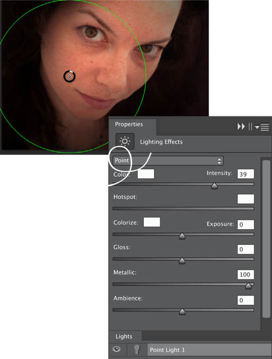
By using a moderately intense Point light with no ambient spread, I’ve been able to draw more attention to my face and less to the background.

The Infinite light combined with a conservative exposure gives a far more natural lighting look.

With the Spot light, I’ve been able to produce a far more dramatic effect that only partially lights my face and keeps the rest of the image in darkness.

And then I could add another Spot light and change the color (to lilac in this instance).
Brushes & Blending
BRUSHES
There is a mind-boggling selection of brushes available to you in Photoshop. Apart from being able to switch between round points and round angles, flat curves and flat fans, crayons, pencils, pastels, chalk, and charcoal, wet sponges and dry brushes, as well as spatters, sparkles, and leaf stamps, there are palettes of other kinds to choose from, including brush size, bristle density, bristle thickness, brush angle, “ink” flow, and pencil softness.
BLENDING
Opacity is a function that has popped up previously throughout this chapter. It describes how the pixels of one layer will interact with the pixels of the layers beneath it—most often, you’ll simply use it to set how opaque or transparent a layer should appear. When you have layer stacked upon layer to create a composite image, the sort of interaction that governs how your pile of layers appear to merge together is significant.
However, opacity is not the only factor that can influence this blending of layers together; Photoshop comes with a selection of different Blending Modes, too.
A whole book could be dedicated to Blending Modes alone, given how many different Blending Modes there are, the variation that can be applied to each one via opacity, and that the different properties of different layers will present inconsistent results for every mode. Mastering the effects of different modes through experimentation will serve you well, but here are a few examples to get you started.
A QUICK WORD ON THE AIRBRUSH
The word “airbrush” is synonymous with Photoshop, and unfortunately, airbrushing has a generally negative reputation, less because of its efficacy than its association with overuse in magazines and media imagery. But ignoring this, it’s an effective tool.
The Airbrush tool can be used to enhance definition in an image by adding subtle highlights and shadows. Spray gently with white to create highlights, introduce shadow with black, and control the effect using the Brush Size, Opacity, and Flow options.

Brush Opacity
Each brush has been sampled at 100% Opacity and Flow in the first column; 50% Opacity and 100% Flow in the second; and 100% Opacity and 50% Flow in the final column, except for the Leaf tool which has been dragged along like a brush, rather than used as a stamp as in the sixth line. First was the round point brush with a size of 25 pixels; then the flat angle brush at 50 pixels; the wet sponge was sized at 55 pixels, and finally the chalk at nine pixels.

Brush Options
On top of all of the other options, you can select your color and opacity, too. Still not enough choice? You can write your own brush preset or purchase one written by someone else.

This is the original image.

I selected the central walnut and painted it purple. Normal blend, 100% Opacity.

Normal blend, 50% Opacity.

Exclusion blend, 100% Opacity.

Hard Mix blend, 100% Opacity.

Vivid Light blend, 100% Opacity.

Saturation blend, 100% Opacity.

Dissolve blend, 67% Opacity.
WRITE IT DOWN
Photoshop provides so many variations on a theme, whether Blending Modes, gradient filters, or saturation values, it can be easy to forget exactly what you did when you’re experimenting and looking for the right effect. Keep a notebook beside your computer to jot down the contenders. It’s low-tech, but it works!
Liquify
The Liquify tool is potentially one of my favorite Photoshop functions. It’s not that I use it a great deal, nor that I find it especially easy or intuitive to interact with—in fact I rarely use it and tend to get frustrated when I do. But I do love what it is capable of rendering. I enjoy being able to make things melt: molten walls, dripping furniture, and in the example that I’ve given here, gooey ice cream.

FINDING THE LIQUIFY TOOL
You will find the Liquify tool sitting directly under the Filter menu (Filter > Liquify). When you open it, it takes you to a new window where, in basic mode, you are presented with seven tools to modify your image: Forward Warp, Restore, Pucker, Bloat, Push Left, Hand, and Zoom. You can also adjust the size of the brush. The advanced mode includes Mask and Presentation options, some brush adjustments, and three further tools: Twirl, Freeze Mask, and Thaw Mask.

MANUALLY LIQUIFYING
There’s a strong temptation when manually using the Liquify tool to push the limit a bit too far. Thankfully, the restore button makes it easy to undo your overzealous alterations without losing the changes that have actually worked. I think my effort to the left looks fairly natural.
Although I wanted to dribble a trail of vanilla down the side of the cone, that would have been more distortion than the pixels of the image could sustain and it would have resulted in an ugly mess. For the ice cream, it was preferable to work with a relatively large brush, about 200 pixels, and to use fairly short brush strokes. It was also important to remember that the ice cream wouldn’t just drip downwards, but would expand and spread a little, too. Mostly, I used Forward Warp here, but the Twirl and Pinch tools also came into play to produce a slightly melted (but not by too much) ice cream.

If you want to cheat with the Liquify tool, it’s entirely possible. Just click Command-F or Control-F and the automatic Liquify mode will magically melt your subjects for you. You can compare my manually melted ice cream on the opposite page with the Photoshop version above.
COLOR AFTER LIQUIFY
If you try to liquify an image to which you’ve already made adjustments in the color files, such as Levels, Curves, and Hue/Saturation, you’ll be presented with a plain white screen. Make those adjustments after you’ve performed your liquefaction. You can, however, Crop and Heal before liquifying.
A LIGHT TOUCH


Liquify isn’t just for melting things. It can be used to tweak the lines of an image slightly, as in the image above where I used the tool to give my brother the slightest hint of a smile, instead of the look of intense concentration that was actually on his face. Only the lightest of touches was needed as too much and his smile began to resemble a Joker-like grimace—really not a good look!