Chapter 4
Charting the Market
IN THIS CHAPTER
![]() Understanding the roles of price, volume, and the security cycle of life in the charting world
Understanding the roles of price, volume, and the security cycle of life in the charting world
![]() Getting up close and personal with four standard charting methods
Getting up close and personal with four standard charting methods
![]() Making sense of well-known chart patterns
Making sense of well-known chart patterns
![]() Simplifying security analysis with candlesticks
Simplifying security analysis with candlesticks
![]() Using trendlines to guide your swing trading path
Using trendlines to guide your swing trading path
A picture’s worth a thousand words, or so I’ve heard. The stock chart is, perhaps, the best proof of this old cliché. For centuries, charts have assisted traders in profiting from buying and selling an underlying contract. Candlestick charting, for example, was developed by the Japanese in the 1700s to profit from changes in the price of rice.
Over time, investors became more sophisticated in understanding charts and the information contained within them. In fact, they became so sophisticated that they started identifying certain chart patterns and giving them funny names. Would you believe that head and shoulders is more than just a shampoo brand, or that cup and handle applies to trading and not just your favorite coffee container? Sure, these patterns may be the result of investors and traders staring too long at charts. After all, I sometimes see funny formations in clouds if I stare long enough. But they are useful tools for your swing trading ventures.
In this chapter, I share how you can predict the likely direction of a security — be it sideways, upward, or downward — by understanding the basic cycle of securities and the specific roles price and volume play in what you see on a chart. I also introduce you to several charting patterns every swing trader needs for success. The patterns are presented in order of complexity, so go ahead and skip straight to what you need based on your familiarity with charting. All set? Then chart away, my friend!
Nailing Down the Concepts: The Roles of Price and Volume in Charting
All charts come down to basically two inputs: price and volume. The majority of this chapter focuses on price, because patterns within price are more meaningful than patterns within volume. You’re rewarded or punished for being right on price, not volume. But I don’t want to gloss over volume. It’s a major tool in your swing trading kit and is worth close examination.
Volume communicates conviction on the part of buyers or sellers:
- A price rise on light volume may signal an absence of sellers, not the presence of buyers.
- Heavy volume, on the other hand, signals that bulls or bears are committed to the calling.
 Look to buy securities on heavy volume (exiting is a different matter). If you’re swing trading trends — regardless of the chart pattern you observe — insist on seeing heavy volume. But what is heavy volume? My general rule of thumb is that volume 1.5 times the average daily volume over the past 30 days is considered heavy. (Yahoo! Finance and most charting programs report average daily volume statistics.) Volume can also help you determine when to exit. A decline on heavy volume, for example, may signal that the security has farther to fall. If you’re swing trading ranges, you want to see light volume, which indicates a lack of interest by bulls and bears.
An old saying on Wall Street notes that amateurs trade at the open and professionals trade at the close. If a security closes higher than it opened, it represents a victory of sorts for the bulls. They were able to overwhelm sellers during the day. On the other hand, if a security closes lower than it opened, that represents a win for the bears, who were able to overwhelm buyers during the day. If a security closes at the same price it opened at, bulls and bears are at a stalemate.
 Major institutions that control billions of dollars are in the markets day in and day out. They account for the majority of volume on exchanges. Security prices move when institutions allocate parts of their portfolios to one security or another. So you want to read how they’re investing their dollars and ride the inevitable wave that follows as more institutions get into the bathtub. One investment wizard I learned from — Ian Woodward — explained volume in these terms: An institution getting into a security is like an elephant getting into a (very large) tub of water. You know the water’s going to overflow. Similarly, volume overflows when institutions buy into or sell out of a security.
Having Fun with Pictures: The Four Main Chart Types
Reading a chart isn’t difficult, but there are different ways of viewing the same price information, be it a line chart, candlestick chart, or bar chart. Most swing traders choose one chart type and stick to it. The most popular chart type for swing traders is the candlestick chart because it reveals the most information.
To get the most value out of charting for your swing trading ventures, you first need to be able to recognize the four main types of charts in the finance world and how each can help you — or harm you if you’re not careful. Following are the four main chart types and a brief description of each (from the most common and basic to the least common):
- Line chart: This chart type simply connects closes from one period to another, and the resulting chart resembles a line. Television news programs often show line charts because of their simplicity. However, critical data is missing. A line chart doesn’t show you where a security opened for the day — only where it closed. Nor does it plot the highs and lows that occurred for each period. Line charts do, however, allow you to focus on the most critical piece of information: the day’s closing price.
- Bar chart: You’re likely familiar with traditional bar charts, which show the open, high, low, and close of a specific security. The bar chart addresses many of the shortcomings found in the line chart. Often called an OHLC bar chart (which stands for open-high-low-close), this chart can provide hourly, daily, weekly, or even monthly information. Figure 4-1 shows a representation of a standard bar. A horizontal line protruding from the left of the bar signals the security’s opening price, and a horizontal line protruding from the right side of the bar signals the security’s closing price. The period’s highs and lows are the top and bottom of the bar.
Candlestick chart: This chart type clearly depicts a security price’s open, high, low, and close. Traditional bar charts do the same, but candlestick charts do it more effectively. Candlestick charts are made up of two components: the range between the open and close (called the real body) and price movement above and below the body (called shadows). If the security closes higher than its open during that period (a bullish sign), the body is usually white. If the security closes lower than its open during the period (a bearish sign), the body is usually black (Note: Different charting programs use different colors to shade in the body.) When prices open and close at the same level, the candlestick body is reduced to a horizontal line, and the remaining parts are the upper and lower shadows. Figure 4-1 shows what typical candlesticks look like.
 Candlesticks are a great way to examine charts, and you can use these patterns to assist you when entering and exiting securities. However, I don’t know any swing traders who rely on candlestick patterns exclusively. So avoid putting all your eggs in the candlestick basket. Like every technical tool, the candlestick is an imperfect instrument. Look for candlestick patterns as confirmation of a trend or reversal, but avoid looking to trade a security primarily because of a candlestick chart pattern.
- Point and figure (P&F) charts: P&F charts plot security prices using a column of Xs (to represent rising price movements) and Os (to represent falling price movements). The major advantage of P&F charts is that they filter out noise or unimportant price movement by plotting only new Xs and Os when the price of a security moves by a predefined amount. One downside is that they don’t reflect the passage of time well. Because new plots are made only when the price exceeds the predetermined threshold, a plot may not be made for days or even weeks if the security in question doesn’t move significantly.

© John Wiley & Sons
FIGURE 4-1: A bar chart (a) and a candlestick chart (b).
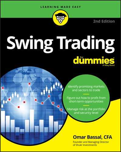
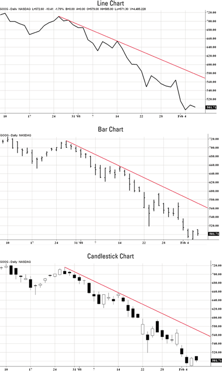
The three charts in Figure 4-2 contrast a line chart, bar chart, and candlestick chart. All three charts cover price action for Alphabet (popularly known as Google) (symbol: GOOG). The bottom chart demonstrates a rising trendline, which highlights a support area that, when broken, signals the end of the uptrend. Figure 4-3 shows the other main chart type: P&F.
Source: TradeStation Technologies
FIGURE 4-2: Sample line chart, bar chart, and candlestick chart featuring shares of Alphabet (symbol: GOOG).
Source: TradeStation Technologies
FIGURE 4-3: A sample P&F chart featuring shares of AK Steel (symbol: AKS).
This book focuses on bar charts and candlestick charts, primarily the latter. Both chart types reveal intraday or intraweek (depending on the time period set) strength of bulls and bears, making them favored tools of swing traders far and wide. Support or resistance areas are also occasionally easier to see with bar charts or candlestick charts.
Charts in Action: A Pictorial View of the Security Cycle of Life
Securities go through a naturally occurring cycle, but not all securities follow this cycle religiously. If you can’t characterize which stage a security is in, you’re better off skipping it and finding one that’s following the normal cycle of accumulation, expansion, distribution, and contraction. The following sections examine these four cycles in greater detail.
Understanding this cycle is helpful because different phases require different strategies. Swing trading trends, for example, is best achieved during the expansion phase. Trading ranges, on the other hand, is best achieved in accumulation and distribution phases.
The waiting game: Accumulation
The accumulation phase is typically the longest phase a security goes through. During this period, a security’s price neither rises nor declines meaningfully. Instead, the price moves sideways through time. Supply and demand are roughly in balance, and institutional managers or “smart money” often accumulate shares of an undervalued security. (Smart money is typically institutional dollars that are informed by extensive research.)
Volume is usually light, reflecting a general consensus that the security’s price is correct. Buyers are unable to push prices higher than a ceiling (a resistance level), whereas sellers are unable to push prices below a floor (a support level). You can’t know in advance with any precision where these ceilings or floors will be found. You can easily identify them, however, by viewing a price chart and looking for price levels that a security is unable to climb above or fall below. These support and resistance areas are usually driven by fundamental reasons. For example, Microsoft’s stock may not be able to rise above $100 per share because that movement represents a valuation of $900 billion, and market participants may not feel the company is worth more than $900 billion. Thus, support and resistance levels vary by security and can’t be determined until you examine a price chart.
Think of an accumulation phase as a period where most market participants agree on a security’s value. Because price isn’t moving dramatically, profiting off of securities in the accumulation phase can be difficult. Some swing traders may buy at or near the support level and attempt to sell at the resistance level. This approach only works, of course, when the distance between the support and resistance level is sufficiently wide enough to make the profit worthwhile. It also only works as long as the security continues to trade in the range. If you swing trade trends (as opposed to trading ranges), you want to look for securities moving out of the accumulation phase and into the expansion phase. However, if you swing trade ranges, you may be content to find accumulation phases and trade them until the security ends its accumulation phase.
You can spot accumulation phases on charts of varying time periods. Although accumulation phases are traditionally thought of as occurring over several months, a security can technically be accumulated over a few days. The key factor is time frame. A day trader, for example, looks at intraday charts where each plot represents a five- or ten-minute interval. For day traders, the accumulation phases may occur over a two-day period.
As a swing trader, you shouldn’t be so close to the bushes. Although you can use intraday charts occasionally to perfect your timing of buys and sells, your default chart period should be measured in days. In these types of charts, an accumulation phase must last several weeks — if not months — to be considered a true accumulation phase. Otherwise, you may be dealing with some other phase of the cycle of the security.
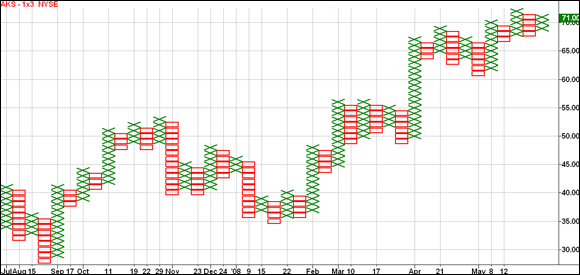
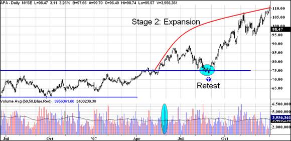
Figure 4-4 highlights a typical accumulation phase when shares of Apache Corporation (symbol: APA) oscillated between two price levels — $75 and $60. This wide trading range allowed swing traders to buy at support level and sell at resistance level for profits.
Source: TradeStation Technologies
FIGURE 4-4: The accumulation phase of APA.
You can’t be strict on exact price levels of support and resistance and assume a security’s price will immediately stop falling near a support level or immediately stop rising near a resistance level. No security will obey a resistance or support range to the cent. Instead, think of resistance and support levels as zones that may cover 2 to 3 percent of a security’s value (for instance, 2 percent above and below $75). For example, if a security’s support level is $35 and its resistance level is $40, you can’t assume the security’s price will immediately stop falling when it hits $35. It may stop falling at $35.20, $34.90, $34.75, $35.50 — well, you get the idea. Sometimes share prices don’t reach either extreme and make turns within the two bands.
The big bang: Expansion
The expansion phase, also known as the markup phase, follows the accumulation phase (see the preceding section) and is a period of increasing prices. If the movement out of the accumulation phase is truly an expansion period, the security’s price doesn’t reenter accumulation. So if you swing trade trends, this is the phase where you want to go long — as soon as possible.
This phase marks the beginning of a change in perception among shareholders and outside investors. A stock expansion may occur as the earnings outlook for a company improves. In the case of companies with a highly successful product (think Apple and the iPod), shares may begin to rise steadily out of an accumulation pattern after that product’s launch.
The expansion phase is ripe with profit opportunities. Swing traders who buy right as the expansion phase gets underway often can ride a strong trend for several days or weeks. The beauty of buying as an expansion gets underway is that the proverbial line in the sand is clearly marked. That is, you know rather quickly whether you bought at the right time based on whether the security’s price reenters the accumulation phase. If you buy late, then you risk a large loss if shares of the security rapidly fall to the breakout price level — or worse — fall back into the previous accumulation range. Use the money management strategies outlined in Chapter 10 if you’re in this boat.
Look for strong volume at the beginning of the expansion phase as confirmation that it’s genuine. If a security emerges from an accumulation phase on weak volume, that may indicate a lack of conviction on the part of buyers. Hence, the rally may be short-lived.
For a real-life example of what the expansion phase looks like, check out Figure 4-5, which reflects the expansion of Apache Corporation (symbol: APA). Notice how the breakout from the accumulation phase is on heavy volume, as highlighted in the volume subgraph, and that shares returned to the resistance level established in the accumulation phase. If prices had broken below that level, that’d indicate the expansion breakout had failed. Instead, shares returned to the breakout level and found support. This move is seen as a low-risk entry level. Yet not all breakouts give you such a beautiful gift. Strong breakouts often don’t return to the accumulation phase and allow reentry.
Source: TradeStation Technologies
FIGURE 4-5: The expansion phase of APA.
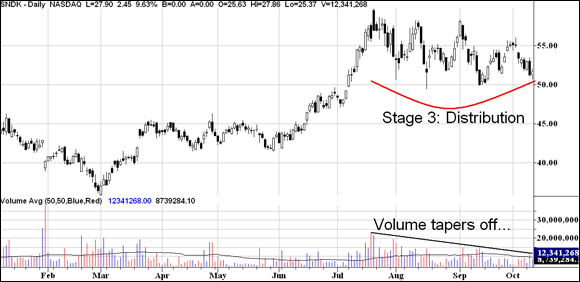
The aftermath: Distribution
All good things must come to an end, including high-flying securities. During the distribution phase, the good news that propelled shares during the expansion phase is no longer so surprising to Wall Street. Share prices start to even out and move sideways instead of rising or falling. Think of the distribution phase as the end of the party. The music is bland, the food is stale, and the conversations are getting old. That’s the distribution phase in a nutshell.
The folks who built up shares of a security in the accumulation phase unload those shares during the distribution phase. Amateur investors are often buying the security in the distribution phase, having found out about the company or the investment from a front cover of a popular magazine or seeing the company talked about on a financial news show. When everyone knows the story, it usually means the story doesn’t have much farther to run.
The distribution phase can resemble the accumulation phase, a misinterpretation that can seriously mess with your swing trading. Confusing the two may prove costly when you’re expecting a higher breakout rather than a lower one.
Shares move sideways during the distribution phase, seemingly indicating a consensus on a security’s price, and volume tends to taper off. You can tell accumulation from distribution by
- Observing that a markup phase precedes distribution, whereas a markdown phase usually precedes accumulation
- Looking at the security’s fundamentals — typically they are improving during the accumulation phase and deteriorating during a distribution phase
Companies can sometimes give you a hint that their shares are priced too high. If you see one offering new shares to the public via a follow-on offering of stock, you can be sure that management thinks shares are trading at a premium to their true value. Or perhaps management acquires another company using stock instead of cash. Finally, you may see a stock split during the distribution phase.
As a swing trader, identifying distribution phases is helpful for timing an exit. If you spot a distribution phase, exit immediately if you own the position. If you fail to spot the distribution phase, your second line of defense is your stop loss order (refer to Chapter 1). You’re likely to be stopped out by one of your sell rules during a distribution phase: a moving average crossover or the breaking of a predefined support level, for example. You may also exit based on the passage of time, a strategy I present in Chapter 10.
Figure 4-6 highlights shares of Sandisk (symbol: SNDK) during a distribution period. Notice that volume tapers off as shares move sideways. This distribution phase followed an expansion phase.
Source: TradeStation Technologies
FIGURE 4-6: Shares of SNDK during a distribution phase.
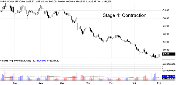
The downfall: Contraction
The fourth and final stage of a security’s price cycle is the contraction, or markdown, phase that’s best summarized as a period of lower highs and lower lows, a time when bulls die and bears roar.
Contraction is a dangerous period. Security prices don’t fall in straight lines. Instead, they fall, and then rally to attract new buyers who believe a bottom has been hit. Those rallies fail, and the security moves to fresh, new lows. Avoid timing a bottom in a security. Often termed bottom fishing, buying a declining security may feel psychologically pleasing because you’re buying something that was more expensive only a few days or weeks ago. But it’s dangerous because shares can fall off a cliff during the contraction phase.
Volume isn’t a helpful indicator in periods of contraction. Although heavy volume indicates sellers’ conviction, light volume doesn’t indicate the opposite. As the old Wall Street maxim says, “A stock can fall on its own weight, but it takes volume to rise.” Hence, a contraction period can be met with light volume throughout.
Securities tend to fall faster than they rise. In just a few days, a security can give up gains that it made over the last several months because greed influences price rises and fear influences price declines. Fear’s a more potent emotion than greed. If traders fear lower prices, they sell — fast. But when prices are rising, they’re not as committed to buying as quickly as possible.
Rallies in a contraction phase are normal and attract waves of bottom fishers trying to enter near the bottom of a stock’s decline. Each rally ends at a point that’s lower than the previous one. And every decline takes the security’s price to a new low. The prudent approach is to wait for clear signs that the contraction phase is complete and that the security’s either holding in an accumulation phase or entering an expansion phase. You want to have the wind at your back when you buy a security, and buying in a contraction phase means that wind’s going to hit you full in the face.
Figure 4-7 highlights the contraction phase in shares of Sandisk (symbol: SNDK). This contraction followed the distribution phase highlighted in Figure 4-6. Shares of Sandisk rallied in late October and late November before breaking to fresh, new lows.
Source: TradeStation Technologies
FIGURE 4-7: Shares of SNDK enter a contraction phase.
Assessing Trading-Crowd Psychology: Popular Patterns for All Chart Types
Highbrow academics in their ivory towers shun chart patterns because spotting a head and shoulders or cup and handle can be subjective. Just like seeing a pattern in a cloud or the stars, chart patterns are difficult to quantify. To be proven sound, an academic needs to establish rules on spotting these chart patterns, but programming a computer to look for patterns is difficult. The good news: Technology has advanced in the years since the publication of the first edition of this book, permitting charting software to spot many common chart patterns. For example, StockCharts.com allows you to screen for common chart patterns.
Even though computers can now perform the work traders performed themselves, it’s important to understand the characteristics of each chart pattern and what they indicate about the likely future direction of a security.
Only trade patterns that are clear as day. If you’re squinting and rubbing your eyes trying to see a pattern, it probably isn’t there.
The following sections describe five major chart patterns: the Darvas box, head and shoulders, cup and handles, triangles, and gaps. Rest assured that other chart patterns exist, but these five are, in my opinion, the most common and the most useful. They occur regularly and reflect the psychology of the crowd.
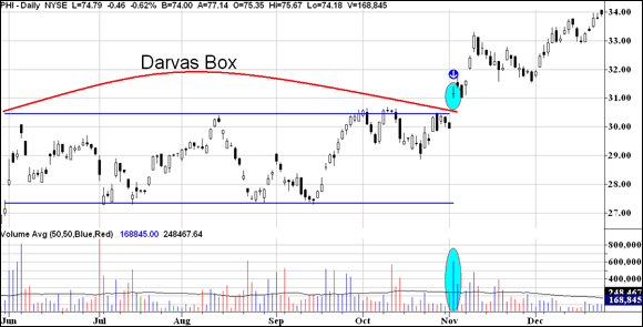
The Darvas box: Accumulation in action
The Darvas box, a rectangle-shaped pattern, illustrates that security prices tend to trade between two levels before breaching a level and rallying or falling. You may recognize this pattern as the accumulation phase described in the earlier section, “The waiting game: Accumulation.”
In a nutshell, the pattern’s creator, Nicholas Darvas, looked for securities that traded between two clear price levels: a support level and a resistance level. The support level marked the price point at which buyers stepped in and bought shares, preventing prices from going down. The resistance level marked the price point at which sellers stepped in and sold shares, preventing prices from going up. Darvas didn’t waste time with securities that didn’t fit nicely into this mold.
After identifying a security as trading between the two price levels, Darvas waited patiently until the security broke out of the upper band on heavy volume. Then he’d buy and hold the stock so long as it didn’t fall back in the old box. If the security rose and formed a new box, he’d raise his stop loss level to the area below the new support level.
Figure 4-8 depicts a typical Darvas box using shares of PLDT Inc. (symbol: PHI, formerly Philippine Long Distance) which traded between two clear price levels: $30.50 and $27.30. The excitement came on November 2, when shares broke out convincingly above $30.50 on heavy volume. This date signaled the beginning of an uptrend (see the later section, “Uptrend lines: Support for the stubborn bulls,” for more info on uptrends) and marked the first time shares had exited the Darvas box, indicating an opportune time to buy. Subsequent Darvas boxes would offer the trader a chance to raise the stop loss level.
Source: TradeStation Technologies
FIGURE 4-8: Shares of PHI traded in a Darvas box before breaking out in November.
If you bought shares on the breakout, around $31, you should hold the position unless it falls back into the old box (around $30 per share). Remember: If the breakout’s genuine, the security doesn’t re-enter the Darvas box.
Although Darvas wasn’t a swing trader per se, he was content to hold a stock longer than the typical swing trader. As a swing trader, you don’t have the luxury of waiting out a security’s consolidation period. Hence, I recommend setting a tight stop loss near the resistance level of the old box. I discuss when to take profits in Chapter 11.
Head and shoulders: The top-off
Not to be confused with the shampoo, the head-and-shoulders pattern is a distribution pattern that marks the end of an uptrend and is among the most reliable of all chart patterns. The Federal Reserve Bank of New York even published a paper called “Head and Shoulders: Not Just a Flaky Pattern.” The Fed said that the pattern appeared to have some predictive value and produced profits in certain markets.
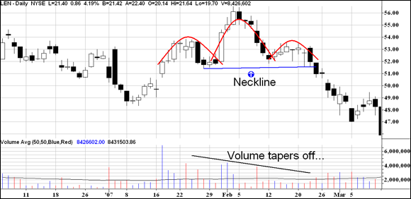
The head-and-shoulders pattern is composed of three hills, with the middle hill being the tallest and the left and right hills roughly the same height. In this way, the hills resemble a head and shoulders, as you can see in Figure 4-9, which highlights shares of homebuilder Lennar (symbol: LEN).
Source: TradeStation Technologies
FIGURE 4-9: Shares of LEN formed a head-and-shoulders pattern that signaled the beginning of a downtrend.
In January, shares of Lennar rallied and met resistance at $54 per share. This occurrence formed the left shoulder of the head-and-shoulders pattern. Buyers attempted to raise prices a second time and succeeded, driving Lennar’s stock north of $56 per share. Sellers stepped in and brought shares back to the same level as the left shoulder ($52) to complete the head. Finally, buyers attempted once again to raise prices but were only able to push Lennar’s stock up to the level established in the left shoulder, a move that completed the right shoulder.
Drawing a trendline through the lows of the left shoulder and the right shoulder establishes the neckline. (The last section of this chapter offers tips on drawing trendlines.) A head-and-shoulders pattern isn’t complete until a stock breaks below this point, a movement that’s usually followed by lower prices. The head-and-shoulders pattern is typically marked by decreasing volume, which shows a lack of conviction among buyers.
Head-and-shoulders patterns give yardsticks as to how much a security’s price will fall after breaking the neckline. Simply measure the distance between the head and the neckline and project that downward to estimate how far the stock will fall at a minimum. In the case of Lennar, the neckline was around $52 and the head was around $56. So you could’ve expected the stock to fall by at least $4 ($56 – $52) from the neckline ($52) and reach $48. Lennar actually exceeded that estimate.
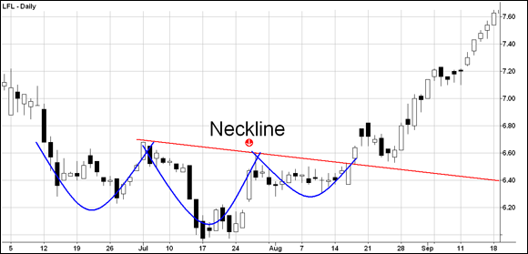
An inverse head-and-shoulders pattern, which marks the end of a downtrend, literally looks identical to the head-and-shoulders pattern except that it’s turned on its head (pardon the pun). Figure 4-10 highlights an inverted head-and-shoulders pattern in shares of Latam Airlines Group (symbol: LFL). The measuring technique used in the traditional head-and-shoulders pattern applies to an inverted pattern as well.
Source: TradeStation Technologies
FIGURE 4-10: Shares of LFL formed an inverse head-and-shoulders pattern in July and August.
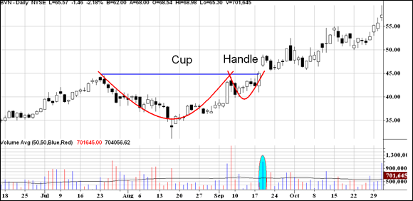
The cup and handle: Your signal to stick around for coffee
The cup and handle is a bullish chart pattern that signals shares are being accumulated and the security is preparing for an upward move. Cup-and-handle formations must be preceded by an uptrend because they’re a continuation formation, a pattern that indicates the continuation of a trend.
The cup and handle first forms after shares rally to some peak. Then for some reason — perhaps fundamental or technical in nature — sellers bring shares down 10 to 20 percent from that peak. Amateur investors who buy near the peak kick themselves for their mistake and agonize over the 10 to 20 percent loss on their investments. They think, “After I break even on this dud, I’ll sell.”
As it happens, shares of the security give amateur investors that opportunity when they rally back to their previous peak. Then those disgruntled shareholders unload the security en masse, creating a resistance level and leaving shares unable to surpass that peak. However, shares don’t fall back to their prior low. Instead, they remain elevated as smart money accumulates shares at a slight discount. Shares may fall 5 percent or so from the peak at this point. On the second attempt to surpass the peak, shares break through and complete the cup-and-handle formation. Volume is key and should rise heavily on the breakout from the handle.
Figure 4-11 illustrates a cup-and-handle pattern in shares of Cia de Minas Buenaventura (symbol: BVN). Shares of BVN rallied to $45 per share in July. Then a general decline in the overall market helped send the shares down to $35, representing a 22 percent loss for shareholders who bought near the peak. Anxious to recoup their losses, these investors unloaded their lot when shares of BVN rose near $45 in September and kept BVN from piercing that level. But the underlying fundamentals of BVN were strong, and investors on the sidelines didn’t let BVN decline much — only $5 from the $45 peak. On the second attempt to break through $45, shares sprinted higher and passed that peak on heavy volume.
Source: TradeStation Technologies
FIGURE 4-11: Shares of BVN formed a cup and handle over two months during an uptrend.
My selection of numerous foreign securities in this chapter is to illustrate that these patterns occur in both domestic and international securities. You can find great trading opportunities in foreign securities, especially when the U.S. market is in a slump.
The cup-and-handle pattern isn’t as accurate as the head-and-shoulders pattern, which I describe in the preceding section. I’ve seen it form time and time again only to fail on the breakout. The key question to ask yourself to avoid being a victim of a false breakout is, “What is the security’s general market and industry group doing?” The stronger the security’s overall market and industry group, the more likely the formation won’t fall flat on its face. However, if the market, industry, or both are weak, the pattern is likely to fail.
Triangles: A fiscal tug of war
Triangle chart patterns (shown in Figure 4-12) provide traders with measurement moves, an estimate of how far the ensuing trend will travel after breaking out from the triangle. Think of triangles as a reflection of the tug of war that occurs between buyers and sellers. Sometimes buyers have the upper hand; other times sellers have it; and occasionally both sides are evenly matched.

© John Wiley & Sons, Inc.
FIGURE 4-12: A depiction of idealized ascending, descending, and symmetrical triangles.
To make use of triangle patterns in your swing trading, you need to get familiar with the three types of triangles and how to calculate price movement with each:
- Ascending: Ascending triangles form when buyers maintain a level of strength while sellers continually weaken, so buyers have the upper hand here. Graphically, buyers maintaining their strength is reflected in prices maintaining a certain price level. Each time sellers push prices down, bulls step in and push shares back. Every decline stops at a higher level than the previous decline — a sign that bears are unable to push prices lower. Eventually, buyer strength overwhelms the sellers, and the security breaks upward. To estimate how far, at a minimum, prices will move after a breakout occurs, add the height of the triangle to the breakout price level. The height of the triangle is the vertical distance between its support and resistance levels.
- Descending: Descending triangles represent the opposite of ascending triangles. Sellers maintain their strength during the formation of the descending triangle, and buyers continually weaken, thus giving sellers the upper hand. Graphically, this weakening is depicted as prices falling to a certain level and subsequent rallies ending at lower peaks. Sellers maintain their strength during the descending triangle, while buyers are unable to push prices to or beyond their previous peaks. Eventually, the buying pressure dries up, and prices break downward. (Think of descending triangles as an amateur boxer fighting a heavyweight. Try as he may, the amateur eventually goes down.) Subtract the height of the triangle from the breakout price level to estimate price movement after a breakout.
- Symmetrical: Symmetrical triangles represent a stalemate; buyers and sellers are evenly matched. Each rally ends at a lower peak than the previous rally, whereas each decline ends at a higher trough than the previous decline. You can’t easily tell who’s going to win, but you can generally expect prices to continue in the same direction as the trend prior to the formation of the symmetrical triangle. To estimate price movement in this case, add or subtract the triangle’s height from the breakout level, depending on which way prices break.
With any triangle chart pattern, be sure to watch for volume on the actual breakout to distinguish between false breakouts and true ones. The heavier the volume, the higher one’s certainty in the validness of the chart formation. Volume connotes commitment.
Ascending and descending triangles are the easiest triangles to trade because you don’t encounter ambiguity on the likely direction of the breakout. Stick to these patterns and skip symmetrical triangles. Being brave won’t earn you any extra awards.
Gaps: Your swing trading crystal ball
Gaps occur frequently in prices; they represent a break in price continuity. For example, a security may be trading in the $19 to $20 range and then open the next day at $25 — leaving a gap between the high of the previous day and the low of the next day. Gaps may represent a seismic shift in the fundamentals of a security, or they may mean nothing. In this section I cover the four types of gaps.
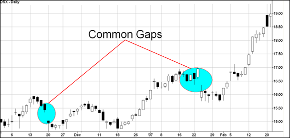
Common gaps
I hate to tell you this, but a common gap is meaningless. Prices gap up or down one day but quickly “fill the gap” in a matter of days. This phrase is a simpler way of saying the security’s price returns to the area where the gap exists. If a security trades at $50 for several days and gaps higher to $52 the next day, its price fills the gap by trading back down to $50. Figure 4-13 shows two common gaps occurring in a chart of Diana Shipping (symbol: DSX).
Source: TradeStation Technologies
FIGURE 4-13: Common gaps appeared in shares of DSX.
Don’t trade common gaps. They typically have light volume and don’t represent conviction on the part of buyers or sellers.
Breakaway gaps
A breakaway gap occurs on heavy volume and indicates seismic shifts are occurring in the security. Often the percentage move up or down is significant (more than 5 percent in a single day), and the volume is at least double the average daily volume. Breakaway gaps are preceded by congestion periods. A security’s price trades for several weeks or months in a certain price area and then violently gaps higher or lower one day. The strength of the move indicates a major change is occurring in the way investors value the security. Figure 4-14 highlights a breakaway gap using shares of Contango Oil & Gas Company (symbol: MCF).
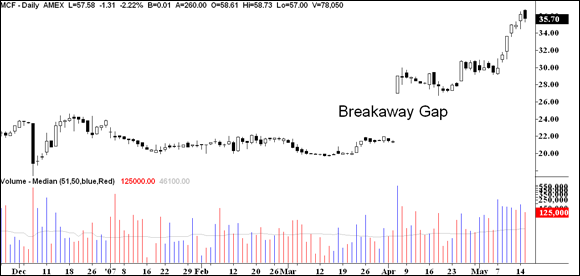
Source: TradeStation Technologies
FIGURE 4-14: This chart of MCF shows a consolidation period followed by a clear breakaway gap.
I like to trade breakaway gaps — so long as they meet these requirements:
- They’re accompanied by heavy volume (at least two or three times the average daily volume).
- A fundamental event explains the move — most likely an earnings report.
Just ensure you manage your risk properly because stocks that gap higher can fall quickly if they close the gap (such as the stock trades back down to the high of the bar prior to the gap); see Chapter 10 on how to manage your risk at the security and the portfolio level.
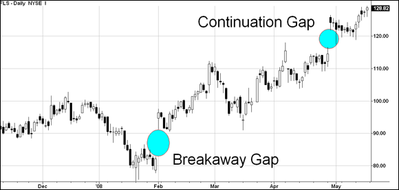
Continuation gaps
A continuation gap crops up in the midst of an uptrend or downtrend and signals — you guessed it — the continuation of the previous trend. Figure 4-15 highlights a continuation gap that followed a breakaway gap in shares of Flowserve Corp. (symbol: FLS). You can trade continuation gaps much the same way I describe for breakaway gaps in the preceding section. Note: Not all continuation gaps are preceded by a breakaway gap.
Source: TradeStation Technologies
FIGURE 4-15: FLS shares form a continuation gap.
Some swing traders actually estimate how far a security will rise or fall based on the price appreciation or depreciation from the beginning of a trend until the continuation gap, and then project that forward. This approach is subjective. Instead, look to add or enter a position on a continuation gap in the direction of the gap (obviously, don’t buy a stock that has just gapped down). Place a protective stop loss within the gap. If the gap is truly a continuation gap, shares don’t return to fill it.
Exhaustion gaps
An exhaustion gap, which occurs in the direction of a trend, resembles a continuation gap and marks the end of that trend. If a security has been falling for several weeks and then gaps down, you may think that gap is a continuation gap. However, if the gap fills quickly, it’s likely an exhaustion gap. Figure 4-16 offers an example of an exhaustion gap occurring at the end of an uptrend in shares of Sigma Designs (symbol: SIGM).
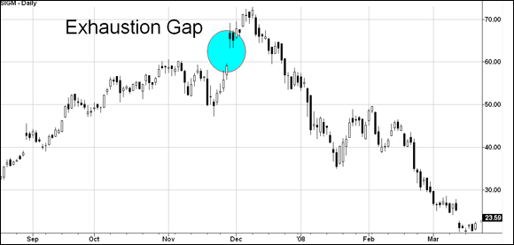
Source: TradeStation Technologies
FIGURE 4-16: An exhaustion gap appears in a chart of SIGM.
The exhaustion gap doesn’t offer any call to action for you as a swing trader.
Letting Special Candlestick Patterns Reveal Trend Changes
Candlestick patterns occur a few bars (be they hourly, daily or weekly) and can signal a trend change or continuation. You can find dozens of candlestick chart patterns out there, but I cover only the ones I feel are most accurate. The next four sections feature candlestick chart patterns that are easy to identify and that may signal a change in momentum or a continuation of a trend. (For help discerning one trend from another, flip ahead to “Measuring the Strength of Trends with Trendlines,” later in this chapter.)
Hammer time!
A hammer represents the bottom of a trend. It looks identical to a hanging man (see the following section) and occurs at the end of a downtrend.
Hammers have small real bodies in the upper portion of the candlestick bar. They have long lower shadows and small upper shadows (if any). Hammers signal that after the price of the security opened on the market, sellers drove it down. By the end of the day, buyers had recouped much of the losses to end the day near or at the high.
I like to see hammers that extend below recent price action. If a hammer occurs within the price action of previous days, I don’t consider it a reliable indicator of a bottom.
Figure 4-17 sheds some light on the difference between a hammer that forms below recent price history and one that forms within price history using shares of Western Digital (symbol: WDC), which bottomed on April 10. Notice how the high and low on that bottoming day were well below recent price history. Contrast this hammer formation to the apparent hammer that formed on March 14. This second hammer’s body was within previous price action, but ultimately, it didn’t mark the bottom of the downtrend.
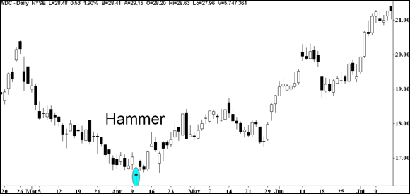
Source: TradeStation Technologies
FIGURE 4-17: Shares of WDC represent a clearly defined hammer on April 10.
No hammer is complete without confirmation. If the price action directly after the hammer is down, then no hammer has occurred. A true hammer can’t have its low violated by subsequent price action. So watch to see how subsequent days unfold before trading a hammer so as to avoid whipsaws.
Volume, again, should be kept in mind. Hammers that form on heavy volume are usually genuine, whereas those that form on light volume probably aren’t the real McCoy.
The hanging man
A hanging man looks identical to the hammer (see the preceding section). However, it occurs at the end of an uptrend rather than a downtrend. It crops up on heavy volume and is followed by price action confirming the top. If the high of the hanging man is surpassed, then its signal is invalid.
Double vision: Bullish and bearish engulfing patterns
My favorite candlestick charting patterns are the bullish and bearish engulfing patterns, which involve two candlestick bars, not one.
Riding the bull
Bullish engulfing patterns occur when a candlestick bar opens lower than the previous candlestick’s close and closes higher than the previous candlestick’s open. In candlestick terminology, the pattern begins with a candlestick bar that has a small real body and is followed by a candlestick bar whose body engulfs the previous day’s body.
Why is this pattern so bullish? It represents a major defeat, so to speak, for bears. When the second candlestick bar opens, sellers are already pushing prices below the prior day’s close. However, buyers step in and begin purchasing en masse. Not only are they able to reverse the direction from the open but they also manage to push prices higher than where sellers began the previous day. Think of a bullish engulfing pattern as a surprise victory in a battle where an infantry division loses not only the gains it made in the previous day but also much more.
I’ve found bullish engulfing patterns to be accurate. Look for subsequent price action to confirm the reversal. If prices trade below the pattern, you can bet your bottom dollar that the pattern failed.
Figure 4-18 highlights a bullish engulfing pattern in shares of NewMarket (symbol: NEU) that fell from $62 in May to less than $40 in June. Notice how the open on June 14, completely engulfed the entire body of the prior day (remember, body, not shadow). Subsequent price action confirmed the bottom.

Source: TradeStation Technologies
FIGURE 4-18: Shares of NEU form a bullish engulfing pattern.
Identifying the bear
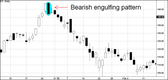
Bearish engulfing patterns occur at the end of uptrends and mark important reversals. They’re characterized by two bar formations. The first candlestick consists of a small real body. The second candlestick opens higher than the previous bar’s close and closes lower than the previous bar’s open, thus engulfing the first candlestick. Figure 4-19 highlights a bearish engulfing pattern that formed in shares of Diamond Offshore (symbol: DO) and signaled the end of the prior uptrend.
Source: TradeStation Technologies
FIGURE 4-19: Shares of DO formed a bearish engulfing pattern to mark the end of an uptrend.
Wait for confirmation before exiting your stock following a bearish engulfing chart pattern since not all bearish engulfing patterns lead to lower prices. If the engulfing pattern is genuine, prices should decline after the formation and shouldn’t exceed the high of the bearish engulfing bar.
The triple threat: Morning and evening stars
Morning and evening stars are reversal chart patterns that consist of three candlesticks. Morning stars mark the end of a downtrend and the beginning of an uptrend. Evening stars mark the end of an uptrend and the beginning of a downtrend.
A morning star occurs at the end of downtrends, which means that sellers (the bears) are in charge prior to the reversal. The formation consists of
- A long, black-bodied candlestick that pushes the downtrend lower
- A second candlestick that gaps lower at the open (but doesn’t necessarily have to be completely below the first candlestick) and forms a small body
- A long, white-bodied candlestick that gaps higher from the second candlestick and closes near the upper portion of the first candlestick
Conversely, an evening star occurs at the end of uptrends, reflecting the last gasp of buyers (the bulls), and is made up of
- A long, white-bodied candlestick that pushes the uptrend higher
- A second candlestick that gaps higher at the open (but doesn’t necessarily have to be completely above the first candlestick) and forms a small body
- A long, black-bodied candlestick that gaps lower from the second candlestick and closes near the lower portion of the first candlestick
Figure 4-20 is an example of an idealized morning and evening star. Both patterns reflect the inability of the ruling party, bulls or bears, to consolidate previous gains. The star (the middle bar) is an exhaustion attempt by buyers (in the case of an evening star) or sellers (in the case of a morning star) to push prices definitively higher or lower, respectively. That’s why the second bar in the morning or evening star formation is small: The day begins with a gap in the direction of the trend, but the initial enthusiasm dies down. The third bar shows a swing in momentum as bulls or bears take over.

Source: TradeStation Technologies
FIGURE 4-20: The morning star and evening star patterns.
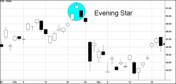
To see one of these star patterns in the context of a chart, take a look at Figure 4-21, which shows the evening star reversal in action in shares of China Mobile Limited (symbol: CHL) in late February. Notice how the star (the middle candlestick in the formation) gapped higher than the previous bar. The third bar represented a resounding defeat for bulls, as bears were able to push prices to the level of the first candlestick.
Source: TradeStation Technologies
FIGURE 4-21: Shares of China Mobile Limited (symbol: CHL) formed an evening star in late February.
Measuring the Strength of Trends with Trendlines
Quite literally, trendlines connect price points together and form either a horizontal, rising, or falling line. They’re helpful in establishing support and resistance levels. When a trendline breaks, shares may or may not reverse course. The most you can take away from a trendline break is that a specific trend has ended. A consolidation period (sideways movement) may follow, a new trend may arise, or the trend may reverse. All three scenarios are possible.
The stock market isn’t some perfect universe where stocks stop and rally on a dime. Remember that in general people price stocks and financial instruments, and people are driven by emotions. Therefore, measuring a trend or a consolidation phase is full of gray areas, and the adept chartist knows to draw trendlines through zones and not to expect a security’s price to always follow a trendline to the dot. It’s okay if the trendlines you draw intersect with prices. But if trendlines are valid, these intersections shouldn’t be significant (in how deeply they intersect) or often (the number of times they intersect with prices.)
Much ink has been spilt on the construction of trendlines, but there’s really no science to them. So, don’t expect one trendline drawn at an angle of 65 degrees to be right and one drawn at 63 degrees to be wrong. The basics of drawing trendlines can be summarized in three simple rules:
- A trendline must touch three different price points to be valid. Otherwise, you can draw a line pretty much anywhere.
- The more times a trendline’s touched, the stronger the support or resistance of that line. A break of a trendline that had been tested several times indicates a serious change in the trend.
- The longer the trendline (measured by time), the more meaningful it is. The staying power of the trend is measured, in part, by how long the trendline has been in effect.
If you find yourself drawing and redrawing trendlines (on your charting program, not by hand), then you’re misusing them.
Don’t waste too much time drawing trendlines. Instead, identify support and resistance levels, which are often horizontal lines. Then look for an uptrend or downtrend line that you can draw through the lows or highs to establish a rate of ascent. A break of a trendline should be material or significant to signal a change in trend.
In the following sections, I share how to distinguish and use different trendlines.
Uptrend lines: Support for the stubborn bulls
Uptrend lines connect several lows and form a support area for the bulls — the bulls’ line in the sand, if you will. They indicate the rate of ascent that buyers have maintained over a certain period of time. If your charts are arithmetically scaled, then the rate of ascent is measured in dollars per time period. If your charts are semi-log or plotted on a log scale, then the rate of ascent represents a percentage change per time period.
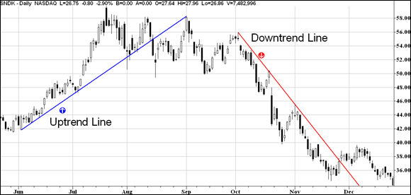
You want to draw your uptrend line through the lows, but don’t take it to an extreme. If the line intersects prices slightly, that’s okay. Consider Figure 4-22, which shows an uptrend line of shares of Sandisk (symbol: SNDK). The uptrend line is drawn through the lows and touches several price points. On an extreme day on August 1, prices fell below the line but basically remained above the trendline. Hence, the trendline stayed intact. However, the break below the uptrend line is mid-August was significant and did in fact represent the end of the uptrend.
Source: TradeStation Technologies
FIGURE 4-22: This chart of SNDK shows an uptrend line and a downtrend line.
Uptrend lines can be good entry points for your swing trading. Not only do they offer an entry price, but they also offer a clear risk-cutting price. Place a stop loss right below the trendline so that you exit shares if the trendline breaks. Make sure you raise your stop-loss order every few days as the stock rises (referred to trailing stop loss because the stop-loss order trails the price).
Uptrend lines have another important characteristic: These support lines become resistance lines after being breached. Look again at Figure 4-22. In mid-August, shares of Sandisk broke below the uptrend line that began in June. When shares rallied in September, that support line became a resistance area. After shares rallied to that trendline, they immediately turned around and began declining.
Downtrend lines: Falling resistance
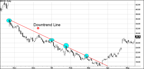
Downtrend lines connect a series of peaks and represent an area of resistance. Think of them as the line in the sand for the bears. And like uptrend lines, they’re more meaningful the more times they’re touched by security prices and the longer they’ve been in effect. Figure 4-23 depicts a downtrend line that occurred shortly after a breakaway gap down in shares of Broadcom. (Broadcom was acquired by CA Technologies and no longer trades on the market.)
Source: TradeStation Technologies
FIGURE 4-23: In this chart, the downtrend line is touched several times, signaling its importance.
Notice that in late March, shares of Broadcom definitively closed above the downtrend line. This signaled the downtrend was broken — but not necessarily the beginning of an uptrend (though that did occur in this case).
Because a break of a trendline doesn’t necessarily mean the beginning of a new trend, you shouldn’t buy a security because of a trend-line break. If you own shares in a stock that’s rising and then suffers a break, selling may be warranted. However, don’t expect a downtrend to necessarily follow.
Horizontal lines: Typical support and resistance
Horizontal trendlines depict a stationary support or resistance level. After either of these levels is broken, a trend usually develops. Alternatively, the security may enter a new trading range with horizontal support and resistance levels.
Some common horizontal trendlines you’ll encounter as you swing trade are ascending triangles (a horizontal level of resistance) and the Darvas box (a horizontal line of support and a horizontal line of resistance). These patterns are both described in earlier sections of this chapter.