Chapter 8
Finding Companies Based on Their Fundamentals
IN THIS CHAPTER
![]() Working your way down the ladder by assessing the market and the industry
Working your way down the ladder by assessing the market and the industry
![]() Employing screens to discover swing trading candidates
Employing screens to discover swing trading candidates
![]() Figuring out which method works for you
Figuring out which method works for you
You can identify fundamentals-based trades (and technical-based trades for that matter) in two ways: by beginning with the security’s market and drilling down into the promising industries or by identifying candidates with promising characteristics on a grassroots level. One approach is top down, whereas the other is bottom up. Both ways have merit.
This chapter outlines how to identify promising candidates to buy using a fundamentally driven top-down or bottom-up approach — and how to determine which approach is right for you.
Seeing the Forest for the Trees: The Top-Down Approach
The top-down approach identifies promising swing trading candidates by starting with market analysis (looking at stock markets, commodity markets, currency markets, and the like). Then it drills down into specific industries before finally examining individual securities. This approach implicitly argues for greater weight on markets and industries over the merits of an individual company because these big-picture items are more important in determining a security’s return than company-level factors.
A top-down trader cares less whether she swing trades XYZ Oil Company or ABC Oil Company (based on the individual characteristics of each company) and more about whether he or she is trading an energy stock or a drug stock in general. (I say “in general” because some fundamentally driven swing traders look for specific catalysts to decide which stocks to swing trade — such as a better than expected earnings report, the launch of a new product, or the firing or hiring of a CEO. For these swing traders, the company is of utmost importance — more than the market or industry).
 Fundamental valuation measures are useful for long-term investing, but prices often diverge from their long-term values. Hence, don’t trade in a direction different from the chart. Chapter 5 covers techniques to use to know whether to be in the market or not. But I still recommend you estimate the market value using fundamental measures in this chapter. You can also check out Appendix A for additional resources that can help you know the proper valuation of the market.
The following sections break down the basics of the top-down approach and explain details of how to dig into the market and industry analysis to benefit from the top-down approach.
Understanding the basics of the top-down approach
The top-down approach allows you to understand the condition of the overall market, which is valuable because the majority of securities follow trends in the overall market. For example, if the stock market is dreadful and hits new lows every few weeks, you probably won’t find many great candidates to buy. On the other hand, if the market is roaring to new highs, choosing winning stocks is much easier because the wind is at your back.
Using this approach, you begin by determining if the market is overvalued or undervalued. Now, I wish I could tell you that the market is so efficient that when it’s overvalued, it quickly snaps back and becomes properly valued. Or that when it’s undervalued, it promptly snaps back and becomes properly valued. Sadly, this isn’t the case. Markets can become and remain over- or undervalued for significant periods of time — even years. For that reason, you evaluate whether the market is overvalued or undervalued on a fundamental basis, but put greater weight on the technical chart to swing trade.
After evaluating the market, you question whether the industry is likely to outperform or underperform the market. Finally, you look at the individual security to see whether its statistics are impressive enough to warrant investment.
Top-down analysis involves two specific steps:
Determine the state of the overall market — is it cheap or not and what direction is the trend?
This step allows you to determine whether the overall market is cheap or expensive. As a swing trader, you don’t have time to call analysts, survey government data, and build an economic model that perfectly captures all information that may influence an overall market. Even if you did have the time for all that, I’ve never seen proof that such complexities improve forecasting abilities (my apologies to my statistics and economics professors). You look at some basic measures of market valuation, but at the end of day you must put greater weight on the technical picture to tell us whether to trade or not.
Assess the prospects of different industries in the market.
This step helps you focus on promising industries so that the wind is at your back when you buy securities within that industry. If the market just bottomed, for example, you will want to focus on those industries poised to outperform the market. Being right on the overall market and wrong on the industry may leave you with losses.
Sizing up the market and examining the technical picture
You can’t identify good swing trading candidates with the top-down approach without first evaluating the overall market. Fortunately you can choose from three measures to determine whether the overall market is cheap, fairly priced, or expensive.
 Just because a market is cheap or expensive according to these measures doesn’t mean you should ignore price action. Ideally, price action should confirm the findings of these measures. When it doesn’t, you should have less confidence in the staying power of the trend. For instance, these measures would’ve told you that the stock market was expensive or overvalued at the beginning of 1999. But that didn’t stop the Nasdaq Composite Index from nearly doubling during that year. The smart swing trader would’ve followed the upward price action. But he or she would’ve kept tight stops in light of the findings of these three valuation measures and, as a result, would’ve been better prepared for the ensuing collapse of the Nasdaq in 2000 that took prices lower by nearly 80 percent through 2002.
The models I present in the following sections are all yardsticks. They aren’t to be taken as fact. Stock markets can be over- and undervalued for long periods of time. But as a swing trader, you should know where value is. Even if you trade in the near term on the other side of value, you’ll know whether a trend has legs based on whether it goes against or with the direction of value. For example, the bull market in technology stocks in 1998 and 1999 was incredible and powerful. But it didn’t last long. Knowing that the market was overvalued — as all three of these indicators would’ve told you — would have prepared you for the major bear market that began in 2000 and ended in late 2002.
Taking the easy path: Long-term P/E ratio
The long-term P/E ratio method of determining whether a market is over- or undervalued is the crudest and simplest method you can use. It simply compares the market’s current P/E to its long-term average. The real question is: Do you look at the P/E based on the last 12 months of earnings, or do you look at it based on the expected earnings in the coming 12 months?
Reviewing the expected earnings over the next 12 months makes more sense than relying on historical earnings. After all, companies are valued based on their future, not their past. Historical earnings are especially unhelpful at points of inflection, where a major turn happens in the economy. The recent past looks very little like the coming future.
Fortunately, Standard & Poor’s (S&P) publishes the P/E of the S&P 500 Index based on both historical and future earnings. The S&P website (https://mena.spindices.com/indices/equity/sp-500) provides spreadsheets that show the P/E for the S&P 500 Index (large companies), the S&P 400 Index (mid cap companies), the S&P 600 Index (small cap companies), and the S&P 1500 Index (the broad market). To download these spreadsheets, go to the S&P website and click on the drop-down menu of Additional Info and select Index Earnings. The Excel sheet that automatically downloads has a wealth of info on the P/E ratio based on trailing 12-month earnings as well as estimated earnings for the coming 12 months.
From 1954 through 2018, the average P/E of the S&P 500 Index — which represents a large part of the market — has been 16.6 (see Figure 8-1). When the market trades significantly above this level (say 20 times earnings), that can indicate the market is overvalued. When the market trades well below this level, that may signal that the market is undervalued.

Source: Standard & Poor’s
FIGURE 8-1: The average P/E of the S&P 500 Index from 1954 through 2018 was 16.6.
 The S&P website breaks out data into two segments: as reported earnings and operating earnings. I recommend you use the operating earnings spreadsheet, because reported earnings can be distorted by one-time events that aren’t reflective of a company’s underlying fundamentals. One-time events that aren’t part of a company’s operations — like the gain generated from selling land or the loss suffered due to a hurricane — can distort a firm’s underlying strength or weakness. The operating earnings category ignores these one-time effects and examines only those earnings generated from a firm’s operations.
The long-term P/E ratio method has the following downsides when it comes to valuing a market:
- It ignores the other investment opportunities you can acquire. Stocks are one asset class and compete with other asset classes for investors’ dollars. When other asset classes offer investors low returns — say 1 or 2 percent — stocks tend to be valued at a higher premium to their historical average. A P/E of 15 may be cheap when interest rates are 1 percent. You can address this issue by combining the long-term P/E ratio with a method that looks at other types of securities, such as the two models addressed in the following sections.
- It may yield a result that won’t be reached for many months, or even years. Take a look again at Figure 8-1. Between 1996 and 2000, the market was overvalued based on long-term P/E but didn’t suffer a major correction for a few years. However, the eventual correction was swift and painful. That’s why you must use the long-term P/E ratio method in conjunction with price action (that is, technical analysis) when determining how to swing trade in a specific market.
- It isn’t useful as a short-term timing vehicle. The P/E model isn’t a short-term trading model and hence may hurt swing traders that depend on short-term price movements. It tells you the direction the wind is blowing, but sometimes the market ignores reality and marches the wrong way. Eventually, the market gets it right. But in the near term, this gap in accuracy may cost you a lot of money.
Solve this lag by incorporating technical analysis with the P/E model. If the P/E model indicates that the market is undervalued but the trend is down according to the charts, don’t fight the tape. Instead, stay in cash or trade a different asset class. However, be alert for signals of a trend change. The near-term weakness may not be sustainable, and the market may be due for a rebound. Similarly, if the P/E model indicates the market is overvalued but the trend is definitively up, don’t argue with the market. Buy stocks, but keep tight stop-loss orders to protect yourself when the fundamentals prove out and the market takes a swoon. Be on the lookout for divergences in technical indicators.
The major indexes may be going in one direction while the majority of stocks are heading in a different direction. Believe it or not, the market indexes can be led by a small number of securities. Indicators such as the Advance/Decline Line or the New High/New Low Index can tip you off to a deteriorating or strengthening market when they diverge from the major averages. (The Advance/Decline Line and the New High/New Low Index can be plotted in most major charting programs, such as TradeStation and High Growth Stock Investor.)
Computing a “fair value” estimate: The Fed Model
The Fed Model compares the yield of the market to the yield of the ten-year U.S. Treasury Note. So essentially it compares the return you may expect to earn in stocks with a major competing asset class so that you aren’t examining stocks in a vacuum. As a result, you have a reference point from which to base your estimation of the market’s current value. For example, when the stock market is offering a higher yield than fixed income instruments, this model assumes that investors will migrate to stocks. When fixed income instruments are offering a higher yield than stocks, the model presumes that investors will flock there.
Here’s how to reach the point of comparison:
Determine the market’s P/E.
Most websites report the S&P 500 P/E ratio. You can also download the data from the S&P website provided earlier in this chapter.
Calculate the inverse of the market’s P/E to determine the market’s earnings yield.
The math is easy here. If the P/E is 12, calculate the inverse by taking 1 and dividing it by 12 (that is, 8.33 percent). If the P/E is 20, the inverse is 5 percent.
Find the yield on the ten-year Treasury Note.
You can locate this number online (try
www.bloomberg.com/markets/rates/) or you can look it up in The Wall Street Journal.
Suppose the P/E of the S&P 500 Index today is 15. That means the earnings yield is 1 divided by 15, or 6.67 percent. For purposes of this example, say the yield on the ten-year Treasury Note is 4.50 percent. Based on the Fed Model, stocks are undervalued because the yield on the S&P 500 Index is higher than the yield on the Treasury Note.
Some swing traders take this model one step further to calculate what the S&P 500 Index should be trading at. The math is simple, but you don’t have to do it to know whether the equity market is over- or undervalued. But if you want to know anyway, check out the nearby sidebar.
One criticism of the Fed Model is that U.S. Treasury government bonds provide lower yields than other bonds. (The lower the yield, the more attractive stocks look when compared to bonds.) U.S. Treasury government bonds are considered “risk free” because the U.S. government has the power to print dollars. Therefore, the U.S. government is unlikely to default on bonds it issues. Some investors feel comparing the yield on companies in the S&P 500 Index, which can default, to the yield of a government security is unfair.
Improving the ol’ standard: The adjusted Fed Model
The adjusted Fed Model compares the earnings yield on stocks to corporate fixed income securities. But you can’t compare yields to just any bonds; different types of bonds carry different levels of default. The higher the potential default, the higher the yield. It’s unfair to compare buying shares of Coca-Cola to buying a security issued by a troubled home lender likely to default on its obligations.
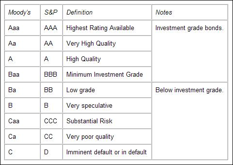
Rating agencies, primarily Standard & Poor’s (S&P) and Moody’s, measure the likelihood of a company defaulting on its obligations and assign rankings to different fixed income security. S&P’s scale ranges from AAA (representing the highest-quality companies) to D (representing ready-to-default securities). Moody’s scale ranges from Aaa (highest) to C (lowest).
Figure 8-2 highlights a table taken from Yahoo! Finance’s that breaks down the different rankings assigned by S&P and Moody’s. Investment-grade securities, which many institutional investors are restricted to investing in, have ratings between AAA and BBB on the S&P scale and Aaa and Baa on the Moody’s scale. These fixed income securities tend to be higher-quality and have a low risk of default. Fixed income securities that are below investment grade have a higher frequency of default (often higher than 1 percent).
Source: Yahoo! Finance
FIGURE 8-2: A comparison of bond rankings in the S&P and Moody’s scales.
When using the adjusted Fed Model, you should examine the yield on ten-year AA Corporate Bonds. These bonds are high quality, attract investment dollars from institutional investors, and represent a competitor to stocks. The higher the yield on corporate bonds, the less likely stocks are to be preferred over bonds. But don’t just take the yield of any AA-rated Corporate Bond. Instead, use a composite or average of all AA Corporate Bonds.
So where can you get this information? Fortunately, it’s provided free of charge at websites like the Wall Street Journal’s homepage (under “Market Data Center”). Figure 8-3 shows a snapshot from the Yahoo! Finance site that provides the yield on fixed income securities with different ratings and maturities (the term of the security). Notice that the yield on ten-year AA-rated Corporate Bonds is 5.60 percent.

Source: Yahoo! Finance
FIGURE 8-3: Find out the yield of corporate bonds with different maturities and S&P ratings by surfing the Internet.
Now that you know the yield on ten-year AA Corporate Bonds, you can compare that to the yield on stocks. Suppose the P/E of the S&P 500 Index is 19 today. That means the earnings yield is 1 divided by 19, or 5.26 percent. Using the information provided in Figure 8-3, you know that the yield on ten-year AA Corporate Bonds is 5.60 percent. Based on the adjusted Fed Model, stocks are overvalued relative to bonds because the yield on ten-year AA Corporate Bonds is higher than the earnings yield on the S&P 500 Index. As a swing trader, you should be alert for weakness in stocks.
As with the regular Fed Model, you can take this model one step further and calculate a fair value (what the fundamental analysis measures say the index should be trading at) of the underlying index by converting the yield on ten-year AA Corporate Bonds into a P/E ratio. A yield of 5.60 percent converts into a P/E of 17.86. To calculate the fair value, multiply the P/E of 17.86 by the expected earnings on the S&P 500 Index.
Assessing industry potential
Industries largely determine the profits of companies. Naturally, profits differ between Delta and United Airlines, but even larger differences exist between a grocery store chain and a PC manufacturer. Therefore, take special care in determining the attractiveness of an industry using fundamental characteristics.
You can identify which industries to focus on by looking at
- Historical performance: Certain industries tend to shine when the overall economy’s growing; others sparkle when the overall economy’s contracting. Technology stocks, for example, tend to do well when the economy is in its early or middle expansion period. Consumer cyclical stocks tend to perform well in late contraction (as the economy emerges from a recession). For suggestions on how to find this historical information, flip to Chapter 9.
Industry fundamentals: Just as you determine whether a stock is cheap or expensive based on items like P/E, return on equity, and expected earnings growth rates, so too can you value industries based on these same factors. The two best places to get this information are Yahoo! Finance (free) and HGS Investor software (paid).
Professor Aswath Damodaran of New York University maintains a wealth of data on industry groups on his website for free:
http://pages.stern.nyu.edu/~adamodar/New_Home_Page/datafile/pedata.html.The following data can be reviewed for all industry groups in the United States from Professor Damodaran’s website:
- Number of firms: The number of companies in the industry group.
- P/E ratio: The P/E ratio of the industry group using trailing earnings or forward expected earnings (such a P/E ratio is called the forward P/E ratio).
- Aggregate market cap/net income: This is an alternative measure to the P/E ratio using the total market caps of companies in the industry divided by the total net income of all firms. This measure is seeking to avoid misleading average P/E ratios that could develop from extreme values in the industry.
- Aggregate market cap/trailing net income (only money-making firms): This ratio is similar to the previous one except that this measure excludes loss-making companies.
- Expected growth – next five years: This gives the expected growth in earnings for the industry over the coming five years.
- PEG Ratio: The PEG ratio compares the P/E ratio to the expected growth rate of the industry. The lower the PEG ratio, the more attractive the company or industry.
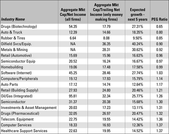
The PEG ratio is the best measure to use when looking for attractive industries. I like to sort all industries by PEG ratio and then focus on the top 20 percent of the industries. Keep in mind that earnings estimates change often. But you can still derive value from knowing what analysts estimate for earnings growth in the coming years.
Figure 8-4 is a snapshot taken from data downloaded from Damodaran’s website. Notice that the biotech industry has the lowest PEG ratio. The PEG ratio in Damodaran’s website uses the “aggregate market cap/trailing net income” measure, which excludes loss-making companies. Also notice that the P/E ratio for the biotech industry is 54 when looking at all companies and 17 when excluding loss-making companies. Biotech companies are often loss making; hence, there is a wide spread between the two P/E ratio measures. I prefer to look for industries where the P/E ratio isn’t materially different when excluding lossmaking companies or when including them.
Source: Aswath Damodaran
FIGURE 8-4: This snapshot shows various fundamental measures on all major sectors.
From this list, I want to dig deeper into the auto and truck industries (which have high expected earnings growth rates) and software Internet (keep in mind that anything in the top 20 percent should be fair game). These industries show high expected earnings growth rates with P/E ratios that are low and not significantly different when excluding loss-making companies.
Additional data sources such as HGS Investor software and the MarketSmith service of Investor’s Business Daily (both paid services) provide earnings growth rates on a sector or industry basis as well as wider valuation measures (such as price to sales ratios or price to cash flow ratios). You should examine this information because industries experiencing the highest earnings growth rates and trading at the lowest valuation levels tend to outperform industries with low earnings growth rates and/or high valuations. These specific vendors can also assist you in identifying promising industry groups ripe for swing trading. By using these fundamental criteria in conjunction with the economic cycle chart in Chapter 9, you can determine which industry group is likely to perform best.
Just because an industry has attractive fundamentals doesn’t mean you can ignore the price action of that industry group. Instead, the price action (the chart and technical indicators) should be in alignment of the attractiveness of the industry.
After identifying the strong industry group you want to swing trade, drill down into the companies that make up that industry to find the most over- or undervalued candidate based on the Six Step Dance in Chapter 9.
Starting from the Grassroots Level: The Bottom-Up Approach
The bottom-up approach is starkly different from the top-down approach, which I describe earlier in this chapter. Instead of beginning with the overall stock market and moving to the industry group, the bottom-up approach places less emphasis on overall economic cycles by beginning at the company level and working its way up. If you favor fundamental analysis over technical analysis or are trying to find promising candidates in a weak market, you may favor the bottom-up approach over the top-down one. If you excel at swing trading securities based on events — such as a change in CEO, an earnings report, or an acquisition — you should also favor the bottom-up approach.
The bottom-up approach usually begins with some type of screen, which you use to identify promising candidates. Some screens are very liberal — they generate dozens of possible candidates, diluting the amount of time you can spend on any one. Other screens are very conservative — the criteria used are so stringent that you may have only five or six possible candidates to evaluate. Think of using a fundamentals-based screen as sifting for gold. A lot of garbage surrounds those valuable nuggets, and your job is to find them amid all the trash. In the following sections, I show you how to do just that.
Using screens to filter information
Fundamental screens can consider everything from earnings growth rates to average daily volume to changes in consensus earnings estimates. Sometimes this variety leads to information overflow, which may be discouraging if you’re using a fundamental screen for the first time. Fortunately, because you create your own screen using the criteria you want to focus on, you don’t need to bother with the premade, too-much-information batches vendors peddle to the public.
In addition to covering the general screening criteria to use, I delve into two screens: a growth-oriented screen and a value-oriented screen. I show you which criteria you really need to examine for each type of screen in order to sift effectively. Note: These screens are for illustrative purposes only to guide your development of your own screens. I recommend you specialize to enhance your trading. In other words, perhaps you’re a swing trader focused on high growth companies that have had a recent pullback on light volume. Or perhaps you focus on companies that just announced earnings exceeded estimates. You’ll be the best swing trader when you specialize in swing trading specific fundamental patterns. You don’t need to be a jack-of-all-trades (or jill-of-all-trades) to be a successful swing trader.
Keep in mind at certain points in time, growth stocks will outperform value. At other times, value will outperform growth. That doesn’t necessarily mean you should be shifting between the two screens. My recommendation is for you to focus on one type of screen that fits your trading pattern. If you excel at fundamental analysis, then focus on screens that speak to that advantage and use many fundamentally driven ratios. If you excel at technical analysis, use screens to narrow a list to charts that meet your trading criteria (whether you trade breakouts or whether you trade ranges. If you want to know whether one type of stock is outperforming another (say value over growth), you can use the techniques described in Chapter 6 to put together a ratio chart of value versus growth stocks.
Figure 8-5 highlights the one-year and five-year returns for growth and value stocks in the large (Russell 1000), mid (Russell Mid Cap), and small (Russell 2000) cap arenas.

Source: FTSE Russell
FIGURE 8-5: Performance comparison of growth and value stock indexes.
Notice the striking differences in returns. Over the five-year period ending December 21, 2018, the Russell 1000 Value Index (large cap value) generated an annualized return of 5.71 percent versus the Russell 1000 Growth Index’s (large cap growth) 9.75 percent return. If you convert the annualized return (which is like an average return over the period) into a total return (how much the index rose in total over the five-year period), the figures look even more astonishing: The large cap value index rose 32.0 percent during the five years while the large cap growth index rose 59.2 percent.
You can see why knowing which horse is in the lead matters. When growth is in favor, as it clearly was during these time periods, swing trading growth stocks is like flying a plane with strong tailwinds. Swing trading value stocks can be profitable as well, but the headwinds lower your overall return.
So growth is the place to be, right? Actually no. It depends on the time period used. In the first edition of this book, the five-year performance of value was significantly higher than growth over a five-year period ending in December 2006 (value delivered 67.5 percent versus growth’s return or 14.2 percent). At different times, value and growth outperform one another.
What you should know about basic screening criteria
Before you start working with screens, you should note that value and growth screens tend to have similar characteristics. For example, both screens should exclude low-priced securities and securities that trade infrequently. When looking for candidates, they should both include a field for high return on equity.
A major difference between value and growth screens is that growth screens tend to focus on earnings growth rate fields, whereas value screens focus on valuation metrics like P/E ratios. Additionally, some fields differ between the two. For example, low-priced stocks are often identified using the price to sales ratio. Growth stocks are rarely found using that measure.
The return on equity criteria will be found in both value and growth screens because it is an important measure in all companies you buy. The higher the statistic, the more profit the company is able to squeeze out from every dollar of equity.
When inputting your screening criteria, take care not to be on either the liberal or conservative extreme. You want your screen to capture companies from several industries, not just one or two. If members of one industry group dominate a screen, one of your criteria is likely too strict. But you don’t need every industry to be represented to have a good screen. When one industry is on hard times, then it may be understandable that few, if any, members of that group appear in screens identifying potential buy candidates.
When growth is on the rise
The important criteria to include in a growth screen include:
- A share price measure: This number allows you to exclude stocks trading below some value you input, such as $5 per share.
- Average daily volume: This part of the screen helps you avoid securities that trade a few hundred shares a day and are thus difficult to enter or exit. No doubt these securities hold opportunities, but I don’t believe the potential return makes up for the risk.
Growth stocks typically reside in the technology, healthcare, and consumer discretionary sectors, but they can reside in other parts of the market as well. Following are the factors that characterize growth companies:
- Earnings growth rates above a specific threshold or above the market average (for example, above 25 percent)
- Sales growth rates above a specific threshold or the market average (such as above 10 percent)
- New products and new management
- Low or no-dividend payment
- Typically found in technology, healthcare, consumer discretionary, and communications sectors
- Higher-than-average P/E
Use the growth screen when growth is outperforming value stocks. In constructing your growth screen, be restrictive enough that you have just a handful of companies to work from, but not so restrictive that you exclude potential opportunities.
USING A GROWTH SCREEN TO FIND FAST-GROWING COMPANIES
Growth stocks exhibit high earnings growth rates. Therefore, the following growth screen, which can be implemented with most popular screening programs, focuses on earnings growth recently and historically. Although the method of inputting these screening functions is largely dependent on the screening program you use, I recommend you always input these numbers:
- Last closing share price ≥$5: I consider stocks below $5 to be penny stocks.
- Average daily volume (last 50 days) ≥ 100,000 shares: Unless you’re trading $5 million or more, average daily volume of 100,000 shares with securities priced $5 or higher should allow you to get in and out without too much trouble.
- Earnings per share (EPS) growth (most recent quarter versus year-ago quarter) ≥ 25 percent: This is the figure recommended by William J. O’Neil, founder of Investor’s Business Daily.
- Annualized five-year historical EPS growth rate ≥ 10 percent: O’Neil recommends this number as well.
- Relative strength rating ≥ 80: Another recommended figure from the Investor’s Business Daily founder.
- Return on equity ≥ 15 percent: Based on my experience, 15 percent is the minimum return on equity I’d look for in companies I want to buy.
I consider these criteria to be important in growth stocks. The first two fields ensure that you’re looking at liquid stocks that trade above $5 per share, which excludes penny stocks from your analysis. The next two focus on earnings growth rates: the lifeblood of the growth stock. The fifth field examines price performance relative to the overall market. (Growth stocks that you buy should be performing in the top 20 percent of the overall market.) The final criterion, the return on equity field, limits your analysis universe to companies that are being run well, meaning their earnings growth is driven by management effectiveness and not necessarily by overall industry fundamentals.
You may notice that valuation metrics aren’t used in this screen. That’s because growth stocks appear overvalued using traditional metrics like P/E or price to sales ratio (P/S). These metrics can be incorporated, if you want, to identify potentially cheap growth stocks. For example, the previous screen can be amended to add a criterion that the P/E of a screened security is less than or equal to the P/E of the overall market.
When value is in vogue
Value stocks are characterized by low valuations, first and foremost. Value screens must hone in on the valuation metric via popular statistics like P/E, PEG ratio, or the price to sales ratio (P/S). You don’t emphasize earnings growth rates or sales growth in value stocks. Although finding a company with strong earnings growth rates makes a value stock that much more attractive, don’t exclude a company for consideration just because earnings may not be growing rapidly and, in fact, may be declining.
USING A VALUE SCREEN TO FIND LEADING VALUE STOCKS
A value screen is most helpful when value stocks are outperforming the market. Value stocks are characterized by their industries and their valuations relative to the overall market.
Here’s a value screen you may use to focus on promising candidates by using the P/S valuation metric (remember, this is just one example, and one I recommend — you should experiment and develop your own screen for selecting securities):
- Last closing share price ≥ $5
- Average daily volume (last 50 days) ≥ 100,000 shares
- P/S ≤ 1.25
- Dividend yield ≥ 1.0%
- Return on equity ≥ 15%
- Relative strength rating ≥ 80
The first two fields restrict you to an investment universe that trades often and above $5 per share. The next ranking restricts you to so-called cheap securities, as measured by P/S. Value stocks often pay dividends, so I like to see some dividend payout. But beware of companies that pay dividends of 10 percent or more. These companies are often distressed and about to cut their dividend payments. Finally, the relative strength ranking helps ensure you concern yourself only with securities performing in the top 20 percent of the market. These securities tend to outperform the market in the near term.
Assessing your screening results
After completing your screen, you need to have some kind of ranking system so you can focus on the most promising candidates first and work your way down. You can rank securities by their P/E ratios, for example, from lowest to highest. Or you can rank securities by their return on equity or price to free cash flow ratios. Ranking helps you push the cream to the top.
HGS Investor allows users to create “combo rankings,” which allow ranking based on two or more measures (like 30 percent weight on EPS rank and 70 percent weight on P/E).
When identifying a promising swing trading candidate using a fundamental screen, the right security should jump out at you. You shouldn’t have to do a lot of equivocating or questioning. Here’s how to analyze your results:
- If the security is one you want to buy, verify that it exhibits strong earnings, has a low valuation, and is in a well-performing industry.
- Use volume to weed out weak candidates from strong ones. You want to be buying when volume is confirming the move.
- If you go through your screened results (for example, 100 stocks fit the screening criteria) and you find yourself saying yes to many of them, it’s a sign you aren’t reviewing the results properly. Remember, most securities should be candidates that you may like to buy when X, Y, or Z happens. You should only go on green, meaning the same day a signal is generated.
- Combine your fundamental analysis with events to enhance your results. Review the company’s recent news announcements because they may be positive catalysts for propelling the stock higher. But don’t buy one or two weeks after the news unless the chart is only telling you to go on green at that time. Usually, news gets incorporated quickly into stock prices so buying on news that’s seven days old may prove ill timed.
Deciding Which Approach to Use
Which approach should you use? As much as you may hate to hear it, this question doesn’t have a right answer. The approach you choose is solely dependent on your style of trading. Do you prefer to identify the ripe industries that are poised to take off? If so, use the top-down approach. Do you enjoy developing screens and then examining the filtered results for promising candidates? In that case, use the bottom-up approach.
Fundamentals-based investors are usually bottom-up oriented. Swing traders and technical traders are often top-down oriented. However, a fundamentals-based trader can be top-down, and a technical swing trader can be bottom-up. Remember: There’s no right or wrong way. The promising candidates are the ones that you find regardless of whether you begin with a top-down or bottom-up approach.
Ideally, a security you find by using the bottom-up approach can also be found by using a top-down approach. But employing both approaches simultaneously is complex and time consuming. Choose one and stick to it so that you perfect identifying promising industries (if you’re a top-down type) or securities that are undervalued on the grassroots level (if you’re a bottom-up type).