
Secondary Color Correction Primer
Although primary color correction affects the entire raster, secondary color correction is limited to specific geographic regions—for example, vignettes or windows—or specific color vectors. Secondary color correction can also affect specific tonal regions, but these secondary regions are more specific than the shadows, midtones, and highlights that are used to qualify corrections in primary color correction.
As the tools have become more nonlinear, the distinctions between what is primary and what is secondary are beginning to blur. For the purposes of defining workflow, this distinction will probably never totally evaporate, but the boundaries between these two terms are more vague than they have been in the past. As a matter of fact, the boundaries where secondary color correction ends are also beginning to fall as more color correction applications are offering the ability to add effects and filters to create exciting new looks. Another aspect of the blurring lines between primary and secondary color correction is that some definitions of secondary color correction describe it as being corrections made downstream of the telecine. Color grading in the years since 2000 have become increasingly detached from the telecine or scanner so that now, virtually everything is done apart from a telecine—if a telecine is involved at all. As of 2012, colorists rarely work from telecined material. Either film scans or digital camera origination is the primary source of material fed into modern color grading suites. Even the telecined material is rarely graded directly from the telecine, instead being transferred “flat” to an HD digital tape or directly to a server. The flat grade is then corrected by the colorist without access to the telecine.
Here are a few of the interfaces for secondary color correction (Figures 5.1–5.7).
Definition
raster: Computer terminology that has crossed over to video to represent an image created from horizontal lines of individual pixels. The raster refers to the entire video image.

Fig. 5.1 DaVinci Resolve Secondary Qualifier tab. This tab is typically behind the Curves tab.

Fig. 5.2 DaVinci Resolve Secondary Window tab. This tab is typically behind the Curves tab.

Fig. 5.3 Color’s Secondaries Room, image courtesy Artbeats.

Fig. 5.4 Final Cut Pro’s Secondary Effect—called Limit Effect, accessed from a twirl-down triangle at the bottom of the three-way color corrector.

Fig. 5.5 Color Finesse’s Secondary tab.
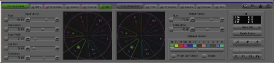
Fig. 5.6 Avid Symphony’s Secondary color correction tab.

Fig. 5.7 IRIDAS’s SpeedGrade DI Secondary correction mode. IRIDAS has been purchased by Adobe. Plans for integration into Adobe products or as a standalone Adobe color corrector were not known at time of publication.
I briefly touched on this issue at the end of the previous chapter, but it could easily be argued that this new effects capability belongs in a discussion of secondary correction instead of primaries. Where it belongs depends on whether you feel that “primary color correction” is a workflow term. If “primary” and “secondary” simply define logical steps in a workflow, then effects work is decidedly in the secondary category. On the other hand, if you regard primary color correction as global corrections to the image and secondary corrections as qualified or targeted corrections to a portion of the image, then effects is probably a primary correction, as many of these filters and effects are applied to the entire image. To many colorists, it is not a distinction that even needs to be made. Everything is simply a tool and categorization is not necessary.
Definition
secondaries: Shorthand for secondary color corrections. The plural is often used because most applications allow you to have multiple secondary color corrections—secondaries—on a single image.
The Purpose of Secondary Correction
In nearly every demo of a color correction application or NLE with color correction capabilities, there is a point in which they turn a car or a shirt or a product package a different color using secondaries.
When I first started color correcting, I rarely used secondaries because I didn’t find myself correcting car commercials in which they filmed a car with the wrong color. I soon learned that serious colorists rarely use secondary color correction for such obvious chores. Instead, secondaries are used subtly for much more natural corrections. Some of the main targets for secondary color corrections are skin tones, sky, water, and grass.
Primary color correction often must be done with an eye on the big picture and an understanding that the goal is to make most of the image look good but also that certain things, like skin tones, may need additional work with secondaries. As you may have noticed, the items I mentioned in the previous paragraph—skin, sky, water, and grass—are all things that people have a natural understanding about and preconceived notions regarding what colors these things should be. Often, getting a primary color correction to look good across most of the image will take these specific items out of the color range that most people are expecting. Sometimes, if you want to warm up an entire image, the skin tones will go much too orange. Or, by pulling the unwanted blue cast out of an outdoor scene, the grass will turn yellowish. Or, by bringing up the levels of the foreground elements of the picture, the sky will become overexposed. All of these things call for a secondary color correction that isolates or qualifies the problem area and fixes just that portion while leaving the rest of the primary correction alone.
Secondary color correction is often used to fix the things that the colorist “broke” in the primary correction. For example, in trying to match the colors and luminance values of two shots, a colorist may use primary color correction to get the majority of the shot to match, but will find that the only way to do that is to have the sky of one shot be a strange color. In this case, the colorist would match most of the shot using primaries, then use secondaries to fix the problem with the sky. This situation often happens with images that have a color cast in addition to clipping, because the clipping in the dominant color cast will cause any corrections to the unclipped portions of the image to deliver some very strange colors to the clipped areas.
Secondaries are also often used to make the subject of the shot “pop” or to focus the viewer’s attention on something important. This task is often done with a vignette, which slightly darkens the edges of the image and points the viewer’s eyes to the main focus of the shot. It can also be done by qualifying an important part of the image and increasing the saturation or contrast in that portion of the image to draw the viewer’s attention to it.
Many colorists I spoke with love getting into specific parts of the picture to work in isolation on that area, but not everyone is in complete agreement about the technique.
One of the hottest colorists in the world for the last decade has been Stefan Sonnenfeld, (Figure 5.8), whose grading kit of choice is the DaVinci Resolve. His filmography as a colorist (as of late 2011) is a staggering 115 titles, including some of Hollywood’s biggest box office hits and films with definitive creative looks: Pirates of the Caribbean (all four), Transformers, Star Trek, 300, Fast and the Furious, National Treasure: Book of Secrets, Invincible, and Alice in Wonderland.
He has worked with the top tier of A-list directors and producers, including Jerry Bruckheimer, Michael Mann, Hans Zimmer, Michael Bay, Steven Spielberg, Gor Verbinsky, Tony Scott, and Spike Jonze.
In addition to his film work, he has also graded TV series, including CSI: NY, Cold Case, Without a Trace, and the pilot of Prison Break.
Sonnenfeld is the president and principal of Company 3 in Santa Monica, with offices in New York, London, and Atlanta. Company 3 includes a wealth of top-level colorists, including Siggy Fersti and Stephen Nakamura (who was featured in my first color correction book). Sonnenfeld was named by Entertainment Weekly as one of the 50 Smartest People in Hollywood.

Fig. 5.8 Company 3 president and colorist, Stefan Sonnenfeld.
On his own use of secondaries, Sonnenfeld says, “I do not use a ton of secondaries. I am also not known to be the craziest colorist. I am telling you that you can go into my room and look at twenty different sessions and you will not find any of that and that is just what it is.”
With the speed at which he works, trying to qualify secondaries would seem impossible. Sonnenfeld explains, “I never have enough time. I have 140 shots that they have given me two hours to do. I have back-to-back 150-shot sessions with four hours to do them, so that is 300 shots in four hours with very difficult work. I know I will get through it, but I do not spend a lot of time on the frames. There are people who will not work with me because I do not sit in a room and key things with 18 windows, just because I am not into that. Let’s do it and move on to the next one, because you can overthink stuff.”
For me, the biggest issue of secondary color correction is qualification. I’m not talking about whether the colorist is skilled enough to do it. I’m talking about what portion of the image you are trying to qualify—in other words, “choose”—as the section in which you make alterations.
In case you missed the earlier glossary item for this word in Chapter 2, “to qualify” or “qualification” means that an area of the picture is specifically isolated for a correction by any number of methods. You could qualify something for correction using its hue, saturation, tonal value, or a combination of all three. You could also qualify an area of the image using a “window” or garbage matte. This is an important concept to grasp. So much of this chapter will be devoted to methods and techniques for qualifying parts of the image. Once a portion of the image is well qualified, altering it is largely based on the skill sets of the previous four chapters.
Once a portion of the image is well qualified, altering it is largely based on the skill sets of the previous four chapters.
Creating effective qualifications when doing secondary color corrections requires a good understanding of your tools and of your ability to analyze the image and understand what can be selected and how.
As this book is not really about developing specialized skill sets with specific tools, I’ll leave that exploration up to you. As for developing an ability for understanding what can be isolated in a shot, that is a matter of some experience and—for even the best colorist—a good deal of experimentation. Of course, the more experienced you are at making these qualifications, the less experimentation you need. Getting that knowledge and practical experience is what the rest of this chapter is about.
Definition
vignette: One of the layperson’s meanings for this word is for a photograph or other image with edges that shade off gradually. To a colorist, “vignette” is both a noun and a verb. The noun describes a shape placed in the picture to allow a different correction inside and out. Most often, this correction is used to create the effect of fading out (darkening usually) the edges of the image. As a verb, it is simply the action of making the vignette or the effect the vignette has on the image, as in “I vignetted it so that the center of the image pops a little better.” Additionally, Color uses the word to describe any use of a shape to create or modify a secondary. For other software, these are considered windows or masks.
TIP
Increased contrast is one of the brain’s visual cues that something is closer to us (and therefore inherently more important).
Qualifications in secondaries are done in three basic ways:
1. Isolating a specific color vector or luminance range or a combination of the two
2. Using a shape to define a portion of the image
3. Using a combination of the two
For all three of these methods, the basic concept is to create a matte or mask that limits the correction to a specific portion of the image.
There are also three basic steps to doing a secondary color correction:
1. Determine what you are trying to accomplish
2. Figure out how you can qualify the correct portion of the image without qualifying unwanted areas
3. Make a correction inside and/or outside of that qualified area
Let’s take a look at the three methods of color correction and walk through each of the three steps with each method.
Color Vector Isolation
One of the main secondary color correction qualification methods is to isolate a specific color vector and alter it in some way. This is a very good way to do secondaries as opposed to “vignettes” or “spot” color correction, because you don’t have to worry about camera movement or things crossing the foreground. The color corrections that you apply to a specific color vector isolation or qualification stay with those pixels as long as those pixels stay relatively the same color. They don’t need to be tracked or rotoscoped. Passing shadows or other active lighting effects or semitransparent foreground effects like smoke or fog will have an effect on color vector isolations, though, as they will change the color of the image behind it.
Each color correction application has a slightly different set of controls to accomplish isolating specific color vectors, but most of them work very similarly to Color. You can try to isolate the vector in the old-school way by guessing at the correct hue and saturation and luminance values and moving the HSL sliders until you have a clean matte, but nearly everyone will start his or her qualification of the selected color by sampling it with the eyedropper first.
Nearly all color correction applications have the ability to sample a portion of an image with an eyedropper. Symphony uses a “syringe” for sampling large areas. Each application has slight differences in how the eyedropper works. Some—like Color—allow you to add and subtract from your qualifications using the eyedropper and certain modifier keys. Some apps allow you to click on a color only with the eyedropper; others allow you to drag over large areas to qualify multiple shades of a color. Some of these eyedroppers sample only the precise pixel that is at the tip of the eyedropper; others allow you to set a user preference of sampling and averaging a 3 × 3 grid of pixels around the tip of the eyedropper or even a 5 × 5 sample. Consult the users’ manual for your application on how the eyedropper works. (And stay on top of your application’s current way of doing things, as applications evolve and gain new abilities or ways of doing things all the time.) Learn the options for the eyedropper tool when creating qualifications. This book is not about specific button pushes in specific applications, so I will not go into them here.
Let’s try doing an old-school color vector qualification, so that if you’re in an application that doesn’t have an eyedropper, you can get something accomplished. Also, learning to do it the hard way helps understand exactly what’s going on and makes doing it the easy way even easier.
Load the “art_institute_lion_proper” clip into your color correction application. I’ll be using Color for this secondary tutorial. In Color, you go to the Secondaries Room (which is like a tab) and enable one of the secondary tabs just above the timeline (there are eight). Apple Color processes each of theses secondary tabs in numerical order, so some colorists like to leave the first secondary tab free in case they want to go back in and stick a secondary in before their first secondary. If that sounds like smart advice to you, select the tab for Secondary 2.

Fig. 5.9
As pointed out earlier, the first step of making a secondary correction is to determine what you are trying to accomplish. For this tutorial, our goal is to make the lion on the Art Institute steps be “the star of the show”—we want the viewer to notice the lion as the focal point of the shot.
The second step is to figure out how to make a qualification that will enable you to accomplish that goal. Looking at the image, the lion is fairly green-blue, and there doesn’t appear to be too much else in the image that is the same hue or saturation as the lion. Much of the rest of the image contains similar luminance levels, so the obvious place to start is to create a key using the hue information.
To view the matte that you create with your qualification, make sure that the Previews tab under the shadow hue offset wheel is active. In the Previews tab, the left window shows you the clip and allows you to see and manipulate any vignettes or garbage mattes you’ve created. The right window shows you the matte of any isolations you’ve made by color vector selections or luminance selections. To the right of that window, there are three small icons called the Matte Preview Mode buttons (Figure 5.11). The top one has red, green, and blue rectangles for viewing the image normally in RGB, which is essentially the same image that is in the Scopes window. The middle one has gray, green, and gray rectangles. This is called the Desaturated Preview. It is a view of your qualified areas in full color and your unqualified areas in black and white (monochrome). The bottom icon has black, white, and black rectangles. This is the Matte Only button and displays the isolation as a black and white matte image, with qualified portions in white and unqualified in black.
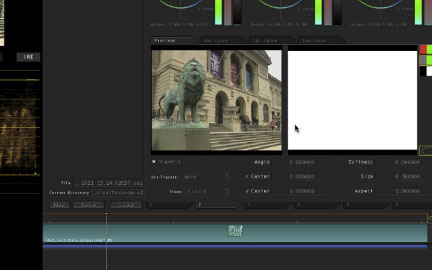
Fig. 5.10 To see the matte created in Color Secondaries Room, select the Previews tab.
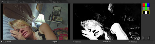
Fig. 5.11 Matte Preview buttons show you what has been selected by the qualification.
Click on the icon to see the black and white matte on the second monitor. The display is white, indicating that the entire image is selected.
Start by selecting only the hue slider and drag the small white lefthand line above the hue bar towards the right (Figure 5.12) to narrow the hue selection, and pull in the small white line on the righthand side to the left and equal amount. Then drag the white line inside the hue bar so that it is over the bluish green area of the hue bar. Now use the white lines on top of the hue bar to adjust the width of the hue selection. Moving either white line will move them both. If you want to move just one side of the hue selection, hold down Shift while you drag. The smaller white lines above the hue bar control the fall off of the selection and will be crucial to creating a nice matte. If you can’t see the fall off controls, then use the eyedropper and click on the lion. This will add two little gray triangles with gray handles above the HSL bars. You can adjust the fall off in the same way as the hue selection.
Disable the luminance and saturation controls, if you used the eyedropper. Just adjust hue until you get the best selection possible. Use that focusing analogy. Try to get the greatest amount of the lion selected with the least selection of other picture elements. Some of the things to look for in this particular image when selecting with hue are the sky and the banners in the arches of the museum. Even the grayish shadows on the inside of the lower arches have some green in them. They can become qualified depending on the angle and spread of the hue, but you should be able to do a good job of isolating just the lion. Here’s my isolation (Figure 5.13).
This correction is not perfect. We want to see if we can isolate the lion more and get less of anything that is not the lion. Also, we need to soften this matte or the correction will look very nasty (Figure 5.14). In Color, choosing a Key Blur of about 1.0 or 2.0 is a good starting point. Key Blur is located just below the HSL selectors.
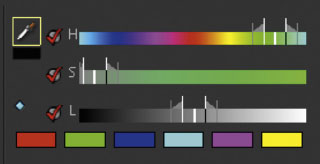
Fig. 5.12

Fig. 5.13

Fig. 5.14
We could further qualify just the lion using a garbage matte created in the vignette section, but for now, see if adjusting the saturation or luminance controls will clean up this qualification any further. After a bit of experimenting, I found that the hue control by itself worked to get the best key (note the check mark in Figure 5.13).
Before we try to improve the qualification any more, let’s see if we can accomplish what we want to do to the lion with the qualification we already have. This step is part of the time management of color correction. You could try to really dial in a perfect matte for the lion, but it is possible that the fairly rough qualification that we have now will suffice, so why waste any more time on it? Later on, you may discover that in order to really take the secondary correction where you want it to go, you need a better qualification so that your adjustment does not pollute other areas of the image.
Our goal with this correction was to make the lion pop from the background and be more prominent. I started by taking the midtone hue offset wheel all the way down to cyan on the outside edge of the wheel, but then I decided that I didn’t want to have the lion’s hue swing to a new direction—I just wanted to increase the saturation and contrast of the color that already existed. So I reset my hue offset wheel and just increased the saturation and lowered the gamma, lift and even the gain a bit. Here are the numbers (Figure 5.15).
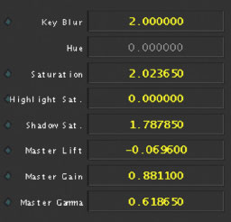
Fig. 5.15
Here’s the before and after (Figure 5.16). This isn’t a final correction—just a secondary on the lion. I also included a diagonal split image to see the difference.
Before moving on to the spot color corrections—or vignettes as they’re known in Color, or Power Windows, as they’re known in DaVinci—let’s take a look at color vector isolations in Avid Symphony. I realize that Symphony is not a widely popular application for color correction, but even if you don’t have a Symphony, don’t skip ahead, because Symphony has an interesting graphical interface that allows you to better understand and visualize what you are doing as you isolate these color vectors.
Figure 5.17 shows the Avid Symphony’s Secondary UI. Notice the two vectorscope-like images in the bottom center. The one to the left shows the vector you’ve selected. The one to the right shows the way you have moved that selected vector. Actually, the entire bottom of the UI is split in two to divide the functionalities of the two sides. To the left, all of the sliders under the words “Input Vector” are controls to define the vector that you want to qualify or isolate. To the right, under the words “Output Vector” all of the controls affect that selected vector. Not all applications break it down into this nice, obvious division of tasks, but they all work the same way. You need to figure out in your application which are the “defining” tools and which are the “affecting” or “controlling” tools. Once you understand that, everything will make sense.

Fig. 5.16
Note
At the bottom of the right side of this UI is a section called Selected Vectors. This section logically belongs on the left side, because it allows you to define a vector by clicking on one of the colored squares, but they didn’t have room for it on the proper side and there was space to the right. These Selected Vectors was how I actually selected the green vector for this image. You can see that the green color square is highlighted in white.

Fig. 5.17
To understand what defining and moving the vector does, look at the Reference image of the ChromaDuMonde chart at the upper-left (upper-left corner of Figure 5.17). This is the source image. Notice the green color chips at the lower-left of the ChromaDuMonde chart. These are the colors that fall within the area defined by the green vector that has been selected for correction (Figure 5.18).
Looking at the vectorscope, you can see the location of the green color chips on the vectorscope. The three selected color chips fall within the area on the vectorscope defined by the green vector area on the Symphony UI.

Fig. 5.18
Notice these same color chips in the center image in the UI (upper center of Figure 5.17). The green color chips are bluish-purple because the green vector was swung towards the blue-purple vector in the “output vector.”
Notice the numbers on the input and output sides. On the input side, the numbers define a specific degree of hue and amount of saturation that has been selected. On the output side, you see the new angle to which the hue has been swung and the fact that the saturation has been increased (Figure 5.19). This saturation increase is also displayed visually by the vectorscope image, which has the green vector pulled out slightly further on the output side than the input side. Just like a vectorscope, the distance from the center of the vectorscope shows the amount or power of the saturation.
To get a better understanding of this, it is possible in the Symphony UI to isolate the vector you are trying to define and to display all of the unselected vectors as gray. To make it more clear what we are selecting, we’ll switch to the “isolate” mode. (Many other applications have a similar mode.)
In this example, we spread the input vector—which could also be known as our isolation or defined or qualified vector—and rotated the hue a bit so that we isolated only the bottom row of green color chips. Notice the numbers for hue are slightly different than in our first example. I needed to rotate the hue slightly so that only the color chips in the bottom row were isolated. Also notice the hue width number is much larger, which allowed us to select all nine of the bottom color chips instead of just the three that were selected in the first example. You can see this visually on the left vectorscope-like image in the UI, which has expanded to cover a larger portion of the vectorscope. (The small dot with the circle around it in the middle of the chosen vector is the control point for moving the vector.) You can see in the Current window at the upper-center of the UI that all of the color chips at the bottom have been chosen.

Fig. 5.19
If we were to rotate the hue one direction or another, we would deselect some of the chips along the bottom and start to select chips going up one side or the other of the ChromaDuMonde chart. In Figure 5.20, the vector was swung towards blue. Notice that we haven’t changed or affected the colors in this example. We are simply defining a slightly different set of colors by rotating the hue.
Symphony also has a set of vectors called “custom vectors,” which are basically the vector selections you create when you use the syringe or eyedroppers to pick colors off of the source clip. Instead of looking like arcs joined by straight lines, custom vectors are round or oval shaped. I created a custom vector by clicking on the upper left skin tone color chip on the ChromaDuMonde chart. (The color chips ringing the ChromaDuMonde chart are meant to mimic the colors around the vectorscope, except for the four chips just above or below the corners. These four chips are skin tone color chips, representing various racial skin tones—or just people with really good tans.)
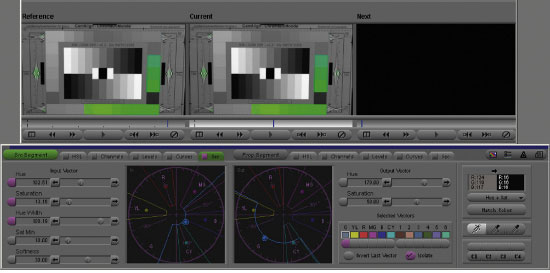
Fig. 5.20
I picked a skin tone because skin tones are common things to target for secondary color corrections. Notice the very tight selection area on the source vectorscope image (Figure 5.21). This step has selected only the upper left color chip, while leaving the other three skin tone chips unselected. This is one of the goals of isolating a vector for secondary color correction.
To select the other skin tone chips, you could see if swinging the hue or increasing the hue width would select them, but as I’ve mentioned before, almost all skin tones line up right along the I line of the vectorscope, regardless of race. So, to select the other skin tones, the other choice is to increase the saturation width. Notice how the custom vector in this image selects more levels of saturation extending from the middle of the vectorscope outwards (Figure 5.22). This effectively selects the other skin tone chips as well as one of the regular color chips that is also very similar to skin tone.
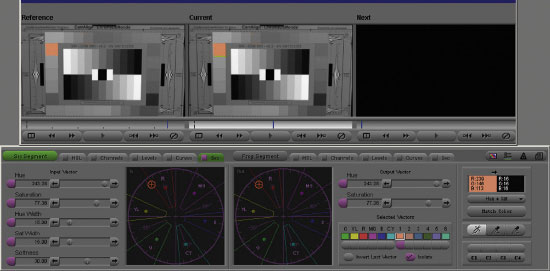
Fig. 5.21

Fig. 5.22
Isolating a Vector in DaVinci Resolve
DaVinci Resolve has great secondary color correction capabilities. Let’s explore the basics of qualifying something in Resolve based on its color.
Let’s start with the “ultralight_barn” QuickTime file (Figure 5.23).
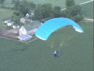
Fig. 5.23

Fig. 5.24
We want to make the canopy of the ultralight pop better from the surrounding field and trees. To do that, we’ll make the grass greener and the canopy bluer. The first part of this process is to qualify—that is, select—the canopy. The easiest way to do this is with the eyedropper button at the bottom right of the Qualifier tab of Resolve’s Color screen.
First, select the HSL tab of the Qualifier tab and make sure that the “On” checkboxes to the left of the hue, saturation, and luminance bars are selected (Figure 5.24). Click on the eyedropper icon then click on or drag over the canopy in the small viewer window in the upper left corner of the Color screen. By the way, the Viewer screen also has an eyedropper icon, and you can use that if you want a larger “canvas” on which to use the eyedropper. Obviously, the image on the Viewer screen is bigger than the smaller image on the Color screen.
When you’ve selected some pixels from the canopy, notice the changes to the hue, saturation, and luminance bars. They indicate—with a white “bell graph”—the values of the pixels that have been selected by the eyedropper.
To see what this qualification looks like on the image itself, click on the Highlight check box at the bottom of the HSL tab, near the eyedropper icon. This changes the viewer window so that the selected pixels are shown in their normal color state and the unselected pixels are grayed out (Figure 5.25).
This feature makes it easier to see how well we are qualifying the image as we continue to manipulate the controls. We want to select as much of the canopy and as little of the rest of the image as possible.
To continue to finesse this qualification, we will use the + and—and + S and –S buttons to the right of the eyedropper button. These are the color picker modes. The + button allows you to add new values to the range. The—button allows you to deselect values from the range. The + S and –S buttons do the same thing with softness.

Fig. 5.25
Experiment with these buttons for a while to see how much of the canopy you can select and how little of the rest of the picture is included in the selection. Command-Z or Control-Z will work to undo simple mistakes or clicks.
The other things we want to experiment with are the sliders to the right of the hue, saturation, and luminance bars. These allow you to adjust the selected values numerically.
Try adjusting the Center slider to the right of the hue bar, “focusing it” back and forth to optimize the best selection of pixels. Then adjust the Width slider until you start to see parts of the barn buildings being selected. Then adjust the symmetry and softness sliders. Watching the white outline on the Hue bar gives a good idea about what these sliders are doing in their selections.
Next to the Saturation bar (the second colored bar under hue), adjust the Low and High sliders. On the low side, the adjustments start to pick up more of the barn buildings because we are telling Resolve to include more low saturation pixels. Because the barn buildings are mostly white, they have some blue in them but are mostly desaturated. By adjusting the Low slider, we are picking up pixels with values that are less desaturated. Adjusting the High slider, we can go all the way to the top of the range because there are no other highly saturated blue pixels in the image. We might as well leave this slider as high as it can go to ensure that we’ve selected as much of the saturated canopy as we can get. But on other images, you will need to focus this adjustment to get the best selection possible. High soft and Low soft sliders control the fall-off of the selection.
Finally, next to the Luminance bar—the black to white bar at the bottom—manipulate the Low, High, Low Soft, and High Soft sliders to maximize your selection. With this image, the hue and saturation of the canopy is so distinct that after some experimentation, you’ll see that you can actually deselect the “on” button on the Luminance bar entirely. It really has no effect. Trying the same thing on the Saturation bar, however, will instantly show that quite a bit of the background pixels have been deselected based on saturation.
The sliders at the bottom of the HSL tab are for the Qualifier blur. The sliders are for the blur amount (radius) and the horizontal and vertical ratio of the blur. There is also a slider to shrink or grow the qualification and another offset control. You can see the effect that these sliders have on your qualification if you make and extreme change to the qualified area, like cranking up the luminance level.
With your qualification complete, deselect the Highlight checkbox to see your image in full color in the viewer. Now we can manipulate the just the color of the canopy without affecting the rest of the image.
To make the canopy stand out, use the Color Wheels in the three-way color corrector tab to swing the gamma towards blue (Figure 5.26). Also, lower the gamma a bit. You can also try corrections in the shadows and highlights. Because of the tonal range of the pixels in the canopy, shadow corrections won’t do too much, but the highlight controls will alter the image almost as much as the gamma controls.

Fig. 5.26 The CMYK reproduction of the correction is not great. Obviously, you need to just tweak the colors enough to make them pop without having them look unrealistic.
For colorists who are migrating over from Apple Color, it’s a little easier to manage multiple secondaries in Apple Color than it is in Resolve, but that’s because using multiple secondaries in Resolve is a lot more powerful and therefore more complex. The method for using multiple secondaries in Resolve is to use the Node Graph to allow mapping of secondaries in very specific ways, including serially or in parallel. In Color, it is possible to map secondaries only with each secondary being fed into the next in series (serially, or in a row). With Resolve, these serial or parallel positions can be remapped at will and can make a real difference in the way the corrections look.
Imagine a case in which your first secondary takes out all of the color of all of the pixels in the image. Then, from that point on, none of the secondaries would have any color information to work with. In Resolve, you can have multiple secondaries running in parallel with each other, or you can rearrange the order of serial connections by disconnecting and reconnecting the links between each node. This approach takes a bit more work, but delivers a lot more power and control.
To do this, you start with a basic correction in the node graph. This first node is always there by default. Now you can either use right clicks on the nodes or in the node graph or you can use the Nodes menu choice at the menu bar at the top of the screen to add specific types of nodes (Figure 5.27).
For a simple set of secondaries, the node graph I’ve built (Figure 5.28) allowed me to add specific vector-based qualifications and corrections to three different areas of the image and then combine them with a unique compositing mode.
Fig. 5.27 DaVinci Resolve’s Nodes pulldown menu.
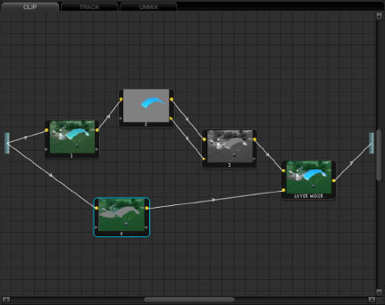
Fig. 5.28 DaVinci Resolve’s Node graph with multiple secondaries combined both in series and in parallel.
Isolation Practice
To practice the ability to isolate a single color in an image, use the “ChromaDuMonde_properexwhite” clip from the DVD and work with your secondary color vector selection tools to isolate individual color chips or to specifically choose sets of two or three or more chips from the others.
Using the ChromaDuMonde chart is good for getting the basics of hue selection under your fingers, but you’ll need something more natural for making other selections based on various levels of saturation. The ChromaDuMonde color chips are all basically the same saturation, except for the skin tone chips.
Plus, one of the other skills that you need to practice is determining the right fall-off or softness levels that allow you to grab (for example) all of the skin tones on a face that is half in shadow or to grab all of the tones of a shirt that has numerous levels of chroma and luminance because of folds and shadows and highlights.
Choose some other clips from the DVD and see if you can isolate various portions of the image. Want a challenge? Try these:
• Isolate the skin tones in “piano_correct.” The highlights of the skin are similar to the aged yellow of the tops of the white piano keys. As I’ve stated before, skin tones are one of the big things that colorists like to tweak as a secondary.
• In any of the ultralight clips, try to isolate the entire “wing” of the ultralight while keeping other colors out of the selection. This is a common correction for a number of reasons. If the video is for the ultralight manufacturer, they might require the color to be a very specific shade to properly represent the product they’re delivering. For other purposes, the producer may just want to pop the ultralight out of the image, calling attention to it through color contrast.
• In the “Jackie_interview” clip, try to isolate her skin tones without selecting the same tones in the wall to the left or in the door behind her. (This can’t be done without the addition of a garbage mask of some sort, but practicing with this real-world image is a great experience.) What would you do if a director of photography (DP) asked for a specific correction to the skin but didn’t want to see that correction in the rest of the image?
• In the “Railroad_LM112 Artbeats” clip, isolate the suitcase. In an image like this, it would be common to ask for more emphasis to be placed on an important prop so that the audience would think of how it relates to the storyline or so that they remember its presence in the scene at some later point.

Fig. 5.29 Courtesy of Bruce Lindbloom (www.brucelindbloom.com).
• In the “8mm_loading_gear” clip, attempt to isolate the yellow jacket or orange life jackets. With the jacket, I found it helpful to turn off saturation (in other words, to not limit by saturation) because the jacket’s saturation levels go from white to yellow. Yellow is one of the colors that people often wish to tweak specifically. Often a shade of yellow with more red in it is desired, yet that red cast is not desired in the rest of the image.
• In the “Football_SP123H1” clip from Artbeats, try to isolate the football and hand from the grass. To attempt the impossible, try to isolate the ball from the hand. This isolation figures prominently in some of the upcoming corrections by our panel of colorists later in the book.

Fig. 5.30 Courtesy Getty Images.
Another good image to use for many experiments is this image created by noted color scientist Bruce Lindbloom. Because there is shading in the image and various levels of saturation in many different hues, this is a good overall image with which to experiment. This image is also on the DVD (“DeltaE_8bit_gamma2.2.tif”).
Another test image that you can use if you need skin tones or are trying to isolate things with secondaries is this image from Getty Images. The image is on the DVD as well (“Getty_Test_Image.jpg”). It is intended for use in setting up printers and doing color management for Getty Images stock site.
Spot Color Correction (Vignettes or Power Windows)
Another form of secondary color correction is called spot color correction. In Color, they’re known as vignettes; in DaVinci, they’re called Power Windows or Windows (Figure 5.31). The basic concept is to draw a shape on the screen and color correct inside or outside of that shape (Figure 5.32). In the early days of Power Windows, you could use only geometric shapes—variations on circles and squares. Now, most of the file-based color correctors like Color and others allow you to draw custom shapes using Bezier curves or B-spline curves. Many of these vignettes, windows, or spot correction shapes can also be tracked to the movement of the shot, which is important in many shots. With some software, like Resolve, you can also combine these shapes, adding them or subtracting them from one another, to create complex windows.
Shot movement—whether it’s camera movement or movement within the frame of a locked-down shot—will be a big factor in whether you choose to use a spot color correction. In the example we did earlier in the chapter of the lion at the Art Institute, the camera is locked down, the lion doesn’t move, and no one crosses in front of the lion or even gets near it, so that shot is a great candidate for a spot correction or for use of a garbage matte to further isolate the color vector correction. (We’ll discuss that in the next tutorial.)

Fig. 5.31 DaVinci Resolve Window tab.
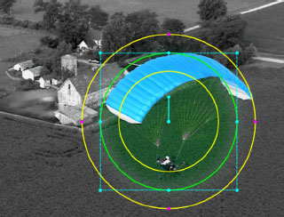
Fig. 5.32 DaVinci Resolve UI showing Circular window with softness on a shot.
There are a couple of reasons to use a spot color correction. One of the ways is to use it very globally to darken the corners of the image and focus attention on the subject in the middle. This method is usually done with a very soft oval shape placed right in the middle of the image. With this use, you don’t really have to worry too much about shot movement because the “spot” is supposed to look more like an in-camera effect, anyway. Another technique for a spot correction is to pick a portion of the frame and affect it in much the same way as the color vector secondary would be used—to pick an area to enhance or fix a problem with the primary correction. The third way to use spot correction is almost as a “post-lighting tool.” You can add this kind of selection to almost spotlight certain regions of the frame. If you are familiar with making prints in a darkroom, this can be similar to dodging and burning.
Let’s do a tutorial for each of these reasons.
The Vignette
Vignette is Color’s term for spot correction. One of the meanings of the English word “vignette” means a photograph whose edges fade off gradually. The following tutorial is about—not Color’s meaning—but the creation of a “vignetted” image.
The vignette is often used to focus the audience’s attention in the middle of the screen. It can also create the point of view (POV) feeling that you are watching the image through your own eyes (as opposed to being a third-person participant). Vignetting is also a common trick to salvage large flat areas of a shot, like a boring sky or a huge, blank wall that was lit flatly. The vignette adds interest and texture to images like that.
Call up the “Kiss” clip (Figure 5.33) from the DVD into Color or some other application that allows you to make spot color corrections.
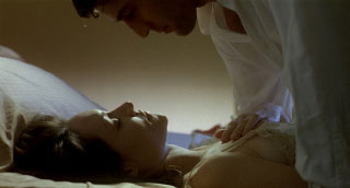
Fig. 5.33
Faking Spot Corrections
If you don’t have a color correction application that allows for spot color correction, you can usually fake it with the tools in most nonlinear editing systems. Copy a clip from your timeline and edit it on a track directly above the clip from which you copied it. Correct one of the clips for the optimum look of the “inside” of the correction and correct the other clip for the look that you want on the “outside” of the correction. Then use a soft-edged wipe to transition between the two of them. You may need to actually create a matte and place it on another track. Each NLE deals with mattes differently, so consult your user manual about the channel on which to place the matte and the channels for the “darkened” and “proper” versions of your color corrections.
On an Avid, for example, the recipe would be to put the correct clip on the bottom track (V1), the darkened clip on the second clip above it (V2), and a matte clip with black around the edges and a soft, white center on the top track (V2). Then add a matte key effect to the top track.
So: Figure 5.34a plus Figure 5.34b keyed with Figure 5.34c gives you Figure 5.34d.
(The matte for this effect is available on the DVD as “mattekeyvignette.psd.”)
In Final Cut Pro, the effect would be accomplished slightly differently. Place the dark clip on the bottom (V1), the correctly graded clip on the top track (V3), and the matte clip in between (Figure 5.35). Then right-click or control-click on the top clip and select “Composite Mode” from the pulldown menu, then “Travelling Matte—Luma.” In Final Cut Pro, you could also generate your gradient for the second track right inside of Final Cut Pro using the Generator button on the Viewer and choosing Render, then creating a radial shape and placing the start point somewhere near the middle or wherever you want it.
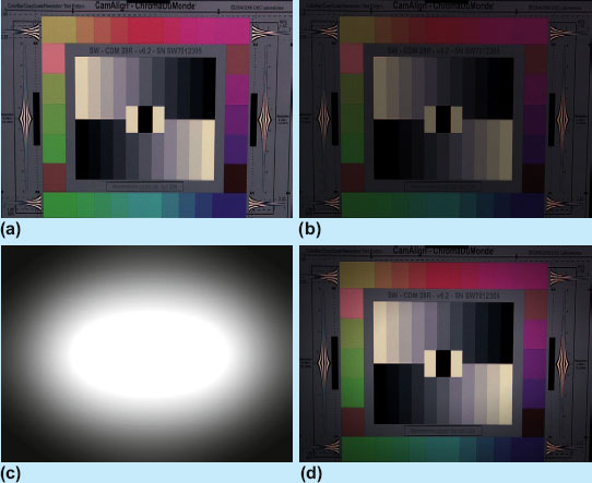
Fig. 5.34 (a) Normal image (b) Darkened image (c) Vignette (d) Final effect.
Fig. 5.35 Screen grab showing the Final Cut Pro timeline.
In Color, go to a secondary and enable it and enable the vignette. Then draw an oval that goes from edge to edge and almost from top to bottom (Figure 5.36).
You can soften this circle by either center-dragging (center-dragging on many mice is the scroll wheel) in the circle or by changing the softness in the vignette control area (Figure 5.37).
Once you have at least a starting point for the shape and softness, you can choose the Control pulldown at the upper right of the secondary tab near the HSL controls and specify whether you want to correct either the inside or outside of the vignette. You can choose to do both inside and outside corrections if you want to. I actually chose to lower the gain and midtones outside of the oval and bring up the chroma a bit inside the oval.
This is the image with a pretty strong vignette (Figure 5.38). We’ll be seeing example of vignettes in the color corrections that our panel of colorists executes in the coming chapters as well. I made this vignette pretty bold to emphasize what I was trying to do, but most of the vignettes that you’ll see later in the book are much more subtle. These vignettes are very hard to show in print unless they’re fairly obvious, which is the opposite thing that most colorists are trying to accomplish with vignettes.
Instead of a very broad oval that covers a lot of the image, you could also aim the center of the vignette to the focal point of the image. In the following image, the correction remains the same as above, but the oval is centered on the kiss and the softness is expanded. The yellow lines are optional UI overlays that let you know the boundaries and shape of the vignette.

Fig. 5.36
Fig. 5.37
If you want to get an idea of how many shots—especially in TV spots—have vignetting, it’s very hard to see if you look at the center of the screen, but focus your eyes on the corners and you will see this on more shots than you would expect.

Fig. 5.38
Fig. 5.39
You can see that this can be a very effective way of enhancing a shot (Figure 5.39).
Geographical Color Fix
You can also use spot color correction to solve a problem that exists in just a specific area of the picture, or to enhance just a specific area of the picture. For our example, call up the “ultralight_horizon” clip (Figure 5.40).
This is not the best way to select the grass and/or sky, but it will work for the purpose of the tutorial. The best way to do this correction “in real life” is to use the same method that we used earlier in the chapter when explaining the Final Cut Pro Limit Effect using the same clip. Let’s continue with this method, though, so that you see how two different methods can be used to the same end result.

Fig. 5.40
This image is very washed out, but it also looks like the top of the image needs to be treated in a much different way than the bottom of the picture, below the horizon. Normally, you would try to balance the picture and expand the contrast first in a primary color correction, but I’m going to take this right to a secondary color correction to make my point.
The first thing to do is to select the grass area with a window of some sort. I will do this correction in Color, so go into secondaries, enable a secondary, and enable Vignette. Then choose a square shape and drag it out and position it so that the top of the resulting rectangle is roughly placed on the horizon which is slightly off-angle. Color has an angle control that can be used to precisely align the top of the rectangle with the horizon. You can also add a slight softness to the rectangle.
For the purpose of this tutorial, we’ll address a single frame of the shot, but the camera does actually tilt up over the course of the shot, so in a real-life situation, you would need to track the rectangle to follow the tilt (Color is capable of doing this) or add keyframes in a program that was not able to track so that the shot’s horizon would stay lined up with your spot correction’s “horizon.”
With the grass defined as the inside of the correction (Figure 5.41), you can adjust the contrast and colors of the grass alone, just as you would in a normal primary color correction. Originally, I started by trying to use the hue offset wheels to pull the grass towards green, but when I added a pretty heavy correction in the master lift, the saturation of my green color looked really bad. I reset my hue offset wheels and worked on contrast first. I chose to lower the master lift and slightly lower gamma and barely raise gain. With the contrast and tone set, I pulled the midtones away from blue just a little to improve the color of the grass. I also did similar, very minor corrections to highlights and shadows in the same direction. The darker overall shade of my grass correction helps focus attention up towards the ultralight.

Fig. 5.41 The shape of the vignette is hard to see since it sits right on the horizon.
Once the color of the of the grass is complete, switch the secondary control from “inside” to “outside.” With the sky, I started working on the contrast first. I brought the master lift down a lot. This popped the ultralight against the sky because it’s the only really dark element in the top half of the image. I brought the gain up so that the clouds would “read” better against the blue of the sky and brought the gammas down a bit to stretch the contrast between the sky and the clouds even further. Then I pulled the midtones towards blue pretty severely. The midtones only really affected the blue sky (remember that the grass is being “protected” from the midtone correction by the spot correction). Then I pulled the highlights—which was basically just the clouds—away from blue so that the clouds would be more cleanly balanced towards white (Figure 5.42).
The result is something that could not be executed in a primary color correction, which is pretty obvious when you see the wildly different corrections that went into the top and bottom of the image (Figure 5.43).

Fig. 5.42
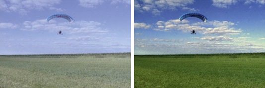
Fig. 5.43 Before and After shots of the ultralight with secondary corrections.
User-Defined Shapes
Many file-based systems, like Lustre, Baselight, Resolve, Color, or Symphony allow you to hand-draw organic shapes to define these geographical areas on the screen. This feature is a very powerful tool that I both encourage you to use and discourage you from using.
On one hand, these custom shapes are very valuable for at least two reasons. The first is that using squares and circles is obviously fairly limiting when you are trying to isolate a specific portion of the screen. The other great reason for using custom shapes is that they are much less likely to be noticed as spot corrections. Obviously you don’t want any spot color correction to be noticed. That is a sure sign that it hasn’t been done properly. But even watching the best of TV spots with a trained eye, you can see vignetting that has been done by a skilled colorist, if you know what to look for. But with a custom shape, it is very hard to see even a fairly extreme spot correction, because the shape is not uniform. This is the same concept as camouflage in military and hunting use. A camouflaged person or truck is just as visible as any other person or truck, but the camouflage pattern works by breaking up the easily defined shapes that humans and animals are used to identifying as another human being or truck.
Pankaj Bajpai
Pankaj Bajpai is Senior Colorist at Encore in Hollywood. He was instrumental in establishing their file-based workflows and DI-style approach to grading TV episodes. He has also provided his expertise to AMPAS’s ACES/IIF color workflow.
In 15 years as a colorist, Bajpai has graded multiple seasons and various episodes of hit TV series, including Lie to Me, Carnivale, Sex and the City, Hung, The Beast, In Treatment, Justified, Rome, and The Wire.
Before becoming a colorist, Bajpai worked as a DP on documentary films around the world.

Fig. 5.44 Encore’s Pankaj Bajpai at the controls of his Lustre.
I sat in with Pankaj Bajpai at Encore in Los Angeles. Pankaj drives a Lustre, and one of his favorite tools in its arsenal is Lustre’s ease of creating masks and windows. He explains, “I do a lot of masks and a lot of Power Window type work because so often it is very important to bring that three-dimensionality, because when your pictures feel three-dimensional, then you almost automatically start to feel like it’s real.”
Figure 5.45 gives you an idea of the complexity of the shapes that Bajpai is drawing to get these organic looks.

Fig. 5.45
Another adamant user of these custom shapes for secondary color correction is veteran Chicago colorist Pete Jannotta, who says, “I always prefer to draw (custom shapes) because even in Da Vinci I don’t use a fixed circle ever anymore. What I like to do is draw the shape and then move it around so I can see how the light is working. I don’t care what the shape is, but if it’s an oval, then it’s fixed and I can’t control it.”
But the flip side of this control is the cost in time. If you’ve got time on your side, then custom shapes are great.
Using Spot Color Correction to Relight
One of the subsets of reasons to use a spot color correction is in the ability to effectively relight the image in post. This is not to cast aspersions on the director of photography in any way. They are under the same time constraints for lighting the scene that we are for grading it in post, so sometimes what the DP wants to do just doesn’t happen on the set.
Many directors of photography complain that the budget isn’t there to pay them to sit in with the colorist for the transfer to act as a guide to ensure the integrity of the final image. Often they are already working on the next project when it’s time to color correct their footage. Sometimes all that the DP has time for is a phone call to the colorist. There are several applications designed to provide a technical link between the DP and the colorist. Kodak has a software system that a production can license to allow the DP to do some basic “look creation” on the set and then deliver that image to the colorist as a guide. IRIDAS has a similar system.
Color Vector with Window or Vignette
Sometimes it is impossible to qualify something with a color vector isolation alone, and that is where the third method comes in, which is a combination of the color vector isolation assisted by a vignette (in Color) or a Window (in Resolve).
Let’s go back to the first image we tried in this chapter, the Art Institute lions. Load the “art_institute_lion_proper” clip into your color correction application. Now try to select the lion again with a color vector isolation or if you saved your isolation from the first example, then load it up.
The best isolation that I could come up with looked like Figure 5.47.
Notice that the lion was pretty well selected, but I also selected some of the grayish-green pedestal that the lion is standing on as well as some grayish-green tones in the steps, under the arches and in the eaves of the building. In the first example, we corrected the lion without further qualifying the isolated areas, and we were able to do our corrections without damaging the rest of the image too much.
In this exercise, we want to get a much cleaner key, and the only way to do that is to add a garbage matte to that will key out the rest of the isolation that we don’t want. In Color, this is done by enabling the vignette portion of the same secondary in which the color vector isolation was executed.
Definition
director of photography (DP): The person on the set responsible for the look of the footage. Sometimes it’s the same as the camera person, sometimes it’s also the person that lights the scene, but the usual role for the director of photography is to serve as the liaison between the director and the rest of the camera and lighting crew in achieving the desired look of the shot. The director of photography is sometimes also the person responsible for directing the colorist to either maintain and protect the look that was created on the set or to enhance it in some way. The director of photography is also sometimes referred to as the DP or DoP or cinematographer.
When trying to relight a scene using spot correction, user-defined shapes are very important because they can be shaped the way a pool of light might normally fall. Using these tools, you can remove spill where it wasn’t wanted or add a little extra punch to a face or to eyes that didn’t quite get enough light on set.
Encore’s Bajpai is quick to point out that he doesn’t feel that his grades are actually relighting: “I am not intending to relight a DPs work. That is not the idea. The idea is to enhance it and in that enhancement, if you look at this image versus where it started, the lights already in there, the lamp is already lit that way so when you’re looking at that and you’re looking at this. All it is, it’s fallen into… it’s not exactly relit.
It is more like what that lighting needs to be in the context of that scene or the emotional feel that happens to be in that scene.”
spill: Light falling outside of the area it is wanted; light from an uncontrolled or undercontrolled light source. With greenscreen work, it refers to unwanted light bouncing from the background onto foreground elements.

Fig. 5.46 (a) This is a matte created from luma of MAR115H1 from Artbeats. Notice the unwanted highlight areas lower on the Marines’ clothing. (b) This is the same matte with a garbage matte applied so that only the portions of the luma matte above the yellow line will be used for the qualification.
If the secondary is enabled and you’re looking at the Preview mode with the matte view selected (showing the matte on the second monitor), you will instantly see what the garbage matte does (Figure 5.48).
Of course, that’s not exactly what you want it to do, so we need to modify it a bit. If you are working in Color or some other application that allows you to draw vignettes or mattes with custom shapes, then you are in luck. If you are limited to using only geometric shapes, you’ll still be fine completing the rest of this tutorial. Just use an oval and shape it, position it, rotate it, and soften it so that it isolates as much as possible without “eating in” to the matte you already created for the lion.
Figure 5.49 is the matte image with the circle garbage matte. The inside and outside softness of the circular garbage matte are defined by the yellow lines.
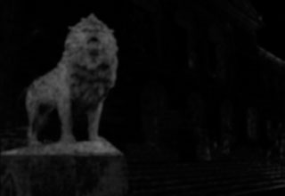
Fig. 5.47

Fig. 5.48

Fig. 5.49
In Color, when you are in the Vignette area and select “User shape” from the Shape pulldown menu just below the Vignette check box, you are instantly transported to the Geometry room where you have a little larger image to work with to set your points. Just start clicking on the image of the lion in the Geometry room UI to create your shape (Figure 5.50). When you get back to almost where you started, choose “Close Shape” from the button to the right of the lion image.
TIP
Those of you with the ability to do custom shapes do not need to add a lot of points. Adding lots of points slows down the processing time because the computer has to track every one of those points. It also makes moving all of those points trickier, even though in Color and many other applications you can move groups of “lassoed” points together.
Once your shape is drawn, use the “Attach” button at the top right of the UI to have the shape “attached” to your secondary correction. This step is necessary because you can choose multiple saved or created shapes to attach to your correction.
Then you can go back to the Secondary room and soften the edges of the shape so that there is not a hard edge to the garbage matte. You can see the difference in the cleanliness of the matte by viewing the matte in the right-hand (non-UI) monitor while toggling the Vignette check box off and on.
The discernable difference in the final image is actually quite small. Remember that the original secondary correction without the garbage matte was to darken the lion and pump up the saturation. In small areas under the lion and in the eaves of the roof, this also darkened those areas and brought up the green cast. With the garbage matte in place, those areas are fixed. Was it worth the effort for the minimal gain? Only you and your client can say. I suggest that you try to make your qualifications as clean as possible, but sometimes your schedule and budget will not allow it. You can certainly see the difference when you toggle between the shots with and without the garbage matte, but if you edited the non–garbage matte version into a show, then put in a second shot and then cut back to the garbage matte version, there is no way anyone would see the difference.
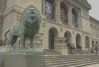
Fig. 5.50
Secondaries Are Crucial
Knowing what to use secondaries for and how to decide what to isolate and how is really critical to good color correction. That is why the next chapter will finally bring in the full expertise of our expert panel of colorists. We’ll have them walk you through a number of color corrections that use secondaries. The tools for each application are really either limited to tools that are available exclusively to a specific application (see the sidebar on Color’s “Secondary Curves”) or they are very limited to the color vector isolation and shape-drawing tools that have already been covered extensively in this chapter. I’ve sprinkled in some great advice from some top colorists in these early chapters, but in the chapters to come, we’ll let these talented, dedicated experts show how to deliver creative results with technical expertise.
Secondary Curves
One of the interesting sets of secondary tools in DaVinci Resolve and Apple Color are the Hue, Saturation, and Luminance curves. These are unlike the curves that we discussed in the previous chapter. These curves allow you to select a specific hue with a click of a button and either rotate its hue, alter its saturation, or change its luminance value (Figure 5.51).
A few pictures will be worth way more than the thousand words that it would take me to explain this further.
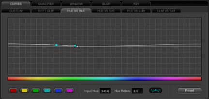
Fig. 5.51 DaVinci Resolve Hue curve UI.
Here’s the unaltered image (Figure 5.52). All of these ultralight images are courtesy of Randy Riesen, who is one of my top three cameramen in Chicago. Digging through 20 hours of raw footage to find a couple of shots that needed some work was difficult. Virtually everything was picture perfect, despite the extreme conditions he was shooting under.

Fig. 5.52
Color allows very quick adjustments to specific hues. In the Hue curve, clicking on the point of the curve that corresponds to the hue of the ultralight’s wing and adjusting it (Figure 5.53). changes the hue of the wing (and quite a bit else); see Figure 5.54.

Fig. 5.53

Fig. 5.54
Adjusting the Saturation curve (Figure 5.55) at the same point makes the wing more saturated (Figure 5.56) instead of changing its hue.

Fig. 5.55

Fig. 5.56
And adjusting the same point on the Luminance curve (Figure 5.57) makes the wing darker (Figure 5.58). This step required setting a second point to isolate the luminance correction on the wing from the other colors in the image that were similar.

Fig. 5.57
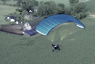
Fig. 5.58