
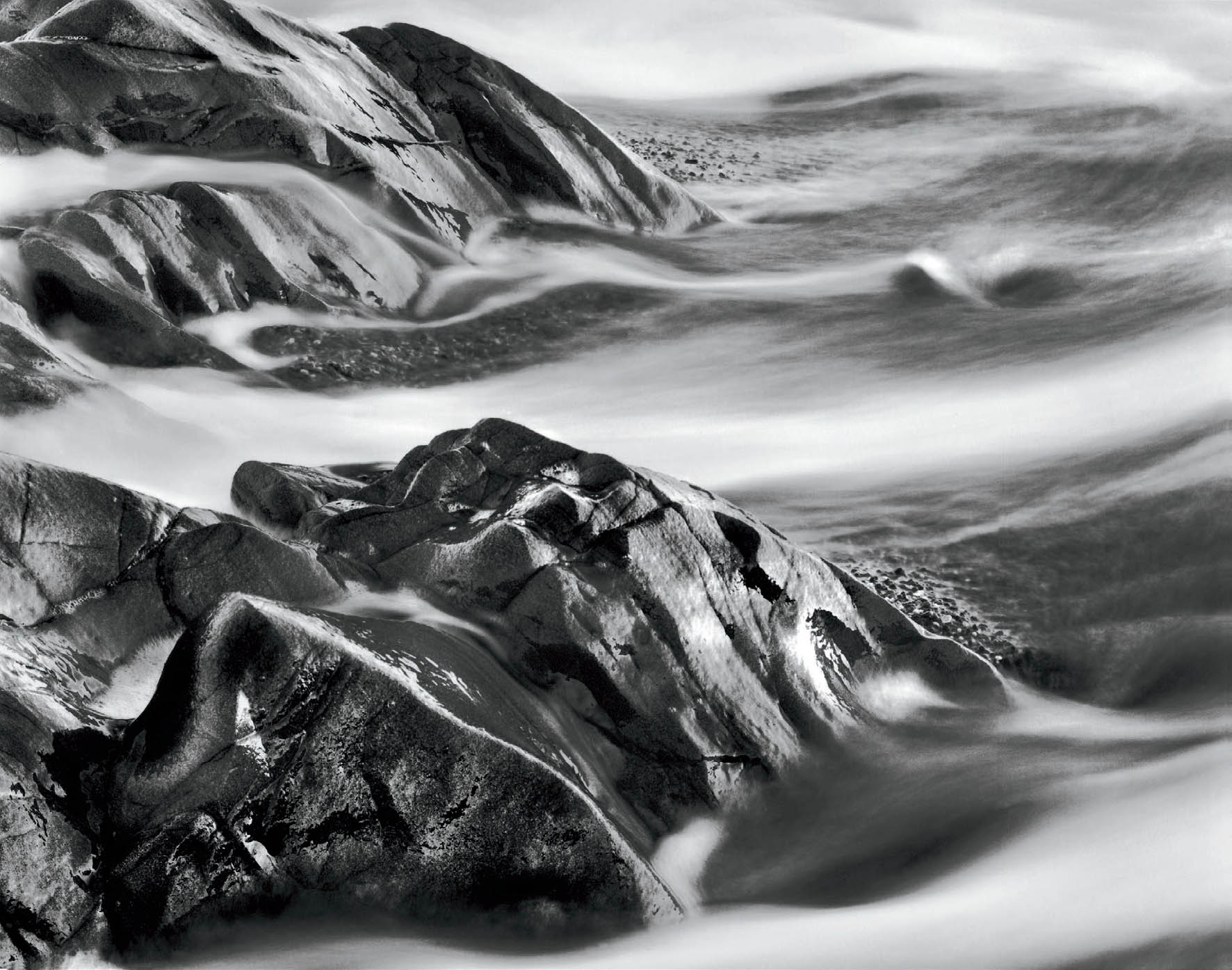
Figure 10-1: Rocks and Receding Wave
I exposed this negative in 1978 and unsuccessfully tried cropping and printing it a few times before giving up. In 2006, I rediscovered the negative and realized that the upper right, which appeared blank white on the contact proof, simply needed burning to bring out necessary detail. So, after nearly 30 years, I finally printed it. The glowing, flowing, abstract forms that I encountered three decades ago have finally come to light. With easy access to any negative I’ve ever exposed, I can print at any time. This is a great advantage of negatives, which stay the same forever, as opposed to digital files, which may not be easily accessible as technology changes.
CHAPTER 10
The Print
![]()
ASIDE FROM YOUR CHOICE OF SUBJECT MATTER, printing a negative in the darkroom is possibly the most personal aspect of photography. Every photographer has his or her own special way of approaching darkroom work, just as every digital practitioner has his or her own workflow, and few photographers avail themselves of the opportunity to watch others work in the darkroom. For this reason, I shall approach this chapter in a very personal manner, detailing the materials and methods I use in making a print. I don’t suggest that my approach is the only way to go about darkroom work, nor is it necessarily the best way—but it is surely my way, and it has proven successful for me. I suggest that you consider each of my methods for possible inclusion in your own approach, with your own personal modifications.
Many of the techniques I regularly employ in the field and in the darkroom started as suggestions from other photographers. I often modified their procedures to suit me. I’ve even invented new techniques. I try to maintain an open, flexible approach, trying new procedures or materials whenever they seem to have merit for my purposes. If you can adopt an open approach, this chapter will prove more meaningful to you, whether you’re at the beginner or advanced level.
The chapter will begin with an overview of materials, because their characteristics are so integrally tied to my methods. From there, it will proceed to methods of printing—using both standard and advanced techniques—then to completion of the process through archival processing (i.e., the production of a permanent image). The discussion will first focus on black-and-white procedures, then on color. I wish to make clear that some of the methods explained in black-and-white are fully applicable to color, and vice versa. So I urge readers with an interest in only one or the other to read the entire chapter.
![]() I find that images possessing substantial areas of white printed on neutral or slightly warm papers appear more brilliant than those printed on cold-toned, bluer papers, even if a densitometer confirms the fact that they both read equally bright.
I find that images possessing substantial areas of white printed on neutral or slightly warm papers appear more brilliant than those printed on cold-toned, bluer papers, even if a densitometer confirms the fact that they both read equally bright.
Black-and-White Enlarging Papers
What is the best enlarging paper? Today there are fewer options due to the rapid shift toward digital photography, but there are still excellent products available. I’ve used many papers over the years, and today’s products are as good or better than ever. As I revise this book, my favorite papers are Fomabrom V111, Adox MCC110, and Ilford Multicontrast Warmtone. All three are variable contrast papers. They all have great brilliance, wide latitude in contrast range, and rich glossy surfaces (not high gloss like drugstore prints, but semigloss with a slight texture). They can be processed to full archival longevity and can be bleached and toned easily. There are other papers available as well, so there are plenty from which to choose. Let me add that most digital users believe that traditional black-and-white is dying or dead, and that most materials have disappeared. That is not the case! Among the abundance of films and papers available, I can say that the products I’m using now are the best I’ve ever used.
Let’s look at several important paper characteristics more carefully. There is a subtlety concerning paper color that deserves real scrutiny. Papers with cold, bluish whites always seem to have less brilliance in broad highlight areas than papers with warmer, yellower whites. It’s an interesting and unusual phenomenon that has intrigued me for some time. I believe I have identified the reason. Let’s investigate a concrete example to understand it.
Suppose you look at an image made in winter of a sunlit snowfield. It would seem that the colder (blue) white paper would convey the feeling more appropriately than a warmer (yellower) white. Surprisingly, it’s the other way around. My explanation is that the human eye responds more strongly to the yellow-white than to the blue-white. This is due to the well-known fact that the human eye responds more strongly to the yellow portion of the spectrum than to the blue portion. After all, we can see light blue, medium blue, and dark blue, but we cannot even comprehend dark yellow. Yellow always appears bright to our eyes, and that carries over to the subtle print coloration. I find that images possessing substantial areas of white printed on neutral or slightly warm papers appear more brilliant than those printed on cold-toned, bluer papers, even if a densitometer confirms the fact that they both read equally bright. But when a highlight is isolated and surrounded by mid-gray or darker tones, the color seems immaterial; any paper appears equally brilliant.
Developing characteristics are also important, for there are subtle differences between the image quality of a fully developed print and one that has been pulled from the developer a bit too soon. Most fiber base papers develop slowly over long periods of time, with increasingly rich blacks and more subtle midtones resulting from extended development times. Variable contrast papers appear to develop more quickly, but gain subtle highlight gradations with extended development. The reason for this characteristic in variable contrast papers is that their two emulsions—one low contrast and one high contrast—don’t always develop at the same rate of speed. The high-contrast emulsion usually develops more quickly, giving the appearance under the safelights that complete development occurs rapidly; but as the low contrast emulsion develops, the subtle highlight and midtone gradations become more apparent. Of course, the low-contrast emulsion adds to the richness and the subtleties within all image tonalities: highlights, midtones and shadows, and down to the deepest blacks. So if you rush your development, or pull the paper out of the developer early, you’ll lose some of the richness of the image.
One final word about papers in general: double weight paper is more durable than single weight paper. That is obvious, but it also means that in the long run, double weight paper is probably cheaper and less frustrating, for fewer prints are damaged during development and subsequent handling. Also, because it can endure rougher handling, double weight paper can be worked on in the developer, with hand rubbing of specific areas to enrich blacks or bring out the most subtle highlight gradations. I don’t know of a single fine art photographer who uses single weight paper over double weight (or “premium weight”), and there’s an important lesson in that fact!
Variable Contrast vs. Graded Papers
The greatest change I have encountered in traditional photography came between 1990 and 2000 with the widespread introduction of high-quality variable contrast papers, also known as multicontrast papers. (In fact, the failure of traditional color photography to adopt variable contrast papers was the prime motivation for my switch to color digital methods.) It amounted to nothing less than a revolution in photographic possibilities. Today, even after carefully watching digital processes improve over the years, I am still convinced that a good gelatin silver black-and-white print is unmatched by any inkjet or other digitally created image. That’s the reason I continue to work with traditional processes in black-and-white. (Besides, the traditional darkroom is also my sanctuary, where I can block out the world while I engage in my creative dreams.)
I used to print all of my images on graded paper, but by 1995, I had completely switched to variable contrast papers. Variable contrast papers exhibit whites that are every bit as white as any graded paper and blacks that are equally rich and brilliant. Thus, they are equal to graded papers in overall tonal quality. Beyond that, there are two advantages to variable contrast paper. The first is a reduction in your need to stockpile vast amounts of paper, since each sheet can be printed to any desired contrast level. Second, you can print an image with one level of contrast in one area and another level in another area, smoothly meshing the two (or more) contrast levels with careful burning and dodging (see below for more information on this topic).
The contrast level of a variable contrast paper depends on the color of light that hits the paper. The color—and therefore the contrast level—is changed by placing filters below the enlarging lens or above the negative inside the enlarger (which is the preferred method because it doesn’t interfere with the optical qualities of the lens). Most enlargers are made with filters built into the system, allowing a continuous increase or decrease in contrast from the highest level (maximum magenta or blue) to the lowest level (maximum yellow or green). Thus each portion of a print can be exposed to your desired contrast, offering a remarkable level of control and flexibility never achievable with graded papers.
The way it works is relatively simple to understand. All variable contrast papers contain two emulsions: high contrast and low contrast. Magenta (or blue) light activates the high contrast emulsion to the greatest extent and the low contrast emulsion to the least extent. Yellow (or green) filtration activates the low contrast emulsion to the greatest extent and the high contrast emulsion to the least extent. Thus, by varying the amount of magenta or yellow filtration, you can control the contrast level of the paper. There is never a reason to use yellow and magenta filtration together, for one serves to negate the other, but doing so does lengthen the exposure under the enlarger due to the neutral density effect of two filters being used simultaneously (more on this below).
Today, anything that can be done with graded paper can be done with variable contrast paper simply by setting its contrast level to the equivalent of the graded paper. Of course, many of the prints I make can still be done equally well on graded paper because the entire image is printed at one contrast level. Some images are simply easier to print—and often are superior in overall quality—on a variable contrast paper. But a few are possible only on variable contrast paper. Because I try to maximize my options in all areas of my photographic endeavors, variable contrast papers have become my logical choice and I strongly recommend them for all printers. The discussion that follows is based largely on variable contrast papers, but everything still applies to graded papers, except where the added flexibility of variable contrast papers come into play.
Fiber Base Papers vs. Resin Coated (RC) Papers
Fiber base silver gelatin papers offer the ultimate in quality and longevity. They are the gold standard by which any paper is measured, including digital papers of any sort. Resin coated (RC) papers were developed for those who need to get prints quickly, have them dry almost immediately, and lay flat on the table without mounting. They were perfect for newspaper use, for example, but now digital processes are even faster; the prime purpose of RC has been superseded in a span of about 20 years.
RC papers have improved significantly since they first hit the market. Initially, images appeared to be a bit fogged and the papers had a short lifespan, lasting no more than 10 years before the plastic base began to crumble, taking the images with it. But great strides have been made over the years in image quality and longevity. However, RC papers still lack the last step of brilliance and are still not as permanent as fiber base papers. They are unlikely to ever reach the quality level of fiber base papers.
Another problem with RC papers is that they develop fully within 60 to 90 seconds. Additional development has no effect on the image. As a result, exposure alone determines the image. This means that development is purely a mechanical process, and the print lacks the subtle variations of tonality that make a fine fiber base print shimmer.
I use fiber base papers exclusively. I see no reason to compromise on quality at any stage of the artistic process, especially the all-important final step: the finished print.
Black-and-White Paper Developers
There are a number of developers available, and each has different properties. It’s worth trying several, printing the same negatives with different developers and different papers to see which combination pleases you most. Don’t be surprised if you find that some combinations work better for some images, while others work better for different images. For years I have used Kodak Dektol developer with a variety of papers with pleasing results. Ilford’s Ilfobrom developer is similar to Dektol in quality, but slightly colder in tone and even a bit higher in contrast. It, too, is excellent. Other developers abound, and experimenting with them (using, perhaps, Dektol as a standard of comparison) will help you determine which is best for your general use. I’ll use Dektol as the standard throughout the ensuing discussion because of its high quality and widespread use. Some developers bring out a warmer tone in papers, whether they are initially warm tone, neutral tone, or cold tone papers. These are worth working with to achieve your desired look.
In addition to the prepackaged developers mentioned above, there are formulas for mixing your own developers, which are available from a variety of sources. I won’t delve into these here. If you’re interested, there are books available about the formulas. I believe that the prepackaged materials possess all the varieties of the formulas, and they are far easier to prepare.
Making Contact Proof Prints
My first step in printing is to make a contact proof of every negative so that I can see what I have on paper and get a good indication of how to print any negative of interest. Making contact proofs is far more important than most printers realize. For me, it’s critically important; it should be for you, as well. I have contact proofs of all my negatives; these serve as a catalog of my entire history of photography. (For digital practitioners, a contact proof is the equivalent of a RAW file: it’s the untouched original from the developed negative with no manipulation. Once you have a contact proof, it’s always there for reference. It never changes.) My contact proof prints are intentionally low in contrast so I can see detail everywhere, even if I later choose to allow some of the detail to disappear in the final print. At the contact print stage of the printing process I’m looking for information, not “punch.” I study each contact proof for the possibilities I envisioned at the scene, and even visualize new possibilities while studying the proof.
To make my contact proofs, I place two sheets of 8 × 10 enlarging paper on top of a thick foam pad under my enlarger and place four 4×5 negatives on each sheet of paper, with the negative’s emulsion in contact with the paper’s emulsion. I cover the entire setup with a ¼"-thick sheet of glass. This arrangement ensures perfect contact between the negative and paper emulsions. The entire arrangement is directly under the enlarger, which is set to a contrast level of 60 units of yellow filtration—roughly equivalent to a #½ or #1 filter (the filtration may vary depending on the paper used). The eight negatives normally vary in density; often there are considerable differences in density among them. So I expose the entire set to the amount of exposure needed to get a good proof of the thinnest of the eight negatives. Of course there may be several negatives within the set that have the same relatively low overall density.
After making that exposure, I place 4×5 sheets of cardboard on top of the glass over each of the thinnest negatives. Then I give additional exposure to the next densest negative(s) in the group, and then I cover that negative with cardboard. I continue giving additional exposure to successively denser negatives until I finally expose the densest one fully. Then I develop both sheets of paper to yield eight proof prints. If any of the proofs comes up too light or too dark to be of value, I simply proof it again in the next set of eight negatives with a more appropriate exposure (maybe even a third or fourth time). Eventually I discard all the useless ones and keep only the good ones, i.e., the ones giving me the best information of what each negative contains.
![]() Making contact proofs is far more important than most printers realize. For me, it’s critically important; it should be for you, as well. I have contact proofs of all my negatives; these serve as a catalog of my entire history of photography.
Making contact proofs is far more important than most printers realize. For me, it’s critically important; it should be for you, as well. I have contact proofs of all my negatives; these serve as a catalog of my entire history of photography.
If I’m proofing 120 roll film, I cut the roll into several segments (five 2¼ × 1⅝ frames per segment, or four 2¼ × 2¼ frames per segment) and use the same procedure with cardboard cut to 2¼ × 1⅝ or 2¼ × 2¼ for density variation. If you use a different size 120mm film (such as 6 × 9 cm or 6 × 7 cm), cut the roll appropriately to proof the entire roll on the sheet of 8" × 10" paper.
I then develop the contact prints for the usual five minutes in Dektol diluted 1:5. This yields a low contrast proof with excellent detail for all but the most high contrast negatives. It doesn’t give me a “snappy” print, but it gives me the maximum amount of information about what is on the negative and shows me how it would look in a straight print. That’s all I want: information!
I process the proof sheets, fully dry them, and then flatten them in a dry mounting press. I number them all to correspond to my negative number system, which allows me to retrieve any contact print and negative later. Then I study the proofs individually before printing any of the negatives. This may appear to be a time-consuming approach for those who want to produce a number of great prints quickly, but it certainly saves time and paper in the darkroom later. By the time I decide which are the most important negatives to print, I also have a rather clear idea of how I wish to print them, including any burning or dodging or other techniques.
Often, I have an idle 25 minutes or even an hour of time, which is not enough for a productive printing session in the darkroom. But those minutes can be extremely valuable for further evaluating contact proofs, not only to determine which images are really worth printing, but also how each image can/should be cropped, the proper contrast level for the final print, and for determining a basic printing strategy. Furthermore, those images rejected as good prospects can be reviewed again days, months, or years later. I’ve gone through that process and, many years later, as I looked at those old contact proofs, I found real gems hidden among those I had long ago rejected. Apparently I’ve been ahead of myself at times, making exposures in the field that I only began to appreciate years later. Having the contact proofs allows me such review; having no contact proofs would have prevented later evaluation of my work. And, of course, I can immediately access any negative I’ve ever exposed for printing in the darkroom (figure 10-1).
Preliminary Work Toward a Final Print
The first thing I look for is a good image from the entire negative. If it disappoints me, I look at the possibility of cropping the photograph to obtain a good image. Though I try to compose the photograph to utilize every square millimeter of negative area, I will crop without hesitation if it can improve the possibilities of yielding a good image.
I use two small 5" × 5" cropping L’s for my purpose, searching the proof for distracting elements along the edges or undesirable areas that could lower the quality of the final print. Then I move the cropping L’s around to see if I can effectively eliminate the unwanted portions. If I find an effective crop, I mark it directly on the proof print with a typical ballpoint pen. If I find a second potential crop of equal value, I mark that one in ink as well. If I have second thoughts about anything I’ve marked, I can remove the ink by swabbing denatured alcohol directly on the proof print with a cotton swab. It removes the ink with no adverse affect to the emulsion.
A contact print of a negative has roughly the same contrast level as the negative projected onto enlarging paper from a diffusion enlarger (but not a condenser enlarger, which would have significantly higher contrast). Thus the low contrast proof I make is closely equivalent to a variable contrast paper printed at 60 units of yellow filtration when projected from the enlarger. If the proof looks good, it tells me that about 60 units of yellow filtration is the logical choice for enlarging the negative. If the proof looks a bit flat, I think about decreasing the amount of yellow filtration, thus increasing the contrast level, perhaps even to zero units of yellow (i.e., “white light”), or going beyond white light into the realm of magenta filtration, which further increases the contrast of the paper.
The “muddier” the contact proof looks, the more magenta filtration I feed into the enlarger, up to its maximum level (170 units of magenta on my LPL enlarger). On the other hand, if the contrast in the contact proof looks too harsh, I dial in progressively higher amounts of yellow filtration to lower the inherent contrast. I never use magenta and yellow filtration simultaneously because they cancel out one another and serve as neutral density filtration, lengthening exposure times.
In the past, I used to start out by printing 8×10 prints, even if the final print would be 11×14 or 16×20. I figured it’s far less expensive to experiment with printing an image on 8×10 paper than on larger sheets. I further decided that the 8×10 prints could always be used for publication prints, even if I had no intention of mounting them, so they were not merely learning devices. I don’t do that today. Instead, relying on a great deal of experience and a lot of pre-planning for each negative to be printed, I go directly to the size I wish to print for exhibition prints (most often 16×20, but sometimes 11×14, 8×10, or even smaller). For publication purposes, 8×10 prints were once required for reproduction, but most reproduction has gone digital, so I simply scan or re-photograph my finished darkroom prints to convert them into reproduction-quality digital TIFF files, which are sent to the printer.
Make Test Prints, Not Test Strips
I don’t make test strips because I find them confusing, counterproductive, and useless. A test strip is generally a small strip of the image, perhaps an inch or two wide by about eight or ten inches in length, taken from the center of the image, with a series of 3-second exposures along the length of the strip . . . so that there may be 10 exposures ranging from 3 seconds to 30 seconds. From that, you’re supposed to choose the best exposure, and proceed to print from that starting point.
But test strips show too small an area of the full image and cannot give enough information if the final image has a variety of tonalities and contrasts. Think of it: the best exposure is showing just one or two square inches of an 8×10 or larger image, or at best about 2% of the image.
Not only is it difficult to judge the best exposure from only two-percent of the image, but the test strip invariably contains two or three segments that are far too light to be usable, two or three that yield useful information, and three or four that are far too dark. This represents an unthinking approach to the start of your darkroom printing process. Instead of this mindless beginning for your printing, let me suggest a far more useful approach—one that turns test strips into a thinking process rather than a mindless one. So let’s get you started on a good track to making prints efficiently.
I recommend a full test print rather than a tiny test strip. If you’re about to make an 8×10 print, use the full 8×10 sheet as a test rather than just a skinny test strip. Here’s how to do it: first, based on your study of the contact proof, choose the contrast level you think the print will require. If the contact proof has good contrast, start with about 60 units of yellow filtration. If the proof seems a bit low in contrast, reduce the yellow filtration to 40 or 30 units, thereby increasing the contrast a bit. If the proof seems slightly muddy, remove all yellow filtration or consider going into a small amount of magenta filtration (after removing all of the yellow filtration, of course). If the proof seems quite muddy, go to 50 or 70 units of magenta. If it looks really muddy, go all the way to the top, maybe 170 units of magenta. Make your test print with that filtration dialed in, or with that filter dialed into your enlarger.
Next, study the amount of light falling on the easel or on the back of the sheet of paper you use for focusing (with the contrast filtration in), and guess at the correct length of exposure. In doing this, you are actually correlating the amount of light hitting the easel to the length of exposure. Correlating the level of light on the easel to the length of exposure will serve you well every time you get into the darkroom to print. It’s an essential step to efficient printing. If you have a dense negative, it may force you to have the aperture wide open to get a reasonable amount of light on the easel; if you have a thin negative, you may need to stop down several stops to get a reasonable amount of light. Try to get the amount of light you think will yield an exposure within the range of 15 to 20 seconds, if possible.
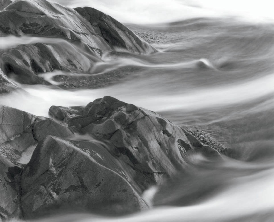
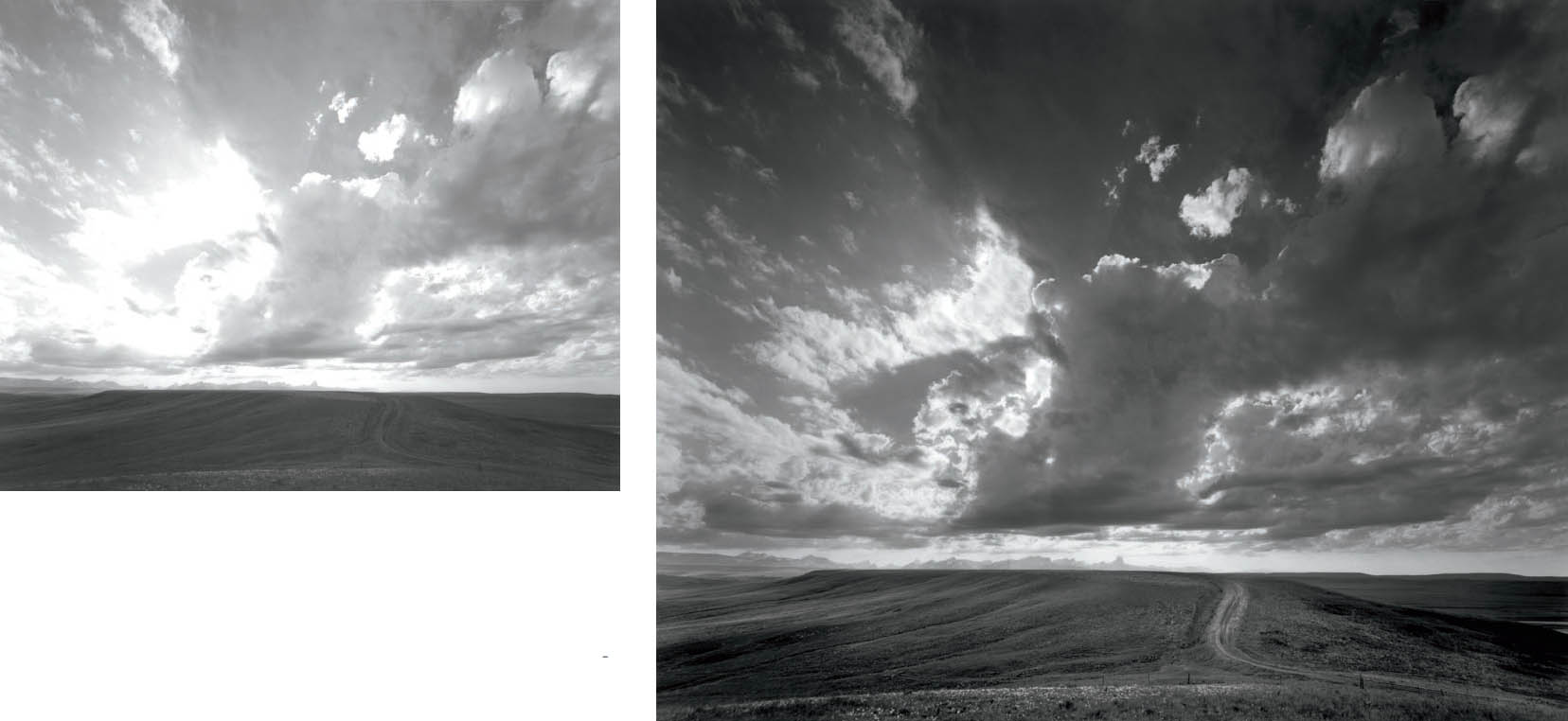
Figure 10-2a: Proof Print of Rocks and Receding Wave
The proof print made at 60 units of yellow light gives me usable detail everywhere (except the far upper-right corner, which remains blank white). It tells me that I need to raise contrast to get the glow on the rocks, indicating that when I increase contrast, the upper-right corner will need additional exposure to bring out detail there.
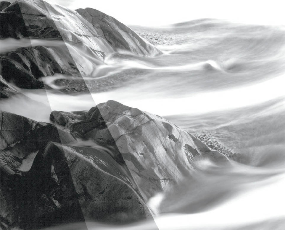
Figure 10-2b: Three-Part Test Print of Rocks and Receding Wave
To make a three-part test print, guess your expected exposure at the contrast level you have chosen in advance. Set the timer for ½ that guess. Then make three exposures across the print to get the major tonal areas into each of the sections. Note that all three sections contain rock, moving water, and pebbles. The “guess” was 15 seconds at the chosen aperture, so the three sections received 7½, 15, and 22½ seconds of exposure, respectively.
In the 15-second exposure the rocks are too dark. The foamy water in the left center looks good at 22½ seconds of exposure. This indicates that a basic exposure of 13 or 14 seconds may be appropriate for the rocks, but that the water has to be burned to 22½ seconds or more to gain detail on the foam. A review of figure 10-1 shows the final print compared to the basic proof print (figure 10-2a), with additional printing information coming from the three-part test print.
A better proof would have given the right side the 22½-second exposure and the left side the 7½-second exposure, yielding more information about the additional exposure needed on the upper right.
Stop down to a seemingly reasonable amount of light hitting the easel (i.e., not so bright that you know an exposure will be too short, and not so dark that you can’t see the image clearly on the easel). Start by guessing at the correct exposure, recognizing that on the first guess, you may be wildly off the mark. No problem. Just proceed as follows:
- Set the timer to exactly half the time of your guess. Suppose you stop down several stops and guess that your exposure will be 15 seconds. Then set your timer for exactly half of that, i.e., 7½ seconds.
- Now make a three-part test print by first covering about ⅔ of the print with heavy cardboard and expose ⅓ of it for 7½ seconds.
- Move the cardboard to expose ⅔ of the enlarging paper and expose that for 7½ seconds.
- Remove the cardboard entirely and expose the entire sheet another 7½ seconds.
With this process, the first third gets 3 × 7½ = 22½ seconds. The middle third gets 2 × 7½ = 15 seconds (or your initial guess), and the final third gets 7½ seconds. This way your “guess exposure” is in the middle. One side gets 50 percent less than your guess; the other side gets 50 percent more than your guess (figures 10-2a and 10-2b).
You can segment the three-part test print horizontally, vertically, or diagonally, or fan out from any point. The important thing is to get highlights and shadows into each of the three sections so you can truly evaluate how to choose a reasonable exposure for the full print.
If you’re way off in your guess, try it again until your guess is about right. So, expect at least two guesses the first time you try this. Once you’ve guessed about right, work on that print until it’s refined. But in the process of refining that print, notice the level of light on the easel. If you then get that same light level on the easel for your next negative—whether you have to open up or close down the aperture to get it—and give it the same amount of exposure time, you’ll get the same average tonalities. Thus, you’re now putting good observation of light levels to use. Again, if that subsequent negative is denser, you may need to open up the aperture a half stop or a full stop or more to get the same level of light; if it’s thinner, you may have to stop down a bit more. The important thing is to get about the same level of light. This way, you’ll begin to see the relationship between the amount of light hitting the easel and the length of exposure you need for the print you want. In other words, you’re thinking about what you’re doing, rather than just mindlessly making test strips over and over without ever judging the amount of light hitting the easel.
I suspect that if you do this several times, your guesses will become quite accurate. In time, you may be able to dispense with the test print entirely, as I have done, but that’s up to you, your accuracy of observation, and your level of confidence. Don’t worry about negatives of varying density.
To repeat: For a dense negative, keep the aperture more open to get the needed amount of light onto the easel; if it’s a thin negative, close down several more stops. At this point you’re observing and thinking; you’re not mindlessly making test strips.
Also, once you’re in the ballpark with a good basic exposure, you can check the contrast level again within the three sections before making your first full print. If contrast within the best section of the three seems a bit too low or too high, alter it for the first print you make. After all, why not make all the changes needed before wasting time and money on prints that won’t be very good?
I employed this method for a long period of time, eventually getting accurate enough, and often enough, that I now dispense with the test print entirely. Instead, I now make an educated guess at both the contrast level and the length of exposure . . . and proceed to make a first print. I’ll predict that if you use this approach often enough, you are likely to get to this stage, yourself. It’s not all that difficult. It requires observation and evaluation, both of which are within your grasp.
Based on the contrast level of the contact proof, I guess at the contrast grade of the enlarged print, recognizing that different sections of the image may require different contrast levels. I also guess at the length of exposure needed based on the amount of light projected from the enlarger down to the easel. Then I go directly to the display size I want for that photograph, complete with dodging and burning (sometimes with burning at different contrast levels in various locations), in an effort to make a first print that is perfect in every respect. Sometimes—amazingly—it is perfect! But rarely. Usually it misses the mark, sometimes by a little, sometimes by a lot. Then by studying it carefully, I make major or minor adjustments in subsequent exposures. My approach works for me, but it may not for you at first. After all, I am relying on a great deal of experience.
With practice, I believe you can do this, too. It’s simply a case of serious observation: observation of the amount of light hitting the easel and correlating that with the tonalities of a finished print. After years of printing, not only do I skip the test print entirely (simply because I can usually guess the exposure time fairly accurately), but I also go further with my initial print because I study the contact proof print extremely carefully. Careful study of the proof print gives me a very good idea of how much contrast the final print needs, but it tells me much more. If a specific area of a proof print is quite light, I may have to burn it to bring out needed detail. If I increase contrast overall for the final print, I’ll have to burn that area progressively more because it will be even brighter as contrast increases. So a careful study of the proof not only tells me if an area needs burning, but also how much I have to burn. In a similar manner, studying the proof print gives me a great deal of information about where I have to dodge the negative during the basic exposure, and roughly how much dodging is needed.
Combining all this information gives me the following:
- The contact proof tells me the level of contrast I need for my print, so I can set my dichroic head filtration for the contrast I need.
- The contact proof tells me where I have to burn and dodge, and as I increase or decrease contrast, it indicates how much I have to burn or dodge each area.
- The level of light hitting the easel when the filtration is dialed in tells me the necessary length of exposure at the chosen aperture.
Now I have a pretty good idea of how to print the negative. My first print of any new negative is an educated guess at the proper contrast, the length of the exposure, and the burning and dodging needed. So I go for it! I make my first print as if I’ve printed it for years, including all the burning and dodging I think I’ll need right from the start. I fully develop that print, then evaluate it carefully after I get it into the fixing bath and inspect it under white lights.
There have been instances in which I hit it right on target on the very first try. Most of the time, I’m a bit off, but I’m generally close enough to make a few minor adjustments to get much closer to the print I want on my second try. Further refinements may extend the process to three or four or more tries before I get the print exactly the way I want it (and, of course, future printings may bring additional improvements to the image). Sometimes, I’m way off on my first set of guesses, but careful comparisons between the contact proof print, the first enlarged print, and my desires for a final print, give me a great deal of insight for a second print that’s usually close to the print I want to have. From that stage, it’s just a question of further refinements.
Concerning aperture, please ignore those who argue that all negatives should be enlarged at two or three stops below maximum aperture on your enlarging lens to yield maximum sharpness. Technically, those arguments are correct. Neither the wide open (full aperture) nor the fully stopped down (minimum aperture) lens is as sharp as the mid-range openings. While that’s technically true, in practical terms it’s meaningless. The sharpness difference at various apertures may be visible on a super-enlarged optical bench, but it isn’t visible to the naked eye at any enlargement that you or I will ever make. Don’t worry about any supposed lack of sharpness as you stop down, because you’ll never see the difference. Choose the aperture that makes sense for the print you’re making: you don’t want an exposure that lasts several minutes (because it’s tiring), and you don’t want one that’s just a few seconds long (because you don’t have the time to dodge consistently from one print to the next; or to put it differently, you lack needed control over the final result). Something in the middle makes logical sense.
The only aperture I generally avoid is maximum aperture, not because of sharpness considerations but simply because it projects significantly more light toward the center than the edges and corners. I stop down at least one full f/stop to achieve an even level of light across the easel. In time, you’ll recognize that if you want a lighter (high key) print, you’ll choose a shorter exposure or a more closed aperture; if you want a darker (low key) print, you’ll choose a longer exposure or a more open aperture (more on this issue below).
Doing test prints rather than test strips gives you a wealth of information and sharpens your view of the negative right from the start. You’ll begin to see the relationship between the negative and the print you want. It helps your understanding of the entire photographic process. You’ll get to your final print quicker this way, and your final print will be better! Start thinking from the beginning! Follow the advice that American painter Robert Henri gave to his students: “Intellect should be used as a tool.”
Dodging and Burning
Dodging and burning are essential techniques in making most prints. Dodging is the procedure of blocking light from the enlarger to selected areas of the print during part of the basic exposure. When light is withheld, the area is made lighter, so dodging lightens an area. Burning is the procedure of giving extra exposure to selected areas of the print, thus making those areas darker.
For dodging, I use small pieces of cardboard cut into geometric shapes (rectangles, circles, squares, ellipses), each taped to the end of a hanger wire. I hold the wire at one end beyond the projected negative image and block light from the enlarging paper with the appropriately shaped cardboard. If dodging is required in a larger area, say the lower third of the print, I use a large piece of cardboard with a straight or curved edge. If dodging is needed along an edge or at a corner, I may use my hands and fingers—sometimes running them back and forth along the edge and often following contours of shapes along the edge as if I were playing scales on the piano.
For burning, I use cardboard sheets with straight edges or with gentle convex or concave curves. To burn interior sections of a print, I cut rounded holes at key locations (near one corner, in the center, midway along an edge, etc.) so I can burn areas of the print along the edges, in the center, near corners, etc., as I please. Whether I’m burning or dodging, I keep the cardboard in constant motion to soften the edge of the manipulated area, allowing it to smoothly mesh with the unaltered adjacent area.
My dodging and burning cardboards are all black mat board with the reverse side white. This allows me to see the projected negative on the white (top) side, while the black (lower) side absorbs light reflected upward from the enlarging paper. For burning, I can alter the size and shape of the hole in the cardboard by holding a second, L-shaped piece of cardboard over it and opening up only part of the precut hole. In this way, I can burn oddly configured areas, even down to narrow slits when necessary. I accomplish this by holding one cardboard atop the other, using the upper one to cover the hole of the lower one (diagram 10.1). Then I turn on the enlarger, holding the two cardboards under the lens so that no light hits the paper. The negative image is visible on the cardboard’s white top side, allowing me to position the hole precisely over the area to be burned (still holding the second cardboard over the hole, so the enlarging paper is still not exposed). Then I slowly uncover part—or all—of the hole by sliding the upper cardboard across the opening, allowing light to go through the hole in the appropriate shape. Both cards must be kept in constant motion in order to smoothly mesh the tonalities of the burned area with its surroundings. As soon as I burn the area for the desired length of time, I close the hole again and turn off the enlarger light.
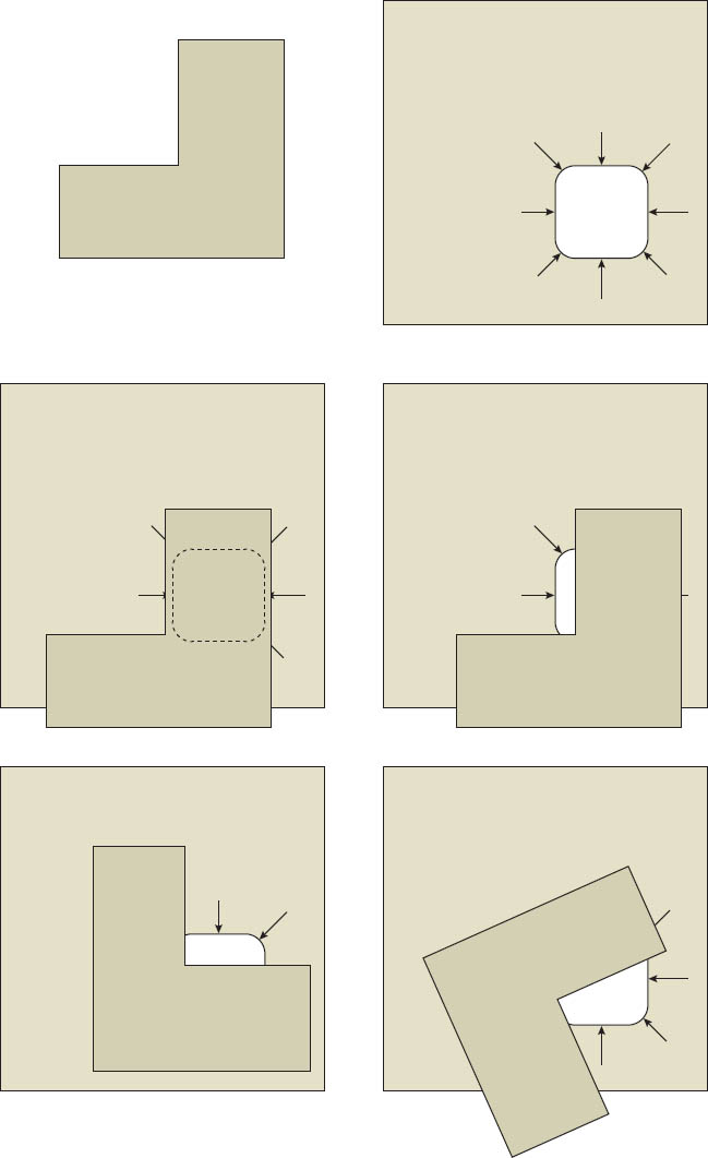
Diagram 10.1:
Two pieces of cardboard are needed for this precise burning tool: an L-shaped card (as shown in the diagram at top left), and a square card with a hole cut in its lower-right corner and with arrows drawn that point toward the hole (top right in diagram).
To start, place the L-shaped card atop the square one, cover the hole completely (see left center), and hold both cards under the enlarging lens so the enlarging paper is not exposed when the enlarger is turned on. Both cards should have a white surface on the upper side to allow the projected image from the enlarger to be easily visible; the underside of each should be black to minimize the light reflection onto the enlarging paper.
Turn on the enlarger light. The arrows on the lower card indicate the location of the hole when the L-shaped card covers it. With the negative image visible on the cards—and the hole still covered by the L-shaped card—move them as a unit to the location where the hole is at the point of desired burning. (The arrows on the lower card will easily show the proper location.) Then slide the L-shaped card away from the hole at the desired location—and in the optimum shape—for burning (right center and bottom in the diagram). As shown, you may need to rotate the L-shaped card for best results. The size and shape of the opening can be controlled during burning by moving the L-shaped card around the hole while moving the lower card over the enlarging paper.
The same two-card system can be used for flashing (see diagram 10.2).
I always make sure that the dodging or burning is not apparent, no matter how extensive it may be, by keeping the dodging or burning tools (hands or cardboards) moving during the exposure to produce smooth, undetectable gradations between manipulated and unmanipulated areas. Too often, a printer darkens a stormy sky for dramatic effect but burns the upper portion of the mountains, trees, or church steeple along with the sky. This obviously represents sloppy technique. Furthermore, too much darkening of the sky may look artificial and phony, not dramatic. The light depicted in a print should be logical. If it isn’t, it simply appears contrived. When manipulation is visible, people see poor technique rather than the intended visual statement.
One might ask how much burning or dodging is acceptable in a print. The answer is: as much as is necessary to direct the viewer’s attention (perhaps I should say, “as much as is necessary to force the viewer’s attention”). However, even if the dodged or burned areas mesh smoothly with the adjacent areas, the manipulation should not be so great that the altered areas appear artificially or unnaturally light or dark. The image must possess coherence, logic, and a realistic feeling of light. There is a logic to light that cannot be violated. That is the only constraint.
Technique—and dodging and burning are essential aspects of printing technique—should be transparent. In other words, when you look at the image you should see the image; you should not detect any manipulations used to create the image. So, if dodging or burning, or any other applied technique is readily apparent, you’ve lost the message. The viewer is distracted by obvious manipulation. That diminishes the message you want to convey, and in the worst cases, it destroys the message. So it’s always wise to not only stay within the bounds the logic of light, but also within the bounds of invisible technique. This is equally true for both traditional and digital approaches.
Manipulation must be done with cunning and subtlety, but not with timidity. I have printed negatives that require as much as 500–1000 percent additional burning of selected areas beyond the basic exposure. The goal is to bring out all the desired detail and mold the light in a way that strengthens the composition wherever possible. Burning or dodging can also be used to add snap to selected areas. There are, of course, any number of reasons for burning or dodging. Use them, but use them sensibly for your goals.
Integrating the Entire Process: Visualization, Exposure, Development, and Printing
When I stand behind the camera composing the scene, I consider camera position, lens focal length, filtration, negative exposure, and development. I also think ahead to the darkroom possibilities of burning and dodging, and I have a strong feeling of the size I’ll print the final image for display purposes. This allows me to fully integrate the entire photographic process and maximize my interpretive capabilities. This is also part of the process fully discussed in chapter 4, “Visualization,” which may be worth rereading at this point. In visualizing the final print, I try to see the steps needed to get there, and darkroom considerations are key among them.
As a simple example, suppose a landscape has low contrast separations within the land itself and the sky above is much brighter and also low contrast. Previous chapters on negative exposure and development may indicate that the obvious approach is to give ample exposure for the darker land within the frame, followed by reduced development of the exposed negative to bring the highlight densities (i.e., the bright sky) down to an easily printable range.
But by thinking ahead to the darkroom possibilities and fully integrating the process, I may decide to maintain overall contrast in the negative through normal development, or I might even increase contrast through extended negative development, and then burn the sky extensively during printing. In this way I bring the tones of the sky down to my desired level, but in the process I maintain or increase the contrast in the land while also maintaining or increasing contrast in the sky. This produces a print that is alive throughout rather than one that has tonal separations throughout (figures 10-3a and 10-3b).
Figures 10-3a and 10-3b: Approaching the Rocky Mountains
Figure 10-3a shows the straight proof print. Figure 10-3b shows the final print in which the sky and ground are printed separately, as if they were two separate negatives. The sky alone is exposed first for 35 seconds at a contrast level lower than the proof print (80 units of yellow), with additional burning in the upper portion to bring out cloud detail. Then the lower (ground) portion is exposed at 70 units of magenta for just 13 seconds, enough to give it strong tonalities. The jagged summits of the northern Montana Rockies can be seen just above the grasslands.
The print may be more difficult to make using this approach, but it will be a more exciting, snappier print. By thinking ahead to the simple technique of burning a portion of the negative during the printing stage (i.e., giving a portion of the negative—the sky in this case—additional exposure under the enlarger), I can choose a different exposure/development regime than I would have without fully integrating the process by thinking ahead.
The same is true of dodging a portion of a print. If I consider areas of a scene that can be exposed and developed with an eye toward dodging (perhaps a deep shadow area possessing interesting and compositionally desirable detail), I may approach my exposure and development differently.
So, my plan for exposure and development of any negative is not based solely on the light meter readings I take during the exposure—though that is surely the heart of the exposure and development plan—but also on the recognition of potential darkroom manipulations. So while I’m in the field, future darkroom possibilities send feedback loops into my thinking. I’m thinking not only about the scene in front of me, but the work I can do later to mold the image to my vision. Thus, the scene serves as the start of my plan, but I want to interpret that scene, not simply record it. I have to integrate the entire process to do so.
I should note that such thinking of future processes must be an essential part of any successful digital approach, as well. Future digital manipulations must be considered when the exposure is made. It’s also the reason I avoid the common phrase of a “digital capture,” because I don’t think any camera “captures” anything. Instead it simply records the light levels in the scene.
If you employ this type of thinking, it will extend your use of the zone system into higher negative densities that you may have previously avoided, or into areas that you felt didn’t exist! Such thinking greatly expands your interpretive and artistic possibilities, and frees you from constraints that you might put on yourself.
I see no magic to a straight print (i.e., one with no darkroom manipulation, such as dodging or burning) unless the tonal values of the scene miraculously fall into the perfect array of tonalities everywhere. Such perfect alignment rarely occurs, so darkroom manipulation is almost always necessary. Ansel Adams knew this, for nearly all of his prints were burned or dodged, some quite heavily. I know this to be true because I had spoken to him about the printing of several of his images, and he explained the extensive manipulations required for most of his images. Most of my prints are manipulated as well, some quite extensively. I recommend that all photographers recognize this and use the tools available in the darkroom for their creative and artistic needs.
Burning can be done to darken highlight areas, midtone areas, or dark areas. Dodging can be done in any tonal area as well. The only consideration is this: what is needed to make the print look as good as it can look? When you decide what is needed, apply the technique. It’s an available, legitimate, creative technique, so use it. Remember, too, that the eye views the scene at many apertures as it scans from bright to dark areas, while the camera sees all areas at the single pre-chosen aperture. So burning or dodging may prove to be the only way to bring the image back to the way you saw it. Where is the manipulation—in your initial viewing of the scene or in your printing? It could be either one, or both! Who cares? The scene isn’t yours, but the print is always yours! So do what is needed. Every good photographer should recognize this.
How many photographers—beginners and advanced—have encountered the following situation in the darkroom? You print a landscape negative that includes a big, puffy, white cumulus cloud. The cloud, towering above the land, ends up blank white in the print. So you make another print, giving lots more exposure to the sky and cloud (i.e., burning it in). Suddenly the cloud has rich tones within it. This tells you that the portions of the negative that printed blank white in the first print (i.e., with densities of Zone 9 or above) contained excellent, usable detail! In other words, without realizing it, you have already exposed and developed negatives that contained densities above Zone 9, and you have printed them successfully!
So you have already used much of the information that I’ve covered in this book. Now you fully understand it, so it won’t remain an obstacle to your thinking in the future. The higher zones are valuable, usable, and easily accessible. Don’t shy away from them, especially since you’ve already used them. This should break down your fear of the “extended zone system.”
Burning or dodging can bring out the compositional unity sought when the exposure was made. For example, I have a photograph of several enormous mushrooms draped over rocks at the base of a dead tree (figures 10-4a and 10-4b). The granite rocks were lighter than the mushrooms. Without darkroom manipulation, the rocks would compete with the mushrooms for attention and become distracting elements in the final print. To achieve my desired print, I dodged the center of the mushrooms during the basic exposure to lighten them considerably while still retaining detail and texture. Then I burned everything around the mushrooms—even the bottoms of the mushrooms—except the tree trunk, which was already dark. I used a cardboard with a hole near the edge and rotated the hole around the outer edge of the mushrooms. I gave the rocks particular emphasis by laying one or two cardboards atop the hole to shape it like the rocks and then burning each rock successively. Ultimately the rocks were lowered in tone to deep, rich grays (Zone 2–5), while the assorted twigs, leaves, pine needles, and dirt had similar deep values.
Now the mushrooms appear to glow with light, and the viewer’s attention is drawn to them without distraction from the surrounding objects. The burning around the mushrooms amounts to nearly 300 percent additional exposure beyond the basic exposure. But the centers of the mushrooms were dodged during the basic exposure, so the surrounding areas actually received about 500 percent more exposure than the centers of the mushrooms. The darkroom manipulations are not apparent in the final print (though they are dramatic when compared with the straight print). It is not an overstatement to say that the compositional unity of this print was largely created in the darkroom.
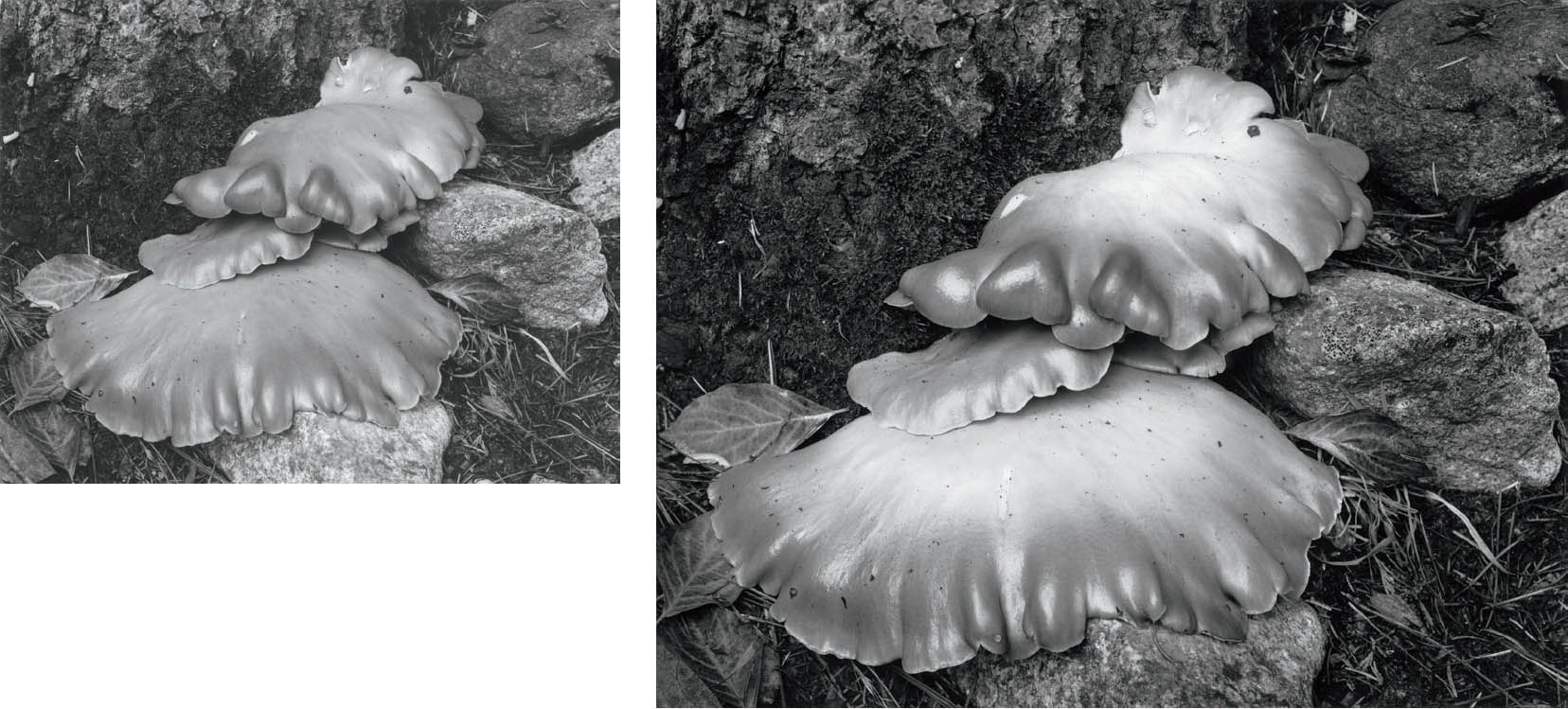
Figures 10-4a and 10-4b: Mushrooms, Yosemite Valley
In figure 10-4a, the mushrooms dominate the image because of their placement and size, but the granite rocks—especially the one below the mushrooms—distract attention. Neither the light beige mushrooms nor the gray granite rocks would have responded to filtration. Darkroom printing was the only option to enhance the image. For figure 10-4b, I raised the contrast level to 50 units of magenta, printing the image substantially darker overall while dodging the tops of the two large fungi throughout the basic exposure. Then I burned the rocks, with special attention to the bright rock at the bottom. The mushrooms glow, yet the background retains detail.
The options you have in the darkroom include dodging and burning, contrast level of paper, two-solution contrast control, and your choice of paper. Each option deserves careful thought. The goal is to achieve a print that enhances the effect you desire. Some prints should sparkle; they should glow. They should be alive with light and luminosity. Others should be subdued and quiet, yet still glow with soft light. The contrast level must be chosen with the mood of the final print in mind. Some prints require high contrast; some demand low contrast. Some should be dominated by large, light areas; some by dark areas; and some by mid-tones. When a print appears flat, a higher contrast filter may solve the problem; but a little burning and dodging with the same contrast level may be a better solution.
Excess contrast often comes across as harsh. It may appear striking at first, but it fails the test of time. Too often, it simply flies in the face of the desired mood. Prints lacking appropriate contrast are simply dull. The question of how much contrast a print should have, how dark it should be, how light it should be, are all subjective questions, and the answers vary from photographer to photographer. Stick to your vision, and do it your way in the darkroom.
Burning with Variable Contrast Papers
Everything in the previous section applies to both graded and variable contrast papers, but variable contrast papers offer a spectacular option not available with graded papers: the ability to burn at a different contrast level from the basic exposure. To understand the importance of this, keep in mind just what high contrast and low contrast mean. High contrast implies that when shadows achieve dark gray or black tonalities, the highlights are light gray or white. Low contrast implies that when shadows achieve dark gray or black tones, highlights are deeper grays, perhaps even mid-gray tonalities. Or, viewed another way, low contrast may mean that by the time you give enough exposure to a negative to achieve subtle highlight detail, the shadow areas are still midtones rather than dark grays or black.
Now, suppose you made an exposure inside an old, abandoned house, and the negative included a window to the landscape outside. That exterior may be an extremely dense portion of the negative compared to the densities in the rest of the negative. If you print for desirable tonalities and contrast for the interior, the window area will likely be blank white in your print. With graded paper, if you burn the window enough to get outside landscape detail, the edge of the wall adjacent to the window will likely have a dark “halo” where your burning touched the wall. This is obvious and therefore sloppy technique.
But with variable contrast paper, you can lower the contrast level for the burning. By the time the landscape becomes visible, the edge of the wall may not be noticeably darker. This may prove to be an image that can be printed only through the use of variable contrast paper. Low contrast burning may allow you to attain subtle detail—or high drama—in the sky without darkening foreground items such as trees, a mountain slope, or a church steeple.
High contrast burning may be the solution to the opposite problem. Suppose you have a landscape with good contrast, but the sky is light, hazy, and lacking good tonal separations in the thin clouds. Not only can you burn the sky at higher contrast, but you may also want to initially dodge the low contrast sky partially or fully, then burn it back in completely at the higher contrast level. This is the way to mesh two or more portions of a negative at completely different contrast levels, melding them seamlessly by carefully burning and dodging where they merge.
Of course, low contrast or high contrast burning can be applied just as appropriately to midtone or dark areas. I have emphasized its use in highlight areas just for the sake of example, but the technique can be equally effective when cleverly applied to any tonal area of a print.
Using this technique, I have been able to make prints with variable contrast papers that are simply impossible to print to my satisfaction with graded papers. It’s allowed me to go even further, making images from more than one negative by finding textural similarities and merging them even when contrast levels between the negatives differ. Thus, variable contrast papers open up creative possibilities beyond those of graded papers.
Advanced Darkroom Techniques
There are three additional darkroom techniques that are generally considered advanced, which simply means most people are not familiar with them. They are flashing, reducing (often referred to as “bleaching”), and masking. Flashing is a method of exposing the enlarging paper to a bit of blank light prior to exposing the negative. This procedure extends the range of visible tonalities on the enlarging paper into the highest densities. Reducing is a method of chemically removing silver from the developed print, thus lightening areas of the print. However, its effect is quite different from that of dodging. Masking, which may require special registration equipment, has two different forms: one increases local contrast while reducing overall contrast, while the other allows printing of bright highlight areas while protecting adjacent dark areas from any additional exposure.
Flashing
In order to understand flashing, try to understand what happens to the enlarging paper when it is exposed to light from the enlarger. Light comes through all portions of a negative—even the densest portions—when the enlarger light is turned on. Yet, as we know, parts of the print may be pure white when fully developed. The reason is that the enlarging paper, just like the negative, has a threshold level that must be reached before any tonality will appear. Until that threshold level of light hits the paper in any area, no density will appear in that area.
![]() Flashing, reducing, and masking are three additional darkroom techniques that are generally considered advanced, but this simply means most people are not familiar with them.
Flashing, reducing, and masking are three additional darkroom techniques that are generally considered advanced, but this simply means most people are not familiar with them.
Let’s say the threshold is 10 units of light, the first tonality beyond pure white. It may take 100 units of light to make medium gray and 1,000 units or more to reach pure black. But suppose a dense highlight area of the negative allows just 4 units of light through during the basic exposure, and you want to show some detail in that highlight area.
You could burn that area a minimum of 150 percent to give it the necessary 6 additional units of light to barely achieve tonality; but the burning process will inevitably spill over into the area adjacent to the highlight, and you could get an obvious dark halo around it. For example, if the adjacent area received 100 units of light during the basic exposure, 150 percent additional burning could give it another 150 units of light, turning it into a dark gray strip around the highlight. If you burn just the center of the highlight so as to avoid the halo effect, you may miss the edge of the highlight area, producing density in the center of the highlight but not along the edges. This would be an equally unacceptable solution.
But suppose you expose the enlarging paper to 7 units of blank light through the enlarger after making your basic exposure, plus the required burning and dodging. Now the 4 units of light from the exposure through the negative plus 7 units of blank light gives you 11 total units, revealing subtle tonality in the highlight. Of course, the flash exposure adds 7 units to all parts of the print, so the adjacent area that received 100 units will now receive 107, which is hardly any change at all. The darkest portions, formerly receiving 500 or more units, will go to 507 units, an imperceptible difference.
You can refine the technique by flashing only the area that needs the boost rather than the entire image. First, focus the negative and find the area that requires flashing. Next, mark it off beside your easel using two cardboard arrowheads as markers of a Cartesian coordinate system (diagram 10.2). Then remove the negative and flash just the designated area, using the two-cardboard system described in the section on burning and shown in the diagram. In this way, only the area you want flashed (along with a little spillover to adjacent areas) will receive the additional blank exposure, and there will be no loss of contrast or muting of tonalities elsewhere.
How do you determine what is 7 units of light? Use the following method. With no negative in the carrier, close the lens aperture down to a minimum setting (f/22, f/32, or f/45—the smaller the better). Then make a test strip of blank light on the same grade paper as the print you are making, giving it one-second increments up to, say, 15 seconds. Then fully develop the strip. To be consistent with the discussion above, let’s say that the full 15 seconds of exposure shows a gray stripe, 14 seconds a lighter gray stripe, 13 seconds still lighter, and so on down to 10 seconds, which shows the last perceptible tonality. Now you know that 10 seconds is the threshold level of 10 units of light, so 7 seconds of flash exposure gives 7 units of light.
Of course, it’s a guess that the basic exposure gives us 4 units of light in the highlight. It could be 2 units or 9 units and still appear blank white in the final print. Thus, 7 units of flash exposure is also a guess, and several attempts may be necessary to determine the optimum amount of flash exposure. It may turn out that the best print involves a small amount of additional burning of the area plus a flash exposure afterwards. These three variables—basic exposure, burning, and flash exposure—must be juggled about to obtain the best result, but for a magnificent print, the result justifies the effort.
When I printed my negatives of English cathedrals on graded papers, I employed this technique frequently to get a full-scale print of the interior architecture while maintaining detail on the stained glass. The windows, of course, are the light source for the interiors, and it’s not easy to get detail on a light source. In order to achieve what I wanted, I generally used a grade of paper with sufficiently high contrast to yield a full range of tones for the interior architecture, apart from the windows. Then I flashed (and often burned as well) to bring out detail in the windows. Without flashing, the windows printed as blank holes devoid of detail, and burning, alone, put an obvious halo around them.
Without flashing, the only approach I could have taken to print the cathedral negatives on graded paper would have been to print on a low contrast paper—making the interior dark, somber, and muted—while the window served as the sole source of brilliance. That would have been a legitimate interpretation, but it’s not how I saw or felt the cathedrals. Thus flashing provided a tool for me to interpret the cathedrals as I felt them.
In general, don’t exceed threshold in your flashing exposure. If threshold is equaled or exceeded, the highlight area will appear gray and dull rather than improved with detail. The whitest white within the highlight area should still remain white. In the cathedral prints, I wanted the clear glass portions of the windows to be pure white, but I wanted the colored glass—and especially the lead mullions separating the panes—to be plainly visible. If I had grayed the clear glass in flashing, the window would no longer appear to be the light source, and the light quality would have been lost.
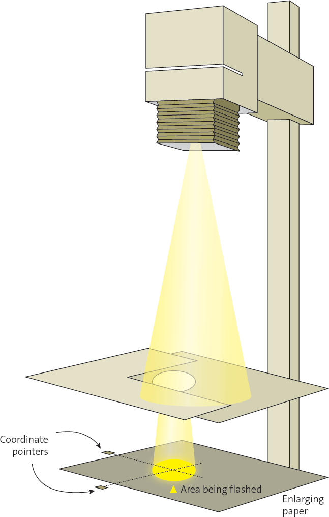
Diagram 10.2: Selective Burning or Flashing
An L-shaped card is held atop the hole in the lower card and is used to open or close the opening, or change its shape. This two-card system can be used for both burning and flashing.
For flashing, when the negative image is focused on the easel, place cards adjacent to the easel to mark coordinates of area(s) to be flashed. After the negative exposure is completed, remove the negative and hold two cardboards with an appropriately shaped hole above the enlarging paper. Expose the paper for a predetermined length of time. This method allows flashing only in the portion of the print that requires it rather than the entire print. Some prints may require flashing of more than one area, each for a different length of time. To do this, use several sets of coordinate markers.
Flashing with Variable Contrast Papers
Variable contrast papers make flashing a rarely needed tool. Going back to printing my English cathedral studies, the task becomes far simpler with variable contrast papers rather than graded papers. The bright windows are the major problem. It is difficult to obtain detail on them while maintaining good contrast and brilliance in the rest of the interior. Using variable contrast paper I print for the interior, essentially ignoring the windows initially. I use a moderate to significant amount of magenta filtration to get the contrast level I want. Then I dial the magenta down to zero and dial up the yellow filtration to burn the windows. Burning the windows entails a bit of excess darkening of the adjacent stonework, but by burning at low contrast it is not darkened to the point that a halo appears.
If I did the burning at the same contrast level as the basic exposure, I would have the same problem that I had with graded paper. But the variable contrast allows me to burn at lower contrast levels, giving me a print almost identical to that of the graded paper print with a bit more tonal separation in the windows. This is due to burning at low contrast rather than flashing at no contrast. A further advantage of this procedure is that I don’t have to remove the negative from the enlarger to complete the print. Thus, the print is marginally improved and significantly easier to print.
While flashing is rarely used with variable contrast papers, it can still be a lifesaver. One example is a photograph I made in 1996 in Utah. On an unusually humid and hazy morning, the sun was coming up behind the imposing Fisher Towers northeast of Moab. From my camera position, the sun’s rays radiated out through the atmosphere, magnificently separating the near cliff and central tower from the distant cliffs and towers. But the entire sky was so much brighter than the backlit rocks that when I tried to print the image, the blank white sky killed it. Flashing saved it (figures 10-5a and 10-5b)!
I used a burning card with a broad concave edge and flashed the upper part of the image, slowly moving the card up and down the sky and even partway down into the central tower and background cliffs. Little of the flash exposure hit the middle or lower portions of the imposing tower in the center of the image because of the shape of the card, but progressively more affected the areas around and above that tower. At the corners, I exceeded threshold substantially, putting a pleasant gray tone into the sky and making it appear that the light was truly emanating from behind the central tower.
The portion of the tower that was exposed to the small amount of flashing showed no appreciable effect. But I could not have done it with burning, even at the lowest possible contrast level, because even the lowest possible contrast (i.e., the highest level of yellow filtration) still has some amount of contrast, whereas flashing has zero contrast. Printing at the highest level of yellow filtration produces an image; flashing at white light yields only levels of gray tonality.
This is an unusual, but very pertinent, example. In general, the ability to burn highlights at low contrast levels (without the need to remove the negative, as flashing requires) can more easily accomplish the same effect as flashing on graded paper. In fact, burning at a low contrast level is often superior because even the lowest contrast level (i.e., a #0 or #00 filter below the lens or in the enlarger, or maximum yellow or green filtration in the enlarger) still yields some tonal separations, whereas the flash exposure with no negative has no separations. It simply boosts the separations made through the negative closer to threshold, or above threshold.
Flashing, either with graded or variable contrast papers, extends your reach into even higher negative densities. This should further free you from any fear of higher zones (those well above Zone 9), and also relax you about getting exposures above the toe of the curve and onto the straight-line portion of the curve. I regularly expose highlights at Zone 9, 10, 11, or higher, then develop the negative as needed (with full consideration of all printing options) for optimum results. Remember that you can expose negatives into the fully usable mid-teen zones, but you don’t want to develop them to such high densities. However, for portions of the negative developed to Zone 9, 10, or 11, you can use burning, low contrast burning, or flashing to bring them into visibility. In the next section on masking, you’ll learn yet another technique to allow use of the higher zones.
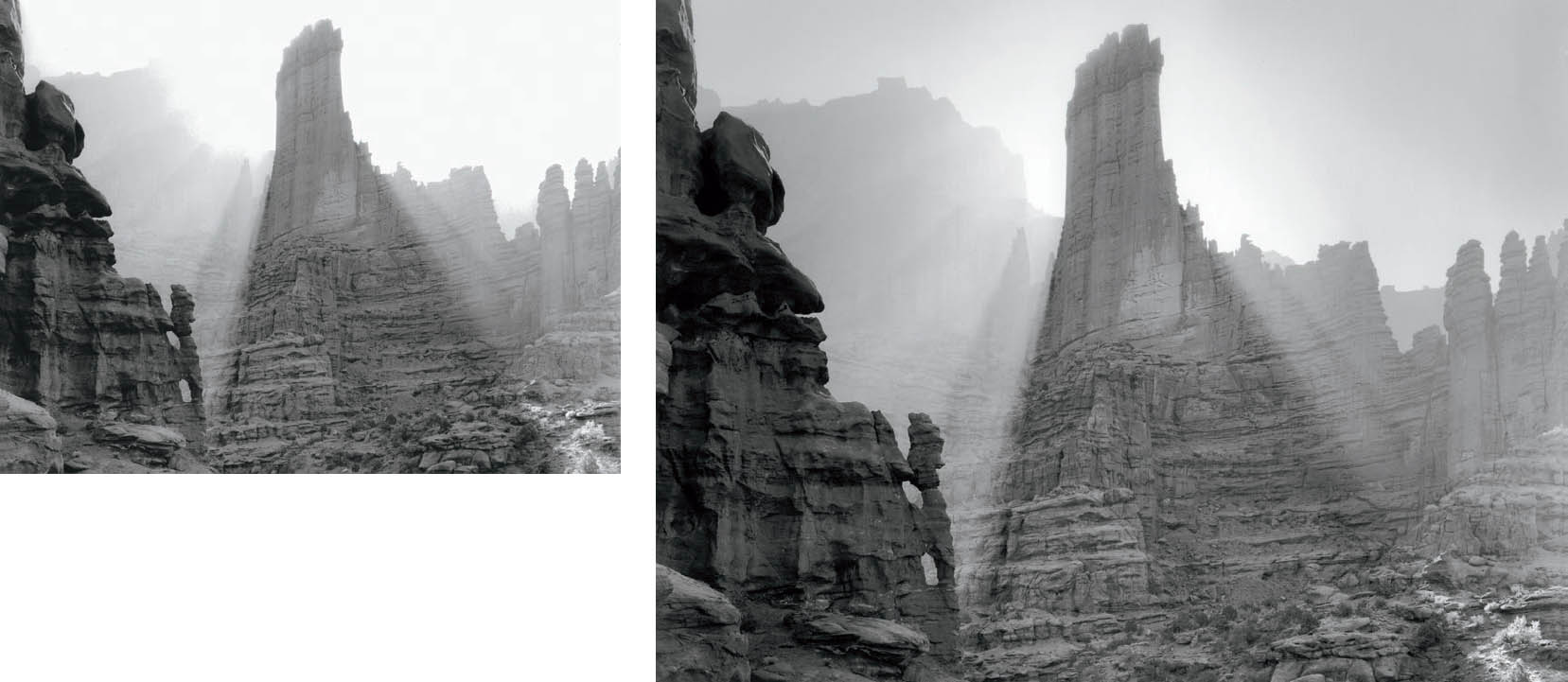
Figures 10-5a and 10-5b: Sunburst, Fisher Towers
In figure 10-5a, the background towers are brilliant, and the sunbeams streaming around the central tower are spectacular. However, the distant cliff wall to the left of the central tower is missing, while the blank white sky kills the image. Burning the sky at any contrast level creates problems due to the cliff, which gets too dark during burning. So, following the basic exposure, I remove the negative from the enlarger, close the aperture down to f/45, and add a two-stop neutral density filter from my enlarger. Using a convex-shaped card, I flash the sky downward from the upper corners, going well beyond threshold exposure and tapering to nothing halfway down each side, with far less flashing exposure in the center. In figure 10-5b, the gray sky tonalities are due to flashing, which is also enough to bring out the cliff wall while affecting the left edge of the cliff very little.
Masking
Masking involves the creation of a second negative (the “mask”) from the original negative. When re-registered with the original negative, the sandwich of the two can accomplish some extraordinary tasks. Good masking may involve the use of exposure registration equipment, which is easy to use and very much worth the cost.
There are two types of masks: the first, and more widely known, is contrast reduction masking or “unsharp masking.” This mask decreases overall contrast while increasing local contrast and apparent sharpness. The second type is highlight masking, which blocks out all shadow and mid-tone areas of the negative, allowing you to print highlights without darkening the other tonalities. Let’s discuss them one at a time.
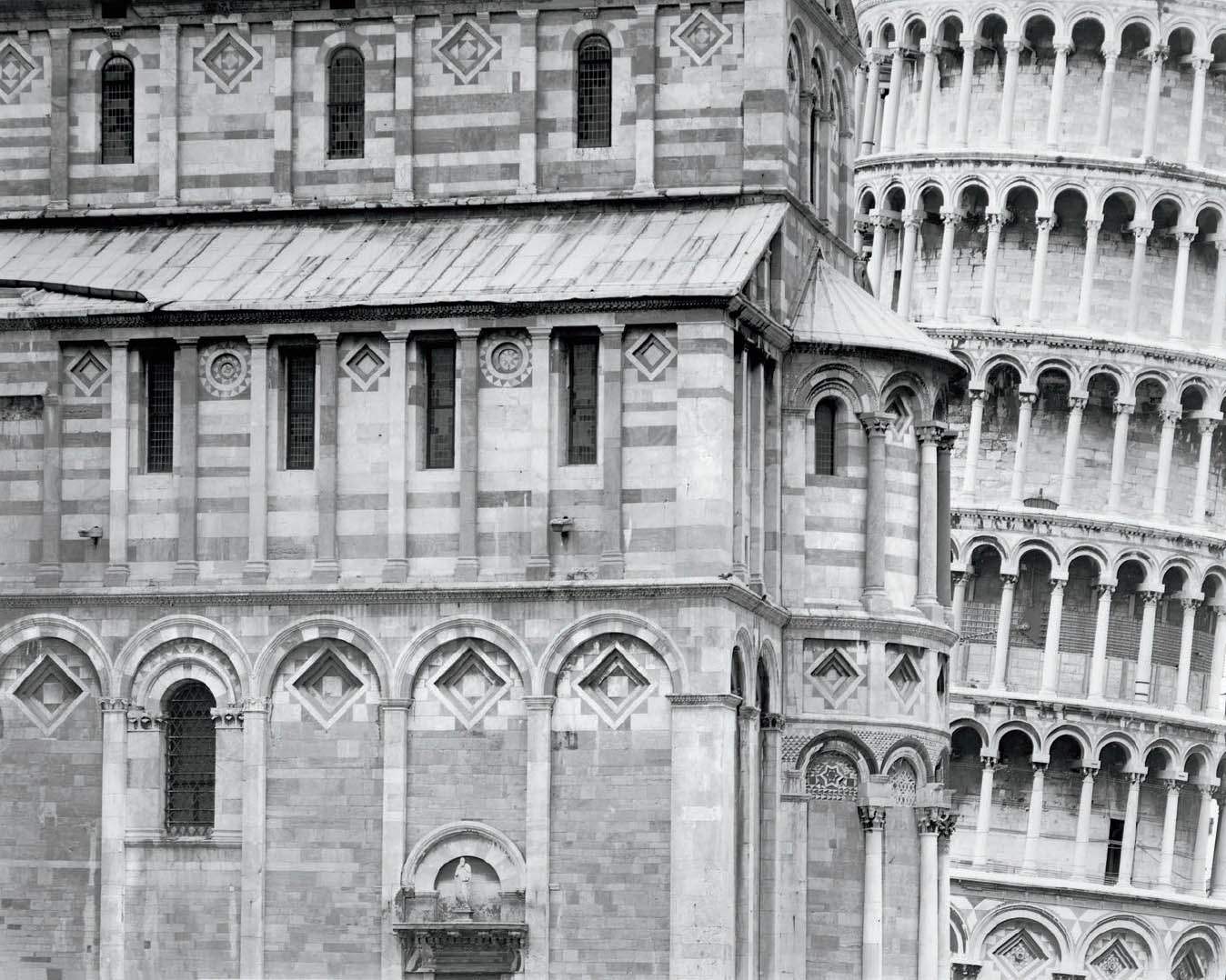
Figure 10-6: Pisa, 2000
I found it exciting to create a composition of the Leaning Tower of Pisa that is different from the millions made annually. However, the area under each arch and window would have been unpleasantly dark without the use of a mask in printing. By adding small amounts of density to each of those areas, I was able, in essence, to dodge them all simultaneously.
#1 – Contrast Reduction Masking (Unsharp Masking)
The contrast reduction mask is useful when the overall contrast of your negative is simply too much to handle, indicating that you developed it at too high a contrast level. Here, the mask is used to correct a mistake. Another use of a contrast reduction mask is when an image has multiple areas that need to be dodged simultaneously. Since we’re not built like octopuses and have only two arms, multiple dodging is impossible. In this case, a mask makes the print far superior (figure 10-6).
This mask is made on low contrast negative material. Any fine grain negative material developed to low contrast (Kodak T-Max 100, Ilford Pan F, Fuji Acros Neopan, etc.) can serve the purpose. To make the mask, place the material below the original negative in a contact printing frame or under a sheet of heavy glass atop a foam rubber base, just as you’d make a contact proof. It’s best to separate the two with several sheets of clear negative material (I recommend T-Max 100 because its base is so clear when fixed). This assures that the mask will have soft, unsharp edges when exposed under the enlarger. (See diagram 10.3 for the setup.)
Expose and develop the mask so that the highlight areas of the original negative (the densest areas) yield little or no density in the mask. The densest areas of the mask (exposed through the thin portions of the negative) should have low density compared to the densest areas of the original negative. The mask is a low contrast, unsharp positive of the negative (making it look like a fuzzy, out-of-focus, low contrast contact proof).
When you re-register the two, you add little or no density to the highlight densities of the negative but significant density to the shadow areas. In printing the sandwich of the negative and the mask (without the intermediate spacers used in making the mask), you normally increase the contrast you would have used for the negative alone.
Because the mask is unsharp, it tends to be smooth-toned in areas that have fine, small-scale local contrasts in the negative (hair on someone’s head or beard, leaves on forest trees, etc.). It doesn’t lower the local contrast but simply adds density to those areas, necessitating longer exposures. But it significantly lowers overall contrast by broadly adding density to shadow areas without adding much (if any) to highlight areas. So this explains a third use of a contrast reduction mask: reducing overall contrast while increasing local contrast, a commonly encountered problem.
If you increase the contrast level at which you print the negative (using a higher paper grade or higher contrast filtration), you can slightly increase local contrast while reducing overall contrast, or greatly increase local contrast while maintaining overall contrast.
In some cases, the alteration of local vs. overall contrast can be exceedingly valuable. In other cases, it can be destructive to the mood you wish to create. Be careful with it and use it wisely. It is a terrific tool when used selectively and intelligently.
It’s ironic that a technique called “unsharp masking” actually increases the apparent sharpness of an image. When a negative has a sharp contrast edge, it changes abruptly from one density to another. The mask’s lower densities are opposite those of the negative, and they change softly from one density to another because the mask is intentionally unsharp (diagrams 10.4a and 10.4b).
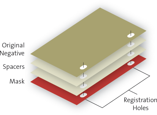
Diagram 10.3: Set-up for making contrast reducing mask
If you are printing a negative at the highest contrast level available, contrast reduction masking is unlikely to be a benefit. Since it reduces contrast, generally necessitating higher contrast levels, it has nowhere to go. Of course you can make a mask and try it. You have nothing to lose but time and effort because the original negative is unaltered. It may turn out that all you needed was increased local contrast. It works best for negatives printed at low or moderate contrast levels without the mask.
When the original negative is sandwiched with the mask, the two density curves are added together (diagram 10.5). The original negative is the dominant curve because the mask is intentionally lower in contrast and density. Notice the odd thing happening adjacent to the abrupt density edge. Just before the density of the original negative makes the quantum drop at the edge, the mask begins to increase the overall density. At the edge it suddenly drops, then slowly increases density again before leveling off. Thus, the sandwich creates imperceptibly thin light and dark lines around every contrast break, yielding an appearance of increased sharpness. Every object is outlined because of the mask.
(Note: This procedure does not improve sharpness in an out-of-focus negative. It yields an appearance of increased sharpness in a negative that is already sharp.)
It’s worth noting that this is the essence of the “sharpening tool” used (and often overused) in digital printing. Digitally, if you can see a black line along the edges of any sharp tonal break (i.e., a dark building against a bright sky or a sunlit aspen against a dark background, etc.), you’ve overused the sharpening tool. This would be like making thick light and dark lines around all tonal breaks via unsharp masking. The remedy: simply pull back on the use of the sharpening tool until it’s invisible to the naked eye. Too many digital photographers fail to notice and correct this rather obvious quirk.
#2 – Highlight Masking
Arista-II Ortho Litho film is the best choice for a highlight mask. Place this high contrast film directly (emulsion-to-emulsion) in contact with your original negative in a contact printing frame or under heavy glass. After exposing through the negative, develop it in high contrast Arista Powder A/B Developer or Arista Premium Liquidlith A/B Developer. (Note: The entire procedure can be done under safelights because Ortho film is blue light sensitive only, so neither yellow nor red safelights affect it.) These products—and many other traditional photographic materials—are available through Freestyle Photo in Los Angeles.
If your exposure is too low, only the thinnest shadow areas of the original negative will achieve density in the mask, and those areas will develop to extremely high densities. Giving more exposure on a second try will yield a mask with high densities in the shadow and midtone areas of the original negative. The highlight areas of the negative will remain clear in the mask. Be sure to follow the directions for proper development; if you quit development too soon, it won’t work.
The density developed in the mask greatly exceeds all densities of the original negative (in essence, the mask is opaque). So when the two are perfectly re-registered in your negative carrier, all midtone and shadow areas of the original negative are blacked out. You can now burn the highlight areas without fear of darkening the midtone or dark areas adjacent to them.
Let’s go back to the example of the old, abandoned house with a window to the outside landscape (see the section on “Burning with Variable Contrast Papers”). When printing the negative, you can first make an exposure with no mask to get the tones you want in the interior. Then black out the interior with the mask in perfect registration, and print only the exterior through the window. With this procedure you can really get those high negative densities to work for you.
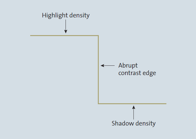
Diagram 10.4a: Negative density at contrast edge

Diagram 10.4b: Mask density at contrast edge
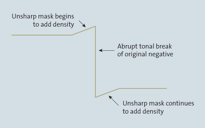
Diagram 10.5: Addition of original negative and mask
You may also want to print the exterior at lower contrast to give it a more atmospheric, distant feel. A word of caution: be careful, because this can be overdone. You can burn the sunlit exterior too much, rendering it too dark and thereby losing the look and feel of it being much brighter than the interior. In fact, if you go hog wild, you can burn the exterior so much that its tonalities nearly match the interior. It would be absurd to do that, as you would lose any sense of realism. So, while you have immense flexibility and many options, it’s best to remain subtle and sensible with an eye toward tonal logic.
In chapter 11, on the digital zone system, you’ll see how you can do this with two photographic exposures—one for the interior, a second for the exterior—layered together in Photoshop. It’s a simple process, but here, too, the results can be utterly illogical unless some semblance of subtlety and common sense are invoked.
Beware of another serious potential problem: the highlight mask must be perfectly registered emulsion-to-emulsion with the negative when printing. Therefore, you must use a glass negative carrier to ensure perfect contact between the negative and mask. (This is also strongly advised for unsharp masking.) Unless you’re reversing the image by placing the original negative in the enlarger upside down (i.e., with its emulsion up), the highlight mask must be placed below the negative. Be sure to place a clear negative of equal thickness below the negative for the basic exposure, the one giving you the interior tonalities. If you fail to do this, you’ll alter the plane of the negative for the second exposure, and you’ll get a slight ghost image at the edge.
It should be apparent that masking—either contrast reduction masking or highlight masking, or both—are extraordinary tools. But like other good tools, they can be overused and abused. It was Mark Twain who said, “If the only tool you have is a hammer, it’s amazing how many things look like nails.” If you find yourself resorting to masking too frequently, it may indicate another underlying problem. It may be that your negatives are chronically overdeveloped, forcing you to print at low contrast levels in an effort to retain detail in extra-dense highlights. Cutting back on your negative development may solve the problem more easily and more effectively. (Of course, if the problem is underexposure, give more exposure to all your negatives in the field. That’s the only real solution to that problem.)
I strongly recommend obtaining a pin registration system. Pin registration equipment for mask making includes a punch to put holes along the edge of the negative, a glass with embedded pins corresponding to the negative holes for alignment, spacers, and a negative carrier with registration pins custom made to your enlarger. At the time of publication of this book, these items can be purchased from the following two sources: Lynn Radeka at www.radekaphotography.com and Alistair Inglis at www.alistairinglis.com. Their systems allow your negative carrier to be removed and reinstalled in exactly the same place for perfect alignment with any number of masks. After each exposure, the carrier can be removed (under safelights, of course, because the paper is still in the enlarger!), the current mask removed, another mask inserted, and the carrier reinserted into the enlarger for another exposure. The cost for the equipment is moderate, but the benefits are enormous, and it’s only a one-time cost.
Inspection, Evaluation, and the Myth of “Dry-Down”
All of the techniques of controlling the print during exposure and into development have now been discussed: dodging, burning, flashing, masking, variable contrast printing, and two-solution development. The final advanced technique of print control, reducing (also known as bleaching), takes place after the print has been fully developed and placed into the fixing bath. Before discussing reducing, let’s first work our way through chemical processing and on to the all-important inspection and evaluation of the image.
After I develop the print, I quickly transfer it to a stop bath for several seconds to terminate development. (I use glacial acetic acid for this purpose.) Next, I place it in the fixer (I use Kodak’s general-purpose fixer with hardener) for approximately 15 seconds with continuous agitation. I then turn on an initial inspection light to view the image while still in the tray.
The intensity of this initial inspection light is far more important than most people realize. My own experience—and my experience with hundreds of students in years of workshops—is that lack of thought about the inspection light can undo all of the good printing techniques performed to this point. In fact, you need two separate inspection lights: an initial inspection light and a final inspection light. Let’s discuss the initial inspection light first.
Most printers feel that any normal room light serves as a good darkroom inspection light. Wrong! Others feel that a good, bright light best shows the print for proper evaluation. Disastrously wrong! The best initial inspection light is a rather dim light—a low wattage bulb placed rather far away from the print. The reason is simple. You have been in a room lit by safelights from the time you removed the enlarging paper from the box, placed it in the easel, exposed the negative with your basic exposure plus extra burning or flashing steps, then developed the print (hopefully for at least four or five minutes), stopped it, and placed it in the fixer. Since you’ve been in that dim light for approximately 10 minutes, your iris is wide open to gather in the light. Then you put on a bright light. It’s like walking out of a matinee into the noonday sun! If the print is actually too dark, it will look good to you. And if it’s printed just right, it will look too light. A dim light will give you a far better feel of what the print really looks like.
![]() Many feel that any normal room light serves as a good darkroom inspection light. Wrong! Others feel that a good, bright light best shows the print for proper evaluation. Disastrously wrong!
Many feel that any normal room light serves as a good darkroom inspection light. Wrong! Others feel that a good, bright light best shows the print for proper evaluation. Disastrously wrong!
What wattage bulb should be used for the inspection light? It depends how far it’s located from your fixing tray. The only criterion is this: if your finished prints consistently look too dark under normal lighting, or if they consistently lack the shadow detail under normal lighting that you saw under the inspection light, then your inspection light is too bright. Replace the bulb with a lower wattage bulb or move the light farther away. In other words, balance the way you see the print in the fixer with the way it looks when dried, mounted, and viewed under good lighting.
In fact, when I do my initial inspection, I look at the shadow detail, virtually ignoring the midtones or highlights. I try to lock the detail I see in my mind for later comparison with the finished, dried print under good room lighting. Adjust your initial inspection light to give you the same dark detail you see in the final print under good lighting.
After your eyes adjust to the dim initial inspection light, you can turn on a brighter light for a complete, thorough inspection of the print. I first remove the print from the fixer tray and place it on a nearly vertical sheet of white acrylic plastic, and then turn on the bright lights. This may seem to contradict the need for a dim light initially, but it does not. The reason for the dim light is to let you see the print initially as you would see it under normal lighting when your eyes are fully adjusted. If the initial light is too bright, you will see shadow detail that is not visible in the finished print (unless you view the print in midday sunlight). The psychological importance of the initial inspection is critical, for once you see shadow detail in the print under a light that’s too bright, it’s hard to strike that impression from your mind. You will always end up fighting that first impression. When you see the finished print, you will attribute the loss of detail in the shadows to “dry-down.” It’s not dry-down, the alleged darkening of an image as it dries; it’s an inspection light that’s too bright!
Once the print is on the white acrylic plastic under the bright lights (i.e., good gallery-quality lighting, not intense lights), I carefully inspect the entire image, especially the highlight detail. I squeegee off the layer of liquid fix from the emulsion. That thin layer of liquid hides the subtle details in the highlights. Again, dry-down is often cited for the appearance of highlight detail in the finished print that was not visible during inspection; it’s not dry-down, but failure to view the print without the layer of liquid fix obscuring highlight detail.
I urge you to try this for yourself by removing a print from the fix after carefully inspecting it in the tray. You’ll notice that more detail immediately shows in the subtle highlights as the print is removed. Then put it on a vertical surface, such as white acrylic plastic. When you squeegee off the remaining liquid, still more detail appears. No more will appear after the print dries. Now hose it down with water or re-immerse it in the tray of fix, and watch those subtle highlights immediately disappear! I call this effect “wet-up”!
Although no more detail appears in the finished print than you see using good inspection techniques, the subtle highlight detail is more pronounced in the dried, finished print. I believe that the reason for this is the slight shrinkage of the print as it dries. A wet 16×20 print may be more than a quarter inch longer than a dried print. The developed silver grains bunch together more closely as the print dries and shrinks, so the subtle detail appears more prominently. This intensity increase in the highlights during drying is the only dry-down effect I have ever observed (I call it “shrink down”); I have not observed any new detail appearing. (Note: Adox MCC110 paper expands when wet, but strangely does not shrink back down when dry.)
Dry-down is an overused excuse for improper inspection. In fact, if there is a change to be seen, it is the other way. When a print is wet, its blacks appear richer, and they lose some of the intensity when the print dries. This is simply due to the way light scatters off the paper from a wet or dry print. (Matte papers exhibit a dramatic loss of brilliance in the blacks when they dry because the surface disperses light far more than glossy or semi-glossy surfaces.) I call this effect “dry-up”!
Most papers can be inspected effectively shortly after the initial dim light is turned on, your eyes adjust, and a second inspection light is turned on. However, most variable contrast papers have a noticeable yellow-ocher cast to the paper base at first. This yellow cast makes it hard to judge the degree of brilliance of whites in the final print, especially if whites and light tones dominate the image. The yellowish cast gradually disappears in the fix, then completely disappears when the print is placed in a holding tray of water after fixing is completed; but the “whitening” of the base can take ten minutes or more. This is frustrating and time-consuming, indeed, but the ultimate brilliance of the paper justifies your wait.
One final note concerning the inspection light: don’t use a light with a rheostat dimmer switch for inspection purposes. The rheostat contains two hidden problems. First, unless you have the dimmer permanently set to a fixed brightness level, you will never have the same brightness level for every print you inspect, and this inconsistency will throw your ability to judge your prints out the window. Second, as a rheostat is adjusted downward from its brightest setting, it yellows noticeably, and this, too, will make your judgment of prints more difficult. Stick with a fixed wattage bulb and determine the proper distance of the bulb from your print for good, consistent results.
Potassium Ferricyanide Reducing (Bleaching)
After the print has been fully developed, stopped, and placed in the fix for a sufficient length of time to allow inspection, reducing (commonly known as bleaching) can begin. A liquid solution of potassium ferricyanide can be applied to portions of the image in order to reduce density by removing developed silver from the emulsion. This should be done under normal or bright lighting. My procedure is as follows: I remove the print from the fix, place it on a vertical sheet of stiff white acrylic plastic, and rinse it thoroughly to wash the fix from the print’s surface. Rinsing the print is important because the fixing bath acts as a catalyst to the bleach. If potassium ferricyanide is applied directly onto the fix, it may act too fast to control.
Potassium ferricyanide is a crystalline substance that can be purchased in one pound bottles. (A bottle of this size should be enough to last for many years.) A tiny amount of the orange crystals—perhaps a quarter of a teaspoon—is dissolved in water for subsequent application as a bleaching agent. I pour the crystals into a small glass container, add about two ounces of water, and stir until all the crystals are fully dissolved. The amounts of crystals and water are not terribly important—except that the more dilute the solution is, the slower it will work, and the more concentrated, the faster. I vary the concentration to suit my working procedures. I simply dissolve the crystals until the solution assumes a yellow color—not too deep a yellow. If the bleaching solution is too strong, it works too fast for me to control. That’s critical to remember, for my experience tells me that most people who have difficulty bleaching tend to mix too strong a solution.
![]() If the bleaching solution is too strong, it works too fast for me to control. That’s critical to remember, for my experience tells me that most people who have difficulty bleaching tend to mix too strong a solution.
If the bleaching solution is too strong, it works too fast for me to control. That’s critical to remember, for my experience tells me that most people who have difficulty bleaching tend to mix too strong a solution.
I cannot overemphasize the problems caused by mixing too strong a solution, and the pervasive tendency to mix too strong a solution. Many people think that ½ teaspoon mixed into a few ounces of water is proper, but that dilution is far too strong with most papers. It surely is too strong with the Foma or Adox papers I use. Try starting with ⅛ teaspoon or less, recognizing that even this dilution may be too strong.
When the print is on the vertical sheet of acrylic plastic and fully rinsed, I dip a paintbrush into the ferricyanide solution and proceed to “paint” areas of the print that I want to lighten in tone. I do this while the sheet of water from the hose rinse is running down the surface of the print to help even out the bleaching and prevent streaks. I direct a constant stream of running water onto the print just below the area I’m reducing to keep the bleach from running down and affecting other areas. When the bleach hits the stream of running water, it’s immediately diluted to such a high degree that it can’t bleach areas that are farther down the print. I work on one small area at a time in order to avoid streaks.
Of course, I can orient the print on the vertical plastic in any direction (upside down, sideways, etc., throughout a full 360° circle of orientation) to avoid even the smallest amount of unintended bleaching. I “paint” for only a few seconds at a time before aiming the hose at the bleached area to rinse it thoroughly. Then I resubmerge the print in the fix.
As stated above, the fixer acts as a catalyst for the potassium ferricyanide, speeding up the bleaching action while at the same time neutralizing the bleach. By thoroughly rinsing those areas of the print where bleach has been applied before resubmerging the print in the fix, I can mute the catalyzing action. Using this procedure, only the bleach embedded in the emulsion will be catalyzed by the fix. If I fail to rinse the bleached area prior to resubmersion, the catalyzing action may be so strong that it bleaches away all existing tonalities.
After 15 or 20 seconds in the fix, all further bleaching action is completed—unless the bleach is so concentrated that a yellow stain is still visible, in which case bleaching will continue. I then remove the print from the fix, place it on the plastic sheet, and inspect it for results. If additional bleaching is desired, I repeat the process as many times as necessary to reach the desired tones. There is a limit, however, to the amount of bleach that can be applied—and the degree of lightening the print will accept—from numerous repetitions. If overdone, the print will stain yellow and the stain cannot be removed. The limits of bleaching vary from paper to paper.
Always remember to follow these important steps:
- Prior to applying bleach, rinse the print.
- Apply the bleach.
- Quickly rinse the bleached area again.
- Resubmerge the print in the fix.
- Then inspect it to see how far the bleaching has gone.
If you watch the bleaching take place until densities are reduced to the desired level, then rinse and resubmerge the print in the fix, it will almost certainly go too far! Again, don’t mix too strong a solution, for it can become uncontrollable if it isn’t adequately diluted.
Some papers contain an additive that resists potassium ferricyanide reducer. (The additive also makes these papers resist selenium toning; see below.) If you use a paper that fails to respond to the bleach as outlined above, try using a more concentrated bleach solution, and do not rinse off the fix prior to applying the potassium ferricyanide. This usually overcomes the resistance. However, it’s quite difficult to accomplish subtle amounts of bleaching with such papers. It’s like trying to push a door that’s stuck—nothing happens as you push harder until it finally gives way and you go flying through! Ilford Multigrade IV notably resists bleach and toner. Surprisingly, Ilford’s Multigrade Warmtone responds well to both bleach and toner, though the same manufacturer produces both papers.
Reducing can be used under many circumstances. If an area of a print is too dark, the bleaching procedure can lighten it and even bring out unseen details in black areas. If an area of a print is too small or intricately shaped for successful dodging during exposure, the ferricyanide treatment can do the job after the print is developed. Note that brushes of any size can be used, from tiny ones for bleaching minute areas to large ones for lightening broad areas at once. When tiny, intricate areas require bleaching, it is best to squeegee the water from the print’s surface, paint the bleach on the precise area that needs reducing, then rinse and proceed as usual.
Reducing can also be used to lighten small areas throughout a print, enhancing highlights or opening up shadow detail. This is especially useful in cases when going to a higher contrast paper would make the overall print too harsh, or when a lower contrast paper would make the overall print too flat.
![]() Reducing (bleaching) does not produce the same effect as dodging!
Reducing (bleaching) does not produce the same effect as dodging!
Potassium ferricyanide reducing increases contrast; dodging does not. Reducing removes silver equally from all areas bleached, whereas dodging lightens all areas proportionately. Let’s look at what this means. Suppose an area of a print contains a range of tones from light gray (say, 30 units of exposure under the enlarger) to medium gray (say, 200 units). If the area is dodged for one third of the exposure time, the light gray area would drop to 20 units, and the dark gray would drop to 133 units. Both tones would be lighter, but the relative contrast between them would remain about the same. However, if the same area is reduced with 20 units of light (or silver) taken away, the light portion would drop to 10 units, which is the threshold of print tonality, and the dark area would drop to 180 units, or only a slight change. Contrast between the two tones would be greatly increased by ferricyanide bleaching.
Contrast increase can be a double-edged sword—beneficial in some cases and detrimental in others. Many times I have tried to salvage an image that was printed too dark, only to find that as the overall tonalities started looking good, the highlights bleached out completely and disappeared! On the other hand, if I have a print that needs a local contrast increase, I can print it slightly too dark in that area, then bleach it back, gaining additional contrast via the procedure. To bleach areas that are rather light in tone, I dilute the bleach far more than usual to slow its action and give me greater control.
Potassium ferricyanide reducing is deceptively difficult. I have ruined many prints—particularly through excess bleaching in the highlights. It’s a fabulous tool when necessary, but I advise you to use it only when absolutely necessary. I use it only if I must.
Recently, I found out that if too much bleach is applied, there may be a way to correct the situation. Instead of rinsing the print and placing it back in the fixer, place it back in the developer where some of the reduced density may return to the image. Then move it to the stop bath and fixer. Not all of the density from the bleached image will return, but some of it may—and it may be enough to salvage the print.
I have several examples of extensive use of potassium ferricyanide reducing. One photograph from my English cathedral series is of the west doors at Bath Abbey, two magnificently carved wood doors set in a sandstone wall of nearly the same color. Working hastily at the scene, I metered the doors but not the stonework; it appeared to me that the doors were slightly lighter than the adjacent stone, and I figured I could increase contrast through expanded negative development, thereby lightening them even more in relation to the stonework. But my seeing was wrong: the stone was actually slightly lighter than the wood doors, and the extended development pushed them further apart tonally, in the wrong direction! I wanted the viewer’s eye to gravitate toward the doors, not the stonework. Frantic dodging of the doors did little more than make them slightly lighter than the masonry. So I turned to reducing.
I started by printing the entire image intentionally dark, dodging the doors throughout the exposure. Then by bleaching the doors, area-by-area (slowly, over a long period of time), I gradually brightened them and simultaneously increased their contrast.
The final print transforms the intricately carved (but tonally dull) doors into an apparent masterpiece of metallic craftsmanship. I never would have envisioned the final result prior to making the print, for I was merely seeking to make the doors the center of attention through the use of light (figures 10-7a and 10-7b).
Figures 10-7a and 10-7b are a prime example of using darkroom techniques for personal interpretation. In this case, the personal interpretation went beyond my initial goal, but I never would have started down the path to the final print if I did not have the desire to make the doors the center of attention.
The same rule that applies to burning or dodging applies to reducing a print: no matter how extensive the procedure is, it must not be apparent. Even in the example of the abbey doors, they appear to be shiny metallic doors, not the result of a contrived photographic technique.
A second extreme example—a true tour de force of bleaching—is shown in figures 10-8a, 10-8b, and 10-8c. This photograph pushes all printing methods to the limit. I printed the upper quarter of the image at 35 units of magenta filtration (just a bit above average contrast) while fully blocking out any exposure on the bottom three quarters. I dialed magenta filtration to the maximum of 170 units on my LPL dichroic enlarger and exposed only the bottom three quarters of the image. Then I progressively burned further down toward the bottom of the print, all the while dodging the boulder in the center, particularly its darker underside. I intentionally made the lower three quarters too dark at this stage, with the knowledge that I would later bleach large portions of that area.
Figures 10-7a and 10-7b: West Doors, Bath Abbey
The intricately carved wooden doors attracted my attention, and to my eye they appeared lighter than the surrounding stonework. Instead, they were darker. I was fooled by the attractive door carvings (figure 10-7a). To direct the viewer to the doors, I printed for the stonework while dodging the doors throughout the exposure, then burned the sidewalk in front of the doors extensively using a concave-shaped card. At this stage, the doors were slightly lighter than the stonework. I then carefully bleached the carved doors, preventing any area from bleaching back to pure white. The bleaching gives the doors a bronzed metallic glow, thus exceeding my goal (figure 10-7b).
It turns out that the negative has two separate areas of contrast: the upper quarter, which has fairly good contrast, and the lower three quarters, which has very low contrast. So I had to deal with those two parts separately, almost as if they were two distinct images. Of course, I had to mesh the two parts smoothly and seamlessly. With great care I bleached the wave form, the central rock, and the striped rock that forms the floor, dramatically increasing contrast of those areas.
But notice that when bleaching the striped floor, I didn’t bleach the portion below the central boulder (figure 10-8c). Because I did not use any bleach in that area, there appears to be a shadow below the boulder, making it look like the rock is teetering at the edge of a precipice. The straight print (figure 10-8a) and the fully burned and dodged print (figure 10-8b) show no such precipice. Hence, for this image, bleaching adds another dynamic to an image that is already filled with dynamism.

Figures 10-8a and 10-8b: Boulder and Metamorphosis Wave
This photograph was made under leaden skies in the late afternoon, revealing everything in the scene, including the deep rock hollows at the top. The upper portion has good contrast, but the lower portion is quite low in contrast (figure 10-8a).
The straight print fails to move the viewer’s eye toward the rock that looks like a breaking wave behind the central boulder. To achieve that, I initially exposed only the top third of the negative through 30 units of magenta filtration, with no exposure on the lower two thirds. Then I dialed 170 units of magenta into the enlarger and exposed the lower two thirds of the image, with additional burning on the lower half, further burning in the lower third, and still more in the lower left quarter (figure 10-8b). At that point, the print was too dark and lacked overall contrast.
Usually, potassium ferricyanide reducing is far less extensive and far subtler. Many of my prints have no bleaching whatsoever. Some have small touches here and there for tonal adjustments. Only a few have the extensive bleaching of these examples. Furthermore, I try to do as much as possible with appropriate contrast filtration, burning, and dodging before I turn to bleaching. But as these examples show, it’s an extraordinarily powerful tool.
The bleaching procedure has no harmful effect on the permanence of the print. When you use potassium ferri-cyanide, always fix the print fully after reducing is completed, just as if the print had first been transferred from the stop bath to the fix. If this step is not completed, the bleached areas will not be fully fixed. For proper fixing of the image, I use two trays of fix. Both are Kodak standard fixer with hardener, packaged as a powder to be dissolved. I mix the second fix before each darkroom session and pour it into the first fix bottle at the close of each darkroom session (after dumping out the first fix). Thus, the first fix is always previously used as a second fix, and the second fix is new. The reason for two fixes is that the first actually does all the fixing (i.e., removing undeveloped silver from the emulsion) and the second removes harmful silver salts that build up in the fix and cannot be washed out later.
For several months in the mid-1990s I switched to a rapid fix, but I began observing problems caused by its use. Moderate or extensive bleaching caused yellow stains. Extended bleaching over long periods of time—even small amounts of bleaching in numerous areas scattered about the print—caused the entire print to become lighter as a result of extended immersion in the rapid fix. As soon as I returned to the standard fix, the problems disappeared. Thus, I recommend standard fixers for printing, not rapid fixers.
Final Fixing of the Image
All of my reducing and reimmersion is done using the first tray of fix. After about five minutes in the first fix if there is no bleaching, or five minutes after all potassium ferricyanide reducing is complete, I transfer the print to the second fix for another few minutes. I then rinse the prints thoroughly with a hose (just like I do prior to bleaching) and place them in a holding tray of water for the remainder of the darkroom session.
Figure 10-8c: Boulder and Metamorphosis Wave
The final step was to bleach the wave, the striped canyon floor, and the central boulder. This increased contrast throughout the bleached areas, drawing the viewer’s attention to the “wave.” However, there is no bleaching on the striped floor directly below the central boulder, thus creating an apparent shadow that was not part of the scene. The boulder appears to teeter at the edge of a precipice, adding a further level of dynamism to an already dramatic scene.
Periodically during the day, I remove a print from the holding tray and place it on my acrylic sheet for additional inspection. I may notice problems on the second or third inspection that I missed at first, and I can return to that negative and reprint it during the same session.
The first fix stabilizes the image by removing all undeveloped silver while preventing the remaining silver from staining or slowly disappearing. As it removes the undeveloped silver from each print, silver salts build up in the fixer tray. Eventually, when enough prints are developed in one printing session, the salts can build up to a saturation point, and then embed themselves into the emulsion and paper base of subsequent prints. These salts cannot be washed out in water, and they will eventually degrade the image. The second fix removes the salts. Thus, if you make only a few prints, there’s no need for a second fixing tray. You’ll have to make many, many prints to saturate the first fix. Light, high key prints exhaust the fixer quicker because more silver is removed.
At the end of my printing session, I pour the remaining potassium ferricyanide solution into the first tray of fix to neutralize it. I also rinse both the glass container and the brush with the fix to neutralize them. I then use a small silver recovery system to remove silver from the fix before disposing of it. As for disposing of photographic chemicals, it is surprising to learn that when developer, stop bath, and fix are all mixed together, they neutralize with a small amount of ammonia left over. Since ammonia is a perfect fertilizer, the best place to dump it is on your lawn! Believe it or not, it will improve your lawn noticeably. The second fixing solution then becomes my first fixer in my next darkroom session, and I mix a new solution for my second fixer.
Figure 10-9: The Empty Road
This image breaks all the rules. The sky and ground are divided in half. The edge of the road splits the lower portion in half. I wanted to create a stark, ominous image of this little-traveled road leading toward a powerful incoming storm. The sky was brighter than the ground, but burning the sky (easily done at the horizon line) was a simple fix to bring the two portions into tonal equality, imparting a foreboding feel to the composition.
Local vs. Overall Contrast Control
One of the greatest difficulties encountered in printing is the common yet perplexing situation in which overall contrast is high but local contrast is low. For example, suppose you have a landscape with a great disparity between the darkness of the land and the brightness of the sky. Yet when you look only at the land, there is relatively low contrast; and when you look at the sky, there is low contrast between the sky and the clouds.
The problem is apparent. If you lower the contrast to accommodate the vast difference between the sky and the ground, you end up with a photograph that is easier to print but lacks punch. Both the sky and the ground are lifeless. On the other hand, if you raise the contrast to make both the ground and the sky more attractive, then the disparity between them is enormous, making it almost impossible to print.
What do you do in a situation like this? My recommendation is that virtually 100 percent of the time you’re better off if you base your printing on the local contrasts. If you work with the local contrasts in order to make each of them visually interesting, you have the option of dodging the darker areas and/or burning the brighter areas to bring the two closer to one another, and therefore bring the entire print into better overall balance.
If the situation is as simple as the example in figure 10-9 (i.e., if the horizon is a horizontal, straight line) then it’s easy to burn the sky after exposing the ground for the correct amount of time. Of course, with variable contrast papers you can even adjust the degree of contrast for the burn in the sky. In fact, you can expose the ground to one level of contrast while dodging the sky entirely, then burn the sky at a completely different level of contrast—adjusting the exposure given to each so as to meld the two parts into one smooth, believable, finished exposure.
But what if the dark and light portions of the print are not as easily delineated as in an image with a dark foreground, a straight horizon line, and a bright sky? It may turn out that some complicated dodging and burning, perhaps using the burning tools detailed above, can solve the problem. However, if the array of darks and lights is so complicated that it’s effectively like a checkerboard, then masking may be the best approach (figure 10-6). This, in fact, is one of the chief reasons for masking in the first place: an array of light and dark areas that becomes too complicated to effectively burn and dodge with only two hands.
Figure 10-10: Road to Monument Valley
This is an enormous landscape, but the photograph has never been printed larger than 5×7. The reason is that the dark areas of uninteresting sagebrush on either side of the road would simply be too dominant and oppressive in a bigger print. Yet those areas look wonderful in a small print. As an aside, the road, which may appear to be dodged to make it glow, is actually burned extensively. Sunlight on the asphalt turned it astonishingly bright.
Another method would be to print any or all of the local areas a bit too dark, then work carefully to lighten those areas by reducing (bleaching)—thereby increasing the local contrast as bleaching does so well.
However you approach a photograph that has the disparity of high overall contrast but low local contrast, I strongly recommend doing whatever is needed to increase the local contrast as the prime consideration.
Scale
For display purposes, I usually have a good idea about the size of the final print as I stand behind the camera to make my exposure, since I feel it’s a necessary part of visualizing the final image. Sometimes, though, I alter that initial previsualization. Size is an important consideration to me because the scale of a print materially imparts an emotional response to the image. For this reason I print each of my exhibition quality photographs in one size only. The same negative printed in 8×10 and 16×20 has a decidedly different character in each size. In general, I print only the size that I feel best compliments the mood I want to convey, and I don’t display an image in any other size. On occasion I find an image that looks good in more than one size, but that is a rare print, indeed! Beyond that, I make even larger prints from selected 16×20 images, going to 20×24, 24×30, and even 30×40.
There are several determining factors in regard to size. Technical considerations are, of course, preeminent. If the print appears sharp as an 8×10 but not as an 11×14 (and if sharpness is important, as it usually is in my images), then 8×10 will be the maximum size. On the other hand, if everything is technically perfect, tonal considerations are next in importance. Sometimes an area of soft tonal modulations holds up well at 8×10 but becomes too diffuse or boring at 16×20. Other times, a dominant area of deep tones or light tones can become visually oppressive if enlarged too much.
![]() I usually have a good idea about the size of the final print as I stand behind the camera to make my exposure, since I feel it’s a necessary part of visualizing the final image. Sometimes, though, I alter that initial previsualization. The scale of a print materially imparts an emotional response to the image.
I usually have a good idea about the size of the final print as I stand behind the camera to make my exposure, since I feel it’s a necessary part of visualizing the final image. Sometimes, though, I alter that initial previsualization. The scale of a print materially imparts an emotional response to the image.
Sheer size is another factor. The scale of the various compositional elements has great emotional impact. A sweeping compositional line may be impressive in 16×20 but merely pleasant in 8×10 or smaller. Large prints tend to have greater impact, so if I’m looking for impact I gravitate toward the larger sizes. If I want a quieter image, I tend toward the smaller sizes. Of course there are exceptions to this general rule, but most often it holds true for me.
Subject matter used to be very important to me in determining print size (a vast landscape had to be big; a tiny flower had to be small), but it plays little role anymore. The size of the image I print is based on the characteristics of the photograph alone, not on the subject (figure 10-10).
Finally, there is a subjective feel that nudges me larger or smaller as I see fit. I would be hard-pressed to say anything more than, “It just feels right in that size!” A musical analogy explains it best for me: some pieces of classical music are written for a string quartet and some for a symphony orchestra, and they should not be reversed. I wouldn’t want to hear Beethoven’s Fifth Symphony played by a string quartet. It wouldn’t work! The scale of orchestration is similar to the scale of a photograph; it should be appropriate for the image.
I have heard many photographers talk about making some prints small in an effort to force people to look at them closely and carefully. This is fallacious reasoning. I have observed people looking at photographs for over forty years, and they always look at a photograph closely no matter how large it is! Perhaps they are looking to see if it’s sharp, or grainy, or something else of great moment that I have yet to discern, but it never fails. Thus, a photograph of any size will draw the viewer close, but a small print eliminates the distant view. I feel an image should be printed to the size that best enhances the intended message: small if a small size enhances its message, large if a large size enhances it.
Whatever size I choose, I can generally employ the same burning and dodging procedures, as well as similar flashing or reducing techniques as on the 8" × 10". Sometimes the printing technique changes a bit. Sometimes it changes drastically, because the size demands a different look to maintain the tonal integrity of the image. As the emotional impact of the print changes with scale, printing may have to change to compensate for it. Some of the changes can create very surprising results.
Selenium Toning Prints
After I complete all my printing for a darkroom session and accumulate the prints in a holding tray of water, I tone them. Toning is a post-development procedure that takes place in full room lighting, and has several effects on the print. First, it alters the color of the print either greatly or subtly depending on the paper, the toner and its concentration, and the length of time the print is immersed in the toner. Second, it gives the print greater overall contrast and increased density in the blacks. Third, it gives the print greater permanence by making it less susceptible to damage from aerial contaminants, particularly acids.
I tone all my prints in Kodak’s Rapid Selenium Toner. I don’t use Kodak’s recommended dilution, however, for I feel it’s too strong, producing a red-brown color that I find terribly distracting. On the toner’s label it states that the print should be thoroughly washed otherwise yellow stains may appear. I have found that warning to be correct. To avoid any yellow stains, I first place each print in Kodak’s Hypo-Clearing Agent. This assures that no significant amount of fix remains on the print that can cause staining. I place one print at a time in the solution—about a minute apart—and gently rock the tray periodically. After five prints are in the tray, I remove the bottom one each time I add a new one and place it in a holding tray of water. When all the prints have been through the Hypo-Clearing wash and are in the holding tray, I proceed with toning.
I dilute four ounces of Kodak Rapid Selenium Toner in a gallon of water with Fomabrom V111 paper (my primary paper today) and I put seven ounces into a gallon of water for Adox MCC 110. Then I place the first print from the holding tray into the solution and rock the tray gently for a minute, then place the next print on top of it. After another minute of agitation, another print is placed on top. After five are in the tray, I pull the bottom one out and compare its color and density with the one just placed in the solution. The toned print is altered in color—its gray-green tone is changed to gray-blue or gray-purple. Also, contrast is increased as the selenium combines chemically with the silver of the emulsion, intensifying the deep grays and blacks.
Because toning occurs slowly, it is unwise to watch a single print tone until it reaches the right color. It’s like watching the hour hand of a clock: it moves, but you can’t see it happening! The best thing to do is to compare a toned print with an untoned one. If my comparison shows that the print’s color has not changed sufficiently, I leave the print in the solution and add another print at approximately the same one-minute interval. When the print finally reaches the desired color, I remove it, place it on my vertical plastic sheet, and hose it thoroughly with water. It then goes into another tray of fresh water. With that, I have established an assembly line timing system in which I add and remove a print every minute or so. If there are many prints to be toned, I gradually lengthen the toning time as the toner slowly exhausts itself. Of course, If I’m using several different papers during my printing session, each may respond to the toner at different rates, so I alter my procedure to account for that.
I used to mix the Rapid Selenium Toner into the Hypo-Clearing Agent, but I could use the solution only once because Hypo-Clearing Agent oxidizes rapidly, rendering it useless a day or two later. Selenium is a metal and does not deteriorate in solution. By separating the two processes, you can simply dump the Hypo-Clearing Agent after each use (which represents no real environmental damage, to my knowledge). Today, with the exceptional artesian well water I have at my home, I no longer see a need for Hypo-Clearing Agent. Since few people have such pure water, it may be wise to use Hypo-Clearing Agent (or it’s equivalent) to be sure all the fix has been washed out of the image. Use it separately from selenium and dump it after each use. I now use the Rapid Selenium Toner several times. After toning is completed, I pour the solution back into a gallon bottle and cap it tightly. After several uses, the toner is quite exhausted and the clear liquid turns a bronze color, making it difficult to judge the degree to which prints are toned. After five or six uses, it must be discarded.
Because of characteristic toning differences among papers, I always begin my toning with the prints that I want to tone the longest and end with those that require shorter toning times, when the toner is a bit exhausted. I use my dilution rather than Kodak’s recommendation to give only a subtle color change. I generally feel that black-and-white prints have more impact with subliminal color variations than with overt color variations.
I have also seen some remarkable prints that benefited from overt color shifts through toning to help create a strong mood. For the most part, though, I want only the subtlest deviations from neutral tones in my final prints. I don’t like heavily colored browns, reds, or other obvious colorations. This preference is purely subjective, and you should allow your own tastes to dictate your toning desires.
Coloration of the print through toning is subjective, and my likes may be widely divergent from your likes. It’s best to try a variety of toning approaches and settle on those that help convey your message most strongly.
Selenium in the toning solution combines with the silver of the emulsion to form a silver-selenium chemical bond that is more resistant to acid decay than the silver alone. Thus, selenium toning—followed by a proper washing of the print—greatly enhances the lifetime of an image. In fact, if handled properly, the print should last hundreds of years; even under strong lighting, it should not fade.
Other Toners
There are a number of other toners besides selenium. Sepia toner is the most common, giving the black-and-white print a drastic color change to warm brown-and-white. Sepia toners are two-solution processes: the first is bleach and the second is a redeveloper. When the print is immersed in the first solution, the image bleaches until it totally disappears. After a short rinse, the print is transferred to the redeveloper where the image reappears in brown tones just seconds later. The intensity of sepia toning can be moderated by the degree of the initial bleaching. If you immerse the print for only a short time in the bleach, redevelopment yields a subdued sepia effect. Experiment to suit your own taste.
Sepia toning adds almost the same degree of permanence to the print as selenium. However, it has an awful smell, much like rotten eggs. There are alternative toners that produce similar visual effects without the smell, the most notable being thio-urea or thio-carbamite.
Brown toner, as the name implies, puts a deep brown tone on prints. Using the manufacturers’ recommendations, you can obtain rich brown tones; by diluting the solution far more than recommended, you can get softer, more silverbrown tones. It’s worth investigating the range of tones that this toner can impart into some of your prints.
Gold toners are made by several manufacturers. Each brand imparts a very different color and unique depth to the toned print, so it’s impossible to give any overall results. Some photographers use gold toner in combination with another toner (generally selenium), first toning a bit in one, then the other to get just the effect they want.
Chemical Coloration
Selenium toning followed by potassium ferricyanide bleaching turns light gray tones to soft rose-beige, while dark tones remain virtually unchanged in color. This effect may be rather pronounced with some papers but nearly imperceptible with others. The duotone coloration can be done with great subtlety and is quite beautiful with certain subjects. The procedure destabilizes the emulsion, so the print must again be fixed, rinsed, and then lightly selenium-toned once more prior to final washing to impart permanence to the image. As a sidelight, note that a color change almost always occurs if a toned print is then bleached, so don’t attempt to reduce a toned print with potassium ferricyanide unless you want the color change. Such “discoloration” can become a rich source of creativity and personal expression.
Painting portions of a print with more concentrated selenium and following that with potassium ferricyanide bleach can produce a remarkable range of warm tones that are permanent when the print is fully washed. I have delved into the use of selenium toner and potassium ferricyanide to produce a range of deep browns, purplish browns, rose tones, yellows, and other variations. Using just these two chemicals, creative possibilities are virtually endless.
Creating colors in black-and-white papers through toning can go beyond the use of selenium, sepia, brown, or gold toners. Copper, blue, and other toners can be used—or grotesquely abused—for a variety of effects. Using a combination of toners, such as sepia or thio-urea together with iron-blue toner, will impart blue overtones in the shadow areas but warm browns and beiges in the highlight areas.
Chemical coloration of black-and-white prints offers creative opportunities that should not be ignored. The book Elements of Landscape Photography by Eddie Ephraums details numerous toning combinations. Photographer’s Formulary in Condon, Montana has a remarkable catalog of photographic chemicals, including a wide range of toners.
On some of my photographs I partially bleach selected areas, then apply concentrated selenium toner to those areas prior to completion of the bleaching. I control the degree of chemical coloration depending on how much bleaching I do before and after applying the toner. If I do most of the bleaching prior to applying the toner, the color change is almost subliminal. But if I apply the toner early, the change can be quite profound. The bottom line is this: if you hear someone say, “Never bleach after toning,” you may want to try it just to see what happens. Any “forbidden” procedure may open up rich creative possibilities.
Full Archival Processing of Prints
After toning, I rinse off the prints with a hose, and then place all of them into a holding tray of water. Once they are in the holding tray, I let them stay there for a minimum of five minutes with water gently running into the tray. I make three more fresh water tray changes to complete the washing, allowing the prints to soak in each tray at least 10 minutes before transferring them—one at a time—to the next. Finally, I squeegee the prints and dry them emulsion side down on large fiberglass window screens. This air-drying technique gives the prints a semigloss surface, which to me offers the optimum in surface qualities between a glassy ferrotype surface and a dull matte surface.
I don’t use a print washer, nor do I feel it necessary to do so. The purpose of washing is to progressively dilute the harmful contaminants embedded in the emulsion or fiber base (residual acids, salts, etc.) to the point that they are rendered harmless to the longevity of the image. Several fresh water tray immersions accomplish the job nicely. I tested my results with Kodak’s Hypo-Eliminator Kit, and the tests showed a perfect wash. All good print washers do the same thing, but they cost more and often use more water to accomplish the same task.
However, if you are pressed for time, a good print washer is a time-saver. The only drawback to my method is the time spent moving prints one-by-one from tray to tray. (Note: Only two trays are needed. When all the prints are transferred from one tray to the next, I empty the first tray, rinse it thoroughly, and refill it to receive prints from the other tray after the appropriate length of time.)
Concerning archival permanence, I’m somewhat skeptical about the information presented to photographers for two reasons. First, tests that simulate the aging of a print may not be accurate. At best, they simulate (in a laboratory environment) what is currently believed to be a factual model of aging. They may not simulate actual aging conditions. Second, no matter how clean the final print is, it is still subject to the high acid content of the air in our modern world. If the acidic air is destroying stone monuments, it is surely doing damage to photographs, even ones protected with selenium. The only way to truly protect a print from damage is to hermetically seal it from any contact with the atmosphere. However, I do recognize that toning and complete washing surely give it greater longevity—if not permanence—than a print lacking that treatment.
![]() Due to the poor quality of the tap water where I used to live, I added one step to this process. After squeegeeing each print, I swabbed it down with a sponge using distilled water and Photo-Flo, and then I squeegeed it off a final time. Without this final swabbing, the print dried with a bothersome film, giving it the degraded look of a print covered with a sheet of old plastic. I found that if I failed to do the final swabbing, the print could not be saved through rewetting and swabbing again. Apparently a precipitate from the water embedded itself in the emulsion and permanently degraded the image. If your prints exhibit uneven gloss or other strange surface characteristics, it may be due to subpar water in your area, and you may well consider this swabbing procedure to eliminate the problem.
Due to the poor quality of the tap water where I used to live, I added one step to this process. After squeegeeing each print, I swabbed it down with a sponge using distilled water and Photo-Flo, and then I squeegeed it off a final time. Without this final swabbing, the print dried with a bothersome film, giving it the degraded look of a print covered with a sheet of old plastic. I found that if I failed to do the final swabbing, the print could not be saved through rewetting and swabbing again. Apparently a precipitate from the water embedded itself in the emulsion and permanently degraded the image. If your prints exhibit uneven gloss or other strange surface characteristics, it may be due to subpar water in your area, and you may well consider this swabbing procedure to eliminate the problem.
Furthermore, the issue of archival permanence is overblown, and often of concern only to photographers. If we turn to painting, watercolors are highly impermanent. In 1981, after I completed photographing the English cathedrals, I was lucky enough to see the Turner watercolors displayed at the Tate Gallery in London. To my understanding, these magnificent paintings are exhibited only once every 10 years for approximately three weeks, and even then they are shown under dim lighting. The reason is that watercolors fade quickly under strong lighting. Nobody raises the issue of impermanence of these treasures, but photographers go on at great lengths about the correct methods of preserving photographs. I think it’s a bit silly. I do the best I can with the information available; I suggest you do the same. Concentrate on your personal expression and your art. Let time do what it will to your vision.
In the early 1990s, David Hockney had an exhibition that included collages in mixed media. Large portions of the work included color photographs, which lack true archival permanence. At the opening, someone reportedly asked him, “How can you charge $10,000 for a work that won’t last 20 years?” Hockney replied, “How much does a Porsche cost, and how long does it last?”
The processing procedures outlined throughout this chapter constitute black-and-white archival print processing. They include two fixing baths for full removal of salts from the emulsion and paper base, selenium toning for greater resistance to environmentally induced damage, and complete washing of prints to remove all remaining acids and salts.
A quick review of my current steps toward black-and-white archival processing may be useful:
- Use two fixing baths to remove all silver salts.
- Fix prints for a total of seven minutes in the two standard fixers (see manufacturers’ recommendations for varying this time for some fixing baths).
- After fixing, hose rinse each print and place in a tray of water with water trickling into it.
- Accumulate all fixed prints in the holding tray of water.
- Bathe all prints in a hypo-clearing agent bath (to prevent staining in selenium toner).
- Accumulate all prints in a holding tray of water.
- Selenium tone all prints. (Other toners may be used instead of selenium.)
- Hose rinse each print and place in a tray of water with water trickling into it.
- Place prints in the second, third, and fourth trays with water trickling into each.
- Squeegee each print and place on a screen (emulsion side down) for drying.
Toning, Intensifying, and Reducing Negatives
Negatives, too, can be selenium toned to increase contrast, density, and permanence. Just as selenium combines with the silver in the paper’s emulsion, it combines with silver in the negative’s emulsion to increase density. This process does not increase grain, an unwanted effect of all other negative intensifiers. Also, all other negative intensifiers, such as chromium intensifier, theoretically degrade the permanence of the negative; selenium treatment enhances it! I use a strong 1:1 dilution of Rapid Selenium Toner with water to intensify negatives.
Selenium treatment of negatives is performed after the processing is completed, so it can be done days, weeks, or years later. A low contrast negative can be intensified, but it works to best effect if the negative has good density to begin with. A thin negative does not offer sufficient silver to combine chemically with the selenium. Just immerse the negative in a solution of selenium and agitate for 15–20 minutes for full effect. Re-wash the negative after treatment, immerse it briefly in Photo-Flo, and hang it to dry. If agitation time is shorter and the contrast increase is insufficient, repeat the process. However, there is an upper limit to the amount of selenium that can be bonded to the existing silver in the emulsion, and therefore an upper limit on the possible contrast increase.
The increase in contrast due to selenium toning of a negative may be the equivalent of an N+ development instead of N. This has particularly important consequences for roll film users, as it extends the use of the zone system to subsequent redevelopment of the negative. Selected frames can be cut out, increased in contrast with selenium, and enlarged more effectively afterwards. It also allows for rethinking negative development in situations where it’s difficult to decide on the appropriate level of contrast. You can always choose the lower contrast option, then later switch to the higher contrast approach via selenium treatment of the negative!
Potassium ferricyanide can reduce density in overly dense negatives. Interestingly, though reducing a print increases contrast to a great extent, reducing a negative (at least the Kodak Tri-X negatives I have subjected to potassium ferricyanide) seems to reduce contrast slightly. I previously used to do this in trays, but found that tray immersion and agitation of the negative lead to unevenness of the reduced negative. I now use the same procedure for reducing an overly dense negative as I use for developing the negatives: in hangers for my sheet film and reels for my roll film: I simply move the hangers or reels from immersion in the bleach solution, to water, and then to a fix solution. I go back and forth—always with immersion in water between the bleach and fix in both directions—as many times as needed to sufficiently remove the excess density.
The key is knowing when to stop this procedure! Always maintain ample tonal density and separations in the shadow (thin) areas of the negative. If you continue the process for too long a time, you can lose those critical shadow areas, permanently destroying the negative. At first, the changes may seem painfully slow because the negative is so dense. After you get past the grossly dense stage, watch it carefully, for the same amount of bleaching will seem to yield far greater density changes than will serve you well.
Cold, Neutral, and Warm Tone Papers
Another aspect of black-and-white papers that was mentioned earlier but not discussed is the inherent coloration of the paper. “Cold tone,” “neutral tone,” and “warm tone” papers each have their adherents. Cold tone implies a blue/white base, neutral tone implies a relatively neutral white base, and warm tone implies a yellow/white base. Some photographers print on one type of paper to the complete exclusion of others. I use neutral papers; Jay Dusard used to use only warm tone papers, until switching to digital imagery. Both of us find cold tone papers to be too blue in it’s base. Some people feel that warm tone papers impart a pleasant, “old” look to a print. Some people prefer to print on neutral or cold tone papers and then use a sepia, brown, or heavy selenium toner to obtain a brown image—one with a different coloration from the warm tone papers.
My observations show three major differences among the papers. Warm tone papers have a warmer, yellower base than all neutral or cold tone papers. Toning does not change the base color of papers, so a toned neutral or cold tone print will not have the same overall look as one printed on warm tone paper. Warm tone papers are much, much slower to expose under the enlarger than the neutral or cold tone papers. They may require two stops of extra exposure to obtain the print you would get on a neutral or cold tone paper. This can present difficulties if your negatives are small and your enlargements are great, and/or if your negatives are very dense. Ultimately, the choice you make is largely subjective, so you simply have to please yourself. And, isn’t that the bottom-line reason for any decision you make about your photography?
Review of Contrast Controls
Before moving on to a brief discussion of traditional color negative printing, it will be helpful to review the numerous controls discussed throughout the book for increasing and decreasing contrast. I have often seen photographers avoid subjects in the field that they feel are either too high or low in contrast, and I hope this review may embolden some to rethink the artistic possibilities of such subjects. (Also see the following section on “Infinite Contrast Control for Black-and-White after Negative Development.”)
In addition to the controls listed below, be aware of the fact that the light source on your enlarger affects the contrast of your print. For complete information on the differences between diffusion, condenser, and point source enlarger lights, see Appendix 2.
Summary of Methods for Contrast Increase
- Filtration during negative exposure. The appropriate filter can further darken a dark area in relation to a lighter area, or brighten a light area in relation to others.
- Long exposures and reciprocity failure effects. If the light is dim enough, the film is already in the realm of reciprocity failure and therefore increased contrast. If the scene is bright, a strong neutral density filter—perhaps in combination with another filter—can extend exposure times into the realm of reciprocity failure.
- Extended negative development.
- Selenium toning of negatives.
- High contrast grade of enlarging paper.
- High contrast developer, such as Dektol.
- Selective dodging or burning of the print to decrease density of highlight areas and/or increase density of shadow areas.
- Potassium ferricyanide reducing of prints.
- Selenium toning of prints.
Summary of Methods for Contrast Decrease
- Filtration. The appropriate filter can bring divergent tones together, thus lowering contrast.
- Reduced or compensating negative development.
- Low contrast grade of paper.
- Low contrast developer, such as Selectol-Soft.
- Selective dodging or burning to increase density of highlight areas and/or decrease density of shadow areas.
- Flashing.
- Masking.
Infinite Contrast Control for Black-and-White after Negative Development
Despite all the methods listed above for increasing or decreasing contrast of your negative (either an individual negative from sheet film or a single frame from a roll), the contrast level may still be either too high or too low for you to print successfully with existing papers. There is still a surprisingly simple way to either increase or decrease contrast from that of the original negative.
Suppose the negative is too low in contrast, and printing with even the highest contrast filtration yields a print lacking sufficient contrast. Here’s how to overcome that problem. Start with the original negative and make a contact image on the same negative material (or any finer-grained film, e.g., T-Max to T-Max, Tri-X to Tri-X, HP5+ to Delta 100), just as you would make a contact proof print. Make sure that the original negative (placed on top, of course) is placed emulsion to emulsion with the unexposed negative. Then develop the newly exposed negative material with increased contrast. This will yield a higher contrast positive image.
Then make a second-generation negative by placing the newly created positive in contact with another unexposed negative. Again increase the contrast when developing the new negative. Now you have a new negative (created via an intermediate positive) in which you increased contrast twice. Of course, the degree of contrast increase at each stage is controllable by you, so you can raise the contrast slightly or greatly via the intermediate positive and the final negative.
Since each of the images is made via a contact process, there is no loss of sharpness. You can repeat this two-step process as many times as you wish (though it would be extremely rare that more than one set of negative-to-positive-to-negative would be required), increasing the contrast to any extent you wish, giving you infinite contrast control. Obviously, for contrast decrease, simply lower the contrast when making the intermediate positive and again in making the final negative.
Also, you may simply wish to end this process with the intermediate positive (either an increase in contrast, decrease in contrast, or no change in contrast) and then use the positive as you would use a negative, producing a negative image. This can be quite creative and extremely effective.
Color Printing
Color negative printing can be more restrictive because classical color processes offer no variable contrast options for printing from negatives. The difficulty with color negatives is that “reading” a color negative is difficult, primarily due to the overall orange overlay on all color negative materials, and success comes only with years of experience.
Much of the information presented in the sections on black-and-white printing is directly applicable to the printing of color negatives. Dodging, burning, masking, and flashing are all usable techniques with color negatives. There is no color equivalent of either potassium ferricyanide reducing or toning. However, color printing allows one interesting variation on both burning and flashing: both can be done with a change in color filtration to shift the color balance of the burned area in relation to the unaffected areas. In general, this must be done with subtlety or the effect will be or appear heavy-handed. If the subject matter is abstract rather than realistic, more leeway of the color shift is acceptable. With complete abstraction, any color balance may be acceptable.
For years, I had used color transparencies rather than color negatives; therefore, my familiarity with color printing had been exclusively through positive-to-positive materials, specifically Ilford’s Ilfochrome (previously known as Ciba-chrome). Recently, however, Ilford discontinued Ilfochrome. That leaves two options for printing from transparencies: (1) You can either create an internegative from the original transparency and then print traditionally from the internegative, or (2) you can scan the original transparency and then print digitally from the scanned transparency, now converted to a digital file.
Option 1: Printing Traditionally from an Internegative
Creating an internegative is simple. You just contact print the original transparency to a negative material the same way you would make a contact proof by printing directly from a negative onto paper. Make sure the transparency and internegative are emulsion to emulsion so there is no loss of sharpness in exposing the internegative. Of course, you’ll have to experiment with the proper exposure for the internegative, as well as the proper development for it. Alternatively, you could have a commercial lab do the entire process, or have a commercial lab just develop the exposed internegative after you have made the exposure. (Unfortunately, even those options are becoming scarce, as the number of commercial labs has dwindled in recent years.) Then you would print the internegative, as you would proceed with any negative, using the guidelines I described earlier for black-and-white printing.
There is a problem here, however. The original transparency has a lower contrast range than a negative exposed to the same subject matter. That means a transparency has a higher inherent contrast than does a negative, and therefore it reaches the limits in both the highlights and the shadows sooner than a negative would if exposed to the same subject matter. So, if you had photographed the same scene originally with negative material, you may have obtained more information on the negative in the highlights or the shadows, or both, than you would have on the transparency, assuming the scene exceeded the range of the transparency film. You cannot get that lost information back when making an internegative from the transparency. But with care, you can maintain all the detail that exists in the original transparency, and even some detail that was previously available for printing only via various complex masking procedures. So the making of an internegative to preserve as much detail as possible can be quite exacting, though not terribly difficult to do.
Option 2: Printing Digitally from a Scan
The other option is to scan the original transparency and then print it digitally. This is the approach I recommend. Producing a high-quality scan is critically important—just as making an internegative is critically important—in order to preserve every bit of information contained within the transparency for later printing. Today, I recommend scanning as the superior approach for color printing from a transparency because color digital printing offers much greater contrast control than the limited contrast control available via traditional color printing techniques.
Please note, this distinction is not an issue for black-and-white printing, since black-and-white papers already have exceptional variable contrast control. In my opinion, black-and-white digital techniques do not trump traditional approaches. Furthermore, I still feel that nothing approaches the glow and luminosity of a traditional black-and-white silver-gelatin print. This is not to debase or degrade the quality of digital black-and-white prints, many of which are quite wonderful, but they just aren’t silver prints, which still produce the finest black-and-white results.
For those interested in scanning color transparencies followed by digital printing, I refer you to the next two chapters of this book, and to the many books on the market (which are updated frequently) on digital printing techniques. Applications such as Adobe Lightroom and Adobe Photoshop, along with numerous others, are available for digital printing.
The Final Product Is What Matters
Times are changing, and it’s logical to change with the times. I have watched the changes in both color and black-and-white printing approaches, and I feel comfortable staying with and recommending traditional approaches for black-and white photography, while recommending digital approaches for color photography.
My basic philosophy about this is the following: Whichever approach you choose (i.e., traditional or digital) is a perfectly good approach. Learn it thoroughly and pursue it to obtain the finest prints you can achieve. If, along the way, you become disenchanted with either the final printed image or the process used to obtain that print, try the other approach. Then, use that alternate approach to work toward obtaining the finest print you can achieve. You have to love both the process and the final result. It’s difficult to proceed if you are unhappy with either of the two. Ultimately, the final product is a photographic print, and you want to present the best product you can create. It’s not the process that’s important—both are perfectly valid—it’s the final product. Does the final print convey what you want it to convey? Does it get your point across? In fact, is there a point you’re trying to convey, or a question you’re trying to ask via your photography? These are the important questions to ask yourself. I have much more to say about these ideas in the final chapters of this book. To answer them successfully, you have to choose the process that yields the best results for you.
In the following discussion about scanning a color transparency, the goal is to get the best possible TIFF or PSD file achievable. The discussion does not go further, into printing that file because papers, inks, printers, and attendant software changes so rapidly that any discussion in this book is likely to be outdated soon after publication (or even before publication). It is best to obtain printing information from books and/or videos that specialize on the topic.
Scanning from Film
Scanning is the bridge that takes you from film, as a starting point for exposure, to digital methods to complete the process of image editing and printing. Many photographers today are using film for their black-and-white photography because of its ability to encompass a much higher contrast range than digital sensors can; or they shoot with color negative films, which also have a very high contrast range. They may also use color transparencies because they love the immediacy of the imagery garnered through a positive transparency. Many such photographers now complete the process digitally, using a hybrid of traditional and digital methods to obtain the final image.
With the demise of Ilfochrome paper and chemicals, few options remain for printing color transparencies directly, so more and more photographers are turning to scanning and digital processing of transparencies. They scan the original, turn it into a digital file, and then proceed with the necessary moves to create the final image. For myself, I’ve exposed color transparencies for years, and now find the flexibility of digital color processing to exceed that of traditional methods, so I have been scanning original transparencies (mostly 4"×5", 6×6 cm, and 6×4.5 cm) for several years. I’ll confine the following discussion to the scanning of color transparencies as a substitute for Ilfochrome printing.
Scanning itself is an art. It requires some deft handling of the original to turn it into the most useful digital file for successful completion of the final image. But it’s really a game of horseshoes: if you’re close enough, you’ve probably done a really good job. Nobody can tell you what the optimum scan may be for any transparency, or any negative, for that matter. But those who understand scanning can surely tell you when the scan is simply not a good one, or when it’s unlikely to yield desirable results.
I don’t want to get caught up in the specifics of hardware or software required for good scanning. But let me note that today, there are flatbed scanners selling for hundreds of dollars that scan at quality levels virtually indistinguishable from the finest drum scanners that sell for many thousands of dollars (although some experts may challenge that claim). There are also a variety of software programs for scanning, and many do an acceptable job, perhaps an exceptional job . . . and the differences are probably discernible only to the most knowledgeable and sophisticated of users. Perhaps in a true blind test nobody would see the differences.
As of the writing of this book, I have an Epson Perfection V750 Pro flatbed scanner and I use SilverFast software for processing. Both are common products, and together they do an excellent job.
My first recommendation for scanning is to decide initially what is likely to be the largest size you may want for the finished print. I recommend a scan of the transparency that can give you about 400 dots per inch (dpi) in that final size. You’ll modify the dpi depending on the printer you use, and its optimization settings. At that degree of resolution, you cannot see the dots without a loop. So the quality is excellent. For example, if your starting point is a 4×5 transparency, and you decide that you want to produce a 16×20 print, then it follows that to obtain the 400 dpi print, your initial scan must be 1600 dpi. If you choose a lower dpi, the final print may lack the smoothness you wish to attain. If you go higher in dpi in your scan, you’re dealing with larger files that take much longer to process and occupy far more memory on the computer. Obviously there’s a trade-off here. So my choice is a practical one. If later I decide to make a larger print, I can always re-scan the original transparency at a higher resolution, and then proceed with the same processing steps to arrive at a comparable print in the larger size. But I won’t do that with every transparency so as not to get slammed with all that memory usage or all that processing time for every scan I perform.
Once you’ve chosen a sensible scanning resolution, it’s important to keep in mind that the better the quality of your scan the less you will have to deal with in Lightroom, Photoshop, or any other subsequent processing. So try to get a scan that has the best possible contrast and color balance, even if the original lacks good contrast or has poor color balance. Don’t put all of that off for the final processing.
Next, check the histogram to be sure that everything on the transparency will be encompassed in the scan. If portions of the histogram go beyond the right edge, you’ll get blank whites in the digital file where there are subtle highlight details in the transparency, so be sure the histogram encompasses those highlights. You’ll need to do the same thing for the shadows: make sure you can get everything down to the most opaque blacks before going any further.
If you want really bright highlights, make sure the rightmost portion of the histogram comes close to touching the highlight marker, but still ends just to the left of the marker. You can give it a little more breathing space if you can work with somewhat lower-level highlights. Then, move the mid-tone marker to the left and right, seeing what those moves do to the thumbnail image. You’ll quickly see where that mid-tone marker should be for best results. It’s all done visually, and it’s quick to master.
Then there are the gradation adjustment curves, which I see as all-important for scanning. My experience is that transparencies fall into several broad categories, and that each requires a specific curve to obtain a good scan as a starting point for final processing. So I’ll run through the categories I’ve found, and share my recommendations for the types of curves that have yielded the best results for me. (There are many options in SilverFast software, some of which I have never used, but the ones I’ve used—primarily the scan curve—seems to me to be the most useful tool, and the one I will concentrate on in the following recommendations.)
Diagram 10.6: The Straight Line Curve
For the well-exposed transparency with a full tonal range, the Straight Line curve appears to be the best choice for your scan. (Note: You can see slight offsets of the different color channels, and these can be perfectly aligned or spread apart to alter color balance.)
SilverFast’s Gradation Curves tool allows you to adjust the gradation, contrast, shadows, and highlights, as well as overall brightness. As with Photoshop curves, you can manipulate the master or individual color channel curves in any way we choose. It’s possible to manually reshape the curve for specific image requirements. In the next section we’ll look at the following four basic scanning curves I work with using the SilverFast Gradation Curves tool:
- The Straight Line Curve
- The S-Curve
- The Reverse C-Curve
- The C-Curve
Diagram 10.7: The S-Curve
For the well-exposed transparency that has a limited contrast range, the S-curve appears to be the best choice for your scan, for it spreads out midtone contrasts a bit, giving the image a little more snap.
Diagram 10.8: The Reverse C-Curve
For an overexposed transparency with overly bright pastel colors and tones, the Reverse C-curve separates the close-tone highlights while also deepening and enriching the colors.
Diagram 10.9: The C-Curve
The C-curve spreads apart the deepest shadow details to the greatest extent, and tends to work best for an underexposed transparency, or even a well-exposed transparency dominated by dark areas. (Note: In the curve shown here, the individual color channels have been modified by lowering the red channel to a large extent and the blue channel to a lesser extent, in relation to the green channel, which was done to rebalance a transparency that had a magenta color cast to it.)
Please understand that none of the recommendations I suggest below should be taken as rules. They’re not rules; they’re recommendations . . . simply starting points to consider. There are always exceptions to any rule. As James Thurber once said, “There is no exception to the rule that every rule has an exception.” If there is anything that comes close to being a rule, it’s that I have found it best that all scanning curves start at the extreme upper-right corner to get my highlights as bright as possible. This is the equivalent of pushing your histogram to the far right when exposing a digital image for optimum results. This concept is thoroughly discussed in chapter 11.
Recommended Scanning Curves for Transparencies
The Straight Line Curve: For well-exposed transparencies that contain a full range of tonalities, I have found that a Straight Line scanning curve, starting at the extreme upper-right corner, and sloping down toward the lower left at the same fixed angle throughout its length is excellent. I don’t go to the extreme lower left (hmmm . . . maybe that’s a rule!) because it may have too little information for the image editing software (i.e., Lightroom or Photoshop) to work with, but I go to a low point on the left edge of the grid above the extreme lower-left corner (diagram 10.6).
The S-Curve: If the transparency is well exposed but doesn’t have a large contrast range (perhaps lacking bright highlights and dark shadow areas, but instead has all mid-value tonalities), I often introduce a slight S-curve variation to the Straight Line curve, which tends to pleasantly increase mid-tone contrast. You’ll have to experiment with the degree of curvature of the S-curve. Sometimes just a slight variation from the Straight Line curve is best; at other times it can be a more pronounced S-curve for greater separation of the mid-tones. With just a small amount of experimentation, you’ll begin to quickly see when the straight line is best, when a slight S-curve is best, or when a pronounced S-curve best serves your purposes (diagram 10.7). Of course, you may want the finished file to be of low contrast, perhaps high key (or not), in order to convey a feeling of quiet and calm, in which case you may wish to use a straight line, rather than any amount of an S-curve into your scan, with the acknowledgment that it’s the mood you want to convey, the feeling you want to impart to the viewer, which is the most important thing. High contrast does not always serve your purposes best.
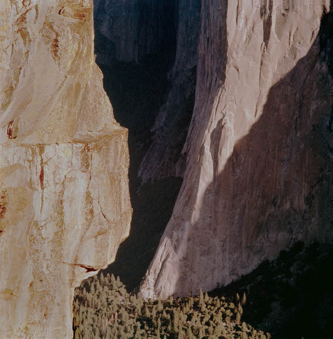
Figure 10-11a: El Capitan Sunrise—straight curve scan
The view of Yosemite’s El Capitan from Taft Point is awe inspiring, particularly at sunrise. Taft Point, on the south rim of Yosemite Valley opposite El Capitan, stands 3,000 feet above the valley floor. From there, the astounding height of El Capitan above the valley’s conifer trees becomes apparent in ways impossible to gauge from the valley floor. The image was made just as the sun moved far enough around to allow a continuum of sunlight from the floor to the top. But the transparency, exposed in the mid-1970s, pushed tonal limit from highlights to shadow, and has faded to magenta over the years, as seen in this straight curve scan of the transparency.
The Reverse C-Curve: For transparencies that are overexposed—those dominated by light tonalities with few or no shadows (yet containing no blown-out, blank areas)—I have found that a Reverse C-curve is best for the scan. This is a curve somewhat in the shape of the letter “C” as viewed through a mirror. Of course, if the transparency is so overexposed that some areas are blank, you’re sunk. You can’t obtain detail via a scan where none exists in the original transparency. This overexposure is similar to clipping a digital exposure, or pushing it beyond the right edge of the histogram, but by a degree that can’t be recovered in Lightroom or other software programs. Again, see chapter 11 for the complete discussion of this.
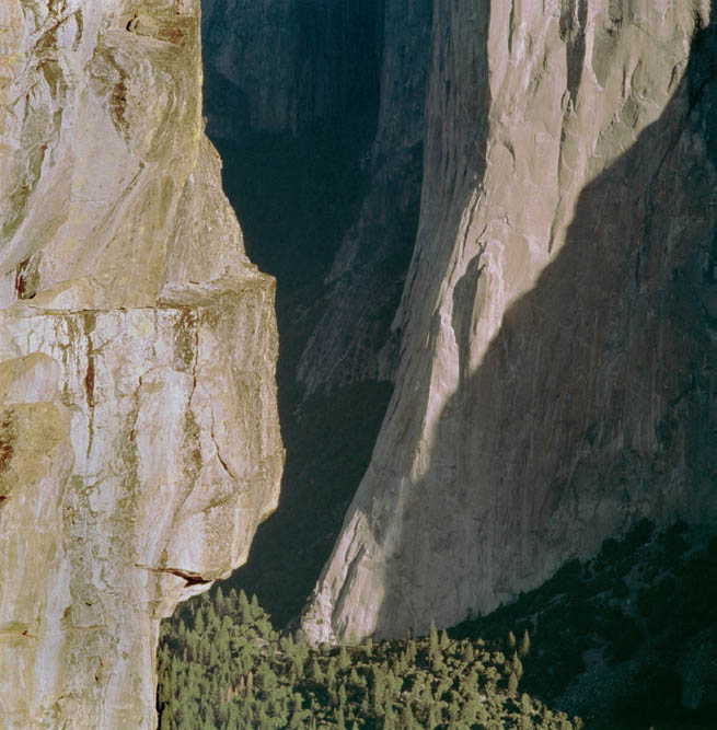
Figure 10-11b: El Capitan Sunrise—modified C-curve scan
The image pushed the limits of tonalities, from the nearby sunlit cliff of Taft Point (on the left side) and the distant sweep of El Capitan, to the deep shadows on the lower-right corner, and to those in the distance, in the upper center. Scanning with a C-curve helped separate tonalities in those shadows. Modifying the basic curve by lowering the red component and increasing the green negated much of the magenta case caused by four decades of fading.
Now, if detail exists everywhere in the transparency, I have found that by starting at the extreme upper right corner of the SilverFast gradation adjustment grid, the curve initially drops quickly down the right side as it slowly turns left toward the lower left, becoming ever-flatter (i.e., more horizontal) as it approaches the lower-left edge. Again, I don’t go to the extreme lower left corner, but to a point above that. (You’ll have to decide the optimum height for yourself.) Another way of picturing a Reverse C-curve is to start with a straight line going from the extreme upper right corner toward the lower left, but gently pushing the middle of that straight line downward and to the right, as if it were a flexible strand of rubber (diagram 10.8). The Reverse C-curve separates the tonalities of those pale, overexposed highlights, giving them some needed depth and brilliance. Neither the Straight Line curve nor the S-curve can adequately do that because their initial downward slope from the upper-right corner of the grid is too flat. Further, the S-curve tends to make matters worse, since its initial slope is even flatter than a straight, sloping line. So the very scanning curve that could serve to energize a well-exposed but low-contrast transparency could be the worst choice for scanning an overexposed transparency.
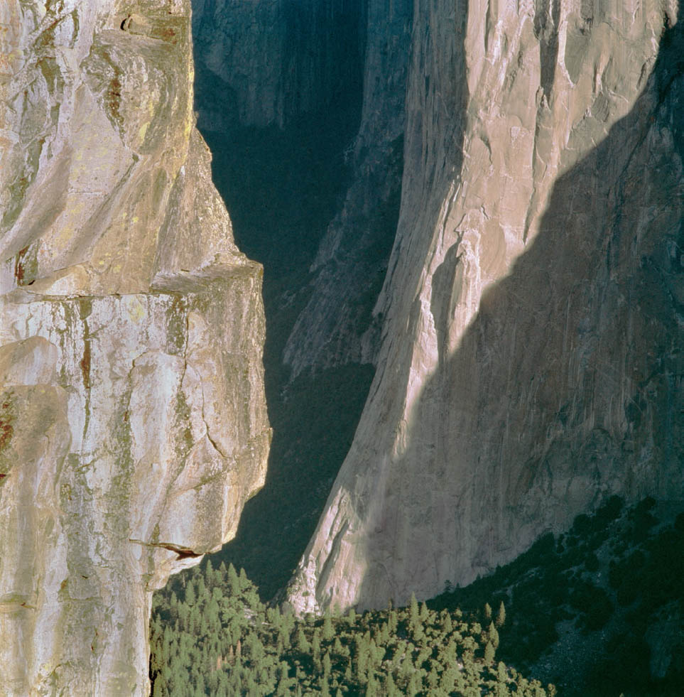
Figure 10-11c: El Capitan Sunrise—Final Image
Further refinements in Photoshop—primarily using Curves for the overall image to bring out additional shadow detail, plus using the Paint Brush to selectively paint the sunlit cliff of Taft Point to reduce glare and slightly increase contrast—yields an image that largely conveys the dimensionality and enormity of the scene I experienced that morning.
Keep in mind that you may want some bright, pastel-dominated images—ones that may appear overexposed at first glance—to be exactly that: an image of soft, pastel colors and tones. This is not an overexposed transparency, but a purposely-made high-key transparency. To preserve that feel in the scan, use the Straight Line scan.
The C-Curve: I have found that a C-curve is best for gradation adjustments for transparencies that are either underexposed (yielding a lot of dark tonalities) or even ones that are well exposed where there was a lot of initial contrast in the scene and with an abundance of dark areas that still possess detail, but are nearly lost in darkness. In the C-curve, you again start the scanning curve at the extreme upper right corner of the grid, and travel leftward with only a slight downward slope to the curve, making it progressively steeper as you approach the left edge, again ending up somewhat above the extreme lower left corner. This is equivalent to pushing the Straight Line curve up and to the left from the middle. Of course, if there are areas of pure black—lacking any detail—in the original transparency, you can’t create visibility in the scan. But if there are simply very dark areas with visible separations, detail can be pulled out via a good scan. I have found that this C-curve is the optimum curve for opening up the deep dark areas of the transparency to greater visibility (diagram 10.9), with the color channel modifications explained in the next section below).
With underexposed or predominantly dark transparencies, the Straight Line curve or the S-curve fails to work well because the lower-left portion of the curve—exactly where you want to separate detail in those overwhelmingly dark areas—is too flat. So instead of separating the dark tones, those curves compress them.
These are four basic scanning curves to work with: (1) the Straight Line curve, (2) the S-curve, (3) the Reverse C-curve, and (4) the C-curve. You’ll find the odd transparency here and there that may not conform to any of those four categories, but those four basic types, with minor variations for each transparency, should serve your purposes for at least 95% of your scans. There will be variations—maybe the upper half of the curve being a straight line, while the lower half is a bit of a C-curve, or a Reverse C-curve—but in general, these four basic curves tend to do the job.
Altering Curves for Faded or Off-Balance Color Transparencies
Some of my transparencies are decades old, and are noticeably faded. Some have taken on the look of an overexposed transparency even though the initial exposure had been quite wonderful. More often, the color balance has gone way off track. I have scanned many such transparencies that have now faded into a deep magenta cast. But these are often correctible via clever scanning, as in the C-curve shown in diagram 10.9 where I have offset the individual color channels. With any of the curves recommended above, I can separate the red, green, and blue channels prior to scanning, making one or two more or less pronounced. In the case of an overall magenta cast, I have found that lowering the red channel below that of the green and blue does a marvelous job of color correction in the scan itself. Sometimes, also lowering the blue a little, along with the lowering of red, eliminates the magenta cast entirely (diagram 10.9). Further tweaking of the individual color channels in the highlights, mid-tones, or shadows can give you more exacting results (figures 10-11a, 10-11b, and 10-11c).
Another example of separating the color channels for scanning would be a scan of an outdoor transparency film that was exposed in shade. Outdoor film is balanced for sunlight, so it tends to go blue in shade. In scanning a transparency like that, the blue channel can be lowered compared to the green and red channels to rebalance the color. Indoor transparency film is balanced for tungsten light, and any other light (including even a window allowing daylight into the room) could throw the color off balance. Again, depending on the color shift of the imbalance, separating the color channels in making the scan can correct the imbalance to a great extent. Using the same techniques, if you want to purposely introduce an imbalance you can do it by adjusting the curves in the scan. You can even introduce specifically desired imbalances into the highlights, midtones, or shadows as you see fit.
With that in mind, consider raising or lowering just a portion of one of the component color channels in the scan to optimize color balance for your creative purposes.
Learning to Use Scanning Curves
My mathematical background has been invaluable in helping me understand the meaning of scanning curves because a mathematical curve has real meaning in the real world. So I was guided toward these curves just by recognizing that a steep portion of the curve will separate tonalities to a greater extent, while a shallower portion of the slope does not. Furthermore, I recognized that I can’t exceed limits—the blackest black is the darkest I can go; the whitest white is the brightest. I had to work within those limits. Everyone has to work within those limits. So there are trade-offs involved. You simply can’t expand every part of the curve. Yet, despite my mathematical insights, I still had to actually apply the curves to real transparencies to prove to myself how they work, and under which conditions the appropriate curve works best. Hence my suggestion to take a few diverse transparencies—a well-exposed one, an overexposed one, an underexposed one—and apply each of the suggested curves to each transparency to get a good feel for how they work. It’s very much worth the time.
In making these recommendations, I caution you to be realistic. You can’t make a silk purse out of a sow’s ear no matter how good your scanning prowess may be. You can go only so far. Do not expect to make a wretched transparency into a great digital image, any more than you can make a wretched exposure into a great image, or a poorly seen color transparency into a great print traditionally, no matter how great your printing skills in the darkroom may have been. Furthermore, a great scan doesn’t mean you started with a great composition, or that you were working with good lighting in the field, or that you had anything of importance to say from the very beginning. A good scan is a good scan, but a good photograph starts with all the necessary ingredients discussed in the early chapters of this book along with the thoughts about creativity and imagination conveyed in the later chapters.
By contrast, a poor scan can damage or destroy the inherent qualities of a fine transparency, or the possibilities residing within an improperly exposed transparency that still may still have the makings of a fine photograph. Scanning is important, so it’s a good idea to learn to do it well.
This section was meant to be simply a brief explanation of scanning and my recommendations. There is a lot more to learn about hardware and software. For more on this subject, please check out Scanning Negatives and Slides, 2nd Edition, by Sascha Steinhoff (2009 Rocky Nook, Inc.).