A web page consists of markup—HTML or XHTML
that describes the meaning of the content on the page—and CSS (Cascading
Style Sheets) that tell the browser how the content should be displayed in
browsers and other user agents that need to display it. CSS tells the
browser everything from the layout of the page to the colors of your
headings.
In this chapter, whose format differs to the rest of the book, I’ll
explain the basics of CSS syntax and how to apply CSS to your web pages. If
you’re experienced with CSS, feel free to skip this chapter and start with
the solutions in Chapter 2.
This book is not a CSS tutorial; rather, it’s a collection of problems
and solutions to help you perform tasks in CSS. If you’re unsure as to the
very basics of HTML and CSS, I can recommend the SitePoint title Build
Your Own Website the Right Way Using HTML & CSS (third
edition) by Ian Lloyd as a companion to this book. If you already
have some understanding of HTML and CSS, however, this chapter should serve
as a refresher, and can be used as a reference as we work through the
solutions in the later chapters.
The basic purpose of CSS is to allow the designer to define
style declarations—formatting details
such as fonts, element sizes, and colors—and then apply those styles to
selected portions of HTML pages using selectors:
references to an element or group of elements to which the style is
applied.
Let’s look at a basic example to see how this is done. Consider the
following HTML document:
<!DOCTYPE html>
<html lang="en">
<head>
  <meta charset="utf-8" />
  <title>A Simple Page</title>
</head>
<body>
  <h1>First Title</h1>
  <p>A paragraph of interesting content.</p>
  <h2>Second Title</h2>
  <p>A paragraph of interesting content.</p>
  <h2>Third title</h2>
  <p>A paragraph of interesting content.</p>
</body>
</html>
This document contains three boldfaced headings, which have been created using
h1 and h2 tags. Without CSS styling, the headings will
be rendered using the browser’s internal stylesheet; the h1 heading will be displayed in a large font
size, and the h2 headings will be
smaller than the h1, but larger than
paragraph text. The document that uses these default styles will be
readable, if a little plain. We can use some simple
CSS to change the look of these elements:
<!DOCTYPE html>
<html lang="en">
<head>
  <meta charset="utf-8" />
  <title>A Simple Page</title>
  <style>
    h1, h2 {
      font-family: "Times New Roman", Times, serif;
      color: #3366cc;
    }
  </style>
</head>
<body>
  <h1>First Title</h1>
  <p>A paragraph of interesting content.</p>
  <h2>Second Title</h2>
  <p>A paragraph of interesting content.</p>
  <h2>Third title</h2>
  <p>A paragraph of interesting content.</p>
</body>
</html>
All the magic lies between the
style tags in the head of
the document, where we specify that a light blue, sans-serif font should
be applied to all h1 and h2 elements on the page. Regarding the syntax,
I’ll explain it in detail shortly. By changing the style definition at the
top of the page, it’s unnecessary to add to the markup itself; it will
affect all three headings, as well as any other headings that might be
added at a later date.
Note: HTML or XHTML?
Throughout this book, the examples will be presented with HTML5 documents using XML-style syntax, as this is my preference. All these examples, however, will work in an XHTML or HTML4 document.
The simplest method of adding CSS styles to your web pages is to
use inline styles. An inline style is applied to
an HTML element via its style attribute, like this:
<p style="font-family: "Times New Roman", Times, serif;
  color: #3366cc;">
  Amazingly few discotheques provide jukeboxes.
</p>
An inline style has no selector; the style declarations are applied to the parent element. In the above example, this is the
p tag.
Inline styles have one major disadvantage: it’s impossible to
reuse them. For example, if we wanted to apply the style above to
another p element, we’d have to type
it out again in that element’s style attribute. And if the style needed
changing further on, we’d have to find and edit every HTML tag where the
style was copied. Additionally, because inline styles are located within
the page’s markup, it makes the code difficult to read and
maintain.
Another approach for applying CSS styles to your web pages is to
use the
style element, as in the
first example we looked at. Using this method, you can declare any
number of CSS styles by placing them between the opening and closing
style tags, as follows:
<style>
  … CSS styles go in here…
</style>
The
style tags are placed
inside the head element, and while it’s nice and simple, the style tag has one major disadvantage: if you
want to use a particular set of styles throughout your site, you’ll have
to repeat those style definitions within the style element at the top of every one of your
site’s pages.
A more sensible alternative is to place those definitions in a
plain text file, then link your documents to that file. This external
file is referred to as an external stylesheet.
An external stylesheet is a file
(usually given a .css filename) that contains a
website’s CSS styles, keeping them separate from any one web page.
Multiple pages can link to the same .css file, and
any changes you make to the style definitions in that file will affect
all the pages that link to it. This achieves the objective of creating
site-wide style definitions as mentioned previously.
To link a document to an external stylesheet (say,
styles.css), we simply place a link element within
the document’s head element:
The linked styles.css file contains the
following style definition:
<link rel="stylesheet" href="styles.css" />Remember our original example in which three headings shared a single style rule? Let’s save that rule to an external stylesheet with the filename styles.css, and link it to the web page like so:
<!DOCTYPE html>
<html lang="en">
<head>
  <meta charset="utf-8" />
  <title>A Simple Page</title>
  <link rel="stylesheet" href="styles.css" />
</head>
<body>
  <h1>First Title</h1>
  <p>A paragraph of interesting content.</p>
  <h2>Second Title</h2>
  <p>A paragraph of interesting content.</p>
  <h2>Third title</h2>
  <p>A paragraph of interesting content.</p>
</body>
</html>
The value of the rel
attribute must be stylesheet. The
href attribute indicates the
location and name of the stylesheet file.
Note: Not Your Type
You’ll often see the link to the stylesheet written as:<link rel="stylesheet" type="text/css"
href="styles.css" />. We’ve omitted the type attribute here because we’re using
HTML5, which, along with browsers, has no requirement for
it.
h1, h2 {
  font-family: "Times New Roman", Times, serif;
  color: #3366cc;
}
As with an image file, you can reuse this
styles.css file in any page in which it’s needed.
It will save you from retyping the styles, as well as ensure that your
headings display consistently across the entire site.
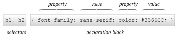
A stylesheet is a collection of style definitions. Every CSS style
definition, or rule, has two main components:
The declaration block contains one or more style declarations and
each one sets the value of a specific property.
Multiple declarations are separated by a semicolon (;). A property
declaration is made up of the property name and a value, separated by a
colon (:). You can see all of these elements labeled in Figure 1.1.
The solutions throughout the book focus mainly on the different
properties and the values they can take. Figure 1.1 also illustrates that a style rule can be
written in a single line. Some CSS authors prefer to indent their style
rules to aid readability, while others write their rules on one line to
save space. The following shows the same style rule written both
ways:
h1, h2 {
  font-family: "Times New Roman", Times, serif;
  color: #3366cc;
}

h1, h2 {
  font-family: "Times New Roman", Times, serif; color: #3366cc;
}
The formatting makes no difference at all; it’s totally up to you
how you write your stylesheet.
A selector is what we use to target the particular bit of markup
on the page that we wish to style. These range from very simple
(targeting a particular HTML element by name) to complex (targeting an
element when it’s in a certain position or state). In the following
example,
h1 and h2 are the selectors, which means that the
rule should apply to all h1 and
h2 elements:
h1, h2 {
  font-family: Times, "Times New Roman", serif;
  color: #3366CC;
}
We’ll be seeing examples of CSS selectors throughout the book, so
you should quickly become accustomed to the different types of selector
and how they work. Below are some examples of each of the main selector
types, so these should be familiar when you encounter them
later.
The most basic form of selector is a type
selector, which we’ve already seen. By naming a particular
HTML element, you can apply a style rule to every occurrence of that
element in the document. Type selectors are often used to set the basic
styles that appear throughout a website. For example, the following
style rule might be used to set the default
h1 font for a website:
               h1 {
  font-family: Tahoma, Verdana, Arial, Helvetica, sans-serif;
  font-size: 1.2em;
  color: #000000;
}
Here we’ve set the font, size, and color for all h1 elements in the document.
Assigning styles to elements is all well and good, but what
happens if you want to assign different styles to identical elements
that occur in various places within your document? This is where CSS
classes come in.
Consider the following style, which colors all
h2 headings blue in a document:
h2 {
  color: #0000ff;
}
That’s great, but what would happen if you had a sidebar on your
page with a blue background? If the text in the sidebar were to display
blue as well, it would be invisible. What you need to do is define a
class for your sidebar text, then
assign a CSS style to that class.
First, edit your HTML to add a
class to the
heading:
<h2 class="sidebar">This text will be white, as specified by the
  CSS style definition below.</h2>
Now write the style for this class:
h2 {
  color: #0000ff;
}

.sidebar {
  color: #ffffff;
}
This second rule uses a class selector to indicate that the style
should be applied to any element with a class value of .sidebar.
The
period (.) at the beginning indicates
that we’re naming a class instead of an HTML element.
You can add a class to as many elements in your document as you
need to.
In contrast with class selectors, ID
selectors are used to select one particular element, rather
than a group of elements. To use an ID selector, you first add an
id attribute to the
element you wish to style. It’s important that the ID is unique within
the HTML document:
<p id="tagline">This paragraph is uniquely identified by the ID
 "tagline".</p>
To reference this element by its ID selector, we precede the ID
with a
hash (#). For example, the following
rule will make the preceding paragraph white:
#tagline {
  color: #ffffff;
}
The next group of selectors we shall take a look at are
combinators. The combinator refers to a character
added between two simple selectors to create a selector more capable of
targeting a precise part of the document.
The descendant selector matches an element that descends from a
specified element. The combinator used in this selector is a
whitespace character.
You might have an
h2 element
on your site that’s set to display as blue; however, within the
sidebar of the site are some h2
elements that you want to display white in order to show up against a
dark background. As we saw earlier, you could add a class to all these headings, but it would
be far neater to instead target them with CSS. This is when the
descendant selector is used.
Here’s the new selector:
.sidebar h2 {
  color: #ffffff;
}
And here’s the updated HTML:
<div class="sidebar">
  <h2>A heading in white</h2>
  <h2>Another heading in white</h2>
</div>
As you can see, a descendant selector comprises a list of selectors (separated by spaces) that match a page element (or group of elements) from the outside in. In this case, because our page contains a
div element with a
class of sidebar, the descendant selector
.sidebar
h2
refers to all h2 elements inside
that div.
By using a descendant selector, there’s no need to access your
HTML to add classes directly to all elements; instead, use the main
structural areas of the page—identified by classes or IDs where
required—and style elements within them.
Unlike the descendant selector—which matches all elements that
are descendants of the parent element, including elements that are
not direct descendants—the child selector matches
all elements that are the immediate children of a specified element.
The combinator used in this selector is the
greater-than sign (
>).
Consider the following markup:
<div class="sidebar">
  <p>This paragraph will be displayed in white.</p>
  <p>So will this one.</p>
  <div class="tagline">
    <p>If we use a descendant selector, this will be white too.
      But if we use a child selector, it will be blue.</p>
  </div>
</div>
In this example, the descendant selector we saw in the section called “Descendant Selectors
”, .sidebar p, would
match all the paragraphs that are nested within the div element with the class sidebar, as well
as those inside the div with the
class tagline. But if, instead,
you only wanted to style those paragraphs that were direct descendants
of the sidebar
div, you’d use a child selector. A child
selector uses the > character to specify a
direct descendant.
Here’s the new selector, which sets the text color to white for
those paragraphs directly inside the sidebar
div (but not those within the tagline
div):
p {
  color: #0000FF;
}

.sidebar>p {
  color: #ffffff;
}
An adjacent selector will only match an element if it’s adjacent
to another specified element. The combinator for this selector is the
plus character (
+).
Therefore, if we have HTML:
<h2>This is a title</h2>

<p>This paragraph will be displayed in white.</p>

<p>This paragraph will be displayed in black.</p>
And then use the following selector:
p {
  color: #000000;
}

h2+p {
  color: #FFFFFF;
}
Only the first paragraph will be displayed in white. The second
p element is not adjacent to an
h2 element, so its text will be
displayed in the black we’ve specified for p elements in the first rule.
A pseudo-class selector acts as if an element has a class
applied according to the state of that element. Pseudo-class selectors
start with a
colon and are usually added
immediately after a type selector with no additional whitespace.
My aim here is to familiarize you with the syntax of and
terminology around these selectors, so that as we meet them later,
you’ll have an understanding of how they work. As a result, I won’t
demonstrate all the selectors in this chapter, but a full list with
explanations can be found online in the SitePoint CSS
Reference.
Most of us first come across pseudo-class selectors when they’re
applied to links. A link has various states. It can be unvisited or
visited, hovered over, or clicked. We can use CSS to target each of
these states:
a:link {
  color: #0000ff;
}

a:visited {
  color: #ff00ff;
}

a:hover {
  color: #00ccff;
}

a:active {
  color: #ff0000;
}
The first definition sets the color for the
link state, which displays for links that users
have visited. If they have visited the link, the second rule is used.
If they hover over the link, the :hover definition
is used, and when clicking or otherwise activating the link, the
:active definition is used. The
:hover and :active pseudo-class
selectors are actually termed dynamic
pseudo-classes, as they take effect only when the user
interacts with the element; something has to happen before they take
effect.
The order of these definitions in your document is important.
The a:active definition needs to come last so that
it overwrites the previous definitions. We’ll find out why that’s the
case later on in this chapter, when we discuss the cascade.
The
first-child pseudo-class selector targets
an element when it’s the first child of a parent element. As with all
these selectors, it’s far easier to understand when you can see an
example.
Within your document is a set of paragraphs. These are contained
inside a div element with a
class of article. We can use CSS and a descendant
selector to address all these paragraphs, making them larger and
bold:
.article p {
  font-size: 1.5em;
  font-weight: bold;
}
If you’d just like the first paragraph to display in a larger
font size and bold—by way of an introduction to the article—you can
use first-child:
.article p:first-child {
  font-size: 1.5em;
  font-weight: bold;
}
This CSS is only applied by the browser if the paragraph is the
very first p element inside an
element with a class of article.
So the first-child pseudo-class selector is useful
for adding nice design touches, such as making the first paragraph of
some text—or the first instance of a heading—slightly
different.
Just as we can use
first-child to address the
very first instance of an element inside a container, we can use
last-child to address the last instance. The
following CSS would add a bottom border to each list item in a
list:
.navigation li {
  border-bottom: 1px solid #999999;
}
To prevent the border displaying on the last item, you can use
the following CSS:
.navigation li {
  border-bottom: 1px solid #999999;
}

.navigation li:last-child {
  border-bottom: none;
}
The
nth-child pseudo-class selector lets you
select multiple elements according to their position in the document
tree. The easiest way to see this in action is by taking a common
example of striping table rows to make them easier to read.
The following CSS declaration will give a table cell a
background color only if it’s in an odd row of the table:
tr:nth-child(odd) td {
  background-color: #f0e9c5;
}
In addition to odd and even keywords, you can use a multiplier
expression:
tr:nth-child(2n+1) td {
  background-color: #f0e9c5;
}
We’ll be looking at nth-child in more depth
later in the book, where I’ll explain how to use these multipliers to
target various parts of a data table.
The
only-child pseudo-class selector will
select an element if it’s the only child of its parent. For example,
if I have in my markup the following two lists—the first having three
list items and the second having one:
<ul>
  <li>Item one</li>
  <li>Item two</li>
  <li>Item three</li>
</ul>

<ul>
  <li>A single item list - not really a list at all!</li>
</ul>
The CSS declaration below would only match the list item in the second list, as it matches where the
li is an only child of the parent ul:
li:only-child {
  list-style-type: none;
}
Pseudo-elements operate as if you’ve added new HTML markup
into your page and then styled that markup. In the CSS3 specification,
pseudo-elements are denoted with a
double colon; for example,
p::first-letter.
However, for pseudo-elements that existed in
CSS2 (such as ::first-letter,
::first-line, ::before, and
::after), browser manufacturers are asked to maintain
support for the
single colon syntax that these selectors used in the past.
If you’re utilizing the above selectors, at the time of writing a single
colon has better browser support, so I’d suggest employing this. The
exception is ::selection, which was added in the CSS3
specification.
The
first-letter pseudo-element selector acts
as if you’ve wrapped a span around
the first letter of the content inside your parent element and are
then styling it. For example, if we used a span within the markup we might have:
<div class="wrapper">
  <p><span class="firstletter">T</span>his is some text within a div
    with a class of wrapper.</p>
</div>
And in the CSS:
.wrapper .firstletter {
  font-size: 200%;
  font-weight: bold;
}
Or we could remove the span
from the markup and target the first letter in the same way using the
first-letter pseudo-element selector:
.wrapper:first-letter {
  font-size: 200%;
  font-weight: bold;
}
In the same way
first-letter
selects the first letter within a container, first-line selects the first line:
.wrapper:first-line {
  font-size: 200%;
  font-weight: bold;
}
The first-line selector is far more flexible
than actually wrapping the first-line of text in a
span and styling that. When wrapping content in a span, it’s not known whether the length of
the first line may change (due to the user’s text size, for example,
or a change in the text added by a content management system). The
first-line pseudo-class selector
will always format the first line of text as displayed in the
browser.
The
before pseudo-element is used along with
the
content property to specify where
generated content should be rendered.
Generated content is content that’s rendered in your
document from CSS. This can be useful for a variety of reasons, which
we’ll look at later in the book. For now, here’s the HTML for a simple
example:
<div class="article">
  <p>Hello World!</p>
</div>
And the CSS:
.article:before {
  content: "Start here";
}
When viewed in a browser, this will render the words “Start
here” just inside the opening div
element—that’s before the first p.
The
after pseudo-element works in the same
way as before, but it renders the content at the
end of the parent element; that’s just before the closing div in our aforementioned HTML
example:
.article:after {
  content: "End here";
}
Given the same markup used for the previous
before example, the previous CSS would render “End
here” just before the closing div,
after the closing p tag.
Attribute selectors let you target an element based on an
attribute. As an example of an attribute on an HTML element, we can look
at the
a element, which creates a
link. Attributes on the following link are href and title:
<a href="http://google.com" title="Visit Google">Google</a>With an attribute selector, we can check what the value of an attribute is, and show CSS based on it. As a simple example, if we take a
form
input field, it has a type attribute explaining what kind of field
it is. Valid values for the type
attribute include text, radio, and checkbox. If we try and style a checkbox in the same way as a text
input
field, we’ll end up with a very strange result, so we can use an
attribute selector to create a definition only for input fields with a type of text. For example,
here is a form field:
<input type="text" name="name" id="fName" />The CSS to target this field is as follows:
form input[type="text"] {
  background-color: #ffffff;
  color: #333333;
}
In Chapter 6, we’ll be looking at more
examples of using attribute selectors.
You’re probably already aware that not all browsers are equal in
their support of CSS, and that’s before you take into consideration that
some users may well have old versions of browsers on their desktop. The
examples in this book should all work as described in the current versions
of the main browsers; in fact, most will work on previous versions of
these browsers as well. Where a certain feature is unavailable in older
versions of, say, Internet Explorer, I’ll indicate this fact.
In Chapter 7, I’ll explain a number of
ways to get older browsers up to speed with the latest CSS, such as using
JavaScript to add support for CSS3 selectors in older versions of Internet
Explorer. If you know that a project you’re working on will have a large
share of its users using old versions of IE, for example, it’s advisable
to turn to that chapter to plan your support strategy from the
outset.
As you move through the solutions in the next few
chapters, you’ll see examples of one way that browsers are coping with
the introduction of CSS3. The CSS3 specification is different from
earlier specifications in that it is modular. The spec is broken down
into modules that can each reach completion—in W3C terms this is known
as a W3C Recommendation—at different times. The stages a module moves
through are as follows:
While a module is moving through the various stages, browser
manufacturers often start implementing the module at Working Draft
stage. This is good, because it helps to provide implementation
experience in terms of how the specification works when used; however,
it is possible that implementation details could change from the initial
proposal.
For example, if you had used a CSS3 property that
subsequently changed, a site built a year ago might suddenly look very
odd indeed in a new browser that changed the implementation to the new,
correct way of doing it.
To avoid this issue, browser manufacturers often use a vendor
prefix when doing their early stage implementations to create a
vendor-specific implementation of the property. For example, we use
- Working Draft: the module has been published for review by the community
- Candidate Recommendation: implementation experience is gathered during this phase
- Proposed Recommendation: the module is sent to the W3C Advisory Committee for final endorsement
- W3C Recommendation: the module is now endorsed by the W3C and should be widely adopted
border-radius to create rounded corners like
so:
border-radius: 10px;However, for rounded corners to work in earlier versions of Firefox and Safari, you’d also need to add the vendor-prefixed versions:
-webkit-border-radius: 10px;
-moz-border-radius: 10px;
border-radius: 10px;
Once the module is unlikely to change, the browsers start supporting the real property alongside their own. Some browsers may never have a vendor-specific version and just implement the one from the specification. You’ll witness many examples of these prefixed properties throughout the book, so you should soon become comfortable using them.
So how does the browser understand our intentions? When more than
one rule can be applied to the same element, the browser uses
the cascade to determine which style properties to
apply.
Understanding the cascade is important when dealing with CSS,
because many CSS development problems are due to styles being
unintentionally applied to an element. We’ve already presented examples in
this chapter where we’ve written a general style rule focused on paragraph
elements, and then a more specific rule aimed at one or more particular
paragraphs. Both style rules target paragraphs, but the more
specific rule overrides the general rule in the case of matching
paragraphs.
There are four factors that the browser uses to make the decision:
weight, origin, specificity, and source order.
The weight of a particular style declaration
is determined by the use of the keyword
!important.
When the keyword appears after a property value, that value can’t be
overridden by the same property in another style rule, except in very
specific circumstances. Using !important in your
stylesheets has a huge negative impact on maintainability, and there’s
often little call for it anyway. For these reasons it should be avoided,
which we’ll do in this book. If you’d like to know more, you can read
about it in the SitePoint
CSS Reference.
There are three possible stylesheet origins:
the browser, the author, and the user. In this book, we focus on what are
called author stylesheets; that’s stylesheets
written by the web page creator—you! We’ve mentioned the browser internal
stylesheet that provides the default styles for all elements, but styles
in author stylesheets will always override styles in the browser default
stylesheet. The only other possible origin for stylesheets are user
stylesheets—custom styles written by the browser users—and even these are
overridden by the author stylesheet except in rare circumstances. Again,
if you’d like to know more, the SitePoint CSS Reference has a whole
section on it.
The two parts of the cascade that will affect your daily CSS work
the most are specificity and source order. The rule of
specificity ensures that the style rule with the
most specific selector overrides any others with less-specific
selectors.
To give you an example of how this works, consider this simple
snippet of HTML markup:
<div id="content">
 <p class="message">
   This is an important message.
 </p>
</div>
Now consider the following style rules that are to be applied to this HTML:
            p { color: #000000; }
.message { color: #CCCCCC; }
p.message { color: #0000FF; }
#content p.message { color: #FF0000; }
These four selectors all match the paragraph element in the example HTML and set the text color. What color will be applied to the paragraph? If you guessed
#FF0000, or red, you’d be right. The
p type selector (any p element) has the lowest level of specificity,
with .message (any element with class
message) coming next. The selector
p.message (any p element with
class
message) then has a higher level of
specificity. The highest is the selector #content
p.message (any p element with class
message that is a child of the element with
id
content).
Longer selectors aren’t necessarily more specific. An ID selector,
for example, will always have a higher specificity than an element
type or class selector. It becomes trickier the more
complex your selectors are, but you should find the examples in this book
simple enough. If you’d like to know the exact formula for measuring
specificity, once again the SitePoint CSS
Reference has all the answers.
If two or more style rules are still applicable to an element, the
order in which the rules appear—the source order—is
used. The last rule to be declared is applied. This is also true if you
declare more than one style rule with the same selector; for example,
.message in your stylesheet. It will be the second
instance of the rule that will be applied to the element. As we’ll see in
later chapters, this behavior is very useful.
Since I wrote the previous edition of this book, the use of CSS
frameworks by designers to speed up the development of their CSS has
grown.
My take on these frameworks is that they can be very useful,
but they’re no substitute for learning CSS. Once you understand CSS and
are used to writing it for your projects, you may come up against workflow
issues that are resolved by employing some of the available tools and
frameworks. If they solve a problem you have—great! There is nothing
inherently wrong with building on the work of other people. However, if
your problem is that you lack a good grasp of CSS, the use of any
framework is more likely to compound your confusion—adding another layer
of complexity that will only make it harder to come to grips with the
basics.
This chapter has given you a taste of CSS and its usage at the basic
level. We’ve even touched on the sometimes confusing concept of the
cascade. If you’re a newbie to CSS but have an understanding of the
concepts discussed in this chapter, you should be able to start using the
examples in this book.
The examples in the early chapters are simpler than those found
later on, so if you’re yet to work with CSS, you might want to begin with
these. They will build on the knowledge you gained in this chapter to
start using and, I hope, enjoying CSS.
..................Content has been hidden....................
You can't read the all page of ebook, please click here login for view all page.