At the time of writing this current edition of The CSS
Anthology, we’re in an exciting period of web design and
development. The latest versions of browsers have great support for CSS,
including much of CSS3. The majority of techniques shown so far in this book
will work in the most current versions of desktop browsers and most mobile
browsers. Browser manufacturers are working to faster release schedules and
implementing new parts of CSS3 far more swiftly than a few years ago, which
means that we can start experimenting with new features quicker.
With modern browsers, we’re dealing less frequently with browser bugs
than we were in the past. Our issues now tend to center on whether or not a
browser supports a certain feature. However, in the real world there are
clients using older browsers containing significant bugs, as well as a
complete lack of support for CSS3. A question we all need to ask is: how
should we balance using CSS3 to create modern web designs with supporting
these older browsers?
This chapter outlines how to create a browser support policy for each
site that you work on, and demonstrates how to provide good experiences for
users of older browsers. We’ll also cover some testing tips, as well as
details of some of the main bugs that come with very old versions of
Internet Explorer, so that if you come across them, you’re able to fix them
quickly.
When I started working in web development, we talked about testing
in “both browsers”—that was Internet Explorer and Netscape. Today, we’re
faced with a large number of browsers and rendering engines.
The answer is to test your sites in as many browsers as you can.
The types of browsers that you’re able to install will depend on the
operating systems to which you have access. At the very least, you
should test in Internet Explorer 6, 7, 8, and 9, as well as the latest
versions of Firefox, Opera, Safari, and Chrome. Additionally, even if
you’re not providing a different experience for mobile users, it’s worth
checking how the site behaves on the iPhone, iPad, and other mobile
devices, making sure that everything is usable via a touch
interface.
That’s not to say that the site should look identical in all of
these browsers. The experience for an IE6 user could be very different
from an IE9 user—but you should aim to have the content accessible and
the site usable.
Note: In the Engine Room
You may have come across the term browser rendering engine. If we conceive of the browser as the complete software package, including the application interface and features, the browser rendering engine is the part that interprets the HTML and CSS, rendering the web pages for you to view and interact with. Some engines are separate software products that are used by more than one browser. For example, the Gecko engine developed by the Mozilla Foundation is used by Firefox, as well as Camino and the last versions of Netscape Navigator, among others. The WebKit engine powers Safari and Chrome, and was originally derived from the KHTML engine that powers the Konqueror web browser on Linux. WebKit is also particularly interesting as it is the rendering engine behind mobile Safari (used on iPhones and iPads) and also browsers for Android and modern Blackberry devices. You may be thinking that if two browsers use the same rendering engine, you only need to test in one. While true to a certain extent, there can still be differences, especially across versions and operating systems. Some browsers, like Internet Explorer and Opera, use their own internal engines.
With the latest versions of browsers having good support for many of
the interesting CSS3 properties, and far fewer browser bugs than we have
seen in the past, it is tempting to consider dropping support completely
for old versions of Internet Explorer. How do we decide which browsers to
support, and what level of support to provide them?
When starting work on a new site, you should first consider the
kind of person who will be using the site, as well as the likely
browsers and devices that they’ll be using. If you are redesigning a
website, you’re in luck! There should be some existing information in
the web statistics as to which browsers are being used.
Even if it is a brand new site, you should be able to draw some
conclusions based on the audience. For example, many really old Internet
Explorer browsers (IE6 and 7) can be found in large companies in the UK
who require it for legacy internal products. If your site is aimed at
these users, you may find that you need to provide more support for
these old browsers. If your site is aimed at young people, or is
particularly useful to people on the go, you might have more mobile
devices than average browsing the site.
You might also have other sites, for which you have access
to statistics, that serve a similar audience. There are also a number of
sites that publish statistics, such as StatCounter. It offers an
analytics service, collating the data from all the sites that run its
service to provide some idea of browser and version trends.
By looking at the browsers and devices that your users most
frequently employ, you can put together a browser support policy for
your site. This can outline the browsers that you test in, and the level
of support you offer in terms of the design.
When discussing the support of older browsers, it doesn’t mean
we need to make the design look or function in an identical way in all
those browsers. If your site happens to have a large number of people
using old versions of Internet Explorer, you may find that there’s
pressure from your boss or client to try and make the design
consistent across the browsers; this generally translates to you
needing to simplify your design and avoid using newer techniques.
However, for most sites it’s appropriate to serve a simpler design to
these older browsers. What’s important is that the content is still
accessible in a usable manner.
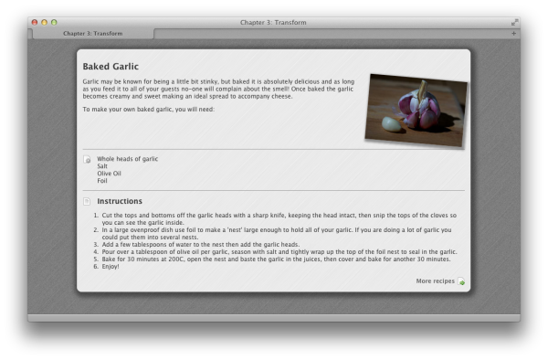
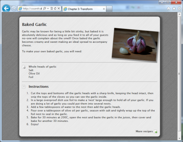
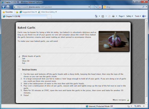
We can take as an example a layout created in Chapter 3. In Figure 7.1, we
can see it displayed in Safari on OS X.
It uses a number of CSS3 properties, highlighted in the CSS
here:
Internet Explorer 9 also supports the CSS properties
that we’ve used. We can see that the design in Internet Explorer 9,
shown in Figure 7.2, looks as it does in
Safari.
Figure 7.3 shows the same layout in
Internet Explorer 6.
Here we can see a few issues:
Overall, the page content is perfectly accessible and looks good
in all the browsers; however, where the very old browsers are
concerned, we do lose some of the finer detail.
chapter_07/example1.css
body {
  background-color: #333;
  background-image: url(brushed_alu_dark.png);
  color: #fff;
  margin: 0;
  padding: 0;
  font: 0.75em/1.3 "Lucida Grande", "Lucida Sans Unicode",
    "Lucida Sans", Verdana, Tahoma, sans-serif;
}

.wrapper {
  width: 80%;
  margin: 20px auto 40px auto;
  background-color: #fff;
  color: #333;
  background-image: url(brushed_alu.png);
  -webkit-box-shadow: 3px 3px 10px 8px rgba(0, 0, 0, 0.4);
  -moz-box-shadow: 3px 3px 10px 8px rgba(0, 0, 0, 0.4);
  box-shadow: 3px 3px 10px 8px rgba(0, 0, 0, 0.4);
  -webkit-border-radius: 10px;
  -moz-border-radius: 10px;
  border-radius: 10px;
}

.recipe {
  padding: 1em;
}

.recipe img {
  float:right;
  width: 200px;
  margin: 0 0 1em 1em;
  -webkit-box-shadow: 3px 3px 5px 3px rgba(0, 0, 0, 0.4);
  -moz-box-shadow: 3px 3px 5px 3px rgba(0, 0, 0, 0.4);
  box-shadow: 3px 3px 5px 3px rgba(0, 0, 0, 0.4);
  -webkit-transform: rotate(5deg);
  -moz-transform: rotate(5deg);
  -o-transform: rotate(5deg);
  -ms-transform: rotate(5deg);
  transform: rotate(5deg);
}

h1 {
  font-size: 150%;
}

h2 {
  font-size: 125%;
}

h2.instructions {
  background-image: url(instructions.png);
  background-repeat: no-repeat;
  background-position: left center;
  padding-left: 30px;
}

ul.ingredients {
  clear:both;
  border-top: 1px solid #999;
  border-bottom: 1px solid #999;
  list-style: none;
  margin: 1em 0 1em 0;
  padding: 1em 0 1em 30px;
  background-image: url(ingredients.png);
  background-repeat: no-repeat;
  background-position: 0 1em;
}

a.more:link, a.more:visited {
  display: block;
  padding: 0.3em 20px 0.3em 0;
  text-align: right;
  color: #666;
  font-weight: bold;
  background-image: url(arrow.png);
  background-position: right center;
  background-repeat: no-repeat;
  text-decoration: none;
}
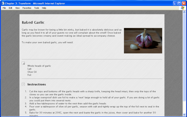
- The rounded corners on the main content area are missing.
- The shadow on the main content area is missing.
- The shadow on the feature image is missing.
-
The
transformdoes not rotate the main image.
This approach is a simple example of
progressive enhancement. Essentially our IE6
layout has all the basics in place. By using CSS, we’ve added detail
that’s unsupported in the older browsers, though those browsers still
display a basic, readable experience. This concept of progressive
enhancement is crucial to robust front-end development. You start simple
for the browsers that have little support, and layer in CSS properties,
JavaScript, and other enhancements for the most capable browsers.
Everyone then has a decent experience, and those with newer, more
capable devices gain all the additional finesse of a modern user
interface.
For very complex layouts that rely heavily on new CSS
features and have very little traffic from browsers such as IE6, you may
wish to take this approach a step further and serve a very simple
stylesheet to IE6. Andy Clarke has popularized
this approach, and his Universal IE6 Stylesheet is available on Google
Code.
My advice is not to ignore older browsers while we still see some
traffic from them; however, it’s appropriate with these problematic
browsers to serve something different. Keep your content accessible, but
there’s no need to try to replicate the modern web experience for
ten-year-old browsers.
CSS3 selectors are incredibly useful, as we’ve already seen in
earlier chapters of this book. If you’re relying on them in your design,
though, it could look a little strange in older browsers lacking
support.
CSS3 selectors are one of the simplest aspects of CSS3 to create
support for using JavaScript. You can do so by writing JavaScript
yourself, or by writing functions to use with another library such as
jQuery, or by including a JavaScript plugin that automatically adds
support for selectors.
We’ll take a look at an example from an earlier chapter
where we learned how to stripe alternate table rows using
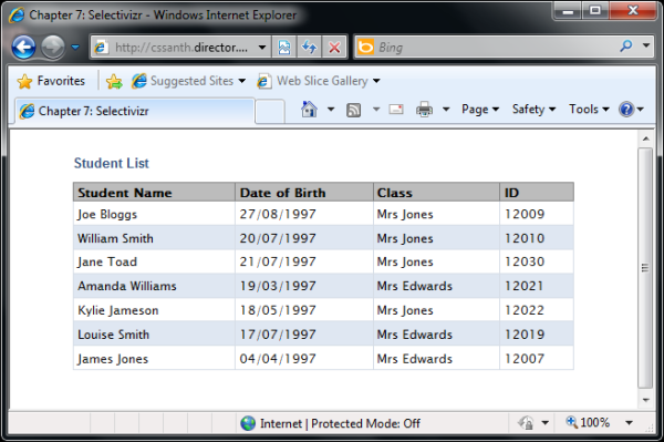
Selectivizr requires another JavaScript library to work. You can
see on the website which libraries it works with, but if you’re already
using a library, it’s quite likely to be included. As my page doesn’t
already use a library, I’ve chosen to include jQuery.
I add the jQuery include, and then download and link in
Selectivizr:
If I reload my page in Internet Explorer, I can see the striped
table rows as evident in Figure 7.6.
nth-child, as seen in Figure 7.4.
The CSS3 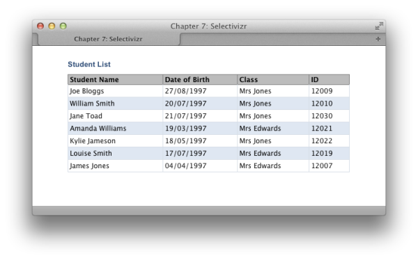
nth-child selector is used as
follows:
.datatable tr:nth-child(odd) {
  background-color: #dfe7f2;
  color: #000000;
}
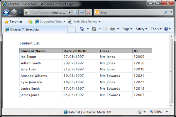
Internet Explorer 8 has no support for
nth-child, so there are no striped rows, as you can
see in Figure 7.5.
One way to patch this is by using Selectivizr. This script provides
CSS3 selector support to Internet Explorer, and does so without you needing to make
any other changes to your CSS. A script that adds in support like this
is sometimes referred to as a polyfill.
Note: What is a polyfill?
A polyfill, sometimes referred to as a shim, is a piece of code that provides support for technology that you would expect the browser to provide itself. Here we’re looking at CSS3 polyfills, though the same approach is also used to provide support for HTML5 features.
chapter_07/selectors.html
(excerpt)
<head>
  <meta charset="utf-8" />
  <title>Chapter 7: Selectivizr</title>
  <link rel="stylesheet" href="selectors.css" />
  <script src="//ajax.googleapis.com/ajax/libs/jquery/1.7.1/
↵jquery.min.js"></script>
  <script type="text/javascript" src="selectivizr-min.js"></script>
</head>
Using Selectivizr is a great solution if you have a lot of CSS3
selectors in use; however, you should take care that your pages are
still comprehensible without it being included just in case a user has
an old version of IE and JavaScript disabled, blocked, or failing to
load for some reason.
If you only have one or two CSS3 selectors to patch, and would
rather skip the inclusion of Selectivizr or its ilk, you could write
your own JavaScript to plug this particular hole. Again, I’m using
jQuery as the library. One very nice benefit of jQuery is that it uses
CSS selectors to target elements. So if you know how to access an
element using CSS, you should find jQuery quite straightforward to use
for these patches.
I include jQuery, then write a simple little function that
adds a
We now need to make a small change to our CSS: adding a selector
that looks for a
This will cause the rows to be striped in older browsers as long
as they support JavaScript.
Whether you use Selectivizr or decide to write your own JavaScript
is up to you. As most of our projects use jQuery anyway, and we tend to
have a JavaScript file that deals with any UI requirements, I often
create a
class of odd to every other table row. In reality,
you’d probably include a JavaScript file here with a number of functions
in it:
chapter_07/selectors-jquery.html
(excerpt)
<script src="//ajax.googleapis.com/ajax/libs/jquery/1.7.1/
↵jquery.min.js"></script>
<script>
  $(document).ready(function(){
    $("tr:nth-child(odd)").addClass("odd");
  });
</script>
class of odd alongside our
nth-child selector:
chapter_07/selectors-jquery.css
(excerpt)
.datatable tr:nth-child(odd), .datatable tr.odd {
  background-color: #dfe7f2;
  color: #000000;
}
fixSelectors function that goes through
and adds classes to enable support for CSS3 selectors. This does involve
a little more work than just including Selectivizr; however, it does
mean that I’m always aware of what the JavaScript is doing. For very
rapid development, or when you are prototyping layouts, scripts such as
Selectivizr are very useful. Browsers lacking support for these
selectors are going to become far less commonly used, making the
employment of Selectivizr more compelling as there’s no need for
additional CSS selectors. If the browsers eventually stop registering in
the stats on your site, you can simply remove the JavaScript
include.
The previous solution used a script that polyfills support for older
versions of Internet Explorer. Is it possible to only serve this script to
those browsers?
The Selectivizr polyfill is designed to provide CSS3 selector
support in Internet Explorer 6, 7, and 8, so there’s no reason to have
WebKit or Gecko browsers downloading it. We can use
conditional comments to serve this script to only certain
versions of IE:
chapter_07/selectors-conditional.html
(excerpt)
<head>
  <meta charset="utf-8" />
  <title>Chapter 7: Selectivizr</title>
  <link rel="stylesheet" href="selectors.css" />
  <script src="//ajax.googleapis.com/ajax/libs/jquery/1.7.1/
↵jquery.min.js"></script>

  <!--[if (gte IE 6)&(lte IE 8)]>
  <script type="text/javascript" src="selectivizr-min.js"></script>
  <![endif]-->
</head>
Conditional comments were introduced by Internet Explorer as a
proprietary method of serving content to specific versions of Internet
Explorer. They can be used to include an additional stylesheet to fix
problems in certain versions of IE, or, as we’re doing in this example,
to include polyfills that only target certain versions of IE.
In our example, we’re stating that if the browser is greater than
or equal to IE6 AND less than or equal to IE8, it should load the
JavaScript. Non-IE browsers and Internet Explorer 9 and above will
ignore it.
Here are some further examples of useful conditional comments.
This would include ie6fixes.css if the browser is
IE6:
<!--[if IE 6]>
<link rel="stylesheet" type="text/css" href="ie6fixes.css" />
<![endif]-->
This includes ie7fixes.css if the browser is equal to IE7:
<!--[if IE 7]>
<link rel="stylesheet" type="text/css" href="ie7fixes.css" />
<![endif]-->
This code will reveal a stylesheet to all versions of Internet Explorer less than or equal to version 7. It’s useful if you have some layout fixes for both these old browsers:
<!--[if lte IE 7]>
<link rel="stylesheet" type="text/css" href="iefixes.css" />
<![endif]-->
For further examples of conditional comments and a full guide to their use, see the SitePoint CSS Reference page.
As we saw in Figure 7.3, it’s often perfectly
acceptable not to try to support CSS3 features in old browsers. Making
your design fall back to square corners where
border-radius is unsupported can be a reasonable
solution. But what if your client or boss is insistent that the rounded
corners work in older browsers?
One solution is to use a polyfill script that adds support for
If you now view your page in Internet Explorer 6, 7, or 8, you
should find that rounded corners and drop shadows are working. Although
not quite as slick as the pure CSS implementation, it does work, as you
can see in Figure 7.8.
border-radius along with other CSS3 properties.
CSS3
PIE (Progressive Internet Explorer) is one such script. We
can take a look at how this works using our example page. In Internet
Explorer 8, our layout displays very much as it does in earlier versions
of Internet Explorer, with no rounded corners or
drop shadows as in Figure 7.7.
Download CSS PIE and unzip the files. The file
PIE.htc needs to be placed into your site.
In any rule set that contains rounded corners or drop shadows, add
the behavior as shown in our code. The path to
PIE.htc needs to be relative to the page rather
than the CSS file, so I would suggest that in a live site you make it a
path from root; for example, 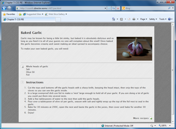
behavior:
      url(/path/to/PIE.htc);
:
chapter_07/pie.css (excerpt)
.wrapper {
  width: 80%;
  margin: 20px auto 40px auto;
  background-color: #fff;
  color: #333;
  background-image: url(brushed_alu.png);
  -webkit-box-shadow: 3px 3px 10px 8px rgba(0, 0, 0, 0.4);
  -moz-box-shadow: 3px 3px 10px 8px rgba(0, 0, 0, 0.4);
  box-shadow: 3px 3px 10px 8px rgba(0, 0, 0, 0.4);
  -webkit-border-radius: 10px;
  -moz-border-radius: 10px;
  border-radius: 10px;
  behavior: url(PIE.htc);
}

.recipe img {
  float:right;
  width: 200px;
  margin: 0 0 1em 1em;
  -webkit-box-shadow: 3px 3px 5px 3px rgba(0, 0, 0, 0.4);
  -moz-box-shadow: 3px 3px 5px 3px rgba(0, 0, 0, 0.4);
  box-shadow: 3px 3px 5px 3px rgba(0, 0, 0, 0.4);
  -webkit-transform: rotate(5deg);
  -moz-transform: rotate(5deg);
  -o-transform: rotate(5deg);
  -ms-transform: rotate(5deg);
  transform: rotate(5deg);
  behavior: url(PIE.htc);
}
PIE is added to your site using a proprietary Internet Explorer
property: the
behavior property. This property
enables you to attach a script to your CSS. The script is in a
.htc file (HTML component). Other
browsers will ignore this property, and only Internet Explorer will
attempt to run your .htc files.
Similar scripts are available that attempt to support
other unsupported features such as CSS3 transforms. It’s worth
mentioning that whenever you use one of these scripts, you should
carefully test all the target browsers, as it’s possible that problems
will be introduced by their inclusion.
An alternative solution would be to avoid using CSS3 at all and
return to older methods of using images to achieve this effect.
Depending on the number of older browser users and the particular effect
you require, this may sometimes be necessary. What’s great about using a
polyfill like PIE is that at the point in time when these older browser
users cease to visit your site, you can simply remove the behavior.
Otherwise, if you add extra markup and images to create the layout
without using CSS3, this weight is then downloaded by all users, and
you’d need to rebuild the site in the future to take advantage of
CSS3.
The most troublesome browsers that you’re likely to come across
today are Internet Explorer 6 and 7. They’re particularly troublesome
because they have significant rendering bugs. Other older browsers that
you might come across, including Internet Explorer 8, tend to have issues
that stem from a lack of support for some CSS. As we’ve seen, a lack of
support is often a manageable problem, as you can decide whether to allow
that browser to show a simpler rendering of the site, or attempt to use
polyfills to patch in support. Browser bugs, however, can cause perfectly
valid markup and CSS to display in very strange ways, and even supporting
IE6 and 7 at a basic level could cause you to run into some of
these.
I’d advise you to avoid worrying too much about these old browsers
while developing your site unless you’re in the unfortunate position of
having a large number of users on such browsers (a situation that is
becoming less common each month). Develop in an up-to-date browser,
validate your markup and CSS, and get everything working as you want it
for modern browsers first. I believe strongly that you should refrain
from cluttering your markup with fixes for very old browsers, and
continually checking and trying to fix issues as you go tends to lead to
that temptation.
There will probably be some problems in IE6 when you first look at
your layout. These might be small predicaments such as incorrect padding
between page elements, or larger issues such as huge sections of your
page disappearing or displaying in an odd place. There’s no need to
panic! Most IE6 issues can be easily resolved by specifying some
different style rules for this particular browser.
The same goes for IE7, although I find there are fewer layout
problems to fix in this browser.
At this point, I’d suggest that you place an additional
stylesheet—as described in the previous section—using conditional
comments to target IE6, 7, or both. You add this stylesheet to your
document head (after the existing stylesheets in your HTML) so that
any rules you place in your IE6- and IE7-specific stylesheet will
overwrite the same rules in the main stylesheet.
You can now work through any problems that you can see in IE6
and 7 in a methodical way, applying fixes in your alternate
stylesheet, safe in the knowledge they’ll only ever be applied by the
browsers that need them. The following tips solve most of the issues
that we see in IE6. For IE7, I usually find that there’s no need for
all the rules used for IE6, but some are still required. It’s rare
that I find a brand new issue in IE7 that I’ve yet to see in IE6, and
the fixes are generally the same.
Make sure that you’re using a correct
doctype
as the first line in your markup; for most new sites, this will be the
HTML5 doctype as used in all the
examples in this book. If you need to use HTML4 or XHTML, make sure you use a full Strict or Transitional
doctype, including the URL. Omitting a
doctype or using an incorrect
doctype may cause your layout to display in
quirks mode in some browsers.[1] This implements an old, incorrect box model used in very
early browsers—best avoided in modern sites. If you want to know more
about this, see the article at Activating Browser Modes with
Doctype.
Internet Explorer 6 has no support for
min-height (the minimum height an element should
take), but it incorrectly interprets height as
min-height. So, even though
height is used to specify a fixed height in other
browsers, Internet Explorer 6 takes it to mean the minimum height;
therefore a block element will expand taller than its specified height
if need be.
To work around this issue, we simply use the
height property in our IE6-specific stylesheet
wherever we’ve used min-height in our main
stylesheet.
IE6 and 7 have a mysterious scripting property called
hasLayout that’s an internal component of the
rendering engine, and the source of many seemingly bizarre rendering
bugs. When an element is responsible for sizing and arranging its
contents, it’s said to have a layout. If an element is without a
layout, it relies on its parent or an ancestor element to take care of
its size and position. When an element has no layout, there’s the
potential for weird stuff to happen—like content disappearing and the
layout behaving erratically. Some elements, like table cells,
automatically have a layout; however, div elements do not. Specifying some CSS
properties, such as setting float to
left or right, also cause an
element to gain a layout. In making an element gain a layout, most of
these problems disappear. The trick is to find a CSS property that
gives an element a layout without having a detrimental effect on your
overall design.
In IE6, I find the simplest way to trigger a layout on
an element is to give it a height value of 1%. As I just mentioned,
IE6 treats height as min-height, so a height of
1% actually renders as a minimum height of 1%—so this is perfectly
safe to apply and the box will still be sized to suit its contents.
Obviously you need to do this in your IE6-specific stylesheet that’s
included with conditional comments.
IE7, by contrast, supports the height
property correctly, so we’re unable to use it as we might with IE6.
However, setting the min-height property to any
value—even to 0—in IE7 causes the element to gain a
layout. This is a safe approach because the default value for
min-height is 0
anyway.
It isn’t always apparent which element is going to need the
layout trigger applied, but if you work methodically, you may well
find the one that causes everything to jump into shape. I usually work
from the innermost container out, so if I have a div nested inside two more divs, I add the height
to the inner div and refresh to see
if it made a difference. Otherwise, I remove it and try the next
div, and so on.
If gaining a layout fails to work, setting
position to relative on an
element will sometimes fix a problem. Keep in mind that setting
position to relative on an
element will mean all its child elements will now use that element for
a positioning context. Otherwise this should be safe to do.
The above tips should fix the worst problems, but you may still
be left with slight alignment, margin, or padding issues. At this
point remind yourself that what you’re dealing with are old, buggy
browsers, so you should feel quite at liberty in your IE6- and
IE7-specific stylesheets to manipulate elements by adjusting the
margin, padding, or positioning until it does work. This will have no
effect on any other browser if you’ve used conditional comments, so no
harm is done. It’s to be hoped there’s little to do, because it will
need to be redone if the layout ever changes. Sometimes, with a very
complex layout, you do need to just hammer bits into place!
HTML5 brings us new elements for marking up sections of our pages;
however, these cause problems in older browsers that prohibit CSS from
being applied to them.
Internet Explorer below version 9 won’t recognize the new HTML5
elements, and will not apply CSS to elements that it fails to recognize.
If you want to use these elements, you can add the
HTML5 shiv[2] to your document as demonstrated in this boilerplate
document from
HTML5
Doctor:
<!DOCTYPE html>
<html>
<head>
  <meta charset="utf-8" />
  <title>HTML 5 complete</title>
  <!--[ lte IE 8]>
  <script src="http://html5shiv.googlecode.com/svn/trunk/html5.js">
    </script>
  <![endif]-->
<style>
  article, aside, details, figcaption, figure, footer, header,
  hgroup, menu, nav, section { display: block; }
</style>
</head>
<body>
  <p>Hello World</p>
</body>
</html>
In this document, you can also see that the HTML5 structural
elements have been set to display: block. This would
normally happen inside your stylesheet for the page. We’ll be covering
the
display property in Chapter 9 more thoroughly; but by setting these elements
to display: block, we’re able to apply CSS to them
much as we would a div element on our
page.
The new HTML5 semantic elements offer far better ways of marking
up sections of your pages than simply using a
div element. If navigation is marked up using
the nav element, a device could
indicate to the user where the navigation was on the page; knowing where
the header and footer of a document is offers potential in terms of
being able to parse and extract content for reuse.
If you decide to take advantage of these elements, you need to be
aware that any CSS used to style them won’t be applied by Internet
Explorer 8 and below. The
HTML5 shiv JavaScript will enable these elements to be styled;
however, you are then building in a reliance on JavaScript for users of
those browsers.
Depending on the traffic to your site, you can decide whether
using these semantic elements and thus requiring JavaScript is
acceptable. The alternative is to continue using the div element to mark up areas on your page
(perhaps adding a class or ID using the HTML5 semantic element name)
until such time as the nonsupporting browsers are enough of an
acceptable minority for you to feel happy about switching. The decisions
you make are likely to be different for each site depending on the site
and audience.
If you are a Windows, Mac, or Linux user with access to only one
operating system, testing across all the browsers can be a bit of a
struggle. How does the web developer without access to a full test suite
deal with cross-browser testing?
There are now far fewer serious browser bugs in commonly used CSS,
but new issues mean that we can’t afford to test in just one modern
browser before launching a site. We need to check that our content is
readable in older browsers when using CSS3, and we’re likely to find
that fonts (especially custom fonts imported using
@font-face) render differently across operating
systems.
Some browsers are available across all operating systems; Firefox,
Chrome, and Opera, for example, can be installed on Windows, OS X, and
Linux. There is a version of Safari, the default browser on OS X, for
Windows. As Chrome is based on WebKit—the same rendering engine as Safari—there are many
similarities across these two browsers; however, it’s unwise to assume
that if it works in one it will work in the other (such as the support
of CSS3, for example). They are, after all, on different release
cycles.
If you use a Mac running OS X, you’re probably in the
most fortunate position. You can natively test any Mac-specific
browsers, and by installing virtualization software such as
VMware
Fusion,
Parallels,
or the free
VirtualBox, you can install
Windows and Linux operating systems in a virtual machine and then
install whichever browsers you like; you can even have multiple
virtual machines with different versions of browsers and operating
systems installed. Windows and Linux users can install virtual
machines to test browsers for Windows and Linux. There are attempts to
get OS X working either in a virtual machine or on non-Apple hardware,
creating a
“Hackintosh”;
however, this is unsupported by Apple and less than straightforward to
set up.
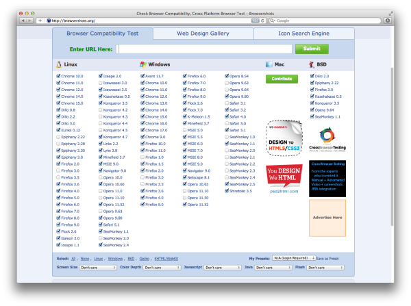
If you simply want to check a layout, there are a number of
sites that offer you the ability to take a screen capture of your site
across multiple browsers. Examples of these are Adobe BrowserLab and Browsershots, the latter of which can be
seen in Figure 7.9. These can be useful for a
quick overview of how your site renders. They’re particularly handy if
you’re checking what a certain font looks like across different
operating systems and browsers; however, their limitation is that you
just get a picture of your site. You’re unable to test whether any
JavaScript is working properly, or whether a bug in some browser has
made your form fields impossible to focus.
A better option than third-party browser-screen-capture
tools, although one that’s likely to cost some money, is
third-party-hosted browser-testing services such as BrowserStack, seen
in Figure 7.10. BrowserStack allows you to test your sites on a range of
browsers and operating systems via the Web. You can load up your site
in your browser of choice, and even set up a tunnel (accessing your
local files on BrowserStack’s remote browser) in order to view files
that are on your computer (rather than needing to set up a live
development site).
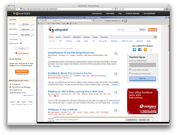
Tip: It Stacks Up
Remote testing tools such as BrowserStack are very useful, even if you have a decent test suite. If a site user is experiencing a problem in a particular browser that you don’t have installed—such as an older version of Firefox—you can quickly go to BrowserStack and load up your site in the exact browser, rather than having to work out how to access an old version of a browser you already run.
As already discussed in this chapter, older versions are very
different from the most recent version of Internet Explorer, and they’re
particularly problematic; however, it’s only possible to run one version
of Internet Explorer on a Windows machine at a time. So what’s the best
way to test multiple Internet Explorer browser versions?
In my experience, the best way to test Internet Explorer
is to use a proper version of Internet Explorer in a virtual machine.
The free virtualization software,
VirtualBox, is very capable
when used for this purpose.
You do need a reasonable amount of disk space and memory to run
virtual machines—especially if you have several open at once. If this is
a problem for you,
Utilu IE
Collection may be helpful; it installs a collection of
standalone versions of Internet Explorer. I would suggest doing this
inside a virtual machine even if you are a Windows user, to avoid
creating any issues with your primary Internet Explorer
browser.
There are simpler solutions for Internet Explorer testing.
Internet Explorer itself, in recent versions, has a method for rendering
pages as if it’s an earlier version. In Internet Explorer 9 Developer Tools, you can switch
browser mode and view a page as if using the earlier browser. While this
works reasonably well, in some cases what you see in browser mode
through IE9 is different to the real browser, and browser mode itself
may well have its own quirks not present in the original browser. So it
might be good for a quick look during development, but I’d always
suggest doing proper testing in the real browser.
There are also multiple IE testing tools such as
IETester;
however, in my experience these are unreliable. In particular,
conditional comments are often ignored (so a stylesheet or
script file targeted solely at this browser may be bypassed). I’ve spent
many a frustrating hour trying to work out why a client was seeing
something different to us in IE6, only to discover they were running
IETester to test the site and not a real IE6 browser! Therefore, I
cannot advise using these tools. For an excellent write-up of Internet
Explorer testing, including many of the tools I’ve mentioned in this
section and much more, read “Reliable
Cross-browser Testing” on Smashing
Magazine.
All smartphones have capable browsers, and are increasingly used for
viewing websites. In addition, we’re seeing a rise in the number of
tablets, such as the iPad, in use. So considering that most of us tend to
own just the one phone, how can we test across devices?
There are two issues when it comes to testing on mobile devices.
One is that they have smaller screen sizes than their desktop
counterparts; the second is that the experience of using a mobile
touchscreen device is different from using a desktop computer with a
keyboard and mouse. So your testing needs to cover “does it look okay?”
and “is it usable?”
The browsers used by mobile devices tend to be fairly up
to date. The iPhone and iPad use mobile Safari, which uses Webkit as its
rendering engine—the same engine behind the default Android browser, and
the browser used in newer Blackberry devices. In addition, there are
mobile versions of Opera and Firefox. Windows phone uses a mobile
browser based on the rendering engine in Internet Explorer 9. Due to
these up-to-date browsers, you can often be more confident using CSS3
for phones than on the desktop. The rendering is generally the same as
desktop versions of these rendering engines—albeit at a small screen
size, and in Chapter 9 we’ll be discussing how you
might support those smaller screens in particular. For current
information on mobile browsers and devices, I’d suggest visiting the
mobile
section of QuirksMode.org run by Peter-Paul Koch and
Mobile HTML5
by Maximiliano Firtman, where a large amount of information
on mobile devices and browsers is being collated.
There are services that let you view how the site might display on
a small device; for example,
Screenfly. There are also
options for taking a screen capture on mobile devices—just as with the
desktop services I described earlier in the chapter.
BrowserCam
is one such service that covers desktop and mobile, and gives access to
a wide range of different devices. Then there are some services that
give remote access to a variety of devices—for example,
Perfecto
Mobile—although these are quite expensive.
Given that the rendering engines of mobile browsers are similar to
desktop rendering engines, and that the browsers tend to be up to date,
you generally won’t hit too many problems in terms of layout for modern
mobile phones. Where you do need to test more thoroughly is in terms of
the actual experience of using your site with a touchscreen device,
especially if you are using drop-down menus or any other interactions
that might become fiddly on a touchscreen.
If possible, I’d recommend that you have access to a couple of
devices: a higher-end device such as an iPhone or Android phone with a
larger screen and reasonable specs, and a cheaper device. I have a tiny
Android phone that I use for this purpose; it’s the kind of phone that,
in the UK, you get free on inexpensive phone plans, so it’s the sort of
device that many people might be using. You can then test the experience
for users of high-end phones and lower spec phones, making sure that
everything is usable. At the very least, you should be checking your
site on one-touch devices at this point in time.
We all find ourselves in situations where our CSS will just
not work. Though you’ve tried every solution you can
think of, the margins on an element continue to be twice the size you
expect, or content is pushing a page wide. Before the bug drives you mad,
take a deep breath and relax. There is a solution!
This is a solution that helps you find the solution.
Once we’re frustrated with battling a problem, applying any kind
of rational process for finding a solution is difficult at best. So
take a break. Go for a walk, tidy your desk, or do some housework. If
you’re at work with your boss looking over your shoulder (and so
unable to make it to the coffee machine in peace), work on another
task: answer some mail or tidy up some content. Do anything to take
your mind off the problem for a while.
If you’ve yet to do so, your next step should be to
validate the CSS and the markup (although you may come across some
validation problems regarding CSS3; see the section called “The validator complains about my vendor-specific extensions, so how
do I validate CSS3?
” for details). Errors in your CSS or markup
may well cause problems and, even if your problem is actually caused
by another issue, they often make it more difficult to find a
solution.
It’s very easy to forget at which point a CSS3 property
made it into a particular browser. If, for example, you’re using
first-child to remove a margin on the first
element, this will fail to work in Internet Explorer 6, and you’ll
need to patch this with a JavaScript polyfill, use some alternate CSS,
or live with the difference in spacing. The website
When can I use
… is an excellent resource for checking which browsers support
which properties.
Can you make your issue occur in isolation from the rest of your
document? CSS problems often display only when a certain group of
conditions is met, so finding out exactly where the problem occurs may
help you work out how it can be fixed. Try to reproduce the problem in
a document separate from the rest of your layout.
If you are using JavaScript polyfills, does the issue go away if
you remove the JavaScript? You may have encountered a bug in a
third-party polyfill script, in which case the script’s support would
be the best place to start asking questions.
If your issue is with a very old browser, in particular Internet
Explorer 6 and 7, it’s highly likely to be a problem that’s been
previously experienced. Bugs with the IE6 and 7 rendering engine are
very well documented. Searching the Web should turn up plenty of sites
with details of these issues; and don’t worry if the websites look out
of date—the browsers are too!
There are far fewer actual CSS rendering bugs with the newer
browsers; the most likely issues for those will be in the lack of
support for properties you’re using. Google can also help you find
answers to problems, as it’s fairly rare to come up against completely
new issues.
If you’re yet to find a solution as you’ve moved through
the aforementioned steps, ask for help. Even the most experienced
developers hit problems that they’re unable to see past. Sometimes,
just talking through the issue with a bunch of people with fresh eyes
can help you resolve the problem, or come up with new ideas to
test—even if no one has an immediate solution.
If you have a reasonable number of front-end developer followers
on Twitter, simply posting an example of the issue may well
prompt a user familiar with the issue to come to your aid. There are
also various forums and lists where help can be found, such as the
SitePoint
forums or Stack
Overflow.
When you post to a website, forum, or mailing list, remember
these rules of thumb:
- Search the site or list archives, just in case your question is common enough to be asked at least once a day.
- Make sure that your CSS and HTML validates; otherwise, the answer you’ll receive is most likely to be “Go and validate your document and see if that helps.”
- Upload an example to a location to which you can link from your forum post. If you manage to reproduce the problem outside a complex layout, so much the better—this will make it easier for others to work out what’s going on. If you can recreate your problem in a tool like jsFiddle, better still. This will allow other people to play around with the issue and see if they can solve it for you.
- Explain the solutions you’ve tried so far. This saves the recipients of your message from pursuing those same dead-ends, and shows that you’ve attempted to fix the problem yourself before asking for help.
- Give your message a descriptive subject line. People are more likely to read a post entitled “Double height margin in Internet Explorer 8” than one that screams, “HELP!” Descriptive titles also make the list archives more useful, as people can see at a glance the post topics in a thread.
- Be polite and to the point.
- Be patient while you wait for answers. If you fail to receive a reply after a day or so and it’s a busy list, it’s usually acceptable to post again with the word “REPOST” in the subject line. Posts can be overlooked in particularly large boards, and this is a polite way to remind users that you’ve yet to receive any assistance with your problem.
- When you receive answers, try implementing the poster’s suggestions. Avoid becoming upset or angry if the recommendations fail to work, or you feel that the poster is asking you to try very basic measures. I’ve seen threads go on for many posts as different posters weigh in to help a user solve a problem, continuing the discussion until a solution is found. Give people a chance to help!
- If you find a solution, or you have no success and decide instead to change your design to avoid the problem, post to the thread to explain what worked and what failed. This shows good manners towards those who helped you, and will also aid anyone who searches the archive for information on the same problem. It’s very frustrating to search an archive and find several possible solutions to a problem, but be unsure which (if any) were successful!
When trying out the examples in this book, or using the techniques
in your own work, you may find that the validator displays warnings due to
proprietary extensions used in your CSS.
Vendor-specific extensions, starting with
-moz,
-webkit, and so on, are not part of the CSS3
specification, so they’ll be unrecognized by the validator and throw a
warning or error. The syntax of beginning an extension to CSS with a
“-” is correct, however, so the validator does
understand about the existence of these extensions. Therefore, you can
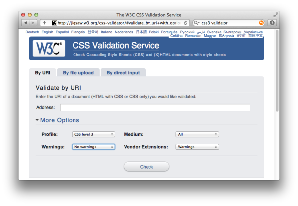
use the additional options fields at the W3C Markup Validator to hide these messages.
At the
CSS
Validator, seen in Figure 7.11, open the
More Options area and make sure that under
Profile you have selected CSS level
3. You can then select No warnings and
set the Vendor Extensions notification to show up
as Warnings. This will allow you to validate your
CSS for the important errors. I’d advise you to also check the warnings
as well, but it can be hard to start looking for problems if you’re
swamped with hundreds of messages about the legitimate use of prefixed
properties.
Another point to note with regards to the Validator is that when
you first validate your page, don’t panic if you see lots and lots of
error messages. Deal with the first one, then validate again. Often the
messages cascade from that one problem, so fixing it will also “fix”
further errors. Fix each issue, then validate, and see what you’re left
with.
This chapter has aimed to shed some light on the thorny subject of
browser testing. It can’t be a complete guide—and the browsers and devices
that we deal with are changing on a very regular basis. My best advice is
to test often, in as many browsers and devices as you can get your hands
on.
In the last few years we’ve seen browsers move to a more consistent
rendering of CSS 2.1, and other than dealing with old browsers, the modern
web developer has far fewer browser bugs to fight with. Nowadays, we need
to keep up with which browsers support which parts of CSS3 and HTML5, and
there are also the issues of designing sites that work for touch
interfaces! That said, we are now in a far better situation with our
browsers than we’ve ever been.
With regard to mobile browsers and touch interfaces, there’s a lot
of information already on the Web about how best to design for smartphones
and tablets. It’s an area in which many people are working to make the
browsing experience better for designers and users interacting with our
sites.
[1] Many modern browsers have two rendering modes. Quirks mode renders documents according to the buggy implementations of older browsers such as Internet Explorer 6. Standards or compliance mode renders documents as per the W3C specifications, or as close to them as they can.
[2] See http://ejohn.org/blog/html5-shiv/ for an explanation of this tool.
..................Content has been hidden....................
You can't read the all page of ebook, please click here login for view all page.