
26
Interpretation of Statistical Analysis
Short Description
Statistical analysis involves the manipulation of data using a variety of mathematical formulae and description of situations using mathematical concepts. It enables simple description of complex situations and can give predictive insights.
The interpretation of the statistical analysis is the vital link between the manipulation of data and the practical application of the results to a real-life problem.
Background
Statistics involves summarizing, analyzing, and graphing data. It includes designing strategies for data collection and information extraction, constructing models for describing and forecasting chance phenomena, and using these models for planning and decision making.1
Statistical analysis aims to introduce an element of objectivity into the significance attached to information output. In scientific research, statistical analysis is specifically used to objectively evaluate the significance of a set of experimental results or of a series of systematic observations.
Statistics can be thought of as a branch of mathematics involving the collection, organization, and interpretation of data. However, statistical analyses are not purely mathematical exercises. Statistics concern both the analysis of data and the design of systems for extracting data (for example, surveys).
Interpretation is crucial to the value of statistics. The value of the analysis is only as good as the quality of the interpretation. Statistics themselves are not useful and may even be dangerously misleading if not interpreted correctly.
Statistical analysis in its various forms provides a system for reducing uncertainty in decision making by inferring patterns, trends, or tendencies in data (and, by extension, in the real-world situations from which the data comes) and distinguishing these from pure coincidences. It should supplement the experience of decision makers by making available objective information and thereby improving the quality of decisions made.
The design of the data collection strategy and the method of analysis are also crucial to the interpretation of statistics. For example, are the survey questions ambiguous or incomplete? Are the methods being used to conduct the analysis appropriate for the nature of the data? How far can you generalize the results of the analysis?
Strategic Rationale and Implications
Statistics provide systematic analysis of data. Data alone does not help with decision-making in business. Decisions are made on the basis of available information and prior knowledge and experience. Data becomes information when it is relevant to your specific situation. Statistical analysis facilitates the transformation of data into information and so aims to inform the decision-making process.
There is a vast amount of data available in modern business. A wide range of record keeping occurs throughout any firm, from financial records, to mailroom records, customer service, and sales results. Statistics allows for systematic analysis and interpretation of data to collate and organize it into meaningful information.
The ideal way to find inferences is to look at all the past data; however, in practice, you will rarely have access to "all the data" either because it is not available or because there would be too much data to handle. Statistics overcomes this by using a "sample" of data to make inferences about the whole "population." A population in statistical terms is the entire set of a particular variable—for example, every sale you have made. A sample is a subset of the population. To get an accurate reflection of the population from your analysis, the sample you use should be representative of the entire population and not biased in any way.
A statistical analysis typically arises out of the need to make a decision or answer a question. The first important task in any analysis is the careful formulating of the questions you wish to have answered. Once you have worked out what questions you need to answer, you can start collecting relevant data. The answers you need and the data you collect will also point you in the direction of which statistical method you should adopt to organize the data.
Statistical methods encompass a wide range of activities, from some very simple processes you can easily perform in-house, all the way up to extremely mathematically complex and technical analyses best left to experts.
For example, revenue and cost information is often subject to simple analysis in-house. It is kept and compared with similar information from the previous quarter or year (or other recording period). Often the comparisons will be made in terms of percentage of increase/decrease.
Other statistical analysis may be outsourced to specialist third parties. For example, market research (say, polling or survey research) to investigate opportunities for new products may be contracted out. When these specialists present their results, they will give the numbers and then an interpretation of them. You must be able to interpret the results yourself to be able to use them effectively for your firm.
Interpretation is not only important in relation to complex statistical analyses. Even simple statistics like percentage increases or decreases in revenue may require some interpretation to ensure their usefulness. For example, some firms experience regular seasonal fluctuations in revenue, and so a percentage of increase or decrease at one particular time of year may indicate something quite different from the same percentage change at another time of year.
Strengths and Advantages
Statistical analysis is an extremely valuable tool for a firm as it provides systematic and objective methods for examining data and extracting useful information from its operations.
Statistical analysis can be used to simplify complex problems and provide methods for reviewing and understanding data that can be applied in the future.
The availability of computers makes complex and powerful statistical analysis of data attainable for even small firms. Many widely used standard software packages, such as Excel, include statistical functions that can be applied to databases without having to resort to specialist software.
Statistics can provide insight into trends and tendencies in data that reflect trends and tendencies in a firm's business, both now and in the future.
The inferences made by statistical analysis can also inform decision-making by supplementing their knowledge and experience with objective information. In turn, this contributes to the further development of knowledge and experience.
The results of a carefully designed statistical analysis can provide objective information about a business' performance, its customers, and the marketplace in general. The potential here is the debunking of prejudices and preconceptions that could be limiting the success of a firm in its marketplace.
The neutrality of the mathematical processes used in analysis can additionally remove politics from the results, and with careful interpretation and presentation, the results of statistical analysis can be a very powerful tool and motivator for change.
Weaknesses and Limitations
Statistical analysis is very easy to misuse and misinterpret. Any method of analysis used, whenever applied to data, will provide a result, and all statistical results look authoritative. Careful interpretation is essential both to evaluate the analysis and to apply it, in order to avoid being misled by meaningless results.
Simplifying a problem or real-life situation by selecting limited data to represent it in order to find a solution using statistical analysis can remove the solution from reality, making it less effective (or ineffective) in practice.
The process of designing a statistical analysis is very important and complex. Errors at any point along the way will seriously compromise the value of the exercise. For example, bias in data is fatal to the usefulness of your results. Bias may occur where the design of the analysis is flawed and the data considered is limited systematically.
One of the biggest potential problems with statistical analysis is the quality of the interpretation of the results. Many people see cause and effect relationships "evidenced" by statistics, which are in actuality simply describing data associations or correlation having little or nothing to do with casual factors.
The reputation of the individual championing the analysis or the outside consultants presenting the information may sway a firm's willingness to accept and use information and ultimately cloud its ability to interpret the realities of the analysis. For example, the neutrality of statistical results (largely being numeric) may make them vulnerable to being interpreted in a manner favorable to the preservation of preconceptions. Similarly, a lack of understanding of the concepts behind the results presented may mean that the results are misunderstood and wrongly interpreted.
Another key weakness is that statistics are necessarily backward facing. Analysis is undertaken of existing data, and some assumptions must be built into the process of analysis regarding the continuation (or changing) of business conditions.
Many statistics require the predicting of probability, which is notoriously difficult to do. There are several common errors made when attempting to judge the probability of an event occurring. Generally people tend to overestimate low-probability events (for example, being in an airline disaster) and underestimate high-probability ones (for example, ignoring the greater likelihood that they will crash their car close to home). Human beings are also highly likely to allow their own personal experience or anecdotal evidence to distort their perceptions of statistical data.
Process for Applying the Technique
There is a wide range of techniques available for statistical analysis. Some of the concepts are very simple and easily grasped. Some of the fundamental concepts important in the interpretation of business statistics are described here.
Percentage Changes
Percentages are probably some of the most basic statistics used, and percentage increases and decreases are widely understood and used.
p = (x – y)/y × 100
where:
p is the percentage change.
x is the new value.
y is the old value.
Interpretation of percentage increases or decreases can be complicated by a couple of circumstances.
The first arises when you are comparing percentage changes across groups. For example, you might be looking at the percentage change in sales for two branches of the firm over the period of a year. In town A, sales increased from 50 to 65, and in town B, sales increased from 50 to 52. The percentage increase for A is 30 percent, while for B it is 4 percent. Looking at percentage changes only, it is easy to see that the sales team in A deserves a bonus and the one in B needs a shake up.
However, care must be taken when interpreting these sorts of statistics. Returning to the preceding example, it could be interesting to consider population growth in town A and town B to see whether there is more to the story.
What would happen, for example, if the population of town A had increased from 10,000 to 15,000 over the year, and the closure of a major factory in town B led to population stagnation with no change in the population of 8,000. Percentage changes in sales are not usefully comparable in this situation. A more useful measure of the changes would be to compare per capita sales in the two towns.
Per capita rates are generally expressed as a figure per 100,000 and are calculated as follows:
c = x/p × 100,000
where:
c is the per capita rate.
x is the value of interest.
p is the total population.
Looking at the per capita sales in A and B, we see that in A, the per capita sales have gone from 500 per 100,000 to 433 per 100,000, while in B sales have gone from 625 per 100,000 to 650 per 100,000. The truth of the situation appears to be that the sales team in B has consistently outperformed the one in A. This would be the case if the competitive environment in both towns were the same; that is, the same competitors are present in each town. The important point to note is that the numbers themselves tell only part of the story and should be interpreted carefully.
The other potential complication for interpreting percentage change is where some other factor has had an influence over the time period, and so an adjustment should be made to the figures. Sometimes these adjustments are seasonal—for example, retail trade figures over Christmas, which are easy to spot and adjust for.
In other circumstances, it may take some research to explain an unusual change. For example, consumption of bottled water is found to have spiked over a couple of months in town C, some distance from head office. While the spike in usage does occur in summer, it is much larger than the usual seasonal increase, so do you rush out to congratulate your sales and marketing teams? A bit of investigation reveals a widely publicized outbreak of Giardia attributed to a particular line of very old pipes in the water supply. The pipes took about six weeks to replace, and people sought out the safer bottled water alternative.
Percentiles and Quartiles
Percentiles are not as widely used as percentages and provide a ranking within a range of data.
Percentiles divide a sample or population into 100 parts. The 10th percentile cuts off the lowest 10 percent of the data. To work out which score represents a particular percentile, you must first arrange your data in increasing order. You can then work out which score by multiplying n (the total number of data points) by P/100 (that is, the number of the percentile divided by 100). The percentile will occur at m, the nearest whole number greater than or equal to n × P/100 (either the mth value in the list of the mean of the mth and the (m + 1)th values).
Quartiles divide data into four parts after the data has been arranged in increasing order. The lower quartile cuts off the bottom 25 percent of the data, and the upper quartile includes only the top 25 percent. In between the upper and lower quartiles is known as the inter-quartile range or mid-spread (and consists of 50 percent of the data). The second quartile, in the middle of the inter-quartile range, occurs at the point known as the median (see later in the chapter for further explanation on the median).
To work out the quartiles for a sample of numerical data, after arranging the data in increasing order, you need to consider n/4, where n is the sample size. The lower quartile will be at point m, where m is the first smallest whole number equal to or greater than n/4. Therefore, where n is not a multiple of 4, the lower quartile is the mth value in the ordered data. If n is a multiple of 4, the lower quartile is the mean of the mth value and the (m + 1)th value.
Normal Distribution and Bell Curve
Distribution refers to the pattern of distribution of measurements for x (along the horizontal or x-axis) against the number of instances, or the frequency of the measurements (vertical or y-axis).
A normal distribution has only one peak. The mean appears in the middle of the peak, and the tails slope away symmetrically on either side. The curve is bell-shaped and commonly referred to as a "bell curve."
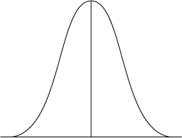
Figure 26.1 Normal distribution or bell curve
Calculation of an accurate mean and standard deviation for data assumes that the data spread approximates a bell curve.
Summarizing Data with One Value—Central Tendency
There are three ways to characterize the "average" of data: mean, median, or mode. Each is useful in a different situation.
Mean—The mean is a measure for the average value of a set of numeric data. To find the mean of a variable, you add each observation you have of that variable together and then divide the total by the number of observations you had. In reality, you would not use every single instance of a variable but would choose a smaller sample to make your calculation.
xmean = (x1 + x2 + x3 + . . . xn)/n
where:
xmean is the mean value of the sample.
n is the total number of values you are looking at in your sample.
x1 is the first data point, x2 is the second data point, and . . . xn is the last data point.
For example, say you wanted to find the average delivery time for an order. You decide to use a sample of 5 delivery times: 2 days; 4 days; 3 days; 3 days; 2 days. You add 2 + 4 + 3 + 3 + 2 to get a total of 14. Divide 14 by 5 (the number of delivery times you added together to get the total of 14) to find the average of 2.8. (Note that, in reality, your customer will not experience 2.8 days as their delivery time: They will experience this as 3 days.)
A mean is useful because it can be used in a variety of other mathematical formulas—for example, standard deviation. However, the use of a mean to describe the "average" measure in a set of data assumes a normal distribution of values. In fact the mean can be misleading where your data includes one or a few very high or very low values—that is, data falling outside a normal curve. These very high or very low values are called "outliers."
You could consider another example using delivery times. Say you were looking at much the same delivery times as previously. The first four times were identical, but the last period you were looking at was 13 days (say, being the time taken to deliver to an international customer). Your new delivery times are: 2 days; 4 days; 3 days; 3 days; 13 days. The mean delivery time is now (2 + 4 + 3 + 3 + 13)/5, which is 5. Five days is not a delivery time experienced by any of your customers—it is a lot longer than most of the local deliveries and much shorter than the international delivery—and so the mean is not a useful measure here.
One method for overcoming the problem of an outlier (or several outliers) in your data is to calculate a mean that does not include them. When this is done, the exclusion of the outlier values must be noted when the mean is discussed.
Returning to the second set of delivery times, you might work out your mean using the first four times ((2 + 4 + 3 + 3)/4 = 3) and note that 3 days is the mean time for local delivery and that this was calculated excluding an international delivery time of 13 days.
Median—The median is not a calculated average. The observations you have made are arranged in order of magnitude, and the median is the central point in the array. If the central point is between two data points, the median is the mean of the two points.
For example, when using the first set of delivery times mentioned previously, arranging the observations would give: 2, 2, 3, 3, 4. The central value is 3 (there are 2 observations below and 2 above the first 3 listed), which is the same value given by calculating the mean in this situation.
The median is not a measure that can be used in further calculations. It can only be used to summarize your set of data.
However, the median can be very useful where your data ranges over a wide set of values, some of which are very large or very small compared with most—that is, the exact sort of data that makes a mean misleading. In the second set of delivery times, when you arrange the new values in order (2, 3, 3, 4, 13), the median is still 3 and so gives a better indication of "average" delivery time than the mean and without having to exclude any values.
Mode—The mode is the most frequently recorded value for an observation. You can have more than one mode in a distribution. The mode is not generally used to summarize numeric data, but is very useful as a single value summary with categorical information.
An example of this could also be taken from delivery data; however, looking at the destination for the goods rather than the time taken. Say the five deliveries are being sent to New York, Washington, New York, Boston, and Los Angeles. The mode of this data set is New York, which tells you the "average" destination (or destination of the "average" order).
Standard Deviation
The standard deviation gives a measure for the distribution or spread of measures within your sample in relation to the mean. As is the case where you are using the mean to describe the "average" value of your data, the standard deviation assumes a normal distribution of data.
The standard deviation is measured in the same units as the mean. So, for example, where you are examining order sizes coming into your business in terms of dollars, the standard deviation will be expressed as a dollar amount.
Standard deviation is calculated from the residuals, or differences, between each data point and the mean. Each residual is squared before they are all added together. The total is then divided by the number of data points in the sample. The square root of that value is your standard deviation. The formula can be written as:
![]()
where:
Σ is the standard deviation for the sample you are looking at.
n is the total number of values in the sample.
x1 is the first data point, x2 is the second data point, and . . . xn is the last data point.
xmean is the mean value of the sample.
Standard deviation is usually calculated by entering all of your data into a software program and getting the program to do the number crunching for you rather than manually working out each residual and squaring it, etc. An example is the STDEV function in Excel, which works out the standard deviation over a range of cells in a worksheet (for example, = STDEV(A1:Z99)).
In a normal distribution, sixty-eight percent of observations of value x will appear within one standard deviation on either side of the mean (within the band stretching from one standard deviation above the mean to one standard deviation below the mean). Ninety-six percent of observations occur within two standard deviations of the mean and over 99 percent within three standard deviations of the mean (see Figure 26.2).
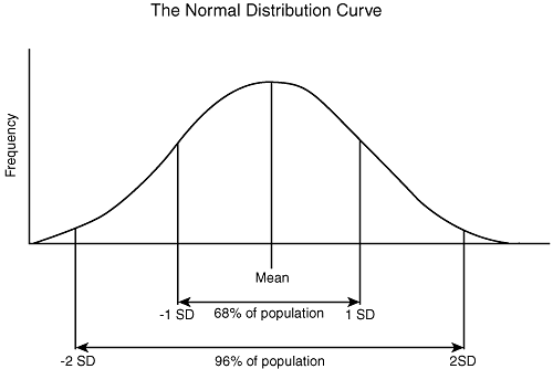
Figure 26.2 Normal distribution showing standard deviation
Whether the standard deviation is considered a large amount or not is dependent on the quantities being compared and not on the numeric amount, per se. If the standard deviation is close to the amount of the mean, then it would be considered high and indicate that your data was widely spread out. For example, if your standard deviation when looking at order size is $122, this might be a high standard deviation if the mean order size were $200 (68 percent of orders fell between the values $78 and $322), but not if the mean order size were $2000 (68 percent of orders fell between $1878 and $2122).
A high value for the standard deviation indicates a wide spread of values in the data set. A low value indicates that most of the data points are clustered closely around the mean, and a graph of the data would show a steeply sided bell curve.
Comparing Data
Statistics are often used to test whether there is a real (significant) difference between two groups or circumstances or conditions. This sort of test can be used to measure the effectiveness of some change made to one of the groups prior to measurement. An example would be to test whether a marketing campaign had successfully increased awareness of a new product. Another use for this sort of test is to investigate whether the same group or circumstance has changed over time (so the same thing is measured on two occasions). An example of this would be to test whether your attrition rate among your customers had changed over time or had not.
These sorts of tests require a null hypothesis. A null hypothesis proposes that there is no difference between two groups or circumstances or that something has had no effect.
The test used to compare means of two groups is called the t-test. It investigates whether two samples are likely to have come from the same population (and are, therefore, not different from one another statistically).
t = (mean1 – mean2)/standard error of the difference between the means
Calculation of the standard error of the difference between the means uses the sample size (n) and the standard deviations of each sample. It is a measure of the variability or dispersion of the two groups.
The t-score resulting from the test is then compared with a table of t-scores, which will say whether the t-score obtained indicates a significant difference between the groups or that there was no significant difference. The significance of the difference is expressed using a p-value (see "P-Values" later in the chapter for further explanation).
Regression Analysis
Looking at two instances of the same value or factor can be useful for investigating changes in it over time. Other comparisons can be used to investigate relationships between two different factors or properties (measured at the same time).
A simple example of two properties that might be related would be height and weight for a sample of people. You could display the results as a scatter plot, showing each person on the plot represented by a point indicating their height (in centimeters on the y-axis in Figure 26.3) and their weight (in pounds on the x-axis in the figure). The convention is that the value or factor you want to predict appears on the y-axis, so Figure 26.3 would be used to predict approximate height of a person from the population the sample came from, given a specific weight.
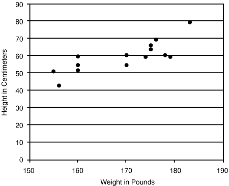
Figure 26.3 Scatter plot of weight against height
Source: Adapted from McNeil, D., Middledorp, J., Petersons, M., and P. Shaw (1994). Modern Statistics: An Introduction, Macquarie University.
Relationships between the two properties or values plotted on a scatter plot are summarized by a line. This is called regression analysis of the data.
There are several methods for investigating the strength of a linear relationship between properties.
Straight Lines
Where a scatter plot displays data with points approximating a straight line, you can draw in a line approximately fitting the data, as shown in Figure 26.4.
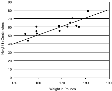
Figure 26.4 Line fitted to scatter plot
The line gives you a rough method for predicting a value for y given a particular value for x.
A point on a straight line is represented by the formula:
ypredicted = a + bx
where:
ypredicted is the value you are predicting.
a is the intercept (where the line would cross the y-axis at y = zero).
b is the slope of the line.
x is the known value.
The value of a and b for any line can be calculated using the coordinates of any two points on the line; the coordinates for the points are x1,y1 and x2,y2.
a = (x2 × y1 – x1 × y2)/(x2 – x1)
b = (y2 – y1)/(x2 – x1)
Using the example in Figure 26.4, we can see that the value of y predicted by the line for the point where x=160, is 50 (the point on the line is 160,50). Similarly, where x=170 we can see the line predicts y=60 (the point on the line is 170,60). Substituting into the formula for a and b, we get the following:
a = (170 × 50 – 160 × 60)/(170 – 160) = –1100/10 = –110
b = (60 – 50)/(170 – 160) = 10/10 = 1
For predicting data along the line in Figure 26.4, the formula is: ypredicted = –110 + 1x
Goodness-of-Fit
When you draw a straight line through data, you are predicting a value for y for each value for x. The actual measures you have for y values will differ from the predicted values for y by an amount called a residual.
The "goodness-of-fit" of your data to the line tests the accuracy of the formula for your line in predicting new values for y by finding the standard deviation of the residuals, or more precisely from the sum of squares of the residuals:
![]()
There is also an actual standard deviation, which is calculated using the same formula as for sresiduals but uses the mean of the y values rather than the y values, as predicted by the formula for the linear relationship.
The standard deviation of the residuals is then used to calculate r2:
r2 = 1 – sactual residuals/sresiduals
The r2 value will be between 0 and 1, and the closer to 1, the better is the fit and the more accurate the formula for the linear relationship is at predicting y values for a given x value.
Lines That Are Not Straight
Sometimes data distribution will approximate a line, but not a straight one. A common example of this is an exponential curve (see Figure 26.5).
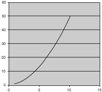
Here, the relationship is represented by the formula:
ypredicted = a + b × x2
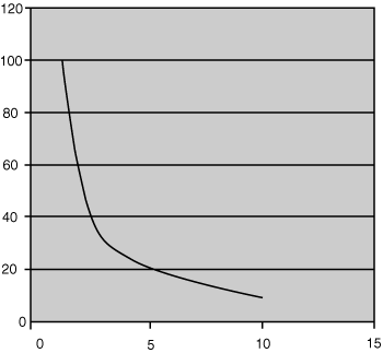
Data may also reverse this sort of curve where there is a different proportionate relationship between the values x and y.
A relationship resulting in a curved line, whether exponential or hyperbolic (as shown in Figure 26.6) or another curve will not be simply fitted over your data using your eye and a ruler. It will result from a complex analysis of your data by a statistical software application.
Interpreting Relationships Found by Regression Analysis
Note that these linear relationships cannot be used to approximate values for any possible value of x and should only be used over the range of the original data. Care must be taken not to extrapolate outside the range or to interpret any extrapolation very carefully.
Data points outside the original range may be inaccurate or even absurd. For example, consider the point on the line in Figure 26.4 where x is zero: No one has a weight of zero any more than they may have a height of –110.
Another important point is that a formula for a linear relationship does not imply that changes in x cause changes in y. The formula is simply a method for predicting new y values.
Correlation
Correlation is a form of regression analysis. It is mentioned separately because it is such a widely used concept. As with all regression analysis, correlation gives an indication of the tendency for one thing to occur in relation to the tendency for another to occur.
The correlation coefficient calculated for the data indicates the strength of the association between the two properties. It will be a number between –1 and 1. The closer the absolute value of the correlation coefficient is to 1, the stronger the association.
Note that as was the case when discussing relationships previously, a high correlation coefficient does not prove the existence of a cause and effect relationship between two events.
The correlation coefficient is the same r that was calculated when calculating the goodness-of-fit of a line to data (it is the square-root of the r2 value).
P-Values
P-values are used to describe the significance of a statistical finding. They relate in part to the number of observations used to reach the conclusion and the magnitude of the observations.
A statistical test is often based on the idea of a null hypothesis. A null hypothesis proposes that there is no difference between two groups or circumstances or that something has had no effect.
For example, if you wished to investigate whether a marketing campaign was successful, you might compare responses to a survey from two groups of customers—one group who had been exposed to the campaign and one who had not. The null hypothesis would be that there should be no difference in the responses of the two groups.
Where a p-value is given as 0.05, this means that if the null hypothesis is true (and there is no difference between the two groups you are testing), you would only have a 5 percent chance of getting the results from a sample group that you in fact got. In other words, if you found a statistical difference between the groups, then saying the difference was significant at p=0.05 indicates that the chance that the difference arose purely by coincidence is only 5 percent.
FAROUT Summary

Figure 26.7 Interpretation of statistical analysis FAROUT summary
Future orientation—Low. Statistics are generated using existing historical data. The analysis provided may guide decision making about the future but is based on an extrapolation of historical data.
Accuracy—Medium to high. The accuracy of the statistical analysis performed will depend on the accuracy of the data used and also on the care taken in deciding what tests to perform on the data. Interpretation of the data analysis may also be subject to biases.
Resource efficiency—Medium. Resource efficiency will depend on the nature of the questions and on the design of the analysis. Where carefully chosen samples of data are used, efficiency is greatest. Using very large sets of data (for example, to avoid bias) will reduce efficiency.
Objectivity—Medium. The objectivity of the actual statistical analysis should be high if unbiased data is used. However, bias in data and then bias in interpreting the results of analysis can be very difficult to avoid in practice.
Usefulness—Medium. Statistical analysis is very useful as a method for organizing and understanding vast amounts of data. However, the usefulness may be compromised very easily by using biased data for analysis, designing the analysis poorly, or by misinterpreting the results (for example, by assuming a cause and effect relationship where none exists).
Timeliness—Low to medium. Statistics are always generated after the event and often analyze data from several years previously. The vast amounts of data may make organizing of the data cumbersome, and the skills required to analyze this data may be quite complex.
Related Techniques
- Benchmarking
- Competitor cash flow analysis
- Financial ratio and statement analysis
- Patent analysis
References
Dr. Arsham's Statistics site. Accessed at http://home.ubalt.edu/ntsbarsh/Business-stat/opre504.htm.
Levin, R., Rubin, D., Stinson, J., and E. Gardner (1989). Quantitative Approaches to Management. Singapore: McGraw-Hill International Editions.
McNeil, D., Middledorp, J., Petersons, M., and P. Shaw (1994). Modern Statistics: An Introduction, Macquarie University.