
3. Quantitative Forecasting Techniques
If you have picked up this book and immediately flipped to this chapter so that you can gain an in-depth understanding of statistical forecasting, including all formulas, assumptions, data requirements, and so forth, then you should put this book back on the shelf and find a different book. And there are lots of them. Plenty of other books will give you guidelines on techniques ranging from Box-Jenkins to Fourier Analysis to Spectral Analysis to Autoregressive Moving Average and so on. The books are excellent and the statistics are important elements of forecasting excellence. But that’s not what this book provides.
This chapter focuses on the reasons behind statistical, or quantitative, forecasting techniques, and how managers should think about the role that statistical forecasting can, and should, play in the overall demand forecasting process. This chapter covers some of the more elementary statistical techniques that are often used by forecasters, and points out their pitfalls. It also touches upon some of the more sophisticated statistical modeling techniques and discusses how twenty-first century forecasting software helps the analyst choose the right model. The chapter concludes with a summary of the benefits that are gained from utilizing statistical analysis of historical demand, along with some cautionary words about over-reliance on statistical modeling.
The Role of Quantitative Forecasting
Quantitative forecasting is like looking in the rear-view mirror. The overall idea of statistical, or quantitative forecasting, is to look backwards, at history, to find and document patterns of demand. Chapter 2 presented the example of Hershey Foods. Demand planners at Hershey Foods can examine historical demand patterns and find important insights. One obvious insight they will observe is that in certain periods of the year, demand for Hershey chocolate products spikes. The weeks leading up to Halloween are high-demand periods, and the weeks immediately following Halloween are low-demand periods. Similar patterns occur around Valentine’s Day (although the specific products or SKUs that are in high demand might be different at Valentine’s Day than for Halloween). Similar patterns occur at Easter. Another type of pattern that demand planners at Hershey Foods might see is an overall upward (or downward) trend in demand for certain SKUs, brands, or product categories. Another pattern they might observe is a spike in demand in response to product promotions, or a dip in demand in response to competitive actions. Statistical analysis can help to not only identify these patterns, but also to predict the size and duration of the spike, or dip, in demand.
Statistical analysis can identify and predict two categories of patterns. The first category is those patterns that are associated with time. In the Hershey Foods example, the spikes that occur at Halloween or Easter are time-based patterns. Any overall upward (or downward) trends are also time-based. Identification and prediction of these time-based patterns are achieved through the use of various time-series statistical techniques. The second category of patterns is the influence that various factors other than time have on demand. An example of these “other factors” is promotional activity. If Hershey Foods embarks on an advertising campaign in the month before Halloween, then (hopefully) demand will increase as a result of that campaign. Demand planners need to know how much demand will change as a result of this advertising campaign. This type of question is best answered by regression analysis, which is a tool you can use to determine whether advertising campaigns—or other promotional activities—have influenced demand in the past, and if so, by how much. In both cases—time series and regression analysis—the demand planner is looking “in the rear view mirror” to find patterns that occurred historically. After those patterns are identified, they can be projected into the future, and voilà!—you have a forecast.
Time Series Analysis
Once again, time series techniques are a category of algorithms that are designed to identify patterns in historical demand that repeat with time. The three components of historical demand that these algorithms try to identify and predict are trend, seasonality, and noise.
• Trend. A trend is a continuing pattern of demand increase or decrease. A trend can be either a straight line (see Figure 3-1A), or a curve (see Figure 3-1B).
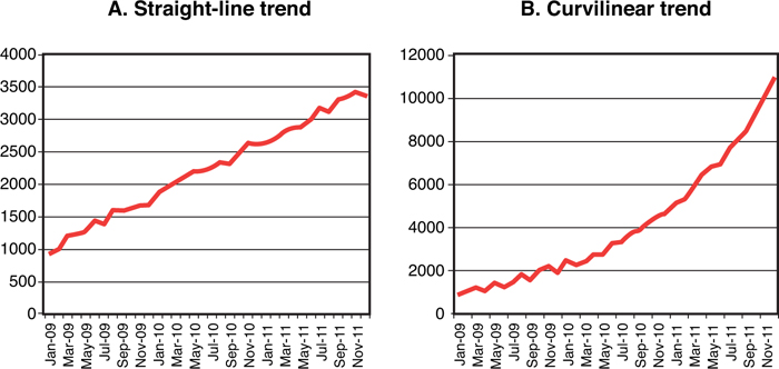
Figure 3-1. Trends in historical demand
• Seasonality. Seasonality is a repeating pattern of demand increases or decreases. Normally, we think of seasonality as occurring within a single year, and cyclicality as occurring over longer than a single year. Figure 3-2 shows a seasonal demand pattern.
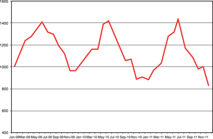
Figure 3-2. Seasonality in historical demand
• Noise. Noise represents random demand fluctuation. Noise is that part of the demand history that the other time series components (trend and seasonality) cannot identify. Figure 3-3 illustrates a demand pattern that contains no discernable trend or seasonality, but is simply noise. Most demand patterns contain some degree of random fluctuation—the less random the fluctuation (that is, the lower the noise level), the more “forecast-able” is the product or service.

Figure 3-3. Noise in historical demand
One complicating factor, of course, is that it is often the case that all three of these components can be present in a stream of historical demand. The overall trend might be going up, while at the same time both repeating seasonal variation and random variation in the form of noise exist. The challenge, then, for forecasters who are examining these types of data patterns, is to find a time-series algorithm that can do the best possible job of identifying the patterns in the data, and then project those patterns into future time period. Let’s begin with very simple techniques, and then move to more sophisticated ones.
Naïve Forecast
The simplest type of times series forecast is a naïve forecast. A naïve forecast is one where the analyst simply forecasts for future time periods whatever demand was in the most recent time period. In other words, if the forecaster is using a naïve forecasting approach, then the forecast for February, March, April, and all future months simply consists of whatever demand was in January. Then, when forecasting for March, April, May, and all future months, the forecast consists of whatever demand was in February. This obviously is a very simple procedure that fails to take into account any trend, seasonality, or noise that might be present in historical demand. Thus, other approaches are more widely, and effectively, used.
Average as a Time Series Technique
Except for a naïve forecast, the simplest form of time series analysis is a simple average. An average can be expressed arithmetically in the following formula:
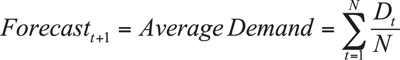
where D = Demand and N = Number of periods of demand data.
In other words, when using a simple average as a forecasting technique, then next month’s forecast, and every future month’s forecast, is the average level of demand from all previous months.
One demand pattern exists in which a simple average is the best forecasting technique to use, and that is a pattern of random data, with neither a detectable pattern of trend or seasonality. Figure 3-4 illustrates how the average responds to this type of data stream. In this and all subsequent figures in this section, the “forecast” data point represents the average of all previous “demand” data points. For example, if the forecaster is working on her forecast in January 2011, the average of all previous demand data points is 2,209 units. Her forecast, then, for February 2011, March 2011, April 2011, and all subsequent periods in her forecasting horizon, would be 2,209 units. If this forecaster’s current month were August 2011, then the average of all previous demand data points is 2,200 units, and all the forecasts in her upcoming forecast horizons would be 2,200 units.
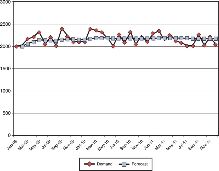
Figure 3-4. Average demand as a forecast, noise only
When only noise is present, then “spikes” are offset by “dips,” and the average demand from all previous periods is as good a forecast as the analyst can develop. Apart from this one fairly simple demand situation, though, using a simple average has significant pitfalls.
One demand pattern that does not lend itself well to using a simple average is a pattern where either an upward or downward trend is present. Figure 3-5 illustrates this demand pattern, and the pitfall from using an average. In this figure, each forecast moves further and further away from the demand trend line. The arithmetic reason that the forecast becomes worse and worse as each month goes by is that all previous months are used in the average calculation. For example, when the analyst is at November 2011, she is averaging all the previous demand from January 2009 through October 2011, and those early months of low demand keeps pulling the forecast further and further from the trend line.

Figure 3-5. Average demand as a forecast, linear upward trend
Another common demand pattern that does not lend itself to being forecasted using simple average is a pattern of seasonality. Figure 3-6 illustrates the problems involved in this situation.

Figure 3-6. Average demand as a forecast, seasonality
In this case, the forecast once again consists of the average of all previous demand data points. By the time the first peak is followed by the first trough, then each “high” is offset by a “low” and the forecast simply flattens out, in much the same way that it reacts to demand data that consists of only noise. Clearly, a simple average is not a good tool for modeling seasonal demand.
A final demand pattern that an average has a hard time modeling is a pattern that includes a change in the overall level. Consider the example found in Figure 3-7. You can see a situation where in January 2010, something big happened. Perhaps a competitor went out of business. Perhaps an entirely new market was opened. Whatever the reason, the base level of demand changed from somewhere in the neighborhood of 2,200 units to somewhere in the neighborhood of 3,100 units. When using a simple average, any forecast that is done following December 2010 will fall short of the new level. In fact, although the forecast will eventually get close to the new level, it will never get there and will asymptote to the new level. Why? The reason again lies in the use of irrelevant data. If a simple average is used, all the data from January through December 2009 is included in the average. Demand that occurred prior to the level change is not relevant, but keeping those data points in the calculation prevents the forecast from being correct.

Figure 3-7. Average demand as a forecast, level change
Moving Average as a Time Series Technique
In two of the cases previously discussed, using a simple average to arrive at a forecast worked poorly because too much old, irrelevant data was used to calculate the average. In the case of the upward trend (refer to Figure 3-5), the forecast continues to be farther and farther away from the actual demand, and in the case of the level change (refer to Figure 3-7), the forecast never catches up to the new level, all because old, irrelevant data is included in the average calculation. This deficiency in the average can be overcome by using a moving average. A moving average is calculated using the following formula:
where Ft+1 = Forecast for period t+1
Dt–1 = Demand for period t–1
N = Number of periods in the moving average
For example, the equation for a three-period moving average is:

Similarly, the equation for a four-period moving average is:

When using a moving average, the forecaster can decide how many periods are relevant, and thus eliminate irrelevant demand history from the calculation.
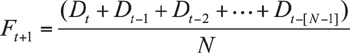
Figure 3-8 illustrates the effect of using three different moving average calculations on a demand history that contains an upward trend.

Figure 3-8. Moving average as a forecast, linear upward trend
As the figure shows, the three-month moving average closely follows the actual demand trend line, although always falling somewhat underneath the actual demand. The six-month moving average also follows the demand trend, but falls a bit further under the actual trend, and the 12-month moving average follows the same pattern. Thus, in the case of a linear trend, either upward or downward, a relatively short-period moving average provides an excellent algorithm for forecasting demand.
The other demand pattern where a simple average is undermined by old, irrelevant data is the pattern with a level change (refer to Figure 3-7). With this demand pattern, a demand forecast that uses a simple average asymptotes to the new level, but never quite “catches up.” Again, a moving average can provide a much more useful forecast in this case, as illustrated by Figure 3-9.

Figure 3-9. Moving average as a forecast, level change
In this scenario, the three-month moving average moves the forecast up to the new level quickly (in this case, in 3 months!). The 6-month and 12-month moving averages move the forecast up to the new level more slowly, but even the 12-month moving average gets the forecast up to the new level eventually. Clearly, then, the moving average methodology overcomes the pitfalls of a simple average approach in some demand patterns.
However, in other demand patterns, a moving average is not the best tool for overcoming the deficiencies of a simple average. One such demand pattern is a seasonal pattern. As illustrated in Figure 3-10, a moving average of either 3, 6, or 12 months fails to provide adequate modeling of seasonal demand patterns. The 3-month moving average does respond to the highs and lows of seasonal demand, but the average lags behind the peaks and valleys by 3 months. In addition, the 3-month moving average flattens out the peaks and valleys. Similarly, the 6-month moving average lags by 6 months, and it flattens the peaks and valleys even more than the 3-month average. In the 12-month average, all the peaks offset the valleys, and the forecast looks remarkably like a simple average. Thus, a moving average is not a particularly useful tool for modeling demand when seasonal patterns are present. It should be pointed out, of course, that seasonal patterns are common, which makes a moving average less than ideal as a “go-to” forecasting methodology.
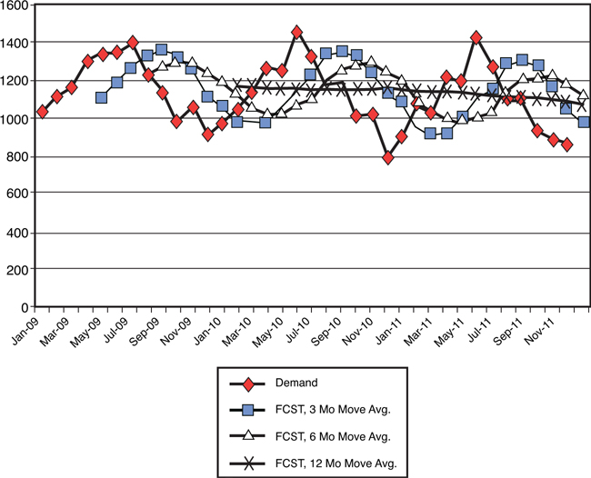
Figure 3-10. Moving average as a forecast, seasonal demand
Exponential Smoothing
As you saw in the preceding section, using a moving average is a good way to eliminate old, irrelevant data from the average calculation. It is, of course, a bit of a “blunt instrument” in achieving that end, in that it completely ignores any data that is older than the number of periods being considered. A different, and more sophisticated and flexible approach for determining how to use historical data is exponential smoothing. This approach allows the forecaster to decide how much weight should be applied to very recent data points, and how much should be applied to more distant data points. In moving average, it’s all or nothing—either the previous data point is included in the calculation or not. In exponential smoothing, previous data points can be given a little or a lot of weight, at the discretion of the analyst.
The formula used to calculate a forecast using exponential smoothing is:
where Ft+1 = Forecast for period t+1
Dt = Demand for period t
Ft = Forecast for period t
Although the introduction of a Greek character (α) might seem intimidating, you can think of it simply as a way to apply more or less weight to more recent observations. For example, when α is set at .1, then the most recent observation has a very small amount of extra weight attached to it, and for all practical purposes, all previous data points are weighted (more or less) the same. On the other hand, when α is set at .9, then considerable weight is assigned to the most recent data point, and much less weight is assigned to previous observations. What makes this technique exponential in nature is the fact that the second term in the equation—(1 – α) Ft—involves the current period’s forecast. The current period’s forecast includes weighting from previous period’s demand, and thus, the effect is that the model is exponential in nature.
To better understand the effect that different levels of α might have on a forecast, take a look at a few examples. Figure 3-11 shows a demand pattern that includes a change in level, and the effect of different levels of α is very clear. When α is set at .1, the result is that nearly equal weight is given to each of the historical demand points. Thus, the forecast looks very much like a simple average, with the problem being that the forecast never climbs to the new level, but rather asymptotes to it after considerable time getting there. At the other extreme, when α is set to .8, then the most recent observations are weighted very heavily, and the forecast very quickly rises to the new demand level. A general rule, then, is that α should be set high when there is a level change.
Figure 3-11. Exponential smoothing as a forecast, level change
Figure 3-12 shows a different example, where there is neither trend, level change, nor seasonality, but rather just noise. Here, when α is set high, such as .8 from the example, then the fact that considerable weight is placed on the most recent data point leads the forecast to react very quickly to the noise. In essence, the forecast is “chasing the noise.” At a low level of α, such as the .1 case in the example, then the forecast looks very much like a simple average. As Figure 3-4 showed earlier, a simple average is probably as good a forecast as can be put together when all there is in demand history is noise. Thus, another general rule is that the noisier the demand history, the lower α should be.

Figure 3-12. Exponential smoothing as a forecast, noise only
A final example shows how exponential smoothing reacts to seasonal demand data. Figure 3-13 shows a demand pattern that is clearly seasonal. When α is set to .1, the forecast reacts in a similar way to when we used simple average. The demand peaks offset the demand troughs, and the forecast becomes (more or less) a straight line. However, when α is set to .8, there is rapid reaction to the seasonal pattern. The forecast follows the seasonal pattern quite closely, but is lagged by a couple months, and so misses the timing of the peaks and troughs.

Figure 3-13. Exponential smoothing as a forecast, seasonal demand
Thus, exponential smoothing overcomes some of the pitfalls of both simple averages and moving averages, and because α can be set to any value between 0 and 1, the analyst has considerable flexibility to adjust the model to fit the data. How is the level of α best determined? A variety of adaptive smoothing techniques can use percent error calculations to help you hone in on the right level of α. Also, other complications exist that involve data patterns that need even more flexibility. For example, sometimes a trend exists in the demand data. An algorithm called exponential smoothing with trend would now be appropriate, where in addition to the smoothing constant (α), a trend constant (β) is introduced. In other cases, the data has both trend and seasonality. In these cases, exponential smoothing with trend and seasonality might be helpful, because α and β are now joined by γ, the seasonality constant. You can use adaptive techniques to transform these algorithms into adaptive exponential smoothing with trend and adaptive exponential smoothing with trend and seasonality. Here, I refer the reader to the first paragraph in this chapter—my intention is not to provide a comprehensive catalog, nor a detailed statistical explanation, behind all these computationally complex and statistically sophisticated methods for modeling historical demand. Other books are already in print that can provide this background.
Now that these various time series approaches have been discussed, a couple of questions remain for the working demand planner. The first question is, “How in the world do I decide which of these highly complex and sophisticated techniques to use?” Thankfully, the answer to this question is that if the analyst has a twenty-first century statistical forecasting software system in place, then he or she doesn’t have to decide—the system will decide! Chapter 2 discussed the primary functions of a demand forecasting system, and one of those functions was what I described as a forecasting “engine.” In twenty-first century forecasting systems, this engine is undoubtedly “expert” in nature. What the forecasting system is expert in is the selection of the most appropriate algorithm that best characterizes the historical demand data made available to it. Whether the forecast is being done at the SKU, brand, or product family level, the sequence of steps that an expert system will follow to create a forecast is
1. Access the demand history. Hopefully, that demand history represents true demand, and not just sales. Also hopefully, adequate historical demand exists to allow various statistical algorithms to identify patterns. Various algorithms require different numbers of historical data points to be able to estimate their parameters. Finally, and also hopefully, these data reside in a professionally managed data warehouse that is updated regularly. A statistical forecast is of little value if it is not created based on accurate, credible data.
2. From its catalog of statistical algorithms, the system applies the first time series methodology to the demand data accessed in step 1.
3. The system calculates the forecast error that would have been generated had that methodology been used, and stores this forecast error. Chapter 6, “Performance Measurement,” discusses the term forecast error in great detail. For present purposes, think of forecast error simply as the difference between forecasted demand and actual demand.
4. The system then applies the second time series methodology to the demand data. It again calculates the forecast error that would have been generated had this second methodology been used. It compares the forecast error to the error from the first methodology, and whichever methodology is lower “wins,” and remains stored.
5. The system then goes on to the third methodology and repeats the process. Some methodologies, particularly variations on exponential smoothing, require the estimation of various parameters, such as α, β, and γ, and different adaptive techniques will be applied to arrive at the best possible forecast for that particular methodology. This sequence continues through all the various time series methodologies that are included in the software system. After all the methodologies have been tried, the system arrives at the one that would have generated the lowest error.
6. The system then uses the selected methodology to project into the future for the required forecasting horizon.
Although expert systems that follow the preceding sequence are wonderful time savers and add considerable power to the demand planner’s arsenal, they must be utilized cautiously to avoid the phenomenon sometimes referred to as black-box forecasting. Black-box forecasting occurs when the analyst pours numbers into an expert forecasting system, and then takes the “answer” recommended by the system without questioning its reasonableness. An example can illustrate the danger that can come from black-box forecasting. Several years ago, our research team performed a forecasting audit for a company that was in the business of manufacturing and marketing vitamins and herbal supplements. These products were sold through retail, primarily at large grocery chains, drug chains, and mass merchandisers. Demand was variable, seasonal, and promotion driven, but reasonably forecastable. Then, an interesting event took place. In June of 1997, the popular ABC news magazine 20/20 aired a story about an herbal product called St. John’s Wort, which had been touted in Europe as an herbal alternative to prescription anti-depressants. The 20/20 report was very complimentary of St. John’s Wort, and presented it in a very positive light. Figure 3-14 shows what happened to consumer demand for St. John’s Wort. (The numbers are made up, but the effect is consistent with actual events.) Demand skyrocketed. Demand remained high for a period, then gradually, over a period of a year or so, returned back to the level it had previously been before the broadcast. Now, imagine yourself as a forecaster for St. John’s Wort in April of 1999. If the demand history that’s shown in Figure 3-14 were to be loaded into an expert forecasting system, a pattern would undoubtedly be identified. The time-series analysis would project a dramatic jump in demand, followed by a slow decline. But unless the story about St. John’s Wort were rebroadcasted on 20/20, then such a forecast would be grossly high. The point, then, of this example is twofold. First, the analyst must understand the dynamics behind historical demand, and not simply rely on an expert forecasting system to do the job completely. Second, just because something happened in the past doesn’t mean that it will happen again in the future. This means that the insights that come from understanding historical demand patterns through time-series analysis must be augmented by insights that come from the judgments of people. Chapter 4, “Qualitative Forecasting Techniques,” returns to this point in great detail.

Figure 3-14. The risk of black-box forecasting: St. John’s Wort
The second question that the working demand planner must face is, “If I have 10,000 SKUs in my product portfolio, how in the world do I manage that?” The answer to this question is a bit more complicated, and requires a revisiting of the forecasting hierarchy discussed in Chapter 2, “Demand Forecasting as a Management Process.” Although forecasting systems can certainly handle the amount of data involved in doing 10,000 SKU-level forecasts, the SKU level might not be the most appropriate level at which to forecast. The following example might prove instructive. Suppose you have two SKUs you want to forecast. Table 3-1 shows the previous 12 months of historical demand, and Figure 3-15 shows a scatter plot of this historical demand.

Table 3-1. Example of SKU-Level Forecasting

Figure 3-15. SKU level forecasting example: scatter plot
What you see in this scatter plot is historical demand that appears largely random. Not much hope exists of finding a statistical algorithm that will effectively identify the pattern of either SKU. However, if you combine these two SKUs into a single product family, the picture looks very different. Table 3-2 and Figure 3-16 show both the preceding table and scatter plot, but re-created with the addition of the product family to the mix.

Table 3-2. Example of Product Family Level Forecasting
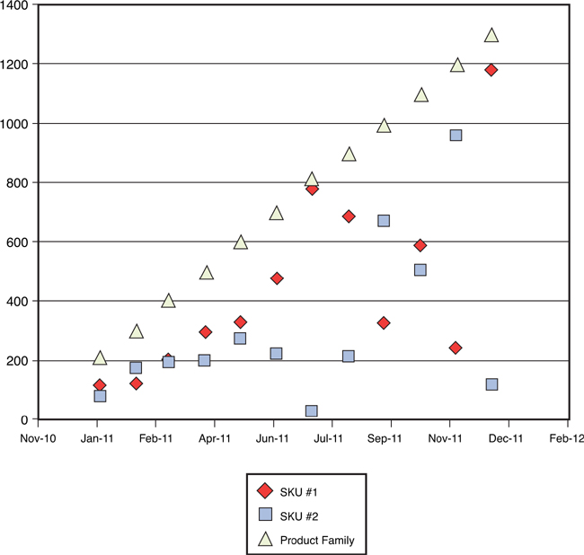
Figure 3-16. Product family level forecasting example: scatter plot
I admit that I’ve stacked the deck in this example to make a point: Sometimes the case is that demand at the SKU level is so random that no pattern can be detected, but if SKUs can logically be grouped into product families, patterns might emerge. What I’ve seen work well in practice is to perform statistical analysis at the product family level, and then apply an average percentage to the SKUs that make up the product family. In other words, if SKU #1 averages 13% of the volume for the product family as a whole, then plan production for SKU #1 at 13% of the forecasted volume for the product family. So, for the forecaster who is faced with 10,000 SKUs to forecast, perhaps there are only 1,000 product families—still a daunting challenge, but considerably more manageable.
Regression Analysis
Time series analysis is the term used to describe a set of statistical tools that are useful for identifying patterns of demand that repeat periodically—in other words, patterns that are driven by time. The other most widely used tool for demand forecasting is regression analysis. This statistical tool is useful when the analyst has reason to believe that some measurable factor other than time is affecting demand. Regression analysis begins with the identification of two categories of variables: dependent variables and independent variables. In the context of demand forecasting, the dependent variable will always be demand. The independent variable(s) are those factors that the analyst has reason to believe might influence demand. Consider the case of a demand forecaster at an automobile company. Identifying measurable factors that can influence demand for new automobiles is easy. Interest rates, for example, probably affect demand. As interest rates go up, demand probably goes down. Unemployment rates probably affect demand. As unemployment rates go down, demand for new automobiles probably goes up. Fuel prices might affect demand, but they might affect demand for different vehicles differently. As fuel prices rise, demand for SUVs probably goes down, while demand for hybrids probably goes up. Thus, these external, economic factors appear to be good candidates to be independent variables that might affect demand. Regression analysis that examines these types of external variables is most appropriate for forecasts at higher levels in the forecasting hierarchy (that is, product category or brand, rather than SKU-level forecasting), as well as forecasts with a relatively longer time horizon.
In addition to these external variables, which the firm has little to no ability to control, internal measurable factors, which the firm can control, also affect demand. Examples of these internal factors are promotional expenditures, pricing changes, number of salespeople, number of distribution outlets, and so forth. Any of these measurable factors are again good candidates to be considered as independent variables that might affect the dependent variable—demand. The term that is often used, especially in industries that are very promotional-intensive, is lift. Regression analysis can be very useful for documenting the lift that occurs when different types of demand-enhancing activities are executed. Understanding lift is useful for both strategic decision-making (“Is the lift from network advertising greater than the lift from cable advertising?”), and for operational forecasting (“What will the lift be from the promotion that is scheduled to run in 3 weeks?”).
Regression analysis comes in many flavors, and the easiest to explain is simple, linear regression. “Simple” implies that only one independent variable at a time is being analyzed, as contrasted with “multiple” regression, in which the analyst is simultaneously considering more than one independent variable. “Linear” regression implies that the analyst is assuming a linear, rather than a curvilinear, relationship between the dependent and independent variables. The easiest way to explain how regression analysis works is to show an example of simple linear regression. Table 3-3 contains 36 months of monthly demand data for a particular product, along with monthly advertising expenditures for that product.
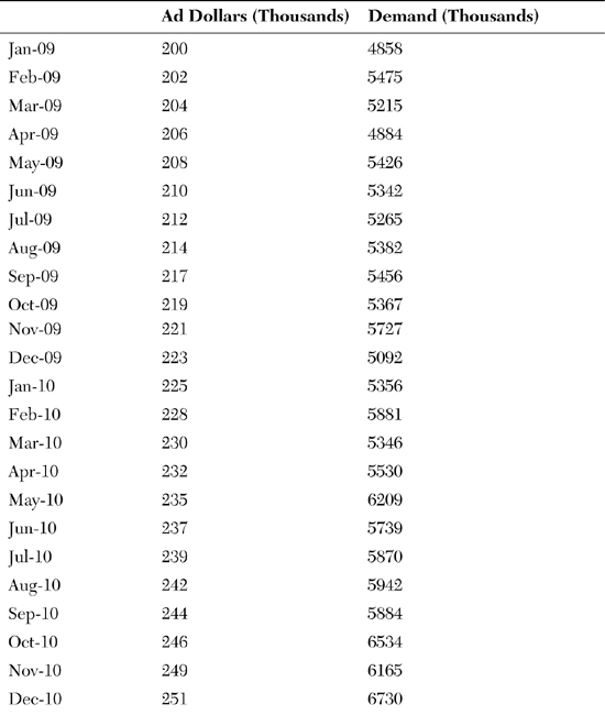

Table 3-3. Example of Regression Analysis
Figure 3-17 shows a scatter plot of these “matched pairs” of data, with each month constituting a matched pair. The vertical axis (the dependent variable, or the Y axis) is the level of demand that occurred in that particular month, in thousands, and the horizontal axis (the independent variable, or the X axis) is the level of advertising expenditure that occurred in that same month. Regression analysis tries to answer two questions from these data:
• Is there a relationship between advertising expenditure and demand?
• Can that relationship be quantified?
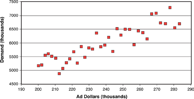
Figure 3-17. How regression analysis works: scatter plot
These questions are answered in Figure 3-18, which contains the output of a regression analysis on these matched-pair data. What simple linear regression does it to first draw a line that constitutes the best “fit” to the data. In this case, “best fit” means that the line created by the analysis is the line in which the total variance between all the data points and the line is minimized. Figure 3-18 shows that regression line. The statistics found at the bottom of Figure 3-18 provide the answers to the two questions posed earlier: “Is there a relationship between advertising expenditure and demand?” The statistics tell us that the answer is “yes.” In the row labeled “Ad Dollars (thousands),” notice a number in the column “p-level” that reads 0.0001. This can be interpreted that a near-zero probability exists that advertising expenditures and demand are not correlated. So (thankfully), the analyst in this case can proceed with a high level of confidence that at least over the last 36 months, advertising expenditures did indeed have a relationship with demand.

Figure 3-18. How regression analysis works: draw regression line
The second question is, “Can that relationship be quantified?” Figure 3-18 again provides the answer. The statistics at the bottom of the figure contain a “coefficient” for the variable “ad dollars,” which in this case is 22.05796. Because this example is simple, linear regression, you can interpret this number as the slope of the regression line that has been drawn through the matched-pairs data. In practical terms, this number means that over the past three years, every additional thousand dollars spent on advertising has resulted in an additional 22,057 units of demand for this product.
The equation at the bottom of the figure represents the overall “answer” from this exercise in regression analysis. The demand planner would like to know what demand will be for this product in, let’s say, 3 months. All the demand planner needs to do, then, is to call his or her friendly advertising manager and ask, “What will advertising expenditures be in 3 months?” Suppose the advertising manager answers, “Our plan is to spend $247,000 in advertising 3 months from now.” The demand planner then simply plugs that number in the equation found at the bottom of Figure 3-18:
Demand (in thousands) = 716.2706 + (22.0580 × 247) = 6,164.597
Because this is expressed in thousands, then the forecast 3 months from now should be 6,164,597 units. Voilà, a forecast!
One must consider important caveats concerning the examples of regression analysis described earlier. First, this is once again an exercise in “looking in the rear-view mirror.” The analysis being conducted here is based on the relationships between independent variables and demand that occurred in the past. Remember the example of a demand planner in the automobile industry who could use regression analysis to predict the effect that interest rates would have on demand for new automobiles. Regression can only tell you what that relationship has been historically. Human judgment must be applied to answer the question, “Do we think that the relationship between interest rates and demand for new automobiles will be the same next year as it was last year?” The analyst might decide that no reason exists to believe that this historical relationship between interest rates and demand for new automobiles will change in the future. But considering this question is necessary.
Another caveat involves properties that must be present in the data for regression analysis to be valid. Issues such as normality of the data, lack of autocorrelation, and heterosketasticity need to be addressed before the results of regression analysis can be considered valid. I again refer the reader to the opening paragraph of this chapter, which contains my disclaimer about going into detail about statistics. The reader can find other sources that are much better references for determining whether the data involved in these analyses conform to the statistical requirements for regression.
A final caveat involves the distinction between correlation and causality. Correlation between variables can be determined statistically using tools such as regression analysis. However, the statistics cannot answer the question of causality. In other words, referring to a previous example, do high interest rates cause a drop in demand for new automobiles, or does a drop in demand for new automobiles cause an increase in interest rates? In this example, common sense would suggest that it is the former, rather than the latter. But in other situations a third factor might in fact be “causing” both the level of demand, and the independent variable being considered, to vary simultaneously. Once again, human judgment must be applied to make sure that the statistical analyses are reasonable, valid, and actionable.
Summary
Note that statistical forecasting is not always useful. Chapter 2 offered the example of Boeing and its need to forecast demand for commercial aircraft. The point was made then that when a company has only 300 customers worldwide, and each product costs hundreds of millions of dollars to purchase, then statistical demand forecasting might not hold much value. Simply asking those customers what their demand is likely to be in the years to come might be far more useful.
But aside from these relatively rare examples, baseline statistical forecasts are an excellent way to begin the forecasting task. Looking in the rear-view mirror is often a good place to start. Understanding historical demand patterns can be extremely helpful, whether those patterns repeat with time or whether fluctuations in historical demand can be understood by discovering the relationship between demand and other factors. As discussed in Chapter 7, “World-Class Demand Forecasting,” best practice involves a stepwise process, where the first step is exploring historical demand, identifying patterns, and projecting those patterns into the future. The important point to make here, though, is that this process of statistical forecasting is just a first step. Too often, companies fail to capitalize on the judgment of informed people to answer the question, “Are these patterns likely to continue into the future?” A risk is associated with over-reliance on statistical forecasting. When no step is in place for adding insights from sales or marketing (in a manufacturing environment), or merchandising (in a retailing environment), then the forecaster has no way to judge whether the future will look any different from the past. Another way to think of it is that if you only look in the rear-view mirror, you might get hit by a truck! On that note, the discussion now turns to the forward-looking process of qualitative forecasting.