
To create dialogs and wizards, the NetBeans Platform uses a set of APIs that focus on business layer matters, rather than their infrastructural concerns. These, and additional APIs such as the MultiViews API and the Visual Library API, are discussed in this chapter. The essentials of these APIs are covered in several small code listings.
The Dialogs API creates and displays dialogs and wizards. The dialogs are based on the Java Dialog class. Using the Dialogs API, you can display standard dialogs, as well as custom dialogs tailored to specific business needs. In addition, the API integrates well with the NetBeans window system, as well as the NetBeans help system.
Use the NotifyDescriptor class to define the properties of a standard dialog. Provide a message in the form of a string, an icon, or a component, which display together with the dialog. Optionally, use an array to display multiple messages in varying situations. Different types of messages can be specified, giving control over the icon displayed. Define the type via the predefined constants in the NotifyDescriptor, as listed in Table 8-1.
Table 8.1. String literals for displaying message types
String Literal | Message/Symbol |
|---|---|
| The message is displayed neutrally, without a symbol. |
| The information symbol is displayed with the message. |
| The question symbol is displayed with the message. |
| The warning symbol is displayed with the message. |
| The error symbol is shown with the message. |
An option type defines which buttons are displayed in the dialog. Four string literals are available, as shown in Table 8-2.
Table 8.2. String literals defining dialog buttons
String Literal | Buttons Displayed |
|---|---|
| The standard buttons are displayed. For example, an information dialog only has an OK button, while an entry dialog has an OK button as well as a Cancel button. |
| OK and Cancel buttons are displayed. |
| Yes and No buttons are displayed. |
| Yes, No, and Cancel buttons are displayed. |
Finally, you can use the constructor or the setAdditionalOptions() method to pass in an Object array to add additional buttons to the dialog. Typically, String objects are passed here, though you can also use Component or Icon objects. Rather than the standard buttons, custom buttons can be provided via the setOptions() method or by passing them in to the constructor. Here, too, the classes String, Component, and Icon are used:
NotifyDescriptor d = new NotifyDescriptor(
   "Text", // Dialog message
   "Title", // Dialog title
   NotifyDescriptor.OK_CANCEL_OPTION, // Buttons
   NotifyDescriptor.INFORMATION_MESSAGE, // Symbol
   null, // Own buttons as Object[]
   null); // Additional buttons as Object[]
Dialog description, such as the one defined previously, is passed in to the notify() method of the DialogDisplayer class, which is responsible for creation and display of dialogs, and also gives a return value when the dialog closes. The DialogDisplayer is created as a global service, with a provider obtained via the getDefault() method.
Object retval = DialogDisplayer.getDefault().notify(d);
Buttons the user clicks are identified via the return values, which indicate the following in Table 8-3.
Table 8.3. String literals as return values
String Literal | Returned When |
|---|---|
| The OK button is clicked |
| The Yes button is clicked |
| The No button is clicked |
| The Cancel button is clicked |
| The dialog is closed without any button having been clicked |
For various dialog types, the Dialogs API provides four subclasses to the NotifyDescriptor class, so you need to define only a few parameters.
Create an information dialog via the NotifyDescriptor.Message class. Pass the text to be displayed to the constructor, as well as an optional message type. By default, the dialog shows the information symbol, as shown in Figure 8-1.
NotifyDescriptor nd = new NotifyDescriptor.Message("Information");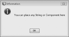
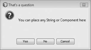
Should the user be enabled to answer a question posed in the dialog (see Figure 8-2), use the NotifyDescriptor.Confirmation class. To that end, a range of constructors are available for passing in the message, message type, and additional option types.
NotifyDescriptor d = new NotifyDescriptor.Confirmation(
   "You can place any String or Component here",
   "That's a question");
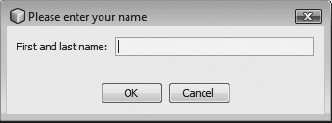
An input dialog is easily created via the NotifyDescriptor.InputLine class. Define the text and title to be displayed in the input area of the dialog (see Figure 8-3). Optionally, pass in an option type and message type so that the desired buttons and symbols are shown.
NotifyDescriptor d = new NotifyDescriptor.InputLine(
   "First and last name:",
   "Please enter your name");
Access text entered by the user via the getInputText() method. Optionally, enter text into the field via the setInputText() method.
To show an exception (see Figure 8-4), use the NotifyDescriptor.Exception class. Pass in a Throwable instance to the constructor, such as an Exception object:
Exception ex = new Exception("An exception has occured");
NotifyDescriptor d = new NotifyDescriptor.Exception(ex);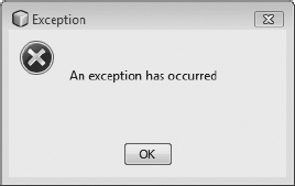
Custom dialogs are created via the DialogDescriptor class. The DialogDescriptor class is an extension of the NotifyDescriptor class. Pass in a Component object to be displayed, while also defining dialog modality and a related ActionListener that reacts when the buttons are clicked. Optionally, pass in a HelpCtx object, providing the ID of a help topic so that the provided topic is automatically opened when the Help button is clicked. For the DialogDescriptor, create a Dialog object via the DialogDisplayer 's createDialog() method. Alternatively, create the dialog directly, via the notify() or notifyLater() methods.
The following example illustrates creation of a Login dialog via the DialogDescriptor class. It is important that the dialog be displayed at the appropriate time—when the application starts. The application should only be blocked until login details are correctly entered. Two approaches are supported, as discussed in the following paragraphs.
As mentioned, a Component object can be passed into the DialogDescriptor, displaying it in the dialog. In the example (see Figure 8-5), this approach is used to integrate two text fields into the dialog so that the user can enter a username and password. The panel makes the username and password available via its getUsername() and getPassword() methods. To allow dialog display as the application starts, a module installer is used (see Chapter 3), applying the restored() method to create a DialogDescriptor, resulting in a Login dialog.
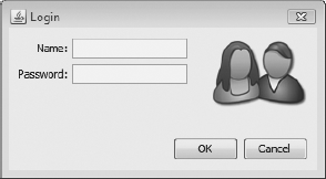
To allow the dialog to perform asynchronously (required since it must be displayed during the initialization sequence), it is recommended that you register an ActionListener to react to user button clicks. Use the actionPerformed() method to handle the login logic. If the entered values are incorrect, exit the application via the LifecycleManager class (see Chapter 17).
To allow reaction when users click the Close button (in the upper right of the dialog), register a PropertyChangeListener, in which the application is closed. To display the dialog immediately after the initialization phase—that is, directly after the splash screen—use the notifyLater() method, as shown in Listing 8-1.
Example 8.1. Login dialog displayed when application starts, blocking application until username and password are successfully entered
public class Installer extends ModuleInstall implements ActionListener {
   private LoginPanel panel = new LoginPanel();
   private DialogDescriptor d = null;
   @Override
   public void restored() {
      d = new DialogDescriptor(panel, "Login", true, this);
d.setClosingOptions(new Object[]{});
d.addPropertyChangeListener(new PropertyChangeListener() {
public void propertyChange(PropertyChangeEvent e) {
if(e.getPropertyName().equals(DialogDescriptor.PROP_VALUE)
&& e.getNewValue()==DialogDescriptor.CLOSED_OPTION) {
LifecycleManager.getDefault().exit();
}
}
});
DialogDisplayer.getDefault().notifyLater(d);
}
public void actionPerformed(ActionEvent event) {
if(event.getSource() == DialogDescriptor.CANCEL_OPTION) {
LifecycleManager.getDefault().exit();
} else {
if(!SecurityManager.login(panel.getUsername(), panel.getPassword())) {
panel.setInfo("Wrong username or password");
} else {
d.setClosingOptions(null);
}
}
}
}Another way to display the dialog uses the notify() method in a separate thread, as soon as the application is available. Do this via the invokeWhenUIReady() method, provided by the WindowManager class. The difference between this approach and notifyLater() is that the dialog is only displayed when the application is completely loaded.
WindowManager.getDefault().invokeWhenUIReady(new Runnable(){
   public void run() {
      DialogDisplayer.getDefault().notify(d);
   }
});
Finally, a complete dialog can be built from scratch, by extending JDialog. To that end, use the related NetBeans IDE wizard available via File
Frame f = WindowManager.getDefault().getMainWindow();
Aside from support for dialogs, the Dialogs API includes a wizard framework to create step-by-step procedures that help users work through a particular process. These processes potentially generate code or other artifacts as the wizard concludes. Wizards of this kind are familiar within the NetBeans IDE itself, such as those used to create new windows or actions.
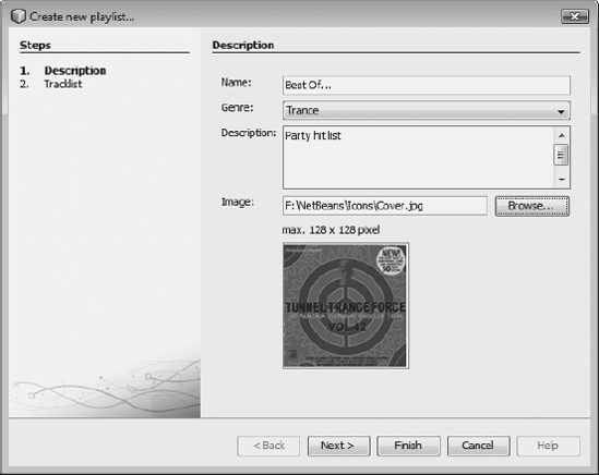
For each step, provide a panel appropriate to the related data entry required for the step. Coordination between steps is handled by the wizard framework. The NetBeans IDE provides a wizard for creating wizards. To show different ways in which a wizard can be displayed, while focusing on the architecture of wizards, create a wizard for the creation of playlists. The wizard provides two steps. The first step allows users to describe the playlist, as shown in Figure 8-6, while the second allows music titles to be chosen and added to the playlist.
The WizardDescriptor class describes and configures wizards. The class is a subclass of the DialogDescriptor class, explained in the previous section. The DialogDescriptor class, in turn, is a subclass of NotifyDescriptor. The WizardDescriptor contains and manages all panels in the wizards and is responsible for tasks such as management of steps and display of user interface components. In other words, the WizardDescriptor is the controller of the entire wizard. Typically, the WizardDescriptor also provides the DataModel, from which data collected over various steps is saved as properties. Rather than using this DataModel, your own can be provided.
For each step in the wizard, provide a panel. Typically, a panel is built out of two separate classes. The first class implements the GUI. This class is known as the visual panel, and normally extends JPanel. The second class, handling the management and validation of the panel, is known as the wizard panel. This class extends the NetBeans API WizardDescriptor. Panel<Data> class. It creates the visual panel on demand and makes it available to the wizard.
In terms of the MVC paradigm, the visual panel is the view, and the wizard panel is the controller. The visual panel only deals with user interface concerns, providing entry fields for the user and making them available via getters and setters. The visual panel does not contain business logic and, in particular, does not deal with wizard-specific classes or calls. As a result, the panel is completely reusable and can be easily ported to an entirely different wizard. In this way, the panel is reused in a dialog where data is edited in a different context. The relationship between WizardDescriptor, WizardPanel, and VisualPanel is shown in Figure 8-7.

The skeleton of a wizard is created in the NetBeans IDE. Go to File
First, open the user interface of the visual panel (the PlaylistVisualPanel1 panel) in the NetBeans Form Editor. Add the several fields the user interacts with to describe the playlist. The user must be able to assign a name to the playlist, while choosing a genre and providing a description and image. The completed panel should look like Figure 8-6, where the panel is shown integrated into the wizard.
The panel is a normal Swing component, extending JPanel; however, you should bear in mind the following implementation details:
For each piece of data requested from the user, a public property constant is defined. These are the name of the playlist, the genre, a description, and an image. These constants are needed later to save and load data into the
DataModel.In the constructor, a listener is added to each field expected to be filled with data. In our example, make sure the name has at least three characters, the chosen image has a maximum size of 128×128 pixels, and a warning message is shown when no image has been selected. To that end, we register a
DocumentListenerfor the text fieldsplaylistNameandimagePath.It is important to override the
getName()method. To do this, provide the names of the panels displayed in the headers of the steps in the wizard.For each field, add a getter method the wizard panel uses to access data entered by the user.
In the
DocumentListenermethodschangedUpdate(), insertUpdate(), andremoveUpdate(), use thefirePropertyChange()method to notify all registeredPropertyChangeListeners when the related method is invoked. The interaction between the three layers of a wizard is discussed in the next section.
Listing 8-2 shows a section from the visual panel PlaylistWizardPanel1. Notice the panel is completely free from wizard logic, focusing only on the user interface of the wizard step.
Example 8.2. Visual panel of the first wizard step
public final class PlaylistVisualPanel1 extends JPanel implements DocumentListener {
   public static final String PROP_PLAYLIST_NAME = "playlist";
   public static final String PROP_GENRE = "genre";
   public static final String PROP_DESCRIPTION = "description";
   public static final String PROP_IMAGE_PATH = "imagePath";
   public PlaylistVisualPanel1() {
      initComponents();
      playlistName.getDocument().addDocumentListener(this);
      imagePath.getDocument().addDocumentListener(this);
   }
   public String getName() {
      return NbBundle.getMessage(PlaylistWizardPanel1.class, "Panel1.Name");
   }
   public String getPlaylistName() {
      return playlistName.getText();
   }
   public String getGenre() {
      return (String)genre.getSelectedItem();
   }
   public String getDescription() {
      return description.getText();
   }
   public String getImagePath() {
      return imagePath.getText();
   }
   public void changedUpdate( DocumentEvent e ) {
      if (playlistName.getDocument() == e.getDocument()) {
         firePropertyChange(PROP_PLAYLIST_NAME, 0, 1);
      } else if(imagePath.getDocument() == e.getDocument()) {
         firePropertyChange(PROP_IMAGE_PATH, 0, 1);
      }
   }
}
Look at the content of the related wizard panel, providing the controller for the visual panel. The class implements the WizardDescriptor.Panel<Data> interface, defining the interfaces of wizard panels. Pass in a class used as the DataModel. As you need no special custom DataModel, the class WizardDescriptor is used to define the wizard panel. In addition, implement a PropertyChangeListener, allowing reaction to changes in the visual panel. A wizard panel has a status: valid or invalid. Validity depends on extensions provided to the wizard panel. In our case, a panel is only valid when the name has at least three characters. The status is saved via the private Boolean isValid.
public class PlaylistWizardPanel1 implements
   WizardDescriptor.Panel<WizardDescriptor>, PropertyChangeListener {
   private PlaylistVisualPanel1 view = null;
   private WizardDescriptor model = null;
   private boolean isValid = false;
   private ResourceBundle bundle = NbBundle.getBundle(PlaylistWizardPanel1.class);
The getComponent() method is a factory method creating the visual panel where needed. The method is called from the WizardDescriptor when the panel is first created in the wizard. To that end, do not create all panels initially. This will significantly improve the performance of wizards that provide many different steps. Therefore, be very careful using the getComponent() method. For example, do not call it in the getName() method when the wizard is created.
After creating visual panels, set properties that influence display of components in the wizard. Use PROP_CONTENT_SELECTED_INDEX to provide the number of the panel (shown in the table of contents on the left side of the wizard), enabling the user to see the number of the current step, as well as how many steps must still be completed.
Set the property PROP_AUTO_WIZARD_STYLE to true, which creates wizards with a contents section, as well as a header section. Setting this to false makes sense when the wizard has only one step, so that these additional parts become superfluous.
Via the properties PROP_CONTENT_DISPLAYED and PROP_CONTENT_NUMBERED, specify that names and numbers of wizard steps are shown on the left side of the wizard.
public PlaylistVisualPanel1 getComponent() {
      if (view == null) {
         view = new PlaylistVisualPanel1();
         view.putClientProperty(
                 WizardDescriptor.PROP_CONTENT_SELECTED_INDEX, new Integer(0));
         view.putClientProperty(
                 WizardDescriptor.PROP_AUTO_WIZARD_STYLE, Boolean.TRUE);
         view.putClientProperty(
                 WizardDescriptor.PROP_CONTENT_DISPLAYED, Boolean.TRUE);
         view.putClientProperty(
                 WizardDescriptor.PROP_CONTENT_NUMBERED, Boolean.TRUE);
      }
      return view;
   }
Using the getName() method, provide the names shown in the header section of the wizard. With getHelp(), provide a HelpCtx.DEFAULT_HELP, activating the Help button in the wizard. Further information about the HelpCtx class and the NetBeans help system are described in Chapter 9.
The status of panels, as discussed earlier (defining whether the wizard step is valid or not) is provided via the isValid() method. The isValid() method is called from the WizardDescriptor, when a panel is closed or via notifications received from the ChangeListener. When the method returns the value true, the Next or Finish buttons are activated.
The setMessage() method is a helper method for which advice is displayed to the user. The advice area of the wizard is provided by default and displayed in the lower part of a panel within the wizard. Text is defined via the property WizardDescriptor.PROP_ERROR_MESSAGE. Additionally, if the property is set and the isValid() method returns false, an error symbol is shown. If the isValid() method returns true, only a warning symbol is displayed. No symbol is shown if null is returned. You can also use the properties PROP_WARNING_MESSAGE or PROP_INFO_ MESSAGE to display warning or normal (info) messages.
public String getName() {
      return bundle.getString("Panel1.Name");
   }
   public HelpCtx getHelp() {
      return HelpCtx.DEFAULT_HELP;
   }
   public boolean isValid() {
      return isValid;
   }
   private void setMessage(String message) {
      model.putProperty(WizardDescriptor.PROP_ERROR_MESSAGE, message);
   }
The DataModel is accessed via the readSettings() and storeSettings() methods. The type of DataModel depends on the template provided, which is defined via the interface specified in the class signature. In this case, the class in question is WizardDescriptor.
The readSettings() method is called when the panel is opened. Here, values are read into panels in the wizard. Register a PropertyChangeListener in the visual panel, informing of user activities in the panel. Register it here to make sure the WizardDescriptor is available.
The storeSettings() method is called when panels are exited. Save the values defined by the user in the WizardDescriptor via the property names provided by the visual panel. In this way, the values are immediately passed from panel to panel until they are read from the WizardDescriptor as the wizard closes.
public void readSettings(WizardDescriptor model) {
      this.model = model;
      getComponent().addPropertyChangeListener(this);
   }
   public void storeSettings(WizardDescriptor model) {
      model.putProperty(PlaylistVisualPanel1.PROP_PLAYLIST_NAME,
              getComponent().getPlaylistName());
      model.putProperty(PlaylistVisualPanel1.PROP_GENRE,
              getComponent().getGenre());
      model.putProperty(PlaylistVisualPanel1.PROP_DESCRIPTION,
              getComponent().getDescription());
      model.putProperty(PlaylistVisualPanel1.PROP_IMAGE_PATH,
              getComponent().getImagePath());
   }
When discussing the visual panel, it was pointed out that values entered by the user must be tested. More specifically, make sure the user has entered a name consisting of at least three characters and that the chosen image is 128×128 pixels in size.
To be informed about changes made to the visual panel—that is, when the user enters a name or chooses an image—register a PropertyChangeListener in the readSettings() method within the visual panel. Implement the propertyChange() method. There, the values entered in the wizard can be tested via the checkValidity() method. The checkValidity() method verifies criteria, displays a message, and returns relevant values. Via these changes, inform the WizardDescriptor so that relevant buttons can be activated or deactivated. The user may only proceed to the next step when the entered data is validated and the WizardDescriptor is notified of that fact. Achieve this via the fireChangeEvent() method.
public void propertyChange(PropertyChangeEvent event) {
      boolean oldState = isValid;
      isValid = checkValidity();
      fireChangeEvent(this, oldState, isValid);
   }
   private boolean checkValidity() {
      if(getComponent().getPlaylistName().trim().length() < 3) {
         setMessage(bundle.getString("Panel1.Error1"));
         return false;
      } else if(getComponent().getImagePath().length() != 0) {
         ImageIcon img = new ImageIcon(getComponent().getImagePath());
         if(img.getIconHeight()>128 || img.getIconWidth()>128) {
            setMessage(bundle.getString("Panel1.Error2"));
            return false;
         }
      } else if(getComponent().getImagePath().length() == 0) {
         setMessage(bundle.getString("Panel1.Warning1"));
         return true;
      }
      setMessage(null);
      return true;
   }
To register a WizardDescriptor with a wizard panel, the WizardDescriptor.Panel interface provides the addChangeListener() and removeChangeListener() methods. Implement these in the class. Use the fireChangeEvent() method to inform all registered listeners. To be efficient, first verify whether the status of panels has changed, so that the WizardDescriptor is notified only when changes occur. If the isValid() method returns true, indicating that the panel has valid status, implement empty methods. The fireChangeEvent() method is not called in this case. This scenario applies to the second panel of the example, which always returns true.
private final Set<ChangeListener> listeners = new HashSet<ChangeListener>(1);
   public void addChangeListener(ChangeListener l) {
      synchronized(listeners) {
         listeners.add(l);
      }
   }
   public void removeChangeListener(ChangeListener l) {
      synchronized(listeners) {
listeners.remove(l);
}
}
protected final void fireChangeEvent(
Object source, boolean oldState, boolean newState) {
if(oldState != newState) {
Iterator<ChangeListener> it;
synchronized (listeners) {
it = new HashSet<ChangeListener>(listeners).
iterator();
}
ChangeEvent ev = new ChangeEvent(source);
while (it.hasNext()) {
it.next().stateChanged(ev);
}
}
}
}So far, you've learned about constructing panels that represent steps in a wizard. You saw how a panel consists of a view and a controller, as well as how these work together.
Only one small detail remains to round out your understanding of wizard panels. A wizard is represented by its WizardDescriptor class. The WizardDescriptor class manages the individual panels. Optionally, one may instantiate the panels and then pass them in to the WizardDescriptor. For example, that's how the action class works that is created automatically when using the IDE to create a wizard skeleton. In the interest of encapsulation, composition, and reusability, it is a good idea to create an individual wizard descriptor, extending the WizardDescriptor class. Thus, this class itself creates the panels and sets their properties. As done with the action class that starts the wizard, create an instance of the WizardDescriptor, which is immediately passed to the DialogDisplayer. In this way, a wizard can be called transparently.
For example, create the PlaylistWizardDescriptor class, extending the WizardDescriptor class (see Listing 8-3). Use the setPanelsAndSettings() method to pass in the Descriptor for both panels, which are declared as private variables. The panels must be passed via an iterator. One such iterator class is responsible for whole ranges of panels. Use the default ArrayIterator. The second parameter for setPanelsAndSettings() is a DataModel, which the panel receives via the readSettings() and storeSettings() methods. Here, use data obtained from the wizard for loading and storing purposes. Pass this as a reference to the PlaylistWizardDescriptor, which is used as a DataModel. Finally, carry out a few configuration tasks.
Example 8.3. WizardDescriptor that gathers the panels to form a wizard
public class PlaylistWizardDescriptor extends WizardDescriptor {
   private PlaylistWizardPanel1 p1 = new PlaylistWizardPanel1();
   private PlaylistWizardPanel2 p2 = new PlaylistWizardPanel2();
   public PlaylistWizardDescriptor() {
      List<Panel<WizardDescriptor>> panels =
              new ArrayList<Panel<WizardDescriptor>>();
      panels.add(p1);
      panels.add(p2);
      this.setPanelsAndSettings(new ArrayIterator<WizardDescriptor>(panels), this);
      this.setTitleFormat(new MessageFormat("{0}"));
      this.setTitle(
              NbBundle.getMessage(PlaylistWizardDescriptor.class, "Wizard.Name"));
      putProperty(WizardDescriptor.PROP_AUTO_WIZARD_STYLE, Boolean.TRUE);
      putProperty(WizardDescriptor.PROP_CONTENT_DISPLAYED, Boolean.TRUE);
      putProperty(WizardDescriptor.PROP_CONTENT_NUMBERED, Boolean.TRUE);
      putProperty(WizardDescriptor.PROP_CONTENT_DATA,
              new String[]{p1.getName(), p2.getName()});
   }
}
Simpler than the WizardDescriptor is the action class that starts the wizard. Create a simple instance of the PlaylistWizardDescriptor class and immediately pass it to the createDialog() method, as illustrated in the "Custom Dialogs" section earlier in the chapter. This creates a Dialog object, which contains a wizard displayed as usual, via the setVisible() method (see Listing 8-4).
As the wizard ends, information is gleaned from the button clicked by the user, via the getValue() method. The most important point here is how the data is managed. Since the WizardDescriptor itself manages data, we can read it directly from the WizardDescriptor. The best approach is to use the getProperties() method, providing a Map with all the properties that have been saved.
Example 8.4. Action class that creates and calls a wizard
public final class PlaylistWizardAction implements ActionListener {
   public void actionPerformed(ActionEvent evt) {
      PlaylistWizardDescriptor descriptor = new PlaylistWizardDescriptor();
      Dialog dialog = DialogDisplayer.getDefault().createDialog(descriptor);
      dialog.setVisible(true);
      dialog.toFront();
      if(descriptor.getValue() == WizardDescriptor.FINISH_OPTION) {
         Map<String, Object> props = descriptor.getProperties();
         // Create the playlist with the data stored in props
      }
   }
}In this section, the relationship between the WizardDescriptor, wizard panel, and visual panel is revised, focusing on how events and notifications are handled. In the sequence diagram in Figure 8-8, observe the initialization of a wizard and the interaction between the various parts of the wizard as the user enters data.
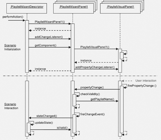
In the actionPerformed() method of the action class that initialized the wizard, an instance of the PlaylistWizardDescriptor is created. This WizardDescriptor generates its panels and registers a ChangeListener for each, so that a notification is fired whenever the status of the panel changes. The visual panel is then obtained via the getComponent() method of the wizard panel. This method creates the visual panel on demand and registers a PropertyChangeListener, informing of changes made by the user. The WizardDescriptor observes the status of its panels via a ChangeListener, which in turn observes the status of visual panels via a PropertyChangeListener.
When the user types data into a field to which a listener is attached, a PropertyChangeEvent is fired, notifying the wizard panel that data has changed. The wizard panel retrieves the data via the getters and then verifies received data. Depending on the result of the verification, status of the panel is set.
If the status changes, a ChangeEvent is fired, notifying the WizardDescriptor, which verifies the panel status, calling the isValid() method. Depending on the value of the isValid() method, the WizardDescriptor enables or disables the buttons in the wizard.
Depending on the business scenario, it may be useful to allow the user to end the wizard prematurely. Normally, the wizard ends when the Finish button is clicked in the last panel. To allow the user to end the wizard in an earlier panel, implement the interface WizardDescriptor. FinishablePanel. The WizardDescriptor.FinishablePanel interface provides the method isFinishPanel(), which uses the return value true when the wizard can be ended. In the example, it is conceivable to implement this interface in the first panel, allowing the user to end the wizard without adding playlist tracks.
Confirming the validity of a panel is provided by the WizardDescriptor 's isValid() method. The method is called via the ChangeListener, as the panel is closed and when notifications are sent. Should additional verifications be required when the user clicks Next or ends the wizard, implement the WizardDescriptor.ValidatingPanel interface. The WizardDescriptor. ValidatingPanel interface specifies the validate() method, in which additional verifications can be performed.
Errors identified in this way are made available as a WizardValidationException. The constructor of this exception class receives a JComponent, which obtains the focus, so that the user can be shown related error messages. In addition, a failure message can be added, which is then shown in the wizard.
Rather than using the validate() method of the WizardDescriptor.ValdiatingPanel interface, which is executed asynchronously in the event dispatch thread (EDT) (where no long-running tasks should be performed), use the WizardDescriptor.AsynchronousValidatingPanel interface to asynchronously handle verification. Using this interface, the validate() method is automatically performed in a separate thread. As a result, the user interface is available to the user, enabling use of the Cancel button to end the process.
Since the asynchronous method is not carried out in the EDT, no access is provided to GUI components in order to read data from them. To that end, the interface provides the prepareValidation() method, which is called in the EDT, allowing access to data in the GUI components, while disallowing further change. Using the data retrieved this way, the validate() method carries out verification.
An iterator within the WizardDescriptor creates the whole range of panels. The interface of an iterator of this kind is described by the WizardDescriptor.Iterator class. A standard implementation of this interface provides the WizardDescriptor.ArrayIterator class, providing panels in a sequential order. The class is also used when passing panels as an array to the WizardDescriptor class. However, when giving the user the choice to skip one or more panels based on entered data, provide your own iterator implementation in the WizardDescriptor. The iterator will then handle dynamic creation of panels.
The infrastructure of a dynamic wizard can be created via a wizard in the NetBeans IDE. Returning to the first step of the Wizard wizard, use the Wizard Step Sequence to set the Dynamic option, letting the IDE create an iterator class.
Based on the WizardDescriptor.Iterator interface, additional classes are provided. Use the WizardDescriptor.InstantiatingIterator interface and its instantiate() method to create a set of objects. Alternatively, use the WizardDescriptor.AsynchronousInstantiatingIterator with its instantiate() method, which is performed asynchronously outside the EDT, when the user clicks the Finish button. Finally, use the WizardDescriptor.ProgressInstantiatingIterator interface to show the user a progress bar when the wizard ends, while the instantiate() method is processing. In this case, the instantiate() method is called in a separate thread, receiving a ProgressHandle. Via this class, the status is shown, as is done with the standard progress bar (see Chapter 5).
Use the MultiViews API and SPI to divide a TopComponent across multiple containers. Typically, as the name suggests, this approach is used to provide more than one view for a single DataObject. The most common example of this is the NetBeans GUI Builder, in which the user switches from the source view to the design view. The views have, as their basis, a .java and a .form file. However, a relationship between the views is not mandatory. The container integrates several independent components that are completely independent of each other, displaying different data. The MultiViews SPI can, as a result, be used as a generic framework, rather than one specifically aimed at displaying a single piece of data.
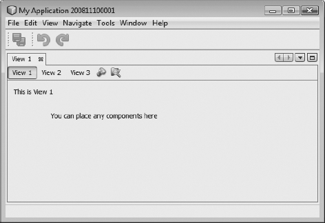
The end result of a multiview includes a drop-down list, allowing the user to switch between the different views. Optionally, one of the views, consisting of any kind of JComponent, provides a toolbar displayed next to the drop-down list (see Figure 8-9).
Each view consists of independent components, which must be subclasses of JComponent. Typically, the base class JPanel is used. However, nothing prevents you from using the TopComponent, allowing integration of one or more windows into a multiview.
To allow a component to be a view in a multiview TopComponent, implement the MultiViewElement interface. The methods, specified by this interface, can best be illustrated via a simple example.
public class MultiViewPanel1 extends JPanel implements MultiViewElement {
   private JToolBar toolbar = new JToolBar();
   private MultiViewElementCallback callback = null;
   public MultiViewPanel1() {
      initComponents();
      toolbar.add(new Panel1ToolbarAction1());
      toolbar.add(new Panel1ToolbarAction2());
   }
To give the view access to the TopComponent, use the setMultiViewCallback() method to receive a MultiViewElementCallback. For example, via this object one obtains the multiview TopComponent. To use the callback object in classes, save the data as a private element. An instance of the view is obtained via the getVisualRepresentation() method. This method is called whenever the view is activated, meaning that creating the component in this method should be avoided. Normally, use this to access the current components. The toolbar of the current view is obtained via the getToolbarRepresentation() method. This method provides a completely created toolbar. Actions in the context menu of the multiview TopComponent are obtained from the currently active view, via the getActions() method. First, use this method to access the standard actions of a TopComponent via the MultiViewElementCallback object. Next, add your own actions to the set of standard actions. Use getLookup() to obtain the current Lookup—the part of the Lookup that is part of the current multiview TopComponent and that is also part of the global context.
public void setMultiViewCallback(MultiViewElementCallback c) {
      callback = c;
   }
   public JComponent getVisualRepresentation() {
      return this;
   }
   public JComponent getToolbarRepresentation() {
      return toolbar;
   }
   public Action[] getActions() {
      if(callback != null) {
         return callback.createDefaultActions();
      } else {
         return new Action[]{};
      }
   }
   public Lookup getLookup() {
      return Lookups.singleton(this);
   }
The next methods should be familiar, since they were dealt with in discussions concerning the TopComponent class. Via these methods, access is provided to the various states of the view and the multiview TopComponent. For example, in the following code, the title of the TopComponent is set dynamically, based on the name of the view, whenever the view is opened or activated. The title can be changed via the MultiViewElementCallback object, using the updateTitle() method.
public void componentOpened() {
      callback.updateTitle("View 1");
   }
   public void componentClosed() {}
   public void componentShowing() {}
   public void componentHidden() {}
   public void componentActivated() {
      callback.updateTitle("View 1");
   }
   public void componentDeactivated() {}
Each view offers its own undo/redo functionality, via the getUndoRedo() method. How undo/redo is implemented via the NetBeans API is discussed in Chapter 17. If this support is unwanted, provide UndoRedo.NONE, as shown here:
public UndoRedo getUndoRedo() {
      return UndoRedo.NONE;
   }
Finally, implement the canCloseElement() method. This method is called on each of the views when the multiview TopComponent closes. Only once all the views have provided CloseOperationState.STATE_OK can the TopComponent be closed. Should a view not be immediately closeable, because (for example) changed data has not yet been saved, provide a CloseOperationState object, created via the MultiViewFactory.createUnsafeCloseState(). This makes sense only when CloseOperationHandler has been implemented, which is passed when the multiview TopComponent is created. This handler is available for resolving the CloseOperationState objects of all the views. For example, within this handler, a dialog can be shown to the user.
public CloseOperationState canCloseElement() {
      return CloseOperationState.STATE_OK;
   }
}
For each view component, create and describe the view via the MultiViewDescription. The main point of this class is instantiation of graphic view components, which are created on demand by the createElement() method (see Listing 8-5). The method is called once only, when the user opens the view for the first time. The method getPersistenceType() is used to specify how the TopComponent is saved. Use the constants of the TopComponent class, a topic illustrated in Chapter 5.
Example 8.5. Description and factory creation of a view
public class MultiViewPanel1Description
        implements MultiViewDescription, Serializable {
   public MultiViewElement createElement() {
      return new MultiViewPanel1());
   }
   public String preferredID() {
      return "PANEL_1";
   }
   public int getPersistenceType() {
      return TopComponent.PERSISTENCE_NEVER;
   }
   public String getDisplayName() {
      return "View 1";
   }
   public Image getIcon() {
      return null;
   }
   public HelpCtx getHelpCtx() {
      return HelpCtx.DEFAULT_HELP;
   }
}
Finally, there remains the creation of a multiview TopComponent from independently created views. To that end, the MultiViews SPI provides a factory class, which is the MultiViewFactory class. It contains methods permitting the creation of TopComponents or CloneableTopComponents, depending on need.
MultiViewDescription dsc[] = {
   new MultiViewPanel1Description(),
   new MultiViewPanel2Description(),
   new MultiViewPanel3Description()};
TopComponent tc = MultiViewFactory.createMultiView(dsc, dsc[0]);
tc.open();
First, create an array of MultiViewDescription classes, representing each of the views. Pass this array to the createMultiView() method. The second parameter contains the initially active view. An optional third parameter includes an implementation of the CloseOperationHandler discussed earlier, for the creation of a CloseOperationState object. The multiview TopComponent is then opened via the open() method.
To give access from outside to the views, use the static method MultiViews.findMultiViewHandler() to create a MultiViewHandler for a view TopComponent. Via this handler, you can, for example, access the currently selected view or all available views at once.
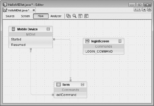
The NetBeans Visual Library API is a generic library for displaying different structures. In particular, the library is most suited to graph-oriented representations. The Visual Library API (version 2.0) is part of the NetBeans Platform and is used by the NetBeans IDE in numerous modules and areas, such as visual modeling of MIDlets in a JME application, as shown in Figure 8-10. To use the Visual Library API, you need only define a dependency on the module (under Libraries within the module's Properties dialog), as previously noted in examples of other modules.
The components of the Visual Library API, like Swing, are structured and managed as a tree. The superclass of all graphic components is the Widget class. If you consider Figure 8-10, then the three components (Mobile Device, form, and loginScreen), as well as the edges connecting components, are all widgets. A widget can also be a container for other widgets. Each widget has a position relative to its parent widget. The Widget superclass is responsible for presenting the border and background of a widget in addition to managing properties such as color and transparency. Like a Swing container, a widget has a certain layout responsible for the positioning of its child widgets. Widgets depend upon each other in order to be notified about changes. A widget can also be linked to a series of actions that are executed when specific user events occur.
All graphic components of the Visual Library API are subclasses of Widget, which manages and provides basic features and functionalities such as layout, background, and font. A Widget is a graphic primitive equivalent to the JComponent class in Swing. From Widget, numerous classes are derived, making relevant Widget implementations available for most applications. This inheritance hierarchy is represented in Figure 8-11, and the descriptions of these various Widget classes are listed in Table 8-4. The most important are dealt with in more detail in the following sections. For more exhaustive descriptions of these classes, see the Visual Library API documentation, found within the Javadoc of the Visual Library.
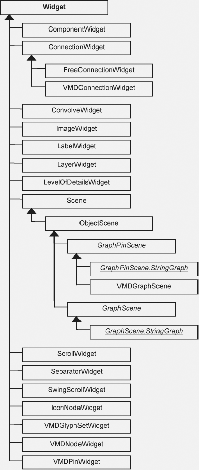
Table 8-4 provides an overview of the features and functionalities of various Widget implementations.
Table 8.4. The descriptions of the different Widget subclasses
Class | Description |
|---|---|
| Using a |
| A |
| A |
| With an |
| With this widget, text is displayed. Text can be represented in four different horizontal and vertical alignments. |
| A |
| A |
| The |
| A |
| This widget represents a separator whose thickness and orientation can be set. |
| This widget, like a |
| An |
Dependencies can be defined between individual widgets. You are thereby able to respond to changes in position or size of other widgets. This dependency is realized by a listener registered on the widget. In addition, the Widget class makes available two methods, addDependency() and removeDependency(), in order that a listener can be added or removed. A listener is specified by the interface Widget.Dependency. The listener must implement the method revalidateDependency(), which is called by the respective widget on a change of position or size. By this method, you call the revalidate() method of widgets that are dependent on other widgets.
Each widget has border. By default, this is an empty border, represented by the class EmptyBorder. Another border can be specified with the setBorder() method. A border is specified by the interface Border. And this interface is implemented by numerous Border classes. In addition to the EmptyBorder class, there are also LineBorder, BevelBorder, DashedBorder, ImageBorder, ResizeBorder, RoundedBorder, and SwingBorder classes. A ResizeBorder adds eight points to the edges of your widget, which are used to change its size. Furthermore, the SwingBorder class allows you to use any Swing javax.swing.border.Border implementation. Last at your disposal is the CompositeBorder class, with which you can combine any number of the Border instances mentioned.
The borders, however, are not created directly, but via a factory. This is the BorderFactory class that provides you with numerous methods with which you can create various border types. Instances produced by the factory can be simultaneously shared by several widgets. If you wish to use the same border between several widgets, you need only create one instance of it.
A widget (like a Swing container) has a special layout, managed and specified by a Layout Manager. A layout is defined by the interface Layout and is responsible for arrangement of the child widgets. Four different variants of layouts are available, produced by the LayoutFactory class and added to a widget with the setLayout() method.
With AbsoluteLayout, child widgets are arranged according to the coordinates supplied by getPreferredLocation(). The size of child widgets corresponds to the proportions provided by getPreferredBounds(). If the two methods supply null, the position becomes (0, 0) and the size becomes (0, 0, 0, 0). This is the default layout used by a widget. This layout is generated with the following:
Layout al = LayoutFactory.createAbsoluteLayout();
The FlowLayout arranges widgets in a sequential order in horizontal or vertical directions. Four different alignments can be selected: left top, center, right bottom, and justified. Furthermore, the gap between individual widgets can be specified. The size of widgets corresponds to the value that getPreferredBounds() returns. The following methods are available for the creation of this layout; alternatively, supply the alignment as a LayoutFactory.SerialAlignment type along with the gap:
Layout hfl = LayoutFactory.createHorizontalFlowLayout();
Layout vfl = LayoutFactory.createVerticalFlowLayout();
A CardLayout shows only the currently active widget, which is specified by the method setActiveCard(). The size of the active widget is determined by getPreferredBounds(). All other widgets are represented by the size (0, 0, 0, 0), thus making them practically invisible. Determine the currently active widget by the method getActiveCard(). Create this layout with the following:
Layout cl = LayoutFactory.createCardLayout();
and specify the active widget with the following call:
LayoutFactory.setActiveCard(Widget parent, Widget activate);
To switch the active widget, you can use the SwitchCardAction class.
The OverlayLayout determines the minimum area containing all child widgets. Both the widget that contain this layout and all child widgets are set to the size of this determined area and arranged on top of each other. The last child widget displays at the top. You create this layout as follows:
Layout ol = LayoutFactory.createOverlayLayout();
A widget knows its position, size, and, content, but not information about its behavior. The behavior of widgets is influenced by actions added arbitrarily to a widget. These actions are specified by the interface WidgetAction, which defines a number of event methods. These methods are called by corresponding events, such as clicking a mouse button on the widget the action is assigned to. Implementation of the action class executes desired behaviors such as moving a widget by drag-and-drop.
Like borders and layouts, actions are created by a factory. This is the ActionFactory class. These actions are managed within a widget by the WidgetAction.Chain class. This class receives user events and forwards these to the appropriate actions it manages. Each widget has an instance of this class, which is obtained by getAction(). With the methods addAction() and removeAction(), the WidgetAction.Chain class adds or removes actions to or from widgets.
Some of the factory methods of the ActionFactory class require a provider as a parameter. A provider implements a specific behavior for an action. For some actions (e.g., the EditAction), a provider implementation that is executed on double-clicking the appropriate widget must be specified. For other actions, like the MoveAction, specify a provider if you wish the behavior to deviate from the default. These providers are specified through special interfaces such as EditProvider or HoverProvider.
The real advantage or purpose for managing a widget's actions in a WidgetAction.Chain class is grouping. For example, in some applications, you permit only certain actions for a scene. Widgets may be moved, but not edited. This functionality is provided by setting the current tool of a scene using the setActiveTool() method in the Scene class. The Widget class manages different actions in separate WidgetAction.Chain instances depending on the currently active tool. Previously, access was granted to actions via the getAction() method. This supplied the default WidgetAction.Chain instance, which is also the case if no tool is set (setActiveTool(null)). Now you can use a variant of the getAction(String activeTool) method, to which you supply the name of the tool and obtain the relevant WidgetAction.Chain instance.
This action is for the treatment of drag-and-drop operations. An AcceptProvider implementation must be provided to create the action. The AcceptProvider interface specifies the method isAcceptable(), which allows specifying whether a drop operation on this widget is allowed, as well as the method accept(), with which you accomplish the drop operation.
ActionFactory.createAcceptAction(AcceptProvider p);
This action provides a context menu, displayed by right-clicking the widget. You create the action using the default method without parameters, whereby actions for the menu are inferred from the ActionMap of the scene view. Additionally, there is an option to supply the method with an InputMap and ActionMap used for production of the menu.
ActionFactory.createActionMapAction();
ActionFactory.createActionMapAction(InputMap i, ActionMap a);
This action can only be used by FreeConnectionWidget widgets. With it, you add or remove control points by double-clicking them. You also indicate the sensitivity used.
ActionFactory.createAddRemoveControlPointAction();

ActionFactory.createAddRemoveControlPointAction(
   double createSensitivity,
   double deleteSensitivity);
With the MoveAction, a widget can be moved by drag-and-drop. Please note that this action only functions if the parent widget has an AbsoluteLayout. Similarly, the AlignWithMoveAction behaves like the MoveAction. In contrast, however, additional "snapping" with other widgets occurs. All widgets against which alignment is checked are gathered using an AlignWithWidgetCollector instance or set through a LayerWidget. In the second case, the alignment of all child widgets within each layer is checked.
ActionFactory.createMoveAction();

ActionFactory.createMoveAction(
   MoveStrategy             strategy,
   MoveProvider             provider);

ActionFactory.createAlignWithMoveAction(
   AlignWithWidgetCollector collector,
LayerWidget              interactionLayer,
   AlignWithMoveDecorator   decorator);

ActionFactory.createAlignWithMoveAction(
   LayerWidget              collectionLayer,
   LayerWidget              interactionLayer,
   AlignWithMoveDecorator   decorator);
With the ResizeAction, you change the size of widgets, while AlignWithResizeAction reviews snapping against other widgets. With widgets needing their alignment checked against others, provide either an AlignWithWidgetCollector instance or a LayerWidget.
ActionFactory.createResizeAction();

ActionFactory.createResizeAction(
   ResizeStrategy             strategy,
   ResizeProvider             provider);

ActionFactory.createResizeAction(
   ResizeStrategy             strategy,
   ResizeControlPointResolver resolver,
   ResizeProvider             provider);

ActionFactory.createAlignWithResizeAction(
   AlignWithWidgetCollector   collector,
   LayerWidget                interactionLayer,
   AlignWithMoveDecorator     decorator);

ActionFactory.createAlignWithResizeAction(
   LayerWidget                collectionLayer,
   LayerWidget                interactionLayer,
   AlignWithMoveDecorator     decorator);
With these actions, the zoom of the whole scene is changed with the mouse wheel. These actions are not added to a widget, but directly to a scene.
ActionFactory.createZoomAction();
ActionFactory.createZoomAction(double zoom, boolean animated);
ActionFactory.createCenteredZoomAction(double zoomMultiplier);
With the ConnectAction, you can connect, with the assistance of ConnectionWidgets, two widgets. This action is added to the widget from which the connection is to be made. Only with a ConnectProvider instance, following a check of the source and target widgets for the desired connection, can a connection be made. Optionally, supply a specific graphic for the connecting line using a ConnectDecorator. With the ExtendedConnectAction, a connection can be made only as long as the Ctrl key pressed. This action is meant for cases where conflicts with other actions occur—for example, if you want to use the ConnectAction and the MoveAction at the same time. In these cases, use the ExtendedConnectAction.
ActionFactory.createConnectAction(
   LayerWidget interactionLayer,
   ConnectProvider provider);

ActionFactory.createConnectAction(
   ConnectDecorator decorator,
   LayerWidget interactionLayer,
   ConnectProvider provider);

ActionFactory.createExtendedConnectAction(
   LayerWidget interactionLayer,
   ConnectProvider provider);

ActionFactory.createExtendedConnectAction(
   ConnectDecorator decorator,
   LayerWidget interactionLayer,
   ConnectProvider provider);

ActionFactory.createReconnectAction(
   ReconnectProvider provider);

ActionFactory.createReconnectAction(
   ReconnectDecorator decorator,
   ReconnectProvider provider);
You shift the focus between the widgets of a scene using the Tab key, either forward or backward. With the CycleFocusAction, you specify the behavior with which the preceding or following widget is focused using a CycleFocusProvider. In the case of the CycleObjectSceneFocusAction, which is applied to an ObjectScene, the order of the focusing is determined by the return value of getIdentityCode().
ActionFactory.createCycleFocusAction(CycleFocusProvider p);
ActionFactory.createCycleObjectSceneFocusAction();
In order to edit a widget by double-clicking, add an EditAction. The triggered behavior is implemented by an EditProvider. A further option supplies an in-place editor that is displayed upon double-clicking. For this, use the InplaceEditorAction, whereby the editor can be any JComponent subclass. For example, with an IconNodeWidget or a LabelWidget, this would typically be a JTextField.
ActionFactory.createEditAction(
   EditProvider provider);

ActionFactory.createInplaceEditorAction(
   InplaceEditorProvider provider);

ActionFactory.createInplaceEditorAction(
   TextFieldInplaceEditor editor);

ActionFactory.createInplaceEditorAction(
   TextFieldInplaceEditor editor,
   EnumSet expansionDirections);
With this action, you can forward keyboard events to other widgets.
ActionFactory.createForwardKeyEventsAction(
   Widget forwardToWidget,
   String forwardToTool);
With the HoverAction, you can react to a mouse pointer that is hovering over a widget. How the widget behaves is specified by a HoverProvider or a TwoStateHoverProvider.
ActionFactory.createHoverAction(HoverProvider p);
ActionFactory.createHoverAction(TwoStateHoverProvider p);
These actions move the control points of the connecting line of a ConnectionWidget. The OrthogonalMoveControlPointAction is used when a ConnectionWidget has an OrthogonalSearchRouter. The FreeMoveControlPointAction has no restrictions on positioning the points.
ActionFactory.createMoveControlPointAction(MoveControlPointProvider provider);
ActionFactory.createFreeMoveControlPointAction();
ActionFactory.createOrthogonalMoveControlPointAction();
If the view of a scene is contained within a JScrollPane, the PanAction allows scrolling the view by moving the mouse while the middle button is pressed. This action is usually added to a scene.
ActionFactory.createPanAction();
Use the PopupMenuAction to provide a widget with a context menu. This requires implementing a PopupMenuProvider within which you provide a JPopupMenu instance.
ActionFactory.createPopupMenuAction(
   PopupMenuProvider more provider);
The SelectAction is similar to the EditAction; however, this event is the result of a single click. The logic is implemented within a SelectProvider, inside which you also specify whether a widget is selected. The RectangularSelectAction is usually added to an ObjectScene or a LayerWidget with which you select widgets by drawing rectangles around them.
ActionFactory.createSelectAction(SelectProvider provider);

ActionFactory.createRectangularSelectAction(
   ObjectScene scene,
   LayerWidget interactionLayer);

ActionFactory.createRectangularSelectAction(
   RectangularSelectDecorator decorator,
   LayerWidget interactionLayer,
   RectangularSelectProvider provider);
The components of the Visual Library API—i.e., widgets—are arranged and managed in a hierarchical tree structure. This means widgets, in turn, can contain other widgets. The Scene class, which itself is a widget, represents the container for all subsequent elements and therefore is the root element of the hierarchy (see Figure 8-11). Graphically, a scene is represented by a view, which is a simple JComponent instance. This is then typically added to a JScrollPane. One always starts with a scene, to which are added further widgets in hierarchical arrangement, depending upon the application's needs. Listing 8-6 illustrates this.
Example 8.6. Creating a scene and adding widgets
final class SceneTopComponent extends TopComponent {
private JScrollPane scenePane = new JScrollPane();
private Scene sc = new Scene();
private SceneTopComponent() {
scenePane.setViewportView(sc.createView());
LayerWidget layer1 = new LayerWidget(sc);
sc.addChild(layer1);
ImageWidget w1 = new ImageWidget(sc,
ImageUtilities.loadImage("com/galileo/netbeans/module/node.gif"));
layer1.addChild(w1);
ImageWidget w2 = new ImageWidget(sc,
ImageUtilities.loadImage("com/galileo/netbeans/module/node.gif"));
layer1.addChild(w2);
LayerWidget layer2 = new LayerWidget(sc);
sc.addChild(layer2);
ImageWidget w3 = new ImageWidget(sc,
ImageUtilities.loadImage("com/galileo/netbeans/module/node2.gif"));
layer2.addChild(w3);
WidgetAction ma = ActionFactory.createMoveAction();
w1.getActions().addAction(ma);
w2.getActions().addAction(ma);
w3.getActions().addAction(ma);
}
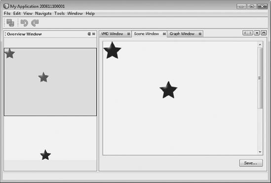
}We create the scene as a private variable. The createView() method provides a view for this scene of the type JComponent, and can be embedded into any Swing container. So that the scene or view is not limited to a certain size, we add this to a JScrollPane. We now hierarchically attach our widgets to the scene after first creating a LayerWidget that acts like a JGlassPane and to which we add two ImageWidgets. To illustrate the grouping and alignment of widgets, we create a further LayerWidget instance and add an additional ImageWidget. The added LayerWidget and contained ImageWidgets are then assigned to the scene. So that the widgets can be moved within the scene, we add a MoveAction instance created with the ActionFactory. An example can be seen in Figure 8-12.
In order to establish fast navigation within larger scenes, a scene offers us an overview in the form of an interactive JComponent. This is a satellite view created using the createSatelliteView() method. If the view of your scene is embedded in a JScrollPane and the scene is larger than that of the displayed area, navigate the scene by moving the gray frame present in the overview to update the view (see Figure 8-12).
In few steps and with the assistance of some Java utilities, you can export a scene generated with the Visual Library API into an image contained within a PNG file. To this end, first produce a BufferedImage object, into which is written the graphic data. Specify the size of this Image instance using the current size of the view of the respective scene, to assure the complete contents are stored. From this object, we avail ourselves of the Graphics2D context with which we feed data into the buffer of the BufferedImage object. This context is then supplied to the paint() method of the Scene object so that content is written to the buffer of the BufferedImage instance rather than the screen (see Listing 8-7). Following this, dispose of the context so that the resources can be released. With a JFileChooser, request a file name and, if necessary, append the appropriate suffix. Once this is done, utilize the ImageIO class that looks for an ImageWriter for PNG files, using it to write the data of the BufferedImage object into the selected file.
Example 8.7. Exporting a scene into a PNG file
private Scene sc = new Scene();

public void exportScene() {
   BufferedImage img = new BufferedImage(
      sc.getView().getWidth(),
sc.getView().getHeight(),
BufferedImage.TYPE_4BYTE_ABGR);
Graphics2D graphics = img.createGraphics();
sc.paint(graphics);
graphics.dispose();
JFileChooser chooser = new JFileChooser();
chooser.setFileFilter(new FileNameExtensionFilter(
"Portable Network Graphics (.png)", "png"));
if(chooser.showSaveDialog(sc.getView()) == JFileChooser.APPROVE_OPTION) {
File f = chooser.getSelectedFile();
if (!f.getName().toLowerCase().endsWith(".png")) {
f = new File(f.getParentFile(), f.getName() + ".png");
}
try {
ImageIO.write(img, "png", file);
} catch (IOException e) {
Logger.getLogger(getName()).warning(e.toString());
}
}
}The Visual Library API provides only the constituent components making up a view. That is, a widget only possesses information about presentation or flow of data. What a widget does not possess is a data model. This is where the ObjectScene class comes into play, representing an extension of the Scene class. The function of this class is to manage widget mapping to an associated data model, which can be any object displayed in a view. The class ObjectScene makes available methods allowing widget assignment to a data model. It's also possible to determine the data model registered to a widget and vice versa. Besides mapping the data model to widgets, the ObjectScene class also provides information about the current state of a widget or data model, represented by the ObjectState class.
Data models are stored internally in a Map. For identification and comparison purposes, data models use the equals() method. Ensure that your data model contains a meaningful implementation of this method and note that each unique data model can only be added once. Thus, if the data model d1 is in an ObjectScene, and a second, d2, is added, whereby d1.equals(d2) == true applies, an exception is raised.
Table 8-5 summarizes the most important methods of the ObjectScene class and their functions.
Table 8.5. The most important methods of the ObjectScene class
Method | Description |
|---|---|
| With the |
| You can remove a known data model with the |
| Use the |
| This method is the counterpart to |
| If several widgets are assigned to a model, these are returned with |
| To receive the current state of a model, use the |
In order to facilitate the creation of graphs (see Figure 8-10 for an example of flow designers)—i.e., the production of nodes and associated edges—the API based on the ObjectScene class introduced in the previous section makes available the classes GraphScene and GraphPinScene. For these classes, an example is shown hereafter, the basis of which clarifies the practical significance of the ObjectScene class.
Both GraphScene and GraphPinScene are abstract classes, whose only task is the management of data models and widgets. The creation of widgets is dependent on subclasses and is reliant upon data models. This is achieved by overriding the relevant abstract methods within the subclasses. The types of data models are defined by templates and can vary in each case for nodes, edges, and pins. In the simplest case, as in this example, use the type String. For the nodes and edges, we provide a separate LayerWidget and add these to the scene.
public class MyGraphPinScene extends GraphPinScene<String, String, String> {
   private LayerWidget mainLayer;
   private LayerWidget connectionLayer;

   public MyGraphPinScene() {
      mainLayer = new LayerWidget(this);
addChild(mainLayer);
connectionLayer = new LayerWidget(this);
addChild(connectionLayer);
}The attachNodeWidget() method is responsible for creating nodes. Therefore, we use the IconNodeWidget class here in the example. The ImageWidget class could also be used. However, we also manage the accompanying pins with the IconNodeWidget class. This is done by using LabelWidget, which is accessed by the getLabelWidget() method. So that the pins can be arranged and presented correctly, a FlowLayout is defined for this widget. In order to move the node, a MoveAction instance is added. Last, we add the node to the MainLayer and return it.
protected Widget attachNodeWidget(String node) {
IconNodeWidget widget = new IconNodeWidget(this);
widget.setImage(
ImageUtilities.loadImage("com/galileo/netbeans/module/node.gif"));
widget.getLabelWidget().setLayout(
LayoutFactory.createHorizontalFlowLayout(
LayoutFactory.SerialAlignment.JUSTIFY, 5));
widget.getActions().addAction(ActionFactory.createMoveAction());
mainLayer.addChild(widget);
return widget;
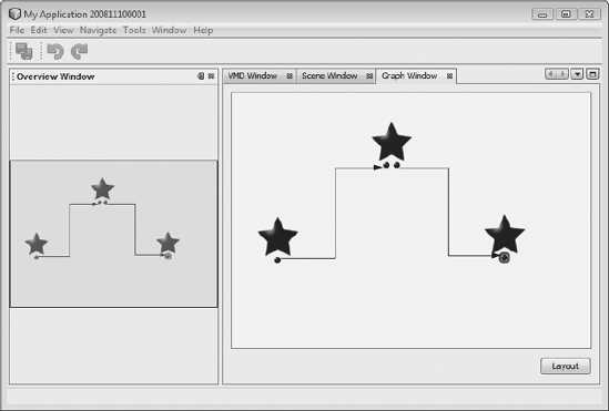
}The attachEdgeWidget() method is responsible for creating edges. But we use the ConnectionWidget class to enable using a router, so edges are not simply drawn as straight lines between nodes possibly intersecting with other nodes or edges. A router permits us to have a series of LayerWidgets, whose widgets are not to be crossed. Accordingly, the router determines paths for edges, so that no intersections occur (see Figure 8-13). Such routers are created with RouterFactory. The configured edges are then added to the ConnectionLayer and returned.
protected Widget attachEdgeWidget(String edge) {
   ConnectionWidget widget = new ConnectionWidget(this);
   widget.setTargetAnchorShape(AnchorShape.TRIANGLE_FILLED);
   widget.setRouter(RouterFactory.createOrthogonalSearchRouter(
      mainLayer, connectionLayer));
   connectionLayer.addChild(widget);
   return widget;
}
Pins are created with the attachPinWidget() method. A pin is an input or output of a node, to which an edge can be connected (the red points in Figure 8-13 represent pins). A pin is assigned to a node, which may possess multiple pins. The data model for the pin and the node to which it will be added is received within those parameters. The findWidget() method assists in determining the widget associated with the node to which the created pin is added.
protected Widget attachPinWidget(String node, String pin) {
      ImageWidget widget = new ImageWidget(this,
         ImageUtilities.loadImage("com/galileo/netbeans/module/pin.gif"));
      IconNodeWidget n = (IconNodeWidget) findWidget(node);
      n.getLabelWidget().addChild(widget);
      return widget;
   }
Last, override the attachEdgeSourceAnchor() and attachEdgeTargetAnchor() methods (see Listing 8-8). With these, the start and endpoints of an edge are specified. Here, first determine the edge to which the pin is to be connected with the findWidget() method. Then provide the AnchorFactory with an anchor point to the pin, which has likewise been determined by the findWidget() method, and add this to the edge.
Example 8.8. Implementation of a GraphPinScene class
protected void attachEdgeSourceAnchor(
      String edge, String oldPin, String pin) {
      ConnectionWidget c = (ConnectionWidget) findWidget(edge);
      Widget widget = findWidget(pin);
      Anchor a = AnchorFactory.createRectangularAnchor(widget);
      c.setSourceAnchor(a);
   }
   protected void attachEdgeTargetAnchor(
      String edge, String oldPin, String pin) {
      ConnectionWidget c = (ConnectionWidget) findWidget(edge);
      Widget widget = findWidget(pin);
      Anchor a = AnchorFactory.createRectangularAnchor(widget);
      c.setTargetAnchor(a);
   }
Similarly, you could create an implementation of the GraphScene class, which has no pins. Here, edges are connected directly to the node rather than a pin. The advantage of the implementation just fashioned now becomes apparent. As with a normal scene, create an instance and add its view to a JScrollPane. What remains is the creation of individual widgets (see Listing 8-9). You need only supply the data model (a String object) to the methods addNode(), addPin(), or addEdge(). These internally call the methods implemented by us to create the widgets and produce a visual representation of the data model.
Example 8.9. Use of a GraphPinScene
final class GraphTopComponent extends TopComponent {
   private GraphTopComponent() {
      MyGraphPinScene scene = new MyGraphPinScene();
      scenePane.setViewportView(scene.createView());
      scene.addNode("Node 1");
scene.addNode("Node 2");
scene.addNode("Node 3");
scene.addPin("Node 1", "p1");
scene.addPin("Node 2", "p2");
scene.addPin("Node 2", "p3");
scene.addPin("Node 3", "p4");
scene.addEdge("Edge 1");
scene.addEdge("Edge 2");
scene.setEdgeSource("Edge 1", "p1");
scene.setEdgeTarget("Edge 1", "p2");
scene.setEdgeSource("Edge 2", "p3");
scene.setEdgeTarget("Edge 2", "p4");
GridGraphLayout<String,String> layout = new GridGraphLayout<String,String>();
SceneLayout sceneLayout = LayoutFactory.createSceneGraphLayout(scene, layout);
sceneLayout.invokeLayout();
}
}
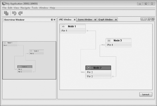
Even easier is implementation of graphs using the VMD classes. VMD stands for Visual Mobile Designer and marks its classes with that acronym. These classes make a GraphPinScene implementation available, as shown in the previous section. In addition to the scene, there are also special classes for nodes, edges, and pins that offer uniform design (see Figure 8-14). Due to this, there are no implementation details, such as creation of widgets, or setting of layout or router; just add the necessary elements. A VMDGraphScene already has four layers, and actions such as zoom, pan, and select. The simple example with three nodes shown in Listing 8-10 is created using a VMDGraphScene.
Example 8.10. Creating a graph using the VMD classes
private VMDTopComponent() {
   VMDGraphScene scene = new VMDGraphScene();
   scenePane.setViewportView(scene.createView());
   VMDNodeWidget node1 = (VMDNodeWidget)scene.addNode("Node 1");
   node1.setNodeName("Node 1");
   VMDNodeWidget node2 = (VMDNodeWidget)scene.addNode("Node 2");
   node2.setNodeName("Node 2");
   VMDNodeWidget node3 = (VMDNodeWidget)scene.addNode("Node 3");
   node3.setNodeName("Node 3");
   VMDPinWidget p1 =(VMDPinWidget)scene.addPin("Node 1", "Pin 1");
   p1.setPinName("Pin 1");
   VMDPinWidget p2 =(VMDPinWidget)scene.addPin("Node 2", "Pin 2");
   p2.setPinName("Pin 2");
   VMDPinWidget p3 =(VMDPinWidget)scene.addPin("Node 2", "Pin 3");
   p3.setPinName("Pin 3");
   VMDPinWidget p4 =(VMDPinWidget)scene.addPin("Node 3", "Pin 4");
   pin4.setPinName("Pin 4");
   scene.addEdge("Edge 1");
   scene.setEdgeSource("Edge 1", "Pin 1");
   scene.setEdgeTarget("Edge 1", "Pin 2");
   scene.addEdge("Edge 2");
   scene.setEdgeSource("Edge 2", "Pin 3");
   scene.setEdgeTarget("Edge 2", "Pin 4");
}
The VMDGraphScene uses the type String for the data models of nodes, edges, and pins. As you know from the previous section, elements are added with the methods addNode(), addPin(), and addEdge(). Here in the example, we give the nodes and pins a name. With setProperties() and other methods, you can set additional properties, such as icons, for nodes or pins.
In this chapter, we looked at NetBeans Platform APIs for the creation of graphical components. Firstly, we explored the Dialogs API, with which you can display system dialogs, as well as those you create yourself.
Next, we looked at the Wizards API. You can use this comprehensive framework to create your own graphic sequences that the user steps through to create artifacts or set properties in the application.
Also, we looked at how to create multiple views within one TopComponent, using the MultiViews API. Finally, we dealt with the NetBeans Platform's powerful widget library, known as the Visual Library API. We looked at the API classes, focusing on the different widgets, layouts, and actions supported out of the box, as well as how to extend them.