CHAPTER
FORTY-SEVEN
ANALYZING RISK FROM MULTIFACTOR FIXED INCOME MODELS
Managing Director
Barclays Capital
ANTÓNIO BALDAQUE DA SILVA, PH.D.
Director
Barclays Capital
RADU C. G![]() BUDEAN, PH.D.
BUDEAN, PH.D.
Vice President
Barclays Capital
ARNE D. STAAL, PH.D.
Director
Barclays Capital
Portfolio managers constantly monitor their exposures, typically net of a benchmark, and routinely ask themselves: What is the portfolio interest-rate duration? How risky is the overexposure to Treasuries? How does it relate to the exposure to credit? What is the exposure to specific issuers? Knowing portfolio holdings and exposures are not enough for portfolio managers, they increasingly rely on quantitative techniques to translate this information into a standard risk language, which allows comparisons across diverse portfolios or situations. Risk models present a consistent view of the portfolio, its exposures, and how they relate to each other. They quantify the risk of each exposure and its contribution to the overall risk of the portfolio.
Chapter 46 covered linear factor models for fixed income portfolios. In this chapter we detail an application of the models for risk forecasting that can be used to monitor risk and gain insightful information regarding the exposures of a portfolio.
The authors would like to thank Bruce Phelps and Andy Sparks for their valuable comments.
APPROACHES USED TO ANALYZE RISK
Throughout this chapter we analyze the risk of a particular bond portfolio, going through the various aspects of risk typically looked at by a manager. We follow a portfolio manager. We assume the following:
• The Barclays Capital U.S. Aggregate Index is the portfolio manager’s benchmark.
• The portfolio manager believes interest rates are coming down. To capitalize on this view, the manager seeks to create a portfolio with interest-rate duration longer than the interest-rate duration of the benchmark. A portfolio with interest-rate duration that exceeds that of the benchmark is referred to as being “long duration” and it outperforms the benchmark when interest rates fall and all other market factors remain unchanged.
• The manager seeks a portfolio with higher yield than the one of the benchmark. Such a portfolio creates superior carry return (also known as income) relative to the benchmark but is subject to increased risks. The total yield of a portfolio can be decomposed into a risk-free yield and a spread over the risk-free yield. Because the portfolio is expected to contain securities with longer maturities to satisfy the long duration target, it will earn a risk-free yield that is different from the risk-free yield of the benchmark (higher most of the time since typically interest-rate curves are upward sloping). To further enhance the portfolio yield, the manager wants to target a portfolio spread that is also higher than the spread of the benchmark. Higher spread typically exposes the portfolio to liquidity and issuer default risks. If defaults occur, or if the portfolio manager is forced to sell securities at a significant discount because of lack of liquidity, then the incurred losses may cancel out the higher yield advantage and could lead to portfolio underperformance relative to the benchmark. The manager must be comfortable that such risks are sufficiently compensated by the higher carry return associated with higher portfolio spread.
• The portfolio manager is required to maintain the difference between the returns of the portfolio and the benchmark at around 20 basis points, on a monthly basis. Therefore, the portfolio manager must calibrate the long duration and high-yield portfolio positions in order to abide by this constraint.
To summarize, the portfolio manager has the mandate to track the benchmark, but is allowed to deviate from it up to a point in order to express views that may lead to superior returns. As mentioned in Chapter 46, a portfolio manager with such a mandate is called an enhanced indexer. The amount of deviation allowed is called the risk budget (20 basis points in our example) and can be quantified using a risk model. The risk model produces an estimate of the volatility of the difference between the portfolio and the benchmark returns, called tracking error volatility (TEV).1 TEV gives the forecasted magnitude of the typical tracking error. The manager should keep the portfolio’s TEV at a level equal to or less than that specified in risk budget. The final portfolio, which we will analyze, contains 100 securities and is consistent with the manager’s views and risk budget.
Market Structure and Exposure Contributions
The portfolio manager starts the analysis by comparing the portfolio holdings with the holdings of the benchmark. Exhibit 47–1 shows that the portfolio composition has several important mismatches relative to the benchmark. The portfolio is underweighted in Treasuries and government-related securities by a combined 9.0%. This is compensated with a combined overweight of 11.2% in Corporates, especially in the Industrials and Financials sectors. These sectors have almost double the weight in the portfolio versus the benchmark. Other mismatches include an underweight in agency mortgage-backed securities (agency MBS) by 3.8% and an overweight in commercial mortgage-backed securities (CMBS) by 1.9%. Notice that the quest for yield pushed the manager out of the relatively safe (in terms of default risk) Treasury and agency MBS sectors and into more risky corporate and CMBS sectors.
EXHIBIT 47–1
Market Weights for Portfolio and Benchmark

If the manager were focusing on equities instead of fixed income, this kind of information—for example, applied to the different industries or sectors of the portfolio—would be of paramount importance for portfolio risk analysis. For a fixed income portfolio, this is not the case. Although important, this analysis tells us little about the true active exposures of a fixed income portfolio, owing to the diverse nature of fixed income securities. What if the Treasuries in the portfolio have significantly longer duration than those in the benchmark—would we be really “short” in this asset class? What if the spreads from CMBS in the portfolio are much smaller than those in the benchmark—is the weight mismatch that important?
To answer these kinds of questions, we turn to another typical dimension of analysis: the portfolio exposure to major sources of risk, measured with analytics such as interest-rate duration. Exposures to other sources of risk typically monitored include spread duration, convexity, spread level, and Vega (if the portfolio has many securities with optionality, such as mortgages or callable bonds). Their associated risks have been discussed in Chapter 46.
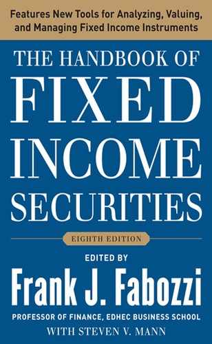
In Exhibit 47–2 we present these analytics at the aggregate level for the portfolio, benchmark, and the difference between the two. We can see that
EXHIBIT 47–2
Aggregate Analytics
• The portfolio is long interest-rate duration (0.38 years), reflecting the forecast the manager has regarding the direction of interest rate moves.
• In terms of spread duration, the mismatch is smaller (0.29 years). The manager wants to minimize the exposure to spread changes as much as possible given the manager has no view on this source of risk. However, the spread duration mismatch cannot be zero because spread risk is related to other risks that she does have a view on, such as rates.
• The portfolio and the benchmark have convexity with opposite signs (0.14 for the portfolio versus −0.04 for the benchmark). This is attributable to the smaller weight MBS have in the portfolio.
• The portfolio also has a higher negative Vega, but the number is reasonably small for both universes.
• The portfolio has significantly higher spread (148 bp) than the benchmark. This mismatch is consistent with the manager’s goal of having a higher yield in her portfolio than the benchmark.
We can combine the analysis in Exhibits 47–1 and 47–2 to create a more detailed picture of where the different risk exposures are coming from. Exhibit 47–3 shows one such example for the portfolio interest-rate duration. The majority of the mismatch in interest-rate duration contribution (market weighted duration exposures) comes from the Treasury component of the portfolio (0.60 years). Interestingly, even though the portfolio is short in Treasuries, it is actually long in terms of interest-rate duration for that asset class. This means that a Treasury sell-off, meaning an increase in rates, would impact the portfolio more negatively than the benchmark. Because the portfolio is net short Treasuries, this result must mean that the Treasury portfolio is longer in interest-rate duration than the benchmark’s Treasury component. Conversely, Corporates have negative contribution to net interest-rate duration, even though they are over-weighted in terms of market value. This means that on average the corporate bonds in the portfolio are significantly shorter in interest-rate duration than those in the benchmark. Note that this kind of analysis could be applied to other analytics of interest, such as to spread or spread duration.
EXHIBIT 47–3
Duration Contribution per Asset Class

Adding Volatility and Correlations into the Analysis
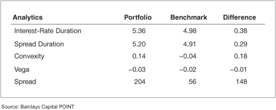
The analysis above gives the manager some basic understanding of the portfolio exposures to different kinds of risk. However, it is still hard to understand how the portfolio manager can compare the level of risk across these different exposures. What is more risky, the long interest-rate duration exposure of 0.38 years, or the extra spread of 148 bp? How can the portfolio manager quantify how serious is the portfolio’s Vega mismatch? Specifically, the risk of the portfolio is a function of the exposures to the risk factors, but also of how “risky” each of the factors is.
To enhance the analysis we must bring factor volatilities into the picture. Exhibit 47–4 shows the outcome of this addition to our example. In particular, it displays the risk of the different exposures of the portfolio in isolation (that is, if the only active imbalances were those from that particular set of risk factors). For example, this exhibit shows that if the only active weight in the portfolio were the mismatch in the yield-curve exposures, the risk of the portfolio would be 11.3 bp/month. By adding volatilities into the analysis, the manager can now quantify that the mismatch of 0.38 years in interest-rate duration “costs” the portfolio 11.3 bp/month of extra volatility, when taken in isolation, and therefore refer to this as the Isolated TEV.2 Remember that the portfolio’s total risk budget is 20 bp/month. Similarly, if the only mismatch were the exposure to corporate spreads, the risk of the portfolio would be 6.9 bp/month. We also see that both the Government-Related and Securitized sectors have nontrivial risk. Interestingly, this is inconsistent with the small interest-rate duration imbalance reported in Exhibit 47–3. Therefore, these sectors must have other sources of risk that are important. By bringing volatilities into the analysis, we can now compare and quantify the impact of each of the portfolio imbalances.
EXHIBIT 47–4
Isolated Risk per Category
For future reference, let us compute the volatility of the portfolio assuming that all these sources of risk are independent (e.g., correlations are zero). This number is 13.9 bp/month.3 Of course, this scenario is unrealistic, as these sources of risk are not independent. Also, this analysis does not allow us to understand the interplay between the different imbalances. For instance, we know that the isolated risk associated with the curve is 11.3 bp/month. But this value can be achieved both by being long or short interest-rate duration. So the isolated number does not allow us to understand the impact of the curve imbalance to the total risk of the portfolio. The net impact certainly depends on the sign of the imbalance. For instance, a long exposure in curve may be diversified away by a long exposure in credit (due to negative correlation between rates and credit-spreads). In contrast, an opposite (short) curve exposure would add to the risk of the long exposure in credit. The risk is clearly smaller in the first case.
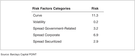
To alleviate these shortcomings, we bring correlations into the picture. They allow us to understand the net impact of the various exposures to the portfolio’s total risk and to detect potential sources of diversification among the portfolio imbalances. Exhibit 47–5 reports the contribution of each of the risk factor groups to the total risk, once all correlations are taken into account. We refer to this quantity as the contribution to tracking error volatility, or CTEV.4 The total risk (10.4 bp/month) is smaller than the zero-correlation risk calculated before (13.9 bp/month) due to generally negative correlations between the curve and the spread factors. The exhibit also allows us to isolate the main contributors to risk as being curve (6.9 bp/month) and credit-spreads (2.9 bp/month), in line with the evidence from the earlier isolated analysis. However, the risk of the Government-Related and Securitized spreads is significantly smaller once correlations are taken into account.
EXHIBIT 47–5
Contributions to Total Risk per Category
The difference in analysis between the isolated risk reported in Exhibit 47–4 and the contributions to total risk in Exhibit 47–5 deserves further discussion. For simplicity, assume there are only two sources of risk in the portfolio—yield-curve (Y) and spreads (S). The total systematic variance of the portfolio (P) can be illustrated as follows:
VAR(P) = VAR(Y + S) = VAR(Y) + VAR(S) + 2COV(Y, S)
= Y × Y + S × S + 2(Y × S)
where we use the product to represent variances and covariances. Another way to represent this summation is using the following matrix:
![]()
The sum of the four elements in the table is the variance of the portfolio. The isolated risk (in standard deviation units) reported in Exhibit 47–4 is the square root of the diagonal terms. So the isolated risk due to spreads is represented as:
![]()
It would be a function of the exposure to all spread factors, the volatilities of all these factors and the correlations among them.
The contribution to total risk reported in Exhibit 47–5 is:
![]()
that is, from the matrix above, we sum all elements in the row of interest (row 1 for Y, row 2 for S), and normalize it by the standard deviation of the portfolio. This normalization (1) takes into account correlations and (2) ensures that the contributions to risk of all factors add up to the total risk of the portfolio given by5
![]()
The difference between isolated and contribution to risk, due to the interplay of the two sources (2(Y × S)), is allocated equally to each source of risk. In cases when one type of risk on isolated basis is much smaller in magnitude than the other, the (Y × S) term may have an oversized effect. To summarize, isolated risk takes into account only the individual behavior of each source of risk, while the contribution to correlated risk looks at the joint behavior of various risk sources.
The generic analysis we just performed constitutes the first step into the description of the risk associated with a portfolio. The analysis refers to categories of risk factors (such as “curve” or “spreads”). However, a factor-based risk model allows for a significantly deeper analysis of the imbalances the portfolio may have. Each of the risk categories referred to above can be described with a rich set of detailed risk factors. Typically in a fixed income factor model, each asset class has a specific set of risk factors, in addition to the potential set of factors common to all (e.g., curve factors). These asset-specific risk factors are designed to capture the particular sources of risk the asset class is exposed to. In the following section, we go through a risk report built in such a way, emphasizing risk factors that are common or particular to the different asset classes. Along the way, we demonstrate how the report offers insights from both a risk management and a portfolio construction perspective.
A Detailed Risk Report
In this section, we continue the analysis of the portfolio introduced previously, a 100-bond portfolio benchmarked against the Barclays Capital U.S. Aggregate Index. The report package we present was generated using POINT, Barclays Capital cross-asset portfolio analysis and construction tool, and gives a detailed picture of the risk embedded in the portfolio.6 The package is divided into four types of reports: summary reports, factor exposure reports, issue/issuer level reports, and scenario analysis reports. Some of the information we reviewed earlier can be thought of as summary reports.
Summary Report
Exhibit 47–6 illustrates a typical risk summary statistics report. It shows that the portfolio has 100 positions, but from only 48 issuers. This number implies limited ability to diversify idiosyncratic risk, as we will see below. The report confirms that the portfolio is long interest-rate duration (5.36 years for the portfolio versus 4.98 years for the benchmark) and has higher yield (4.55% for the portfolio versus 2.97% for the benchmark) and coupon (5.07% for the portfolio versus 4.24% for the benchmark).
EXHIBIT 47–6
Summary Statistics Report
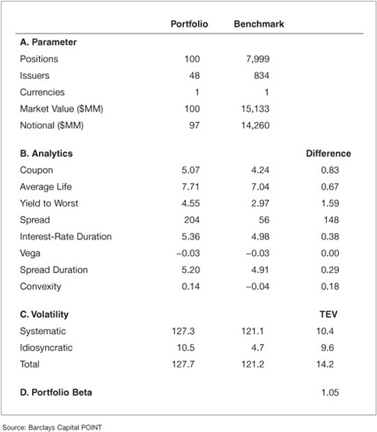
The exhibit also reports that the total volatility of the portfolio (127.7 bp/month) is higher than that of the benchmark (121.2 bp/month). This is not surprising: longer interest-rate duration, higher spread, and less diversification all tend to increase the volatility of a portfolio. Because of its higher volatility, we refer to the portfolio as riskier than the benchmark. Looking into the different components of the portfolio volatility, the exhibit reports that the idiosyncratic volatility of the portfolio is significantly smaller than that of the systematic one (10.5 bp/month versus 127.3 bp/month), which is what we expect from a medium-sized portfolio of investment-grade bonds.
Given the fact that the systematic and idiosyncratic components of risk are independent by construction, we can calculate the total volatility of the portfolio as
![]()
There are two interesting observations regarding this number:
1. The total volatility is smaller than the sum of the volatilities of the two components.
2. The total volatility is very close to the systematic one.
The first observation is the diversification benefit that comes from combining independent sources of risk. The second observation may suggest that the idiosyncratic risk is irrelevant. That is an erroneous and dangerous conclusion, as we will see later. In particular, when managing against a benchmark, the focus should be on the net exposures and risk, not on their absolute counterparts.
In Exhibit 47–6, the total TEV is reported as 14.2 bp/month. This means that the model forecasts the portfolio return to be typically around 14 bp/month higher than or lower than the return of the benchmark. This number is in line with the risk budget of the manager. The exhibit also reports idiosyncratic TEV of 9.6 bp/month, which is close in magnitude to the systematic TEV (10.4). Therefore, when measured against the benchmark, half of the risk is idiosyncratic, contrary to the conclusion one could draw by looking only at the portfolio’s volatility. The TEV of the portfolio is also greater than the difference between the volatilities of the portfolio and benchmark. It would be equal to the difference only if the portfolio and benchmark were perfectly correlated.
Finally, the report shows that the portfolio has a beta of 1.05 to the benchmark. This statistic measures the co-movement between the portfolio and the benchmark. We can read it as follows: the model forecasts that a movement of 100 bp in the benchmark leads to a movement of 105 bp in the portfolio in the same direction. Note that a beta of less than one does not mean that the portfolio is less risky than the benchmark; it just means that the portfolio is less sensitive to movements in the benchmark. To see this more clearly, consider the limit case when the portfolio and benchmark are uncorrelated. The portfolio beta in this case is zero but obviously that does not mean that the portfolio has zero risk. Finally, one can compute many different “betas” for the portfolio or subcomponents of it.7 A simple and widely used one is the “interest-rate duration beta,” given by the ratio of the portfolio interest-rate duration to that of the benchmark. In our case this ratio is 5.36/4.98 = 1.08. This implies that the portfolio has a return from yield-curve movements around 1.08 times larger than that of the benchmark. This beta is larger than the portfolio beta (1.05), meaning that net exposures to other factors (e.g., spreads) “hedge” the portfolio’s net curve risk.
This first summary report (Exhibit 47–6) allows the manager to get a glimpse into the risk of the portfolio. However, the manager wants to know in more detail what the sources of this risk are. Risk can be broken down along various dimensions, two of which we briefly looked at above: security groups (asset classes) and risk factors. The next two summary reports present the detailed risk breakdown along these two dimensions. In the first, risk is partitioned across different groups of risk factors. In the second, the partition is across groups of securities.
Exhibit 47–7 shows four different statistics associated with each set of risk factors. The first two were partly explored in Exhibits 47–4 and Exhibit 47–5.8 The exhibit reports in the first column the isolated TEV, that is, the risk associated with that particular set of risk factors only. We see that in an isolated analysis, the systematic risk and idiosyncratic risk are balanced at 10.4 and 9.6 respectively.
EXHIBIT 47–7
Factor Partition—Risk Analysis
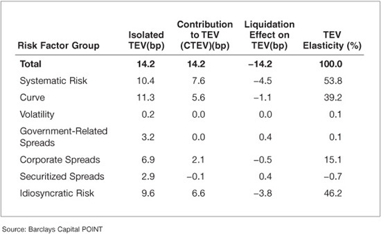
The report also shows the isolated risk associated with the major components of systematic risk. As discussed before, all components of systematic risk have nontrivial isolated risk, but only curve and credit-spreads are relevant when we look into the CTEV. If we look across factors, the major contributors are idiosyncratic risk, curve, and credit-spreads. Other systematic exposures are relatively small.
Another look into the correlation comes when we analyze the liquidation effect reported in Exhibit 47–7. This number represents the change in TEV when we completely hedge that particular group of risk factors. For instance, if we hedge the curve component of the portfolio, the TEV drops by 1.1 bp/month—from 14.1 to 13.0. One may think that the drop is rather small given the magnitude of isolated risk the curve represents. However, if we hedge the curve, we also eliminate the risk reduction effect of the negative correlation between curve and spreads. Therefore, there is a more limited impact when hedging the curve risk than what is expected based on previous numbers. In fact, for this portfolio we see that hedging any particular set of risk factors has a limited effect on the overall risk.
The TEV elasticity reported in the last column gives another perspective into how the TEV changes when risk loadings change. Specifically, it tells the manager what the percentage impact on TEV is if the exposure to that particular set of factors is changed. For example, if the manager reduces the exposure to corporate spreads by 10%, the TEV would decrease by 10% × 15.1% = 1.51% and therefore it would become 14.2 bp × (1 – 1.51%) = 14.0 bp.
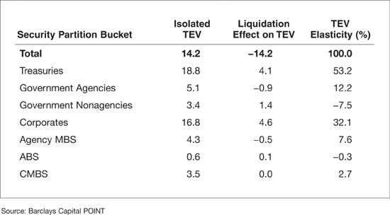
We perform a similar analysis in Exhibit 47–8, but apply it to a security partition. That is, instead of looking at individual sources of risk (e.g., curve) across all securities, we now aggregate all sources of risk within a security and report analytics for different groups of these securities (e.g., subportfolios). Exhibit 47–8 reports results when securities are grouped by asset class. It shows that the majority of risk (7.8 bp/month) comes from the Treasury component of the portfolio. Most of this risk is systematic, which is what we expect given the typically low idiosyncratic risk of the sector and the significant interest-rate duration mismatch. Corporates are also a major contributor to the portfolio’s risk, mostly coming from idiosyncratic risk. This reflects the portfolio’s large net market weight (NMW) to this sector. The lack of systematic risk contribution by the corporate sector comes from the hedging effect of spreads to the overall curve risk in the portfolio. Note that because the analysis is at the portfolio level, the interplay between net curve risk of Treasuries and spread risk of corporates is partly reflected in the total risk attributed to corporates. The same story applies to other spread sectors, all of which contribute little to systematic risk. Both agency MBS and CMBS contribute non-trivially to idiosyncratic risk. Since the portfolio manager’s goal is the replication of a very large benchmark with only 100 positions, the manager has to be comfortable with the issuers selected. This report highlights the significant name risk to which the portfolio is exposed.
EXHIBIT 47–8
Security Partition—Risk Analysis I

Exhibit 47–9 completes the analysis, reporting other important risk statistics about the different asset classes within the portfolio. These statistics mimic the analysis done in terms of risk factor partitions in Exhibit 47–7, so we will not repeat their definitions and focus on the results. Looking at isolated TEV, we see that Corporates have risk of 16.7 bp/month, which is higher than the total risk of the portfolio. This means that the exposures to the other asset classes, on average, hedge the Corporates portfolio. The same can be said about Treasuries. We can even take the analysis a bit further: the next column shows through the liquidation effect that if we eliminate the imbalance the portfolio has on Corporates, we actually would increase the total risk of the portfolio by 4.6 bp/month. In short, we would be eliminating the hedge this asset class provides to the global portfolio, therefore increasing its risk. Because a similar analysis holds for Treasuries, we can conclude that the exposures to Treasuries and Corporates were built to balance each other in the portfolio. Finally, Exhibit 47–9 also reports the TEV elasticity of the different components of the portfolio. This number represents how much a relative change in NMW translates into a relative change on TEV, so we need to read the numbers with an opposite sign if the NMW is negative. In particular, if we decrease the weight of the agency portfolio (making it more negative, or “more short”) by 10%, we would actually increase the TEV by 10% × 12.2 % = 1.22% making it equal to 14.2 bp × (1 + 1.22%) = 14.4 bp. This result shows that the position in agencies provides hedging “on average,” but further increasing the exposure to this sector would actually increase the risk of the portfolio. In other words, the hedging went beyond its optimal value.
EXHIBIT 47–9
Security Partition—Risk Analysis II
This set of summary reports gives us a clear picture of the major sources of risk and how they relate to each other. In what follows, we focus on the more detailed analysis of the individual systematic sources of risk.
Factor Exposure Reports
At the heart of a multifactor risk model is the definition of the set of systematic factors that drive risk across the portfolio. As described in Chapter 46, there are many different types of risk sources a fixed income portfolio is exposed to. In what follows we focus on the three major types: curve, credit, and prepayment risk. To illustrate credit and prepayment risk, we use the Corporates component and the agency MBS component of the portfolio, respectively. Moreover, to keep the example simple, we show only a partial view of all relevant factors for these sources of risk.
Curve Risk Exhibit 47–10 details the risk in the portfolio associated with the U.S. Treasury curve. It starts by describing all risk factors the portfolio or benchmark load on. In particular, we use six key-rate (KR) points on the curve plus the convexity term as the risk factors associated with U.S. Treasury risk. They are described in the first column of panel A in the exhibit and measure the risk associated with moves of that particular point on the curve. Exposure to these risk factors is measured by the key-rate durations (KRD) for each of the six points. The description of the loading is in the exhibit’s second column, while its value for the portfolio, benchmark, and the difference is displayed in the next columns. Key-rate durations are also called partial durations, as they add up to the interest-rate duration of the portfolio. For instance, for the portfolio, the sum of the key-rate durations is 0.13 + 0.47 + 1.74 + 0.93 + 1.00 + 1.09 = 5.36, the total interest-rate duration of the portfolio. Their loadings are constructed by aggregating partial durations across all the securities.
EXHIBIT 47–10
Treasury Curve Risk
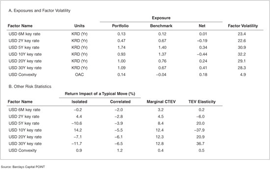
Looking at the exhibit, we see significant mismatches in the duration profiles between the portfolio and its benchmark, namely at the 10-year and 30-year points on the curve. Specifically, we are short 0.44 years at the 10-year point and long 0.41 years at the 30-year point. Moreover, we are also significantly long at the 5-year and 20-year points. How serious is this mismatch? Looking at the factor volatility column, it can be seen that these points on the curve have been fairly volatile at around 30 bp/month. If we interpret this volatility as a typical move, the first two columns of panel B show us the potential impact of such a movement in the return of the portfolio, net of benchmark. For instance, a typical move up (+32.2 bp/month) in the 10-year point of the Treasury curve, when considered in isolation, will deliver a positive net return of +14.2 bp.9 In isolation, the positive impact is expected because we are short that point of the curve. More interesting may be the correlated number on the exhibit. It states the return impact but in a correlated fashion. In the scenario under analysis, a movement in the 10-year point will almost surely involve a movement of the neighboring points on the curve. So contrary to the positive isolated effect documented above, the correlated impact of a change up in the 10-year point is actually negative, at –5.5 bp. This result is in line with the overall positive interest-rate duration exposure the portfolio has: general (correlated) movements up in the curve have a negative impact on the portfolio’s performance.10 As another expression of the high correlation among curve points, we can see that correlated changes on various points on the curve have a similar impact on the final portfolio, even though their associated exposures vary greatly. Finally, and broadly speaking, the ratio of the correlated impact to the factor volatility gives us the model-implied partial empirical interest-rate duration of the portfolio. For instance, if we focus on the 10-year point, we get 5.5/32.2 = 0.17. This smaller empirical interest-rate duration is typical in portfolios with spread exposure. This spread exposure tends to empirically hedge some of the curve exposure, given the negative correlation between these two sources of risk. In addition, Exhibit 47–10 shows the risk associated with convexity. We can see that the portfolio is long convexity while the benchmark is short, so higher order changes in the yield-curve have an opposite impact on the portfolio than on the benchmark.
There are many other statistics of interest one can analyze regarding the Treasury curve risk of the portfolio. The portfolio manager may ask questions such as: If I want to reduce the risk of my portfolio by manipulating my Treasury curve exposure, what could I change? What is the most effective move? By how much would my risk actually change? The statistics reported in columns “Marginal Contribution to TEV” and “TEV Elasticity (%)” of panel B are typically used to answer these questions. Regarding the marginal contributions, the 30-year point has the largest value, showing us that an increase (reduction) of one unit of exposure (in this case one year of duration) to the 30-year point leads to an increase (reduction) of 12.8 bp in the TEV.11 In other words, if we want to reduce risk by manipulating the exposure to the yield-curve, the 30-year point seems to present the fastest track. In addition, the exhibit shows that all Treasury risk factors are associated with positive marginal contributions. This means that an increase in the exposure to any of these factors increases the risk (TEV) of the portfolio. This conclusion holds even for factors for which we have negative exposure (e.g., the 10-year key-rate) because increasing exposure to it means decreasing the negative exposure. To put it differently, the result is a consequence of the portfolio’s overall long interest-rate duration exposure. Adding more duration exposure, regardless of the specific point where the manger does it, will result in an increase in portfolio risk.12 This result holds because we take into consideration the correlations between the different points in the Treasury curve.
Exhibit 47–10 also reports the TEV elasticity of each of the risk factors, a concept introduced earlier. The interpretation is similar to the marginal contribution, but with normalized changes (percentage changes). This normalization makes the numbers more comparable across risk factors of very different nature. It is also useful when considering leveraging the entire portfolio proportionally. In our case, if we increase the exposure to the 10-year key-rate point by 10%, from –0.44 to –0.484 (effectively reducing the long interest-rate duration exposure), the TEV would be reduced by 3.79% (from 14.2 to 13.7 bp/month).
We now turn the analysis to the other component of the curve risk described above: the risk embedded into the portfolio exposure to swap spreads, that is, the differences between the swap and Treasury curves. Many securities trade against the swap curve, making it the natural choice as the base risk curve for those markets. To unify the analysis with markets that use Treasuries as the base curve, we break the swap curve into the Treasury curve (analyzed in Exhibit 47–10) and excess over the Treasury—the swap spread.13
All the securities that typically trade against the swap curve (e.g., corporates and securitized bonds) are exposed, in our methodology, to both Treasury and swap spread (SS) risk. The analysis of the latter follows very closely that of the Treasury curve, so we only highlight the major risk characteristics of the portfolio along this dimension. Exhibit 47–11 shows that in general the exposure to swap spreads is smaller than of the exposure to the Treasury curve. Remember that Treasuries do not load on this set of risk factors, so the market-weighted exposures are consequently smaller. Comparing the swap spread volatilities with those from the Treasury curve (see Exhibit 47–10), we can observe significant differences. Looking at the profile of factor volatilities, one can see that its term structure of volatilities is U-shaped, with the short-end being quite volatile and the 5-year point having the lowest volatility. This is typically the case during periods when liquidity risk is high. Regarding net exposures, the exhibit shows that the largest mismatch is at the 10-year point, where the portfolio is short by 0.35 years. Interestingly, this is not the most expensive mismatch in terms of risk: when looking at the last column, we see that we would be able to change risk the most by manipulating the short end of the exposure to the swap spread curve, namely the 6-month point.

The previous exhibits allow us to understand the portfolio exposures to the different types of curve risk and their impact both on the return and risk of portfolios. They also guide us regarding what changes we can introduce to modify the risk profile of the portfolio. We continue our analysis with sources of risk that are more specific to particular asset classes.
Credit Risk Credit risk may be analyzed along various dimensions such as geography, industry, debt seniority, credit rating, or spread level. As discussed in Chapter 46, a powerful determinant of credit risk of a bond for relatively short horizons is given by its duration times its spread, or DTS. Under this setting, the spread return of the security is given by the product of its DTS and the percentage change in its spread.14
Assuming that the percentage change in spread has similar statistical properties across a group of bonds, we can select this common component as one driver of systematic spread changes, giving rise to the DTS systematic risk factor. Apart from DTS, many other characteristics may explain systematic changes in spreads. Examples would be systematic differences along debt seniority or credit rating. However, these differences are typically well captured by the DTS levels of each security. Therefore, they do not justify risk factors in addition to the DTS. On the other hand, there are bonds with similar DTS that may behave very differently, depending on their geography or industries membership, for instance. This difference is relevant enough to grant the typical use of different risk factors across these dimensions. In the framework under analysis here, this is achieved by introducing several DTS factors, one for each combination of region and industry considered in the risk model.
The results of such an approach to the analysis of the portfolio in our example are displayed in Exhibit 47–12, which shows the typical industry risk factors associated with credit risk. The portfolio has exposure to a single region (U.S.) and has net positions in 27 industries, spanning all three major sectors: industrials (IND), Utilities (UTI), and Financials (FIN). We saw before that the portfolio has significant net exposure to Financials in terms of market weights (3.7%, see Exhibit 47–1). In terms of risk exposure, Exhibit 47–12 shows that the net DTS attached to the Banking industry is 0.6215 clearly the highest across all sectors. However, the marginal contribution to TEV that comes from that industry is comparable to almost all other industries, even with ones that have an almost zero net exposures, such as Brokerage. This observation suggests that all these industries are close substitutes to each other in the context of the current portfolio.
EXHIBIT 47–12
Credit-Spread Risk

Another interesting point is highlighted by the fact that the marginal contribution is negative for all industries, even though some (such as Retail and Healthcare) are significantly over-weighted. The analysis suggests that if we increase the risk exposure to them, the risk would actually decrease. This result is again driven by the strong negative correlation between spreads in these industries and the yield-curve. For example, the exposure in banking is partially hedging out the significant long interest-rate duration position. This kind of analysis is only possible by accounting for the correlations across factors, underscoring the importance of the quality of the correlation estimates used by the model.
Although the risk factors used to measure risk are predetermined in a given factor model, there is flexibility on the way the risk numbers can be aggregated and reported.16 For example, the credit risk model used to generate the risk report presented in Exhibit 47–12 does not use credit ratings as drivers of systematic credit risk. Instead, it uses the DTS concept. However, once generated, the risk numbers can be reported using any portfolio partition.
As an example, Exhibit 47–13 shows the risk breakdown by rating. As reported in this exhibit, the majority of risk is coming from the AAA exposure (11.3 bp/month), the bucket with the biggest mismatch in terms of net weight (–12.1%). This bucket includes Treasury and government-related securities, sectors that are underweighted in the portfolio, leading to significant risk. This is even clearer when we look into the isolated TEV numbers. If the manager had mismatches only on AAA’s, the portfolio risk would be 22.8 bp/month, instead of the actual 14.2: the other exposures hedge the risk from AAA’s. This report also identifies the systematic betas associated with each of the rating sub-portfolios. These betas add up to the portfolio beta, when we use the portfolio weights (not NMW) as weights in the summation. For example, the exhibit allows us to infer that a movement of 10 bp in the benchmark leads to a 12.6 bp return in the AAA sub-component of the portfolio. On the other hand, the beta of 0.22 for the BAA2 component of the portfolio does not signal low volatility for this sub-portfolio. It indicates mainly low correlation with the benchmark, possibly a result of the significant role of idiosyncratic risk for this set of bonds. Systematic betas of zero identify buckets for which the portfolio has (close to) no holdings.
Prepayment Risk Most securitized bonds, such as MBS or asset-backed securities (ABS), have uncertain cash-flows due to the borrower’s option to prepay the bond at any time. Interest rates strongly drive this prepayment behavior, as explained in Chapter 46, thus adding an extra channel of exposure to interest-rate risk that is absent from other bonds (e.g., corporate bonds with no optionality). Typically, interest and prepayment models can accommodate this feature only imperfectly. Moreover, there are other factors influencing prepayment risk. To accommodate these limitations, risk models incorporate other major characteristics that can be associated with prepayment risk. Examples are the program/term of the deal, if the bond is priced at discount or premium (i.e., if the coupon on the bond is bigger than the current mortgage rates) and how seasoned the bond is.
Exhibit 47–14 shows a potential set of risk factors that capture these characteristics. Programs identified as having different prepayment characteristics are the Conventional (FannieMae and FreddieMac) 30-year bonds (the base case used for the analysis), the 15-year Conventional bonds, as well as the Ginnie Mae 30- and 15-year bonds. The age of bonds is captured by factors distinguishing between new and aged (seasoned) deals. Finally, each bond is also classified by the price of the security—discount, current or premium. In this example there are no seasoned discounted bonds, suggesting that the market rates at the time of the analysis are at historical lows. In terms of risk exposures, the exhibit shows that the manager is underweighting 15-year and over-weighting 30-year Conventional bonds (the base case).
EXHIBIT 47–14
Agency MBS (Spread) Prepayment Risk
Interaction between Sources of Risk So far we analyzed the major sources of spread risk: credit and prepayment. To do this, we conveniently used two asset classes—Corporates and Agency MBS, respectively—where one can argue that these sources of risk appear relatively isolated. However, recent developments have made clear that these sources of risk appear simultaneously in other major asset classes, including nonagency MBS, home equity loans, and CMBS.17 When designing a risk model for a particular asset class, one should be able to anticipate the nature of the risks the asset class exhibits currently or may encounter in the future. The design and ability to segregate between different kinds of risk depends also on the multitude of the bond indicatives and analytics available to the researcher. For this last point, it is imperative that the portfolio manager understand the pricing model and assumptions made to generate the analytics typically used as inputs in a risk model. This allows the portfolio manager to fully understand the output of the model, as well as its applicability and shortcomings. Other sources of risk—for example, liquidity risk—may be important for particular fixed income portfolios. They were discussed in Chapter 46.
Issue-Level Reports
The previous analysis focused on the systematic sources of risk. We now turn our attention to the idiosyncratic or name-specific risk embedded in the portfolio. This risk measures the volatility the portfolio has because of events specific to the individual issues/issuers it holds. Therefore, idiosyncratic risk is independent across issuers and diversifies away as the number of issuers in the portfolio increases: events with negative impact for some issuers are canceled by events with positive impact for others. Even for medium-sized portfolios, the idiosyncratic risk may be a substantial component of the total risk. Exhibit 47–7 indicates that the idiosyncratic volatility is 10.5 bp/month, more than double the idiosyncratic volatility of the benchmark (4.7 bp/month). When looking at the tracking error volatility net of benchmark, Exhibit 47–6 shows that the idiosyncratic risk is 9.6 bp/month and close to the systematic component (10.4 bp/month). This means that a major component of the monthly net return is typically driven by events affecting only individual issuers. Therefore, monitoring these individual exposures is of particular importance.
The idiosyncratic risk of each bond is a function of two variables: its net market weight and its idiosyncratic volatility. This latter variable depends on the nature of the bond issuer. For instance, a bond from a distressed firm has much higher idiosyncratic volatility than one from a government-related agency.
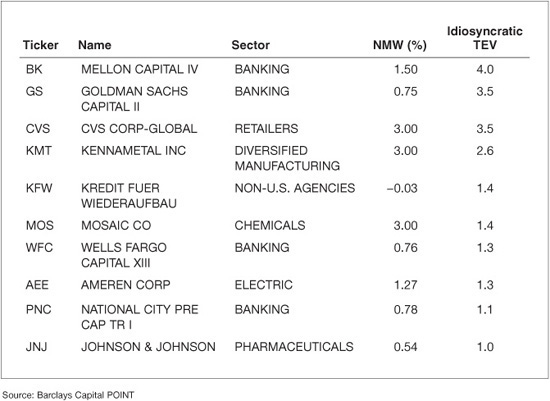
Exhibit 47–15 provides a summary of the idiosyncratic risk for the top 10 positions by market weight in the manager’s portfolio. Not surprisingly, seven out of 10 are Treasury or agency MBS securities, in line with the constitution of the index used as benchmark. Moreover, these positions have significant market weights, given that the portfolio contains only 100 positions. Even though we see large concentrations, the idiosyncratic TEV for these holdings is small, as they are not exposed to significant issuer risk. The last column of the exhibit shows that within this group the bonds with the highest idiosyncratic risk are corporate bonds, one issued by CVS Corporation (CVS) and another issued by Kennametal Inc. (KMT). This is not surprising, as these are the type of securities with larger event risk. Even within corporates, idiosyncratic risk can be quite diverse: in particular, it usually depends on the industry, spread duration, and level of distress of the issuer (usually proxied by rating, or by the spread of the bond). For instance, the net position for both the CVS and KMT bonds is similar (3.06% and 3.00% respectively), and even though their maturity is similar, the CVS bond spread is higher, resulting in higher idiosyncratic risk (3.5 versus 2.6 bp/month). To manage the idiosyncratic risk in the portfolio the portfolio manager should pay close attention to mismatches between the portfolio and benchmark for bonds with large spreads or long spread durations. These would tend to affect disproportionally the idiosyncratic risk of the portfolio.
EXHIBIT 47–15
Issue Specific Risk
Although important, the information in Exhibit 47–15 is not enough to fully assess the idiosyncratic risk embedded in the portfolio. For instance, a portfolio manager could buy credit protection on CVS through a credit default swap (CDS), thereby significantly reducing the exposure to this issuer’s bond. The position reported in this exhibit would still look significant because the CDS protection would not be reflected in it.
A better way is to look at idiosyncratic risk at the issuer rather than at the issue level. While idiosyncratic risk is usually independent across issuers, one may not assume that the idiosyncratic risk of securities of the same issuer is uncorrelated because they are all subject to the same company-specific events. A good risk model should account for such correlation and try to quantify it for different issuer and security types. For example, all types of securities (bonds, equities, convertibles, etc.) of an issuer in financial distress tend to move in a correlated fashion because they all represent claims to the same distressed assets. Adding more securities from such an issuer to a portfolio does not generally deliver additional diversification. On the other hand, securities from issuers in strong financial health can move quite differently from each other, driven primarily by liquidity or capital structure effects rather than credit. In this case, a portfolio manager can achieve some diversification of idiosyncratic risk (although limited) even when adding issues from that same issuer into the portfolio.
In order to understand the net effect of all such interactions, it is useful to review the contributions of individual issuers to the portfolio’s total idiosyncratic risk. When aggregating risk from the issue (as shown in Exhibit 47–15) to the issuer level, the correlations referred to above should be fully taken into account. Exhibit 47–16 shows the results of this exercise for the 10 issuers with the highest isolated idiosyncratic TEV. The riskiest issuer exposure in the portfolio comes from Mellon Capital, with isolated idiosyncratic risk of 4.0 bp/month. Note that no single security from this issuer appears as a top holding in the portfolio (see Exhibit 47–15). This highlights the importance of aggregating idiosyncratic risk at the issuer level. We can also observe that idiosyncratic TEV is not monotonic in the NMW: Mellon Capital and Ameren Corp have similar NMW, but the former is significantly riskier (4.0 versus 1.3 bp/month). It is also possible to have important idiosyncratic risk even for issuers the portfolio does not hold, namely for bonds from issuers that have significant market weight in the benchmark.
Finally, note that because the idiosyncratic risk across issuers is independent, the cumulative risk of several issuers can be easily calculated. For example, the total idiosyncratic risk of the top two issuers in Exhibit 47–16 is given by:
![]()
As is the case in most portfolios tracking a benchmark, most issuers present in the portfolio are over-weighted relative to the benchmark. This is a natural consequence of the fact that, in practice, portfolios hold far fewer positions than the benchmark. It may be difficult for the manager to hold positive views in all issuers selected in the portfolio. In fact, some of these positions may be selected to build exposure to specific systematic factors, such as a particular industry or asset class, and not to a particular issuer. However, it is important that the manager hold positive views for the issuers with the largest contribution to idiosyncratic risk. If this is not the case, then the manager is assuming a significant unintended name risk that should be promptly taken out of the portfolio, in favor of another issuer with similar characteristics for which the manager does have a positive view. This interactive exercise can easily be performed with a good and flexible portfolio construction tool and the help of an optimizer.
EXHIBIT 47–16
Issuer Specific Risk
Scenario Analysis Report
Scenario analysis provides an additional perspective on the portfolio’s risk. This exercise can be performed in several ways. For instance, a manager may want to reprice the whole portfolio under a particular scenario on risk factors, such as interest rates or spreads, and look at the hypothetical return under that scenario. Alternatively, a portfolio manager may wish to evaluate how the portfolio would have performed under particular historical scenarios (e.g., the 1987 equity crash or the Asian crisis in 1997). One particular problem with this approach is the fact that, given the dynamic nature of the securities, the current portfolio with its current characteristics did not exist during such historical episodes. Some of the portfolio securities may have not even been issued during such periods. A solution might be to price the current securities with the market variables at the time. While a valid solution, it is difficult to implement because pricing models require inputs possibly not available during that historical period.
EXHIBIT 47–17
Historical Systematic Simulated Returns (basis points)

An alternative is to represent the current portfolio as the set of loadings to all systematic risk factors in a linear factor risk model. We can then multiply these loadings by the historical realizations of the risk factors. The result is a set of historical systematic simulated returns. Exhibit 47–17 presents monthly returns for the period between December 2003 and December 2010. The dark line represents the absolute portfolio returns and the lighter line represents the portfolio’s return net of the benchmark. Note that this analysis uses only one set of static portfolio loadings. Therefore, these simulated returns can be interpreted as the hypothetical returns a portfolio with these characteristics would have, if submitted to the historical episodes. As expected, the largest volatility was realized during the crisis of 2007–2009, when the portfolio registered returns between –300 and 400 bp. The largest underperformance against the benchmark occurred in November 2007 at about –25 bp, followed by other months during the crisis such as February and September 2008. The largest outperformance (about +30 bp) was registered at the end of 2008, when the portfolio—being long interest-rate duration—benefited from the sharp drop in interest rates registered during that period.
This analysis has some limitations, especially for the portfolio under analysis, where idiosyncratic exposure is a major source of risk. This kind of risk is always hard to capture and obviously less relevant from an historical perspective, as the issuers in the current portfolio may have not witnessed any particular major idiosyncratic event in the past. However, these and other types of historical scenario analyses are important, because they give managers some indication of the magnitude of historical returns the portfolio might have encountered. They are usually the starting point for any scenario analysis. The manager should always complement them with other non-historical scenarios relevant for the particular portfolio under analysis. In particular, the risk model can be used to express such scenarios, as discussed in Chapter 46.
KEY POINTS
• A good risk model provides detailed information about the exposures of a portfolio. Risk analysis starts with weight imbalances in the portfolio, when compared to the benchmark. For fixed income portfolios, the analysis of market weights has to be complemented with other analytics for a better description of the portfolio’s exposure to the different sources of risk.
• The relevance of a risk source is given by the product of its volatility—how risky it is—and the portfolio’s exposure to it. To get an aggregated description of risk, we have to bring into the analysis correlations between the different risk sources the portfolio is exposed to. The combination of these elements results in the overall risk of a portfolio versus a benchmark, or it’s tracking error volatility.
• There are many different ways to analyze the risk of a portfolio. We can do it by type of risk factor (e.g., interest-rate risk) or by type of security (e.g., corporates). Many different metrics—such as contribution to TEV, liquidation effect on TEV or TEV elasticity—can provide further understanding of the overall risk of the portfolio.
• Risk analysis can be significantly enhanced using scenario analysis. There are several methods to perform it. One method is to look at the historical performance of a theoretical portfolio with constant loadings. This analysis allows a manager to study the potential behavior of a portfolio with such characteristics across major historical events.