
Composition
Composition is the arrangement of visual elements within the boundaries of an image, or in this case, a photograph. The word composition means putting together. This translates easily to painting or drawing because artists start with a blank canvas and are free to place various elements wherever they like.
Composition in photography is a little more complicated because it is not usually possible to rearrange nature, an event, or most other types of scenes for that matter. In most cases, the photographer’s task is one of recognition—of seeing what reality presents and determining a pleasing composition. In other words, it is more about recognizing a good composition than forming one from scratch. There are situations, such as in the studio, where photographers have freedom to compose their own version of reality, but for the majority of us, it is a matter of spotting what nature, people, or happenstance presents to us.
We took a brief look at composition in chapter two and now I’d like to flesh out those thoughts. First, though, I want to stress that composition is very much a personal matter. While there are certain rules that are beneficial to know, how those rules are interpreted and at what stage they are applied—if at all—is a matter of individual taste.
I don’t think much about rules. I may think about them when something is not working instinctively, such as when I want to take a shot but the best composition will not show itself, or when I’m editing and can’t find a good crop. Other times, I might think about rules on the rare occasions when a photograph I have taken surprises me in a good way. I may deconstruct the composition to see exactly why that image works better than others, but it is, at best, a hitor-miss process. Really good photographs often go beyond the rules of composition. If composition was purely formulaic taking a perfect photo would be nothing more than a technical exercise, I would not have written this chapter, and you would be reading a math book.
Composition should be dictated by the scene that presents itself in the moment and not by a rule learned from a book. Keep this thought in mind when you read the rest of this section and also when you have your camera in front of you. The process of photography is an active one, so it is advantageous to be thinking about capturing the best image rather than wondering how to squeeze what is in front of the lens into a mathematical formula.
In the following sections, I will discuss some of the rules of composition along with some of the dangers of being hidebound by the rules. Here is a bit of advice that applies to everything you read: read actively. Read a paragraph, then decide whether you agree, disagree, or something in between. The important thing is to know where you stand regarding the point being made. Of course, a second reading or reading a paragraph further may cause you to change your mind, which is fine. When you are reading something with the intention of improving your photography, or just about anything for that matter, become actively involved. Passive reading leads to rehashing the thoughts of others, and will show in your work.
Composition should be dictated by the scene that presents itself in the moment and not by a rule learned from a book.
Rule of Thirds
The rule of thirds is usually the first rule of composition anyone learns. The best way to envision this rule is to imagine a tic-tac-toe grid over the image in question. If the lines of the grid are close to going over major lines in the image, then the composition is more likely to work. This is why, generally speaking, horizons work best when they are roughly a third from the bottom or a third from the top of the image. If the intersections of the grid lines are in roughly the same spot as the focal point of the image, this will also strengthen the composition.
It is worth emphasizing that the application of the rule of thirds needs to be instinctive. When a photographer tries to force a scene to fit the grid on the viewfinder, it can make the image appear contrived and therefore static and lifeless.
Leading Lines
The one thing that the rule of thirds has going for it is that it can be applied to any image, whether the photo is a pictorial landscape, a modernist closeup of a human body part, or a completely abstract and unidentifiable macro shot. This is not the case with the next compositional device, leading lines. A leading line is used to give emphasis to the appearance of depth. Think of a river winding its way through lowlying hills or the center line of a road disappearing into a seemingly infinite desert.
The effect of a line in the image is often enhanced if the line’s path is S-shaped. A leading line is a strong visual element intended to draw the viewer’s eye to a point of interest, or sometimes out of the photo completely.
There is no doubt that a leading line can add interest to a photograph, but it can also be used as a crutch, producing an acceptable photograph without having to really work at it.
There is another, deeper issue at play here. The prescribed use of a line that draws the eye through the depth of the image is based on the assumption that it is desirable for the two-dimensional image to give the impression of three-dimensional space. This thinking relegates all of the two-dimensional art forms, including painting, as being less than their three-dimensional counterparts. Photography’s function, it would seem, is far higher than that of a device for squashing three dimensions into two. Fortunately, as with most things visual, the other two-dimensional arts, such as painting, put this issue to bed more than a hundred years ago.
The Post-Impressionists consciously rejected the idea that depth had to somehow be incorporated into a painting. They deliberately flattened surfaces because they believed this reduction gave the art power and focus. The artist who took this approach the furthest was probably Paul Gauguin, and I recommend studying his work if you would like to gain a clearer sense of composition that goes far beyond what is usually taught to photographers. Although one of his main contributions is the flattening of perspective, his work contains other important lessons. He, along with many Post-Impressionists, believed that the best art combined the real world with our internal one, and this is the territory that some of the best photographers are now beginning to explore.
The flattening of depth caused by a telephoto lens achieves, through optical physics, what Gaugin did with his brush and canvas
Balance
Whereas the rule of thirds and leading lines are easy concepts to grasp, the same cannot always be said for balance; arguably the most important single aspect of composition. Unfortunately, many photographers see balance as being synonymous with symmetry. Nothing could be further from the truth. Symmetry in this context is the mirroring of the left and right sides of the photograph. Such symmetry rarely leads to anything interesting, but is obvious, predictable, and sucks the life out of an image. It may have a superficial appeal, but that’s about it. Balance, however, is about combining different elements to make the image pleasing, but not in a superficial way.
To give a relatively simple example, imagine just two elements are being balanced. This balance can be achieved by juxtaposing these two elements according to contrast, color, shape, texture, and placement as follows:
![]() A small shape that contrasts heavily in tone with the background can balance a much larger shape with less contrast.
A small shape that contrasts heavily in tone with the background can balance a much larger shape with less contrast.
![]() A small area of a bright color can be balanced with a larger area of a more muted hue.
A small area of a bright color can be balanced with a larger area of a more muted hue.
![]() A small complex shape can balance a large simple one.
A small complex shape can balance a large simple one.
![]() A small, highly textured surface can balance a larger, plainer one.
A small, highly textured surface can balance a larger, plainer one.
![]() A smaller object can balance a larger one by being farther away from the center.
A smaller object can balance a larger one by being farther away from the center.
Of course, life and subject matter is rarely this simple. Objects or surfaces will display multiple characteristics, and it is these characteristics that determine the best relative positions. Follow this idea to its conclusion, and it is easy to see that in just about every case you will have to approach this problem by instinct and by trial and error. Balance is the most complex element of composition, and the only real way to gain any control of it is to practice by taking as many photographs as possible, and then learning from the results. Deconstruct the images to see why some work and others fail. If the balance of an image is wrong, it will not work regardless of any other factor. Master the effective application of balance in your images, and you will probably never have to give the formal elements of composition another thought.
A simple composition avoids being boring despite the obvious similarity between the left and right sides of the image. It is the very small differences between the two sides that prevent it from being a static image.
Positive and Negative Space
In most photographs, it is fairly easy to work out the areas of positive and negative space. In the traditional sense, the area inside a major object is positive and the area outside is negative. In a photograph of an apple, for example, anything inside the apple shape is positive space, and anything outside is negative space. It is not always that straightforward, though, especially in photography where there is little or no emphasis on depth. With abstract photography, the positive–negative distinction can become meaningless.
The balance that a good use of positive and negative space brings to an image still has an important place in abstract and contemporary photography. Even if there are no objects, as in an image that deals with a texture on a single surface, there will still be areas of differing tone that form their own shapes. Here, light and dark tones can be treated as elements of positive and negative space and balanced against each other, using exactly the same principle as if the image were of a vase or an apple.
It all comes back to balance. Practice with abstract images is never wasted because it forces the photographer to work out exactly which areas of the image have to be balanced with others. Working traditionally, where the positive and negative areas are easily defined, is okay, but to take it to the next level, the photographer needs to be able to work instinctively, without the clues of inside and outside spaces provided by the real world. This may seem like a difficult concept, but it is well worth spending time on.
Scale
Using scale creatively is a great way to get people to stop and look at your image as opposed to looking at the thousands of others out there. The reason for this is simple; as consumers of images, we have become very blasé due to the sheer volume available. For example, on seeing an image of an apple, the brain matches it to its interior model of a generic apple, thinks “boring,” and tunes it out. To get a viewer’s brain to stay with a photograph, this process of matching up an image with a preexisting template has to be short-circuited. This can be done in a number of ways, including use of unusual angles, dramatic lighting, or placement in an unusual situation, to name just three.
Scale is another way of engaging the viewer and not triggering the “boring” response. Most of us see apples from a distance of 2 to 12 feet, so a good way to hold the viewer is to go into macro mode and get really close. Focus on where the stem joins the apple, or try focusing on a blemish, and work the rest of the image around this. Get in close enough, and nearly any object can be treated compositionally as a landscape. This change in mental approach, from photographing an object to photographing a scene, can really bring an image to life because it shows viewers something familiar in a way they may not have seen before.
Photographs of objects we see or use every day, shot in unexpected ways, may be more satisfying than images of stunning vistas or rare and precious objects, however well those may be executed.
I have found that it is the photographs of objects we see or use every day, shot in unexpected ways, that are more satisfying than images of stunning vistas or rare and precious objects, however well those may be executed. You may be surprised at just how many viewers respond positively to photographs of things that are normally considered banal.
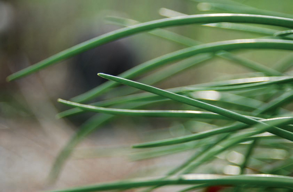
Nature abstracted using macro. The actual area of the closest elements is about an inch wide.

The trick with macro photography is to treat it the same as any other type of photography and not automatically go into shooting a science specimen mode. There are incredible artistic possibilities with macro photography.
A combination of creative use of scale and unusual angles can be very effective. If an object is usually seen from above, try photographing it up close and straight on, or even from underneath (a glass-top table is useful for this). There is a caveat to this, though: The line between a striking image and one that just looks wrong is a fine one. As with most things in life, the best way to find this line is to step over it a few times and then pull yourself back.
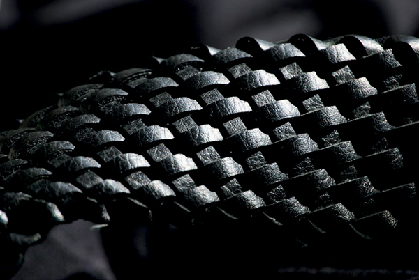
The texture of this belt could be drawn by just using blocks of tone. The lines would appear automatically, as part of the process.
Line, Shape, Tone, and Color
Most discussions about composition start off by discussing line, shape, and tone. This makes sense on the surface, because these elements can be considered the basic building blocks of composition. Elsewhere in this book, I discuss minimalism as a reductive process; we start with lots of elements and then reduce these elements to what is essential (minimalism from nothing to something is not really minimalism, in the true sense of the word). I think the process of learning about composition is also best handled by starting off with the big picture—in this case the concepts addressed in the previous sections of this chapter—and then reducing them to their essence.
You may be familiar with the list of compositional elements—line, shape, tone, and color—and you may be familiar enough with it to sense there is an omission. If this is the case, you are correct. Texture is usually lumped in as a basic element or building block of composition. It shouldn’t be. Texture is a level up from the basic building blocks because it is always composed of those building blocks and therefore cannot be one itself. I am belaboring this point for a reason. The more reductionist you can be in your thinking, the better photographer you will become, regardless of your style or tastes.
The impressionist artist Edouard Manet stated that there are no lines in nature, just areas of color. This is an important and useful concept. If you look at any photograph, you will see that this is indeed the case (obviously tone will have to be substituted for color in the case of a monochrome photograph). Many drawing instructors encourage an approach that does not make use of lines in the traditional sense, but rather encourages the building up of compositions by using blocks of tone. The end result of this approach is often much more impressive than making a line drawing and then shading in the areas.
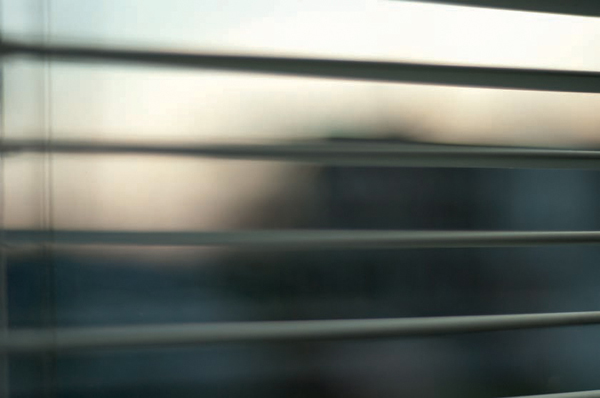
Horizontal lines have a calming effect. The muted colors and soft edges add to this effect.
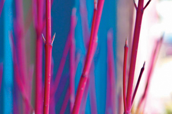
Not clearly defining the subject allows the focus to be on the abstract. Here the vertical lines and the relationship between the two colors is what is important.
Even if you don’t draw, and you don’t intend to learn how to draw, it is worth finding a simple solid such as a cube, lighting it from one side, and drawing it—including the shadow—using both methods, first with lines and then with just blocks of tone. This will help you grasp the idea that all we really see are blocks of tone or color, as opposed to a series of lines that are filled in. More important, perhaps, it will give your subconscious something to work with. Learning always has a subconscious component, and this has to be utilized to fully understand any art form.
Despite this, we know there is a part of composition that we instinctively recognize as a line. As you probably realize by now, a line is where two areas butt up against each other. It has no existence of its own. To illustrate this, look at the cube again. It may seem as if the edge is a line with its own existence, but it isn’t. Light will never be exactly the same on the two faces that abut to form the edge, and it is the resulting difference in tone or color that gives the illusion of a line.
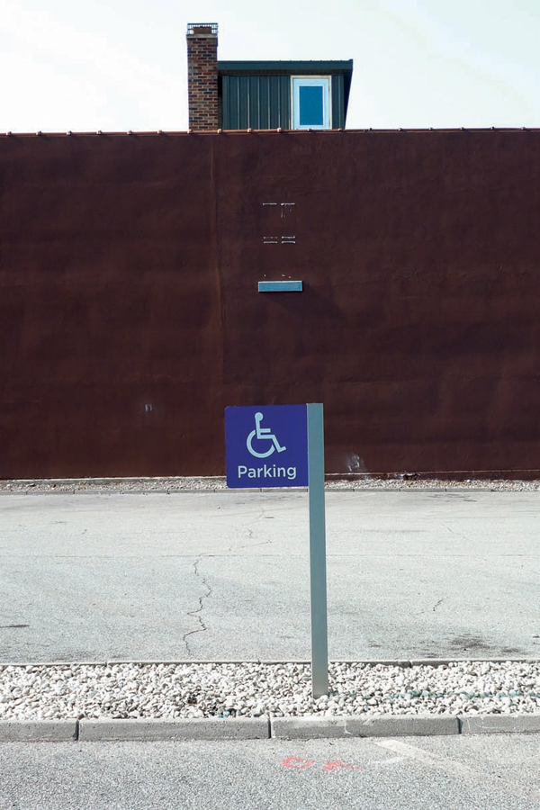
The one possible exception is a line drawn on a flat surface, but very few photographs contain an element like this. In relation to this, a line that has any thickness at all is in fact an area, albeit a skinny one. This may seem contrived, but with logos, writing on signs, or road markings, it is completely valid. Seeing these elements as either lines or areas can really open up your photography.