
Contrast is probably the single most important feature of design that makes things appealing to our eyes. Glancing at the two slides below, both of which say exactly the same thing, to which one do you feel your eyes pulling toward?
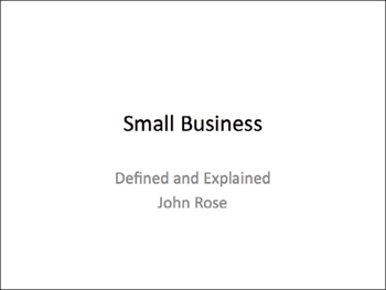
This is PowerPoint’s default slide opener. There’s not much contrast on this page—the text is practically all the same size; the colors are similar; the white page is more important than the black type; it’s all rather wimpy. If you show this as your opening slide, you look wimpy. Tidy, but wimpy.

With a contrast in the size of the type and the strong black/white, your eyes are pulled into this slide. And it gives you, the presenter, a more substantial impact.
You can create contrast in all sorts of ways. One of the easiest is by using a strong typeface. Remember, sometimes people are in the back of a large room, so not only does contrast make the slide stronger, it makes it easier to read. Clarity!
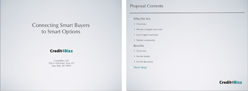
These slides are nice and clean, but they have no impact. In fact, the “Proposal Contents” slide is downright impossible to read. (If it’s small on your computer screen, it’s going to be small in the lecture room as well.)
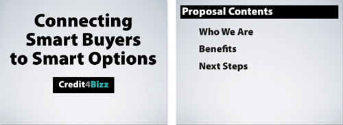
Now we not only see what’s on the screen, but the stronger impact has a subtle effect on me (in the audience) in that I feel more confident in what I see.
Notice the “Proposal Contents” slide no longer has all those tiny bullet points; those points have been expanded into further slides and this one is now just the overview of what’s coming up.
Notice also that the actual bullets are gone. Can the clutter.
Small black text on a big white slide is wimpy; it’s fine in print, but not on a slide. And only people in the first two rows can read it!
I realize the first set of slides below uses the default slide theme in PowerPoint, but you don’t have to use that template. At least enlarge your type size as a simple contrast. And remember, it’s easier to enlarge the text if you have less of it. Edit!
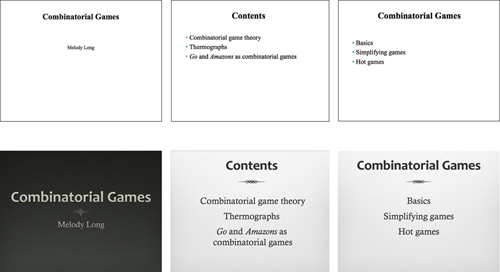
This example uses a template in PowerPoint, but I did have to make the type larger than its default point size. Notice this type isn’t a huge size—it’s simply a more readable size. Contrast doesn’t have to be extreme to be effective.
You can create contrast with the colors on your slides. I’m actually quite surprised by the number of slides I’ve seen that look like the two directly below. Really truly honestly, can you create that slide on your computer and sincerely say that it’s easy to read? Keep in mind that on your monitor, the light comes from behind and glows through the glass straight to your eyes; on a presentation screen, the light reflects off the screen and bounces back to your eyes, so the contrast of colors is even weaker.
Always remember that no matter how great it looks on your computer, it’s not going to be that bright and that clear on a projector screen; it might not even be the same color. This is especially true if you like to present with the lights on.

If you have any doubt at all about your text being difficult to read on a projection screen, change it. “When in doubt, don’t.” (That’s another of the Rules of Life.)
So much about design is really about seeing. Since you are reading this book, I assume you are interested in seeing more clearly—all it takes is a conscious effort. Be aware of what you see. Listen to your eyes.
The problem with the slides above is that there is not enough contrast between the background and the text. And it’s not just the colors, but the busy backgrounds don’t contrast with the wimpy type. If you really want this background, then contrast the type, as shown on the opposite page.

It’s much easier to contrast the type and the background, of course, when there is less text. Edit. Open up those slides. Use as many as you need.

You can carry a piece of that busy background into the other slides as a unifying element, as shown here. This is the principle of repetition, as you’ll see in the next chapter. It lets you use your favorite busy background in a suitable way.
Contrast can provide a solid foundation from which to deliver your talk. Slides that use strong contrast tend to look substantial, and when you are confident in the vigorous foundation of your slides, that can translate to increased confidence for you as you present.
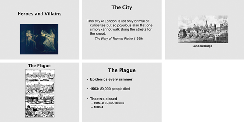
Wimpy. Sorry, but these are just wimpy slides. Why are the images so small? Why is the text so cowardly? Please don’t make me use binoculars!
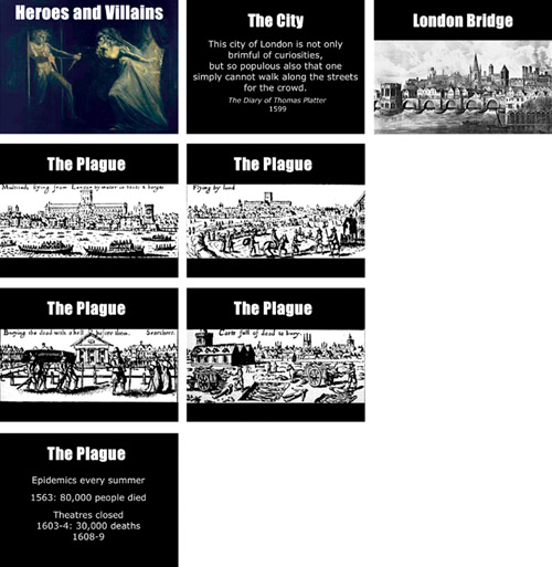
As I often explain, rarely will you use only one of these design principles—you will usually use several of them at once. But you can see where we added contrast here: a hefty typeface, large graphics, and a strong background. Headings are also aligned now (see Chapter 9). Because the plague image was so small, I copied it three times and cropped a different segment from each one, allowing me to enlarge it; as the slides dissolve one into the other, all that appears to change on each slide is the graphic. Now the audience can actually see the graphics.
Contrast between elements creates an organization. The contrast on each slide helps to guide the viewer’s eyes through the information because our eyes are attracted to the oppositions. On most slides, of course, there isn’t a lot of information on each one (well, there shouldn’t be) to worry too much about its organization, but you will run across instances when this will be important and it’s good to know how to manage it.
The hierarchy you set up through contrast can become a repetitive element (see the following chapter) that helps your audience follow along with you.
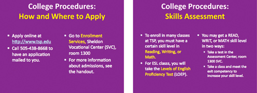
This presenter has a good start with contrast; she’s pulling out important statements with a contrast of color. But she could emphasize it a little more. (And she could edit the text on the slides so there’s not so much on each one.)
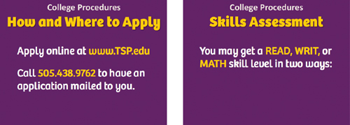
She strengthened the contrast in the headings: “College Procedures” is smaller, the unnecessary colon is gone, and the main heading is larger and bolder to attact our eyes.
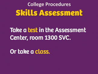
She spread out the text onto more slides (note how “Skills Assessment” has opened up) so the information is large enough to read, then used the gold color for the most important info. The contrast pulls our eyes toward it.
By its very nature, contrast calls attention to itself. You have surely been (or can imagine being) in a place where the way you look is very different from all those around you—even though you may be a very ordinary person amongst your own kind, you stand out in some places by contrast. It’s pretty much the same in a slideshow, so take advantage of that. For instance, perhaps you are going along talking, talking, talking, showing your slides, and there’s something coming up that is so stunning that you really want your audience to sit up and take notice—give it a remarkable contrast.

You can imagine sitting in a darkened room looking at small bugs and then—kapow—the most Magnificent Insect of All appears on the screen, hugely.