
Alignment organizes the various elements on your page and presents a structured and coherent look. It cleans up the page and helps to communicate more clearly.
The concept of alignment calls for conscious decisions about where you place items on the page. Don’t ever stick something on the page in some random spot! Every item needs to be connected to something else on that individual slide, and your collection of slides should have consistent alignments throughout the deck. No more sticking things in empty corners—make sure elements are aligned.
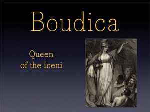
The items on this slide have no connection to each other—each one is just tossed onto the page randomly.
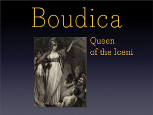
If we just do one thing—align each item with something else—see how the slide is instantly more organized.
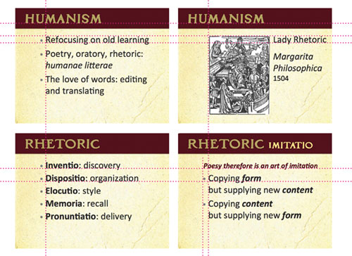
The photo is aligned on the left edge of the heading, with the vertical bar of the B. The smaller text is aligned with the top of the photo and is now flush left so its left edge aligns with the edge of the photo.
Even if you have a lot of text on your slide (not recommended but sometimes you might feel it’s necessary), alignment is the most important tool you have to make all that potential busyness appear calm and collected.
If you take a pencil and draw lines along all the edges of shapes and text boxes, or through the centers of center-aligned text, you see a lot of lines. That’s what’s making it look so messy.
But if we just align the objects, it’s amazing how it cleans up the look. And a clean slide is a more communicative slide.
I changed those small blue boxes to match (repeat) the shape of the bar across the top; getting rid of those fussy corners on the small shapes helps tidy up the slide.
You can see that every item on the page is now aligned with something else.
Yes, the slide still has too much text (which makes it too small to read) but at least it is clean and organized, which helps immensely.
It’s really quite remarkable how this one quick and easy thing can make such a radical difference in your slides.
There isn’t much tying all these slides together; everything is sort of haphazardly placed on the slides.
Now there are several alignments on the individual slides and across the slides. In the middle one, the three lines of type forced the two photos down, but that’s okay because there is still alignment across the headlines and between the two photos. Notice that everything doesn’t have to be lined up (not both top and bottom, for instance); you just need some consistent connections.
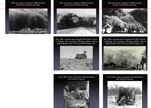
But let’s do one thing more—let’s use more slides. They’re free! These images are terrific and very emotional. With a dissolve transition between slides in each set, the text will appear to stay in the same place and just the photos will change. You create a much greater impact because your audience can actually see the photos.
In a collection of slides, alignment not only makes individual slides cleaner and more organized, it makes your entire presentation cleaner and more organized as you repeat the alignments throughout the deck.
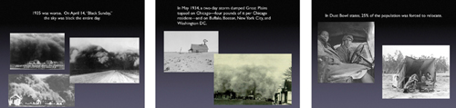
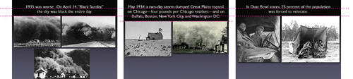
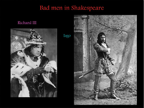
The elements on these slides were thrown on the page with no thought to their placement. The look is chaotic. (The excessive red doesn’t help. And get rid of lengthy and complex web addresses that no one can read or write down; if it’s important, put it in the handout.)
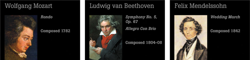
Now there are consistent alignments. You can practically see the invisible line running under all the headlines. The smaller text is aligned flush left, and that strong flush left is aligned against the strong edge of the portraits. The portraits themselves are now all the same size and aligned with each other as the slides progress. (These public domain images were free from Wikimedia Commons at commons.wikimedia.org.)
While we’re looking at these slides, I just want to say something about the current trend of solid black backgrounds: Try something else. Perhaps solid black really is what you need for your presentation, or you like the way your slide bleeds into the background when it’s projected, but at least try other colors. There are lots of rich, dark colors to choose from in this world. Or maybe it doesn’t need to be dark! Lighten up!
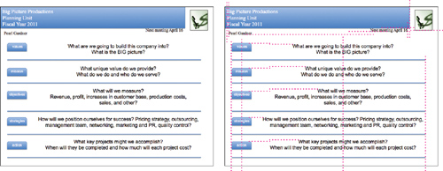
The example below is the same one I showed in the previous chapter where I applied repetition. But alignment is also a big factor in this example (rarely will you use just one of these design principles in any project). You can see that creating guidelines to align items across slides can unify an entire collection.
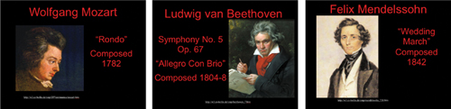
Few of the items are aligned on these individual slides or throughout the collection of slides.
If you draw lines between the items on the individual slides, you see they are now more unified by alignment.
It’s true. You are your slides. If they are sloppy and unclear, it naturally follows (in many minds) that you are sloppy and unclear or that your information is not sound. It’s not a conscious decision on the part of the audience—it just happens. So look smarter and be smarter. Align those objects!
Again, you can see that not one of these five items on the slide has any relationship with any other item. (And the text is rather small.)
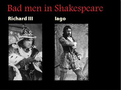
Now you can draw lines between items and see how they are connected. You can also see that I cropped the image of Iago so I could make him larger.
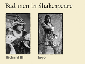
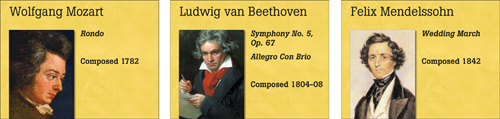
Let’s also see how it looks without a black background. Hmm, seems a little easier to read. (Dark text on a light background is always easier to read.)
images are from commons.WikiMedia.org
Alignment is the single most important guideline to follow to visually organize the material on your slides.

I hope you are starting to see how nothing is aligned or connected to anything else on these slides—it’s all a random hodgepodge.
Personally, I would get rid of this background, but the presenter apparently really likes it. So let’s work with it instead of piling stuff on it willy-nilly; let’s keep items inside the boundaries created by the background.
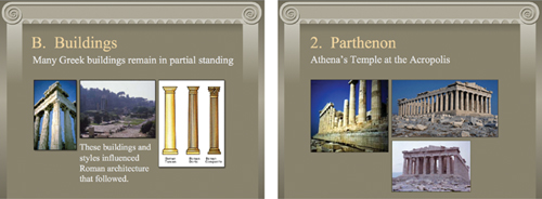
Now everything is aligned with something else. Take a moment to draw the alignments with a pencil, both on the individual slides and across both slides.
I deleted the single bullet graphic on each page. If there’s only one bullet, what’s the point?
I gave all the images the same 1-point border (repetition). (I also reduced the sizes of the images that were too low-res to be displayed so large.)
There is now the same amount of space between the graphics on all slides (repetition and alignment).
When developing your presentation, you’ll probably find that you need to adjust your alignments as you go along in order to keep them consistent across slides. Learn to use your software to set up your own master page that suits your material. If you’re using PowerPoint, it often makes up its own mind about the sizes of fonts and the placement, so I remind you once again to learn your software, learn how to control PowerPoint—don’t let it control you (see Chapter 12 for some tips).
Sometimes you will have a few slides that can’t fit into the alignment you set up, and that’s okay. If you have a strong alignment across the slides, then when you intentionally break out of that alignment it will look intentional instead of random and chaotic. Now, this doesn’t give you license to arbitrarily ignore how you place items on the slide—you must be able to put into words exactly why you decided to break the alignment for that particular slide and why it’s okay.

So you’re going along and all your graphics are neatly fitting into certain spaces you have designated when, lo and behold, you really want to do something different with this one. That’s perfectly great! As long as you’ve got a solid foundation holding your deck together, you can break out of it with glee.