
This chapter encourages you to make sure your presentation is clear and understandable and that viewers can easily assimilate your information. No matter how pretty you make it, all that prettiness is worthless if you aren’t communicating clearly.
Part of communicating clearly is deciding what should be left out. It’s a difficult struggle to edit out information that you think is important. But keep in mind that no one in your audience is going to remember everything you say, and actually, the less you say, the more they will remember. Prioritize the information for this particular audience and delete items that take away from the primary focus. For instance, do the sales reps really need a history of the corporation and its mission statement, or can you get right to the point and show the demo they need? (Give them a link to the corporate overview on the handout or brochure you leave behind.)
The possibilities for a clean, streamlined, visually pleasant presentation are enhanced with good editing. Get rid of those extra words! The fewer words on the slide, the larger the words can be and the more design options you have.
By editing out all the superfluous words (above), the presenter had more room (below) to add contrast, make the type bigger, and provide a clearer message for quick reading and notetaking.
Condensing the information to its essentials also makes it easier for you to present because you can use the slides as quick reference points to keep you on track.
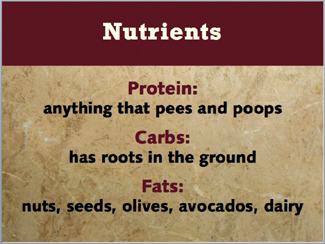
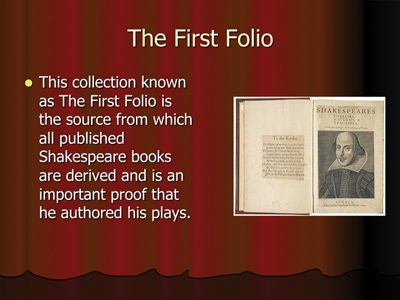
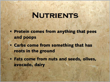
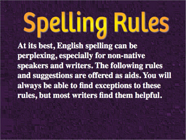
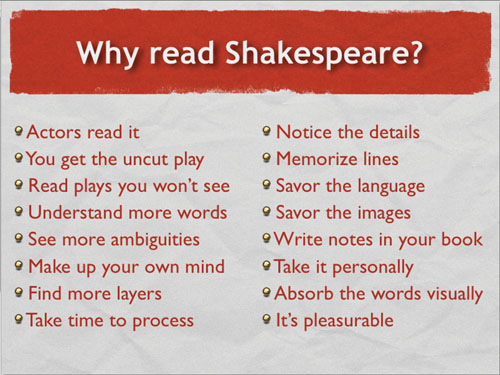
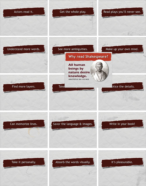
In this example, the instructor has too many words on the page. Most of the words are actually useless because he is going to spend several minutes talking about this object, the First Folio.
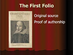
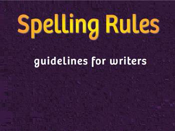
By condensing the key points into a few words, he makes it easier for students to grasp the points and to fill in their notes with more information while still listening to the instructor. And he can enlarge both the graphic (cropped) and the text.
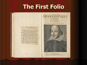
He might consider not using any bullet points at all on the slide, just a visual of the First Folio. The image and its title will stick in the students’ minds much longer than the text with too many unnecessary words.
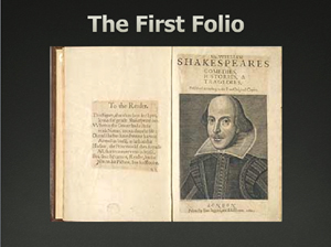
And I would recommend getting rid of that silly background. If you’re going to use an evocative background, make sure you work with it—don’t just plop things on top of it.
You rarely need to write complete sentences, especially if they’re long. You will be speaking in complete sentences, so you want your audience to be able to skim the main points on your slide. If the main points are instantly accessible (if no one has to sludge through a dense sentence), the audience can immediately grasp the ideas on the slide and still have enough brain-processing power left over to listen to you as you elaborate on those points.
Notice in the example below there are no bullets. There are bullet points, but simply eliminating the actual bullets softens the slide.
I also got rid of unnecessary items on the slide. Important web addresses (as on the slide above) should be on your handouts—no one can copy complex addresses properly while listening to you.
With this limited amount of text, you can speak your piece and your audience will pick up these main points more easily.
Below is an example of the kind of presentation that makes people holler, “Don’t read your slides!” The problem is not that the speaker reads her slide—the problem is that she has put her introductory notes right on the slide so she has no choice but to read the slide—it’s her intro.
This style of presentation design is perfectly okay if you plan to post the file and it must stand alone. But if you are presenting it in person, do not put the full text that you plan to say on the page. Otherwise why do you need to show up?
Don’t write on the slide what you plan to speak aloud. Give people a reason to listen to your dynamic self.
This is all you need for an intro slide. You’ll show this slide and speak the text as shown above.
By not reading the slide, it emphasizes you as the authority and center of this presentation. It indicates that you know your stuff and are comfortable speaking and teaching, not just reading.
I realize this little reminder about active voice vs. passive voice is not really a design issue, but it will affect the number of words you put on a slide, which is a design issue. I bring it up right here because generally the active voice takes fewer words and right now we’re in the process of deleting superfluous words for clarity.
You can recognize when a sentence is in passive voice because no one is responsible. It’s like when you’re talking to a group about an issue but don’t want to point fingers.
“The office microwave was blown up by someone” is passive.
“George blew up the microwave” is active.
On a slide, if you see that you explain or give directions passively, make those directions active.
“When a fire is suspected, one can push the Big Red Button” is passive.
“If you suspect a fire, push the Big Red Button” is active.
“If you have the feeling that your life is being threatened, you can often escape by running away” is passive.
“If your life is threatened, run” is active.
Active writing is more dynamic and, more importantly for a slide presentation, it uses fewer words.
The passive voice uses too many words:
With fewer words, you can consider using full-screen graphics. You are going to be expanding on this topic as you speak (that’s why you’re there) so you don’t need all those words on the screen:

Now try even fewer words:
Images are from iStockphoto.com
You can consider not using any text at all, since your attendees will have a visual message in their eyes and your relevant words in their ears (and any necessary tables of data in their handouts; see Chapter 13). It’s very trendy to do that right now—images with no words. But having the key word or phrase plus the image is a perfectly viable option because it brands both the text and the image into the brain and there’s nothing wrong with that. And the phrase on the screen helps you easily refer to items as you talk about them.
Gerunds are those verbs that act as nouns or noun phrases by adding “ing” to them. ’Ings tend to be passive and weak, and it takes more words to use ’ings.
“Do you mind my asking?” as opposed to, “May I ask?”
“There is going to be hell to pay,” as opposed to, “There will be hell to pay.”
“We will be seeing a drop in sales next week,” as opposed to, “Sales will drop next week.”
“You’re going to make my day,” as opposed to “Make my day.”
Check your text and see if you can delete any gerunds and thus make the sentences or phrases more direct, less passive, and use fewer words.
Sometimes, of course, a word ending in ’ing is the best possible word to use, and that’s okay. For instance, you can’t talk about the fishing industry without using the word “fishing.” The “fish industry” just isn’t right.
But get rid of the ’ings that are unnecessary.
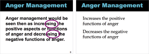
By getting rid of the complete sentence and getting rid of the ’ings, the message is much clearer.
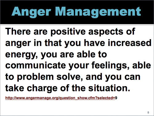
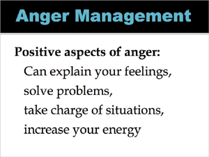
Also, can you see how passive that sentence is? “Anger management would be seen then as . . . .” Good heavens, how wimpy can you get? Stand up and make a statement: “Anger management increases the positive functions of anger.” There.
With fewer words on the slide, the audience can easily listen to you, take notes, and still absorb the important content.
All of the preceding guidelines are designed to shorten your text so you 1) have more design options, 2) don’t bore your audience, 3) provide greater clarity, and 4) allow your audience to focus on you and what you’re saying instead of trying to read a lot of words.
Below are examples of slides that contain too much text. Can you edit them down so they contain the essential information? Keep in mind that the slides should not tell the entire story, they are not expected to stand on their own.
Also keep in mind that as a presenter, you usually have an obligation to provide handouts for your attendees (see Chapter 13 on handouts). Even when you post a presentation online, you can include the speaker notes. Consider what text should be on the screen as opposed to in your talk and in your handouts. Some possible editing solutions are on the following page.
Below are two examples of the editing possibilities, and certainly not the only possibilities. Notice I also made some design decisions along the way to help improve the clarity. We’ll be looking at the design of a slide more carefully in the next section, but right now, can you point out the differences in the looks?

Each of these topics requires the presenter to elaborate. By editing the text, the audience can more clearly see where he is heading and can more easily follow along.
Consider deleting the bullets as well.
This presenter made the common mistake of typing his introduction right on the screen so then he ends up reading it. I eliminated his entire last sentence because that should be another slide altogether, after he gets through his intro.
A good presentation revolves around you, the person, not around your slides. So don’t replace yourself with text on slides; don’t make yourself redundant!
I’m not giving you rules such as, “Never use more than five bullets” or “Never use more than three words per bullet point” or “Never use more than six words per slide.” What I am doing is promoting CLARITY. Sometimes that means you need more text. If you need more text to provide absolute clarity, then use more text.
Quoting someone else provides a good example of the necessity of enough words. Quotes are great—they are succinct, usually clever or we wouldn’t be quoting them, and can add credibility to our own talking points. But how many quotes are six words or less?
And unless you positively know that every person in the entire auditorium has great eyesight (or can even see in the first place), read that quote aloud. You are probably doing that already and maybe feeling guilty because you’re always told not to read your slides aloud, but phooey on that (as I mentioned on page 29, that’s a misinterpreted guideline). Reading the quote aloud does a service to those who can’t see well, plus it reinforces the message when it goes in eyes and ears at the same time, plus you create a connection between you and the clever person you are quoting. And your message will be clearer.

Mr. Eliot understood how difficult it is to write less.
I suppose this slide could say:
More time = shorter letter
but then it would be a data point and we’d miss the human being struggling with this thought.
I’m not sure why presenters so often feel compelled to put all their bullet points on one slide. Slides are free. Six slides or a hundred slides—it costs the same! So spread out your message. You might want to give an overview on one slide, for instance, of the next five points you are going to focus on, but then repeat each focus point on a separate slide so your audience can read the slide and take notes on just that one important point. Remember, the point of your presentation is to communicate information clearly, so present it clearly.

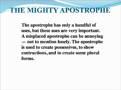
There is too much text and it’s too dense. A student has to struggle through the sentences word by word, and surely the instructor is talking while the student is reading.
First, get rid of Arial/Helvetica. It just reeks of boring (see page 140 if you really want to use it).
(And get rid of the hyphens where they don’t belong—it’s confusing and they’re wrong: “Meter-divide” is not a hyphenated word.)
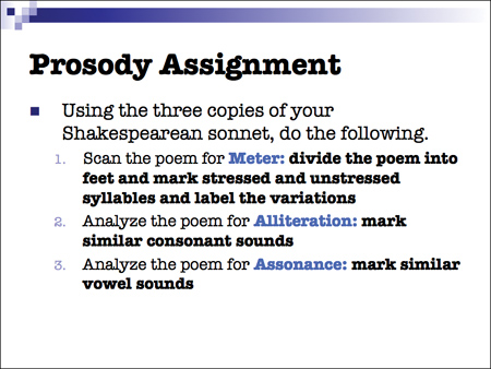
This slide instantly has a nicer look with the new font, and the important points are highlighted in blue. But it’s still too heavy and dense.
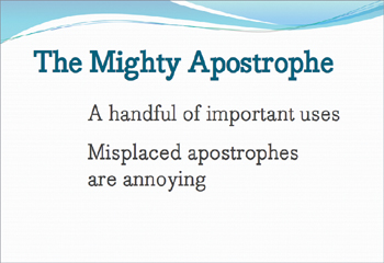
Get rid of the superfluous words. Since you, as instructor, are going to elaborate on each of the three tasks, eliminate unnecessary words from this slide so students instantly see what their three tasks are.
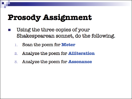
Clarity. Yes. As a student, now I know exactly what to write in my notes and I know exactly what my tasks are.
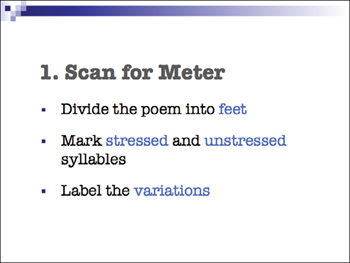
Now each task is explained. I can clearly see what each task entails, and I can write clear notes.
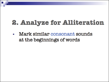
As the instructor proceeds to elaborate and answer questions, I can focus—without struggling to decipher dense text on the screen at the same time.
Here is another example along the same lines—why put all five bullet points on one slide? Your attendees will be trying to write down all five of these as soon as you start talking about the first one. Give them one principle at a time—they can write that one down quickly (or add notes to their handout), then give you their undivided attention. Everyone is happier.
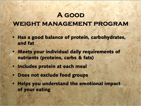
One result of displaying all five bullet points on one slide is that the type has to be so small.
Plus your audience has too much to worry about and will not be able to catch all the information.
You could make your bullet points zoom in from the side one at a time, but why do that when slides are free? Make more slides!
By using more slides, we can make the text larger on each one, focus on each point, and have more room to add contrast to the page in the bargain.
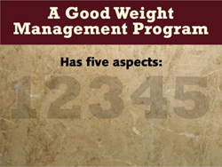
This intro slide leads into the following five slides.
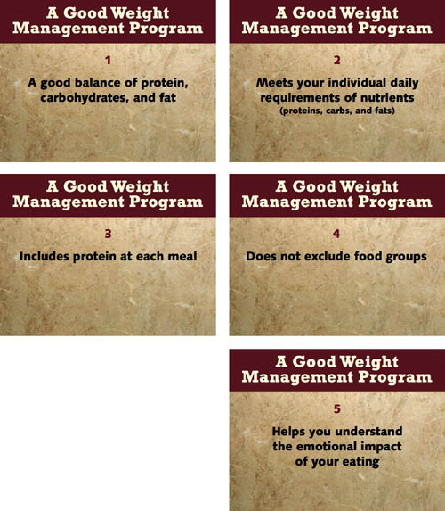
The presenter will elaborate on each of these points. Thus the attendees can add to their notes calmly and clearly.
Notice there are no bullets at all.
Whether you put all your bullet points on one slide (left) or each on individual slides (below), it will take the same amount of time to talk about them. On individual slides, it is easier for your audience to see, follow, understand, and take notes. And it’s easier to look at.
(This is a Keynote template.)
I realize some presentation gurus make up rules about how many slides you should have in a presentation. Let’s say your presentation uses 46 slides and it’s neat and organized and takes just the right amount of time. Someone tells you, “Oh no! A good presentation has no more than 18 slides! It’s a RULE!” So you cram all your information onto 18 slides. It still takes the same amount of time! But now it has a cluttered visual impression and is difficult to comprehend—it lacks clarity.
It’s not the number of slides that makes the difference. It’s your organization and personal presentation of that material that makes the difference.
If you have a lot of slides, be sure to read pages 60–61 about transitions to help your audience follow along with your changes in topics.
Also see pages 70–71 about varying your pace as you go through slides so it’s not a monotonous production.
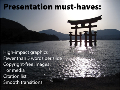
photo by Jim Thomas
Do you see anything odd on this slide?
It insists that there be “fewer than 5 words per slide.” A bit ironic, eh?
I’m also a little confused about the relevance of the photo. Yes, it’s a “high-impact graphic,” but what’s its point in this presentation? One part of my mind is trying to listen to the speaker and another part is trying to make a connection between the words and the image. Don’t confuse me!
Keep in mind I’m not recommending that every little topic be on a separate slide. Of course there are many times when one slide is sufficient for a number of bulleted items (even if you don’t actually use a bullet). Generally, when you have a group of items that you might be skimming over or introducing or talking about as a collection, keep them on one slide.
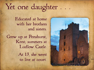
Each of these topics about Mary Sidney’s childhood are closely related and only take a minute for each bullet point, so I left them all on one slide.
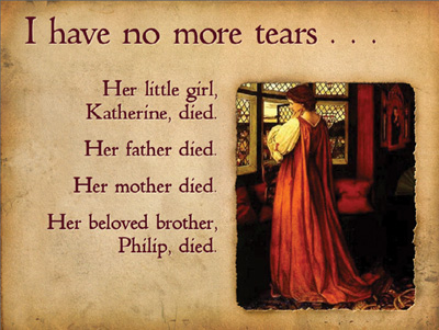
While discussing a tragic time in her life, each bullet slides in from the left as I bring it up. Because they are so related and I want the audience to see the cumulative list of grief, they are all on one slide.
If all of your talking points are about one thing and you won’t be dwelling on specific items, then of course leave your bullets on one page; bring them on one at a time if you prefer. Only expand into more pages if your talk expands on those items.
images from commons.WikiMedia.org
As you develop your presentation, you’ll figure out whether or not to leave all your items on one page or to expand into multiple slides. By grouping some items and expanding others, it will help you to vary the pace of the presentation—some slides go by quickly, some you linger on, some prompt further discussion; it’s like a conversation among friends.
It’s just a fact with presentations that sometimes you do need a lot on the screen. It might be a complex chart, a comparison of diagrams, or an important progression of tasks. Or your presentation might be intended as a stand-alone piece that gets distributed and so you’ll have much more on the screen than if you were giving the talk in person. This is where it is most important to be clear and uncluttered, both in the text and in the design.
And don’t forget that even when a presentation is distributed throughout the office or posted online, there is always a place for speaker notes.
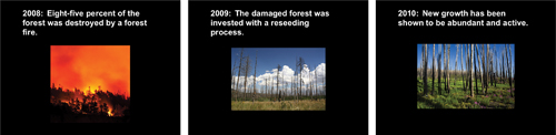
Let’s take a look at a very busy slide and see what we can do to make it clearer.
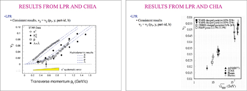
This is the original slide. Look at every object and see if there are any that are unnecessary.
It’s surely safe to remove the dorky clip art from the top corners, yes? And we can make an argument that the slide number in the bottom right can go, and even the footer text since that information is on the first and last slides and in the handout.
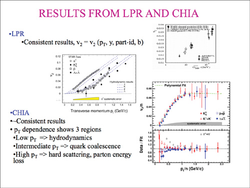
Not much of the other text can be removed, so we’ll have to work with that (see the following page).
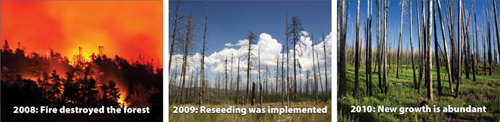
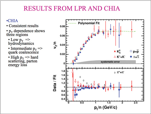
I can’t imagine (although that doesn’t mean it’s not possible) that one could give this presentation or distribute these slides without an accompanying handout or speaker notes. You must admit that in the original slide, no one in the room would be able to read the data on these charts or be able to visually compare their results. So let’s bite the bullet and separate the charts onto individual slides. If you’re giving this presentation live, it’s not difficult to flip back and forth between these three slides to show comparisons, and if they get printed, now the reader can actually see what they’re looking at.
These slides still need some work (particularly alignment), but at least the data is usable now. Slides are free—don’t be afraid to use as many as you need to present the information clearly.
Are you worried that when you print your slides with notes using the default option in your software, too many pages will have to be printed? Then buck up and create an appropriate handout instead of relying on the software to do it for you.
I’m a firm believer that the visual look of the material is as important to clarity as what the material says. In the next section (not the next chapter) I’ll talk about how to design clarity into your slides, but you can’t do that unless you’ve first made sure the information itself is clear and succinct.