
Whether you’re defusing a ticking time bomb, or trying to design a decent-looking site, if you choose the wrong color—you’re doomed. Okay, so the wrong color selection for a client’s site is unlikely to be the death of you, but it could curtail your budding career as a web designer. Choosing colors is no simple matter. There are aesthetic, identity, and usability considerations to take into account. And, to make matters worse, most modern displays can render more than sixteen million colors. That’s a huge number of horrible color combinations just waiting to happen!
Fortunately, there’s no need to be a swatchbook-carrying color consultant to make good color choices. A wealth of knowledge is available, from touchy-feely (as I like to call them) psychological guidelines to tried-and-true color theories that will help you make the right choices with your palette.
Color psychology is a field of study that’s devoted to analyzing the emotional and behavioral effects produced by colors and color combinations. Ecommerce website owners want to know which color will make their website visitors spend more money. Home decorators are after a color that will transform a bedroom into a tranquil Zen retreat. Fast-food restaurant owners are dying to know which color combinations will make you want to super-size your meal. As you can imagine, color psychology is big business.
Although it’s important to know how your color choices might affect the masses, the idea that there’s a single, unified, psychological response to specific colors is spurious. Many of the responses that color psychologists accredit to certain colors are rooted in individual experience. It’s also interesting to note that many cultures have completely different associations with, and interpretations of, colors. With those caveats in mind, let’s explore some general psychological associations that the majority of people in Western cultures have in response to specific colors.
Describing the emotional connections that people can have with colors can be a very hippy-esque topic. If you find that hard to believe, just head over to your favorite online music store and sample some tracks from Colors by Ken Nordine. Although most designers will stop short at relying solely on the supposed meanings, characteristics, and personalities of specific colors, it’s still handy to have an understanding of the emotional attributes of some of the main color groups. It's also important to keep in mind that color associations should be considered in context with their culture.
- Red
-
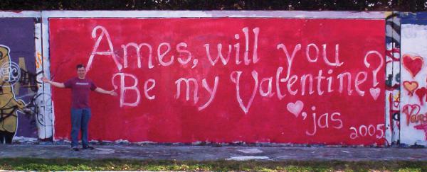
The color red has a reputation for stimulating adrenaline and blood pressure, and is also known to increase human metabolism. It’s an exciting, dramatic, and rich color. Red is also a color of passion. Nothing says love quite like painting a wall bright red on Valentine’s Day for your sweetheart, as seen in Figure 2.1. The darker shades of red, such as burgundy and maroon, have a rich, indulgent feeling about them—the flip side of which is that they have the potential to seem quite hoity-toity. Think about these colors when designing anything for wine enthusiasts or connoisseurs of fine living. The more earthy shades of red are associated with autumn and harvest time.
- Orange
-
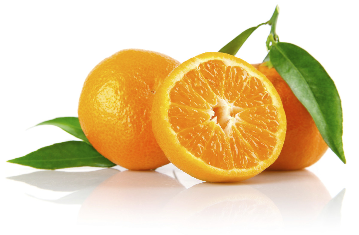
Like red, orange is an active and energetic color, although it doesn’t evoke passion the way that red can. Orange is thought to promote happiness, and represents sunshine, enthusiasm, and creativity. Orange is a more informal and less corporate-feeling color than red, which is perhaps a reason why the designers behind the operating system, Ubuntu, chose it for their logo. Since orange is a relatively rare sight in nature, it tends to jump out at us when we see it. For that reason, it’s often used for objects that require high-visibility, such as life jackets, road cones, and hunting vests. Orange, like red, also stimulates metabolism and appetite, so it’s a great color for promoting food and cooking. That’s probably why the picture of a tangerine in Figure 2.2 is making you hungry, even if you don’t like citrus fruits.
- Yellow
-
Like orange, yellow is an active color, and being highly visible, it’s often used for taxicabs and caution signs. It’s also associated with happiness and, as Figure 2.3 illustrates, is the signature color of smileys. The original orange and lemon-lime flavors of the sports energy drink Gatorade are still the brand’s best-selling products; this is likely due—at least partly—to the energetic characteristics associated with the colors orange and yellow.
An anonymous quote that’s often used with color associations says, “Babies cry more in yellow rooms, husbands and wives fight more in yellow kitchens, and opera singers throw more tantrums in yellow dressing rooms”. Whether this comment is true or not, the point is that too much yellow can be overpowering. Come on—if you were a baby stuck in a dressing room with fighting spouses and tantrum-throwing opera singers, you’d cry too!
- Green
-
Green is most commonly associated with nature. It’s a soothing color that symbolizes growth, freshness, and hope. There’s little doubt why the color has been so closely tied with environmental protection. Visually, green is much easier on the eyes, and far less dynamic, than yellow, orange, or red. Although many website designs using green appeal to visitors’ sense of nature, green is a versatile color that can also represent wealth, stability, and education. When bright green is set against a black background, it really pops—lending the design a technological feel. For me, it brings back memories of my first computer—a trusty old Apple IIe. This was the inspiration for the MailChimp loading screen I designed recently, shown in Figure 2.4.
- Blue
-
When I was a kid, my favorite color was blue. Not just any blue, but cerulean blue from Crayola crayons. While most kids are less particular about the particular shade, blue is often cited as a universally loved color. On the touchy-feely level, blue symbolizes openness, intelligence, and faith, and has been found to have calming effects. On the other hand, blue has also has been found to reduce appetite. This is probably due, in part, to the rarity of blue in real food. Aside from blueberries, how many naturally blue foods can you count? Blue, it would seem, is excluded from nature’s appetite-inducing palette. As such it’s less than ideal for promoting food products.
In addition, blue is sometimes seen as a symbol of bad luck and trouble. This emotional color connection is evident in blues music, as well as in the paintings of Picasso’s depression-induced “blue period”. It’s not all about unnatural food colors and melancholy forms of art, though; blue has universal appeal because of its association with the sky and the sea. For me, the presence of blue in the stacked stones image in Figure 2.5 makes me feel more at ease.
This visual connection makes blue an obvious choice for websites associated with airlines, air conditioning, pool filters, and cruises. Have you ever noticed that blue is the primary color in the logos of IBM, Dell, HP, and Microsoft? That’s because blue also conveys a sense of stability and clarity of purpose… that is, until you’ve experienced the dreaded blue screen of death!
- Purple
-
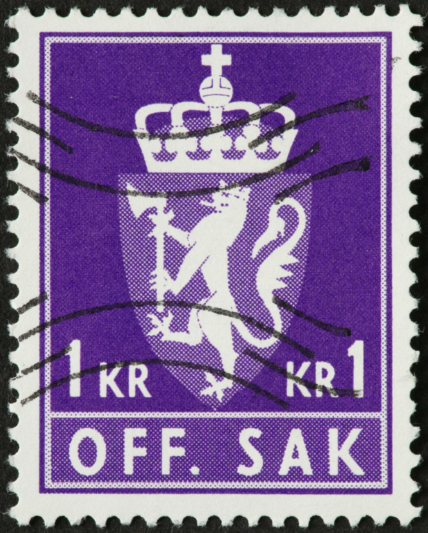
Historically, the color purple has been associated with royalty and power, as it is on the postage stamp in Figure 2.6. The secret behind purple’s prestigious past has to do with the difficulty of producing the dye needed to create purple garments. To this day, purple still evokes wealth and extravagance. That extravagance is carried over into nature. Purple is most often connected with flowers, gemstones, and wine. It balances the stimulation of red and the calming effects of blue. According to Patrick McNeil, author of The Web Designer’s Idea Book,[5] purple is one of the least-used colors in web design. He explains that finding good examples of website designs featuring purple was so hard that he almost had to cut the section from his book. If you’re trying to create a website design that stands out from the crowd, think about using a rich shade of purple.
- White
-
You might think there’s nothing special about the color of the wind turbines in Figure 2.7, but the use of white actually helps promote the idea that this is clean power. In Western cultures, white is considered to be the color of perfection, light, and purity. This is why crisp white sheets are used in detergent commercials, and why a bride wears a white dress on her wedding day. For an idea of how ingrained the meaning of white is in our culture, read the poem Design by Robert Frost.[6]In it, Frost symbolically contradicts our associations by using white to represent death and darkness. Interestingly, in Chinese culture, white is a color traditionally associated with death and mourning. Such cultural distinctions should serve as a reminder to research the color associations of your target audience, as they may vary greatly from your own.
In design, white is often overlooked because it’s the default background color. Don’t be afraid to shake it up, though. Try using a dark background with white text, or put a white background block on an off-white canvas to make it pop. Using colors in unexpected ways can make a bold statement.
- Black
-
Although black often suffers from negative connotations such as death and evil, it can also be a color of power, elegance, and strength, depending on how it’s used. If you’re wondering what the associations are for a particular color, just ask yourself, “What are the first three things that come to mind when I think about it?” For me black conjures mental images of Johnny Cash, tuxedos, and Batman. Cash, in particular, is a powerful emotional trigger, with his black clothes, deep voice and melancholy songs.


If you treat all your color choices this way, establishing three word associations for each, chances are you’ll gain a good idea of how that color is widely perceived among your audience.
Even though color psychology plays a role in the way a visitor may see your site, keep in mind there is no wrong color to use. While psychological reasoning may help to start your palette, the success of a color scheme depends on the harmony that exists between all the colors you choose. To achieve this, we’ll need to be mindful of a few other attributes of color.
One such attribute that exists across the entire spectrum is color temperature. Which color faucet gives you hot water? What color do you associate with ice? Why? The answers are obvious, and are enforced by both culture and nature.
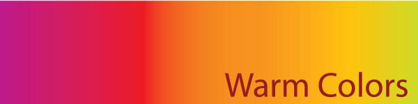
Warm colors are the colors from red to yellow, including orange, pink, brown, and burgundy. Due to their association with the sun and fire, warm colors represent both heat and motion. When placed near a cool color, a warm color will tend to pop out, dominate, and produce the visual emphasis that we talked about in Chapter 1.

Cool colors are the colors from green to blue, and can include some shades of violet. Violet is the intermediary between red and blue, so a cooler violet is, as you'd imagine, one that’s closer to blue, while a reddish violet can feel warm. Cool colors are calming, and can reduce tension. In a design, cool colors tend to recede, making them great for backgrounds and larger elements on a page, since they won’t overpower your content.
The measure of the lightness or darkness of a color is known as its chromatic value. Adding white to a color creates a tint of that color. Likewise, a shade is produced by adding black to a given color. Adding the complementary color will produce a shade that is more lifelike and natural. This method is often used in painting, because it won't be quite as dark. Figure 2.9 illustrates this distinction.

As with colors themselves, the chromatic value of colors you’re using can impact on the psychological connection users will have to the content. One use of chromatic value might be to accent the time of day that customers associate with a company or organization. If you were designing a website that’s all about nightlife or concerts, for instance, you’d probably want to go with dark shades and limit your use of light tints. Tints tend to be associated with daylight, springtime, and childhood. Think: sunrise, baby clothes, and Care Bears. These light pastel colors can be used in professional, sophisticated, grown-up ways, too, as anyone who’s ever spent time in a hospital can attest. This is because tints are soothing colors that provide personality to sterile environments without startling the ill or making babies cry. Color designers are generally uninspired by colors such as “Hospital Green,” but if you’re working on a website for a day spa, tints would be a great foundation for your color palette.
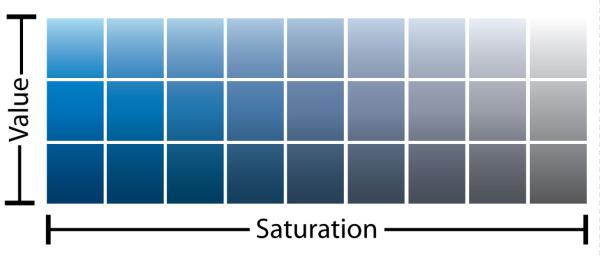
The saturation or intensity of a color is described as the strength or purity of that color. It’s obvious that intense, vivid colors stand out. Even though cool colors tend to recede, a vivid blue will draw more attention to itself than a dull orange. When we add gray (black and white) to a color, it becomes dull and muted. Like an office with beige walls, or an overcast winter morning, these colors are less exciting or appealing than bright, vivid colors. On the bright side—no pun intended—dull colors help to reduce tension, giving compositions a meditative, dreamy mood.
The relationship between value and saturation is illustrated in Figure 2.10.
To take our knowledge of color further, we’ll first need to gain a grounding in some of the more technical concepts associated with the subject, such as how colors are formed and how they can be categorized.
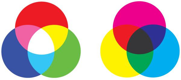
The colors displayed on your computer screen (that is, the colors we’ll be using in our website designs) are based on an additive color model. In an additive color model, colors are displayed in percentages of red, green, and blue (RGB) light. If we turn all three of these colors on full blast, we’ll have white light. If we turn red and green all the way up, but switch off blue, we have yellow.
If you’ve ever owned a color printer, you might be familiar with the acronym CMYK (cyan, magenta, yellow, and black). Your ink-jet printer, laser printer, and industrial four-color printing press all create images using cyan, magenta, yellow, and black inks or toners. This process uses a subtractive color model; by combining colors in this color model, we come close to achieving a grayish black. There’s no way of producing black combining just cyan, magenta, and yellow. This is why they’re always supplemented with black—the K in CMYK. Take a look at Figure 2.11 for a better idea of how additive and subtractive color models work.
Regardless of whether you’re designing for print or the Web, the lessons of traditional color theory are key to helping us classify colors and group them together. Recorded studies of color classification date back to the fourth century BC and the works of Aristotle. Since then, many other great artists and philosophers have contributed to our knowledge of how colors work, including Isaac Newton, Johann Wolfgang von Goethe, and Johannes Itten. The works of these individuals, in the 17th, 18th, and 20th centuries respectively, provide the foundations on which much of our understanding of color lies. All three theorists explained colors in relation to a color wheel, using red, yellow, and blue as the primary colors. The color wheel is a simple but effective diagram developed to present the concepts and terminology of color theory. The traditional artists’ wheel is a circle divided into 12 slices, as Figure 2.12 indicates. Each slice is either a primary color, a secondary color, or a tertiary color.
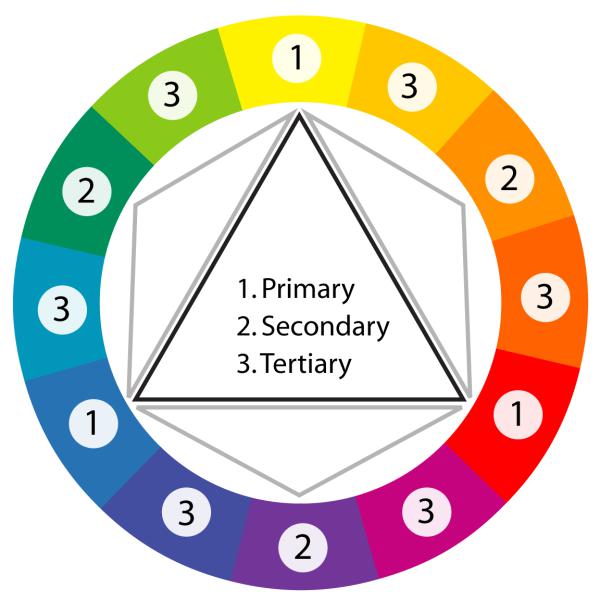
- Primary colors
-
The primary colors of the traditional color wheel are red, yellow, and blue. These hues form an equilateral triangle on the color wheel, and commencing from a primary color, every fourth color represents another primary color.
- Secondary colors
-
By mixing two primary colors, we create secondary colors, indicated here by the small gray triangles. The secondary colors are orange, green, and purple.
- Tertiary colors
-
There’s a total of six tertiary colors: vermilion (red-orange), marigold (yellow-orange), chartreuse (yellow-green), aquamarine (blue-green), violet (blue-purple), and magenta (red-purple). As you might already have guessed, mixing a primary color with an adjacent secondary color forms a tertiary color.
I’m constantly amazed by the lack of respect that exists for the red, yellow, and blue primary color wheel. I’ve heard people call it invalid, archaic, and a kindergarten tool. It’s true that the red, yellow, and blue color wheel is not a scientifically accurate model of the perception of light. Many people want to eliminate the red, yellow, and blue color wheel from art curricula, and establish the CMYK color wheel, shown in Figure 2.13, as the universal color model. Note that the secondary colors in the CMYK color wheel are red, green, and blue, meaning that we could use the CMYK to illustrate both additive (using light) and subtractive (on paper) color.
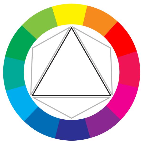
To illustrate the reasoning behind the push to move to CMYK, I’ve used gouache paints, which are basically watercolors that come in a tube. When mixed with water, they are fairly translucent and produce the colors you would expect to see on the modern CMYK color wheel, as Figure 2.14 shows. Magenta and yellow mix to produce nice shades of orangey reds, while cyan and yellow mix to produce green and minty tones. This is how CMYK printing works. The inks are translucent and the overlap between them (along with the use of black) gives us most of the colors we can see on an additive, light-emitting monitor or TV. As the famous TV painting instructor Bob Ross might have said, “That’s a happy little color model.”
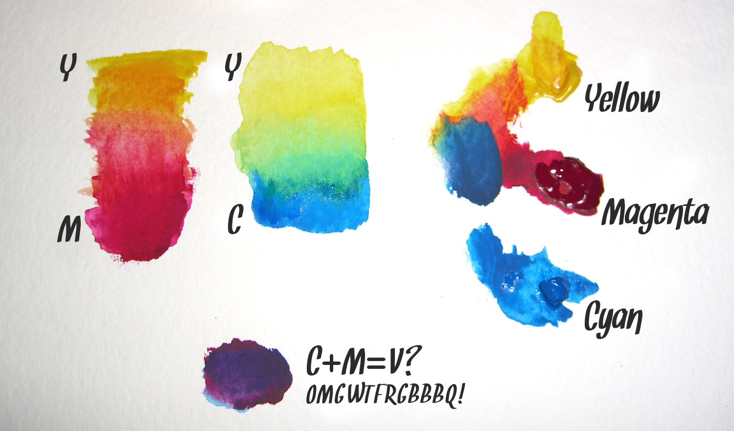
Hang on a minute! What’s that purple splodge? Yes, equal amounts of cyan and magenta form a violet or purple, instead of the pure blue suggested by the CMYK color wheel. In actuality, several anomalies like this crop up when we mix opaque pigments. The problem is that, if your paint is so thick that you’re unable to see the white paper or canvas on which you’re painting, the concept of a CMYK color wheel starts to fail. In this regard, the traditional red, yellow, and blue color wheel developed by Goethe, Itten, and others over the last four centuries or so is a superior model.
But we’re using pixels, not paint! The reason many digital artists still keep a red, yellow, and blue color wheel handy is because the color schemes and concepts of traditional color theory are based on that model. As we’ll see shortly, the relationships between colors are largely determined by their relative positions on the color wheel. But these positions differ depending on the wheel used; for instance, on the traditional color wheel, red and green are opposite one another, but on the CMYK wheel, cyan is opposite red. We can’t simply shift the red and blue around the color wheel and call it a day.
Indeed, there are flaws to be found in both color wheel models; complementary colors are a prime example. But here's the crowning head scratcher—neither color wheel can fully describe the complexities of how we perceive color from light. Even though I design mostly for the Web—a medium that’s displayed in RGB—I still use red, yellow, and blue as the basis for my color selections. I believe that color combinations created using the red, yellow, and blue color wheel are more aesthetically pleasing, and that good design is about aesthetics. For this reason, I’m going to present color theory as I learned it in my sophomore design fundamentals class in college: from the traditional red, yellow, and blue color wheel.
Currently, we know enough about colors to talk about their values, intensities, psychological associations, temperatures, and locations on the traditional color wheel. That’s all well and good, but how do we find multiple colors that work together? This is where color schemes come in handy. Color schemes are the basic formulae for creating harmonious and effective color combinations. Six classic color schemes exist:
-
monochromatic
-
analogous
-
complementary
-
split complementary
-
triadic
-
tetradic (also called double complementary)
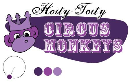
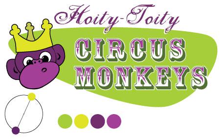
In order to employ any of these classic color schemes, we must start with a color. Consider the subject of the website you’re working on, and choose a base color that suits the site’s purpose. Of course, this choice may be out of your hands. Sometimes, you’ll have to work within a company’s rules, perhaps adhering to seemingly inane and eccentric color guidelines. But let’s assume that the site you’re designing is for a proud family of hoity-toity circus monkeys. These circus monkeys still believe they have a royal lineage, so they have requested that we incorporate a regal purple into the design. Silly monkeys… but you know what they say: “the client is always right.”
When we talked about the value of color earlier, we talked about tints and shades. A monochromatic color scheme—like the one shown in Figure 2.15—consists of a single base color and any number of tints or shades of that color.
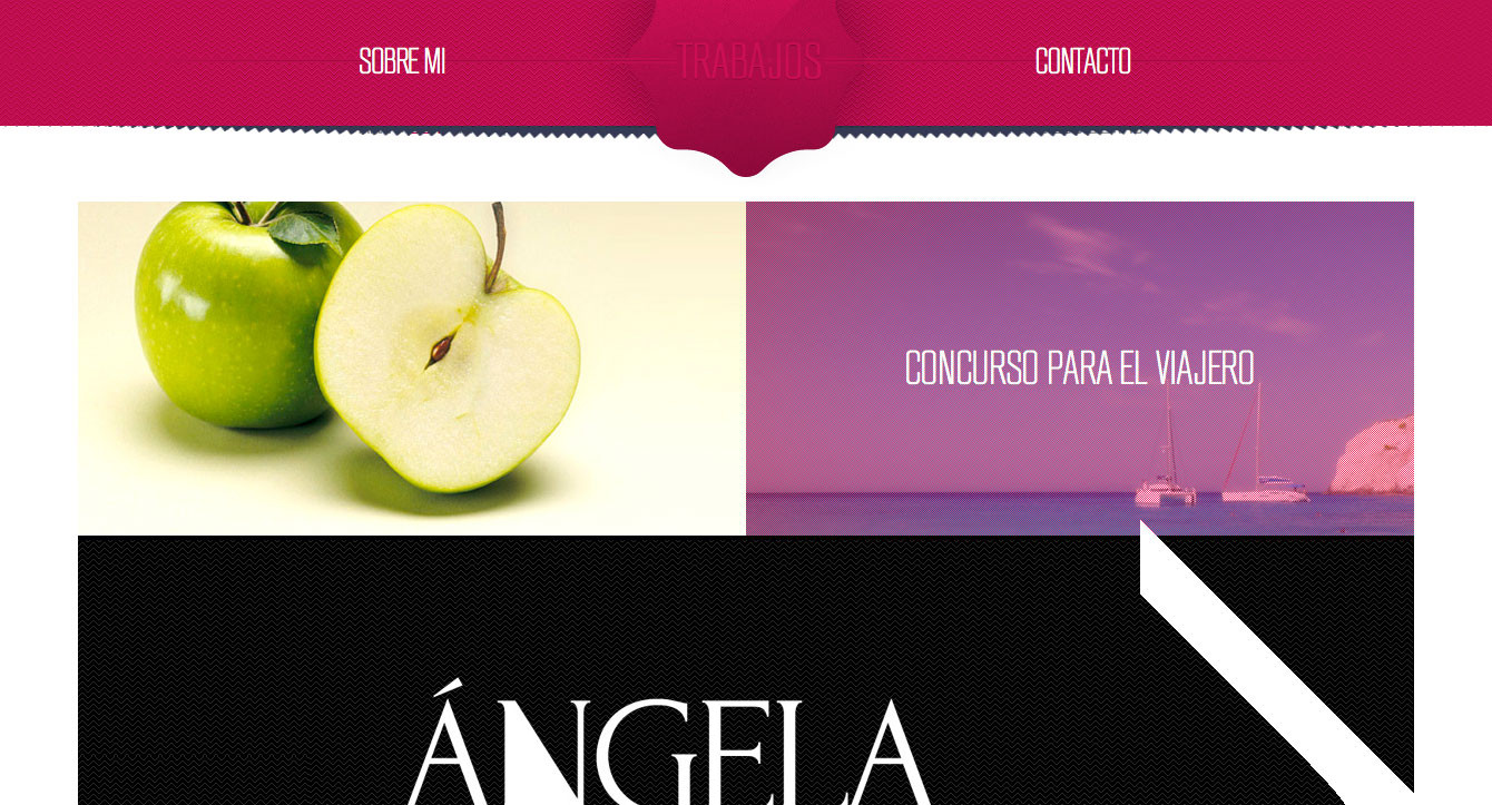
Hot pink is a super-saturated color that packs a powerful punch when paired with black and white. This is obviously what Ruben Sanchez was going for with the monochromatic color scheme you see in Figure 2.16. Each section of this single-page, scrolling site has between a white background and a pink textured overlay on each image. The simple design, combined with subtle textures, creates a strong sense of contrast and emphasis.
Another example of saturated, monochromatic design can be found in the website of issue tracking software, DoneDone. Each page of the site features a different monochromatic color scheme. From orange on one page to purple on another page, as shown in Figure 2.17 each distinct area of the site has subtle background images to break up what would, otherwise, be solid areas of color. It’s these images and shapes that make the site more visually interesting, creating a rich monochromatic color scheme for each page.

Warning: Changing Color Schemes
Many websites use different color schemes for each section of content. This approach can add richness and character to the content, but may also produce some identity issues. If you’re going to use multiple color schemes within a single site, be sure to keep the logo, menu, and overall layout of the site consistent to avoid confusion.
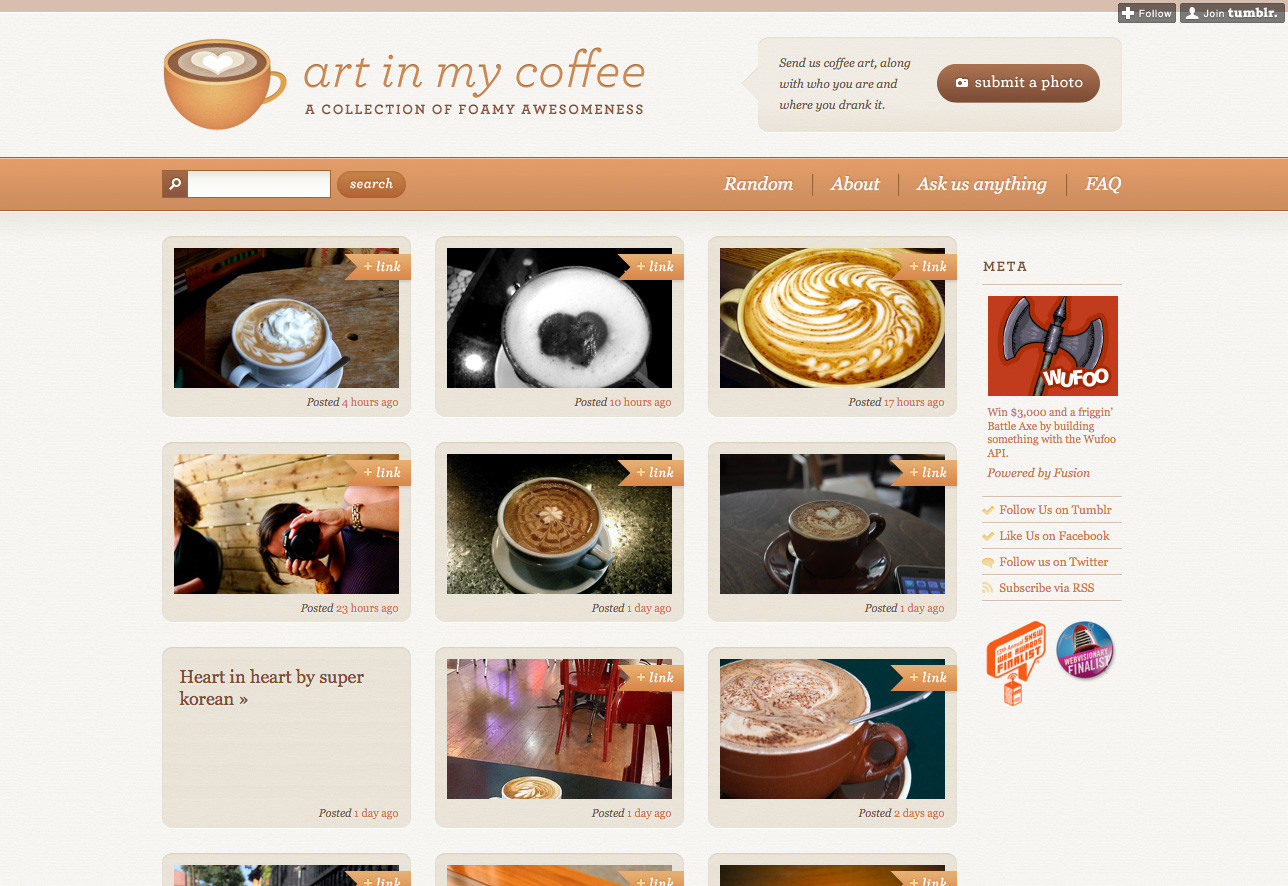
Art in My Coffee is a Tumblr blog created by Jina Bolton and designed by Meagan Fisher, which catalogs latte art from all around the world. It’s no surprise, then, that the site features a monochromatic color scheme based around creamy tints of tasty brown coffee, as you can see in Figure 2.18. If you know that the photos and content of your site will feature lots of the same color, it’s a terrific idea to follow Meagan’s lead and design your color scheme around the content.
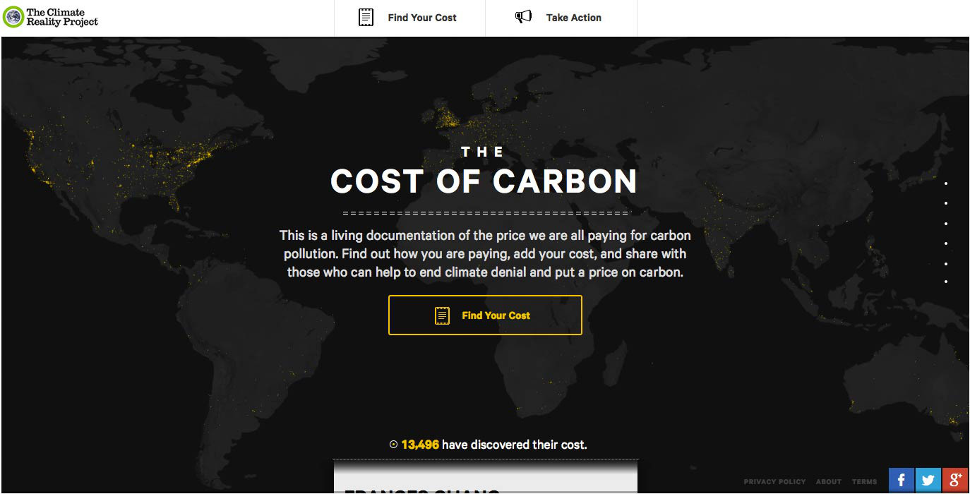
The site for The Climate Reality Project in Figure 2.19 features a special breed of monochromaticism. And, yes, I just made that word up. Any set of colors that consists solely of black, white, and shades of gray is known as an achromatic color scheme. The word achromatic literally means “without color.” Just because the overall scheme of the site has no color, it doesn’t mean the content has to be colorless as well. Because of the dark background, ample use of “white” space, and lack of surrounding color, the vibrant yellow dots pop off the page, giving life and light to the design.
An analogous color scheme consists of colors that are adjacent to one another on the color wheel. If our color wheel were a delicious pie (mmm, pie!), then an analogous color scheme would be a fairly large slice. The key to creating a good analogous scheme is to remember that your eyes are bigger than your appetite. As a rule of thumb, avoid having a slice that’s bigger than one-third of the whole, or you’re bound to make users sick. In the Serial Cut ExtraBold design shown in Figure 2.20, they’ve taken their regal purple and warmed it up with some orange tones.

The playful illustration on the home page for Startup Turkey is a beautiful example of an analogous color scheme. From light yellow, to a rosy red Figure 2.21, has a real look of depth. The positioning of contrasting analogous colors, complete with different shades is the key to creating this gorgeous effect.

Blinksale, shown in Figure 2.22, is a hosted web application that creates, manages, and sends CSS-formatted and plain-text invoices. It’s also an excellent example of what a creative analogous color scheme can do for a business website. It crumples up those preconceived notions of how corporate websites should look, and tosses them into a cool sea of colors ranging from blue-green to yellow. Note how color contrast makes their call to action the first thing you see. The perspective lines of the screenshot on the right also take advantage of continuance, constantly guiding your eyes back toward that sign-up button.

While Blinksale’s home page is designed to dazzle and amaze, the HerbaGurus page (Figure 2.23) gets straight down to business. This is achieved by relying on a solid analogous color scheme of blues and greens. The white search area at the top of the page stands out because it introduces a completely different look from the rest of the site. One might even say it contrasts the blue navigation bar… but what does that mean? Read on to find out.

Complementary color schemes like the one featured in our updated hoity-toity illustration—shown in Figure 2.24—consist of colors that are located opposite each other on the color wheel. Placing red-violet and yellow-green together is uncommon, but the monkeys insisted that I keep some of their royal purple in the picture. Sheesh… these clients are a bunch of primates.
The University of Florida is my wife’s undergraduate alma mater, and the school’s orange and blue team colors provide a strong foundation for a complementary color scheme. Some people may be put off by the stark contrast of complementary color schemes found on its athletics website (seen in Figure 2.25), but when the colors represent the business or entity for which you’re designing, you can’t go wrong.

Pittsburgh’s Sprout Fund Spring Program website in Figure 2.26 proves that complementary color schemes don’t have to be as bold as UF’s orange and blue. By toning down the saturation, this red and green design looks very natural and earthy, helping support the message of biodiversity. The beautiful illustrations and artistic textures really make this design sing.

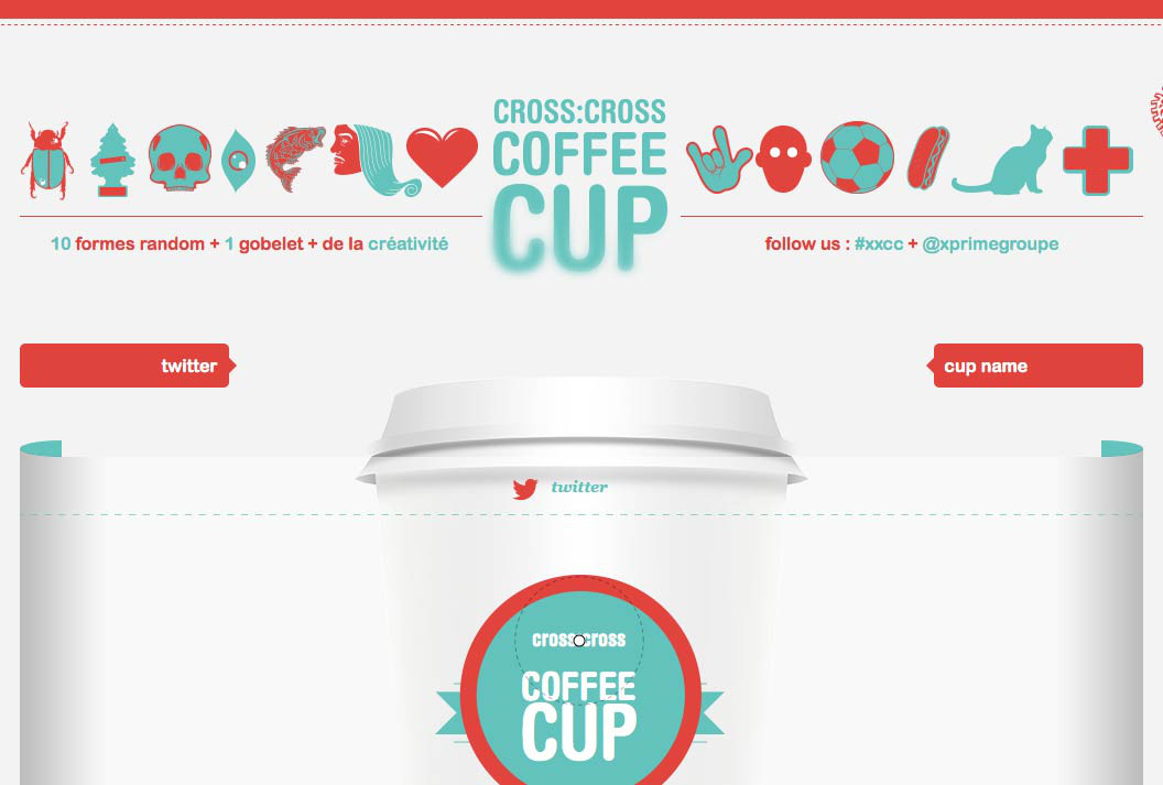
The website for Cross Cross Coffee Cup is a beautiful, textbook example of a complementary color scheme, as you can see in Figure 2.27. It’s impossible to choose complementary colors without pairing cool with warm, and the designers of this site were well aware of that. The city skyline and bright, round sun glow hot against the cool teal water. If you wanted to experiment with this exact color scheme, the secret formula is right there in the overlapping circles of the logo. To this site’s credit, there’s a non-Flash fallback for those of us trying to access it via iPhone or iPad.
Since complementary colors are so different from each other in many ways, they can cause an effect known as simultaneous contrast when placed together: this is when each color makes the other appear more vibrant and dominant. This is actually what makes complementary color schemes so successful at moving visitors’ eyes around a composition. However, it can be horribly painful when complementary colors are used in a foreground–background relationship, as they are in Figure 2.28.

Another common pitfall is to choose colors that aren’t directly opposite one another on the color wheel, yet aren’t close enough to be analogous colors. These combinations are known as discordants because the colors will often clash with one another, causing viewer discord. In fact, 1980s fashion was all about discordant colors. Seeing a discordant color scheme these days tends to bring back fond memories of that geometric “designer series” of Trapper Keeper binders I loved so dearly at school—one’s depicted in Figure 2.29.

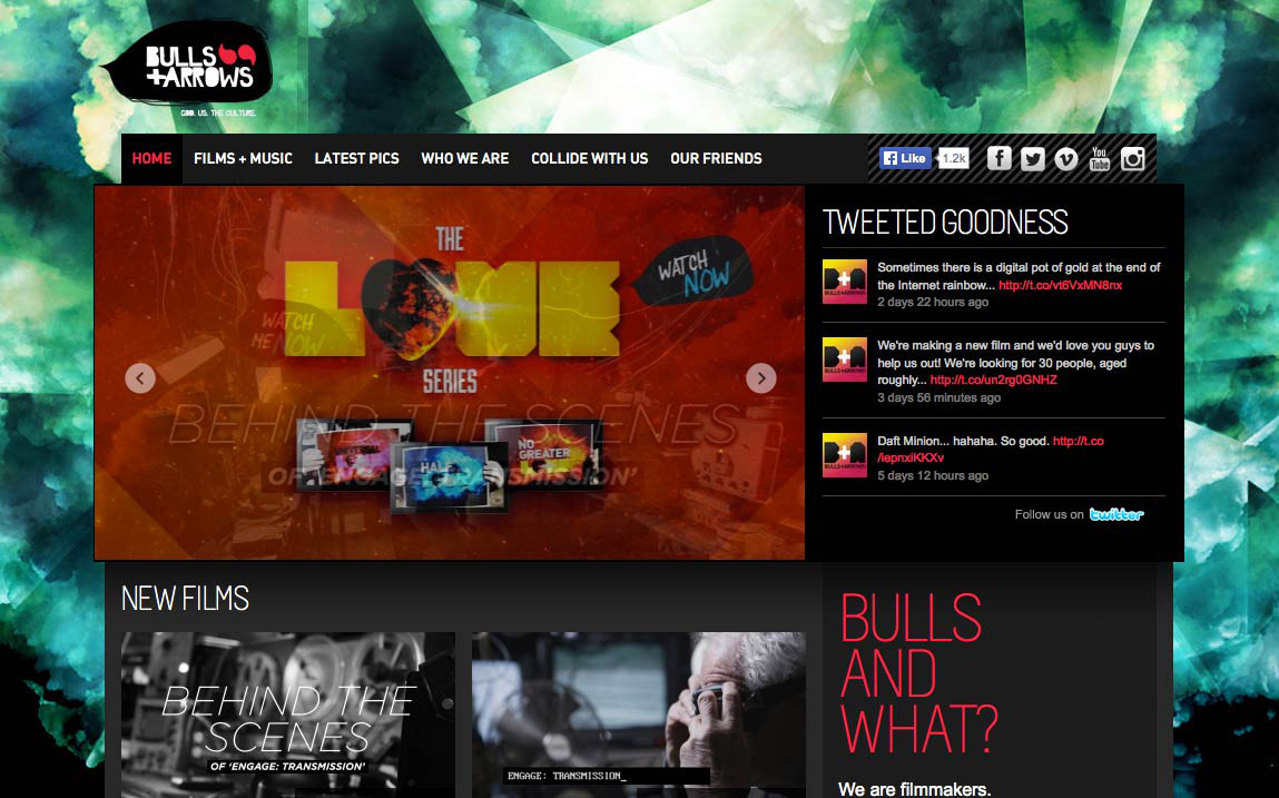
As this example shows, this pitfall can be made workable if it’s used intentionally. Discordant colors are whizzbang combinations that really appeal to children, teens, and tweens, so using them for youth-oriented sites or products is worth considering. They can also be used sparingly in more grown-up designs to create greater emphasis than can be achieved with just a simple complementary combination. For an example of this type of color scheme, check out Bulls+Arrows in Figure 2.30. The site features several randomly loading background images, each with a color scheme of its own. This particular image pairs bright red with a blue-green that’s just far enough from complementary to give this design an edgy look.
Split-complementary, triadic, and tetradic color schemes sound technical, but they’re just simple variations of a basic complementary color scheme.
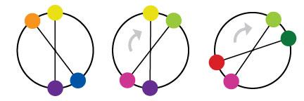
To create a split-complementary color scheme, use the two colors adjacent to your base color’s complement. For example, take the left-most color scheme shown in Figure 2.31. Red is the base color here, so instead of using green to form a complementary scheme, we’ll use the two colors adjacent to green, chartreuse (yellow-green) and aquamarine (blue-green), to form a three-color split-complementary scheme. Note that, since you’re using your base color with two discordant colors, this type of color scheme can look juvenile and extreme, but that may be just the effect you want.

For a triadic color scheme, we just push our split-complements out one more notch on each side, so that all the colors are equally spaced on the color wheel. Starting with red as our base color again, we select yellow rather than chartreuse, and instead of aquamarine, we select blue. This divides the color wheel into thirds, hence the tri prefix in triadic. In this example, which is the left-most scheme in Figure 2.32, we have the three primaries (red, yellow, and blue) making up our color scheme. If you turned the scheme clockwise one notch, you’d have chartreuse (yellow-green), violet (blue-purple), and vermilion (red-orange), as shown in the middle example in Figure 2.32.
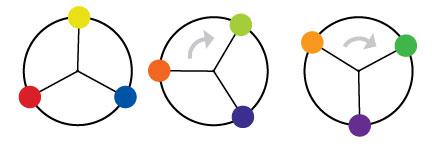
Knowing that triadic color schemes involve three colors, you have probably deduced that a tetradic color scheme involves four colors. Tetradic color schemes combine any complementary color scheme with another complementary color scheme. The left-most example in Figure 2.33 is a tetradic color scheme that combines orange and blue with yellow and purple.
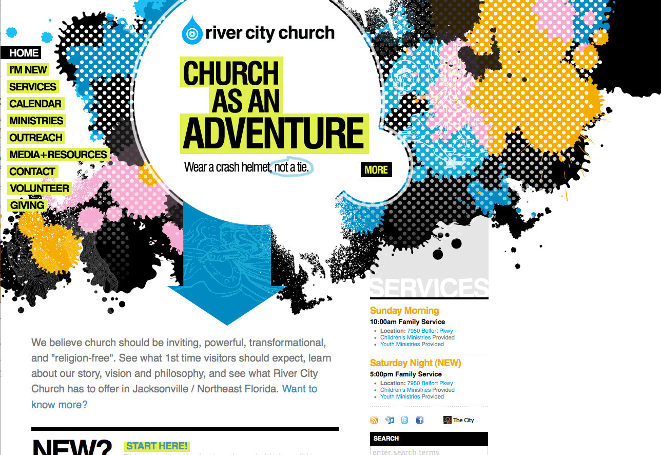
The website for River City Church in Jacksonville, Florida (shown in Figure 2.34) is an excellent example of a tetradic color scheme. Notice that there are exactly four colors in this design besides black and white. We have the complements orange and blue, paired with pink and green. Finding pure examples of the six classic color schemes I’ve described above is a difficult task. That’s because, sometimes, designers make one up from scratch, or because they use a slight variation on one of these themes. In the section called “Other Variants” below, we’ll discuss a few options.
Although most designers are aware of the standard color schemes, the combinations can tend to feel basic and uninspired. However, if you treat the color wheel like a dartboard, and pick whatever colors you land on, you’re likely to come up with some truly awful combinations—trust me, I’ve tried it. Rather than taking that risk, there are other ways to tweak the classic color schemes to create fresh combinations. Once you have a handle on monochromatic, analogous, and complementary color relationships, try experimenting with some of the following:
- Monochromatic with mo’ pop
-
Rather than just using tints and shades of your base color, try incorporating pure gray, black, and white. This will create more contrast, and more “pop” within a monochromatic color scheme.
- Analo-adjust
-
Adjust the saturation of one of the colors in your monochromatic scheme up and adjust the others down. A highly saturated color will stand out when placed among muted colors.
- Mono-split-complement
-
If you have a good thing going with a split-complement color scheme but want to add some depth, try using a few tints and shades of your base color in the design.
Obviously, I just made those names up, but you’ll notice that all three variants are similar to the main traditional schemes. It’s easy to tweak the traditional color schemes a little for more character, but remember that the color scheme you choose is the foundation upon which you’ll build your website’s color palette. And without a firm foundation, the rest of your design could come tumbling down.
“A palette?” you might ask. “Isn’t that the same as a color scheme?” Well, yes and no. A color scheme will only give you two, three, or four colors to work with. Although a limited palette can be beautiful, you’re probably going to need a few more colors to design your website. It’s better to nail down this process while you’re thinking in the language of color, rather than pick ancillary colors at random as you need them for your layout. The number of colors you’ll need will depend on the complexity of your design. I like to start off with at least five or six solid color choices before I even think about applying them to my layout.
Since this is the stage at which we become specific about each color we’re choosing, we’re going to need a standard way to refer to the colors in our palette. You probably already know about hexadecimal RGB color values, but if you don’t, here’s the quick drive-through version of the theory.
The hexadecimal counting system is much like the decimal counting system you’re used to, except that instead of being based on multiples of ten, it’s based on multiples of sixteen, and has six additional digits: A (which is the equivalent of decimal 10), B (11), C (12), D (13), E (14), and F (15). Table 2.1 shows how we count from 1 to 255 in decimal and hexadecimal.
So, what does this have to do with color palettes? Earlier in the chapter, I explained that your monitor uses an additive RGB color model, and that every pixel in the screen is “painted” using a combination of red, green, and blue light. What I didn’t mention was that there are 256 different levels of red light, 256 levels of green light, and 256 levels of blue light; we can use these to create 16,777,216 distinct colors.
Thankfully, we have a way of describing each of these colors quickly and easily—using hexadecimal color codes. A hexadecimal color code specifies the levels of red, green, and blue that go into a given color. For example, combining red, green, and blue at their highest possible values makes white. To use white in a web page, we set its red component to 255 (FF in hexadecimal), its green component to 255 (FF), and its blue component to 255 (FF). We then combine these hexadecimal values in the order red, green, and blue and come up with the code FFFFFF.
Table 2.1. Counting from 1 to 255 in hexadecimal
| Decimal | Hexadecimal | Decimal | Hexadecimal | Decimal | Hexadecimal |
|---|---|---|---|---|---|
| 0 | 00 |
16 | 10 |
32 | 20 |
| 1 | 01 |
17 | 11 |
33 | 21 |
| 2 | 02 |
18 | 12 |
34 | 22 |
| 3 | 03 |
19 | 13 |
35 | 23 |
| 4 | 04 |
20 | 14 |
… | |
| 5 | 05 |
21 | 15 |
245 | F5 |
| 6 | 06 |
22 | 16 |
246 | F6 |
| 7 | 07 |
23 | 17 |
247 | F7 |
| 8 | 08 |
24 | 18 |
248 | F8 |
| 9 | 09 |
25 | 19 |
249 | F9 |
| 10 | 0A |
26 | 1A |
250 | FA |
| 11 | 0B |
27 | 1B |
251 | FB |
| 12 | 0C |
28 | 1C |
252 | FC |
| 13 | 0D |
29 | 1D |
253 | FD |
| 14 | 0E |
30 | 1E |
254 | FE |
| 15 | 0F |
31 | 1F |
255 | FF |
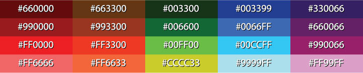
Black, which is made by setting red, green, and blue to zero (00), has the code 000000. Red, which we can create by setting red to FF and leaving green and blue at 00, has the code FF0000. Figure 2.35 shows several standard colors with their hex value. After you’ve seen and used a lot of hex colors, you’ll start to see the colors in the code. #F26382, for instance, is a coral-colored shade of pink and #371324 is the color of a slightly purple red wine. Once you think you’ve reached that Jedi Hex-Master status, head over to http://yizzle.com/whatthehex/ for a little game of “What the Hex?”
Now we all have a basic understanding of how colors are represented as hexadecimal values. The next step is to find out those values for each color with which we want to work. Many resources are available to help you choose colors for your palette, including a ton of stand-alone applications and plugins for both Macs and PCs. Here are a few of my favorites:
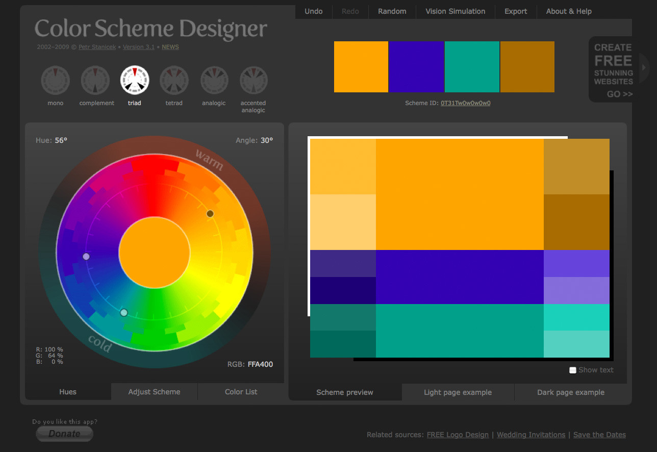
Although there are many online color pickers out there, my favorite is Color Scheme Designer (formerly known as the WellStyled Color Scheme Generator), shown in Figure 2.36. Where many other applications use an RGB or CMYK color wheel, this awesome HTML tool uses the traditional red, yellow, and blue color wheel. With just a few clicks, you can choose and customize a color scheme, as well as identify a variety of other colors from which to build a harmonious palette. Once you have a palette you like, you can use the Vision Simulator to see what those colors look like to people with various levels of color blindness; then you can export your colors as HTML/CSS, XML, text, a Photoshop palette, or a GIMP palette.
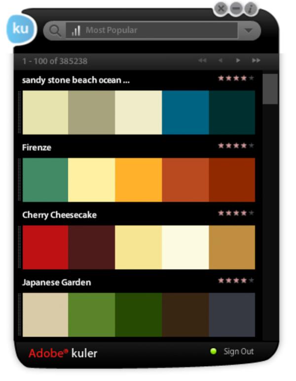
Another excellent color selection resource is Adobe Kuler. On the Kuler website, you can create color combinations based on the standard color scheme configuration similar to the way Color Scheme Designer 3 works. Unlike that site, though, Kuler will also generate a palette from an uploaded image. Another key feature of Kuler is its community. If you create a login for the site, you can save and share your color palettes with other Kuler users, and anyone can browse the most-recent and highest-rated color combinations on the site. Figure 2.37 shows it in action.
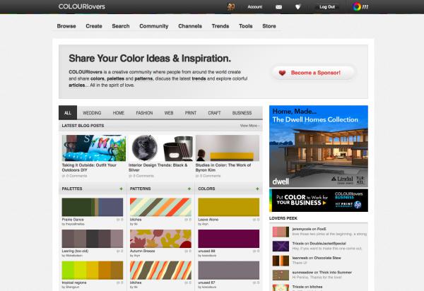
If Kuler provides too limited a community to suit your social needs, the COLOURlovers website, shown in Figure 2.38, certainly will. It’s less of a color generator tool and more of an inspiration-sharing website. It started off with just color schemes, but now you can also share patterns and view color (or colour if you insist) inspirations for a variety of design fields.
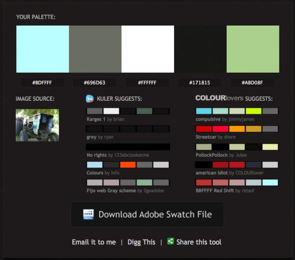
Kuler and COLOURLovers are great tools to meticulously tweak and gain social feedback about color schemes you’re working on, but what if you see some color inspiration on the go? That’s where Pictaculous comes in handy. Pictaculous is a free MailChimp Labs project that provides color schemes based on your pictures via email. You simply take a picture with your smartphone and email it to [email protected]. Within a couple of minutes, you’ll receive an email with a five-color palette, an assortment of suggested color schemes from Kuler and COLOURLovers, and an attached Adobe color palette (.aco) file. There are alternatives to doing it by email, though. Figure 2.39 shows Pictaculous’s color suggestions for a picture that I uploaded to http://pictaculous.com/ from my computer.
When choosing the colors for your palettes, it’s always good to try to pick at least two colors that have enough contrast to be used as background and text colors. Having a proper contrast between text and background colors is essential for interactive design; without it, some people may be unable to read your site. An easy way to confirm that there’s enough contrast between two colors is to plug the RGB values for your foreground and background into Jonathan Snook’s Colour Contrast Check website.
Sometimes combinations that you think would be valid fail to meet the color difference and brightness requirements of the Web. As Jonathan says in his blog post about the contrast checker, “… this tool shouldn’t be taken as gospel… but rather should help guide you towards better colour choices”.
Being able to come up with a unique color palette is all about keeping your eyes open. If you see a website, advertisement, illustration, or other graphic that stands out, try to figure out what the dominant colors are, and what type of color scheme underlies the palette. Remember, though, that color inspiration can come from anywhere. Is there a color that reminds you of a certain song? How about the colors of your favorite meal? Maybe there’s even a color in that tacky seventies wallpaper in your parents’ house that would work well for you. Being aware of the kinds of issues associated with color usage will give you an eye for color and an ability to come up with original palettes that fulfill the requirements of your client.
Knoxville Reflexology Group's old site, shown in Figure 2.40, seemed very feminine in nature. KRG's services applied to men and women, and it was feared that the lavender color scheme didn't appeal to both sexes. KRG needed to appeal to both men and women, which meant that the entire color scheme needed to be reworked.
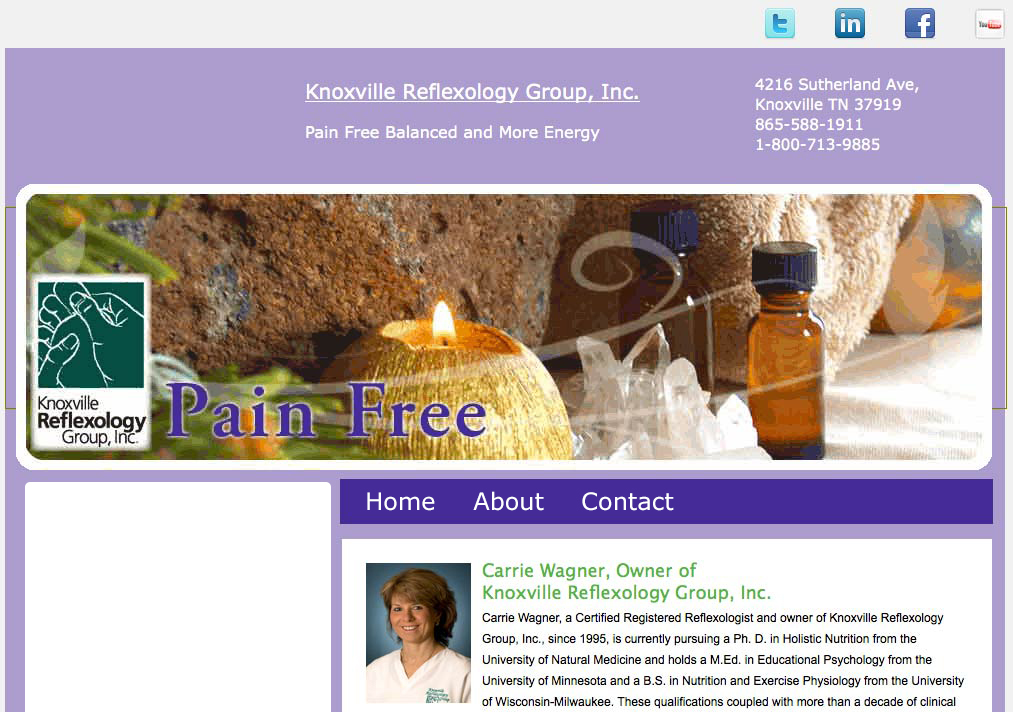
Looking back at the old version of the site, it really had no direction or branding. The goal was to develop the site into a place for visitors to go, not only to find out information, but to buy products, book appointments, and learn about the different services that the company provides. It would also be a promotional resource for their business, through articles, list building, and strong branding.
Once the purpose was established a direction needed to be taken with the overall branding of the site. They had developed a somewhat professional logo, but it was just plastered on the old site, and the branding wasn’t carried throughout.
I put together a mood board that illustrates the different types of things associated with this type of industry, shown in Figure 2.41. These images are thoughts, textures, and inspiration that may be used to gauge the taste of your client. Carrie loved the color of the logo, but wanted it refined and also wanted the site to carry this color throughout the design.

As you look through the elements of the image above, you’ll notice that there is a wide variety of colors, textures, and typography.
I presented the mood board to her to find out the types of images and styles that she liked, and we moved forward from there. I used the logo, as well as colors taken from the images that I presented to her to create the color scheme for the site.
The color scheme I presented is shown in Figure 2.42. Carrie was pleased with it, because she wanted rich, organic appeal, while avoiding the stereotypical feminine colors that you would expect from a business that deals with massage therapy. She was adamant that men used her products and services, too. It was important that the focus was on natural remedies, life, relaxation and pain relief. Blues and greens convey a sense of calm and life. Blues also give the sense of cleanliness and refreshment.

The overall color scheme was analogous, except for the dark brown, which was important for balancing out the brighter blue. Carrie loved the color scheme, because it was organic, rich, and smooth. The cool colors gave a sense of relief and calm, which is what most of her clients are looking for. The colors weren't masculine or feminine, but would appeal to both, and would work well with the types of products she promoted.
It was essential that the site look highly professional and trustworthy, while still being inviting. The signature blue/green needed to be closely converted to RGB for the website. It was to be carried out across the site in strategic locations, such as the navigation menu and the call-to-action section. Colors that worked well with green, but didn't compete with it were to be used to create a sense of hierarchy within the content.
With the color choices made, it's time to consider adding depth to the site. Even though flat design is a currently in vogue, there are other options to consider. The right texture can add a lot to a design, but it has to fit with the concept and overall direction of the site. This is what we'll discuss in the next chapter.