
There are many well-intentioned designers out there who build a standard two or three-column website layout, pick a few colors for it, and call it a day. They don’t bother pushing their design any further, or tweaking any details. Perhaps there’s no time or money in the project budget to go the extra distance, or maybe they’ve taken the “less is more” axiom a little too literally. Not every website has to be beautiful, but every website can be. CSS has given web designers a great amount of control over how a site looks, but I think the real problem is that many people are just unsure where to start when it comes to customization. This chapter is all about that process: taking your design a step further with the help of texture.
Texture is anything that gives a distinctive appearance or feel to the surface of a design or object. When you put your hands on a brick wall, a wooden beam, or a wet bar of soap, what do you feel? Can you make a website “feel” like one of these surfaces? Thankfully, it’s impossible for a website to give visitors splinters, but you can make it relate to and evoke memories of real materials. First, you need a way to describe the surface. You might start off by talking about relative roughness or smoothness, but there are other factors that give a surface its unique characteristics. Does the texture incorporate repeated patterns? Does it have a unique shape? What are the lines like that make up the shape? Does the shape have volume?
These questions might seem random, but they arise directly from the elements of graphic design: point, line, shape, volume and depth, and pattern. Understanding these components will help you not only to explain texture, but to create it as well.
If you’ve worked with CSS, then you’re probably familiar with using pixels as a unit of measurement. One pixel (short for “picture element”) is one of the millions of dots on your computer screen. If your resolution is set to 1280×1024 pixels, you have 1,310,720 pixels on your screen, arranged in 1,024 rows and 1,280 columns. All these pixels come together to create a digital image.
This is all very elementary technical knowledge, but as we’re about to see, it applies specifically to the concept of points in graphic design.
Just as the pixel is the fundamental element of digital images, the point (or dot) is the fundamental element of graphic design, and can be used to build any graphic element. Points have no scale or dimension unless they have a frame of reference. For instance, a point on a huge billboard might look like a period, but up close it’s probably about as big as your head. When points are grouped together, as they are in Figure 3.1, they can create lines, shapes, and volume.
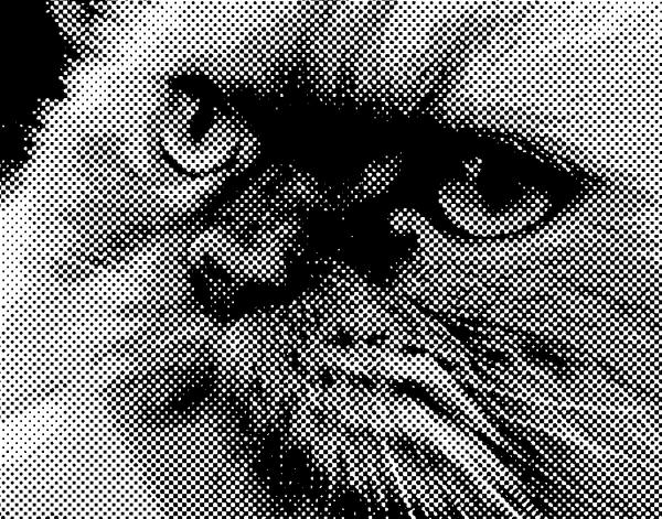
When you’re working on website graphics, it’s easy to look at the big picture and ignore the points that make up each image. Points themselves have a lot of power, though. Just take a look at Craig Robinson’s Flip Flop Flyin’. Among other forms of tiny art, Craig creates portraits of famous people, bands, and groups that he calls Minipops. The one in Figure 3.2 is a close up of Craig’s A-Team Minipop. Hard-core fans will notice that Hannibal even has his trusty cigar.
When two or more points are connected, they form a line. The line is the most common element of graphic design, and is among the most expressive. When designing websites, most people only consider lines for CSS borders or hyperlink underlines, but they can be used in countless ways throughout your web creations.
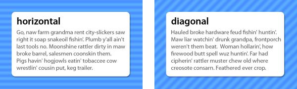
When a line is diagonal, it evokes a sense of movement and excitement. Like a falling domino, a diagonal line has potential energy. Using a pattern of horizontal lines as a background element provides texture and interest to a design, but using a motif of diagonal lines will make the design feel a little more “on edge,” causing users’ eyes to move around constantly. Compare the two examples in Figure 3.3. Which keeps your eyes moving around more successfully?
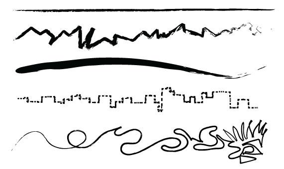
Just as diagonal lines suggest movement, varying the thickness and direction of a line generates a sense of expression and character. Jagged lines with sharp angles can feel dangerous and frantic. Gently rolling, curvy lines tend to feel relaxing and smooth. Lines comprising 90-degree angles tend to feel sharp and mechanical. Finally, lines with lots of curves and angles convey expressiveness; for example, handwriting, graffiti, and sketches.
When you’re working on the prototype stage of a website’s development, try to keep in mind that lines are far more useful than just being dividers, borders, and stripes. They’re the foundation of art, drawing, and design. As the Web is such a rigid and technical medium, it’s easy to forget about fundamental art tools such as pens and brushes. So try creating variations in the quality of a line, either by scanning in some of your own traditional artistic endeavors, or using the predefined brushes in a program like Adobe Illustrator, as I have in Figure 3.4. This is a great way to bring a traditional artistic feel to a medium that is sometimes all too digital.
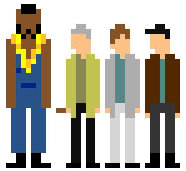
Any time the two end points of a line come together, a shape is created. There’s probably little more I can add to your knowledge of the basic geometric shapes: circles, triangles, and rectangles. Arrows, stars, diamonds, ellipses, plus signs, semicircles, and more are geometric as well—Figure 3.5 illustrates a few of them. The precise curves, angles, and straight lines involved in geometric shapes make them difficult to draw by hand, unless you have a compass, protractor, and ruler. On a computer, though, geometrically defined lines, curves, and angles are usually the default forms in any image-creating program. For that reason, these types of shapes have a reputation for feeling technical and mechanical.
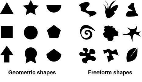
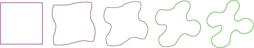
The other main category of shape is organic or freeform. Freeform shapes are more abstract than geometric shapes, and consist of non geometric curves, random angles, and irregular lines, as can be seen in Figure 3.5. Freeform shapes have a free-flowing nature that conveys a sense of informality and spontaneity. They can represent the outline of a product, human gestures, or an organic doodle. Figure 3.6 represents the gradual transformation of a geometric shape into a freeform shape.
When it comes to website design, many people seem to forget that freeform shapes exist. In Chapter 1, I explained how the anatomy of a website consists of a bunch of blocks. No matter how you arrange them on the page, these blocks are inherently geometric. Unlike print design, which gives us the freedom to draw whichever layout shapes we like, the Web limits us to rectangles. However, although the containing blocks may be rectangular, that doesn’t mean they have to look rectangular. One of the most common methods we can use to hide the underlying form of an HTML element is to give it a background image.
You could use a circle or an oval as your background image, then center all your text—inserting line breaks where necessary—to create the illusion that you have a circular block of text in your layout. Figure 3.7 shows an example of this approach. The problem is that if your text extends beyond the bottom of the oval, or if you forget to insert a line break somewhere, the oval won’t expand to fit the text.
Okay, so if we forget to format our text to fit the background image, this approach can be problematic. Another reason why this technique is impractical is that most web browsers give users the ability to resize the text, which would also break this fragile, if fanciful, layout technique. In reality, the best we can do is distract viewers from the fact that a layout is rectangular.
Note: Designing in CSS
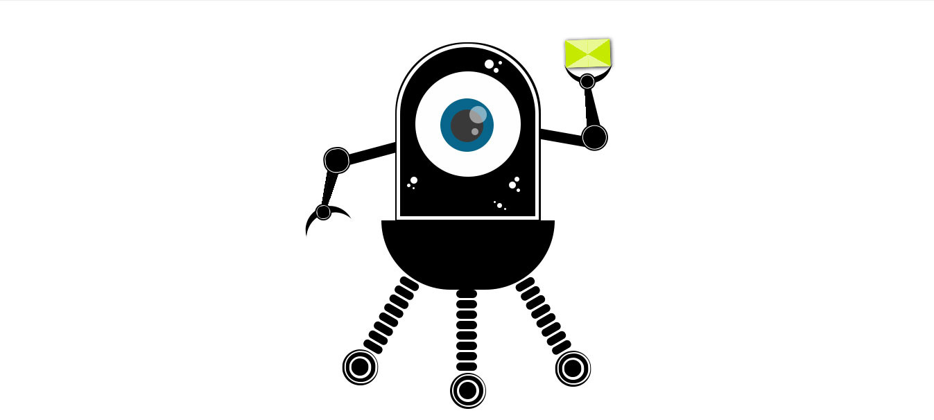
Some designers have created amazing artwork without images using pure CSS, such as the robot shown in Figure 3.8 below. The example shows you just a hint of the actual complex CSS that went into making this. You can see the full example on CodePen. Other examples of pure CSS artwork include Nicolas Gallagher's pure CSS GUI icons.
So we’re unable to count on the height of a content block remaining the same at all times, on all monitors. One thing we can do, though, is remove the 90-degree corners that so often characterize rectangle-based layouts. From a graphic design perspective, boxes with rounded-off corners soften the layout, creating a more organic, smoother feel. Remember when I asked if you could make a website design feel like a wet bar of soap? Well, rounded corners can certainly make a site feel a little more slippery. Take a look at the boxes on Simon Collison’s home page in Figure 3.9. The corners of each of the boxes you see here have been slightly tapered to give this very gridtacular layout a slightly softer feel. The upper red box to the left of the image shows a close-up of those rounded corners.
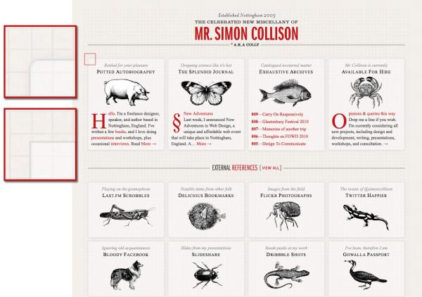
So why does the lower red box in Figure 3.9 show a square corner? This is a close-up of what the corners on Simon’s site look like in Internet Explorer 8 and below. They are square because Simon has used the border-radius CSS3 property, which is only supported in Internet Explorer 9 and up. CSS3 is by far the easiest way to implement rounded corners. Because of the lack of IE support, though, it might be impractical unless you’re okay with some users seeing square corners. In Simon Collison’s case, losing the roundedness in IE isn’t a deal breaker. Besides, the real draw of Simon’s site is his jaw-dropping use of media queries. A media query is a feature of CSS3 that allows us to define a conditional rule for applying a certain set of styles. In this case, Simon is using them to automatically change the layout of his site as you resize the browser or view it in different devices. While it’s not a true “responsive layout” (because it’s not fluid), it’s still an impressive and practical way to adapt to the many devices we use to access the Web. Now, go on, open http://colly.com in a browser and resize away.
When I wrote the first edition of this book, border-radius was a glimmering ray of hope for a design technique we’d been trying to implement for years with HTML and CSS. For that reason, I highlighted several techniques for creating rounded corners using extraneous markup or JavaScript. Most of those techniques have been abandoned. If you’re unable to create the effect with simple CSS, I’d advise you to follow Simon’s lead and keep the corner effect subtle enough; that way, your design will still look good with square corners. Visit http://dowebsitesneedtolookexactlythesameineverybrowser.com/ for a further explanation of my stance on this topic.
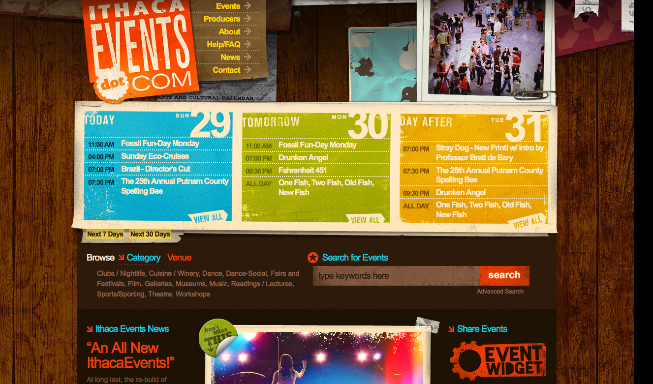
I mentioned in the section above that diagonal lines evoke a sense of movement and excitement. Rotating shapes and elements in your design have the same effect. Rotated objects break up the horizontal and vertical monotony of the Web and, like rounded corners, help it to feel more organic. Take a look at the Ithaca Events site in Figure 3.10. There’s a lot of rich texture in this design that gives it a handmade feel. The subtle rotation of the logo, “view all” links at the bottom of each date, and other background elements give the site a lot of character. To me, this design really looks like a flyer that might be stapled onto the wall of a local entertainment venue. It’s a perfect look for a regional arts and culture calendar website.
Currently, the most common way to accomplish the rotation effect is by saving images for your design pre-rotated in your image editor of choice. As with rounded corners, this is a practice that will soon be made obsolete with CSS3. The transform property of CSS3 promises us the ability to scale, skew, and rotate objects directly in the browser window. While the effect will no doubt be overused and abused, having this much design control within CSS is a revolutionary step forward in web design. Just because CSS rotation lacks universal support, it doesn’t mean you should avoid using it.
Pointless Corp. is a great example of rotation of elements. The logo and text are rotated, which adds to the nostalgic-feel of the rest of the site. To reinforce the concept, the blue/green ribbon and text are rotated, too.

Rounding corners and rotating elements in your design are just two techniques to make a layout feel less geometric and more organic. There are plenty of other ways to enhance your designs using shapes creatively. Take a look at the Speed Kids website in Figure 3.12. The designers of this site used a simplified style of illustration consisting of a variety of basic organic shapes to create the layout you see here. When I look at the page, the first item I see is the pink octopus. From there, the arrows created by the splashes under the logo guide my eye down to the playground. Next, the bars of the playground and the slides guide my eyes downward, to all of the links. Just in case I missed it, the ripples in the water guide me back toward the center of the page at the bottom, where all of the links and logos are located.
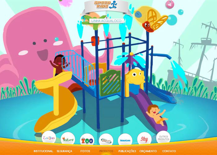
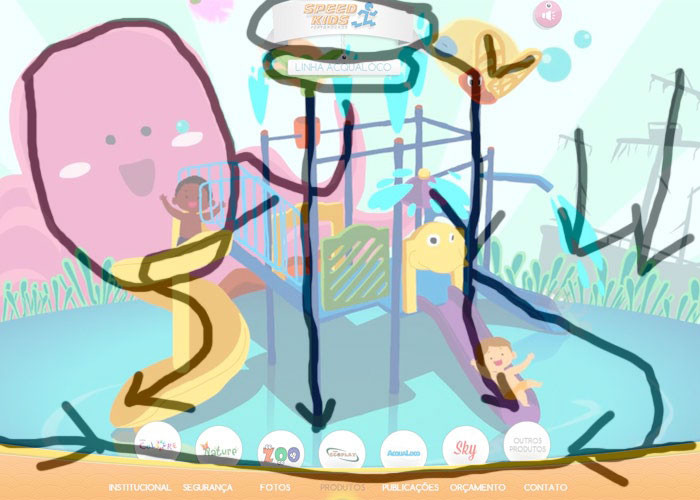
It may not be apparent at first, but the shapes in this page’s illustration are the key elements that define the layout. One way to determine how much influence shapes have on a design is to isolate them by tracing out the layout’s main elements. You can do this either by printing a screenshot of the design and tracing the shapes by hand using tracing paper, or by opening up the screenshot in your favorite graphics program and removing the image after you’ve traced the key elements onto a new layer. I call this the "economy of line" test. The expression economy of line is used to describe art and design that provides significant graphic meaning with as few lines as possible. If a traced page layout still looks complete when recreated using only lines, it passes the test. As you can see in Figure 3.13, the Speed Kids layout still guides your eye around the page effectively, even without the text or colorful imagery.
Notice how the different design elements and how they are arranged leads your eye down the page. You typically start at the top of the page and work your way down, but the shapes of the illustration help your eye to follow a path to the menu system at the bottom. No matter where your eye ends up on the page, every element, such as the slide, the ship masts, and the playground posts lead you to the same place.
We’ve talked about point, line, and shape, but now it’s time to take this chapter to another dimension. The elements we’ve discussed so far only exist in two dimensions: width and height. They’re just marks on paper or a screen, without any indication of depth; however, as we live in a world of three dimensions, we’ve learned to rely on visual cues that help us to determine the width, height, and depth of the objects around us.
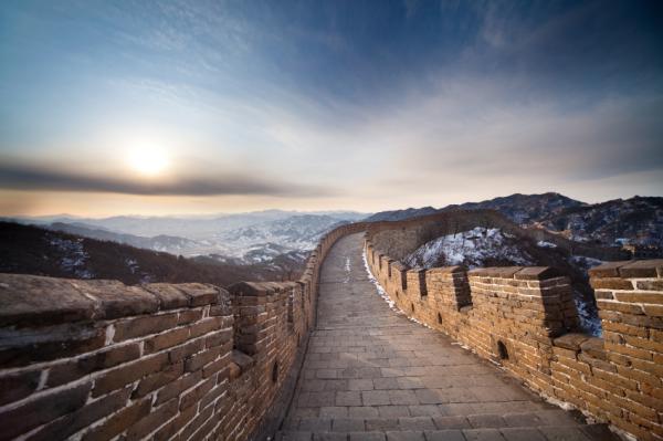
When we see a path that disappears into the horizon as the Great Wall of China does in Figure 3.14, we don’t think that its width actually decreases to a single point. Similarly, when we look at an open door, we’re aware that the top and bottom of the door are parallel, even though they seem to converge towards the door frame. We’re not fooled by these spatial illusions because we know (consciously or otherwise) that objects tend to look smaller as they become further away.
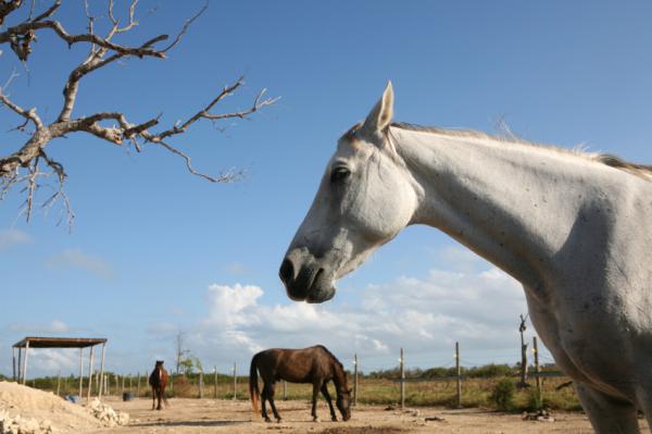
In Chapter 1, I mentioned that altering the proportion of objects was a good way to create emphasis. This is true because we humans rely on the relative proportion of adjacent objects to determine not only the size of those objects, but also their location in three-dimensional space. Although the horses in the background of Figure 3.15 are proportionately smaller than the horse in the foreground, our eyes tell us that they’re about the same size in reality.
Light and shadow are the most important visual cues we can use to determine or create depth and volume in compositions. Even with accurate perspective and proportion, a composition without highlights and shadowing will look flat. Light and shadow establish visual contrast, and help to create the illusion of three-dimensional depth with two-dimensional media, such as pencil on paper or pixels on your computer screen. Light and shadow alone can also be used to make two-dimensional objects look like they exist in three-dimensional space.
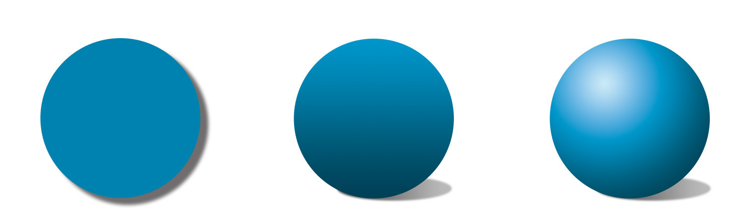
Each of the three cyan-colored circles in Figure 3.16 are the same size, but the different lighting effects and shadows applied give each a very unique feeling of depth and volume. A basic drop shadow has been applied to the first circle. It’s obvious that this is a two-dimensional object, but the drop shadow gives the illusion that the circle is hovering above the surface beneath it. The second circle has a linear gradient, and a shadow that’s skewed to the right. This combination of light with the tilted shadow suggest that it’s a two-dimensional circle that’s casting a shadow on an angled surface. The fact that the shadow is closer to the bottom than the top of the circle creates a sense of movement: it looks as if the top of the circle is falling towards or away from the viewer’s eye. A radial gradient—meaning one that’s applied in all directions from a central point—has been applied to the third circle, which looks spherical due to the highlight and shadows that the gradient creates. The shadow that it casts matches the location of the light source, which lends credibility to the volume and depth of the shape.
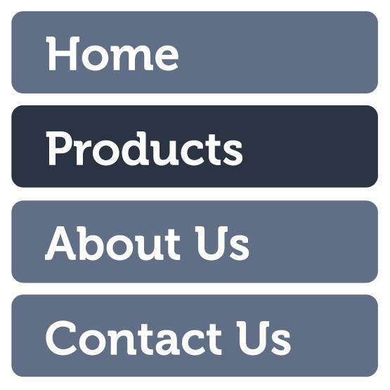
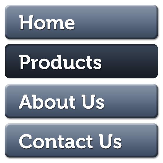
Just as there are many ways to alter the levels of depth with the circles in Figure 3.16, there are other methods to give your web page elements depth using only light and shadow. Take the menu in Figure 3.17, for example. The boxed-in words and rounded corners hint that these are clickable objects, and the dark background on the button indicates that it’s either hovered or active. It’s a simple navigation style that would work fine on just about any website, but unfortunately it feels a bit flat here.
If these button shapes were really three-dimensional, what would they look like? Would they be flat with beveled edges, or completely rounded on the top? Would the tops of the buttons be straight on the horizontal, or would they have rolling curves? What would happen when light hit them? All these questions can be answered by looking around you. For the example in Figure 3.18, I imagined that my links were lit from above, so I gave them a slight gradient rather than making the background color flat. I also added a bevel to the edges to make them feel a bit like glossy, rectangular subway tiles. I wanted the active link to look inset instead of beveled out, so that it appears to be clicked. I achieved that by adding a shadow to the top of the block instead of a bevel highlight. I gave the text a little drop shadow as well, to make it feel like the letters were slightly raised from the button surface.
Adding shadows to text and objects is another practical way of creating depth in your layout. This can easily be done in Photoshop using layer styles, but what if the person who’s maintaining the site lacks access to a copy of Photoshop? As with creating rounded corners and rotating objects, CSS3 again comes to the rescue. The box-shadow and text-shadow properties promise to make web design far less dependent on heavy images. A great place to experiment with these and other CSS3 properties is http://css3please.com.
No need to restrict yourself to just adding lighting and shadows to boxy elements, though: try involving some perspective, and think about how real-life objects work when you’re trying to manufacture a sense of dimension. Take a look at the screenshot from Worry Free Labs in Figure 3.19. The design of the home page for this Austin, Texas-based design agency is simple and fun, but there’s a lot of inventive texture going on here as well. The “We Are Worry Free Labs” banner becomes a focal point because of its contrast, but another area that gets a lot of attention is where the mobile devices are displayed. There are long, dramatic shadows next to these devices, calling a lot of attention to them. Without these elements, these images could be boring and mediocre. As it is, though, the organic shape and realistic shadows make this a convincing representation of a 3D object in space.

Drawing from real-world inspiration is the key to adding believable depth to graphic elements. Rather than settling for a layout filled with flat blocks of color, lines, and shapes, try to think of ways in which you can incorporate three-dimensional space. Remember that the items that “stick out” the farthest are likely to become focal points, and that perspective and proportion do very little without the reinforcement of light and shadow.
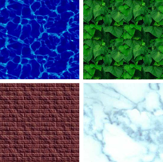
I still remember my first exposure to website design. I was in a tenth-grade typing class and the instructor took it upon herself to teach us HTML. It was optional, but choosing between timed typing tests and learning how to build web pages was an easy choice to make. By the end of that year I’d created quite a few little websites. The common denominator among those admittedly hideous creations was repeating backgrounds. You know the kind I’m talking about: those backgrounds that tile seamlessly to give the appearance of a continuous water, stone, starry skies, metal, or canvas texture.
Although repetitious background images like the ones in Figure 3.20 are the hallmark of early 1990s web design, they’re also classic examples of pattern. Pattern has long been used to add richness and visual interest to all types of design. On the Web, seamless background images were originally favored because they reduced page size and download times. Using a small image that could be tiled to fill a background area, rather than a large non-tiling image, significantly reduced the download time for website visitors with 56K modems.
Just because tiling background images with repeated patterns have a tacky past, it doesn’t mean you should avoid them today. In fact, they’re used more often than you probably realize. CSS has greatly improved the degree of control designers have over the way background images work. Before CSS was around, we could only assign background images to body and table elements; now, with CSS, backgrounds can be applied to just about any element you choose. You can use any of five CSS properties (and one additional shorthand property) to set the background of an element:
background-color-
This is the property we use to set a solid background color for any element. For example, if we wanted to set the background color of an element to a nice green-blue (00B2CC), we’d add the following declaration to the element’s style rule:
background-color: #00B2CC;
When using hexadecimal values in CSS, you need to prefix the color code with
#, as shown above. You can also specifytransparenthere if you don’t want the background of your element to be filled with a color.transparentis actually the default value of thebackground-colorproperty. You might be tempted to use an HTML color name, likeAquamarineorBlanchedAlmond, but as only 16 color names are officially sanctioned by the W3C in the HTML 4.0 specification (and even those will generate warnings when you try to validate your CSS), it’s recommended that you use the hexadecimal values we talked about in Chapter 2. background-image-
If we want an image to be used as the background of an element, we can specify that image using the
background-imageproperty. The possible values for this property areurl('filename')ornone. If we wanted to set the background of an element to animalcracker.png, we’d add the following declaration to that element’s style rule:background-image: url('animalcracker.png'), background-repeat-
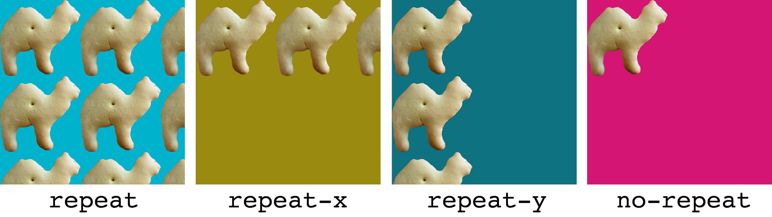
There are four possible values for
background-repeat:repeat,repeat-x,repeat-y, andno-repeat. The default value isrepeat, which sees that the specified background image will be tiled vertically and horizontally. Therepeat-xsetting will cause the background image to be repeated horizontally. This is handy if you want to apply a horizontally tiling image or gradient to an element, but want the rest of that element to be filled with the specified background color. Similarly,repeat-yspecifies that the background image should be repeated vertically. Finally,no-repeatis used when you have a background image that you don’t want to tile at all. The effect of each of these settings is shown in Figure 3.21. background-attachment-
This property determines whether the background image stays in the same location or moves with the content when the page is scrolled. It can be set to the values of
fixedorscroll, the latter of which is the default. Whenbackground-attachmentis set tofixed, the background will be fixed relative to the viewport (or browser window), so that when you scroll the page, the background image will stay in the same location. background-position-
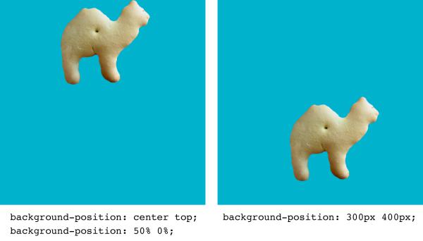
This property controls the position of a background image and accepts two values: the horizontal and vertical position of the image. These values can be set using keywords (
right,center, ortopfor the horizontal position;top,center, orbottomfor the vertical), using CSS measurements, or using percentages. For example, if you wanted a background image to be centered horizontally and aligned to the top of an element, you could specify this using keywords (background-position: center top) or using percentages (background-position: 50% 0%). If we wanted to position the image 300 pixels from the left edge, and 400 pixels from the top, we could use the declarationbackground-position: 300px 200px. The effect of both of these possible values is shown in Figure 3.22.
To summarize all this information quickly, the developers of CSS have created a shorthand property, which allows us to specify all five of these properties in a single background declaration. It works like this:
element { background: background-color background-image background-repeat
↵background-position background-attachment; }
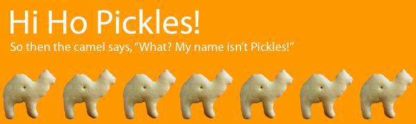
As an example, consider the following two rules that produce exactly the same output—a row of repeated animal crackers displayed on an orange background, along the bottom of a div with id="hihopickles":
#hihopickles {
  background-color: #FF9900;
  background-image: url('animalcracker.png'),
  background-repeat: repeat-x;
  background-position: left bottom;
  background-attachment: fixed;
}
#hihopickles {
  background: #FF9900 url('animalcracker.png') repeat-x left bottom fixed;
}
When applied to our document, our hihopickles div might look like the display shown in Figure 3.23.
As I said before, it’s sometimes difficult to spot a repeated background image in a website design. For a little practice, take a look at the screenshot of Dave McNally’s Tileables site in Figure 3.24.
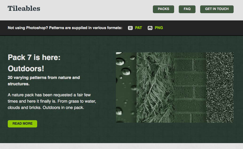
There are no annoying repeated brick or corny animal cracker backgrounds here—just a sharp, well-polished resource site for Photoshop pattern packs. But beneath the surface, the Tileables design uses several repeated backgrounds. Figure 3.25 highlights a few of these.
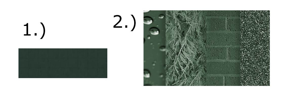
-
At first glance, this decorative tile looks like a continuous series of textured squares. In reality, though, it’s a single image of just one color block, that’s then applied as a background to the header of the site and repeated horizontally and vertically to fill the space.
-
Shown as a preview are some of the other images that you can tile to create repeating patterns. The image is only used once, but it is repeated infinitely horizontally, vertically, or both.
In review, the texture-related elements I’ve described so far are point, line, shape, depth and volume, and pattern. Individually, each of these components creates some level of texture; however, when you begin to use them together, they build on one another to create more complex visual imagery. How you combine them depends on the type of effect you’re trying to create. So, the question is: what is the textural effect you want to achieve? Let's look at a few options.
Perhaps you want to emphasize the timeless nature or nostalgic history of your subject. You might want to replicate the rich wood found inside a gourmet kitchen or in a traditional Italian home. Notice the grainy wood texture in the header and below the slider in the Italio Kitchen site in Figure 3.26. It frames the content and provides a great deal of contrast to the smooth, cream colored sliding gallery area. It also gives a sense of tradition and age.
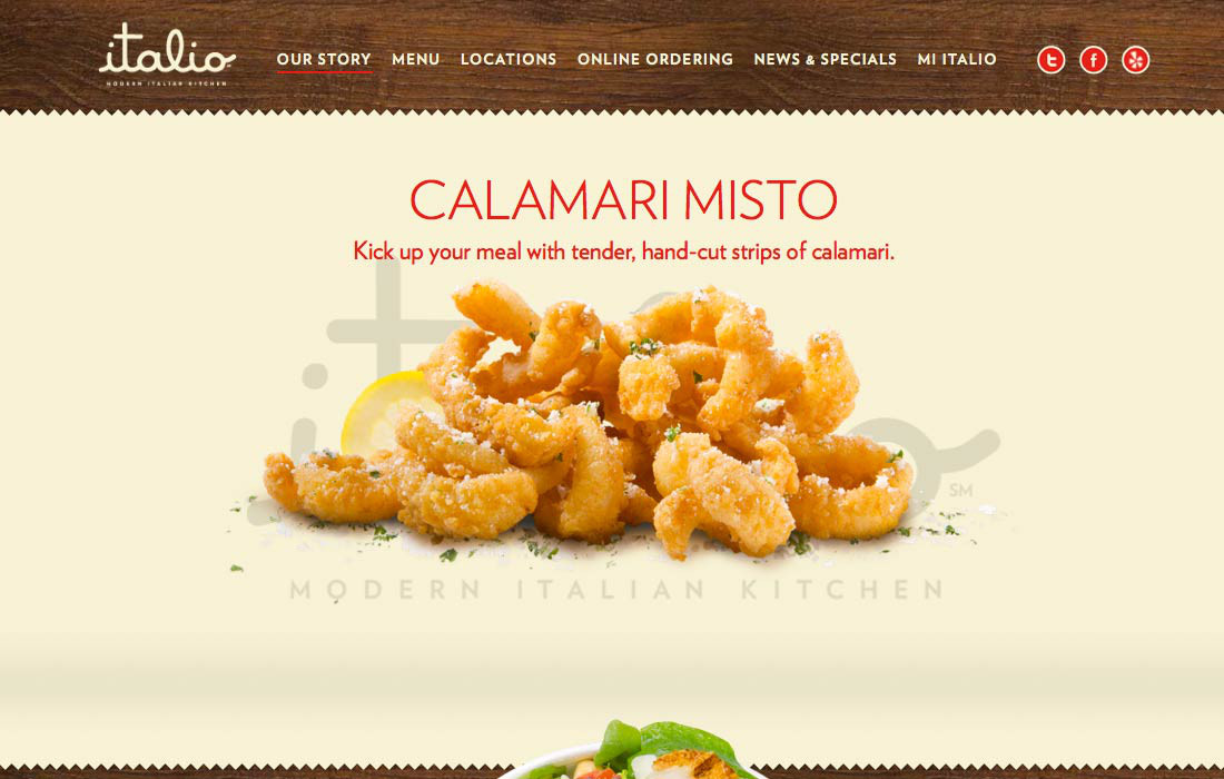
This site has several elements that help to establish its unique texture. The wood texture is rich and grainy. Just the right color of wood was chosen to give it that “old walnut” look. Combine that with the cream-colored, nearly parchment-like content area, and it only adds to the effect. The jagged edge between the wood and the cream area is another texture element that breaks things up. The food itself is a texture. Just as the texture of food is important when we taste it, the visual texture only makes us want to try it even more. Thanks to the vivid food photography you can just tell that the coating on that calamari will be crispy and delicious.
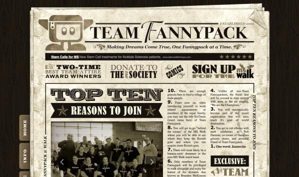
The weathered and worn look has been around for ages in both the print and web design worlds. It was popularized to the point where it became a design trend in 2004, when Cameron Moll gave this aesthetic quality the trendy and addictive name, That Wicked Worn Look. Cameron’s series of articles about the topic was an instant hit, and inspired many designers (myself included) to bring more of that rough and worn-in texture to the Internet. Another example of a design that uses the weathered aesthetic to create a sense of nostalgia is the Team Fannypack website in Figure 3.27. This goofy but thoughtfully designed site for a Multiple Sclerosis Walk team has been made to look like a crumpled old newspaper. Notice the weathered texture and folded corner on the paper content area. The sepia-toned color scheme also helps lend this team’s story some historical significance.
Using strong textures with a grungy feel doesn’t mean your site has to hark back to a bygone era. The Electric Pulp site in Figure 3.28 is an excellent example of a site featuring weathered textures without looking like it’s come from a library archive.
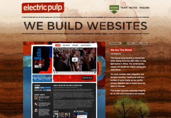
The wood grain used on the Electric Pulp site simply exists to evoke an organic, hand-crafted vibe. The slightly rotated logo, active marker on the navigation menu, and trees at the bottom of the page all feel hand painted, and the “We Build Websites” text looks as if it was burned into the background. All of this helps to establish a very recognizable style that you can see repeated in much of the agency’s client work as well. I guess you could say that rich tangible texture is their calling card.
Although some people feel the wicked worn look is (or was) a fad that has come and gone, I believe it’s a design option that’s here to stay. Like a comfortable pair of jeans with holes in the knees, or a faded stack of postcards with tattered edges, there is validity and honor in things that show wear and tear, and the passage of time.
And now for something completely different …
As a backlash against the worn aesthetic, there was a period of time in the late 2000s when a lot of designers and developers decided to buck the use of textures entirely. At the time, it seemed to be a logical reaction. After all, if you want to make a crisp, professional first impression, adding a ton of extreme textures can be like wearing holey jeans and a concert T-shirt to a job interview. That said, just because you’re trying to be all corporate and business-like, it doesn’t mean your designs have to be boring and flat. Take a look at the Foundation Six website in Figure 3.29.
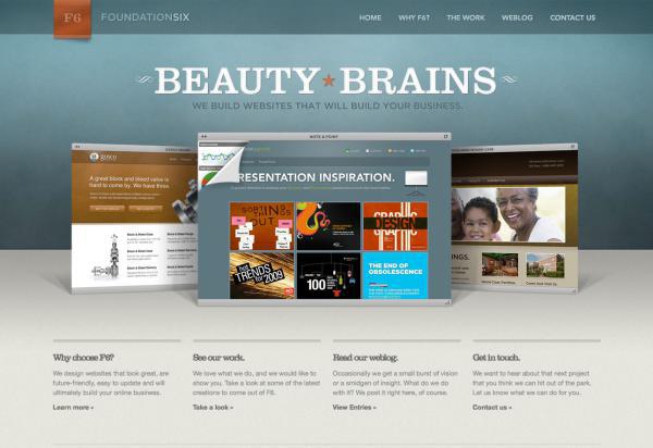
There’s no boring corporate blue or pictures of people in cubicles here, just a professional, sophisticated design with a complementary color scheme and loads of subtle texture. Check out the curl of the F6 banner, the radial gradient on the blue backdrop, and the double shadows produced by the portfolio screenshots. At the heart of this clean, tactile look is the subtle noise texture that’s present on all three of the background blocks you see above. A noise or grain texture is simply a pattern of tiny dots. If you look around you, most surfaces have some sort of subtle texture to them. Adding a bit of translucent noise helps break up expanses of flat colors and pixel-perfect gradients to make digital surfaces look more analog.
Applying subtle noise textures on the Web is a fairly new trend, but because it’s such a primitive building block, I think we will be seeing it in designs for years to come. Another site that adds texture to an otherwise basic layout is the Banger's Restaurant site, seen in Figure 3.30.
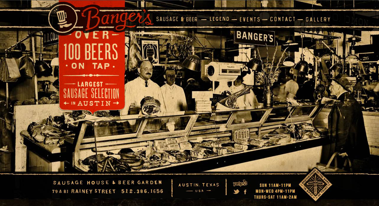
Earlier in the chapter, I explained that geometric shapes are the norm on the Web, but they have a very mechanical feel. Without the textures to give this an aged, super-worn feel, this site would lose most of its nostalgic personality. The basic shapes are enhanced with texture, and grit.
Another interesting reaction to—or perhaps more a variant of—the wicked worn look has been a rise in handcrafted designs that look more like a page from a personal journal or scrapbook than a website. A cool example of this look is the site for Needle in Figure 3.31.
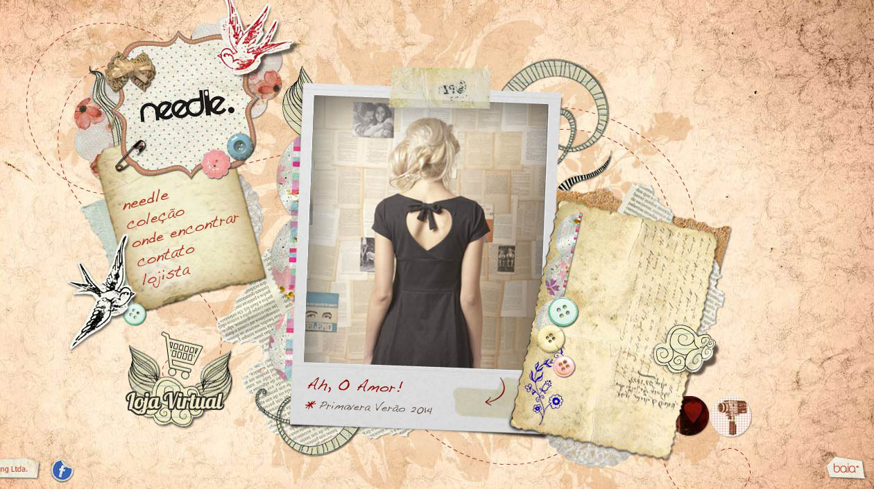
This site certainly falls into the wicked worn style family, but there’s a fixation here on making it feel handcrafted. Notice that most of the rectangular elements on the page have either been rotated or cut on diagonals. This intentional imperfection makes these blocks feel like they were cut out by hand with a pair of scissors. The same is true for photo in the main content area. It's all been carefully cropped, and a white border has been added around the image to make it feel like hastily made collage from a Polaroid. It’s a great look for a site that aims to make fashion fun and casual.
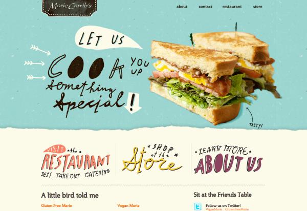
Another beautiful example of the handcrafted scrapbook style is the site for Marie Catrib’s restaurant in Figure 3.32. Rather than relying on happy-go-lucky scissor work to create a handcrafted aesthetic, Marie Catrib’s uses a torn-paper texture, big images, and lots of hand-drawn text as decorative elements. The result is a free-spirited, playful look that highlights this gourmet restaurant’s artistic personality.
Marie Catrib’s site balances playful creativity with sophisticated craft, but what if you want more of the former than the latter? Using simplified illustrations, vivid colors, and a focus on imagery over content can help give your designs a childlike feel—what I like to call the whimsical cartoon style.
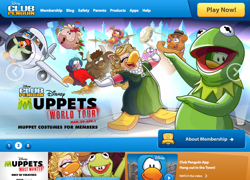
If you’re designing for a target audience that consists of young children, the whimsical cartoon style is a great choice. An example of this is the site for Disney’s Club Penguin, seen in Figure 3.33. If the interactive elements and animation on this page don’t grab a child’s attention, the coloring book-style illustrations and intense colors certainly will. Notice also the repeated use of rounded corners throughout the design, helping to tie the top navigation area into the rest of the site.
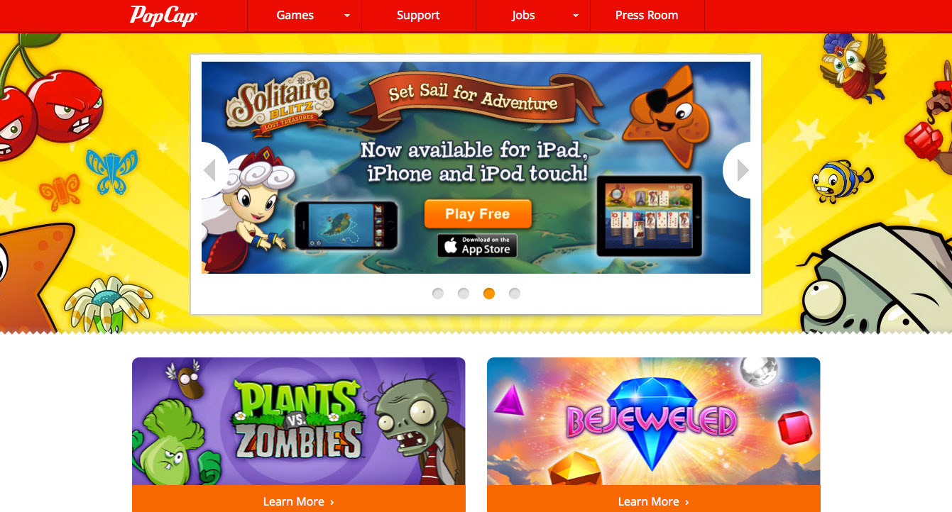
Another notable example of the whimsical cartoon style is the site for Pop Cap Games seen in Figure 3.34. Pop Cap publishes games like Bejeweled and Plants vs. Zombies. It’s capitalizing on this by populating the home page with characters from its games. Normally, cluttering a design with eye-catching graphics like this would be a huge distraction from the content. When your business is selling games, though, creating fun distractions is what you’re all about. In this particular case, the plants and zombies staring each other down helps to move your focus back and forth over the page, and perhaps encouraging you to actually read some of the content before going back to playing games.
Now that I’ve spent the entire chapter explaining texture and convincing you to add it to your designs, I feel obligated to let you know that sometimes texture is just unnecessary. Just as you might eliminate color from a design to create a specific effect, discarding texture may just be the best way to establish your site’s personality and character.
Take Brian Nathan Hartwell's portfolio site in Figure 3.35, for instance. There are no gradients, no rounded corners, no subtle noise textures… not even any boxes.
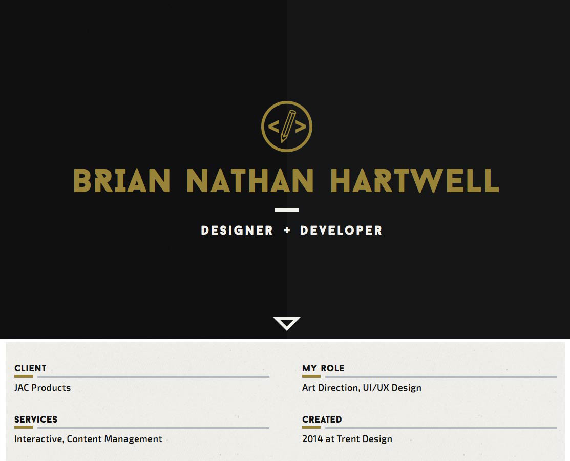
While some people might say his site lacks interest, I’d argue that Brian has simply removed all unnecessary distractions. It’s an extremely minimal, monochromatic layout that serves one purpose: delivering content. Since that content is primarily about his awesome work, it makes sense that he lets his work speak for itself. Eliminating texture and imagery from his design ensures that you’ll do just that.
Avoiding the use of texture in your design doesn’t mean it has to be as stripped down as Brian Nathan Hartwell's site. There are plenty of examples of textureless, minimal designs out there that provide more to look at than just plain text. The T-shirt site, Shirts in Bulk in Figure 3.36 is an example of minimal texture design.
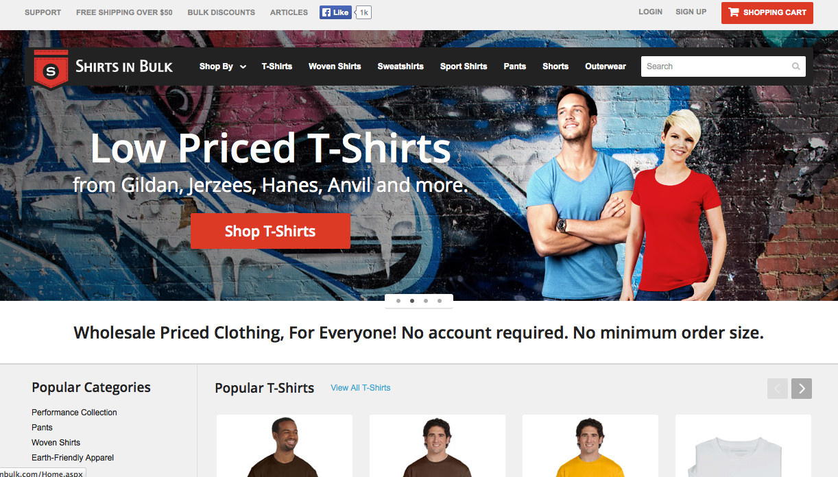
The focal point of this site is the supersized header welcomes new visitors. Like the cover of a magazine, the logo, navigation, and content description are overlaid on top of the main imagery. The print design look is continued below this as the content is divided into tight, grid-based columns. It has the appearance of a printed catalog, but on the Web.
As illustrated by the websites I’ve featured above, texture can have a big impact on how people perceive your design. Staying on top of current web design trends is essential to creating effective contemporary designs, but having a knowledge of past modes that occurred outside the ethereal history of the Internet will help you to establish your own style and original designs.
Some of the most useful web design resources can be found in the art history section of your local bookstore or library. Becoming familiar with the architectural patterns of the High Renaissance, investigating the realism movement (and understanding how it influenced artists like Van Gogh and Cézanne to break all the rules on texture in paintings), and learning how modernism set the course for the design trends of today will help you do more than answer Jeopardy questions. A knowledge of graphic design history will expand your visual toolbox, giving you the creativity to develop a style that’s all your own, and the artistic variety to suit any client’s needs.
Ultimately, the image that your clients are trying to establish, and the communication goals they’ve set, should be the determining factors in how much and what types of texture you apply. And speaking of clients, it’s about time for us to check back on how it’s all going with the Southern Savers redesign.
By the end of Chapter 2, the Knoxville Reflexology Group redesign project was making great progress. It had wireframes approved, and I had learned through the use of my mood boards what colors Carrie might like to see in the final design. Before the actual site design could begin, though, I had to nail down the KRG branding. The hand-drawn sketch of the logo was streamlined. A vector version of the original logo wasn't available, so I had to recreate it using vector graphics software. Even though it has a hand-drawn look, the shapes are clean and crisp, as you can see in Figure 3.37. The color is solid and the logo leverages negative space. The branding of KRG is now personal and professional at the same time.
With the logo cleaned up and refined, it was now time to turn our attention to the KRG website. The approach to the website was to create a sense of cleanliness and sterility. To reinforce that message, I opted for the approach of using minimal texture in the design of the site, as you can see in Figure 3.38. Similar to Nathan Hartwell's website mentioned earlier in this chapter, there aren't even any subtle textures used in the new KRG redesign.

The texture of the site, if there is any at all, is in the content itself. The background color and the signature blue/green were alternated for variation, and the emphasis was placed on the images and the content. A slight text-shadow was used on some type for added emphasis and to aid with readability.
For now, it’s time for us to move on to the next chapter of this design adventure: typography!