Introduction
SAY IT WITH CHARTS
It’s 9:00 a.m. on the third Tuesday of the month, time for the monthly meeting of the Steering Committee. To set the rest of the day’s proceedings in perspective, the committee chairman has asked a bright, fast-rising manager—let’s call him Frank—to prepare a brief presentation on the state of the industry in which we compete and our company’s performance as a stepping-stone for new investment opportunities.
Intent on doing a good job, Frank has done much research, worked on his story line, and prepared a series of visual aids to help him say it with charts. Like most of us, Frank realizes that charts are an important form of language. They’re important because, when well conceived and designed, they help us communicate more quickly and more clearly than we would if we left the data in tabular form.
When charts aren’t well conceived or designed, as we’re about to see in Frank’s examples, they serve more to confuse than to clarify. Let’s sit with the audience and listen to Frank’s presentation as we comment, quietly, on the effectiveness of his visuals.
Frank begins: Good morning ladies and gentlemen. My purpose is to present a brief overview of our industry and our company’s performance. My objective is to gain your support for expanding into developing countries. I’ve designed a few visual aids to better place my findings in perspective.
First, let me point out that we compete in a healthy industry. As you can clearly see from this exhibit, for the 11 measures of performance shown across the top and the three types of companies within the industry listed down the side, performance is excellent.

And there you sit in the audience, wondering whether your eyesight is failing, as you try in vain to read the numbers.
Frank continues: Within the industry, our performance has been outstanding. For instance, our sales have grown, considerably since 2000, in spite of the decline in 2002, which, as you know, was the result of the strike.
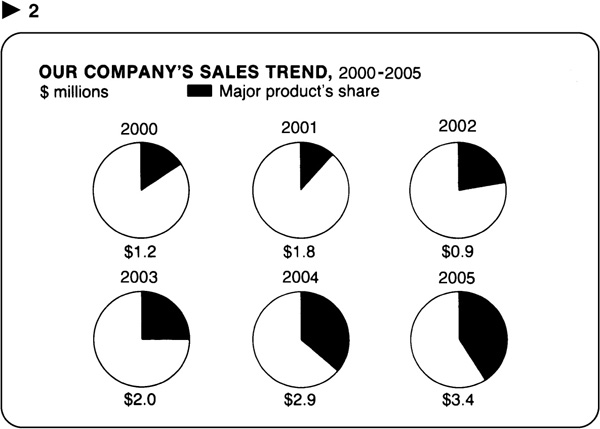
“Oops,” you whisper,” did I just miss something? I could swear I heard Frank say that sales have grown considerably, but what I see is a series of pie charts that show our major product’s share increasing. Oh! Wait a minute. I see! He’s referring to the figures underneath each pie ….”
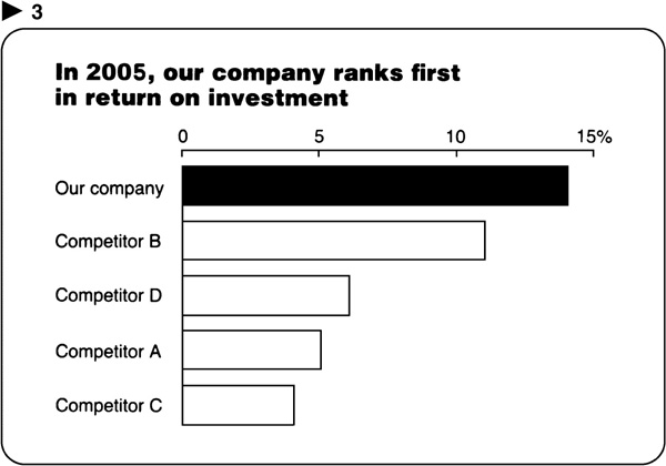
Frank goes on: Compared with our four major competitors, we rank first in return on investment with 14 percent….

“What ranks first? Who ranks first?” you say. “From the visual, I thought the point was that ROI has been fluctuating.”
… and our market share has increased since 2000 along with that of one competitor, while the other three lost share.

You sigh in frustration “Has someone spiked my orange juice? Why do I feel that my eyes and ears aren’t talking to one another, that I’m receiving mixed signals? Is it perhaps that the visuals I see are not supporting the messages I hear?”
Frank proceeds: Given these sales, ROI, and market-share trends, we recommend expanding the selling effort for our major product into developing countries. We believe these markets hold considerable potential. Since you may not understand this visual, let me explain it. What I’ve done is shown the total size of the market worldwide in 2005 and projected it to 2015. On the basis of a lot of research, we forecast that the market will increase from $8 billion to over $11 billion. Then I divided the totals by the 11 countries that make up the market and showed the size of each. Then I calculated the average annual compound growth rate for each country and listed it in the center. As you can see from these figures, the developing countries are projected to show the fastest growth.

Now I feel your nudge and hear your aside: “Isn’t it remarkable how these visual aids designed to aid speakers require so much speaker aid to be understood. I always thought that a picture was worth 1,000 words, not that it required them.”
Frank: If we are to move ahead, however, we need first to persuade top management that the political and social climate in these developing countries will not interfere with our plans. A recent poll of 16 top management members reveals they are almost evenly split for and against investing in these countries.

By now, your social unrest is hard to contain, and the pie chart conjures visions of dessert at lunch.
Frank’s intention was right: he meant to use charts to support his presentation. His execution was not good: he developed a series of charts that were illegible or unintelligible and that detracted from his presentation. Let’s review his charts and see why they don’t work.
Visual number ![]() 1 is illegible. Like all illegible visuals, it suffers from the APK—anxious parade of knowledge—syndrome. This is usually the case when the presenter is more concerned with what’s been put into the chart than in what the audience gets out of it.
1 is illegible. Like all illegible visuals, it suffers from the APK—anxious parade of knowledge—syndrome. This is usually the case when the presenter is more concerned with what’s been put into the chart than in what the audience gets out of it.
What Frank didn’t realize is that a chart used in a visual presentation must be at least twice as simple and four times as bold as one used in a report. It’s the same as the distinction between a billboard that must be read and understood in the time you drive past it and a magazine advertisement that you can study in detail.
At the other extreme is the last chart, number ![]() 6, which is so simple that it is not needed; the message could have been expressed with words alone. In addition to overly simple charts, there are other situations when you’re better off without a chart:
6, which is so simple that it is not needed; the message could have been expressed with words alone. In addition to overly simple charts, there are other situations when you’re better off without a chart:
1. Sometimes the chart denotes a sense of accuracy that may be misleading, as is the case with projections or ranges that may be tenuous.
2. Sometimes there are sets of data that the audience or reader has become comfortable with, such as the company’s profit and loss statement, and changing the form to a chart could be confusing.
3. Certain individuals may be unaccustomed to, or resistant to, or skeptical about the use of charts.
With charts, a good rule is “fewer is better.” Producing charts is time-consuming and expensive. Also, the more charts we use, the less people remember. Use one chart in a report or presentation, and it will receive 100 percent of the audience’s attention; use 100, and none will be memorable.
Chart 5, the one describing the world market, is what I call a “charttable”; it can’t make up its mind whether to be a chart or a table and decides to be both. The hope is that if the chart doesn’t work, the information may. In most cases, neither does. Undoubtedly, this chart helped Frank figure out the important relationships—in this case, the comparison of projected growth rates by country. However, Frank did not translate the data from the form that helped him analyze the problem to a simpler chart that emphasized the results of his analyses.
The remaining three charts, ![]() 2, 3, and 4, suffer from what is probably the major problem facing most of us when we translate data into chart form: the wrong form for the message. In Chart 2, pie charts were chosen where a line chart is called for; in Chart 3, a line chart was used where a bar chart would be better; in 4, we see a dot chart instead of column charts. Here is what these three charts should have looked like to support the spoken message more quickly and clearly.
2, 3, and 4, suffer from what is probably the major problem facing most of us when we translate data into chart form: the wrong form for the message. In Chart 2, pie charts were chosen where a line chart is called for; in Chart 3, a line chart was used where a bar chart would be better; in 4, we see a dot chart instead of column charts. Here is what these three charts should have looked like to support the spoken message more quickly and clearly.
Sales have increased from $1.2 million in 2000 to $3.4 million in 2005 despite the decline in 2002 caused by the strike.

Compared with our four major competitors, we rank first with a 14 percent return on investment in 2005.
Our market share has increased 4 percentage points from 11 percent in 2000 to 15 percent today. Of our four competitors, B also improved, while C, A, and D lost share.

Now these charts work. In each case, the chart form supports the message expressed in the title, and the title reinforces the point the chart demonstrates. In all cases, the message comes across faster and better than it would if the data were left in table form.
And there you have the purpose of this book. Its goal is to help you say it with charts by choosing and using charts that will work for you and your audience no matter where the charts are used—be it in business presentations or reports, in your management information system, in computer graphics software packages, in annual reports, or in magazines or newspaper articles.
In the next portion of this section, we’ll work our way through the process that moves us from data to chart. In Section II, we’ll examine a portfolio of finished charts that you can refer to for ideas the next time the need arises.
In Section III, we’ll show how to convey your message using concept visuals, and visual metaphors. As you see, we’ve included a CD-ROM so you can download the images.
As I said before, charts are an important form of language. But as is true of any language we want to become proficient in, it takes time and patience to learn the vocabulary, and practice until the skill becomes second nature. Since most people learn best by doing rather than just reading, I’ve inserted work projects throughout the book so you can practice the lessons learned. In addition, Section IV offers additional opportunities for learning. Here, I’ll present a range of charts that need improvement, ask you to improve them, and then offer my solution for comparison.
For now, let’s move on to the process of choosing charts.