2. The Five Qualities of Great Visualizations
The greatest value of a picture is when it forces us to notice what we never expected to see.
—John W. Tukey, Exploratory Data Analysis
In April 2013, Enrico Bertini, a professor of visualization at the NYU Polytechnic School of Engineering, posed a challenge to his community. In a blog post titled “Where are the data visualization success stories?” he wrote:
I see a lot of visualization around me now, and I am extremely excited about it. Yet, are we making any real difference? I mean, are we having any real impact on people’s lives other than telling them beautiful stories? Yes, I know, impact could be defined in a million different ways, and it may be hard to capture. But why do I never stumble on to an article or blog post showing, I don’t know, for instance, how a visualization helped a group of doctors do something remarkable? Is it just because this stuff does not get reported or what?1
1 http://fellinlovewithdata.com/reflections/visualization-success-stories
On Twitter I replied that success happens every time that a statistician, an economist, a scientist—or any citizen, for that matter—discovers something useful thanks to a simple chart or map. But Enrico was making a very good point: we, designers, journalists, programmers, and computer scientists who do visualization for a living don’t think often enough about the triumphs in our disciplines.
For decades, we have taken certain cherished notions for granted: that visualization works; that learning how to do it properly can make anybody better not only at communicating relevant facts about the world, but also at exploring them; and that it is a craft based not on artistic predispositions, but on embracing certain principles and heuristics derived from experience and scientific inquiry. I believe those ideas are right. But they are far from being self-evident.
Therefore, I felt prompted to come up with examples of graphics that changed public understanding. There are quite a few, but my favorite among the ones that I remembered immediately is the hockey stick chart (Figure 2.1), designed by professors Michael E. Mann, Raymond S. Bradley, and Malcolm K. Hughes. Let me first explain what this chart is and how it came about, and then I’ll tell you how it demonstrates the values that lie at the core of this book.
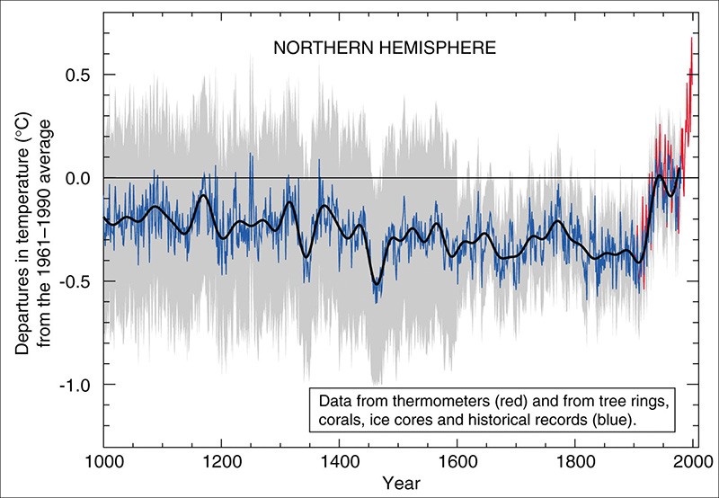
Figure 2.1 The hockey stick chart. Summary For Policymakers of the 2001 Third Assessment Report of the Intergovernmental Panel on Climate Change.
The Hockey Stick Chart
The fact that Earth has warmed in the past century, that it continues doing so at an alarming pace, and that humans have a key role in that warming isn’t controversial today outside of fringe—but very well-financed—partisan dens. I’m writing these words on the day that the Intergovernmental Panel on Climate Change (IPCC) is releasing its latest assessment report, the fifth since 1990.2 Its conclusion: climate change is “unequivocal.” Disagreements exist on the details, as is normal in science, and a lot of research remains to be done, but most of the scientific community agrees that climate change is a worrisome reality.3
2 For a summary, read http://www.theguardian.com/environment/2013/sep/27/ipcc-climate-report-digested-read.
3 Thousands of scientists from all over the world work on the IPCC reports, which strive to accurately reflect the consensus and disagreements within the scientific community. If you are among those who still believe that the IPCC is a conspiracy of radical scientists to get lavish government funding, it’s probably because you’ve never been close to a real scientist. Nothing brings more pleasure to researchers than to cruelly debunk their colleagues’ results.
The situation was different in 2001. That year, the IPCC published its third report. It was, arguably, the most controversial up to that point mainly because it prominently showcased the bomb of a chart in Figure 2.1. That graphic shows temperature variation measured in degrees Celsius in comparison to the 1981 to 1990 average, the zero line in the middle of the Y-axis.
What later came to be known as the “hockey stick chart” had already appeared, in slightly different forms, in scientific papers published in 1998 and 1999.4 One of them explained that the 1990s had been the warmest decade on record and that 1998, the latest year included in the chart, had been the hottest ever.
4 Mann, Michael E., Bradley, Raymond S., and Hughes, Malcolm K. “Northern Hemisphere Temperatures During the Past Millennium: Inferences, Uncertainties, and Limitations.” Geophysical Research Letters, Vol. 26, No. 6, pages 759-762, March 15, 1999.
As the systematic record of temperatures began only in the seventeenth century, the researchers had to look into multiple sources of paleoclimate data to draw a complete picture of temperatures in the past millennium. They used proxy variables5 such as tree-ring growth rates and changes in varved sediments, ice cores, and corals.
5 A proxy variable is a measurable unit or entity that can be used to study something that is hard, or even impossible, to observe directly. As an analogy, think of HIV, the virus that causes AIDS. Most tests that detect its presence in the human body don’t look for the virus. They try to find other clues of its presence, such as antibodies, which fight against infections. The entity “antibodies-against-HIV,” in this case, is a proxy of the entity “HIV virus.”
No statistical estimate is fully accurate, so the authors were careful to display uncertainty in their chart: notice the gray strip that surrounds the lines. With a very high degree of confidence, scientists can claim that the temperature of each year was within the range defined by the uppermost and the bottom tips of that gray strip.
The gray band grows thinner the closer we get to the present. Here’s why: as measurement tools and techniques improved, the data available to calculate average temperatures became much more precise and reliable. As a consequence, uncertainty became smaller.
The message of the chart is unambiguous: in the first years of the twentieth century, temperatures experienced a sharp rise. This was a time when emissions of human-made greenhouse gases, like carbon dioxide from fossil fuels, increased rapidly.
The hockey stick chart went unnoticed, except in scientific circles, until it was picked up by the IPCC for the 2001 report. After that, it became one of the most famous, influential, and disputed graphics ever. Michael E. Mann, his colleagues, and many climate scientists who had participated in the IPCC reports throughout the years began to receive vicious attacks—character assassination attempts, really—from individuals, political groups, and other organizations that have a vested interest in denying the reality of global warming, no matter how solid the evidence is.6
6 It’s actually rock-solid. A couple of short summaries that can lead you to other readings: http://www.theatlantic.com/technology/archive/2013/05/the-hockey-stick-the-most-controversial-chart-in-science-explained/275753/ and http://www.scientificamerican.com/article/behind-the-hockey-stick/. See also Naomi Oreskes’s and Erik M. Conway’s book Merchants of Doubt (2010). The authors reveal that the tactics used by climate change deniers today are identical to the ones the tobacco industry used decades ago to cast doubt over the evidence linking cigarette consumption and lung cancer.
As Mann himself wrote in 2012, “The controversy that the hockey stick would ultimately generate had little to do with the depicted temperature rise in and of itself. Rather, it was a result of the perceived threat this simple graph represented to those who are opposed to governmental regulations or other social restraints aimed at protecting our environment and the long-term prospects for the health of our planet.”7
7 Mann, Michael E. The Hockey Stick and the Climate Wars: Dispatches from the Front Lines (2012).
The hockey stick chart is one of the most iconic and persuasive visualizations ever created. It’s a success story, in Enrico Bertini’s words, because it has certain qualities:
1. It is truthful, as it’s based on thorough and honest research.
2. It is functional, as it constitutes an accurate depiction of the data, and it’s built in a way that lets people do meaningful operations based on it (seeing change in time).
3. It is beautiful, in the sense of being attractive, intriguing, and even aesthetically pleasing for its intended audience—scientists, in the first place, but the general public, too.
4. It is insightful, as it reveals evidence that we would have a hard time seeing otherwise.
5. It is enlightening because if we grasp and accept the evidence it depicts, it will change our minds for the better.
These five qualities constitute the framework this book is built upon. All of them are dangerously polysemic, so let me briefly explain them.
Truthful
If you randomly pick a book about visualization from your local bookstore or library, I have the hunch that one of the words you will find more often in it is “clarity.”8 We designers and journalists obsess over presenting things concisely, simply, clearly, and elegantly. Otherwise, people would be confused and upset when reading our graphics.
8 Now that so many books are available in digital format, I’d love to see an analysis of the words that are most often used. Perhaps my hunch is completely wrong!
Information designer Richard Saul Wurman calls himself an “information architect” and has explained why in several books, like his delightful fable 33: Understanding Change & the Change in Understanding (the boldface here is mine):
I mean architect as in the creating of systemic, structural, and orderly principles to make something work—the thoughtful making of either artifact, or idea, or policy that informs because it is clear.9
9 This quote also appears in Wurman’s classic Information Architects (1997).
But do those things really inform because they are clear? Or is clarity just a means? Should clarity be the prime value of visualization design? Hold those questions in mind for just one minute while looking at Figure 2.2.
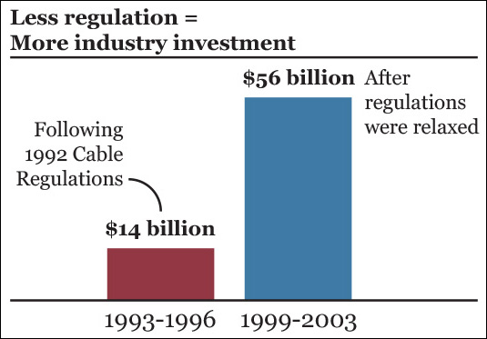
The original chart, which was similar to mine, was published on the home page of the website of the National Cable & Telecommunications Association. The NCTA is a trade organization that does very effective public relations and lobbying for U.S. cable companies.10
10 Visit https://www.ncta.com.
Here’s what the chart suggests: As a consequence of U.S. government regulations in 1992, cable companies invested little money in infrastructure. After regulations were relaxed, investment boomed. There you go. You see this chart on Twitter, as I did, and if you don’t inspect it closely or if you’re absentminded, you may walk away convinced of what the headline says: less regulation = more industry investment.
Let’s scrutinize the chart for a bit, though. Get used to not just seeing or looking at visualizations but to reading them. Marketers are very aware of the fact that most people don’t pay a lot of attention to what they see and that charts and data maps can be very persuasive, as they look so sciencey.11
11 In 2014, Aner Tal and Brian Wansink, two researchers at Cornell University, published a study in the journal Public Understanding of Science titled “Blinded with science: Trivial graphs and formulas increase ad persuasiveness and belief in product efficacy.” The results of their experiments were revealing: “The mere presentation of elements associated with science alongside claims about medication efficacy increases persuasion. People who were given graphs or formulas along with claims regarding medication efficacy displayed greater belief in medication effectiveness.”
First of all, assuming that these figures are adjusted for inflation (I didn’t check), notice that there are years missing. What happened between 1996 and 1999? Did these companies invest nothing during those years? That’s unlikely. Second, there are four years between 1993 and 1996 (first bar) and five between 1999 and 2003. If you want to add up the investments in those time periods, at least you should make sure that they encompass the same number of years.
Here’s some advice for you: whenever a designer, journalist, PR person, advertiser, or your own sweet Auntie Julie shows you a visualization with just a few figures that are the result of adding up, rounding, or averaging tons of data, distrust him or her. In a world full of graphics devoid of nuance, crooks thrive. If someone hides data from you, it’s probably because he has something to hide.
When the NCTA promoted this chart on Twitter, proudly announcing that it proved that government regulations are evil, my baloney alarm started screaming like crazy.12 I tweeted back, detailing some misgivings. The person running the NCTA’s account replied that anyone interested in seeing the data in more detail could navigate through their page to find an obscure blog post that’s not even linked from their index page.
12 I also call it “bullshit alarm.”
What I found was a chart like the one in Figure 2.3. It tells a completely different story. The Cable Television Protection and Competition Act—this is the evil regulation that was the focus of the first chart—was passed in 1992. Investment in infrastructure didn’t plunge right after but began growing healthily.

Following the deregulatory Telecommunications Act of 1996, investment fell, possibly because of the financial crisis of 1997–98, and then took off. Thanks to that piece of legislation? No idea. It could be. Or maybe not, as that increase corresponds to the rapid expansion of Internet access and the dot-com bubble between 1997 and 2000. In those years, an increasing amount of people got interested in accessing online content. Therefore, the spike in the line chart was likely just a reaction to high demand.
Even if all my conjectures above were wrong, I’m already conditioned to distrust the NCTA. This is the consequence of clear and effective, but ultimately deceitful, communication: misleading people isn’t just morally unacceptable, it also undermines your credibility.
Note that I haven’t used the word “lie.” I don’t think that the first graphic is a complete lie. The numbers in it are right, mathematically speaking. They are the result of adding up the investments of two periods of time, even if they are of different lengths. The first chart may be true, even if its headline isn’t. But the second one is much truer. It provides a much more accurate and factual depiction of the topic. Truth and untruth aren’t absolutes. They are the extremes at either end of a spectrum, an idea that I will expand upon in the next chapter.
Therefore, I don’t think that clarity should be the prime goal of visualization design. Getting our information as right as possible—that’s what being truthful means in the context of this book—comes first.
Being truthful involves two different but tightly connected strategies:
• Avoid self-deception. We humans evolved to see patterns in meaningless noise. We jump to conclusions. We see causality where there’s only correlation. Truthful graphics are created by people who do their best to prevail over their intellectual shortcomings and cognitive and ideological biases by applying certain critical thinking techniques.
• Be honest with your audience. Show them your best understanding of what the reality is. Or, to use the words of Carl Bernstein, one of the reporters who broke the Watergate story in the 1970s, we should strive to pursue and deliver “the best obtainable version of the truth.”
I can envision what some of you are thinking: “Oh, but we humans can’t be objective and truthful!” Perhaps you have read some critical theorists and sociologists of science too literally13 or attended Journalistic Reporting 101 in college and got convinced of these two ideas: (a) that the “Truth” is never fully available to us, as we’re prone to making reasoning mistakes, and (b) that we can’t strive to prevent and overcome those mistakes. (a) makes sense; (b) doesn’t.
13 Here’s a quote from popular philosopher Bruno Latour: “‘Reason’ is applied to the work of allocating agreement and disagreement between words. It is a matter of taste and feeling, know-how and connoisseurship, class and status. We insult, pout, clench our fists, enthuse, spit, sigh, and dream. Who reasons?” I tend to think the best of people, so I’ll assume that Latour’s ideas are much more nuanced than what those words, and many others in his oeuvre, suggest. I can’t be sure, though, as he is a notoriously ironic, obscure, and contradictory author.
Creating truthful graphics also involves making the right design choices. Here’s the first hint that the five qualities of great visualizations aren’t independent from each other but are tightly interrelated: to make a truthful graphic, you also need to pay attention to its functions or purposes.
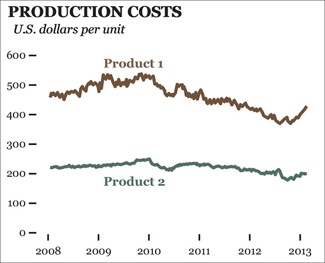
In Figure 2.4, I’m presenting the production cost of two products. They clearly co-vary, don’t they? Maybe not. Notice that the chart has two Y-axes and, as economist Gary Smith once said, “If you double the axes, you can double the mischief. Using two vertical axes and omitting zero from either or both opens a statistical beauty parlor with many cosmetic possibilities.”14
14 In his book Standard Deviations (2014)

As we’ll soon see, not all charts need a zero baseline, but being careless with scales and axes is always dangerous. The data look quite different if we plot the lines on the same scale (Figure 2.5).
Functional
If getting your information right is the most important step in creating any visualization, the second one is helping the audience interpret it correctly.
In my previous book, The Functional Art, I explained that choosing graphic forms to encode information is not mainly a matter of personal taste but can be based on rational thinking. Later in this book I’ll dig deeply into this process, which is akin to designing any object meant to be usable and useful: you begin with raw matter, you think of a purpose it can be used for, and then you shape it in a way that enables people to achieve that purpose.
This isn’t such an easy task. Look at Figure 2.6. I am hiding the percentages in the second pie chart on purpose. The goal of these charts is to help people estimate change—that’s explicit in the headline. Try to compare the popularity of hip-hop in 1994 and in 2014; tell me if reggae was more popular in 2014 than it was in 1994. And samba? It’s clear that country and classic music were equally popular in 1994, but what about in 2014?
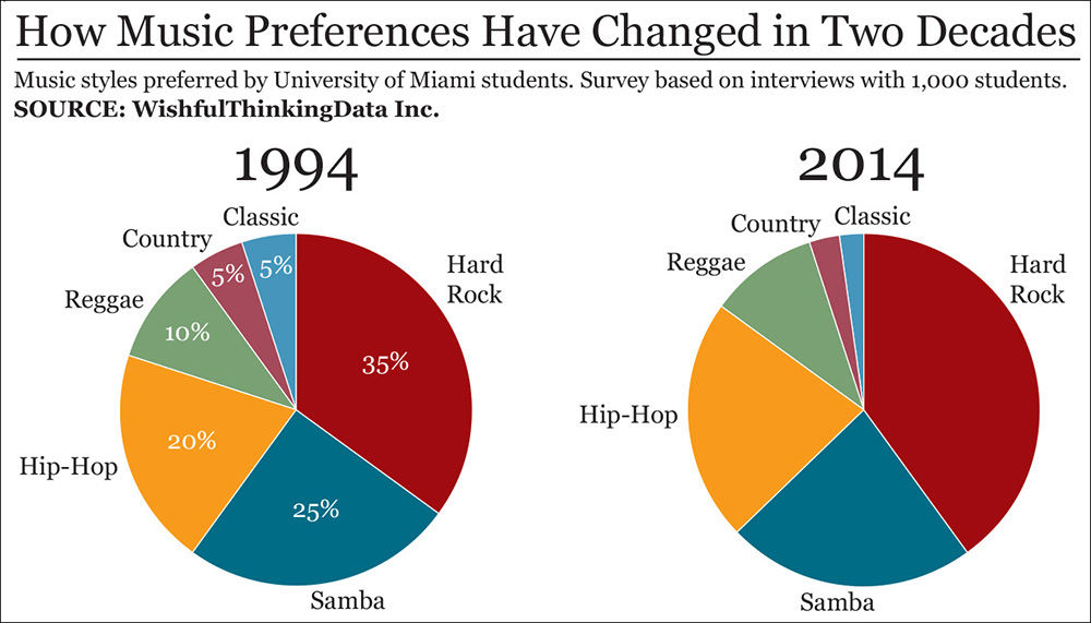
Figure 2.6 Notice the source of the graphic. Quite a bit of wishful thinking on my part was involved in making up the data, as I like hard rock.
Comparing slices within a single pie chart is hard enough. Comparing two or more pie charts is even more difficult.15 We’re being forced to pay attention to the numbers in the graphics rather than focusing on the size of their segments. And if you need to read all of the numbers in a chart to understand it, why do you need the chart in the first place?
15 Here’s design theorist Edward Tufte: “The only worse design than a pie chart is several of them.”
The reason why pie charts are still so widespread despite their obvious shortcomings escapes me. I think that people keep using them because they are fun and aesthetically pleasing. Also, as kids we got used to representing part-to-whole relationships using this kind of graphic, even if it is inefficient when you have more than two or three segments.
Now read Figure 2.7, in which I display exactly the same data as a slope chart. Isn’t answering the questions I posed before much easier now? You don’t even need to read the labels on the vertical axis to identify what went up and what went down. The purpose (or function) of my graphic is to display change, so I show change in a way that our brains can grasp: what grows bigger goes up, and what becomes smaller goes down.

This is what functional visualization means: choose graphic forms according to the tasks you wish to enable. The purpose of your graphics should somehow guide your decision of how to shape the information.
Beautiful
If you ever visit Chicago, make some time for a walk in the Near North Side area, downtown. Find the Chicago River—not a hard feat—and head east toward Lake Michigan. On the north bank of the river, you’ll see the Centennial Fountain. There’s a picture of it on the following pages, but don’t look at it just yet.
When passing by, most tourists are impressed by the huge water arc that the fountain shoots every hour, but they miss the story it tells. The first time I traveled to Chicago, I was lucky to be in the company of two knowledgeable friends, ProPublica’s Scott Klein and NPR’s Brian Boyer. They pointed out to me that the Centennial Fountain isn’t just an intriguing piece of architectural art. It’s also an explanatory visualization.
Before I show the fountain, I’d like you to read an infographic I designed (Figure 2.8). This is similar to many other slightly dull news graphics: a handful of simple maps, perhaps one chart or two, some copy to provide context, and that’s it. It gets the job done, but it’s not particularly exciting.
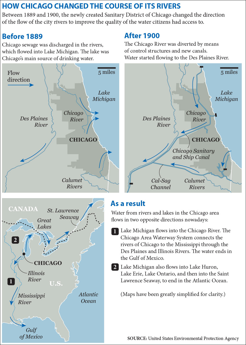
The Centennial Fountain was built to commemorate the 100th anniversary of the Sanitary District of Chicago. Between 1889 and 1900, that entity reversed the flow of several rivers in Chicago as part of an ambitious plan to solve the many sewage challenges the city had faced in the past. Before this great feat of civic engineering, sewage was discharged into Lake Michigan, which is the city’s main source of water, too.
Now see the fountain (Figure 2.9) and the explanation of how it should be interpreted (Figure 2.10). The central and highest point of the fountain is the city of Chicago. The arms at either side represent the watersheds that originate in it: one goes from Lake Michigan to the Atlantic Ocean, and the other was designed by the Sanitary District of Chicago at the end of the nineteenth century, taking water from the local rivers to the Gulf of Mexico.

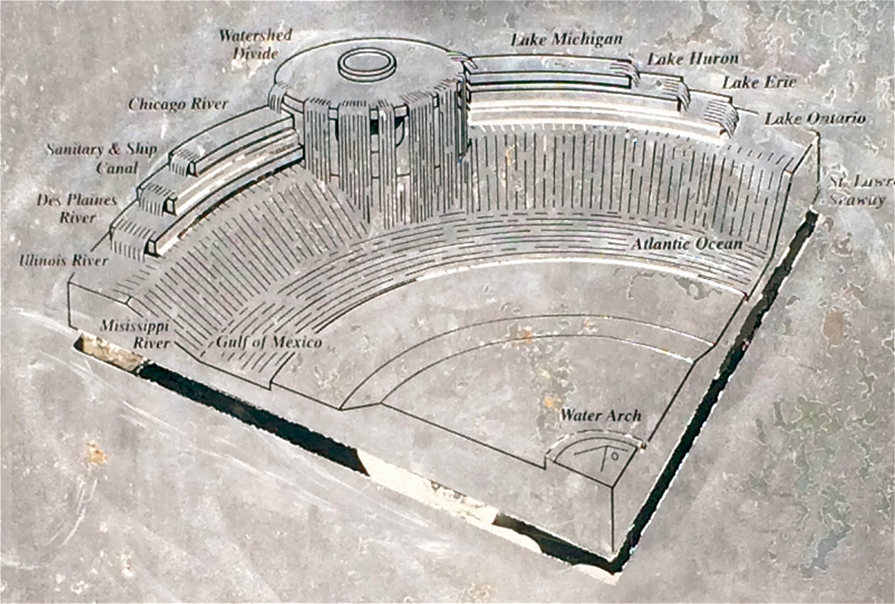
Figure 2.10 An explanation of how to “read” the fountain, part of its signage. (Photo by Scott Klein.)
Which visual explanation do you prefer? My version (Figure 2.8), which is precise—to be fair, it’s as precise as any infographic designed in 45 minutes can be—or the fountain?
Depending on the purpose of the visualization and its audience, I might choose the fountain. This highly schematic map of the watersheds isn’t to scale, so it’s not precise at all. But does it need to be? The fountain is a physical diagram depicting a system after all, so being true to the underlying geography may not be necessary, particularly if the tourists who visit it more often already know where those rivers and lakes are because they studied them in primary school.16
16 If we predict that many among the fountain’s audience don’t know much about U.S. geography, then it would be advisable to show the abstract diagram and something similar to my infographic side by side.
The Centennial Fountain is arresting, at least for the people I saw passing by during my visit. You cannot fail to notice it, to stop and contemplate its elegant symmetry, which can be appreciated without knowing anything about what it’s intended to represent.
These are the essential components of the feeling of beauty: the way we perceive the appearance of an object and its deep connection to its purpose. Beauty always consists of a balanced mix of sensual and intellectual pleasure. In the words of philosopher Roger Scruton, “Art moves us because it is beautiful, and it is beautiful because it means something. It can be meaningful without being beautiful; but to be beautiful it must be meaningful.”
Saying that beauty is subjective, as I’m anticipating that some of you will be quick to argue, is trivial. As any triviality, it contains a grain of truth, but think about it this way: anything that depends on human brains experiencing and interpreting our surroundings is subjective, as our experience is always mediated by complex interactions between sensation, perception, emotion, and feeling.17 What matters is to what degree that interaction is particular or universal, parochial, or broad. In other words, what matters isn’t if the objects of our creation are beautiful or not per se, but if they are experienced as beautiful by as many people as possible.
17 The way I commonly use those terms, which aren’t synonyms, has been influenced by Antonio Damasio’s book The Feeling of What Happens: Body and Emotion in the Making of Consciousness (1999).
I am sure that an overwhelming majority of readers, regardless of age, gender, race, or educational background would agree that the second chart in Figure 2.11 feels more aesthetically pleasing (and, therefore, closer to being beautiful) than the first one. Both of them present exactly the same content, but the second one does it in a much simpler, clearer, and more elegant way.
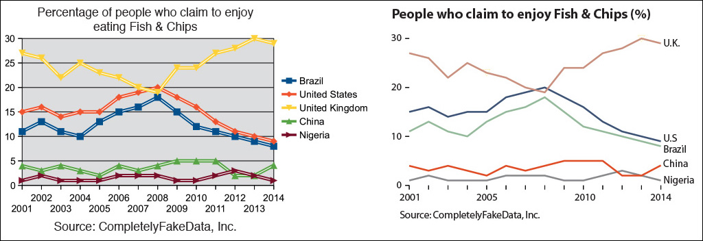
Beauty is, thus, not a thing, or a property of objects, but a measure of the emotional experience of awe, wonder, pleasure, or mere surprise that those objects may unleash. The very word “aesthetics” comes from the Greek aísth![]() sis, which means sensation or feeling. As Donald A. Norman wrote in his book Emotional Design (2003), beauty matters because attractive and pleasing things work better. They put us in a good mood, and so they invite us to invest some effort in understanding how to operate them.
sis, which means sensation or feeling. As Donald A. Norman wrote in his book Emotional Design (2003), beauty matters because attractive and pleasing things work better. They put us in a good mood, and so they invite us to invest some effort in understanding how to operate them.
Some things can be beautiful just by virtue of being efficient: they deliver a lot using a minimum amount of elements. Many visualization designers and theorists have stressed the importance of simplicity, and I tend to agree with them. As I’ve pointed out elsewhere,18 data visualization isn’t the same as data decoration.
18 “Don’t call yourself an infographics designer if what you do is data decoration.” From http://www.thefunctionalart.com/2014/10/dont-call-yourself-infographics.html
Unfortunately, there are people out there who call themselves infographics or data visualization designers but who are in reality data decorators. They deliver charts like Figure 2.12 with relentless and terrifying consistency. They ignore the advice of the likes of critic Alice Rawsthorn: “Design has been (...) trivialized, misunderstood, and misused. It is routinely confused with styling (...) Few things infuriate designers more [than feeling relegated to the role of styling or decorating].”19
19 This comes from Alice Rawsthorn’s book Hello World: Where Design Meets Life. See references at the end of this chapter.

That said, personal aesthetic preferences can play a role in visualization, and not all design choices that are unrelated to the data can be deemed as useless, whimsical decoration, or chart junk. The work of the design studio Accurat is paradigmatic. It stands in the blurry boundary between data visualization and art. In Figure 2.13, Accurat sacrificed some clarity to come up with an artistically expressive display.
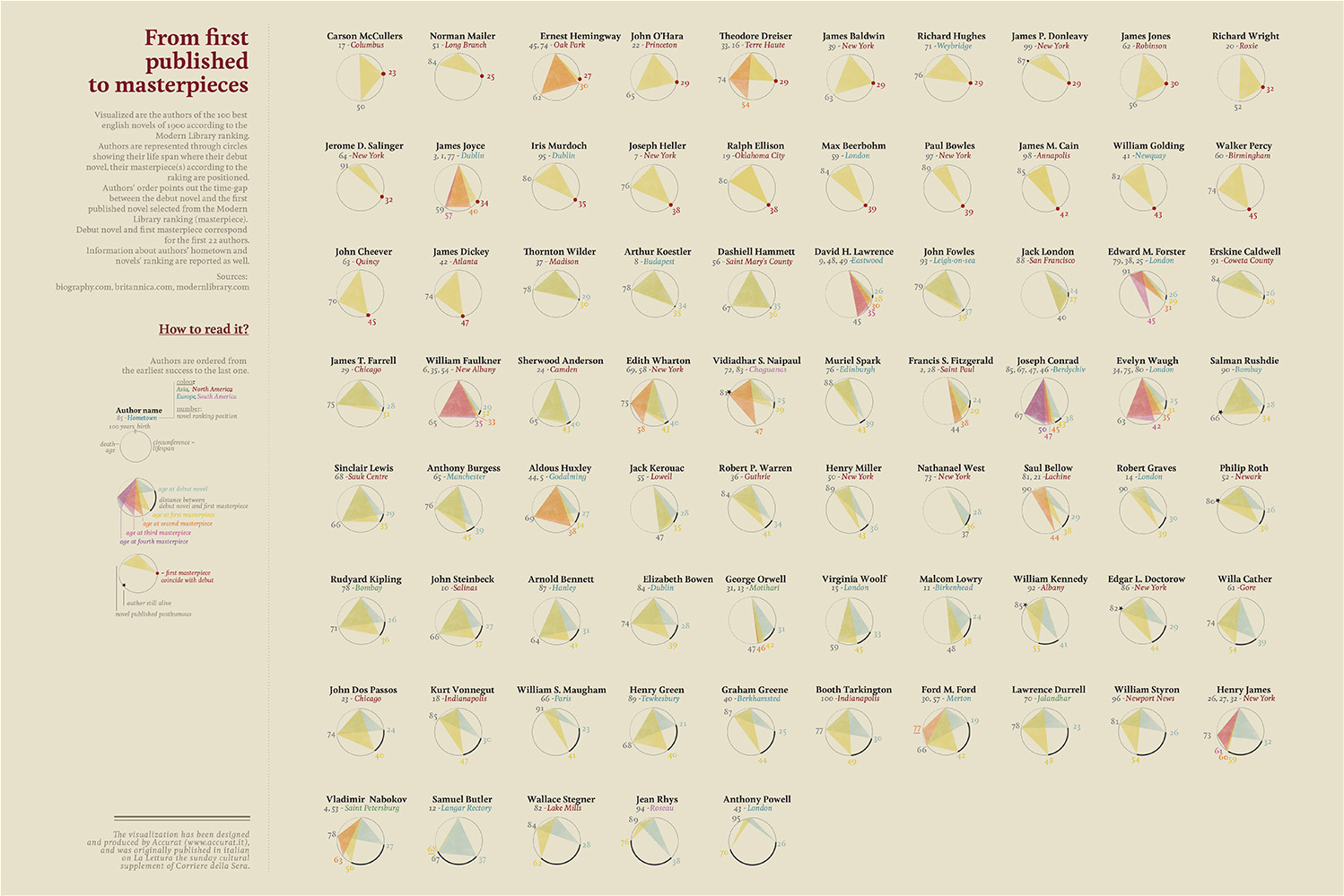
Compare Accurat’s graphic to a quick redesign I’ve just made, in Figure 2.14, which is just a draft based on a small sample of authors. Mine, if it was finished and the writers were sorted correctly, would be more efficient at letting readers extract patterns and make accurate comparisons. However, to me it also looks less intriguing, surprising, and elegant than the original.
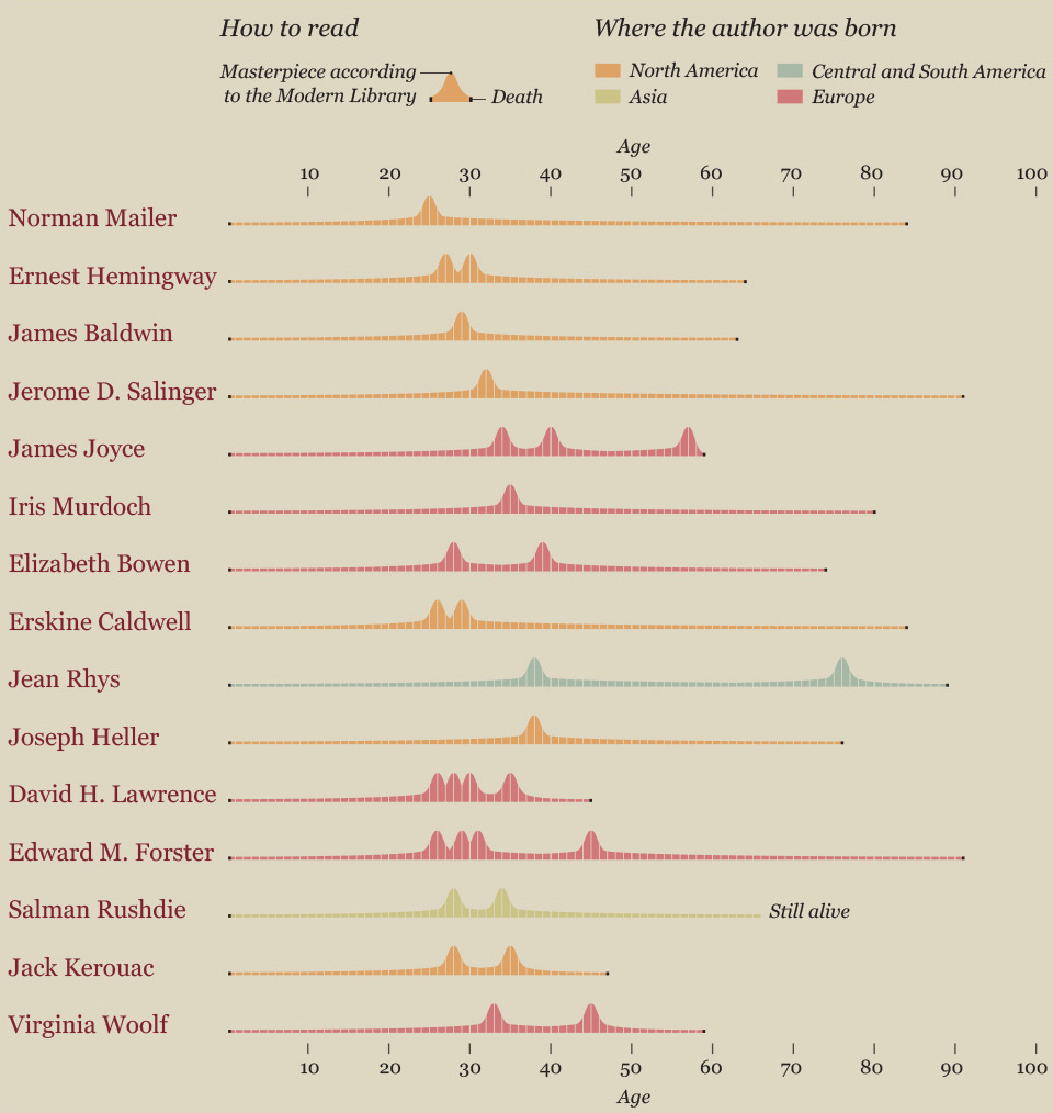
Figure 2.14 A quick redesign of Figure 2.13.
Which one do you think I’d print if I were the owner of a publication, mine or Accurat’s? Is it appropriate to make a graphic less readable—or more complicated—if that increases its novelty and visual appeal? Are there strategies to make function and beauty reinforce each other? How do we balance them out? I will withhold my answers to those questions for now. I’ll just give you a heads-up, also coming from critic Alice Rawsthorn:
Of all the many thousands of words devoted to untangling the tortuous relationship between art and design, my favourites are those of Charles Eames, who, when asked if design was “an expression of art,” said: “I would rather say that it is an expression of purpose. It may (if it is good enough) later be judged as art.”
Insightful
“The purpose of visualization is insight, not pictures,” proclaims a classic book.20 This means that good visualizations clear the path to making valuable discoveries that would be inaccessible if the information were presented in a different way. Visualizations that offer just obvious and trivial messages are worthless. Implicitly, their designers ask you to invest effort in reading them in exchange for very little return.
20 Readings in Information Visualization: Using Vision to Think, co-edited by Stuart K. Card, Jock D. Mackinlay, Ben Shneiderman
Designers of visualizations, and scholars who study them have struggled to give a coherent definition of insight. A group of researchers from the University of North Carolina–Charlotte proposed that there are several kinds of insight.21 One of them, spontaneous insight, is equivalent to a “eureka” or “a-ha” moment. It’s sudden, surprising, and unexpected. Another one, called knowledge-building insight, is based on a gradual and deliberate process of exploration of the information that doesn’t necessarily lead to “wow” moments.
21 “Defining Insight for Visual Analytics,” by Remco Chang, Caroline Ziemkiewicz, Tera Marie Green, and William Ribarsky: http://www.cs.tufts.edu/~remco/publications/2009/cga-viewpoints-insight.pdf.
The two kinds of insight are related. Talking about science, the authors write, “The major paradigm shifts associated with spontaneous insight can create new structures and relationships in a user’s understanding of a problem, which can then serve as the schematic structures needed for generating future knowledge-building insights.” This newly acquired knowledge can then open the door to even more spontaneous insights, in a virtual cycle akin to the island of knowledge metaphor I discussed earlier.
The hockey stick chart at the beginning of this chapter is an example of how spontaneous insight works. It’s likely that many readers experienced a eureka moment the first time they saw it: “Whoa, take a look at that steep slope! What’s going on there?” Suddenly, what hid behind a veil of complexity became evident; meaningful patterns and trends turned into something they couldn’t ignore.
Knowledge-building insight is much more common in interactive visualizations. Consider the graphic in Figure 2.15, and go to the link in its caption. First, you’ll see the global PhD gender gap. Now, click the little arrow to the left of “All PhDs” and you’ll access “Non-science PhDs.” Did you notice something? The gender gap is wide, but now there are more women than men in most countries. Women tend to choose graduate programs in the social sciences and the humanities more than men do.
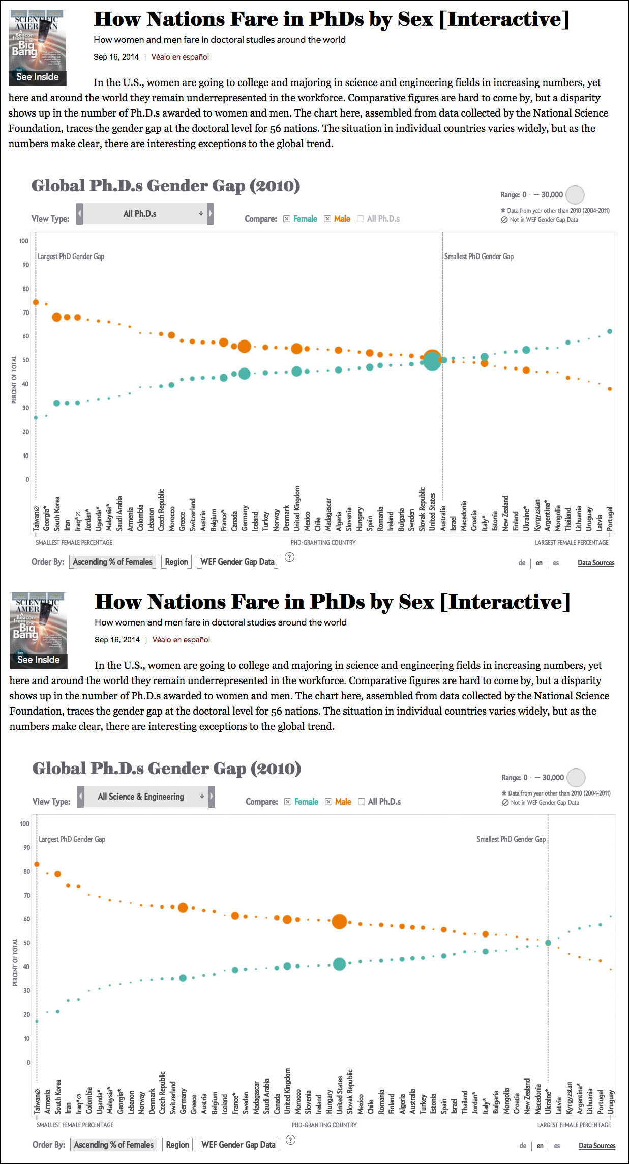
Figure 2.15 Graphic by Periscopic for Scientific American magazine: http://www.scientificamerican.com/article/how-nations-fare-in-phds-by-sex-interactive/.
Click the same arrow again, and you’ll be as struck as I was by the huge gender imbalance in science and engineering. In places like Taiwan and South Korea, more than 75 percent of graduates are men. If you ever believed that the lack of gender diversity in the tech industry worldwide was a hoax, check the evidence. This interactive visualization will be of great help with that.
Enlightening
Ultimately, the goal of any candid visual communicator is to give people access to the information they need to increase their well-being. Great visualizations change people’s minds for the better. They are enlightening.
An enlightening graphic is a consequence of paying attention to the previous four qualities. A graphic that is truthful, functional, beautiful, and insightful has the potential of being enlightening as well. But there’s something else to consider at this point: the topic of the visualization. Choosing topics ethically and wisely—casting light over relevant issues—matters a lot.
Every semester I mentor several students who want to pursue careers in data visualization or news infographics. One of the projects I’m most proud of was made by a Spanish designer and programmer, Esteve Boix, who is very passionate about geeky movies and TV shows.
Esteve wanted to quantify the first season of Buffy the Vampire Slayer, the television series that brought fame to writer-director Joss Whedon. I agreed on the topic, although I knew close to nothing about Buffy. My experience tells me that students do much better when they can work on things they care about.
The results were impressive (Figure 2.16). Esteve turned in a project that explores every episode of the first season of Buffy. You can see which characters were onscreen in each scene and sort and filter the data in different ways. Esteve didn’t work with an existing database, by the way. He watched all episodes repeatedly to time each character’s appearances.
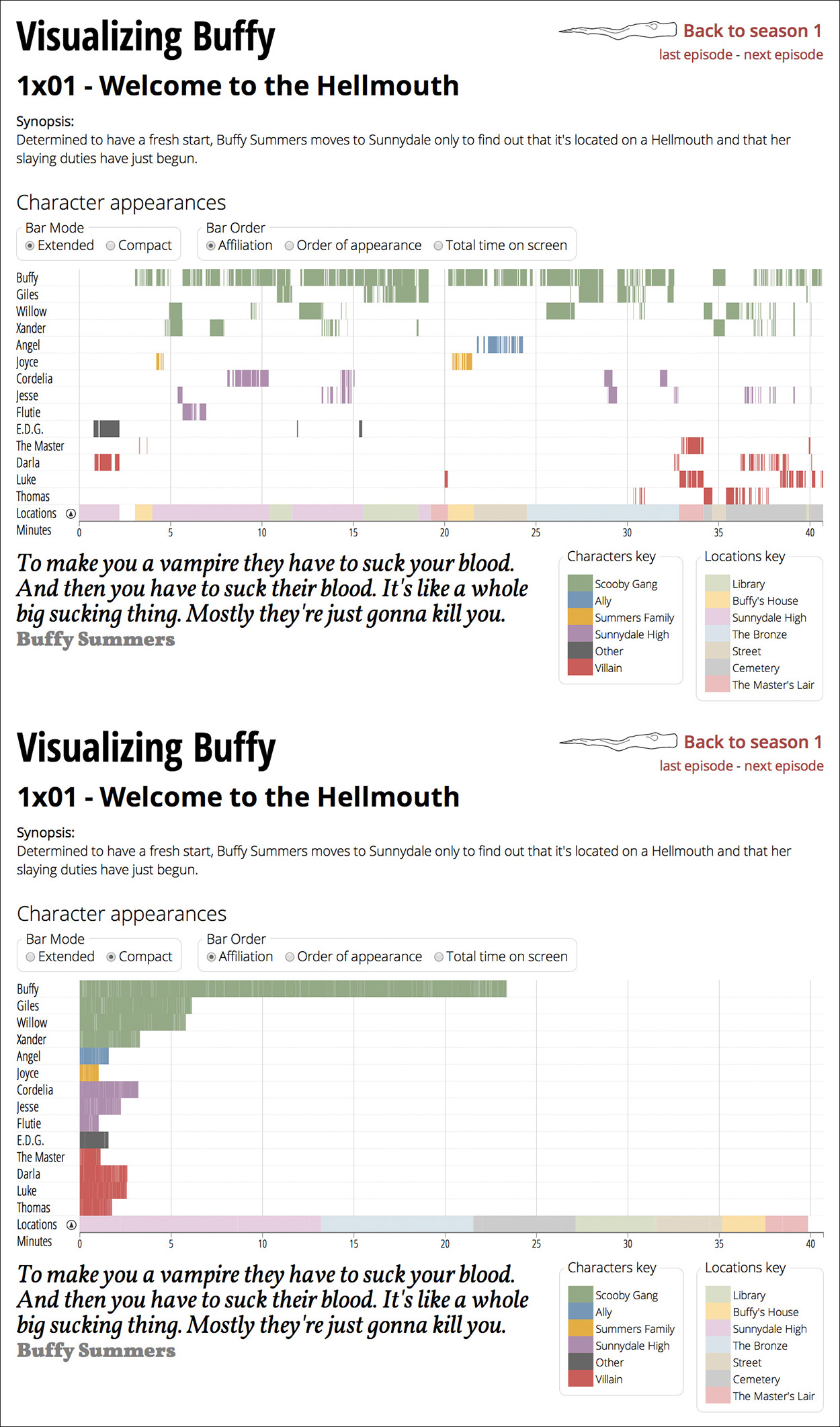
Figure 2.16 http://www.visualizingbuffy.com by Esteve Boix.
Now, read the following paragraph, which opens an article by Pulitzer Prize winner David K. Shipler, written after Hurricane Katrina devastated the coast of Louisiana:
There is no more telling indictment of reporters and editors than the surprise felt by most Americans in seeing the raw poverty among New Orleans residents after Hurricane Katrina. In an open society, nobody who had been watching television or reading newspapers should have been surprised by what Katrina “revealed,” to use the word so widely uttered in the aftermath. The fissures of race and class should be “revealed” every day by America’s free press. Why aren’t they?22
22 “Monkey See, Monkey Do”: http://nhi.org/online/issues/145/monkeyseemonkeydo.html.
Nowadays, as any of us can potentially be part of that “free press,” we can also ask ourselves: which of these topics matters more, Buffy or New Orleans? The easy response is to succumb to relativism: “It depends on who you are and on your audience. Besides, those topics aren’t comparable!”
I honestly believe that that’s not what you really want to answer. Those topics are comparable. We humans love to have fun instead of worrying about somber realities—to eat doughnuts instead of broccoli, so to speak—and we’ll make any excuse we can to justify our behavior and rationalize it, no matter how well we know, deep inside, that we’re fooling ourselves consciously and unashamedly. Some topics do matter more than others indeed because they are more critical to the well-being of more people.
I’m not saying that visualizing Buffy is wrong, mind you. It’s great, in fact. Lifestyle and popular culture sections in newspapers and magazines exist for that reason. But life is short and time is limited, so given the choice of tweaking our priorities as visual communicators, we perhaps could work a bit more on the New Orleans of this world and a bit less on the vampire slayers. If Esteve wanted to do a second visualization project, I’d suggest being inspired by the work of the Pulitzer Center, such as its visualization about childhood mortality (Figure 2.17).

Figure 2.17 Child Lives. Pulitzer Center: http://pulitzercenter.org/blog/child-lives-visualization-mortality-global-aid-public-health
Caring about social good doesn’t mean that we need to become ideologues or activists, which is a quite tempting prospect. The motto of one of the visualization companies that I admire the most, Periscopic, is “do good with data.” I wholeheartedly support that motto, but I also feel uncomfortable with it, as the road to hell is paved with good intentions. Most activists I’ve met are noble and honest people, but some, like anti-vaccine campaigners, are deeply misguided.
We should certainly do good with data, but only after we’ve thoroughly made sure that our data is good. Let’s see how.
To Learn More
• Papanek, Victor. Design for the Real World: Human Ecology and Social Change. Chicago: Chicago Review Press, 2nd ed., 2005. A vigorous manifesto about ethical choices in design.
• Rawsthorn, Alice. Hello World: Where Design Meets Life. New York: The Overlook Press, 2013. An overview of what design—graphic and otherwise—really is.
• Scruton, Roger. Beauty. New York: Oxford University Press, 2009. A brief and intriguing essay about aesthetics.
• Tufte, Edward R. The Visual Display of Quantitative Information. Cheshire, CT: Graphics Press, 1983. Tufte has written four books about visualization design. His first one is still the best.