7. Visualizing Distributions
I couldn’t claim that I was smarter than 65 other guys—but the average of 65 other guys, certainly!
—Richard P. Feynman, Surely You’re Joking, Mr. Feynman!: Adventures of a Curious Character
My favorite data-driven stories are those that reveal something funny about the human condition. Christian Rudder, one of the founders of the dating website OKCupid and author of Dataclysm: Who We Are (When We Think No One’s Looking), has plenty of them.
Creating a profile in OKCupid involves filling out some surveys to give the website clues to find the people you may be most interested in dating. Based on your answers, OKCupid soon begins sending you recommendations. By analyzing your navigation patterns (see photo, click it, spend some time reading the profile), the data folks at OKCupid can estimate the preferences of their users. In Figure 7.1, I’m presenting the two charts I found most amusing in Rudder’s book.
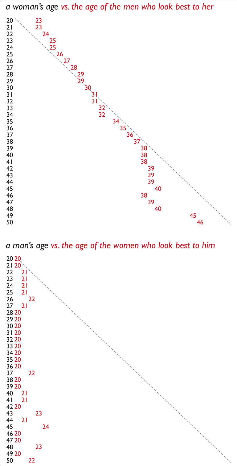
The one on top shows the age of women compared to the average age of men they find most attractive. Women who are 20 like men who are 23, women who are 30 like men who are their own age, women of 40 like men of 38. The diagonal line is the age parity line.
The second chart shows that men of all ages invariably find women in their early twenties attractive. This isn’t that surprising, is it? I guess that we all already knew that most men like the looks of younger women, even if we end up dating and marrying women who are close to our own age.1 Well, here you have the data to confirm that hunch.
1 When asked directly, both men and women say they would like to date people who are roughly their same age.
I like to show Rudder’s elegant charts in my classes. My students are usually thrilled. These graphics are just so persuasive and clear, they say. Dangerously so, I reply. As we saw in the previous chapter, a single statistic—the mode, the mean, the median, etc.—may not be a model that represents the entire data set correctly. In his book, Rudder acknowledges this problem and explains caveats in his data.
I wish journalists and designers were that careful. How many times have you read news stories that report just averages, with no mention whatsoever of ranges, distributions, frequencies, or outliers? Sometimes it may be appropriate to mention just a simple average, but that doesn’t happen often. The age of the women who most men my age (40) find most good-looking is 21. Now, imagine that we don’t show just that figure to our readers. Instead, we plot all preferences of all men of 40 on a histogram.
I’ve designed five fictitious histograms (Figure 7.2) that share the same mode, 21. Each little red rectangle represents 1 percent of 40-year-olds, so there are 100 rectangles on each chart. Ask yourself on which of these cases you would report just an average.

Figure 7.2 Five possible (and fictitious) distributions for the data corresponding to the preferences of men of 40. All of them have the same mode: 21.
I’d say that it’d be appropriate to do so just in the first case—and I still have my doubts—because all scores are clustered around the mode, at the lower end of the distribution, and the range is relatively narrow. All the other distributions would force you to show readers not just the average, but the very relevant details that hide behind them.
On distributions 3 and 4, for instance, a good amount of 40-year-old men like women who are their age. On 5, many 40-year-old men find women who are older than they are attractive.
This is another example of why we should always design visualizations of our data. To supplement them, we can also calculate numerical summaries of spread. We’ll learn about two methods in this chapter: first, the standard deviation and, then, the one that is preferred in exploratory data analysis, percentiles.
The Variance and the Standard Deviation
Any data analysis software can calculate a standard deviation for you faster than a frog zaps a fly with its tongue, but it’s important to understand where that statistic comes from. So let’s take a look at a handful of simple formulas.
To calculate the standard deviation, we first need to find the variance, a statistic that is quite useful for confirmatory tests.2 Figure 7.3 shows the formula for the variance with some explainers to clarify its elements.
2 You may have heard of ANOVA, which means “analysis of variance.” This test is useful to analyze if the differences between the means of several groups of scores (say, test scores from several schools) are noticeable enough.
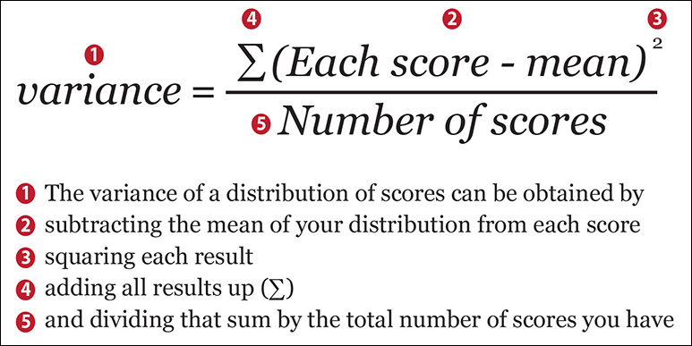
To calculate the variance, first you need to have the mean of your distribution. Remember that the mean is the result of adding up all your scores or values and then dividing the result by the number of scores. Once you have the mean, get all your scores, subtract the mean from each of them, and square each result. Then add up all the results.
After that, divide this sum by the total number of scores.
Two important side notes: First, why the squaring portion of the formula? The reason is that there are scores/values that are smaller than the mean. Therefore, when you do the subtractions, some results will be negative numbers. If you add up the results of all subtractions without squaring them first, negative values will cancel out positive ones, and the final sum will be zero. If you don’t believe me, see the small data set in Figure 7.4 and compare the non-squared deviations from the mean (each score minus the mean) to the squared ones.

Second: At the end of the formula, we divided by the number of scores. However, most statistics and data analysis books recommend to do that only if you’re calculating the variance of a population. If it’s a sample from that population you’re analyzing, they recommend to divide by the mean minus one.
Why minus one? The answer is a bit complicated, so I’m going to give you just the short version: it’s a correction to remove possible distortions. When dealing with smallish samples, if you just divide the sum of squared deviations by the number of scores in the sample, the variance may be quite different from the real variance of the population. Subtracting 1 from the number of scores before making the division will result in a variance that may be closer to the variance of the population our sample is intended to represent. Let’s leave it there.
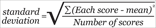
Now that we know how to calculate the variance, the standard deviation will be as easy as 1+1. Here’s the formula:
Standard deviation = Square root of the variance
The full version of the formula is on Figure 7.5. If you compare it to Figure 7.3, you will see that the only addition is the square root symbol. Now, let’s learn what the standard deviation is useful for.
Standard Deviation and Standard Scores
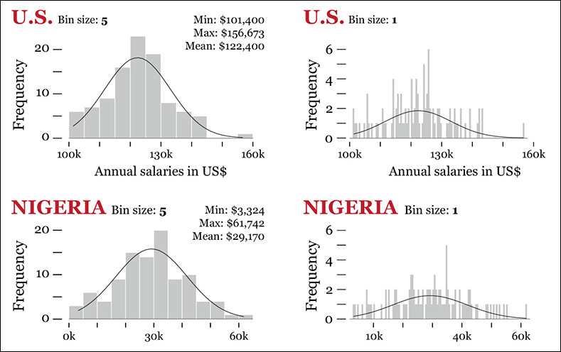
Imagine that you are studying the gross annual salaries of the Information Technology (IT) employees of a company that operates in two countries, the United States and Nigeria. There are 100 IT workers in each country. Figure 7.6 shows the first few rows of our data set, corresponding to the highest salaries.

Figure 7.6 See the entire data set at www.thefunctionalart.com.
We want to run some comparisons based on these distributions. For instance, we may wish to know, roughly, in which country salaries are more or less equal or how salaries in both countries compare to each other. First, we calculate the mean and the standard deviation. I’m not even going to use the formulas explained before. I’ll make the software do the heavy lifting for me:
U.S. salaries. Mean: 122,400; Standard deviation: 10,746
Nigerian salaries. Mean: 29,170; Standard deviation: 12,589
In the case of the United States, the standard deviation is roughly 8.8 percent of the mean salary. In Nigeria, the standard deviation is a whopping 43.2 percent of the mean salary! This may suggest that U.S. salaries have a reasonable range, while Nigerian ones tend to deviate a lot from their mean. Let’s write a note about it and continue working.
Read the histograms on Figure 7.7. I designed two for each distribution, changing bin sizes to avoid being misled by any single graphic. I also overlaid density curves. These are lines that software can calculate for you and that may be helpful to spot patterns when a distribution is very messy.
Next, suppose that we want to see what the equivalences are between U.S. and Nigerian salaries. Say that an IT employee makes $125,335 a year in the United States. What would be a similar salary in Nigeria?
When discussing where a specific score stands in its distribution and how it compares to others, we can transform it into a standard score (or z-score). A standard score is simply an indication of how far a raw score deviates from the mean, measured in number of standard deviations.
To better understand this idea, I’m plotting the standard deviation over our histograms (Figure 7.8). How far is the highest U.S. salary ($156,673) from the mean? Roughly, it’s 3.2 standard deviations. This number is the standard score of that salary. And the lowest salary, $101,400? It’s around –2.0 standard deviations from the mean. That’s the standard score that corresponds to that raw score.
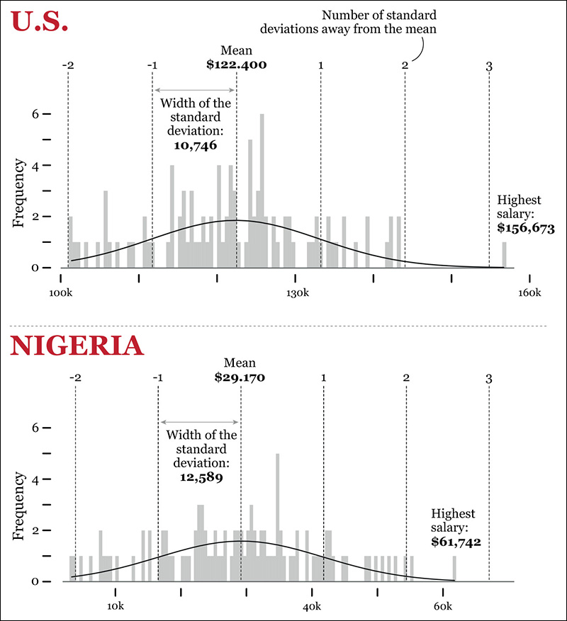
Notice something interesting in the distribution of salaries in Nigeria? The lowest salary there, $3,324, is just a bit below -2.0 standard deviations from the mean, similar to what happens in the United States. What about the highest salary in Nigeria, $61,742? It’s 2.6 standard deviations from the mean. The highest salary in the United States. ($156,673), on the other hand, is 3.2 standard deviations from the mean of its distribution.
Does this mean that we have suddenly proved that U.S. salaries are more unequal than Nigerian ones? Not so fast. Read the charts again. In the U.S. distribution, if we ignore the highest salary, which is an unusual case, all the other ones lie within 2 and -2 standard deviations from the mean. In the Nigerian distribution, three values are beyond the –2 and 2 boundaries: the lowest salary and the two highest ones.
Lesson learned, again: Never trust just one statistic. Always plot your data.
Let’s go back to standard scores. Here’s how to calculate them:
z-score of a raw score = (Raw score-mean)/standard deviation
Let’s apply this formula to some U.S. salaries. Remember that the mean is $122,400 and the standard deviation is 10,746:
$156,673 -> z-score = (156,673-122,400)/10,746 = 3.2 (I’m rounding these)
$125,335 -> z-score = (125,335-122,400)/10,746 = 0.3
$101,400 -> z-score = (101,400-122,400)/10,746 = -2.0
Now, Nigeria. The mean is $29,170 and the standard deviation, 12,589:
$61,742 -> z-score = ($61,742-29,170)/12,589 = 2.6
$31,074 -> z-score = ($31,074-29,170)/12,589 = 0.2
$4,879 -> z-score = ($4,879-29,170)/12,589 = -1.9
Back to the question I posed before: If an IT employee is making $125,335 in the United States, what would a person in a similar position make in Nigeria? We know that the standard score of $125,335 is 0.3 (see above). Which salary in Nigeria has a standard score of 0.3?
To do this, we need to reverse our previous formula.
From z-score of a score = (Raw score – mean)/standard deviation
We derive Raw score = (z-score × standard deviation) + mean
Therefore: Raw score = (0.3 × 12,589) + 29,170 = $32,947
Standard scores can come in handy when comparing different distributions, mainly when these distributions are normal (more about this in a minute). Say that you are a student and that you have done two final exams, graded on a scale from 0 to 100. On the math exam you got 68. On the English one you hit a mark of 83.
Can you say that you did better in English than in math? Nope. To be sure, you need the grades of your peers to calculate the mean and the standard deviation of both exams. Suppose that the mean grade of the math exam was 59 and the mean grade of the English exam was 79. The standard deviation was 5 in the math exam and 7 in the English exam. Therefore:
Your grade in the math exam: 68 -> z-score = (68-59)/5 = 1.8
Your grade in the English exam: 83 -> z-score = (83-79)/7 = 0.6
So you did proportionally better in the math exam, as your grade was 1.8 standard deviations above the mean!
The name “standard score” to refer to z-scores may be a bit misleading, in the sense that it suggests that they are the only way of standardizing raw scores. In reality, when you control one variable for another variable or factor, you are also standardizing the original variable. The very word “standardize” means “to compare with a standard,” after all.
A few chapters ago, I wrote about comparing motor vehicle fatalities in two cities that have widely different populations, Chicago, Illinois, and Lincoln, Nebraska. You’d never compare just the total accident counts. You’d also need to compare rates, which are standardized scores—for instance, the number of fatalities per 100,000 vehicles. Similarly, when you analyze salaries or prices of products across the years, you must adjust for inflation. This adjustment is a form of standardization.
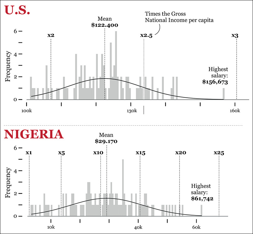
We could explore our data set of salaries of IT workers in the United States and Nigeria by standardizing the scores in a different way. For instance, we know that the minimum salary in the U.S. headquarters is $101,400, whereas in Nigeria it’s $3,324, and they are both around -2.0 standard deviations away from the means of their distributions. But this tells us nothing of how high or low these salaries are in comparison to the income of the population in those countries.
We can try to express all salaries as a function of the average national salary or of the Gross National Income (GNI) per capita. The 2013 GNI per capita was $53,470 in the United States and $2,710 in Nigeria. We could do the following operation:
Salary of each IT worker in the company/ GNI per capita of her country
Therefore, in the United States:
Minimum salary of IT worker: $101,400/$54,470 = 1.9 times the U.S. GNI per capita.
Maximum salary: $156,673/$54,470 = 2.9 times the U.S. GNI per capita.
And in Nigeria:
Minimum salary of IT worker: $3,324/$2,710 = 1.2 times the Nigerian GNI per capita.
Maximum salary: $61,742 /$2,710 = 22.8 times the Nigerian GNI per capita!
We could then re-create our histograms (Figure 7.9). After reading them, ask yourself again where IT workers are really better paid in relative terms.
Presenting Stories with Frequency Charts
Let’s catch some breath after all that math. Frequency charts can be useful not just to explore the shape of your data but also to reveal it to your readers. And the histogram isn’t the only graphic form you can use.
Take the presidential approval chart by The Washington Post on Figure 7.10. The darker the shade, the more common a particular approval rating was in Gallup polls for each president.
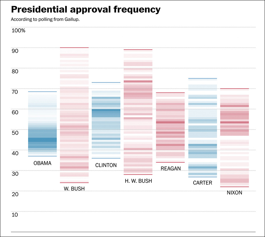
Figure 7.10 Graphic by The Washington Post; see http://www.washingtonpost.com/blogs/the-fix/wp/2015/01/02/barack-obamas-presidency-has-been-remarkably-steady-at-least-in-his-approval-rating/.
This lovely little graphic reveals that the range of approval ratings for presidents like Obama and Clinton is pretty narrow, particularly compared to George W. Bush and George H. W. Bush. However, Obama’s approval ratings tend to concentrate at the lower end of the range, while Clinton’s are a bit closer to the upper one.
Figure 7.11 comes from Spain’s elespanol.com, a news website that was launched right before the 2015 presidential election, so much of its initial coverage was related to this event. Each of these histograms compares the ideologies of people who intend to vote for each party with the ideology of the Spanish population in general. Data came from the Centro de Investigaciones Sociológicas (Center for Sociological Research), a governmental organization.
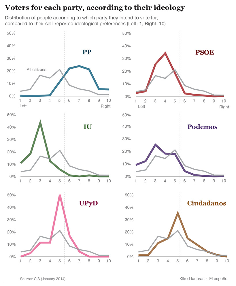
Figure 7.11 Graphics by Kiko Llaneras for elespanol.com, http://www.elespanol.com/actualidad/asi-es-la-ideologia-de-los-votantes-de-cada-partido-segun-el-cis/.
Citizens who declare themselves as voters for Partido Popular (PP) tend to lean to the right, while Podemos’ and Izquierda Unida’s (IU) sympathizers are mostly leftist. Ciudadanos’ fans are centrists, for the most part.
Besides the histograms, elespanol.com’s Kiko Llaneras also designed vertically oriented charts (Figure 7.12) with a different distribution. In this case, potential voters weren’t asked to position themselves on a scale from 0 (hard-left) to 10 (hard-right), but to choose the label that better defines their ideological stance—communist, conservative, ecologist, and so on. (Note for U.S. readers: In Europe, a “liberal” is a person on the center-right, usually progressive in cultural issues but conservative in economic ones.)

Figure 7.12 Graphics by Kiko Llaneras for elespanol.com: http://www.elespanol.com/actualidad/asi-es-la-ideologia-de-los-votantes-de-cada-partido-segun-el-cis/.
Exploring and presenting data may require multiple graphic forms shown simultaneously on screen. In 2013, Ukraine’s Texty.org.ua published an interactive visualization of student performance in the largest cities (Figure 7.13). The GPA scores of each school is presented on a strip plot, as well as on hexagon-based maps. The drop-down menu lets readers choose subjects: math, English, etc. One critical feature that aids exploration in this case is that chart and maps are linked: when you hover over one hexagon, schools in that area are highlighted on the strip plot.
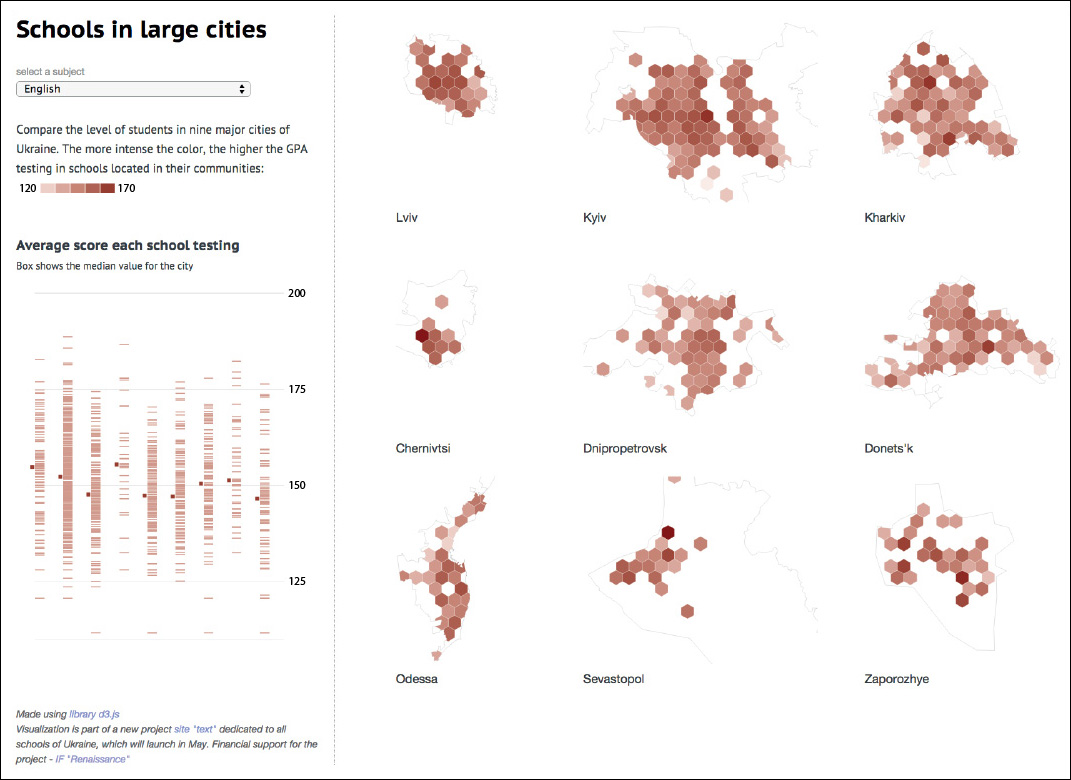
Figure 7.13 Graphic Texty.org.ua; see http://texty.org.ua/mod/datavis/apps/schools2013/. Use a translation tool if you don’t read Ukrainian. That’s what I did!
Finally, see the sequence of histograms and network diagrams in Figure 7.14. They represent the growing partisan divide in the United States between 1949 and 2011 by visualizing patterns of cooperation between pairs of representatives in Congress. The math behind these graphics requires some explanation, but I think that they make it evident that since 1949, intra-party collaborations have become much more common than inter-party ones.3
3 Read the paper: http://journals.plos.org/plosone/article?id=10.1371/journal.pone.0123507#abstract0. Politico.com published some comments about it: http://www.politico.com/story/2015/04/graphic-data-america-partisan-divide-growth-117312.html.
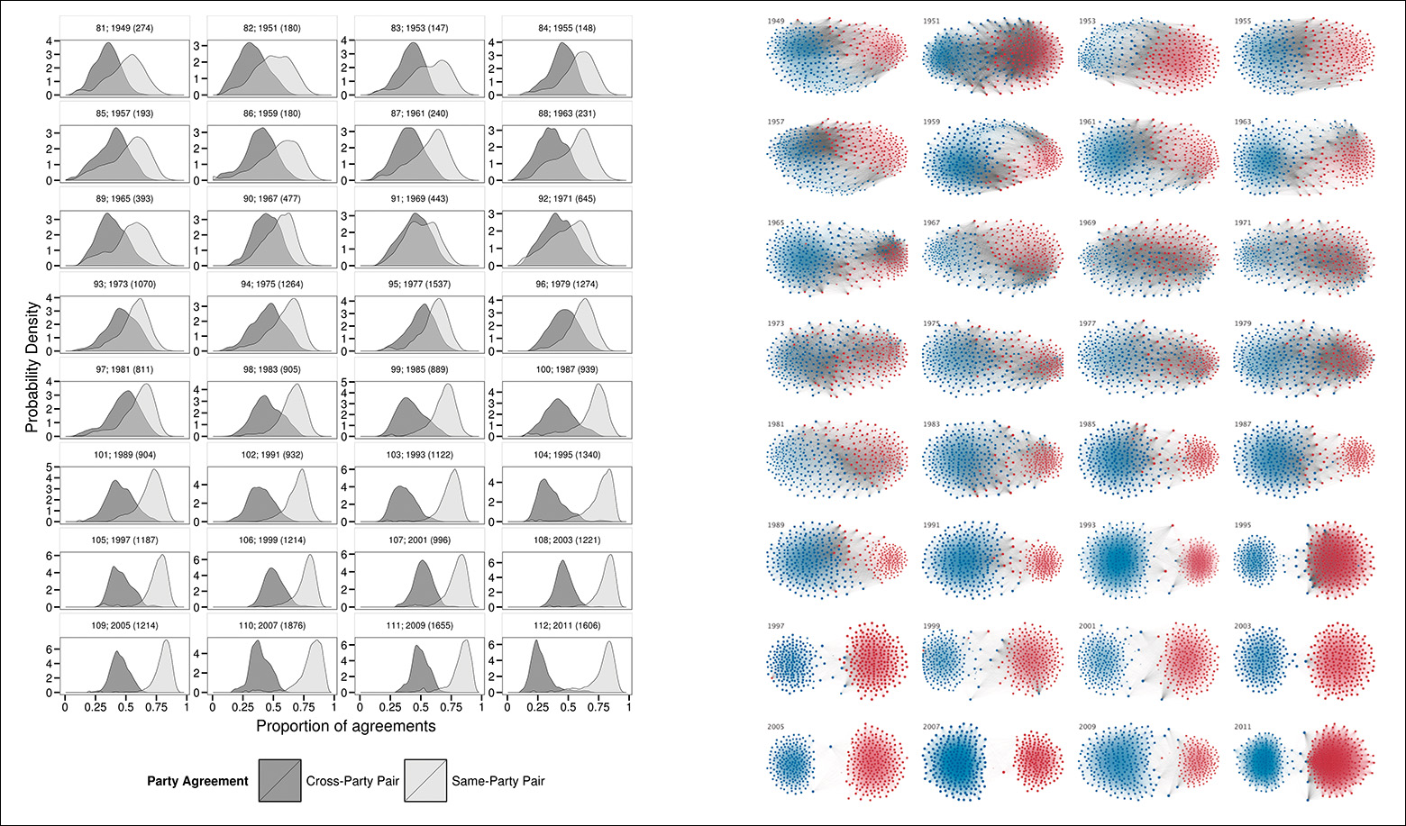
Figure 7.14 For an explanation on how to interpret these graphics, see “The Rise of Partisanship and Super-Cooperators in the U.S. House of Representatives.” Clio Andris, David Lee, Marcus J. Hamilton, Mauro Martino, Christian E. Gunning, John Armistead Selden, at http://journals.plos.org/plosone/article?id=10.1371/journal.pone.0123507#abstract0.
How Standardized Scores Mislead Us
After praising standardized scores of all kinds, let me offer you a mystery: if you get a data set of cancer rates in the United States, you may observe that rural, sparsely populated counties have the lowest figures.
If you’re similar to most journalists I know—including me—you’ll quickly begin making conjectures about the causes: this surely has to do with environmental factors, such as lack of pollution, tons of exercise, and a healthy diet based on homegrown vegetables and antibiotic-free meat. This will make for such a good story! Let’s write it right away! I can even suggest a headline: “Want to Avoid Cancer? Move to Clark County, Idaho (Population: 867)!”4
4 I’ve chosen that county from this list: http://tinyurl.com/jru6xjw.
Sorry to be a killjoy, but let me suggest that we plot all our data. The maps on Figure 7.15 show the counties with the lowest and highest kidney cancer death rates. The main features of the counties with the highest rates? They are rural and sparsely populated, too. Oops!
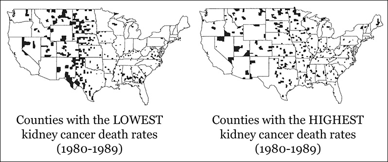
Figure 7.15 Maps by Deborah Nolan and Andrew Gelman. See the “To Learn More” section at the end of this chapter.
What’s going on? Could the age of the population be related to this? That might be a lurking factor. Imagine that you compare the cancer death rates of Santa Clara and Laguna Woods, two counties in California. Santa Clara, where Silicon Valley is, has lots of young people. Much more than half of the population of Laguna Woods is older than 65. It wouldn’t be surprising to see more cancer cases in the latter than in the former (I haven’t checked these numbers).
But age isn’t the problem here. Our figures were age-adjusted beforehand. The problem that will shred my beautifully crafted headline is population size. Always keep this in mind: estimates based on small populations (or samples) tend to show more variation—to include proportionally more extreme scores relative to the number of scores that are closer to the mean—than estimates based on large populations.
This is an unfortunate result of how probability works, and you can see it plotted in Figure 7.16. The X-axis is population, measured on a logarithmic scale; each tick mark identifies a value 10 times larger than the previous one. The Y-axis is age-adjusted cancer rates.
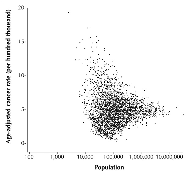
Figure 7.16 Funnel plot by Howard Wainer. Source: http://press.princeton.edu/chapters/s8863.pdf.
Each dot is a county. Notice that many counties with small populations—those on the left side—show both very high and very low cancer rates. The more we move to the right, the larger the population of each county is, and the narrower the variation of cancer death rates becomes. This kind of chart, which plots a variable against population or sample size, is called a funnel plot.
To understand why this happens, you can try a woodworking exercise at home. You’ll need a sturdy box, some pieces of wood or cardboard, and a good number of pins and marble balls. You’re going to build something similar to Figure 7.17. This is called a Galton probability box, or Galton quincunx, in honor of Sir Francis Galton, the famous polymath we met chapters ago.5
5 I learned about Galton’s box in a lecture by statistician Stephen Stigler, back in 2013. Stigler’s writings about the history of statistics are a delight. I’m saying this just in case you don’t have enough reading materials already.
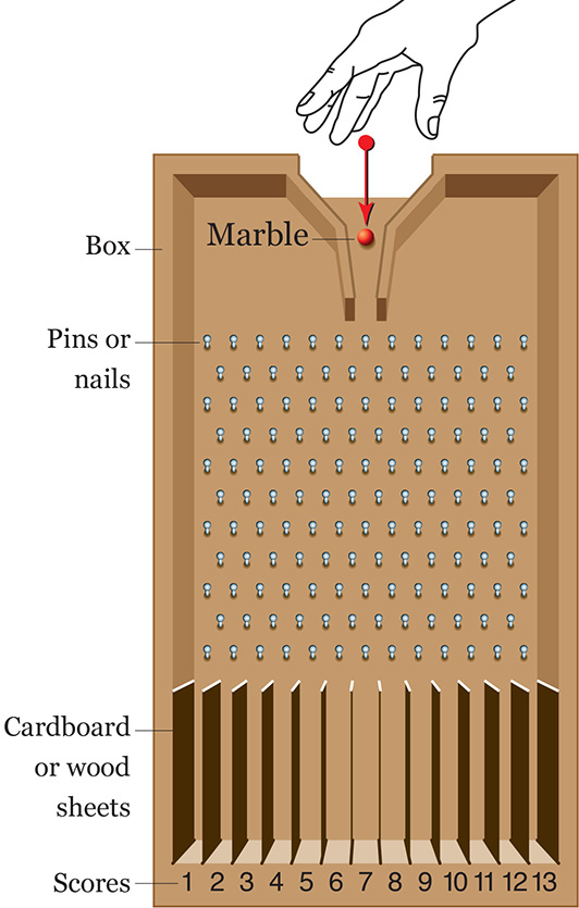
Even if you haven’t built the box, you may imagine what would happen if we send a marble rolling through the opening on top.
See illustration A on Figure 7.18. Every time that the marble hits a pin, there’s a 50-50 chance that it will continue rolling down at either side of it. If we built our Galton box with care, with the pins evenly spaced, any combination of left and right is equally likely. Our first marble can end up falling inside any of the spaces at the bottom of the box, either one close to the center or one at the extremes.
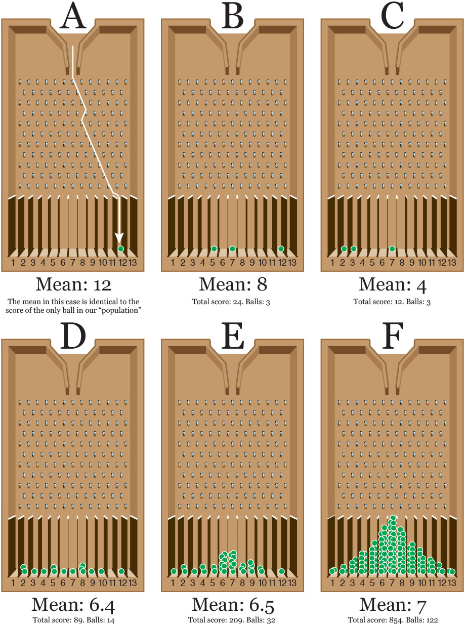
Imagine now that this single marble is a sample extracted from a population whose average score is 7. As our sample size is 1 (one marble), the score we’ll obtain when letting the marble go will also be the mean of the sample. As illustration A on Figure 7.18 shows, our marble lands on space 12. That’s quite far from the true mean, isn’t it?
Now, let’s suppose that we draw two samples of three scores each. We throw two sets of three marbles (illustrations B and C.) Just by chance, we have obtained two very different means. On illustration B, the mean of the scores is (5+7+12)/3 = 8, and the one for C is (2+3+7)/3 = 4. These are closer to the real mean.
Now comes the magic: the more marbles you send rolling, the more of them will end up in the middle portion of the box, as you can see in illustrations D, E, and F. And the larger our sample, the more likely it will be that its mean is close to the mean of the population it was drawn from.6 Why? Because cumulative probability isn’t the same as individual probability.
6 I should add: in a real experiment, this is true only if the samples are randomly chosen. This is an important caveat.
Just think about it: the probability of falling at either side of a pin is 50 percent. To fall on the bottom space corresponding to a score of 1, a marble would need to bounce left-left-left-left, etc., tons of times. Getting that result with just one marble is possible, but when you throw a large number of marbles—122 in illustration F—combinations closer to the 50 percent, left-right split will be more likely.
This is cumulative probability at work: your marbles will start forming a very peculiar bell shape, and the mean of all scores will approximate 7 more and more. If we could somehow throw millions of marbles, this curve would be very smooth, and the number of marbles at either side of the mean would be exactly the same. Congratulations. You’ve made a normal distribution out of marbles.
The Galton probability box helps us understand what happened with our erratic kidney death cancer rates before: small counties are like illustrations A, B, and C.7 They have small populations and, therefore, their rates vary a lot, with many of them being at the highest and lowest extremes. If a county has a population of 10 and one person dies of kidney cancer, which is possible just out of bad luck, suddenly its rate will be higher than the one of a county of 10,000 where 900 people die of the same cause. On the first county, 10 percent of the population died of cancer. On the second one, it’d be 9 percent.
7 There are some cool simulations of Galton probability boxes on YouTube. See this one, for instance: https://www.youtube.com/watch?v=3m4bxse2JEQ.
The Galton box also explains why researchers conducting any study (a survey, an experiment, etc.) always try to increase the size of their random samples as much as possible. A study based on a sample of 10 randomly chosen individuals won’t be as reliable as another in which the sample size is 1,000. Very small samples are living bait for the demons of chance.
Peculiarities of the Normal Distribution
No phenomenon in nature follows a perfect normal distribution, but many of them approximate it enough as to make it one of the main tools of statistics: the distribution curves of heights, weights, life expectancy at birth, exam scores, and so on, all are usually close to normal.
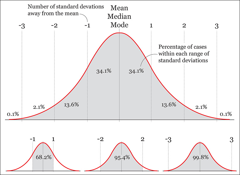
Normal distributions can be fatter and thinner than the one depicted in Figure 7.19, but this is a common one, called the standard normal distribution. It has the following properties:
1. Its mean, median, and mode are the same.
2. The distribution is symmetrical: 50 percent of scores are above the mean, and 50 percent are below it.
3. We know what percentage of scores lay in between certain ranges: 68.2 percent of cases in the data are 1 standard deviation (sd) away from the mean, 95.4 percent are within 2 sd, and 99.8 percent are within 3.
4. We can do some arithmetic with those figures. They can be halved to calculate, for instance, what percentage of cases lie between the mean and 1 sd above it: 34.1 percent. They can also be added or subtracted, to calculate the probability of finding a particular score between any others. What percentage of cases are between 1 and 2 sd above the mean and 1 and 2 sd below the mean? The answer is 27.2 percent (13.6+13.6.)
If you know that the phenomenon you’re studying is normally distributed, even if not perfectly, you can estimate the probability of any case or score with reasonable accuracy.
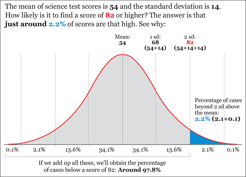
For instance, say that you are analyzing the science test scores of a large population of students and that you know that they are close to being normally distributed. The mean is 54 and the standard deviation is 14. How likely would it be to find a student with a score of 82 or higher if we chose one randomly?
I’ve done the calculations for you in Figure 7.20. This example is easy, as 82 is exactly 2 standard deviations above the mean, but any software tool for data analysis should let you calculate the probability of finding scores above or below any threshold, or within two other scores.
Percentiles, Quartiles, and the Box Plot
So far we’ve explored distributions using non-resistant statistics, like the mean and the standard deviation, which are very sensitive to extreme values. Following John W. Tukey, it is advisable to also summarize and visualize our data using resistant statistics, which are not distorted by outliers. The fictional example about U.S. and Nigerian salaries we saw pages ago is one case in which calculating resistant statistics would be essential.
We have already learned about the median, the score or case that divides a distribution in half. If your scores are 1, 4, 7, 9, 11, 13, 15, 16, and 19, the median is 11. The median is resistant because if the scores at the lower and higher end of that distribution were 0.1 and 10,000, instead of 1 and 19, the median would be as imperturbable as an Egyptian sphinx.
We can measure the spread of the data beginning with the median using percentiles. A percentile (let’s call it p) is a value that splits up your distribution in a way that (p) percent of the other values lie below it. The median is always the 50th percentile, as it’s the score lying in the middle of the distribution.
Percentiles divide your distribution into hundredths, and they work as a rank: whenever you learn that you’re at the 90th percentile in some sort of measure or test, you can be certain that you are equal or better than 90 percent of the rest.
Certain percentiles receive specific names. For instance, the 10th, 20th, 30th, and so on, continuing to the 90th percentile are called deciles. They divide your distribution into tenths. The 20th, 40th, 60th, and 80th percentiles are called quintiles. Quintiles divide your distribution into fifths.
When exploring data, Tukey recommends quartiles. The quartiles are the 25th, 50th (median), and 75th percentiles. They divide your distribution into—yes, you guessed right—quarters!
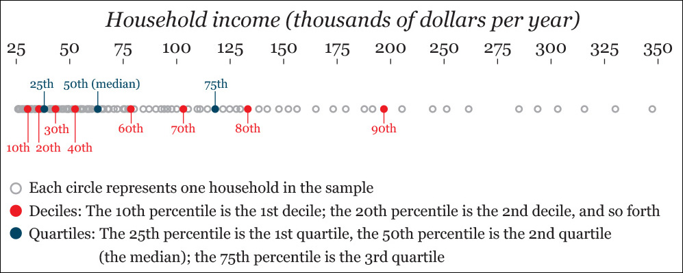
Let’s visualize all this. Imagine that you’re analyzing the household annual income of a neighborhood. You randomly sample 100 families, and you visualize them on a strip plot (Figure 7.21).
We can represent quartiles using a box plot, a graphic form devised by John W. Tukey himself. To learn how to read the most common kind of box plot, pay attention to the middle figure in Figure 7.22. This kind of graphic, sometimes also called a box-and-whisker plot, is a simplified representation of a distribution, less detailed than other charts like the histogram or the strip plot.

Notice that I calculated the Interquartile Range (IQR). This is the difference between the first and the third quartiles. As the scores that correspond to those are $38,000 and $118,000, the IQR is 80,000 (118,000-38,000).
The whiskers represent the range of scores that lie within 1.5 times the IQR either below the first quartile or above the third quartile. Scores beyond these thresholds are considered outliers and are displayed as individual dots. Why 1.5 times the IQR? According to my friend Diego Kuonen, a statistician at Statoo Consulting in Switzerland, Tukey was once asked by a student and he replied, “Because 1 is too small and 2 is too large!” Remember this next time someone suggests that statistics is an exact science.
Why would we use a box plot next to histograms and strip plots? There are several reasons: first, histograms and especially strip plots sometimes show so much detail that important information may get obscured. Second, the box plot emphasizes the boundaries of segments of equal size in our distribution (that’s what percentiles are for, after all) and it stresses outliers. Good luck seeing them clearly on a histogram, particularly if the distribution is very pointy and has very flat tails. Outliers will always stand out on a box plot.
Third, box plots are excellent when you are analyzing not just one distribution but comparing several of them. Figure 7.23 shows the distribution of Ideb scores I described in Chapter 6. Compare this figure to any histogram or strip plot in that chapter.
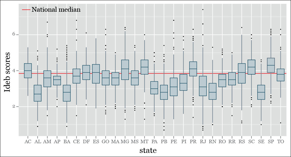
Figure 7.23 An example of a box-and-whisker plot. Remember that the Ideb score, which we discussed in Chapter 6, is an index (1–10) that measures school quality in Brazil.
Manipulating Data
Remember that doing exploratory data analysis consists of observing trends and patterns (the norm, or smooth), and then identifying deviations or exceptions from them. You have just learned the basics of what that means.
The operations we’ve learned so far created abstract models that summarized the essential nature of our data sets. This “essential nature” is the norm, which is made of three main features: the level (measures of central tendency, such as the mean), the spread, and the shape of our data.
But there are always departures from the elements of our models, values that don’t fit our density curves perfectly or that lie so far from the mean or median that they can be considered outliers, as we’ve just seen. Exploring both the norm and the exceptions is crucial for finding insights and, subsequently, designing visualizations to explain them to our readers.
Exploring exceptions often involves transforming our data to set aside one of the elements of the norm, with the goal of discovering features that might remain unseen otherwise. We’ll return to this idea in the following chapter, so let’s just see a simple example.
We transformed data a bit already when we calculated standard scores (z-scores) to compare two distributions that had very different ranges. Transforming the original data sets into standard scores set aside the real measure of spread of the data and substituted it with a standardized one, based on the number of standard deviations away from the mean.
Using the previous box plot as a starting point, we can try to set aside another element of the norm: the level. Doing it is quite simple. It just requires doing a series of subtractions:
New score = Each original score – Any measure of central tendency
See an example in Figure 7.24. To create that plot, I did this:
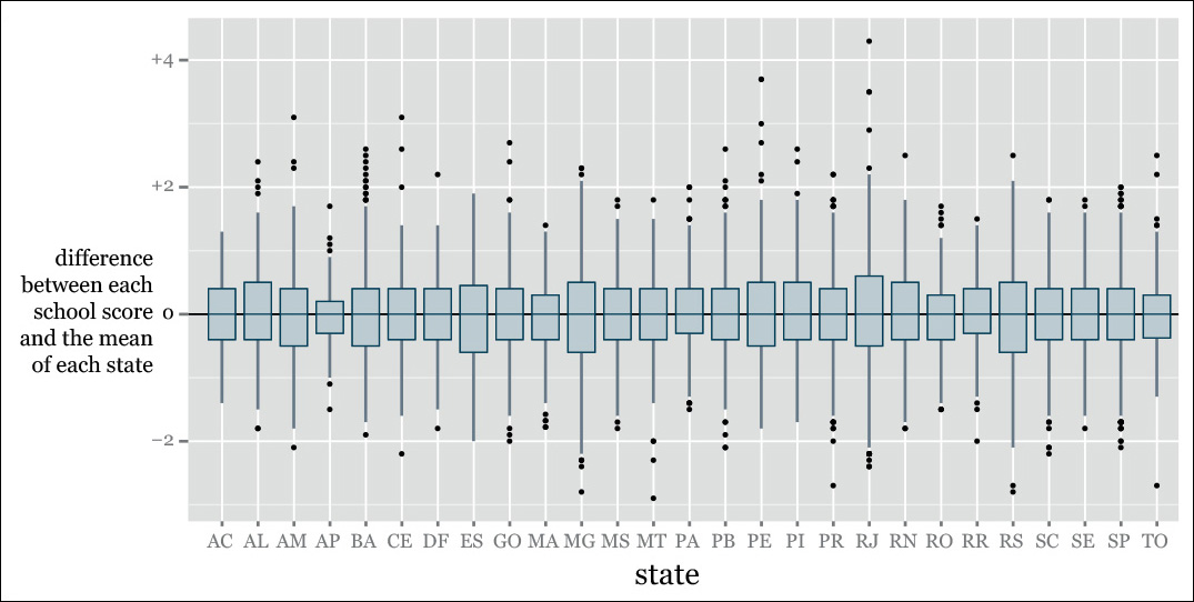
Difference between a school’s Ideb quality score and the mean score of the state where that school is = Each school’s Ideb score – Mean Ideb score of the state.
Why choose the state means, rather than the national mean? No particular reason. I could have done either or both. I could have used the median, too. Seeing our data from multiple angles, through the lenses of as many visualizations as possible, is arguably the wisest choice at these early stages of our exploration. You’ll never know what you can find.
In Figure 7.23 we saw all schools against the same baseline, the national mean. Figure 7.24 helps a bit in finding schools that are unusually good or bad compared to their in-state neighbors, which are probably subject to the same policies and rules.
Frequency Over Time
To end this chapter on a high note (no pun intended), see the strip plots in Figure 7.25, by the Los Angeles Times. Those dots are 17,000 songs that made it to the U.S. Billboard Hot 100 between 1960 and 2010. Len DeGroot, director of data visualization at the LA Times, told me that this project was produced in just one day, using a tool called CartoDB, which was originally designed to create interactive maps. This is real breaking-news visualization.
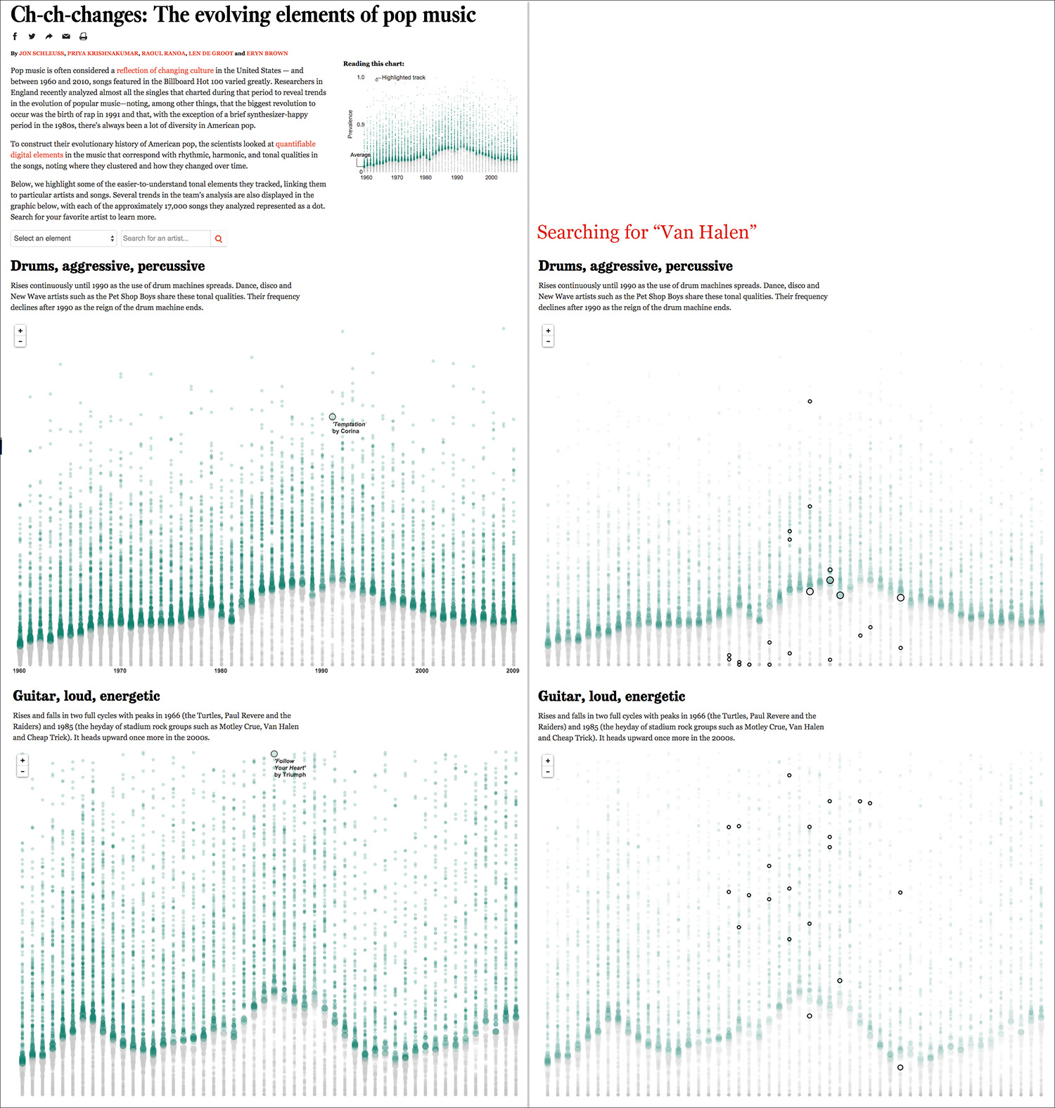
Figure 7.25 Visualization by the Los Angeles Times: http://graphics.latimes.com/pop-music-evolution.
The X-axis is time, and the Y-axis is the prevalence of specific qualities of the music, such as rhythm, harmony, instrumentation, style, and so on. The higher a song is on the Y-axis, the more prevalent that quality is in it. Green bubbles are either on the yearly average or above it. Gray bubbles are below the average.
Bubble size represents proximity to the mean.
When you visit this series of visualizations online, notice how well-thought-out they are. They don’t just show the yearly distributions, but you can also search for specific bands—I chose Van Halen as I’m an old-fashioned rocker.
The page where the graphics are inserted includes links to YouTube videos of songs that ranked high or low on each category, which is a nice aid for readers. Moreover, the titles of each section are catchy and, in some cases, even funny: “Manilow couldn’t keep the orchestra alive.” Poor Barry!
To Learn More
• Behrens, John. T. “Principles and Procedures of Exploratory Data Analysis.” Psychological Methods, 1997, Vol. 2, No. 2, 131–160. Available online: http://cll.stanford.edu/~langley/cogsys/behrens97pm.pdf.
• Erickson, B.H. and Nosanchuk, T.A. Understanding Data, 2nd ed. Toronto, Canada: University of Toronto Press, 1992. A very readable introduction to the principles of exploratory analysis.
• Gelman, Andrew, and Ann Nolan, Deborah. Teaching Statistics: A Bag of Tricks. Oxford: Oxford UP, 2002.
• Wainer, Howard. Picturing the Uncertain World: How to Understand, Communicate, and Control Uncertainty through Graphical Display. Princeton: Princeton UP, 2009.