11. Uncertainty and Significance
Quantitative knowing is dependent on qualitative knowledge (...) In quantitative data analysis, numbers map onto aspects of reality. Numbers themselves are meaningless unless the data analyst understands the mapping process and the nexus of theory and categorization in which objects under study are conceptualized.
—John T. Behrens, “Principles and Procedures of Exploratory Data Analysis”
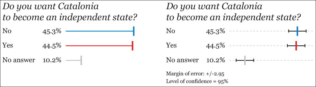
“Catalan public opinion swings toward ‘no’ for independence, says survey,” read the December 19, 2014, headline of the Spanish newspaper El País.1 Catalonia has always been a region where national sentiments run strong, but independentism hadn’t been a critical issue for the Spanish government in Madrid until the last quarter of 2012. Catalonia’s president, Artur Mas, said that the time had come for the region to be granted the right of self-determination.
1 The English version of the article, which—and this is decisive—doesn’t include the charts or the margin of error of the survey: http://elpais.com/elpais/2014/12/19/inenglish/1419000488_941616.html.
Between 2012 and 2014, public opinion in Catalonia was divided between those who desired it to become an independent state and those who didn’t. The former were more than the latter, particularly in 2012 and 2013, when mass demonstrations for the independence of that region were frequent.
El País’s story was based on data from the Catalan government’s survey institute, the Centre d’Estudis d’Opinió (CEO). As the first chart on Figure 11.1 shows, the situation in Catalonia had reversed: there were now more people against independence than in favor of it.
Or were there?
There was a crucial data point buried in the story: the margin of error of the survey was 2.95 percentage points. El País commented that this was “a relevant fact, considering how close the yes and the no to independence are.” Indeed. This should have rung some serious alarms. Let’s plot the same data with that margin of error (second chart in Figure 11.1) around them.
The margin of error is just another name for the upper and lower boundaries of a confidence interval, a concept we’ll learn about soon. If you visit El País’s source,2 you’ll see that they disclosed the technical specifications of the survey: a sample of 1,100 people—which I assume is random—and an error of +/–2.95 around the point estimates (45.3 percent, 44.5 percent, etc.) with a level of confidence of 95 percent.
2 English summary of the survey: http://tinyurl.com/qxfnm44.
Here’s what the researchers mean, translated to proper English: “If we were able to conduct this exact same survey—same methods, same sample size, and a completely different random set of respondents—100 times, we estimate that in 95 of them, the confidence interval will contain the actual percentages for ‘yes’ and ‘no’.” We can’t say the same of the other five samples.”
The margin of error hints at a challenge to El País’s story: the 45.3 percent and the 44.5 percent figures are much closer to each other than they are from the boundaries of the confidence interval. Based on this, it seems risky to me to write a four-column headline affirming that one is truly greater than the other. This tiny difference could be the product of a glitch in the survey or of simple random noise in the data.
When two scores have non-overlapping confidence intervals, you may assume that they are indeed different. However, the opposite isn’t true: the fact that confidence intervals do overlap on a chart, as it happens in this survey, isn’t proof that there isn’t a difference between them. What to do in this case?
Let’s begin with a guess. We’re going to play the devil’s advocate and assume there isn’t a difference, that the real split among the citizens of Catalonia is even: 50 percent want Catalonia to become independent, and 50 percent don’t. So our assumption is that the real difference between “yes” and “no” is zero percentage points. This assumption of no difference is called a null hypothesis.
After we have posed this hypothesis, we receive the results of an appropriately sized survey, based on solid polling methods, and it tells us that it has measured a difference of 0.8 points (45.3 percent minus 44.5 percent). What is the probability that this result, which is not that far from a zero difference, is the product of mere chance?
The answer is more than 80 percent.3 A statistician would say that the difference isn’t statistically significant,4 which simply means that it’s so tiny that it’s indistinguishable from noise. If I were the editor in charge of the first page of El País that day, I wouldn’t have written that headline. We cannot claim that the “yes” is greater than the “no,” or vice versa. The data doesn’t let us affirm that with aplomb.
3 I didn’t do anything by hand, but relied on software, as usual. There are many pretty good, free tools for this kind of calculation online. See this one, by Vassar College: http://faculty.vassar.edu/lowry/polls/calcs.html. You just need to input the two proportions you wish to compare and the sample size. The website http://newsurveyshows.com also has a lot of useful tools. The math behind all those websites is related to what is explained in this chapter, but it lies beyond my purposes in this book.
4 My friend Jerzy Wieczorek (http://www.civilstat.com), a PhD candidate in statistics at Carnegie Mellon University at the moment of this writing, reminds me that statistical significance, a concept we’ll explore later, isn’t so much about what the “true” values are so much as about how precisely we measure things. When I asked him about El País’s story, Jerzy suggested the following analogy:
“Imagine a literal horse race, where the judges chose inexpensive stopwatches which are accurate to within +/– 1 second 95 percent of the time. The watches’ readouts display an extra decimal place, but you can’t trust it.
“In this race, the top two horses’ stopwatches put Horse A at 45.3 seconds and Horse B at 44.5 seconds. It looks like Horse B was faster. But given the precision of your stopwatches, Horse A could plausibly have been (say) 44.8 seconds while Horse B could plausibly have been (say) 45.1 seconds. Maybe Horse A was actually faster.
Now you wish you’d bought the other (really expensive) stopwatches which are accurate to within +/- 0.1 seconds 95 percent of the time. But you didn’t, so all you can honestly say with this data is that the race was too close to call.”
In case El País wanted to find an alternative headline, another figure lurking in the story sounds promising to me: the percentage of people who favor independence in Catalonia has dropped from nearly 50 percent in 2013 to the current 44.5 percent. Assuming that those figures come from polls with identical sample sizes and methods, the difference (5.5 points) is well beyond the margin of error. The probability of getting such a drop due to mere chance is less than 0.001 percent. That’s significant.
Where did all these numbers come from? To begin to understand it, I need to give you a sweeping tour through the mysterious world of standard errors, confidence intervals, and how to plot them. To follow the rest of this chapter, you need to remember some previous material:
• Chapter 4, which is an elementary introduction to the methods of science.
• From Chapter 6: the mean.
• From Chapter 7: the standard deviation, standard scores (also called z-scores), and the properties of the normal distribution.
Back to Distributions
Suppose you wish to get an idea of the heights of 12-year-old girls in your town. You know little of what this population looks like—you don’t have a budget to measure hundreds or thousands of girls—but its unknown shape is represented in the top histogram of Figure 11.2.5 Even if I designed a normal-looking curve, remember that the distribution may not be normal.
5 Statisticians have come up with some jokes about distribution shapes. See Matthew Freeman’s “A visual comparison of normal and paranormal distributions,” http://www.ncbi.nlm.nih.gov/pmc/articles/PMC2465539/.

Remember that a histogram is a frequency curve: the X-axis represents the score ranges, and the height of the curve is proportional to the amount of scores. The higher the curve, the more girls there are of that particular height.
You randomly choose a sample (A) of 40 girls, measure them and get a distribution like the second histogram. Its mean is 5.3 feet—a bit more than 5 feet and 3 inches—with a standard deviation of 0.5.
A different researcher draws a similar sample (B) using the same methods and gets a mean of 5.25 feet (exactly 5 feet and 3 inches) and the same standard deviation. The means of samples A and B are very close to each other. That’s a promising clue that they are good approximations to the population mean.
However, if we draw tons of random samples of the same size from the population, it is also possible to obtain a few sample means that look far-fetched, such as the ones of C and D, on Figure 11.3.
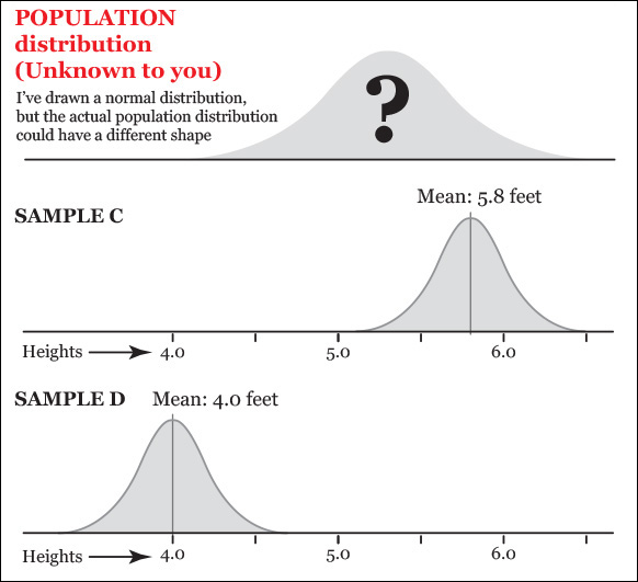
Figure 11.3 When drawing many samples from a population, it is possible to obtain a few with means that greatly differ from the population mean.
These are possible, but not as likely as A and B if the true mean of the population is close to 5.3 feet (something we don’t know, but let’s assume for a moment that we do). Why? Here comes a critical idea: think of the histogram not just as a distribution of the number of girls of each height, but as a probability chart.
This is what I mean: our population histogram curve is very high in the middle section. A lot of scores lie in that part of the distribution. It is very low on the tails, so just a few girls can be found at either extreme of the chart. Imagine that you pick just one girl at random from the population and measure her height. Which would be more likely: that her height is between 4.8 and 5.8 feet (that’s the mean of sample A plus/minus one standard deviation of 0.5) or that it is equal or higher than, say, 6.8 (the mean of sample A plus three standard deviations)?
If the distribution of heights in the population is roughly normal (and, again, we don’t know this), your answer can be inspired by a chart we saw in Chapter 7 (Figure 11.4), which displays the percentage of scores that lie in between a certain number of standard deviations from the mean. We see that 68.2 percent of scores lie between –1 and 1 standard deviations from the mean, and just 0.1 percent of scores are above three standard deviations.
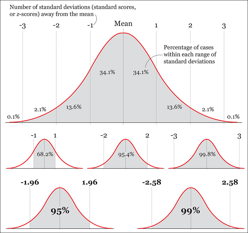
(Remember that the number of standard deviations away from the mean are called standard scores, or z-scores. If a specific value in your sample is 1.5 standard deviations away from the sample mean, its z-score is 1.5.)
I have made a couple of additions to the chart. They will become relevant in the next section:
• In a standard normal distribution, 95 percent of the scores lie between z-scores –1.96 and 1.96 (that is, between –1.96 and 1.96 standard deviations from the mean).
• Also in a standard normal distribution, 99 percent of the scores lie between z-scores –2.58 and 2.58 (they are between –2.58 and 2.58 standard deviations from the mean).
The Standard Error
I am asking a lot from your imagination, but I’ll need you to make some extra effort. Bear with me for a few more pages. Use Figure 11.5 to understand the following lines.

Imagine that instead of drawing just a few samples from our population, we are able to get dozens of random samples of 40 girls each and that we calculate the mean of each of them. There’s no need to draw them in reality. Just imagine that we can.
Next, imagine that we discard all scores from all samples, and that we just keep their means. Then, we draw a histogram of just of these means. This imaginary histogram is called a distribution of sample means.
As any other distribution, it will have a mean of its own (a mean of sample means) and a standard deviation. This standard deviation of many imaginary sample means is called the standard error of the mean.
The histogram of the distribution of our imaginary samples will have an approximately normal shape.6 To understand why, remember what I said about the samples in Figure 11.3: every time we draw a sample, its mean can be equal, greater, or smaller than the mean of the population. If we take thousands and thousands of samples, most of them will have means that are a bit above or below the mean of the population, and just a few samples will have means that are very far from the population mean. In other words, samples with means that are close to the population mean are more probable than samples with means that are far from the population mean.
6 This is the Central Limit Theorem, a cornerstone in mathematics: with few exceptions (like distributions with very extreme scores), regardless of what the real shape of the population distribution is, if you calculate the means of a very large amount of large samples with the same size, and then you plot those means in a histogram, the resulting distribution will be normal.
If you plot the means of all those imaginary samples, and then you calculate the standard deviation of that distribution of means, what you get is an estimate of error—how much the mean of a sample of that specific size (40 girls in our example) might deviate, on average, from the population mean, measured in number of standard scores. This is what the standard error of the mean is.
Here’s how to compute the standard error of the mean (SE):
SE = Standard deviation of our sample / √Sample size.
Our sample has a size of 40 and a standard deviation of 0.5. Therefore:
SE = 0.5 / √40 = 0.5/6.32 = 0.08
The size of the standard error is inversely proportional to the square root of the sample size. Here’s the proof:
For a sample with a size of just 10 girls:
SE = 0.5 / √10 = 0.5/3.16 = 0.16
For a sample with a size of 500 girls:
SE = 0.5 / √500 = 0.5/22.36 = 0.02
So the larger the sample, the smaller the standard error will be. Bringing the standard error down is costly, though, because the relationship between sample size and standard errors follows a law of diminishing returns. For instance, multiplying your sample size by four will only cut the standard error in half, not make it a quarter of what it was before.
For a sample with a size of 20 girls:
SE = 0.5 / √20 = 0.5/4.47 = 0.11
For a sample with a size of 80 girls (20 × 4):
SE = 0.5 / √80 = 0.5/8.94 = 0.056
Moreover, it’s impossible to reach a standard error of 0. Imagine that we could draw a sample of 1,000,000 girls. We’d still have some error, dammit!
SE = 0.5 / √1,000,000= 0.5/1,000 = 0.0005
Finally, as you’ve probably noticed, the standard error can be computed even if we don’t know the size of the population that our sample is intended to represent. What really matters to reduce the amount of uncertainty isn’t the size of the population per se, but the size of our samples and if they have been drawn following the strict rules of random sampling.
Building Confidence Intervals
A confidence interval is an expression of the uncertainty around any statistic you wish to report. It’s based on the standard error, and it’s usually communicated this way:
“With a 95 percent level of confidence, we estimate that the average height of 12-year-old girls is 5.3 feet +/–(margin of error here.)”
Remember that this also means, “If we could draw 100 samples of the same size, we estimate that in 95 of them the actual value we’re analyzing would lie within their confidence intervals. We cannot say the same of the remaining five samples!”
To compute a confidence interval first, you need to decide on a confidence level. The most common ones are 95 percent and 99 percent, although you could really pick any figure you wish. What we need to remember is that the greater the confidence level we choose, the greater the margin of error becomes.
You can calculate confidence intervals of any statistic: means, correlation coefficients, proportions, etc. I’m going to give you just a few simple examples and refer you to the recommended readings if your brain tickles with excitement afterward.
Let’s begin with the confidence interval for the mean of a sample. The average height of girls in our sample was 5.3 feet, and the standard deviation was 0.5. The 5.3 score is a point estimate. Reporting it on its own isn’t correct. We must also disclose the uncertainty that surrounds it. The formulas for the confidence interval of the mean of a large sample and how to apply them are in Figure 11.6.
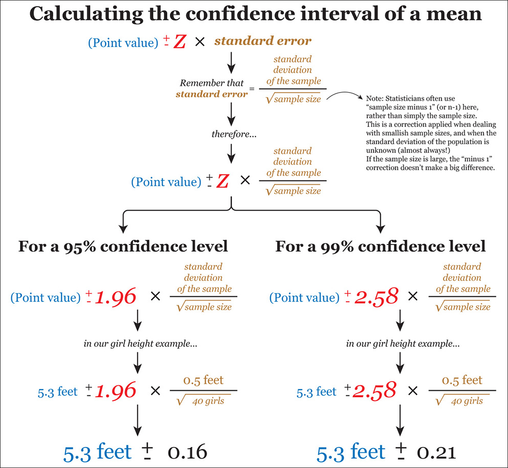
The z in red is called the critical value, and it’s closely related to the confidence level and to z-scores. A few pages ago we saw that in a standard normal distribution, 95 percent of the scores lie between –1.96 and 1.96 standard deviations, and 99 percent lie between –2.58 and 2.58. Therefore, we use a 1.96 critical value in our formula when we wish to build a 95 percent confidence interval and 2.58 when our preference is a 99 percent confidence interval.
Things get trickier if your sample is small, say 12 or 15 girls. In a case like this, statisticians have shown that the distribution of sample means isn’t necessarily normal. Therefore, using a z-score as critical value isn’t an option.
When a sample is small and the standard deviation of the population is unknown, the distribution of the sample means may adopt the shape of a t distribution, whose tails are fatter than those of a normal distribution. Don’t worry about the details of t distributions. Just remember this simple formula: small sample size = not normal.
So how to decide which critical value to use in our confidence interval formula instead of 1.96 or 2.58?
First, get your sample size. Let’s suppose just 15 girls were measured. Subtract 1 from the sample size, so you get 14 (to understand why, refer to the bibliography and look for “degrees of freedom”). After that, decide on the confidence level you wish, 95 or 99 percent. With all that, go to the table on Figure 11.7 and follow its instructions.

Figure 11.7 How to obtain the t critical value to use in your confidence interval formula when your sample is small.
As you can see on that table, for a sample size of 15, we need to go to the 14th row (15 – 1 = 14). Then we need to take a look at the two other columns: for a confidence level of 95 percent, our critical value is 2.145, and for 99 percent, it is 2.977. The resulting formulas are on Figure 11.8.

Figure 11.8 Updating our confidence interval formula, using a small sample size and t critical values rather than z critical values.
Read the table again and notice that the larger our sample size gets, the closer the t critical values get to 1.96 (if you chose a 95 percent confidence level) and 2.58 (when it’s 99 percent). The reason is that the larger a sample size is, the more similar the shape of the t-distribution becomes like our lovely normal distribution. This is why some statisticians say that, when your sample size is truly large, even if the standard deviation of the population is unknown, you can use z-critical values, as I explained on Figure 11.6. Other statisticians recommend to always use t-critical values, regardless of sample size.
For smaller samples, the t-critical values are larger than z-critical values. You can think of this as an extra fudge factor: with a small sample, your results are less precise, and the t values help to make the confidence interval wider so that you don’t overstate your certainty.
• Many papers report confidence intervals (CI) following a format similar to this: Mean = 23.3, 95 percent CI 20.3–26.3 (the lower limit of the confidence level is 20.3, and 26.3 is the upper limit). Doing some arithmetic, we can see that the margin of error here is +/– 3.0, for a 95 percent confidence level.
• Just to give you another quick example of how to compute confidence intervals, follow the instructions and example on Figure 11.9, if you’re dealing with percentages.
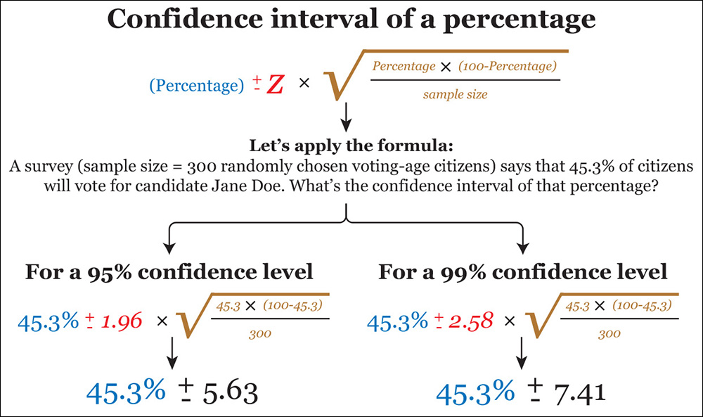
Figure 11.9 Confidence intervals for a percentage. Sometimes researchers add a correction to this formula based on ratio between the sample size and the underlying population.
Disclosing Uncertainty
Confidence intervals are a means to envision the uncertainty in our data. This uncertainty is crucial information, as visualizations or stories that mention only point estimates, without the padding that surrounds them—and these include the graphics in this book so far, and many that I have produced in my career as a journalist and designer—convey an unjustified feeling of strict accuracy.
The most straightforward way of communicating the uncertainty in a visualization is as a note in your graphic. However, if it’s feasible, work to find a way to display it on the visualization itself in a manner that doesn’t clutter it.7 In Figure 11.10, you have three elementary methods, two of them based on error bars. These and their many variations have been in use for decades, but they have come under criticism in the past few years due to their shortcomings.
7 Here are a couple of good introductions to uncertainty in visualization: “A Review of Uncertainty in Data Visualization,” by Ken Brodlie, Rodolfo Allendes Osorio, and Adriano Lopes (http://tinyurl.com/nwbkm6f) and a blog post by Andy Kirk at http://tinyurl.com/kqjnh94.

The most obvious one is that error bars have an all-or-nothing quality, which can lead to misleading inferences. Roughly speaking, a confidence interval works as a probability distribution: scores closer to its upper and lower boundaries are less likely, in theory, than scores close to the point estimate we are reporting. This feature is hidden in error bars.
To address this problem, in a paper presented at the 2015 IEEE (Institute of Electrical and Electronics Engineers) VIS conference in Paris,8 University of Madison-Wisconsin computer scientists Michael Correll and Michael Gleicher discussed alternative classic methods of showing uncertainty: the gradient plot, the violin plot, and a modified box plot not based on the median or quartiles, as the classic one invented by John Tukey, seen in Chapter 7 (Figure 11.11).
8 Michael Correll and Michael Gleicher: “Error Bars Considered Harmful: Exploring Alternate Encodings for Mean and Error,” https://graphics.cs.wisc.edu/Papers/2014/CG14/.
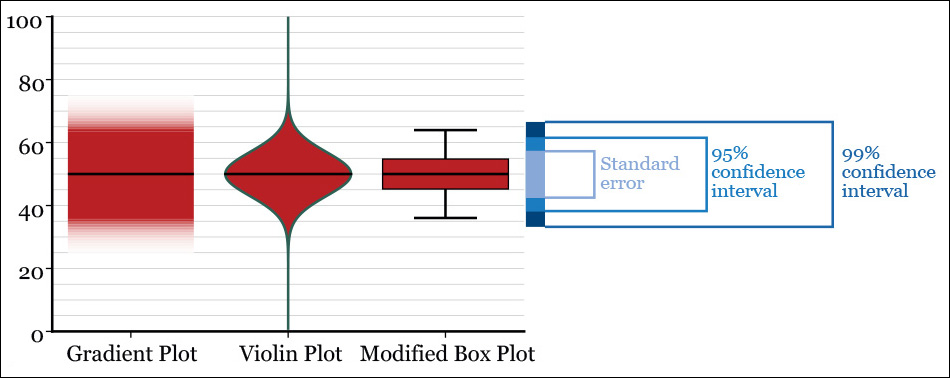
Figure 11.11 Alternative ways of displaying a point estimate (a mean, for instance) and confidence intervals. The gradient blue box serves as a comparison.
Gradient plots and fuzzy error bars or backgrounds are design strategies that have been pursued by other designers, like Alex Krusz, who developed a fun web tool to visualize data sets with different variances (Figure 11.12).9 Vienna Institute of Demography’s statistician Guy Abel has even created a package for the R programming language, called “fanplot,” which creates charts emulating the plots that the Bank of England has used in its forecasts since 1997 (Figure 11.13).
9 The tool is at http://krusz.net/uncertainty/; its source code is at https://github.com/akrusz/dragon-letters and Krusz’s article explaining it all is at http://tinyurl.com/q2fj23f.
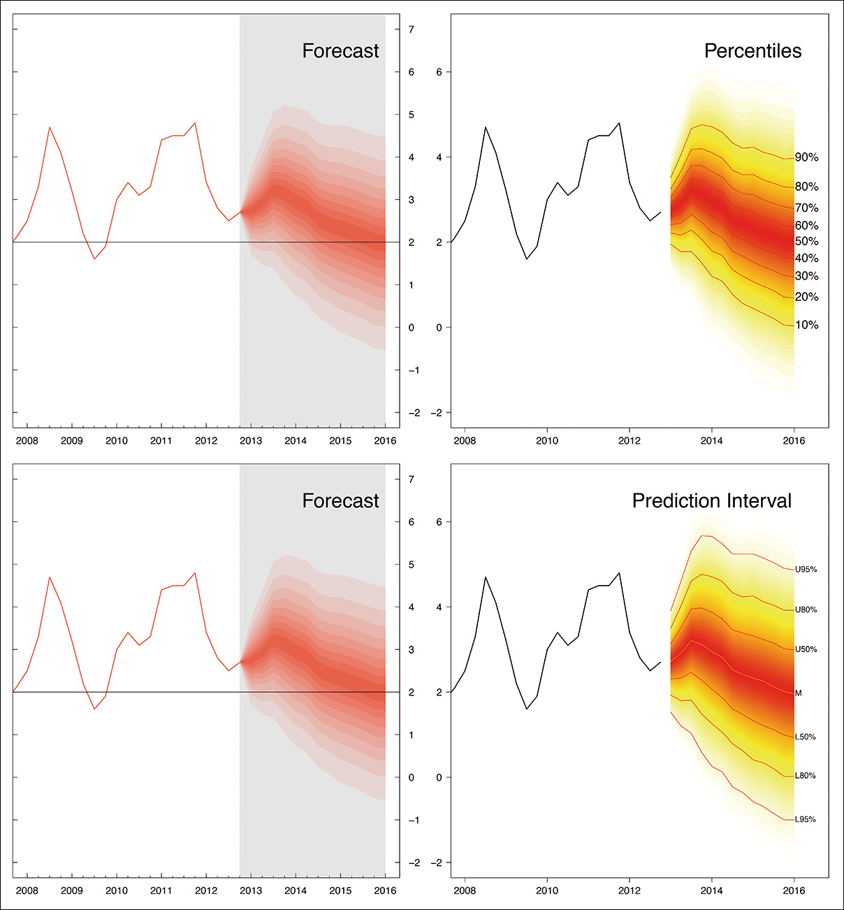
Figure 11.13 Fan chart with percentiles and prediction intervals (not confidence intervals.) (By Guy Abel. Source: http://journal.r-project.org/archive/2015-1/abel.pdf).
Uncertainty can also be revealed on maps. Living in Florida, one faces uncertainty almost every year during hurricane season. In Figure 11.14, a map from the National Oceanic and Atmospheric Administration (NOAA) shows the probable path of Hurricane Charley in 2004. As this is a forecast, the error area gets wider the more the line moves away from the latest current location, 5 p.m., Friday on the map.10
10 Visualizing uncertainty on maps has concerned cartographers for ages. Read Igor Drecki’s “Representing Geographical Information Uncertainty: Cartographic Solutions and Challenges” for an overview of techniques and relevant literature: http://tinyurl.com/pawvyty, and Alan MacEachren, et al., “Visualizing Geospatial Information Uncertainty: What We Know and What We Need to Know,” http://tinyurl.com/o6tpsuj. Also by MacEachren is “Visualizing Uncertain Information,” http://tinyurl.com/oxmfk88.

The Best Advice You’ll Ever Get: Ask
Journalists and designers usually don’t generate their own data, but instead obtain it from sources such as government agencies, non-profit organizations, corporations, scientists, and so on. Many of those sources have a strong presence online, and they provide troves of information unthinkable just a decade ago.
Today, any aficionado with access to a computer, an Internet connection, and some popular (and free!) software tools can explore distributions, run a simple linear regression, estimate uncertainty, and then publish a story or visualization, all on her own. That’s a recipe for disaster, as what she won’t be able to do by herself is to assess if any of those findings are truly meaningful. For that, she’d need deep domain-specific knowledge.
So here’s the most important piece of advice you’ll ever get if you want to do visualization and infographics either as an amateur or a professional (I hinted at it in previous chapters): the secret behind any successful data project is asking people who know a lot about the data at hand and its shortcomings, about how it was garnered, processed, and tested.
If you have downloaded some data from public sources and explored it using the techniques explained in this book, don’t publish anything: take your hunches to experts. Three are always better than two. Here’s what Scott Klein, head of the news applications department at ProPublica, has to say about this:
What differentiates journalism from other disciplines is that we always rely on the wisdom of smarter people. It is crucial that we talk to somebody even if we think that we perfectly understand a data set or the math we’ve done with it. Whenever we’re working on a project at ProPublica, we always call people who can tell us we’re wrong. We show them what we’ve done, how we’ve done it, what our assumptions are, the code we generated. All this is crucial to our ability to get things right.11
11 In “What Google’s News Lab Means for Reporters, Editors, and Readers,” http://contently.net/2015/07/02/resources/googles-news-lab-means-reporters-editors-readers/
Any journalist will tell you that a key component of her job is to create, cultivate, and then extend a network of sources to consult when the time comes. Let me suggest a few germane questions to ask before and after you play with that inviting data set in the Downloads folder of your computer.
How Has Stuff Been Measured?
Physicist Werner Heisenberg once said that what we observe is not nature itself but nature exposed to our method of questioning. The way we look at the world influences how we categorize and record our observations.
Statistician Andrew Gelman considers measurement “the number one neglected topic in statistics” and adds that it’s a puzzling situation because measurement constitutes “the connection between the data you gather and the underlying object of your study.”12
12 “What’s the most important thing in statistics that’s not in the textbooks?” http://tinyurl.com/ntlkofa.
This is a big challenge for everyone, as there’s an all-too-human temptation to take data at face value, oblivious to the famous dictum “garbage in, garbage out.” If you begin with poor data, you will end up with poor conclusions. Fact-checking large data sets is beyond my skills, and I guess that most of you are in a similar situation. But there’s still plenty we can do to begin assessing the quality of the sources we use.
Next time you download a spreadsheet from the United Nations or the International Monetary Fund—just to name two popular sources of country-level data—don’t just look at its rows and columns. Read the documentation that usually accompanies spreadsheets. This is part of the metadata, or data about the data.13 If no documentation is available, or if it is unclear or spotty, you’ll need expert advice. Well, really, you’ll need expert advice regardless.
13 Similarly, if you publish a visualization or story based on any kind of data, you should disclose the methods you’ve used. This is becoming common practice in journalism, and I really hope that it will continue that way.
Data from sources that are widely considered reliable shouldn’t be free from scrutiny and skepticism. After studying the way African development figures are computed, Morten Jerven, an economist at Simon Fraser University (Canada) concluded:
More than half of the rankings of African economies up to 2009 may be pure guesswork [and] about half of the underlying data for continent-wide growth statistics are actually missing and have been created by the World Bank through unclear procedures. The prevailing sentiment is that data availability is more important than the quality of the data that are supplied.14
14 From Poor Numbers: How We Are Misled By African Development Statistics and What to Do About It (2013).
Similar dismaying messages are common in other books, like Zachary Karabell’s The Leading Indicators (2014). Does all this mean that we should raise our hands up in the air and pray to Tlaloc, the rain god?15 No. It just means that we need to be extra careful when dealing with data we haven’t generated ourselves, even when numbers come from the most trusted sources.
15 I wrote that line right after coming back from Mexico. Incidentally, I brought a Tlaloc stuffed doll for my 4-year-old daughter. In spite of Tlaloc being an ugly and menacing toothy beast, she loved it. The doll now occupies a place of honor in her bed, next to the teddy bear she’s owned since she was born.
Dispatches from the Data Jungle
Heather Krause is the founder of Datassist, a statistical consulting firm that specializes in visualization design and that also aids journalists and non-profit organizations in making sense of data. While I was working on this chapter, Heather shared with me several recent experiences that illustrate the amount of work that is often necessary to ascertain that the information you’re planning to present is sound.
During a project about rural milk production in Bangladesh, Heather saw that one of the variables in the data sets she was analyzing was called “group gender composition” with possibilities of male, female, and mixed.
One day, while working in the field, Heather looked up from her laptop at some people fetching milk and noticed that there were only men in it. That didn’t make a lot of sense. According to the data, that group had a female gender composition. Her field facilitator explained that the variable labeled “group gender composition” did not mean the actual gender makeup of all the members of the group. It meant who the data collector thought was doing the actual work at home.
Heather’s conclusion is, “Never rely on a variable’s name or your assumptions about the data to tell you what the numbers really represent.” She then offered another example, even more illuminating:
Understanding violence against women (intimate partner violence, or IPV) involves analyzing trends, exploring attitudes, and examining factors in its increase or decrease. It’s complicated. Violence against women is a broad term with varying definitions and it often goes unreported. Who do you ask? All women? Married women? Women who have ever been in a relationship?
I often download datasets on IPV from various websites. During one project, I found data of the prevalence rate of IPV in Cameroon. The figures from different sources were anywhere from 9, 11, 14, 20, 29, 33, 39, 42, 45, to 51 percent. And this isn’t unique to Cameroon. Similar patterns of wide variation exist in most countries [Figure 11.15].

Figure 11.15 Bars represent the intimate partner violence rate (IPV) measured by several sources in these three countries. Notice the enormous differences. (Chart by Heather Krause, http://idatassist.com/.)
Why the discrepancies? All the data was collected within a three-year span, much of it in the same year. The difference is what the data is specifically measuring. Upon reading the detailed metadata, the way different organizations measure IPV [see a summary in Figure 11.16] boils down to three main dimensions:
1. What is being measured?
What definition of intimate partner violence are the data collectors using? IPV can be measured in many ways. If you are giving a prevalence rate for IPV, does that include the rate of only physical violence? Or does it also include sexual violence? Does it include emotional violence? Does it count physical AND sexual violence or physical AND/OR sexual violence?
The definition of IPV that your data is based on is going to have a big difference in the rate you get. For example, in Cameroon the rate of physical IPV is reported at 45 percent, the rate of sexual at 20 percent, physical and/or sexual 51 percent.
2. Who is the population being measured?
What ages of women are covered in the data you have? Surveys vary widely from including only traditional fertility-aged women to including women of all ages—and many variations in between. This is an especially important piece of metadata if you want to compare trends over time. For example, in Peru the rate of physical violence in the past 12 months ranges from 11 to 14 percent depending on what ages are being included.
In a situation like IPV, the marital status of the women included in the survey is quite important to understand when using this data. Are you working with data that estimates the rate of partner violence among all women? Or the rate among currently married women? Or the rate of all women who have ever been in a relationship?
3. What time period is being measured?
Prevalence data needs to say clearly what time period it’s measuring. Some IPV data measures violence experienced in the woman’s lifetime; others measure violence experienced in the past 12 months, and others measure experiences in the last 5 years. This makes a significant difference in the results. In the USA, the rates of IPV even range from 20 to 36 percent while the rate of IPV in the previous 12 months range from 1 to 6 percent.
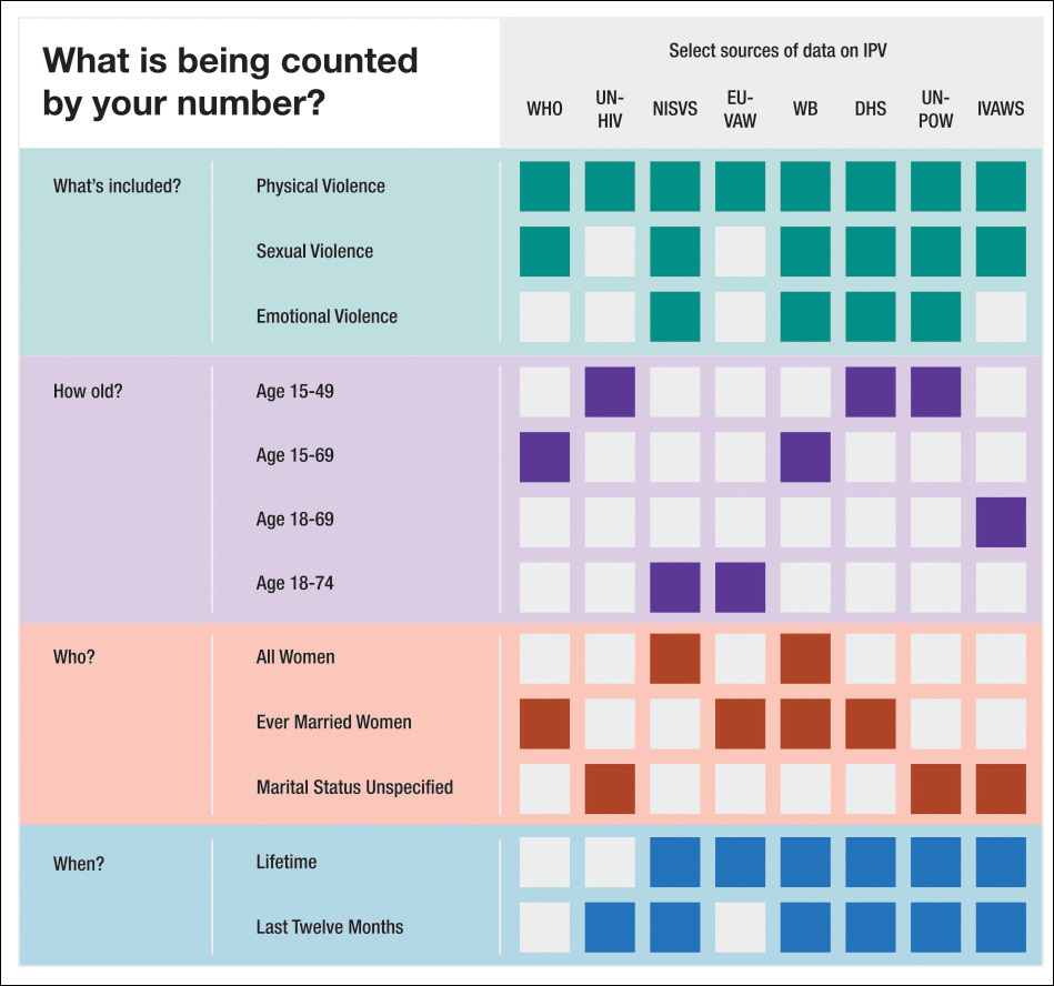
Figure 11.16 What is being measured when studying intimate partner violence rate (IPV)? (Chart by Heather Krause, http://idatassist.com/.)
Remember these tales next time you’re tempted to write a story or design a visualization without doing some checking, asking sources, and then including footnotes, caveats, and explainers so readers understand the limitations and biases in the data.
Significance, Size, and Power
Much research is based on comparing statistics from different groups and estimating if discrepancies between them are likely to be due to chance or not. In many cases, scientists report p values, a term you’ve probably found (and dreaded) in the past.
Here’s a definition by statistician Alex Reinhart: “A p value is the probability, under the assumption that there is no true effect or no true difference, of collecting data that shows a difference equal to or more extreme than what you actually observed.”16
16 Statistics Done Wrong (2015). See the end of this chapter.
This is very confusing for someone with just a pedestrian understanding of statistics—me—so let’s imagine that a team of social scientists wants to test if a particular learning technique has any effect on the reading skills of first-graders. We’ll call the technique the “treatment” and the possible changes in student performance the “effect.”
Ideally, they would proceed this way:
1. Researchers begin with the assumption that the new technique won’t have any effect whatsoever on students’ reading skills. This assumption is called a null hypothesis, as we learned before.
2. They draw a large random sample of students. Let’s say 60.
3. They test those students’ reading skills.
4. Students are randomly divided into two groups of 30. One of them is called the experimental group and will be taught using the novel technique for, say, a month. The other 30 students will keep receiving the same reading lessons they did before. They are the control group.
5. After a month, all students are tested again.
6. Researchers analyze the data and see if students in the experimental group have improved or not. The scientists compute the before and after performances of the experimental and control groups, and then they calculate if those differences (if they detect any, of course) might be the product of chance.
7. If researchers estimate that differences would be unlikely if they were the result of chance, they say that they got a statistically significant result. They will “reject the null,” as the null is the hypothesis that said that there wouldn’t be any differences between the experimental group and the control group after the treatment was applied to the former.
8. Researchers will express all this by writing something like “differences were such and such, and were statistically significant p<0.05 (or p<0.01).” That’s the p-value. You can read 5 percent instead of 0.05 and 1 percent instead of 0.01 if it’s easier for you.
The p value is the probability of measuring such differences (or larger ones) if there weren’t really any differences between the experimental and the control group after the experimental group received the treatment. In other words, the p value is simply an estimation of how likely it is to measure such an effect by mere chance. It is the probability (again, 5 percent or 1 percent) of obtaining the data we obtained if the null hypothesis were true, if the difference between experimental group and the control group were zero.
It’s important to understand what a p value is not: a p value is not the probability of the effect being real. It is not the probability of the scientist having found a relevant effect. And it doesn’t imply that the researchers are 95 percent certain that our novel teaching technique is effective.
I can’t stress these points enough, as they are the source of many bad news stories. They are also among the reasons why, even if p values are widely spread in science, it’s extremely risky to read too much in them.17
17 The literature criticizing the perfunctory use of p values in research is large, and it has merit, as p values are easily manipulated. For a summary, read “The Extent and Consequences of P-Hacking in Science” (http://tinyurl.com/np8jpef) and “Statistics: P values are just the tip of the iceberg” (http://tinyurl.com/nrpnh4a). Some experts in statistics argue that we should dispose of p values outright. Others say that p values are just one tool among many others, and that they are still valid if not used on their own.
Here’s another reason: a statistically significant effect can be insignificant in logical or practical terms, and a non-significant result obtained in an experiment can still be significant in the colloquial sense of the word. No statistical test can be a substitute to common sense and qualitative knowledge on the part of whoever is analyzing the data.
Statistician Jerzy Wieczorek explained it well: “Statistics is not just a set of arbitrary yes/no hoops to jump through in the process of publishing a paper; it’s a kind of applied epistemology,” or of systematic reasoning.18
18 Epistemology is the study of what distinguishes justified belief from opinion. The article this quote came from is at http://tinyurl.com/obxcn8j.
As a consequence, a single research paper reporting a statistically significant result doesn’t mean much. It needs to be weighed against a solid prior understanding of the phenomena the data describes. Replication is a cornerstone in science:19 the more studies show statistical significant effects, the more our uncertainty will shrink. As Carl Sagan used to repeat, “Extraordinary claims require extraordinary evidence.” Beware of press reports about experiments or papers that claim to have found results that defy common knowledge. They will be likely just the result of chance.
19 Read Jeffrey T. Leek and Roger D. Peng’s “Reproducible research can still be wrong: Adopting a prevention approach” at http://www.pnas.org/content/112/6/1645.
Another feature to pay attention to when reading scientific papers is the effect size. Suppose that you’re testing if a medicine is effective against the common cold. Getting a statistically significant result after testing it with people isn’t enough because the p value tells you nothing about how large the effect of the medicine is.
It might be that tons of people in the experimental group felt better sooner after having the medicine than people in the control group who didn’t get the treatment. That may be a statistically significant result, but perhaps not an important one. It may be that “sooner” means just “one hour less,” so the medicine is not really worth much. The number of minutes is the effect size in this case, which we could actually call practical significance.
Effect sizes are connected to the power of the tests that researchers conduct. The statistical power of a test is the probability that the experiment will detect an effect of a particular size. Power is connected to sample size: a small sample may not be enough to detect tiny—but perhaps extremely relevant—effects, in which case we’d say that the test is underpowered.
On the other hand, an overpowered test, one in which the sample chosen is very large, may detect statistical significant effects that are irrelevant for practical purposes, maybe because the effect size is minimal. Papers that don’t report significance, effect sizes, and power together deserve extra skepticism, as a general rule.
The following example, from Alex Reinhart’s Statistics Done Wrong, illustrates the relationship between these properties. It also shows how crucial it is that citizens understand them, at least at a conceptual, non-mathematical level:20
20 Reinhart’s example is inspired by Ezra Hauer’s “The harm done by tests of significance” at http://tinyurl.com/pevpye8.
In the 1970s, many parts of the United States began allowing drivers to turn right at a red light. For many years prior, road designers and civil engineers argued that allowing right turns on a red light would be a safety hazard, causing many additional crashes and pedestrian deaths. But the 1973 oil crisis and its fallout spurred traffic agencies to consider allowing right turns on red to save fuel wasted by commuters waiting at red lights, and eventually Congress required states to allow right turns on red, treating it as an energy conservation measure just like building insulation standards and more efficient lighting.
Several studies were conducted to consider the safety impact of the change. In one, a consultant for the Virginia Department of Highways and Transportation conducted a before-and-after study of 20 intersections that had begun to allow right turns on red. Before the change, there were 308 accidents at the intersections; after, there were 337 in a similar length of time. But this difference was not statistically significant, which the consultant indicated in his report. When the report was forwarded to the governor, the commissioner of the Department of Highways and Transportation wrote that “we can discern no significant hazard to motorists or pedestrians from implementation” of right turns on red. In other words, he turned statistical insignificance into practical insignificance.
Several subsequent studies had similar findings: small increases in the number of crashes, but not enough data to conclude these increases were significant.
Of course, these studies were underpowered. But more cities and states began to allow right turns on red, and the practice became widespread across the entire United States. Apparently, no one attempted to aggregate these many small studies to produce a more useful dataset. Meanwhile, more pedestrians were being run over, and more cars were involved in collisions. Nobody collected enough data to show this conclusively until several years later, when studies finally showed that among incidents involving right turns, collisions were occurring roughly 20 percent more frequently, 60 percent more pedestrians were being run over, and twice as many bicyclists were being struck.
Alas, the world of traffic safety has learned little from this example. A 2002 study, for example, considered the impact of paved shoulders on the accident rates of traffic on rural roads. Unsurprisingly, a paved shoulder reduced the risk of accident—but there was insufficient data to declare this reduction statistically significant, so the authors stated that the cost of paved shoulders was not justified. They performed no cost-benefit analysis because they treated the insignificant difference as meaning there was no difference at all, despite the fact that they had collected data suggesting that paved shoulders improved safety! The evidence was not strong enough to meet their desired p value threshold. A better analysis would have admitted that while it is plausible that shoulders have no benefit at all, the data is also consistent with them having substantial benefits. That means looking at confidence intervals.
To Learn More
• Field, Andy, Jeremy Miles, and Zoë Field. Discovering Statistics Using R (5th edition). Thousand Oaks, CA: SAGE. Don’t be scared if you ever see this 1,000-page brick of a book in front of you. It’s fun to read, and it comes in handy when you need a refresher about any statistics-related topic. Besides, Field, the main author, is an Iron Maiden fan. I guess that this makes the book more appealing just to me and other old-fashioned metalheads.
• Karabell, Zachary. The Leading Indicators: A Short History of the Numbers That Rule Our World. New York, NY: Simon & Schuster, 2014. After reading it, you’ll never look at GDP figures the same way you did before.
• Reinhard, Alex T. Statistics Done Wrong: The Woefully Complete Guide. San Francisco, CA: No Starch Press, 2015. After studying a few intro to statistics textbooks, this little gem will tell you why many of your intuitions are flat wrong. Don’t feel discouraged, though. You will learn a lot from it.
• Ziliak, Stephen T., and Deirdre N. McCloskey. The Cult of Statistical Significance: How the Standard Error Costs Us Jobs, Justice, and Lives. Ann Harbor, MI, The University of Michigan Press. The fiery title of its book can give you an idea of its style. Read it only after you’ve gotten a good grasp of elementary statistics.