12. On Creativity and Innovation
Progress is not possible without deviation. It is important that people be aware of some of the creative ways in which some of their fellow men are deviating from the norm. In some instances, they might find these deviations inspiring and might suggest further deviations which might cause progress.
—Frank Zappa, http://tinyurl.com/ot37azm
Everything is “edgy” today; everyone’s creative or an innovator or an innovative creator who thinks outside the box.
—William Deresiewicz, “Excellent Sheep”
In December 2014, I visited my University of Miami colleague Dr. Vance Lemmon, a distinguished professor in developmental neuroscience. Vance works at The Miami Project to Cure Paralysis,1 one of the most important centers studying spinal cord injuries in the world. Vance also happens to be a visualization enthusiast and a friend.
1 Its website is: http://www.themiamiproject.org.
While we had lunch, Vance showed me several slides from one of his talks. He stopped on Figure 12.1 and explained the image on the top left. It’s a side view of the spinal cord of a rat. The left (green) portion is the side connected to the brain.

Figure 12.1 Visualizations of the spinal cord of a rat by The Miami Project to Cure Paralysis, from a paper published in PNAS: http://tinyurl.com/qa4yj94.
The spinal cord’s main function is to serve as a two-way information conduit between the brain and the rest of the body. The nervous system is made up of many different kinds of cells, but the main ones are neurons, tree-like cells that communicate with each other through branches that protrude from their cell bodies. There are two kind of branches, axons and dendrites. If you damage or sever the axons—the green lines on Figure 12.1—that run through the spinal cord, you provoke paralysis.
Vance’s lab uses gene therapy to stimulate axon regeneration. They insert viruses inside the brains of rats and mice whose spinal cords have been cut. These viruses are modified to carry different kinds of genetic materials and to target nerve cells.
When a virus attaches to a neuron, it inserts its genes into the cell’s genome. Researchers at Vance’s lab have tested different combinations of genes and discovered that some of them seem to trigger axon regeneration. Neurons stimulated in this way could potentially restore the connection between the brain and the rest of the body.
Images A and B in Figure 12.1 show the connections before gene therapy. Images C and D show them after the therapy. When I compared them, I exclaimed, “Whoa, that’s a lot of new connections!”
Vance replied (and I’m not quoting him verbatim): “It looks impressive, doesn’t it? The problem is that there aren’t really a lot of new axons. It just looks like that because axons and dendrites aren’t perfectly straight. They fold and twist, so to an untrained eye it seems that the therapy has unleashed an enormous growth. Results of these experiments are very promising, but not as promising as the images may suggest to you.
“To the untrained eye.” Let’s keep that in mind.
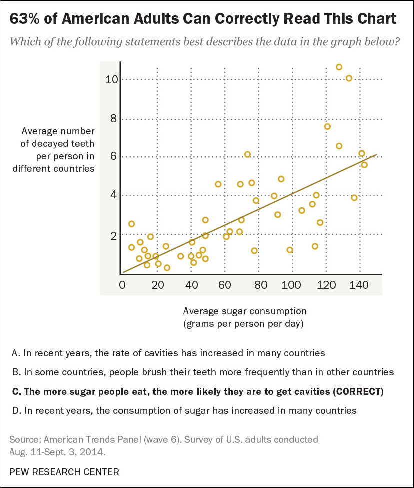
On September 18, 2015, the Pew Research Center published the results of a survey about the knowledge that Americans have about science. The center asked questions on physics, chemistry, earth sciences, and so on. One included a scatter plot comparing the sugar consumption per capita with the number of decayed teeth per person in several countries. The chart shows that the more sugar people put in their mouths, the more likely they are to get cavities.
Among the respondents, 63 percent got the message of the chart right. Results were better for people with a college education (more than eight out of ten interpreted the plot correctly) and much worse for people with a high school diploma or less (half of them were able to understand the chart). See Figure 12.2.2
2 “The art and science of the scatterplot,” http://tinyurl.com/ogeaz3k.
Is this bad news? I don’t think so. It’s excellent news. Had this same survey been conducted a couple of decades ago, my guess is that the percentage of people reading the scatter plot correctly would have been much smaller, particularly among those without advanced degrees. Why has this progress happened? I’d blame the media.
I took a course on data journalism and statistics in college. It covered basic correlation and regression, so it exposed me to scatter plots when I was in my twenties. Had that not been the case, where else could I have learned how to read a scatter plot? Perhaps in the newspaper.
I’ve been a newspaper reader since I was 8 years old. Up until the late 1990s, I don’t remember seeing a single scatter plot in the publications I read on a regular basis. The situation was similar in online media. News designers and journalists stuck to graphic forms most of us learn in elementary school, such as the bar chart, the time-series chart, and the pie chart. That was about it.
But at some point, and I don’t really know when, designers in news media took the scatter plot out of the realms of science and statistics and began using it, showing it to the general public. The first time, they probably left a huge portion of their readership puzzled. The second time, this portion would have been smaller. Some readers’ eyes would have been trained already.
Many journalists and designers believe that any visualization should be understood in the blink of an eye. That’s a mistake. Visualization has a grammar and a vocabulary.3 Visualization is not meant just to be seen, as I’ve already pointed out in this book, but to be read, like written text.
3 It is not a coincidence that one of the best books about visualization is titled The Grammar of Graphics (Leland Wilkinson, 1999).
It is true that you may confuse part of your audience the first time you show them an unusual chart. But if that chart is really needed, you should not refrain from using it just because of that.
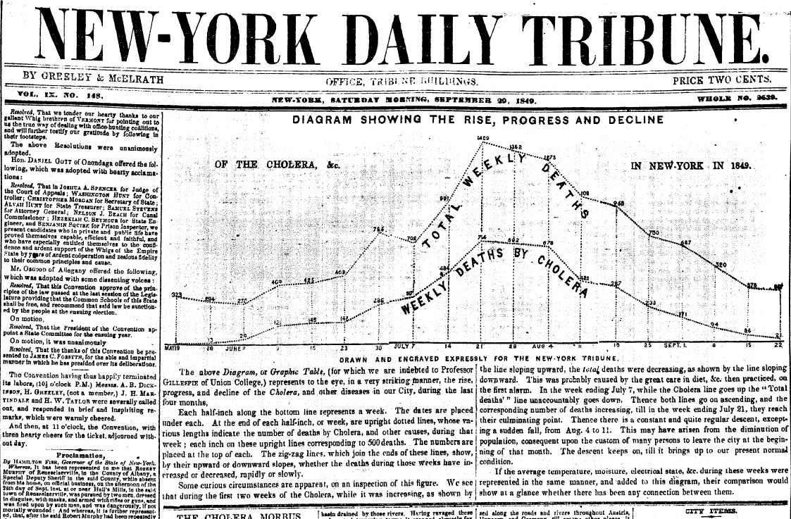
We journalists and designers tend to believe that our readers are sillier than we are, and the opposite is normally the case. Moreover, if we think that many readers won’t understand a specific graphic, we can always do what the New-York Daily Tribune, a 19th-century newspaper, did in 1849 (Figure 12.3): offer an explanation. The Tribune editors needed a time-series chart to show cases of cholera week by week, but they guessed that many of their readers hadn’t seen a line chart before. So they added a caption that explains how to read the chart. Go ahead, take a look at it. It only looks childish to you because you’ve seen line charts since you were a kid.
A good visualization isn’t just a good choice of visual forms to display the data. The words you write to accompany it matter too. The folks at The New York Times graphics desk call this the annotation layer. Some annotation would have been really helpful for me when seeing Vance Lemmon’s visualization of axons and dendrites. The words would have made up for my lack of pre-existing knowledge about what I was seeing.
Perhaps you’re thinking that verbalizing how to read a simple chart is patronizing. It isn’t. Assuming that your readers won’t ever understand a scatter plot is. The same is true about many other graphic forms that are underused in news media, such as the histogram, the dot-and-whisker plot, and the ones that we’ll still need to invent to tell compelling stories in the future.
The Popularizers
The purpose of this chapter is to pay tribute to the work of many people who I believe are popularizing, improving, and in some cases, trying to expand the vocabulary and grammar of graphics. We invent new words to refer to new phenomena. Why wouldn’t we invent novel visual strategies to express ideas we couldn’t fathom otherwise, or gently educate the public on how to read existing visualization forms?
An example of the latter is the work of the Pew Research Center itself, particularly its Fact Tank blog. Its designers aren’t afraid of publishing scatter plots on a regular basis (Figure 12.4 and Figure 12.5) or of asking their readers to stop for a few seconds to figure out a chart (Figure 12.6). Needless to say, if you request effort from your audience, you ought to be ready to deliver some worthwhile insight. I believe that these charts succeed in that respect.
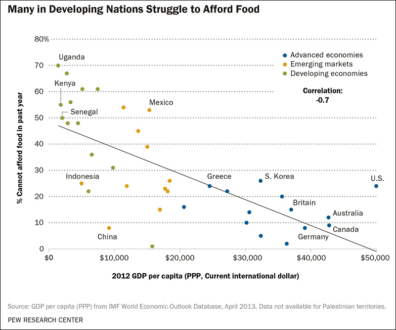
Figure 12.4 Graphic by the Pew Research Center: http://tinyurl.com/pp3bskp.
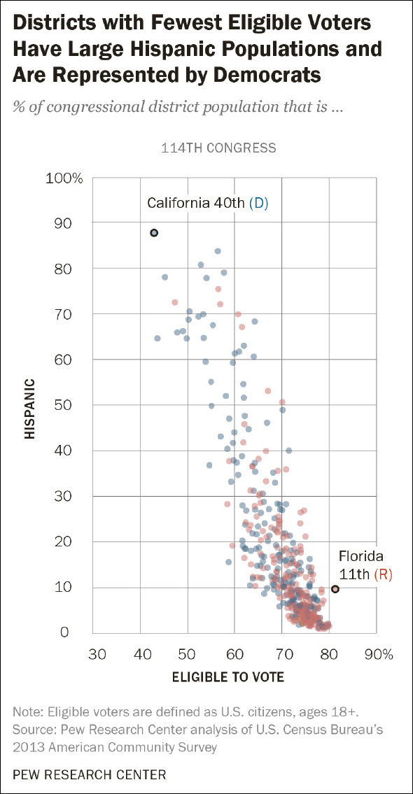
Figure 12.5 Graphic by the Pew Research Center: http://tinyurl.com/p36laaj.
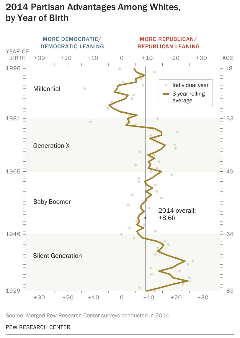
Figure 12.6 Graphic by the Pew Research Center: http://tinyurl.com/nbs8php.
Stephen Few, the person who has written most authoritatively about how to use visualization to analyze business data, is also well known for imagining new kinds of charts. My favorite is his bullet graph, invented in 2005.4 You can see it on Figure 12.7.
4 You can read more about the bullet graph at Few’s website, http://perceptualedge.com/. Here’s an article about this kind of graphic: http://tinyurl.com/psacvvw.

Figure 12.7 How to use bullet graphs. Graphic by Stephen Few: https://www.perceptualedge.com/articles/misc/Bullet_Graph_Design_Spec.pdf.
A bullet graph compares a metric—the black bar—to some sort of target or other measure, such as previous performance; that’s the thin black line. Both objects are placed over background colors that represent ranges such as “bad,” “average,” and “excellent.” The bullet graph condenses a large amount of data into a tiny space. Imagine trying to display all this information with a traditional bar chart. It’d be a cluttered mess.
If you’re interested in expanding your horizons, the world of statistics can be a bottomless source of joy. As you’ve seen in this book, statisticians like William Cleveland, Naomi Robbins, Edward Tufte, John Tukey, Leland Wilkinson, and others have been tireless popularizers and innovators. Among my favorite charts coming from this realm is the funnel plot. We saw an example in Chapter 7, when we discovered that cancer rates are both highest and lowest in sparsely populated areas.
The funnel plot is a way to visualize the relationship between a variable and the population or sample size you’re studying. The one on Figure 12.8 was done by Xan Gregg, a computer engineer at SAS-JMP.
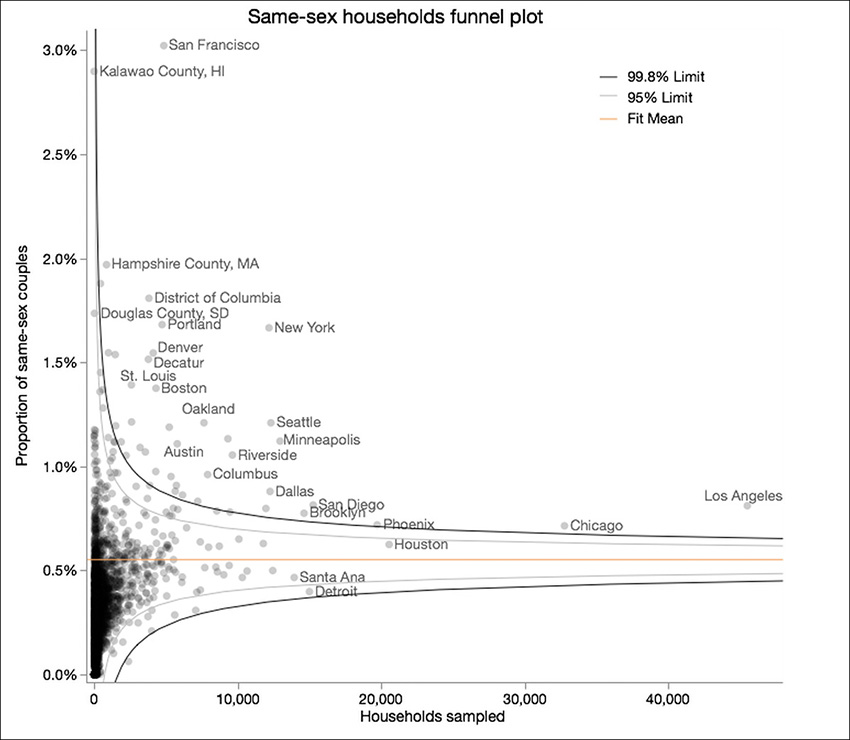
Figure 12.8 Chart by Xan Gregg. http://tinyurl.com/nb5uzpp.
In the article where this chart was published, Xan discusses a county-level map of same-sex couples by The New York Times.5 The map showed the rates of same-sex couples per 1,000 people, and it was based on data adjusted by Gary Gates, a researcher at the University of California-Los Angeles’ Charles R. Williams Institute on Sexual Orientation Law and Public Policy.
5 “Graph Makeover: Where same-sex couples live in the U.S.”: http://tinyurl.com/nb5uzpp.
Xan was aware that population size was an important factor to explain the variation observed. Here’s why:
Douglas County, South Dakota, has one of the highest proportions of same-sex couples in the country at 17.4 per 1,000, while nearby Hanson County has the minimum of 0. Each of these counties has fewer than 1,500 households, and given the sampling rate of the American Community Surve for South Dakota, we can estimate that fewer than 30 households were sampled in each county. So one same-sex couple in 30 respondents for Douglas County looks like a relatively large proportion even after Gates’ adjustments. Meanwhile 0 same-sex couples in 30 looks like none for all of Hanson County.
In Xan’s chart, the Y-axis is the percentage of same-sex couples, and the X-axis is the number of households sampled. As you can see, the smaller the sample, the larger the variation of the percentage is. It is quite obvious why this happens: if you sample just ten couples, and only one of them is a same-sex couple, you’ll get a rate of 10 percent.
I bet that you’re tempted to claim that “my readers will never understand a chart like the funnel plot!”—to which I’d reply that you better hold your judgment. Many at the New-York Daily Tribune probably thought the same about time-series charts in 1849, and they still published one with an explanatory caption.
News Applications
When I began my career back in 1997, news graphics desks were made mostly of people coming from journalism, graphic design, and fine arts. Nowadays, some graphics desks don’t even call themselves “graphics” desks anymore. They are “news applications” or “visuals” departments; they have computer scientists, statisticians, hackers, web designers and developers in their ranks; and they don’t just produce charts, maps, and diagrams, but software tools as well. The world has changed for the better.
A good example is NPR’s Visuals team.6 Led by Brian Boyer, whom we met in Chapter 2, the team’s output is consistently engrossing. NPR is also a pioneer of responsive design applied to visualization: its graphics automatically adapt to the size of the screen the reader is using. This is a common feature in many other organizations’ work nowadays, but it wasn’t when NPR started building visualizations this way, years ago.
6 Its blog is at http://blog.apps.npr.org.
The charts on Figure 12.9 belong to a story about how automatization changes the job market, killing some professions and bringing up new ones. They were done by Quoctrung Bui, who works for NPR’s “Planet Money” program in close collaboration with Brian’s team.
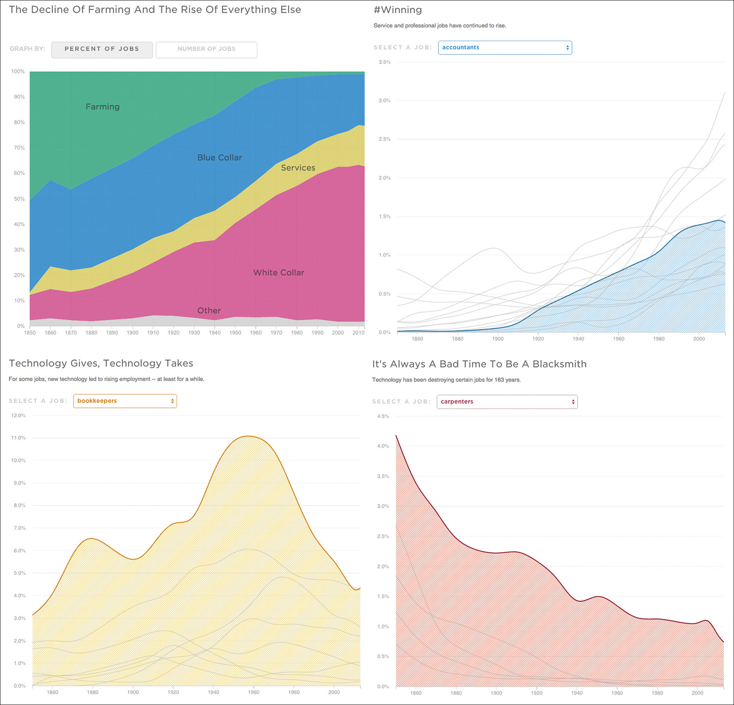
Figure 12.9 “How Machines Destroy (And Create!) Jobs, In 4 Graphs,” by NPR’s Quoctrung Bui; http://tinyurl.com/l4psdxj.
Menus in this visualization let readers switch between percentages and total scores, or select a specific job and see how the Y-scale of the corresponding chart changes. Transitions are animated: when you navigate through jobs, the Y-scale adapts to the maximum and minimum scores displayed. Animated transitions are preferable to abrupt ones.
In the summer of 2014, I spent more than a month working with ProPublica’s News Applications team. My goal was to collect data for a PhD dissertation that I’ll need to write sooner or later (keep me in your prayers). In my notebook, I wrote that ProPublica’s News Applications desk “is not a graphics desk with an interest in technology, but a technology team with an interest in graphics—among many more things.” The team doesn’t just make visualizations. They are not a service desk. They report stories, and do the writing, besides building searchable databases and interactive visualizations.
ProPublica’s graphics are often deceptively simple, like Figure 12.10, by Eric Sagara and Charles Ornstein. This small, interactive array can get sorted from highest to lowest (click on “Last year”) or alphabetically (“State”). As in the NPR graphic above, transitions are animated. The chart of the national average always remains on the upper-left corner, to make comparisons easier. The visualization is responsive too. Depending on the size of your device, a different number of charts will be placed on each row.
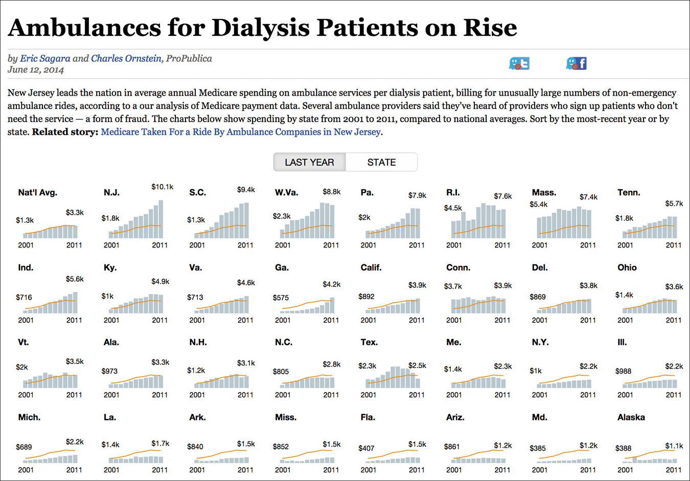
Figure 12.10 Visualization by ProPublica; https://projects.propublica.org/graphics/ambulances.
Figure 12.11, by Lena Groeger and Michael Grabell, is the result of an investigation about compensation for body damages suffered on the job. Each state in the United States has its own rules to decide how much money a worker would receive if she gets injured. Losing a pinky finger, for instance, would get you nearly $80,000 in Oregon, but just $2,000 in Massachusetts. I confess that I felt uneasy the first time I saw this visualization. I first thought that the decision of scaling the limbs in proportion to money was a risky one, as it makes the illustrations look creepy. But that may be appropriate. It’s a creepy topic, after all.
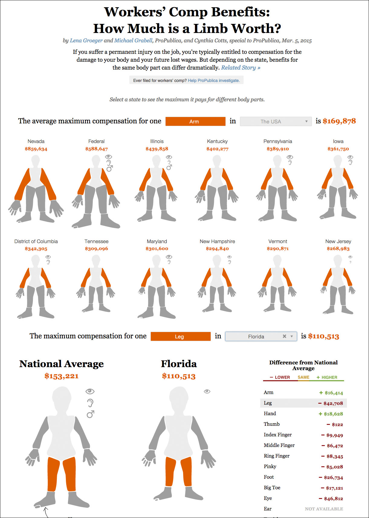
Figure 12.11 Visualization by ProPublica; https://projects.propublica.org/graphics/workers-compensation-benefits-by-limb.
ProPublica regularly collaborates with scientists and designers to develop their projects. Figure 12.12, a database of endangered species, was designed by Anna Flagg, a data journalist now working for Al Jazeera.7 Notice how certain words in the intro copy are used as buttons, how elegantly arranged all elements are, and how carefully colors and fonts were chosen. Also, see the “how to read this graphic” question mark on the top left; when you hover over it, a window with a small explanation diagram pops up.
7 Her portfolio is at http://www.annaflagg.com.
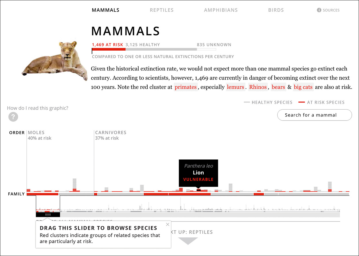
Figure 12.12 Visualization by Anna Flagg for ProPublica; http://projects.propublica.org/extinctions/.
ProPublica has also experimented with what my University of Miami colleague and mentor Rich Beckman calls interactive multimedia storytelling.8 In the past, news organizations used to publish all text on one side of the page (or of the screen) and videos, photos, and graphics on another side. But that hardly makes any sense. Isn’t it much better to seamlessly integrate all elements of the story and make them refer to each other?
8 Before coming to Miami, Rich was a professor at the School of Media and Journalism at the University of North Carolina-Chapel Hill (he hired me there in 2005; I stayed until the end of 2009.) Rich created the first coding and programming specialization ever offered in any U.S. journalism school.
That’s what Figure 12.13 does. “Losing Ground,” by Brian Jacobs and Al Shaw, is a project about how Louisiana’s coast is changing due to rising sea levels. As the intro to the project says, “The state is losing a football field of land every 48 minutes—16 square miles a year.”
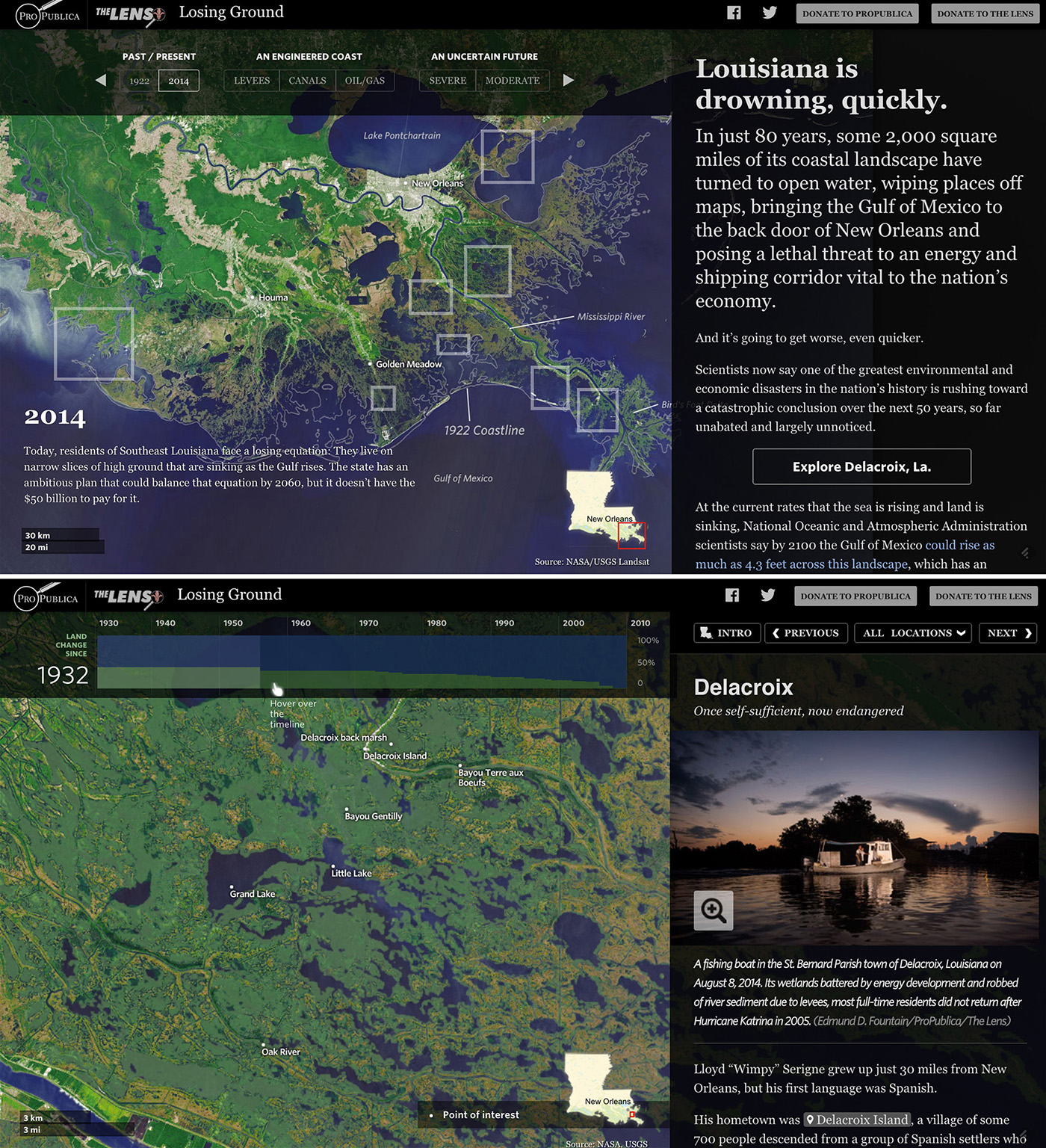
Figure 12.13 Multimedia project by ProPublica; http://projects.propublica.org/louisiana/.
I am going to ask you something. I want you to quickly say what comes to your mind without giving the question any conscious thinking. OK, here it comes: What is the news organization that produces the best visualizations and infographics in the world? I bet that many of you chose The New York Times.
That’s not surprising. In the past couple of decades, the Times graphics desk, first under the leadership of Charles Blow (until 2004) and then with Steve Duenes, has become the main inspiration for visualization designers worldwide, and not just those interested in journalism. It’s a very large department that produces lots of excellent projects.
Most Times’ visualizations strike the balance between being engaging, readable, and deep. See Figure 12.14, by Mike Bostock, Matt Ericson, and Robert Gebeloff. A series of small multiple lattices are arranged as a linear narrative. Chart titles highlight relevant data points (“...While payroll taxes have risen for all—but not as much for the affluent”) helping readers grasp the gist of the story. In a news publication, this kind of title is preferable to the more aseptic style researchers favor, something like “Payroll tax variation between 1980 and 2010.”
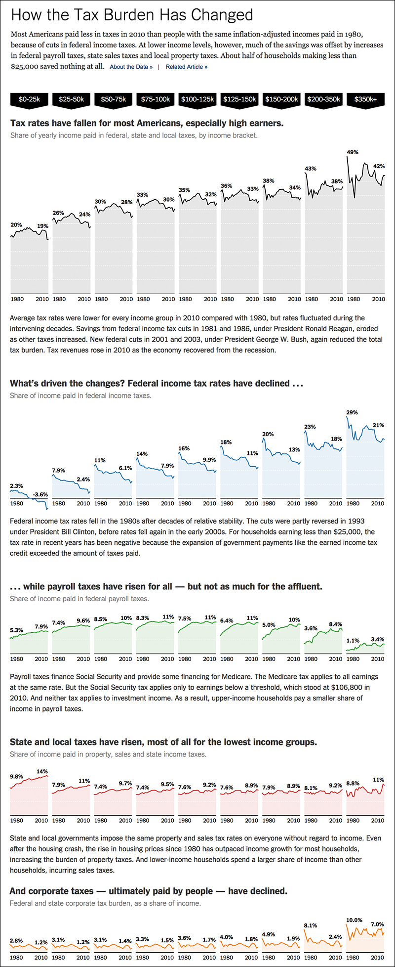
Figure 12.14 Graphic by The New York Times, http://tinyurl.com/cxdgacu.
Figure 12.15, by Ford Fessenden and Mike Bostock, is also a data-driven story. Here, charts and maps fit naturally in between paragraphs of copy that comment on them and anticipate what readers will see. This project is richly layered: clicking on the maps of certain New York neighborhoods takes readers to a detailed explorable map of the entire city.
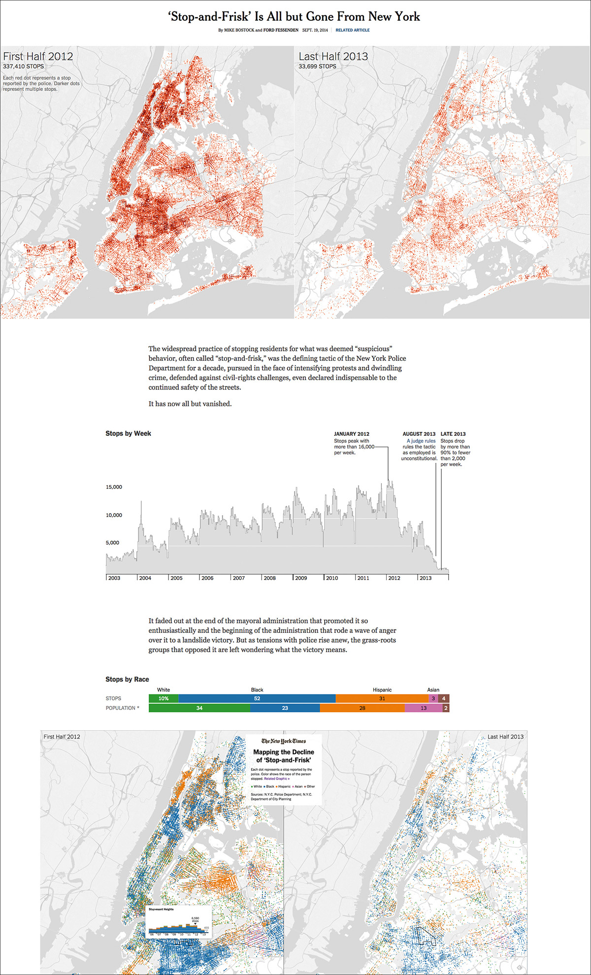
Figure 12.15 Story by The New York Times, http://tinyurl.com/qj4q2ol.
The Times also produces visualizations that put you, the reader, at the center of the stage. The first thing that you’ll see when visiting Figure 12.16, by Josh Katz and Wilson Andrews, is a series of questions about how you pronounce various words, or about which terms you use to refer to different objects. The visualization then estimates where you were born. The predictive model behind this project is based on the Harvard Dialect Survey, by professors Bert Vaux and Scott Golder.

Figure 12.16 Interactive quiz by The New York Times, http://tinyurl.com/pke94a2.
When you visit this visualization, notice that you don’t need to answer the 25 questions to get results. Each time you make a choice, a little map on the left side of the screen gets updated. That kind of instant feedback is critical if you want to maintain your readers’ attention.
(Incidentally, I replied to all questions, and the graphic told me that I am probably from Texas. I obviously wasn’t born in the United States. I guess that this is close enough—I’m from A Coruña, Spain.)
The Times is keen on experimenting with charts and maps. Figure 12.17 is a good example. It was designed by Amanda Cox, Mike Bostock, Derek Watkins, and Shan Carter, and it shows the results of the 2014 midterm elections on maps that look like watercolor paintings.

Figure 12.17 Graphic by The New York Times, http://www.nytimes.com/interactive/2014/11/04/upshot/senate-maps.html.
What makes this project so different to many other choropleth maps is that the color scheme doesn’t represent a single variable (political orientation) but two (political orientation and population density.) Bivariate scales aren’t common in news publications right now, but they can come in handy.
The New York Times’ popularity sometimes eclipses astonishing work by other U.S. news organizations, such as The Washington Post, the Boston Globe, National Geographic magazine, or The Wall Street Journal (WSJ). This is unfortunate, as much can be learned from projects like Figure 12.18. This WSJ multi-chart display by Andrew Van Dam and Renee Lightner is an overview of trends in U.S. unemployment rates.
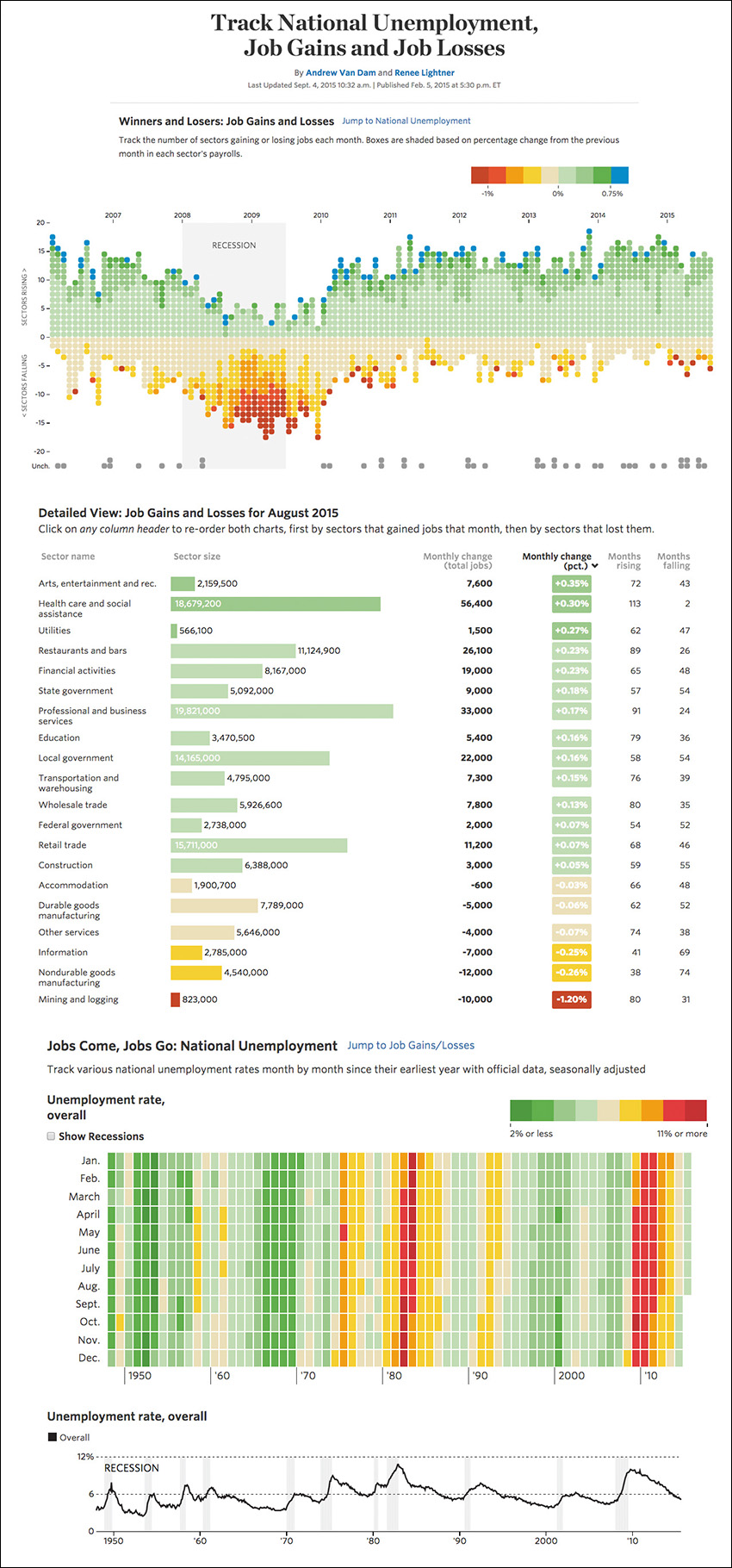
Figure 12.18 Visualization by The Wall Street Journal, http://graphics.wsj.com/job-market-tracker/.
Each dot on the top chart represents a sector in the economy. Notice that during the most recent recession, between 2008 and the middle of 2009, most sectors destroyed jobs. How many? Hues and shades represent percentage change from the previous month in each sector’s payrolls. Underneath, a bar chart, a heat map, a time-series chart, and several filters add detail to the display.
The Journal is very fond of heat maps. Figure 12.19, by Tynan DeBold and Dov Friedman, is one that won deserved praise when it was published, as it persuasively reveals that vaccines work. The black line going across each chart, which corresponds to the moment when each vaccine was introduced, works as a sharp boundary. Before it, colors are intense and ominous, indicating a large incidence of each disease; after the line, diseases vanish.
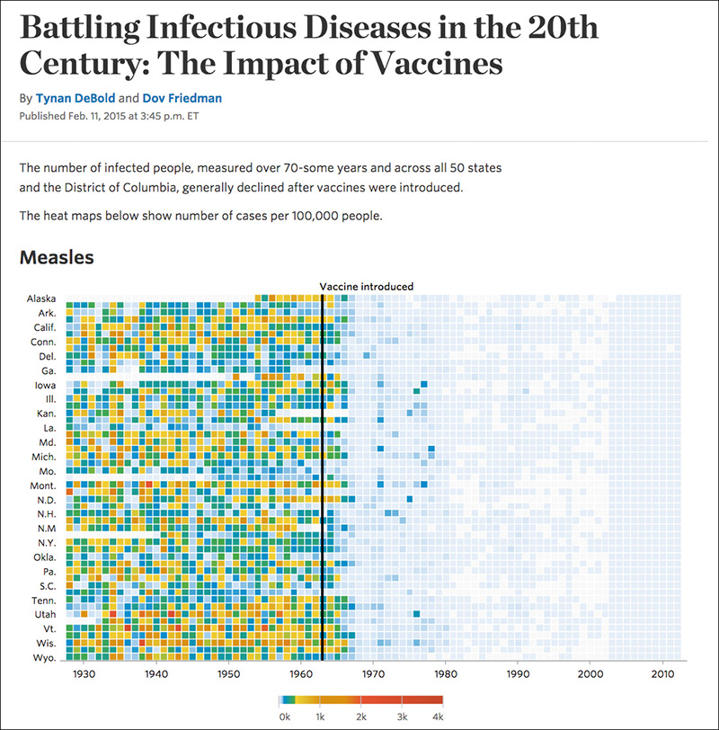
Figure 12.19 Graphic by The Wall Street Journal, http://graphics.wsj.com/infectious-diseases-and-vaccines/.
No visualization is ever perfect, and sometimes attentive readers will make time to propose improvements. Valentine Svensson, a mathematician at the European Bioinformatics Institute, argued that a time-series chart may be more appropriate to present the data, so he designed several charts like Figure 12.20.9 I must confess that I felt torn when I compared the original WSJ chart with Svensson’s. I like them both, and I’m not sure which one I’d choose if I were doing this project myself.
9 Svensson wrote an entire article about this: “Modeling Measles in 20th Century US,” http://tinyurl.com/qgpajgp.
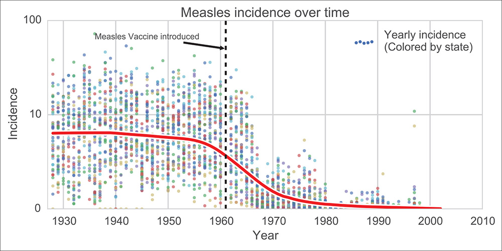
Figure 12.20 Chart by Valentine Svensson, http://tinyurl.com/qgpajgp.
Svensson’s reaction is an expression of a trend that I hope will strengthen in the future. We’re witnessing the rise of a culture of experimentation and innovation in visualization. That’s great, but not enough. A culture of experimentation needs to be accompanied by a culture of constructive criticism. That’s the point of a wonderful essay titled “Design and Redesign in Data Visualization,” by Fernanda Viégas and Martin Wattenberg, visualization designers at Google, who wrote:
Design is not a science. But “not a science” isn’t the same as “completely subjective.” In fact, the critique process has brought discipline to design for centuries. For visualizations which are based on an underlying shared data set, there’s an opportunity for an additional level of rigor: to demonstrate the value of a critique through a redesign based on the same data (...) Criticism through redesign may be one of the most powerful tools we have for moving the field of visualization forward. At the same time, it’s not easy, and there are many pitfalls, intellectual, practical, and social.10
10 The essay has appeared in multiple online publications. Here’s one link: http://tinyurl.com/ozhpcjm.
Fernanda and Martin happen to be two of the most innovative individuals out there. Their famous Wind Map (Figure 12.21) shows wind direction and strength in real time. Figure 12.22 reveals the amounts of different colors in photos of the Boston Common park posted on Flickr. Whites and grays dominate during the fall and winter, and bright hues become common in the spring and summer. There’s little very surprising about this, but how often have you seen the evidence for something you already guessed so beautifully expressed?
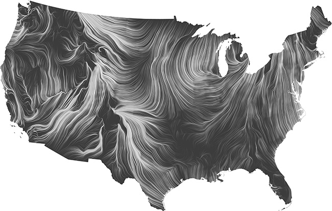
Figure 12.21 Fernanda Viégas and Martin Wattenberg’s Wind Map, http://hint.fm/wind/.
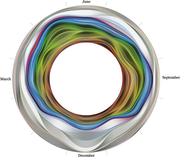
Figure 12.22 Flickr Flow, by Fernanda Viégas and Martin Wattenberg (annotations by Alberto Cairo), http://hint.fm/projects/flickr/.
In the past five years, several online-only news publications that heavily use infographics and data visualization have been launched. Among them, I’d like to single out FiveThirtyEight.com. FiveThirtyEight is led by Nate Silver, who became famous while writing about politics and sports at publications like Daily Kos, Esquire, and The New York Times.11 Trained as a statistician, Silver predicted the outcomes of several elections with an accuracy rarely seen before in news media.
11 Before becoming a writer, Silver was already famous for PECOTA (Player Empirical Comparison and Optimization Test Algorithm), a system to predict baseball players’ performance. He’s also the author of a fine and popular book about statistics and data analysis, The Signal and the Noise (2012).
Figure 12.23 and Figure 12.24 will give you an idea of the kind of visualizations FiveThirtyEight produces. The first one, by Allison McCann, is an example of the slightly edgy and geeky style that the publication favors. FiveThirtyEight’s priority is clarity, but that doesn’t make its designers refrain from having fun.

Figure 12.23 Graphic by FiveThirtyEight; http://tinyurl.com/kryl27c. Copyright © ESPN. Reprinted with permission from ESPN.

Figure 12.24 Graphic by FiveThirtyEight; http://tinyurl.com/nbzmqyc. Copyright © ESPN. Reprinted with permission from ESPN.
Figure 12.24, by Aaron Bycoffe, is a very detailed story of the endorsements received by candidates to the Democratic and Republican presidential primaries since 1980. The Y-axis corresponds to the cumulative endorsement points each candidate received from one year before the Iowa caucuses until the party conventions.
These points are calculated based on the kind of endorsements each candidate receives. Here’s the explanation provided in the story: “Not all endorsements are equally valuable. We use a simple weighting system: ten points for governors, five points for U.S. senators, and one point for U.S. representatives (there are roughly five times as many representatives as senators and ten times as many representatives as governors.)”
Hillary Clinton is the Democratic candidate who, historically, began with a larger amount of endorsements. One year before the Iowa caucuses, she already had almost 200 endorsement points. On the Republican side, most candidates began with almost no support at all.
Those Enchanting Europeans
In preceding chapters, I tried to include as many non-U.S. visualizations as possible. This one won’t be an exception. We’ve already seen some work by Zeit Online. I’d like to show you another of their projects, Figure 12.25, which displays the opinion disparities that still exist between Germans living in the western part of the country, and those on the eastern regions who were under Soviet influence until the reunification of Germany in October 1990.
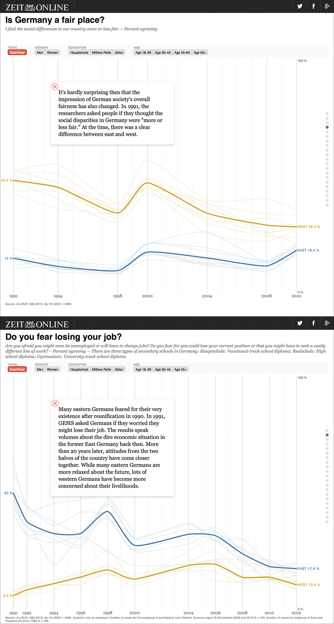
Figure 12.25 “Charting Germany,” Christian Bangel, Julian Stahnke, Kim Albrecht, Paul Blickle, Sascha Venohr, Adrian Pohr. Zeit Online. http://zeit.de/charting-germany
The multiple time-series charts in this project reveal that Germans tend to think more alike than they did 25 years ago, but cultural differences persist, even when filtering by age and gender, something that readers can do using the menus on top.
Figure 12.26, by the Berliner Morgenpost, is another graceful example of the enduring power of traditional graphic forms, like the time-series line chart. It shows the increase in rent prices in Berlin. Each line is a zip code. Prices are in euros per square meter. The visualization can be navigated with the arrow keys on your keyboard, by hovering over the lines, or by searching for a zip code. In any case, whenever a line is highlighted, a little locator map shows where the zip code is.

Figure 12.26 The stark increase of rental prices in Berlin. Berliner Morgenpost: http://tinyurl.com/osfbefu.
The Morgenpost likes to experiment with combinations of various graphic forms. In Figure 12.27, a time-series chart serves as the slider to control a large heat map of measles cases per district in Berlin. Vaccination against measles isn’t compulsory in Germany, and the amount of parents who ignore all relevant science, and therefore refuse to have their children vaccinated, has increased in the past decade. Those factors have led to hundreds of new cases in 2015, and even the death of a baby.12
12 Deutsche Welle has a good summary of the 2015 epidemic, the worst in a decade: http://tinyurl.com/pvcm9fn.
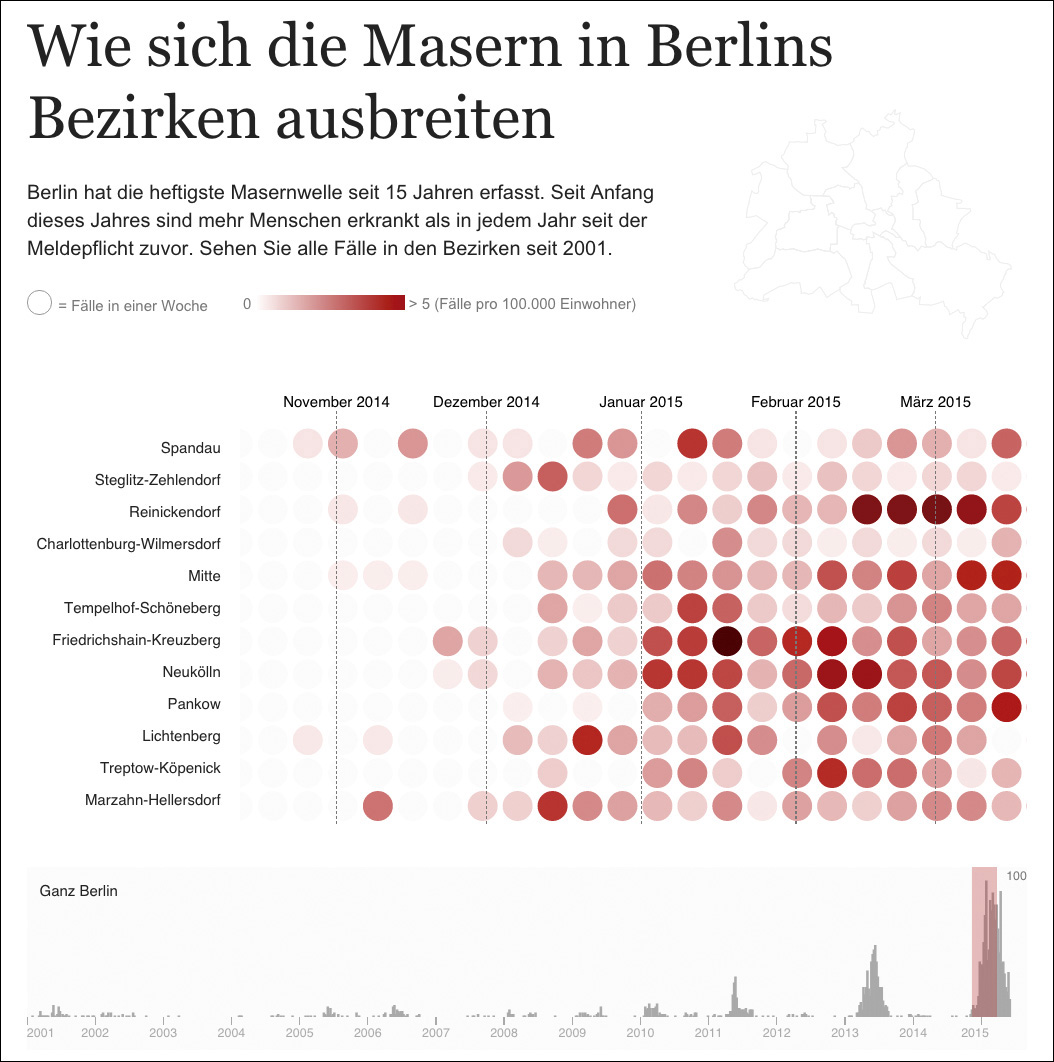
Figure 12.27 The spread of measles in Berlin’s districts. Berliner Morgenpost: http://tinyurl.com/oejb4q7.
Maarten Lambrechts, a visualization designer and journalist from Diest, Belgium,13 embodies a trend I’ve observed in the past decade: an increasing number of people with backgrounds in technical and scientific fields (Maarten is an engineer) have finally understood that journalism isn’t just what newspapers or news magazines or broadcast TV do. Marteen became interested in visualization while working in Bolivia as an agricultural economist. Later on, almost by happenstance, he landed several jobs in journalism.
13 http://www.maartenlambrechts.be
Maarten’s most interesting projects focus on climate and weather patterns. The Y-axis on Figure 12.28 is average monthly temperatures. Each line is a year between 1833 and 2014. There’s much to explore on this chart, but the main takeaway is that all years between 2005 and 2014 are way above the historical average.
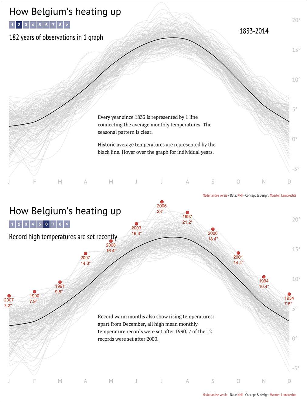
Figure 12.28 “How Belgium’s Heating Up,” by Maarten Lambrechts; http://www.maartenlambrechts.be/vis/warm2014/warm2014.html.
Figure 12.29 is an experimental visualization of weather data from Cairo and Singapore. You choose a date, and the graphic will show you temperature, rainfall, wind speed and direction, and cloud cover. Circular plots always make me feel nervous, but I’m fine with these. The one showing wind direction and strength makes a lot of sense; as for the others, I prefer plots based on straight axes—you can estimate proportions more efficiently—but I understand the design choice here, as the data is cyclical.
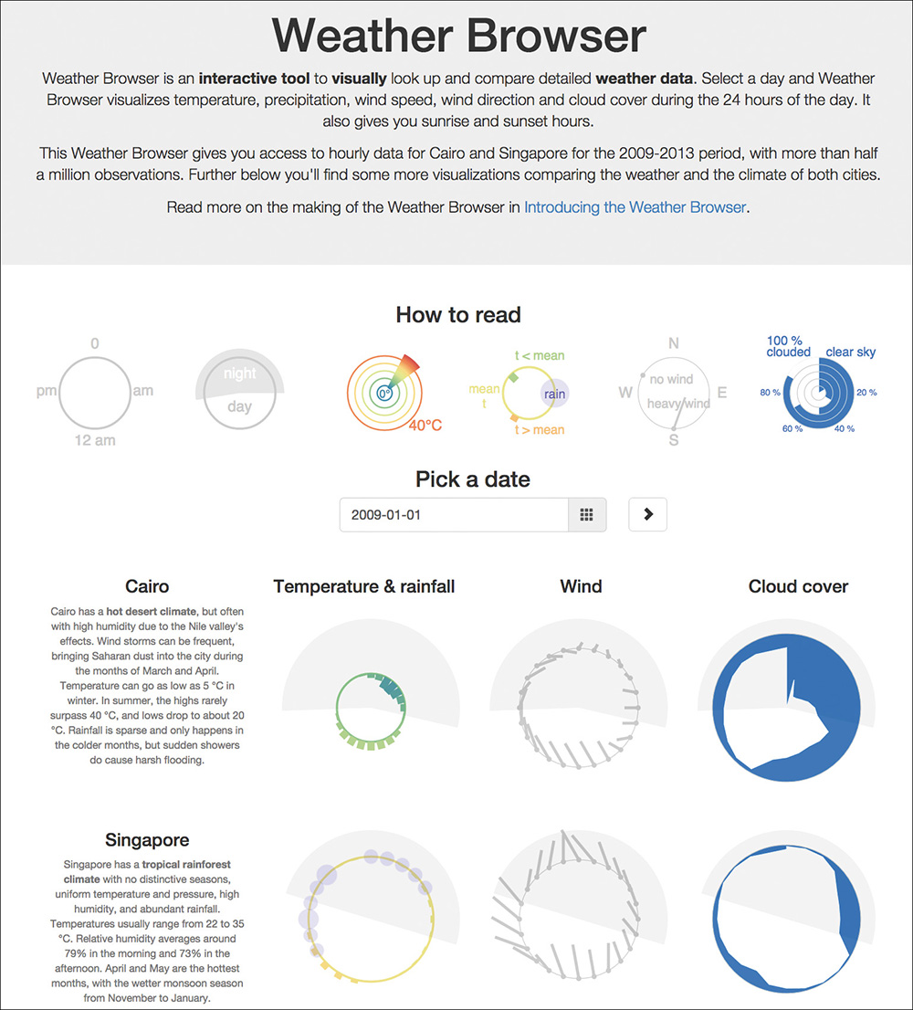
Figure 12.29 “The Weather Browser,” by Maarten Lambrechts; http://www.maartenlambrechts.be/vis/weatherbrowser/. Read an explanation of how this project was done at http://www.maartenlambrechts.be/introducing-the-weather-browser/.
Making Science Visual
Many science magazines, both popular and specialized, produce wonderful graphics. Recently, Science magazine hired Alberto Cuadra, an experienced infographics designer from Spain,14 and every issue of Popular Science contains at least one large display of data and visual explanation. Scientific American is also in that group.
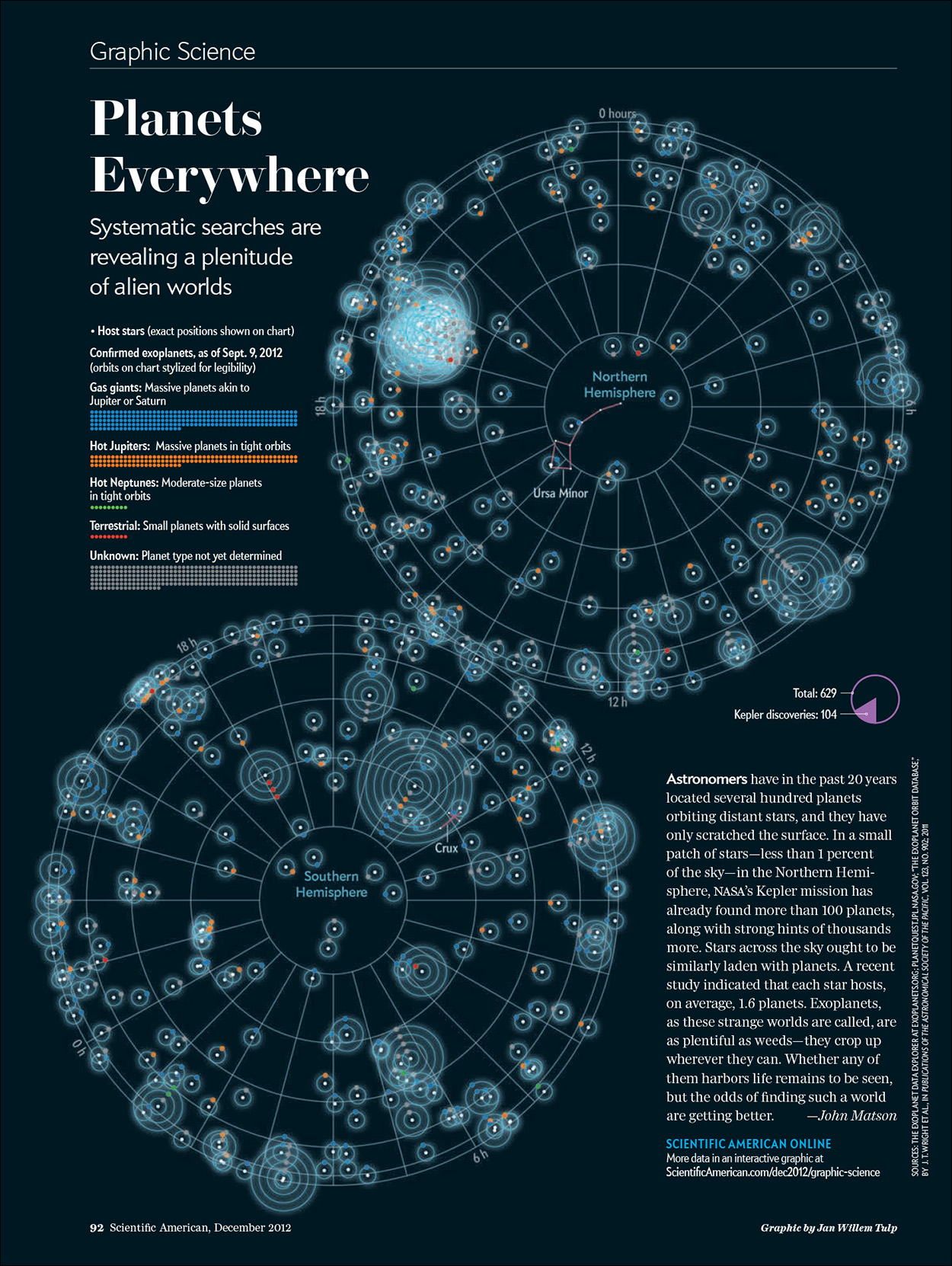
Scientific American’s head of graphics is Jen Christiansen.15 Trained as a natural science illustrator and art director, Jen has established collaborations with many of the most renowned infographics and data visualization designers in the field. Figure 12.30, done in collaboration with Jan Willem Tulp,16 plots the confirmed exoplanets, as of September 2012.
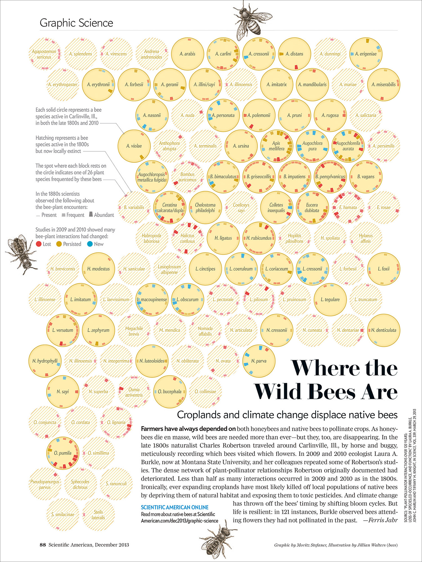
Moritz Stefaner17 authored the intricate diagram on Figure 12.31, on the interactions between species of bees and plants. This is one of those graphics that requires a lot of effort on the part of the reader in exchange for a significant payoff (if you’re into bees!).18
17 http://truth-and-beauty.net
18 Moritz documented the bees project in this article: http://tinyurl.com/lot5l2e.
Scientific American has also partnered up with Periscopic,19 a visualization firm based in Portland, Oregon. Figure 12.32 is a part of a special issue about diversity in science. The graphic compares the percentage of PhDs awarded to men and women in more than 50 countries. It begins by showing you all PhDs aggregated; then you can use the menus and buttons above and below the graphic to sort the data in multiple ways and to see just specific PhD categories. For instance, compare “Math & Computer Science” to “Social & Behavioral.” The disparity is glaring.
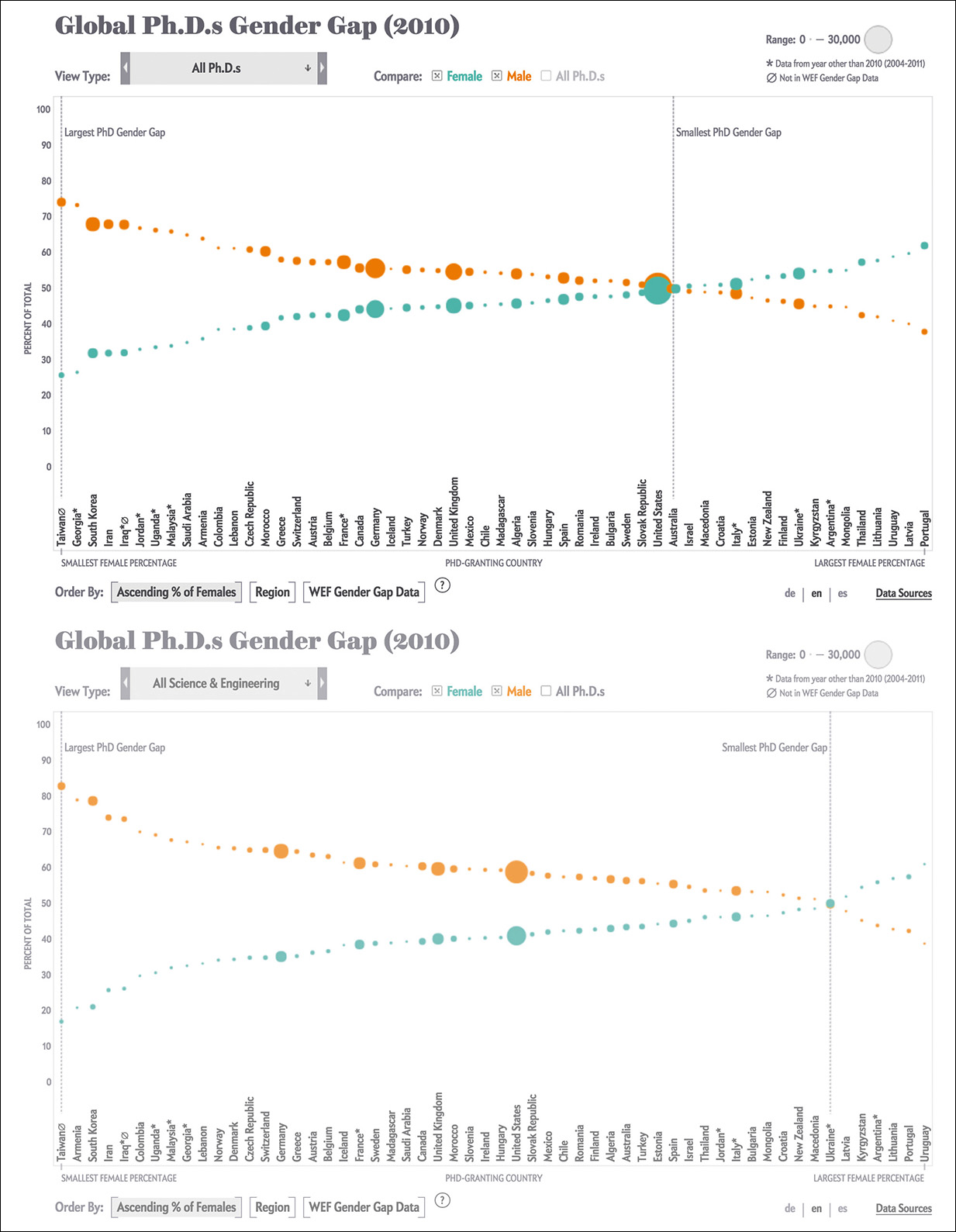
Figure 12.32 Visualization by Periscopic for Scientific American; http://tinyurl.com/qd4qvev.
Culture Data
Visualization can also be used to explore realms that aren’t usually thought of as amenable to quantification, such as literature or movies. Take Figure 12.33, which is part of a large interactive project titled Culturegraphy, by information designer Kim Albrecht.20
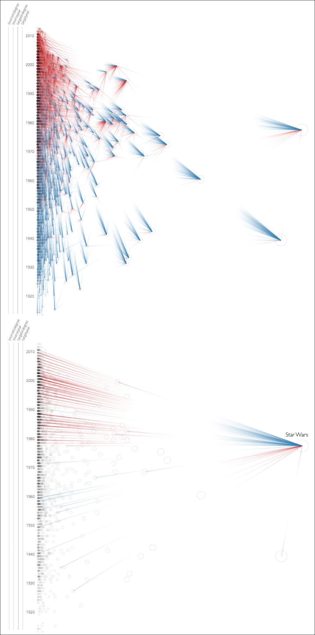
Figure 12.33 Culturegraphy: http://www.culturegraphy.com/.
The project uses data from the Internet Movie Database (IMDB) to explore cross-movie references, when each movie is mentioned in another movie. Culturegraphy doesn’t show all existing movies, just the 3,000 most connected ones. These references don’t need to be explicit, by the way. If a movie borrows a line from another one, that’s considered a reference, even without mentioning the movie title. “May the force be with you,” a saying made famous in Star Wars: A New Hope (1977), also appears in movies like Beverly Hills Cop II (1987).
Jeff Clark, a data visualization designer who runs a company called Neoformix,21 is the author of many graphics about cultural data. My favorites belong to a series called Novel Views (Figure 12.34), which visualizes Victor Hugo’s Les Miserables.
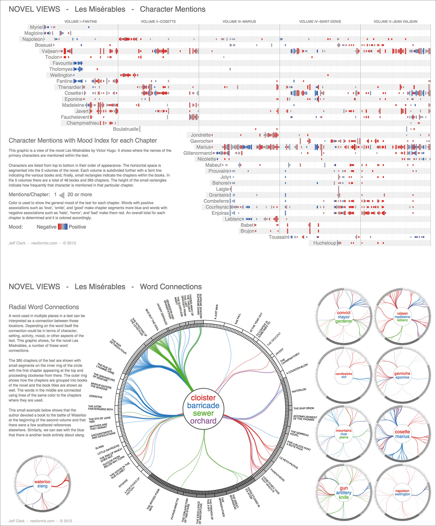
Figure 12.34 Novel Views, visualizing Victor Hugo’s Les Miserables, by Jeff Clark; http://neoformix.com/2013/NovelViews.html.
One of the plots presents the characters by order of appearance and then shows the number of times their name is mentioned with bars of varying lengths. The mood of each chapter is represented through color: blue indicates the presence of words like “love” and “good,” and red corresponds to a prevalence of words with negative connotations. Other diagrams in the series let Victor Hugo’s fans see thematic connections between chapters.
The Artistic Fringes
The designers in this last section operate at the fringes between traditional data visualization—ruled by the capacities and constraints of human visual perception and cognition—and artistic expression. After reading so much in this book about appropriate and not-so-appropriate practices when presenting information visually, it may be a refreshing experience to visit a realm where those rules are stretched, bent, and sometimes broken.
Broken, yes, but rarely in a random manner. Creativity and innovation are hard work in all disciplines. Consider painters like Picasso or Jackson Pollock. Their most famous pieces, the ones that shattered conventions, came after they had spent decades mastering their craft, being inspired by those who preceded them, copying them, and following canonical rules. If you allow me the cliché, you cannot think “out of the box” if you don’t know really well what the inside of the box looks like.
This said, there are people out there like Giorgia Lupi. Giorgia is the main driving force behind the visualization firm Accurat (www.accurat.it), which has won worldwide recognition for works like Figure 12.35.

Figure 12.35 Graphic by Accurat; http://visual.ly/atlases-world-history-english.
This graphic compares the number of pages each atlas of world history devotes to each time period (upper timeline of each section) with an actual timeline in which centuries are equally spaced. The De Agostini Atlas of World History devotes half of its pages to modern and contemporary history (from 1500 onward), while the Garzanti Atlas of World History uses two-thirds of its pages for the same purpose. Vertical color bars indicate space allocated to different topics.
Giorgia is an accomplished artist, as her delicate sketches (Figure 12.36) prove. Many of her most personal visualizations are devoted to the study of art, history, and literature. Figure 12.37 chronicles the lives of 90 famous painters. Don’t feel overwhelmed by the amount of information included. Spend some time reading the key and then enjoy the experience. Remember: these graphics are not intended to be understood in just one quick glance.

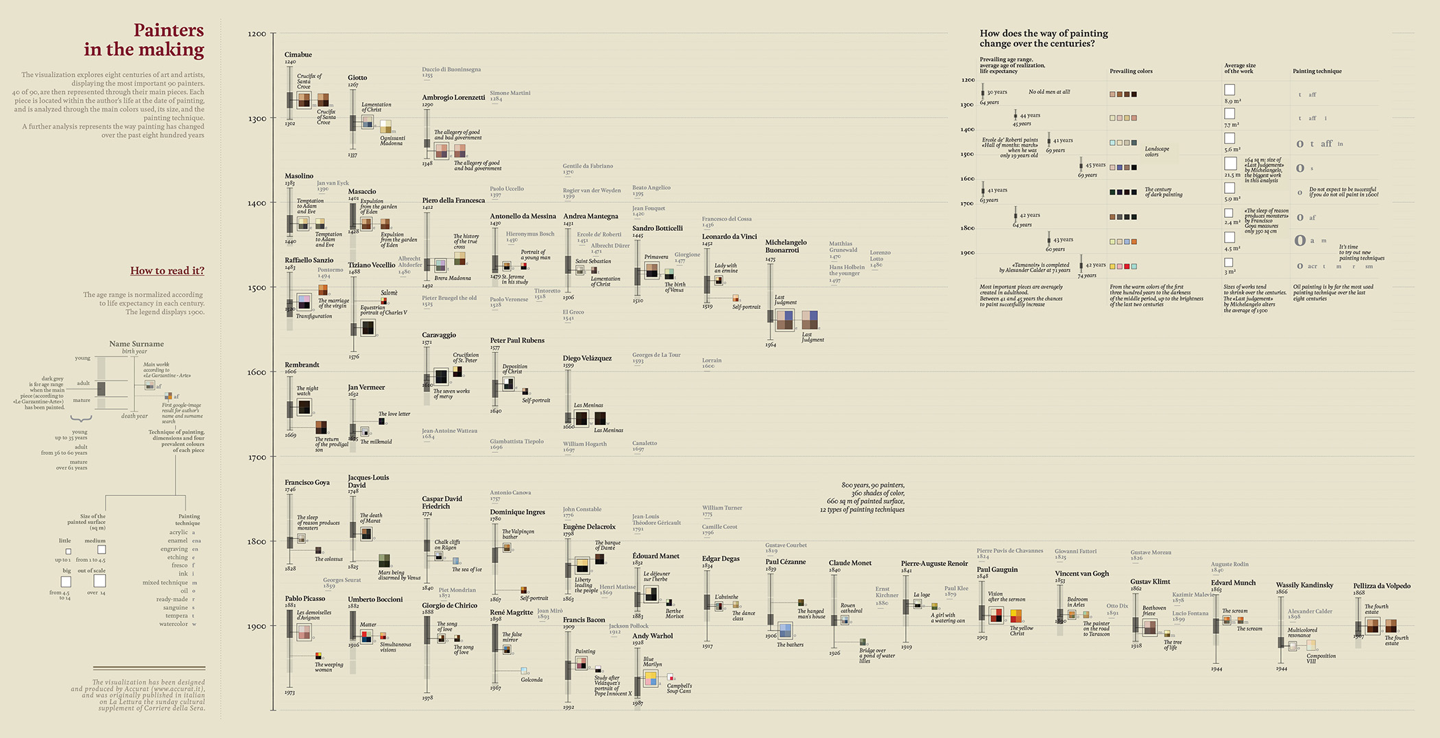
Figure 12.37 Graphic by Accurat; http://visual.ly/painters-making.
During 2014 and 2015, Giorgia partnered up with another data artist, Stefanie Posavec,22 to launch Dear Data,23 a project described by both authors as “Two women who switched continents to get to know each other through the data they draw and send across the pond.”
22 Stefanie’s website is http://www.stefanieposavec.co.uk. I interviewed her for my previous book, The Functional Art.
23 The project’s website is http://www.dear-data.com/.
This lovely initiative began with two ladies who have only met twice in person—Giorgia lives in New York and Stefanie lives in London—and who share an interest in doing art with numbers. Each began collecting data about their daily lives. Based on that personal research, they drew a weekly postcard-sized, hand-drawn visualization like Figure 12.38 for 52 weeks.

Figure 12.38 Postcards from the “Dear Data” project, by Stefanie Posavec and Giorgia Lupi; http://www.dear-data.com/.
Mathematician, designer, and coder Santiago Ortiz is one of the most forward-thinking minds in visualization. The projects in his portfolio are sometimes genial, sometimes bizarre and crazy, but always suggestive24. Something similar can be said of New York-based artist Jer Thorp25, who has been hailed as “the man who makes data beautiful.”26
26 “This Man Makes Data Look Beautiful,” http://tinyurl.com/nmeb4cj.
To an orthodox journalist and graphics designer like me, Santiago’s (Figure 12.39) and Jer’s (Figure 12.40) visualizations often look perplexing, risky, and even incomprehensible, but I also believe that it is in those features that their true value resides. They are experiments. Many of their experiments will fail, but a handful of them will inevitably stick.

Figure 12.39 The Iliad, visualized by Santiago Ortiz; http://moebio.com/iliad/.
Figure 12.40 “GoodMorning!” a Twitter visualization that shows about 11,000 “good morning” tweets over a 24-hour period, by Jer Thorp; http://blog.blprnt.com/blog/blprnt/goodmorning.
It is a common pattern in history to see the scandalous become routine, and, as J. R. R. Tolkien wrote in The Lord of the Rings, “not all those who wander are lost.” In this world, I am willing to argue, we need both sedentary dwellers and nomadic wanderers. The former keep our collective Island of Knowledge safe and dry. The latter strive to expand its shorelines, always looking at a horizon of promise far away, beyond the perilous Sea of Mystery.