
Chapter 11
Prototyping
Objectives
After reading this chapter, you will:
1. Be able to articulate what prototyping is and why it is needed
2. Understand how to choose the appropriate depth and breadth, level of fidelity, and amount of interactivity of prototypes
3. Understand special types of prototypes, such as physical mockups and Wizard of Oz prototypes
4. Understand the appropriate type of prototype for a given stage of design evolution
5. Understand the role of prototypes in the transition to a product
11.1 Introduction
11.1.1 You Are Here
We begin each process chapter with a “you are here” picture of the chapter topic in the context of the overall Wheel lifecycle template; see Figure 11-1. Although prototyping is a kind of implementation, design and prototyping in practice often overlap and occur simultaneously. A prototype in that sense is a design representation.
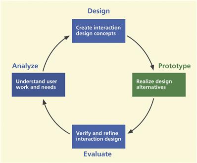
Figure 11-1 You are here; the chapter on prototyping in the context of the overall Wheel lifecycle template.
So, as you create the design and its representation, you are creating the prototype. Therefore, although in Figure 11-1 it might seem that prototyping is limited to a particular place within a cycle of other process activities, like all other activities, prototyping does not happen only at some point in a rigid sequence.
11.1.2 A Dilemma, and a Solution
Have you ever rushed to deliver a product version without enough time to check it out? Then realized the design needed fixing? Sorry, but that ship has already left the station. The sooner you fail and understand why, the sooner you can succeed. As Frishberg (2006) tells us, “the faster you go, the sooner you know.” If only you had made some early prototypes to work out the design changes before releasing it! In this chapter we show you how to use prototyping as a hatching oven for partially baked designs within the overall UX lifecycle process.
Traditional development approaches such as the waterfall method were heavyweight processes that required enormous investment of time, money, and personnel. Those linear development processes have tended to force a commitment to significant amounts of design detail without any means for visualizing and evaluating the product until it was too late to make any major changes.
Construction and modification of software by ordinary programming techniques in the past have been notoriously expensive and time-consuming activities. Little wonder there have been so many failed software development projects (Cobb, 1995; The Standish Group, 1994, 2001)—wrong requirements, not meeting requirements, imbalanced emphasis within functionality, poor user experience, and so much customer and user dissatisfaction.
In thinking about how to overcome these problems, we are faced with a dilemma. The only way to be sure that your system design is the right design and that your design is the best it can be is to evaluate it with real users. However, at the beginning you have a design but no system yet to evaluate. But after it is implemented, changes are much more difficult.
Enter the prototype. A prototype gives you something to evaluate before you have to commit resources to build the real thing. Because prototyping provides an early version of the system that can be constructed much faster and is less expensive, something to stand in stead of the real system to evaluate and inform refinement of the design, it has become a principal technique of the iterative lifecycle.
Universality of prototyping
The idea of prototyping is timeless and universal. Automobile designers build and test mockups, architects and sculptors make models, circuit designers use “bread-boards,” artists work with sketches, and aircraft designers build and fly experimental designs. Even Leonardo da Vinci and Alexander Graham Bell made prototypes.
Thomas Edison sometimes made 10,000 prototypes before getting just the right design. In each case the concept of a prototype was the key to affording the design team and others an early ability to observe something about the final product—evaluating ideas, weighing alternatives, and seeing what works and what does not.
Alfred Hitchcock, master of dramatic dialogue design, is known for using prototyping to refine the plots of his movies. Hitchcock would tell variations of stories at cocktail parties and observe reactions of his listeners. He would experiment with various sequences and mechanisms for revealing the story line. Refinement of the story was based on listener reactions as an evaluation criterion. Psycho is a notable example of the results of this technique.
Scandinavian origins
Like a large number of other parts of this overall lifecycle process, the origins of prototyping, especially low-fidelity prototyping, go back to the Scandinavian work activity theory research and practice of Ehn, Kyng, and others (Bjerknes, Ehn, & Kyng, 1987; Ehn, 1988) and participatory design work (Kyng, 1994). These formative works emphasized the need to foster early and detailed communication about design and participation in understanding the requirements for that design.
11.2 Depth and breadth of a prototype
The idea of prototypes is to provide a fast and easily changed early view of the envisioned interaction design. To be fast and easily changed, a prototype must be something less than the real system. The choices for your approach to prototyping are about how to make it less. You can make it less by focusing on just the breadth or just the depth of the system or by focusing on less than full fidelity of details in the prototype (discussed later in this chapter).
11.2.1 Horizontal vs. Vertical Prototypes
Horizontal and vertical prototypes represent the difference between slicing the system by breadth and by depth in the features and functionality of a prototype (Hartson & Smith, 1991). Nielsen (1987) also describes types of prototypes based on how a target system is sliced in the prototype. In his usability engineering book (1993), Nielsen illustrates the relative concepts of horizontal and vertical prototyping, which we show as Figure 11-2.
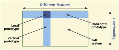
Figure 11-2 Horizontal and vertical prototyping concepts, from Nielsen (1993), with permission.
A horizontal prototype is very broad in the features it incorporates, but offers less depth in its coverage of functionality. A vertical prototype contains as much depth of functionality as possible in the current state of progress, but only for a narrow breadth of features.
A horizontal prototype is a good place to start with your prototyping, as it provides an overview on which you can base a top-down approach. A horizontal prototype is effective in demonstrating the product concept and for conveying an early product overview to managers, customers, and users (Kensing & Munk-Madsen, 1993) but, because of the lack of details in depth, horizontal prototypes usually do not support complete workflows, and user experience evaluation with this kind of prototype is generally less realistic.
A horizontal prototype can also be used to explore how much functionality will really be used by a certain class of users to expose typical users to the breadth of proposed functionality and get feedback on which functions would be used or not.
A vertical prototype allows testing a limited range of features but those functions that are included are evolved in enough detail to support realistic user experience evaluation. Often the functionality of a vertical prototype can include a stub for or an actual working back-end database.
A vertical prototype is ideal for times when you need to represent completely the details of an isolated part of an individual interaction workflow in order to understand how those details play out in actual usage. For example, you may wish to study a new design for the checkout part of the workflow for an e-commerce Website. A vertical prototype would show that one task sequence and associated user actions, in depth.
11.2.2 “T” Prototypes
A “T” prototype combines the advantages of both horizontal and vertical, offering a good compromise for system evaluation. Much of the interface is realized at a shallow level (the horizontal top of the T), but a few parts are done in depth (the vertical part of the T). This makes a T prototype essentially a horizontal prototype, but with the functionality details filled out vertically for some parts of the design.
In the early going, the T prototype provides a nice balance between the two extremes, giving you some advantages of each. Once you have established a system overview in your horizontal prototype, as a practical matter the T prototype is the next step toward achieving some depth. In time, the horizontal foundation supports evolving vertical growth across the whole prototype.
11.2.3 Local Prototypes
We call the small area where horizontal and vertical slices intersect a “local prototype” because the depth and breadth are both limited to a very localized interaction design issue. A local prototype is used to evaluate design alternatives for particular isolated interaction details, such as the appearance of an icon, wording of a message, or behavior of an individual function. It is so narrow and shallow that it is about just one isolated design issue and it does not support any depth of task flow.
A local prototype is the solution for those times when your design team encounters an impasse in design discussions where, after a while, there is no agreement and people are starting to repeat themselves. Contextual data are not clear on the question and further arguing is a waste of time. It is time to put the specific design issue on a list for testing, letting the user or customer speak to it in a kind of “feature face-off” to help decide among the alternatives.
For example, your design team might not be able to agree on the details of a “Save” dialogue box and you want to compare two different approaches. So you can mockup the two dialogue box designs and ask for user opinions about how they behave.
Local prototypes are used independently from other prototypes and have very short life spans, useful only briefly when specific details of one or two particular design issues are being worked out. If a bit more depth or breadth becomes needed in the process, a local prototype can easily grow into a horizontal, vertical, or T prototype.
11.3 Fidelity of prototypes
The level of fidelity of a prototype is another dimension along which prototype content can be controlled. The fidelity of a prototype reflects how “finished” it is perceived to be by customers and users, not how authentic or correct the underlying code is (Tullis, 1990).
11.3.1 Low-Fidelity Prototypes
Low-fidelity prototypes are, as the term implies, prototypes that are not faithful representations of the details of look, feel, and behavior, but give rather high-level, more abstract impressions of the intended design. Low-fidelity prototypes are appropriate when design details have not been decided or when they are likely to change and it is a waste of effort and maybe even misleading to try and flesh out the details.
Because low-fidelity prototypes are sometimes not taken seriously, the case for low-fidelity prototyping, especially using paper, bears some explaining. In fact, it is perhaps at this lowest end of the fidelity spectrum, paper prototypes, that dwells the highest potential ratio of value in user experience gained per unit of effort expended. A low-fidelity prototype is much less evolved and therefore far less expensive. It can be constructed and iterated in a fraction of the time it takes to produce a good high-fidelity prototype.
But can a low-fidelity prototype, a prototype that does not look like the final system, really work? The experience of many has shown that despite the vast difference between a prototype and the finished product, low-fidelity prototypes can be surprisingly effective.
Virzi, Sokolov, and Karis (1996) found that people, customers, and users do take paper prototypes seriously and that low-fidelity prototypes do reveal many user experience problems, including the more severe problems. You can get your project team to take them seriously, too. Your team may be reluctant about doing a “kindergarten” activity, but they will see that users and customers love them and that they have discovered a powerful tool for their design projects.
But will not the low-fidelity appearance bias users about the perceived user experience? Apparently not, according to Wiklund, Thurrott, and Dumas (1992), who concluded in a study that aesthetic quality (level of finish) did not bias users (positively or negatively) about the prototype’s perceived user experience. As long as they understand what you are doing and why, they will go along with it.
Sometimes it takes a successful personal experience to overcome a bias against low fidelity. In one of our UX classes, we had an experienced software developer who did not believe in using low-fidelity prototypes. Because it was a requirement in the project for the course, he did use the technique anyway, and it was an eye-opener for him, as this email he sent us a few months later attests:
After doing some of the tests I have to concede that paper prototypes are useful. Reviewing screenshots with the customer did not catch some pretty obvious usability problems and now it is hard to modify the computer prototype. Another problem is that we did not get as complete a coverage with the screenshots of the system as we thought and had to improvise some functionality pretty quickly. I think someone had told me about that ….
Low-fidelity prototyping has long been a well-known design technique and, as Rettig (1994) says, if your organization or project team has not been using low-fidelity prototypes, you are in for a pleasant surprise; it can be a big breakthrough tool for you.
11.3.2 Medium-Fidelity Prototypes
Sometimes you need a prototype with a level in between low fidelity and high fidelity. Sometimes you have to choose one level of fidelity to stick with because you do not have time or other resources for your prototype to evolve from low fidelity to high-fidelity. For teams that want a bit more fidelity in their design representations than you can get with paper and want to step up to computer-based representations, medium-fidelity prototypes can be the answer.
In Chapter 9, for example, this occurs about when you undertake intermediate design and early detailed design. As a mechanism for medium-fidelity prototypes, wireframes (also in Chapter 9) are an effective way to show layout and the breadth of user interface objects and are fast becoming the most popular approach in many development organizations.
11.3.3 High-Fidelity Prototypes
In contrast, high-fidelity prototypes are more detailed representations of designs, including details of appearance and interaction behavior. High-fidelity is required to evaluate design details and it is how the users can see the complete (in the sense of realism) design. High-fidelity prototypes are the vehicle for refining the design details to get them just right as they go into the final implementation.
As the term implies, a high-fidelity prototype is faithful to the details, the look, feel, and behavior of an interaction design and possibly even system functionality. A high-fidelity prototype, if and when you can afford the added expense and time to produce it, is still less expensive and faster than programming the final product and will be so much more realistic, more interactive, more responsive, and so much more representative of a real software product than a low-fidelity prototype. High-fidelity prototypes can also be useful as advance sales demos for marketing and even as demos for raising venture capital for the company.
An extreme case of a high-fidelity prototype is the fully-programmed, whole-system prototype, discussed soon later, including both interaction design and non-user-interface functionality working together. Whole system prototypes can be as expensive and time-consuming as an implementation of an early version of the system itself and entail a lot of the software engineering management issues of non-prototype system development, including UX and SE collaboration about system functionality and overall design much earlier in the project than usual.
11.4 Interactivity of prototypes
The amount of interactivity allowed by a prototype is not independent of the level of fidelity. In general, high interactivity requires high-fidelity. Here we discuss various ways to accomplish interactivity within a prototype.
11.4.1 Scripted and “Click-Through” Prototypes
The first prototypes to have any “behavior,” or ability to respond to user actions, are usually scripted prototypes, meaning programmed with a scripting language. Scripting languages are easy to learn and use and, being high-level languages, can be used to produce some kinds of behavior very rapidly. But they are not effective tools for implementing much functionality. So scripted prototypes will be low or medium fidelity, but they can produce nice live-action storyboards of screens.
A “click-through” prototype is a medium-fidelity prototype with some active links or buttons that allow sequencing through screens by clicking, but usually with no more functionality than that. Wireframes can be used to make click-through prototypes by adding links that respond in simple ways to clicking, such as moving to the next screen.
11.4.2 A Fully Programmed Prototype
Even the prototypes of large systems can themselves be large and complex. On rare occasions and in very special circumstances, where time and resources permit and there is a genuine need, a project team is required to produce a high-fidelity full-system operational prototype of a large system, including at least some back-end functionality.
One such occasion did occur in the early 1990s when the FAA sought proposals from large development organizations for a big 10-year air traffic control system development project. Bidders successful in the first phase of proposals would be required to design and build a full-function proof-of-concept prototype in a project that itself took nearly 2 years and cost millions of dollars. On the basis of this prototype phase, even larger multiyear contracts would be awarded for construction of the real system.
Such large and fully functional prototypes call for the power of a real programming language. Although the resulting prototype is still not intended to be the final system, a real programming language gives the most flexibility to produce exactly the desired look and feel. And, of course, a real programming language is essential for implementing extensive functionality. The process, of course, will not be as fast, low in cost, or easy to change.
11.4.3 “Wizard of Oz” Prototypes: Pay No Attention to the Man Behind the Curtain
The Wizard of Oz prototyping technique is a deceptively simple approach to the appearance of a high degree of interactivity and highly flexible prototype behavior in complex situations where user inputs are unpredictable. The setup requires two connected computers, each in a different room. The user’s computer is connected as a “slave” to the evaluator’s computer. The user makes input actions on one computer, which are sent directly to a human team member at the evaluator’s computer, hidden in the second room.
The human evaluator sees the user inputs on the hidden computer and sends appropriate simulated output back to the user’s computer. This approach has particular advantages, one of which is the apparently high level of interactivity as seen by the user. It is especially effective when flexible and adaptive “computer” behavior is of the essence, as with artificial intelligence and other difficult-to-implement systems. Within the limits of the cleverness of the human evaluator, the “system” should never break down or crash.
In one of the earliest uses of the Wizard of Oz technique that we know of, Good and colleagues (1984) designed empirically a command-driven email interface to accommodate natural novice user actions. Users were given no menus, help, no documentation, and no instruction.
Users were unaware that a hidden operator was intercepting commands when the system itself could not interpret the input. The design was modified iteratively so that it would have recognized and responded to previously intercepted inputs. The design progressed from recognizing only 7% of inputs to recognizing about 76% of user commands.
The Wizard of Oz prototyping technique is especially useful when your design ideas are still wide open and you want to see how users behave naturally in the course of simulated interaction. It could work well, for example, with a kiosk.
You would set up the general scope of usage expected and let users at it. You will see what they want to do. Because you have a human at the other end, you do not have to worry about whether you programmed the application to handle any given situation.
11.4.4 Physical MockUps for Physical Interactivity
If a primary characteristic of a product or system is physicality, such as you have with a handheld device, then an effective prototype will also have to offer physical interactivity. Programming new applications on physical devices with real software means complex and lengthy implementation on a challenging hardware and software platform. Prototypes afford designers and others insight into the product look and feel without complicated specialized device programming.
Some products or devices are “physical” in the sense that they are something like a mobile device that users might hold in their hands. Or a system might be “physical” like a kiosk. A physical prototype for such products goes beyond screen simulation on a computer; the prototype encompasses the whole device. Pering (2002) describes a case study of such an approach for a handheld communicator device that combines the functionality of a PDA and a cellphone.
If the product is to be handheld, make a prototype from cardboard, wood, or metal that can also be handheld. If the product, such as a kiosk, is to sit on the floor, put the prototype in a cardboard box and add physical buttons or a touchscreen.
You can use materials at hand or craft the prototype with realistic hardware. Start off with glued-on shirt buttons and progress to real push-button switches. Scrounge up hardware buttons and other controls that are as close to those in your envisioned design as possible: push buttons, tilt buttons, sliders, for example, from a light dimmer, knobs and dials, rocker switch, or a joystick from an old Nintendo game.
Even if details are low fidelity, these are higher fidelity in some ways because they are typically 3D, embodied, and tangible. You can hold them in your hands. You can touch them and manipulate them physically. Also, physical prototypes are excellent media for supporting evaluation of emotional impact and other user experience characteristics beyond just usability.
And just because physical product prototyping usually involves a model of physical hardware does not rule out being a low-fidelity prototype. Designers of the original Palm PDA carried around a block of wood as a physical prototype of the envisioned personal digital assistant. They used it to explore the physical feel and other requirements for such a device and its interaction possibilities (Moggridge, 2007, p. 204).
Physical prototyping is now being used for cellphones, PDAs, consumer electronics, and products beyond interactive electronics, employing found objects, “junk” (paper plates, pipe cleaners, and other playful materials) from the recycle bin, thrift stores, dollar stores, and school supply shops (N. Frishberg, 2006). Perhaps IDEO1 is the company most famous for its physical prototyping for product ideation; see their shopping cart project video (ABC News Nightline, 1999) for a good example.
Wright (2005) describes the power of a physical mockup that users can see and hold as a real object over just pictures on a screen, however powerful and fancy the graphics. Users get a real feeling that this is the product. The kind of embodied user experience projected by this approach can lead to a product that generates user surprise and delight, product praise in the media, and must-have cachet in the market.
Paper-in-device mockup prototype, especially for mobile applications
The usual paper prototype needs an “executor,” a person playing computer to change screens and do all the other actions of the system in response to a user’s actions. This role of mediator between user and device will necessarily interfere with the usage experience, especially when a large part of that experience involves, holding, feeling, and manipulating the device itself.
Bolchini, Pulido, and Faiola (2009) and others devised a solution by which they placed the paper prototype inside the device, leveraging the advantages of paper prototyping in evaluating mobile device interfaces with the real physical device. They drew the prototype screens on paper, scanned them, and loaded them into the device as a sequence of digital images that the device can display. During evaluation, users can move through this sequential navigation by making touches or gestures that the device already can recognize.
This is an agile and inexpensive technique, and the authors reported that their testing showed that even this limited amount of interactivity generated a lot of useful feedback and discussion with evaluation users. Also, by adding page annotations about user interactions, possible user thoughts, and other behind-the-scenes information, the progression of pages can become like a design storyboard of the usage scenario.
11.4.5 Animated Prototypes
Most prototypes are static in that they depend on user interaction to show what they can do. Video animation can bring a prototype to life for concept demos, to visualize new interaction designs, and to communicate design ideas. While animated prototypes are not interactive, they are at least active.
Löwgren (2004) shows how video animations based on a series of sketches can carry the advantages of low-fidelity prototypes to new dimensions where a static paper prototype cannot tread. Animated sketches are still “rough” enough to invite engagement and design suggestions but, being more like scenarios or storyboards, animations can convey flow and sequencing better in the context of usage.
HCI designers have been using video to bring prototypes to life as early as the 1980s (Vertelney, 1989). A simple approach is to use storyboard frames in a “flip book” style sequence on video or, if you already have a fairly complete low-fidelity prototype, you can film it in motion by making a kind of “claymation” frame-by-frame video of its parts moving within an interaction task.
11.5 Choosing the right breadth, depth, level of fidelity, and amount of interactivity
There are two major factors to consider when choosing the right breadth, depth, level of fidelity, and amount of interactivity of your prototypes: the stage of progress you are in within the overall project and the design perspective in which you are prototyping. These two factors are interrelated, as stages of progress occur within each of the design perspectives.
11.5.1 Using the Right Level of Fidelity for the Current Stage of Progress
Choosing your audience and explaining the prototype
In general, low-fidelity prototypes are a tool to be used within the project team. Low-fidelity prototypes are shown to people outside the team only to get feedback on very specific aspects of the design. If low-fidelity prototypes are shown casually around to users and customer personnel without careful explanation, they can be misinterpreted. To someone not familiar with their use, a paper prototype can look like the product of an inexperienced amateur.
Even if they do get beyond the rough appearance, without guidance as to what kind of feedback you want, “sophisticated” users and customers will immediately see missing features and think that you do not know what you are doing, possibly creating a credibility gap. Therefore, low-fidelity prototypes are often considered “private” to the project team and reserved for your own use for early exploration and iterative refinement of the conceptual design and early workflow.
Therefore, when a project is deliverable-oriented and the customer expects to evaluate your progress based on what they see developing as a product, a medium- or high-fidelity prototype can be used as a design demo. Practitioners often construct pixel-perfect representations of envisioned designs for these prototypes to show off designs to customers, users, and other non-team stakeholders. Such realistic-looking demos, however, carry the risk of being interpreted as complete designs, as versions of the final product. If something is wrong or missing, the designers are still blamed. Explaining everything in advance can head off these complications.
A progression of increasing fidelity to match your stage of progress
As a general rule, as you move through stages of progress in your project, you will require increasing levels of fidelity in your prototypes. For example, the goal in an early stage might be to determine if your design approach is even a good idea or a feasible one.
The goal of a later stage might simply be to show off: “Look at what a cool design we have!” In Table 11-1 we describe the appropriate time and place to use each kind of prototype in terms of various kinds of iteration within design production (Chapter 9). The types of prototypes mentioned in Table 11-1 are described in various places, mostly in this chapter.
Table 11-1 Summary of the uses for various levels of fidelity and types of prototypes
| Kind of Iteration | Purpose | Types of Prototypes |
| Ideation and sketching | To support exploring ideas, brainstorming, and discussion (so design details are inappropriate) | Sketches, fast and disposable mockups, ultralow fidelity |
| Conceptual design | To support exploration and creation of conceptual design, the high-level system structure, and the overall interaction metaphor | Evolution from hand-drawn paper, computer-printed paper, low-fidelity wireframes, high-fidelity wireframes, to pixel-perfect interactive mockups (to communicate with customer) |
| Intermediate design | To support interaction design for tasks and task threads | Evolution from paper to wireframes |
| Detailed design | Support for deciding navigation details, screen design and layout, including pixel-perfect visual comps complete specification for look and feel of the “skin” | Detailed wireframes and/or pixel-perfect interactive mockups |
| Design refinement | To support evaluation to refine a chosen design by finding and removing as many UX problems as possible | Medium to high fidelity, lots of design detail, possibly a programmed prototype |
11.5.2 Using the Right Level of Fidelity for the Design Perspective Being Addressed
For each design perspective in which you make a prototype, you must decide which kind of prototype, horizontal or vertical and at what fidelity, is needed, requiring you to consider what aspects of the design you are worried about and what aspects need to be tested in that perspective. In large part, this means asking about the audience for and the purpose of your prototype in the context of that perspective. What do you hope to accomplish with a prototype in the design perspective being addressed? What questions will the prototype help you answer?
Prototyping for the ecological perspective
To support exploration of the high-level system structure, a prototype in the ecological perspective is a kind of concept map to how the different parts of the system will work at the conceptual level and how it fits in with the rest of the world—other systems and products and other users.
Ecological Perspective
The ecological design perspective is about how the system or product works within its external environment. It is about how the system or product is used in its context and how the system or product interacts or communicates with its environment in the process.
As you evaluate the conceptual design, remember that you are looking at the big picture so the prototypes do not need to be high fidelity or detailed. If evaluation with early conceptual prototypes shows that users do not get along well with the basic metaphor, then the designers will not have wasted all the time it takes to work out design details of interaction objects such as screen icons, messages, and so on.
The development of IBM’s Olympic Message System (Gould et al., 1987) was an avant garde example of product prototyping with emphasis on the ecological setting. IBM was tasked to provide a communications system for the 1984 Olympics in Los Angeles to keep athletes, officials, families, and friends in immediate contact during the games. For their earliest concept testing they used a “Wizard of Oz” technique whereby participants pressed keys on a computer terminal and spoke outgoing messages. The experimenter read aloud the incoming messages and gave other outputs as the interaction required.
For enhanced ecological validity they used a “hallway methodology” that started with a hollow wooden cylinder set in IBM building hallways, with pictures of screens and controls pasted on. They quickly learned a lot about the best height, location, labeling, and wording for displays. Real interactive displays housed in more finished kiosk prototypes led to even more feedback from visitors and corporate passersby. The resulting system was a big success at the Olympics.
Ecological Validity
Ecological validity refers to the realism with which a design of evaluation setup matches the user’s real work context. It is about how accurately the design or evaluation reflects the relevant characteristics of the ecology of interaction, i.e., its context in the world or its environment.
Prototyping for the interaction perspective
Interaction Perspective
The interaction design perspective is about how users operate the system or product. It is a task and intention view, where user and system come together. It is where users look at displays and manipulate controls, doing sensory, cognitive, and physical actions.
For conceptual design, support early exploration with ideation and sketching using rapid and disposable low-fidelity prototypes. As you evaluate the conceptual design, remember that you are looking at the big picture so the fidelity of prototypes can be low. Use many rapid iterations to refine candidate conceptual design ideas.
As you move into intermediate design iteration, start by choosing a few tasks that are the most important and prototype them fairly completely. Mockup a typical task so that a user can follow a representative task thread.
Use medium-fidelity prototypes, such as wireframes, to flesh out behavior, including sequencing and responses to user actions. As we will see in later chapters on formative evaluation, a great deal can be learned from an incomplete design in a prototype.
For detailed design, after you have exhausted possibilities in evaluating the conceptual model and early screen design ideas with your low-fidelity, possibly paper, prototype, you will move on. You might next use a computer-printed paper prototype or a computer-based mockup to test increasing amounts of design detail.
You will flesh out your prototype with more complete task threads, well-designed icons, and carefully worded messages. Representing and evaluating full design details require high-fidelity prototypes, possibly programmed and possibly connected with some working functionality, such as database functions.
Prototyping for the emotional perspective
Emotional Perspective
The emotional design perspective is about emotional impact and value-sensitive aspects of design. It is about social and cultural implications, as well as the aesthetics and joy of use.
A prototype to support evaluation of emotional impact needs certain kinds of details. High fidelity and high interactivity are usually required to support this perspective. Although full details at the interaction level may not always be required, you do need details relating to fun, joy of use, and user satisfaction. Further, the emotional perspective for physical devices more or less demands physical mockups for a real feeling of holding and manipulating the device.
11.5.3 Managing Risk and Cost within Stages of Progress and within Design Perspectives
There has been much debate over the relative merits of low-fidelity prototypes vs. high-fidelity prototypes, but Buxton (2007a) has put it in a better light: It is not so much about high-fidelity prototypes vs. low-fidelity prototypes as it is about getting the right prototype. But, of course, part of getting it right is in determining the right level of abstraction for the purpose.
One way to look at the horizontal vs. vertical and low-fidelity vs. high-fidelity question is with respect to the three design perspectives (Chapter 7). For each of these perspectives, it is about managing risk, particularly the risk (in terms of cost) of getting the design wrong (with respect to the corresponding perspective) and the cost of having to change it.
A user interaction design can be thought of in two parts:
![]() the appearance, especially the visual aspects of the user interface objects
the appearance, especially the visual aspects of the user interface objects
![]() the behavior, including sequencing and responses to user actions
the behavior, including sequencing and responses to user actions
Of these, which has the biggest risk in terms of cost to change late in the schedule? It is the behavior and sequencing. The behavior is the part that corresponds roughly to the design metaphor envisioned to support the user workflow. Therefore, we should try to get the best design we can for the behavior before we worry about details of appearance. That means our earliest and easiest to change prototypes should represent interaction design behavior and that means having a low-fidelity prototype first. This interaction structure and sequencing is very easy to change with paper screens, but becomes increasingly more difficult to modify as it is committed to programming code.
In low-fidelity prototypes it can even be a disadvantage to show too many details that appear refined. As Rettig (1994) points out, if you have a nice slick look and feel, you will naturally get most of your feedback on the look and feel details rather than on high-level issues such as workflow, task flow, overall layout, and the metaphor. Also, some users may be less willing to suggest changes for a prototype that even appears to be high fidelity because of the impression that the design process is completed and that any feedback they provide is probably too late (Rudd, Stern, & Isensee, 1996).
Later, however, increasingly higher fidelity prototypes can be used to establish and refine the exact appearance, the visual and manipulation aspects of interface objects such as colors, fonts, button design, highlighting an object, and so on, and eventually to bring in some depth in terms of functionality, for example, more detail about checking and handling errors in user inputs. As shown in Table 11-2, there is a place for both low-fidelity and high-fidelity prototypes in most design projects.
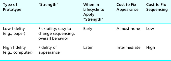
Table 11-2 Summary of comparison of low-fidelity and high-fidelity prototypes
Finally, and just as an aside, prototyping is a technique that can help manage and reduce risks on the software engineering side as well on the UX side of a project.
11.5.4 Summary of the Effects of Breadth, Depth, and Fidelity Factors
In the graph in Figure 11-3 we show roughly how scope (vertical vs. horizontal) and fidelity issues play out in the choice of prototyping approaches based on what the designer needs.
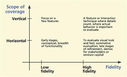
Figure 11-3 Depth, breadth, and fidelity considerations in choosing a type of prototype.
11.6 Paper prototypes
Soon after you have a conceptual design mapped out, give it life as a low-fidelity prototype and try out the concept. This is the time to start with a horizontal prototype, showing the possible breadth of features without much depth. The facility of paper prototypes enables you, in a day or two, to create a new design idea, implement it in a prototype, evaluate it with users, and modify it.
Low fidelity usually means paper prototypes. You should construct your early paper prototypes as quickly and efficiently as possible. Early versions are just about interaction, not functionality. You do not even have to use “real” widgets.
Sometimes a paper prototype can act as a “coding blocker” to prevent time wasted on coding too early. At this critical juncture, when the design is starting to come together, programmers are likely to suffer from the WISCY syndrome (Why Isn’t Sam Coding Yet?). They naturally want to run off and start coding.
You need a way to keep people from writing code until we can get the design to the point where we should invest in it. Once any code gets written, there will be ownership attached and it will get protected and will stay around longer than it should. Even though it is just a prototype, people will begin to resist making changes to “their baby”; they will be too invested in it. And other team members, knowing that it is getting harder to get changes through, will be less willing to suggest changes.
11.6.1 Paper Prototypes for Design Reviews and Demos
Your earliest paper prototypes will have no functionality or interaction, no ability to respond to any user actions. You can demonstrate some predefined sequences of screen sketches as storyboards or “movies” of envisioned interaction. For the earliest design reviews, you just want to show what it looks like and a little of the sequencing behavior. The goal is to see some of the interaction design very quickly—in the time frame of hours, not days or weeks.
11.6.2 Hand-Drawn Paper Prototypes
The next level of paper prototypes will support some simulated “interaction.” As the user views screens and pretends to click buttons, a human “executor” plays computer and moves paper pieces in response to those mock user actions.
11.6.3 Computer-Printed Paper Prototypes
Paper prototypes, with user interface objects and text on paper printed via a computer, are essentially the same as hand-drawn paper prototypes, except slightly higher fidelity in appearance. You get fast, easy, and effective prototypes with added realism at very low cost. To make computer-printable screens for low-fidelity prototypes, you can use tools such as OmniGraffle (for the Mac) or Microsoft Visio.
Berger (2006) describes one successful case of using a software tool not intended for prototyping. When used as a prototyping tool, Excel provides grid alignment for objects and text, tabbed pages to contain a library of designs, a hypertext feature used for interactive links, and a built-in primitive database capability.
Cells can contain graphical images, which can also be copied and pasted, thus the concept of templates for dialogue box, buttons, and so on can be thought of as native to Excel. Berger claimed fast turnarounds, typically on a daily basis.
11.6.4 Is not paper just a stopgap medium?
Is not paper prototyping a technique necessary just because we do not yet have good enough software prototyping tools? Yes and no. There is always hope for a future software prototyping tool that can match the fluency and spontaneity afforded by the paper medium. That would be a welcome tool indeed and perhaps wireframing is heading in that direction but, given the current software technology for programming prototypes even for low-fidelity prototypes, there is no comparison with the ease and speed with which paper prototypes can be modified and refined, even if changes are needed on the fly in the midst of an evaluation session.
Therefore, at least for the foreseeable future, paper prototyping has to be considered as more than just a stopgap measure or a low-tech substitute for that as yet chimerical software tool; it is a legitimate technology on its own.
Paper prototyping is an embodied effort that involves the brain in the creative hand–eye feedback loop. When you use any kind of programming, your brain is diverted from the design to the programming. When you are writing or drawing on the paper with your hands and your eyes and moving sheets of paper around manually, you are thinking about design. When you are programming, you are thinking about the software tool.
Rettig (1994) says that with paper, “… interface designers spend 95% of their time thinking about the design and only 5% thinking about the mechanisms of the tool. Software-based tools, no matter how well executed, reverse this ratio.”
11.6.5 Why Not Just Program a Low-Fidelity Prototype?
At “run-time” (or evaluation time), it is often useful to write on the paper pages, something you cannot do with a programmed prototype. Also, we have found that paper has much broader visual bandwidth, which is a boon when you want to look at and compare multiple screens at once. When it comes time to change the interaction sequencing in a design, it is done faster and visualized more easily by shuffling paper on a table.
Another subtle difference is that a paper prototype is always available for “execution,” but a software prototype is only intermittently executable—only between sessions of programming to make changes. Between versions, there is a need for fast turnaround to the next version, but the slightest error in the code will disable the prototype completely. Being software, your prototype is susceptible to a single bug that can bring it crashing down and you may be caught in a position where you have to debug in front of your demo audience or users.
The result of early programmed prototypes is almost always slow prototyping, not useful for evaluating numerous different alternatives while the trail to interaction design evolution is still hot. Fewer iterations are possible, with more “dead time” in between where users and evaluators can lose interest and have correspondingly less opportunity to participate in the design process. Also, of course, as the prototype grows in size, more and more delay is incurred from programming and keeping it executable.
Because programmed prototypes are not always immediately available for evaluation and design discussion, sometimes the prototyping activity cannot keep up with the need for fast iteration. Berger (2006) relates an anecdote about a project in which the user interface software developer had the job of implementing design sketches and design changes in a Web page production tool. It took about 2 weeks to convert the designs to active Web pages for the prototype and in the interim the design had already changed again and the beautiful prototypes were useless.
11.6.6 How to Make an Effective Paper Prototype
Almost all you ever wanted to know about prototyping, you learned in Kindergarten.
Get out your paper and pencil, some duct tape, and WD-40. Decide who on your team can be trusted with sharp instruments, and we are off on another adventure. There are many possible approaches to building paper prototypes. The following are some general guidelines that have worked for us and that we have refined over many, many iterations.
Start by setting a realistic deadline
This is one kind of activity that can go on forever. Time management is an important part of any prototyping activity. There is no end to the features, polishing, and tweaking that can be added to a paper prototype. And watch out for design iteration occurring before you even get the first prototype finished. You can go around in circles before you get user inputs and it probably will not add much value to the design. Why polish a feature that might well change within the next day anyway?
Gather a set of paper prototyping materials
As you work with paper prototypes, you will gather a set of construction materials customized to your approach. Here is a starter list to get you going:
![]() Blank plastic transparency sheets, 8½ × 11; the very inexpensive write-on kind works fine; you do not need the expensive copier-type plastic
Blank plastic transparency sheets, 8½ × 11; the very inexpensive write-on kind works fine; you do not need the expensive copier-type plastic
![]() An assortment of different colored, fine-pointed, erasable and permanent marking pens
An assortment of different colored, fine-pointed, erasable and permanent marking pens
![]() A supply of plain copier-type paper (or a pad of plain, unlined, white paper)
A supply of plain copier-type paper (or a pad of plain, unlined, white paper)
![]() “Scotch” tape (with dispensers)
“Scotch” tape (with dispensers)
![]() A bottle of Wite-out or other correction fluid
A bottle of Wite-out or other correction fluid
![]() A yellow and/or pink highlighter
A yellow and/or pink highlighter
![]() “Sticky” (e.g., Post-it) note pads in a variety of sizes and colors
“Sticky” (e.g., Post-it) note pads in a variety of sizes and colors
Keep these in a box so that you have them handy for the next time you need to make a paper prototype.
Work fast and do not color within the lines
If they told you in school to use straight lines and color only within the boxes, here is a chance to revolt, a chance to heal your psyche. Change your personality and live dangerously, breaking the bonds of grade school tyranny and dogmatism, something you can gloat about in the usual postprototype cocktail party.
Draw on everything you have worked on so far for the design
Use your conceptual design, design scenarios, ideation, personas, storyboards, and everything else you have created in working up to this exciting moment of putting it into the first real materialization of your design ideas.
Make an easel to register (align) your screen and user interface object sheets of paper and plastic
Use an “easel” to register each interaction sheet with the others. The simple foam-core board easels we make for our short courses are economical and serviceable. On a piece of foam-core board slightly larger than 8½ × 11, on at least two (of the four) adjacent sides add some small pieces of additional foam-core board as “stops,” as seen in Figures 11-4 and 11-5, against which each interaction sheet can be pushed to ensure proper positioning. When the prototype is being “executed” during UX evaluation, the easel will usually be taped to the tabletop for stability.
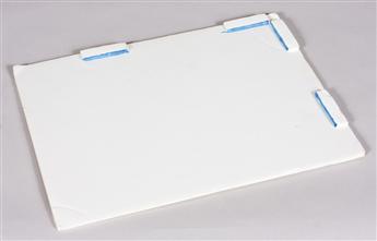
Figure 11-4 Foam-core board paper prototype easel with “stops” to align the interaction sheets.
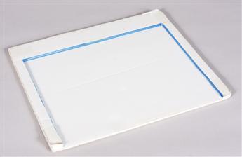
Figure 11-5 Another style of “stops” on a foam-core board paper prototype easel.
Make underlying paper foundation “screens.”
Start with simplest possible background for each screen in pencil or pen on full-size paper (usually 8½ × 11) as a base for all moving parts. Include only parts that never change. For example, in a calendar system prototype, show a monthly “grid,” leaving a blank space for the month name). See Figure 11-6.
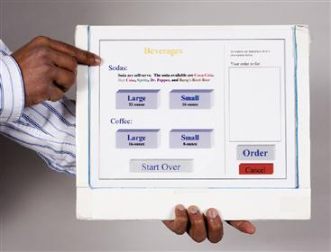
Figure 11-6 Underlying paper foundation “screen.”
Use paper cutouts taped onto full-size plastic “interaction sheets” for all moving parts
Everything else, besides the paper foundation, will be taped to transparent plastic sheets. Draw everything else (e.g., interaction objects, highlights, dialogue boxes, labels) in pencil, pen, or colored markers on smaller pieces of paper and cut them out. Tape them onto separate full-size 8½ × 11 blank plastic sheets in the appropriate position aligned relative to objects in the foundation screen and to objects taped to other plastic sheets.
We call this full-size plastic sheet, with paper user interface object(s) taped in position, an “interaction sheet.” The appearance of a given screen in your prototype is made up of multiple overlays of these interaction sheets. See Figure 11-7.
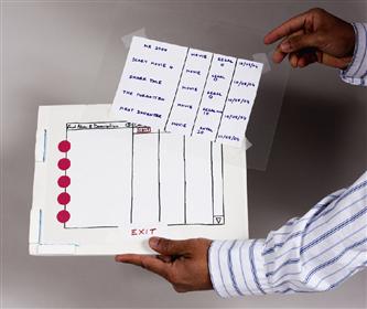
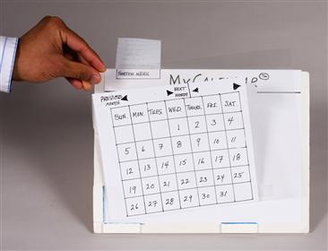
Figure 11-7 Paper cutouts taped to full-size plastic for moving parts.
When these interaction sheets are aligned against the stops in the easel, they appear to be part of the user interface, as in the case of the pop-up dialogue box in Figure 11-8.
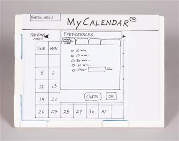
Figure 11-8 A “Preferences” dialogue box taped to plastic and aligned in easel.
Be creative
Think broadly about how to add useful features to your prototype without too much extra effort. In addition to drawing by hand, you can use simple graphics or paint programs to import images such as buttons, and resize, label, and print them in color. Fasten some objects such as pull-down lists to the top or side of an interaction sheet with transparent tape hinges so that they can “flap down” to overlay the screen when they are selected. See Figure 11-9.
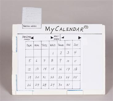
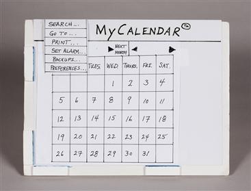
Figure 11-9 Pull-down menu on a tape “hinge.”
Scrolling can be done by cutting slits in your paper menu, which is taped to a plastic sheet. Then a slightly smaller slip of paper with the menu choices can be slid through the slots. See Figure 11-10.
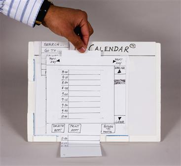
Figure 11-10 Paper sliding through a slit for scrolling.
Use any creative techniques to demonstrate motion, dynamics, and feedback.
Do not write or mark on plastic interaction sheets
The plastic interaction sheets are almost exclusively for mounting and positioning the paper pieces. The plastic is supposed to be transparent; that is how layering works. Do not write or draw on the plastic. The only exception is for making transparent objects such as highlights or as an input medium on which users write input values. Later we will discuss completely blank sheets for writing inputs.
Make highlights on plastic with “handles” for holding during prototype execution
Make a highlight to fit each major selectable object. Cut out a plastic square or rectangle with a long handle and color in the highlight (usually just an outline so as not to obscure the object or text being highlighted) with a permanent marking pen. See Figure 11-11.
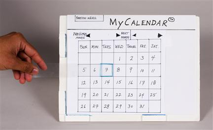
Figure 11-11 Selection highlight on plastic with a long handle.
Make your interaction sheets highly modular by including only a small amount on each one
Instead of customizing a single screen or page, build up each screen or display in layers. The less you put on each layer, the more modular and, therefore, the more reuse you will get. With every feature and every variation of appearance taped to a different sheet of plastic, you have the best chance at being able to show the most variation of appearances and user interface object configurations you might encounter. Be suspicious of a lot of writing/drawing on one interaction sheet. When a prototype user gives an input, it usually makes a change in the display. Each possible change should go on a separate interaction sheet.
Get modularity by thinking about whatever needs to appear by itself
When you make an interaction sheet, ask yourself: Will every single detail on here always appear together? If there is a chance two items on the same interaction sheet will ever appear separately, it is best to put them on separate interaction sheets. They come back together when you overlay them together, but they can still be used separately, too. See Figure 11-12.
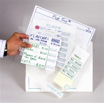
Figure 11-12 Lots of pieces of dialogue as paper cutouts aligned on plastic sheets.
Do lots of sketching and storyboarding before making interaction sheets
This will save time and work.
Use every stratagem for minimizing work and time
Focus on design, not writing and paper cutting.
Reuse at every level
Make it a goal to not draw or write anything twice; use templates for the common parts of similar objects. Use a copy machine or scanner to reproduce common parts of similar interaction objects and write in only the differences. For example, for a calendar, use copies of a blank month template, filling in the days for each month. The idea is to capture in a template everything that does not have to change from one instance to another.
Cut corners when it does not hurt things
Always trade off accuracy (when it is not needed) for efficiency (that is always needed). As an example, if it is not important to have the days and dates be exactly right for a given month on a calendar, use the same date numbers for each month in your early prototype. Then you can put the numbers in your month template and not have to write any in.
Make the prototype support key tasks
Prototype at least all benchmark tasks from your UX target table, as this prototype will be used in the formative evaluation exercise.
Make a “this feature not yet implemented” message
This is the prototype’s response to a user action that was not anticipated or that has not yet been included in the design. You will be surprised how often you may use this in user experience evaluation with early prototypes. See Figure 11-13.
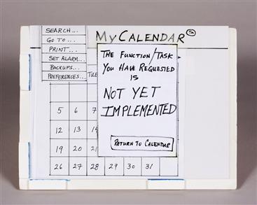
Figure 11-13 “Not yet implemented” message.
Include “decoy” user interface objects
If you include only user interface objects needed to do your initial benchmark tasks, it may be unrealistically easy for users to do just those tasks. Doing user experience testing with this kind of initial interaction design does not give a good idea of the ease of use of the design when it is complete and contains many more user interface objects to choose from and many more other choices to make during a task.
Therefore, you should include many other “decoy” buttons, menu choices, etc., even if they do not do anything (so participants see more than just the “happy path” for their benchmark tasks). Your decoy objects should look plausible and should, as much as possible, anticipate other tasks and other paths. Users performing tasks with your prototype will be faced with a more realistic array of user interface objects about which they will have to think as they make choices about what user actions are next. And when they click on a decoy object, that is when you get to use your “not implemented” message. (Later, in the evaluation chapters, we while discuss probing the users on why they clicked on that object when it is not part of your envisioned task sequence.)
Accommodate data value entry by users
When users need to enter a value (e.g., a credit card number) into a paper prototype, it is usually sufficient to use a clear sheet of plastic (a blank interaction sheet) on top of the layers and let them write the value in with a marking pen; see Figure 11-14. Of course, if your design requires them to enter that number using a touchscreen on an iPad, for example, you have to create a “text input” interaction sheet.
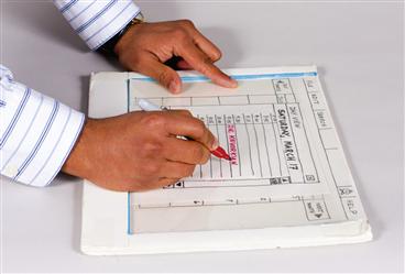
Figure 11-14 Data entry on clear plastic overlay sheet.
Create a way to manage complex task threads
Before an evaluation session, the prototype “executor” will have all the paper sheets and overlays all lined up and ready to put on the easel in response to user actions. When the number of prototype pieces gets very large, however, it is difficult to know what stack of pieces to use at any point in the interaction, and it is even more difficult to clean it all up after the session to make it ready for the next session.
As an organizing technique that works most of the time, we have taken to attaching colored dots to the pieces, color coding them according to task threads. Sheets of adhesive-backed colored circles are available at most office supply stores. See Figure 11-15. Numbers written on the circles indicate the approximate expected order of usage in the corresponding task thread, which is the order to sort them in when cleaning up after a session.
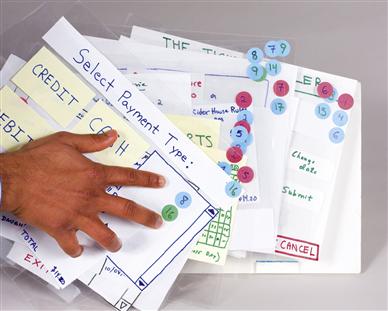
Figure 11-15 Adhesive-backed circles for color coding task threads on prototype pieces.
Pilot test thoroughly
Before your prototype is ready to be used in real user experience evaluation sessions, you must give it a good shake-down. Pilot test your prototype to be sure that it will support all your benchmark tasks. You do not want to make the rookie mistake of “burning” a user participant (subject) by getting them started only to discover the prototype “blows up” and prevents benchmark task performance.
Simulate user experience evaluation conditions by having one member of your team “execute” the prototype while another member plays “user” and tries out all benchmark tasks. The user person should go through each task in as many ways as anyone thinks possible to head off the “oh, we never thought they would try that” syndrome later in testing. Do not assume error-free performance by your users; try to have appropriate error messages where user errors might occur. When you think your prototype is ready, get someone from outside your group and have them play the user role in more pilot testing.
Exercise
See Exercise 11-1, Building a Low-Fidelity Paper Prototype for Your System
11.7 Advantages of and cautions about using prototypes
11.7.1 Advantages of Prototyping
In sum, prototypes have these advantages:
![]() Offer concrete baseline for communication between users and designers
Offer concrete baseline for communication between users and designers
![]() Provide conversational “prop” to support communication of concepts not easily conveyed verbally
Provide conversational “prop” to support communication of concepts not easily conveyed verbally
![]() Allow users to “take the design for a spin” (who would buy a car without taking it for a test drive or buy a stereo system without first listening to it?)
Allow users to “take the design for a spin” (who would buy a car without taking it for a test drive or buy a stereo system without first listening to it?)
![]() Give project visibility and buy-in within customer and developer organizations
Give project visibility and buy-in within customer and developer organizations
![]() Encourage early user participation and involvement
Encourage early user participation and involvement
![]() Give impression that design is easy to change because a prototype is obviously not finished
Give impression that design is easy to change because a prototype is obviously not finished
![]() Afford designers immediate observation of user performance and consequences of design decisions
Afford designers immediate observation of user performance and consequences of design decisions
![]() Help sell management an idea for new product
Help sell management an idea for new product
![]() Help affect a paradigm shift from existing system to new system
Help affect a paradigm shift from existing system to new system
11.7.2 Potential Pitfalls of Prototyping
Prototyping, however, is not without potential drawbacks that, with some caution, can be avoided.
Get cooperation, buy-in, and understanding
To ensure your best chances of success with a process based on prototyping, especially if your organization is not experienced with the technique, the UX team must first secure cooperation and buy-in from all parties involved, including management.
Be sure you sell prototyping as the vehicle through which you will apply an iterative process and eventually come to an acceptable level of user experience in the design. Otherwise, managers may view allocation of resources to building a prototype, especially a throw-away one, as wasteful.
In a small contract we had many years ago with a nationally known retail chain, we were asked to help redesign the in-store point-of-sale software. The process was discussed only generally because the UX people did not think others needed to know much about what, after all, they would be doing. So when there seemed to be agreement upfront, it seemed like the client had bought into the process. But it turned out to not be a real buy-in.
When we presented the first prototype, one that had never been evaluated or iterated, the client’s software people immediately took over the prototype and the interaction designers were powerless to apply their process further to arrive at a better design. Later, when the design proved inferior, the interaction designers were blamed, validating the software people’s view that a UX process does not add value. “We just implemented what you designed.”
If at least project management, if not the SE people, had understood the process and the place of the prototype within that process, and if the UX people had been empowered to carry out their process, this unfortunate scenario could have been avoided.
Be honest about limitations and do not overpromise
However, you must present a design prototype to any audience—management, customers, users, other professionals—with the utmost of professional honesty. It is your responsibility not even passively to allow your audience to assume or believe that it is the real product, especially for design exploration prototypes and prototypes promising features that do not yet exist and, possibly, cannot be delivered.
The ease of making a low-fidelity prototype makes it easy to add bells and whistles that you may not be able to deliver in the final product. Remember that a prototype can be perceived to make promises about features and functionality. And a slick prototype can cause management to believe that you are further along in development than you really are in the project schedule.
Do not overwork your prototype
The engineering maxim to “make it good enough” applies particularly to prototypes. A programmed prototype can seduce designers into the trap of overdesign or wasting resources on overworking a prototype, only eventually to have it scrapped.
Do not “fall in love” with your prototype and continue to expand and polish it after it has served its usefulness. Establish formative evaluation goals for prototyping and stick to them.
Finally, it may not be you, but your boss or manager who falls in love with your prototype. You might be expected to “baby sit” the prototype and keep it updated to the minute so you can trot it out without notice to demonstrate it to the next visiting dignitary or visitor. Our advice is to find a way to be busy on something more important.
11.8 Prototypes in transition to the product
If you have a high-fidelity prototype near the end of the iterative UX lifecycle, you will be thinking next about making the transition from prototype to real product. Do you keep the prototype or do you scrap it and start over? The answer often is that you do some of each.
Perhaps the most important consideration is the investment you have made in the iterative refinement of your design. To protect that investment, you should do everything possible to preserve the details of the user interface objects, the “look” or appearance part of the design—the layout and design of all screens and the exact wording of all labels, menus, and text. If a single detail changes in the transition, it could impact the user experience—user experience that you bought and paid for during evaluation and iteration.
Similarly, you will want to preserve the feel and sequencing behavior of your well-tested prototype. However, this will require careful recoding from the ground up. Your prototype code for the sequencing always was “spaghetti” code and was never intended to be anything else.
11.8.1 Graduation Day in the Trenches: The Sacred Passing of the Prototype
After all your iteration, the day will arrive in each project where all attention will “graduate” from prototypes to the current version or release of the final software product. There is no longer an independent UX lifecycle, and all the action in this “tail” of the lifecycle will be on the SE side because they own the code.
Some formative evaluation can still be done, but it will be with the real software system and not the prototype. Further changes on either side will be much slower and more expensive. As marketing circles in, and perhaps after a little bubbly for celebration/commiseration, the UX team will either disband or start working on their next great design.
What happens to the prototype code?
If you do, as we suggest you might, use your interaction design prototype as part or all of your interaction design specifications. What are the conditions that determine how you offer it to the SE folks? How much of the prototype software, especially for a high-fidelity prototype, is to be thrown away and how much is reused? In most cases, the technical answer is that it all should be thrown away; the design is what you reuse.
You cannot just keep the prototype
Despite the urge to say “Hey, we have a prototype that works, let us just use that as the first version of the product,” in almost all cases the prototype cannot be gussied up into the final product, for a number of reasons. Rarely is the best software platform for fast mockups and flexibility of cut-and-try changes to prototypes the best platform for production software. Furthermore the prototype code is never production quality; if it is, you were doing prototyping wrong.
How do you reuse the interaction design of the prototype?
Expectations for the implementation of your prototype in production software are that it will be generally faithful to the intent and behavior of the prototype, including sequencing and connections to functionality, and literally and absolutely faithful to every detail of the look, feel, and design of the user interface objects.
The need for faithfulness of conversion in the second point just given is paramount. Details such as font size or location of a dialogue box have been finely honed through significant investment in iterative design and evaluation. These details are to be treated as sacrosanct and taken literally to an extreme; they are too valuable to risk being “lost in translation” at this point in the project.
One way that many practitioners get this result is to use a prototype that is a wireframe plus a visual comp “skin,” a graphical appearance created by visual designers and often constrained to an exacting visual style guide dictating color choices (often with great precision down to the RGB increments), branding, and so on.
An important tool for capturing and communicating much of the interaction design detail is the custom project style guide (Chapter 9). Your project style guide, if maintained to capture detailed design decisions, can serve as a reference to enforce consistency in similar other designs and will go a long way toward preventing loss of details in the transition from one platform to another.
The need for UX and SE collaboration and respect
At this point of the overall project, the process requires even more collaboration across the UX–SE aisle. The UX people “own” the interaction design but not the software that implements it. It is a little like owning a home but not the land upon which it sits. The “hand-off” point is a serious nexus in the two lifecycles. As the hand-off occurs across the boundaries of the two domains, there is a tendency on both sides to think that full responsibility has passed from one team to another. But a successful hand-off has to be much more of a collaborative event. Both sides face the challenge of connecting the interaction design representations to existing software development processes.
UX interests are vested in the design, and SE interests are vested in what will become the implementation code. Mutual preservation of those interests demands careful collaboration, tempered with mutual respect (Chapter 23).
Do not think the UX team is now done
There are no standards governing the translation from prototype to product implementation. Because preserving quality user experience in the design is not in the purview of the SE people, the UX people have a strong responsibility to ensure that their interaction design comes through with fidelity. If the SE people are the sole interpreters of this process, there is no way to predict the assiduousness at the task.
There are important reasons why the UX team cannot just hand it off and walk away, confident that it is now entirely within the SE bailiwick. There are currently no major software development lifecycle concepts that include adequate support for including the UX lifecycle or its work products, such as interaction design specifications, as a serious part of the overall system development process.
The SE people do not have, and should not be expected to have, the UX skills and knowledge to interpret the interaction design specifications thoroughly and accurately enough to get a perfect translation to software requirements specifications. The SE people did not participate in the interaction requirements and design processes and, therefore, do not know its inner details, boundaries, and supporting rationale.
The SE people cannot know all of what is contained in and communicated by the prototype (as part of the interaction design specifications) without guidance from the UX people who created and refined it. Anyway, if your interaction design matriculates from prototype to implementation successfully, congratulations!
11.9 Software tools for prototyping
In a previous section we mentioned a hope for the future about tools that would allow us to replace paper prototypes with low-fidelity programmed prototypes, but with the same ease of building, modifying, and executing low-fidelity prototypes as we had in the paper medium. The human–computer interaction (HCI) research community has not been unaware of this need and has tried to address it over the years (Carey & Mason, 1989; Gutierrez, 1989; Hix & Schulman, 1991; Landay & Myers, 1995). However, the technical challenges of designing and building such a software tool have been steep. We are not there yet, but such a software tool would certainly be valuable.
In the 1990s, user interface management systems (UIMSs), broad tool suites for defining, implementing, and executing interaction designs and prototypes (Myers, 1989, 1993, 1995; Myers, Hudson, & Pausch, 2000), and software prototyping tools were hot topics. Hix and Schulman (1991) also did some work on software tool evaluation methods.
There were different and competing looks, feels, and interaction styles built into many of these tools, such as CUA (IBM), OpenLook (Next), Toolbook (Asymetrix), Altia design (Altia, Inc.), Delphi (Borlund), Visual Basic (Microsoft Windows), and Dreamweaver (from Macromedia, for Web-based interaction). Some were not available commercially but were developed by the organizations that used them (e.g., TAE Plus by NASA). And some tools depended on a variety of different “standards,” such as OSF Motif, not to mention Windows vs. Macintosh.
Many of the first tools for prototyping of interactive systems required a great deal of programming. Thus, interaction designers lacking programming skills could not use them directly, and “compiling” a new design iteration into executable form could be lengthy, complex, and fraught with bugs. Because many of the early UIMSs had a strong connection to computer graphics, resulting prototypes could be very realistic and could exhibit rather complex graphical behavior.
Some tools were, and some still are, based on interpretable interface definitions of the design entered declaratively, possibly along with some behavior structuring code. The interpretive approach offered more speed and flexibility in accommodating changes but, because of early hardware limitations, almost always caused the prototype execution to suffer slow performance. As the ability to produce user interface façades advanced in the tools, provision was made to program or at least stub non-interface functionality, moving the technology slowly toward whole system prototypes.
There is still no single prototyping platform capable of facilitating rapid prototype construction while meeting requirements to simulate today’s complex interaction paradigms. This has been a persistent problem in HCI, where the prototyping tools are always a little behind on the state of the art of interaction possibilities.
For example, in a study we conducted with eight student teams working on building a real-world software system, we observed a situation where the interaction designers in the team needed an autocomplete feature in a pull-down menu as a core feature of their prototype. But because they could not get autocompletion in a prototype without a database, the software engineers in the team ended up having to build the database to support this one interaction design feature.
That software investment could not be used in the product itself, however, because it was on the wrong platform. We have to keep repeating the difficult prototype programming it takes to provide the functional behaviors that are becoming expected in any interactive software system, such as log-in sequences, auto-completion functions, or data entry validation sequences. Nowadays more and more of these complex interaction patterns are being communicated using static or click-through wireframes. We hope the state of the art in prototyping tools will soon evolve to support such patterns more effectively.
11.9.1 Desiderata for Prototyping Tools
As we have said, prototyping tools so far have almost always shared the same downside: it takes too long to make changes, as even the smallest amount of programming distracts from the purpose of a low-fidelity prototype and, as the prototype grows in size, it becomes less amenable to changes. Therefore, we (especially the user interface software community) continue on a quest for the perfect software prototyping tool, among the desired features of which are:
![]() Ease on the order of that of paper prototypes: as natural as changing a paper prototype
Ease on the order of that of paper prototypes: as natural as changing a paper prototype
![]() Tool transparency: Needs so little focus on the software that it does not distract from the design and prototype building
Tool transparency: Needs so little focus on the software that it does not distract from the design and prototype building
![]() Fast turnaround to executability so there is almost no wait before it can be executed again
Fast turnaround to executability so there is almost no wait before it can be executed again
![]() Non-programmer ease of prototype definition and use
Non-programmer ease of prototype definition and use
![]() Non-programmers must be able to define and modify design features
Non-programmers must be able to define and modify design features
![]() Built-in common behaviors and access to large varieties of other behaviors via a library of plug-ins
Built-in common behaviors and access to large varieties of other behaviors via a library of plug-ins
![]() Easily include realism of features and behavior commensurate with expectations for modern interaction styles
Easily include realism of features and behavior commensurate with expectations for modern interaction styles
![]() Supports a wide variety of interaction styles and devices, including various pointing and selecting devices, touchscreens, speech/audio, tactile/haptic, and gesture
Supports a wide variety of interaction styles and devices, including various pointing and selecting devices, touchscreens, speech/audio, tactile/haptic, and gesture
![]() Ease of creating and modifying links to various points within the interaction design (e.g., buttons, icons, and menu choices to particular screens) to simulate user navigational behavior
Ease of creating and modifying links to various points within the interaction design (e.g., buttons, icons, and menu choices to particular screens) to simulate user navigational behavior
![]() Communication with external procedures and programs (e.g., calls, call-backs, data transfer) to include some functionality and additional application behavior
Communication with external procedures and programs (e.g., calls, call-backs, data transfer) to include some functionality and additional application behavior
![]() Capability to import text, graphics, and other media from other sources
Capability to import text, graphics, and other media from other sources
![]() Capability to export look and feel components for eventual transition to final product code
Capability to export look and feel components for eventual transition to final product code