Lesson 17. Consider Your Color Palette
One of the things you’ll consistently notice about the bodies of work of photographers who’ve been doing this a while is that many of them, though not all, seem to work very intentionally to create a consistency within a body of work—some kind of unifying element. Often that element revolves around a theme, so it’d be a body of work about the female nude figure, for example. That theme alone can create a visual unity. Another way of doing the same thing is with consistency in other constraints, like a shared crop ratio, such as every image being square or 4:5, for example.
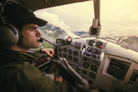
Nikon D3s, 600mm, 1/100 @ f/5.6, ISO 1600
Nikon D3s, 30mm, 1/125 @ f/11, ISO 200
Nikon D3s, 16mm, 1/50 @ f/11, ISO 200
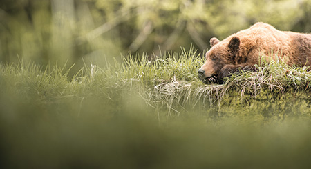
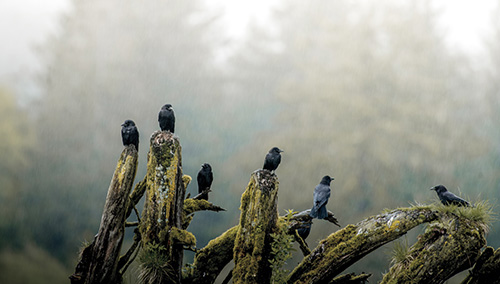
Nikon D3s, 600mm, 1/400 @ f/5.6, ISO 800
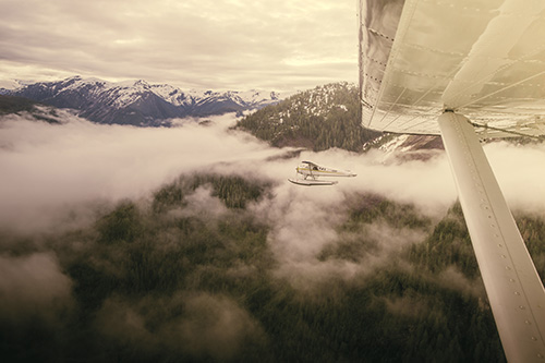
Nikon D800, 200mm, 1/500 @ f/8, ISO 200
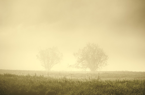
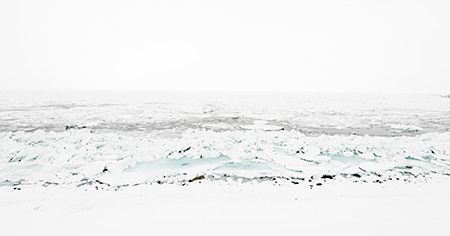
Nikon D800, 70mm, 1/8 @ f/16, ISO 100
Nikon D3s, 23mm, 1/400 @ f/9, ISO 400
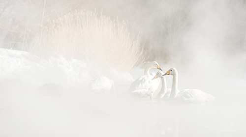
Nikon D800, 175mm, 1/100 @ f/7.1, ISO 400
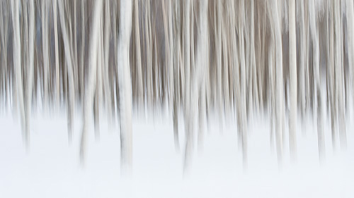
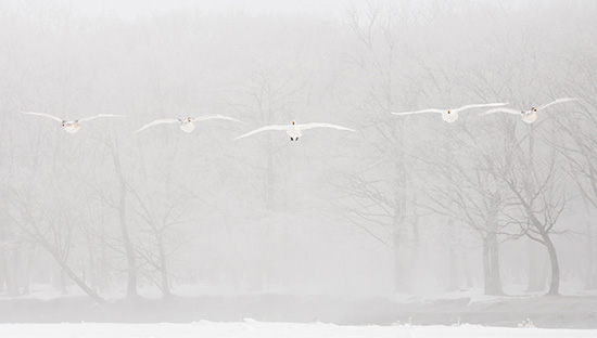
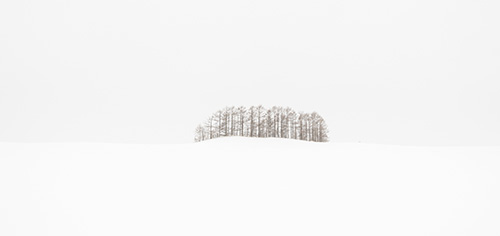
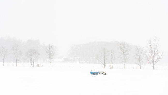
A consistent color palette also does this powerfully, with every image sharing a common set of hues and tones. This creates a flow when the images are presented together, creating a common mood or emotion through the work, even when the gesture within the images changes dramatically. You can choose this palette while you photograph, and refine it as you become more and more aware of what the body of work is becoming. Not all of us begin a body of work to find it becomes the thing we imagined it. There’s often an evolution that leads to stronger, more unexpected, work than if we’d not allowed ourselves to divert in a new direction. You can also choose, or refine, this palette in the digital darkroom. In the case of my Hokkaido series I was very intentional while I photographed and needed very few adjustments in Lightroom. The grizzly series from the Khutzeymateen all shared a consistent palette when I photographed it, but not the one I wanted, so I worked hard to subdue some of the hyper-saturated greens and bring a common warmth to the images, which, shot over seven days in very different weather, needed some help with the tones to bring them all a little closer to being cohesive.
“You can choose this palette while you photograph, and refine it as you become more and more aware of what the body of work is becoming.”
Intentionally chosen color palettes are not only for unifying bodies of work. A painter sitting at his easel and wanting to create a certain mood will choose a color palette. It’s a little easier for painters, but photographers work with an existing reality. Although we can do anything we want with Photoshop or Lightroom, it’s not my style to be so heavy-handed. But you can be selective while you still have the camera in your hand. Being intentional while you look at the scene, choosing weather or a time of day that contributes to what you’re trying to accomplish, or lighting the studio and dressing the set—none of these happen accidentally, and if you go into your work remembering that a well-chosen color palette is a powerful tool, you can at least begin to exclude elements that do not conform to your vision.