
Lesson 31. White Balance for Mood
Although there’s a lot of talk about achieving accuracy in our white balance, I think the whole conversation misses a larger opportunity, specifically the ability to use color balance to achieve a greater emotional response to an image. If you do catalog work or something else that requires faithful and exact reproduction of color, it’s worth going the extra mile to do color balance as accurately as possible. But for most of us, we’re making photographs for other reasons, and accuracy can be a moving target that distracts us from the bigger issue.
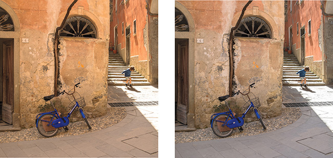

Fuji XE-1, 14mm, 1/140 @ f/5, ISO 200
Two different images, both treated with different white balances. Which is right? The only answer I have to that is, “Which one feels right?” The answer will be different for all of us, depending on what we felt at the time.
Given how powerfully we respond to color, it should be no surprise that we respond emotionally to the color of light. We will feel differently about a photograph with apparently cool light than we will about one with apparently warm light—that is to say, our experience will change from one to the other.
“Given how powerfully we respond to color, it should be no surprise that we respond emotionally to the color of light.”
When people talk about making color accurate in their image, they generally mean the neutral tones in the scene are rendered neutrally in the photograph, without a color cast. It’s generally worth taking magenta or green tints out of our images, because light doesn’t typically take on these hues. But the yellows and blues? Color temperature is a great creative tool, and experimenting with your white balance will help you understand that, either in-camera or later in the darkroom when you’ve got a little more control over it.
Let’s go back for a moment to the issue of neutrality. If I place a perfectly neutral target, like a gray card, into a scene during the golden hour before sunset, that neutral target will be naturally contaminated with warm light. Removing the warmth of that light—which is, ironically, a cooler color temperature on the Kelvin scale, where blue is hot and red is cold; go figure—would be anything but accurate. Likewise, with a gray card placed in the blue shade of a tree in winter, removing the blue would warm up the scene and make it feel very much the opposite of how it truly felt to us. If anything, you might want to cool it down even more.
Dealing with people in these kinds of scenes introduces a complication, because though we can forgive—even desire—a change in color temperature in landscapes and other scenarios, we know quite well what skin tones look like, and a change in color temperature is not only noticed but also creates an even stronger reaction, not always positive. So mind how creative you get. But, ignoring the issue of skin tone for now, my suggestion is that you look at white balance in-camera as a creative tool as much as, or more than, a tool to achieve accuracy. And even more so when you refine things later in Lightroom or Photoshop.