
CHAPTER 18
GUI—Containers
All GUI applications normally use a top-level container in which components are placed, and then the top-level container is made visible. This would also show all the components which have been added into the container. Figure 18.1 shows the class hierarchy for all the container classes. Out of these, the Window class and its sub-classes as well as the java.applet.Applet are considered as the top-level containers. So any GUI application would use one of these. Most commonly, it is the Frame class which is used as the top-level container for the AWT-based Java applications. The java.applet.Applet class is used in case of Web-based applications, where the Applet class is deployed on the Web server and it is used by the browser using the HTTP protocol.
18.1 Container CLASS
The Container class is the abstract base class for all types of container components. This class has mainly methods for managing components within the container component. All containers can manage multiple components except for the ScrollPane. The instances of the ScrollPane class can only have one component added to it. The size of the component added to the ScrollPane may be bigger than the size of the ScrollPane itself. In such a case the instances of ScrollPane automatically manage the scroll bars allowing the user to scroll and view the other parts of the component.
The common methods of the Container class used for managing components are as given in Listing 18.1.
Listing 18.1. Methods of Container class
    1     public Component add(Component comp)
 2     public Component add(Component comp, int index)
 3     public void add(Component comp, Object constraints)
 4     public void add(Component comp, Object constraints, int index)
 5     public void validate()
 6     public int getComponentCount()
 7     public Component getComponent(int index)
 8     public Component[] getComponents()
 9     public void remove(int index)
 10    public void remove(Component)
 11    public Insets getInsets()
 12 // inherited from Component class
 13    public ComponentOrientation getComponentOrientation()
 14    public void setComponentOrientation(ComponentOrientation 0)
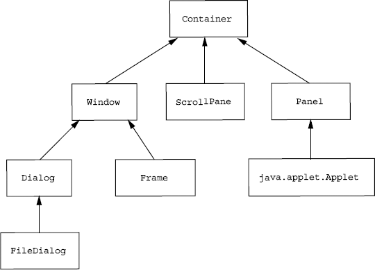
Figure 18.1 Class hierarchy for all AWT containers
The components are managed in the Container index position wise. The first two add methods return the added component. This could be used for method chaining. The methods in Lines 3 and 4 take an additional parameter called constraints. The constraints are used to pass some additional information to the Container. These are normally used by the layout manager in the container. The constraints are only used in case the layout manager for the container is of type LayoutManager2. We will be looking at the layout managers in Section 18.1.1. There are other methods in the listing which are used for retrieving or removing components from a container. All containers have a client area. The entire area of the client is not usable, e.g. in case of a frame or a dialog we have a title bar which cannot be used by any components added to the container, i.e. all containers have some border area which is not usable by child components. This region is available by using the getInsets() method. It returns an instance of Insets. The Insets class has four instance variables, top, bottom, left and right. So Insets obtained from a container specifies the area of the container which cannot be used by child components.
Let us create a small Java application to create a frame and try adding a button to the frame and see how it appears. For this we may try the code as given in Listing 18.2.
Listing 18.2. Adding a button to a frame
    1 import java.awt.*;
 2
 3 public class TestContainer {
 4     public static void main(STring[] args) {
 5         Frame f = new Frame("Test Container");
 6         f.setBounds(0, 0, 700, 700);
 7         Button b1 = new Button("Button1");
 8         b1.setBounds(100, 100, 50, 15);
 9         f.add(b1);
 10        f.setVisible(true);
 11    }
 12 }
In this application we create a frame with bounds (0, 0, 700, 700). Then we create a button and have its bounds set to (100, 100, 50, 15), and then make the frame visible. We would be expecting the frame to show a button at location (100, 100) within the frame. Instead what we find is that the bounds of the button are the full size of the container; when we interactively resize the frame the button also gets resized. When we added the button into the frame the bounds property which was set on the button is totally ignored and instead they get changed such that the button which is added to the frame always appears to occupy the full client area of the frame.
Let us try another application, where we add a panel into the frame instead of the button and we add the buttons to the panel and make the frame visible as given in Listing 18.3.
Listing 18.3. Adding a panel to the frame and buttons to a panel
    1 import java.awt.*;
 2
 3 public class TestContainer {
 4     public static void main(STring[] args) {
 5         Frame f = new Frame("Test Container");
 6         f.setBounds(0, 0, 700, 700);
 7         Panel p = new Panel();
 8         p.setBounds(20, 20, 600, 600);
 9         p.setBackground(Color.pink);
 10        f.add(p);
 11        Button okButton = new Button("OK");
 12        Button cancelButton = new Button("Cancel");
 13        Button applyButton = new Button("Apply");
 14        okButton.setBounds(100, 500, 50, 15);
 15        cancelButton.setBounds(175, 500, 50, 15);
 16        applyButton.setBounds(250, 500, 50, 15);
 17        p.add(okButton);
 18        p.add(cancelButton);
 19        p.add(applyButton);
 20        f.setVisible(true);
 21    }
 22 }
In this application we first create a frame, set its bounds to (0, 0, 700, 700). Then we create a panel and set its bounds to (20, 20, 600, 600) within the frame. We change the panel’s background color to distinguish its bounds from that of the parent frame. We then create three buttons and set their bounds and add these to the panel. What happens when we make the frame visible? We find a completely different picture. The setBounds on the panel and buttons do not seem to work. Their bounds change completely when they are getting added to the container. The bounds for the buttons added to the panel are set to sizes which seem to be appropriate for them based on their labels.
18.1.1 Layout Managers
What happens to the bounds setting for the buttons when they are added to a panel and to the bounds setting of the panel when it is added to a frame? Why is the size of the buttons and panel getting changed? When a component is added to a container, then it is the layout manager of the container which decides the bounds for the components added to it. The layout manager would decide the bounds of a component based on its index position, its preferred size, its component orientation value and its insets. The buttons which we find in the panel are actually set to their preferred sizes. Every component has a preferred size. This size depends on various attributes of the component. We have a method getPreferredSize() returning an instance of Dimension in the Component class. From Java 5 onwards, the preferred size of a component could be set using the setPreferredSize() method. The LayoutManager is the name of an interface. There are different implementation classes for this interface. We have seen two different kinds of behaviour of the layout managers. When we add a component to the frame there is a different behaviour of the layout manager and when we add the components to a panel, we find a different kind of behaviour of the layout manager. The initial default layout managers for the frame and panel instances are different.
Figure 18.2 shows the classes implementing the LayoutManager interface. We have a subinterface of LayoutManager called LayoutManager2. All containers have a layout manager except for the ScrollPane. The ScrollPane does not use any layout manager since it has only one component to manage and is designed for not changing the bounds of the component which is added to it. The methods for getting and setting a layout manager on a container are getLayout() and setLayout(). A single instance of layout manager may be shared by more than one container. For a container, if we do not want a layout manager, and would like to let the components’ original bound settings to work, then we can call the setLayout() with null value. For e.g. if we update Listings 18.2 and 18.3 to set a layout manager to null by introducing code lines like f.setLayout(null); and p.setLayout(null), then the components would appear as per the settings which we have set on them.
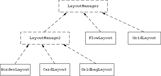
Figure 18.2 Inheritance hierarchy for AWT layout managers
In the java.awt package, we find five layout manager implementation classes. These are (a) BorderLayout, which is the default for the Window class and its sub-classes, (b) FlowLayout which is the default for Panel and its sub-class java.applet.Applet, (c) GridLayout, (d) CardLayout and the (e) GridbagLayout. Out of these the BorderLayout, CardLayout and the GridbagLayout are implementing the LayoutManager2 interface. All the layout managers implementing the LayoutManager2 make use of constraints. The add() methods in the Container class are overloaded to take constraints as the parameter. The constraints can be used only with containers which use LayoutManager2. Let us look at each of these layout managers.
BorderLayout: The BorderLayout is the default layout manager for the Window, Frame and the Dialog classes in the java.awt package. The BorderLayout divides the container into five regions, namely “North”, “South”, “East”, “West” and the “Center”. When using BorderLayout, we add at the most five components to the container (one in each region). When we add a component to a container which has a BorderLayout, then we can pass the name of the region as a constraint to indicate the region in which it should be added. When we don’t specify the constraint, then by default it assumes the constraint values as “Center”. There are constants in the BorderLayout class for the names of the regions as given in Listing 18.4. When we add a component to the “North” region, then the component is in the top region of the container. The width of this component is according to the width of the container, and the height of the component is the preferred height of the component. The width and height of the component added to the “South” is similar to the component added to the “North”, but it is located at the bottom of the container. The components added to the “East” and “West” have a height which depends on the height of the container, the heights of the components in the “North” and the “South”, their width is set according to their preferred width setting. The component added to the “East” is placed on the right end of the container between the components in the “North” and “South”. The component added to the “West” is placed on the left end of the container between the components in the “North” and the “South”. The component added to the “Center” occupies the entire area in the center which is left after the components in the other region. Listing 18.4 shows the constructors and methods to change settings of any BorderLayout instance.
Listing 18.4. BorderLayout methods and constructors
    1     public static final String NORTH   = "North";
 2     public static final String SOUTH   = "South";
 3     public static final String EAST    = "East";
 4     public static final String WEST    = "West";
 5     public static final String CENTER  = "Center";
 6     public BorderLayout(int hgap, int vgap)
 7     public BorderLayout()
 8     public int getHgap()
 9     public void setHgap(int hgap)
 10    public int getVGap()
 11    public void setVGap(int vgap)
The BorderLayout has two settings, the hgap and the vgap settings. The hgap indicates the gap between the components in the horizontal direction and the vgap setting indicates the gap between the components in the vertical direction. The initial default value of hgap and vgap is 0 unless specified in the constructor.
EXERCISE 18.1 Modify the code in Listing 18.3 to add the panel in the “North” region.
FlowLayout: The FlowLayout is the default layout manager for the Panel and Applet. This layout manager does not use constraints. The components added to containers with FlowLayout have their sizes set to their preferred size. The components are arranged from left to right and top to bottom in a flow with horizontal alignment of either left, right or center. The order of appearance of the components in the container depends on their index position within the container. The flow layout has settings for the alignment, hgap and vgap. Listing 18.5 shows the constructors and methods to change settings of any FlowLayout instance.
Listing 18.5. FlowLayout methods and constructors
    1     public static final int LEFT     = 0;
 2     public static final int CENTER   = 1;
 3     public static final int RIGHT    = 2;
 4     public static final int LEADING  = 3;
 5     public static final int TRAILING = 4;
 6     public FlowLayout(int align, int hgap, int vgap)
 7     public FlowLayout(int align)
 8     public FlowLayout()
 9     public int getHgap()
 10    public void setHgap(int hgap)
 11    public int getVgap()
 12    public void setVgap(int vgap)
 13    public int getAlignment()
 14    public void setAlignment(int align)
The initial default value of the alignment is center, and the default value for hgap and vgap is 5.
GridLayout: The GridLayout does not use constraints. The grid layout divides the components into equal-sized rectangular cells. It divides the container into rows and columns. The size of all the components added to the container with GridLayout is the same. It is the size of the rectangular cell. In case the hgap and vgap settings have a non-zero positive value then accordingly the size of the component is reduced by the value of hgap and vgap in the horizontal and vertical directions, respectively. Listing 18.6 shows the constructors and methods to change settings in the GridLayout instance.
Listing 18.6. GridLayout methods and constructors
    1     public GridLayout(int rows, int cols, int hgap, int vgap)
 2     public GridLayout(int rows, int cols)
 3     public GridLayout()
 4     public int getHgap()
 5     public void setHgap(int hgap)
 6     public int getVgap()
 7     public void setVgap(int vgap)
 8     public int getRows()
 9     public void setRows(int align)
 10    public int getColumns()
 11    public void setColumns(int align)
The instance of GridLayout has four settings. Two settings are for the hgap and vgap, and two settings are for the number of rows and number of columns. The number of rows and columns used by the GridLayout instance is decided by the rows, columns settings and the number of components in the container. The GridLayout uses only one of the rows or column settings which has been specified, the other value would be arrived at by the number of components in the container. It would use the setting of the number of rows and ignore the setting for the number of columns unless the number of rows has been set to 0. So, if we specify the rows setting to a non-zero positive value, then the number of rows is set to the specified value and the number of columns will then be minimum number of columns in order to accommodate all the components. If the row setting is set to 0, then the column setting must be non-zero, and the number of columns is decided by the column setting of the layout manager, the number of rows will be the minimum number of rows needed to accommodate all the components added in the container. The GridLayout is very commonly used in board games, calculators, etc. where we need equal-sized components. When we create an instance of GridLayout using its no arg constructor, then the row count value is 1 and the column, hgap and vgap values are 0.
CardLayout: The CardLayout implements LayoutManager2 and requires a constraint. The constraint is always of String type. The instance of CardLayout has setting for hgap and vgap. The size of all the components added to a container with CardLayout has the same size, which is the size of the container. Depending on the values of the hgap, vgap and the insets of the container the size of the component gets reduced. In this case, the components are stacked over each other and only the topmost component is visible at any time. Initially the component which is added first is at the top. The other components are behind the first component. We have methods in the CardLayout to bring the other components on the top (Listing 18.7).
Listing 18.7. CardLayout methods and constructors
    1     public CardLayout(int hgap, int vgap)
 2     public CardLayout()
 3     public int getHgap()
 4     public void setHgap(int hgap)
 5     public int getVgap()
 6     public void setVgap(int vgap)
 7     public void first(Container c)
 8     public void next(Container c)
 9     public void last(Container c)
 10    public void previous(Container c)
 11    public void show(Container c, String name)
The methods first(), last(), next() and previous() bring the first, last, next component or the previous component on top. When we add a component to the container with CardLayout, we have to specify a string, which is used as an identity by the CardLayout to identify this component. The show() method can be used to bring the component identified by a name on top. All these methods require the Container as a first parameter. This is required since a single instance of CardLayout may have been set on multiple containers. So, when we invoke the method like first(), we need to indicate on which container the first componnet should be brought on top.
GridbagLayout: The GridbagLayout is a flexible layout manager. At first glance, it may seem to be difficult, but it is one of the most flexible layout managers. In this layout manager, the container is divided into rows and columns like the grid layout, but the widths and the heights of the columns and rows are flexible; each row and column can have different widths and heights. The number of rows and columns both can be decided and can be kept to be fixed or it can be determined by the components added to the container.
The GridbagLayout implements LayoutManager2 and requires a constraint. The constraint is always an instance of type GridbagConstraints (Listing 18.8).
Listing 18.8. GridbagLayout methods and constructors
    1     public int[] columnWidths;
 2     public int[] rowHeights;
 3     public double[] columnWeights;
 4     public double[] rowWeights;
 5     public GridbagLayout()
 6     public GridbagConstraints getConstraints(Component comp)
 7     public void setConstraints(Component comp, GridbagConstraints
           constraints)
 8     public int[][] getLayoutDimensions()
 9     public double[][] getLayoutWeights()
Each component added to the container with GridbagLayout is associated with an instance of GridbagConstraints. The GridbagConstraints does not have any methods, it has only instance variables and some static constants, which are listed in Listing 18.9.
Listing 18.9. GridbagConstraints
    1     public int gridx;
 2     public int gridy;
 3  // constant for gridx and gridy
 4     public static final int RELATIVE = -1;
 5     public int gridwidth;
 6     public int gridheight;
 7  // constant for gridwidth and gridheight
 8     public static final int REMAINDER = 0;
 9     public double weightx;
 10    public double weighty;
 11    public int anchor;
 12 // valid values for anchor
 13    public static final int CENTER = 10;
 14    public static final int NORTH = 11;
 15    public static final int NORTHEAST = 12;
 16    public static final int EAST = 13;
 17    public static final int SOUTHEAST = 14;
 18    public static final int SOUTH = 15;
 19    public static final int SOUTHWEST = 16;
 20    public static final int WEST = 17;
 21    public static final int NORTHWEST = 18;
 22    public static final int PAGE_START = 19;
 23    public static final int PAGE_END = 20;
 24    public static final int LINE_START = 21;
 25    public static final int LINE_END = 22;
 26    public static final int FIRST_LINE_START = 23;
 27    public static final int FIRST_LINE_END = 24;
 28    public static final int LAST_LINE_START = 25;
 29    public static final int LAST_LINE_END = 26;
 30    public static final int BASELINE = 0x100;
 31    public static final int BASELINE_LEADING = 0x200;
 32    public static final int BASELINE_TRAILING = 0x300;
 33    public static final int ABOVE_BASELINE = 0x400;
 34    public static final int ABOVE_BASELINE_LEADING = 0x500;
 35    public static final int ABOVE_BASELINE_TRAILING = 0x600;
 36    public static final int BELOW_BASELINE = 0x700;
 37    public static final int BELOW_BASELINE_LEADING = 0x800;
 38    public static final int BELOW_BASELINE_TRAILING = 0x900;
 39    public int fill;
 40 // valid values for fill
 41    public static final int NONE = 0;
 42    public static final int BOTH = 1;
 43    public static final int HORIZONTAL = 2;
 44    public static final int VERTICAL = 3;
 45    public insets insets;
 46    public int ipadx;
 47    public int ipady;
The GridbagConstraints has 11 instance variables. The first four instance variables gridx, gridy, gridwidth and gridheight determine the display area for the component. The display area is the area available to a particular component within the container. A component’s display area can span multiple cells. The values of gridx and gridy determine the top left cell for the display area of the component and the gridwidth and gridheight determine the number of cells across the row and the number of cells across the column for the display area of the component.
The fill and anchor values determine how the component will be positioned and sized within its display area. There are several constants for the anchor value and the fill value. The fill value indicates how the component should be resized within the display area. If the fill value is set to NONE, then the component’s size is set to its preferred size. If the value is set to HORIZONTAL, then the component’s width is the full width of the display area, and its height would be set to its preferred height. If the value is set to VERTICAL, then the component’s height is the full height of the display area and its width would be set to its preferred width. If the value is set to BOTH, then the components’ size is the full display area. Now, in case the fill value is not BOTH, then the value of anchor will decide the position within the display area. The interpretation of the anchor value is affected by the value of the component orientation of the container.
The insets value is used to specify the amount of border area within the display, which is not usable by the component. So, if the value of insets top, bottom, left and right variables is more, then it reduces the size of the component. The ipadx and ipady values define the internal padding of the component in the horizontal and vertical direction. The internal padding increases the size of the component.
The weightx and weighty values set on the component’s constraint affects the weights of the column and the row of the component. The weightx and weighty values are of type double. The weightx value applies to the column of the component. A particular column’s weightx is the maximum weightx of all the components in a particular column, similarly the weighty value applies to the row of the component. A particular row’s weighty is the maximum weighty of all the components in a particular row. The weightx value of a column indicates how much percentage of any increase in the width of the container will be given to a particular column. Similarly the weighty value of a row indicates how much percentage of any increase in the height of the container will be given to a particular row.
There are few public instance variables in the GridbagLayout which can override the number of columns, their minimum widths, the number of rows, their heights, the weights for the width of the column and the weights for the heights of the rows, which are normally derived from the constraints of the components added within the container. This way we can have a better and a real good control over the layout within a container. The columnWidths, rowHeights, rowHeights and columnWidths instance variables can be set to override the values computed from the constraints for the components.
18.2 TOP-LEVEL CONTAINERS
We have seen some of the methods from the Container class so far. All these methods and characteristics are inherited by its sub-classes. Window and its sub-classes and the java.applet.Applet classes are considered as the top-level containers. The instances of the Window class and its sub-classes cannot be added to another container, whereas the Applet class is a Panel and can be added to any container. The Applet class is normally used in a Web application, where it is not added to any other container class of Java. The Applet class has been described in detail in Chapter 21. Let us look at the other container classes.
18.2.1 Window Class
An instance of Window is a top-level window without any kind of decorations. It does not have any title bar, or any kind of a border. It also does not have any kind of menu bar also. Since the Window instances do not have any kind of decoration and borders, the user cannot interactively resize the window size. Listing 18.10 lists some of the commonly used constructors and methods of the Window class.
Listing 18.10. Mehods and constructors of Window class
    1     public Window(Frame owner)
 2     public Window(Window owner)
 3     public void dispose()
 4     public Component getFocusOwner()
 5     public List<Image> getIconImages()
 6     public void setIconImage(Image image)
 7     public void setIconImages(List<? extends Image> icons)
 8     public Window[] getOwnedWindows()
 9     public Window getOwner()
 10    public static Window[] getOwnerlessWindows()
 11    public static Window[] getWindows()
 12    public boolean isActive()
 13    public boolean isAlwaysOnTop()
 14    public void setAlwaysOnTop(boolean alwaysOnTop)
 15    public vodi toBack()
 16    public void toFront()
 17    public boolean isAlwaysOnTopSupported()
 18    public boolean isFocusableWindow()
 19    public void setFocusableWindowState(boolean focusableWindowState)
 20    public boolean isFocused()
 21    public boolean isShowing()
 22    public void pack()
An instance of Window can have an owner. The constructor requires an owner. The value of the owner can be null to get a window without the owner. A Window instance which is showing can be hidden either by calling the method dispose() or setVisible(false). When we use the dispose() method then all the system resources used by the window would also be released, whereas when we use setVisible(false), then the system resources are not released and the window could be shown again using the setVisible(true). A window could be set to always be on top using the setAlwaysOnTop() method. The window could be sent to back or to the front using the methods toBack() or toFront(). We can get the current focus owning component within the window by using the method getFocusOwner(). We also have a method called pack(), which resizes the window to the minimum size required for accomodating all the layed out components within the window. This method is very commonly used so as to get a window which does not have a lot of unused gaps at the borders. Most of the time the instances of Window are used for showing splash screens, when an application is loading and starting.
18.2.2 Decorated Windows Frame and Dialog
The Frame and Dialog are the two direct sub-classes of the Window class. These are the decorated windows and both have title bars and borders. Both of these can be resized interactively by a user. These classes have certain properties which are comon. Listing 18.11 lists the common methods for Frame and Dialog which are not inherited from the Window class.
Listing 18.11. Methods of Frame and Dialog
    1     public String getTitle()
 2     public void setTitle(String title)
 3     public boolean isResizable()
 4     public void setResizable(boolean resizable)
 5     public boolean isUndecorated()
 6     public void setUndecorated(boolean undecorated)
The methods getTitle() and setTitle() are used for getting and setting the title of any frame or a dialog (including file dialog). The interactive resizing of the frame and dialog can be enabled or disabled using the method setResizable(), and even the decoration of a frame and dialog can be enabled or disabled using the setUndecorated() method.
Frame class: A frame is always used without an owner. The frame is the only AWT container which can have a menubar. Normally all AWT applications would use one frame instance and there may be other dialogs for which the frame would be the owner. Some of the common constructors and methods of the Frame class are as given in Listing 18.12.
Listing 18.12. Constructors and methods of Frame
    1     public static final int NORMAL = 0;
 2     public static final int ICONIFIED = 1;
 3     public static final int MAXIMIZED_HORIZ = 2;
 4     public static final int MAXIMIZED_VERT = 4;
 5     public static final int MAXIMIZED_BOTH = MAXIMIZED_VERT |
           MAXIMIZED_HORIZ;
 6     public Frame()
 7     public Frame(String title)
 8     public static Frame[] getFrames()
 9     public Image getIconImage()
 10    public MenuBar getMenuBar()
 11    public void setMenuBar(MenuBar mb)
 12    public int getState()
 13    public void setState(int state)
 14    public int getExtendedState()
 15    public void setExtendedState(int state)
 16    public Rectangle getMaximizedBounds()
 17    public void setMaximizedBounds(Rectangle bounds)
The methods setMenubar() and getMenubar() can be used to set a menu bar for a frame. The instance of MenuBar is set on a frame to get a menu bar for the frame. MenuBar and related classes are described in Section 18.2.2. Initially by default there is no menu bar for a frame. The frame has maximum size, which is normally decided by the system. On some platforms these values for the bounds of the frame when it is maximized can be overridden by using the setMaximizedBounds(). Only the top left corner or the width or the height may be set by setting the other values in the rectangle for the bounds to Integer.MAX_VALUE. The state of the frame can be set to iconified or maximized using the appropriate values in the setExtendedState() method.
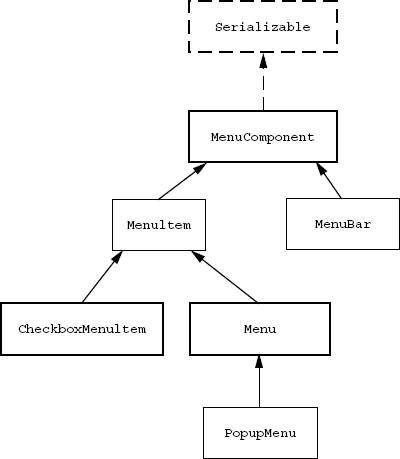
Figure 18.3 Class hierarchy for MenuComponent
Menus: All the menu-related widgets in AWT are sub-classed from the abstract base class MenuComponent. The class hierarchy for MenuComponent class is given in Figure 18.3.
There are two direct sub-classes of the abstract base class—the MenuBar and the MenuItem. The MenuBar is a container for the Menu, which is a sub-class of MenuItem. All menus are sub-classed from the menu item. The instance of MenuBar can be set on a Frame. The MenuBar in turn can contain instances of Menu. The menus are a container for the MenuItem. We can always add an instance of Menu to a Menu, since Menu is a sub-class of MenuItem. This allows us to have submenus. Listing 18.13 gives the list of common methods for all kinds of menu components.
Listing 18.13. Methods of MenuComponent
    1     public Font getFont()
 2     public void setFont(Font font)
 3     public String getName()
 4     public void setName(String name)
 5     public MenuContainer getParent()
Every menu component has name and font properties. We have get and set methods for getting and setting the name and font properties. The getParent() method returns the parent of any menu component. The parent for a menu bar can only be a frame, and the parent for the menu can be either the menu bar or another menu. The parent for instances of MenuItem can be a Menu or PopupMenu. Listing 18.14 lists common methods and constructors of the MenuBar class.
Listing 18.14. Constructors and methods of MenuBar
    1     public MenuBAr()
 2     public void add(Menu m)
 3     public void deleteShortcut(MenuShortcut s)
 4     public Menu getHelpMenu()
 5     public void setHelpMenu(Menu m)
 6     public int getMenuCount()
 7     public Menu getMenu(int index)
 8     public Menuitem getShortcutMenuItem(MenuShortcut s)
 9     public void remove(int index)
 10    public void remove(MenuComponent m)
 11    public Enumeration<MenuShortcut> shortcuts()
The MenuBar has methods to manage the various menus under a menu bar. All the menu shortcuts associated with various menu items under a menu bar are accessible using the method shortcuts(). A menu shortcut under a menu bar hierarchy may be deleted by using the deleteShortcut() method. Any one of the menus under a menu bar may be designated as a help menu by using the setHelpMenu().
Listing 18.15 lists common methods and constructors of the MenuItem class.
Listing 18.15. Constructors and methods of MenuItem
    1     public MenuItem(String label)
 2     public MenuItem(String label, MenuShortcut s)
 3     public String getLabel()
 4     public void setLabel(String label)
 5     public MenuShortcut getShortcut()
 6     public void setShortcut(MenuShortcut s)
 7     public boolean isEnabled()
 8     public void setEnabled(boolean b)
All menu items have three basic properties, label, enabled and menu shortcut. All three have the get and set methods. The menu shortcut can be associated with a menu item. The menu item is activated whenever the user uses the corresponding menu shortcut key. The menu shortcut is always activated using a key combination of a control key and some other key. It may also include the shift key in the combination. The MenuShortcut has the methods as given in Listing 18.16.
Listing 18.16. MenuShortcut
    1     public MenuShortcut(itn keycode)
 2     public MenuShortcut(int keycode, boolean usesShiftModifier)
 3     public int getKey()
 4     public boolean usesShiftModifier()
The constructor of MenuShortcut takes the keycode and a boolean as parameters. The first int parameter is a keycode. Every key on the keyboard has a keycode value. The constants for the keycode values are available as static variables in the java.awt.event.KeyEvent class. The keycode value constants start with VK_, e.g. we have keycode values for the A – Z keys as KeyEvent.VK_A – KeyEvent.VK_Z and so on. The second boolean parameter specifies whether the shortcut would include the shift modifier key. So, if we are creating a menu shortcut for an exit menu item and want to associate it with the Ctrl+X, it can be created as follows:
MenuShortcut exitShortCut = new MenuShortcut(KeyEvent.VK_X);
MenuItem exitItem = new MenuItem("Exit", exitShortcut);
The Menu and CheckboxMenuItem are sub-classes of the MenuItem. The CheckboxMenuItem has one additional property than the MenuItem. The CheckboxMenu-Item has a boolean state, either it is checked or unchecked. The state toggles whenever the checkbox menu item is selected.
The Menu class has additional methods to manage instances of MenuItem. A menu can group a number of menu items by making use of separators. The methods and constructors for Menu are as given in Listing 18.17.
Listing 18.17. Menu
    1     public Menu(String label}
 2     public Menu(String label, boolean taarOff)
 3     public MenuItem add(MenuItem mi)
 4     public void add(String label)
 5     public MenuItem getItem(int index)
 6     public int getItemCount()
 7     public void insert(MenuItem mi, int index)
 8     public void insert(String label, int index)
 9     public void remove(int index)
 10    public void remove(MenuComponent mi)
 11    public void removeAll()
 12    public void addSeparator()
 13    public void insertSeparator(int index)
 14    public boolean isTearOff()
Dialog class: A Dialog always has a parent, which can be a Frame or another Dialog. Dialogs can be modal or non-modal. Modal dialogs block access to the parent while they are visible. The constructor of Dialog requires a parent which can be a Frame or another Dialog, a String for the title and a boolean for modal. Normally dialogs are created as modal dialogs. Another way to look at the difference between modal and non-modal is in the code part like this:
    1     Dialog d = new Dialog(….);
 2     ………
 3   //when we want show the Dialog we call setVisible(true) method as
 4     d.setVisible(true);
 5     ………
There would be some code after call to setVisible(true). In case the Dialog d is modal then the thread which calls the setVisible(true) waits for the Dialog to be disposed or setVisible(false) and then only it will proceed with the code after setVisible(true). In case of non-modal dialog the execution in the current thread proceeds after making the dialog visible. It does not wait for the dialog to be removed from the screen.
The Modal dialogs are normally used for accepting inputs from a user or for prompting some messages. We can create sub-classes of Dialog for accepting different types of input from the user. In case of java.awt, we do not have readymade sub-classes of Dialog, except for the FileDialog class. There are no sub-classes for accepting a confirmation or showing a message with ok button, for selecting a font or a color, etc.
FileDialog class: The FileDialog class is used for accepting a file selection from the user. The FileDialog is a modal dialog. The constructor for FileDialog would require an owner, a title and an integer value for the mode. The value for mode can be LOAD or SAVE. If the mode is LOAD then it can be used for accepting files which are existing; in case the mode is SAVE, then it is used for accepting new file names. Here if an existing file name is selected by the user then depending on the platform a warning for replace is managed by the FileDialog class itself. The FileDialog class has common methods as given in Listing 18.18.
Listing 18.18. FileDialog
    1     public FileDialog(Frame owner, String title, int mode)
 2     public FileDialog(Frame owner, String title)
 3     public FileDialog(Frame owner)
 4     public FileDialog(Dialog owner, String title, int mode)
 5     public FileDialog(Dialog owner, String title)
 6     public FileDialog(Dialog owner)
 7     public String getDirectory()    // gives the directory selected
           by the user
 8     public String getFile()         // gives the name of the file
           selected by the user
 9     public void   setDirectory(String name)
 10    public void   setFile(String name)
The set methods may be used before setVisible(true) in order to set the initial directory and the file selection. After setVisible(true) we can find the selection of the user by using the getDirectory() and the getFile() methods. In case the user cancels the selection, then the getDirectory() and the getFile() methods return a null.
So a simple way to use the FileDialog could be as follows:
    1     FileDialog fd = new FileDialog(frame);
 2     File currentFile = null;
 3     ……..
Inside some event handler, i.e. on click of a button or a menu item
    1     fd.setTitle(…);
 2     fd.setMode(…);
 3     fd.setVisible(true);
 4     if (fd.getDirectory() == null) { return; } // the canceled the
           selection
 5     currentFile = new File(fd.getDirectory(), fd.getFile()); //
           initialize the currentFile
 6     ……….                                      //
           according to the selection
18.3 OTHER CONTAINERS
The Panel and ScrollPane are not the top-level containers and are used only after adding to some other container.
18.3.1 Panel Class
The Panel is a plain container which can be added to any other container. The default layout manager for a panel is the flow layout. An instance of the Panel class can be created by specifying the initial layout manager or using the no arg constructor. The Panel does not have additional methods than what are available from the Container class.
18.3.2 ScrollPane Class
The ScrollPane is a Panel with scroll bars. At the most one component may be added to a ScrollPane. It automatically gets scrollbars for scrolling in case the size of the component added to the ScrollPane is greater than the size of the ScrollPane. Most of the time a single panel which manages a host of other components is added to a scroll pane.
18.4 CREATING A GUI
When creating any GUI application, we would first identify the top-level containers which are required, and the components which go into that container. The normal approach is to have a class which extends from the top-level container. Most of the time there would be one frame and multiple dialog instances, which would be required as top-level containers. For each top-level container we would create a separate sub-class of the appropriate top-level container class, unless we are using a readymade dialog like the FileDialog. Let us say we would like to create an application for creating a simple text editor. The editor has to be a frame, which contains two panels, to be used as a toolbar and a statusbar, a text area for the text entry. The toolbar would require some buttons, the statusbar may have a few text fields. We would also have the menus in our frame. So for creating this kind of an application, we would first create a class by extending from the Frame class, and have instance variables in this class for the various components which are part of the editor. We would also need some additional instance variables in this class based on requirement of our application, e.g. in case of the text editor, the frame which is used as the top-level container displays contents of a particular file. So, an instance of File may be associated to represent the currently open file. Listing 18.19 is a sample listing of how such an editor may be initially created.
Listing 18.19. TextEditor.java
    1 package com.classofjava.gui;
 2
 3 import java.awt.*;
 4 import java.io.*;
 5 import java.util.*;
 6 import java.text.*;
 7
 8 public class TextEditor extends Frame {
 9     private static final SimpleDateFormat clockFormat = new
           SimpleDateFormat("dd-MMM-yyyy HH:mm:ss");
 10    private Panel toolBar = new Panel();
 11    private Button openButton = new Button("Open");
 12    private Button saveButton = new Button("Save");
 13    private Button saveAsButton = new Button("Save As");
 14    private Button exitButton = new Button("Exit");
 15    private Panel statusBar = new Panel();
 16    private TextField statusField = new TextField();
 17    private TextField helpField = new TextField();
 18    private TextField clockField = new TextField();
 19    private TextArea editArea = new TextArea();
 20    private MenuItem newMenuItem = new MenuItem("New");
 21    private MenuItem openMenuItem = new MenuItem("Open");
 22    private MenuItem saveMenuItem = new MenuItem("Save");
 23    private MenuItem saveAsMenuItem = new MenuItem("Save As");
 24    private MenuItem exitMenuItem = new MenuItem("Exit");
 25    private FileDialog fileDialog = new FileDialog(this);
 26    private File currentFile;
 27
 28    public TextEditor() {
 29        super("untitled");
 30        setBounds(0, 0, 700, 700);
 31        setupComponents();
 32        setupMenus();
 33        startClockThread();
 34    }
 35
 36    private void setupComponents() {
 37        this.add(toolBar, BorderLayout.NORTH);
 38        this.add(statusBar, BorderLayout.SOUTH);
 39        this.add(editArea, BorderLayout.CENTER);
 40        toolBar.setLayout(new FlowLayout(FlowLayout.LEFT));
 41        toolBar.add(openButton);
 42        toolBar.add(saveButton);
 43        toolBar.add(saveAsButton);
 44        toolBar.add(exitButton);
 45        statusBar.setLayout(new GridLayout());
 46        statusBar.add(statusField).setEnabled(false);
 47        statusBar.add(helpField).setEnabled(false);
 48        statusBar.add(clockField).setEnabled(false);
 49    }
 50
 51    private void setupMenus() {
 52        MenuBar menuBar = new MenuBar();
 53        Menu fileMenu = new Menu("File");
 54        Menu editMenu = new Menu("Edit");
 55        Menu viewMenu = new Menu("View");
 56        Menu helpMenu = new Menu("Help");
 57        menuBar.add(fileMenu);
 58        menuBar.add(editMenu);
 59        menuBar.add(viewMenu);
 60        menuBar.add(helpMenu);
 61        fileMenu.add(newMenuItem);
 62        fileMenu.addSeparator();
 63        fileMenu.add(openMenuItem);
 64        fileMenu.add(saveMenuItem);
 65        fileMenu.add(saveAsMenuItem);
 66        fileMenu.addSeparator();
 67        fileMenu.add(exitMenuItem);
 68        this.setMenuBar(menuBar);
 69    }
 70
 71    private void startClockThread() {
 72        Runnable clockTicker = new Runnable() {
 73            public void run() {
 74                Date date = new Date();
 75                while (true) {
 76                    clockField.setText(clockFormat.format(date));
 77                    try {
 78                        Thread.sleep(1000);
 79                    } catch (InterruptedException ie) {
 80                        ie.printStackTrace();
 81                    }
 82                    date.setTime(System.currentTimeMillis());
 83                }
 84             }
 85        };
 86        Thread thread = new Thread(clockTicker);
 87        thread.setDaemon(true);
 88        thread.start();
 89    }
 90
 91    public static void main(String[] args) {
 92        TextEditor editor = new TextEditor();
 93        editor.setVisible(true);
 94    }
 95 }
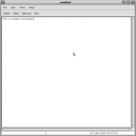
Figure 18.4 Output of com.classofjava.gui.TextEditor
In Listing 18.19, we create a sub-class of Frame. The constructor would set up some default bounds for the TextEditor, set up all the components, it would also set up all the menus required in the TextEditor and set up any additional requirements on the container, like here we are starting a thread which could be used to update the time on the text field every second (Figure 18.4).
After creating everything, a GUI application would now wait for interaction from the user. These interactions from the user need to be handled. The constructor normally has this additional task of setting up the handlers to handle the various actions which could be performed by the user. The event handling is covered in Chapter 19.
LESSONS LEARNED
- Containers are the components which manage other components. The
Containerclass provides methods to manage containers. These are managed index position-wise. - The
Containeruses various types ofLayoutManagerto manage the bounds for its child components. By default theWindow,FrameandDialoguse the theBorderLayoutas the initialLayoutManager, and thePanelandAooketuseFlowLayoutas the initialLayoutmanager. - Top-level containers are the containers which are not required to be added to another container in order to be used.
Window,Frame,Dialog,FileDialogandAppletare the top-level containers.. - Among the top-level containers available in AWT, only
Framecan have menus. The menus are managed in aMenuBar, which can be set on aFrame. The instances ofMenu - are managed in a
MenuBar, and instances ofMenuItemare managed in aMenu. - Instances of
Dialoghave aparent. Theparentfor aDialogcan be either aFrameor anotherDialog. These dialogs can bemodalor non-modal. When a modal dialog is visible, it blocks access to the parent. TheDialoginstances are normally used for getting inputs from the user or displaying some messages to draw the attention of the user. - The instance of
FileDialogis used to interactively get the choice of a file name from the user. - The instances of
ScrollPanecan accomodate only one component and do not use aLayoutManager. - Most of the GUI applications which are created using AWT would create a top-level container by extending from the
Frameclass and would normally create and layout all the components in the constructor.
EXERCISES
- State which of the following are true or false:
BorderLayoutis the default layout manager for all the containers.- The
Dialoginstance requires a parent; thereforeDialogis not a top-level container. - In AWT, only
Frameclass and its sub-classes can have menus. - A non-modal dialog blocks all access to its parent when it is visible.
- Instances of the
Windowclass itself can be resized interactively.
- Fill in the blanks in the following:
- __________ is the default layout manager for the
Panelclass. - In __________ layout manager class, all the components are visible and have the same size.
- A shortcut can be set for instances of
MenuItemusing an instance of __________ class. - The __________
LayoutManagersets the size of the components to their preferred size.
- __________ is the default layout manager for the
- Explain the various layout managers available in AWT.
- List the four instance variables of
GridbagConstraintswhich determine the display area for the component. - Write a class
ConnectDialog, which is a dialog used for accepting the inputs regarding the host and port number to which a TCP connection may be required. Create just the GUI part, event handling may be taken care in the exercise of the next chapter.