1
AN INTRODUCTION TO COLOR STUDY
The Experience of Color / Color Awareness / The Uses of Color / Color-Order Systems / Color Study
Color is essential for life.
—Frank H. Mahnke
Color is stimulating, calming, expressive, disturbing, exuberant, symbolic. It pervades every aspect of life, embellishes the ordinary, and gives beauty and drama to everyday objects. If black-and-white images bring the news of the day, color writes the poetry.
The romance of color exists for everyone, but color plays a far more important role for design professionals. Forms, colors, and their arrangement are the foundation elements of design, and of these, color is arguably the most powerful weapon in the designer's arsenal. A skilled colorist understands how colors are seen, when and why they seem to change, the variety of their meanings and suggestive powers—and how to apply that knowledge to enhance the marketability of products. Whether that product is a graphic design, a sweater, an airplane seat, a kitchen utensil, a laptop, a wedding cake, or anything else, color will play a great part in determining its success or failure in the consumer marketplace. For designers, color means business.
The Experience of Color
Color is, first, a sensory event. Every color experience begins as a physiological response to a stimulus of light. Colors of light are experienced in two very different ways. The colors on a monitor screen are seen as direct light. The colors of the real world—of printed pages, physical objects, and the surrounding environment—are seen as reflected light.
The perception of colors seen as direct light is straightforward: wavelengths of light reach the eye directly from a light source. The experience of real-world color is a more complex event. Real-world colors are seen indirectly, as light reflected from a surface. For tangible objects and printed pages, light is the cause of color, colorants (like paints, inks, or dyes) are the means used to generate color, and the colors that are seen are the effect.
Colors that are experienced as reflected light are unstable. Move a red object from one kind of illumination to another—from daylight to fluorescent lighting, for example—and its apparent color will undergo a noticeable shift. The same red paint applied to smooth plaster will not seem the same on rough stucco. A single color can appear as two or even more different colors simply by changing its placement against other colors. Two identical oranges, one laid on a red tablecloth and the other on a yellow one, will seem different: the first more yellow-orange, the other more red-orange.
Colors seen as direct light are more stable. As long as a particular wavelength of light reaching the eye does not shift, that color will be seen dependably as the same. But despite that stability, colors of light are not easily translated into real-world color. The color of a carpet underfoot is very different from that of its image on a screen, and each of these is different from its illustration on a printed page.
Finally, there is a human element to the instability of colors. Whether a color is seen as direct or reflected light, one person's perception of “true red” will be different from someone else's “true red.” Not only are colors themselves unstable, individuals' ideas about colors differ as well. And when colors are used symbolically, their meanings change in different cultures and in different situations.
With rare exceptions, work in the design industries today is done in images of light on a screen for products that will ultimately be produced as material goods or printed pages. Are the screen image and the actual product the same color? Can they be the same color? Which is the “true” color—the one on the screen or the one that is the tangible object? Is there such a thing as a “true” color at all?
Designers use color. Their concern is with effects, not with words, ideas, or causes. Understanding what is seen, and how and why it is seen—how colors work—is background knowledge that supports the art of color. Designers work with color every day in a comfort zone: a healthy mix of fact, common sense, and intuition. A skilled colorist exploits the instabilities of color and uses them to create interest and vitality in design.
We understand color in much the same way that we understand the shape of the earth. The earth is round, but we experience it as flat, and act according to that practical perception. Color is light alone, but it is experienced so directly and powerfully that we accept it as a physical entity. No matter what color technology is available, we believe our eyes. Ultimately, color problems in the design industries are solved with the human eye. Designers work with color from the evidence of their eyes.
Color Awareness
Color is sensed by the eye, but the perception of color takes place in the mind, and nearly always at an unconscious level. Colors are understood by their placement and their context. They are experienced at different levels of awareness depending on how and where they are seen. Colors may be perceived as two- or three-dimensional forms, as light, or as surroundings. Colors permeate the environment, are an attribute of objects, and communicate without words.
Environmental color is all-encompassing. Both the natural world and man-made environments immerse us in colors, whether they are the cold whites of Antarctica, the lush greens of tropical forests, the accidental color compositions of urban streets, or the controlled-color environments of architecture, landscape design, interior design, or theater design.
Surrounding colors have a powerful impact on the human body and mind, but most of the time they are experienced with an astonishing lack of awareness. They are noticed only when they become a focus of attention, like a beautiful sunset or a freshly decorated room. Even a stated awareness of color can be self-deceiving. Someone who expresses a dislike for green may nevertheless take enormous pleasure in a garden, describing it as a blue or yellow garden, when in fact the foliage is overwhelmingly green, with blue or yellow only a small part of the whole.
The colors of objects are perceived very directly. The separateness of an object allows a viewer to focus both eyes and mind on a single entity and single color idea. We are most consciously aware of color when it is an attribute of a defined object: a blue dress, a red car, a yellow diamond.

Figure 1–1. Environmental Color. Nature offers unrivaled displays of color.

Figure 1–2. Environmental Color. The gray of city streets is only a background for the brilliant colors of street life.

Figure 1–3. Object Color. Contemporary glass beads in many colors add brilliance and surprise to a timeless jewelry form. Necklace design and image courtesy of Lois Dubin.
Graphic colors are the colors of images: painted, drawn, printed, or on-screen. Graphein, the Greek root of the English word “graphic,” means both “writing” and “drawing.” Whether a graphic design is made of written words, illustrations, or both, its purpose is to communicate. It tells a story, sends a sales pitch or political message, even conveys emotion. Color in a graphic design is integral to the message, and that message is experienced on many levels: conscious and unconscious, sensory and intellectual, at the same time.

Figure 1–4. Graphic Color. Color adds meaning to the written word.
The Uses of Color
Color is recognized universally as a natural component of beauty. The Russian-language word for red has the same root in Old Russian as the word for beautiful. But colors are far more than beautiful; they are also useful. Color can be used to communicate ideas and emotions, to manipulate perception, to create focus, to motivate and influence actions.
Color can be used as pure function, to increase or reduce available light in living spaces. Light colors reflect light and increase the available light in a space; dark colors absorb light and reduce it. A room painted in pale ivory will reflect more of the light that reaches its walls than the same room painted dark red. When room walls are dark, adding additional illumination alone will not entirely solve the problem. If the walls are absorbing light, they will continue to do so. Illumination and color are equals in environmental space: it is a balance of the two that establishes the level of brightness.
Colors can modify the perception of space, creating impressions of size, nearness, separation, or distance. Colors can be chosen to minimize or obscure objects and spaces, or to delineate space, separating one area from another. Color can be used to create continuity between separated elements in design, to establish emphasis, or to create focus in a composition.
Color can be a visual expression of mood or emotion. Intense colors and strong contrasts communicate action and drama. Gentle colors and soft contrasts evoke serenity. Color can be used to manipulate the viewer, to generate emotional response. Some colors have physiological effects on the body and can be used to stimulate or to calm. Colors can be used to arouse a nonvisual sense, instill unconscious motivation, alter behavior, or induce mood.
Colors can be a nonverbal language. Every culture uses color to convey ideas without written or spoken words. Alone or in combination, colors can symbolize a nation or an institution, a product or political idea. National flags are identified by color. IBM is Big Blue; Harvard is crimson. We cheer for the red, white, and blue. Color communicates social status. In ancient China, the emperor alone wore yellow. Roman Catholic priests wear black as a daily vestment but change to white, green, violet, red, rose, or gold for special liturgies. A bride may be dressed in white as a symbol of purity in Western cultures, but in a Hindu wedding she is garbed festively and gloriously in red, which is associated with a revered Hindu goddess and with fertility and passion, promising a happy conjugal future.

Figure 1–5. Color Conveys Mood. An offbeat combination of colors perfectly expresses the edgy modernity of Dvorak's Piano Concerto in D Minor. Image courtesy of Carin Goldberg Design.
Colors can be used to alert or warn. A flashing red light evokes a different response than a green one. Violet is recognized internationally as an indicator of radiation hazard.
Color identifies. It provides instant discrimination between objects of similar or identical form and size. The red file holds unpaid bills; the green file the paid ones. Color is associative. The ordinary items of everyday life are identified by color associations. They can all be found in the Yellow Pages.
And, of course, color can simply be used to make things more beautiful.

Figure 1–6. Safety First! A vest in federally mandated safety orange combines with high-impact red and yellow, alerting passers-by to avoid a construction zone.

Figure 1–7. Color Identifies. Retrieving records from an enormous filing system is made more manageable by tabs of different colors.
Color-Order Systems
One way to understand color is to organize it into a system—to hypothesize and illustrate a structured model of color relationships. The color-order model, or color system, is a thread that runs from the earliest writings about color to the present day. Countless different and competing systems organize color in various ways, each convinced of its own absolute rightness. But color is such an enormous topic that no single color-order system can be truly inclusive. In the early 1930s the National Bureau of Standards tried to categorize and describe ten million colors for scientific and industrial use. The result was a massive color-name volume and a breathtaking failure. The group “grayish-yellowish-pink,” for example, included about thirty-five thousand samples.*
A similar effort today might call for categorizing the millions of colors that are available in design software, and even that number is not as great as the number of colors that can be distinguished by the human eye. More successful systems address a narrower range of issues. These systems fall into three groups:
- Technical-scientific color systems
- Commercial color systems
- Intellectual-philosophical color systems
Technical-scientific color systems lie in the province of science and industry. They measure color under specific and limited conditions. Most deal with the colors of light, not the colors of materials. One means of measuring the color of light is by determining the exact temperature in degrees Kelvin (K) of a piece of metal, called a blackbody, as it heats up. The color of a blackbody changes at specific temperatures. Color temperature in the scientific sense refers to the point in degrees K at which the blackbody changes color as it heats, from yellow, to red, to blue, to white.
The International Commission on Illumination, known as the CIE, has developed a color triangle that locates the color (in degrees K) of any light source. The CIE triangle deals only with colors of light. It is mathematical and includes all spectral colors (colors of light) within the human range of vision. It is said to be the most accurate of the color description models, but it is highly theoretical—so theoretical that, according to a CIE spokesman, it cannot accurately be illustrated. In addition, it does not include the darker, lighter, or muted variations of the colors that are part of the real-world color experience. It is not applicable to many technologies, including color printing and color monitors, so these must use other color-order models.
Another system, the color rendering index (CRI), evaluates the way in which a given light source renders the colors of objects in comparison to a chart of eight colors that have been standardized in relation to daylight. The phasing out of incandescent light sources, originally CRI-rated as best for illuminating living spaces, has created new challenges for the CRI.†
Technical systems of color organization are rarely part of the day-to-day work of the design studio, but they are of value in maintaining quality control in manufacturing.
Commercial color systems are systematic arrangements of colors meant to assist the user in making selections from a range of colors available in a particular product line. There are two broad categories of commercial color systems: color systems and color collections.
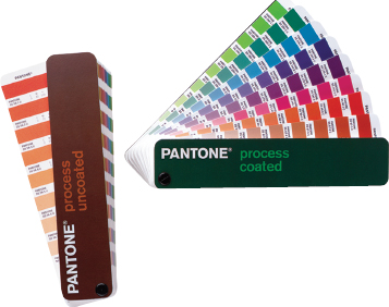
Figure 1–8. Commercial Color-Order Systems. The Pantone Matching System offers swatch books of standardized colors for a wide range of products, including printing inks, software, color films, plastics, and markers, among others, for use by designers and industry.
Color systems are based on a theory of colors and are presented, in print or on screen, as colors arranged in a visually logical order. They attempt to illustrate all possible colors that can be produced within a specific medium, like paints, printing inks, or software. The Benjamin Moore Color System, for example, includes more than 3,300 paint colors as printed samples and offers a computer-matching option to create colors that do not appear in print.
Another example of a commercial color-order system is the Pantone Inc.‡ swatch book for colors that can be printed using four-color process printing inks. The colors are arranged in a visually logical way and each is labeled with the percentage of cyan, magenta, yellow, or black (CMYK) ink required to produce it. Bright red Pantone P57-C, for example, is noted as C0, M100, Y66, K0. Pantone offers similar charts for six-color printing inks, solid color inks, and a multitude of other products.
Color collections are narrower in scope. They offer a limited number of colors, often with a theme or point of view, to assist the user in making a selection within a single product or group of related products. Color collections do not attempt to include all possible colors. Instead, they offer a color range intended to meet most needs within a specific target market or industry. A collection of historical paint colors or catalog clothing fabrics are color collections. The number of samples in these collections can vary widely. Coats Industrial Thread Company offers 919 colors of sewing threads in their Global Colour Reference of Industrial Apparel Thread Shades. Farrow and Ball, a fine paint company, offers only a few dozen painstakingly researched colors that have been created to simulate historical prototypes.

Figure 1–9. Color Collections. Coats Industrial offers thread in 919 colors. Shown here, a selection of Coats & Clark Dual Duty XP, available in 384 colors.

Figure 1–10. Color Collections. A representative sampling of Farrow and Ball paint colors, part of a limited collection of colors based on historical prototypes. Farrow and Ball 2005. All rights reserved. No part of a color card may be reproduced without permission of Farrow and Ball.
Commercial color systems and collections are practical both in intent and in fact. They do not contribute to an understanding of color, but they were never intended to do so. Within their limitations they are invaluable aids to specifying colors for design and other purposes.
Intellectual-philosophical systems explore the meaning and organization of color. There is writing on color from the earliest beginnings of recorded thought, and fascination with the topic has never been limited to the world of art. Plato and Aristotle, Goethe, and Schopenhauer wrote about color, as did a host of other scientists and philosophers.
The late seventeenth and early eighteenth centuries saw a flowering of writing on color whose influence persists to the present day. Two threads of inquiry run through these studies. The first is the search for a perfect color-order system; the second, the search for laws of harmony in color combinations. The two paths have converged into the present-day field of study known as color theory.
Early writers made no distinction between the art of color and the science of color. The colors of light and the colors of objects were dealt with as a single discipline. Over time the study of color tilted steadily toward the sciences and eventually into separate fields: color as biology, mathematics, physics, chemistry, medicine, and psychology, among others. Even color theorists whose focus was on the arts continued to approach color as a scientific discipline. The aesthetic and philosophical color-order systems they proposed were thought of as scientific truth until well into the twentieth century. Today, writers on color still come from scientific, artistic, and philosophical disciplines, but color theory for artists and designers has been separated from scientific inquiry. Color theory has, at last, its own place in the arts.
Color Study
It makes no difference whether color is seen as light on a monitor screen or as an attribute of a physical object. No matter how color is seen, or in what medium it is rendered, or what other senses seem to respond to it, the first experience of color is visual. Color study focuses first on eye-training: learning to distinguish in every color sample three objective attributes:
- Hue: the name of the color.
- Value: the relative darkness or lightness of a color.
- Saturation, or chroma: the relative brilliance or muted quality of a color.
These qualities are independent only for purposes of study. Every color possesses these three attributes. No color can be described fully as only one idea. The emphasis of one quality over the others gives each color individual character, but all three are always present. Other descriptive qualities of colors, like texture, translucency, or opacity, are additional to these basics.
The second focus of color study is color control. The instability of colors cannot be eliminated, but with awareness and skill it can be minimized, even utilized. Designers deal with the instability of color in three principal ways: first, by anticipating as much as is possible the changes that may occur when objects are seen under different lighting conditions; second, by adjusting for changes that take place when colors are given different placements relative to one another; and third, by adjusting for changes that take place when colors must be transposed from one medium to another—for example, in illustrating a piece of dyed fabric on a monitor screen.
Finally, color study provides guidelines that enable designers to create consistently effective color combinations. The ability to use color well is a skill that can be taught and strengthened. Color competence is the ability to predict and control, to the extent possible, color effects and the ability to select and use colors that will enhance every product and page.
Many color courses taught today have their foundation in the teachings of Albert Munsell (1858–1918) and Josef Albers (1888–1976). Munsell's method follows the classic color-order tradition. It is a formal system based on orderly progressions of the three basic color qualities: hue, value, and saturation. Albers was an innovator who took a more free-spirited approach. He believed that true understanding of color comes from an intuitive response to it. He rejected the rigidity of color-order systems and, in his classic Interaction of Colors, stressed the power of eye-training exercises.§ These two very different paths to color study—one stressing control, the other intuition—are seen often as competitive, but they are not. Each has its value, and each has its place.
Because no two individuals see color in exactly the same way, or share the exact idea of any given color, it is easy to conclude that color study in a class would be (at best) a waste of time or (at worst) a scheduled free-for-all. But there are great benefits to studying color in a group. For every problem assigned there are wrong answers, but there are also many different possible right answers. Twenty students may bring in twenty different, yet equally acceptable, solutions to the same color assignment.
Academic (non-design) education tends to reward students who find the single “right” answer to a question or assignment. Some students who have been successful in traditional academic areas find a flexible standard of “rightness” difficult. But the possibility of many right answers for each problem is extraordinarily liberating because it increases exponentially the chances of success. It is also extraordinarily instructive, because seeing a variety of responses, even “wrong” ones, sharpens developing critical skills.
The first step of color study is to enable students to see colors without the interference of preconceived ideas. Students with a self-assessed “good sense of color” may feel inhibited, disoriented, or exasperated at the start. Just as mastering written music may at first slow down a natural musician, learning basic color skills may at first hamper an artist or designer, but the inhibiting effect is short-term. There is a moment when learned material becomes reflexive, like the magical moment for children when learning to read ends and reading begins. The ability to work effectively with color is part of a designer's core competence. It is artistic empowerment. The designer who understands color has a competitive edge in every industry.