
I claim not to have controlled events, but confess plainly that events have controlled me. | ||
| --Abraham Lincoln | ||
Capture its reality in paint! | ||
| --Paul Cézanne | ||
An actor entering through the door, you’ve got nothing. But if he enters through the window, you’ve got a situation. | ||
| --Billy Wilder | ||
But, soft! what light through yonder window breaks? It is the east, and Juliet is the sun! | ||
| --William Shakespeare | ||
In this chapter you’ll learn:
<objective>To create menus, tabbed windows and multiple document interface (MDI) programs.
</objective> <objective>To use the ListView and TreeView controls for displaying information.
To create hyperlinks using the LinkLabel control.
To display lists of information in ListBox and ComboBox controls.
To input date and time data with the DateTimePicker.
To create custom controls.
</objective> </feature><feature> <supertitle>Outline</supertitle> </feature>This chapter continues our study of GUIs. We start with menus, which present users with logically organized commands (or options). We show how to develop menus with the tools provided by Visual Studio. Next, we discuss how to input and display dates and times using the MonthCalendar and DateTimePicker controls. We also introduce LinkLabels—powerful GUI components that enable the user to access one of several destinations, such as a file on the current machine or a web page, by simply clicking the mouse.
We demonstrate how to manipulate a list of values via a ListBox and how to combine several checkboxes in a CheckedListBox. We also create drop-down lists using ComboBoxes and display data hierarchically with a TreeView control. You’ll learn two other important GUI elements—tab controls and multiple document interface (MDI) windows. These components enable you to create real-world programs with sophisticated GUIs.
Visual Studio provides many GUI components, several of which are discussed in this (and the previous) chapter. You can also design custom controls and add them to the ToolBox, as we demonstrate in this chapter’s last example. The techniques presented here form the groundwork for creating more substantial GUIs and custom controls.
Menus provide groups of related commands for Windows applications. Although these commands depend on the program, some—such as Open and Save—are common to many applications. Menus are an integral part of GUIs, because they organize commands without “cluttering” the GUI.
In Fig. 15.1, an expanded menu from the Visual C# IDE lists various commands (called menu items), plus submenus (menus within a menu). The top-level menus appear in the left portion of the figure, whereas any submenus or menu items are displayed to the right. The menu that contains a menu item is called that menu item’s parent menu. A menu item that contains a submenu is considered to be the parent of that submenu.

Menus can have Alt key shortcuts (also called access shortcuts, keyboard shortcuts or hotkeys), which are accessed by pressing Alt and the underlined letter—for example, Alt F typically expands the File menu. Menu items can have shortcut keys as well (combinations of Ctrl, Shift, Alt, F1, F2, letter keys, and so on). Some menu items display checkmarks, usually indicating that multiple options on the menu can be selected at once.
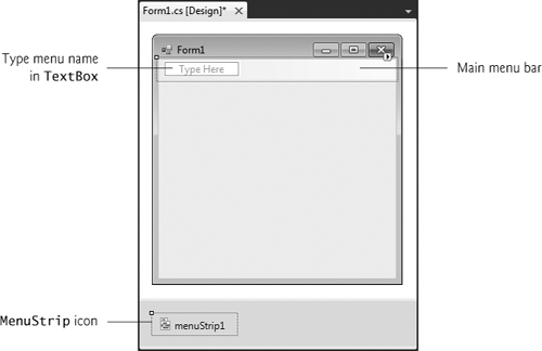
To create a menu, open the Toolbox and drag a MenuStrip control onto the Form. This creates a menu bar across the top of the Form (below the title bar) and places a MenuStrip icon in the component tray. To select the MenuStrip, click this icon. You can now use Design mode to create and edit menus for your application. Menus, like other controls, have properties and events, which can be accessed through the Properties window.
To add menu items to the menu, click the Type Here TextBox (Fig. 15.2) and type the menu item’s name. This action adds an entry to the menu of type ToolStripMenuItem. After you press the Enter key, the menu item name is added to the menu. Then more Type Here TextBoxes appear, allowing you to add items underneath or to the side of the original menu item (Fig. 15.3).
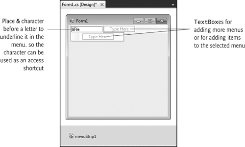
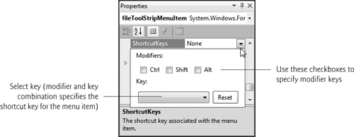
To create an access shortcut, type an ampersand (&) before the character to be underlined. For example, to create the File menu item with the letter F underlined, type &File. To display an ampersand, type &&. To add other shortcut keys (e.g., <Ctrl> F9) for menu items, set the ShortcutKeys property of the appropriate ToolStripMenuItems. To do this, select the down arrow to the right of this property in the Properties window. In the window that appears (Fig. 15.4), use the CheckBoxes and drop-down list to select the shortcut keys. When you are finished, click elsewhere on the screen. You can hide the shortcut keys by setting property ShowShortcutKeys to false, and you can modify how the shortcut keys are displayed in the menu item by modifying property ShortcutKeyDisplayString.
Look-and-Feel Observation 15.1

Buttons can have access shortcuts. Place the & symbol immediately before the desired character in the Button's text. To press the button by using its access key in the running application, the user presses Alt and the underlined character. If the underline is not visible when the application runs, press the Alt key to display the underlines.
You can remove a menu item by selecting it with the mouse and pressing the Delete key. Menu items can be grouped logically by separator bars, which are inserted by right clicking the menu and selecting Insert > Separator or by typing “-” for the text of a menu item.
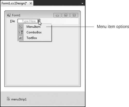
In addition to text, Visual Studio allows you to easily add TextBoxes and ComboBoxes (drop-down lists) as menu items. When adding an item in Design mode, you may have noticed that before you enter text for a new item, you are provided with a drop-down list. Clicking the down arrow (Fig. 15.5) allows you to select the type of item to add—Menu-Item (of type ToolStripMenuItem, the default), ComboBox (of type ToolStripComboBox) and TextBox (of type ToolStripTextBox). We focus on ToolStripMenuItems. [Note: If you view this drop-down list for menu items that are not on the top level, a fourth option appears, allowing you to insert a separator bar.]
ToolStripMenuItems generate a Click event when selected. To create an empty Click event handler, double click the menu item in Design mode. Common actions in response to these events include displaying dialogs and setting properties. Common menu properties and a common event are summarized in Fig. 15.6.
Table 15.6. MenuStrip and ToolStripMenuItem properties and an event.
Description | |
|---|---|
| |
| Causes text to display from right to left. This is useful for languages that are read from right to left. |
| |
| Indicates whether a menu item is checked. The default value is |
| Indicates that a menu item should appear checked or unchecked as it is clicked. |
| Specifies text that should appear beside a menu item for a shortcut key. If left blank, the key names are displayed. Otherwise, the text in this property is displayed for the shortcut key. |
| Specifies the shortcut key for the menu item (e.g., <Ctrl>-F9 is equivalent to clicking a specific item). |
| Indicates whether a shortcut key is shown beside menu item text. The default is |
| Specifies the menu item’s text. To create an Alt access shortcut, precede a character with |
Common | |
| Generated when an item is clicked or a shortcut key is used. This is the default event when the menu is double clicked in the designer. |
Look-and-Feel Observation 15.2
It is a convention to place an ellipsis (...) after the name of a menu item (e.g., Save As...) that requires the user to provide more information—typically through a dialog. A menu item that produces an immediate action without prompting the user for more information (e.g., Save) should not have an ellipsis following its name.
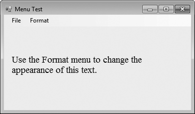
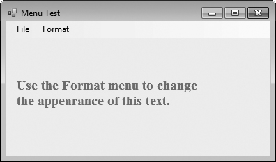
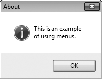
Class MenuTestForm (Fig. 15.7) creates a simple menu on a Form. The Form has a top-level File menu with menu items About (which displays a MessageBox) and Exit (which terminates the program). The program also includes a Format menu, which contains menu items that change the format of the text on a Label. The Format menu has submenus Color and Font, which change the color and font of the text on a Label.
Example 15.7. Menus for changing text font and color.
 1   // Fig. 15.7: MenuTestForm.cs
 2   // Using Menus to change font colors and styles.
 3   using System;
 4   using System.Drawing;
 5   using System.Windows.Forms;
 6
 7   namespace MenuTest
 8   {
 9      // our Form contains a Menu that changes the font color
10      // and style of the text displayed in Label
11      public partial class MenuTestForm : Form
12      {
13         // constructor
14         public MenuTestForm()
15         {
16            InitializeComponent();
17         } // end constructor
18
19         // display MessageBox when About ToolStripMenuItem is selected
20         private void aboutToolStripMenuItem_Click(
21            object sender, EventArgs e )
22         {
23            MessageBox.Show( "This is an example
of using menus.", "About",
24               MessageBoxButtons.OK, MessageBoxIcon.Information );
25         } // end method aboutToolStripMenuItem_Click
26
27         // exit program when Exit ToolStripMenuItem is selected
28         private void exitToolStripMenuItem_Click(
29            object sender, EventArgs e )
30         {
31            Application.Exit();
32         } // end method exitToolStripMenuItem_Click
33
34         // reset checkmarks for Color ToolStripMenuItems
35         private void ClearColor()
36         {
37            // clear all checkmarks
38            blackToolStripMenuItem.Checked = false;
39            blueToolStripMenuItem.Checked = false;
40            redToolStripMenuItem.Checked = false;
41            greenToolStripMenuItem.Checked = false;
42         } // end method ClearColor
43
44         // update Menu state and color display black
45         private void blackToolStripMenuItem_Click(
46            object sender, EventArgs e )
47         {
48            // reset checkmarks for Color ToolStripMenuItems
49            ClearColor();
50
51            // set color to Black
52            displayLabel.ForeColor = Color.Black;
53            blackToolStripMenuItem.Checked = true;
54         } // end method blackToolStripMenuItem_Click
55
56         // update Menu state and color display blue
57         private void blueToolStripMenuItem_Click(
58            object sender, EventArgs e )
59         {
60            // reset checkmarks for Color ToolStripMenuItems
61            ClearColor();
62
63            // set color to Blue
64            displayLabel.ForeColor = Color.Blue;
65            blueToolStripMenuItem.Checked = true;
66         } // end method blueToolStripMenuItem_Click
67
68         // update Menu state and color display red
69         private void redToolStripMenuItem_Click(
70            object sender, EventArgs e )
71         {
72            // reset checkmarks for Color ToolStripMenuItems
73            ClearColor();
74
75            // set color to Red
76            displayLabel.ForeColor = Color.Red;
77            redToolStripMenuItem.Checked = true;
78         } // end method redToolStripMenuItem_Click
79
80         // update Menu state and color display green
81         private void greenToolStripMenuItem_Click(
82            object sender, EventArgs e )
83         {
84            // reset checkmarks for Color ToolStripMenuItems
85            ClearColor();
86
87            // set color to Green
88            displayLabel.ForeColor = Color.Green;
89            greenToolStripMenuItem.Checked = true;
90         } // end method greenToolStripMenuItem_Click
91
92         // reset checkmarks for Font ToolStripMenuItems
93         private void ClearFont()
94         {
95            // clear all checkmarks
96            timesToolStripMenuItem.Checked = false;
97            courierToolStripMenuItem.Checked = false;
98            comicToolStripMenuItem.Checked = false;
99         } // end method ClearFont
100
101        // update Menu state and set Font to Times New Roman
102        private void timesToolStripMenuItem_Click(
103           object sender, EventArgs e )
104        {
105           // reset checkmarks for Font ToolStripMenuItems
106           ClearFont();
107
108           // set Times New Roman font
109           timesToolStripMenuItem.Checked = true;
110           displayLabel.Font = new Font( "Times New Roman", 14,
111              displayLabel.Font.Style );
112        } // end method timesToolStripMenuItem_Click
113
114        // update Menu state and set Font to Courier
115        private void courierToolStripMenuItem_Click(
116           object sender, EventArgs e )
117        {
118           // reset checkmarks for Font ToolStripMenuItems
119           ClearFont();
120
121           // set Courier font
122           courierToolStripMenuItem.Checked = true;
123           displayLabel.Font = new Font( "Courier", 14,
124              displayLabel.Font.Style );
125        } // end method courierToolStripMenuItem_Click
126
127        // update Menu state and set Font to Comic Sans MS
128        private void comicToolStripMenuItem_Click(
129           object sender, EventArgs e )
130        {
131           // reset checkmarks for Font ToolStripMenuItems
132           ClearFont();
133
134           // set Comic Sans font
135           comicToolStripMenuItem.Checked = true;
136           displayLabel.Font = new Font( "Comic Sans MS", 14,
137              displayLabel.Font.Style );
138        } // end method comicToolStripMenuItem_Click
139
140        // toggle checkmark and toggle bold style
141        private void boldToolStripMenuItem_Click(
142           object sender, EventArgs e )
143        {
144           // toggle checkmark
145           boldToolStripMenuItem.Checked = !boldToolStripMenuItem.Checked;
146
147           // use Xor to toggle bold, keep all other styles
148           displayLabel.Font = new Font( displayLabel.Font
149              displayLabel.Font.Style ^ FontStyle.Bold );
150        } // end method boldToolStripMenuItem_Click
151
152        // toggle checkmark and toggle italic style
153        private void italicToolStripMenuItem_Click(
154           object sender, EventArgs e )
155        {
156           // toggle checkmark
157           italicToolStripMenuItem.Checked =
158              !italicToolStripMenuItem.Checked;
159
160           // use Xor to toggle italic, keep all other styles
161           displayLabel.Font = new Font( displayLabel.Font
162              displayLabel.Font.Style ^ FontStyle.Italic );
163        } // end method italicToolStripMenuItem_Click
164     } // end class MenuTestForm
165  } // end namespace MenuTest
b)

c)
d)
e)
f)
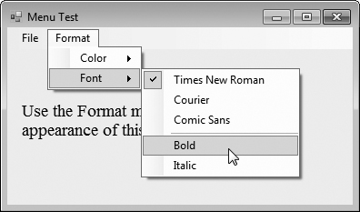
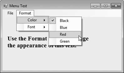
To create this GUI, begin by dragging the MenuStrip from the ToolBox onto the Form. Then use Design mode to create the menu structure shown in the sample outputs. The File menu (fileToolStripMenuItem) has menu items About (aboutToolStripMenuItem) and Exit (exitToolStripMenuItem); the Format menu (formatToolStripMenuItem) has two submenus. The first submenu, Color (colorToolStripMenuItem), contains menu items Black (blackToolStripMenuItem), Blue (blueToolStripMenuItem), Red (redToolStripMenuItem) and Green (greenToolStripMenuItem). The second submenu, Font (fontToolStripMenuItem), contains menu items Times New Roman (timesToolStripMenuItem), Courier (courierToolStripMenuItem), Comic Sans (comicToolStripMenuItem), a separator bar (dashToolStripMenuItem), Bold (boldToolStripMenuItem) and Italic (italicToolStripMenuItem).
The About menu item in the File menu displays a MessageBox when clicked (lines 20–25). The Exit menu item closes the application through static method Exit of class Application (line 31). Class Application’s static methods control program execution. Method Exit causes our application to terminate.
We made the items in the Color submenu (Black, Blue, Red and Green) mutually exclusive—the user can select only one at a time (we explain how we did this shortly). To indicate that a menu item is selected, we will set each Color menu item’s Checked property to true. This causes a check to appear to the left of a menu item.
Each Color menu item has its own Click event handler. The method handler for color Black is blackToolStripMenuItem_Click (lines 45–54). Similarly, the event handlers for colors Blue, Red and Green are blueToolStripMenuItem_Click (lines 57–66), redToolStripMenuItem_Click (lines 69–78) and greenToolStripMenuItem_Click (lines 81–90), respectively. Each Color menu item must be mutually exclusive, so each event handler calls method ClearColor (lines 35–42) before setting its corresponding Checked property to true. Method ClearColor sets the Checked property of each color ToolStripMenuItem to false, effectively preventing more than one menu item from being selected at a time. In the designer, we initially set the Black menu item’s Checked property to true, because at the start of the program, the text on the Form is black.
The Font menu contains three menu items for fonts (Courier, Times New Roman and Comic Sans) and two menu items for font styles (Bold and Italic). We added a separator bar between the font and font-style menu items to indicate that these are separate options. A Font object can specify only one font at a time but can set multiple styles at once (e.g., a font can be both bold and italic). We set the font menu items to display checks. As with the Color menu, we must enforce mutual exclusion of these items in our event handlers.
Event handlers for font menu items Times New Roman, Courier and Comic Sans are timesToolStripMenuItem_Click (lines 102–112), courierToolStripMenuItem_Click (lines 115–125) and comicToolStripMenuItem_Click (lines 128–138), respectively. These event handlers behave in a manner similar to that of the event handlers for the Color menu items. Each event handler clears the Checked properties for all font menu items by calling method ClearFont (lines 93–99), then sets the Checked property of the menu item that raised the event to true. This enforces the mutual exclusion of the font menu items. In the designer, we initially set the Times New Roman menu item’s Checked property to true, because this is the original font for the text on the Form. The event handlers for the Bold and Italic menu items (lines 141–163) use the bitwise logical exclusive OR (^) operator to combine font styles, as we discussed in Chapter 14.
Many applications must perform date and time calculations. The .NET Framework provides two controls that allow an application to retrieve date and time information—the MonthCalendar and DateTimePicker (Section 15.4) controls.
The MonthCalendar (Fig. 15.8) control displays a monthly calendar on the Form. The user can select a date from the currently displayed month or can use the provided arrows to navigate to another month. When a date is selected, it is highlighted. Multiple dates can be selected by clicking dates on the calendar while holding down the Shift key. The default event for this control is the DateChanged event, which is generated when a new date is selected. Properties are provided that allow you to modify the appearance of the calendar, how many dates can be selected at once, and the minimum date and maximum date that may be selected. MonthCalendar properties and a common MonthCalendar event are summarized in Fig. 15.9.
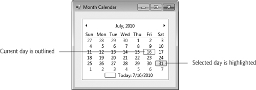
Table 15.9. MonthCalendar properties and an event.
Description | |
|---|---|
| |
| Sets which day of the week is the first displayed for each week in the calendar. |
| The last date that can be selected. |
| The maximum number of dates that can be selected at once. |
| The first date that can be selected. |
| An array of dates that will displayed in bold in the calendar. |
| The last of the dates selected by the user. |
| The dates selected by the user. |
| The first of the dates selected by the user. |
Common | |
| Generated when a date is selected in the calendar. |
The DateTimePicker control (see output of Fig. 15.11) is similar to the MonthCalendar control but displays the calendar when a down arrow is selected. The DateTimePicker can be used to retrieve date and time information from the user. A DateTimePicker’s Value property stores a DateTime object, which always contains both date and time information. You can retrieve the date information from the DateTime object by using property Date, and you can retrieve only the time information by using the TimeOfDay property.
The DateTimePicker is also more customizable than a MonthCalendar control—more properties are provided to edit the look and feel of the drop-down calendar. Property Format specifies the user’s selection options using the DateTimePickerFormat enumeration. The values in this enumeration are Long (displays the date in long format, as in Thursday, July 10, 2010), Short (displays the date in short format, as in 7/10/2010), Time (displays a time value, as in 5:31:02 PM) and Custom (indicates that a custom format will be used). If value Custom is used, the display in the DateTimePicker is specified using property CustomFormat. The default event for this control is ValueChanged, which occurs when the selected value (whether a date or a time) is changed. DateTimePicker properties and a common event are summarized in Fig. 15.10.
Table 15.10. DateTimePicker properties and an event.
| Description |
|---|---|
| |
| Sets the text color for the calendar. |
| Sets the calendar’s background color. |
| Sets the custom format string for the user’s options. |
| Sets the format of the date and/or time used for the user’s options. |
| The maximum date and time that can be selected. |
| The minimum date and time that can be selected. |
| Indicates if a |
| Indicates whether the control displays up and down |
| The data selected by the user. |
Common | |
| Generated when the |
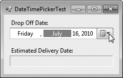
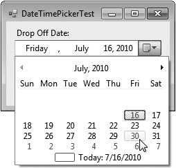
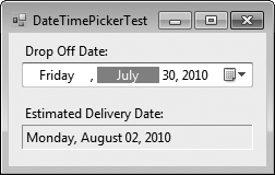
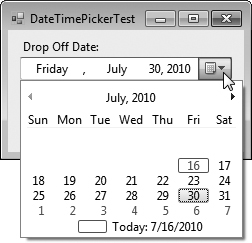
Figure 15.11 demonstrates using a DateTimePicker to select an item’s drop-off time. Many companies use such functionality—several online DVD rental companies specify the day a movie is sent out and the estimated time that it will arrive at your home. The user selects a drop-off day, then an estimated arrival date is displayed. The date is always two days after drop-off, three days if a Sunday is reached (mail is not delivered on Sunday).
Example 15.11. Demonstrating DateTimePicker.
 1   // Fig. 15.11: DateTimePickerForm.cs
 2   // Using a DateTimePicker to select a drop-off time.
 3   using System;
 4   using System.Windows.Forms;
 5
 6   namespace DateTimePickerTest
 7   {
 8      // Form lets user select a drop-off date using a DateTimePicker
 9      // and displays an estimated delivery date
10      public partial class DateTimePickerForm : Form
11      {
12         // constructor
13         public DateTimePickerForm()
14         {
15            InitializeComponent();
16         } // end constructor
17
18         private void dateTimePickerDropOff_ValueChanged(
19            object sender, EventArgs e )
20         {
21            DateTime dropOffDate = dateTimePickerDropOff.Value;
22
23            // add extra time when items are dropped off around Sunday
24            if ( dropOffDate.DayOfWeek == DayOfWeek.Friday ||
25               dropOffDate.DayOfWeek == DayOfWeek.Saturday ||
26               dropOffDate.DayOfWeek == DayOfWeek.Sunday )
27
28               //estimate three days for delivery
29               outputLabel.Text =
30                  dropOffDate.AddDays( 3 ).ToLongDateString();
31            else
32               // otherwise estimate only two days for delivery
33               outputLabel.Text =
34                  dropOffDate.AddDays( 2 ).ToLongDateString();
35         } // end method dateTimePickerDropOff_ValueChanged
36
37         private void DateTimePickerForm_Load( object sender, EventArgs e )
38         {
39            // user cannot select days before today
40            dateTimePickerDropOff.MinDate = DateTime.Today;
41
42            // user can only select days of this year
43            dateTimePickerDropOff.MaxDate = DateTime.Today.AddYears( 1 );
44         } // end method DateTimePickerForm_Load
45      } // end class DateTimePickerForm
46   } // end namespace DateTimePickerTest
a)
b)
d)
The DateTimePicker (dropOffDateTimePicker) has its Format property set to Long, so the user can select a date and not a time in this application. When the user selects a date, the ValueChanged event occurs. The event handler for this event (lines 18–35) first retrieves the selected date from the DateTimePicker’s Value property (line 21). Lines 24–26 use the DateTime structure’s DayOfWeek property to determine the day of the week on which the selected date falls. The day values are represented using the DayOfWeek enumeration. Lines 29–30 and 33–34 use DateTime’s AddDays method to increase the date by three days or two days, respectively. The resulting date is then displayed in Long format using method ToLongDateString.
In this application, we do not want the user to be able to select a drop-off day before the current day, or one that is more than a year into the future. To enforce this, we set the DateTimePicker’s MinDate and MaxDate properties when the Form is loaded (lines 40 and 43). Property Today returns the current day, and method AddYears (with an argument of 1) is used to specify a date one year in the future.
Let’s take a closer look at the output. This application begins by displaying the current date (Fig. 15.11(a)). In Fig. 15.11(b), we selected the 30th of July. In Fig. 15.11(c), the estimated arrival date is displayed as the 2nd of August. Figure 15.11(d) shows that the 30th, after it is selected, is highlighted in the calendar.
The LinkLabel control displays links to other resources, such as files or web pages (Fig. 15.12). A LinkLabel appears as underlined text (colored blue by default). When the mouse moves over the link, the pointer changes to a hand; this is similar to the behavior of a hyperlink in a web page. The link can change color to indicate whether it is not yet visited, previously visited or active. When clicked, the LinkLabel generates a LinkClicked event (see Fig. 15.13). Class LinkLabel is derived from class Label and therefore inherits all of class Label’s functionality.

Table 15.13. LinkLabel properties and an event.
Description | |
|---|---|
Common Properties | |
| Specifies the color of the active link when the user is in the process of clicking the link. The default color (typically red) is set by the system. |
| Specifies which portion of text in the |
| Specifies the link’s behavior, such as how the link appears when the mouse is placed over it. |
| Specifies the original color of the link before it’s been visited. The default color (typically blue) is set by the system. |
| If |
| Specifies the control’s text. |
| If |
| Specifies the color of a visited link. The default color (typically purple) is set by the system. |
Common Event | (Event arguments |
| Generated when the link is clicked. This is the default event when the control is double clicked in Design mode. |
Look-and-Feel Observation 15.3
A LinkLabel is the preferred control for indicating that the user can click a link to jump to a resource such as a web page, though other controls can perform similar tasks.
Class LinkLabelTestForm (Fig. 15.14) uses three LinkLabels to link to the C: drive, the Deitel website (www.deitel.com) and the Notepad application, respectively. The Text properties of the LinkLabel’s cDriveLinkLabel, deitelLinkLabel and notepadLinkLabel describe each link’s purpose.
Example 15.14. LinkLabels used to link to a drive, a web page and an application.
 1   // Fig. 15.14: LinkLabelTestForm.cs
 2   // Using LinkLabels to create hyperlinks.
 3   using System;
 4   using System.Windows.Forms;
 5
 6   namespace LinkLabelTest
 7   {
 8      // Form using LinkLabels to browse the C:drive,
 9      // load a web page and run Notepad
10      public partial class LinkLabelTestForm : Form
11      {
12         // constructor
13         public LinkLabelTestForm()
14         {
15            InitializeComponent();
16         } // end constructor
17
18         // browse C:drive
19         private void cDriveLinkLabel_LinkClicked( object sender,
20            LinkLabelLinkClickedEventArgs e )
21         {
22            // change LinkColor after it has been clicked
23            driveLinkLabel.LinkVisited = true;
24
25            System.Diagnostics.Process.Start( @"C:" );
26         } // end method cDriveLinkLabel_LinkClicked
27
28         // load www.deitel.com in web browser
29         private void deitelLinkLabel_LinkClicked( object sender,
30            LinkLabelLinkClickedEventArgs e )
31         {
32            // change LinkColor after it has been clicked
33            deitelLinkLabel.LinkVisited = true;
34
35            System.Diagnostics.Process.Start( "http://www.deitel.com" );
36         } // end method deitelLinkLabel_LinkClicked
37
38         // run application Notepad
39         private void notepadLinkLabel_LinkClicked( object sender,
40            LinkLabelLinkClickedEventArgs e )
41         {
42            // change LinkColor after it has been clicked
43            notepadLinkLabel.LinkVisited = true;
44
45            // program called as if in run
46            // menu and full path not needed
47            System.Diagnostics.Process.Start( "notepad" );
48         } // end method driveLinkLabel_LinkClicked
49      } // end class LinkLabelTestForm
50   } // end namespace LinkLabelTest
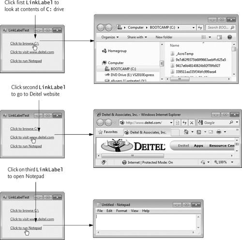
The event handlers for the LinkLabels call method Start of class Process (namespace System.Diagnostics), which allows you to execute other programs, or load documents or web sites from an application. Method Start can take one argument, the file to open, or two arguments, the application to run and its command-line arguments. Method Start’s arguments can be in the same form as if they were provided for input to the Windows Run command (Start > Run...). For applications that are known to Windows, full path names are not needed, and the file extension often can be omitted. To open a file of a type that Windows recognizes (and knows how to handle), simply use the file’s full path name. For example, if you a pass the method a .doc file, Windows will open it in Microsoft Word (or whatever program is registered to open .doc files, if any). The Windows operating system must be able to use the application associated with the given file’s extension to open the file.
The event handler for cDriveLinkLabel’s LinkClicked event browses the C: drive (lines 19–26). Line 23 sets the LinkVisited property to true, which changes the link’s color from blue to purple (the LinkVisited colors can be configured through the Properties window in Visual Studio). The event handler then passes @"C:" to method Start (line 25), which opens a Windows Explorer window. The @ symbol that we placed before "C:" indicates that all characters in the string should be interpreted literally—this is known as a verbatim string. Thus, the backslash within the string is not considered to be the first character of an escape sequence. This simplifies strings that represent directory paths, since you do not need to use \ for each character in the path.
The event handler for deitelLinkLabel’s LinkClicked event (lines 29–36) opens the web page www.deitel.com in the user’s default web browser. We achieve this by passing the web-page address as a string (line 35), which opens the web page in a new web browser window or tab. Line 33 sets the LinkVisited property to true.
The event handler for notepadLinkLabel's LinkClicked event (lines 39–48) opens the Notepad application. Line 43 sets the LinkVisited property to true so that the link appears as a visited link. Line 47 passes the argument "notepad" to method Start, which runs notepad.exe. In line 47, neither the full path nor the .exe extension is required—Windows automatically recognizes the argument given to method Start as an executable file.
The ListBox control allows the user to view and select from multiple items in a list. ListBoxes are static GUI entities, which means that users cannot directly edit the list of items. The user can be provided with TextBoxes and Buttons with which to specify items to be added to the list, but the actual additions must be performed in code. The CheckedListBox control (Section 15.7) extends a ListBox by including CheckBoxes next to each item in the list. This allows users to place checks on multiple items at once, as is possible with CheckBox controls. (Users also can select multiple items from a ListBox by setting the ListBox’s SelectionMode property, which is discussed shortly.) Figure 15.15 displays a ListBox and a CheckedListBox. In both controls, scrollbars appear if the number of items exceeds the ListBox’s viewable area.
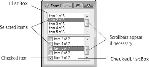
Figure 15.16 lists common ListBox properties and methods and a common event. The SelectionMode property determines the number of items that can be selected. This property has the possible values None, One, MultiSimple and MultiExtended (from the SelectionMode enumeration)—the differences among these settings are explained in Fig. 15.16. The SelectedIndexChanged event occurs when the user selects a new item.
Table 15.16. ListBox properties, methods and an event.
| Description |
|---|---|
Common Properties | |
| The collection of items in the |
| Indicates whether the |
Returns the index of the selected item. If no items have been selected, the property returns | |
| Returns a collection containing the indices for all selected items. |
| Returns a reference to the selected item. If multiple items are selected, it returns the item with the lowest index number. |
| Returns a collection of the selected item(s). |
| Determines the number of items that can be selected and the means through which multiple items can be selected. Values |
| Indicates whether items are sorted alphabetically. Setting this property’s value to |
Common Methods | |
| Deselects every item. |
| Returns |
Common Event | |
| Generated when the selected index changes. This is the default event when the control is double clicked in the designer. |
Both the ListBox and CheckedListBox have properties Items, SelectedItem and SelectedIndex. Property Items returns a collection of the list items. Collections are a common way to manage lists of objects in the .NET framework. Many .NET GUI components (e.g., ListBoxes) use collections to expose lists of internal objects (e.g., items in a ListBox). We discuss collections further in Chapter 23. The collection returned by property Items is represented as an object of type ListBox.ObjectCollection. Property SelectedItem returns the ListBox’s currently selected item. If the user can select multiple items, use collection SelectedItems to return all the selected items as a ListBox.SelectedObjectColection. Property SelectedIndex returns the index of the selected item—if there could be more than one, use property SelectedIndices, which returns a ListBox.SelectedIndexColection. If no items are selected, property SelectedIndex returns -1. Method GetSelected takes an index and returns true if the corresponding item is selected.
To add items to a ListBox or to a CheckedListBox, we must add objects to its Items collection. This can be accomplished by calling method Add to add a string to the ListBox’s or CheckedListBox’s Items collection. For example, we could write
myListBox.Items.Add( myListItem ); |
to add string myListItem to ListBox myListBox. To add multiple objects, you can either call method Add multiple times or call method AddRange to add an array of objects. Classes ListBox and CheckedListBox each call the submitted object’s ToString method to determine the Label for the corresponding object’s entry in the list. This allows you to add different objects to a ListBox or a CheckedListBox that later can be returned through properties SelectedItem and SelectedItems.
Alternatively, you can add items to ListBoxes and CheckedListBoxes visually by examining the Items property in the Properties window. Clicking the ellipsis button opens the String Collection Editor, which contains a text area for adding items; each item appears on a separate line (Fig. 15.17). Visual Studio then writes code to add these strings to the Items collection inside method InitializeComponent.
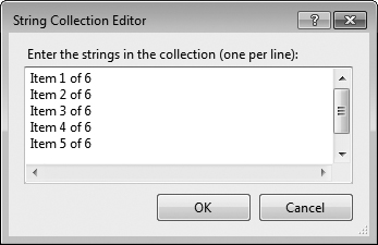
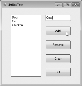
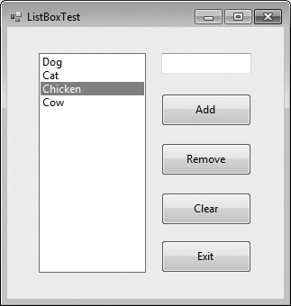
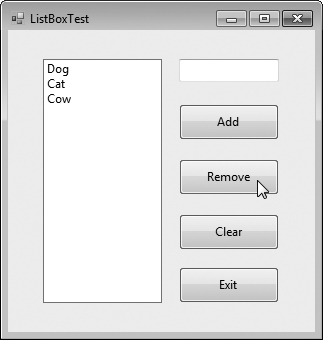
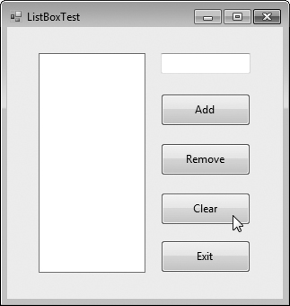
Figure 15.18 uses class ListBoxTestForm to add, remove and clear items from ListBox displayListBox. Class ListBoxTestForm uses TextBox inputTextBox to allow the user to type in a new item. When the user clicks the Add Button, the new item appears in displayListBox. Similarly, if the user selects an item and clicks Remove, the item is deleted. When clicked, Clear deletes all entries in displayListBox. The user terminates the application by clicking Exit.
Example 15.18. Program that adds, removes and clears ListBox items.
 1   // Fig. 15.18: ListBoxTestForm.cs
 2   // Program to add, remove and clear ListBox items
 3   using System;
 4   using System.Windows.Forms;
 5
 6   namespace ListBoxTest
 7   {
 8      // Form uses a TextBox and Buttons to add,
 9      // remove, and clear ListBox items
10      public partial class ListBoxTestForm : Form
11      {
12         // constructor
13         public ListBoxTestForm()
14         {
15            InitializeComponent();
16         } // end constructor
17
18         // add new item to ListBox (text from input TextBox)
19         // and clear input TextBox
20         private void addButton_Click( object sender, EventArgs e )
21         {
22            displayListBox.Items.Add( inputTextBox.Text );
23            inputTextBox.Clear();
24         } // end method addButton_Click
25
26         // remove item if one is selected
27         private void removeButton_Click( object sender, EventArgs e )
28         {
29            // check whether item is selected, remove if
30            if ( displayListBox.SelectedIndex != -1 )
31               displayListBox.Items.RemoveAt(
32                  displayListBox.SelectedIndex );
33         } // end method removeButton_Click
34
35         // clear all items in ListBox
36         private void clearButton_Click( object sender, EventArgs e )
37         {
38            displayListBox.Items.Clear();
39         } // end method clearButton_Click
40
41         // exit application
42         private void exitButton_Click( object sender, EventArgs e )
43         {
44            Application.Exit();
45         } // end method exitButton_Click
46      } // end class ListBoxTestForm
47   } // end namespace ListBoxTest
a)
b)
d)
The addButton_Click event handler (lines 20–24) calls method Add of the Items collection in the ListBox. This method takes a string as the item to add to displayListBox. In this case, the string used is the user input from the inputTextBox (line 22). After the item is added, inputTextBox.Text is cleared (line 23).
The removeButton_Click event handler (lines 27–33) uses method RemoveAt to remove an item from the ListBox. Event handler removeButton_Click first uses property SelectedIndex to determine which index is selected. If SelectedIndex is not –1 (i.e., an item is selected), lines 31–32 remove the item that corresponds to the selected index.
The clearButton_Click event handler (lines 36–39) calls method Clear of the Items collection (line 38). This removes all the entries in displayListBox. Finally, event handler exitButton_Click (lines 42–45) terminates the application by calling method Application.Exit (line 44).
The CheckedListBox control derives from ListBox and displays a CheckBox with each item. Items can be added via methods Add and AddRange or through the String Collection Editor. CheckedListBoxes allow multiple items to be checked, but item selection is more restrictive. The only values for the SelectionMode property are None and One. One allows a single selection, whereas None allows no selections. Because an item must be selected to be checked, you must set the SelectionMode to be One if you wish to allow users to check items. Thus, toggling property SelectionMode between One and None effectively switches between enabling and disabling the user’s ability to check list items. Common properties, a method and an event of CheckedListBoxes appear in Fig. 15.19.
Table 15.19. CheckedListBox properties, a method and an event.
Description | |
|---|---|
Common Properties | (All the |
| Returns the collection of items that are checked as a |
| Returns indices for all checked items as a |
| When |
| Determines whether items can be selected and checked. The possible values are |
Common Method | |
| Takes an index and returns |
Common Event | (Event arguments |
| Generated when an item is checked or unchecked. |
| |
| Indicates whether the current item is checked or unchecked. Possible values are |
| Returns the zero-based index of the item that changed. |
| Specifies the new state of the item. |
Common Programming Error 15.1
The IDE displays an error message if you attempt to set the SelectionMode property to MultiSimple or MultiExtended in the Properties window of a CheckedListBox. If this value is set programmatically, a runtime error occurs.
Event ItemCheck occurs whenever a user checks or unchecks a CheckedListBox item. Event-argument properties CurrentValue and NewValue return CheckState values for the current and new state of the item, respectively. A comparison of these values allows you to determine whether the CheckedListBox item was checked or unchecked. The CheckedListBox control retains the SelectedItems and SelectedIndices properties (it inherits them from class ListBox). However, it also includes properties CheckedItems and CheckedIndices, which return information about the checked items and indices.
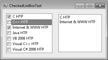
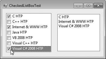
In Fig. 15.20, class CheckedListBoxTestForm uses a CheckedListBox and a ListBox to display a user’s selection of books. The CheckedListBox allows the user to select multiple titles. In the String Collection Editor, items were added for some Deitel books: C, C++, Java™, Internet & WWW, VB 2008, Visual C++ and Visual C# 2008 (the acronym HTP stands for “How to Program”). The ListBox (named displayListBox) displays the user’s selection. In the screenshots accompanying this example, the CheckedListBox appears to the left, the ListBox on the right.
Example 15.20. CheckedListBox and ListBox used in a program to display a user selection.
 1   // Fig. 15.20: CheckedListBoxTestForm.cs
 2   // Using a CheckedListBox to add items to a display ListBox
 3   using System;
 4   using System.Windows.Forms;
 5
 6   namespace CheckedListBoxTest
 7   {
 8      // Form uses a checked ListBox to add items to a display ListBox
 9      public partial class CheckedListBoxTestForm : Form
10      {
11         // constructor
12         public CheckedListBoxTestForm()
13         {
14            InitializeComponent();
15         } // end constructor
16
17         // item about to change
18         // add or remove from display ListBox
19         private void itemCheckedListBox_ItemCheck(
20            object sender, ItemCheckEventArgs e )
21         {
22            // obtain reference of selected item
23            string item = itemCheckedListBox.SelectedItem.ToString();
24
25            // if item checked, add to ListBox
26            // otherwise remove from ListBox
27            if ( e.NewValue == CheckState.Checked )
28               displayListBox.Items.Add( item );
29            else
30               displayListBox.Items.Remove( item );
31         } // end method itemCheckedListBox_ItemCheck
32      } // end class CheckedListBoxTestForm
33   } // end namespace CheckedListBoxTest
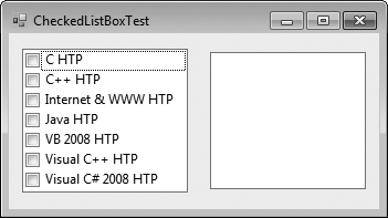
a)

b)
c)
d)
When the user checks or unchecks an item in itemCheckedListBox_ItemCheck, an ItemCheck event occurs and event handler itemCheckedListBox_ItemCheck (lines 19–31) executes. An if...else statement (lines 27–30) determines whether the user checked or unchecked an item in the CheckedListBox. Line 27 uses the NewValue property to determine whether the item is being checked (CheckState.Checked). If the user checks an item, line 28 adds the checked entry to the ListBox displayListBox. If the user unchecks an item, line 30 removes the corresponding item from displayListBox. This event handler was created by selecting the CheckedListBox in Design mode, viewing the control’s events in the Properties window and double clicking the ItemCheck event. The default event for a CheckedListBox is a SelectedIndexChanged event.
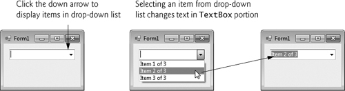
The ComboBox control combines TextBox features with a drop-down list—a GUI component that contains a list from which a value can be selected. A ComboBox usually appears as a TextBox with a down arrow to its right. By default, the user can enter text into the TextBox or click the down arrow to display a list of predefined items. If a user chooses an element from this list, that element is displayed in the TextBox. If the list contains more elements than can be displayed in the drop-down list, a scrollbar appears. The maximum number of items that a drop-down list can display at one time is set by property MaxDropDownItems. Figure 15.21 shows a sample ComboBox in three different states.
As with the ListBox control, you can add objects to collection Items programmatically, using methods Add and AddRange, or visually, with the String Collection Editor. Figure 15.22 lists common properties and a common event of class ComboBox.
Table 15.22. ComboBox properties and an event.
| Description |
|---|---|
Common Properties | |
| Determines the type of |
| The collection of items in the |
Specifies the maximum number of items (between | |
| Returns the index of the selected item, or |
| Returns a reference to the selected item. |
| Indicates whether items are sorted alphabetically. Setting this property’s value to |
Common Event | |
| Generated when the selected index changes (such as when a different item is selected). This is the default event when control is double clicked in the designer. |
Look-and-Feel Observation 15.4
Use a ComboBox to save space on a GUI. A disadvantage is that, unlike with a ListBox, the user cannot see available items without expanding the drop-down list.
Property DropDownStyle determines the type of ComboBox and is represented as a value of the ComboBoxStyle enumeration, which contains values Simple, DropDown and DropDownList. Option Simple does not display a drop-down arrow. Instead, a scrollbar appears next to the control, allowing the user to select a choice from the list. The user also can type in a selection. Style DropDown (the default) displays a drop-down list when the down arrow is clicked (or the down arrow key is pressed). The user can type a new item in the ComboBox. The last style is DropDownList, which displays a drop-down list but does not allow the user to type in the TextBox.
The ComboBox control has properties Items (a collection), SelectedItem and SelectedIndex, which are similar to the corresponding properties in ListBox. There can be at most one selected item in a ComboBox. If no items are selected, then SelectedIndex is -1. When the selected item changes, a SelectedIndexChanged event occurs.
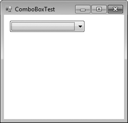
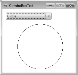
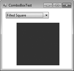
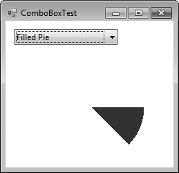
Class ComboBoxTestForm (Fig. 15.23) allows users to select a shape to draw—circle, ellipse, square or pie (in both filled and unfilled versions)—by using a ComboBox. The ComboBox in this example is uneditable, so the user cannot type in the TextBox.
Example 15.23. ComboBox used to draw a selected shape.
 1   // Fig. 15.23: ComboBoxTestForm.cs
 2   // Using ComboBox to select a shape to draw.
 3   using System;
 4   using System.Drawing;
 5   using System.Windows.Forms;
 6
 7   namespace ComboBoxTest
 8   {
 9      // Form uses a ComboBox to select different shapes to draw
10      public partial class ComboBoxTestForm : Form
11      {
12         // constructor
13         public ComboBoxTestForm()
14         {
15            InitializeComponent();
16         } // end constructor
17
18         // get index of selected shape, draw shape
19         private void imageComboBox_SelectedIndexChanged(
20            object sender, EventArgs e )
21         {
22            // create graphics object, Pen and SolidBrush
23            Graphics myGraphics = base.CreateGraphics();
24
25            // create Pen using color DarkRed
26            Pen myPen = new Pen( Color.DarkRed );
27
28            // create SolidBrush using color DarkRed
29            SolidBrush mySolidBrush = new SolidBrush( Color.DarkRed );
30
31            // clear drawing area, setting it to color white
32            myGraphics.Clear( Color.White );
33
34            // find index, draw proper shape
35            switch ( imageComboBox.SelectedIndex )
36            {
37               case 0: // case Circle is selected
38                  myGraphics.DrawEllipse( myPen, 50, 50, 150, 150 );
39                  break;
40               case 1: // case Rectangle is selected
41                  myGraphics.DrawRectangle( myPen, 50, 50, 150, 150 );
42                  break;
43               case 2: // case Ellipse is selected
44                  myGraphics.DrawEllipse( myPen, 50, 85, 150, 115 );
45                  break;
46               case 3: // case Pie is selected
47                  myGraphics.DrawPie( myPen, 50, 50, 150, 150, 0, 45 );
48                  break;
49               case 4: // case Filled Circle is selected
50                  myGraphics.FillEllipse( mySolidBrush, 50, 50, 150, 150 );
51                  break;
52               case 5: // case Filled Rectangle is selected
53                  myGraphics.FillRectangle( mySolidBrush, 50, 50, 150,
54                     150 );
55                  break;
56               case 6: // case Filled Ellipse is selected
57                  myGraphics.FillEllipse( mySolidBrush, 50, 85, 150, 115 );
58                  break;
59               case 7: // case Filled Pie is selected
60                  myGraphics.FillPie( mySolidBrush, 50, 50, 150, 150, 0,
61                     45 );
62                  break;
63            } // end switch
64
65            myGraphics.Dispose(); // release the Graphics object
66         } // end method imageComboBox_SelectedIndexChanged
67      } // end class ComboBoxTestForm
68   } // end namespace ComboBoxTest
b)
c)
d)
Look-and-Feel Observation 15.5
Make lists (such as ComboBoxes) editable only if the program is designed to accept user-submitted elements. Otherwise, the user might try to enter a custom item that is improper for the purposes of your application.
After creating ComboBox imageComboBox, make it uneditable by setting its DropDownStyle to DropDownList in the Properties window. Next, add items Circle, Square, Ellipse, Pie, Filled Circle, Filled Square, Filled Ellipse and Filled Pie to the Items collection using the String Collection Editor. Whenever the user selects an item from imageComboBox, a SelectedIndexChanged event occurs and event handler imageComboBox_SelectedIndexChanged (lines 19–66) executes. Lines 23–29 create a Graphics object, a Pen and a SolidBrush, which are used to draw on the Form. The Graphics object (line 23) allows a pen or brush to draw on a component, using one of several Graphics methods. The Pen object (line 26) is used by methods DrawEllipse, DrawRectangle and DrawPie (lines 38, 41, 44 and 47) to draw the outlines of their corresponding shapes. The SolidBrush object (line 29) is used by methods FillEllipse, FillRectangle and FillPie (lines 50, 53–54, 57 and 60–61) to fill their corresponding solid shapes. Line 32 colors the entire Form White, using Graphics method Clear.
The application draws a shape based on the selected item’s index. The switch statement (lines 35–63) uses imageComboBox.SelectedIndex to determine which item the user selected. Graphics method DrawEllipse (line 38) takes a Pen, and the x- and y-coordinates of the upper-left corner, the width and height of the bounding box in which the ellipse will be displayed. The origin of the coordinate system is in the upper-left corner of the Form; the x-coordinate increases to the right, and the y-coordinate increases downward. A circle is a special case of an ellipse (with the width and height equal). Line 38 draws a circle. Line 44 draws an ellipse that has different values for width and height.
Class Graphics method DrawRectangle (line 41) takes a Pen, the x- and y-coordinates of the upper-left corner and the width and height of the rectangle to draw. Method DrawPie (line 47) draws a pie as a portion of an ellipse. The ellipse is bounded by a rectangle. Method DrawPie takes a Pen, the x- and y- coordinates of the upper-left corner of the rectangle, its width and height, the start angle (in degrees) and the sweep angle (in degrees) of the pie. Angles increase clockwise. The FillEllipse (lines 50 and 57), FillRectangle (line 53–54) and FillPie (line 60–61) methods are similar to their unfilled counterparts, except that they take a Brush (e.g., SolidBrush) instead of a Pen. Some of the drawn shapes are illustrated in the screenshots of Fig. 15.23.
The TreeView control displays nodes hierarchically in a tree. Traditionally, nodes are objects that contain values and can refer to other nodes. A parent node contains child nodes, and the child nodes can be parents to other nodes. Two child nodes that have the same parent node are considered sibling nodes. A tree is a collection of nodes, usually organized in a hierarchical manner. The first parent node of a tree is the root node (a TreeView can have multiple roots). For example, the file system of a computer can be represented as a tree. The top-level directory (perhaps C:) would be the root, each subfolder of C: would be a child node and each child folder could have its own children. TreeView controls are useful for displaying hierarchical information, such as the file structure that we just mentioned. We cover nodes and trees in greater detail in Chapter 21, Data Structures. Figure 15.24 displays a sample TreeView control on a Form.
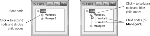
A parent node can be expanded or collapsed by clicking the plus box or minus box to its left. Nodes without children do not have these boxes.
The nodes in a TreeView are instances of class TreeNode. Each TreeNode has a Nodes collection (type TreeNodeCollection), which contains a list of other TreeNodes—known as its children. The Parent property returns a reference to the parent node (or null if the node is a root node). Figure 15.25 and Fig. 15.26 list the common properties of TreeViews and TreeNodes, common TreeNode methods and a common TreeView event.
Table 15.25. TreeView properties and an event.
Description | |
|---|---|
Common Properties | |
| Indicates whether |
| Specifies an |
| Returns the collection of |
| The selected node. |
Common Event (Event arguments | |
| Generated after selected node changes. This is the default event when the control is double clicked in the designer. |
Table 15.26. TreeNode properties and methods.
| Description |
|---|---|
Common Properties | |
| Indicates whether the |
| Specifies the first node in the |
| Indicates the path of the node, starting at the root of the tree. |
| Specifies the index in the |
| Specifies the last node in the |
| Next sibling node. |
| Collection of |
| Previous sibling node. |
| Specifies the index in the |
| Specifies the |
Common Methods | |
| Collapses a node. |
Expands a node. | |
| Expands all the children of a node. |
| Returns the number of child nodes. |
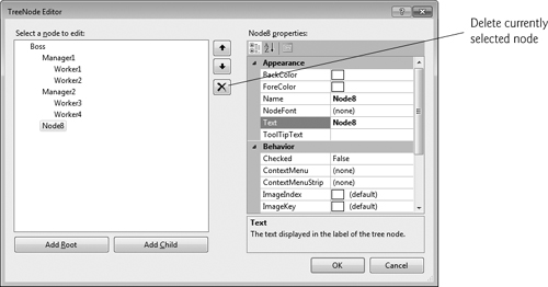
To add nodes to the TreeView visually, click the ellipsis next to the Nodes property in the Properties window. This opens the TreeNode Editor (Fig. 15.27), which displays an empty tree representing the TreeView. There are Buttons to create a root and to add or delete a node. To the right are the properties of current node. Here you can rename the node.
To add nodes programmatically, first create a root node. Create a new TreeNode object and pass it a string to display. Then call method Add to add this new TreeNode to the TreeView’s Nodes collection. Thus, to add a root node to TreeView myTreeView, write
myTreeView.Nodes.Add( new TreeNode( rootLabel) ); |
where myTreeView is the TreeView to which we are adding nodes, and rootLabel is the text to display in myTreeView. To add children to a root node, add new TreeNodes to its Nodes collection. We select the appropriate root node from the TreeView by writing
myTreeView.Nodes[ myIndex ] |
where myIndex is the root node’s index in myTreeView’s Nodes collection. We add nodes to child nodes through the same process by which we added root nodes to myTreeView. To add a child to the root node at index myIndex, write
myTreeView.Nodes[ myIndex].Nodes.Add( new TreeNode( ChildLabel ) ); |
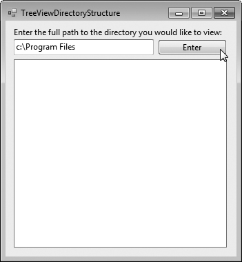
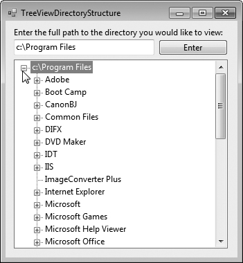
Class TreeViewDirectoryStructureForm (Fig. 15.28) uses a TreeView to display the contents of a directory chosen by the user. A TextBox and a Button are used to specify the directory. First, enter the full path of the directory you want to display. Then click the Button to set the specified directory as the root node in the TreeView. Each subdirectory of this directory becomes a child node. This layout is similar to that used in Windows Explorer. Folders can be expanded or collapsed by clicking the plus or minus boxes that appear to their left.
Example 15.28. TreeView used to display directories.
 1   // Fig. 15.28: TreeViewDirectoryStructureForm.cs
 2   // Using TreeView to display directory structure.
 3   using System;
 4   using System.Windows.Forms;
 5   using System.IO;
 6
 7   namespace TreeViewDirectoryStructure
 8   {
 9      // Form uses TreeView to display directory structure
10      public partial class TreeViewDirectoryStructureForm : Form
11      {
12         string substringDirectory; // store last part of full path name
13
14         // constructor
15         public TreeViewDirectoryStructureForm()
16         {
17            InitializeComponent();
18         } // end constructor
19
20         // populate current node with subdirectories
21         public void PopulateTreeView(
22             string directoryValue, TreeNode parentNode )
23         {
24            // array stores all subdirectories in the directory
25            string[] directoryArray =
26               Directory.GetDirectories( directoryValue );
27
28            // populate current node with subdirectories
29            try
30            {
31               // check to see if any subdirectories are present
32               if ( directoryArray.Length != 0 )
33               {
34                  // for every subdirectory, create new TreeNode,
35                  // add as a child of current node and recursively
36                  // populate child nodes with subdirectories
37                  foreach ( string directory in directoryArray )
38                  {
39                     // obtain last part of path name from the full path
40                     // name by calling the GetFileNameWithoutExtension
41                     // method of class Path
42                     substringDirectory =
43                        Path.GetFileNameWithoutExtension( directory );
44
45                     // create TreeNode for current directory
46                     TreeNode myNode = new TreeNode( substringDirectory );
47
48                     // add current directory node to parent node
49                     parentNode.Nodes.Add( myNode );
50
51                     // recursively populate every subdirectory
52                     PopulateTreeView( directory, myNode );
53                  } // end foreach
54               } // end if
55            } //end try
56
57            // catch exception
58            catch ( UnauthorizedAccessException )
59            {
60               parentNode.Nodes.Add( "Access denied" );
61            } // end catch
62         } // end method PopulateTreeView
63
64         // handles enterButton click event
65         private void enterButton_Click( object sender, EventArgs e )
66         {
67            // clear all nodes
68            directoryTreeView.Nodes.Clear();
69
70            // check if the directory entered by user exists
71            // if it does, then fill in the TreeView,
72            // if not, display error MessageBox
73            if ( Directory.Exists( inputTextBox.Text ) )
74            {
75               // add full path name to directoryTreeView
76               directoryTreeView.Nodes.Add( inputTextBox.Text );
77
78               // insert subfolders
79               PopulateTreeView(
80                  inputTextBox.Text, directoryTreeView.Nodes[ 0 ] );
81            }
82            // display error MessageBox if directory not found
83            else
84               MessageBox.Show( inputTextBox.Text + " could not be found.",
85                  "Directory Not Found", MessageBoxButtons.OK,
86                  MessageBoxIcon.Error );
87         } // end method enterButton_Click
88      } // end class TreeViewDirectoryStructureForm
89   } // end namespace TreeViewDirectoryStructure
b)
When the user clicks the enterButton, all the nodes in directoryTreeView are cleared (line 68). Then, if the directory exists (line 73), the path entered in inputTextBox is used to create the root node. Line 76 adds the directory to directoryTreeView as the root node, and lines 79–80 call method PopulateTreeView (lines 21–62), which takes a directory (a string) and a parent node. Method PopulateTreeView then creates child nodes corresponding to the subdirectories of the directory it receives as an argument.
Method PopulateTreeView (lines 21–62) obtains a list of subdirectories, using method GetDirectories of class Directory (namespace System.IO) in lines 25–26. Method GetDirectories takes a string (the current directory) and returns an array of strings (the subdirectories). If a directory is not accessible for security reasons, an UnauthorizedAccessException is thrown. Lines 58–61 catch this exception and add a node containing “Access denied” instead of displaying the subdirectories.
If there are accessible subdirectories, lines 42–43 use method GetFileNameWithoutExtension of class Path to increase readability by shortening the full path name to just the directory name. The Path class provides functionality for working with strings that are file or directory paths. Next, each string in the directoryArray is used to create a new child node (line 46). We use method Add (line 49) to add each child node to the parent. Then method PopulateTreeView is called recursively on every subdirectory (line 52), which eventually populates the TreeView with the entire directory structure. Our recursive algorithm may cause a delay when the program loads large directories. However, once the folder names are added to the appropriate Nodes collection, they can be expanded and collapsed without delay. In the next section, we present an alternate algorithm to solve this problem.
The ListView control is similar to a ListBox in that both display lists from which the user can select one or more items (an example of a ListView can be found in Fig. 15.31). ListView is more versatile and can display items in different formats. For example, a ListView can display icons next to the list items (controlled by its SmallImageList, LargeImageList or StateImageList properties) and show the details of items in columns. Property MultiSelect (a bool) determines whether multiple items can be selected. CheckBoxes can be included by setting property CheckBoxes (a bool) to true, making the ListView’s appearance similar to that of a CheckedListBox. The View property specifies the layout of the ListBox. Property Activation determines the method by which the user selects a list item. The details of these properties and the ItemActivate event are explained in Fig. 15.29.
Table 15.29. ListView properties and events.
Description | |
|---|---|
Common Properties | |
| Determines how the user activates an item. This property takes a value in the |
| Indicates whether items appear with |
| Specifies the |
| Returns the collection of |
| Determines whether multiple selection is allowed. The default is |
| Returns the collection of selected items as a |
| Specifies the |
| Determines appearance of |
Common Events | |
| Generated when an item is clicked. This is the default event. |
| Generated when an item in the |
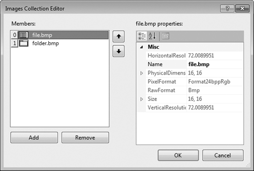
ListView allows you to define the images used as icons for ListView items. To display images, an ImageList component is required. Create one by dragging it to a Form from the ToolBox. Then, select the Images property in the Properties window to display the Image Collection Editor (Fig. 15.30). Here you can browse for images that you wish to add to the ImageList, which contains an array of Images. Adding images this way embeds them into the application (like resources), so they do not need to be included separately with the published application. They’re not however part of the project. In this example, we added images to the ImageList programmatically rather than using the Image Collection Editor so that we could use image resources. After creating an empty ImageList, add the file and folder icon images to the project as resources. Next, set property SmallImageList of the ListView to the new ImageList object. Property SmallImageList specifies the image list for the small icons. Property LargeImageList sets the ImageList for large icons. The items in a ListView are each of type ListViewItem. Icons for the ListView items are selected by setting the item’s ImageIndex property to the appropriate index.
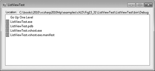
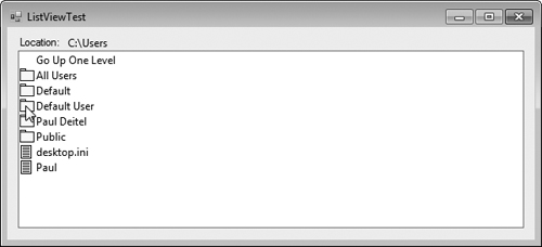
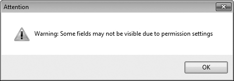
Class ListViewTestForm (Fig. 15.31) displays files and folders in a ListView, along with small icons representing each file or folder. If a file or folder is inaccessible because of permission settings, a MessageBox appears. The program scans the contents of the directory as it browses, rather than indexing the entire drive at once.
Example 15.31. ListView displaying files and folders.
 1   // Fig. 15.31: ListViewTestForm.cs
 2   // Displaying directories and their contents in ListView.
 3   using System;
 4   using System.Windows.Forms;
 5   using System.IO;
 6
 7   namespace ListViewTest
 8   {
 9      // Form contains a ListView which displays
10      // folders and files in a directory
11      public partial class ListViewTestForm : Form
12      {
13         // store current directory
14         string currentDirectory = Directory.GetCurrentDirectory();
15
16         // constructor
17         public ListViewTestForm()
18         {
19            InitializeComponent();
20         } // end constructor
21
22         // browse directory user clicked or go up one level
23         private void browserListView_Click( object sender, EventArgs e )
24         {
25            // ensure an item is selected
26            if ( browserListView.SelectedItems.Count != 0 )
27            {
28               // if first item selected, go up one level
29               if ( browserListView.Items[ 0 ].Selected )
30               {
31                  // create DirectoryInfo object for directory
32                  DirectoryInfo directoryObject =
33                     new DirectoryInfo( currentDirectory );
34
35                  // if directory has parent, load it
36                  if ( directoryObject.Parent != null )
37                  {
38                     LoadFilesInDirectory(
39                        directoryObject.Parent.FullName );
40                  } // end if
41               } // end if
42
43               // selected directory or file
44               else
45               {
46                  // directory or file chosen
47                  string chosen = browserListView.SelectedItems[ 0 ].Text;
48
49                  // if item selected is directory, load selected directory
50                  if ( Directory.Exists(
51                     Path.Combine( currentDirectory, chosen ) ) )
52                  {
53                     LoadFilesInDirectory(
54                        Path.Combine( currentDirectory, chosen ) );
55                  } // end if
56               } // end else
57
58               // update displayLabel
59               displayLabel.Text = currentDirectory;
60            } // end if
61         } // end method browserListView_Click
62
63         // display files/subdirectories of current directory
64         public void LoadFilesInDirectory( string currentDirectoryValue )
65         {
66            // load directory information and display
67            try
68            {
69               // clear ListView and set first item
70               browserListView.Items.Clear();
71               browserListView.Items.Add( "Go Up One Level" );
72
73               // update current directory
74               currentDirectory = currentDirectoryValue;
75               DirectoryInfo newCurrentDirectory =
76                  new DirectoryInfo( currentDirectory );
77
78               // put files and directories into arrays
79               DirectoryInfo[] directoryArray =
80                  newCurrentDirectory.GetDirectories();
81               FileInfo[] fileArray = newCurrentDirectory.GetFiles();
82
83               // add directory names to ListView
84               foreach ( DirectoryInfo dir in directoryArray )
85               {
86                  // add directory to ListView
87                  ListViewItem newDirectoryItem =
88                     browserListView.Items.Add( dir.Name );
89
90                  newDirectoryItem.ImageIndex = 0;  // set directory image
91               } // end foreach
92
93               // add file names to ListView
94               foreach ( FileInfo file in fileArray )
95               {
96                  // add file to ListView
97                  ListViewItem newFileItem =
98                     browserListView.Items.Add( file.Name );
99
100                 newFileItem.ImageIndex = 1; // set file image
101              } // end foreach
102           } // end try
103
104           // access denied
105           catch ( UnauthorizedAccessException )
106           {
107              MessageBox.Show( "Warning: Some fields may not be " +
108                 "visible due to permission settings",
109                 "Attention", 0, MessageBoxIcon.Warning );
110           } // end catch
111        } // end method LoadFilesInDirectory
112
113        // handle load event when Form displayed for first time
114        private void ListViewTestForm_Load( object sender, EventArgs e )
115        {
116           // add icon images to ImageList
117           fileFolderImageList.Images.Add( Properties.Resources.folder );
118           fileFolderImageList.Images.Add( Properties.Resources.file );
119
120           // load current directory into browserListView
121           LoadFilesInDirectory( currentDirectory );
122           displayLabel.Text = currentDirectory;
123        } // end method ListViewTestForm_Load
124     } // end class ListViewTestForm
125  } // end namespace ListViewTest
b)
c)
Method ListViewTestForm_Load (lines 114–123) handles the Form’s Load event. When the application loads, the folder and file icon images are added to the Images collection of fileFolderImageList (lines 117–118). Since the ListView’s SmallImageList property is set to this ImageList, the ListView can display these images as icons for each item. Because the folder icon was added first, it has array index 0, and the file icon has array index 1. The application also loads its home directory (obtained at line 14) into the ListView when it first loads (line 121) and displays the directory path (line 122).
The LoadFilesInDirectory method (lines 64–111) populates browserListView with the directory passed to it (currentDirectoryValue). It clears browserListView and adds the element "Go Up One Level". When the user clicks this element, the program attempts to move up one level (we see how shortly). The method then creates a DirectoryInfo object initialized with the string currentDirectory (lines 75–76). If permission is not given to browse the directory, an exception is thrown (and caught in line 105). Method LoadFilesInDirectory works differently from method PopulateTreeView in the previous program (Fig. 15.28). Instead of loading all the folders on the hard drive, method LoadFilesInDirectory loads only the folders in the current directory.
Class DirectoryInfo (namespace System.IO) enables us to browse or manipulate the directory structure easily. Method GetDirectories (line 80) returns an array of DirectoryInfo objects containing the subdirectories of the current directory. Similarly, method GetFiles (line 81) returns an array of class FileInfo objects containing the files in the current directory. Property Name (of both class DirectoryInfo and class FileInfo) contains only the directory or file name, such as temp instead of C:myfolder emp. To access the full name, use property FullName.
Lines 84–91 and lines 94–101 iterate through the subdirectories and files of the current directory and add them to browserListView. Lines 90 and 100 set the ImageIndex properties of the newly created items. If an item is a directory, we set its icon to a directory icon (index 0); if an item is a file, we set its icon to a file icon (index 1).
Method browserListView_Click (lines 23–61) responds when the user clicks control browserListView. Line 26 checks whether anything is selected. If a selection has been made, line 29 determines whether the user chose the first item in browserListView. The first item in browserListView is always Go Up One Level; if it is selected, the program attempts to go up a level. Lines 32–33 create a DirectoryInfo object for the current directory. Line 36 tests property Parent to ensure that the user is not at the root of the directory tree. Property Parent indicates the parent directory as a DirectoryInfo object; if no parent directory exists, Parent returns the value null. If a parent directory does exist, lines 38–39 pass the parent directory’s full name to LoadFilesInDirectory.
If the user did not select the first item in browserListView, lines 44–56 allow the user to continue navigating through the directory structure. Line 47 creates string chosen and assigns it the text of the selected item (the first item in collection SelectedItems). Lines 50–51 determine whether the user selected a valid directory (rather than a file). Using the Combine method of class Path, the program combines strings currentDirectory and chosen to form the new directory path. The Combine method automatically adds a backslash (), if necessary, between the two pieces. This value is passed to the Exists method of class Directory. Method Exists returns true if its string parameter is a valid directory. If so, the program passes the string to method LoadFilesInDirectory (lines 53–54). Finally, displayLabel is updated with the new directory (line 59).
This program loads quickly, because it indexes only the files in the current directory. A small delay may occur when a new directory is loaded. In addition, changes in the directory structure can be shown by reloading a directory. The previous program (Fig. 15.28) may have a large initial delay, as it loads an entire directory structure. This type of tradeoff is typical in the software world.
Software Engineering Observation 15.2

When designing applications that run for long periods of time, you might choose a large initial delay to improve performance throughout the rest of the program. However, in applications that run for only short periods, developers often prefer fast initial loading times and small delays after each action.
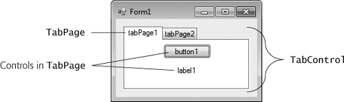
The TabControl creates tabbed windows, such as those in Visual Studio (Fig. 15.32). This enables you to specify more information in the same space on a Form and group displayed data logically. TabControls contain TabPage objects, which are similar to Panels and GroupBoxes in that TabPages also can contain controls. You first add controls to the TabPage objects, then add the TabPages to the TabControl. Only one TabPage is displayed at a time. To add objects to the TabPage and the TabControl, write
myTabPage.Controls.Add( myControl ); myTabControl.TabPages.Add( myTabPage ); |
The preceding statements call method Add of the Controls collection and method Add of the TabPages collection. The example adds TabControl myControl to TabPage myTab-Page, then adds myTabPage to myTabControl. Alternatively, we can use method AddRange to add an array of TabPages or controls to a TabControl or TabPage, respectively. Figure 15.33 depicts a sample TabControl.
You can add TabControls visually by dragging and dropping them onto a Form in Design mode. To add TabPages in Design mode, right click the TabControl and select Add Tab (Fig. 15.34). Alternatively, click the TabPages property in the Properties window and add tabs in the dialog that appears. To change a tab label, set the Text property of the TabPage. Clicking the tabs selects the TabControl—to select the TabPage, click the control area underneath the tabs. You can add controls to the TabPage by dragging and dropping items from the ToolBox. To view different TabPages, click the appropriate tab (in either design or run mode). Common properties and a common event of TabControls are described in Fig. 15.35.
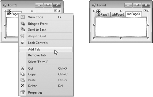
Table 15.35. TabControl properties and an event.
Description | |
|---|---|
Common Properties | |
| Specifies images to be displayed on tabs. |
| Specifies the tab size. |
| Indicates whether multiple rows of tabs can be displayed. |
| Index of the selected |
| The selected |
| Returns the number of tab pages. |
| Returns the collection of |
Common Event | |
| Generated when |
Each TabPage generates a Click event when its tab is clicked. Event handlers for this event can be created by double clicking the body of the TabPage.
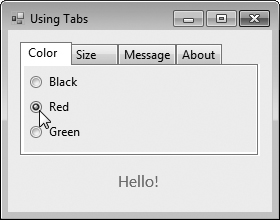
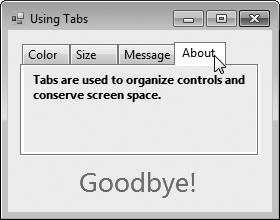
Class UsingTabsForm (Fig. 15.36) uses a TabControl to display various options relating to the text on a label (Color, Size and Message). The last TabPage displays an About message, which describes the use of TabControls.
Example 15.36. TabControl used to display various font settings.
 1   // Fig. 15.36: UsingTabsForm.cs
 2   // Using TabControl to display various font settings.
 3   using System;
 4   using System.Drawing;
 5   using System.Windows.Forms;
 6
 7   namespace UsingTabs
 8   {
 9      // Form uses Tabs and RadioButtons to display various font settings
10      public partial class UsingTabsForm : Form
11      {
12         // constructor
13         public UsingTabsForm()
14         {
15            InitializeComponent();
16         } // end constructor
17
18         // event handler for Black RadioButton
19         private void blackRadioButton_CheckedChanged(
20            object sender, EventArgs e )
21         {
22            displayLabel.ForeColor = Color.Black; // change color to black
23         } // end method blackRadioButton_CheckedChanged
24
25         // event handler for Red RadioButton
26         private void redRadioButton_CheckedChanged(
27            object sender, EventArgs e )
28         {
29            displayLabel.ForeColor = Color.Red; // change color to red
30         } // end method redRadioButton_CheckedChanged
31
32         // event handler for Green RadioButton
33         private void greenRadioButton_CheckedChanged(
34            object sender, EventArgs e )
35         {
36            displayLabel.ForeColor = Color.Green; // change color to green
37         } // end method greenRadioButton_CheckedChanged
38
39         // event handler for 12 point RadioButton
40         private void size12RadioButton_CheckedChanged(
41            object sender, EventArgs e )
42         {
43            // change font size to 12
44            displayLabel.Font = new Font( displayLabel.Font.Name, 12 );
45        } // end method size12RadioButton_CheckedChanged
46
47         // event handler for 16 point RadioButton
48         private void size16RadioButton_CheckedChanged(
49            object sender, EventArgs e )
50         {
51            // change font size to 16
52            displayLabel.Font = new Font( displayLabel.Font.Name, 16 );
53         } // end method size16RadioButton_CheckedChanged
54
55         // event handler for 20 point RadioButton
56         private void size20RadioButton_CheckedChanged(
57            object sender, EventArgs e )
58         {
59            // change font size to 20
60            displayLabel.Font = new Font( displayLabel.Font.Name, 20 );
61         } // end method size20RadioButton_CheckedChanged
62
63         // event handler for Hello! RadioButton
64         private void helloRadioButton_CheckedChanged(
65            object sender, EventArgs e )
66         {
67            displayLabel.Text = "Hello!"; // change text to Hello!
68         } // end method helloRadioButton_CheckedChanged
69
70         // event handler for Goodbye! RadioButton
71         private void goodbyeRadioButton_CheckedChanged(
72            object sender, EventArgs e )
73         {
74            displayLabel.Text = "Goodbye!"; // change text to Goodbye!
75         } // end method goodbyeRadioButton_CheckedChanged
76      } // end class UsingTabsForm
77   } // end namespace UsingTabs
a)
b)
c)
d)
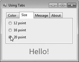
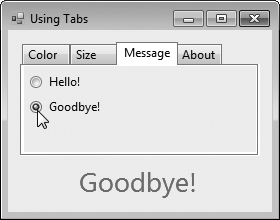
The textOptionsTabControl and the colorTabPage, sizeTabPage, messageTabPage and aboutTabPage are created in the designer (as described previously). The colorTabPage contains three RadioButtons for the colors black (blackRadioButton), red (redRadioButton) and green (greenRadioButton). This TabPage is displayed in Fig. 15.36(a). The CheckedChanged event handler for each RadioButton updates the color of the text in displayLabel (lines 22, 29 and 36). The sizeTabPage (Fig. 15.36(b)) has three RadioButtons, corresponding to font sizes 12 (size12RadioButton), 16 (size16RadioButton) and 20 (size20RadioButton), which change the font size of displayLabel—lines 44, 52 and 60, respectively. The messageTabPage (Fig. 15.36(c)) contains two RadioButtons for the messages Hello! (helloRadioButton) and Goodbye! (goodbyeRadioButton). The two RadioButtons determine the text on displayLabel (lines 67 and 74, respectively). The aboutTabPage (Fig. 15.36(d)) contains a Label (messageLabel) describing the purpose of TabControls.
In previous chapters, we have built only single document interface (SDI) applications. Such programs (including Microsoft’s Notepad and Paint) can support only one open window or document at a time. SDI applications usually have limited abilities—Paint and Notepad, for example, have limited image- and text-editing features. To edit multiple documents, the user must execute another instance of the SDI application.
Many complex applications are multiple document interface (MDI) programs, which allow users to edit multiple documents at once (e.g., Microsoft Office products). MDI programs also tend to be more complex—Paint Shop Pro and Photoshop have a greater number of image-editing features than does Paint.
An MDI program’s main window is called the parent window, and each window inside the application is referred to as a child window. Although an MDI application can have many child windows, each has only one parent window. Furthermore, a maximum of one child window can be active at once. Child windows cannot be parents themselves and cannot be moved outside their parent. Otherwise, a child window behaves like any other window (with regard to closing, minimizing, resizing, and so on). A child window’s functionality can differ from that of other child windows of the parent. For example, one child window might allow the user to edit images, another might allow the user to edit text and a third might display network traffic graphically, but all could belong to the same MDI parent. Figure 15.37 depicts a sample MDI application with two child windows.
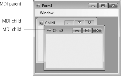
To create an MDI Form, create a new Form and set its IsMdiContainer property to true. The Form changes appearance, as in Fig. 15.38. Next, create a child Form class to be added to the Form. To do this, right click the project in the Solution Explorer, select Project > Add Windows Form... and name the file. Edit the Form as you like. To add the child Form to the parent, we must create a new child Form object, set its MdiParent property to the parent Form and call the child Form’s Show method. In general, to add a child Form to a parent, write
ChildFormClass childForm = New ChildFormClass(); childForm.MdiParent = parentForm; childForm.Show(); |
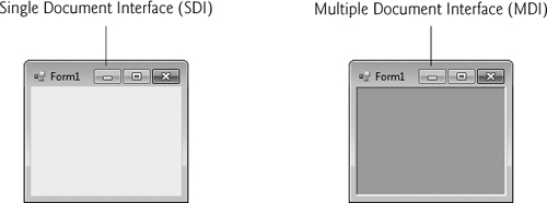
In most cases, the parent Form creates the child, so the parentForm reference is this. The code to create a child usually lies inside an event handler, which creates a new window in response to a user action. Menu selections (such as File, followed by a submenu option of New, followed by a submenu option of Window) are common techniques for creating new child windows.
Class Form property MdiChildren returns an array of child Form references. This is useful if the parent window wants to check the status of all its children (for example, ensuring that all are saved before the parent closes). Property ActiveMdiChild returns a reference to the active child window; it returns null if there are no active child windows. Other features of MDI windows are described in Fig. 15.39.
Table 15.39. MDI parent and MDI child properties, a method and an event.
MDI | Description |
|---|---|
Common MDI Child Properties | |
| Indicates whether the |
| Specifies the MDI parent |
Common MDI Parent Properties | |
| Returns the |
| Indicates whether a |
| Returns the MDI children as an array of |
| Determines the display of child forms on an MDI parent. The method takes as a parameter an |
Common Event | |
| Generated when an MDI child is closed or activated. |
Child windows can be minimized, maximized and closed independently of the parent window. Figure 15.40 shows two images: one containing two minimized child windows and a second containing a maximized child window. When the parent is minimized or closed, the child windows are minimized or closed as well. Notice that the title bar in Fig. 15.40(b) is Form1 - [Child1]. When a child window is maximized, its title-bar text is inserted into the parent window’s title bar. When a child window is minimized or maximized, its title bar displays a restore icon, which can be used to return the child window to its previous size (its size before it was minimized or maximized).
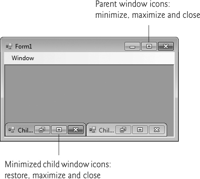
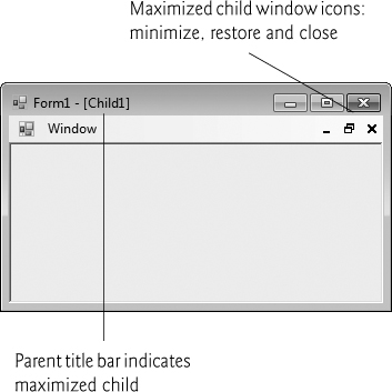
C# provides a property that helps track which child windows are open in an MDI container. Property MdiWindowListItem of class MenuStrip specifies which menu, if any, displays a list of open child windows that the user can select to bring the corresponding window to the foreground. When a new child window is opened, an entry is added to the end of the list (Fig. 15.41). If ten or more child windows are open, the list includes the option More Windows..., which allows the user to select a window from a list in a dialog.
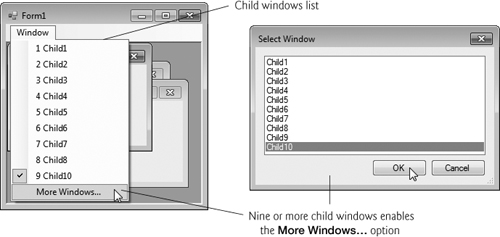
Good Programming Practice 15.1
When creating MDI applications, include a menu that displays a list of the open child windows. This helps the user select a child window quickly, rather than having to search for it in the parent window.
MDI containers allow you to organize the placement of its child windows. The child windows in an MDI application can be arranged by calling method LayoutMdi of the parent Form. Method LayoutMdi takes an MdiLayout enumeration, which can have values ArrangeIcons, Cascade, TileHorizontal and TileVertical. Tiled windows completely fill the parent and do not overlap; such windows can be arranged horizontally (value TileHorizontal) or vertically (value TileVertical). Cascaded windows (value Cascade) overlap—each is the same size and displays a visible title bar, if possible. Value ArrangeIcons arranges the icons for any minimized child windows. If minimized windows are scattered around the parent window, value ArrangeIcons orders them neatly at the bottom-left corner of the parent window. Figure 15.42 illustrates the values of the MdiLayout enumeration.
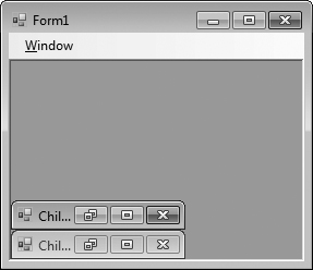
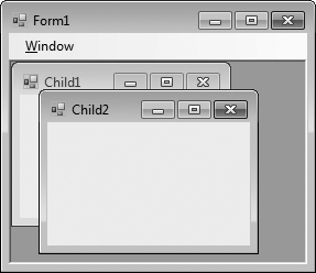
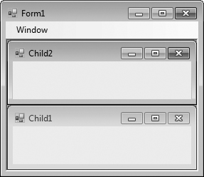
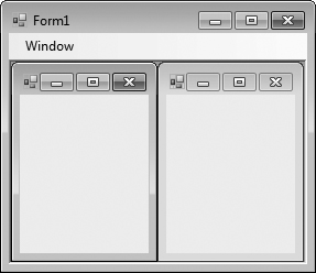
Class UsingMDIForm (Fig. 15.43) demonstrates MDI windows. Class UsingMDIForm uses three instances of child Form ChildForm (Fig. 15.44), each containing a PictureBox that displays an image. The parent MDI Form contains a menu enabling users to create and arrange child Forms.
Example 15.43. MDI parent-window class.
 1   // Fig. 15.43: UsingMDIForm.cs
 2   // Demonstrating use of MDI parent and child windows.
 3   using System;
 4   using System.Windows.Forms;
 5
 6   namespace UsingMDI
 7   {
 8      // Form demonstrates the use of MDI parent and child windows
 9      public partial class UsingMDIForm : Form
10      {
11         // constructor
12         public UsingMDIForm()
13         {
14            InitializeComponent();
15         } // end constructor
16
17         // create Lavender Flowers image window
18         private void lavenderToolStripMenuItem_Click(
19            object sender, EventArgs e )
20         {
21            // create new child
22            ChildForm child = new ChildForm(
23                "Lavender Flowers", "lavenderflowers" );
24            child.MdiParent = this; // set parent
25            child.Show(); // display child
26         } // end method lavenderToolStripMenuItem_Click
27
28         // create Purple Flowers image window
29         private void purpleToolStripMenuItem_Click(
30            object sender, EventArgs e )
31         {
32            // create new child
33            ChildForm child = new ChildForm(
34                "Purple Flowers", "purpleflowers" );
35            child.MdiParent = this; // set parent
36            child.Show(); // display child
37         } // end method purpleToolStripMenuItem_Click
38
39         // create Yellow Flowers image window
40         private void yellowToolStripMenuItem_Click(
41            object sender, EventArgs e )
42         {
43            // create new child
44            Child child = new ChildForm(
45                "Yellow Flowers", "yellowflowers" );
46            child.MdiParent = this; // set parent
47            child.Show(); // display child
48         } // end method yellowToolStripMenuItem_Click
49
50         // exit application
51         private void exitToolStripMenuItem_Click(
52            object sender, EventArgs e )
53         {
54            Application.Exit();
55         } // end method exitToolStripMenuItem_Click
56
57         // set Cascade layout
58         private void cascadeToolStripMenuItem_Click(
59            object sender, EventArgs e )
60         {
61            this.LayoutMdi( MdiLayout.Cascade );
62         } // end method cascadeToolStripMenuItem_Click
63
64         // set TileHorizontal layout
65         private void tileHorizontalToolStripMenuItem_Click(
66            object sender, EventArgs e )
67         {
68            this.LayoutMdi( MdiLayout.TileHorizontal );
69         } // end method tileHorizontalToolStripMenuItem
70
71         // set TileVertical layout
72         private void tileVerticalToolStripMenuItem_Click(
73            object sender, EventArgs e )
74         {
75            this.LayoutMdi( MdiLayout.TileVertical );
76         } // end method tileVerticalToolStripMenuItem_Click
77      } // end class UsingMDIForm
78   } // end namespace UsingMDI
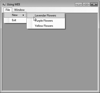
a)
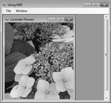
b)
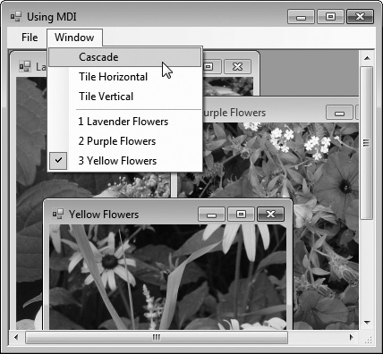
c)
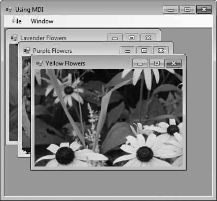
d)
Example 15.44. MDI child ChildForm.
 1   // Fig. 15.44: ChildForm.cs
 2   // Child window of MDI parent.
 3   using System;
 4   using System.Drawing;
 5   using System.Windows.Forms;
 6
 7   namespace UsingMDI
 8   {
 9      public partial class ChildForm : Form
10      {
11         public ChildForm( string title, string resourceName )
12         {
13            // Required for Windows Form Designer support
14            InitializeComponent();
15
16            Text = title; // set title text
17
18            // set image to display in PictureBox
19            displayPictureBox.Image =
20               ( Image ) ( Properties.Resources.ResourceManager.GetObject(
21                  resourceName );
22         } // end constructor
23      } // end class ChildForm
24   } // end namespace UsingMDI
Figure 15.43 presents class UsingMDIForm—the application’s MDI parent Form. This Form, which is created first, contains two top-level menus. The first of these menus, File (fileToolStripMenuItem), contains both an Exit item (exitToolStripMenuItem) and a New submenu (newToolStripMenuItem) consisting of items for each child window. The second menu, Window (windowToolStripMenuItem), provides options for laying out the MDI children, plus a list of the active MDI children.
In the Properties window, we set the Form’s IsMdiContainer property to true, making the Form an MDI parent. In addition, we set the MenuStrip’s MdiWindowListItem property to windowToolStripMenuItem. This enables the Window menu to contain the list of child MDI windows.
The Cascade menu item (cascadeToolStripMenuItem) has an event handler (cascadeToolStripMenuItem_Click, lines 58–62) that arranges the child windows in a cascading manner. The event handler calls method LayoutMdi with the argument Cascade from the MdiLayout enumeration (line 61).
The Tile Horizontal menu item (tileHorizontalToolStripMenuItem) has an event handler (tileHorizontalToolStripMenuItem_Click, lines 65–69) that arranges the child windows in a horizontal manner. The event handler calls method LayoutMdi with the argument TileHorizontal from the MdiLayout enumeration (line 68).
Finally, the Tile Vertical menu item (tileVerticalToolStripMenuItem) has an event handler (tileVerticalToolStripMenuItem_Click, lines 72–76) that arranges the child windows in a vertical manner. The event handler calls method LayoutMdi with the argument TileVertical from the MdiLayout enumeration (line 75).
At this point, the application is still incomplete—we must define the MDI child class. To do this, right click the project in the Solution Explorer and select Add > Windows Form.... Then name the new class in the dialog as ChildForm (Fig. 15.44). Next, we add a PictureBox (displayPictureBox) to ChildForm. In ChildForm’s constructor, line 16 sets the title-bar text. Lines 19–21 retrieve the appropriate image resource, cast it to an Image and set displayPictureBox’s Image property. The images that are used can be found in the Images subfolder of this chapter’s examples directory.
After the MDI child class is defined, the parent MDI Form (Fig. 15.43) can create new child windows. The event handlers in lines 18–48 create a new child Form corresponding to the menu item clicked. Lines 22–23, 33–34 and 44–45 create new instances of ChildForm. Lines 24, 35 and 46 set each Child’s MdiParent property to the parent Form. Lines 25, 36 and 47 call method Show to display each child Form.
Chapter 11 discussed how to create classes by inheriting from other classes. We have also used inheritance to create Forms that display a GUI, by deriving our new Form classes from class System.Windows.Forms.Form. This is an example of visual inheritance. The derived Form class contains the functionality of its Form base class, including any base-class properties, methods, variables and controls. The derived class also inherits all visual aspects—such as sizing, component layout, spacing between GUI components, colors and fonts—from its base class.
Visual inheritance enables you to achieve visual consistency across applications. For example, you could define a base Form that contains a product’s logo, a specific background color, a predefined menu bar and other elements. You then could use the base Form throughout an application for uniformity and branding. You can also create controls that inherit from other controls. For example, you might create a custom UserControl (discussed in Section 15.14) that is derived from an existing control.
Class VisualInheritanceBaseForm (Fig. 15.45) derives from Form. The output depicts the workings of the program. The GUI contains two Labels with text Bugs, Bugs, Bugs and Copyright 2010, by Deitel & Associates, Inc., as well as one Button displaying the text Learn More. When a user presses the Learn More Button, method learnMoreButton_Click (lines 18–24) is invoked. This method displays a MessageBox that provides some informative text.
Example 15.45. Class VisualInheritanceBaseForm, which inherits from class Form, contains a Button (Learn More).
 1   // Fig. 15.45: VisualInheritanceBaseForm.cs
 2   // Base Form for use with visual inheritance.
 3   using System;
 4   using System.Windows.Forms;
 5
 6   namespace VisualInheritanceBase
 7   {
 8      // base Form used to demonstrate visual inheritance
 9      public partial class VisualInheritanceBaseForm : Form
10      {
11         // constructor
12         public VisualInheritanceForm()
13         {
14            InitializeComponent();
15         } // end constructor
16
17         // display MessageBox when Button is clicked
18         private void learnMoreButton_Click( object sender, EventArgs e )
19         {
20            MessageBox.Show(
21               "Bugs, Bugs, Bugs is a product of deitel.com",
22               "Learn More", MessageBoxButtons.OK,
23               MessageBoxIcon.Information );
24         } // end method learnMoreButton_Click
25      } // end class VisualInheritanceBaseForm
26   } // end namespace VisualInheritanceBase
Before a Form (or any class) can be used in multiple applications, it must be placed in a class library to make it reusable. The steps for creating a reusable class are:
Declare a
publicclass. If the class is notpublic, it can be used only by other classes in the same assembly—that is, compiled into the same DLL or EXE file.Choose a namespace name and add a
namespacedeclaration to the source-code file for the reusable class declaration.Compile the class into a class library.
Add a reference to the class library in an application.
Use the class.
Let’s take a look at these steps in the context of this example
For Step 1 in this discussion, we use the public class VisualInheritanceBaseForm declared in Fig. 15.45. By default, every new Form class you create is declares as a public class.
For Step 2, we use the namespace declaration that was created for us by the IDE. By default, every new class you define is placed in a namespace with the same name as the project. In almost every example in the text, we’ve seen that classes from preexisting libraries, such as the .NET Framework Class Library, can be imported into a C# application. Each class belongs to a namespace that contains a group of related classes. As applications become more complex, namespaces help you manage the complexity of application components. Class libraries and namespaces also facilitate software reuse by enabling applications to add classes from other namespaces (as we’ve done in most examples). We removed the namespace declarations in earlier chapters because they were not necessary.
Placing a class inside a namespace declaration indicates that the class is part of the specified namespace. The namespace name is part of the fully qualified class name, so the name of class VisualInheritanceTestForm is actually VisualInheritanceBase.VisualInheritanceBaseForm. You can use this fully qualified name in your applications, or you can write a using directive and use the class’s simple name (the unqualified class name—VisualInheritanceBaseForm) in the application. If another namespace also contains a class with the same name, the fully qualified class names can be used to distinguish between the classes in the application and prevent a name conflict (also called a name collision).
To allow other Forms to inherit from VisualInheritanceForm, we must package VisualInheritanceForm as a class library and compile it into a .dll file. Such as file is known as a dynamically linked library—a way to package classes that you can reference from other applications. Right click the project name in the Solution Explorer and select Properties, then choose the Application tab. In the Output type drop-down list, change Windows Application to Class Library. Building the project produces the .dll. You can configure a project to be a class library when you first create it by selecting the Class Library template in the New Project dialog. [Note: A class library cannot execute as a stand-alone application. The screen captures in Fig. 15.45 were taken before changing the project to a class library.]
Once the class is compiled and stored in the class library file, the library can be referenced from any application by indicating to the Visual C# Express IDE where to find the class library file. To visually inherit from VisualInheritanceBaseForm, first create a new Windows application. Right-click the project name in the Solution Explorer window and select Add Reference... from the pop-up menu that appears. The dialog box that appears will contain a list of class libraries from the .NET Framework. Some class libraries, like the one containing the System namespace, are so common that they’re added to your application by the IDE. The ones in this list are not.
In the Add Reference... dialog box, click the Browse tab. When you build a class library, Visual C# places the .dll file in the project’s binRelease folder. In the Browse tab, you can navigate to the directory containing the class library file you created in Step 3, as shown in Fig. 15.46. Select the .dll file and click OK.
Open the file that defines the new application’s GUI and modify the line that defines the class to indicate that the application’s Form should inherit from class VisualInheritanceBaseForm. The class-declaration line should now appear as follows:
public partial class VisualInhertianceTestForm :
VisualInheritanceBase.VisualInheritanceBaseForm |
Unless you specify namespace VisualInheritanceBase in a using directive, you must use the fully qualified name VisualInheritanceBase.VisualInheritanceBaseForm. In Design view, the new application’s Form should now display the controls inherited from the base Form (Fig. 15.47). We can now add more components to the Form.
Class VisualInheritanceTestForm (Fig. 15.48) is a derived class of VisualInheritanceBaseForm. The output illustrates the functionality of the program. The components, their layouts and the functionality of base class VisualInheritanceBaseForm (Fig. 15.45) are inherited by VisualInheritanceTestForm. We added an additional Button with text About this Program. When a user presses this Button, method aboutButton_Click (lines 19–25) is invoked. This method displays another MessageBox providing different informative text (lines 21–24).
Example 15.48. Class VisualInheritanceTestForm, which inherits from class VisualInheritanceBaseForm, contains an additional Button.
 1   // Fig. 15.48: VisualInheritanceTestForm.cs
 2   // Derived Form using visual inheritance.
 3   using System;
 4   using System.Windows.Forms;
 5
 6   namespace VisualInheritanceTest
 7   {
 8      // derived form using visual inheritance
 9      public partial class VisualInheritanceTestForm :
10         VisualInheritanceBase.VisualInheritanceBaseForm
11      {
12         // constructor
13         public VisualInheritanceTestForm()
14         {
15            InitializeComponent();
16         } // end constructor
17
18         // display MessageBox when Button is clicked
19         private void aboutButton_Click(object sender, EventArgs e)
20         {
21            MessageBox.Show(
22               "This program was created by Deitel & Associates.",
23               "About This Program", MessageBoxButtons.OK,
24               MessageBoxIcon.Information );
25         } // end method aboutButton_Click
26      } // end class VisualInheritanceTestForm
27   } // end namespace VisualInheritanceTest
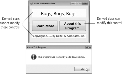
If a user clicks the Learn More button, the event is handled by the base-class event handler learnMoreButton_Click. Because VisualInheritanceBaseForm uses a private access modifier to declare its controls, VisualInheritanceTestForm cannot modify the controls inherited from class VisualInheritanceBaseForm visually or programmatically. You can, however, add event handlers for the inherited controls. The IDE displays a small icon at the top left of the visually inherited controls to indicate that they’re inherited and cannot be altered.
The .NET Framework allows you to create custom controls. These custom controls appear in the user’s Toolbox and can be added to Forms, Panels or GroupBoxes in the same way that we add Buttons, Labels and other predefined controls. The simplest way to create a custom control is to derive a class from an existing control, such as a Label. This is useful if you want to add functionality to an existing control, rather than replacing it with one that provides the desired functionality. For example, you can create a new type of Label that behaves like a normal Label but has a different appearance. You accomplish this by inheriting from class Label and overriding method OnPaint.
All controls have an OnPaint method, which the system calls when a component must be redrawn (such as when the component is resized). The method receives a PaintEventArgs object, which contains graphics information—property Graphics is the graphics object used to draw, and property ClipRectangle defines the rectangular boundary of the control. Whenever the system raises a Paint event to draw the control on the screen, the control catches the event and calls its OnPaint method. The base class’s OnPaint should be called explicitly from an overridden OnPaint implementation before executing custom-paint code. In most cases, you want to do this to ensure that the original painting code executes in addition to the code you define in the custom control’s class. Alternately, if we do not wish to let the base-class OnPaint method execute, we do not call it.
To create a new control composed of existing controls, use class UserControl. Controls added to a custom control are called constituent controls. For example, a programmer could create a UserControl composed of a Button, a Label and a TextBox, each associated with some functionality (for example, the Button setting the Label’s text to that contained in the TextBox). The UserControl acts as a container for the controls added to it. The UserControl contains constituent controls, but it does not determine how these constituent controls are displayed. To control the appearance of each constituent control, you can handle each control’s Paint event or override OnPaint. Both the Paint event handler and OnPaint are passed a PaintEventArgs object, which can be used to draw graphics (lines, rectangles, and so on) on the constituent controls.
Using another technique, a programmer can create a brand-new control by inheriting from class Control. This class does not define any specific behavior; that’s left to you. Instead, class Control handles the items associated with all controls, such as events and sizing handles. Method OnPaint should contain a call to the base class’s OnPaint method, which calls the Paint event handlers. You add code that draws custom graphics inside the overridden OnPaint method. This technique allows for the greatest flexibility but also requires the most planning. All three approaches are summarized in Fig. 15.49.
Table 15.49. Custom-control creation.
Custom-control techniques and | Description |
|---|---|
Custom-Control Techniques | |
Inherit from Windows | You can do this to add functionality to a preexisting control. If you override method |
You can create a | |
Inherit from class | Define a brand new control. Override method |
| |
| The control’s graphics object. It is used to draw on the control. |
| Specifies the rectangle indicating the boundary of the control. |
We create a “clock” control in Fig. 15.50. This is a UserControl composed of a Label and a Timer—whenever the Timer raises an event (once per second in this example), the Label is updated to reflect the current time.
Example 15.50. UserControl-defined clock.
 1   // Fig. 15.50: ClockUserControl.cs
 2   // User-defined control with a timer and a Label.
 3   using System;
 4   using System.Windows.Forms;
 5
 6   namespace ClockExample
 7   {
 8      // UserControl that displays the time on a Label
 9      public partial class ClockUserControl : UserControl
10      {
11         // constructor
12         public ClockUserControl()
13         {
14            InitializeComponent();
15         } // end constructor
16
17         // update Label at every tick
18         private void clockTimer_Tick(object sender, EventArgs e)
19         {
20            // get current time (Now), convert to string
21            displayLabel.Text = DateTime.Now.ToLongTimeString();
22         } // end method clockTimer_Tick
23      } // end class ClockUserControl
24   } // end namespace ClockExample
Timers (System.Windows.Forms namespace) are non-visual components that generate Tick events at a set interval. This interval is set by the Timer’s Interval property, which defines the number of milliseconds (thousandths of a second) between events. By default, timers are disabled and do not generate events.
This application contains a user control (ClockUserControl) and a Form that displays the user control. Create a Windows application, then create a UserControl class by selecting Project > Add User Control.... This displays a dialog from which we can select the type of control to add—user controls are already selected. We then name the file (and the class) ClockUserControl. Our empty ClockUserControl is displayed as a grey rectangle.
You can treat this control like a Windows Form, meaning that you can add controls using the ToolBox and set properties using the Properties window. However, instead of creating an application, you are simply creating a new control composed of other controls. Add a Label (displayLabel) and a Timer (clockTimer) to the UserControl. Set the Timer interval to 1000 milliseconds and set displayLabel’s text with each Tick event (lines 18–22). To generate events, clockTimer must be enabled by setting property Enabled to true in the Properties window.
Structure DateTime (namespace System) contains property Now, which returns the current time. Method ToLongTimeString converts Now to a string containing the current hour, minute and second (along with AM or PM, depending on your locale). We use this to set the time in displayLabel in line 21.
Once created, our clock control appears as an item on the ToolBox in the section titled ProjectName Components, where ProjectName is your project’s name. You may need to switch to the application’s Form before the item appears in the ToolBox. To use the control, simply drag it to the Form and run the Windows application. We gave the ClockUserControl object a white background to make it stand out in the Form. Figure 15.50 shows the output of Clock, which contains our ClockUserControl. There are no event handlers in Clock, so we show only the code for ClockUserControl.
Visual Studio allows you to share custom controls with other developers. To create a UserControl that can be exported to other solutions, do the following:
Create a new Class Library project.
Delete
Class1.cs, initially provided with the application.Right click the project in the Solution Explorer and select Add > User Control.... In the dialog that appears, name the user-control file and click Add.
Inside the project, add controls and functionality to the
UserControl(Fig. 15.51).Build the project. Visual Studio creates a
.dllfile for theUserControlin the output directory (bin/Release). The file is not executable; class libraries are used to define classes that are reused in other executable applications.Create a new Windows application.
In the new Windows application, right click the ToolBox and select Choose Items.... In the Choose Toolbox Items dialog that appears, click Browse.... Browse for the
.dllfile from the class library created in Steps 1–5. The item will then appear in the Choose Toolbox Items dialog (Fig. 15.52). If it is not already checked, check this item. Click OK to add the item to the Toolbox. This control can now be added to theFormas if it were any other control.
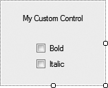
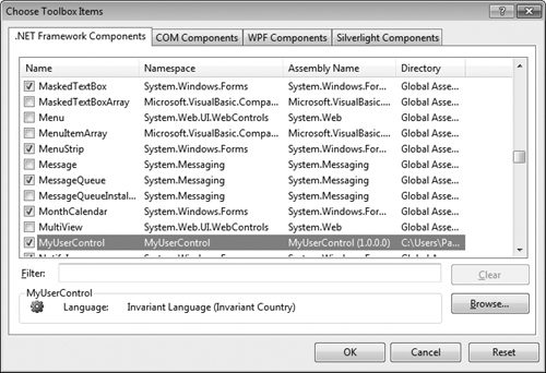
Many of today’s commercial applications provide GUIs that are easy to use and manipulate. Because of this demand for user-friendly GUIs, the ability to design sophisticated GUIs is an essential programming skill. Visual Studio’s IDE makes GUI development quick and easy. In Chapters 14 and 15, we presented basic Windows Forms GUI development techniques. In Chapter 15, we demonstrated how to create menus, which provide users easy access to an application’s functionality. You learned the DateTimePicker and MonthCalendar controls, which allow users to input date and time values. We demonstrated LinkLabels, which are used to link the user to an application or a web page. You used several controls that provide lists of data to the user—ListBoxes, CheckedListBoxes and ListViews. We used the ComboBox control to create drop-down lists, and the TreeView control to display data in hierarchical form. We then introduced complex GUIs that use tabbed windows and multiple document interfaces. The chapter concluded with demonstrations of visual inheritance and creating custom controls. In Chapter 16, we introduce string and character processing.
Menus provide groups of related commands for Windows applications.
An expanded menu lists menu items and submenus.
A menu that contains a menu item is called that menu item’s parent menu. A menu item that contains a submenu is considered to be the parent of that submenu.
All menus and menu items can have shortcut keys.
Some menu items display checkmarks, indicating that multiple options on the menu can be selected at once.
The
MenuStripcontrol is used to create menus in a GUI.Top-level menus and their menu items are represented using type
ToolStripMenuItem.To create an access shortcut, type an ampersand (
&) before the character to be underlined.To add other shortcut keys, set the
ShortcutKeysproperty of theToolStripMenuItem.You can hide shortcut keys by setting property
ShowShortcutKeystofalse. You can modify how shortcut keys are displayed in the menu item by modifying propertyShortcutKeyDisplayString.A menu item’s
Checkedproperty is used to display a check to the left of the menu item.
The
MonthCalendarcontrol displays a monthly calendar.The user can select a date from the currently displayed month or navigate to another month.
A
MonthCalendar’sDateChangedevent occurs when a new date is selected.
The
DateTimePickercontrol can be used to retrieve date and/or time information from the user.Property
Formatof classDateTimePickerspecifies the user’s selection options.The
DateTimePicker’sValueChangedevent is raised when the selected value is changed.
The
LinkLabelcontrol displays links to other resources, such as files or web pages.A
LinkLabelappears as underlined text (colored blue by default). When the mouse moves over the link, the pointer changes to a hand; this is similar to a hyperlink in a web page.The link can change color to indicate whether the link is new, previously visited or active.
When clicked, the
LinkLabelgenerates aLinkClickedevent.
The
ListBoxcontrol allows the user to view and select items in a list.ListBoxpropertySelectionModedetermines the number of items that can be selected.The
SelectedIndexChangedevent of classListBoxoccurs when the user selects a new item.Property
Itemsreturns all the list items as a collection.Property
SelectedItemreturns the currently selected item.Use method
Addto add an item to theListBox’sItemscollection.You can add items to
ListBoxes andCheckedListBoxes visually by using theItemsproperty in the Properties window.
The
CheckedListBoxcontrol extends aListBoxby including a checkbox next to each item.Items can be added via methods
AddandAddRangeor through the String Collection Editor.CheckedListBoxes imply that multiple items can be checked.CheckedListBoxeventItemCheckoccurs when a user checks or unchecks aCheckedListBoxitem.
The
ComboBoxcontrol combinesTextBoxfeatures with a drop-down list.Property
MaxDropDownItemsspecifies the maximum number of items that can display at one time.You can add objects to collection
Itemsprogrammatically, using methodsAddandAddRange, or visually, with the String Collection Editor.Property
DropDownStyledetermines the type ofComboBoxand is represented as a value of theComboBoxStyleenumeration, which contains valuesSimple,DropDownandDropDownList.There can be at most one selected item in a
ComboBox(if none, thenSelectedIndexis-1).When the selected item changes in a
ComboBox, aSelectedIndexChangedevent occurs.
The
TreeViewcontrol displays nodes hierarchically in a tree.Traditionally, nodes are objects that contain values and can refer to other nodes.
A parent node contains child nodes, and the child nodes can be parents to other nodes.
Two child nodes that have the same parent node are considered sibling nodes.
A tree is a collection of nodes, usually organized in a hierarchical manner. The first parent node of a tree is the root node.
TreeViewcontrols are useful for displaying hierarchical information.In a
TreeView, a parent node can be expanded or collapsed by clicking the plus box or minus box to its left. Nodes without children do not have these boxes.The nodes displayed in a
TreeVieware instances of classTreeNode.Each
TreeNodehas aNodescollection (typeTreeNodeCollection), containing a list ofTreeNodes.To add nodes to a
TreeViewvisually, click the ellipsis next to propertyNodesin the Properties window. This opens the TreeNode Editor, which displays an empty tree representing theTreeView.To add nodes programmatically, you must create a root
TreeNodeobject and pass it astringto display. Then call methodAddto add this newTreeNodeto theTreeView’sNodescollection.
The
ListViewcontrol is similar to aListBoxin that both display lists from which the user can select one or more items.ListViewis more flexible and can display items in different formats.Property
MultiSelect(abool) determines whether multiple items can be selected.To display images, an
ImageListcomponent is required.Property
SmallImageListof classListViewsets theImageListfor the small icons.Property
LargeImageListof classListViewsets theImageListfor large icons.The items in a
ListVieware each of typeListViewItem.
The
TabControlcontrol creates tabbed windows.TabControls containTabPageobjects. Only oneTabPageis displayed at a time.You can add
TabControls visually by dragging and dropping them on aFormin Design mode.To add
TabPages in Design mode, right click theTabControland select Add Tab, or click theTabPagesproperty in the Properties window, and add tabs in the dialog that appears.Each
TabPageraises aClickevent when its tab is clicked.
The application window of a Multiple document interface (MDI) program is called the parent window, and each window inside the application is referred to as a child window.
Child windows cannot be parents themselves and cannot be moved outside their parent.
To create an MDI
Form, create a newFormand set itsIsMdiContainerproperty totrue.To add a child
Formto the parent, create a new childFormobject, set itsMdiParentproperty to the parentFormand call the childForm’sShowmethod.Property
MdiWindowListItemof classMenuStripspecifies which menu, if any, displays a list of open child windows.MDI containers allow you to organize the placement of child windows. The child windows in an MDI application can be arranged by calling method
LayoutMdiof the parentForm.
Visual inheritance allows you to create a new
Formby inheriting from an existingForm. The derivedFormclass contains the functionality of its base class.Visual inheritance can also be applied with other controls as well.
Visual inheritance enables you to achieve visual consistency across applications by reusing code.
A reusable class is typically placed in a class library.
When you compile a class library, the compiler will create a
.dllfile, known as a dynamically linked library—a way to package classes that you can reference from other applications.
The .NET Framework allows you to create custom controls.
Custom controls can appear in the user’s Toolbox and can be added to
Forms,Panels orGroupBoxes in the same way thatButtons,Labels and other predefined controls are added.The simplest way to create a custom control is to derive a class from an existing control, such as a
Label. This is useful if you want to add functionality to an existing control, rather than replacing it with one that provides the desired functionality.To create a new control composed of existing controls, use class
UserControl.Controls added to a custom control are called constituent controls.
A programmer can create a brand-new control by inheriting from class
Control. This class does not define any specific behavior; that task is left to you.Timers are non-visual components that generateTickevents at a set interval. This interval is set by theTimer’sIntervalproperty, which defines the number of milliseconds (thousandths of a second) between events.
ShortcutKeyDisplayStringproperty of classToolStripMenuItemTreeViewEventArgsclass
15.3 | (Using | ||||||||||||||||||||||||||||||||||||||||||||||||||||||||||||||||||||||||||||||||||||
15.4 | (Using | ||||||||||||||||||||||||||||||||||||||||||||||||||||||||||||||||||||||||||||||||||||
15.5 | (Sorting Strings) Write a program that allows the user to enter | ||||||||||||||||||||||||||||||||||||||||||||||||||||||||||||||||||||||||||||||||||||
15.6 | (File Browser) Create a file browser (similar to Windows Explorer) based on the programs in Figs. 15.14, 15.28 and 15.31. The file browser should have a | ||||||||||||||||||||||||||||||||||||||||||||||||||||||||||||||||||||||||||||||||||||
15.7 | (MDI Text Editor) Create an MDI text editor. Each child window should contain a multiline | ||||||||||||||||||||||||||||||||||||||||||||||||||||||||||||||||||||||||||||||||||||
15.8 | (Login User Control) Create a | ||||||||||||||||||||||||||||||||||||||||||||||||||||||||||||||||||||||||||||||||||||
15.9 | (Restaurant Bill Calculator) A restaurant wants an application that calculates a table’s bill. The application should display all the menu items from Fig. 15.53 in four Table 15.53. Food items and prices.
| ||||||||||||||||||||||||||||||||||||||||||||||||||||||||||||||||||||||||||||||||||||
15.10 | (Using | ||||||||||||||||||||||||||||||||||||||||||||||||||||||||||||||||||||||||||||||||||||
15.11 | (MDI Drawing Programs) Create an MDI application with child windows that each have a |