
5.3. Collecting Baseline Data
Now Jane and her team embark on the process of obtaining the historical data and verifying its integrity. Once this is done, they will compute some baseline measures.
5.3.1. Obtaining the Data
Recall that Jane has decided to study two periods during which 5 percent price increases were targeted. She has identified 20 products and, for each product, 12 customers representing various sizes and regional locations (3 customers per region). Each of these product and customer combinations had sales in each of two periods: oversupply and shortage. This results in 480 different product-by-customer-by-period combinations.
Having identified the data required, the corresponding invoice figures are directly downloaded from Polymat's data warehouse into a standard database. After entering the Product Categorization Matrix categories determined earlier, along with the sales representative experience and buyer sophistication rankings, Jane loads the data from the two ill-fated pricing interventions into JMP for further investigation. The raw data are given in the first ten columns in the 480-row data table BaselinePricing.jmp (Exhibit 5.4).
Figure 5.4. Partial View of Baseline Pricing Data Table

Jane is thinking more and more about the failure of a sale to achieve a 5 percent price increase as a defect; she has even heard some members of the management team refer to this failure as a pricing defect. She adds an eleventh column to the data that indicates whether the given sale has this defect. She calls this column Defect (<=5%), and defines it using a formula, as indicated by the + sign next to the column name in the columns panel to the left of the data grid. Jane foresees using this column as an easy categorization of whether the price obtained for the given sale met the mandated increase. For her current purposes, Jane will consider any sale that exhibits a pricing defect to be defective.
The columns in the data table are described in Exhibit 5.5. Note that only the last two variables are Ys. The rest are Xs that Jane believes may be useful in her understanding of the resulting price increases. Jane assigns appropriate data modeling types to her variables: Most are nominal, but Sales Rep Experience and Buyer Sophistication are ordinal, while Annual Volume Purchased and % Price Increase are continuous.
Figure 5.5. Description of Columns in the Baseline Pricing Data Table

5.3.2. Verification of Data Integrity
Jane wants to perform a quick check to make sure that the data she has imported into JMP are what she expects. She also wants to check that the incidence of the categories in her nominal variables is large enough to allow useful analysis. For example, if only 2 percent of records were not defective, then the data would be of questionable value in helping to determine which Xs affect the response Defect (<=5%). There would simply not be very many records with a nondefective outcome.
To take a quick look at her data, Jane obtains Distribution analyses for all of her columns. She selects Analyze > Distribution and enters all 11 of her variables as Y, Columns (see Exhibit 5.6).
Figure 5.6. Distribution Dialog with All Variables Entered

When she clicks OK, Jane sees the reports partially shown in Exhibit 5.7. From the first four reports, she verifies that her 20 product codes, 4 regions, 240 customers, and 2 periods of supply/demand balance are represented in equal proportions. She looks at the remaining reports to learn that:
Sales Rep: A reasonable number of sales representatives are represented.
Sales Rep Experience: The experience levels of these sales representatives span the three categories, with reasonable representation in each.
Buyer Sophistication: Buyers of various sophistication levels are represented in almost equal proportions.
Product Category: Each of the four product categories is well-represented, with the smallest having a 17.5 percent representation.
Annual Volume Purchased: The distribution of volume purchased for these products is consistent with what Jane expected.
% Price Increase: This shows a slightly right-skewed distribution, which is to be expected—Jane will analyze this Y further once she finishes her verification.
Defect (<=5%): This shows that about 72 percent of all records are defects according to the 5 percent cut-off and that 28 percent are not. The representation in the two groupings is adequate to allow further analysis.
Just in passing, Jane notices that JMP does something very nice in terms of ordering the categories for nominal variables. The default is for JMP to list these in alphabetical order in plots; for example, the Sales Rep names are listed in reverse alphabetical order in the plot and in direct order in the frequency table in Exhibit 5.7. But, JMP uses some intelligence in ordering the categories of Sales Rep Experience and Buyer Sophistication. Both have Low, Medium, and High categories, which JMP places in their context-based order, rather than alphabetical order.
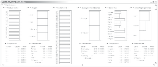
Figure 5.7. Distribution Reports for all Variables
Because Jane wants to document her work and be able to reproduce it easily later on, she saves the script that created this report to her data table as Distributions for All Variables. She will save scripts for most of her analyses because this allows her to recreate her analyses easily. However, we emphasize that when you are working on your own projects you need not save scripts unless you want to document or easily reproduce your work.
Satisfied that her data are consistent with her intended design and that the distributions of the nondesigned variables make sense and provide reasonable representation in the categories of interest, Jane initiates her baseline analysis.
5.3.3. Baseline Analysis
The purpose of Jane's baseline analysis is to understand the capability of the current pricing management process under the two different market conditions of Oversupply and Shortage. She has already seen (Exhibit 5.7) that the overall defect rate is about 0.72. An easy way to break this down by the two Supply Demand Balance conditions is to construct a mosaic plot and contingency table.
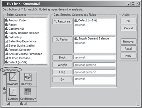
Jane selects Analyze > Fit Y by X, and populates the dialog as shown in Exhibit 5.8. She thinks of Defect (<=5%) as the response (Y) and Supply Demand Balance as an X that might explain some of the variation in Y. The schematic in the lower left area of the dialog indicates that because both X and Y are nominal, the resulting report will be a Contingency analysis.
Figure 5.8. Fit Y by X Dialog for Defect (<=5%)
When she clicks OK, Jane sees the report shown in Exhibit 5.9 (note that she has closed the disclosure icon for Tests). She sees immediately that the percentage of defective sales is much larger in periods of Oversupply than in periods of Shortage, as represented by the areas in the Mosaic Plot (these appear blue on a computer screen).
Figure 5.9. Contingency Report for Defect (<=5%)

The Contingency Table below the plot gives the Count of records in each of the classifications as well as the Row %. Jane sees that in periods of Oversupply about 86 percent (specifically, 85.83 percent) of the sales in her data table are defective, while in periods of Shortage, about 58 percent (specifically, 57.92 percent) are defective. Jane saves this script as Baseline Contingency.
This finding makes sense. However, if Jane relates what she sees to the expectation of Polymat's leadership team she starts to understand some of Bill Roberts's frustrations. Even in times of Shortage, when the account managers are in a strong negotiating position, Polymat suffers a high pricing defect rate—an estimated 58 percent of the sales are defective due to being negotiated so as to have an increase below the 5 percent target.
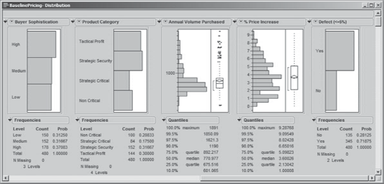
To assess baseline behavior in terms of the continuous Y, % Price Increase, Jane first refers back to the Distribution report that she constructed earlier. She clicks the red triangle next to % Price Increase, and from the menu that appears chooses Display Options > Horizontal Layout. This gives the layout shown in Exhibit 5.10. Jane sees that the mean % Price Increase is about 3.7 percent and that the percentage increases vary quite a bit, from 0 percent to about 9.3 percent.
Figure 5.10. Distribution Report for % Price Increase

What about the breakdown by Supply Demand Balance? Jane selects Distribution from the Analyze menu. In the dialog box, she enters % Price Increase as Y, Response and enters Supply Demand Balance as a By variable. She clicks OK. In the resulting report, she selects Stack from the menu obtained by clicking the red triangle next to Distributions Supply Demand Balance = Oversupply. She obtains the report shown in Exhibit 5.11.
Figure 5.11. Distribution Report for % Price Increase by Supply Demand Balance

In periods of Oversupply, the report shows that the mean % Price Increase is about 2.7 percent, while in periods of Shortage it is 4.7 percent. Both means are below the desired 5 percent increase, with a much lower mean during periods of Oversupply, as one might expect.
Yet, for Jane this is an exciting initial finding! There is a high potential for improvement if the business can increase prices when market conditions are advantageous. Jane immediately uses her baseline analysis to entice Polymat's senior staff to increase their commitment to the project. Recognizing the power of appropriate language to change behavior, Jane also starts to reinforce the concept of a pricing defect within the leadership team. She is pleasantly surprised by how quickly Bill starts to use this language to drive a new way of thinking.