
5.4. Uncovering Relationships
Jane is excited about moving on to the task of identifying Hot Xs. But first, she takes a little time to think through how she will structure the analysis of her data. She thinks back to the Visual Six Sigma Data Analysis Process (Exhibit 3.29) and observes that she is now at the Uncover Relationships step, which, if necessary, is followed by the Model Relationships step. Referring to the Visual Six Sigma Roadmap (Exhibit 3.30), she decides that she will:
Use Distribution and dynamic visualization to better understand potential relationships among her variables.
Plot her variables two at a time to determine if any of the Xs might have an effect on the Ys.
Use multivariate visualization techniques to explore higher-dimensional relationships among the variables.
If Jane finds evidence of relationships using these exploratory techniques, and if she can corroborate this evidence with contextual knowledge, she could stop her analysis here. She would then proceed directly to proposing and verifying improvement actions as part of the Revise Knowledge step. This presumes that she can substantiate that her findings are indicative of real phenomena. However, since her data set is not very large, Jane decides that for good measure she will follow up with the Model Relationships step to try to confirm the hypotheses that she obtains from data exploration.
5.4.1. Dynamic Visualization of Variables Using Distribution
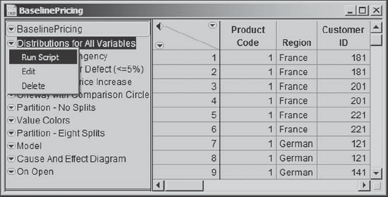
She begins to explore which Xs might be influencing the Ys by obtaining Distribution reports for all of her variables, as she did when she was verifying her data. Since she saved her script at that time, calling it Distributions for All Variables, she simply locates it in the table panel, clicks on the red triangle next to it, and selects Run Script from the list of options (Exhibit 5.12).
Figure 5.12. Running the Script Distributions for All Variables
Jane now starts to use dynamic linking in the Distribution platform to identify the Xs that influence the success or the lack of success of the two historical price increases under investigation. In the Distribution plot for Defect (<=5%), she clicks in the No bar (see Exhibit 5.13). This has the effect of selecting all those rows in the data table where Defect (<=5%) has the value No. In turn, this highlights the areas that represent these rows in all of the other Distribution plots. (Note that the plot for Customer ID is only partially shown in Exhibit 5.13, as it involves 240 bars.)
Figure 5.13. Highlighted Portions of Distributions Linked to Defect (<=5%) = No
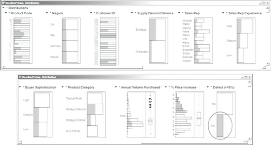
Toggling between the Yes and No bars for Defect (<=5%) quickly shows Jane that Supply Demand Balance, Buyer Sophistication, and Product Category have different distributions, based on whether Defect (<=5%) is Yes or No. It also appears that Defect (<=5%) may be related to Product Code and Customer ID. This raises the question of how, in terms of root causes, these last two variables might affect pricing defects. Jane believes that the causal link is probably captured by how the customer views the product, namely, by the Product Category as assigned using the Product Categorization Matrix.
Interacting with the Defect (<=5%) bar chart in this way also shows Jane that price increase has little or no association with:
Region. Whether a price increase is a defect does not appear to depend on region.
Sales Rep. There is some variation in how sales representatives perform, but there is no indication that some are strikingly better than others at achieving the target price increases.
Sales Rep Experience. Interestingly, the highly experienced account managers appear to be no more effective in increasing the price than those who are less experienced. (This is much to everyone's surprise.)
Annual Volume Purchased. Sales representatives appear to be no better at raising prices with small customers than with large customers.
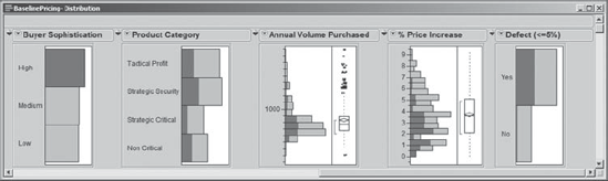
Jane wants to see the impact of Product Category on pricing defects. She first clears the selected bar in the bar graph for Defect (<=5%) by holding the control key while she clicks in the bar. Then she highlights Strategic Security and Strategic Critical in the Distribution report by clicking on these two bars in the Product Category plot while holding down the shift key. The impact on Defect (<=5%) is shown in Exhibit 5.14.
Figure 5.14. Impact of Strategic Product Categories on Defect (<=5%)

Note that almost all of the sales that met the price increase target, namely, where Defect (<=5%) has the value No, come from these two categories. Alternatively, clicking on the No bar in the Defect (<=5%) graph shows that almost all of these sales are either Strategic Security or Strategic Critical. This supports Jane's belief that Product Category captures the effect of Product Code and Customer ID.
However, the most interesting X appears to be Buyer Sophistication. Jane selects High values of this variable by clicking on the appropriate Distribution plot bar; after examining the remaining plots, she clicks on the Medium and Low values. With highly sophisticated buyers, the proportion of pricing defects is much higher than for buyers who have Medium or Low sophistication. Jane concludes that these buyers use highly effective price negotiations to keep prices low (Exhibit 5.15).
Figure 5.15. Impact of High Buyer Sophistication on Defect (<=5%)
To date, her exploratory analysis leaves Jane suspecting that the main Xs of interest are Supply Demand Balance, Buyer Sophistication, and Product Category. Although Jane has simply run Distribution analyses for her variables, she has used dynamic linking to study her variables two at a time by viewing the highlighted or conditional distributions. In the next section, Jane uses Fit Y by X to view her data two variables at a time.
5.4.2. Dynamic Visualization of Variables Two at a Time
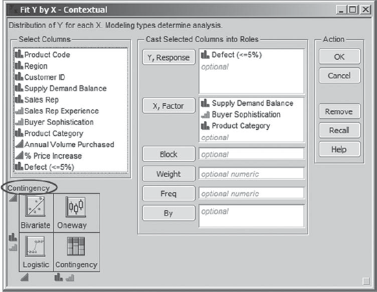
The Fit Y by X platform, found under Analyze, provides reports that help identify relationships between pairs of variables. To get a better look at how Supply Demand Balance, Buyer Sophistication, and Product Category are related to Defect (<=5%), Jane selects Analyze > Fit Y by X. In the launch dialog, she enters Defect (<=5%) as Y, Response and Supply Demand Balance, Buyer Sophistication, and Product Category as X, Factor (Exhibit 5.16). Since two of her Xs are nominal and one is ordinal, while her Y is nominal, she sees from the small schematic in the bottom left of the launch dialog that JMP will provide a Contingency analysis for each pair of variables.
Figure 5.16. Fit Y by X Dialog for Defect (<=5%)
When she clicks OK, mosaic plots and contingency tables appear. The contingency tables that are shown by default include Total % and Col %, but Jane is only interested in Count and Row %. Jane would like to remove Total % and Col % from all three analyses. She also would prefer not to have to go through the keystrokes to do this individually for all three reports. Rather, she would like to run through the keystrokes once and have the commands broadcast to all three analyses. She knows that JMP makes this easy: One simply holds down the control key while selecting the desired menu options; this sends those choices to all other similar objects in the report.
So, holding down the control key to broadcast her changes to the other two contingency tables, Jane clicks on the red triangle next to the Contingency Table heading in one of the reports. Then, she unchecks Total %. She repeats this, unchecking Col %. Her output now appears as shown in Exhibit 5.17. (The script is called Contingency for Defect (<=5%).)
Figure 5.17. Three Contingency Reports for Defect (<=5%)

The plots and contingency tables show:
Supply Demand Balance. Not surprisingly, there are fewer defective sales in periods of Shortage than in periods of Oversupply (58 percent versus 86 percent, respectively).
Buyer Sophistication. There are more defective sales when dealing with highly sophisticated buyers (90 percent) than when dealing with medium or low sophistication buyers (about 61 percent for each group). In fact, there appears to be little difference between low and medium sophistication buyers relative to defective sales, although other variables might differentiate these categories.
Product Category. This has a striking impact on defective sales. The defect rates for Strategic Critical and Strategic Security are 56 percent and 47 percent, respectively, compared to Non Critical and Tactical Profit, with defect rates of 92 percent and 94 percent, respectively.
This analysis is conducted with the nominal response, Defect (<=5%). Will these results carry through for the continuous response, % Price Increase?
Jane proceeds to see how Supply Demand Balance, Buyer Sophistication, and Product Category are related to % Price Increase. She realizes that the variable Defect (<=5%) is simply a coarsened version of this continuous variable. As she did with Defect (<=5%), Jane uses the Fit Y By X platform to look at % Price Increase as a function of each of these three potential Hot Xs.
She selects Analyze > Fit Y by X and, in the resulting dialog, assigns column roles as shown in Exhibit 5.18. Now the schematic at the bottom left of the launch window indicates that the analysis will be Oneway.
Figure 5.18. Fit Y by X Dialog for % Price Increase

The resulting report, shown in Exhibit 5.19, consists of three Oneway displays. Each of these displays has a red triangle drop-down menu, allowing the user to choose different options for each.
Figure 5.19. Three Oneway Reports for % Price Increase

The points in the plots seem to overwrite each other and Jane would like the plots to show the points individually without overlap. To do this, Jane holds down the control key (to broadcast her next command), clicks on one of the red triangles, and chooses Display Options > Points Jittered. This jitters the points nicely (Exhibit 5.20). Jane saves this script as Oneway of % Price Increase.
Figure 5.20. Three Oneway Reports for % Price Increase with Points Jittered

This is nice, and gives Jane a better idea of the distributions across the levels of each variable. But Jane would like a statistical guide to determine which levels differ. She knows that Compare Means, obtained from the red triangle menu, provides a visual representation of a statistical test for significant differences among the levels of the Xs.
When you choose Compare Means you will notice four options. Those most often used are Each Pair, Student's t and All Pairs, Tukey HSD. The difference between these two procedures is that the Each Pair option controls the risk of incorrectly concluding that two specific groups differ, while the All Pairs option controls this risk for all possible comparisons of two groups. The default level for both risks is 5 percent. The All Pairs, Tukey HSD option is the more conservative, and for this reason, Jane chooses to use this option. (We would encourage you to use the All Pairs, Tukey HSD option in general, unless you have good reason not to.)
Yet again, Jane would prefer not to make her next selections individually for each of the three predictors, so, as before, she broadcasts her commands. She holds down the control key, clicks on any one of the red triangles, and chooses Compare Means > All Pairs, Tukey HSD. To see the means on the plots, Jane also makes another choice: Again holding the control key while clicking a red triangle, she selects Display Options > Means Diamonds. She would also like calculated values for the means. Holding the control key, she clicks a red triangle and selects Means and Std Dev. (The script is saved as Oneway with Comparison Circles.)
The resulting report (Exhibit 5.21) shows the plots with means diamonds overlaid on the jittered points. The central horizontal line in each of these diamonds is plotted at the level of the sample mean for % Price Increase for that category. The top and bottom of each diamond defines a 95 percent confidence interval for the true category mean. Looking at these, Jane realizes that there are probably a number of statistically significant differences. For each variable, a table of means and standard deviations for each grouping is given below the plot.
The plot in Exhibit 5.21 also shows a new area to the right of the points containing comparison circles. These circles are a graphical way to test for differences in the means of the levels of each predictor. For example, take Product Category, which has four levels. There is one circle corresponding to each level. The top two circles in the plot in Exhibit 5.21 correspond to the levels Strategic Critical and Strategic Security.
Jane clicks on the circle corresponding to Strategic Critical. This causes the labels below the jittered points to change appearance. Now the label for Strategic Critical is in boldface type and, on her computer screen, it is red, while the circle for Strategic Security appears red on her screen, but is not bolded. Since both circles are red, this means that the mean % Price Increase does not differ significantly for these two levels. However, the circles for Non Critical and Tactical Profit are gray. This means that the mean % Price Increase for each of these two categories differs significantly from the mean % Price Increase for Strategic Critical, the bolded category.
In the grayscale plot shown in Exhibit 5.21, you will notice that the label for Strategic Critical is in boldface text, while the label for Strategic Security is not bolded. This indicates that these two groups do not differ statistically. The other two labels, Non Critical and Tactical Profit, are in non-boldface, italicized text, indicating that these two do differ statistically from Strategic Critical.
Jane remembers a very important point from her training. Some students incorrectly assumed that groups were statistically significantly different if and only if their circles did not overlap. It is true that groups with nonoverlapping circles differ statistically. However, she learned that, in fact, groups with overlapping circles can also differ significantly (on screen, when one is selected, they will have different colors).
To illustrate, in the Product Category plot, Jane clicks on the lowest circle, which corresponds to Tactical Profit. The Tactical Profit circle does overlap with the Non Critical circle. Yet, on the screen, the Tactical Profit circle is bold red and the Non Critical circle is gray, indicating that the categories differ statistically.
Exhibit 5.21 also shows Oversupply selected for Supply Demand Balance. The circles do not overlap, indicating that the two groupings, Oversupply and Shortage, differ statistically in their effect on % Price Increase. For Buyer Sophistication, High sophistication buyers are selected. They differ statistically in their effect on % Price Increase from Medium and Low sophistication buyers. By clicking on the circle for Medium sophistication buyers, Jane sees that the Medium and Low sophistication groups do not differ statistically.
Figure 5.21. Reports Showing Means Diamonds and Comparison Circles
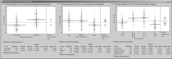
Continuing her analysis, Jane clicks on circles corresponding to other levels of variables in Exhibit 5.21 one by one to see which differ relative to % Price Increase. Recalling that two categories differ with statistical significance only if, when she clicks on one of the circles, the other changes to gray, she concludes that:
The mean % Price Increase differs significantly based on the Supply Demand Balance, with higher increases in periods of Shortage.
The mean % Price Increase for High Buyer Sophistication is significantly lower than for Medium or Low sophistication levels, while these last two do not differ significantly.
The means of % Price Increase for the Strategic Critical and Strategic Security Product Category levels are each significantly higher than for the Non Critical and Tactical Profit levels, although the means for Strategic Critical and Strategic Security do not differ significantly.
The mean % Price Increase for Non Critical products is significantly higher than for Tactical Profit products.
The Means Comparisons reports, whose blue disclosure icons are closed in Exhibit 5.21, are analytic reports containing the results that give rise to the comparison circles. For exploratory purposes, Jane knows that it suffices to examine the comparison circles.
Jane realizes that she has identified which levels differ with statistical significance. Practical importance is quite another matter. In the report (Exhibit 5.21), she studies the actual means and their confidence intervals. For example, relative to Buyer Sophistication, she notes that High sophistication buyers had mean % Price Increase values of about 2.7 percent, with a confidence interval for the true mean ranging from about 2.4 to 2.9 percent (Lower 95% and Upper 95% refer to the confidence interval limits). For less sophisticated buyers, these increases are much higher—about 4.3 percent for Medium and 4.4 percent for Low sophistication levels.
In a similar fashion, Jane studies the other Xs. Then, in her usual tidy way, she saves this script to the data table, calling it Oneway with Comparison Circles.
This exploratory Fit Y by X analysis has provided Jane with evidence that there are differences in % Price Increase based on a number of levels of these three Xs. Given this evidence, Jane is comfortable thinking of Supply Demand Balance, Buyer Sophistication, and Product Category as Hot Xs for the continuous Y, % Price Increase. Of course, she will need to verify that these are indeed Hot Xs. She realizes that there may well be interactions among the potential Xs and that these will not be evident without a multivariate analysis. To that end, she now proceeds to an exploration of multivariate relationships among these variables.
5.4.3. Dynamic Visualization of Several Variables at a Time
5.4.3.1. THE INITIAL PARTITION REPORT
As mentioned, Jane realizes that the Fit Y by X analysis she has just undertaken only looks at one X at a time in relation to her Ys. This means that her conclusions to date may overlook multidimensional relationships among the Xs and Ys. She has both a nominal Y, Defect (<=5%), and a continuous Y, % Price Increase. She could explore Defect (<=5%) using logistic regression or a partition analysis. Because of its ease of interpretation and the fact that she has several nominal Xs, some of which have many levels, she decides to use the Partition platform.
Jane understands that she will use partition as an exploratory method. There are no hypothesis tests that allow statistical validation of results. For confirmation of conclusions from a partition analysis, she will have to rely on contextual knowledge of the process and validation based on future data. (Note that later on, to study % Price Increase, Jane will use a multiple linear regression model, using Fit Model. This will provide a confirmatory analysis and bring new results to light.)
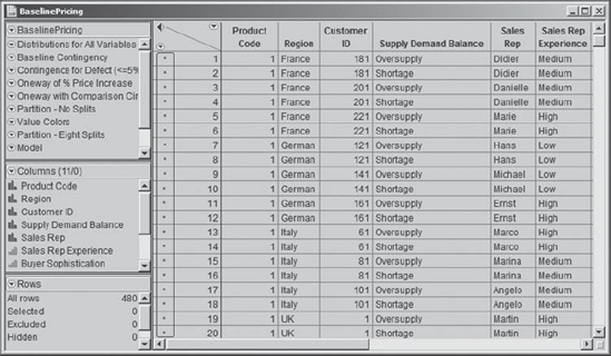
To obtain a partition analysis of Defect (<=5%), Jane selects Analyze > Modeling > Partition. She enters Defect (<=5%) as Y, Response. Thinking about her Xs, she decides to enter all nine of them. This is her chance to find multivariate relationships, and there is no reason to miss any of these. So, she assigns the column roles shown in Exhibit 5.22.
Figure 5.22. Partition Launch Dialog

Clicking OK provides an initial partition report. In order to display the proportion of defective sales versus nondefective sales shown in the single node in the report in Exhibit 5.23, Jane has chosen Display Options > Show Split Prob from the drop-down menu obtained by clicking the red triangle at the top of the report. This allows Jane to see the levels of Defect (<=5%) as well as the Prob, or proportion, of sales falling in each group (shown in Exhibit 5.23).
Figure 5.23. Initial Partition Report with Split Probabilities

5.4.3.2. APPLYING COLORS
Knowing that color always makes displays easier to understand, Jane clicks on Color Points, located under the plot and to the right of the Split and Prune buttons. This has the effect of assigning the color blue to all points associated with a pricing defect (Yes) and the color red to points where there is no pricing defect (No). Jane also sees that by choosing this coloring option the colors are displayed next to each row number in the data table (Exhibit 5.24). (You may want to work through this specific analysis on your computer in order to see the colors.)
Figure 5.24. Partial View of Data Table with Color Markers
"But wait a minute," Jane thinks. "This coloring sends the wrong message: Points where there are no defects are colored red (a color associated with danger), while the points where there are defects are colored blue." Jane thinks it might be good, for the purpose of presenting her results, if the points corresponding to no defects were colored green and those corresponding to defects were colored red.
To make this happen, Jane needs to define a column property, namely a property associated with a column or variable. She saves the script for her initial partition report to the data table, calling it Partition – No Splits, since she knows that she will want to rerun this report with the new colors. She closes her partition analysis. In the Rows menu, she selects Clear Row States to remove the blue and red color assignment.
Now she proceeds to assign a value colors property to the column Defect (<=5%). She right-clicks on Defect (<=5%) in the columns panel of BaselinePricing.jmp. (Alternatively, she could right-click in the column header.) She selects Column Info, and under Column Properties chooses Value Colors (see Exhibit 5.25). The colors that appear for the two values, No and Yes, are the colors that were assigned in the partition analysis (red and blue, respectively).
Figure 5.25. Value Colors for Defect (<=5%)

To change the color for No, Jane clicks on the red-filled ellipse next to No and chooses a bright green color from the palette that appears (see Exhibit 5.26). She repeats this process for Yes, choosing a bright red color for sales that are defective. Then she closes the dialog window by clicking OK. (The script Value Colors will create this column property.)
Figure 5.26. Changing the Color Assigned to No from Red to Green

Now, Jane runs the script Partition – No Splits. Although the bars in the node are now an informative green and red, the points in the plot are black, so she clicks on Color Points to apply the new coloring. She checks that points are colored as she wanted, red for defective sales (Yes) and green for nondefective sales (No). She also sees that the coloring for the points has been applied in the data table.
5.4.3.3. SPLITTING
At this point, Jane is ready to start splitting her data into groups or nodes that differentiate between defective and nondefective sales. At each split step, the partition algorithm finds the variable that best explains the difference between the two levels of Defect (<=5%). The two groupings of values that best explain this difference are added as nodes to the diagram, so that repeated splits of the data produce a tree-like structure.
Jane realizes that she can split as many times as she likes, with the only built-in constraint being the minimum size split. This is the size of the smallest split grouping that is allowed. To see where this is set by default, Jane clicks on the red triangle at the top of the report and selects Minimum Size Split. The dialog window that appears indicates that the minimum size is set at 5. With 480 records, Jane thinks this might be small. It could allow for modeling noise, rather than structure. Jane thinks about this for a while and decides to specify a minimum size of 25 for her splits in order to help ensure that her analysis reveals true structure, rather than just the vagaries of this specific data set. So, she enters 25 as the Minimum Size Split, as shown in Exhibit 5.27, and clicks OK.
Figure 5.27. Setting the Minimum Size Split

Finally, she is ready to begin splitting. She clicks once on the Split button, obtaining the report in Exhibit 5.28. To her dismay, the first split is on the variable Customer ID. She sees that for a large group of customers all sales are defective, while for the other group of customers only about 33 percent of sales are defective. But this does not help her understand the root causes of why defects occur. She regrets having included Customer ID as a predictor.
Figure 5.28. Partition with One Split on Customer ID
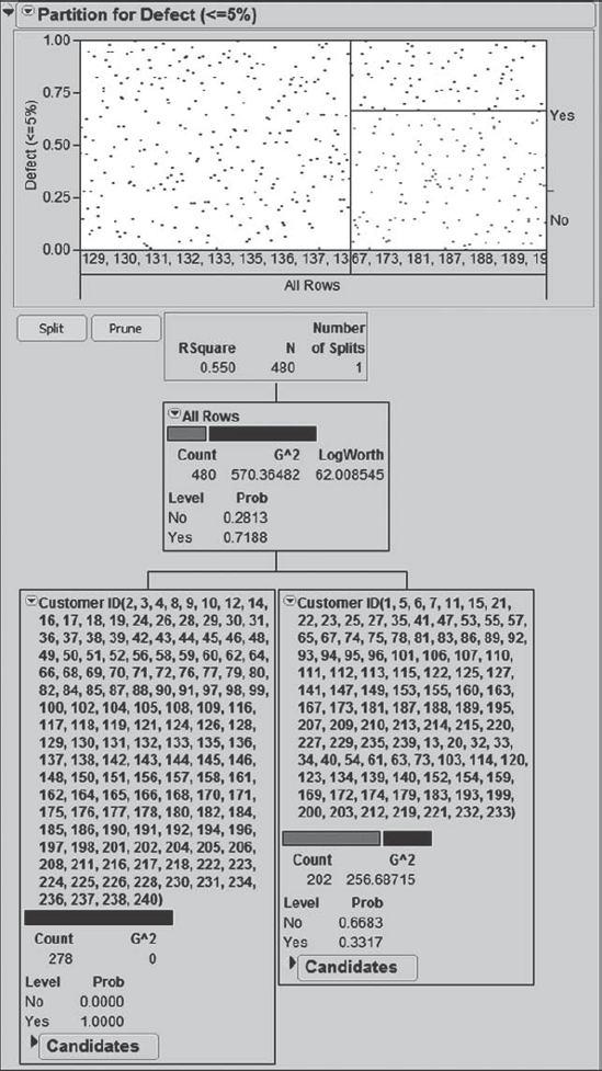
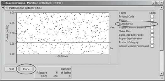
Ah, but she does not need to start her analysis over, although it would be very easy for her to do so. Instead, Jane clicks on the top red triangle and selects Lock Columns (Exhibit 5.29). As the menu tip points out, this will allow Jane to lock the Customer ID column out of her analysis.
Figure 5.29. Selecting Lock Columns

Selecting Lock Columns inserts a list of the Xs to the right of the plot. In this list, Jane checks Customer ID. She then clicks on the Prune button to remove the split on Customer ID from the report (Exhibit 5.30).
Figure 5.30. Locking Out Customer ID
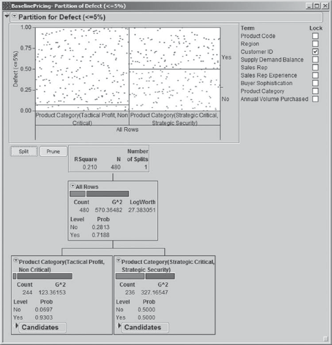
She is ready to split once more. Clicking Split once provides a split on Product Category (Exhibit 5.31). Jane sees that the two categories Tactical Profit and Non Critical result in a 93 percent defective rate (node on the left). The Strategic Critical and Strategic Security categories have a 50 percent defective rate (node on the right). These proportions are reflected in the plot above the tree. Jane hopes that further splits will help explain more of the variation left unexplained, especially by the node on the right.
Figure 5.31. Partition with First Split on Product Category
A second split brings Buyer Sophistication into play (Exhibit 5.32). Jane sees that for the Strategic Critical and Strategic Security product categories, High sophistication buyers are associated with an 82 percent rate of defective sales, while Medium and Low sophistication buyers are associated with a 30 percent rate. This is fantastic information, reinforcing the notion that for high-profile product categories Polymat's sales representatives need to be better equipped to deal with highly sophisticated buyers.
Figure 5.32. Partition with Two Splits

At this point, Jane decides to split until the stopping rule, a minimum size node of 25, ends the splitting process. She clicks on Split and keeps an eye on the Number of Splits in the information panel to the right of the Split and Prune buttons. As a result of the specified minimum size split, splitting stops after nine splits.
At this point, the tree is so big that it no longer fits on Jane's screen. She has to navigate to various parts of it to see what is going on. After a while, she checks the top red triangle menu and selects Small Tree View. A small tree (Exhibit 5.33) appears to the right of the plot and lock columns list. This small tree allows Jane to see the columns where splits have occurred, but it does not give the node detail. However, with the exception of Region at the bottom right, the splits are on the three variables that Jane has been thinking of as her Hot Xs.
Figure 5.33. Small Tree View after Nine Splits

To better understand the split on Region, Jane navigates to that split in her large tree. It is at the bottom, all the way to the right (see Exhibit 5.34). The split on Region is a split of the 72 records that fall into the Supply Demand Balance(Shortage) node at this point in the tree (note that there are three splits on Supply Demand Balance). The Supply Demand Balance(Shortage) node contains relatively few records (2.78 percent) reflecting defective sales. The further split into the two groupings of regions attempts to explain the Yes values, using the fact that there are no defective sales in France or Italy at that point in the tree. But the proportions of Yes values in the two nodes are not very different (0.06 and 0.00).
Figure 5.34. Nodes Relating to Split on Region

Jane does not see this as useful information. She suspects this was one of the last splits, so she clicks the Prune button once. Looking at the Small Tree View, she sees that this split has been removed and so concludes that it was the ninth split. She is content to proceed with her analysis based on the tree with eight splits. She saves the script for this analysis as Partition—Eight Splits.
5.4.3.4. PARTITION CONCLUSIONS
Jane continues to study her large tree. She sees evidence of several local interactions. For example, for Tactical Profit and Non Critical products, Buyer Sophistication explains variation in times of Shortage (Exhibit 5.35) but not necessarily in times of Oversupply, with the Low sophistication buyers resulting in substantially fewer defects (66.67 percent) than High and Medium sophistication buyers (96.25). Again the message surfaces that sales representatives need to know how to negotiate with sophisticated buyers.
Figure 5.35. Example of a Local Interaction

Jane notices that she can obtain a summary of all the terminal nodes by selecting Leaf Report from the red triangle menu at the top of the report. The resulting Leaf Report, shown in Exhibit 5.36, describes all nine terminal nodes and gives their response probabilities (proportions) and counts.
Figure 5.36. Leaf Report

Jane would like to see a listing of the node descriptions in decreasing order of proportion defective, in other words, with the proportions under the Yes heading under Response Prob listed in descending order. To obtain this, she right-clicks in the body of the Leaf Report, as shown in Exhibit 5.37, and selects Sort by Column from the list of options that appears. In the resulting dialog box, she chooses Yes and clicks OK. The sorted leaf report is shown in Exhibit 5.38.
Figure 5.37. Selection of Sort by Column in the Leaf Report

Figure 5.38. Leaf Report Sorted by Proportion Defective Sales

Jane studies both the leaf report and her tree carefully to arrive at these conclusions:
Product Category is the key determining factor for pricing defects. Pricing defects are generally less likely with Strategic Critical or Strategic Security products. However, with High sophistication buyers, a high defective rate can result even for these products, both in Oversupply (93.48 percent) and Shortage (69.57 percent) situations.
Buyer Sophistication interacts in essential ways with Product Category and Supply Demand Balance. The general message is that for Strategic Critical and Strategic Security sales, pricing defects are much more likely with buyers of High sophistication (81.52 percent) than for those with Low and Medium sophistication (29.86 percent). In periods of Shortage, sales of these products to Low and Medium sophistication buyers result in very few defects (2.78 percent), but sales to High sophistication buyers have a high defective rate (69.57 percent).
Supply Demand Balance also interacts in a complex way with Product Category and Buyer Sophistication. The general message is that for Strategic Critical and Strategic Security sales involving Low and Medium sophistication buyers, pricing defects are less likely when there is a Shortage rather than an Oversupply.
Jane reviews this analysis with the team. The team members concur that these conclusions make sense to them. Their lively discussion supports the suggestion that sales representatives are not equipped with tools to deal effectively with sophisticated buyers. Team members believe that sophisticated buyers exploit their power in the negotiation much more effectively than do the sellers. In fact, regardless of buyer sophistication, sales representatives may not know how to exploit their negotiating strength to its fullest potential in times of oversupply.
Also, the experiences of the team members are consistent with the partition analysis' conclusion that the only occasions when sales representatives are almost guaranteed to achieve at least a 5 percent price increase is when they are dealing with less sophisticated buyers in times of product shortage and selling products for which buyers have few other options for purchase. However, the team members do express some surprise that Sales Rep Experience did not surface as a factor of interest.
At this point, Jane takes stock of where she is relative to the Visual Six Sigma Data Analysis Process (Exhibit 5.39). She has successfully completed the Uncover Relationships step, having performed some fine detective work in uncovering actionable relationships among her Xs and Ys. Although all of her work to this point has been exploratory (EDA), given the amount of corroboration of her exploratory results by team members who know the sales area intimately, Jane feels that she could skip the Model Relationships step and move directly to the Revise Knowledge step. This would have the advantage of keeping her analysis lean. But she reflects that her data set is not large and that a quick modeling step using traditional confirmatory analysis might be good insurance. So, she proceeds to undertake this analysis.
Figure 5.39. Visual Six Sigma Data Analysis Process
