
6.3. Collecting Data
Data collection is the usual focus of the Measure Phase of a Six Sigma project. Here, a team typically assesses the measurement systems for all key input and output variables, formulating operational definitions if required and studying variation in the measurement process. Once this is done, a team constructs a baseline for current process performance.
Relative to measurement processes, Sean is particularly concerned with the visual inspection that classifies parts as good or bad. However, prudence requires that measurement of the four Ys identified should also be examined. Sean asks the team to conduct MSAs on the three measurement systems: the backscatter gauge, the spectrophotometer, and the visual color inspection rating that classifies parts as good or bad.
6.3.1. Backscatter Gauge MSA
Since the capability of the backscatter gauge used to measure thickness has not been assessed recently, the team decides to perform its first MSA on this measurement system. The team learns that only one gauge is typically used, but that as many as 12 operators may use it to measure the anodize thickness of the parts.
Sean realizes that it is not practical to use all 12 operators in the MSA. Instead, he suggests that the team design the MSA using three randomly selected operators and five randomly selected production parts. He also suggests that each operator measure each part twice, so that an estimate of repeatability can be calculated. The resulting MSA design is a typical gauge R&R (repeatability and reproducibility) study, with two replications, five parts, and three operators. (Such a design can easily be constructed using DOE > Full Factorial Design.) Note that since the operators are randomly chosen from a larger group of operators, the variation due to operator will be of great interest.
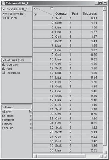
To prevent any systematic effects from affecting the study (equipment warm-up, operator fatigue, etc.), Sean insists that the study be run in completely random order. The data table ThicknessMSA_1.jmp contains the run order and results (see Exhibit 6.4). Thickness is measured in thousandths of an inch.
Figure 6.4. Data Table for Backscatter Gauge MSA
The variability in measurements between operators (reproducibility) and within operators (repeatability) is of primary interest. Sean shows the team how to use the Variability/Gauge Chart platform, found in the Graph menu, to visualize this variation, filling in the launch dialog as shown in Exhibit 6.5.
Figure 6.5. Launch Dialog for Variability Chart

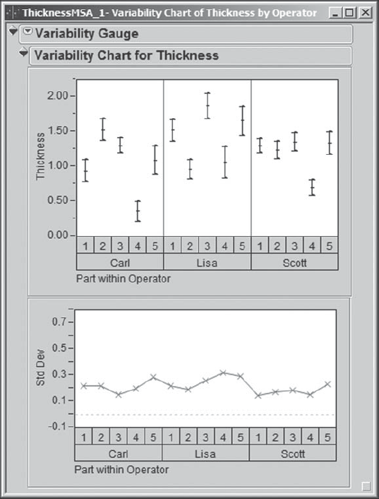
Clicking OK yields the variability chart shown in Exhibit 6.6. Sean remembers that this chart is sometimes called a Multi-Vari chart.[] The chart for Thickness shows, for each Operator and Part, the two measurements obtained by that Operator. These two points are connected by a Range Bar, and a small horizontal dash is placed at the mean of the two measurements. Beneath the chart for Thickness, Sean sees a Std Dev chart. This plots the standard deviation of the two measurements for each Operator and Part combination.
Figure 6.6. Variability Chart for Thickness MSA
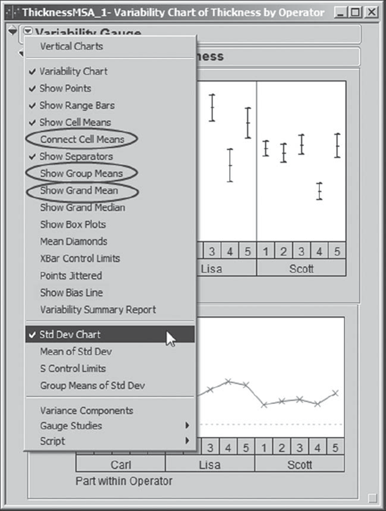
Since there are only two values for each Operator and Part combination, and since this range is already illustrated in the Thickness chart, Sean removes the Std Dev plot from the display by clicking on the red triangle at the top of the report and unchecking Std Dev Chart in the resulting menu. In that menu, he also clicks Connect Cell Means, Show Group Means, and Show Grand Mean (Exhibit 6.7). These choices help group the data, thereby facilitating visual analysis. Sean saves this script to the data table as Variability Chart.
Figure 6.7. Selections Made under Variability Gauge Report Drop-Down Menu
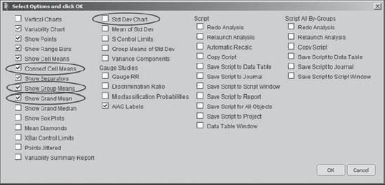
Sean remembers, a little too late, that there is a JMP shortcut that allows the user to choose a number of options simultaneously from red triangle drop-down menus. If you hold the Alt key while clicking on the red triangle, a dialog containing all the menu commands and options appears, allowing you to check all that are of interest to you. This eliminates the need for repeated visits to the red triangle. (See Exhibit 6.8, where Sean's choices are shown.)
Figure 6.8. Select Options Dialog Obtained by Holding Alt Key
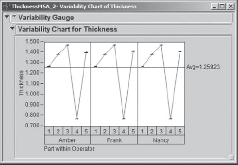
Sean's variability chart is shown in Exhibit 6.9. The chart shows that for the five parts, measured Thickness values range from about 0.25 (Carl's lowest reading for Part 4) to about 2.00 (Lisa's highest reading for Part 3). However, this variation includes Part variation, which is not of direct interest to the team at this point. In an MSA, interest focuses on the variation inherent in the measurement process itself.
Figure 6.9. Variability Chart for Backscatter Gauge MSA—Initial Study

Accordingly, the team members turn their focus to the measurement process. They realize that Thickness measurements should be accurate to at least 0.1 thousandths of an inch, since measurements usually range from 0.0 to 1.5 thousandths of an inch. The Thickness plot in Exhibit 6.9 immediately signals that there are issues.
Measurements on the same Part made by the same Operator can differ by a value of from 0.20 to 0.45 thousandths. To see this, look at the vertical line (range bar) connecting the two measurements for any one Part within an Operator, and note the magnitude of the difference in the values of Thickness for the two measurements.
Different operators differ in their overall measurements of the parts. For example, for the five parts, Carl gets an average value of slightly over 1.0 (see the solid line across the panel for Carl), while Lisa gets an average of about 1.4, and Scott averages about 1.2. For Part 1, for example, Carl's average reading is about 0.9 thousandths (see the small horizontal tick between the two measured values), while Lisa's is about 1.5, and Scott's is about 1.3.
There are differential effects in how some operators measure some parts. In other words, there is an Operator by Part interaction. For example, relative to their measurements of the other four parts, Part 2 is measured high by Carl, low by Lisa, and at about the same level by Scott.
Even without a formal analysis, the team knows that the measurement process for Thickness must be improved. To gain an understanding of the situation, three of the team members volunteer to observe the measurement process, attempting to make measurements of their own and conferring with the operators who routinely make Thickness measurements.
These three team members observe and experience that operators have difficulty repeating the exact positioning of parts being measured using the backscatter gauge. Moreover, the gauge proves to be very sensitive to the positioning of the part being measured. They also learn that the amount of pressure applied to the gauge head on the part affects the Thickness measurement. In addition, the team members notice that operators do not calibrate the gauge in the same manner, which leads to reproducibility variation. They report these findings to Sean and the rest of the team.
Armed with this knowledge, the team and a few of the operators work with the metrology department to design a fixture that automatically locates the gauge on the part and adjusts the pressure of the gauge head on the part. At the same time, the team works with the operators to define and implement a standard calibration practice.
Once these changes are implemented, the team conducts another MSA to see if they can confirm improvement. Three different operators are chosen for this study. The file ThicknessMSA_2.jmp contains the results. Sean constructs a variability chart for these data (see Exhibit 6.10) following the procedure he used for the initial study. For his future reference, he saves the script to the data table as Variability Chart.
Figure 6.10. Variability Chart for Backscatter Gauge MSA—Confirmation Study
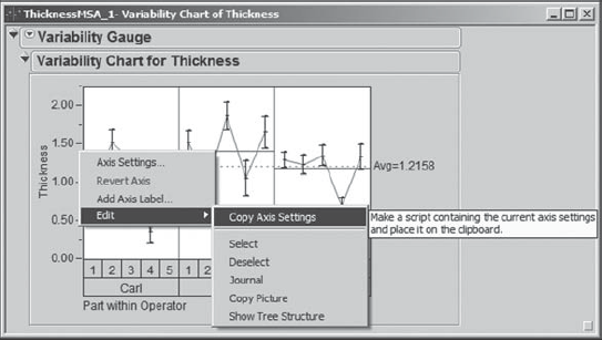
Now, Sean would like to see this new variability chart with the same scaling as he obtained in the chart shown in Exhibit 6.9. To accomplish this, in the variability chart for the initial MSA, he moves his cursor to hover over the vertical axis until it becomes a hand. At this point, Sean right-clicks to show a context-sensitive menu. Here, he chooses Edit > Copy Axis Settings, as shown in Exhibit 6.11. This copies the axis settings to the clipboard.
Figure 6.11. Copying Axis Settings from Initial Study Variability Chart
Now, with the variability chart for the data in ThicknessMSA_2.jmp active, he again hovers over the vertical axis until he sees a hand and then right-clicks. In the context-sensitive menu, he selects Edit > Paste Axis Settings.
The resulting chart is shown in Exhibit 6.12. Sean checks that it has the same vertical scale as was used in the plot for the initial study in Exhibit 6.9. The plot confirms dramatic improvement in both repeatability and reproducibility. In fact, the repeatability and reproducibility variation is virtually not visible, given the scaling of the chart. Sean saves the script as Variability Chart Original Scaling.
Figure 6.12. Rescaled Variability Chart for Backscatter Gauge MSA—Confirmation Study

The team follows this visual analysis with a formal gauge R&R analysis. Recall that the gauge should be able to detect differences of 0.1 thousandths of an inch. Sean clicks the red triangle next to Variability Gauge at the top of the report and chooses Gauge Studies > Gauge RR (Exhibit 6.13).
Figure 6.13. Gauge RR Selection from Variability Gauge Menu

This opens a dialog window asking Sean to select the Variability Model. Sean's effects are crossed, namely, each Operator measured each Part. So, he accepts the default selection of Crossed and clicks OK.
The next window that appears asks Sean to enter gauge R&R specifications (Exhibit 6.14). Since there are no formal specifications for Thickness, he does not enter a Tolerance Interval or Spec Limits. He simply clicks OK.
Figure 6.14. Gauge R&R Specifications Dialog

The resulting analysis is shown in Exhibit 6.15. It indicates a Gauge R&R value of 0.0133. This means that the measurement system variation, comprised of both repeatability and reproducibility variation, will span a range on the order of only 0.0133 thousandths of an inch.
Figure 6.15. Gauge R&R Report for Backscatter Gauge Confirmation Study
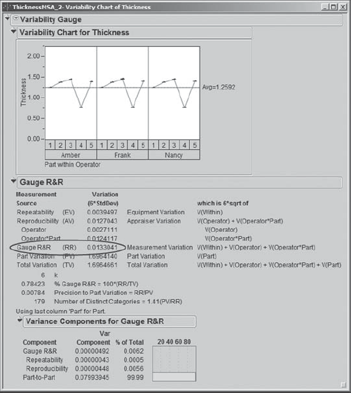
This indicates that the measurement system will easily distinguish parts that differ by 0.1 thousandths of an inch. Thanks to the new fixture and new procedures, the Thickness measurement process is now extremely capable. Sean saves this script to the data table as Gauge R&R.
Having completed the study of the backscatter gauge, Sean guides the team in conducting an MSA on the spectrophotometer used to measure color. Using an analysis similar to the one above, the team finds the spectrophotometer to be extremely capable.
6.3.2. Visual Color Rating MSA
At this point, Sean and his team address the visual inspection process that results in the lot yield figures. Parts are classified into one of three Color Rating categories: Normal Black, Purple/Black, and Smutty Black. Normal Black characterizes an acceptable part. Purple/Black and Smutty Black signal defective parts, and these may result from different sets of root causes. So, not only is it important to differentiate good parts from bad parts, it is also important to differentiate between these two kinds of bad parts.
Sean helps the team design an attribute MSA for the visual inspection process. Eight different inspectors are involved in inspecting color. Sean suggests using three randomly chosen inspectors as raters for the study. He also suggests choosing 50 parts from production, asking the team to structure the sample so that each of the three categories is represented at least 25 percent of the time. That is, Sean would like the sample of 50 parts to contain at least 12 each of the Normal Black, Purple/Black, and Smutty Black parts. This is so that accuracy and agreement relative to all three categories can be estimated with somewhat similar precision.
In order to choose such a sample and study the accuracy of the visual inspection process, the team identifies an in-house expert rater. Given that customers subsequently return some parts deemed acceptable by Components Inc., the expert rater suggests that he work with an expert rater from their major customer to rate the parts to be used in the MSA. For purposes of the MSA, the consensus classification of the parts by the two experts will be considered correct and will be used to evaluate the accuracy of the inspectors.
The experts rate the 50 parts that the team has chosen for the study. The data are given in the table AttributeMSA_PartsOnly.jmp. To see the distribution of the color ratings, Sean obtains a Distribution report for the column Expert Rating (Exhibit 6.16). He checks that all three categories are well represented and deems the 50-part sample appropriate for the study. (The script is called Distribution.)
Figure 6.16. Expert Color Rating of Parts for Color Rating MSA

The team randomly selects three raters, Hal, Carly, and Jake, to participate in the MSA. Each rater will inspect each part twice. The team decides that, to minimize recall issues, the parts will be presented in random order to each rater on each of two consecutive days. The random presentation order is shown in the table AttributeMSA.jmp. The Part column shows the order of presentation of the parts on each of the two days. Note that the order for each of the two days differs. However, to keep the study manageable, the same order was used for all three raters on a given day. (Ideally, the study would have been conducted in a completely random order.) Note that the Expert Rating is also given in this table.
The team conducts the MSA and records the rating for each rater in the table AttributeMSA.jmp. Sean selects Graph > Variability/Gauge Chart, making sure to choose Attribute under Chart Type. He populates the launch dialog as shown in Exhibit 6.17 and clicks OK.
Figure 6.17. Launch Dialog for Attribute MSA

He obtains the report shown in Exhibit 6.18, where Sean has closed a few disclosure icons. As usual, in order to keep a record, Sean saves the analysis script, called Attribute Chart, to the data table.
Figure 6.18. Agreement Reports for Color Rating MSA
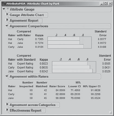
Sean first focuses on the kappa values in the Agreement Comparisons panel, which assess interrater agreement, as well as agreement with the expert. Sean knows that kappa provides a measure of beyond-chance agreement. It is generally accepted that a kappa value between 0.60 and 0.80 indicates substantial agreement, while a kappa value greater than 0.80 reflects almost perfect agreement. In the Agreement Comparisons panel shown in Exhibit 6.18, Sean sees that all kappa values exceed 0.60. For comparisons of raters to other raters, kappa is always greater than 0.72. The kappa values that measure rater agreement with the expert all exceed 0.80.
Next, Sean observes that the Agreement within Raters panel indicates that raters are fairly repeatable. Each rater rated at least 80 percent of parts the same way on both days.
The effectiveness of the measurement system is a measure of accuracy, that is, of the degree to which the raters agree with the expert. Loosely speaking, the effectiveness of a rater is the proportion of correct decisions made by that rater. An effectiveness of 90 percent or higher is generally considered acceptable. Sean opens the disclosure icon for the Effectiveness Report in order to study the effectiveness of the measurement system (Exhibit 6.19).
Figure 6.19. Effectiveness Report for Color Rating MSA
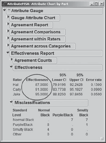
He notes that there is room for improvement, as one rater has an effectiveness score below 90 percent and another is at 91 percent. Also, since these three raters are a random selection from a larger group of raters, it may well be that other raters not used in the study will have effectiveness scores below 90 percent as well. The Misclassifications table gives some insight on the nature of the misclassifications.
Based on the effectiveness scores, Sean and the team take note that a study addressing improvements in accuracy is warranted. They include this as a recommendation for a separate project. However, for the current project, the team agrees to treat the visual Color Rating measurement system as capable at this point.
To summarize, the team has validated that the measurement systems for the four CTQ Ys and for yield are now capable. The team can now safely proceed to collect and analyze data from the anodize process.
6.3.3. Baseline
The anodize process is usually run in lots of 100 parts, where typically only one lot is run per day. However, occasionally, for various reasons, a complete lot of 100 parts is not available. Only those parts classified by the inspectors as Normal Black are considered acceptable. The project KPI, process yield, is defined as the number of Normal Black parts divided by the lot size, that is, the proportion of parts that are rated Normal Black.
The baseline data consist of two months' worth of lot yields, which are given in the file BaselineYield.jmp. Note that Sean has computed Yield in this file using a formula. If he clicks on the plus sign next to Yield in the columns panel, the formula editor appears, showing the formula (Exhibit 6.20).
Figure 6.20. Formula for Yield

It might appear that Yield should be monitored by a p chart. However, Sean realizes that taken as a whole the process is not likely to be purely binomial (with a single, fixed probability for generating a defect). More likely, it will be a mixture of binomials because there are many extraneous sources of variation. For example, materials for the parts are purchased from different suppliers, the processing chemicals come from various sources and have varying shelf lives, and different operators run the parts. All of these contribute to the likelihood that the underlying proportion defective is not constant from lot to lot.
For this reason, Sean encourages the team to use an individual measurement chart to display the baseline data. To chart the baseline data, Sean selects Graph > Control Chart > IR. Here, IR represents Individual and Range, as control charts for both can be obtained. He populates the launch dialog as shown in Exhibit 6.21. Note that Sean has unchecked the box for Moving Range (Average); he views this as redundant, given that he will see the ranges in the chart for Yield.
Figure 6.21. Launch Dialog for IR Chart of Yield

Sean clicks OK and saves the script for the resulting report to the data table as Baseline Control Chart. The chart appears in Exhibit 6.22.
Figure 6.22. Control Chart of Baseline Yield Data

The team is astounded to see that the average process yield is so low: 18.74 percent. The process is apparently stable, except perhaps for an indication of a shift starting at lot 34. In other words, the process is producing this unacceptably low yield primarily because of common causes of variation, namely, variation that is inherent to the process. Therefore, the team realizes that improvement efforts will have to focus on common causes. In a way, this is good news for the team. It should be easy to improve from such a low level. However, the team's goal of a yield of 90 percent or better is a big stretch!
6.3.4. Data Collection Plan
At this point, Sean and the team engage in serious thinking and animated discussion about the direction of the project. Color Rating is a visual measure of acceptability given in terms of a nominal (attribute) measurement. Sean and his team realize that a nominal measure does not provide a sensitive indicator of process behavior. This is why they focused, right from the start, on Thickness and the three color measures, L*, a*, and b*, as continuous surrogates for Color Rating.
Sean sees the team's long-range strategy as follows. The team will design an experiment to model how each of the four continuous Ys varies as a function of various process factors. Assuming that there are significant relationships, Sean will find optimal settings for the process factors. But what does "optimal" mean? It presumes that Sean and the team know where the four responses need to be in order to provide a Color Rating of Normal Black.
No specification limits for Thickness, L*, a*, and b* have ever been defined. So, Sean and his team members conclude that they need to collect data on how Color Rating and the four continuous Ys are related. In particular, they want to determine if there are ranges of values for Thickness, L*, a*, and b* that essentially guarantee that the Color Rating will be acceptable. These ranges would provide specification limits for the four responses, allowing the team and, in the long term, production engineers to assess process capability with respect to these responses.
They decide to proceed as follows. Team members will obtain quality inspection records for lots of parts produced over the past six weeks. For five randomly selected parts from each lot produced, they will research and record the values of Color Rating, Thickness, L*, a*, and b*.
It happens that 48 lots were produced during that six-week period. The team collects the measurements and summarizes them in the data table Anodize_ ColorData.jmp.