
6.7. Revising Knowledge
In the Visual Six Sigma Data Analysis Process, the Model Relationships step is followed by Revise Knowledge (see Exhibit 3.29). This is where we identify the best settings for the Hot Xs, visualize the effect of variation in the settings of the Hot Xs, and grapple with the extent to which our conclusions generalize. Having developed models for the four responses and, in the process, identified the Hot Xs, Sean and his team now proceed to the Revise Knowledge step.
6.7.1. Determining Optimal Factor Level Settings
Sean and his teammates are pleased with their four different models for the responses. At this point, their intent is to identify settings of the five Xs that optimize these four Ys. Sean knows that factor settings that optimize one response may, in fact, degrade performance with respect to another response. For this reason, it is important that simultaneous optimization be conducted relative to a sound measure of desirable performance.
In the Analyze Phase, the team defined target values and specification limits for the four Ys, hoping to guarantee acceptable color quality for the anodized parts. Using these targets and specifications as a basis for optimization, Sean guides the team in performing multiple optimization in JMP.
JMP bases multiple optimization on a desirability function. Recall that when Sean entered his responses in the custom design dialog he noted that the goal for each response was to Match Target, and he entered the specification limits as response limits—see the Lower Limit and Upper Limit entries under Responses in Exhibit 6.40. Note also that Sean assigned equal Importance values of 1 to each response (also Exhibit 6.40). (What is important is the ratio of these values; for example, they could equally well have all been assigned as 0.25.)
The desirability function constructs a single criterion from the response limits and importance values. This function weights the responses according to importance and, in a Match Target situation, places the highest desirability on values in the middle of the response range (the user can manually set the target elsewhere, if desired). The desirability function is a function of the set of factors that is involved in the union of the four models. In Sean's case, since each factor appears in at least one of the models, the desirability function is a function of all five process factors.
In JMP, desirability functions are accessed from the Profiler, which is often called the Prediction Profiler to distinguish it from the several other profilers that JMP provides. Sean knows that the Profiler for a single response can be found in the Fit Model report for that response. He also knows that when different models are fit to multiple responses the Profiler should be accessed from the Graph menu. So, he selects Graph > Profiler, realizing almost immediately that he has acted prematurely. He must first save prediction formulas for each of the responses; otherwise, JMP will not have the underlying models available to optimize.
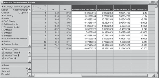
So, he returns to the table Anodize_CustomDesign_Results.jmp. He needs to save the four prediction formulas to the data table. He does this as follows:
He runs the script that he has saved for the given response (Thickness Model, L* Model, a* Model, or b* Model).
In the Fit Model dialog, he clicks Run Model.
In the report, he clicks the red triangle at the top and chooses Save Columns > Prediction Formula.
This inserts a Pred Formula column in the data table for each response—these will appear as the final four columns in the data table (Exhibit 6.56). (Alternatively, you can run the script Four Prediction Formulas.)
Figure 6.56. Columns Containing Prediction Formulas for Final Models
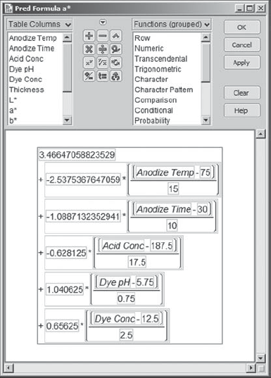
Each of these columns is defined by the formula for the model for the specified response. For example, the prediction formula for a* is given in Exhibit 6.57.
Figure 6.57. Prediction Formula for a*
Now, confident that he has laid the infrastructure, Sean returns to Graph > Profiler and enters the four prediction formulas as Y, Prediction Formula. Exhibit 6.58 shows the configuration of the launch dialog.
Figure 6.58. Launch Dialog for Graph > Profiler

When Sean clicks OK, the Profiler appears with desirability functions displayed in the rightmost column (Exhibit 6.59). This column is associated with each response's individual desirability function. For each response, the maximum desirability value is 1.0, and this occurs at the midpoint of the response limits. The least desirable value is 0.0, and this occurs near the lower and upper response limits. (Since Sean's specifications are symmetric, having the highest desirability at the midpoint makes sense. We reiterate that the user can change this.) The cells in the bottom row in Exhibit 6.59 show traces, or cross-sections, for the desirability function associated with the simultaneous optimization of all four responses.
Figure 6.59. Prediction Profiler for Four Responses

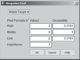
Recall that the response limits for b* were −2.0 and +2.0. To better understand the desirability function, Sean double-clicks in the desirability panel for b*, given in the rightmost column. He sees the dialog displayed in Exhibit 6.60. He notes that −2.0 and +2.0 are given desirability close to 0, namely, 0.0183, and that the midpoint between the response limits, 0, is given desirability 1. If he wanted to change any of these settings, Sean could do so in this dialog. Satisfied, Sean clicks Cancel to close the Response Goal dialog.
Figure 6.60. Response Goal Dialog for b*
The profiler is dynamically linked to the models for the responses. When the profiler first appears, the dotted (red) vertical lines in the panels are set to the midpoint of the predictor values. Sean shows the team that by moving the dotted (red) vertical line for a given process factor one can see the effect of changes on the four responses. This powerful dynamic visualization technique enables what-if inquiries such as "What happens if we increase Anodize Time?" The team explores various scenarios using this feature, before returning to the goal of optimization.
To perform the optimization, Sean selects the Maximize Desirability option from the red triangle in the Prediction Profiler panel. Sean's results for the multiple response optimization of the four responses are shown in Exhibit 6.61. However, since there are many solutions to such an optimization problem, the results you obtain may differ from Sean's. (Sean's specific results can be obtained by running the script Profiler in Anodize_CustomDesign_Results.jmp.)
Figure 6.61. Results of Simultaneous Optimization of Four Responses
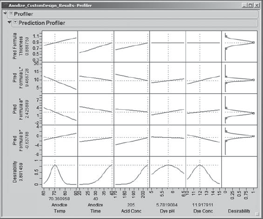
The wealth of information concerning the responses and the process variable settings provided in this visual display amazes Sean and his team. At the bottom of the display (in gray in Exhibit 6.61, in red on a screen), he sees optimal settings for each of the five process variables. To the left of the display (again, gray in Exhibit 6.61 and red on a screen), he sees the predicted mean response values associated with these optimal settings.
Sean notes that the predicted mean levels of all four responses are reasonably close to their specified targets, and are well within the specification limits. It does appear that further optimization could be achieved by considering higher values of Anodize Time and Acid Conc, since the optimal settings of these variables are at the extremes of their design ranges. Sean makes a note to consider expanding these ranges in a future experiment.
6.7.2. Linking with Contour Profiler
One of the team members asks Sean if there is a way to see other settings that might optimize the overall desirability. Even though the optimal factor settings obtained are feasible in this case, it is always informative to investigate other possible optimal or near-optimal settings.
Sean reflects a bit and then concludes that the Contour Profiler would be useful in this context. He realizes that he can access the Contour Profiler from the red triangle menu next to Profiler. But he would prefer to see it in a separate window, which is possible if he accesses it from the Graph menu. So, he selects Graph > Contour Profiler, enters all four prediction formulas as Y, Prediction Formula in the dialog, and clicks OK. The report shown in Exhibit 6.62 appears. (Sean saves the script as Contour Profiler.)
Figure 6.62. Contour Profiler for Four Prediction Formulas

The report shows contours of the four prediction formulas, as well as small surface plots for these formulas. Additional contour lines can be added by selecting Contour Grid from the red triangle next to Contour Profiler. Sean does not do that yet.
Sean observes that in the top part of the Contour Profiler report the Current X values are the midpoints of the design intervals. Recall that these were the initial settings for the factors in the Prediction Profiler as well. Sean would like to set these factor levels at the optimal settings as determined earlier using the Prediction Profiler.
To do this, he places the two profilers side-by-side. First, Sean links the two profilers. He does this by clicking on the red arrow next to Prediction Profiler and choosing Factor Settings > Link Profilers, as shown in Exhibit 6.63. This causes the Contour Profiler to update to the settings in the Prediction Profiler.
Figure 6.63. Linking the Profilers

By now, Sean has lost his optimal settings in the Prediction Profiler. So, once he has linked the two profilers, in the Prediction Profiler, he reruns Maximize Desirability. The settings for Current X in the Contour Profiler update to match the optimal settings found in the Prediction Profiler (Exhibit 6.64). (If the optimal settings are still showing in your Prediction Profiler when you link the profilers, you do not need to rerun Maximize Desirability.)
Figure 6.64. Linked Profilers
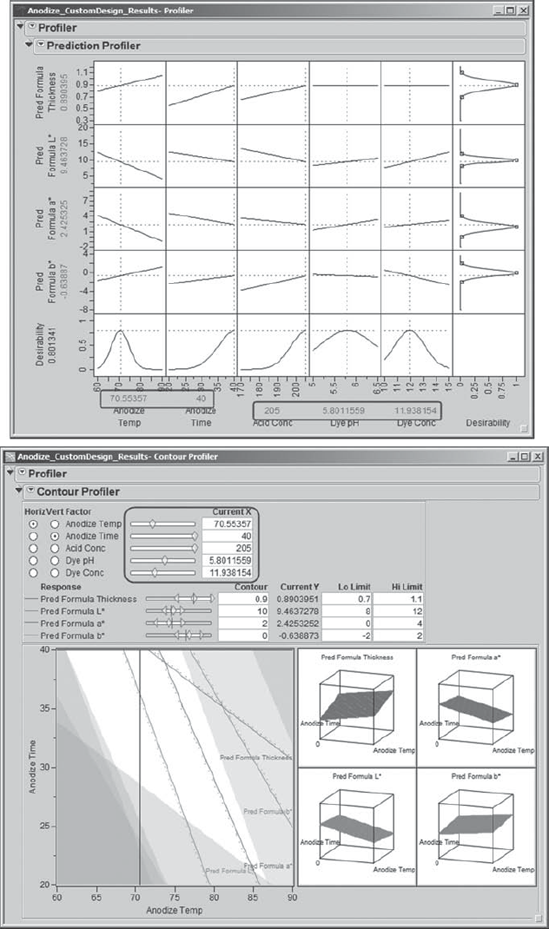
Now Sean illustrates how, by making choices of Horiz and Vert Factor in the Contour Profiler and by moving the sliders next to these or by moving the crosshairs in the contour plot, one can see the effect of changing factor settings on the predicted responses. One can see the effect on overall desirability by checking the Prediction Profiler, which updates as the factor settings are changed in the Contour Profiler. Sean chooses settings for the Contour Grid, obtained from the Contour Profiler red triangle menu, as appropriate to better view responses.
Sean and his team agree that the Contour Profiler and its ability to link to the Prediction Profiler is an extremely powerful tool in terms of exploring alternative factor level settings. In some cases it might be more economical, or necessary for other reasons, to run at settings different from those found to be optimal using the Prediction Profiler. This tool allows users to find alternative settings and to gauge their effect on desirability as well as on the individual response variables. At this point, Sean closes the Contour Profiler. Since they have been exploring various settings of the predictors, Sean runs the script Profiler to retrieve his optimal settings.
6.7.3. Sensitivity
The Prediction Profiler report provides two ways to assess the sensitivity of the responses to the settings of the process variables: desirability traces and a sensitivity indicator.
Notice that the last row of the Prediction Profiler display, repeated in Exhibit 6.65, contains desirability traces for each of the process variables. These traces represent the overall sensitivity of the combined desirability functions to variation in the settings of the process factors. For example, Sean observes that the desirability trace for Anodize Temp is peaked, with sharply descending curves on either side of the peak. Thus, the desirability function is more sensitive to variation in the setting of Anodize Temp than, say, to Dye pH, which is much less peaked by comparison. Variation in the setting of Anodize Temp will cause significant variation in the desirability of the responses.
Figure 6.65. Desirability Traces in Last Row of Prediction Profiler

Sean clicks the red triangle in the Prediction Profiler report panel and selects Sensitivity Indicator. These indicators appear in Exhibit 6.66 as small triangles in each of the response profiles. (Note that Sean has used the grabber tool to rescale some of the axes so that the triangles are visible; place your cursor over an axis and the grabber tool will appear.) The height of each triangle indicates the relative sensitivity of that response at the corresponding process variable's setting. The triangle points up or down to indicate whether the predicted response increases or decreases, respectively, as the process variable increases.
Figure 6.66. Prediction Profiler Report with Sensitivity Indicators

For Anodize Temp, Sean notices that Pred Formula L* and Pred Formula a* both have relatively tall downward-pointing triangles, indicating that according to his models both L* and a* will decrease fairly sharply with an increase in Anodize Temp. Similarly, Sean sees that Pred Formula Thickness and Pred Formula b* have upward-pointing triangles, indicating that those responses will increase with an increase in Anodize Temp.
Sean is puzzled by the horizontal traces and lack of sensitivity indicators for Dye pH and Dye Conc in the row for Pred Formula Thickness. In fact, he is about to write to JMP Technical Support, when he remembers that not all factors appear in all prediction formulas. In fact, he remembers now that the dye variables did not appear in the model for Thickness. So, it makes sense that horizontal lines appear, and that no sensitivity indicators are given, since Dye pH and Dye Conc do not have an effect on Thickness.
From the sensitivity analysis, Sean concludes that the joint desirability of the responses will be quite sensitive to variation in the process variables in the region of the optimal settings. The team reminds him that some process experts did not believe, prior to the team's experiment, that the anodize process, and especially color, was sensitive to Anodize Temp. It is because of this unfounded belief that temperature is not controlled well in the current process. The team views this lack of control over temperature as a potentially large contributor to the low yields and substantial run-to-run variation seen in the current process.
6.7.4. Confirmation Runs
The team now thinks it has a potential solution to the color problem. Namely, the process should be run at the optimized settings for the Ys, while controlling the Xs as tightly as possible. The Revise Knowledge step in the Visual Six Sigma Roadmap (see Exhibit 3.30) addresses the extent to which our conclusions generalize. Gathering new data through confirmation trials at the optimal settings will either provide support for the model or indicate that the model falls short of describing reality.
To see if the optimal settings actually do result in good product, Sean suggests that the team conduct some confirmation runs. Such confirmation is essential before implementing a systemic change to how a process operates. In addition to being good common sense, this strategy will address the skepticism of some of the subject matter experts who are not involved with the team.
With support from the production manager, the team performs two confirmatory production runs at the optimized settings for the process variables. The results of these confirmation runs are very favorable—not only do both lots have 100 percent yields, but the outgoing inspectors declare these parts uniformly to have the best visual appearance they have ever seen. The team also ships some of these parts to Components Inc.'s main customer, who reports that these are the best they have received from any supplier.
6.7.5. Projected Capability
At this point, the team is ready to develop an implementation plan to run the process at the new optimized settings. However, Sean restrains the team from doing this until the capability of the new process is estimated. Sean points out that this is very important, since some of the responses are quite sensitive to variation in the process variables.
In Design for Six Sigma (DFSS) applications, estimation of response distribution properties is sometimes referred to as response distribution analysis. Predictive models, or more generally transfer functions, are used to estimate or simulate the amount of variation that will be observed in the responses as a function of variation in the model inputs.
Sean and his team set out to obtain estimates of the variation in the process variables for the current production process. They learn that they can control Anodize Time with essentially no error. Standard deviation estimates for the remaining variables are shown in Exhibit 6.67.
Figure 6.67. Estimated Standard Deviations for Process Factors
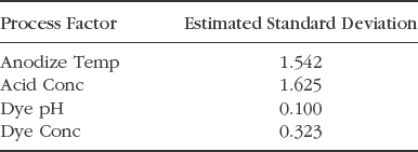
In the data table Anodize_CustomDesign_Results.jmp, for each of these four Xs, Sean enters these values as the Column Property called Sigma in Column Info. He does not specify a Sigma property for Anodize Time, which the team will treat as fixed. (Set Sigma is a script that enters these values as Sigma column properties.)
As Sean knows from his participation in DFSS projects, the Prediction Profiler in JMP includes an excellent simulation environment. He accesses it by selecting Simulator from the menu obtained by clicking the red triangle next to Prediction Profiler. Sean saves this script as Profiler 2.
Exhibit 6.68 displays the simulation report. Keep in mind that your settings will likely differ from those shown in the exhibit. However, the script Profiler 2 reproduces the settings shown in the exhibit.
Figure 6.68. Simulation at Optimal Settings with Specified Process Factor Distributions
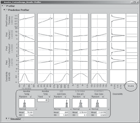
JMP automatically defaults to Normal distributions and inserts the optimal settings as Mean and the standard deviations specified as Sigma in the column properties as SD. These settings appear, with histograms showing the specified process variable distributions, at the bottom of the output. Sean uses the normal distributions that are given by default, but he realizes that several distributions are available for use.
Sean clicks on the Simulate button, located to the far right. This causes JMP to simulate 5,000 rows of factor values for which simulated response values are calculated. Histograms for these simulated response values appear above the Simulate button, as shown in Exhibit 6.69.
Figure 6.69. Simulation Results

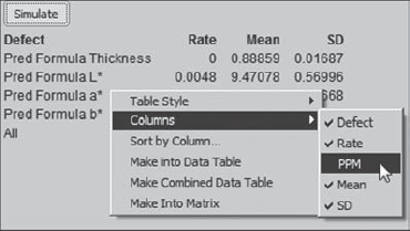
Based on the simulation results, the Prediction Profiler also calculates estimated defective rates for each of the four responses. The team notices that the estimated defective rate for L* is 0.48 percent, which is higher than they would like. For the other three responses, at least to four decimal places, the estimated defective rate is 0. Sean remembers that one can obtain an estimate of defective parts per million (PPM) by right-clicking in the Simulate area and selecting Columns > PPM, as shown in Exhibit 6.70.
Figure 6.70. Obtaining a PPM Estimate in the Defect Report
Rerunning the simulation a few times indicates that an overall defect rate of 0.48 percent, corresponding to a PPM level of 4,800, is in the ballpark. The team takes note of this as a possible direction for further study or for a new project.
To obtain an estimate of the capability of the process when run at the new settings, Sean saves 5,000 simulated response values to a data table. Such a table is easily created within the Prediction Profiler using the Simulator panel (see Exhibit 6.71). After clicking on the disclosure icon for Simulate to Table, Sean clicks on Make Table to run the simulation. Once the table appears, Sean saves this simulated data table for future reference as Anodize_CustomDesign_Simulation.jmp.
Figure 6.71. Simulating a Data Table with 5,000 Values

The data table consisting of the simulated data contains a script called Distribution. Sean runs this script, which provides histograms and capability analyses for all four predicted responses. The capability analyses are provided because specification limits were saved to the column information for the original responses, and JMP carried those to the prediction formulas.
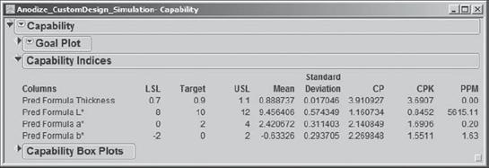
The report for Pred Formula Thickness, based on the simulated results, is shown in Exhibit 6.72. For Pred Formula Thickness, the capability, as measured by Cpk, is 3.691. Also, note that the process is slightly off center. (The reader needs to keep in mind that since the capability analyses are based on simulated data, these values will change whenever the simulation is run.)
Figure 6.72. Capability Report for Predicted Thickness

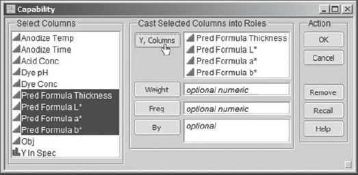
Sean suddenly remembers that JMP has a platform designed to support the visualization of capability-related data when numerous responses are of interest. He has four responses, admittedly not a large number, but he is still interested in exploring his simulated capability data using this platform. While he still has the simulated data table as the current data table, Sean selects Graph > Capability. In the capability launch dialog, he enters all four prediction formulas (Exhibit 6.73).
Figure 6.73. Launch Dialog for Capability
When Sean clicks OK, he obtains the report shown in Exhibit 6.74. The Goal Plot displays a point for each predicted response. The horizontal value for a response is its mean shift from the target divided by its specification range. The vertical value is its standard deviation divided by its specification range. The ideal location for a response is near (0,0); it should be on target and its standard deviation should be small relative to its specification range.
Figure 6.74. Capability Report for Four Simulated Responses

There is a slider at the bottom of the Goal Plot that is set, by default, to a CPK of 1. The slider setting defines a triangular, or goal, area in the plot, within which responses have Cpks that exceed 1.
The slider can be moved to change the CPK value and the corresponding goal area. Recall that a centered process with a Cpk of 1 has a 0.27 percent defective rate; such a process is generally considered unacceptable. Assuming that a process is stable and centered, a Cpk of 1.5 corresponds to a rate of 6.8 defective items per million.
Sean enters the value 1.5 into the CPK text box. The triangular region changes, but three of the four responses continue to fall in the Cpk-defined goal area. Sean looks at the red triangle options next to Goal Plot and notices that he can request Goal Plot Labels. He does so, and the plot that results is shown in Exhibit 6.75.
Figure 6.75. Goal Plot with Labels and Cpk Region at 1.5
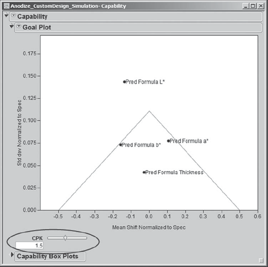
Sean notes that Pred Formula L* falls outside the 1.5 Cpk region, while the three other predicted responses fall within that region. From the red triangle menu at the top level of the report, next to Capability, Sean selects Capability Indices Report. This report shows summary information for all four predicted responses, as well as their Cpk values (Exhibit 6.76). (Note that Sean has double-clicked on the PPM column to choose a decimal format.) It is clear that L* would benefit from further study and work.
Figure 6.76. Estimated Capability Values from Simulation
The second plot in Exhibit 6.74 gives Capability Box Plots. These are box plots constructed from the centered and scaled data. To be precise, the box plot is constructed from values obtained as follows: The response target is subtracted from each measurement, then this difference is divided by the specification range. Sean and his teammates see, at a glance, that except for Pred Formula Thickness the simulated responses fall off target, and, in the case of L*, some simulated values fall below the lower spec limit.
At this point, Sean saves his script as Capability and closes both his Capability report and the simulation table Anodize_CustomDesign_Simulation.jmp. As he reexamines results from the sensitivity analysis, he recalls that L* and a* are particularly sensitive to variation in Anodize Temp (Exhibit 6.66), which is not well controlled in the current process. The team suspects that if the variation in Anodize Temp can be reduced, then conformance to specifications will improve, particularly for L*.
The team members engage in an effort to find an affordable temperature control system for the anodize bath. They find a system that will virtually eliminate variation in the bath temperature during production runs. Before initiating the purchasing process, the team asks Sean to estimate the expected process capability if they were to control temperature with this new system.
Conservative estimates indicate that the new control system will reduce the standard deviation of Anodize Temp by 50 percent, from 1.5 to 0.75. To explore the effect of this change, Sean returns to Anodize_CustomDesign_Results.jmp and reruns the script Profiler 2. He changes the standard deviation for Anodize Temp at the bottom of the Prediction Profiler panel to 0.75. Since he hopes to be dealing in small defective rates based on this change, Sean changes the specification of Normal distributions for his process factors to Normal Weighted distributions. The Normal Weighted distribution implements a weighted sampling procedure designed for more precise estimation of small defective rates. These changes in the Profiler are shown in Exhibit 6.77. Sean saves the script for this analysis as Profiler 3.
Figure 6.77. Profiler Settings for Second Simulation

Sean constructs a new 5,000-value simulated data table (Anodize_CustomDesign_ Simulation2.jmp). He runs the Distribution script that is automatically saved in this table to obtain capability analyses, which he then studies. The Capability Indices Report that he obtains using Graph > Capability is shown in Exhibit 6.78. (Again, since these values are based on a simulation, the values you obtain may differ slightly.)
Figure 6.78. Estimated Capability Values Based on Reduction of Anodize Temp Standard Deviation
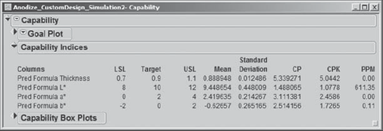
Sean and the team are very pleased. The new capability analyses indicate that Thickness, a*, and b* have extremely high capability values and very low PPM defective rates. Most important, the PPM rate for L* has dropped dramatically, and it now has a Cpk value of about 1.1.
Sean asks the team to run some additional confirmation trials at the optimal settings, exerting tight control of Anodize Temp. Everyone is thrilled when all trials result in 100 percent yield. Sean wonders if perhaps the specification limits for L* could be widened, without negatively affecting the yield. He makes a note to launch a follow-up project to investigate this further.
At this point, the team is ready to recommend purchase of the new temperature control system and to begin operating at the settings identified in the optimization. Sean guides the team in preparing an implementation plan. The team, with Sean's support, reports its findings to the management team. With the capability calculations as leverage, the team recommends the purchase of the anodize bath temperature control equipment. Management agrees with the implementation plan and the recommendations, and instructs the team members to implement their solution. With this, the project enters the Control Phase.