
4.4. Uncovering the Hot Xs
At this point, Alex and Alice have learned a great deal about their data. They are ready to begin exploring the drivers of late charges, to the extent possible with their limited data. They are interested in whether late charges are associated with particular accounts, charge codes, or charge locations. They suspect that there are too many distinct descriptions to address without expert knowledge and that the Description data should be reflected in the Charge Code entries.
In their pursuit of the Hot Xs, Alex and Alice will use Pareto plots, tree maps, and the data filter, together with dynamic linking.
4.4.1. Exploring Two Unusual Accounts
At this point, it seems reasonable for Alice to construct Pareto plots for each of these variables: Account, Charge Code, and Charge Location. But, to gauge the effect of each variable on late charges, she and Alex decide to weight each variable by Abs(Amt), as this gives a measure of the magnitude of impact on late charges.
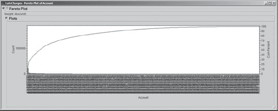
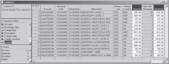
Alice closes all data tables and reports other than LateCharges.jmp. Recall that there were 389 different accounts represented in the data. To construct a Pareto plot, Alice selects Graph > Pareto Plot. She inserts Account as Y, Cause and Abs(Amt) as Weight. When she clicks OK, she sees a Pareto chart with 389 bars, some so small that they are barely visible (see Exhibit 4.47).
Figure 4.47. Pareto Plot for Account
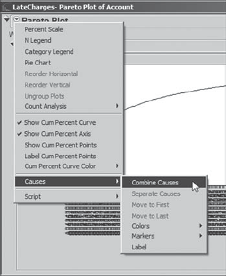
She realizes that these barely visible bars correspond to Accounts with very small frequencies and/or Abs(Amts). To combine these into a single bar, Alice clicks on the report's red triangle and selects Causes > Combine Causes (Exhibit 4.48).
Figure 4.48. Selection of Combine Causes
This opens a dialog window in which Alice clicks the radio button next to Last causes and asks JMP to combine the last 370 causes. Alice saves the script for this plot to the data table as Pareto Plot of Account. The resulting chart is shown in Exhibit 4.49.
Figure 4.49. Pareto Plot of Account with Last 370 Causes Combined

The plot shows that two patient accounts represent the largest proportion of absolute dollars. In fact, they each account for $21,997 in absolute dollars out of the total of $186,533. Alice sees this by clicking each bar.
Alice is interested in the raw values of Amount that are involved for these two accounts. She selects the records corresponding to both accounts by holding down the control key while clicking on their bars in the Pareto plot. This selects 948 records. She goes back to the LateCharges.jmp data table and, using Data View, creates a table containing only these 948 records. (Alternatively, Alice could have created this table by double-clicking on either bar in the Pareto chart while holding the control key.) All rows are selected in her new data table; to clear the selection, Alice chooses Rows > Clear Row States.
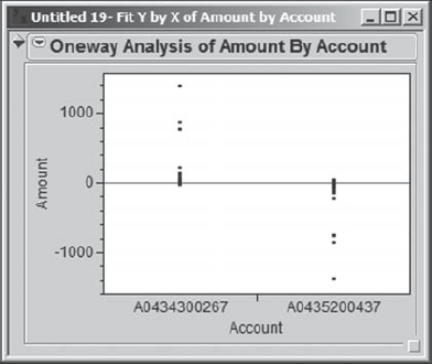
For these two accounts, Alice wants to see if the Amount values have similar distributions. So, with this new data table active, she selects Analyze > Fit Y by X. She enters Amount as Y, Response and Account as X, Factor. When she clicks OK, Alice obtains the plot shown in Exhibit 4.50.
Figure 4.50. Oneway Plot for Two Accounts
Alice thinks that some of the points are overwriting each other, and so she checks to see if there is a way to better display these points. She clicks on the red triangle and selects Display Options > Points Jittered. This gives the plot in Exhibit 4.51.
Figure 4.51. Oneway Plot for Two Accounts with Points Jittered

The plot in Exhibit 4.51 strongly suggests that amounts from the second account are being credited and charged to the first account. Sorting twice by Abs(Amt) in the data table consisting of the 948 records for these two accounts to obtain a descending sort, Alice sees the pattern of charges and credits clearly (Exhibit 4.52). Also, to better distinguish the rows corresponding to the two accounts, Alice selects a single cell containing account number A0434300267, and then uses Rows > Row Selection > Select Matching Cells to select all rows corresponding to that account number.
Figure 4.52. Partial Data Table Showing Amounts for Top Two Accounts

Alternatively, Alice could have selected one such cell and right-clicked in the highlighted row area to the left of the account number. This opens a context-sensitive menu from which she can choose Select Matching Cells (Exhibit 4.53).
Figure 4.53. Context-Sensitive Menu for Selecting Matching Cells

This analysis confirms the need to charter a team to work on applying charges to the correct account. Alex and Alice document what they have learned and then close this 948-row table.
4.4.2. Exploring Charge Code and Charge Location
Alex and Alice now turn their attention to Charge Code and Charge Location, making sure that LateCharges.jmp is active. They keep in mind that about 25 percent of records are missing values of at least one of these variables. They consider constructing Pareto charts, but again, because of the large number of levels, they would have to combine causes. Alice wants to try a tree map; this is a plot that uses rectangles to represent categories.
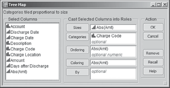
Alice selects Graph > Tree Map. She enters Charge Code as Categories. Then, at Alex's direction, she enters Abs(Amt) as Sizes. Alex explains that the sizing results in rectangles with areas that are approximately proportional to the sum of the values in the size column. In other words, a size variable is analogous to a weighting variable. Alex asks her to enter Abs(Amt) as Coloring. This will assign an intensity scale to the rectangles based on the mean of the specified value within each category. Alex also indicates that Abs(Amt) should be entered as Ordering. This asks JMP to try to put rectangles that are of similar sizes relative to Abs(Amt) close to each other. The completed launch dialog is shown in Exhibit 4.54.
Figure 4.54. Launch Dialog for Tree Map of Charge Code
When Alice clicks OK, the plot in Exhibit 4.55 appears. On the screen, this exhibit displays the default blue-to-red intensity scale. For this book, we present it with a white-to-black scale, with black representing the grouping with the highest mean Abs(Amt). Alice saves the script as Tree Map of Charge Code.
Figure 4.55. Tree Map of Charge Code: Sized, Colored, and Ordered by Abs(Amt)

Studying the tree map, Alice and Alex note that there are five charge codes— LBB, RAD, BO2, ND1, and ORC—that have large areas. This means that these charge codes account for the largest percentages of absolute dollars (one can show that, in total, they account for 85,839 out of a total of 186,533 absolute dollars). One of these charge codes, ND1, is colored black. This means that although the total absolute dollars accounted for by ND1 is less than, say, for LBB, the mean of the absolute dollars is higher.
Alex clicks in the ND1 area in the tree map; this has the effect of selecting the rows with an ND1 Charge Code in the data table. Then he obtains a Data View (Exhibit 4.56). There are only seven records involved, but they are all for relatively large charges. He notes that these charges appear from 7 to 18 days after discharge. Also, none of these are credits. Alice and Alex conclude that addressing late charges in the ND1 Charge Code is important.
Figure 4.56. Data View of the Seven Charge Code ND1 Rows

Alice applies this same procedure to select the ORC records, which are shown in Exhibit 4.57. Here, there are 14 records and a number of these are credits. Some are charge and credit pairs. The absolute amounts are relatively large.
Figure 4.57. Data View of the 14 Charge Code ORC Rows
She also looks at each of the remaining top five Charge Codes in turn. For example, the LBB Charge Code consists of 321 records and represents a mean absolute dollar amount of $87 and a total absolute dollar amount of $28,004. There appear to be many credits, and many charge and credit pairs. From this analysis, Alex and Alice agree that Charge Code is a good way to stratify the late charge problem.
But how about Charge Location? They both realize that Charge Location defines the area in the hospital where the charge originates, and consequently identifies the staff groupings who must properly manage the information flow. Alice selects Graph > Tree Map once again. She clicks on the Recall button, which reinserts the settings used in her previous analysis (Exhibit 4.54). However, she now wants to replace Charge Code with Charge Location. This is easily done. She selects Charge Code in the Categories text box, clicks on the Remove button, and inserts Charge Location into the Categories box. Alice obtains the plot shown in Exhibit 4.58. She saves the script as Tree Map of Charge Location.
Figure 4.58. Tree Map of Charge Location: Sized, Colored, and Ordered by Abs(Amt)

The eight largest rectangles in this graph are: T2, LAB, RAD, ED, 7, LB1, NDX, and OR. These eight Charge Locations consist of 1,458 of the total 2,030 records, and represent 140,115 of the total of 186,533 absolute dollars. Alice and Alex both wonder about location 7, and make a note to find out why this location uses an apparently odd code.
Next, Alice and Alex examine each of these groupings individually using the process of selecting the rectangle and creating a table using Data View. One interesting finding is that Charge Location NDX consists of exactly the seven Charge Code ND1 records depicted in Exhibit 4.56. So it may be that the NDX location only deals with the ND1 code, suggesting that the late charge problem in this area might be easier to solve than in other areas.
But this raises an interesting question for Alex. He is wondering how many late charge Charge Code values are associated with each Charge Location. Alex thinks that the larger the number of charge codes involved, the higher the complexity of information flow, and the higher the likelihood of errors, particularly of the charge-and-credit variety.
To address this question in a manageable way, Alice suggests that they select all records corresponding to the eight largest Charge Location rectangles and use Fit Y by X to create a mosaic plot. In the tree map, Alice selects the eight charge locations T2, LAB, RAD, ED, 7, LB1, NDX, and OR, holding down the shift key to add values to the selection. She notes that in the rows panel of the data table 1,458 rows appear as selected. She right-clicks on Selected in the rows panel and selects Data View. This produces a table containing only those 1,458 rows; as usual in such a table, all the rows are selected, so Alice deselects them. (A script that produces this data table is saved to LateCharges.jmp as Charge Location Subset. The data table is labeled as Charge Location Subset in the exhibits that follow.)
Using this data table, Alice selects Analyze > Fit Y by X, and populates the launch dialog as shown in Exhibit 4.59.
Figure 4.59. Fit Y by X Launch Dialog for Charge Location Subset
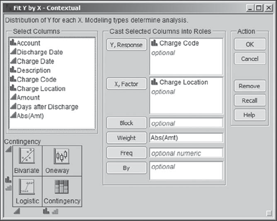
Note that for consistency Alice weights this plot by Abs(Amt). She clicks OK to obtain the report in Exhibit 4.60. (In the data table produced by the script Charge Location Subset, this mosaic plot is obtained by running the script called Contingency.)
Figure 4.60. Mosaic Plot of Charge Code by Charge Location, Weighted by Abs(Amt)
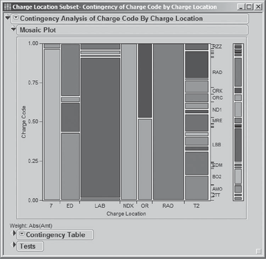
Alice and Alex find it noteworthy that Charge Location T2 deals with a relatively large number of Charge Code values. This is precisely the location that had 25 percent of its Charge Code values missing, so the sheer volume of codes associated with T2 could be a factor. The remaining areas tend to deal with small numbers of Charge Code values. In particular, NDX and RAD each only have one Charge Code represented in the late charge data. NDX and RAD may deal with other codes, but the January 2008 late charges for each of these two areas are only associated with a single code.
Alex and Alice note that except perhaps for T2 these charge locations tend to have charge codes that seem to be unique to the locations. In the colored version of the mosaic plot viewed on a computer screen, one can easily see that there is very little redundancy, if any, in the colors within the vertical bars for the various charge locations.
"Wait a minute," says Alice. "Where is LB1?" The LB1 Charge Location does not appear in the mosaic plot—only seven locations are shown. Alex reminds Alice that Charge Code is entirely missing for the LB1 Charge Location, as they learned in their earlier analysis of the relationship between Charge Code and Charge Location.
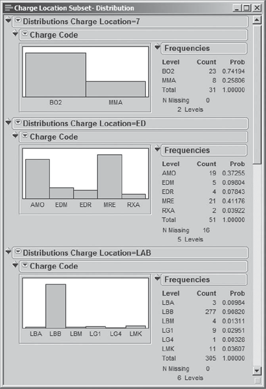
With that mystery solved, Alex and Alice turn their attention back to the mosaic plot in Exhibit 4.60. Both Alex and Alice, who are approaching the bifocal years, want to double-check their vision. They decide to use distribution plots to better see how Charge Code varies by Charge Location.
Alice makes the subset data table containing the 1,458 rows the current data table. She selects Analyze > Distribution and enters Charge Code as Y and Charge Location as the By variable. When she clicks OK, she obtains an alert message indicating: "Column Charge Code from table Charge Location=LB1 has only missing values." She realizes that this is because Charge Location LB1 has missing data for all rows. She clicks OK to move beyond the error alert.
When the distriution report opens, Alice clicks on the red triangle next to the first Distribution report and chooses Stack (see Exhibit 4.61). This converts the report to a horizontal layout with the histograms stacked, as shown in Exhibit 4.62.
Figure 4.61. Selection of Stack Option for Distribution Report
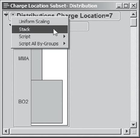
Figure 4.62. Partial View of Stacked Distributions for Charge Locations
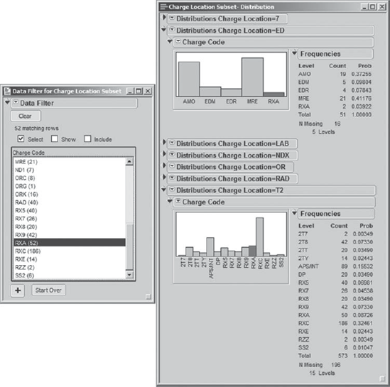
Now Alice selects Rows > Data Filter, chooses Charge Code as the variable of interest, and clicks Add. (The script Distributions and Data Filter in the subset table produces both reports.) Alice clicks on each of the Charge Code values in turn in the data filter menu and scrolls to see which bar graphs in the Distribution report reflect records with that Charge Code. They find that almost all of the Charge Code values only appear in one of the locations. RXA is one exception, appearing both for ED and T2 (see Exhibit 4.63).
Figure 4.63. Data Filter and Distribution Display Showing Charge Code RXA
Alex and Alice also conduct a small study of the Description information, using tree maps and other methods. They conclude that the Description information could be useful to a team addressing late charges, given appropriate contextual knowledge. But they believe that Charge Location might provide a better starting point for defining a team's charter.
Given all they have learned to this point, Alex and Alice decide that a team should be assembled to address late charges, with a focus on the eight Charge Location areas. For some of these areas, late charges seem to be associated with Charge Codes that are identified as prevalent by the tree map in Exhibit 4.55, and that would give the team a starting point in focusing their efforts.