
6.4. Uncovering Relationships
Sean's thinking is that a visual analysis of the data in Anodize_ColorData.jmp will give the team some insight on whether certain ranges of Thickness, L*, a*, and b* are associated with the acceptable Normal Black value of Color Rating, while other ranges are associated with the defective values Purple/Black and Smutty Black. In other words, he wants to see if good parts can be separated from bad parts based on the values of the four continuous Ys. If so, then those values would suggest specification limits that should result in good parts.
Sean realizes that this is a multivariate question. Even so, it makes sense to him to follow the Visual Six Sigma Roadmap (Exhibit 3.30), uncovering relationships by viewing the data one variable at a time, then two variables at a time, and then more than two at a time.
6.4.1. Using Distribution
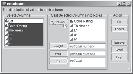
To begin the process of uncovering relationships, the team obtains distribution plots for Color Rating and for each of Thickness, L*, a*, and b*. To construct these plots, Sean selects Analyze > Distribution and enters all five variables as Y, Columns (Exhibit 6.23).
Figure 6.23. Distribution Launch Dialog
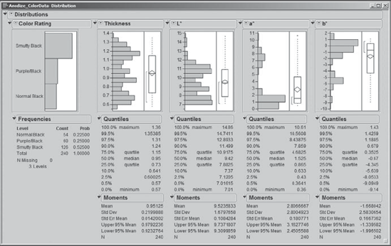
When he clicks OK, the team sees the plots in Exhibit 6.24. Sean saves this script to the data table as Distribution for Five Reponses.
The distribution of Color Rating shows a proportion of good parts (Normal Black) of 22.5 percent. This is not unexpected, given the results of the baseline analysis. However, the team members are mildly surprised to see that the proportion of Smutty Black parts is about twice the proportion of Purple/Black parts. They also notice that the distributions for Thickness, L*, a*, and b* show clumpings of points, rather than the expected mound-shaped pattern.
Figure 6.24. Distribution Reports for Five Response Variables
What Sean would really like to see are the values of Thickness, L*, a*, and b* stratified by the three categories of Color Rating. Realizing that there are many ways to do this in JMP, Sean begins with the simple approach of clicking on the bars in the bar graph for Color Rating. When Sean clicks on the bar for Smutty Black, the 126 rows corresponding to Smutty Black parts are selected in the data table, and JMP shades all plots to represent these 126 points. The four histograms for Thickness, L*, a*, and b* now appear as in Exhibit 6.25.
Figure 6.25. Histograms for Thickness, L*, a*, and b*, Shaded by Smutty Black
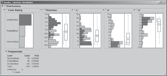
Note that Sean has removed the selection of Quantiles and Moments from the reports for the continuous variables. He did this by holding down the control key while clicking on a red triangle next to any one of the continuous variables, releasing it, selecting Display Options > Moments to uncheck Moments, and then repeating this for Quantiles. Holding the control key in this fashion broadcasts commands from one report to all similar reports in a window. Sean saves the script that gives this view as Distribution 2.
Studying the plots in Exhibit 6.25, Sean and his team members begin to see that only certain ranges of values correspond to Smutty Black parts. Next, Sean clicks on the Purple/Black bar, and the shaded areas change substantially (Exhibit 6.26). Again, he and the team see that very specific regions of Thickness, L*, a*, and b* values correspond to Purple/Black parts.
Figure 6.26. Histograms for Thickness, L*, a*, and b*, Shaded by Purple/Black
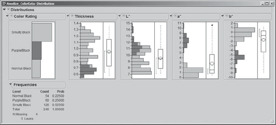
However, of primary interest is which values of Thickness, L*, a*, and b* correspond to Normal Black parts. Sean clicks on the Normal Black bar in the Color Rating distribution plot. The shaded areas now appear as in Exhibit 6.27.
Figure 6.27. Histograms for Thickness, L*, a*, and b*, Shaded by Normal Black
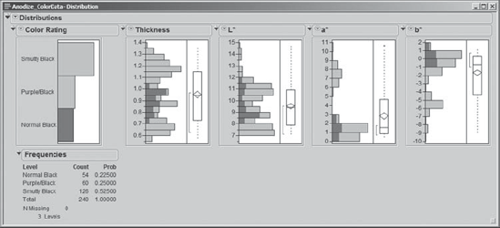
Sean notes that there is a specific range of values for each of the four responses where the parts are largely of acceptable quality. In general, Normal Black parts have Thickness values in the range of 0.7 to 1.05 thousandths of an inch. In terms of color, for Normal Black parts, Sean notes that L* values range from roughly 8.0 to 12.0, a* values from 0.0 to 3.0, and b* values from −1.0 to 2.0.
6.4.2. Using Graph Builder
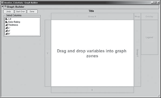
Actually, Sean thinks it would be neat to see these distributions in a single, matrix-like display. He recalls that JMP 8 has a new feature called Graph Builder. This is an interactive platform for exploring many variables in a graphical way.
Sean clears previously selected rows by selecting Rows > Clear Row States. Then he selects Graph > Graph Builder. The initial template is shown in Exhibit 6.28. Sean observes that this template is split into zones for dragging and dropping variables.
Figure 6.28. Graph Builder Template
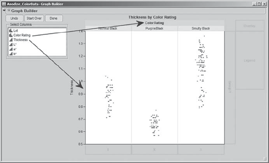
Sean begins by dragging Thickness to the Y zone at the left of the display area. This results in a display of jittered points, showing the distribution of Thickness. Next, Sean drags the variable Color Rating to the Group X zone at the top of the display area. As shown in Exhibit 6.29, this groups the points for Thickness according to the three levels of Color Rating: Normal Black, Purple/Black, and Smutty Black. It is easy to see how the values of Thickness differ across the three categories of Color Rating.
Figure 6.29. Graph Builder with Thickness and Color Rating
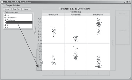
Sean would like to see this kind of picture for all four responses. He adds L* to the vertical axis by dragging it to the Y zone below Thickness. When a bottom-justified blue polygon appears, as shown in Exhibit 6.30, Sean drops L*.
Figure 6.30. Adding Additional Variables to the Y Zone
He repeats this process with a* and b*, always dragging these new variables until a bottom-justified blue polygon appears before dropping them in the Y zone. He makes a few mistakes in doing this, which he easily corrects by clicking the Undo button at the top left of the report window. This results in the plot shown in Exhibit 6.31.
Figure 6.31. Graph Builder Plot with Four Ys, Grouped by Color Rating
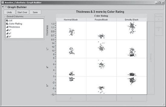
Sean and his team study this plot and conclude that Normal Black parts and Purple/Black parts generally appear to have distinct ranges of response values, although there is some overlap in L* values. Normal Black parts and Smutty Black parts seem to share common response values, although there are some systematic tendencies. For example, Normal Black parts tend to have lower Thickness values than do Smutty Black parts.
Although the points help show the differences in the distributions across the categories of Color Rating, Sean would like to see histograms. To switch to histograms, Sean again uses the idea of broadcasting a command. He holds down the control key as he right-clicks in the plot. Then he releases the control key, and in the context-sensitive menu that appears, he selects Points > Change to > Histogram, as shown in Exhibit 6.32.
Figure 6.32. Context-Sensitive Menu with Options

This replaces the points in each of the 12 panels with histograms, as shown in Exhibit 6.33. Here, Sean has rescaled the axes a bit to separate the histograms for the four variables.
Figure 6.33. Final Graph Builder Plot with Histograms
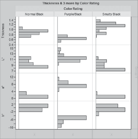
This is a compact way to view and present the information that Sean and his team visualized earlier by clicking on the bars of the bar graph for Color Rating. It shows the differences in the values of the four response variables across the categories of Color Rating, all in a single plot. Sean saves the script for this plot as Graph Builder.
6.4.3. Using Scatterplot Matrix
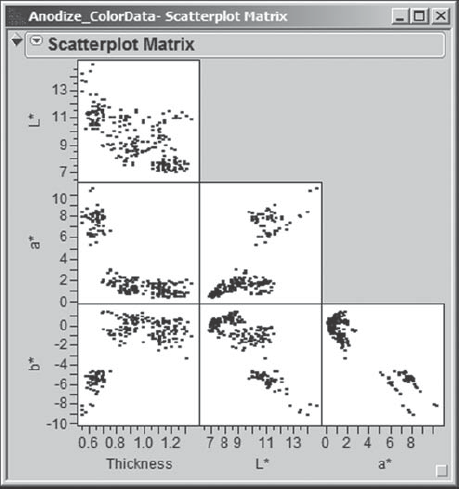
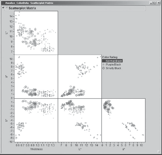
Next, Sean uses a scatterplot matrix to help the team members in their efforts to define specification ranges for the four Ys. He finds the Scatterplot Matrix platform under the Graph menu, enters the four responses (Thickness, L*, a*, and b*) as Y, Columns, and clicks OK. This gives the plot shown in Exhibit 6.34.
Figure 6.34. Scatterplot Matrix for Four Responses
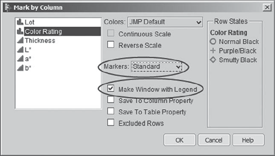
Sean wants to distinguish the Color Rating groupings in this plot. To obtain different markers (and colors) for the points, Sean right-clicks in one of the scatterplot panels. This opens a context-sensitive menu, where Sean selects Row Legend. In the resulting Mark by Column dialog, he chooses Color Rating, sets Markers to Standard, and checks Make Window with Legend (see Exhibit 6.35). He clicks OK. (The script Color and Mark by Color Rating produces these colors and markers, but not the legend window.)
Figure 6.35. Mark by Column Menu Selections
When Sean clicks OK, the markers and colors are applied to the points in the scatterplot matrix. A legend appears in the matrix panel, and although Sean does not need it at this point, a small legend window is created (Exhibit 6.36). For later reference, Sean saves the script for the scatterplot to the data table as Scatterplot Matrix.
Figure 6.36. Scatterplot Matrix with Legend and Legend Window

Sean begins to explore the scatterplot matrix. He notices that when he clicks on the text Normal Black in the legend (Exhibit 6.37), the points that correspond to Normal Black in all the scatterplots (the circles) are highlighted. (These circles are bright red on a computer screen.) Using the legend, Sean can click on each Color Rating in turn. This highlights the corresponding points in the plots, bringing them to the forefront.
The regions in the scatterplot matrix associated with each Color Rating are more distinct than the regions shown in the histograms. The Purple/Black parts occur in very different regions than do Normal Black and Smutty Black. More interestingly, whereas the Normal Black and Smutty Black parts were difficult to distinguish using single responses, in the scatterplot matrix Sean sees that they seem to fall into fairly distinct regions of the b* and L* space. In other words, joint values of b* and L* might well distinguish these two groupings.
Figure 6.37. Scatterplot Matrix with Normal Black Parts Highlighted
6.4.4. Using Scatterplot 3D
The regions that differentiate Color Rating values are even more striking when viewed in three dimensions. Sean selects Graph > Scatterplot 3D to see yet another view of the data, entering his responses in the order Thickness, L*, a*, and b*, and clicking OK. Here, Sean's legend window comes in handy. He places it next to the scatterplot 3D window and clicks on each Color Rating in turn.
Exhibit 6.38 shows the plot with Thickness, L*, and a* on the axes, and with points corresponding to Normal Black (again shown by circles here, but with a red color on screen) highlighted using the legend for Color Rating. Using either the drop-down lists at the bottom of Exhibit 6.38 or the arrow to their right, Sean is able to view three-dimensional plots of all possible combinations of the four response measures.
Figure 6.38. Scatterplot 3D with Normal Black Parts Highlighted
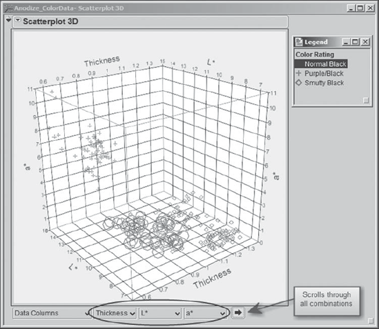
In each plot, Sean places his cursor in the plot, then clicks and drags to rotate the plot so that he can see patterns more clearly. It seems clear that Color Rating values are associated with certain ranges of Thickness, L*, a*, and b*, as well as with multivariate functions of these values. At this point, Sean saves the script as Scatterplot 3D and clears any row selections.
6.4.5. Proposing Specifications
Using the information from the histograms and the two- and three-dimensional scatterplots, the team feels comfortable in proposing specifications for the four Ys that should generally result in acceptable parts. Although the multidimensional views suggested that combinations of the response values could successfully distinguish the three Color Rating groupings, the team members decide that for the sake of practicality and simplicity they will propose specification limits for each Y individually.
Exhibit 6.39 summarizes the proposed targets and specification ranges for the four Ys. The team members believe that these will suffice in distinguishing Normal Black parts from the other two groupings and, in particular, from the Smutty Black parts. (You might want to check these limits against the appropriate 3D scatterplots.)
Figure 6.39. Specifications for the Four CTQ Variables

At this point, we note that the team could have used more sophisticated analytical techniques such as discriminant analysis and logistic regression to further their knowledge about the relationship between Color Rating and the four CTQ variables. However, the simple graphical analyses provided the team with sufficient knowledge to move to the next step.