
7.4. Investigating Promotional Activity
Rick's first task is to verify the claims of the marketing group that the test promotion they ran in 2008 was successful. The promotion was run from May through December 2008 in three regions: Midlands, Northern Ireland, and Southern England.
Rick's first thought is to look at total prescriptions written per physician across the eight months for which he has data, and to see if the three promotion regions stand out. To accomplish this, he must construct a summary table giving the sum for the relevant variables over the eight-month period. This will allow him to compare the 2008 physician totals across regions, taking into account physician variability. But Rick is also interested in how prescription totals vary by region when considering the number of visits. Do the promotional regions stand out from the rest in terms of prescriptions written if we account for the number of visits per physician?
7.4.1. Preparing a Summary Table
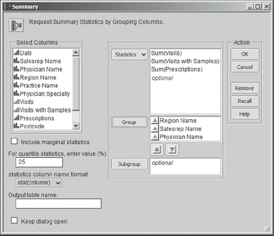
Rick begins by creating a data table that summarizes his data across physicians. First, he makes sure that colors and markers by Region Name are still applied to his data table. (If yours are not, then please run the script Color and Mark by Region.) To create a summary table, he selects Tables > Summary. Thinking carefully about what to summarize, Rick decides that he will want to sum Visits, Visits with Samples, and Prescriptions across Physician Name. To populate the dialog correctly, he first selects all three of the variables that he wants to sum and then goes to the Statistics drop-down list, where he selects Sum (Exhibit 7.32). When he clicks on Sum, the list box to the right of Statistics shows the three variables, Sum(Visits), Sum(Visits with Samples), and Sum(Prescriptions).
Figure 7.32. Summary Launch Dialog Showing Statistics Drop-Down List

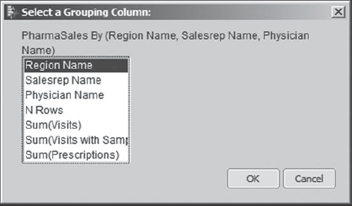
Next, Rick devotes some thought to the other columns that should appear in his summary table. Surely, Physician Name is one of these, since that is the column on whose values he wants the summary to be based. In fact, he hopes to see 11,983 rows—one for each Physician Name. But he would also like to have Region Name included in the summary table, as well as Salesrep Name. These last two variables should not define additional grouping classes, since each Physician Name is associated with only one Salesrep Name and only one Region Name over the eight months. So Rick includes these in the Group list. When he has done this, the launch dialog appears as in Exhibit 7.33.
Figure 7.33. Completed Summary Launch Dialog
When Rick clicks OK, he obtains the data table that is partially shown in Exhibit 7.34. To his delight, Rick notes that this summary table has inherited the row markers that were present in PharmaSales.jmp, and that there are indeed 11,983 rows in the summary.
At this point, Rick (or you, if you were conducting a similar analysis) would normally save this summary table as a new table for reuse later. However, to make it easy for you to recreate the summary table, we have saved a script in PharmaSales.jmp that does this. The script is called Summary Table 1. If you are interested in how this is done, see the section "Additional Details" at the end of this chapter.
Figure 7.34. Partial View of Summary Table

7.4.2. Uncovering Relationships: Prescriptions versus Region
7.4.2.1. EXPLORATORY APPROACH: COMPARISON CIRCLES
Rick's first thought is to compare values of Sum(Prescriptions) across Region Name to see if the promotion regions had significantly more prescriptions written than did the nonpromotion regions. So, making sure that his summary table is active, Rick selects Analyze > Fit Y by X. He inserts Sum(Prescriptions) as Y, Response and Region Name as X, Factor. When he clicks OK, he obtains the plot shown in Exhibit 7.35.
Figure 7.35. Oneway Plot of Sum(Prescriptions) by Region Name
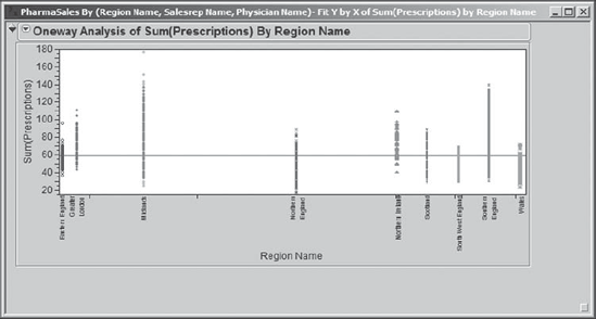
Rick notes that the regions are not spread uniformly across the horizontal axis. He figures out that this is meant to illustrate the sizes of the groupings—regions with many observations get a bigger share of the axis than do regions with few observations. This is why Midlands and Northern England, the regions with the most data, have a comparatively large share of the axis. He also notes that the points are all lined up, and he suspects that with 11,983 records in his data table some of the data points overwrite each other.
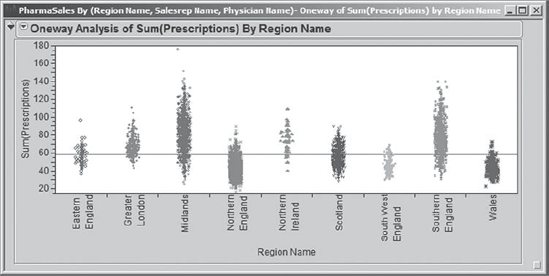
To fix the overwriting, Rick clicks on the red triangle at the top of the report and chooses Display Options > Points Jittered. He also would prefer that the regions be spread evenly across the horizontal axis. To address this, in the red triangle menu, Rick chooses Display Options and unchecks X Axis proportional. The resulting display is shown in Exhibit 7.36.
As expected, Rick sees the huge density of points representing Northern England. But his real interest is in the promotion regions: Midlands, Northern Ireland, and Southern England. Indeed, there appear to be more prescriptions being written in these three regions. Rick thinks about how he can verify this more formally. Ah, he remembers: comparison circles! These provide a visual representation of statistical tests that compare pairs of categories, which here consist of regions.
Figure 7.36. Oneway Plot with New Display Options
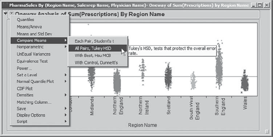
Rick clicks on the red triangle at the top of the report and selects Compare Means > All Pairs, Tukey HSD (see Exhibit 7.37). He chooses the All Pairs, Tukey HSD option (rather than Each Pair, Student's t) because he will be making pairwise comparisons of nine regions. There are (9 × 8) / 2 = 36 possible pairs to compare. So, Rick wants to control the overall error rate for the collection of 36 tests at 0.05. (HSD stands for honestly significant difference.) If Rick had chosen the Each Pair, Student's t option, each individual comparison would have a 0.05 false alarm rate. Over 36 tests, this could result in a very large overall false alarm rate (1 − (1 − 0.05)36 = 0.84, or 84 percent). Note that JMP refers to the false alarm rate as the error rate.
Figure 7.37. Compare Means Options
When he clicks the All Pairs, Tukey HSD option, Rick obtains comparison circles, as he expects. These appear in a new area to the right of the dot plots, as shown in Exhibit 7.38. Some analytic output is also provided in the Means Comparisons panel, but Rick realizes that all the information he needs is in the circles. Rick saves his script to the summary data table as Oneway.
Rick reminds himself of how the comparison circles work. There is one circle for each value of the nominal variable. So here, there will be one circle for each value of Region Name. Each circle is centered vertically at the mean for the category to which it corresponds. When you click on one of the circles, it turns a bold red on the screen, as does its corresponding label on the X axis. Each other circle either turns gray or normal red (but not bold red). The circles that turn gray correspond to categories that significantly differ from the category chosen. The other circles that turn red correspond to categories that do not significantly differ from the chosen category.
With this in mind, Rick clicks on the tiny topmost circle. He sees from the bold red label on the plot that this circle corresponds to the Midlands. He infers that it is tiny because Midlands has so many observations. Once that circle is selected, he sees that all of the other circles and axis labels are gray. This means that Midlands differs significantly from all of the other regions. Technically stated, each of the eight pairwise tests comparing the mean of Sum(Prescriptions) for Midlands to the mean Sum(Prescriptions) for another region is significant using the Tukey procedure.
Next, Rick clicks on the big circle that is second from the top, shown in Exhibit 7.39. He is not surprised that this corresponds to Northern Ireland—the circle is large because there is comparatively little data for Northern Ireland. All the other circles turn gray except for the very small circle contained within and near the top of Northern Ireland's circle. By clicking on that circle, Rick sees that it corresponds to Southern England. He concludes that Northern Ireland differs significantly from all regions other than Southern England relative to prescriptions written.
Exploring comparison circles relies heavily on color and is therefore very easy to do on a computer screen. With grayscale printed output, such as that in Exhibit 7.39, one must look carefully at the labels on the horizontal axis. Note that the label for Northern Ireland is bold gray. Labels that correspond to regions that differ significantly from Northern Ireland are italicized. Those that do not differ significantly are not italicized. Note that the label for Southern England is the only label other than Northern Ireland's that is not italicized.
Figure 7.38. Comparison Circles
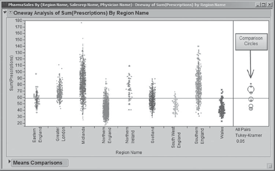
Figure 7.39. Comparison Circles with Northern Ireland Selected

Rick peruses the report in the Means Comparisons panel. He discovers a table that summarizes the significant differences among regions (see Exhibit 7.40, where this table is enclosed in a rectangle). Rick sees that this table divides his nine regions into six groups based on an associated letter, and that each of these groups differs significantly from the other groups. This table is sometimes called a Connecting Letters report.
Midlands (letter A) has significantly more sales than all of the other regions. Next come Southern England and Northern Ireland, both of which are associated with the letter B and can't be distinguished statistically, but both have significantly more sales than the regions associated with the letters C, D, E, and F. The smallest numbers of sales are associated with Wales and Northern England. The Connecting Letters report also provides the Mean number of prescriptions written by physicians in each of the regions. These vary from 42.5 in Wales and Northern England to 81.6 in Midlands.
Figure 7.40. Connecting Letters Report
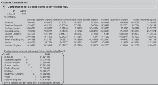
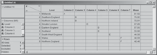
Rick really likes this table and wants to present it as part of a Microsoft® PowerPoint presentation. He would like to turn this into a nicely formatted table for the presentation and therefore wants to put the results into an Excel file where he can format the cell contents and add borders. He right-clicks in the interior portion of the table area. This opens a context-sensitive menu, shown in Exhibit 7.41, and Rick notices that he can choose to Make into Data Table. He chooses this option, and the output is converted to a JMP data table that Rick then copies and pastes into Excel. The JMP data table is shown in Exhibit 7.42. Here, Rick has right-clicked in the column header for Mean, selected Column Info, and changed the format to display only two decimal places.
Figure 7.41. Context-Sensitive Menu in Means Comparisons Panel

Figure 7.42. Data Table Showing Connecting Letters Report
Rick is excited about these results. He has learned that physicians in the three promotional regions wrote significantly more prescriptions over the eight-month promotional period than did those in the six nonpromotional regions. He has also learned that physicians in Midlands wrote significantly more prescriptions than those in Northern Ireland or Southern England. He is intrigued by why this would be the case and makes a note to follow up at his next meeting with the sales representatives.
Rick also notes that there are significant differences in the nonpromotional regions as well. Physicians in Northern England (the region with the largest number of physicians) and Wales wrote the smallest numbers of prescriptions. He wants to understand why this is the case. But, he firmly keeps in mind that many factors could be driving such differences. It is all too easy to think that the sales representatives in these two regions are not working hard enough. But, for example, there could be cultural differences among patients and physicians that make them less likely to request or prescribe medications. There could be age, experience, or specialty differences among the physicians. Rick realizes that many causal factors could be driving these regional differences.
7.4.2.2. MODEL TO ACCOUNT FOR SALES REPRESENTATIVE EFFECT
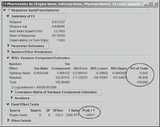
When Rick discusses his results with his golfing buddy, Arthur indicates that there might be a subtle problem with the way that Rick conducted his tests. Each value in Sum(Prescriptions) represents the total number of prescriptions written by a given physician over the eight-month period. But, the number of prescriptions written by a given physician could be driven by the sales representative, and each sales representative has a number of assigned physicians. This means that the values of Sum(Prescriptions) are not independent, as required by the Compare Means test that Rick used. Rather, they are correlated: Sum(Prescriptions) values for physicians serviced by a given sales representative are likely to be more similar than Sum(Prescriptions) values for physicians across the collection of sales representatives. If, in fact, the number of prescriptions written is highly dependent on the particular sales representative, then the tests that Rick used previously are not appropriate. Arthur points out that Rick's Compare Means analysis ignored the sales representative effect (Salesrep Name).
Arthur tells Rick that there are two options that would lead to more appropriate analyses: Aggregate the data to the sales representative level and then use Compare Means, or construct a model that accounts for the effect of Salesrep Name. Rick is intrigued by this second approach, and so Arthur shows him how to do this.
Using the summary data table as the current data table, he tells Rick to select Analyze > Fit Model. In the Fit Model launch dialog, he tells Rick to enter Sum(Prescriptions) as Y and to add both Region Name and Salesrep Name as model effects. Arthur explains that Rick is interested in the variability contributed by sales representatives within a region, rather than in comparing one sales representative to another. This means that Rick should treat Salesrep Name as a random effect. Arthur shows Rick how to indicate this: He must select Salesrep Name in the Construct Model Effects box and then click the red triangle next to Attributes at the bottom left of the Construct Model Effects box, selecting Random Effect (see Exhibit 7.43). This places the & Random designation next to Salesrep Name in the Model Effects box. Rick saves this launch dialog to his data table as a script called Model with Random Effect.
Figure 7.43. Fit Model Dialog
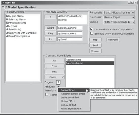
By treating Salesrep Name as a random effect, Rick will obtain an estimate of the variation due to sales representatives within a region. Arthur also points out that the sales representatives are nested within a region. In other words, a given sales representative works in only one region and his or her effect on another region cannot be assessed. The analysis that JMP provides takes this into account automatically.
When he clicks Run Model, Rick obtains the report shown in Exhibit 7.44. Rick immediately sees that Region Name is significant, even when properly accounting for the sales representative effect. Arthur explains that this test for Region Name is based on the variability due to sales representatives, not physicians, as opposed to the comparison circle tests that Rick used earlier.
Rick also sees that Salesrep Name accounts for only 0.042 percent of the total variation. The Residual variation, which accounts for most of the variation, is the variation due to physicians. It follows that within a region most of the variation is due to physician, not sales representative, differences. This indicates that the earlier conclusions that Rick drew from his analysis using comparison circles are actually not misleading.
Figure 7.44. Fit Model Report
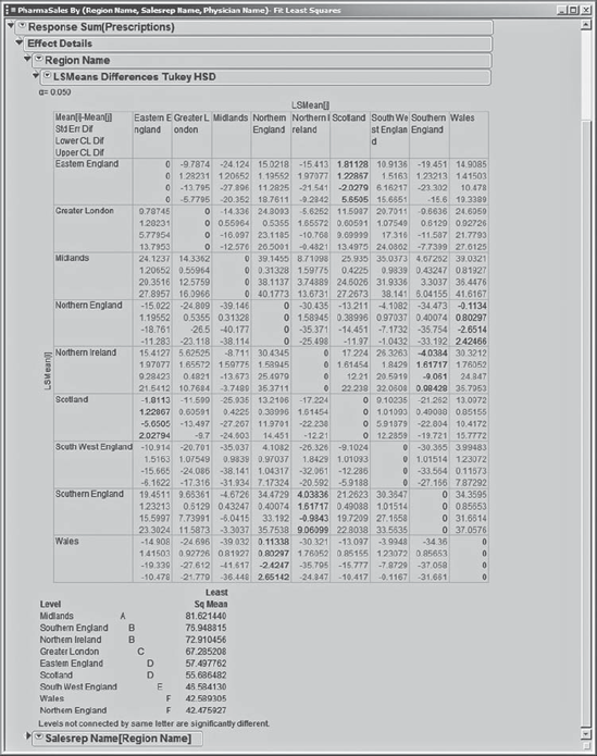
Arthur also points out that Rick can obtain an analog of comparison circles from this report. He tells Rick to open the Effect Details panel. The Region Name panel shows the Least Squares Means Table for Sum(Prescriptions). Clicking the red triangle next to Region Name opens a list of options from which Rick chooses LSMeans Tukey HSD. This presents pairwise comparisons based on the current model (Exhibit 7.45).
Figure 7.45. Effect Details Options for Region Name

The test results are represented in matrix form as shown in Exhibit 7.46. The first row in each cell of the matrix gives the mean difference between the two regions. Sean notes that some differences are large. Pairs of regions with results in gray (red on the screen) are significantly different (with an overall false alarm rate of 0.05). If the results are black, the difference is not statistically significant. The Connecting Letters report below the matrix summarizes the differences.
Note that these conclusions are exactly the same as those that Rick obtained using his simpler Compare Means approach. But, had the data contained substantial variability due to sales representatives, these conclusions might well have differed from those he obtained earlier.
Figure 7.46. Tukey HSD Pairwise Comparisons
With this, Rick thanks Arthur for his help. He feels much more comfortable now that he has a rigorous way to analyze his data. However, he reflects that he learned a lot from the simple, slightly incorrect comparison circle analysis. He closes all report windows but keeps his summary table open.
7.4.3. Uncovering Relationships: Prescriptions versus Visits by Region
Reflecting on the regional differences, Rick starts to wonder if the number of visits has an effect on a physician's prescribing habits. Do more visits tend to lead to more prescriptions for Pharma Inc.'s main product? Or, do physicians tire of visits by sales representatives, leading perhaps to a negative effect? Do more sample kits lead to more prescriptions, as one might expect?
Rick proceeds to develop insight into these issues by running Fit Y by X, with Sum(Prescriptions) as Y, Response and Sum(Visits) as X, Factor. After he clicks OK, he selects Fit Line from the red triangle. He obtains the Bivariate Fit plot shown in Exhibit 7.47.
Figure 7.47. Bivariate Plot for Sum(Prescriptions) by Sum(Visits)

Rick reminds himself that the X axis represents the total number of visits paid to the given physician by the sales representative over the eight-month period. It does appear that at least to a point more visits result in more prescriptions being written. Given the pattern of points on the plot and the fact that at some point additional visits will have diminishing returns, Rick suspects that there may be a little curvature to the relationship. So, he starts thinking about a quadratic fit. But, he would like to see such a fit for each of the nine regions, that is, by the values of Region Name.
First, Rick removes the line he has fit to all of the data. To do this, he clicks on the red triangle next to Linear Fit at the bottom left of the plot and chooses Remove Fit. Now he clicks on the red triangle at the top of the report and chooses Group By. This opens the dialog window shown in Exhibit 7.48. Rick chooses Region Name and clicks OK. This directs JMP to group the rows by Region Name so that further fits are performed for the data corresponding to each value of Region Name, rather than for the data set as a whole.
Figure 7.48. Group By Dialog
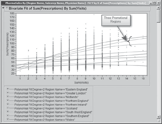
With this done, Rick returns to the red triangle at the top of the report and selects Fit Polynomial > 2, quadratic. He obtains the plot in Exhibit 7.49, which shows nine second-degree polynomial fits, one for each region. When he sees this, Rick is immediately struck by the three curves that start out fairly low in comparison to the others but that exceed the others as Sum(Visits) increases. Which regions are these?
Figure 7.49. Quadratic Fits to Each of the Nine Regions
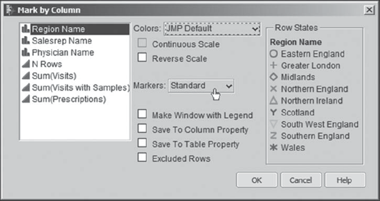
To better identify the regions, Rick right-clicks in the plot and chooses Row Legend from the context-sensitive menu that appears. A Mark by Column dialog window opens, where Rick selects Region Name from the list and specifies Standard Markers, as shown in Exhibit 7.50.
Figure 7.50. Mark by Column Dialog
When Rick clicks OK, a legend appears in his bivariate fit report. Rick finds that when he clicks on each region name in turn the points in the plot corresponding to that region are highlighted. This makes it easy for him to see how the different regions behave relative to Sum(Visits) and Sum(Prescriptions). Exhibit 7.51 shows the plot with Northern Ireland selected.
Figure 7.51. Bivariate Plot with Northern Ireland Selected
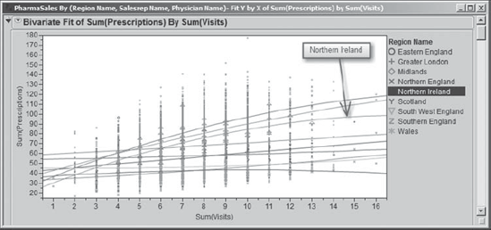
From the legend colors, Rick is able to tell that the three curves that start out low and proceed to exceed the others are for the three promotional regions. This suggests that leaving sample kits behind makes a big difference. Rick makes a mental note to run a similar analysis with Sum(Visits with Samples) as X, Factor in a few minutes.
The plot suggests that some of the other six regions may not see an increase in the number of prescriptions written with increased visits. Rick quickly peruses the Prob > F values for the model tests in the Analysis of Variance tables (realizing that these tests suffer from the same deficiency as his comparison circles did in his previous analysis and so are not technically correct). Models that are associated with Prob > F values less than 0.05 are marked by asterisks and can be considered significant. He sees that the Prob > F values for Eastern England, Southwest England, and Wales do not indicate that the quadratic fits are significant (nor are linear fits, which Rick also checks). This suggests that in these regions the sales representatives may need to do something other than increase visit frequency if they wish to increase sales. Rick saves this script to the data table as Bivariate Fit 1.
Yes, indeed, Rick is already planning a second bivariate fit! For this second fit, Rick selects Analyze > Fit Y by X, and enters Sum(Prescriptions) as Y, Response and Sum(Visits with Samples) as X, Factor. He repeats the steps that he took for the previous plot, grouping by Region Name, fitting second-degree polynomials to each region, and obtaining a row legend within the plot. He obtains the plot shown in Exhibit 7.52, where once again Northern Ireland is selected. He saves this second report as Bivariate Fit 2.
Figure 7.52. Bivariate Plot for Promotional Regions with Sum(Visits with Samples) on X Axis

Since only the three promotional regions had nonmissing data on Visits with Samples, these are the only three regions for which fits are possible. All three polynomial fits are significant. It seems clear that up to a point the more frequently the sales representative visited and left sample kits behind, the larger the number of prescriptions written. This analysis provides more evidence that the promotion was successful.
Of course, it raises the question about limits. When does one reach the point of diminishing returns relative to the number of visits with sample kits being left? This is an important marketing question. Rick wants to think about how to address this question before he raises it with his vice president. For now, though, Rick is confident that the promotion was successful, and he can use his plots to communicate the results to the vice president. Rick closes his summary table and all open reports and clears row states.