
8.7. Revising Knowledge
Having constructed models for MFI and CI and having identified the relevant Hot Xs, Carl and his team are ready to proceed to the Revise Knowledge step of the Visual Six Sigma Data Analysis Process. They will identify optimal settings for the Hot Xs, evaluate process behavior relative to variation in the Hot Xs using simulation, and run confirmatory trials to verify improvement.
8.7.1. Determining Optimal Factor Level Settings
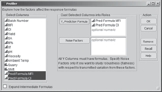
With both prediction formulas saved to the data table, Carl is ready to find settings for the Xs that will simultaneously optimize MFI and CI. To find these optimal settings, Carl selects Graph > Profiler. He enters both prediction formulas as Y, Prediction Formula (Exhibit 8.68).
Figure 8.68. Launch Dialog for Profiler
Clicking OK displays the profiler report shown in Exhibit 8.69, and Carl immediately saves this script as Profiler. Carl thinks back to what he learned in his training. The idea is to think of each prediction formula as defining a response surface. The profiler shows cross sections, called traces, of both response surfaces, with the top row of panels corresponding to MFI and the second row corresponding to CI. The cross sections are given for the designated values of M%, Xf, SA, and Quarry. To explore various factor settings, the vertical red dotted lines can be moved by clicking and dragging, showing how the two predicted responses change.
Consider only the top row of plots, which relate to MFI. Carl has estimated a prediction model for MFI that is based on the factors M%, Xf, SA, and Quarry. For a given value of Quarry, this is a response surface in four dimensions: There are three factor values, and these result in one predicted value. Given the settings in Exhibit 8.69, the profiler is telling us, for example, that when Quarry is Kuanga A and M% = 1.75 and Xf = 15.75, the predicted MFI values, for various settings of SA, are those given in the panel above SA. In other words, given that Quarry is specified, for specific settings of any two of the continuous factors, the profiler gives the cross section of the response surface for the third continuous factor.
Figure 8.69. Initial Profiler Report

8.7.2. Understanding the Profiler Traces
"Ha," thinks Carl. It is getting late in the day, and the idea of visualizing these traces by plotting a response surface sounds like a wonderful diversion. Then, maybe he can see more easily what these traces represent. So, he selects Graph > Surface Plot and enters Pred Formula MFI, SA, M%, Xf, and MFI as Columns. When he clicks OK, a surface plot appears.
Carl is interested in visualizing the interesting trace for MFI above SA in the prediction profiler in Exhibit 8.69. To do this, in the Independent Variables panel, Carl selects SA as X and Xf as Y, as shown in Exhibit 8.70. He sets M% to 1.75, its value in the prediction profiler. Glancing beneath the X and Y buttons, he notes that Quarry is set at Kuanga A, as in the profiler. The points for MFI are plotted, and the surface that is being used to model these points is displayed.
Carl notes that if he puts his cursor over the plot and clicks he can rotate the surface so as to better see various features. He rotates the plot to bring SA to the front and to make the Xf axis increasing from front to back. Carl notes that he can set a grid in the Independent Variables panel. He checks the box for Grid next to Xf and checks to verify that the Value is set at 15.75 (Exhibit 8.71).
Figure 8.70. Surface Plot for Pred Formula MFI
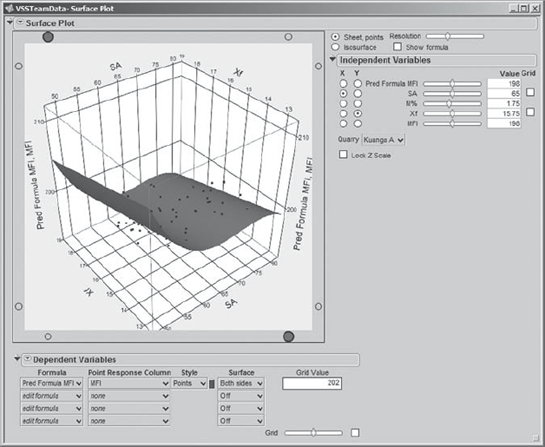
Figure 8.71. Surface Plot for Pred Formula MFI with Grid for Xf

This vertical grid cuts the surface in a curved shape. This is precisely the trace shown for SA in the profiler in Exhibit 8.69. Carl saves this script as Surface Plot – SA and Xf.
Now, Carl does realize that the profiler gives that cross section when Xf = 15.75 and M% = 1.75 and Quarry = Kuanga A. Carl varies the value of M% by moving the slider in the Independent Variables panel. He notes how the trace across the surface changes. This behavior is exhibited in the profiler when he changes settings as well.
Carl also explores the effect of Quarry, choosing the other quarries from the drop-down menu in the Independent Variables panel. The prediction surface changes slightly as he runs through the three quarries.
This exercise in three dimensions gives Carl some intuition about the profiler traces. He realizes that when he changes the settings of factors in the prediction profiler the traces correspond to cross sections of the prediction equation at the new settings.
8.7.3. Back to Simultaneous Optimization
"Well," Carl thinks, "That was fun! I need to show that to the team members later on. They will love it." Carl proceeds to his next task, which is to find optimal settings for the Hot Xs. To do this, he returns to the profiler. By now, he has lost that window, so he simply clicks on one of his reports, selects Window > Close All Reports, and then reruns the Profiler script.
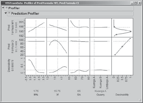
To find optimal settings, Carl will use the JMP desirability functions. He clicks on the red triangle next to Prediction Profiler and chooses Desirability Functions, as shown in Exhibit 8.72. He saves this script as Profiler – Desirability Functions.
Figure 8.72. Profiler Menu Showing Desirability Functions Option

This has the effect of adding a few more panels to the profiler. Two panels are added at the right, one for each of the responses (Exhibit 8.73). These show the desirability of various values of the responses, based on the specification limits that Carl entered into Column Info for MFI and CI earlier, in the section "Dealing with the Preliminaries." For example, values of MFI near 195 have desirability near 1, while values above 198 and below 192 have desirabilities near 0. Similarly, large values of CI have high desirability.
Figure 8.73. Profiler Showing Desirability Functions
To see the description of the desirability function for a given response, Carl double-clicks in the desirability function panel for that response. For MFI, he obtains the Response Goal dialog shown in Exhibit 8.74. After reviewing this, he clicks Cancel to exit with no changes.
Figure 8.74. Response Goal Dialog for MFI

New panels have also appeared at the bottom of the profiler, in a row called Desirability (Exhibit 8.73). This row gives traces for the desirability function, which, like the predicted surface, is a function of M%, Xf, SA, and Quarry. For example, Carl sees that if M% = 1.75 and SA = 65, then low values of Xf are not very desirable. This is true for all three settings of Quarry; Carl sees this by setting the vertical red line at each of the three values of Quarry.
Of course, the goal is to find settings of the factors that maximize the desirability value. To do this, Carl returns to the red triangle next to Prediction Profiler and chooses Maximize Desirability. He obtains the settings shown in Exhibit 8.75. The plot indicates that optimal settings for the three continuous Hot Xs are M% = 0, Xf = 15.1, and SA = 62.3. The optimal Quarry is Kuanga B. At Carl's settings, the predicted value of MFI is 195.069 and of CI is 99.740, both well within their specification limit ranges. Note that you may not obtain these same settings, since, in most cases, many different settings can maximize desirability. (Carl's exact settings can be obtained by running the script Profiler – Desirability Maximized.)
Figure 8.75. Profiler with Desirability Functions Maximized

"Now," thinks Carl, "it is not likely that we can rely on only a single supplier. What happens if we run at the optimal settings of the continuous variables, but obtain product from the other quarries?" He sees that for the optimal settings of the continuous variables all three quarries have desirability close to 1. He also reminds himself that Quarry is in the model for MFI but not for CI, so it does not affect the predicted value of CI.
Carl moves the vertical dashed line for Quarry to Kuanga A and notes that the predicted value for MFI increases by about 0.2 units to 195.26. He moves it to Umbago A and notes that the predicted value for MFI is about 195.40. It is clear that at the optimal settings of M%, Xf, and SA, Quarry does not have a large impact on MFI.
The plot also indicates that for the optimal settings of M% and SA, if Xf drifts to the 16- or 17-unit range, then desirability drops dramatically. By dragging the vertical dashed line for Xf to 16.5 and higher while looking at the Pred Formula CI trace for Xf, Carl sees that Pred Formula CI drops below 80 when Xf exceeds 16.5 or so. He concludes that CI is very sensitive to variation in Xf at the optimal settings of M% and SA.
8.7.4. Assessing Sensitivity to Predictor Settings
In fact, this reminds Carl that he learned about a sensitivity indicator in his training. From the Prediction Profiler red triangle, Carl selects Sensitivity Indicator. This adds little hollow triangles to the prediction traces. He saves the script as Profiler – Optimized with Sensitivity Indicators.
Carl leaves M% and SA at their optimal values and moves Xf to about 16.5 (Exhibit 8.76). He observes how the sensitivity indicator for CI in the Xf panel gets larger as he increases Xf to 16.5. He remembers that the sensitivity indicator points in the direction of change for the response as the factor level increases and that its size is proportional to the change. Carl concludes that maintaining tight control over Xf is critical.
Figure 8.76. Profiler with Sensitivity Indicators and Xf near 16.5
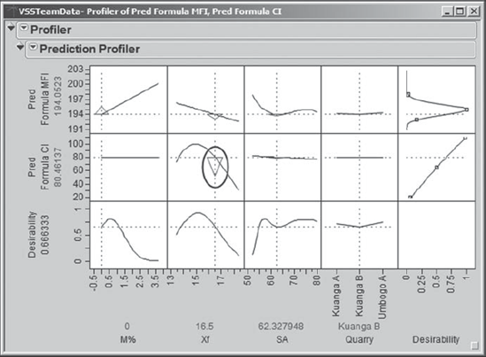
Carl reruns the script Profiler – Optimized with Sensitivity Indicators since, by exploring sensitivity, he has lost his optimal settings. This time, he moves the SA setting to its left a bit. The sensitivity indicator for MFI shows that MFI is highly sensitive to SA excursions to 60 and below (see Exhibit 8.77, where SA is set at 58). Carl also observes that in the design region shown in the profiler, CI is linearly related to SA, but CI is relatively insensitive to SA (the triangle for CI above SA is so small that it is barely visible). Also, MFI is linearly related to, and somewhat sensitive to, Xf. But, Carl concludes, the big sensitivities are those of MFI to low SA and CI to high Xf.
Figure 8.77. Profiler with Sensitivity Indicators and SA at 58

Carl reexamines the optimal settings, which he retrieves by rerunning the script Profiler – Desirability Maximized. Carl finds them very interesting: The optimal setting for M%, the viscosity modifier, is 0! So, adding the modifier actually degrades MFI (M% is not involved in the model for CI).
When Carl brings this information to the team members, they are surprised. It was always believed that the modifier helped the melt flow index. The team members talk with engineers about this, and it is decided that, perhaps, the modifier is not required—at least they are interested in testing a few batches without it.
Based on Carl's sensitivity analysis, the team concludes that both SA and Xf must be controlled tightly. The team members get started on developing an understanding of why these two factors vary, and on proposing procedures that will ensure tighter control over them. They propose a new control mechanism to monitor SA (amps for slurry tank stirrer) and to keep it on target at the optimal value of 62.3 and within narrow tolerances. They also develop procedures to ensure that filler and water will be added at regular intervals to ensure that Xf (percent of filler in the polymer) is kept at a constant level close to 15.1 percent.
Carl instructs the team members to test their new controls and to collect data from which they can estimate the variability in the SA and Xf settings in practice.
8.7.5. Simulating Process Outcomes
This takes the team members a few weeks. But they return with data that indicate that when they attempt to hold Xf and SA on target their effective settings do vary. They appear to have approximately normal distributions with standard deviations of 0.4 and 1.9, respectively. Carl's plan is to use these estimates of variation, together with simulation, to obtain reliable estimates of capability for both responses of interest.
With the team present, Carl reruns his profiler script, Profiler – Desirability Maximized. From the second-level red triangle he chooses Simulator (Exhibit 8.78).
Figure 8.78. Profiler Menu Showing Simulator Option

This adds options to the report (see Exhibit 8.79). In particular, below the factor settings, the report now contains drop-down menus that allow the user to specify distributions to use in simulating factor variability.
Figure 8.79. Profiler with Simulation Options

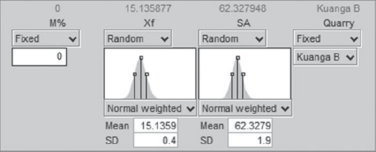
The work of the team members has shown that estimates for the standard deviations of Xf and SA are 0.4 and 1.9, respectively. Carl enters these as follows. For Xf, he clicks on the arrow next to Fixed (circled in Exhibit 8.79). From the drop-down list for Xf, he chooses Random. The default distribution is Normal. But Carl clicks on the arrow next to Normal and chooses Normal weighted from the list of distributions that appears (see Exhibit 8.80). This option results in sampling from a normal distribution, but in a fashion that estimates the parts per million (PPM) defective rate with more precision than would otherwise be possible. The mean is set by default at the optimal setting. Carl enters 0.4 as the SD for Xf.
Figure 8.80. Simulator with Choices of Distributions

In a similar fashion, for SA, Carl chooses Normal weighted and adds 1.9 as the SD (see Exhibit 8.81). Then he saves the script as Profiler – Simulator.
Figure 8.81. Simulator with Values Entered
Now, the moment of truth has arrived. The team waits with anticipation (a drum roll is heard) as Carl clicks the Simulate button. A panel appears below the Simulate button (Exhibit 8.82). Carl right-clicks in these results and selects Columns > PPM. When the team members see the PPM value of 360, they erupt in congratulations. Carl runs the simulation a few more times, and although there is some variation in the PPM values, that first value of 360 seems to be a reasonable estimate.
Figure 8.82. Simulation Results

In the Defect table below the Simulate button, Carl notices that the majority of defective values are coming from CI. He remembers that CI is sensitive to Xf values in the region of the optimal settings. If the standard deviation for Xf could be reduced, this might further reduce the estimated PPM rate. Nonetheless, the team has very good news to report. Everyone is anxious to meet with Edward, the manufacturing director, and to test these predictions in real life.
8.7.6. Confirming the Improvement
Edward is thrilled with the team's report and gives them the go-ahead to run formal confirmation trials, measuring yield through to the molding plant. In the limited experience they have had to date with running the process at the optimal settings, they have only monitored the polymer plant yield. Together, the team and Carl decide to perform tests on five batches using the target settings and controls for SA and Xf. The batches are followed through the molding plant, so that, in line with the original definition, Yield is measured using both polymer plant and molding plant waste. The measurements for these five batches are given in the data table ConfirmationData.jmp, shown in Exhibit 8.83.
Figure 8.83. Confirmation Data from Five Batches
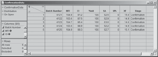
What a delight to see all MFI and CI values well within their specifications and to see 100 percent Yield on all five batches! Carl and his team are ecstatic.