
9.3. Uncovering Relationships
As suggested by the Visual Six Sigma Roadmap (Exhibit 3.30), Mi-Ling begins her analysis of the Wisconsin Breast Cancer Diagnostic Data Set by visualizing the data one variable at a time, two variables at a time, and more than two at a time. This provides her with the knowledge that there are strong relationships between the 30 predictors and the diagnosis into benign or malignant masses.
9.3.1. One Variable at a Time
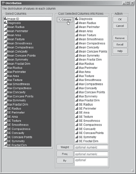
Mi-Ling opens the data table CellClassification_1.jmp. As a first step, she obtains distribution reports for all of the variables other than ImageID, which is simply an identifier. She notes that each variable other than Diagnosis has a name beginning with Mean, Max, or SE, indicating which summary statistic has been calculated—the mean, max, or standard error of the mean of the measured quantity. She selects Analyze > Distribution and populates the launch dialog as shown in Exhibit 9.3.
Figure 9.3. Launch Dialog for Distribution Platform
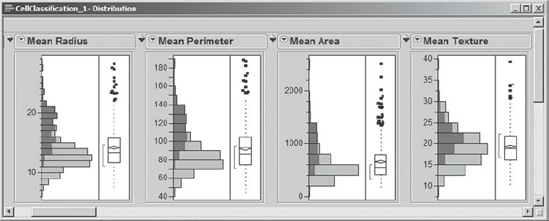
Upon clicking OK, she sees 31 distribution reports, the first four of which are shown in Exhibit 9.4. The vertical layout for the graphs is the JMP default. Mi-Ling knows that she can change this either interactively or more permanently in File > Preferences, but she is happy with this layout for now.
Figure 9.4. First 4 of 31 Distribution Reports

The bar graph corresponding to Diagnosis indicates that 212, or 37.258 percent, of the tumors in the study were assigned the value M, indicating they were malignant rather than benign. Scrolling through the plots for the 30 predictors, Mi-Ling assesses the shape of the distributions and the presence of possible outliers. She notes that most distributions are skewed toward higher values and that there may be some outliers, for example, for SE Concavity. She also determines, by looking at N under Moments, that there are no missing values for any of the variables. All in all, the data are well-behaved—she expects her marketing data to be much messier—but she decides that this is a good practice data set given her goal.
Mi-Ling saves a script to recreate the analysis in Exhibit 9.4 to her data table as described in Chapter 3, calling it Distribution – 31 Variables. When she does this, the script name is placed in the table panel at the upper left of the data table. To run this script in the future, Mi-Ling can simply click on the red triangle next to its name and choose Run Script.
9.3.2. Two Variables at a Time
9.3.2.1. DISTRIBUTION AND DYNAMIC LINKING
Next, Mi-Ling addresses the issue of bivariate relationships among the variables. Of special interest to her is whether the predictors are useful in predicting the values of Diagnosis, the dependent variable.
To get some initial insight on this issue, she returns to her distribution report. In the graph for Diagnosis, Mi-Ling clicks on the bar corresponding to M. This has the effect of selecting all rows in the data table for which Diagnosis has the value M. These rows are dynamically linked to all plots, and so, in the 30 histograms corresponding to predictors, areas that correspond to the rows where Diagnosis is M are highlighted.
For four of the histograms that correspond to Mean characteristics, Exhibit 9.5 shows the highlighting that results when Mi-Ling selects M in the Diagnosis bar chart. She notes that malignant masses tend to have high values for these four variables. By scrolling through the remaining plots, she sees that there are relationships with most of the other variables as well. In fact, for most, but not all, of the variables, malignant masses tend to have larger values than do benign masses.
Figure 9.5. Histograms for Four Mean Variables, with Malignant Masses Highlighted
Mi-Ling then clicks on the bar for Diagnosis equal to B for additional insight. Mi-Ling concludes that there are clear relationships between Diagnosis and the 30 potential predictors. She is optimistic that she can build good models for classifying a mass as malignant or benign based on these predictors.
9.3.2.2. CORRELATIONS AND SCATTERPLOT MATRIX
Mi-Ling is also interested in how the 30 predictors relate to each other. To see bivariate relationships among these 30 continuous predictors, she decides to look at correlations and scatterplots. She selects Analyze > Multivariate Methods > Multivariate. In the launch dialog, she enters all 30 predictors, from Mean Radius to SE Fractal Dimension, as Y, Columns (see Exhibit 9.6). There is a drop-down menu at the bottom of the dialog that allows the user to choose one of five estimation methods; this choice is driven by considerations such as the nature of the data and the extent of missing values. Mi-Ling trusts JMP to choose the best method for her.
Figure 9.6. Launch Dialog for Multivariate and Correlations Report

When Mi-Ling clicks OK, a report containing a correlation matrix appears (a partial view is shown in Exhibit 9.7).
Figure 9.7. Partial View of Correlation Matrix for 30 Predictors

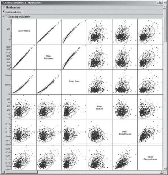
Mi-Ling prefers to see plots, so she clicks on the red triangle at the top of the report next to Multivariate and chooses Scatterplot Matrix. This gives a 30 × 30 matrix showing all bivariate scatterplots for the 30 predictors. The 6 × 6 portion of the matrix corresponding to the first six Mean variables is shown in Exhibit 9.8. She saves the script that generates this output to the data table as Scatterplots – 30 Predictors.
Figure 9.8. Partial View of Correlation Matrix: Six Mean Variables
"It would be nice to see how Diagnosis fits into the scatterplot display," thinks Mi-Ling. James had shown her that in many plots one can simply right-click to color or mark points by the values in a given column. So, she right-clicks in various locations in the scatterplot. When she right-clicks in an off-diagonal square, the menu shown in Exhibit 9.9 appears. Mi-Ling hovers over Row Legend with her cursor, reads the tool-tip that appears, and realizes that this is exactly what she wants—a legend that colors the rows according to the values in the Diagnosis column.
Figure 9.9. Context-Sensitive Menu from Right-Click on an Off-Diagonal Square

When Mi-Ling clicks on Row Legend, a Mark by Column dialog appears. Here, she chooses Diagnosis. The default colors don't look appropriate to her—red, a color typically associated with danger, is associated with B, which is a good outcome, and blue is associated with M, a bad outcome (Exhibit 9.10). She would like to see these colors reversed.
Figure 9.10. Mark by Column Dialog with Diagnosis Selected

So, she checks the box next to Reverse Scale—this switches the colors. Then, she explores what is available under Markers, viewing the updated display in the dialog's Row States panel. She settles on Hollow markers, because these will show well in grayscale printouts. After a quick telephone call to James, at his suggestion, she checks Make Window with Legend and Save to Column Property. James indicates that Make Window with Legend will provide her with a separate legend window that is handy, especially when viewing large or three-dimensional plots. He also suggests Save to Column Property, as this will save her color scheme to the Diagnosis column, which she may find useful later on. The launch window with her selections is shown in Exhibit 9.11. She clicks OK.
Figure 9.11. Completed Mark by Column Dialog

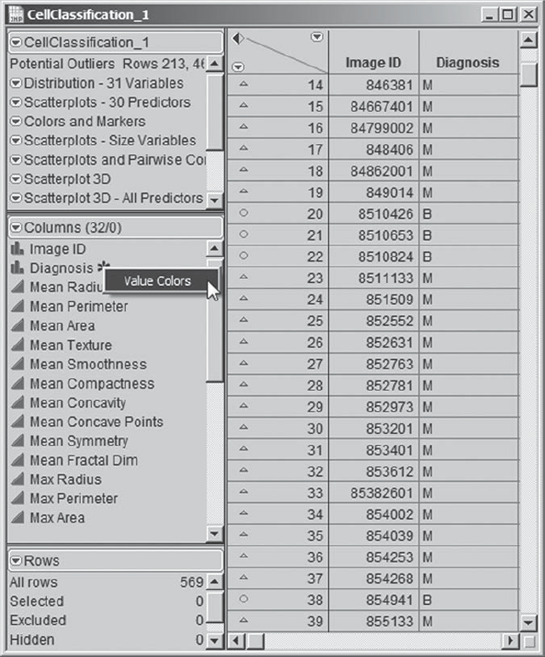
Mi-Ling observes that the colored markers now appear in her data table next to the row numbers. Also, an asterisk appears next to Diagnosis in the columns panel. She clicks on it, and it indicates Value Colors (Exhibit 9.12). Clicking on Value Colors takes her to the Diagnosis Column Info dialog, where she sees that the colors have been applied to B and M as she requested.
Figure 9.12. Markers in Data Table and Value Colors Property
The colors and markers appear in the scatterplots as well, and a legend is inserted to the right of the matrix as part of the report. Exhibit 9.13 shows the rightmost part of the scatterplot matrix along with the inserted legend.
Figure 9.13. Top Right Portion of Correlation Matrix with Legend for Markers and Colors

Mi-Ling has also created the portable legend window that is shown in Exhibit 9.14. (The script Colors and Markers will add the colors and markers but will not produce the freestanding legend window.)
Figure 9.14. The Portable Legend Window

Mi-Ling moves the portable legend into the upper left portion of her scatterplot matrix, as shown in Exhibit 9.15. Here, she has clicked on the B level for Diagnosis. This selects all rows where Diagnosis is B and highlights these points in plots, as can be seen in the portion of the scatterplot matrix shown in Exhibit 9.15. To unselect the B rows, Mi-Ling holds the control key as she clicks on the B level in the legend. Note that the built-in legend shown in Exhibit 9.13 can also be used to select points.
Figure 9.15. Portable Legend Window with B Selected
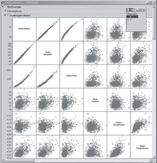
Mi-Ling turns her attention to the radius, perimeter, and area variables. She thinks of these as size variables, namely, variables that describe the size of the nuclei. Mean Radius, Mean Perimeter, and Mean Area show strong pairwise relationships, as do the Max and SE versions of the size variables. To view these relationships in greater detail, Mi-Ling obtains three Multivariate reports: one for the Mean size variables, one for the Max size variables, and one for the SE size variables. The reports for the Mean and SE size variables are shown in Exhibit 9.16. (The script is Scatterplots – Size Variables.)
Figure 9.16. Scatterplot Matrices for Mean and SE Size Variables

For example, Mi-Ling sees from the plots that Mean Radius and Mean Perimeter are highly correlated. Also, the Correlations panel indicates that their correlation coefficient is 0.9979. Given what is being measured, she notes that this is not an unexpected result. She also sees that Mean Area is highly correlated with both Mean Radius and Mean Perimeter. These relationships show some curvature and appear to be quadratic. Giving this a little thought, Mi-Ling realizes that this is reasonable, since the area of a circle depends on the square of its radius and circumference.
Similar relationships extend to the variables Max Radius, Max Perimeter, and Max Area, as well as to the variables SE Radius, SE Perimeter, and SE Area, albeit in a weaker form.
For documentation purposes, Mi-Ling would like to save a single script that recreates all three of these Multivariate reports. To do this, she saves the script for one of the reports to the data table. The script is automatically saved with the name Multivariate 2, where the 2 is added because the table already contains a script called Multivariate. Then, Mi-Ling clicks on the red triangle to the left of Multivariate 2 and selects Edit.
In the script text box, she enters a semicolon after the very last line; this is how JMP Scripting Language (JSL) glues statements together. Then she copies the code that is there and pastes it twice at the very end of the code in the text window. Having done this, Mi-Ling then changes the variable names in the obvious way, replacing Mean with Max in the second Multivariate function and Mean with SE in the third. She renames the script Scatterplots – Size Variables. (If you rename your script using this name, a suffix of 2 will be added as part of its name in the data table, since Mi-Ling's script with this name is already saved to the data table. In her script, for convenience, you will see that we have added a Color by Column command.)
9.3.2.3. PAIRWISE CORRELATIONS
At this point, Mi-Ling wonders which variables are most strongly correlated with each other, either in a positive or negative sense. The scatterplot certainly gives her some clear visual information. However, a quick numerical summary showing correlations for all pairs of variables would be nice.
She closes the three size variable reports that she has just created and returns to the Multivariate report for the 30 predictors (if you have closed this report, you can retrieve it by running the script Scatterplots – 30 Predictors). She clicks on the disclosure icons next to Correlations and Scatterplot Matrix to close these parts of the report, and then selects Pairwise Correlations from the red triangle next to Multivariate. Mi-Ling saves this new script as Scatterplots and Pairwise Correlations.
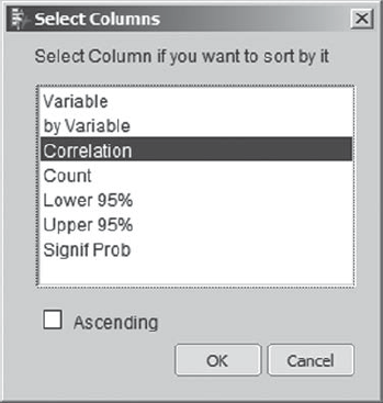
Mi-Ling would like to see the correlations sorted in descending order. She remembers something that James showed her. In the Pairwise Correlations panel, Mi-Ling right-clicks, and the menu shown in Exhibit 9.17 appears. James had mentioned that this is a standard menu that usually appears when you right-click in a report containing text or numeric results.
Figure 9.17. Context-Sensitive Menu from a Right-Click in Table Panel

Mi-Ling selects Sort by Column, and a pop-up list appears allowing her to choose the column by which to sort. She chooses Correlation (Exhibit 9.18) and clicks OK.
Figure 9.18. Pop-Up List for Column Selection
"How many pairwise correlations are there?" Mi-Ling wonders. She reasons: There are 30 variables, each of which can be paired with 29 other variables, giving 30 × 29 = 870 combinations; but these double-count the correlations, so there are 870/2 = 435 distinct pairwise correlations. These 435 correlations are sorted in descending order. Exhibit 9.19 shows the 20 most positive and 10 most negative correlations.
Figure 9.19. Most Positive 20 and Most Negative 10 Correlations

In this report, Mi-Ling again notes the high correlations among the Mean size variables, the Max size variables, and the SE size variables, which appear in the top part of Exhibit 9.19. She also notes that the Max size variables are very highly correlated with the Mean size variables. Again, this is an expected result. In fact, scanning further down the report, Mi-Ling observes that the Mean and Max variables for the same characteristics tend to have fairly high correlations, as expected.
Many of the large negative correlations involve fractal dimension and the size measures. Recall that the larger the fractal dimension the more irregular the contour. Six such correlations are shown in the bottom part of Exhibit 9.19. This suggests that larger cells tend to have more regular contours than smaller cells. How interesting! Mi-Ling wonders if this apparent relationship might be an artifact of how fractal dimension was measured.
9.3.2.4. A BETTER LOOK AT MEAN FRACTAL DIMENSION
To get a better feeling for relationships between size variables and fractal dimension, Mi-Ling explores Mean Fractal Dim and Mean Radius. She selects Analyze > Fit Y by X, enters Mean Radius as Y, Response, Mean Fractal Dim as X, Factor, and clicks OK. Her bivariate report is shown in Exhibit 9.20.
Figure 9.20. Bivariate Plot for Mean Radius and Mean Fractal Dim

As the correlation coefficient indicates, the combined collection of benign and malignant cells exhibits a decreasing relationship between Mean Radius and Mean Fractal Dim. However, given a value of Mean Fractal Dim, Mean Radius appears to be higher for malignant cells than for benign cells.
Mi-Ling would like to fit lines to each Diagnosis grouping in Exhibit 9.20. She clicks on the red triangle in the report and selects Group By. This opens a list from which Mi-Ling can select a grouping column. She selects Diagnosis and clicks OK. Then she clicks again on the red triangle and selects Fit Line. The report updates to show the plot in Exhibit 9.21. She saves this script as Bivariate.
Figure 9.21. Bivariate Plot for Mean Radius and Mean Fractal Dim, with Lines Fit by Diagnosis
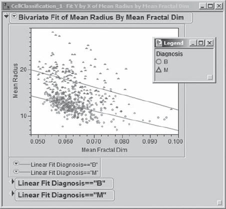
In fact, there is a very big difference between the two diagnosis groups, based on how Mean Radius and Mean Fractal Dim are related. Mi-Ling can see that for many pairs of values on these two variables one could make a good guess as to whether a mass is benign or malignant. She can see where she would need additional variables to help distinguish the two groups in that murky area between the fitted lines. But this is encouraging—it should be possible to devise a good classification scheme.
At this point, Mi-Ling remembers that one of the pitfalls of interpreting correlations of data containing a grouping or classification variable is that two variables may seem highly correlated, but when broken down by the levels of the classification variable, this correlation may actually be small. This was clearly not the case for Mean Radius and Mean Fractal Dim. However, she wonders if this might be the case for any of her other correlations.
From their plot in the scatterplot matrix, Mi-Ling suspects that Mean Area and Mean Compactness may provide an example of this pitfall. The correlation matrix indicates that their correlation is 0.4985, which seems somewhat substantial. To see the relationship between these two variables more clearly, she selects Analyze > Multivariate Methods > Multivariate, and enters only Mean Area and Mean Compactness as Y, Columns. Clicking OK gives the report in Exhibit 9.22. The points as a whole show a positive relationship, with Mean Area increasing with Mean Compactness.
Figure 9.22. Correlation and Scatterplot Matrix for Mean Area and Mean Compactness

But what happens if the two Diagnosis groups are separated? Mi-Ling returns to Analyze > Multivariate Methods > Multivariate, clicks on Recall to repopulate the menu with the previous entries, and adds Diagnosis as a By variable. (The script is saved as Multivariate.) As she suspected, the resulting report, shown in Exhibit 9.23, shows that for each Diagnosis grouping there is very little correlation between these two variables.
Figure 9.23. Correlations and Scatterplots for Mean Area and Mean Compactness by Diagnosis
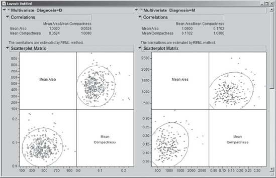
The apparent correlation when the data are aggregated is a function of how the two Diagnosis groups differ relative to the magnitudes of the two predictors. She makes a note to keep this phenomenon in mind when she is analyzing her test campaign data. (We note in passing that the arrangement seen in Exhibit 9.23 is created using Edit > Layout. You can learn about this feature in Help.)
Part of what motivates Mi-Ling's interest in correlations is simply that they help to understand pairwise relationships. Another aspect, though, is that she is aware that strong correlations lead to multicollinearity, which can cause problems for explanatory models—model coefficients and their standard errors can be too large and the coefficients can have the wrong signs. However, Mi-Ling realizes that her interest is in predictive models. For these models, the individual coefficients themselves, and hence the impact of multicollinearity, are of less importance, so long as future observations have the same correlation structure.
In examining the scatterplot matrix further, Mi-Ling notes that there may be a few bivariate outliers. If this were her marketing data set, she would attempt to obtain more background on these records to get a better understanding of how to deal with them. For now, she chooses not to take any action relative to these points. However, she makes a mental note that later she might want to revisit their inclusion in model-building since they have the potential to be influential. (We invite you, the reader, to explore whether the exclusion of some of these outliers might lead to better models.)
9.3.3. More Than Two Variables at a Time
Thinking back to her analysis of pairwise correlations, Mi-Ling realizes that the ability to color and mark points by Diagnosis class, a nominal variable, has in effect allowed her to do three-dimensional visualization. But what if all three variables of interest are continuous? What if there are more than three variables of interest? Mi-Ling is anxious to see how JMP can help with visualization in this setting. At this point, Mi-Ling tidies up by closing all her open reports but leaves the portable legend window open.
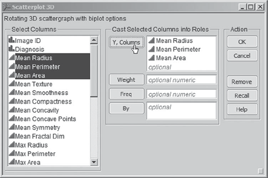
Under Graph, Mi-Ling sees something called Scatterplot 3D. She thinks that this might be a useful tool for three-dimensional explorations. To start, she is interested in viewing the three-dimensional relationship among the three size variables, Mean Radius, Mean Perimeter, and Mean Area. She selects Graph > Scatterplot 3D and enters the three size variables as Y, Columns (see Exhibit 9.24).
Figure 9.24. Launch Dialog for Scatterplot 3D
When she clicks OK, a rotatable three-dimensional plot of the data appears. She rotates this plot to better see the relationships of the three predictors with Diagnosis (Exhibit 9.25). The strength of the three-dimensional relationship is striking. However, it is not clear where one would define a split into the two Diagnosis classes. Mi-Ling saves the script that generates this plot as Scatterplot 3D.
Figure 9.25. Three-Dimensional View of Mean Size Variables, by Diagnosis

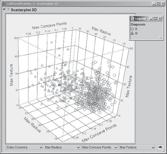
Mi-Ling returns to Graph > Scatterplot 3D and enters all 30 predictor variables as Y, Columns in the Scatterplot 3D launch dialog. She clicks OK and obtains a plot showing the same three variables as in Exhibit 9.25, since they were the first listed. She sees that JMP allows the user to select any three variables for the axes from the drop-down lists at the bottom of the plot (Exhibit 9.26). In fact, Mi-Ling discovers that by clicking on the arrow at the bottom right of the plot, she can cycle through all possible combinations of three axis choices, of which there are many.
Figure 9.26. Scatterplot 3D Showing List for Axis Choice

One of the plots catches her attention. To see it again, Mi-Ling makes selections from the lists to redisplay it, choosing Max Radius, Max Concave Points, and Max Texture. She rotates this plot (Exhibit 9.27) and notes that the two diagnosis classes have a reasonable degree of separation in this three-dimensional space. This is encouraging, again suggesting that a good classification scheme is possible. She saves the script that generates this rotated plot, as well as 3D plots for all the other variables, as Scatterplot 3D – All Predictors.
Figure 9.27. Scatterplot 3D for Max Radius, Max Concave Points, and Max Texture
Pleased that she can view the data in this fashion, Mi-Ling decides to move on to her modeling efforts. She suspects that she will want to pursue more three-dimensional visualization as she develops and assesses her models. She closes all reports, as well as the legend window.