
9.4. Constructing the Training, Validation, and Test Sets
At this point, Mi-Ling has accumulated enough knowledge to realize that she should be able to build a strong classification model. She is ready to move on to the Model Relationships step of the Visual Six Sigma Data Analysis Process. However, she anticipates that the marketing study will result in a large and unruly data set, probably with many outliers, some missing values, irregular distributions, and some categorical data. It will not be nearly as small or as clean as her practice data set. So, she wants to consider modeling from a data-mining perspective.
From her previous experience, Mi-Ling knows that some data-mining techniques, such as recursive partitioning and neural nets, fit highly parameterized nonlinear models that have the potential to fit the anomalies and noise in a data set, as well as the signal. These data-mining techniques do not allow for variable selection based on hypothesis tests, which, in classical modeling, help the analyst choose models that do not overfit or underfit the data.
To balance the competing forces of overfitting and underfitting in data-mining efforts, one often divides the available data into at least two and sometimes three distinct sets. Since the tendency to overfit data may introduce bias into models fit and validated using the same data, just a portion of the data, called the training set, is used to construct several potential models. One then assesses the performance of these models on a hold-out portion of the data called the validation set. A best model is chosen based on performance on the validation data. Since choosing a model based on the validation set can also lead to overfitting, in situations where the model's predictive ability is important, a third independent set of the data is often reserved to test the model's performance. This third set is called the test set.[]
With these issues in mind, Mi-Ling proceeds to construct three analysis data sets: a training set, a validation set, and a test set. She defines these in her data table and runs a quick visual check to see that there are no obvious issues arising from how she divided the data. Then she uses row state variables to facilitate selecting the rows that belong to each analysis set.
9.4.1. Defining the Training, Validation, and Test Sets
Admittedly, Mi-Ling's data set of 569 observations is small and well-behaved compared to most data sets where data-mining techniques are applied. But she reminds herself that she is working with this smaller, more manageable data set in order to learn how to apply techniques to the much larger marketing data set that she will soon need to analyze, as well as to any other large databases with which she may work in the future.
Mi-Ling will divide her data set of 569 rows into three portions:
A training set consisting of about 60 percent of the data.
A validation set consisting of about 20 percent of the data.
A test set consisting of the remaining 20 percent of the data.
This is a typical split used in data-mining applications, where a large share of the data is used to develop models, while smaller shares are used to compare and assess models.
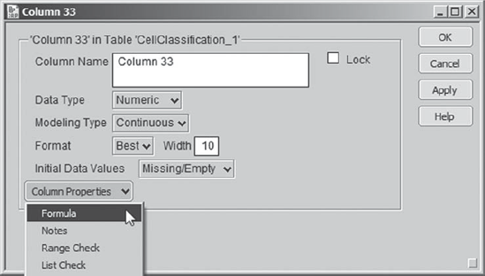
Mi-Ling wants to assign rows to these groups randomly. With some help from James, she sees how she can accomplish this using the formulas for random number generation provided in JMP. Mi-Ling inserts a new column in her data table. (If you prefer not to work through defining this new column, you can insert it by running the script Random Unif.) She does this by double-clicking in the column header area to the right of the column that is furthest to the right in the data table, SE Fractal Dim. The text Column 33 appears and is selected, ready for her to type in a column name. But she is not ready to do this yet, and so she clicks away the column header, and then double-clicks back on it. This opens the Column Info window. From the Column Properties menu, Mi-Ling selects Formula (see Exhibit 9.28).
Figure 9.28. Column Info Dialog with Formula Selected from Column Properties
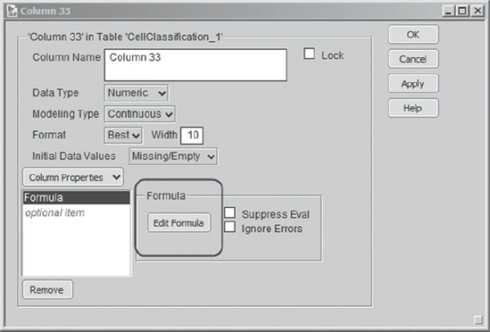
Once she has selected Formula, the Column Info menu updates with a panel for the Formula and an Edit Formula button (Exhibit 9.29). Had a formula already been entered, it would display in this Formula panel.
Figure 9.29. Column Info Dialog with Formula Panel
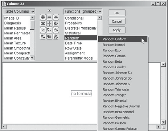
Since Mi-Ling wants to enter a formula, she clicks Edit Formula. This opens the formula editor. Here, Mi-Ling notices that the formula expressions are arranged into groups, in the list Functions (grouped). She scrolls down until she comes to Random (Exhibit 9.30). Here, she is impressed with the many different types of distributions from which random values can be generated. She recalls that a uniform distribution is one that assigns equal likelihood to all values between 0 and 1 and realizes this will make it easy for her to assign rows to her 60–20–20 percent sampling scheme. She selects Random Uniform, as shown in Exhibit 9.30.
Figure 9.30. Formula Editor Showing Function Groupings with Random Uniform Selected
The formula Random Uniform() appears in the formula editor window. Mi-Ling clicks Apply in the formula editor. This enters values into her new column. She checks these values, and they appear to be random values between 0 and 1. Just to see what happens, she clicks Apply again. The values change—it appears that whenever she clicks Apply, new random values are generated. This is very nice, but Mi-Ling sees that it could lead to problems later on if she or someone else were to access the formula editor for this column and click Apply. So, since she no longer needs the formula, she clicks on the box outlining the formula to select it and then clicks the delete key on her keyboard.
Then Mi-Ling clicks OK and returns to the Column Info dialog, which is still open. She types in Random Unif as the Column Name and clicks OK. The new column in the data table now has the name Random Unif, and it is populated with values randomly chosen between 0 and 1.
Because the random uniform command chooses values between 0 and 1 with equal likelihood, the proportion of values in this column that fall between 0 and 0.6 will be about 60 percent, the proportion between 0.6 and 0.8 will be about 20 percent, and the proportion between 0.8 and 1.0 will be about 20 percent. Mi-Ling will use this as the basis for her assignment of rows to the training, validation, and test subsets. She will define a column called Data Set Indicator that will assign values in these proportions to the three analysis subsets. (If you prefer not to work through setting up this column and defining the assignments, you may run the script Data Set Indicator.)
Mi-Ling inserts another new column by double-clicking to the right of Random Unif. She replaces the highlighted Column 34 with the name for her new column, Data Set Indicator. She will define values in this column using a formula, but this time she takes a shortcut to get to the formula editor. She clicks away from the column header and then right-clicks back on it. The context-sensitive menu shown in Exhibit 9.31 appears. From this menu, Mi-Ling chooses Formula. This opens the formula editor window.
Figure 9.31. Context-Sensitive Menu Obtained from Right-Click in Column Header Area

Once in the formula editor, Mi-Ling begins the process of entering the formula (shown in its completed form in Exhibit 9.38) that assigns rows to one of the three data sets based on the value of the random uniform value assigned in the column Random Unif. Here are the steps that Mi-Ling follows in constructing this formula:
From Functions (grouped), Mi-Ling chooses Conditional > If (Exhibit 9.32). This gives the conditional function template in Exhibit 9.33.
Since she wants four conditional clauses, Mi-Ling proceeds to insert these. She selects the last box in the template, which is a placeholder for the else clause (Exhibit 9.34).
Then, she locates the insertion key in the top right corner of the keypad (Exhibit 9.35). She clicks the insertion key four times to obtain her desired configuration (Exhibit 9.36).
Now Mi-Ling needs to populate the boxes. She selects the first expr box and clicks on Random Unif in the Table Columns listing. This inserts Random Unif into the selected box, as shown in Exhibit 9.37.
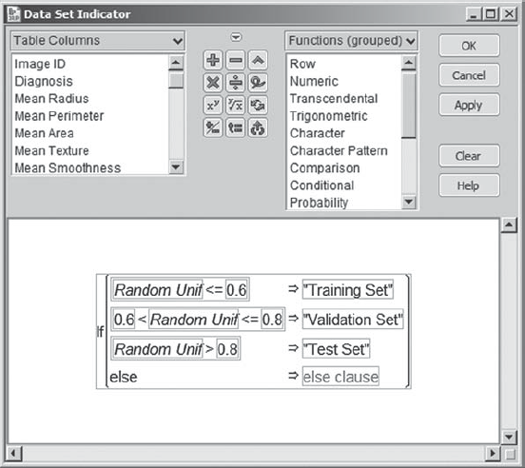
Using her keyboard, Mi-Ling types the symbols: < = 0.6. This completes the first expression.
Now, she selects the first then clause box. She clicks on it and types in the text "Training Set" with the quotes. She realizes that quotes are needed, because she is entering a character value.
She completes the second and third clauses in a similar fashion. When she is finished, her formula appears as in Exhibit 9.38.
She leaves the final else clause as is. This has the effect of assigning a missing value to any row for which Random Unif does not fall into one of the three groupings defined in the preceding clauses. Although Mi-Ling knows that she has covered all possible values of Random Unif in the first three expressions, she realizes that it is good practice to include a clause to catch errors in a conditional formula such as this one.
Finally, she clicks OK to close the formula editor. The Data Set Indicator column is now populated based on the values of Random Unif. In addition, as she notes from the columns panel, the column Data Set Indicator has been assigned a nominal modeling type, consistent with its character data values.
Figure 9.32. Conditional Function Choices
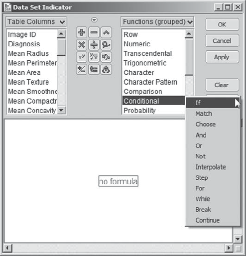
Figure 9.33. Conditional Formula Template
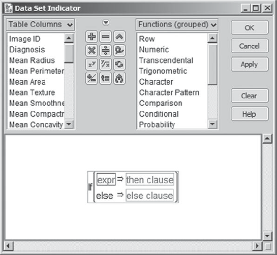
Figure 9.34. Conditional Formula Template with Else Clause Selected

Figure 9.35. Insertion Key

Figure 9.36. Conditional Template after Four Insertions
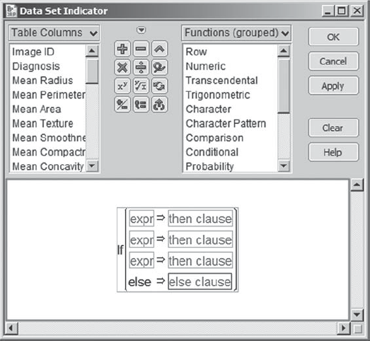
Figure 9.37. Insertion of Random Unif into Expr Box
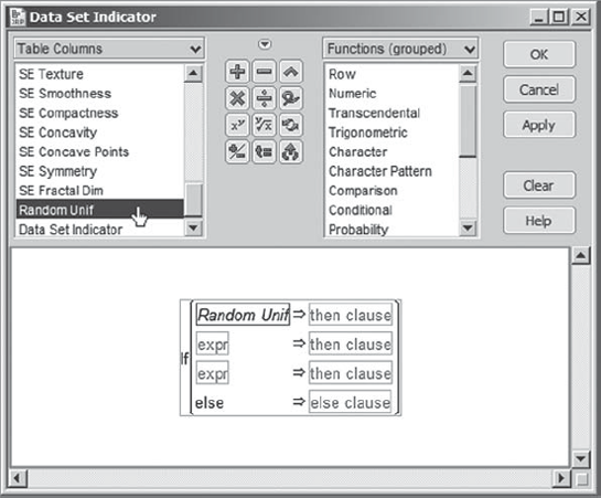
Figure 9.38. Formula Defining Data Set Indicator Column
There is one last detail that Mi-Ling wants to address before finishing her work on the column Data Set Indicator. When she thinks about her three data sets, she associates a temporal order with them: First, the training set, second, the validation set, and, finally, the test set. When these data sets appear in plots or reports, she wants to see them in this order. This means that she needs to tell JMP how she wants them ordered. She can do this using the Value Ordering column property.
By double-clicking in the column header area for Data Set Indicator, Mi-Ling opens the Column Info dialog window. (She could also right-click in the Data Set Indicator column header area, then choose Column Info from the options list.) Under Column Properties, she chooses Value Ordering (Exhibit 9.39).
Figure 9.39. Value Ordering Choice from Column Properties Menu

Once this is selected, a new dialog opens where she can set the ordering of the three values (Exhibit 9.40). She would like these values to appear in the order: Training Set, Validation Set, and Test Set. All she needs to do is to select Test Set, and then click Move Down twice. (This property can be assigned by the script Value Ordering.)
Figure 9.40. Value Ordering Dialog with Sets in Desired Order

When Mi-Ling clicks OK, this property is assigned to Data Set Indicator and is marked by an asterisk that appears next to the column name in the columns panel. Clicking on this asterisk opens a list showing the property Value Ordering. Clicking on Value Ordering takes Mi-Ling to that column property in Column Info.
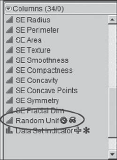
Mi-Ling realizes that she will not have further need for the column Random Unif. She could delete it at this point, but decides to retain it, just in case. However, she would rather not see it in the data table or in lists of columns in launch dialogs. So, she decides to hide it and exclude it. To this end, Mi-Ling right-clicks on the column name in the columns panel and chooses both Hide and Exclude (Exhibit 9.41). Two small icons appear to the right of the column name to indicate that it is hidden and excluded (Exhibit 9.42).
Figure 9.41. Context-Sensitive Menu Obtained in Columns Panel
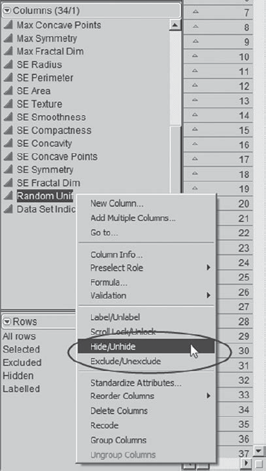
Figure 9.42. Columns Panel Showing Exclude and Hide Symbols for Random Unif Column
9.4.2. Checking the Analysis Data Sets Using Graph Builder
Now, if you have been working along with Mi-Ling using CellClassification_1.jmp and have constructed these two columns, then you realize that since Random Unif contains randomly generated values, your columns and Mi-Ling's will differ. At this point you should switch to a data table that contains Mi-Ling's training, validation, and test sets. The data table CellClassification_2.jmp contains her work to this point. Her analysis will continue, using this second data table.
Now Mi-Ling wants to examine her three analysis data sets, just to verify that they make sense. She begins by running Distribution on Data Set Indicator (Exhibit 9.43). She observes that the proportion of rows in each set is about what she wanted.
Figure 9.43. Distribution Report for Data Set Indicator

She is also interested in confirming that her training, validation, and test sets do not differ greatly in terms of the distributions of the predictors. James introduced Mi-Ling to Graph Builder (a new option in JMP 8), which is found under Graph. He demonstrated that it provides an intuitive and interactive interface for comparing the distributions of multiple variables in a variety of ways. She is anxious to try it out, thinking that it may be very useful in understanding her marketing data, which she anticipates will be messy.
Mi-Ling envisions a plot that has three vertical layers: one for the Mean variables, one for the Max variables, and one for the SE variables. She also envisions three horizontal groupings: one for each of the training, validation, and test sets. She selects Graph > Graph Builder. For a first try, in the window that appears, she selects all ten of the Mean variables and drags them to the Y zone in the template. She obtains the plot in Exhibit 9.44.
Figure 9.44. Graph Builder View of Ten Mean Variables

She notes that the scaling of the ten variables presents an issue. The third variable, Mean Area, covers such a large range of values that the distributions of the other nine variables are obscured. Mi-Ling clicks Undo in order to start over, this time using all Mean variables except for Mean Area. The resulting plot (Exhibit 9.45) is still unsatisfactory. It does suggest, though, that she might obtain acceptable plots if she were to construct three sets of plots:
One for the Area variables only.
One for the Radius, Perimeter, and Texture variables.
One for the remaining variables.
Figure 9.45. Graph Builder View of Nine Mean Variables, Excluding Mean Area

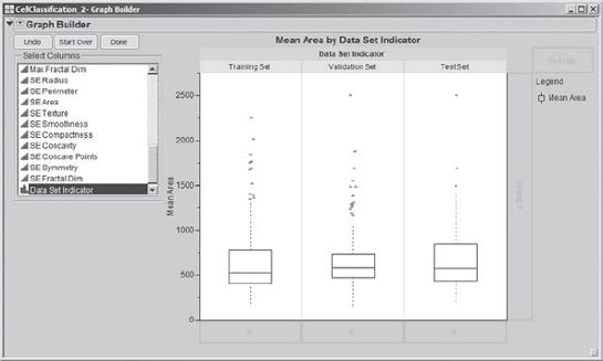
She begins with the Area variables, which cover such a range that they will be given their own plot. Mi-Ling clicks Start Over. She selects Mean Area and drags it to the Y zone. Then she selects Data Set Indicator and drags it to the Group X zone at the top of the template. This results in three box plots for Mean Area, one corresponding to each analysis set (Exhibit 9.46). Mi-Ling examines the three box plots and decides that the three data sets are quite similar relative to the distribution of Mean Area.
Figure 9.46. Graph Builder View of Mean Area by Data Set Indicator
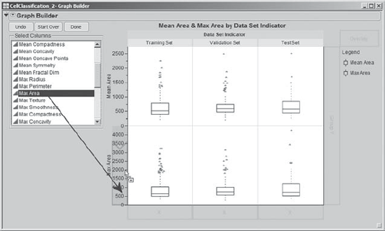
What about the distributions of Max Area and SE Area? To add Max Area to the plot shown in Exhibit 9.46, Mi-Ling clicks and drags Max Area from the Select Columns list to the Y zone, dragging her cursor to that part of the Y zone that is just above 0, as shown in Exhibit 9.47. An add to the bottom blue polygon appears, creating a new layer of plots.
Figure 9.47. Mean Area and Max Area by Data Set Indicator
She repeats this procedure with SE Area to obtain the plot in Exhibit 9.48. Mi-Ling saves the script for this analysis to the data table as Graph Builder – Area.
Figure 9.48. Mean Area, Max Area, and SE Area by Data Set Indicator

Mi-Ling reviews the plots in Exhibit 9.48 and notices the two large values of SE Area. These points fall beyond the range of SE Area values reflected in her training data set. Otherwise, the distributions of the area variables seem relatively similar across the three analysis data sets.
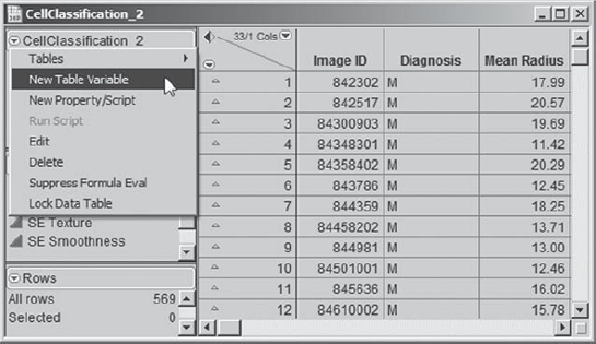
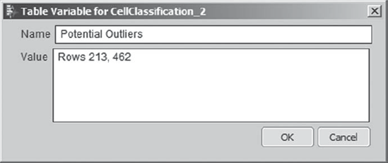
She uses her cursor to hover over each of these two outliers and identifies them as rows 213 and 462. To make sure that she does not forget about these, she adds this information to her data table as a Table Variable. In her data table, Mi-Ling clicks the red triangle to the left of the data table name and selects New Table Variable, as shown in Exhibit 9.49.
Figure 9.49. New Table Variable Selection
She fills out the text window that opens as shown in Exhibit 9.50. Then she clicks OK.
Figure 9.50. Table Variable Text Window
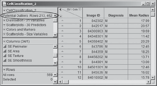
This information now appears in the table panel, as shown in Exhibit 9.51. Mi-Ling likes this. Defining a Table Variable is a convenient way to document information about the data table.
Figure 9.51. Table Variable
She now returns to her plot (Exhibit 9.48). Out of curiosity, Mi-Ling right-clicks in the top row of the plot area. A context-sensitive menu appears. She notices that she can switch to histograms or points, or add these to the plots, and that she can customize the plot in various ways. Just for fun, she chooses to change to histograms, making the choices shown in Exhibit 9.52.
Figure 9.52. Context-Sensitive Menu Showing Histogram Option

When she clicks on Histogram, each plot in the first row changes from a box plot to a histogram. Since this change appears to work for one row at a time, to get the remaining two rows of box plots to appear as histograms, Mi-Ling goes to one of the other two rows, holds down the control key before right-clicking in one of these rows, and then releases it. She remembers that the control key can be used to broadcast commands, so it makes sense to her to try it here. Then she selects Box Plot > Change to > Histogram. As she had hoped, this turns all box plots in the display into histograms (Exhibit 9.53). Had she held the control key down prior to her initial click in the top row, all rows would have been changed at that point.
Figure 9.53. Histograms Replacing All Box Plots

Now Mi-Ling proceeds to study the other 27 variables. Her next plot involves the Mean, Max, and SE variables associated with Radius, Perimeter, and Texture. To construct this plot, she uses the same procedure that she used with the area variables. The only difference is that she selects three variables for each row of the plot; for example, for the first row, she selects Mean Radius, Mean Perimeter, and Mean Texture. The completed plot is shown in Exhibit 9.54. To the right of the plot, JMP provides color-coding to identify the groupings. Mi-Ling saves the script as Graph Builder – Radius, Perimeter, Texture.
Figure 9.54. Graph Builder View of Radius, Perimeter, and Texture Variables
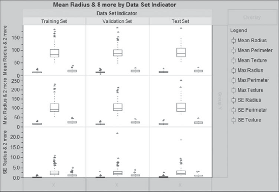
Mi-Ling observes that the distributions across the three analysis data sets are similar, with the exception of outlying points for SE Perimeter in the validation and test sets. She suspects that these outliers are associated with the outliers for SE Area. And they are: By hovering over these points, she notes that they correspond to rows 213 and 462.
Yet, she is curious about where these points appear in all of her plots to date. She places the plots shown in Exhibits 9.48 and 9.54 next to each other, as illustrated in Exhibit 9.55. Then she selects the two outliers in the plot for SE Area. When she selects them, these two points appear as large triangles in all plots. The linked view of the plots allows her to see where these points fall for all 12 variables across the Data Set Indicator groupings. She notes that they are somewhat outlying for Mean Area and Mean Perimeter as well, but do not appear to be an issue for the Texture variables.
Figure 9.55. Selection of Outliers for SE Area

Since these are not in her training set, Mi-Ling is not overly concerned about them. However, she does note that they could affect her validation results (we will leave it to the reader to check that they do not). Before proceeding, she deselects these two points by clicking in the plots next to, but not on, the points. Alternatively, she could deselect them in the data table by clicking in the lower triangular area above the row numbers or by pressing the escape key while the data table is the active window.
Finally, Mi-Ling uses Graph Builder to construct a plot for the remaining six features: Smoothness, Compactness, Concavity, Concave Points, Symmetry, and Fractal Dim. This plot is shown in Exhibit 9.56; she saves the script as Graph Builder – Smoothness to Fractal Dimension.
Figure 9.56. Graph Builder View for Remaining Six Variables

These distributions seem consistent across the three analysis data sets. The only exceptions are two large values for SE Concavity in the training set, which Mi-Ling identifies as rows 69 and 153. She selects these two points by dragging a rectangle around them in the SE Concavity box plot for the training set. Looking at the plots for the other 17 variables, she concludes that they do not appear anomalous for the other variables. Nonetheless, to keep track of these two rows, which could be influential for certain models, she adds them to her list of potential outliers in her Potential Outliers table variable.
Her graph builder analysis leaves Mi-Ling satisfied that she understands her training, validation, and test sets. She finds that they are fairly comparable in terms of predictor values and are not unreasonably affected by unruly data or outliers. Thinking about her marketing data, she can see how Graph Builder will provide great flexibility for interactive exploration of multivariate relationships.
Mi-Ling is ready to start thinking about how to work with these three analysis data sets. At this point, she closes all of her open reports.
9.4.3. Defining Row State Variables
Mi-Ling realizes that she will want to start her work by developing models using her training data set, but that later on she will want to switch to her validation and test sets. She could segregate these three sets into three data tables, but it would be much easier to retain them in one data table. For example, as part of her modeling efforts, she will save prediction formulas to the data table. If her validation rows were in a separate table, she would have to copy her prediction formulas to that other table. That would be inconvenient. She prefers an approach that allows her to select each of the three analysis sets conveniently in a single table.
James suggested that Mi-Ling might want to use row state variables. A row state is an attribute that changes the way that JMP interacts with the observations that make up the data. There are six row state attributes: Selected, Excluded, Hidden, Labeled, Color, and Marker. For example, if a row is excluded, then values from that row are not used in calculations. However, values from that row will appear in plots. The hidden row state will ensure that a row is not displayed in plots. To both exclude and hide a row, both row state attributes must be applied.
James showed Mi-Ling how to define row state variables—these are columns that contain row state assignments, indicating if a particular row is selected, excluded, hidden, labeled, colored, or marked. Mi-Ling plans to make it easy to switch from one analysis set to another by defining row state variables.
First of all, Mi-Ling will identify her training set. She checks to make sure that she still has colors and markers assigned to the rows in her data table. (If you have cleared yours, be sure to reapply them before continuing. You may run the script Colors and Markers.) Then, she selects Rows > Data Filter. This opens the dialog window shown in Exhibit 9.57. She selects Data Set Indicator and clicks Add.
Figure 9.57. Dialog Window for Data Filter

She is interested in identifying her training set and excluding all other rows. In the Data Filter dialog window that appears, she clicks on Training Set, unchecks Select, and checks Show and Include, as shown in Exhibit 9.58.
Figure 9.58. Data Filter Settings

Show has the effect of hiding all rows for which Data Set Indicator is not Training Set. Include has the effect of excluding all rows for which Data Set Indicator is not Training Set. So, with one easy dialog box, Mi-Ling has excluded and hidden all but the Training Set rows. Mi-Ling checks her data table to verify that the exclude and hide symbols appear to the left of rows belonging to the validation and test sets.
The row states defined by the icons next to the row numbers are the row states in effect. Mi-Ling is going to store these row states as a column for later use.
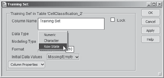
With a little perusal of the JMP Help files (searching on row states in the Index), Mi-Ling figures out how to save these row states in a Row State column. By double-clicking in the column header area, she creates a new column to the right of the last column, Data Set Indicator. She names her new column Training Set. She clicks off the column and then double-clicks back on the header to open Column Info. Under Data Type, she chooses Row State, as shown in Exhibit 9.59. She clicks OK to close the Column Info dialog.
Figure 9.59. Column Info Dialog with Choice of Row State as Data Type
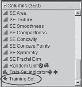
This has the effect of creating a column that can store row state assignments. To place the row states in this new column, Mi-Ling goes to the columns panel to the left of the data grid. She notices that her new column, Training Set, has a star-shaped icon to its left (Exhibit 9.60).
Figure 9.60. Row State Icon for Training Set Column
Mi-Ling clicks on the star and sees four options. She chooses Copy from Row States (Exhibit 9.61).
Figure 9.61. Options under Row State Icon Menu

Now Mi-Ling checks the column Training Set and sees that the exclude and hide row states have been copied into that column. The colors and markers, which are also row states, have been copied into that column as well (Exhibit 9.62).
Figure 9.62. Training Set Column Containing Row States

In the Data Filter specification window, she clicks Clear. This command only affects the row states that have been imposed by Data Filter, removing the Hide and Exclude row symbols next to the row numbers, but leaving the colors and markers intact.
To construct the Validation Set and Test Set columns, Mi-Ling repeats the process she used in constructing the Training Set column. (We encourage the interested reader to construct these columns.) When she has finished, she again clicks Clear and closes the Data Filter window. The only remaining row states are the colors and markers. (The three row state columns can be constructed using the scripts Training Set Column, Validation Set Column, and Test Set Column.)
When she has finished constructing these three columns, Mi-Ling checks that she can apply these row states as she needs them. She does this by clicking on the star corresponding to the appropriate data set column in the columns panel and choosing Copy to Row States. With these three subsets defined, she is ready to embark on her modeling expedition.