THOUGHTS ON PAINTING
Myths often surround the painting process—for example: painting is always inspired; accomplished artists find painting easy and always succeed; painting is always fun; good artists only paint when they feel like it; and creating a good painting is unpredictable. Let’s dispel some of the myths.
First, an artist does not have to be inspired to paint. A successful painting is predictable and logical, particularly in the realistic style. I have often dragged myself into the studio, not feeling like doing much of anything. But then things start developing and I do feel inspired! Another common experience is “artist’s slump.” Sometimes, about halfway through a painting, I feel as if it is a loser and I simply want to heave it—but I force myself to persevere. This is something all artists have to learn to overcome.
LAYING THE GROUNDWORK
When beginning a realistic painting, keep the following tips in mind: (1) Resolve the drawing—composition, design, and balance—before you pick up a brush. There should be no guesswork; painting has enough challenges without having to worry about the fundamentals. (2) When you get frustrated, put the work away for a few days. Don’t throw anything out when you’re upset—it could be a mistake. (3) Use a mirror to look at your painting in progress. It gives a completely new view of your work. (4) When painting, find a comfortable place where you can make a mess. (5) Make color charts and keep them handy for mixing colors. These charts are important. One summer I made 1,200 color mixtures and placed them in a notebook for reference. (6) Finally, use this book as a reference for techniques and tips. The order in which you tackle a painting is crucial, so follow the suggestions throughout, and you will succeed.
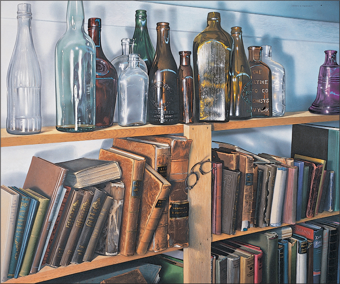
Still Life in a Bookshop (40" × 50") gouache on illustration board, private collection
COMPOSITION
Composition refers simply to the way objects are placed in a painting. When beautifully painted, an unimportant item can become a masterpiece. The same is true of a composition; a truly original composition can turn a good painting into a great painting. Here are some suggestions for improving your composition skills: 1) Study the great masters. Place tracing paper over their work and trace; then examine where they placed items in their paintings. 2) Try overlapping objects. 3) Place some objects apart from all others to draw your eye to them. 4) Make some objects bigger and some farther away to create depth. 5) Let shadows and interesting lighting create a mood (under lighting, noon lighting, side lighting, back lighting). These tips can make something commonplace appear exciting and unique. Composition skills improve simply by composing and experimenting. Over time, each artist develops his or her own way of designing a composition.
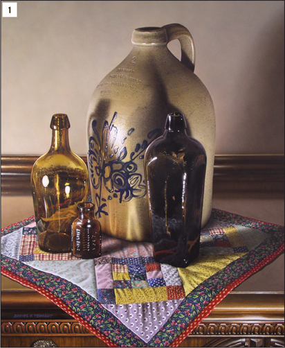
1 Another example of color harmony is to paint a still life with a limited palette. This painting consists of mainly browns and earth tones, so when you add cool colors, they really stand out. Don’t get stuck in the horizontal mode, either. Completing a vertically oriented painting can be a refreshing change. Vertical paintings generally have more tension than horizontal paintings.
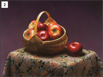
2 Notice that I placed the basket slightly to the left of center. It’s best to avoid placing the main subject in the very center of the painting. This is sometimes called a “bull’s eye” type of composition, and it is the weakest design for a work of fine art (although it can work well in advertising).
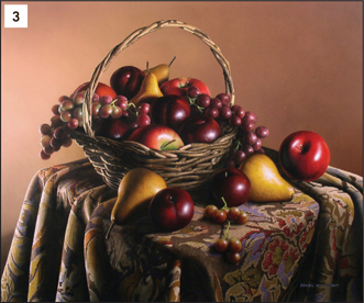
3 Here is another example of placing the main subject off center. To balance the large basket, I placed a prominent red apple on the right. Think of your painting as though it is being weighed on a scale. Make sure it is balanced. If you place something on the left, try placing something on the right to counterbalance the “weight” of the object on the left. There are many different ways to compose a picture, but having a sense of balance is an important aspect.
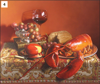
4 This painting is an example of dramatic lighting. The main light source was placed at right, and the secondary lighting was placed at left. For a more three-dimensional feeling to your work, try bouncing light into the shadows instead of dreary darks. You can have color even in the shadows. You can use a reflector board made out of white cardboard, illustration board, and even aluminum foil stretched over a board to help create colors in the shadows. The high wine glass is balanced by the heavy body of the lobster, and the red cheese wheel adds more balance to the reddish-orange lobster. I also painted a warm background so the painting would have more color harmony.