
AppBars, Flyouts, and Navigation
In this chapter, I show you how to create and use some of the user interactions that are essential parts of the Windows app user experience. The Application Bar (AppBar) and Navigation Bar (NavBar) provide the means by which the user can interact with your content and features and navigate within your app. I also show you how to create flyouts, which are pop-ups used to capture information from the user, usually in response to an interaction with the AppBar. Table 3-1 provides the summary for this chapter.
Table 3-1. Chapter Summary
| Problem | Solution | Listing |
|---|---|---|
| Add an AppBar. | Declare an AppBar control within the XAML Page.BottomAppBar property. | 1 |
| Add buttons to an AppBar. | Use Button controls, formatted either with predefined or with custom styles. | 2–5 |
| Add a flyout. | Declare a Popup control with the IsLightDismissEnabled property set to True. | 6, 8 |
| Display a flyout. | Position the Popup relative to the AppBar Button that caused it to be displayed. | 9–11 |
| Easily obtain access to the view model for a flyout. | Use the DataContext property. | 12–15 |
| Add a NavBar. | Create a wrapper Page that declares an AppBar element within the XAML Page.TopAppBar property. | 16, 18 |
| Navigate within an App. | Add a Frame control to the wrapper Page and use the Navigate method to show other Page controls when the NavBar buttons are clicked. | 19 |
Adding an AppBar
The AppBar appears at the bottom of the screen when the user makes an upward-swiping gesture or right-clicks with the mouse. The emphasis in the Windows 8 app UI is to have few extraneous controls in the main layout and to rely on the AppBar as the mechanism for any interaction that is not about the immediately available functionality but that does pertain to the currently displayed layout. In this section, I’ll show you how to define and populate an AppBar.
 Tip There is a similar control at the top of the screen, called the Navigation Bar (NavBar), which is used to navigate between different parts of an app. I show you how to create and use the NavBar later in this chapter.
Declaring the AppBar
The simplest way to create an AppBar is to declare it in your XAML file. Listing 3-1 shows the additions to the ListPage.xaml file from the example project.
Listing 3-1. Defining an AppBar
<Page
    x:Class="GrocerApp.Pages.ListPage"
    xmlns=" http://schemas.microsoft.com/winfx/2006/xaml/presentation "
    xmlns:x=" http://schemas.microsoft.com/winfx/2006/xaml "
    xmlns:local="using:GrocerApp.Pages"
    xmlns:d=" http://schemas.microsoft.com/expression/blend/2008 "
    xmlns:mc=" http://schemas.openxmlformats.org/markup-compatibility/2006 "
    mc:Ignorable="d">

    <Grid Background="{StaticResource AppBackgroundColor}">

        <Grid.RowDefinitions>
            <RowDefinition/>
            <RowDefinition/>
        </Grid.RowDefinitions>
        <Grid.ColumnDefinitions>
            <ColumnDefinition/>
            <ColumnDefinition/>
        </Grid.ColumnDefinitions>

        <StackPanel Grid.RowSpan="2">

            <TextBlock Style="{StaticResource HeaderTextStyle}" Margin="10"
                       Text="Grocery List"/>
            <ListView x:Name="groceryList" Grid.RowSpan="2"
                ItemsSource="{Binding GroceryList}"
                ItemTemplate="{StaticResource GroceryListItemTemplate}"
                SelectionChanged="ListSelectionChanged" />
        </StackPanel>

        <StackPanel Orientation="Vertical" Grid.Column="1">
            <TextBlock Style="{StaticResource HeaderTextStyle}" Margin="10"
                       Text="Item Detail"/>
            <Frame x:Name="ItemDetailFrame"/>
        </StackPanel>

        <StackPanel Orientation="Vertical" Grid.Column="1" Grid.Row="1">
            <TextBlock Style="{StaticResource HeaderTextStyle}" Margin="10"
                       Text="Store Detail"/>
        </StackPanel>
    </Grid>

    <Page.BottomAppBar>
        <AppBar>
            <Grid>
                <Grid.ColumnDefinitions>
                    <ColumnDefinition />
                    <ColumnDefinition />
                </Grid.ColumnDefinitions>

                <StackPanel Orientation="Horizontal" Grid.Column="0"
                            HorizontalAlignment="Left">
                    <Button x:Name="AppBarDoneButton"
                            Style="{StaticResource DoneAppBarButtonStyle}"
                            IsEnabled="false"
                            Click="AppBarButtonClick"/>
                </StackPanel>

                <StackPanel Orientation="Horizontal" Grid.Column="1"
                            HorizontalAlignment="Right">

                    <Button x:Name="AppBarAddButton"
                            Style="{StaticResource AddAppBarButtonStyle}"
                            AutomationProperties.Name="New Item"
                            Click="AppBarButtonClick"/>

                    <Button x:Name="AppBarStoresButton"
                            Style="{StaticResource StoresAppBarButton}"
                            Click="AppBarButtonClick"/>

                    <Button x:Name="AppBarZipButton"
                            Style="{StaticResource HomeAppBarButtonStyle}"
                            AutomationProperties.Name="Zip Code"
                            Click="AppBarButtonClick"/>

                </StackPanel>
            </Grid>
        </AppBar>
    </Page.BottomAppBar>
</Page>
To create the AppBar, I have to declare an AppBar control within the Page.BottomAppBar property, as shown in the listing. This has the effect of creating the AppBar and its contents and assigning them to the BottomAppBar property of the containing page.
Tip You can create the NavBar by declaring an AppBar control within the Page.TopAppBar property.
AppBars contain buttons, and the convention is to have buttons that are specified to the currently selected item shown on the left side of the AppBar and app-wide buttons shown on the right. To follow this convention, I have added a Grid to my AppBar control. The Grid has one row and two columns, and each column contains a StackPanel.
There are two ways to add buttons to an AppBar: you can select and adapt ones that are already defined in StandardStyles.xaml, or you can create your own. The listing uses both approaches, which I explain in the following sections.
Adapting Predefined AppBar Buttons
Most of the /Common/StandardStyles.xaml file, which is added to Visual Studio projects automatically when they are created, contains styles for Button controls that are part of an AppBar, like the one shown in Listing 3-2.
Note There are a lot of these button styles in the StandardStyles.xaml file, and, by default, they are commented out. This means you have to uncomment the ones you want to use. For this chapter, you will need to search for HomeAppBarButtonStyle and AddAppBarButtonStyle and uncomment them; otherwise, they won’t be available for use in the example app.
Listing 3-2. The Style for the Add AppBar Button
...
<Style x:Key=" AddAppBarButtonStyle " TargetType="ButtonBase"
BasedOn="{StaticResource AppBarButtonStyle }">
<Setter Property="AutomationProperties.AutomationId" Value="AddAppBarButton"/>
<Setter Property="AutomationProperties.Name" Value="Add"/>
<Setter Property="Content" Value=""/>
</Style>
...
All of the predefined Button styles are derived from the AppBarButtonStyle, which defines the basic characteristics of an AppBar button. I’ll use this style when I create my own button in the next section.
The two properties that differentiate individual buttons are AutomationProperties.Name and Content. The AutomationProperties.Name property specifies the text shown under the button, and the Context property specifies the icon that will be used. The value for this property is a character code from the Segoe UI Symbol font. You can see the icons defined by this font using the Character Map tool that is included in Windows 8; the value E109 corresponds to a plus sign.
The style shown in the listing doesn’t quite meet my needs. I like the icon, but I want to change the text. To adapt the button to my needs in the ListPage.xaml file, I simply use the predefined style and override the parts I want to change, as shown in Listing 3-3.
Listing 3-3. Adapting a Predefined AppBar Button in the LisPage.xaml File
...
<Button x:Name="AppBarAddButton"
    Style="{StaticResource AddAppBarButtonStyle }"
    AutomationProperties.Name="New Item"
    Click="AppBarButtonClick"/>
...
Creating Custom AppBar Button Styles
An alternative approach is to define your own styles for your AppBar buttons. Listing 3-4 shows a style I added to my resource /Resources/GrocerResourceDictionary.xaml file for this purpose.
Listing 3-4. Defining a Custom AppBar Button Styles
...
<Style x:Key="StoresAppBarButton" TargetType="Button"
BasedOn="{StaticResource AppBarButtonStyle }">
<Setter Property="AutomationProperties.Name" Value="Stores"/>
<Setter Property="Content" Value=""/>
</Style>
<Style x:Key="DoneAppBarButtonStyle" TargetType="Button"
BasedOn="{StaticResource AppBarButtonStyle }">
<Setter Property="AutomationProperties.Name" Value="Done"/>
<Setter Property="Content" Value=""/>
</Style>
...
I have based these styles on AppBarButtonStyle, so I get the basic look and feel for an AppBar button, and I have set values for the AutomationProperties.Name and Content properties. You can go further and redefine some of the core characteristics of the underlying style, but you run the risk of departing from the standard Windows 8 app appearance and experience that your users will expect.
Implementing AppBar Button Actions
The Button controls on the AppBar don’t do anything at the moment. To address this, I am going to implement the Done button, just so you can see how it is done.
I will activate this Button when the user makes a selection from the grocery item list. When the user clicks the button, I will remove the currently selected item from the list, allowing the user to indicate when they have purchased an item. Listing 3-5 shows the changes to the ListPage.xaml.cs code-behind file.
Listing 3-5. Implementing the Done AppBar Button
using GrocerApp.Data;
using Windows.UI.Xaml;
using Windows.UI.Xaml.Controls;
using Windows.UI.Xaml.Navigation;

namespace GrocerApp.Pages {

    public sealed partial class ListPage : Page {
        ViewModel viewModel;


        public ListPage() {

            viewModel = new ViewModel();

            // ...test data removed for brevity

            this.InitializeComponent();

            this.DataContext = viewModel;

            ItemDetailFrame.Navigate(typeof(NoItemSelected));

            viewModel.PropertyChanged += (sender, args) => {
                if (args.PropertyName == "SelectedItemIndex") {
                    if (viewModel.SelectedItemIndex == -1) {
                        ItemDetailFrame.Navigate(typeof(NoItemSelected));
                        AppBarDoneButton.IsEnabled = false;
                    } else {
                        ItemDetailFrame.Navigate(typeof(ItemDetail), viewModel);
                        AppBarDoneButton.IsEnabled = true;
                    }
                }
            };
        }

        protected override void OnNavigatedTo(NavigationEventArgs e) {
        }

        private void ListSelectionChanged(object sender,             SelectionChangedEventArgs e) {
            viewModel.SelectedItemIndex = groceryList.SelectedIndex;
        }

        private void AppBarButtonClick(object sender, RoutedEventArgs e) {
            if (e.OriginalSource == AppBarDoneButton
                    && viewModel.SelectedItemIndex > -1) {

                viewModel.GroceryList.RemoveAt(viewModel.SelectedItemIndex);
                viewModel.SelectedItemIndex = -1;
            }
        }
    }
}
There are two points to note in this listing. The first is that for simple tasks, implementing the action for a Button on the AppBar is just a matter of responding to the Click event.
The second point is that you can start to see the benefit of the view model appearing in the code. My code in the AppBarButtonClick method doesn’t need to switch the contents of the Frame to the NoItemSelected page or that the Done button should be disabled when an item is completed. I just update the view model, and the rest of the app adapts to those changes to present the user with the right layout and overall experience.
You can see the result of adding the AppBar and its Button controls in Figure 3-1. If you want to see the AppBar firsthand, then start the example app and swipe from the top or bottom of the screen or right-click with the mouse. The figure shows both states of the Done button, which you can re=create by selecting an item from the list.

Figure 3-1. Adding an AppBar to the example app
The Done AppBar button has a simple action associated with it, which can be performed directly in the event handler code associated with the Click event. Most AppBar buttons, however, require some kind of additional user interaction, and this is performed using a flyout.
A flyout is a pop-up window that is displayed near the AppBar button that has been clicked and that is dismissed automatically when the user clicks or touches elsewhere on the screen. There is a Flyout control for JavaScript Windows 8 apps, but getting the same effect with XAML and C# requires the use of a Popup and some careful positioning code.
Creating the User Control
XAML files can quickly become long and difficult to manage. I like to define my flyouts as user controls, which are like snippets of XAML elements and a code-behind file. (I am skipping some XAML details here, but you’ll see what I mean as you read this section of the chapter.) I have created a folder in my example project called Flyouts and used the UserControl template to create a new item called HomeZipCodeFlyout.xaml, the contents of which you can see in Listing 3-6.
Listing 3-6. The HomeZipCodeFlyout.xaml File
<UserControl
    x:Class="GrocerApp.Flyouts.HomeZipCodeFlyout"
    xmlns=" http://schemas.microsoft.com/winfx/2006/xaml/presentation "
    xmlns:x=" http://schemas.microsoft.com/winfx/2006/xaml "
    xmlns:local="using:GrocerApp.Flyouts"
    xmlns:d=" http://schemas.microsoft.com/expression/blend/2008 "
    xmlns:mc=" http://schemas.openxmlformats.org/markup-compatibility/2006 "
    mc:Ignorable="d"
    d:DesignHeight="300"
    d:DesignWidth="400">

    <Popup x:Name="HomeZipCodePopup"
           IsLightDismissEnabled="True" Width="350" Height="130" >
        <StackPanel Background="Black">
            <Border Background="#85C54C" BorderThickness="4">
                <StackPanel>
                    <StackPanel Orientation="Horizontal" Margin="10">
                        <TextBlock Style="{StaticResource PopupTextStyle }"
                                Text="Home Zip Code:"
                                     VerticalAlignment="Center"
                                Margin="0,0,10,0" />
                        <TextBox Height="40" Width="150" FontSize="20"
                                 Text="{Binding Path=HomeZipCode,
                                      Mode=TwoWay}" />
                    </StackPanel>
                    <Button Click="OKButtonClick"
                         HorizontalAlignment="Center"
                            Margin="10">OK</Button>
                </StackPanel>
            </Border>
        </StackPanel>
    </Popup>
</UserControl>
As the file name suggests, this flyout will allow the user to change the value of the HomeZipCode property in the view model. This property doesn’t do anything in the example, other than provide an opportunity for some useful examples.
User controls work like templates. Within the UserControl element, you define the XAML elements that represent the controls you want to create. You must use a Popup control when creating flyouts, but the content that you put inside the Popup is up to you. My layout in the listing consists of a TextBox to collect the new value from the user, a Button so that the user can indicate when they have entered the new value, and some surrounding elements to provide context and structure.
There are three important attributes that you must set for your Popup element, each of which I have marked in bold in the listing. The IsLightDismissEnabled attribute specifies whether the pop-up will be dismissed if the user clicks or touches anywhere outside of the Popup; this must be set to True when you are using Popups for flyouts because it is an essential part of the flyout user experience.
The Width and Height attributes must be set so that the Popup is just large enough to contain its contents. I need explicit values for these attributes when I position the Popup, which I’ll demonstrate shortly.
Caution If you use my positioning code (which I describe shortly) to manage your flyouts, then you must provide explicit and accurate Width and Height values. The flyout won’t be positioned correctly if you omit the values or provide inaccurate dimensions.
You will see that I reference the PopupTextStyle style in the listing. I defined this style, and some others that I need in this chapter, in my /Resources/GrocerResourceDictionary file, as shown in Listing 3-7.
Listing 3-7. Defining a Custom Style for the Flyouts
<ResourceDictionary
    xmlns=" http://schemas.microsoft.com/winfx/2006/xaml/presentation "
    xmlns:x=" http://schemas.microsoft.com/winfx/2006/xaml "
    xmlns:local="using:GrocerApp.Resources">

    <ResourceDictionary.MergedDictionaries>
        <ResourceDictionary Source="/Common/StandardStyles.xaml" />
    </ResourceDictionary.MergedDictionaries>

    <!-- ...other styles omitted for brevity... -->

    <Style x:Key="PopupTextStyle" TargetType="TextBlock"
            BasedOn="{StaticResource BasicTextStyle}">
        <Setter Property="FontSize" Value="22" />
    </Style>

    <Style x:Key="AddItemText" TargetType="TextBlock"
           BasedOn="{StaticResource GroceryListItem}" >
        <Setter Property="FontSize" Value="22"/>
        <Setter Property="HorizontalAlignment" Value="Right"/>
        <Setter Property="VerticalAlignment" Value="Center"/>
    </Style>

    <Style x:Key="AddItemTextBox" TargetType="TextBox"
            BasedOn="{StaticResource ItemDetailTextBox}">
        <Setter Property="FontSize" Value="22"/>
    </Style>

    <Style x:Key="AddItemStore" TargetType="ComboBox"
            BasedOn="{StaticResource ItemDetailStore}">
        <Setter Property="FontSize" Value="22"/>
    </Style>

</ResourceDictionary>
User controls still have code-behind files, even though they present fragments of XAML. Listing 3-8 shows the contents of the HomeZipCodeFlyout.xaml.cs file.
Listing 3-8. The HomeZipCodeFlyout.xaml.cs File
using Windows.UI.Xaml;
using Windows.UI.Xaml.Controls;

namespace GrocerApp.Flyouts {
    public sealed partial class HomeZipCodeFlyout : UserControl {

        public HomeZipCodeFlyout() {
            this.InitializeComponent();
        }

        public void Show(Page page, AppBar appbar, Button button) {
            HomeZipCodePopup.IsOpen = true;
            FlyoutHelper.ShowRelativeToAppBar(HomeZipCodePopup, page, appbar, button);
        }

        private void OKButtonClick(object sender, RoutedEventArgs e) {
            HomeZipCodePopup.IsOpen = false;
        }
    }
}
The main problem I have to solve for my flyout is positioning the Popup. The convention for flyouts that appear in response to an AppBar button is to show the Popup just above the clicked Button element.
Positioning the Popup Control
The Windows app controls don’t provide a simple way of working out the relative position of elements in the layout, so some indirect techniques are required. Listing 3-9 shows the contents of the FlyoutHelper class, which defines the static ShowRelativeToAppBar method and which I added in the Flyouts folder. This method takes care of positioning the Popup correctly relative to an AppBar button, but to do this, it needs to the Popup control, the Page that contains the AppBar, the AppBar control, and the Button that was clicked. This isn’t ideal, but it is the only way I have found to reliably position a flyout.
Listing 3-9. Positioning a Popup Control Relative to an AppBar Button
using System;
using Windows.Foundation;
using Windows.UI.Xaml;
using Windows.UI.Xaml.Controls;
using Windows.UI.Xaml.Controls.Primitives;

namespace GrocerApp.Flyouts {
    class FlyoutHelper {

        public static void ShowRelativeToAppBar(Popup popup, Page page,
            AppBar appbar, Button button) {

            Func<UIElement, UIElement, Point> getOffset =
                delegate(UIElement control1, UIElement control2) {
                    return control1.TransformToVisual(control2)
                        .TransformPoint(new Point(0, 0));
                };

            Point popupOffset = getOffset(popup, page);

            Point buttonOffset = getOffset(button, page);
            popup.HorizontalOffset = buttonOffset.X - popupOffset.X
                - (popup.ActualWidth / 2) + (button.ActualWidth / 2);
            popup.VerticalOffset = getOffset(appbar, page).Y
                - popupOffset.Y - popup.ActualHeight;

            if (popupOffset.X + popup.HorizontalOffset
                + popup.ActualWidth > page.ActualWidth) {

                popup.HorizontalOffset = page.ActualWidth
                    - popupOffset.X - popup.ActualWidth;
            } else if (popup.HorizontalOffset + popupOffset.X < 0) {
                popup.HorizontalOffset = -popupOffset.X;
            }
        }

    }
}
The code positions the Popup just above the AppBar button that it relates to and is repositioned if that would mean that the Popup would disappear off the left or right edge of the screen. I am not going into the details of this code because it is convoluted. Instead, I recommend you use this code verbatim and dig into it only if you have problems. If you do have problems, the most likely cause will be that you have not set the Width and Height attributes for the Popup.
Showing and Hiding the Popup Control
The other function that my HomeZipCodeFlyout class is responsible for is showing and hiding the Popup. There is some sleight of hand in the way that my flyout works, which I use to simplify this code. If you look back at the XAML in Listing 3-6, you will see that I have specified a Mode for my data binding, like this:
...
<TextBox Height="40" Width="150" Text=" {Binding Path=HomeZipCode,
    Mode=TwoWay} " />
...
Data bindings are one-way by default, meaning that changes in the view model update the control. I have specified a two-way binding, which means that, in addition, the value that the user enters into the TextBox control will be used to update the corresponding view model property.
Tip Notice that I don’t have to set the DataContext to make the binding work. The user control will be added to the main XAML layout, which means that it inherits the value of the DataContext from the top-level Page object.
This allows me to deal with the OK button being clicked by simply hiding the Popup; I don’t have to worry about getting the value from the TextBox and explicitly updating the view model. The downside of this approach is that the view model may be updated multiple times before the flyout is dismissed, which can cause problems if you are listening for changes to the affected property elsewhere in your app. This isn’t an issue for the HomeZipCode property, and I wanted to show you this technique, which can be a very neat way of dealing with user input.
Adding the Flyout to the App
The reason I have gone to the trouble of creating a user control is because I want to keep the XAML for my main layout as focused as possible. I still have to add the user control to the XAML, however. You can see how I have done this in Listing 3-10, which shows the changes I have made to the ListPage.xaml file.
Listing 3-10. Adding a Flyout Control to the ListPage XAML
<Page
    x:Class="GrocerApp.Pages.ListPage"
    xmlns=" http://schemas.microsoft.com/winfx/2006/xaml/presentation "
    xmlns:x=" http://schemas.microsoft.com/winfx/2006/xaml "
    xmlns:local="using:GrocerApp.Pages"
    xmlns:flyouts="using:GrocerApp.Flyouts"
    xmlns:d=" http://schemas.microsoft.com/expression/blend/2008 "
    xmlns:mc=" http://schemas.openxmlformats.org/markup-compatibility/2006 "
    mc:Ignorable="d">

    <Grid Background="{StaticResource AppBackgroundColor}">

        <Grid.RowDefinitions>
            <RowDefinition/>
            <RowDefinition/>
        </Grid.RowDefinitions>
        <Grid.ColumnDefinitions>
            <ColumnDefinition/>
            <ColumnDefinition/>
        </Grid.ColumnDefinitions>

        <StackPanel Grid.RowSpan="2">
            // ...contents removed for brevity
        </StackPanel>

        <StackPanel Orientation="Vertical" Grid.Column="1">
            // ...contents removed for brevity
        </StackPanel>

        <StackPanel Orientation="Vertical" Grid.Column="1" Grid.Row="1">
            // ...contents removed for brevity
        </StackPanel>

        <flyouts:HomeZipCodeFlyout x:Name="HomeZipFlyout"/>
    </Grid>

    <Page.BottomAppBar>
        // ...contents removed for brevity
    </Page.BottomAppBar>
</Page>
I have to define a new XAML namespace so that I can use the user control in the Flyouts folder, so I have added the following line to the XAML:
xmlns: flyouts ="using: GrocerApp.Flyouts"
The important part is the name that I assign after the xmlns part, which is flyouts in this case. I have to use the same name when I declare my user control, like this:
< flyouts :HomeZipCodeFlyout x:Name="HomeZipFlyout"/>
Notice that the declaration for the flyout goes inside the Grid; even though it is not immediately displayed, the flyout user control must be declared as part of the main app layout, and Page controls can have only regular child elements (which is why the AppBar control has to be declared inside the Page.BottomAppBar property).
Showing the Flyout
All that remains is to hook up my flyout so it is displayed when the user clicks the AppBar button. Listing 3-11 shows the addition to the ListPage.xaml.cs file that makes this happen.
Listing 3-11. Showing the Flyout in Response to the AppBar Button Being Clicked
...
private void AppBarButtonClick(object sender, RoutedEventArgs e) {
    if (e.OriginalSource == AppBarDoneButton
            && viewModel.SelectedItemIndex > -1) {

        viewModel.GroceryList.RemoveAt(viewModel.SelectedItemIndex);
        viewModel.SelectedItemIndex = -1;

    } else if (e.OriginalSource == AppBarZipButton) {
        HomeZipFlyout.Show(this, this.BottomAppBar, (Button)e.OriginalSource);
    }
}
...
I call the Show method I defined in my user control, passing in the set of controls that I need to correctly position the Popup. You can see the result in Figure 3-2.

Figure 3-2. Displaying a flyout next to the AppBar button it relates to
Creating a More Complex Flyout
Now that I have demonstrated the basics, I can build a flyout that will allow the user to add new items to the grocery list. The difference in this flyout is that it won’t be able to rely on the two-way binding trick for dealing with the view model. This isn’t an especially complex technique; I just want to show you both approaches so you can pick the one that works for your projects. The more flyout examples I can show you, the easier you will find it when you come to create your own.
To start, I used the UserControl template to create the AddItemFlyout.xaml file in the Flyouts project folder. I then followed the same basic approach of laying out my content in a Popup, as shown in Listing 3-12.
Listing 3-12. The XAML for the AddItem Flyout
<UserControl
    x:Class="GrocerApp.Flyouts.AddItemFlyout"
    xmlns=" http://schemas.microsoft.com/winfx/2006/xaml/presentation "
    xmlns:x=" http://schemas.microsoft.com/winfx/2006/xaml "
    xmlns:local="using:GrocerApp.Flyouts"
    xmlns:d=" http://schemas.microsoft.com/expression/blend/2008 "
    xmlns:mc=" http://schemas.openxmlformats.org/markup-compatibility/2006 "
    mc:Ignorable="d"
    d:DesignHeight="300"
    d:DesignWidth="400">

    <Popup x:Name="AddItemPopup" IsLightDismissEnabled="True" Width="435" Height="265" >
        <StackPanel Background="Black">
            <Border Background="#85C54C" BorderThickness="4">
                <Grid Margin="10">
                    <Grid.RowDefinitions>
                        <RowDefinition/>
                        <RowDefinition/>
                        <RowDefinition/>
                        <RowDefinition/>
                    </Grid.RowDefinitions>
                    <Grid.ColumnDefinitions>
                        <ColumnDefinition Width="Auto"/>
                        <ColumnDefinition Width="300"/>
                    </Grid.ColumnDefinitions>

                    <TextBlock Text="Name:" Style="{StaticResource AddItemText}"  />
                    <TextBlock Text="Quantity:" Grid.Row="1"
                               Style="{StaticResource AddItemText}" />
                    <TextBlock Text="Store:" Grid.Row="2"
                               Style="{StaticResource AddItemText}" />

                    <TextBox x:Name="ItemName" Grid.Column="1"
                             Style="{StaticResource AddItemTextBox}" />
                    <TextBox x:Name="ItemQuantity" Grid.Row="1" Grid.
                             Column="1"
                             Style="{StaticResource AddItemTextBox}" />
                    <ComboBox x:Name="ItemStore" Grid.Column="1" Grid.
                             Row="2"
                              Style="{StaticResource AddItemStore}"
                              ItemsSource="{Binding StoreList}"
                              DisplayMemberPath="" />
                    <StackPanel Orientation="Horizontal" Grid.Row="3"
                                HorizontalAlignment="Center"
                                Grid.ColumnSpan="2">
                        <Button Click="AddButtonClick">Add Item</Button>
                    </StackPanel>
                </Grid>
            </Border>
        </StackPanel>
    </Popup>
</UserControl>
The layout of the Popup is very similar to the layout of the ItemDetail page that I created in Chapter 2. It is possible to embed Frame controls (and therefore Pages) into Popups for flyouts, but the effort required to adjust the styling and change the code-behind behavior often makes it more attractive to simply duplicate the elements. I am happy to do this for simple projects, even though I have a nagging feeling that I will be revisiting the project at some point to remove the duplication and do it properly.
Writing the Code
The part of this flyout that I want you to see is in the code, which is shown in Listing 3-13.
Listing 3-13. The AddItemFlyout.xaml.cs File
using System;
using GrocerApp.Data;
using Windows.UI.Xaml;
using Windows.UI.Xaml.Controls;

namespace GrocerApp.Flyouts {
    public sealed partial class AddItemFlyout : UserControl {

        public AddItemFlyout() {
            this.InitializeComponent();
        }

        public void Show(Page page, AppBar appbar, Button button) {
            AddItemPopup.IsOpen = true;
            FlyoutHelper.ShowRelativeToAppBar(AddItemPopup, page, appbar, button);
        }

        private void AddButtonClick(object sender, RoutedEventArgs e) {

            ((ViewModel)DataContext) .GroceryList.Add(new GroceryItem {
                Name = ItemName.Text,
                Quantity = Int32.Parse(ItemQuantity.Text),
                Store = ItemStore.SelectedItem.ToString()
            });

            AddItemPopup.IsOpen = false;
        }
    }
}
I need to get my view model object so I can add the new item to it. There are several ways of doing this, but the simplest is to read the value of the DataContext property, as shown in the listing. Some care is required, because I am making the assumption that the value of this property will be my ViewModel object, which I set in the constructor of the ListPage class (in the ListPage.xaml.cs file). As I mentioned at the time, the DataContext property is inherited, which means that the object I set for the Page object can be retrieved from my UserControl, but only if another object hasn’t been assigned to the DataContext property of one of the intermediate controls in the layout hierarchy.
Once I have the ViewModel object, it is a simple matter to add a new GroceryItem to the GroceryList collection. Since the collection is observable, the addition will automatically be reflected in the rest of the app.
Adding the Flyout to the App
All that remains is to add my new flyout to the ListPage layout and code, which I do following the same pattern as for the previous flyout. Listing 3-14 shows the XAML declaration for the flyout.
Listing 3-14. Declaring the Add Item Flyout in the XAML
...
<flyouts:HomeZipCodeFlyout x:Name="HomeZipFlyout"/>
<flyouts:AddItemFlyout x:Name="AddItemFlyout"/>
...
Listing 3-15 shows the addition to the AppBarButtonClick in the ListPage class, which shows the flyout in response to the Add Item AppBar button being clicked.
Listing 3-15. Showing the Flyout in Response to the AppBar Button
...
private void AppBarButtonClick(object sender, RoutedEventArgs e) {
    if (e.OriginalSource == AppBarDoneButton
            && viewModel.SelectedItemIndex > -1) {

        viewModel.GroceryList.RemoveAt(viewModel.SelectedItemIndex);
        viewModel.SelectedItemIndex = -1;

    } else if (e.OriginalSource == AppBarZipButton) {
        HomeZipFlyout.Show(this, this.BottomAppBar, (Button)e.OriginalSource);
    } else if (e.OriginalSource == AppBarAddButton) {
        AddItemFlyout.Show(this, this.BottomAppBar, (Button)e.OriginalSource);
    }
}
...
You can see how the flyout appears in Figure 3-3. The “light dismiss” style for flyout Popup controls associated with the AppBar means that only one flyout will be shown at a time.
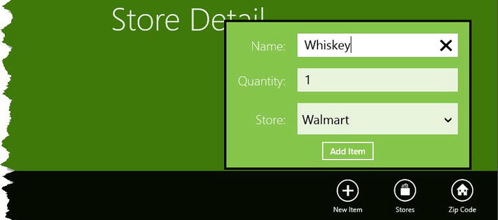
Figure 3-3. The Add Item flyout
Navigating Within a Windows App
If your app contains distinct functionality sections, then you need to provide a Navigation Bar (NavBar) so that the user can easily move between them. The simplest way to provide consistent navigation is to restructure the app so that the functional areas are presented in a Frame control within a wrapper page.
I created the MainPage.xaml file in the Pages folder to act as my wrapper. You can see the content of this file, which I created using the Blank Page template, in Listing 3-16.
Listing 3-16. The MainPage.xaml File
<Page
x:Class="GrocerApp.Pages.MainPage"
xmlns=" http://schemas.microsoft.com/winfx/2006/xaml/presentation "
xmlns:x=" http://schemas.microsoft.com/winfx/2006/xaml "
xmlns:local="using:GrocerApp.Pages"
xmlns:d=" http://schemas.microsoft.com/expression/blend/2008 "
xmlns:mc=" http://schemas.openxmlformats.org/markup-compatibility/2006 "
mc:Ignorable="d">
<Page.TopAppBar>
<AppBar>
<StackPanel Orientation="Horizontal" HorizontalAlignment="Center">
<Button x:Name="ListViewButton"
Style="{StaticResource AppBarButtonStyle}"
AutomationProperties.Name="List View"
Content="" Click="NavBarButtonPress"/>
<Button x:Name="DetailViewButton"
Style="{StaticResource AppBarButtonStyle}"
AutomationProperties.Name="Detail View"
Content="" Click="NavBarButtonPress"/>
</StackPanel>
</AppBar>
</Page.TopAppBar>
<Grid Background="{StaticResource ApplicationPageBackgroundThemeBrush}">
<Frame x:Name="MainFrame" />
</Grid>
</Page>
To add a NavBar, I declare an AppBar control within the Page.TopAppBar property. The mechanics of the NavBar are the same as the (bottom) AppBar, and I have added two Button controls to support navigation between the two views that the app contains.
In addition to the NavBar, the layout of the MainPage contains a Frame, which I will use to display the different views.
The code to support this layout is very simple and is shown in Listing 3-17. I respond to either of the Button controls being clicked by navigating to the appropriate Page and changing the IsChecked property of the buttons. I have also created the ViewModel object in this class so that there is just one instance across the entire app. The object is passed to the individual pages through the Frame.Navigate method.
Listing 3-17. The MainPage.xaml.cs
using System;
using GrocerApp.Data;
using Windows.UI.Xaml;
using Windows.UI.Xaml.Controls;
using Windows.UI.Xaml.Controls.Primitives;
using Windows.UI.Xaml.Navigation;

namespace GrocerApp.Pages {

    public sealed partial class MainPage : Page {
        private ViewModel viewModel;

        public MainPage() {
            this.InitializeComponent();

            viewModel = new ViewModel();

            viewModel.StoreList.Add("Whole Foods");
            viewModel.StoreList.Add("Kroger");
            viewModel.StoreList.Add("Costco");
            viewModel.StoreList.Add("Walmart");

            viewModel.GroceryList.Add(new GroceryItem {
                Name = "Apples",
                Quantity = 4, Store = "Whole Foods"
            });
            viewModel.GroceryList.Add(new GroceryItem {
                Name = "Hotdogs",
                Quantity = 12, Store = "Costco"
            });
            viewModel.GroceryList.Add(new GroceryItem {
                Name = "Soda",
                Quantity = 2, Store = "Costco"
            });
            viewModel.GroceryList.Add(new GroceryItem {
                Name = "Eggs",
                Quantity = 12, Store = "Kroger"
            });

            this.DataContext = viewModel;

            MainFrame.Navigate(typeof(ListPage), viewModel);
        }

        protected override void OnNavigatedTo(NavigationEventArgs e) {
        }

        private void NavBarButtonPress(object sender, RoutedEventArgs e) {
            Boolean isListView = (Button)sender == ListViewButton;
            MainFrame.Navigate(isListView ? typeof(ListPage)
                : typeof(DetailPage), viewModel);
        }
    }
}
I navigate to the default view for my app in the constructor, which is the ListPage I have been using in earlier examples.
Tip The ListPage has been refactored so that the view model is obtained from the arguments to the OnNavigatedTo method. I am not going to list those changes here because they are so simple, but you can see the modified class in the source code download that accompanies this book and that is available from Apress.com.
I have to update the App.xaml.cs file to put my wrapper view into place, as shown in Listing 3-18.
Listing 3-18. Making MainPage the Default Page for the Example App
...
if (rootFrame.Content == null) {

    if (!rootFrame.Navigate(typeof( Pages.MainPage ), args.Arguments)) {
        throw new Exception("Failed to create initial page");
    }
}
...
Creating the Other View
I need to add another page to the application using the Blank Page template . I have created a placeholder called DetailPage.xaml in the Pages project folder; the layout is shown in Listing 3-19.
Listing 3-19. The DetailPage.xaml File
<Page
    x:Class="GrocerApp.Pages.DetailPage"
    xmlns=" http://schemas.microsoft.com/winfx/2006/xaml/presentation "
    xmlns:x=" http://schemas.microsoft.com/winfx/2006/xaml "
    xmlns:local="using:GrocerApp.Pages"
    xmlns:d=" http://schemas.microsoft.com/expression/blend/2008 "
    xmlns:mc=" http://schemas.openxmlformats.org/markup-compatibility/2006 "
    mc:Ignorable="d">

    <Grid Background="{StaticResource ApplicationPageBackgroundThemeBrush}">
        <StackPanel VerticalAlignment="Center" HorizontalAlignment="Center">
            <TextBlock Style="{StaticResource HeaderTextStyle}" Text="Detail
                View"/>
        </StackPanel>
    </Grid>
</Page>
This page doesn’t contain any functionality; it just exists so that I can show you how to handle navigation within an app.
Testing the Navigation
All that remains is to test the navigation. If you start the example app and bring up the AppBar, you will see that the NavBar appears automatically as well, as shown in Figure 3-4.

Figure 3-4. The NavBar shown with the page-specific AppBar
Click the Detail View button in the NavBar, and you’ll see the alternative view, as shown in Figure 3-5.

Figure 3-5. Displaying the other content view in the app
This is a nice feature where the page-specific AppBars are seamlessly integrated with the app-wide navigation controls. You can implement a single AppBar for the app by declaring it in the wrapper page. If you do this, you become responsible for ensuring that buttons are added and removed from the AppBar as needed.
Summary
In this chapter, I showed you how to create AppBars, NavBars, and flyouts, which, between them, provide essential parts of the Windows 8 app user experience. Implementing these interactions is important in making your app consistent with the broader user experience, and I recommend you take the time to ensure that the controls you display are always relevant to the content and view the user is presented with. In the next chapter, I’ll show you some features that allow your app to integrate into Windows: tiles and badges.