
CHAPTER 4
Controls
The heart and soul of Windows 8 programming is embodied in the controls available to you in the Toolbox. I’ll show you the most important controls and how to use them in your application. The goal is not to provide a comprehensive reference guide but rather to illustrate how to declare these controls in the XAML and obtain a lot of flexibility with a minimum of coding.
TextControls
You’ve already seen the work-horse controls for text, TextBlock and TextBox, in Chapter 1. One notable aspect of the Text controls is that rather than having a Content property (which can be just about anything) they have a Text property as they are optimized for the display and manipulation of text (see the “Content” sidebar). A common use of TextBlock is as a label, and of course TextBoxes are used to gather input from the user.
CONTENT
Many controls have a Content property. Much of the time the Content property is populated with a simple string, but that need not be so. Content can hold text or any UIElement, but it can only hold one. Thus, the most common element to put into Content (after text) is a panel, which in turn can hold any number of elements. If you want a button, for example, with three lines of text, you assign a panel to the Button’s Content property, and then three TextBlocks to the panel. The resulting code might look like this:
   <Button Name="ContentButton">


        <StackPanel>


            <TextBlock


                Text="First line of text" />


            <TextBlock


                Text="Second line of text" />


            <TextBlock


                Text="Third line of text" />
        </StackPanel>


    </Button>
The result is shown in Figure 4-1.

Figure 4-1. Three lines of text in a button
PasswordBox
PasswordBox is very much like TextBox except that the characters typed into the box are masked (hidden from view) for purposes of keeping them secret. The default masking character is a bullet (·) but you can change that to any character you like using the PasswordCharproperty. You can also determine if there will be a “reveal” button in the text box that, when held, shows the password in clear text, as shown in Figure 4-2.
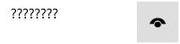
Figure 4-2. Reveal button
The following code illustrates both changing the default masking character and setting the IsPasswordRevealButtonEnabled to true:
<StackPanel

    VerticalAlignment="Top"

    HorizontalAlignment="Left">

    <PasswordBox

        PasswordChar="?"

        IsPasswordRevealButtonEnabled="True"

        Name="xPassword"

        Width="200"

        Height="50"

        LostFocus="xPassword_LostFocus_1" />

    <TextBox

        Name="Dummy"

        Width="200"

        Height="50"

        Margin="20" />

    <TextBlock
        Margin="20"

        Name="Message"

        Text="Ready..." />

</StackPanel>
This codebehind supports the LostFocus event, which is fired when the PasswordBox loses focus (e.g., the user tabs to another control).
private void xPassword_LostFocus_1( object sender, RoutedEventArgs e )

{

    Message.Text = xPassword.Password;

}
RichEditBox
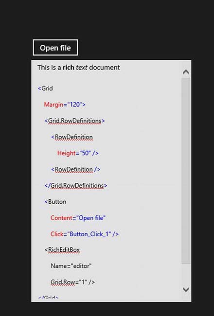
The RichEditBox allows the user to open and view and edit a Rich Text Format (RTF) document. “Rich text” refers to all the text attributes you associate with a word processor but not with a text editor (e.g., bold, color, etc.). The RichEditBox control handles all the work of understanding and presenting the rich text. The following code illustrates creating and using a RichEditBox control:
<Grid

    Margin="120">

    <Grid.RowDefinitions>

        <RowDefinition

            Height="50" />

        <RowDefinition />

    </Grid.RowDefinitions>

    <Button

        Content="Open file"

        Click="Button_Click_1" />

    <RichEditBox

        Name="editor"

        Grid.Row="1" />

</Grid>
The codebehind to support the RichEditBox is shown here and explained in detail below:
private async void Button_Click_1( object sender, RoutedEventArgs e )

{

    Windows.Storage.Pickers.FileOpenPicker open =

        new Windows.Storage.Pickers.FileOpenPicker();

    open.SuggestedStartLocation =

        Windows.Storage.Pickers.PickerLocationId.DocumentsLibrary;

    open.FileTypeFilter.Add( ".rtf" );

    open.FileTypeFilter.Add( ".txt" );


    Windows.Storage.StorageFile file = await open.PickSingleFileAsync();


    Windows.Storage.Streams.IRandomAccessStream randAccStream =

        await file.OpenAsync( Windows.Storage.FileAccessMode.Read );


    editor.Document.LoadFromStream(
       Windows.UI.Text.TextSetOptions.FormatRtf, randAccStream );

}
In this code, an instance of FileOpenPicker is created and named open. The start location (where to start looking for documents) is set to the Documents library, and the file types to open are set as rtf and txt. An instance of StorageFile named file is then created by calling PickSingleFileAsync() on open. This opens the file picker, as seen in Figure 4-3.
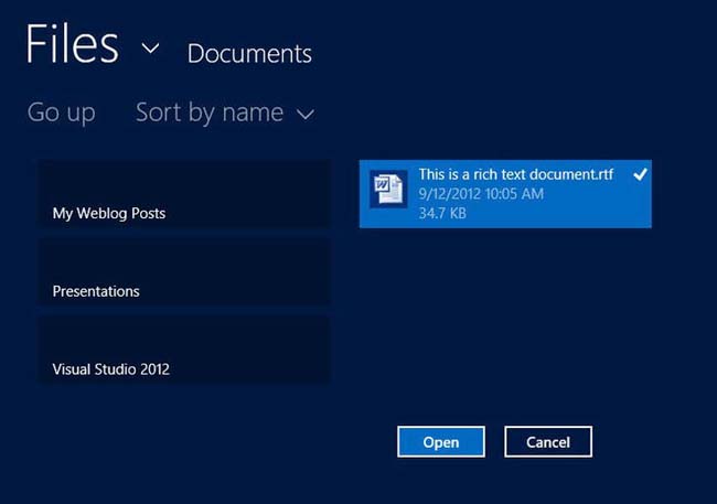
Figure 4-3. A file picker
The await keyword causes the method to wait for the results before continuing. For more on the await keyword, please see the “Await” sidebar.
An instance of the interface IRandomAccessStream is created by calling OpenAsync on file, passing in that you want the file to be opened in read-only mode. With the stream in hand, you load the document into your RichEditBox, passing in the format you want to use (rtf) and the access stream. The file is read into the RichEditBox, as shown in Figure 4-4.
Selection Controls
The next sections will cover the various selection controls.
Button, ToggleButton, HyperlinkButton
The classic Button looks and feels like a real-life button. You push it and it appears to depress. More importantly, when you push it, something happens (the elevator comes, the light comes on, nuclear war commences…). In XAML programming, you designate what is to happen by assigning a handler to one or more events. The most common event for Button is Click. You write the code for what is to happen when the Click button is raised in the Click button event handler. A ToggleButton is much like a regular button except that it toggles between two states and reflects which state it is in (on/off) in its appearance. Finally, a HyperlinkButton acts like a button but also navigates to a new location (typically a new page in your application). The following code illustrates these three button types:
<StackPanel Margin="20">

    <Button

        Name="xButton"

        Content="Standard Button"

        Click="xButton_Click_1" />

    <ToggleButton

        Name="xToggleButton"

        Content="ToggleButton"

        Checked="xToggleButton_Checked_1"

        Unchecked="xToggleButton_Unchecked_1"/>

    <HyperlinkButton

        Name="xHyperlinkButton"

        Content="HyperLinkButton"

        NavigateUri="http://JesseLiberty.com"

        Click="xHyperlinkButton_Click_1"/>

    <TextBlock

        Name="Message"

        Text="Ready..." />

</StackPanel>
Notice that each of the buttons has an event and a named event handler, shown in bold. In fact, ToggleButton has two events (Checked and Unchecked). These event handlers are written in the codebehind file, as shown:
private void xButton_Click_1( object sender, RoutedEventArgs e )

{

    Message.Text = "Regular button clicked!";

}


private void xToggleButton_Checked_1( object sender, RoutedEventArgs e )

{

    Message.Text = "Toggle button is "on"";

}


private void xToggleButton_Unchecked_1( object sender, RoutedEventArgs e )

{

    Message.Text = "Toggle button is "off"";


}


private void xHyperlinkButton_Click_1( object sender, RoutedEventArgs e )

{

    Message.Text = "Hyperlink was clicked!";

}
 Note The
 HyperLinkButton not only has an event, but also causes navigation via the NavigateUri property in the XAML.
Content for Controls
As will be true most of the time, the content for the buttons shown above was just text. You can, however, assign any content you like because buttons are content controls and the Content property does not have to take just a string. You can add virtually any content you like to a button, such as a shape (see below) or a pane that then contains multiple controls, as illustrated in the following code and shown in Figure 4-5:
<StackPanel>

     <Button Content="This button has text" />

     <Button>

         <Rectangle

             Height="30"

             Width="60"

             Fill="Red" />

     </Button>

     <Button>

         <StackPanel>

             <Ellipse

                 Height="40"

                 Width="40"

                 Fill="Red" />

             <TextBlock>Push Me!</TextBlock>

         </StackPanel>

     </Button>

 </StackPanel>
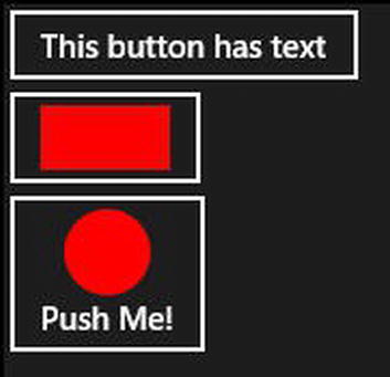
Figure 4-5. Push me!
CheckBox
CheckBox controls are not as common in Windows 8 as they were in previous versions of Windows, as they have been more or less supplanted by ToggleButtons (see below). That said, they still have their purpose, allowing either for the user to choose one of two states (yes/no) or three states (yes/no/indeterminate). To see this at work, create a new project and add the XAML and codebehind shown here:
<StackPanel Margin="20">

<CheckBox

    Name="xCheckBox"

    VerticalAlignment="Top"

    HorizontalAlignment="Left"

    Content="Loves XAML"

    Checked="xCheckBox_Checked_1"

    Unchecked="xCheckBox_Unchecked_1"

    IsThreeState="True"

    Indeterminate="xCheckBox_Indeterminate_1" />


    <TextBlock

        Name="Message"

        Text="Ready..."

        VerticalAlignment="Top"

        HorizontalAlignment="Left" />

</StackPanel>


private void xCheckBox_Checked_1( object sender, RoutedEventArgs e )

{

    Message.Text = "You DO love XAML, I knew it.";

}


private void xCheckBox_Unchecked_1( object sender, RoutedEventArgs e )

{

    Message.Text = "Hang in there, it gets better.";

}


private void xCheckBox_Indeterminate_1( object sender, RoutedEventArgs e )

{

    Message.Text = "Some people can't make up their mind.";

}
The checked checkbox has an x in it, the unchecked check box is empty, and the indeterminate has a square in it, as shown in Figure 4-6.
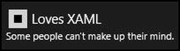
Figure 4-6. A checkbox and some text
ToggleSwitch
ToggleSwitch is a very intuitive way of asking the user to choose one of two states. As such, it has come close to replacing the CheckBox. When you create a ToggleSwitch control, you provide text for the header for the content when the switch is on and the content for when it is off. The on and off content replace one another when the switch is toggled. Here’s some simple XAML to create a toggle switch (no codebehind is needed unless you want to react to the change in state):
<ToggleSwitch

    Header="Having fun yet?"

    OnContent="Yup"

    OffContent="Nope"

    Width="130" />
The result of adding this code and toggling the switch on is shown in Figure 4-7.
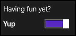
Figure 4-7. Toggle switch in action
RadioButton
RadioButtons allow for the setting of two or more mutually exclusive choices. In the following code, you see two sets (groups) of RadioButtons. One asks the user to choose among two alternatives (true/false) and the second group asks the user to choose among three alternatives. In both cases, only one choice can be made at a time (when you click one radio button, the currently selected button is de-selected).
Note Radio buttons are named and modeled after the old-fashioned radio buttons from automobiles, where you would physically push one button in and the currently chosen button would pop out, thus allowing you to select one station at a time. This is back from the days when there were no computers, roads were unpaved, and horses ran wild through the streets.
<StackPanel>

    <StackPanel

        Orientation="Horizontal">

        <RadioButton

            Name="xRB1"

            GroupName="Truth"

            Content="True"

            IsChecked="True" />

        <RadioButton

            Margin="5,0,0,0"

            Name="xRB2"

            GroupName="Truth"
            Content="False" />

    </StackPanel>

    <StackPanel

        Orientation="Horizontal">

        <RadioButton

            Name="xRB3"

            GroupName="Quality"

            Content="Excellent"

            IsChecked="True" />

        <RadioButton

            Margin="5,0,0,0"

            Name="xRB4"

            GroupName="Quality"

            Content="Good" />

        <RadioButton

            Margin="5,0,0,0"

            Name="xRB5"

            GroupName="Quality"

            Content="Poor" />

    </StackPanel>

</StackPanel>
No codebehind is needed unless you wish to be notified when a button is clicked or when a button is checked or unchecked, in which case you would use the respective event handlers.
ListView and GridView
The ListView and GridView both display collections of data. They both derive from ItemsControl and have very similar functionality, but their appearance is quite different.
The ListView stacks items vertically. The GridView puts items into a grid (hence the name) and effectively stacks them horizontally and then vertically. The ListView takes up relatively little room and is often used in snapped view. The GridView is a richer control and is used when each item needs more space, such as with a photo gallery.
Either ItemsControl can be populated directly either in XAML or in code, or can be populated through data binding using the ItemsSource property. Because they are best suited to different views, it is common to have both a ListView and a GridView bound to the same data, allowing you to make visible whichever control is appropriate.
To add items directly to a ListView using XAML just add them within the element, as shown here:
<ListView

    Name="xListView"

    <x:String>Item 1</x:String>

    <x:String>Item 2</x:String>

    <x:String>Item 3</x:String>

</ListView>
You can generate the items in code just as easily, adding them to the Items collection of the ItemsControl.
protected override void OnNavigatedTo(NavigationEventArgs e)

{

    GridView xGridView = new GridView();
    xGridView.Items.Add( "Item 1" );

    xGridView.Items.Add( "Item 2" );

    xGridView.Items.Add( "Item 3" );

    xStackPanel.Children.Add( xGridView );

}
Items added to an ItemsControl are wrapped in an item container, ListViewItem or GridViewItem, respectively. If you wish to change the display of the item, you can apply a style to the item container by way of the ItemContainerStyle property, as you’ll see in the Chapter 5.
Note that when you added items programmatically, you explicitly added them to the Items collection. Items added via XAML are added to the Items collection automatically. Thus this code
<ListView

    Name="xListView"

    <x:String>Item 1</x:String>

    <x:String>Item 2</x:String>

    <x:String>Item 3</x:String>

</ListView>
is really the same as writing
<ListView

    Name="xListView"

 <ListView.Items>

    <x:String>Item 1</x:String>

    <x:String>Item 2</x:String>

    <x:String>Item 3</x:String>

  </ListView.Items>

</ListView>
It is more common to add items to an ItemsControl from a collection, typically retrieved from a web service or a database, and to use data binding. To populate an ItemsControl in this way, you set its ItemsSource property to your collection of data, much as you did in the example with the ComboBox. Similarly to that example, you may choose to create a DataTemplate to control how the list is shown, in either the ListView or the GridView.
AppBar
Windows-style applications focus on content, not chrome. Part of traditional chrome is buttons used for command and navigation. How do you provide this functionality to the user without adding chrome back into the application? The answer is to put the command and navigation buttons into an app bar that slides up from the bottom (or down from the top) on request, as shown in Figure 4-8.
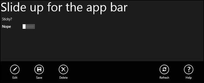
Figure 4-8. The app bar showing at bottom of application
The app bar is brought into view by sliding up from the bottom (or down from the top) of the screen. It has an IsSticky attribute. If that attribute is set to true, then you dismiss the app bar with the same gesture that brought it into view. If IsSticky is false, then you can tap anywhere on the application (outside of the app bar itself) to dismiss the app bar.
The StandardStyles.xaml file, which is added under the Common folder when you create your application, has a number of button images that you can use in the app bar, as shown in Figure 4-8 and in the following code:
<Style x:Key="SaveAppBarButtonStyle" TargetType="Button" BasedOn="{StaticResource
AppBarButtonStyle}">
<Setter Property="AutomationProperties.AutomationId" Value="SaveAppBarButton"/>
<Setter Property="AutomationProperties.Name" Value="Save"/>
<Setter Property="Content" Value=""/>
</Style>
<Style x:Key="DeleteAppBarButtonStyle" TargetType="Button" BasedOn="{StaticResource
AppBarButtonStyle}">
<Setter Property="AutomationProperties.AutomationId" Value="DeleteAppBarButton"/>
<Setter Property="AutomationProperties.Name" Value="Delete"/>
<Setter Property="Content" Value=""/>
</Style>
<Style x:Key="DiscardAppBarButtonStyle" TargetType="Button" BasedOn="{StaticResource
AppBarButtonStyle}">
<Setter Property="AutomationProperties.AutomationId" Value="DiscardAppBarButton"/>
<Setter Property="AutomationProperties.Name" Value="Discard"/>
<Setter Property="Content" Value=""/>
</Style>
<Style x:Key="RemoveAppBarButtonStyle" TargetType="Button" BasedOn="{StaticResource
AppBarButtonStyle}">
<Setter Property="AutomationProperties.AutomationId" Value="RemoveAppBarButton"/>
<Setter Property="AutomationProperties.Name" Value="Remove"/>
<Setter Property="Content" Value=""/>
</Style>
<Style x:Key="AddAppBarButtonStyle" TargetType="Button" BasedOn="{StaticResource
AppBarButtonStyle}">
<Setter Property="AutomationProperties.AutomationId" Value="AddAppBarButton"/>
<Setter Property="AutomationProperties.Name" Value="Add"/>
<Setter Property="Content" Value=""/>
</Style>
Styles are covered in detail in Chapter 5; however you can see here that these styles, when applied to a button, will add the glyph and behavior expected for the button. To create the app bar itself, declare the AppBar class at the page level, as shown here:
<Page.BottomAppBar>

        <AppBar

            x:Name="BottomAppBar1"

            Padding="10,0,10,0">

            <Grid>

                <Grid.ColumnDefinitions>

                    <ColumnDefinition

                        Width="50*" />

                    <ColumnDefinition

                        Width="50*" />

                </Grid.ColumnDefinitions>

                <StackPanel

                    x:Name="LeftPanel"

                    Orientation="Horizontal"

                    Grid.Column="0"

                    HorizontalAlignment="Left">

                    <Button

                        x:Name="Edit"

                        Style="{StaticResource EditAppBarButtonStyle}"

                        Click="AppBarButtonClick"

                        Tag="Edit" />

                    <Button

                        x:Name="Save"

                        Click="AppBarButtonClick"

                        Style="{StaticResource SaveAppBarButtonStyle}"

                        Tag="Save" />

                    <Button

                        x:Name="Remove"

                        Click="AppBarButtonClick"

                        Style="{StaticResource RemoveAppBarButtonStyle}"

                        Tag="Delete" />

                </StackPanel>

                <StackPanel

                    x:Name="RightPanel"

                    Orientation="Horizontal"

                    Grid.Column="1"

                    HorizontalAlignment="Right">

                    <Button

                        x:Name="Refresh"

                        Click="AppBarButtonClick"

                        Style="{StaticResource RefreshAppBarButtonStyle}"

                        Tag="Refresh" />

                    <Button

                        x:Name="Help"
                        Click="AppBarButtonClick"

                        Style="{StaticResource HelpAppBarButtonStyle}"

                        Tag="Help" />

                </StackPanel>

            </Grid>

        </AppBar>

    </Page.BottomAppBar>
You start the AppBar by creating a grid with two columns, left and right for the sets of buttons. By convention, application-specific buttons appear on the left, while more global buttons appear on the right. You then align the buttons by using horizontal stack panels, and each button is given a name, a style (for the glyph), and a tag. The tag is used in handling the click event (in this example, all of the buttons share the same click event handler).
The page itself consists of a few controls stacked one atop another.
<Grid

     Background="{StaticResource ApplicationPageBackgroundThemeBrush}">

     <StackPanel>

         <TextBlock

             Text="Slide up for the app bar"

             FontSize="50" />

         <ToggleSwitch

             Name="xToggleSwitch1"

             Header="Sticky?"

             OnContent="Yup"

             OffContent="Nope"

             Toggled="ToggleSwitch_Toggled_1" />

         <TextBlock

             Name="xMessage"

             FontSize="40" />

     </StackPanel>

 </Grid>
The ToggleSwitch toggles between IsSticky mode being on and off. The third control is a TextBlock named xMessage. When a button is clicked, you obtain the tag property of that button and use it to display which button was clicked in the Message TextBlock. Here’s the codebehind for the page:
private void ToggleSwitch_Toggled_1( object sender, RoutedEventArgs e )

 {

         BottomAppBar1.IsSticky = xToggleSwitch1.IsOn;

 }


private void AppBarButtonClick( object sender, RoutedEventArgs e )

 {

     Button b = e.OriginalSource as Button;

     var t = b.Tag;

     string msg = t.ToString();


     xMessage.Text = String.Format("You clicked {0} !", msg);


 }
Shapes
XAML has two built in shapes (Ellipse and Rectangle) and the ability to create arbitrary shapes using Paths.
Ellipse and Rectangle
Ellipses and circles, rectangles and squares can all be created in XAML just by declaring an instance and setting the width and height (if the width and height are equal, you will have a circle or square). The shapes can be used in a variety of ways, including in custom creation of buttons and other controls (see Chapter 6 on templates).
The following code creates four shapes and places them onto a Canvas. The result is shown in Figure 4-9.
<Canvas>

    <Ellipse

        Width="200"

        Height="100"

        Fill="Red"

        Canvas.Left="20"

        Canvas.Top="20" />

    <Rectangle

        Width="200"

        Height="100"

        Fill="Blue"

        Canvas.Left="300"

        Canvas.Top="20" />

    <Ellipse

        Width="200"

        Height="200"

        Fill="Green"

        Canvas.Left="20"

        Canvas.Top="200" />

    <Rectangle

        Width="200"

        Height="200"

        Fill="Purple"

        Canvas.Left="300"

        Canvas.Top="200" />

</Canvas>
Note In this code, Canvas replaces the outermost grid rather than being placed inside it.
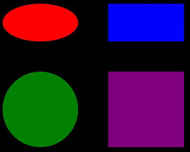
Figure 4-9. Canvas with shapes
Path
You can also draw on the Canvas with a Path, like so:
<Path

    Stroke="DarkBlue"

    StrokeThickness="4"

    Data="M 200,100 C 100,50 300,350 500,175 H 280" />
The Path statement uses a special encoding. Briefly, M indicates the starting offset (200 on the x axis and 100 down from the top on the y axis). M indicates “move to without drawing.” The C indicates a cubic Bezier curve from the starting point (200,100) to its ending point (500,175) using two control points (100,50 and 300,350). A control point is a turning point in the curve—a cubic Bezier has two turning points or bends. The H indicates a horizontal line, which is drawn from where the line happens to be (500,175) to a new endpoint at 280,175. Notice that since the y coordinate in the end point didn’t change, it need not be specified. Typically, paths are not created by hand but by a tool such as Expression Blend; see Figure 4-10.
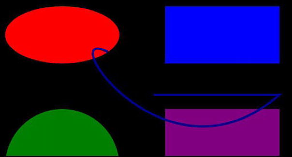
Figure 4-10. A path on a canvas
Presentation Controls
There are various presentation controls that are available to you.
Slider
The Slider control provides a visual representation of numeric values or allows the user to select from a range of values by moving the thumb along the slider (see Figure 4-11). In the following code, you bind the value from the Slider to the TextBlock, causing the current value of the slider to appear in the TextBlock.
<StackPanel>

    <StackPanel

        Orientation="Horizontal"

        Margin="0,20,0,0">

        <TextBlock

            Text="Slider: " />

        <Slider

            x:Name="xSlider"

            Width="130"

            Margin="60,0,0,0"

            VerticalAlignment="Center" />

    </StackPanel>

    <StackPanel

        Orientation="Horizontal">

        <TextBlock

            Text="Value: " />

        <TextBlock

            x:Name="xSliderValue"

            Text="{Binding Value, ElementName=xSlider}"

            Margin="10,0,0,0" />

    </StackPanel>

</StackPanel>
The value in the TextBlock is updated immediately as the slider is moved, as shown in Figure 4-11.
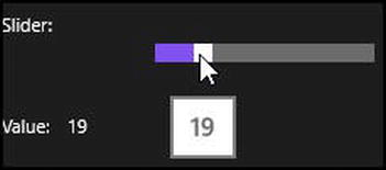
Figure 4-11. Moving the slider and updating the TextBlock
Image
Adding an image to your application is shockingly easy using the Image control. Place the image in a known location (typically an images folder) and add the Image control to your application, providing attributes to determine the height and width of the image you want to display, and how you want the image stretched if it does not match the aspect ratio you specify. The possible stretch values are
- None: Preserves the original size
- Fill: Resizes to fit dimensions; ignores original aspect ratio
- Uniform: Resizes to fit dimensions; preserves original aspect ratio
- Uniform To Fill: Resizes to fit dimensions; ignores original aspect ratio; if necessary, clips to fit
The following code illustrates adding an image to a project:
<StackPanel

    Orientation="Horizontal"

    Margin="0,20,0,0">

    <TextBlock

        Text="Your Author: " />

    <Image

        x:Name="AuthorImage"

        Source="images/Jesse.jpg"

        Width="400"

        Height="500"

        Stretch="UniformToFill"

        Margin="10,0,0,0" />

</StackPanel>
FlipView
The FlipView control allows the user to flip through a sequence of items, one by one. A typical use for the FlipView control would be to make an image browser. In its basic form, it is an incredibly simple and easy control to use. You just tell it where the images are and it takes care of the rest, as shown in the following code:
<FlipView Name="xFlipView">

     <Image

         Source="images/Alnwick.jpg" />

     <Image

         Source="images/kings.jpg" />

     <Image

         Source="images/maine.jpg" />

     <Image

         Source="images/peace.jpg" />

 </FlipView>
This small block of code is sufficient to display these four images one at a time, allowing the user to move from one to the next with the flick of a finger or the click of a mouse.
If you have more than a handful of images, however, you will want to assign a collection to the FlipView, which you can do through its ItemsSource property. In the following code, you will create a collection of Image objects, and then add your images to that collection before making that collection the ItemsSource for your FlipView. The first image is added one step at a time and the following images do the same work but all in one line.
protected override void OnNavigatedTo(NavigationEventArgs e)

{

    var images = new List<Image>();


    var img = new Image();

    img.Source = new BitmapImage( new Uri( this.BaseUri, @"images/alnwick.jpg" ) );

    images.Add( img );


    images.Add( new Image() { Source = new BitmapImage( new Uri( this.BaseUri, @"images/kings.

jpg" ) ) } );

    images.Add( new Image() { Source = new BitmapImage( new Uri( this.BaseUri, @"images/maine.

jpg" ) ) } );

    images.Add( new Image() { Source = new BitmapImage( new Uri( this.BaseUri, @"images/peace.

jpg" ) ) } );

    images.Add( new Image() { Source = new BitmapImage( new Uri( this.BaseUri, @"images/round.

jpg" ) ) } );

    images.Add( new Image() { Source = new BitmapImage( new Uri( this.BaseUri, @"images/sheep.

jpg" ) ) } );


    xFlipView.ItemsSource = images;


}
Imagine that instead of hard-coding these paths, you can obtain the images from a database or other server. In any case, once you have the collection, you assign it to the ItemsSource of FlipView and voila! an image carousel.
MediaElement
MediaElement is another one of those controls, like FlipView, that let you create an amazing user experience with virtually no code. You can then go on to add features to your heart’s delight, but getting started is wicked simple. In the following code, you declare a MediaElement and point it at a video clip you’ve placed into a folder named media. That’s all you have to do. AutoPlay is set to true so when you run the application the video starts up in full screen mode. Nice.
<MediaElement

    Name="xMedia"

    AutoPlay="True"

    Source="media/Wildlife.wmv" />
It is worth noting, however, that there is a lot more you can do with MediaElement. You can start out, of course, with adding buttons for stop, pause, resume, etc., but then go on to add markers so that you can provide the user with additional meta-information, or set the style, add special effects, etc. MediaElement supports MPEG-4, MPEG-2, ASF, ADTS, MP-3, WAV, AVI, and AC-3. One could write a book (and not a bad idea) on MediaElement.
Popup
The Popup class provides support for creating popups in your application, but the body of the popup itself is a user control that you create. In the following code, you create a user control as the popup content. The user control consists of a StackPanel with two TextBlocks and a Button.
<UserControl

    x:Class="PopupDemo.PopupPanel"

    xmlns="http://schemas.microsoft.com/winfx/2006/xaml/presentation"

    xmlns:x="http://schemas.microsoft.com/winfx/2006/xaml"

    xmlns:local="using:PopupDemo"

    xmlns:d="http://schemas.microsoft.com/expression/blend/2008"

    xmlns:mc="http://schemas.openxmlformats.org/markup-compatibility/2006"

    mc:Ignorable="d"

    d:DesignHeight="300"

    d:DesignWidth="400">


    <StackPanel

        Height="200"

        Width="200"

        Background="Wheat">

        <TextBlock

            Foreground="Black"

            Text="Welcome to my popup control!"

            FontSize="20" />

        <TextBlock

            Foreground="Black"

            Text="Push the button to close the popup"

            FontSize="10"

            Margin="0,10,0,0" />

        <Button

            Foreground="Black"

            Name="xClosePopup"

            Content="Close"

            Margin="0,10,0,0"

            Click="xClosePopup_Click_1" />
    </StackPanel>

</UserControl>
On the page that creates the popup, you add a Button to invoke the popup.
<StackPanel>

    <Button

        Name="xPopupButton"

        Click="xPopupButton_Click_1"

        Content="Show Popup" />

</StackPanel>
In the codebehind, you initialize a member of type Popup.
Popup popup = new Popup();
The event handler is then able to use this member to display the popup by checking the Popup property IsOpen and, assuming it is not open, creating a Child member of the type you created (your user control). You add the vertical and horizontal offset, and display the popup by setting IsOpen to true.
private void xPopupButton_Click_1( object sender, RoutedEventArgs e )

{

    if ( !popup.IsOpen )

    {

        popup.Child = new PopupPanel();

        popup.VerticalOffset = 200.0;

        popup.HorizontalOffset = 500.0;

        popup.IsOpen = true;

    }

}
In the event handler for the button within the popup, you obtain the original popup control (the parent to the user control) and set Popup.IsOpen to false, closing the popup.
private void xClosePopup_Click_1( object sender, RoutedEventArgs e )

 {

     Popup PopupParent = Parent as Popup;

     PopupParent.IsOpen = false;

 }
ProgressBar
A progress bar can be shown whenever you need to make the user aware that a lengthy process is proceeding. It can be run in either of two modes: indeterminate or determinate. The former shows dots that cycle through the control, the latter shows a bar that is filled proportionate to how much of the job is completed.
When you can break the process down into measurable chunks, the determinate approach provides more information to the user and is generally preferable; if you can’t know how long remains, however, it is better to use the indeterminate approach.
In the following code, you create a ProgressBar class and set its IsDeterminate property to true if the corresponding checkbox is checked; this lets you display both modes of the ProgressBar. If you are showing a determinate ProgressBar, you fill the bar with the percentage entered into the corresponding TextBox, as shown in Figure 4-12.
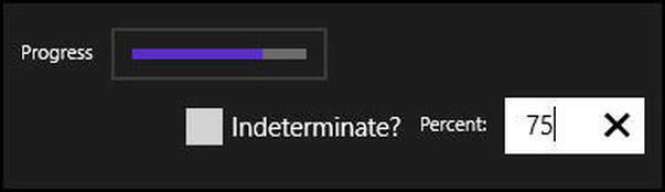
Figure 4-12. A Determinate ProgressBar
<StackPanel

    Width="450"

    Height="150">

    <StackPanel

        Orientation="Horizontal"

        Margin="0,0,0,10">

        <TextBlock

            Text="Progress"

            VerticalAlignment="Center"

            Margin="0,0,10,0" />

        <Border

            BorderThickness="2"

            BorderBrush="#22FFFFFF"

            Padding="10">

            <ProgressBar

                x:Name="xProgressBar"

                IsIndeterminate="{Binding IsChecked, ElementName=xIndeterminate}"

                Width="100"

                Value="{Binding Text, ElementName=Value,

                    Converter={StaticResource StringToDoubleConverter}}" />

        </Border>

    </StackPanel>

    <StackPanel

        Orientation="Vertical"

        HorizontalAlignment="Center">

        <StackPanel

            Orientation="Horizontal">

            <CheckBox

                x:Name="xIndeterminate"

                Content="Indeterminate?"

                IsChecked="True" />

            <TextBlock

                Text="Percent:"

                VerticalAlignment="Center"

                Margin="10,0,0,0" />

            <TextBox

                x:Name="Value"

                Width="80"

                Height="30"

                Margin="10,0,0,0" />

        </StackPanel>

    </StackPanel>
</StackPanel>
ProgressRing
Either the indeterminate ProgressBar or the ProgressRing should be used when the user is aware she is waiting for something from the computer and it will take more than 2 seconds. The ProgressBar should be used in non-modal (non-blocking) situations, while the ProgressRing should be used with a modal (blocking) wait.
The ProgressRing has an IsActive property. When true, the ring spins; when false it is inert, as shown in the following code:
<StackPanel

    Width="450"

    Height="150">

    <StackPanel

        Orientation="Horizontal"

        Margin="0,0,0,10">

        <TextBlock

            Text="Progress"

            VerticalAlignment="Center"

            Margin="0,0,10,0" />

        <Border

            BorderThickness="2"

            BorderBrush="#22FFFFFF"

            Padding="10">

            <ProgressRing

                x:Name="xProgressBar"

                Width="100"

                IsActive="{Binding IsChecked, ElementName=xIsActive}" />

        </Border>

        <CheckBox

            Margin="5,0,0,0"

            x:Name="xIsActive"

            Content="Active?"

            IsChecked="True" />

    </StackPanel>

</StackPanel>
The result of setting IsActive to true is shown in Figure 4-13.
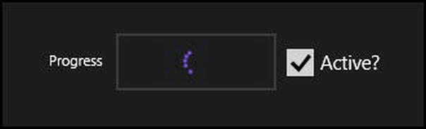
Figure 4-13. A ProgressRing set to IsActive
Tooltip
A tooltip “pops up” when the user hovers over an object with the mouse, or taps and holds the object with touch. The tooltip is typically added to provide additional or explanatory information. ToolTipService is a static class that provides static properties to allow the easy addition of a tooltip to a control. The following code illustrates adding a tooltip to an image with two additional lines of XAML (highlighted):
<StackPanel

    Grid.Row="2"

    Orientation="Horizontal"

    Margin="0,20,0,0">

    <TextBlock

        Text="Your Author: " />

    <Image

        x:Name="AuthorImage"

        Source="images/Jesse.jpg"

        Width="400"

        Height="500"

        Stretch="UniformToFill"

        Margin="10,0,0,0"

        ToolTipService.ToolTip="Your Author"

        ToolTipService.Placement="Right" />

</StackPanel>
Figure 4-14 shows the tooltip in action.

Figure 4-14. Helpful tooltip