
Chapter 10. Titles, Subtitles, and Credits
Text superimposed over film footage is incredibly common in the film and video worlds. You’d be hard-pressed to find a single movie, TV show, or commercial that doesn’t have titles, captions, or credits. In fact, one telltale sign that you’re watching an amateur video is the absence of superimposed text.
In iMovie, the term title refers to any kind of text effect: titles, credits, subtitles, copyright notices, and so on. You don’t need to be nearly as economical in your use of titles as you are with, say, transitions. Transitional effects interfere with something that stands perfectly well on its own—your footage. When you superimpose text on video, on the other hand, the audience is much more likely to accept your intrusion. You’re introducing this new element for their benefit, to convey information you couldn’t transmit otherwise.
Moreover, as you’ll see, most of iMovie’s text effects are far more focused in purpose than its transition selections, so you’ll have little trouble choosing the optimum text effect for a particular editing situation. For example, the Scrolling Credits effect rolls a list of names slowly up the screen—an obvious candidate for the close of your movie.
Add Titles
Adding text to your movie involves choosing a style for your title, positioning it, adding the text, and then choosing the type style. Here are the steps in detail.
Choose a Title Style
With your project open, start by choosing Window→Content Library→Titles (⌘-2), or by clicking Titles in the Content Library (found under your Event list). iMovie launches the Titles panel in place of your Event browser (Figure 10-1). You can preview the titles by skimming them.
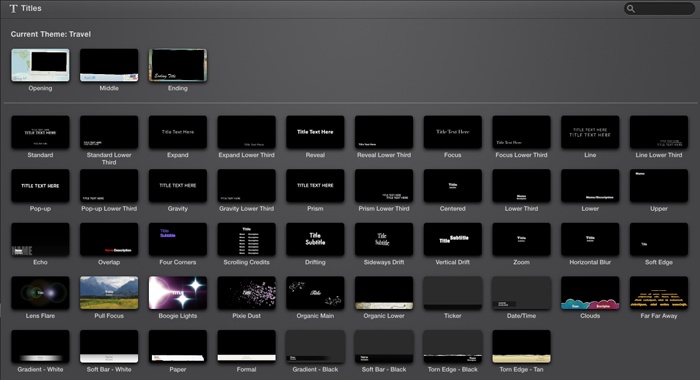
Figuring out the idea behind each title style isn’t rocket science, but here’s a run-down, listed in the order they appear in iMovie:
Standard. The Standard title style may be the most useful of all iMovie text effects. It produces centered lines of text that fade in and then zoom in, stay onscreen for a moment, and then fade out, making this style ideal for the title of your movie. This is a tasteful, professional, and powerful effect.
Standard Lower Third. The name “Lower Third” comes from the TV business—it refers to the lower third of a TV screen. This one basically does the same thing as the Standard title, but in the lower part of your screen.
Expand and Expand Lower Third. These titles work like the Standard ones, but the letters drift apart from the center to the sides of the screen.
Reveal and Reveal Lower Third. The words look like a spotlight is shining across them from the bottom up.
Focus and Focus Lower Third. The letters drop in individually and go from blurry to clear. They drop out again with a blur, as though losing focus.
Line and Line Lower Third. An elegant title, this one has a thin line expand from the center, followed by words above and below the line.
Pop-up and Pop-up Lower Third. This is the first whimsical effect in the list. The letters appear and disappear in a way that looks like a stadium full of people doing the wave.
Gravity and Gravity Lower Third. Back to serious again, these words blur in, except for the first letter of each word, which descends gracefully into place.
Prism and Prism Lower Third. This title looks as though you’re turning a prism, where the letters shift in and out in geometric shapes.
Centered. The old iMovie classic. Plain old letters (Gill Sans font, of course, but you can change that, as explained on Font, Size, and Style) fade in and out without any other style or effect. Of course, this title has become so recognizable, it basically screams to people that you’re using iMovie.
Lower Third. This most closely resembles the lower-third titles you see on TV, like when a show identifies a talking head (“Harold P. Higgenbottom, GrooviTunes CEO”). You can use it that way, or use it to identify the location of a scene, or as a subtitle to translate what a person (like a baby) is saying.
Lower. This title hovers in the bottom-right corner of the screen, as in an MTV music video, but on the wrong side.
Upper. This one gives you Lower’s exact opposite: The text appears in the upper-left corner.
Echo. This unusual style features a title, a subtitle, and an echo of the main title. An enormous, semitransparent, all-caps version of the main title appears behind your text, almost as a graphic element.
Overlap. Two bits of text, one red and one white, meet briefly in the middle at the bottom of the frame, and then keep going their merry way. If you place several Overlap titles consecutively, they alternate colors.
Four Corners. A very colorful series of titles, where the text swoops in from different sides to meet in the middle before swooping out again. Each time you add one of these titles, the entry points and colors of the text change, with up to four variations.
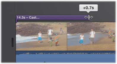
Scrolling Credits. This effect produces a line of text with two columns, for credits like Director…Steven Spielberg and Writer…Robert Towne, or character name…actor name (Figure 10-2).
Be careful when you use this effect, for two reasons. First, iMovie automatically adjusts the speed of the scroll to make sure the effect displays all the names you specify within the duration you specify. If you make the title effect too short, the credits will scroll by too fast for anyone to read.
Tip
Setting up this title style requires special instructions, which appear on Special Notes on Scrolling Credits.
Second, the type is fairly small, which could be a problem if you intend your movie to be viewed on something like an iPhone.
Drifting, Sideways Drift, Vertical Drift. These are three variations on the same basic idea: The text zooms onto the screen, decelerates as it gets to the middle, and then speeds up to leave the frame, never really coming to a full stop. If your clip were a stop sign, these titles would probably get a ticket.
Zoom. Like a centered title, but one that subtly grows (slightly) bigger over time.
Horizontal Blur. This effect simulates your eyes coming into focus to see the title, then going out of focus again.
Soft Edge. Another very subtle effect. The text drifts slightly right, and then a magic eraser wipes it into existence and promptly erases it again.
Lens Flare, Boogie Lights, Pixie Dust. These titles all use something shiny to announce themselves to the world (Figure 10-3). Definitely useful when you want something flashy.
Pull Focus. If you play around much with the manual focus on a camera, this one will look familiar. As the text comes into focus, the background goes blurry. At the end of the title, the background comes back into focus, only to have the title get blurry and disappear.
Organic Main and Organic Lower. These are both very elegant titles, the kind you’d love to have in a wedding video. Both involve delicate, viny animated plants that grow along with the title before fading away.
Ticker. You know how cable-news channels run breaking news headlines across the bottom of the screen? In the same way, the Ticker title runs text, right to left, across the screen. It’s much more plain, however, than what you see on CNN.
Date/Time. The only entirely uneditable title. When you select it, the preview window denies you access. It just sits there, impervious to clicking. This title’s only job is to display the date and time of the underlying clip, which can come in handy if you want to remind viewers of when an event (like a vacation) took place. It appears in the bottom-left corner of the screen.
Tip
OK, this style isn’t totally uneditable. You can change the date and time of your footage, as described on Fade to Black & White/Sepia/Dream.
Clouds. This is a whimsical, animated, lower-third title. Two clouds, one blue and one pink, bounce up into the frame, carrying some equally whimsical text.
Far Far Away. For all the budding George Lucases out there, this title displays text in the iconic, scrolling Star Wars style.
Gradient (White or Black), Soft Bar (White or Black), Paper, Formal, Torn Edge (Black or Tan). These are all variations on the Lower Third style. The only difference is what’s behind the text. You have a choice of semi-opaque backgrounds to make the text more readable and to make it stand out more from the video playing behind it.

Theme-Based Titles
If you added a theme to your project (Cross Zoom), iMovie lists three to eight additional title styles (depending on your theme) at the top of the Titles pane (Figure 10-4). Some of them are heavily animated, embedding your clip into a shot of a photo album, for example. The other titles are simpler, but stylistically designed to match your theme.
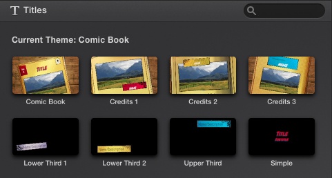
You can use theme titles only if you applied a theme to your project. This also means you can’t use titles from multiple themes in a single project.
Tip
Want a particular theme title, but not the entire theme itself? Just make sure that when you add a theme, you turn off the “Automatic content” checkbox, which tells iMovie to automatically add transitions and titles (see Automatic Transitions). That way, your movie uses only the theme elements you choose, even if you end up using just one theme-based title in your entire project.
Drag the Title into Position
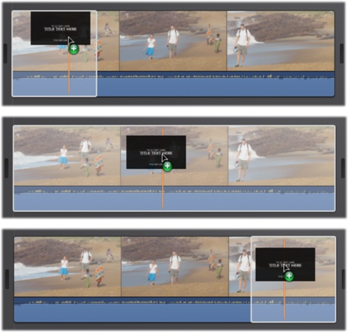
Once you choose a title style, drag its icon directly into the storyboard. As you do, iMovie highlights part of the underlying filmstrip in white (Figure 10-5)—that’s iMovie’s way of helping you position your title.
As you’ll soon see, knowing when to release the mouse button is extremely important. As you helicopter over a clip, you’ll find that you can drop it at any of four places; at each one, iMovie snaps the title into place. Here’s what happens when you have the cursor at various positions over a clip:
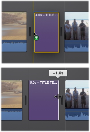
At the beginning of the clip. As the white highlighting in Figure 10-5 illustrates, iMovie proposes covering the first 8 seconds of your clip with the title. When you play back the clip, placeholder text appears over the video.
Note
When you place a title at the beginning or end of a clip, iMovie automatically makes it 8 seconds long. You can change that duration by dragging the end or beginning of the purple title bar.)
Figure 10-5. As you drag a title onto a clip, iMovie previews its position and duration with white highlighting. The title snaps into three positions relative to the clip, shown in these examples. Top: If you drag toward the beginning of the clip, the title covers the first 8 seconds of it. Middle: If you drag over the middle, the title covers the entire clip. Bottom: If you drag toward the end of the clip, the title covers the final 8 seconds of it. Of course, you can adjust any of these durations later.Over the middle of the clip. If your cursor winds up here, the title covers the entire clip, beginning to end.
At the end of the clip. If your cursor falls here, the title stretches over the final 8 seconds of the clip.
Between clips. Under normal circumstances, iMovie text gets superimposed over video. But you might want the title to appear on a nice, black background for a striking and professional-looking effect.
In those cases, drag the title to the gap between filmstrips. iMovie drops a 4-second version of the title into place with a black background. In your storyboard, the title looks like a clip, but one that’s a solid purple rectangle (see Figure 10-6).
Note
If you’re upgrading from an old version of iMovie, you no longer see a checkbox for “Over black,” nor is there a background selector that automatically pops up, as in previous iMovie versions; you simply drag the title between two clips, or to the very beginning or end of the storyboard. See Figure 10-6.
You may prefer a title background other than black. In the Content Library, under Maps & Backgrounds, iMovie offers 20 animated or still backgrounds (see Import from the Finder). You insert one of them by dragging it into your timeline. Then just drag and drop a title onto the background you inserted.
In professional movie editing, a black background is by far the most common. More often than not, this is the one you want to choose, for three reasons. First, it looks professional. Second, the high contrast of white against black makes the text very legible. Third, the audience will read it, instead of being distracted by the video behind it.
Note
When you create a title over a background or between clips, you add to the total length of your movie. You force the clips to the right of your title to slide further rightward to accommodate the credit you just inserted. That’s just a reminder in case you’re editing a video in sync with music. (When you insert text over video, by contrast, you don’t change the overall length of your movie.)
Add by Double-Clicking
Instead of dragging and dropping a title into your storyboard, you can always just double-click it in the titles panel. When you do, iMovie drops in a 4-second title right where the playhead is in your storyboard.
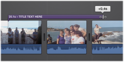
Adjust the Timing
Once you drop a title into place, it turns into a purple stripe over the filmstrip. The stripe indicates how long the text appears onscreen. As you can see in Figure 10-7, the stripe can straddle part of a clip, a whole clip, or many clips, which gives you a huge amount of flexibility.
Note
iMovie doesn’t let you overlap titles. You can, however, have more than one title in the same clip. Drag one onto the front third and another onto the back third of the clip, for example. Then move the titles away from the ends of the clip and add even more titles, always using the clip ends as landing spots. The only rule is that titles can’t overlap.
You can adjust this stripe three ways:
As you make adjustments, take into account your viewers’ reading speed. There’s only one thing more frustrating than titles that fly by too quickly to read, and that’s titles that sit onscreen forever, boring the audience silly. Many video editors use this guideline: Leave the words onscreen long enough for somebody to read them aloud twice.
Also consider the location of your title carefully. If you superimpose it on a solid-color background or a still image, no problem. But if you plan to superimpose it on moving video, choose a scene that’s relatively still, so the video doesn’t distract the audience from the text.
Be particularly careful not to superimpose your titles on an unsteady shot; the contrast between the jiggling picture and the rock-steady lettering will make your audience uncomfortable.
Type the Text
Unless the name of your movie is, in fact, “Title Text Here,” you probably want to edit the dummy text of your newly born title.
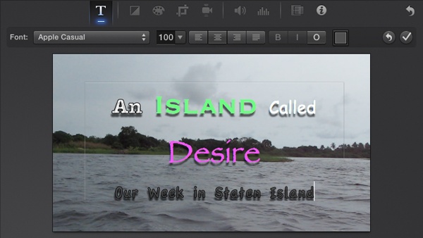
To do so, double-click the purple stripe in the storyboard. That opens the Adjust menu in the Viewer and automatically selects the Title tool. In the Viewer, the title’s text boxes change from static placeholders to text boxes ready for an edit.
For most styles, you actually see two text boxes: a main title and a subtitle. Click inside one of the boxes to edit the dummy text.
Note
You don’t have to type text into both boxes. The subtitle box is there solely for your convenience, for those occasions when you need a second, smaller line of type underneath the larger credit. If you don’t need text there, just delete the placeholder text. When you play back your movie, both the text and its editing box are gone.
All the usual OS X text-editing tricks apply to the text boxes. For example:
Double-click a word to highlight it.
Triple-click inside the text box to select the entire title.
Press Option-arrow key (left or right) to jump one word at a time.
Press ⌘-arrow key (left or right) to jump to the beginning or end of the text box.
Add Shift to the above two keystrokes to jump and select the intervening text simultaneously. For example, Shift-Option-right arrow highlights the word to the right of your insertion point.
Cut, Copy, and Paste work just as you’d expect.
Press Tab to jump between text boxes.
When you finish editing, click ![]() in the Viewer, or style the text using the
instructions that follow.
in the Viewer, or style the text using the
instructions that follow.
Special Notes on Scrolling Credits
When you click the purple stripe representing a Scrolling Credits title, you see placeholder text snippets like the one shown in Figure 10-8.
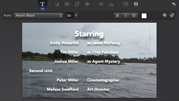
To replace the dummy text with the names of your actors and characters, heed these notes:
First, double-click where it says “Title.” Now you can type something new in its place, like “Featuring” or “Cast.”
Next, drag diagonally through the scrolling list of placeholder names. Once you highlight them, you can begin typing your own cast list: Type in the character name (“Raymond,” for example), press Tab, and then type in the actor’s name (“Dustin Hoffman,” for example). Press Tab to go to the next row. Type the next character name, press Tab, and then add that actor’s name. And so on.
As you go, you can create headings like the ones shown in Figure 10-8 by pressing the Enter key at the end of a row. iMovie places the insertion point at the left side of the frame, so you can type the heading (like “CREW” or “SECOND UNIT”).
You create a blank line in the credits by pressing Enter, Enter, Tab.
Tip
Using the Font panel, you can control the spacing between the lines of credits. See the Tip on Tip.
If you have too many names to fit on one screen, don’t worry; the list scrolls automatically when you reach the bottom of the frame. You can keep typing until you credit every last gaffer, best boy, and caterer. (You can scroll back up again by holding down the up arrow key.)
Font, Size, and Style
iMovie’s creators are rather fond of Gill Sans; that’s a typeface, not a renowned video editor. iMovie uses the Gill Sans Serif font in most of its title styles. It looks great, but it also looks like everyone else’s iMovie videos.
Note
Unfortunately, you can’t change many of the fonts that iMovie uses in its titles, thanks to the way the software animates them. If you can’t click the font drop-down menu as you edit your title, sadly, your title is a one-font pony.
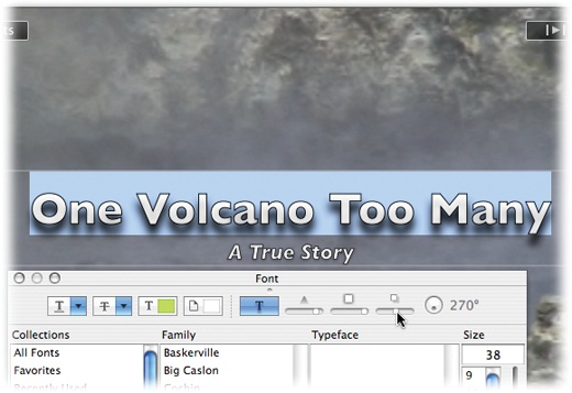
Fortunately, you have a surprising amount of typographic flexibility with many titles. That may come as a surprise, considering that you can’t see any font, size, style, or justification controls when you create a title.
Start by double-clicking the purple stripe of a title you’ve already placed. The Title settings tool appears in the Viewer. Then drag through some of the text in the Viewer.
Tip
For most titles, iMovie doesn’t limit you to a single font and size. You can use different fonts within a single text block, if you must. You can even use a different font for every letter, if you so desire (or if you’re making a ransom-note video).
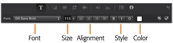
If the font tools in the Viewer are editable, you’re in luck. Your options (shown in Figure 10-9) include these:
Note
Some title styles are only partially editable. For example, you might be able to change the font but not the alignment. When that’s the case, the non-functioning tools either disappear or are grayed out.
Font. iMovie recommends a set of 14 fonts of different styles and weights. If you’d like to customize a bit more liberally, choose Show Fonts at the bottom of the Font drop-down menu to use your Mac system fonts instead.
Size. You can choose one of the recommended sizes from the drop-down menu, or just type in a value, like 120.
Align. These buttons adjust the horizontal alignment of the text within its text block. You can choose Left (against the left side), Center (centered), or Right (against the right side). (The final choice, Justified, does nothing in iMovie unless you have big long paragraphs for titles, which you probably shouldn’t. If you must, Justified makes your text line up straight on both the left and right sides by adding space between words.)
Bold/Italic/Outline. These three buttons change the style of your letters, to be either bolded, italicized, or surrounded by a black outline.
Color. If white is not your thing, you can change the font color by clicking this box. The color picker offers millions of colors. (See Underline, Strikethrough, Color, Shadow for how to use the color picker.)
Figure 10-10 shows examples of many of these styles in use at once in a single, truly hideous opening credit.
The System Font Panel
Handy as it is to have iMovie recommend fonts, it offers only a tiny slate of options, just 14. What is this, graphic-designer preschool?
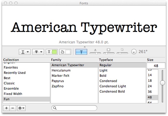
Fortunately for control freaks, iMovie also gives you full access to the System Fonts Panel, a standard OS X feature that puts all typographic controls in a single place.
Suppose you just highlighted a title block, and now you want to choose an appropriate typeface. At the end of the Font drop-down menu, choose Show Fonts.
Here’s what you’ll find there (Figure 10-11):
Collection. The first column lists your collections, which are canned sets of fonts. Apple starts you off with collections called things like “PDF” (a set of standard fonts used in PDF files) and “Web” (fonts you’re safe using on web pages—that is, fonts likely installed on all Macs and Windows PCs).
Family, Typeface. The second column shows the names of the actual fonts in your system. The third, Typeface, shows the different style variations—Bold, Italic, Condensed, and so on—available in that type family. (Oblique and Italic are roughly the same thing; Bold, Black, and Ultra are varying degrees of boldface.) Just click the font you want.
Figure 10-11. The OS X system fonts offer elaborate control over the color, shadow, and underline style of a title’s text. If all you see is the font preview, grab the tiny bubble on the line below the preview and drag it upward. What if all you can see is the font list, but no preview? To get that, choose Show Preview from the drop-down menu at the bottom-left of
the panel. Or use the mousy way: Place your cursor just above
the headings (Collection, Family, and so on) and then drag
downward.
drop-down menu at the bottom-left of
the panel. Or use the mousy way: Place your cursor just above
the headings (Collection, Family, and so on) and then drag
downward.Size. The last column lists a sampling of point sizes. You can use the Size slider, choose from the point-size pop-up menu, or type any number into the box at the top of the Size list.
Underline, Strikethrough, Color, Shadow
You’ll see five rectangular buttons at the top of the Font Panel. Each is a pop-up menu that gives you an even more ridiculous amount of typography control:
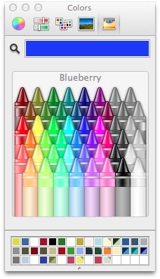
Underline. You can choose how you want iMovie to underline the selected text: with one underline, two, or none. If you choose Color, then the OS X Color Picker appears (Figure 10-12), so you can specify what color you want the underlines to be.
Strikethrough. This option draws a line through your text, as though you crossed it out. These days, there’s really only one situation when you might find it useful: the way bloggers indicate a correction, either a real one or a fake one done for humorous purposes. You know: “Cellphone Companies Are Greedy Slimebags Profitable.”
Text color. The third pop-up rectangle opens the Color Picker dialog box. Here you can specify the color of the highlighted text. (See the box on Figure 10-12.) The important thing is to choose a color that contrasts with the footage behind the lettering. Use white against black, black against white, yellow against blue, and so on.
Figure 10-12. Some styling options can get ridiculous. When you request a different color for an underline or strikethrough, iMovie launches the OS X Color Picker, which gives you a million ways to dial up a precise shade. (If your computer doesn’t offer the toolbar controls shown in this image, make the window wider by dragging the bottom-right corner.)Document color. The next pop-up rectangle is supposed to let you choose a background color for your text, but it doesn’t work in iMovie.
Drop shadow. The rightmost pop-up button is responsible for the shadow that iMovie adds to your titles to help them stand out from the background (Figure 10-13).
General Guidelines
As you choose fonts and type effects for the various credits in your movie, consider these guidelines:
Be consistent. Using the same typeface for all the titles in your movie lends consistency and professionalism to the project.
Remember the QuickTime effect. If you plan to distribute your finished movie as a QuickTime file—an electronic movie file that you can share with others—use the biggest, boldest, cleanest fonts you have. Avoid spindly, delicate fonts or script fonts. When QuickTime compresses your movie down, what looks terrific in your Viewer will be so small it may become illegible.
Come to think of it, you might want to choose big, bold, clean fonts even if you’re going to play the finished movie on a TV with a resolution far lower than that of your computer screen. Be especially careful if you use one of the text effects that includes a subtitle, as iMovie subtitles often use an even smaller typeface than the one for the primary title, and you may lose legibility if the font has too much filigree.
Finally, favor sans serif fonts—typefaces that don’t have the tiny serifs, or “hats and feet,” at the ends of the character strokes. The typeface you’re reading now is a sans serif font, one that’s more likely to remain legible in a QuickTime movie.
The beauty of iMovie’s titling feature is that the fonts you choose become embedded in the actual digital picture. In other words, when you distribute your movie as a QuickTime file, you don’t have to worry that your recipients may not have the same fonts you used to create the file. They’ll see on their screens exactly what you see on yours.
Tip
Don’t forget that you can superimpose text on a still image, too (Chapter 12)—such as a photo or some gradient fill you created in, say, Photoshop Elements.
Add a Custom Title
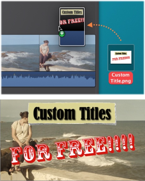
The Titles feature isn’t the only way to create text effects. Using a graphics program like Photoshop or Photoshop Elements, you can create text “slides” with far more flexibility than you can find in the Titles feature. You’re free to use any text color and any font size you want, and you can import the resulting file into iMovie as a title card (read on). You can even dress up such titles with clip art, 3D effects, and whatever other features your graphics software offers. Figure 10-14 (bottom) shows the idea.
Creating a title like this involves creating an alpha-channel PNG file. A little Photoshop experience is helpful, but here’s the gist:
Use the text tool to type and format the text in Photoshop. In the Layers palette, ⌘-click the text layer’s thumbnail to select it. Then, at the bottom of the Channels palette, click the “Save Selection as Channel” button. Finally, choose File→Save As.
Choose PNG as the format, and Photoshop makes you save the file as a copy. (Don’t worry, the transparency should be preserved.) Name the title and save it to your desktop.
Now just drag the title graphic off your desktop and just above the clip you want titled, as shown in Figure 10-14, top. iMovie adds the graphic as a Cutaway (Adjust the Fade-In and -Out); your PNG graphic will now look like a title to anyone who watches your movie.
Check the Results
As you edit a title, you can see how it looks in context by
clicking the ![]() button in the Viewer. Or, once you finish your
title, point to a spot in the storyboard just before the title and
then press the space bar to view the title in the context of the
movie. You can also simply move your cursor back and forth across the
title in the storyboard without clicking to see how it looks.
button in the Viewer. Or, once you finish your
title, point to a spot in the storyboard just before the title and
then press the space bar to view the title in the context of the
movie. You can also simply move your cursor back and forth across the
title in the storyboard without clicking to see how it looks.
If the title isn’t quite what you wanted—if it’s the wrong length, style, or font, or if there’s a typo, for example—you can change its settings as described in the next section. If the title wasn’t at all what you wanted—if it’s the wrong title style, for example—you can undo the entire process by highlighting the purple title stripe and pressing the Delete key (or choosing Edit→Undo, if you added the title recently).
Edit or Delete a Title
If you don’t like the title style you chose, just drag another one from the Titles pane and drop it right on top of the one you want to replace. iMovie updates the title instantly to reflect the change.
Tip
You can also change a title’s style quickly by selecting it and then double-clicking a new title style in the Titles pane.
Making other changes to a title is easy:
Change the start or end points by dragging the endpoints of the purple stripe in the storyboard.
Move the entire title earlier or later by dragging its stripe left or right in the storyboard.
Edit the text or its typography by clicking the title’s purple stripe in the storyboard. The text boxes appear immediately in the Viewer. Follow the steps starting on Font, Size, and Style if you need to change the color, font, or other typographical niceties.
Delete a title by clicking its purple stripe and then pressing the Delete key.